4 minute read
How to Infuse Living Spaces with Color that Feeds the Soul
H O W TO INFUSELiving SpacesFeeds the SoulWith Color That
(Family Features) From experiences to surroundings, the past year has brought a renewed focus on feeding the soul. In an era of overstimulation and information overload, many are finding a new appreciation for living life minimally but with maximum experiences.
That mentality is increasingly evident in all aspects of life, especially with home design and decor. After all, spending more time at home means more time to discover what truly evokes happiness.
At the same time, as the focus on physical and mental wellness heightens, design experts see those trends reflected in a more considered approach to design inspired by color therapy, which makes it possible to create beautiful spaces filled with healing color.
With an expertly coordinated color palette, like the Color Collections from HGTV Home by Sherwin-Williams, colors work in perfect harmony in any combination. Thoughtful use of color is among the most effective design tools for reveal-worthy style in your home.
Appliances
In the past, appliances were meant to blend into the decor to be less obvious, albeit essential, elements of a kitchen. A more contemporary approach: vibrant appliances that get noticed. You can find major appliances in a wide range of colors, but if you’re not sure about going that big and bold, many smaller countertop appliances, such as stand mixers and toasters, come in a range of colorful options, too.
Architecture
When contemplating where and how to apply color to a space, avoid boxing in your options. Think beyond the traditional wall space when you’re planning ways to change the color in a space; be thoughtful with color and highlight architectural details to elevate the interest and charm in your home. Take a 360-degree immersive color approach, painting the same shade from floor to ceiling and all around to create a mood-boosting lift to a room.
To infuse more color and boldness into your space, consider a timeless and elegant shade of red, like HGTV Home by Sherwin-Williams’ 2021 Color of the Year. This paint color, “Passionate,” is


a deeply saturated hue that is daringly rich and invigorates the senses. This bold and empowering red is steeped in history, merging modern design with traditional charm.
Furniture
Whether you’re Elements like window treatments, into project blankets, pillows and rugs lend pieces you can transform important detail and character to a into something room, and they’re also a relatively new or simply affordable way to make shopping for furnishings noticeable changes. that complement your space, be sure to consider how the furniture fits into the overall color scheme. A space isn’t defined by the color of its walls or floors alone. Selecting furniture that fits with the design brings a more cohesive and stylized feel to the room. For example, a desk and bookshelves in pale natural hues can lend warmth to an office with walls painted a cool dynamic blue.

Cabinets Textiles
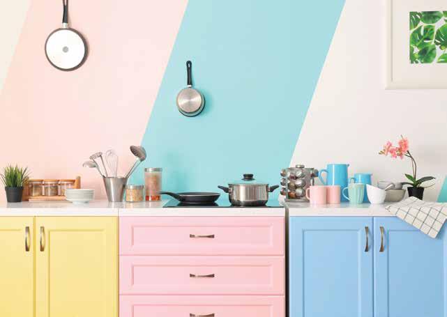
Painted cabinets are on-trend, and if you’re bored with basic whites and grays, you’re not alone. Designers are going bold in the kitchen and using cabinetry as a showpiece. These color palettes create inspiring spaces that invite you to get busy baking or simply pull up a chair and linger over a cup of coffee.
If you’re concerned about how to bring a color palette together, consider using a collection that has been intentionally curated to mix and match shades for a perfect look no matter which hues you choose. You can easily achieve a new look with an option like the Delightfully Daring Color Collection from HGTV Home by Sherwin-Williams. With earthy tones inspired by nature and a dose of vibrancy, the shades are simultaneously energizing and calming. The palette makes it easy to introduce statement colors in unexpected ways so you can feel confident in your selections.
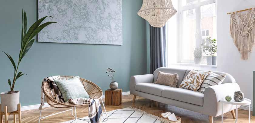
Elements like window treatments, blankets, pillows and rugs lend important detail and character to a room, and they’re also a relatively affordable way to make noticeable changes. The key is to establish cohesion in the space so no one element is overpowering. Softer tones and natural textures can help bring balance to bold hues while vibrant shades create a colorful pop against a more neutral backdrop. To keep the balance, start with your color statement, whether it’s bold bedding in an otherwise neutral bedroom or softer shades in the accent pieces for a room with strong color applied to the decorative molding.
Explore color combinations and get inspired to bring healing design elements into your own home at hgtvhomebysherwinwilliams.com.
Incorporate Color Like a Pro
* Balance the boldness of red with soft whites and natural textures. * Rustic reds and natural wood elements add warmth to a cool backdrop. * An invigorating green hue pairs beautifully with brass, copper and rich wood tones. * For a soft, monochromatic look that’s full of complexity and dimension, add layers of texture with furnishings in the same color for a 3D color look. * Carry bold color onto ceilings for a truly immersive experience.


