
INDEX
ACADEMIC
SITE STUDY: ‘SAKURA PAVILION’
FLARE SERIES I, II, III
STREET STUDY: DIGITAL ARCHIVE
LANDSCAPE STUDY: NATIONAL GARDENS OF ATHENS
WORK STUDY TEAM
NATIONAL MUSEUM OF CONTEMPORARY ART
ATHENS (EMST) PUBLIC SPACE PROPOSAL


A research conducted on Queen’s Park to present a time-gated gallery-pavilion experience. The construction of the pavilion also factors the environment and nature of the site, involving sound, light, as well as circulation (both in human traffic and the environment).
The pavilion also mimics the environment through the use of its materials, using wood and concrete to imitate the surrounding trees as well as skyscrapers, and the implementation of a pool of water to contrast the land-based area in the city, producing a zen atmosphere.


02

FLARE: SERIES I
MDF Boards | Mylar Paper | Acrylic Dowels | Balsa Wood
Rhinoceros 7 | Enscape | Adobe Illustrator


A conceptual space that holds no site context. This piece becomes a physical and conceptual representation of a chosen ‘Project Verb’—Flare. First from a series, this project focuses more on the analysis of walls and divisions, ultimately examining what defines a space, through an array of columns, translucent walls, and implied entraces. With all these in mind, the structure extends its spatial qualities with the idea of circulation and choreography, ultimately pathing a movement for individuals that interact with the space-in a ‘flaring’ manner.


FLARE: SERIES I


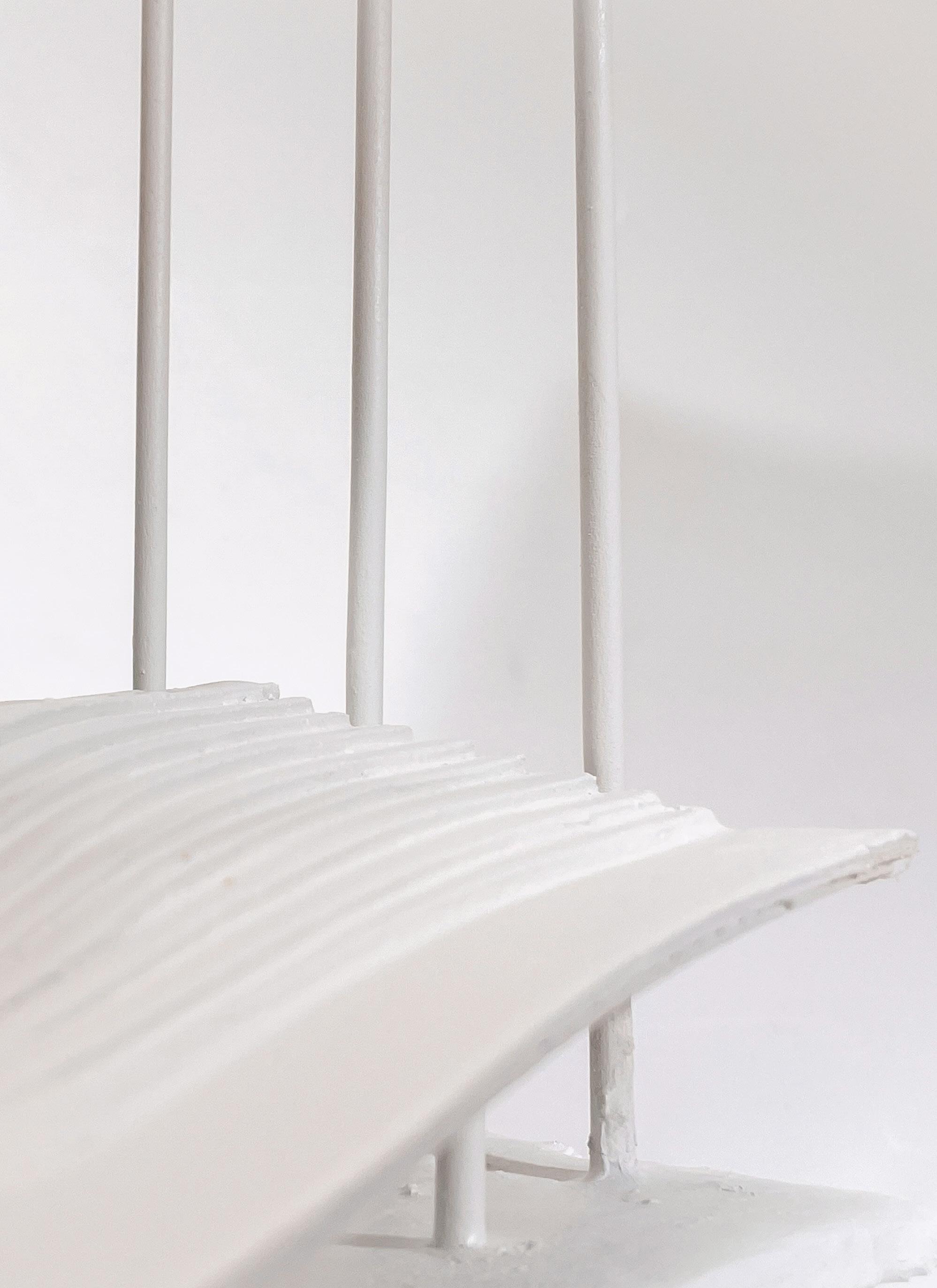
As a continued concept of a space without site context. This piece becomes a physical and conceptual representation of a chosen ‘Project Verb’—Flare. This project extends on the study regarding levels and verticality of a building, using different floors and storeys to define a space with some kind of elevation difference—through the slight gestures like a recessed landscape and cantilevers.
It also experiments with spaces in congruence with the notion of ramps and stairs; in this particular piece, these two elements are combined to make an architectural design, that is the flared st-ramps. With all these in mind, the structure extends its spatial qualities with the idea of circulation and choreography, ultimately pathing a movement for individuals that interact with the space-in a ‘flaring’ manner.
02

FLARE: SERIES II
MDF Boards | Mylar Paper | Wooden Dowels | Balsa Wood | Foam Sheets | Plaster
Rhinoceros 7 | Enscape | Adobe Illustrator


02

FLARE: SERIES III
Boards | Mylar Paper | Wooden
Rhinoceros 7 | Enscape | Adobe Illustrator
|
|
|

In concluding the FLARE series, the design is now situated within a site context. This piece becomes a physical and conceptual representation of a chosen ‘Project Verb’—Flare while assuming a multiprogrammatic structure. This project conflates the ideas behind the previous FLARE studies, of both horizontality and verticality. The space combines various programs as to representing a student space at Devonshire
Place, oriented towards communities in University of Toronto as a useable multi-programmatic commons. With all these in mind, the structure extends its spatial qualities with the idea of circulation. choreography, and functionality, ultimately pathing a movement for individuals that interact with the space-in a ‘flaring’ manner while creating definite spaces for different functions within the structure.


FLARE: SERIES III


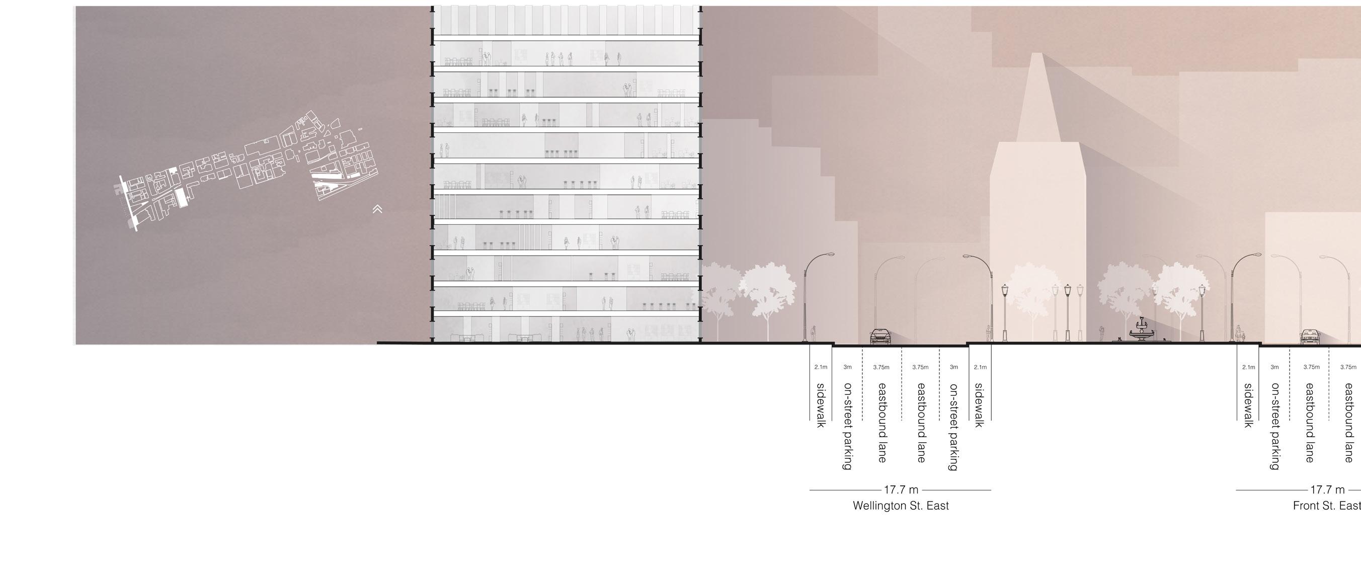
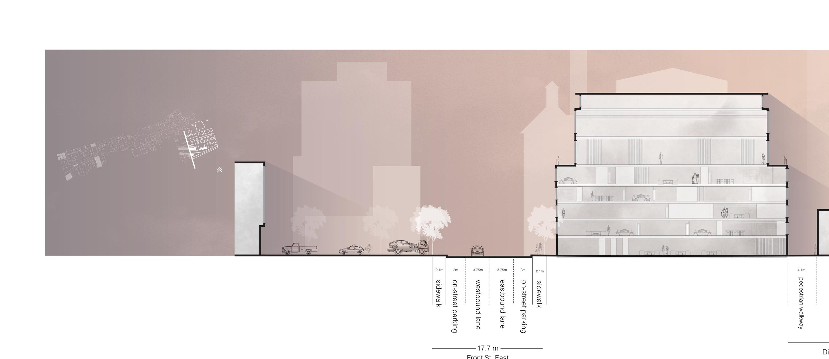
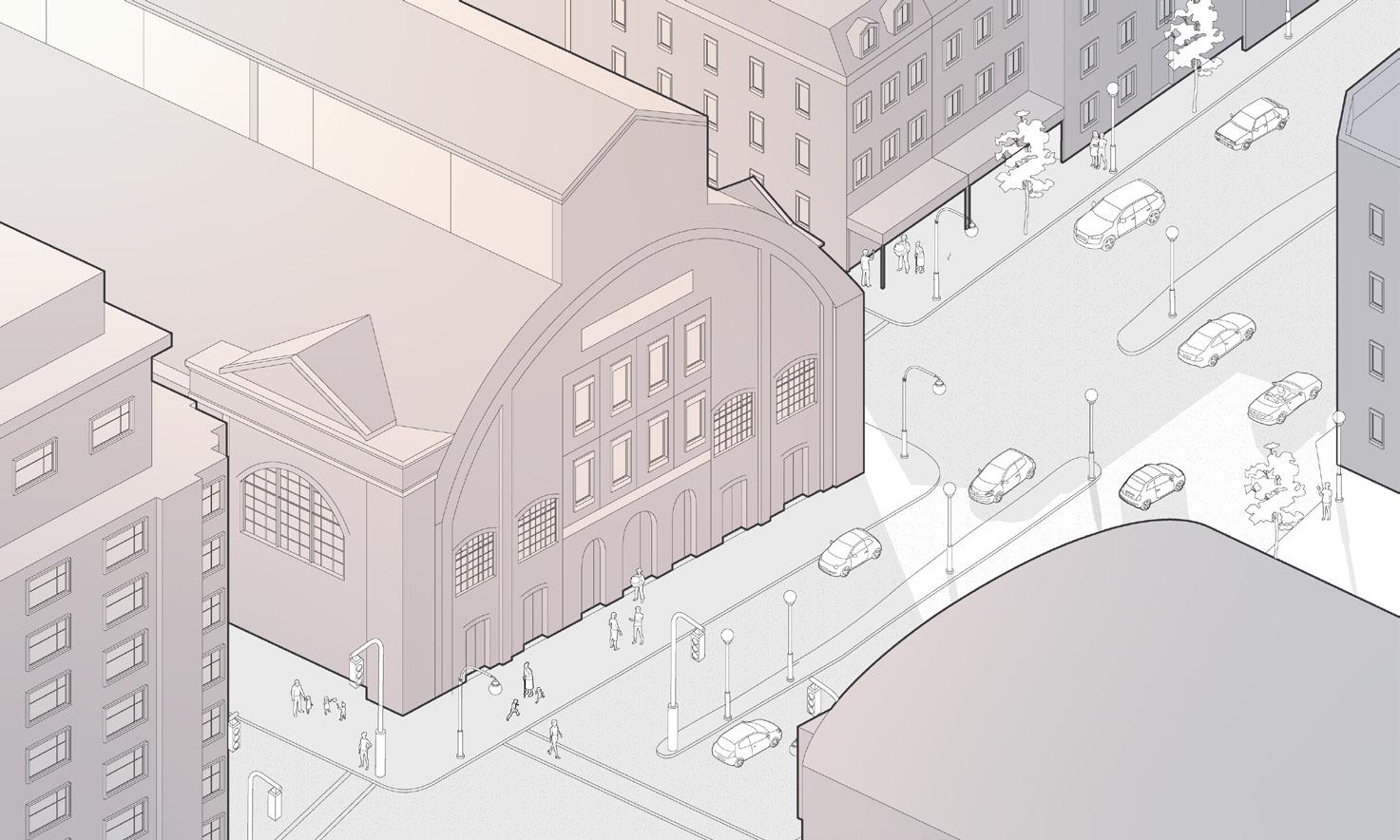
Toronto is an evolving city under mass redevelopment, which has resulted in the erasure of much of its historical urban fabric, which often comes with the growth of a city. Our street of study is Front St., which still has fragments of Toronto’s heritage buildings, capturing the city’s former essence—Old Toronto. In our contemporary day and age, the digital platforms and media have become the most ubiquitous and readily available way of archiving and documenting the city. Content shared on social media sites shape the public consciousness and the perceived image of the city which stimulates people to constantly make the same digital copy or image of these landmarks, often from the same vantage point. The aesthetic and appeal of these sites remain notable to our current moment despite their dated architecture, in a way of preserving the past not only as a photographic memento but as a living thing. In light of a constantly evolving city, the act of preserving these landmarks become more difficult, especially in aligning older architecture with contemporary trends.
Upon the initial study of Front St. the photographic documentation of Front St. and its adjacencies were mostly concentrated in several points in the city, leaving some of the central areas of Toronto undocumented and ultimately encouraging the growth of what we sought as a “generic city” or areas not deemed worthy od documentation based on the driving principes or unwritten style guidelines that inform many social media platforms. To challenge this condition, our design interventions seek to reflect and critique on social media platforms aesthetics, like Instagram, by creating attention-seeking installation for potential “photo ops” as a way to combat the gradual loss of the city’s and essence in these deemed “generic”. With the intent of motivating individuals—tourists and locals—to capture these moments through the digital and social media documentation, a possibility of documenting and preserving parts of Toronto’s ruch urban culture, its historical character, and revealing overlooked sites to both city-dwellers and tourists.

03 STREET STUDY: DIGITAL ARCHIVE


ST. LAWRENCE MARKET


DISTILLERY DISTRICT


This explores the urban layering and structure of Athens as a society under continuous development. Athens is known for its urban design in conjuction with undulating grounds and terrain, creating its own genre of Athenian archtitecture. However, as the city progresses through time, and as the Athenian society demands for urbanism, the urban design and structure of Athens is forced for a change; the city overcomes the spatial issue through either burial of areas to allow for new architecture and infrastrucures, or the excavation of a site.
Nonetheless, urban renewal does not define the experience in Athens alone, it exceeds far more than the branching design of urbanism in Athens; other gestures such as walking through
the roads, analyzing historical artifacts, as well as understanding Athenian urban transformation also encapsulate the true experience in Athens, Greece.
The chosen landscape, the National Gardens of Athens, is one of the largest green spaces in the heart of Athens. The garden also plays a role in urban planning and cityscape design where it contributes as the city’s green infrastructure, providing residents and visitors alike with access to nature amidst a city undergoing constant development and technological strides. This integration of green spaces into the urban fabric is essential for promoting environmental sustainability and enhancing quality of life in cities as well as actively combatting the climate crisis that present in the site.


05 NATIONAL MUSEUM OF CONTEMPORARY ART IN ATHENS (EMST) PUBLIC SPACE PROPOSAL

This design proposal for the National Museum of Contemporary Art in Athens aims to resolve design inconsistencies of the area and the facade of the museum, but also implement green spaces and sustainable architecture in conguence with the environmental and climate conditions in Athens, Greece.
The proposal consists of a green facade, a more contemporary hardscape design, as well as a redesigned entrance for the Metro. Initially, the preexisting space consists of three independent spaces, the museum, the bus station, as well as the park, all of which are divided by paved lanes meant for vehicular traffic. This new EMST landscape explores the idea of a multiprogrammatic public space which focuses on foot traffic and interactions while maintaining the existing conditions for
vehicular circulation.
The three areas are integrated into one unified space with a hardscape material and foliage. The open space also consists of tree rows that accentuate the linearity of the new landscape. This hardscape also extends to the park, creating a pathing condition that leads individuals towards the museum from the Metro entrance, allowing for more museum visits and attraction. Due to the low bus traffic, the designated lanes that used to cut through in between these areas are now redesigned for both accessibility and space. These lanes are given their specific areas on each side of the public space, ultimately redefining the area to have more intention for foot traffic rather than for vehicles.


BUS STATION REDESIGN


024
