5 minute read
A NEST FROM URBAN LIVELINESS
ONLY A STEP FROM VENICE, AMBASCIATORI HOTEL VENICE MESTRE TAPESTRY COLLECTION BY HILTON OPENSI WITH A NEW INTERIOR DESIGN PROJECT TO REVIVE ITS GLAMOUR PAST WHILE INFUSING IT WITH A FRESH, CONTEMPORARY YET COMFORTABLE DESIGN.

Mestre is historically considered a place of passage, however its exponential growth can no longer be ignored since the years of the Italian economic miracle, when it moved from a town with just over 20,000 inhabitants to today’s city of 200,000.
Mestre is no longer a shadow city of the famous Venice, but a real destination full of historical and contemporary points of interest.
In response to this shift, the client’s vision for the new Ambasciatori was to create a city hotel that’s conveniently situated near the renowned Venice, yet not confined by its influence. Collaboratively, THDP embraced this vision and worked on a project that embodies its distinct urban identity, reflecting the hotel’s location and family’s story.

In the 1960s, the family owned Hotel Ambasciatori became a favoured destination for numerous Italian movie and TV stars, drawn to its sophisticated and welcoming interiors.

The aim of the new interior design project for the public areas is to revive that glamour past while infusing it with a fresh, contemporary yet comfortable design.
The initial experience of arrival should be both surprising and delightful, while also meeting the operational requirements of the hotel.
The reception and lobby bar areas, before the renovation, were merged in a large open plan space with no dedicated zones for the check-in area, lobby and bar lounge.
Both the reception and bar counter were placed sideways respect to the hotel entrance and both facing the left side of the lobby lounge, not allowing the receptionists and the bar staff to visually communicate with each other.
Creating different spaces, that could answer to different needs during the day, was pivotal for the Client along with the request to create a memorable experience for their guests.
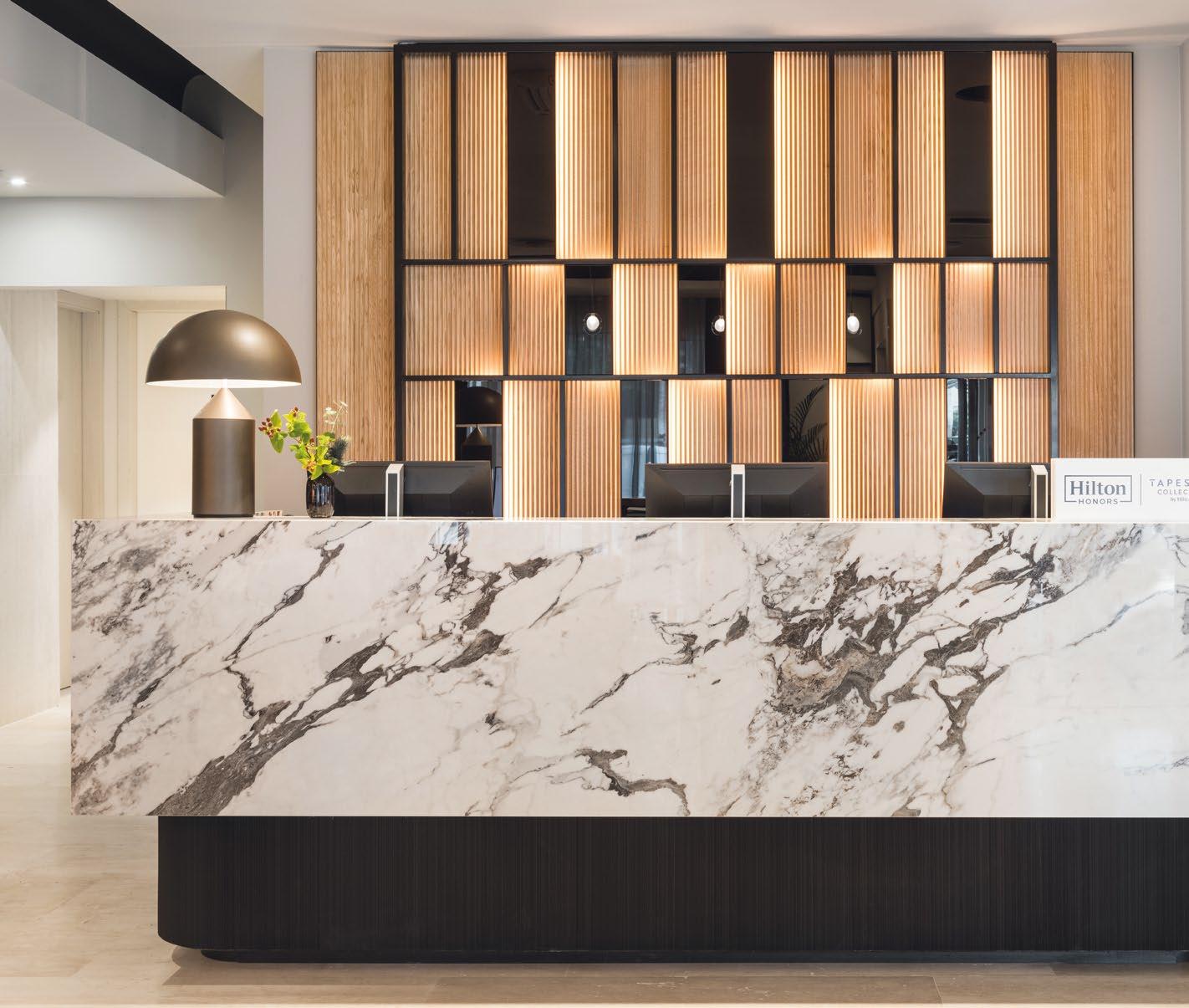
The reception desk’s design draws inspiration from the building and Mestre city, featuring a linear and monolithic counter clad in Marazzi’s Breccia Capraia tile slab and surrounded by a black metal and glass screen softly lit against a fluted wood panelling to pay homage to the vibrant city landscape.
In front of the reception desk, THDP added a dedicated seating area in support of the check-in operations. This zone offers guests the opportunity to be welcomed while seating on the uniquely designed curved custom and armchairs, all while enjoying the collection of objects and locally sourced artifacts displayed on the bespoke shelving positioned between the desk and the seating space.
The lobby shows an exciting and energetic ambiance, boasting an elegant colour palette highlighted by vibrant blues, dark yellows, and black accents.
Positioned in the heart of the lobby, the central bar counter island offers guests the freedom to walk around and choose their seating based on individual preferences. Whether it’s unwinding with a local Spritz on the lounges adjacent to the floor-to-ceiling windows or indulging in a light meal while sending emails in the more secluded dining area behind the bar counter.
The design ensures versatile options for relaxation and productivity also thanks to the addition of a flexible meeting space, concealed behind a set of rich velvet curtains, with facilities to host 8 to 10 people.
The bar lounge features a soft curved bar counter clad with urban inspired brick style greige tiles by Marazzi.

THE CONCEPT FOR THE RESTAURANT REVOLVES AROUND GENERATING AN URBAN VIBE, EMBRACING THE NATURAL LIGHT POURING IN THROUGH THE GLAZED FACADE, ACHIEVED BY ADORNING THE EXISTING WINDOWS WITH DECORATIVE METAL AND AMBER REEDED GLASS SCREENS, CREATING INTRIGUING REFLECTIONS.


The countertop stands out, featuring a backlit fluted timber and black metal edge that echoes the adjacent reception desk’s finishes. To enhance the architectural details of the space, THDP has incorporated black metal framing as accents around existing columns, newly added artwork, and above the bar counter, boosting the area with a distinct character.
The introduction of the iconic wallpaper ‘CocktailsFornasetti design’ by Cole & Son on the main wall facing the windows, adds an element of surprise, infusing the bar lounge with an energetic and vibrant backdrop.
Meanwhile, the upscale restaurant on the mezzanine level offers a more serene and pared-back atmosphere. The concept for the restaurant revolves around generating an urban vibe, embracing the natural light pouring in through the glazed facade, achieved by adorning the existing windows with decorative metal and amber reeded glass screens, creating intriguing reflections. Pendant lights line the perimeter, ensuring consistent and enchanting illumination throughout the day and night.
Inspired by the verdant trees along the Corso, the earthly colour palette includes shades of forest green, warm browns, and natural tones.
The guestrooms are adorned with textile wall coverings, custom-made lighting, and refined joinery, all harmoniously celebrating the generous influx of natural light. These carefully selected natural tone materials with blue and burgundy accents come together to recreate a serene, bright, and warm ambiance, evoking a delightful sense of place and comfort for our guests.


