K E R Y N B O E R
Architecture Portfolio 2019-2023


K E R Y N B O E R
Architecture Portfolio 2019-2023
Architecture Student, 國立台灣科技大學
I am originally from Indonesia and I am currently a final year architecture student at National Taiwan University of Science and Technology. As a highly organized, hardworking, and ambitious individual, I am always eager to take on challenges that can help me grow and improve. Despite balancing my academic workload with a job and extracurricular activities, have consistently maintained good grades.
Designing has been my passion since childhood, from playing design games to ultimately deciding to pursue a career in design. I am committed to working hard and striving towards my goals, and am constantly seeking opportunities to learn and develop my skills.


LANGUAGE 語言
(National Taiwan University of Science and Technology)
Architecture Majoring, Faculty of Design
University
Taipei, Taiwan
IPEKA Puri
Math and Science Majoring
Senior High School
West Jakarta, Indonesia

九典聯合建築師事務所 (Bio-Architecture Formosana), Taipei
Part-time 2022/9 - 2023/3
元宏聯合建築師事務所 (SED-IA Architecture), Taipei
2022/2 - 2022/5
Internship
璧川室內裝修有限公司 (Beatrix Space Design), Taipei
2021/7 - 2021/8
Internship


Bahasa Indonesia
English (TOEIC: 875)
Mandarin
Hokkien
SOFTWARE 軟體
Autocad
Sketchup
Revit
Rhino
Twinmotion
Lumion
Vray
Adobe Photoshop
Adobe InDesign
Microsoft

ORGANIZATION EXPERIENCE
ACHIEVEMENTS & EXPERIENCES
成就與經驗
Member 2022 2021中華民國全國建築師公會學生競圖歷任總統圖書館
歷任總統圖書館設計
First Prize Winner (首獎)
https://www.naa.org.tw/view_article.php?id=5807
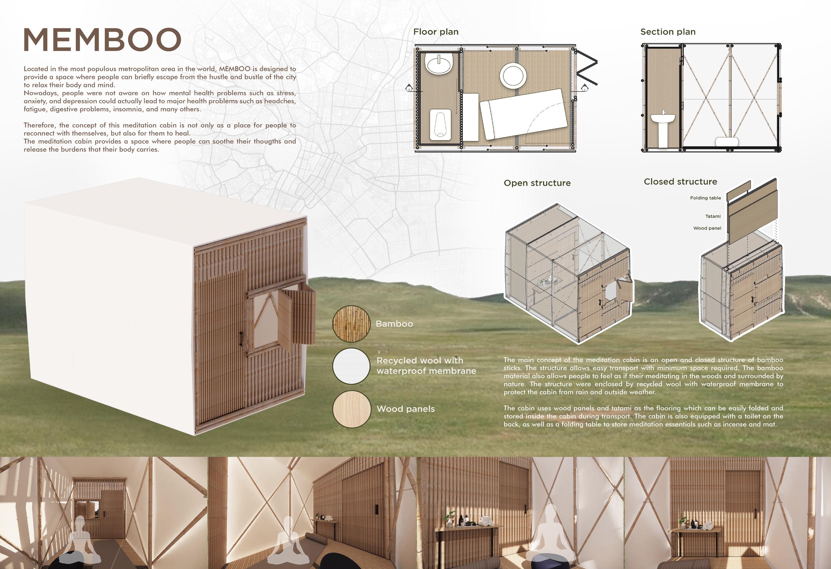
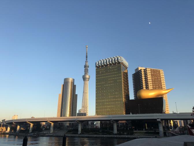
Tokyo Urban Meditation Cabins
Buildner Architecture Competition
Participant
Participant 2020
第八屆特力家居盃全國室內暨傢俱設計競圖大賽 (Decor House Award)
『全齡樂居宅』設計
108級畢業設計畢籌會
場佈組
ICE (Indonesian Cultural Exhibition)
Exhibition Division
Member
NTUST IOS (NTUST Indonesian Overseas Student)
Publication and Design Division
Member
NTUST IOS (NTUST Indonesian Overseas Student)
Publication and Design Division
Member
Design
Member
Taiwan Presidential Library Design
Second Semester Student Project, 2020
- 2021中華民國全國建築師公會學生競圖歷任總統圖書館
Library Design
Second Semester Student Project, 2020
and Workspace Design Third Semester Student Project, 2020
BUDDHIST MONASTERY DESIGN
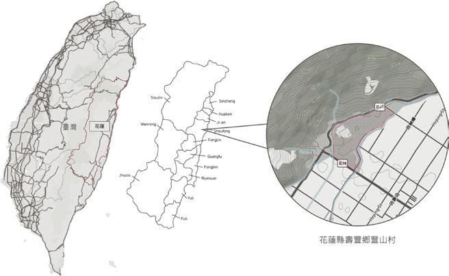
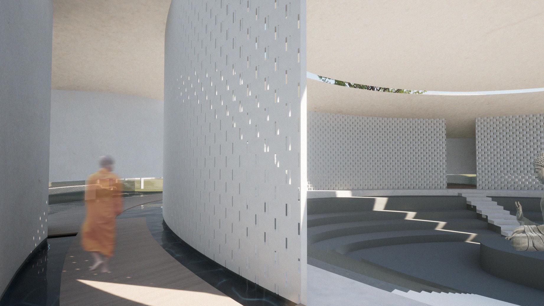
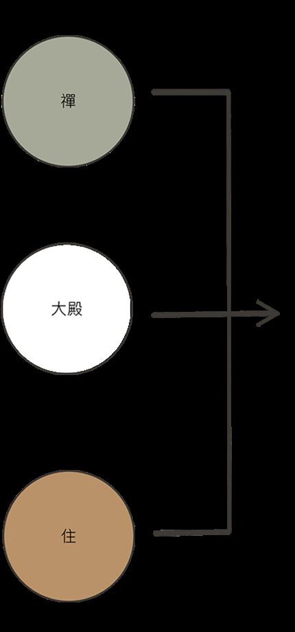
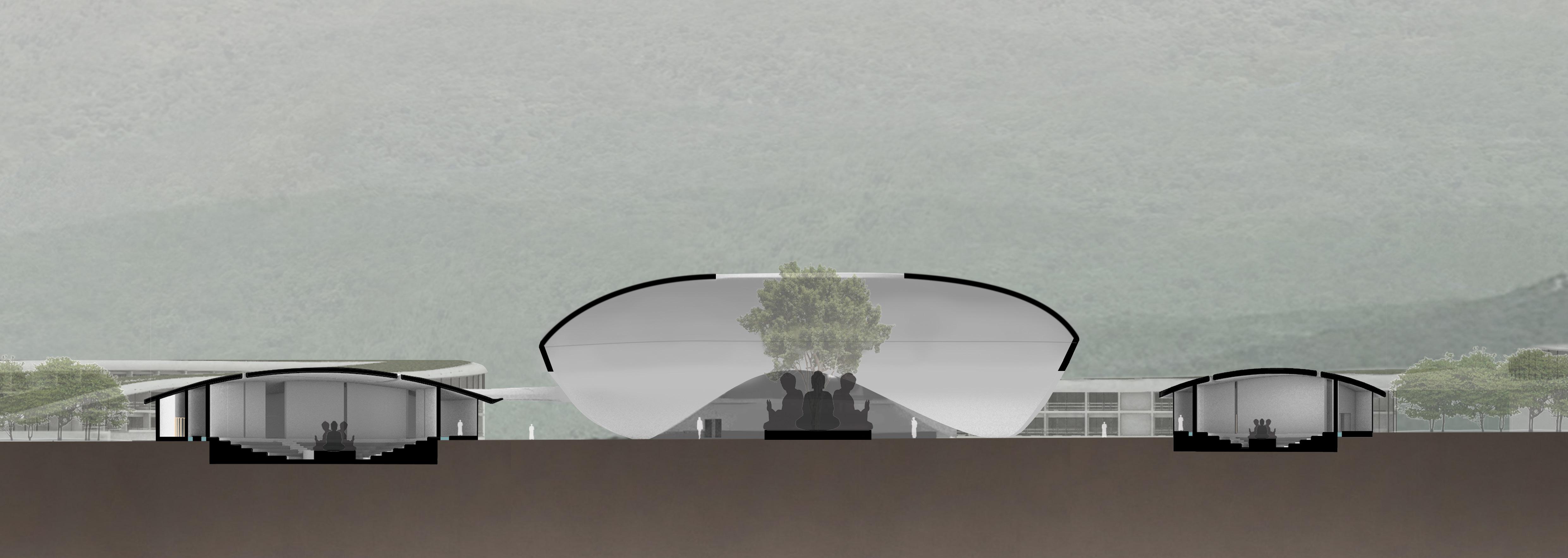
This Buddhist monastery is based on the largest Buddhist sect in Taiwan, Mahayana Buddhism, and is located in Shoufeng Township, Hualien County. The main design purpose is to provide a tranquil place for people to meditate and to find peace, a place for practicing wisdom and compassion, aiming to help people overcome suffering and attain nirvana. This concept comes from the most famous Mahayana Buddhist sutra, the Lotus Sutra. The Lotus Sutra states, “The Tathagata teaches only the One Vehicle, with no other vehicles, whether small or great.” The “Three Vehicles” (the Vehicle of Bodhisattvas, the Vehicle of Hearers, and the Vehicle of Pratyekabuddhas) represent the users of the temple (monastics, laypeople, and students).
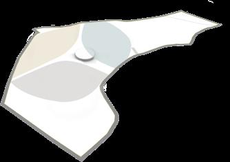
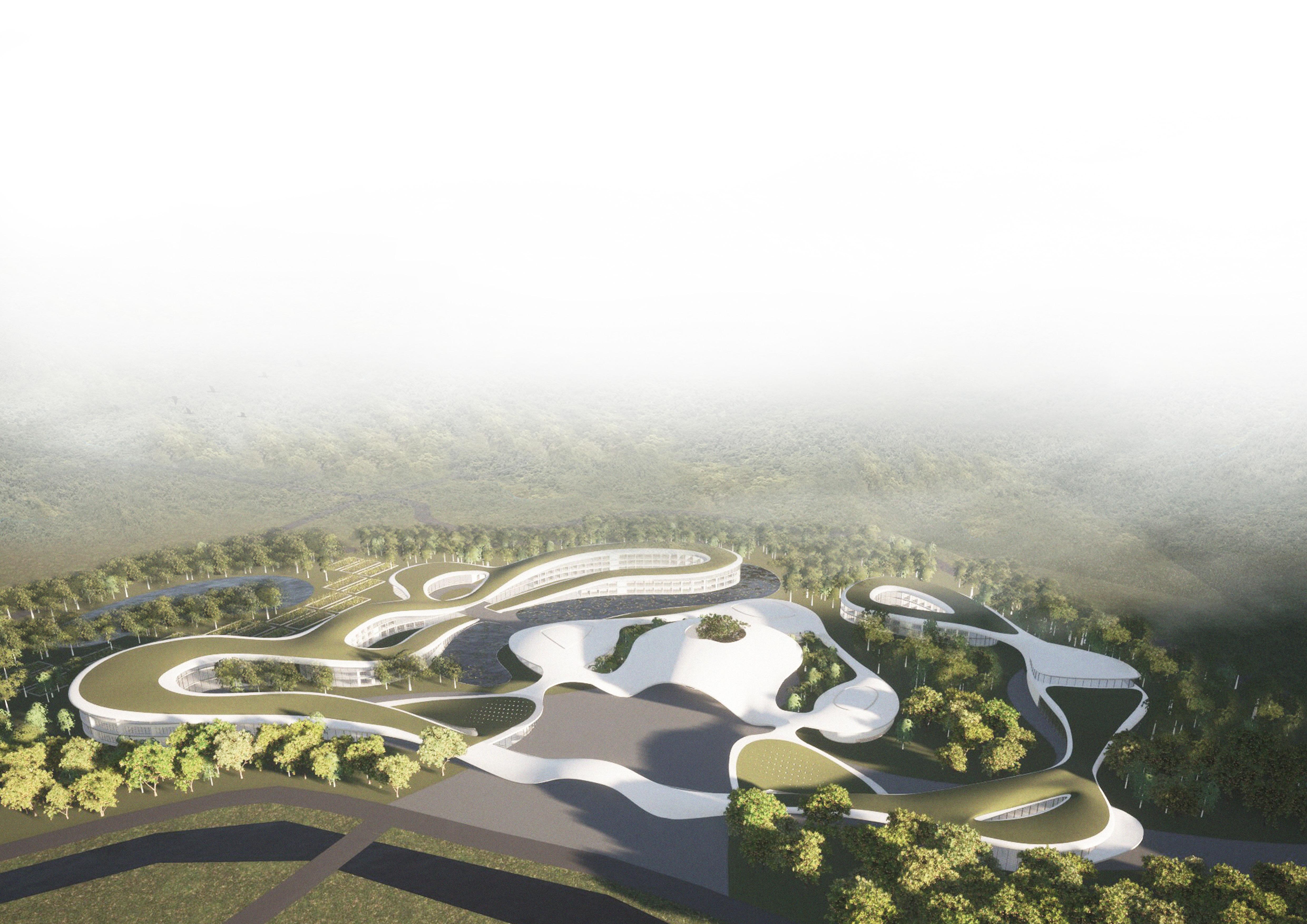


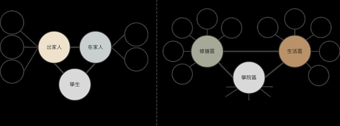
The “Three Vehicles” are the concrete practice of the “One Vehicle,” and the “One Vehicle” is the summary and essence of the “Three Vehicles.” It is because the practice of the “Three Vehicles” can ultimately lead to the same goal that they are also called the “One Vehicle,” and therefore, the “One Vehicle” has become the main concept of the temple.
The aim of the monastery desingn is to create a beautiful, harmonious, and meaningful Buddhist architecture, aiming to provide a quiet and peaceful place for believers to seek spiritual solace and opportunities for spiritual growth.
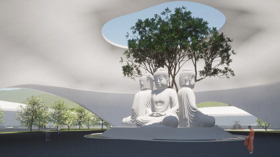
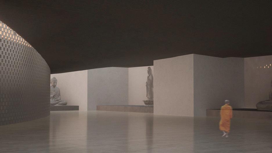
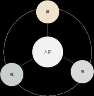
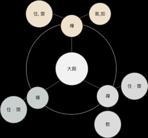
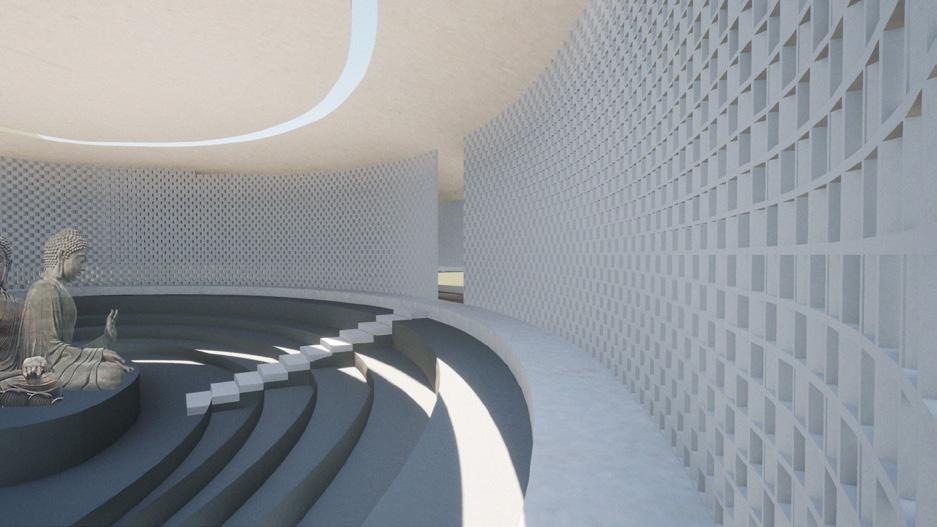
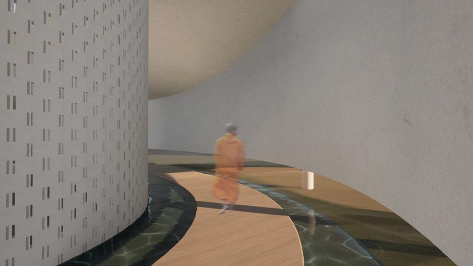
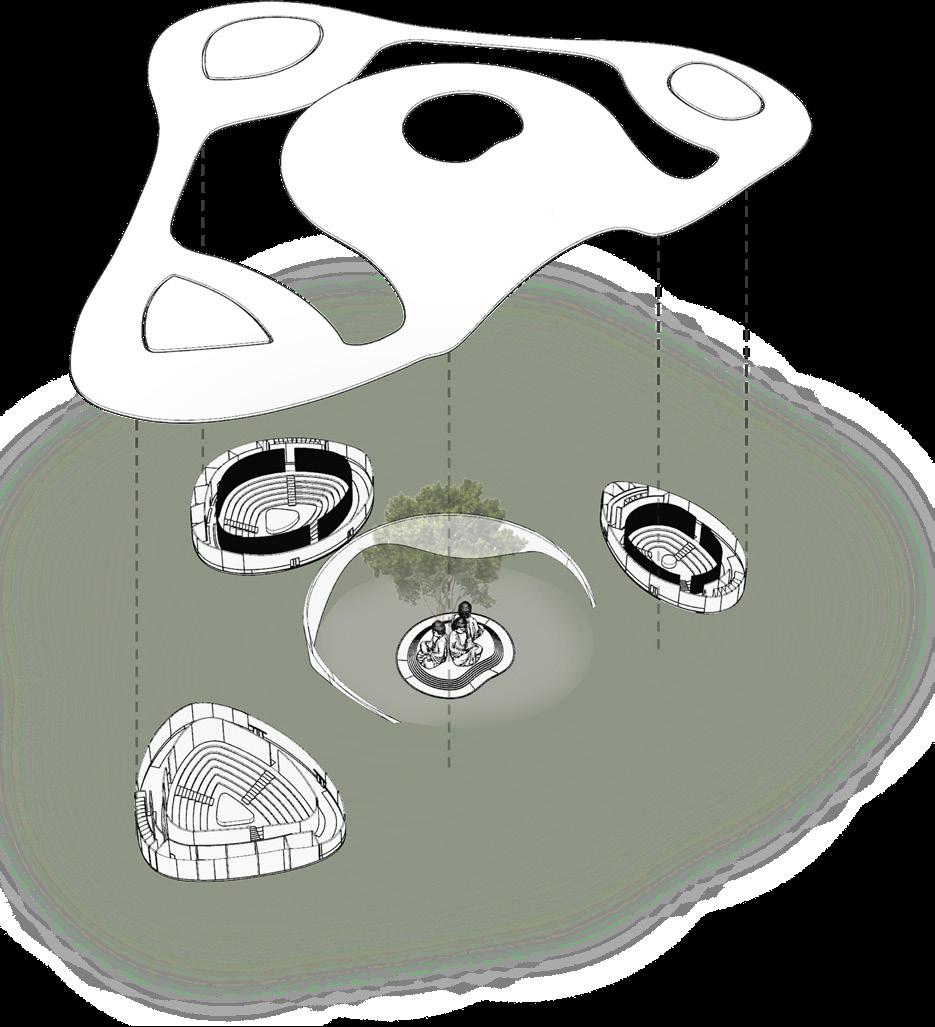
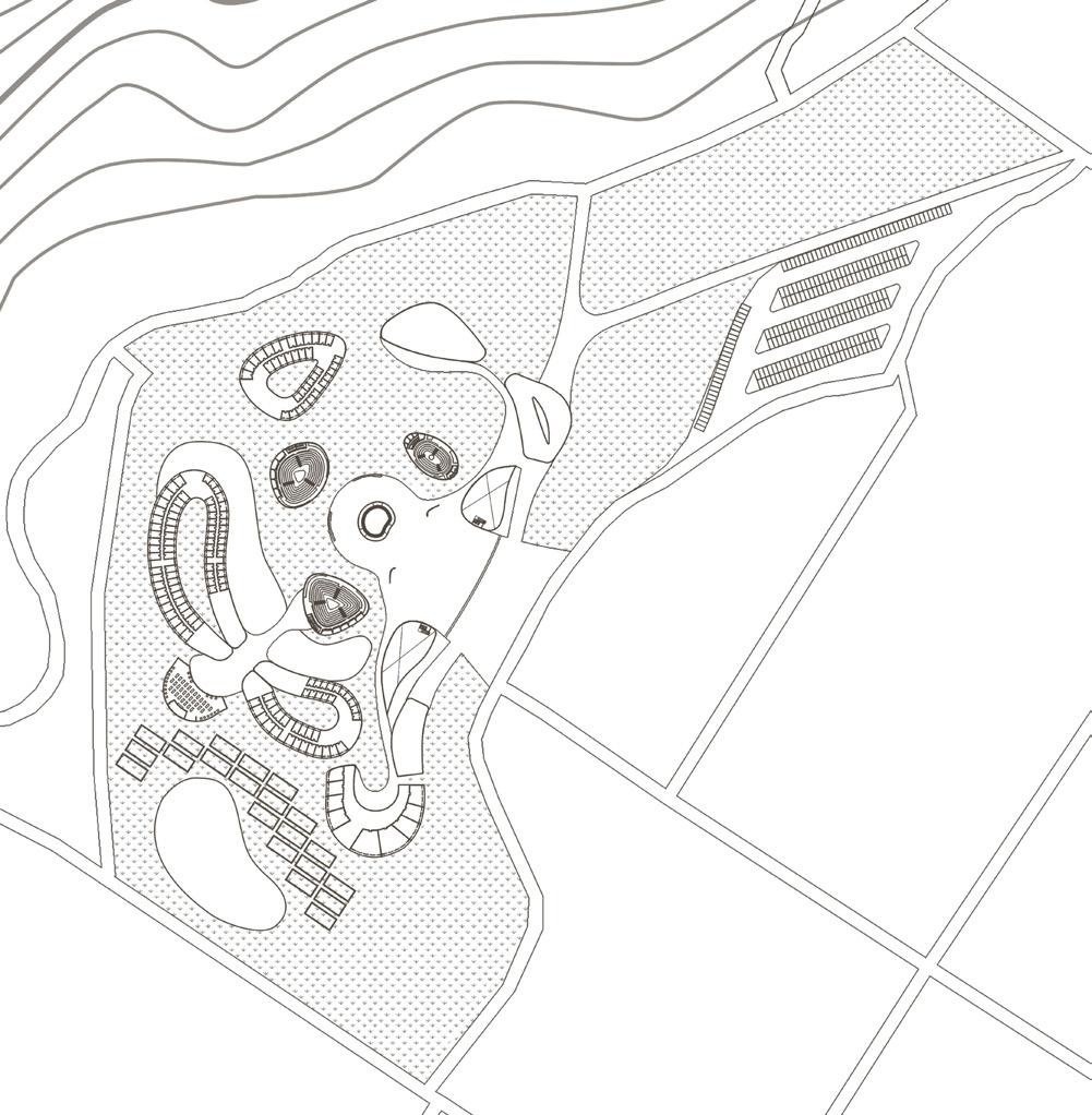
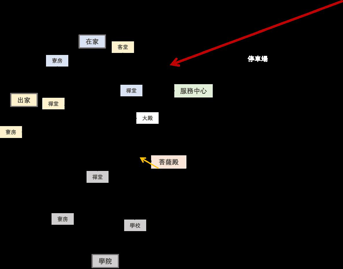
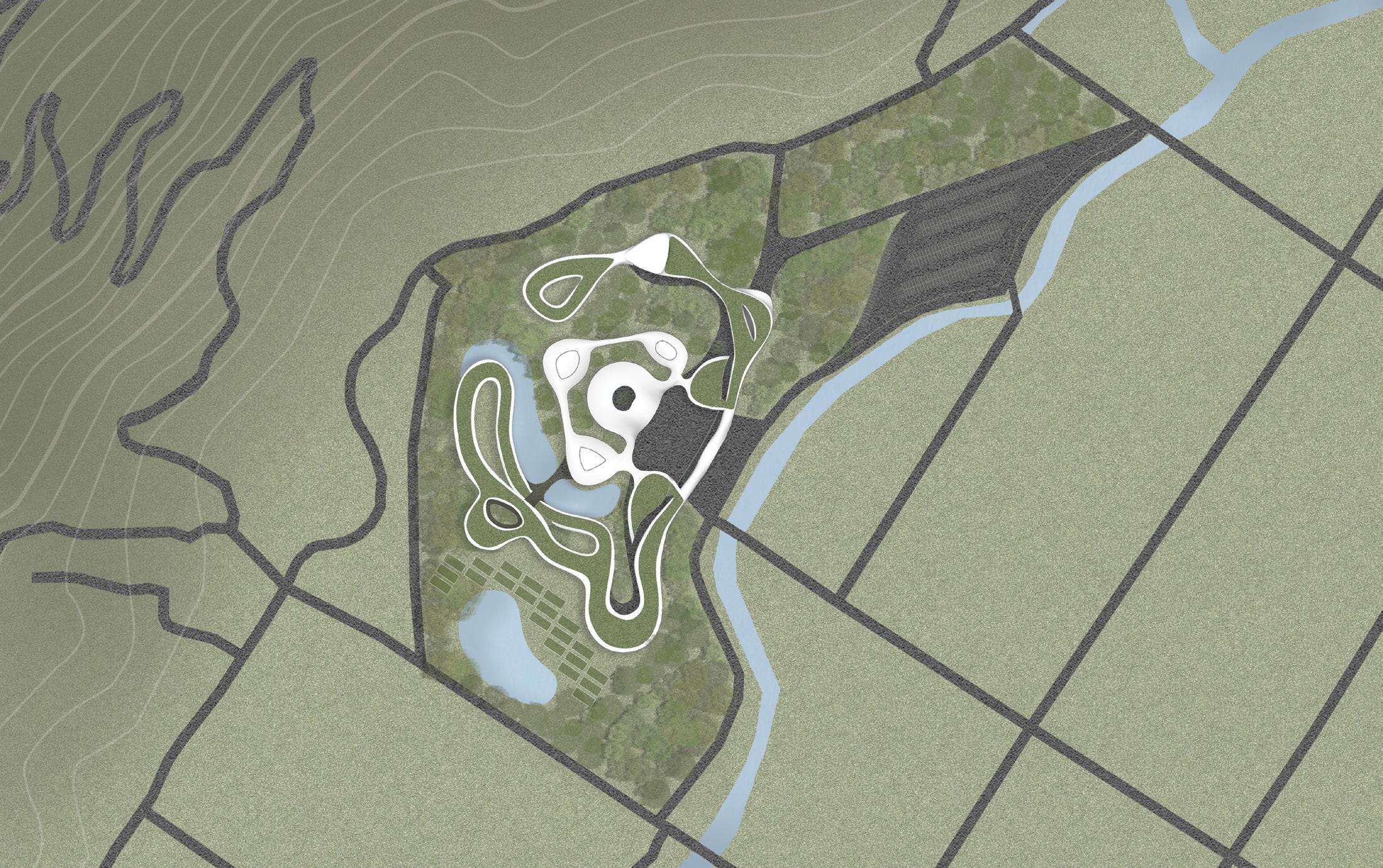
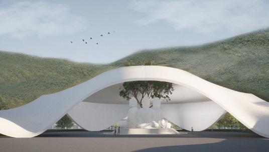
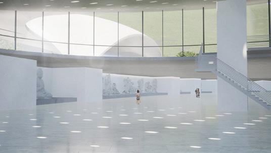
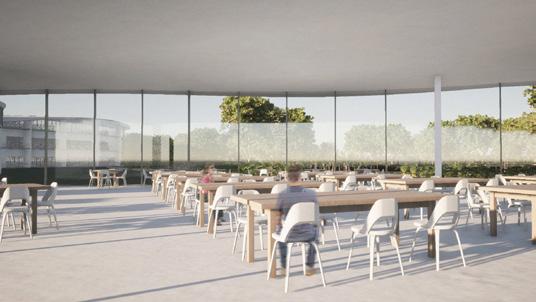
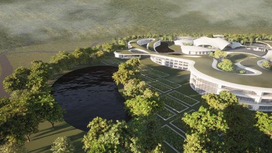
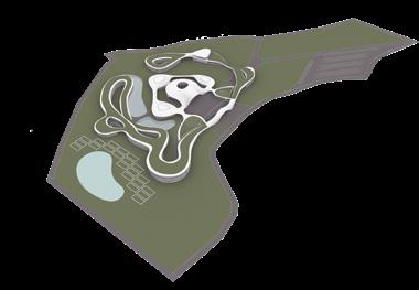
Starting from the entrance, visitors can directly enter the tourist center. The tourist center has two entrance, one that leads into the tourist center and one that leads to the main monastic area, which includes the main prayer hall where people worship the Triple Gem Buddhas. The open space in front of the main prayer hall serves as the puja space, and on both sides of the hall are the Boddhisattva halls. Accessible through a sloping road in front of it, the boddhisattva hall is located in the basement.
Surrounding the prayer area are buildings that serve as public utilities such as a school and an office. The living area is separated from these buildings by greens and lakes to create a clear boundary between public and private space. In addition to the dorm area, there is a plantation located behind it, which provides a space for residents to engage in agricultural activities.

首獎 - 2021中華民國全國建築師公會學生競圖歷任總統圖書館
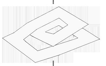
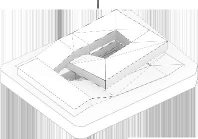
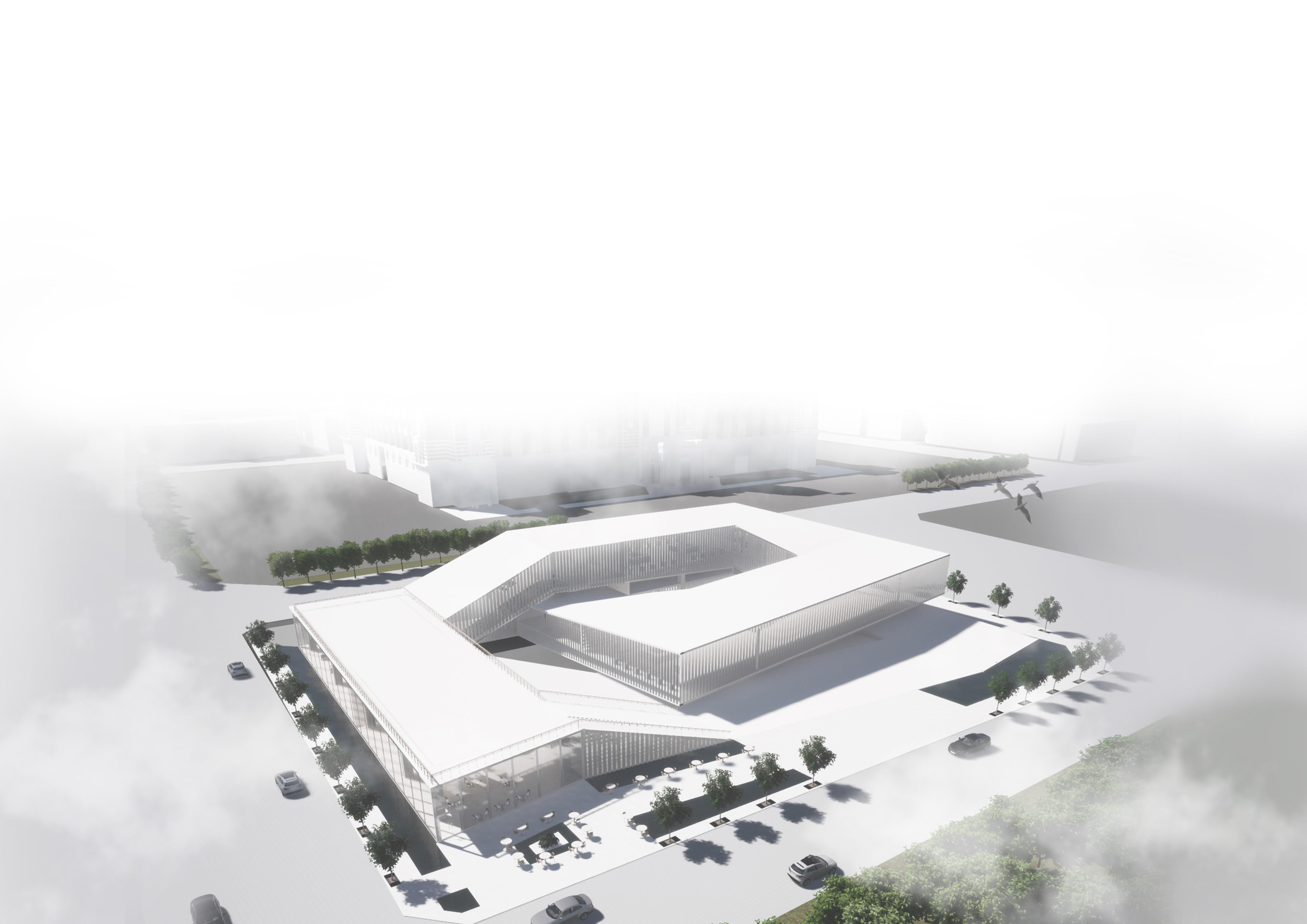
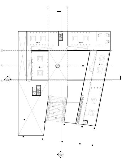
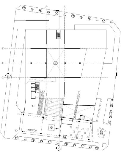
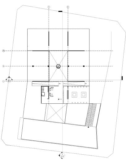
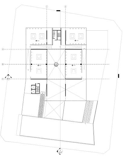
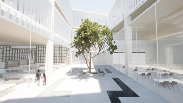
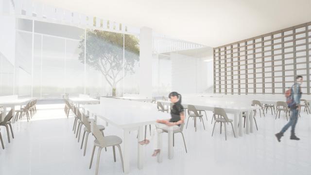
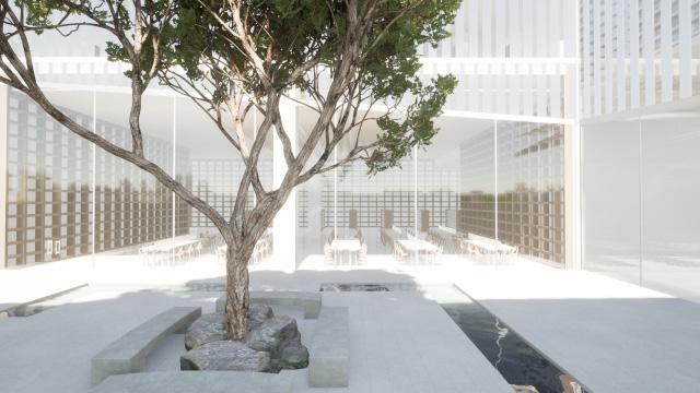
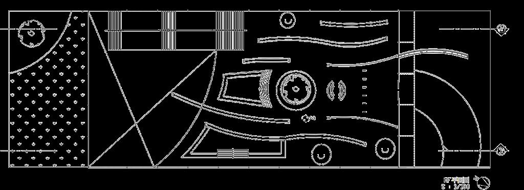
The concept of this library is derived from the shape of a Mobius Strip. The infinity loop is a symbol of unity, it represents an everlasting connection. This library function is not only as a place to read and learn, but also as a place to tell Taiwan’s historical story. History itself is the study of the past events, which is secured in a time frame. The Mobius Strip concept represents the idea of history as an everlasting piece of time. Visitors can explore the building from head to toe in one connected loop.
Strip. The infinity loop is a symbol of unity and an everlasting connection. This library functions not only as a place to read and learn but also as a place to tell Taiwan’s historical story. History itself is the study of past events, which are secured in a time frame. The Mobius Strip concept represents toe in loop.


LIBRARY DESIGN
ARCHITECTURAL DESIGN 2
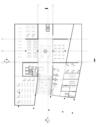
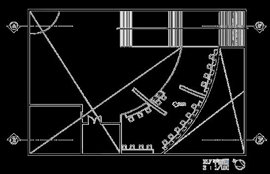
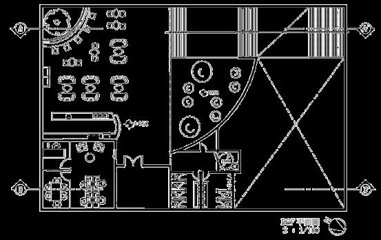
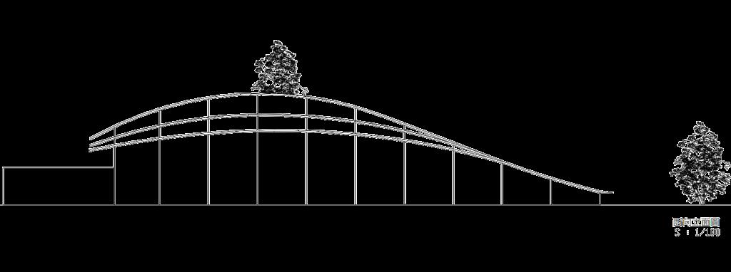
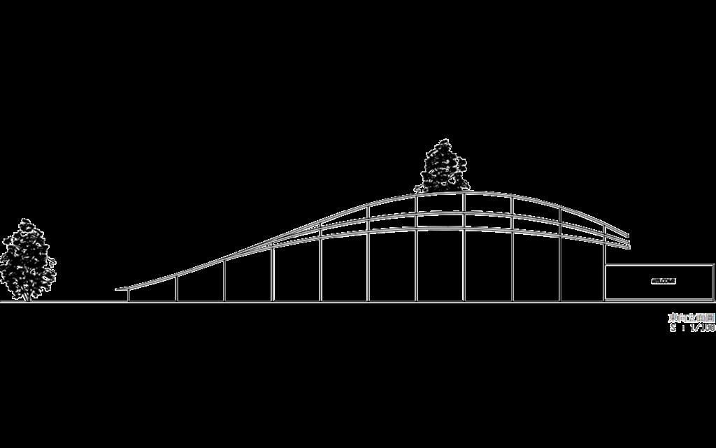
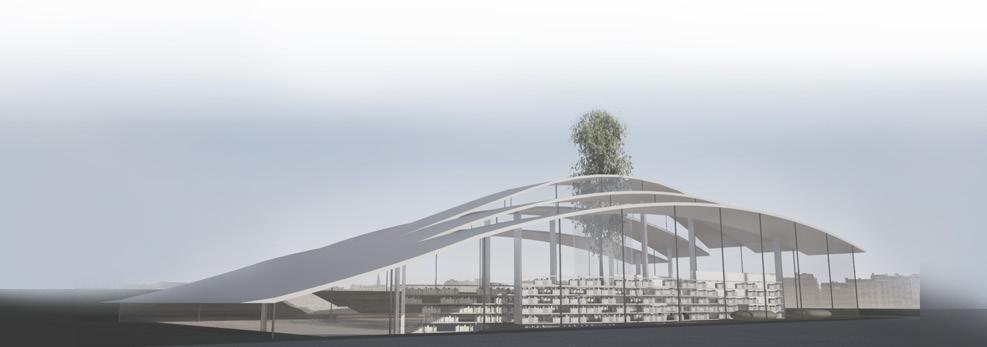
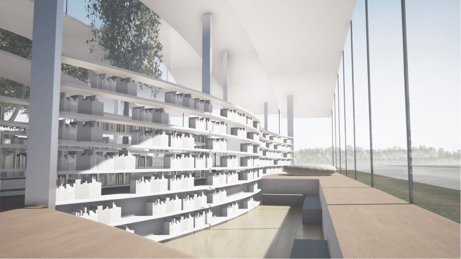
FLOW is a library that uses the concept of people’s flow. This concept is developed from the Barcelona Pavilion flow concept where people decides their own way between the walls. Likewise, this library is also an open space whereas the bookshelves “act” as the walls. The shape itself is inspired from opened book pages. All the outdoor walls uses glass material to let the space feels wide and to let people feel as if they’re reading in nature.
FLOW is a library that utilizes the concept of people’s This concept was developed from the flow concept of the Barcelona Pavilion, where people decide their own way tween the walls. Similarly, this library is also an open space, where the bookshelves “act” as the walls. The shape itself is inspired by opened book pages. All the outdoor walls use glass material to make the space feel wide and to give people the feeling of reading in nature.


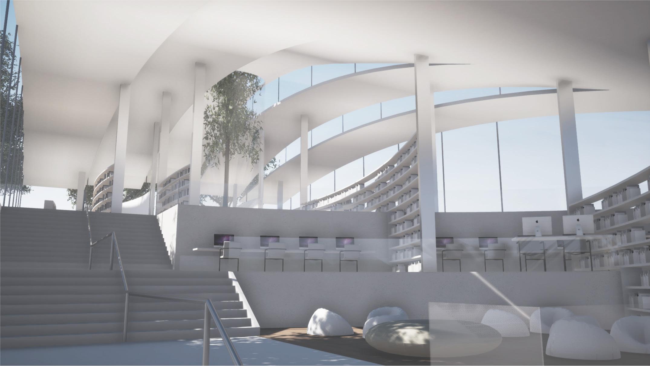
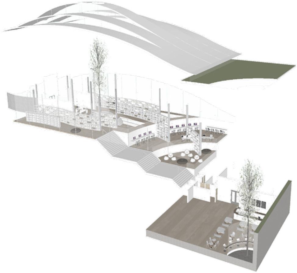
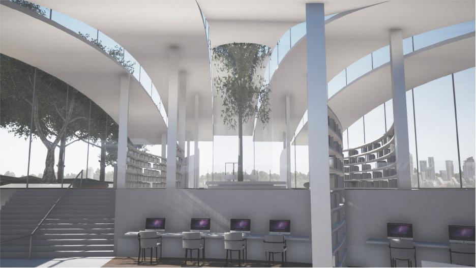
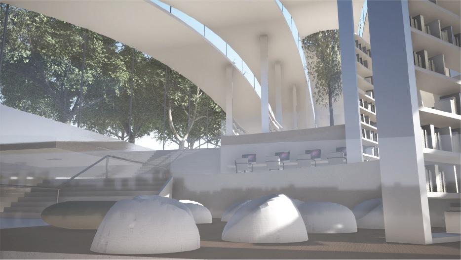
The lobby is the first area of the library, leading directly to the bookshelves area. The bookshelves have a flowy, curved design that matches the library’s concept and connects better with the overall architectural design.
The first area of the library is the lobby which directly leads to the bookshelves area. The bookshelves have a flowy curved design to match the concept of the library and to have a better connection with the whole architecture concept. Visitors can sit and read in the floor reading area located between the bookshelves.
There is a low seating reading area between the bookshelves for visitors to read books. Beside the stairs, there are several spaces. The first is the computer area, providing facilities for visitors to read online or use the internet.
The stair leads to the basement area. There are several spaces beside the stair. First is the computer area which provides the facilities for visitors who want to read online or use the internet. The second area is the relax reading area which provides several bean bags for visitors to read and relax. There are a few bookshelves between these two areas for visitors to find books without having to go upstairs.
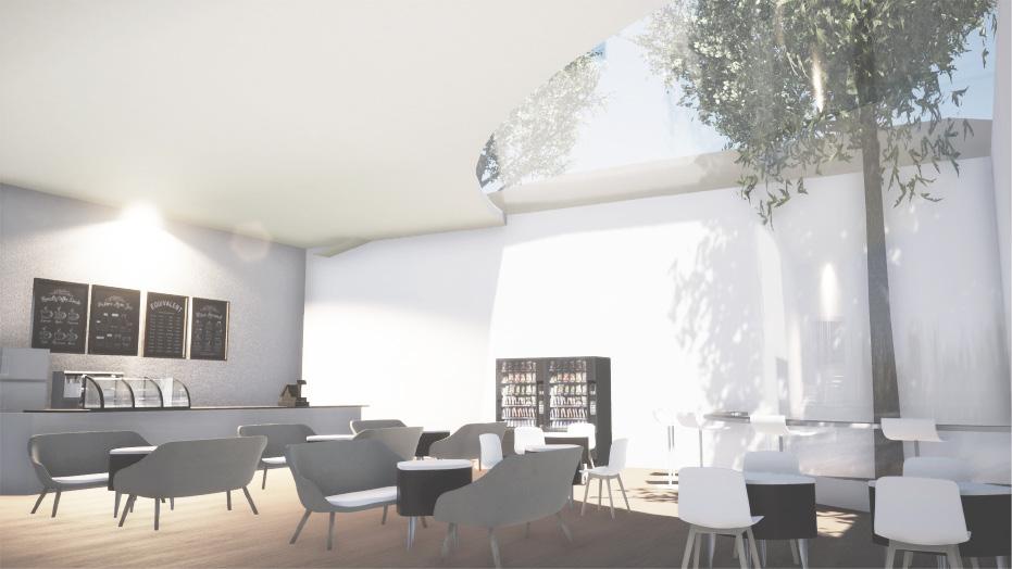
The second space is the open reading area, located beside the computer area, which is a cozy space that allows visitors to unwind and relax. There are a few bookshelves between these two areas for visitors to find books without having to go upstairs. Other public utilities, such as a cafe and office, are located in the basement.
The basement area is functioned for cafe, office, and toilet. The cafe is near to the relax reading area to let visitors easily buy some snacks to eat while reading.

ARCHITECTURAL DESIGN 4
STUDENT DORMITORY DESIGN
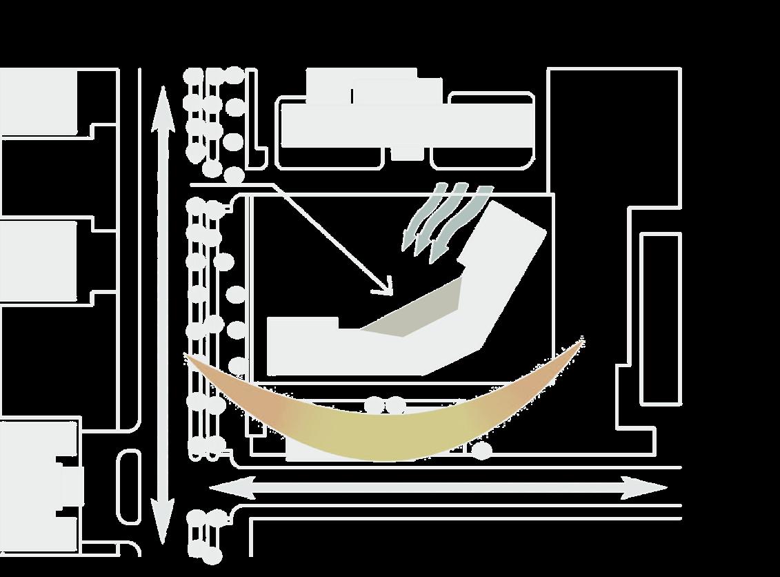
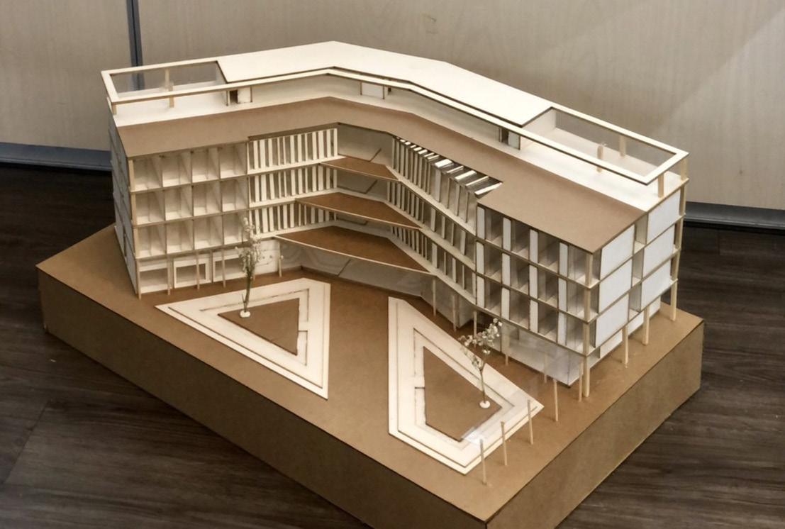
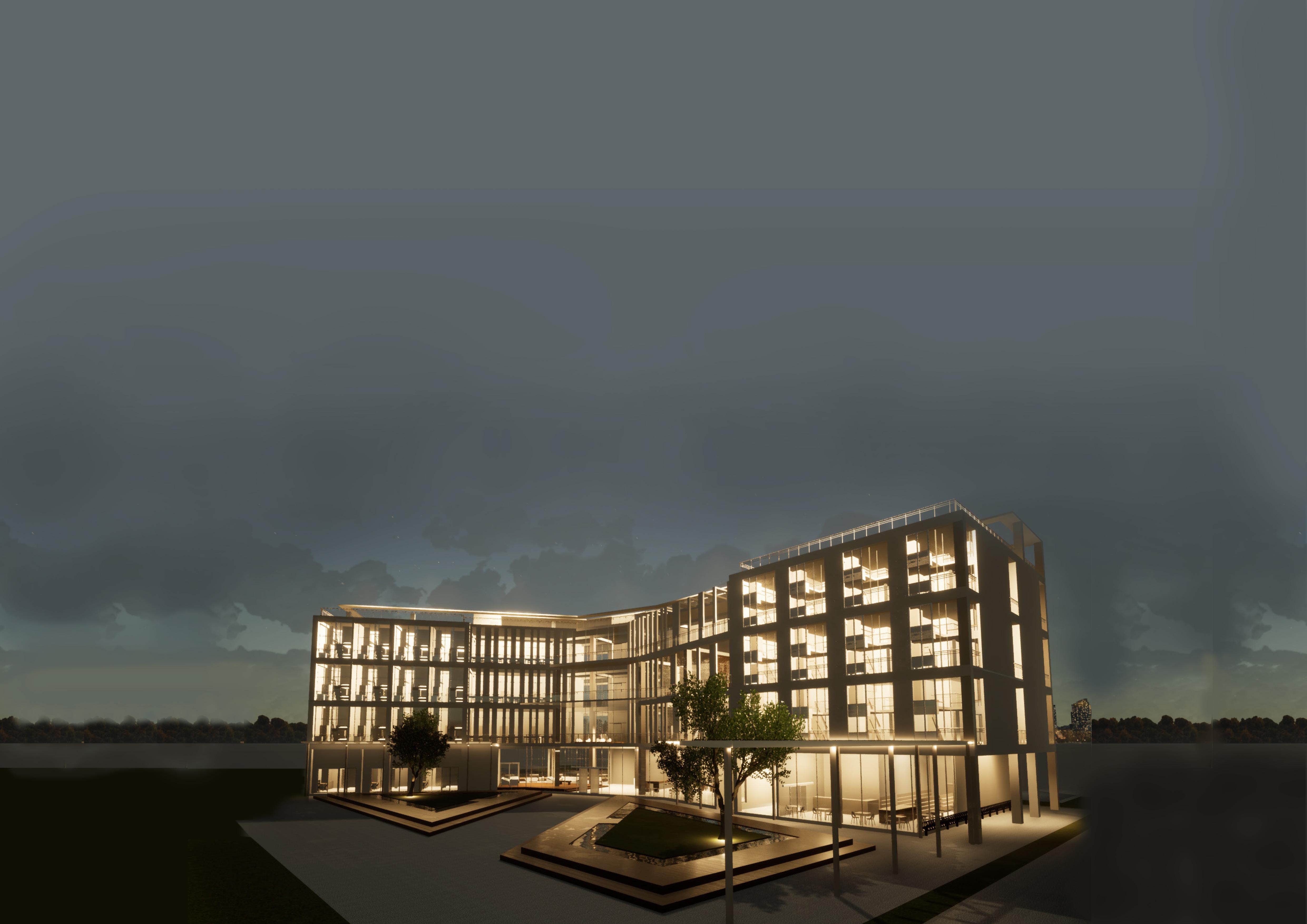
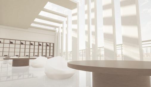
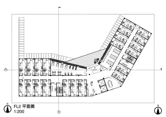
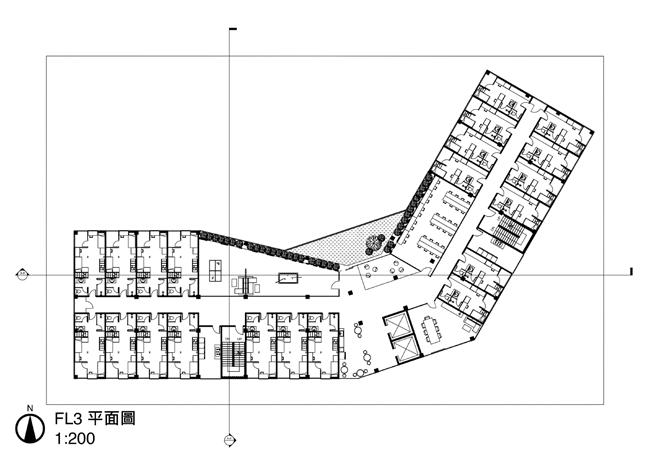
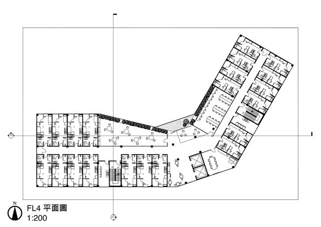
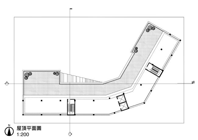
The concept of this dormitory building is derived from an L-shaped mass. The shape forms 2 area division for 2 different room types (2 person and 4 person room). The L shape forms a large open space in the middle of the building which provides a large space for people to gather and do their activities. Developed from this concept, the open space is widen 30 degree into a 120 degree open space to provide even larger space. The 2 separate areas have one buffering space in the middle which functioned as indoor gathering space, and public facilities with a small garden at every floor to provide greenery and nature feels.
Derived from an L-shaped mass, this dormitory building is designed to form two separate areas for two different room types (2-person and 4-person rooms). The L shape creates a vast open space in the center of the building, allowing people to gather and engage in various activities. The open space has been expanded by 30 degrees, creating a 120-degree space, providing even more room. The two separate areas have a buffering space in the middle that serves as an indoor gathering space and public facility, with small gardens on each floor to provide a natural and green ambiance.
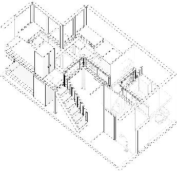
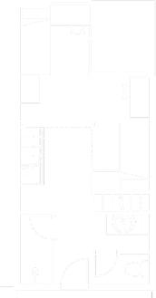
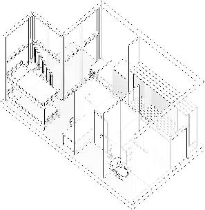
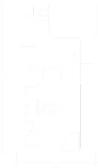
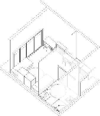
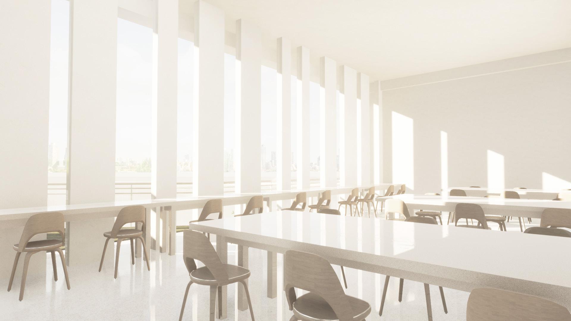
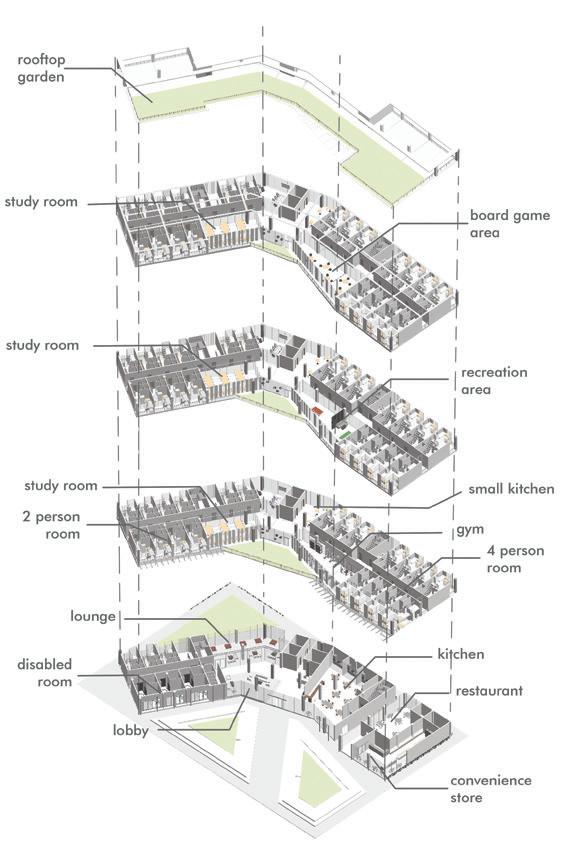
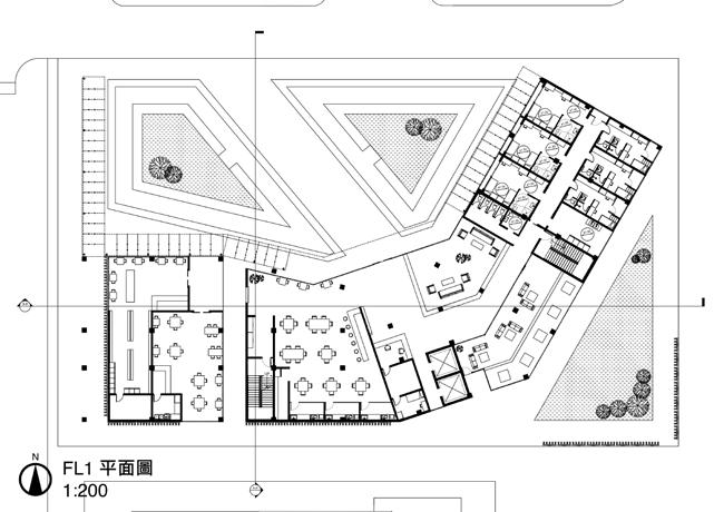




The first area on the first floor is the lobby. There is a waiting area infront of it to let people sit and relax. The lounge area is located beside the lobby, this lounge has large windows overviewing the backyard. This dorm also includes kitchen facilities, a cafe, and a convenient store. The disabled room is also located on the first floor, on the dormitory west wing.
The lobby is located on the first floor, and there is a waiting area in front of it where people can sit and relax. The lounge area is adjacent to the lobby, with large windows overlooking the backyard. The dorm also includes kitchen facilities, a cafe, and a convenience store. The disabled room is located on the first floor, on the west wing of the dormitory.

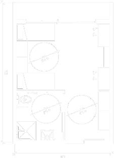
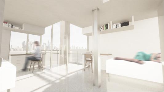
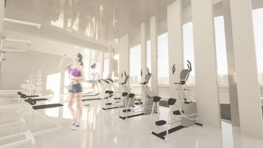
The 4 person room is devided into two floors, 2 person per floor. Every person has their own bed, table, and shelf. The 2 person room has a different design, it isn’t devided into floors but uses a bunkbed instead. Every floor has different facilities: a gym on the second floor, a recreation area that is used for residents to play billiard and pingpong on the third floor, and a board game area on the fourth floor. Besides mentioned facilities, every floor except the first, has their own study room. There is also a rooftop garden on the top floor for people to hangout.
The 4-person room is divided into two floors, accommodating 2 persons per floor, each having their own bed, table, and shelf. The 2-person room has a simpler design with no floor seperation. Each floor has different facilities, including a gym on the second floor, a recreation area for playing billiards and ping pong on the third floor, and a board game area on the fourth floor. In addition to these facilities, every floor except the first has its own study room. Finally, a rooftop garden is available on the top floor for people to hang out.
ARCHITECTURAL DESIGN 6
ART VILLAGE DESIGN
Located in Aodi, this art village concept derives from the char acteristics of Aodi’s stone house (石頭屋). 石頭屋 is a unique architecture located in Aodi, the stone house is a culture that has lasted for a hundred years and is very distinctive. The main idea of this art village is to combine Aodi’s art and culture with modern functions to give tourists the best facilities and experience while learning Aodi’s beautiful culture.
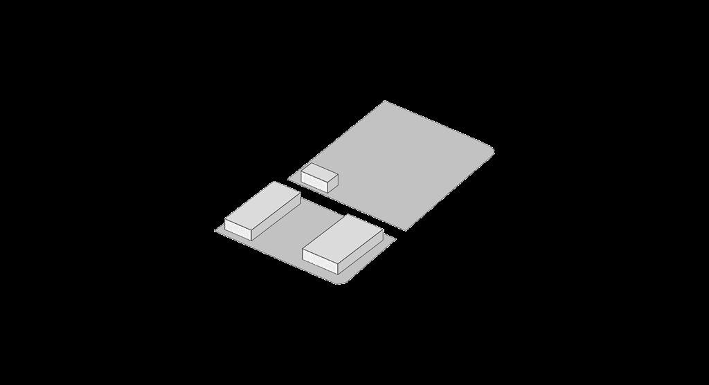
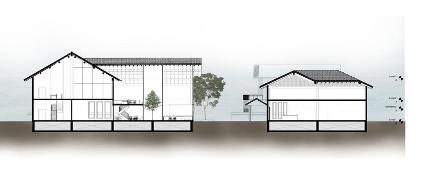
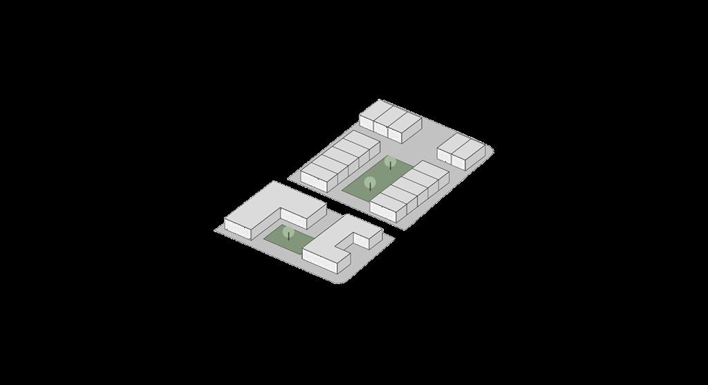


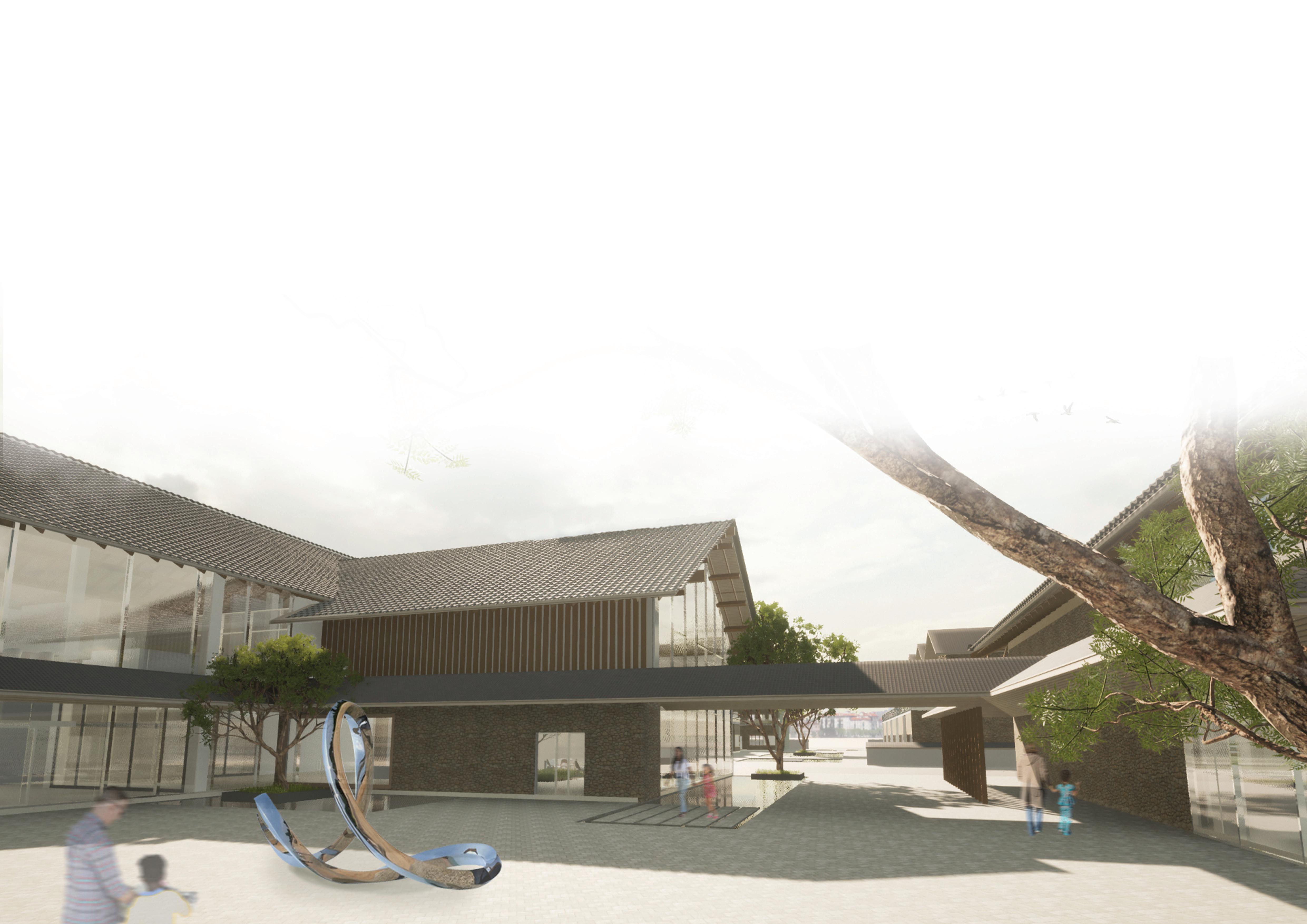
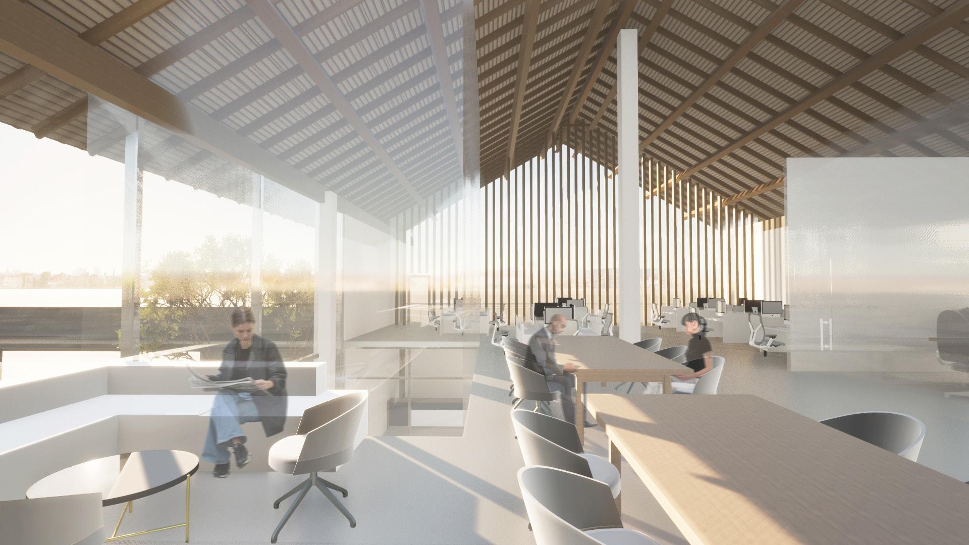
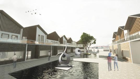

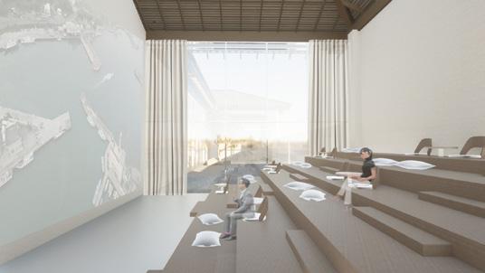
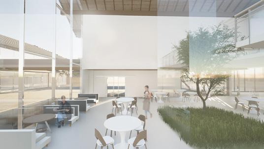
The site is divided into two areas, A and B. The tourist information center and exhibition area are located at site A, while site B is provided for artists as a mixed commercial and residential housing area. The main entrance leads to a public space that is filled with sculptures and ponds creating a beautiful landscape for tourists to enjoy. In accordance to the concept of this art village, the buildings use stone as its main material and is enhanced with modern materials such as wood facade and steel structure.
The tourist information center includes the counter area, indoor public space, and souvenir shop which are directly connected to the cafe, the second floor is used as office area. The exhibition space is located across the tourist information center where tourists can explore Aodi’s art and sculpture and learn Aodi’s history. The artist’s house is divided into two floors. The first floor is used as a commercial area where tourists can purchase the artist’s artworks and experience the art making process, while the second floor is used as the artist’s living space.
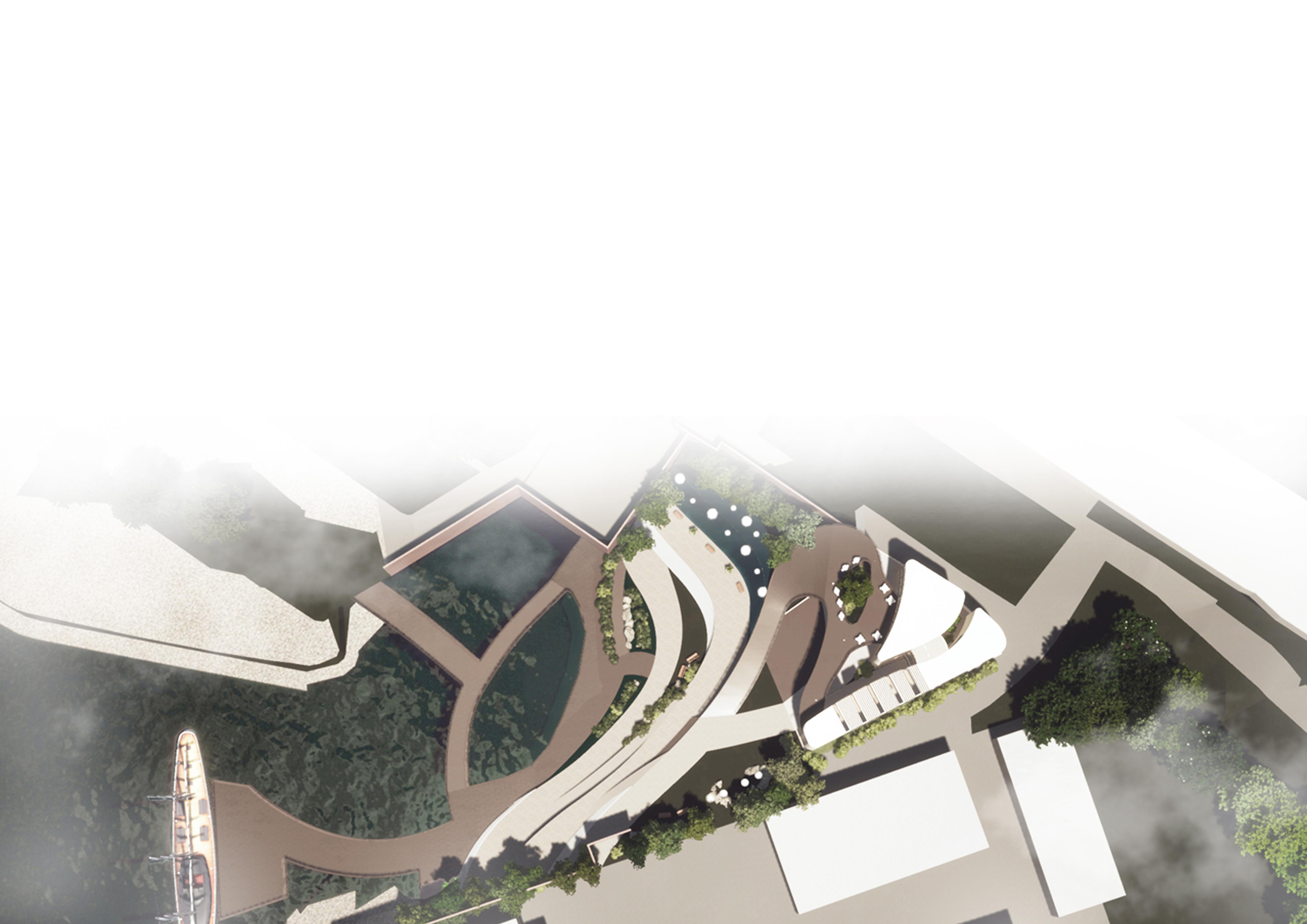

This project focuses on both landscape and building design. Located at Tamsui, the landscape is designed to fit in and to connect with Tamsui River, the most famous spot in Tamsui. The concept of the landscape design is derived from the topography lines of the site. The flow of the landscape pathway is designed according to the height difference between the river bank and the building site.
project focuses on both landscape and building design. Located at Tamsui, the landscape is designed to fit in and to connect with Tamsui River, the most famous spot in Tamsui. The concept of the landscape design is derived from the topography lines of the site. The flow of the landscape pathway is designed according to the height difference between the river bank and the building site.
There are several stairs between the pathways that creates different tracks for people to walk. Besides stairs, ramps are also designed for people with disabilities. The landscape itself has several spots with different function such as parks with benches for people to seat, waterfall , and water fountain for kids to play.
are several stairs between the pathways that creates different tracks for people to walk. Besides stairs, ramps are also designed for people with disabilities. The landscape itself has several spots with different functions such as parks with benches for people to seat, waterfall , and water fountain for kids to play.
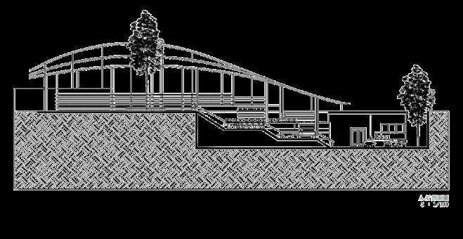
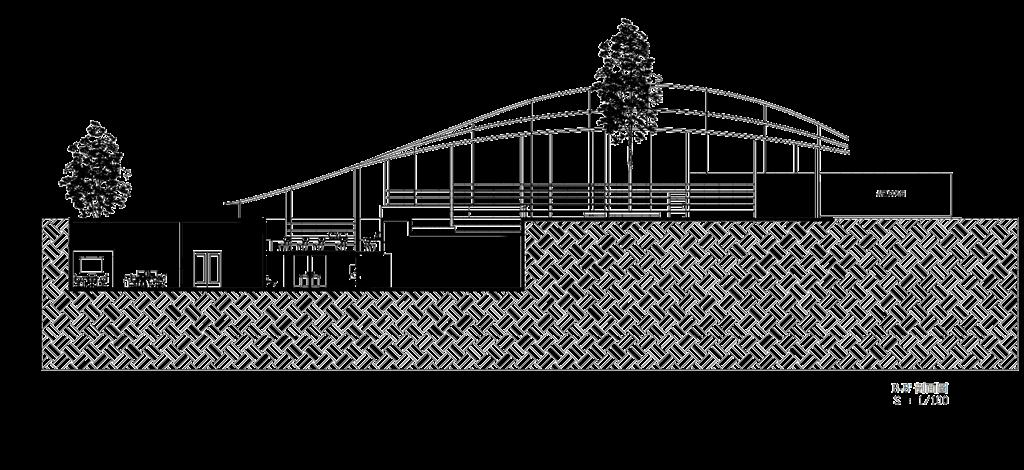
A-A’剖面圖
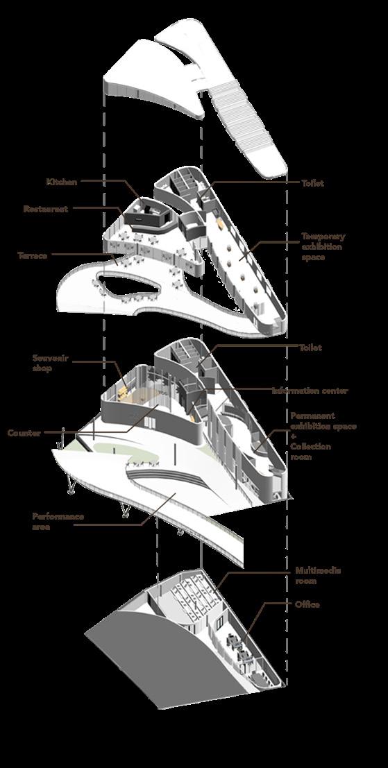
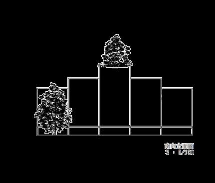
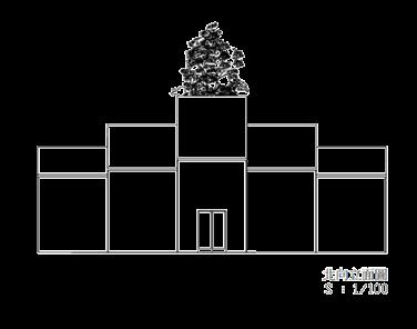
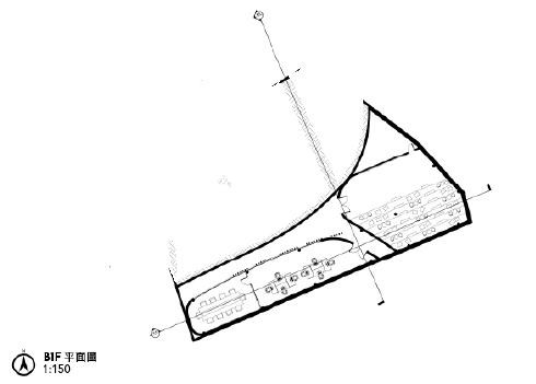
The Cultural Center building has 3 different entrance: first which leads to the lobby, second which leads to the basement, and third which leads to the restaurant. Multimedia room and office are located at the basement. The multimedia room is placed at the basement because it doesn’t require any sunlight. Employees can also directly access the office without having to pass the lobby counter.
second which leads to the basement, and third which leads to the restaurant. Multimedia room and office are located at the basement. The multimedia room is located at the basement as it doesn’t require any sunlight. Employees can also directly access the office without having to pass the lobby area.
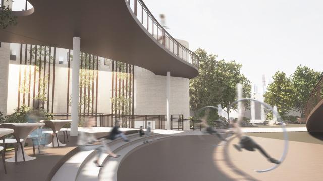
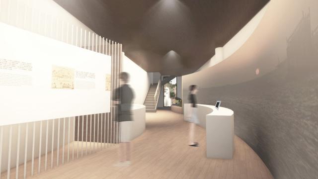
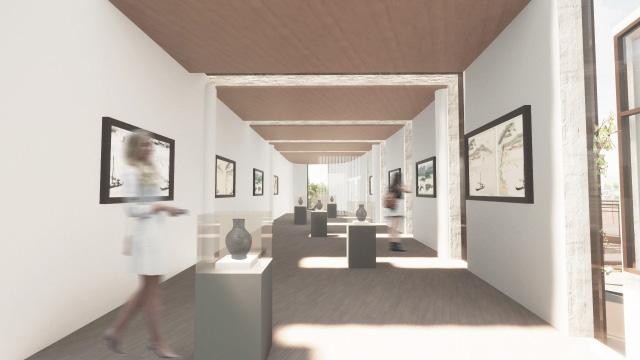
While walking through the main entrance, people can enjoy performances on the outdoor performance area which located beside the main pathway. The first area on the first floor is the lobby. There is a counter with tourist information center and souvenir shop next to it. After visitors buy their tickets on the counter, they can directly walk to the permanent exhibition space and the collection room. The temporary exhibition space and restaurant is located on the second floor which can be access by taking the stair that is located at the end of the permanent exhibition space, or by taking the elevator which located at the central part of the building.
While walking through the main entrance, people can enjoy performances located at the outdoor performance area beside the main pathway. The first area on the first floor is the lobby. There is a counter with tourist information center and souvenir shop along the side. Visitors can directly walk to the permanent exhibition space and the collection room from the lobby area. The temporary exhibition space and are located on the second floor, which can be accessed by the stairs located at the end of the permanent exhibition space, or by taking the elevator which is located at the central area of the building.
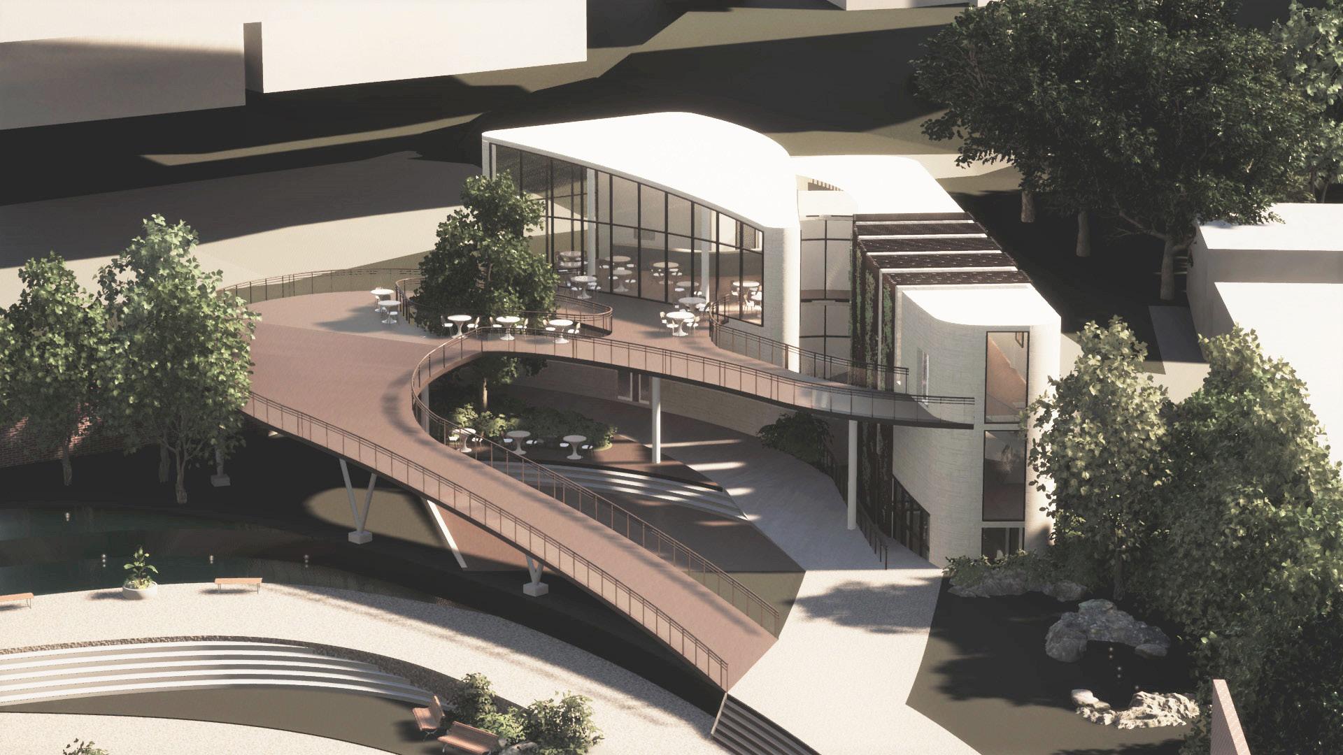
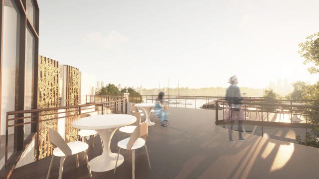
The restaurant has an outdoor area which also functioned as an outdoor deck. People can enjoy Tamsui river scenery and watch sunset from the deck while enjoying their food. The slope path located at the end of the deck leads to the first floor.
restaurant has an outdoor area where people can enjoy the Tamsui river scenery and watch the sunset from the deck while enjoying their food. Additionally, there is a ramp located at the end of the deck that leads to the first floor.
ARCHITECTURAL DESIGN 4
PARENT AND CHILD CENTER DESIGN

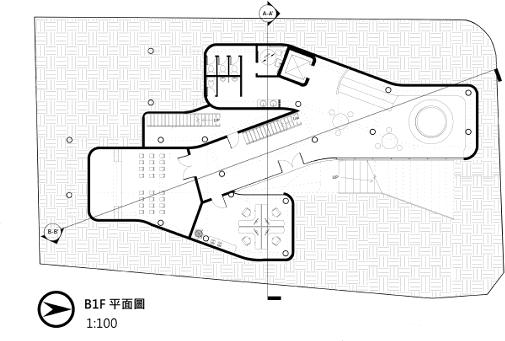


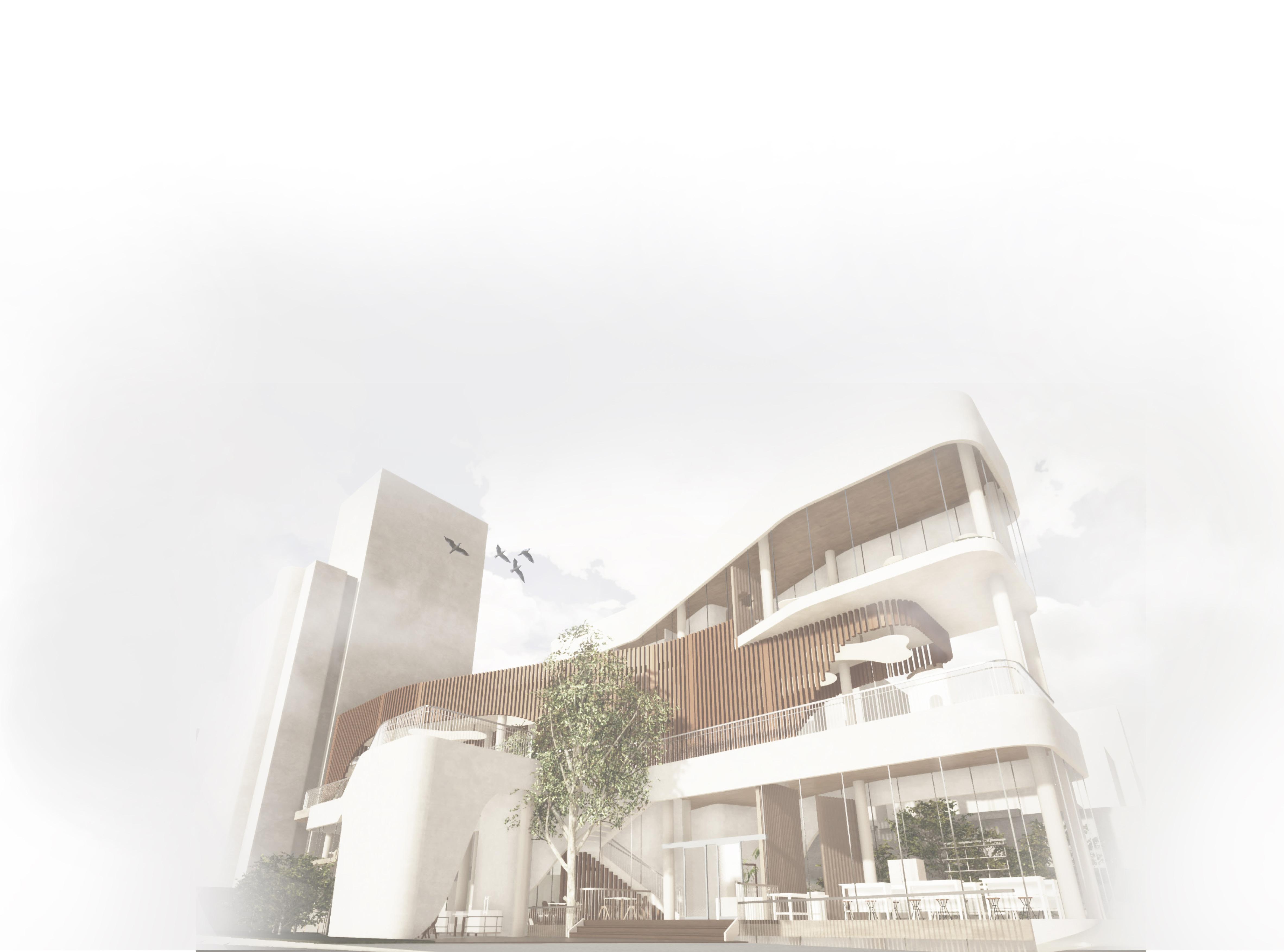
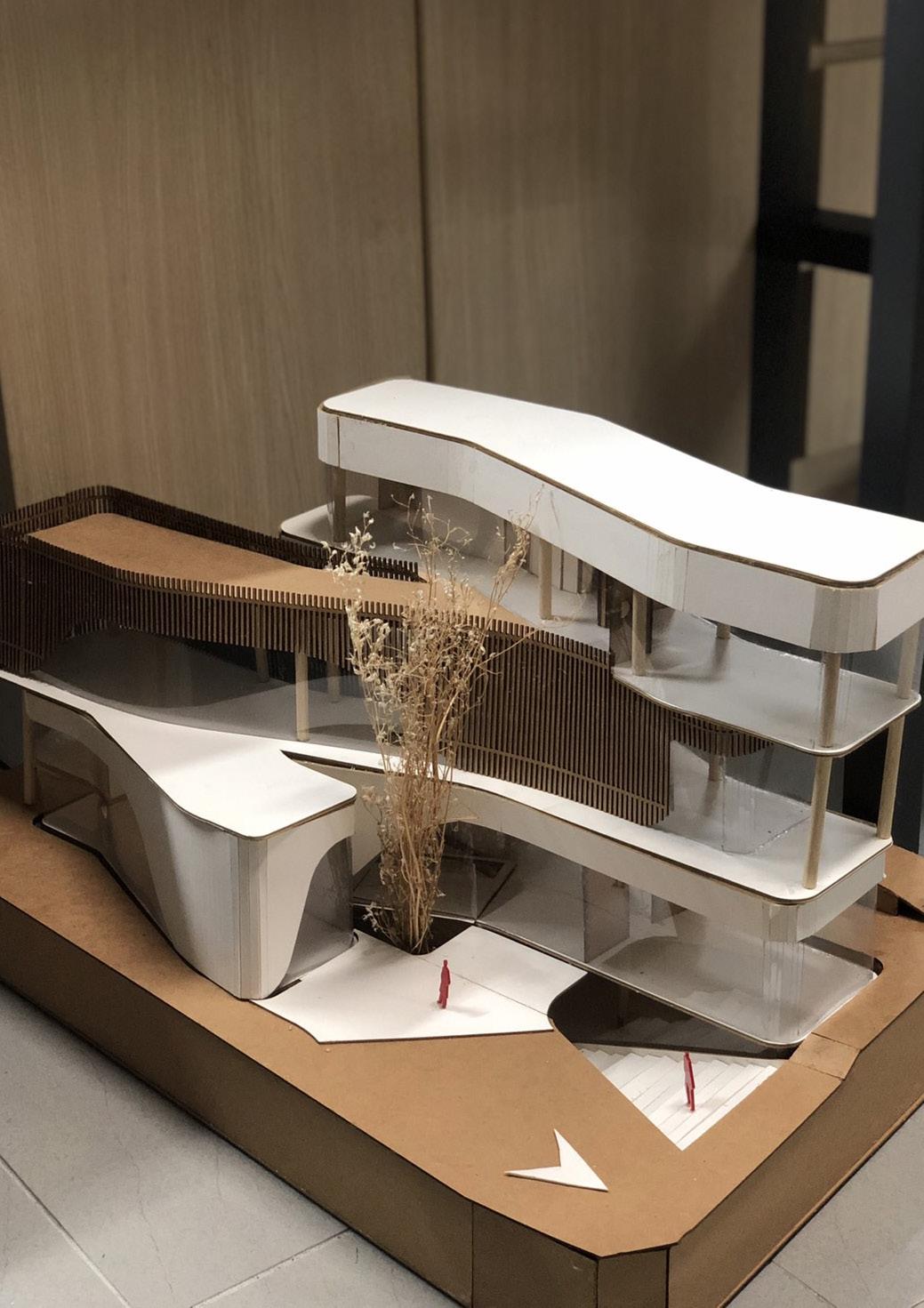
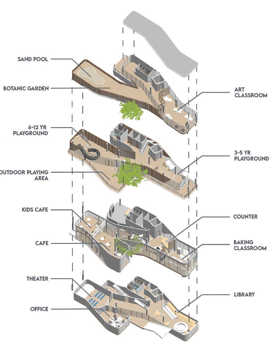
The form concept of this building is inspired from two hands that are connected. These hands represent a mother and a father’s hand that are connected to protect their child. There’s 4 floors in total including basement. Library, theater, and office are located on basement. Cafe and baking class are located on first floor. Playing area is located on second floor, this area is divided into 2: 3-5 years and 6-12 years playing area. Art classroom is located on third floor with outdoor activity area. The wooden façade on second floor is designed to reduce sunlight heat so that children can play comfortably.
design concept of this building is inspired by two hands that are connected, representing a mother’s and hands connected to protect their child. There are four floors in total, including the basement. The library, theater, and offices are located in the basement. The cafe and baking class are located on the first floor. The playing area is located on the second floor, which is divided into two sections for children aged 3-5 years and 6-12 years. The art classroom is located on the third floor with an outdoor activity area. The wooden façade on the second floor is designed to reduce sunlight and heat so that children can play comfortably.
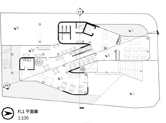
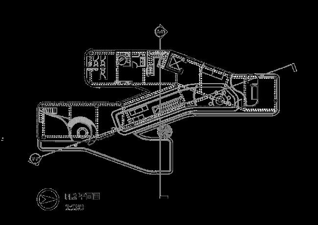
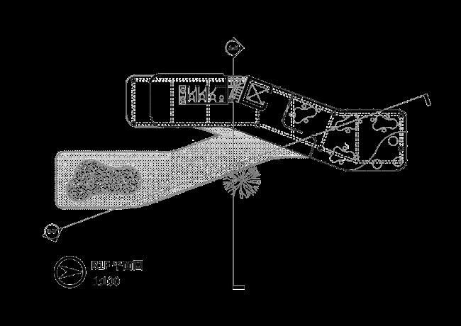

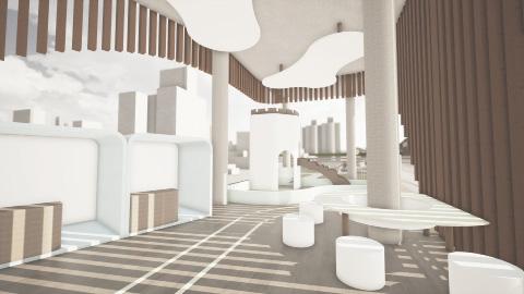
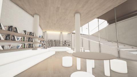
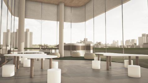
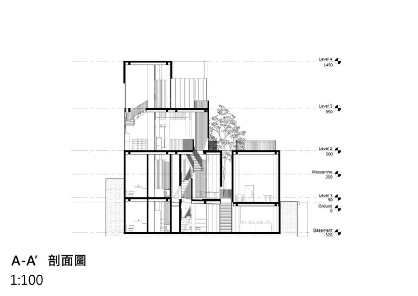
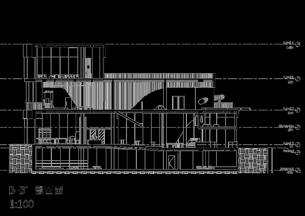
The entrance to this building is devided into two. The main entrance leads directly to the counter, and the second entrance leads to the cafe area. The basement which functioned as library, theater, and office can be directly accesed from the outdoor stair. The first floor is functioned mainly as cafe and bakery, both which related to food and beverages. The second floor is functioned mainly as a playground. The playground is divided into two, first which focus more on learning and second which focus more on playing. The third floor is functioned mainly as outdoor playing area and art classroom.
entrance to this building is divided into two. The main entrance leads directly to the counter, and the second entrance leads to the café area. The basement, which functions as a library, theater, and office, can be directly accessed from the outdoor stairs. The mainly used as a cafe and bakery, both of which are related to food and beverages. The second floor is mainly used as a playground, divided into two sections. The first section focuses more on learning, while the second section focuses more on mainly used as an outdoor playing area and an art classroom.
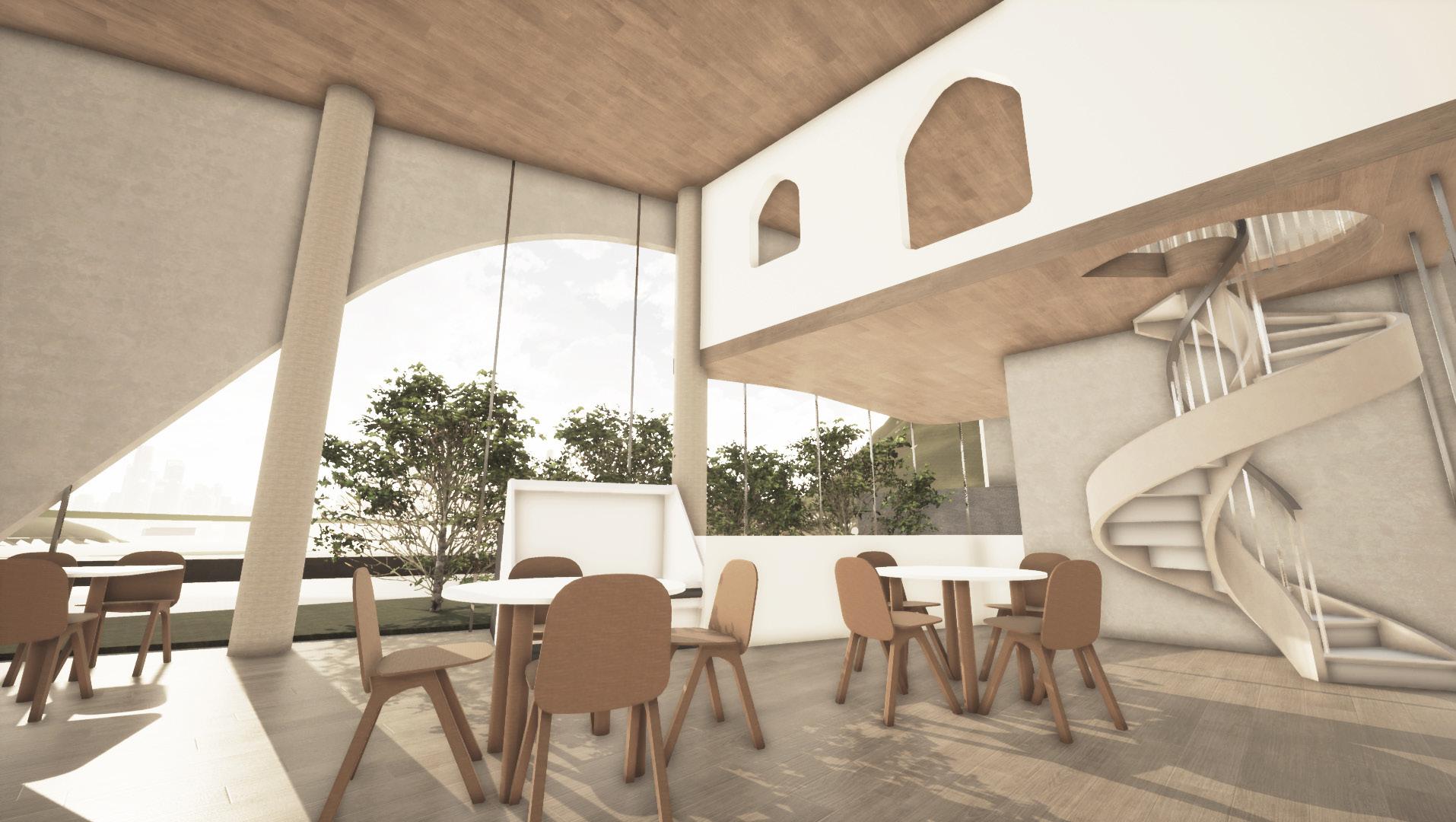
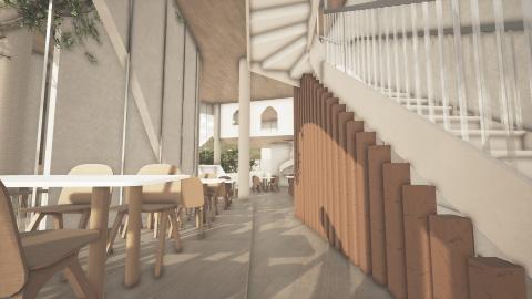
The interior design and function focuses for both parents and children. It is designed to be comfortable for childrens to play and for parents to company them while they play. The cafe mezzanine is designed for childrens to play and have fun after lunch or for them to seat together with their friends while having lunch together. The ceiling on the playground area is designed “cloud like” to enhance the feel of “playful” environment. The wood brown and white color is chosen to enhance calm and comfort feels.
design and function of the space focuses on both parents and children. It is designed to be comfortable for children to play and for parents to accompany them while they play. The cafe mezzanine is designed for children to have fun after lunch or to sit together with their friends while having lunch. The ceiling in the playground area is designed to be “cloud-like” to enhance the playful environment. The brown and white color scheme is chosen to enhance feelings of calm and comfort.


HOUSE AND WORKSPACE DESIGN
ARCHITECTURAL DESIGN 3
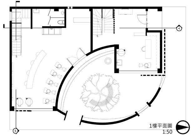
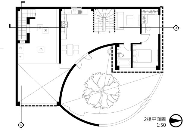
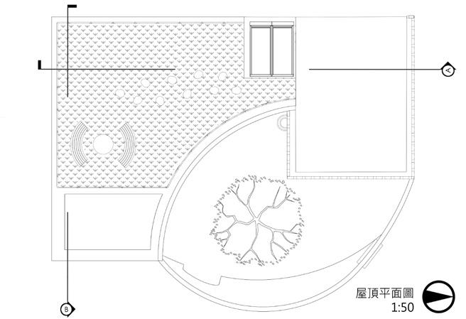
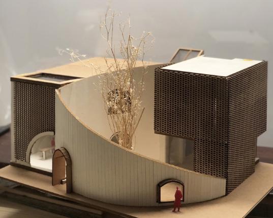
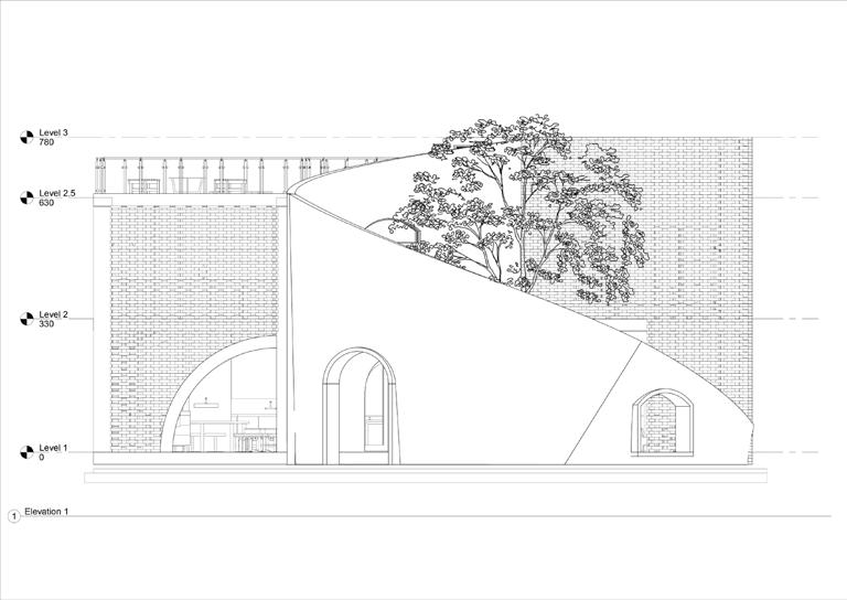
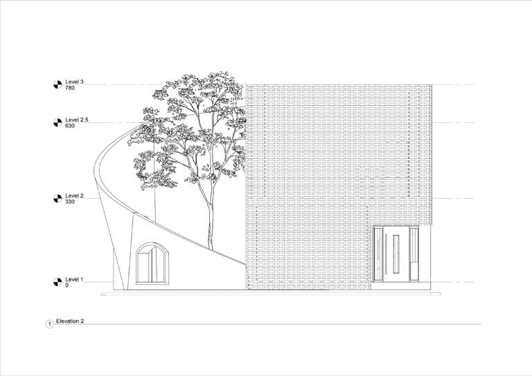
This building is designed for pottery artist as their workspace and living house. The concept of this building’s shape is de rived from the process of making a pottery. The curved wall in front which is the main attraction of the building is shaped like an opening of a pottery, this allows people to feel like they’re inside of a pottery when they get in, creating a great first impression. This building is divided into two area: left and right, which is the workspace and the living house. The division allows both space to be fully separated. The façade of this building uses a clay brick, the design allows resident to feel more peaceful and comfortable, as people from outside can’t look inside. The brick holes allows sunlight trespasses in.
building is designed for pottery artists as their workspace and living quarters. The concept for the building’s shape is derived from the process of making pottery. The curved wall in front, which is the main attraction of the building, is shaped like the opening of a pottery, allowing people to feel like they’re inside a pottery when they enter, creating a great first impression. The building is divided into two areas: the workspace and the living quarters, each fully separated from the other. The façade of the building uses clay bricks, and the design allows residents to feel more peaceful and comfortable, as people from outside cannot look inside. The brick holes allow sunlight to enter the building.
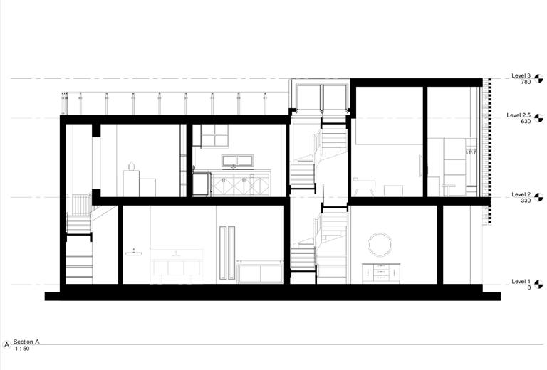
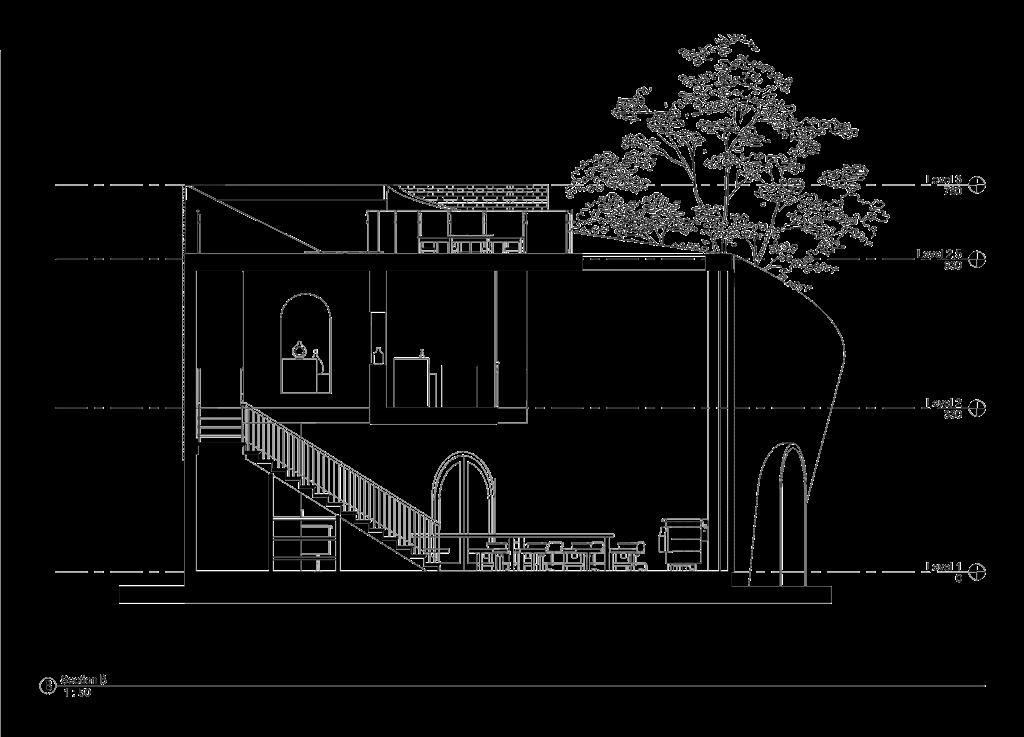
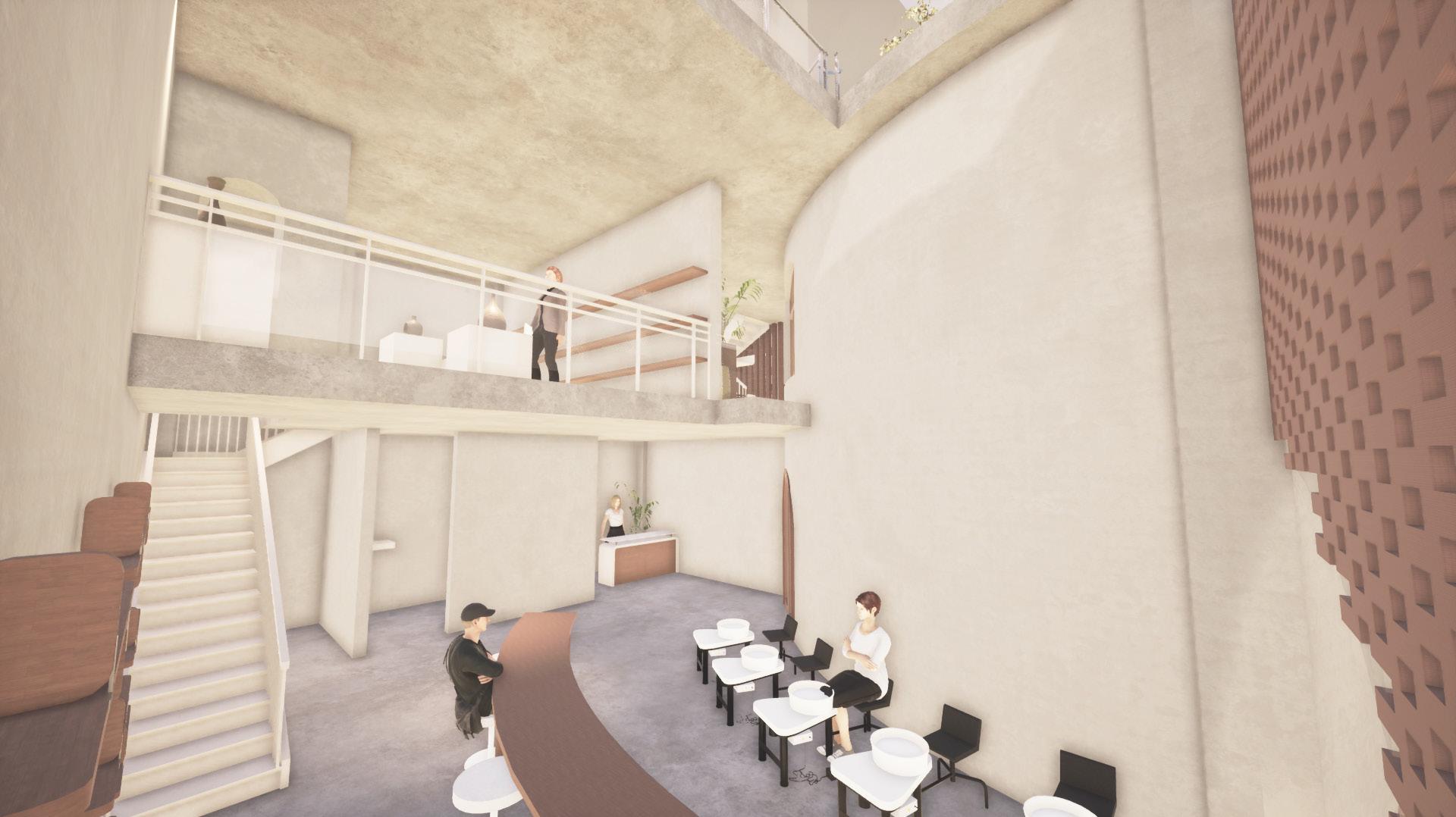
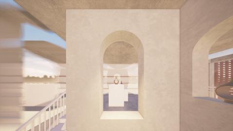
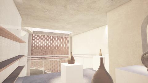
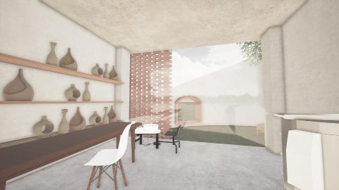
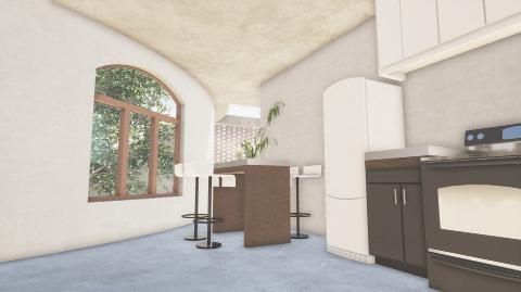
The main entrance of the building leads to the pottery working space. It has one long curved table for manual pottery making and several pottery wheels . The seats are facing each other so that visitors can interact to each other while making their pottery. The second floor of the working space is functioned as a pottery exhibition space. The exhibition space is designed as a mezzanine to let visitors observe the pottery making process while appreaciating famous pottery artist’s works.
The main entrance of the building leads to the pottery workspace. It has one long curved table for manual pottery making and several pottery wheels. The seats are facing each other so that visitors can interact with each other while making their pottery. The second floor of the workspace functions as a pottery exhibition space. The exhibition space is designed as a mezzanine, allowing visitors to observe the pottery-making process while appreciating the works of famous pottery artists.
The entrance to the residence located at the south part of the building. The first area is the private working space, the place where the pottery artist creates their pottery models. There is a private table, molding space, pottery wheel, and shelf to display their works. The storeroom is located below the stairs which leads to the second floor. The second floor is functioned mainly as a house, where there is a kitchen, a living room, and a bed room.
entrance to the residence is located on the south side of the building. The first area is the private working space, where the pottery artist creates their pottery models. There is a private table, molding space, pottery wheel, and a shelf to display their is located under the stairs that lead to the second floor. The second floor functions mainly as a house, with a kitchen, a living room, and a bedroom.
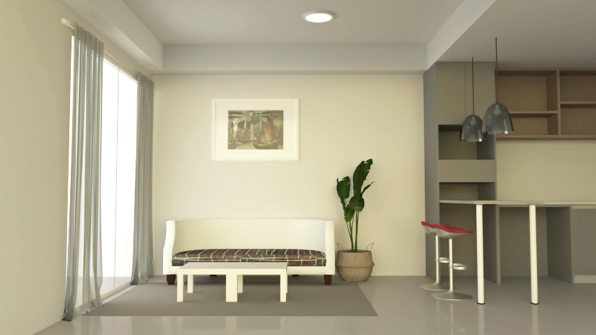
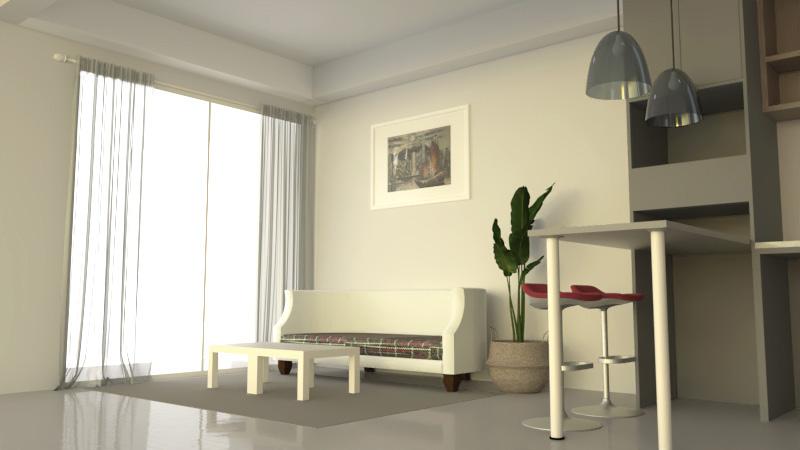
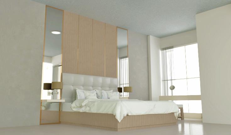
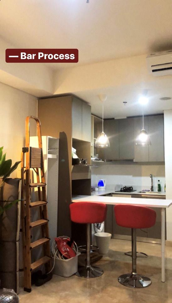
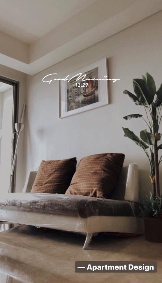
On the last winter vacation in 2020, I decided to start designing on a real site project. I finally got a chance to design a 56m² apartment on my city, Jakarta. The purpose of the design is to create a minimalistic natural feel with a warm colour tone. There are 2 rooms that is designed: living room and bed room.
During the vacation in 2020, I decided to start designing a real site project. I finally got the chance to a in my city, Jakarta. The purpose of the design was create a minimalist, natural feel with warm color tones. The design includes two rooms: a living room and a bedroom.
The design and assembly process starts on February 2020 and is expected to be done in 1 month, but due to the pandemic, the process needs to be delay for a while until further consideration.
design and assembly process started in February 2020 and was expected to be completed in one month. However, due to pandemic, the process needed to be delayed until further consideration.
INTERNSHIP PROJECT - 2021
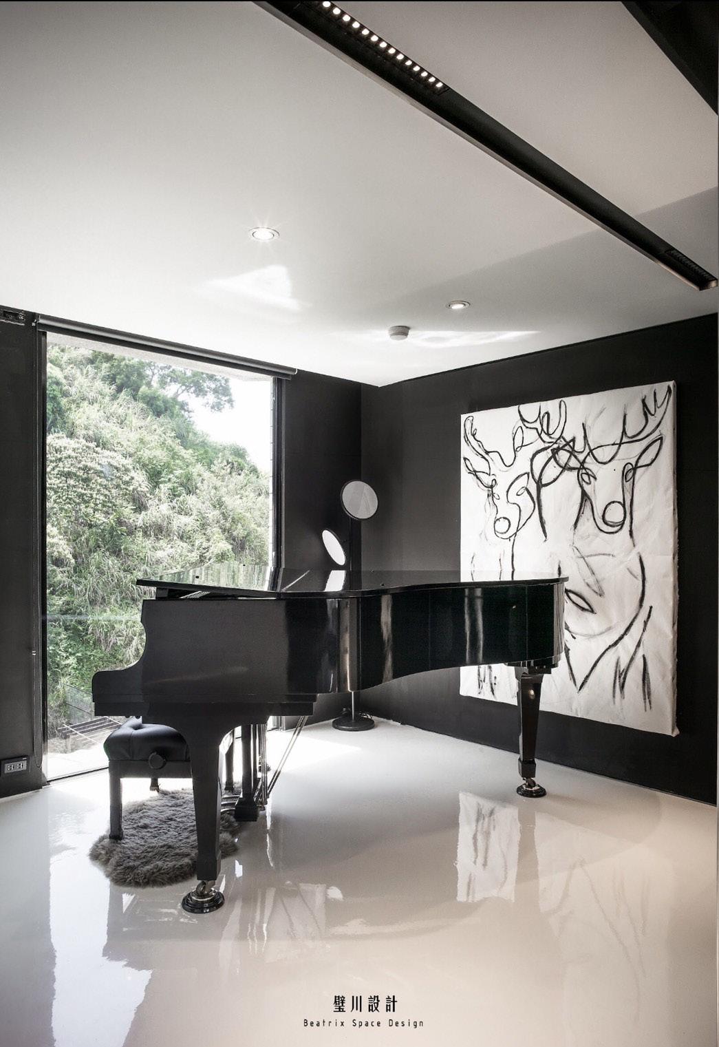
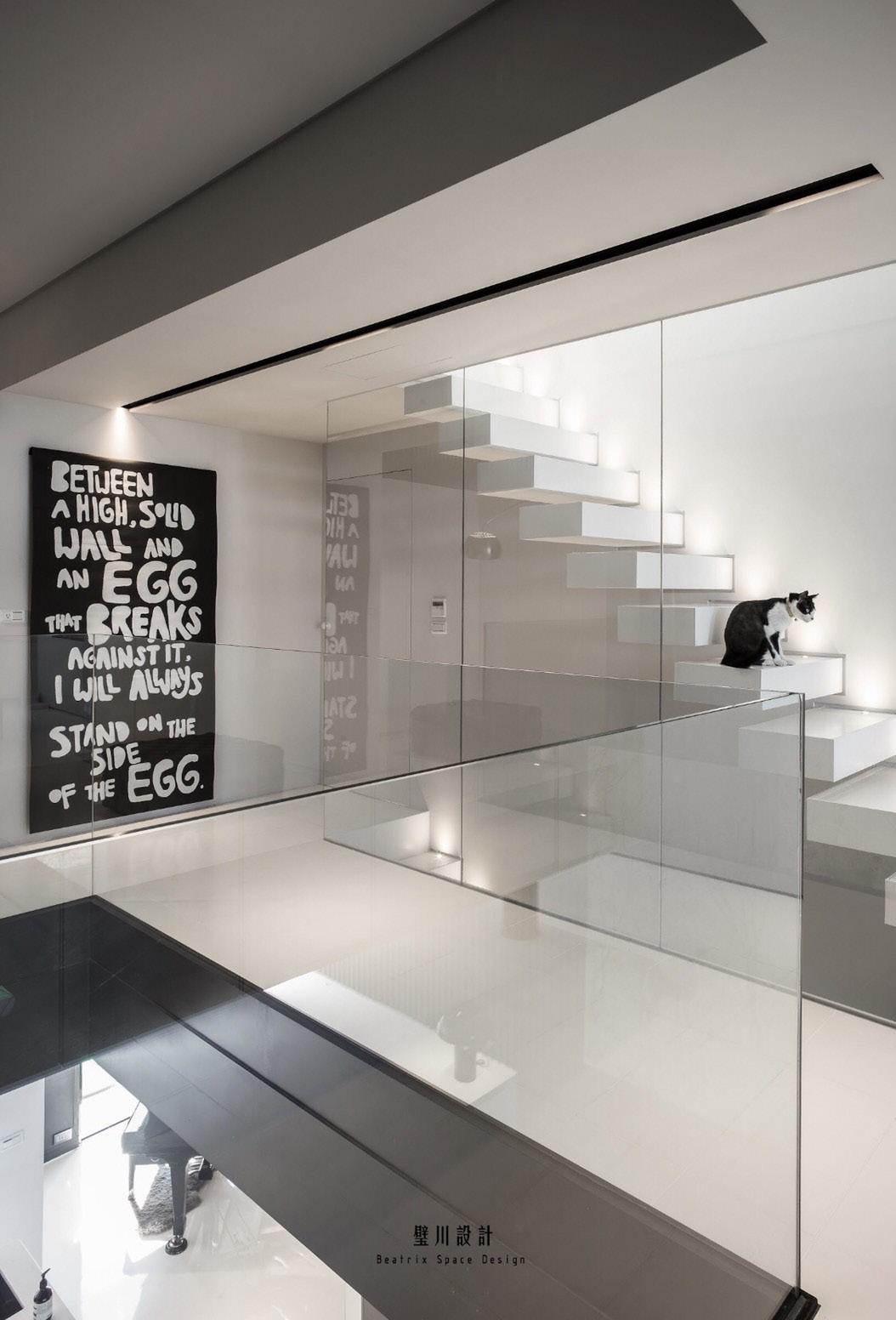

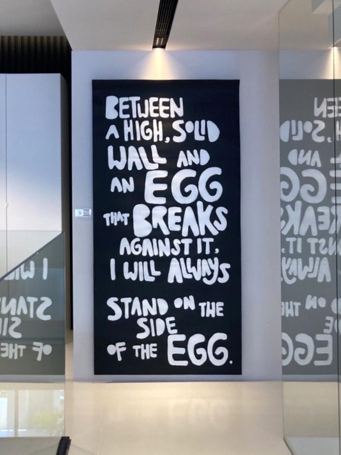
During my last internship at Beatrix Design, I was assigned to paint two paintings for the company’s interior photoshoot. The paintings were sized at 1.2mx1.6m and 1mx2m respectively (as shown in the image above).
On my last internship at Beatrix Design, I was assigned to paint 2 paintings. The paintings were intended for the company’s interior photoshoot. The size of the paintings were respectively (according to the image above): 1,2mx1,6m and 1mx2m.
The concept for both paintings was black and white. The first painting depicts two reindeer facing opposite directions, representing bravery and gracefulness. The second painting was created based on the company’s own requirements.
The concept of the paintings is black and white, The first painting shows two reindeers facing each other’s opposite direction. The main concept of the painting is to represent braveness and gracefulness. The second painting is created based on the comapny’s own requirements.
