3 minute read
LIO FOTIA: THE SIGNIFYING POWER OF THE HANGING CRAVAT


NICHOLAS WONOSAPUTRA - Writer, 1st Year, Intended MCB Neurobiology
"Apparently those old-school cloths tucked into the collar are called cravats?"
Advertisement
Originally published on Oct. 17, 2019
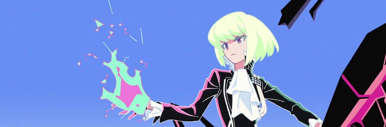
Promare is ultimately a reflection, and a celebration, of the years of hard work and dedication that Studio Trigger has spent making a name for itself, and features, for better or worse, all of the elements that fans of the studio have come to expect, and love. Thus, in typical Trigger fashion, Promare is a film that lives and dies by its bombastically expressive characters and animation. But one character seems to stand out from the rest from both a narrative and visual standpoint: Lio Fotia, the leader of the terrorist group Mad Burnish, and one of the film’s main protagonists.
Lio’s character design is complex, and incorporates a multitude of different design philosophies, the practicality of which is twofold: to wholly convey Lio’s personality and values in a short amount of time, and to give him a uniquely kinetic onscreen presence. In order to understand the character designer Shigeto Koyama’s brilliance at work, let’s break down how a specific element of Lio’s design works, and why it matters in the grand scheme of the film.
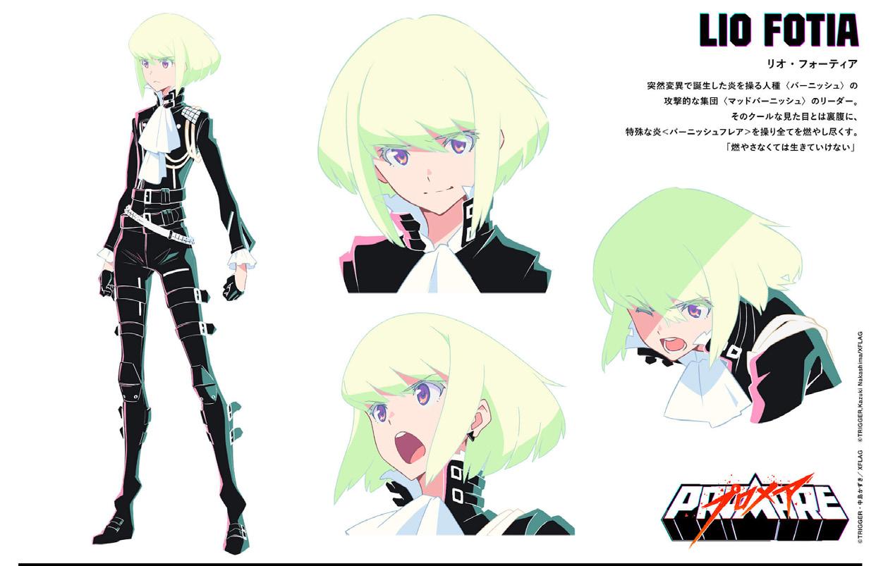
The centerpiece of Lio’s outfit may, ironically, be the one thing people tend to overlook when they see Lio’s design for the first time. The article of clothing in question is a double-layered, hanging cravat that hangs from the front of his collar and spills out onto his chest. Symbolically, the cravat functions as a fashionable, although oldschool, sign of authority and class. It is important to note that, unlike the designs of the FPA uniforms from Legend of the Galactic Heroes, the cravat isn’t tucked into the uniform, which seems to suggest that Lio, though classy and somewhat reserved, isn’t afraid to show that he can also be flamboyant and relaxed. From a design perspective, the hanging cravat is the centerpiece of Lio’s uniform because it is the much-needed positive space in a design that’s dominated by negative space. The two layers of the cravat also have a second function in forming an arrow that points towards Lio’s face. These elements all draw the viewer’s attention towards Lio’s chest, face, and hair, which all contrast with the mostly black outfit. This serves to emphasize Lio’s facial expressions, and helps direct the viewer’s attention where the film wants it.
The cravat also gives the added benefit of visually showing the direction in which the character is moving in each shot. This may sound unnecessary and redundant, but it’s an essential part of animation, as a shot of a character running towards the right side of the frame with the background sliding past them towards the left can feel jarring if the character has no element in their design that shows that they are affected by gravity and air resistance. This is typically achieved by directing the character’s hair in the opposite direction of the movement, but for characters with short hair like Lio, a second element is necessary to further immerse the viewer into the illusion that the character is actually running within that space. Without elements that clearly convey the effects of gravity and air resistance, the character may seem as though they are on a different plane of existence from the background, destroying the illusion of movement, and breaking immersion.

This essay was originally intended to be much longer in order to cover all aspects of Lio’s design, but to go any further would go beyond the scope of a single magazine article. By discussing one aspect of Lio’s design--his surprisingly important cravat--I hope that I was at least able to show the multitude of reasons that one additional element of design may enhance a character’s on-screen presence in terms of animation.


