
KRISTEN FONG PORTFOLIO
Hello Slant’d team!
I took the creative liberty to reimagine my portfolio into more of a “magazine”. Each piece can be considered individually, but together they are a peek into my designs and creations over the years.
Thank you for your consideration and I hope you enjoy.
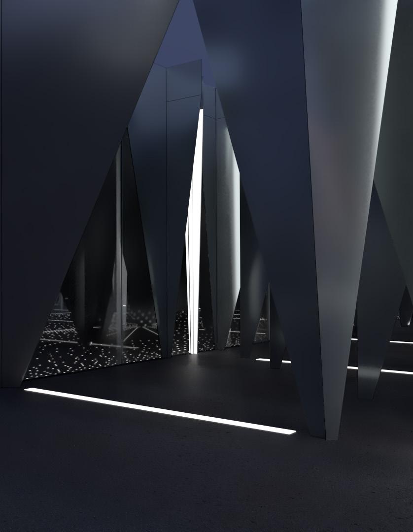
POD Living
an exploration of life on Mt. Wilson
Landscape Studio
Instructor: Mohamed Sharif
UCLA A.UD Fall 2016
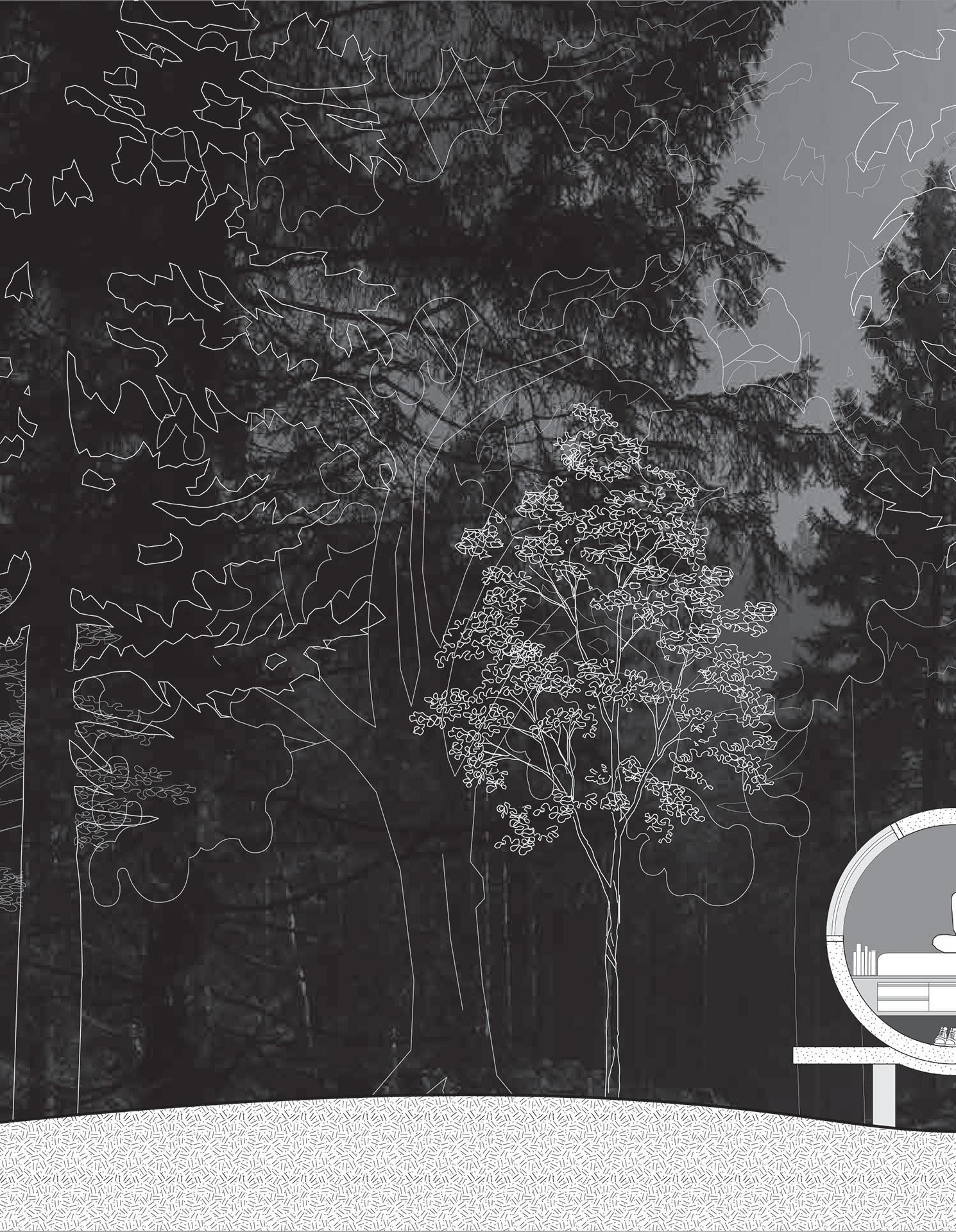
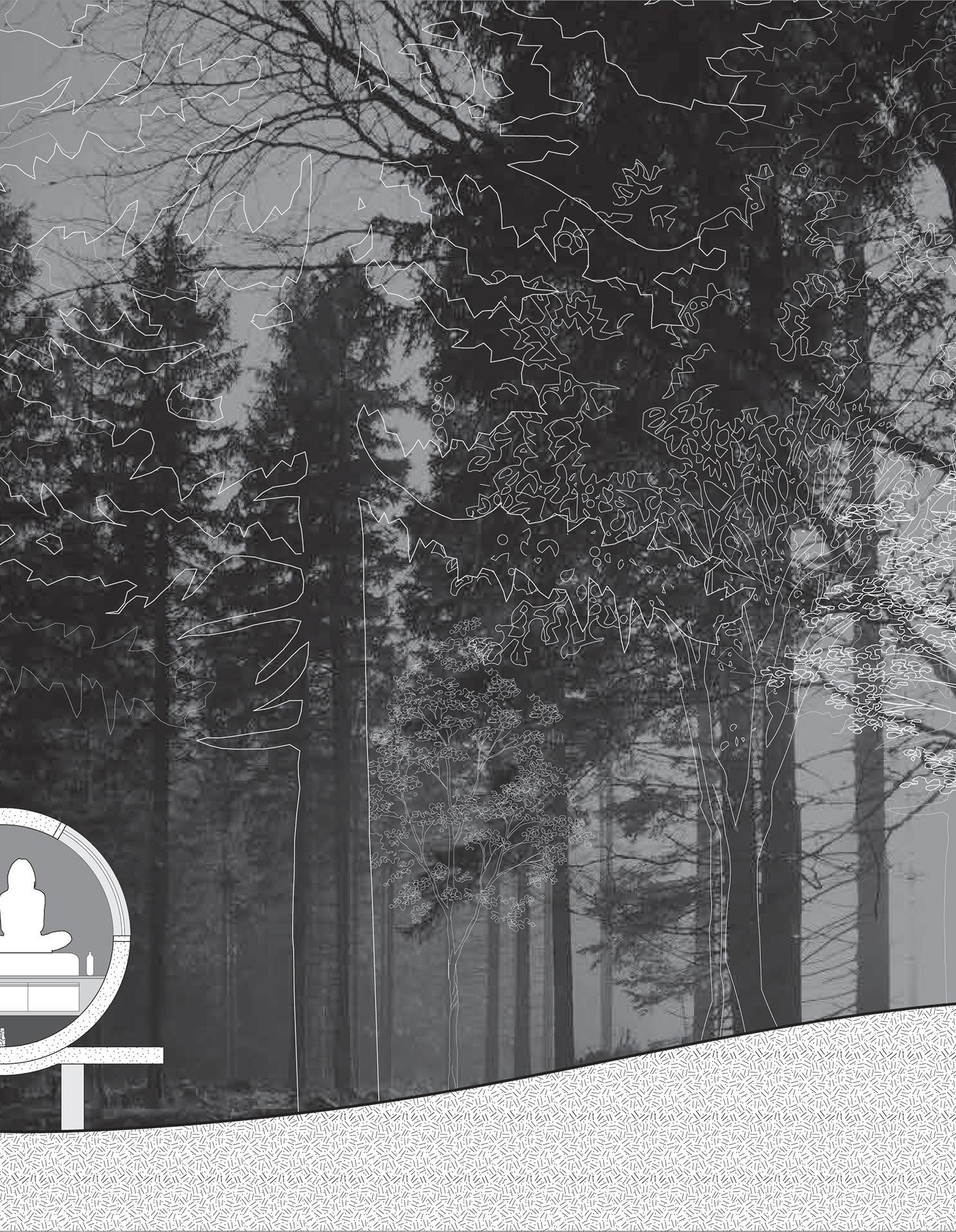
This project explores the different scales of living and being with nature among the backdrop of the Mt. Wilson Observatory.
Using the basic building block of the sleeping pod as an individual unit, how does a small village of 100 people dwell in this landscape? Since the units are solely for resting, each other area of living was reprogramed into the existing buildings. This creates a spectrum of living styles. On one hand, inhabitants are embedded into nature and on the other, they are embedding into the landscape of buildings and technology. The act of leaving one’s pod alters the level of interaction with both human and nature.


Building Design + Landscape Studio
Instructor: Mohamed Sharif UCLA A.UD Fall 2016
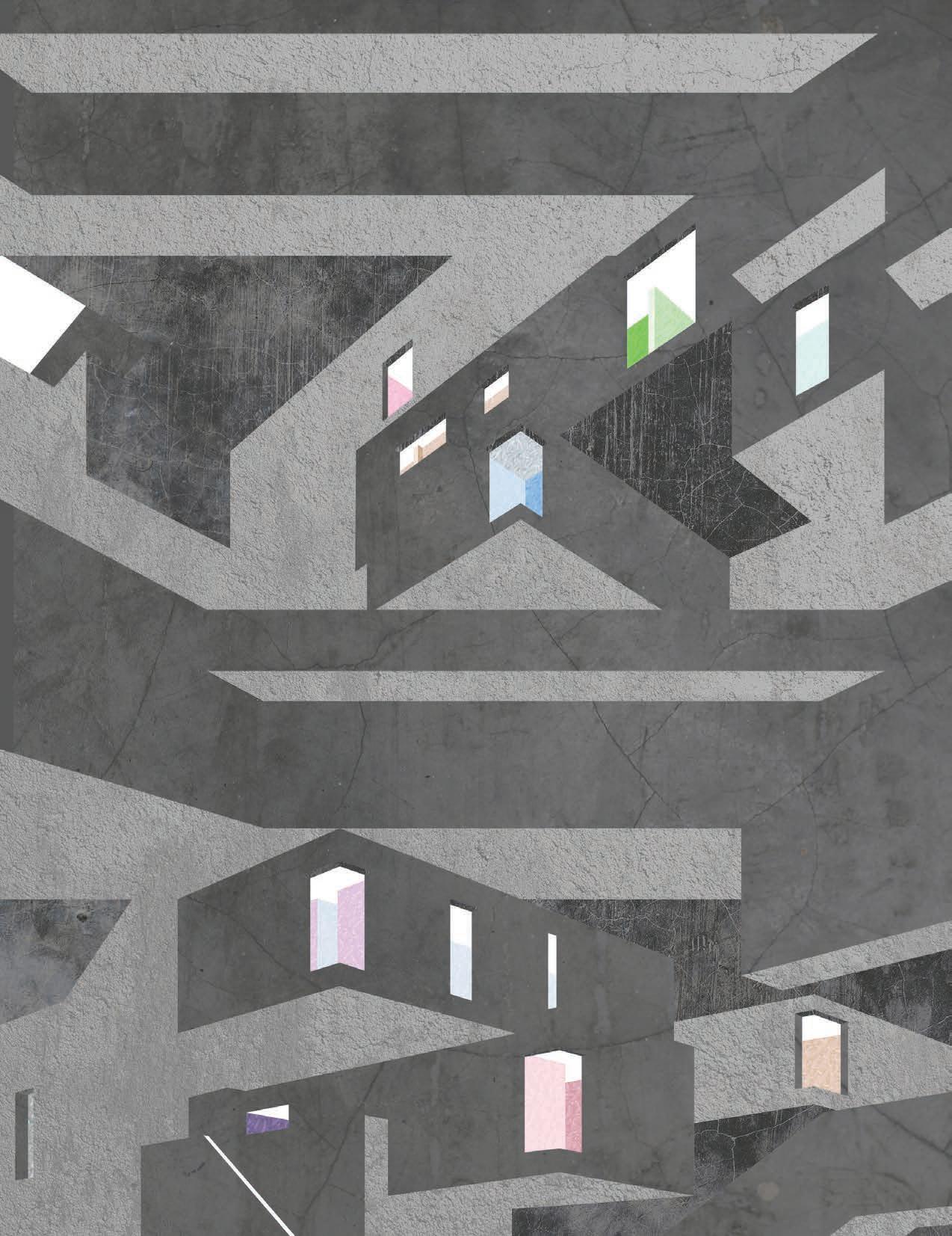
The effect of Habitat’s aggregated units is obfuscation. The materiality of concrete flattens perception and only the window, door, and garden allow you to distinguish units. The uniformity of the exterior is contrasted by customizable interiors. The exterior shell for each unit is structural. The interiors are blank canvases awaiting inhabitants to finish realizing them.
habitat 67 a visual case study

theSHED



Introductory Design Studio
Instructor: Erin Besler
UCLA A.UD Fall 2015
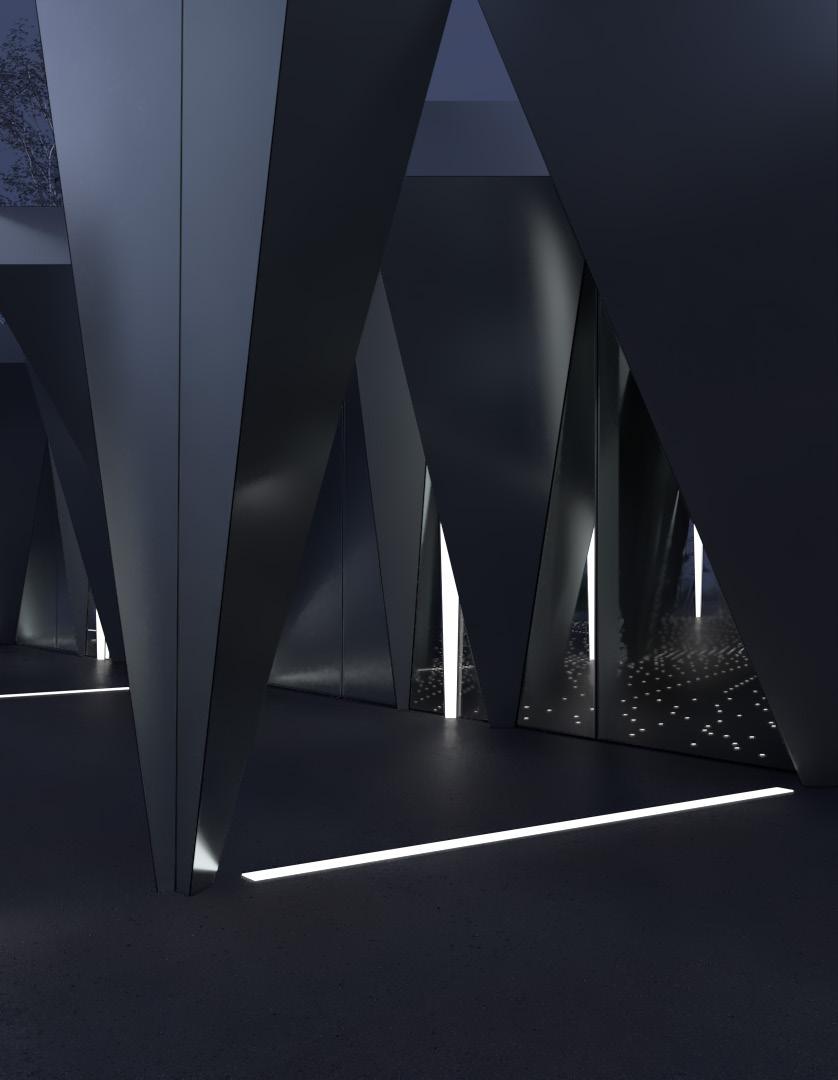
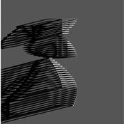
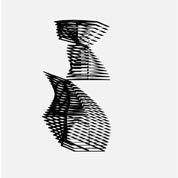
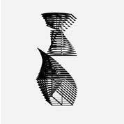
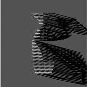
In this atypical shed, I became interested in how the concept of variation could be used as a method of design and focused specifically on the roof. Typically roof types are understood in very defined ways. However, geometric analysis reveals something that is very clearly defined begins to fall out of its limits - changing from one type to another.
By defining the constraints and rule-set as a type of tool, which in this situation is the miter angle of a rafter and number of cuts, the rules produces a variety of new forms. These new forms now define the shed. There is now variety in both the part-part (rafter to rafter) and part-whole (rafter to shed) relationships.


Same... ...but different
explorations in the materiality of white



On Topography Studio
Instructor: Wonne Ickx
UCLA A.UD Fall 2019
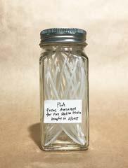
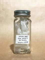
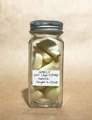
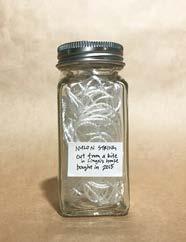
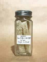
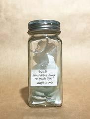
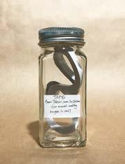
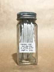
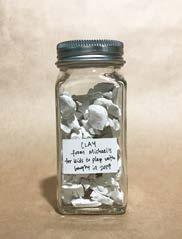
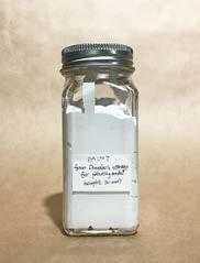
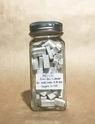
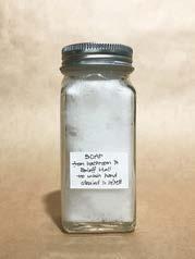
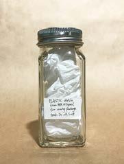
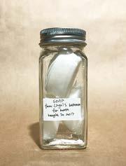
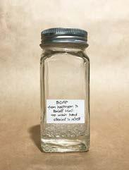
Inspired by John Lautner’s integration of the natural landscape and man-made materials into his work, this collection of 100 white things & objects seeks to challenge how a singular color (or in this case “lack” thereof) is perceived through its many different forms. White was chosen for its ability to be blank (and because we thought it would be easy to find 100).
The items were collected (or stolen) from our homes, friends, studio, the bathroom down the hallway, really just anything and anywhere we could find something white. Spice jar bottles served as a container but limited what could be collected. Some liquid, some aggregate, some too big so they had to be cut/broken/ crumpled down to fit, some even edible but mostly not.









































On Topography Studio
Instructor: Wonne Ickx
UCLA A.UD Fall 2019

in the historic Bunker Hill of DTLA, a dance school sets the stage to explore the formal engagement with topography.
THE LOOP’S FORMAL HARDSCAPE MEETS THE 2ND-FLOOR PROVIDING EACH RESIDENCE WITH THEIR OWN PRIVATE ACCESS TO THE SHARED TERRACED HILL.


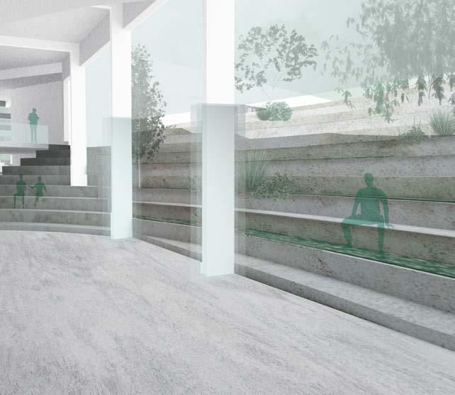
THE TERRACE ENGAGES WITH THE SCHOOL THROUGH CREATING AN INDOOR-OUTDOOR STUDENT LOUNGE.
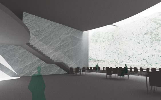
UNDERGROUND, THE RESTAURANT FEATURES A DRAMATIC SKYLIGHT AND THE THEATRE’S LIGHTING MIMICS THE TERRACED LAND ABOVE.

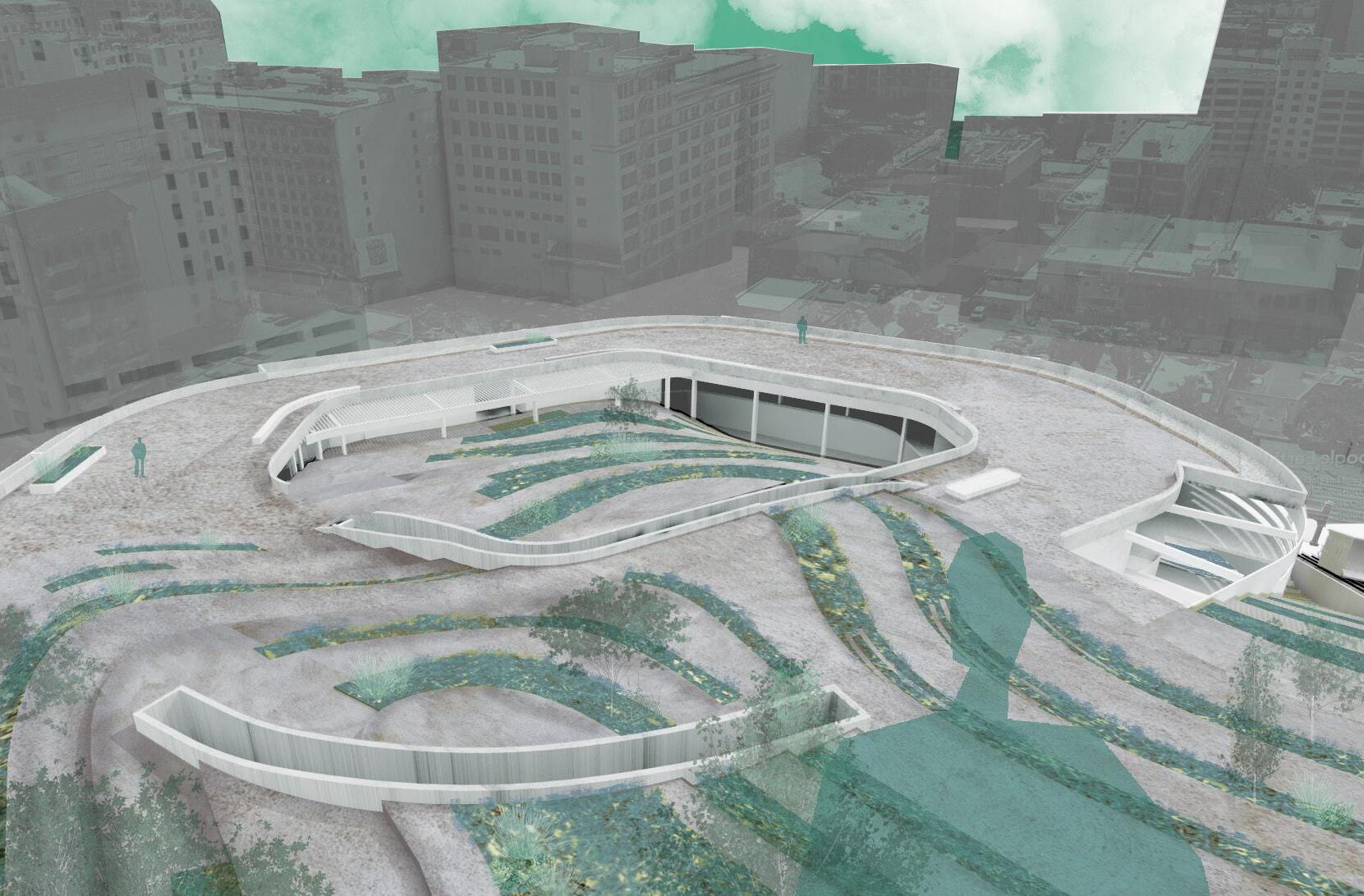
THE LOOP EXTENDS FROM THE CONTOURED ARTIFICIAL HARDSCCAPE AND MOMENTS OF THE BUILDING’S INTERSECTION ARE CAPTURED.
spectacle of motion
How can the spectacle of firemen going out for a call influence design?
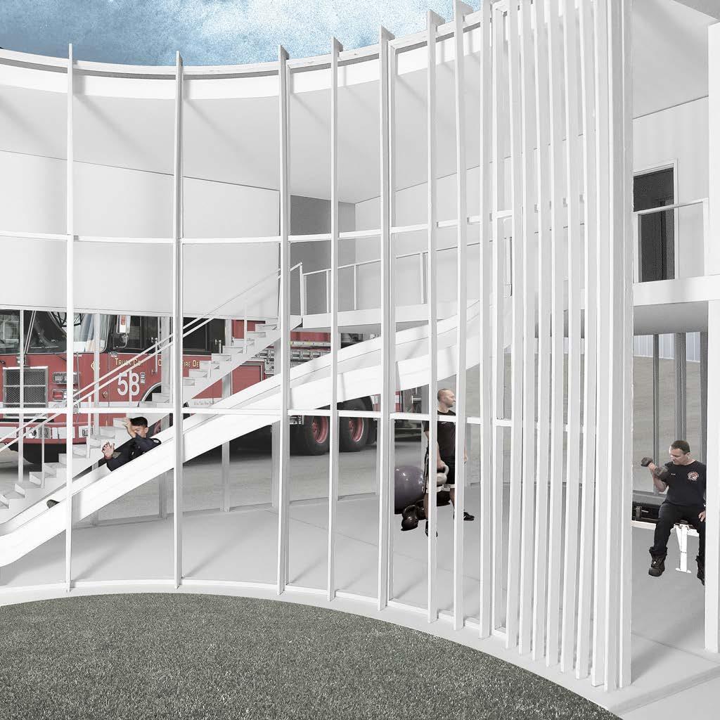
This fire station is organized around the dimension of speed through a series of curves and radii. There are two sets of curves corresponding to two types of movement, those for the equipment - the trucks - and those for the people - the firemen. Adding another dimension of movement, the two slides in place of fire poles are where the main spectacle occurs.
Fire Station Studio
Instructor: Gabriel Fries-Biggs UCLA A.UD Spring 2018
Thinking about adjacency and efficiency, the other interior programs pull away from the main apparatus bay. Using the specific truck turning radii, pathways create curves for the rest of the program to inhabit
The orchestrated performance of movement on the interior is registered legible on the exterior through a system of lines and louvers as ornament. The closer the spacing the more private, and the wider the more public.


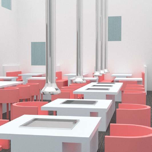


kitchen
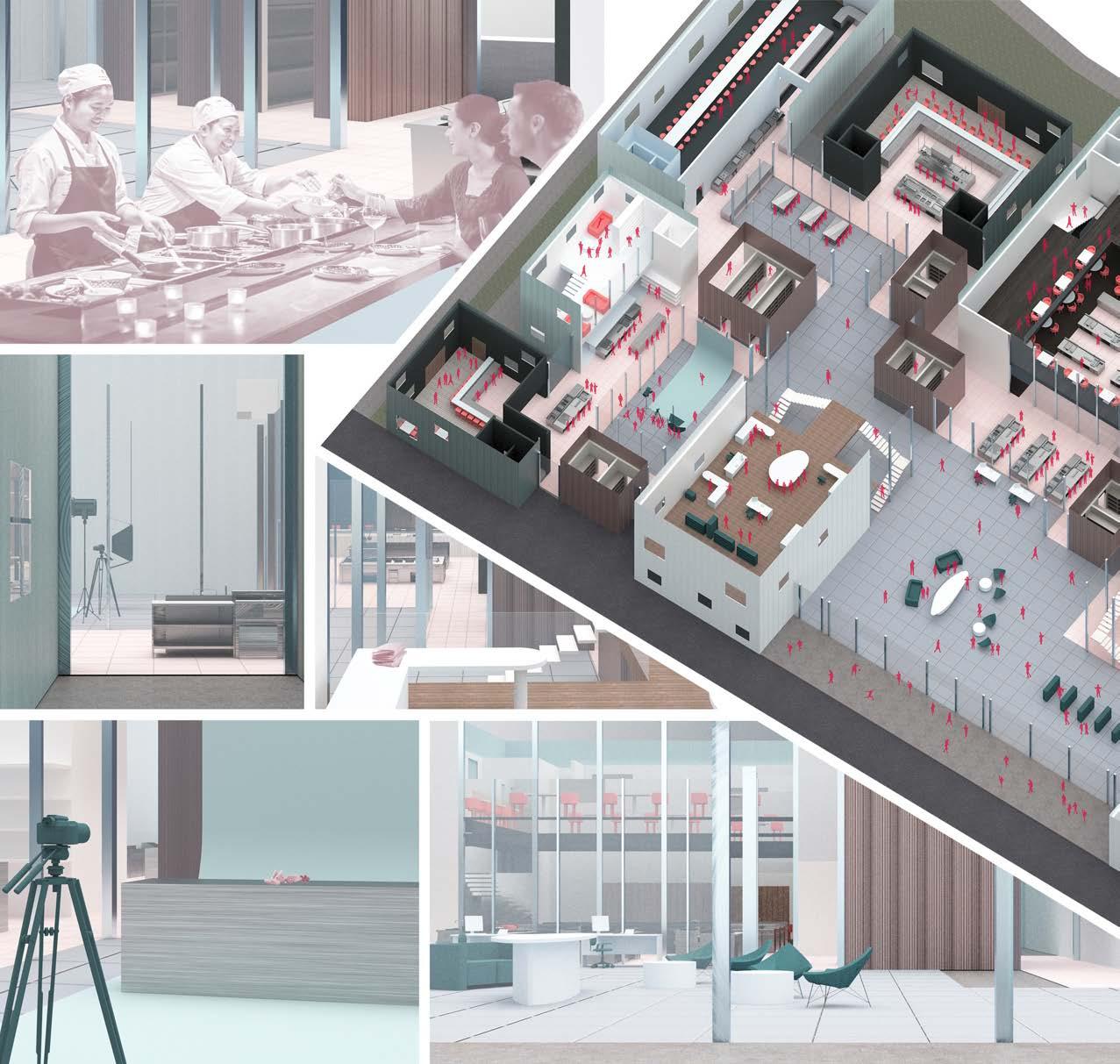
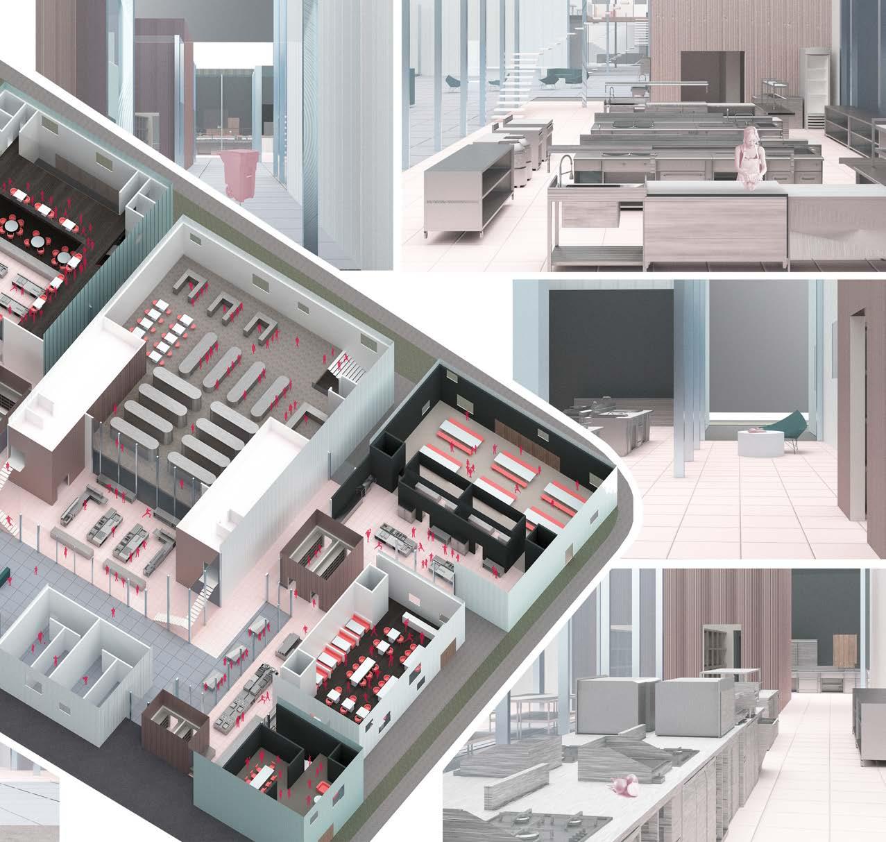
Workhouse: Graduate Thesis
Instructor: Hitoshi Abe UCLA A.UD Spring 2019
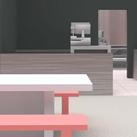
In the culinary world of Kitchen Network, the three main players are: student chefs, established chefs, and dining guests. A variety of experiences is provided through a unified space by analyzing the relationships between the three.
Congruently, there are alos three layers of program. The perimater consists of nine distinct dining experiences meanwhile the interior serves as the educational and office coworking spaces. The two are connected by the network of kitchen - figuratively and literally uniting diners, chefs, and student.
Daily Bruin
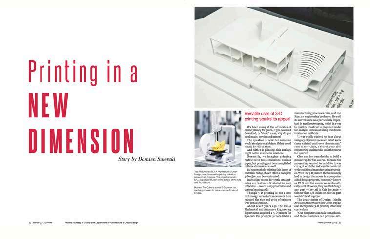
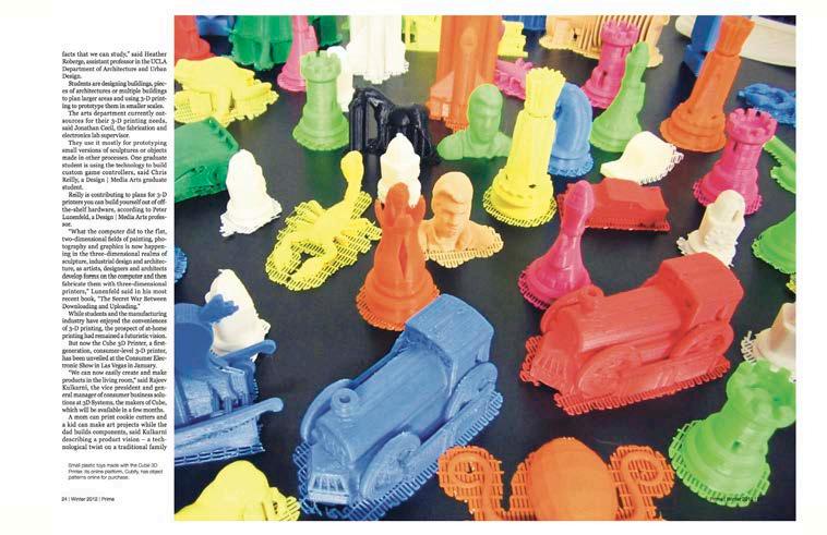
Top: Layout design for a story on the new tech of 3D-printing, Prime literary magazine.
Bottom Left: Front page design for UCLA’s annual Dance Marathon story, DB newspaper.
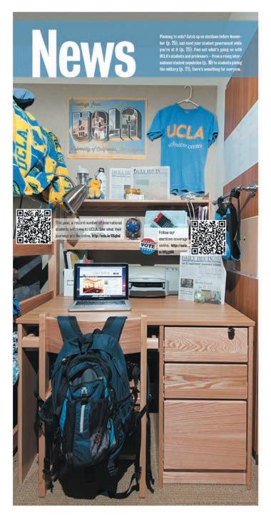
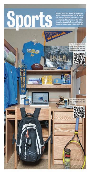
Bottom Right: Art direction for the dorm room themed covers of UCLA’s back-to-school special registration issue, DB newspaper. Also lent some props like the tennis racket.
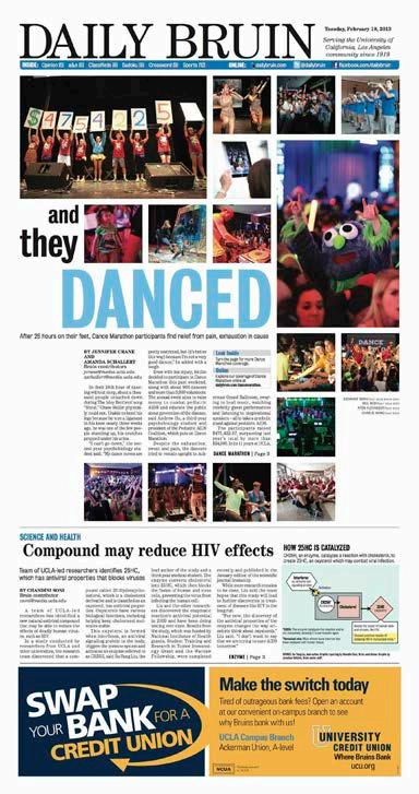
Select works from my time at UCLA’s Daily Bruin 2012-2014





risograph print
risograph print
