MEET
KYLA DUKES
Hello, My name is Kyla Dukes and I am a graphic designer. I have over 4 years of experience in Packaging, Brand Identity, Editorial, and Web Design. I recently graduated from Johnson & Wales University earning a Bachelor’s Degree.
Designing isn’t just a hobby of mine it is a passion. My passion started from my love for ceramics in high school. I was taking various ceramics class and my teacher recommended me to try a graphic design class they were offering and I have loved everything about designing ever since.
![](https://assets.isu.pub/document-structure/230109213523-765f4889c30655122e84ecc7f10fb632/v1/7eea872b8427dbaba775d3efcf4ddceb.jpeg)
![](https://assets.isu.pub/document-structure/230109213523-765f4889c30655122e84ecc7f10fb632/v1/d5d4cf1e3848f258fe4d41543581e342.jpeg)
![](https://assets.isu.pub/document-structure/230109213523-765f4889c30655122e84ecc7f10fb632/v1/1a3ba388695f36fb7233031d08424c46.jpeg)
![](https://assets.isu.pub/document-structure/230109213523-765f4889c30655122e84ecc7f10fb632/v1/77fbb3bd657c3784f393ef2670167722.jpeg)
![](https://assets.isu.pub/document-structure/230109213523-765f4889c30655122e84ecc7f10fb632/v1/1a6e35a29ddb589c6d05164bad3f7254.jpeg)
![](https://assets.isu.pub/document-structure/230109213523-765f4889c30655122e84ecc7f10fb632/v1/c6c803ed9111201fc0b3e6da09cdd92c.jpeg)
Box size: 15x9x5
Instagram Welcome Box
I was tasked to conceptualize and design a university acceptance welcome package for new incoming freshman, or a company welcome package for new employees. I chose to design a welcome package for Instagram.
Instagram is an app I use on a day-to-day basis exploring new places and things. Therefore, Instagram was the perfect company to create a welcome box for. Instagram takes pride in their brand values therefore, I wanted to Incorporate their values in my own way. A catchphrase I came up with through reviewing their mission statement is “ Together Inspire Creativity”. This is found on the t-shirt and on the pen it says “Inspire Creativity”.
Designing the box was a challenge and a test to my craftsmanship. I had to figure out dementions that would allow for all of the items to fit. I then created a box template, print and prototmed the box. I designed a tray with deviders, in order to cleanly dispcay the various collateral. The tray and dividers are made out of a foam board.
Included in the box is a custom designed planner, lanyard, pen, t-shirt, water bottle, speaker, ring light, and a Polaroid camera.
![](https://assets.isu.pub/document-structure/230109213523-765f4889c30655122e84ecc7f10fb632/v1/6271b486aeb826b3a5d1988fd439c47d.jpeg)
![](https://assets.isu.pub/document-structure/230109213523-765f4889c30655122e84ecc7f10fb632/v1/0e603eed414cfabcf5445e30d13601d6.jpeg)
![](https://assets.isu.pub/document-structure/230109213523-765f4889c30655122e84ecc7f10fb632/v1/6ee140e274a1546e116f7dcc3e540b92.jpeg)
![](https://assets.isu.pub/document-structure/230109213523-765f4889c30655122e84ecc7f10fb632/v1/eca8cc7d8e42b70d33f351e8dd427e9f.jpeg)
Allen Country
For this project, we were told to choose an old annual report and give it a redesign. Out of the numerous annual reports I chose United Way of Allen Country’s 2019/2020 annual report. What I loved about the original annual report is that they stayed within the logos colors and I wanted to keep that in my redesign and implement a modern day feel.
![](https://assets.isu.pub/document-structure/230109213523-765f4889c30655122e84ecc7f10fb632/v1/7f729eb1b49b61a55a5c2ba2ea9cb1e1.jpeg)
![](https://assets.isu.pub/document-structure/230109213523-765f4889c30655122e84ecc7f10fb632/v1/f12fa3211a46e1f7139f9c82df8e5a6a.jpeg)
![](https://assets.isu.pub/document-structure/230109213523-765f4889c30655122e84ecc7f10fb632/v1/765a20b5d2eb254133753c838df07e20.jpeg)
![](https://assets.isu.pub/document-structure/230109213523-765f4889c30655122e84ecc7f10fb632/v1/ec51f95054bc354eaa99b1e5fbeb9773.jpeg)
![](https://assets.isu.pub/document-structure/230109213523-765f4889c30655122e84ecc7f10fb632/v1/fa0f77bc9f3eefb923867b20524efdb3.jpeg)
![](https://assets.isu.pub/document-structure/230109213523-765f4889c30655122e84ecc7f10fb632/v1/3e04ca025e3fd4a274ce66ac118c8718.jpeg)
![](https://assets.isu.pub/document-structure/230109213523-765f4889c30655122e84ecc7f10fb632/v1/dfb711df548095ac1153e8e8c3c382a9.jpeg)
![](https://assets.isu.pub/document-structure/230109213523-765f4889c30655122e84ecc7f10fb632/v1/b4c9c1d7fe7d4d6795c75e27c78d9116.jpeg)
![](https://assets.isu.pub/document-structure/230109213523-765f4889c30655122e84ecc7f10fb632/v1/3aa73939fe4a22c9c123e122e701659f.jpeg)
![](https://assets.isu.pub/document-structure/230109213523-765f4889c30655122e84ecc7f10fb632/v1/6564770b4639575bf5297a7b8b695a5f.jpeg)
LayerUp
![](https://assets.isu.pub/document-structure/230109213523-765f4889c30655122e84ecc7f10fb632/v1/6cad5b042e59b393f08558f57e8b9332.jpeg)
A freelance project for Chief Brand Marketing Strategist, Jocelyn Taylor, out of South Orange, NJ. Redesigned and created website in a fast-paced environment to help bring awareness to LayerUp! during Ad week NY 2021 (Blaq App & LayerUp!) LayerUp is a collaborative Global narrative media platform, multi-tiered educational resource and social movement hub. When creating this website we wanted to portray the feel of unity and elevate while implementing the colors of the South African flag.This was created in WIX.
![](https://assets.isu.pub/document-structure/230109213523-765f4889c30655122e84ecc7f10fb632/v1/9b3f7fa52305745f51f1d8ea9f3632b9.jpeg)
![](https://assets.isu.pub/document-structure/230109213523-765f4889c30655122e84ecc7f10fb632/v1/65500f4211d56df33eb65da10dc7638d.jpeg)
![](https://assets.isu.pub/document-structure/230109213523-765f4889c30655122e84ecc7f10fb632/v1/5cf2352bd3a23c19f901c22827bca274.jpeg)
![](https://assets.isu.pub/document-structure/230109213523-765f4889c30655122e84ecc7f10fb632/v1/d69e67cbe7d228b65bf48c7b3466ee7f.jpeg)
![](https://assets.isu.pub/document-structure/230109213523-765f4889c30655122e84ecc7f10fb632/v1/e88976964ca0af514aa565861dea2f6b.jpeg)
![](https://assets.isu.pub/document-structure/230109213523-765f4889c30655122e84ecc7f10fb632/v1/b00a4da981050703be6a61c0f43f29d5.jpeg)
![](https://assets.isu.pub/document-structure/230109213523-765f4889c30655122e84ecc7f10fb632/v1/5767cabb8f92acf0cdeb231de149ff59.jpeg)
![](https://assets.isu.pub/document-structure/230109213523-765f4889c30655122e84ecc7f10fb632/v1/ca0dbe280f4b867797121ceff5170d43.jpeg)
Magazine Spreads.
![](https://assets.isu.pub/document-structure/230109213523-765f4889c30655122e84ecc7f10fb632/v1/bf3467c45289c097b0d7ba7c37061888.jpeg)
The task was to create two magazine spreads that are completely different using the same article. This was a challenge. When designing I wanted to convey the aethetic of a high-end fashion editoral. For my second spread, I went for an urban editorial look. Typography and hierarchy was an extremely important factor when I was designing this, because these design choices really made these layouts aesthetically pleasing.
![](https://assets.isu.pub/document-structure/230109213523-765f4889c30655122e84ecc7f10fb632/v1/bb2976ecd78dda4810f0273ca6667166.jpeg)
![](https://assets.isu.pub/document-structure/230109213523-765f4889c30655122e84ecc7f10fb632/v1/c1dab79375f565783bb84bbf67bb8337.jpeg)
![](https://assets.isu.pub/document-structure/230109213523-765f4889c30655122e84ecc7f10fb632/v1/5ddfd71df798989a9daa773526822963.jpeg)
![](https://assets.isu.pub/document-structure/230109213523-765f4889c30655122e84ecc7f10fb632/v1/0c07d319ee1386d5445ab4c38376bf57.jpeg)
![](https://assets.isu.pub/document-structure/230109213523-765f4889c30655122e84ecc7f10fb632/v1/fa8f38655a6481583e11bef524b74def.jpeg)
Sprinkles
![](https://assets.isu.pub/document-structure/230109213523-765f4889c30655122e84ecc7f10fb632/v1/4a12dfbf4aa814b9a456584a27c7b6c5.jpeg)
Vintage
![](https://assets.isu.pub/document-structure/230109213523-765f4889c30655122e84ecc7f10fb632/v1/ce552a5ffe952d6496910e2ba6da35a4.jpeg)
![](https://assets.isu.pub/document-structure/230109213523-765f4889c30655122e84ecc7f10fb632/v1/62a84f10b08b91612ebcdff26313f9c1.jpeg)
![](https://assets.isu.pub/document-structure/230109213523-765f4889c30655122e84ecc7f10fb632/v1/5fff08a1ee25929fb54eb48551204f74.jpeg)
![](https://assets.isu.pub/document-structure/230109213523-765f4889c30655122e84ecc7f10fb632/v1/b9de0cd52e86d1d980c1cb6c18399ba5.jpeg)
Handwritten Minimal
![](https://assets.isu.pub/document-structure/230109213523-765f4889c30655122e84ecc7f10fb632/v1/5038ff0c482ce8484d3cf9773b19a288.jpeg)
![](https://assets.isu.pub/document-structure/230109213523-765f4889c30655122e84ecc7f10fb632/v1/f992eea504078d0fefe9b6a19b13ccba.jpeg)
![](https://assets.isu.pub/document-structure/230109213523-765f4889c30655122e84ecc7f10fb632/v1/5458889dd9774e01ee84bf405e66ee7a.jpeg)
Negative Space
![](https://assets.isu.pub/document-structure/230109213523-765f4889c30655122e84ecc7f10fb632/v1/31978ca6123c85af80580768bcf2c2c8.jpeg)
VIA makes good things happen.
mutualofamerica.com
![](https://assets.isu.pub/document-structure/230109213523-765f4889c30655122e84ecc7f10fb632/v1/fc924df6a816ae05fc123756e6fa4153.jpeg)
![](https://assets.isu.pub/document-structure/230109213523-765f4889c30655122e84ecc7f10fb632/v1/457f7aa95c2f2479ae98695d13fd99f8.jpeg)
![](https://assets.isu.pub/document-structure/230109213523-765f4889c30655122e84ecc7f10fb632/v1/e23fe54b420a0463d8e2c3f4c128202a.jpeg)
![](https://assets.isu.pub/document-structure/230109213523-765f4889c30655122e84ecc7f10fb632/v1/7d0cf98cb70efaacbbf4a4f2a8f90db9.jpeg)
For
people who need you. For the difference you make. Thank you.
Mutual of America
I had the pleasure to participate in a 8 week financial service internship program, and focused on niche marketing projects. During this program I worked closely with the strategic marketing team to assist them with various designing marketing collaterals. I was able to create a new look and feel for old powerpoint designs, and designed a webinar waiting page for their first Pride Month webinar. I designed a modern 401k brochure to include diverse representation to reach a broader audience, and updated company event invitations.
![](https://assets.isu.pub/document-structure/230109213523-765f4889c30655122e84ecc7f10fb632/v1/667dcd9b7c6ec8e7f767ab9bfbe4bb2b.jpeg)
![](https://assets.isu.pub/document-structure/230109213523-765f4889c30655122e84ecc7f10fb632/v1/26c16f18ac2decb7adc594d618cf95dd.jpeg)
![](https://assets.isu.pub/document-structure/230109213523-765f4889c30655122e84ecc7f10fb632/v1/c1f7629ef65ccec8f0cb9742c8671c6a.jpeg)
![](https://assets.isu.pub/document-structure/230109213523-765f4889c30655122e84ecc7f10fb632/v1/bb531d7d50e95171a493c260b9b064b6.jpeg)
![](https://assets.isu.pub/document-structure/230109213523-765f4889c30655122e84ecc7f10fb632/v1/04237f3b6499c1816e45c33519c77fd6.jpeg)
![](https://assets.isu.pub/document-structure/230109213523-765f4889c30655122e84ecc7f10fb632/v1/ee62dd67e03ff749e9397de5fd3475e9.jpeg)
![](https://assets.isu.pub/document-structure/230109213523-765f4889c30655122e84ecc7f10fb632/v1/a2c2f976ffaa55359045bfa7d726125c.jpeg)
![](https://assets.isu.pub/document-structure/230109213523-765f4889c30655122e84ecc7f10fb632/v1/0fa1cf52439bd693de678366765368aa.jpeg)
![](https://assets.isu.pub/document-structure/230109213523-765f4889c30655122e84ecc7f10fb632/v1/b31cb9cbeb59ed651e7e55d7942a18fd.jpeg)
Miss. Pink
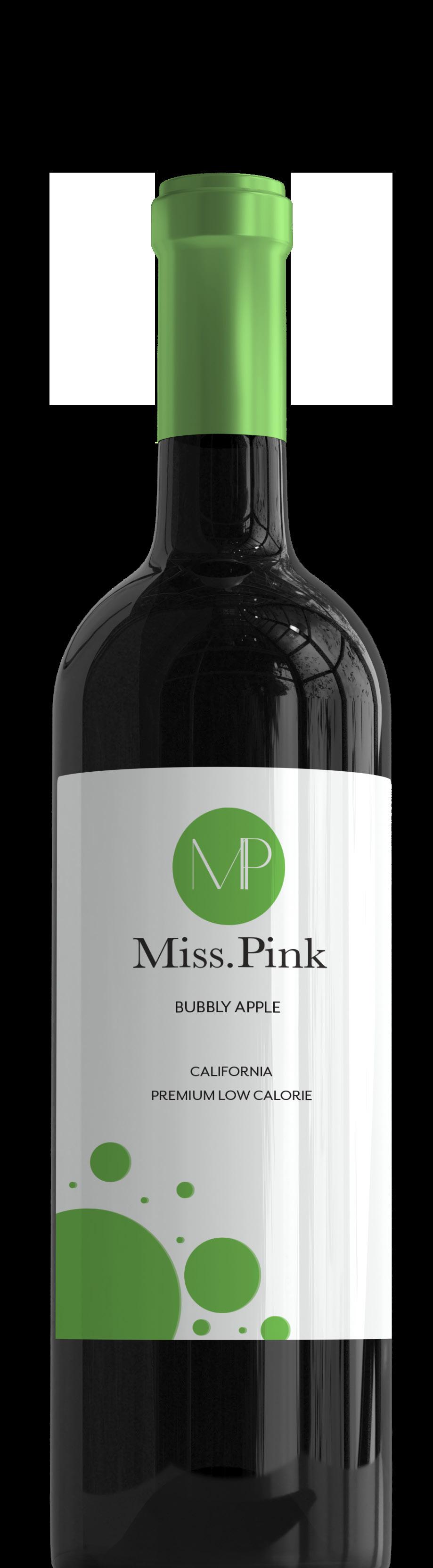
This assignment we were asked to design a brand and a ad campaign for a beverage company that sells healthy alternatives to its customers. I choose to design a brand for a fictitious wine company. Miss Pink is a low calorie bubbly wine that comes in 3 flavors; Rosé, Apple, and Peach. The target audience for Miss Pink are women from ages 21-40. Therefore, I wanted my design to look feminine and conspicuous.
![](https://assets.isu.pub/document-structure/230109213523-765f4889c30655122e84ecc7f10fb632/v1/c267a9b2a5dd4b6292fbbcb6e116378f.jpeg)
![](https://assets.isu.pub/document-structure/230109213523-765f4889c30655122e84ecc7f10fb632/v1/7631b1342a7e1e34a5955203c7448551.jpeg)
![](https://assets.isu.pub/document-structure/230109213523-765f4889c30655122e84ecc7f10fb632/v1/44b1154a3269ae30f6a04baa524ef41e.jpeg)
![](https://assets.isu.pub/document-structure/230109213523-765f4889c30655122e84ecc7f10fb632/v1/75db449cdae7fce25ef3ca01fb905264.jpeg)
![](https://assets.isu.pub/document-structure/230109213523-765f4889c30655122e84ecc7f10fb632/v1/4f62200d9a0b8f9f69592d9cec89a556.jpeg)
![](https://assets.isu.pub/document-structure/230109213523-765f4889c30655122e84ecc7f10fb632/v1/73ef6be40d0821979d9c849fad931c57.jpeg)
![](https://assets.isu.pub/document-structure/230109213523-765f4889c30655122e84ecc7f10fb632/v1/e91bf0e4484876b3f399843526e8994b.jpeg)
![](https://assets.isu.pub/document-structure/230109213523-765f4889c30655122e84ecc7f10fb632/v1/c069f18949d170485bd81e2a23c2affc.jpeg)
Swietny’s
This tast was to create a fictitious restaurant and to design a logo and menu. Swietny’s which means excellent in Polish Is a vegan restaurant that serves the best all natural and organic products. Bringing vegan dining to a fresh, new and delicious level. I wanted to create menu and logo that is realistic to a modern vegan restaurant that is clean and aesthetically pleasing. While exploring new tricks and learning how to properly use hierarchy and layout. happy as a vegan happy as a vegan
![](https://assets.isu.pub/document-structure/230109213523-765f4889c30655122e84ecc7f10fb632/v1/41673edae40a09d74845e66a270d3b42.jpeg)
![](https://assets.isu.pub/document-structure/230109213523-765f4889c30655122e84ecc7f10fb632/v1/a150b2426c1dd312a6c234ecdedfbf46.jpeg)
![](https://assets.isu.pub/document-structure/230109213523-765f4889c30655122e84ecc7f10fb632/v1/ef2c65ae0894dc014e27a5e88722213e.jpeg)
![](https://assets.isu.pub/document-structure/230109213523-765f4889c30655122e84ecc7f10fb632/v1/1a0f470914ee7f469bd49b773af46852.jpeg)
![](https://assets.isu.pub/document-structure/230109213523-765f4889c30655122e84ecc7f10fb632/v1/45d8c488ca5ab57b130b7edde1107680.jpeg)
![](https://assets.isu.pub/document-structure/230109213523-765f4889c30655122e84ecc7f10fb632/v1/490eddb261a45c1a789ee41286378bf4.jpeg)
![](https://assets.isu.pub/document-structure/230109213523-765f4889c30655122e84ecc7f10fb632/v1/917d940a3a436e842b7b9999ae31f8db.jpeg)
Prosperity Candle Co.
![](https://assets.isu.pub/document-structure/230109213523-765f4889c30655122e84ecc7f10fb632/v1/3fa891db06bc101884f99c0c85af930a.jpeg)
This project we were tasked to create a brand and design an eight page catalog selling various products for the brand. While implementing multiple products for a fatidious brand using original photography. Prosperity Candle is an, flameless candle company. This is the winter 2020 collection that features different flameless candles and colors. There is also an addition to the collection of organic reeds in different scents.
![](https://assets.isu.pub/document-structure/230109213523-765f4889c30655122e84ecc7f10fb632/v1/e9079b1e9a48a1f01b2af489789a1dfb.jpeg)
![](https://assets.isu.pub/document-structure/230109213523-765f4889c30655122e84ecc7f10fb632/v1/1fd3630b1c0177b127cc594f55c932f2.jpeg)
![](https://assets.isu.pub/document-structure/230109213523-765f4889c30655122e84ecc7f10fb632/v1/093f7536d83293b5ab52a56e762fa61a.jpeg)
![](https://assets.isu.pub/document-structure/230109213523-765f4889c30655122e84ecc7f10fb632/v1/25d4e5ede849f183bde3c38132687a27.jpeg)
![](https://assets.isu.pub/document-structure/230109213523-765f4889c30655122e84ecc7f10fb632/v1/e44ea3263bdfc2af3bd17d5fc81159fd.jpeg)
![](https://assets.isu.pub/document-structure/230109213523-765f4889c30655122e84ecc7f10fb632/v1/9c1245d089fff151d4d54162e2c4bd8e.jpeg)
![](https://assets.isu.pub/document-structure/230109213523-765f4889c30655122e84ecc7f10fb632/v1/a6cc997787aa9ac85a0d81869dcb39c3.jpeg)
Moi Magazine Productions
![](https://assets.isu.pub/document-structure/230109213523-765f4889c30655122e84ecc7f10fb632/v1/db24d1c4f4505696990cb5b09d0f69a0.jpeg)
![](https://assets.isu.pub/document-structure/230109213523-765f4889c30655122e84ecc7f10fb632/v1/0021902f5cc988b61982a4e47255356e.jpeg)
Moi magazine productions was a freelance project for a photographer named Zamoi Merielle based out of New York. I created a website and logo. The goal for this website was to have a portfolio showcase and request to book services.
![](https://assets.isu.pub/document-structure/230109213523-765f4889c30655122e84ecc7f10fb632/v1/16b8570997fcadf26e9549b760db40fd.jpeg)
![](https://assets.isu.pub/document-structure/230109213523-765f4889c30655122e84ecc7f10fb632/v1/2d5c723b9f4cb4fc1467b33dac4e4aaf.jpeg)
![](https://assets.isu.pub/document-structure/230109213523-765f4889c30655122e84ecc7f10fb632/v1/20eaa185b25153005d24cc9f32961203.jpeg)
![](https://assets.isu.pub/document-structure/230109213523-765f4889c30655122e84ecc7f10fb632/v1/f34645131e084a408b388b2c3472d15b.jpeg)
![](https://assets.isu.pub/document-structure/230109213523-765f4889c30655122e84ecc7f10fb632/v1/f3b1fa29d6bc9629e154e1ffb55c20c0.jpeg)
![](https://assets.isu.pub/document-structure/230109213523-765f4889c30655122e84ecc7f10fb632/v1/8a8dfc8e018e6f5a98211bc869d0570d.jpeg)
Moms of Marieville
For this class project I worked with in a design team with one other member. We were given a local non-for profit organization in North Providence, Rhode Island called, Mom of Marieville. The deliverables they requested were web design and development, a brand identity package, and setting up an instagram account. Additional items included a 6 and 8 ft banner, and t-shirt. When designing the brand I wanted to represent what they do which is giving back to the community, therefore I created two icons reaching for a heart. The two icons represent the two founders of the organization.
![](https://assets.isu.pub/document-structure/230109213523-765f4889c30655122e84ecc7f10fb632/v1/a852cd86ed9bd99ee044d3c29518155a.jpeg)
![](https://assets.isu.pub/document-structure/230109213523-765f4889c30655122e84ecc7f10fb632/v1/be5a5ce8345f25089b10fcefd5699fd7.jpeg)
![](https://assets.isu.pub/document-structure/230109213523-765f4889c30655122e84ecc7f10fb632/v1/0d8624d0955b49884161e6e4da6d6a73.jpeg)
![](https://assets.isu.pub/document-structure/230109213523-765f4889c30655122e84ecc7f10fb632/v1/f5b0e80f2c04786b885a98944f994274.jpeg)
![](https://assets.isu.pub/document-structure/230109213523-765f4889c30655122e84ecc7f10fb632/v1/a22fa9beb6be77364dcfe52e85ce13f2.jpeg)
![](https://assets.isu.pub/document-structure/230109213523-765f4889c30655122e84ecc7f10fb632/v1/c6062286133ec7fffd67e350964313be.jpeg)
![](https://assets.isu.pub/document-structure/230109213523-765f4889c30655122e84ecc7f10fb632/v1/e3c87e05614c012ee7983c3078615523.jpeg)
CrownThis project we were tasked to create a brand Identity and packaging for a fictitious brand. Crown is a natural hair company for curly hair that has no sulfates or harsh chemicals. I wanted this academic project to be realistic as possible, where you could imagine it on a store shelf with other natural hair care products. The packaging I designed has a natural look and I achieved this by using earth tones and incorporating vector illustrations of natural ingredients
![](https://assets.isu.pub/document-structure/230109213523-765f4889c30655122e84ecc7f10fb632/v1/04fbbfe591df31785855174604e2e27f.jpeg)
![](https://assets.isu.pub/document-structure/230109213523-765f4889c30655122e84ecc7f10fb632/v1/359f6dd292663a09a64e96062040b6b6.jpeg)