Well.. Sophomore year first semester past. Ha ya… remember when you sat on your laptop and broke your computer screen. Ya I am reallllly enjoying living with the consequences of our own actions right now. This entire class has been bliss until now. Being a Graphic Design Minor was definitely the right move. Allows me to turn off my brain for at least one class and just have FUN! Welp, I hope you enjoy looking through this academic requirement (we know you’re not gonna read anything) for your Intro to Design class with a spin on Mean Girls: Burn Book.
Ya girl, 2024 Kyra
Crash Course
I preserved the reason we did the Crash Course was to simulate what designing something from scratch would be like with a client. This project was about learning about your client, discovering a problem, and then creating a solution under a time crunch.
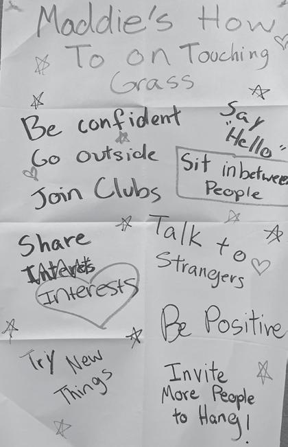
Talking with a real person made me realize that they needed a confidence boost. I made them a motivational poster, a reminder rather than a silly gag. Showing my client unfinished work was a lot more fun it gave us both the opportunity to laugh at mistakes rather than judge them. The ticking clock is different from what I am used to; It gave me enough time to get to know my client. Once I completed the project and let my mind settle, I started
coming up with more ideas. I would probably add a few more things to my poster like “complement someone” and “ask about a keychain.” If I could go back and do something again, I would collaborate with my client because I had so much fun working with them!
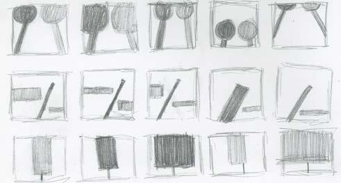
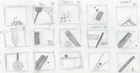
Dot Line Draft
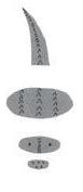
The main premise of this project was learning how to use Gestalt’s Theory of abstraction. The Dot and Line Project required the class to make three black and white pieces with only paper cut outs of dots and lines. Later, we added a black border around our final pieces.
Dot Line Final
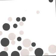
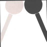
Gestalt is looking at the big picture. Abstraction requires people to look at things in ways they would not before. I would say it took a lot more concentration to make a “well-crafted object.” “An artist’s work is never done” meaning people tend to constantly nit-pick the details. For this project I tried to look at the big picture
(like gestalt) rather than the details so I would find myself spiraling over one little thing. I would rather make things quickly with a less perfect final product. This project made me realize that people will always try to make stories out of nothing. It’s kind of like the ink blot test in that way. People see what they want to see.
Joy Longing
I would say I use gestalt when I am trying to time manage. When something minuscule would go wrong, I would take a step back and look at the big picture. If I could still get my message across to them, I would move on to the next task.
Oppression
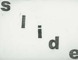
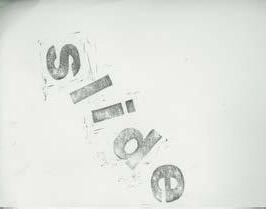
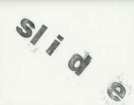
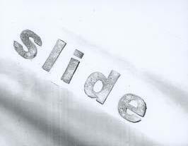
Letterform Drafts
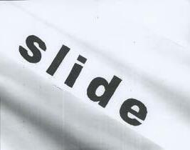
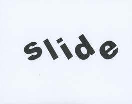
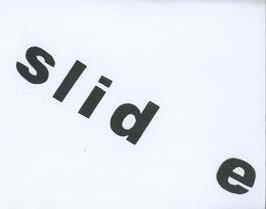
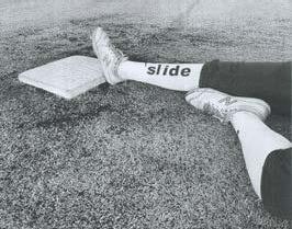
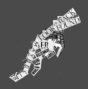
The Letterform project was assigned to teach us the importance of letter shape, spacing, color, etc. For the Letterform project we were required to make four black and white pieces using one word (I chose slide). We had to have at least one piece of each category: straight print, typographic print (not straight), and modification (real life). Our fourth piece was allowed to be a duplicate of whatever one we wanted.
Letterform Finals
I learned that there is a lot of trial and error with this art style. People who live by this medium must be very precise. I definitely found myself losing a lot of patience with this medium however, I did not mind the projects themselves. If I were to continue working with these letters I would work with a bigger piece of paper. I think elongating the word “sl i d e” might look more interesting I would also try a picture with the word “slide” on the shoe while showing someone sliding forward from a backward perspective. In a perfect world I would hire a stunt person for these pictures.
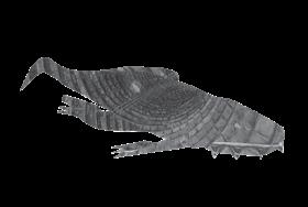
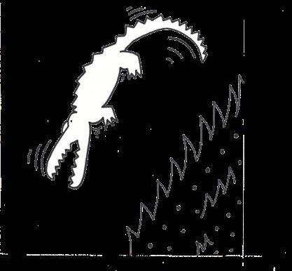
Interpretive Illustration Drafts
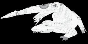
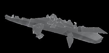
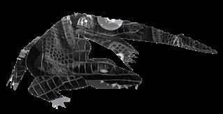
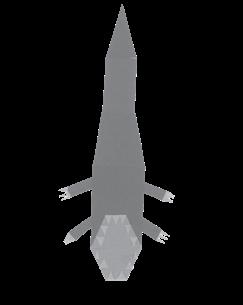
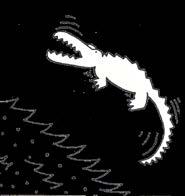
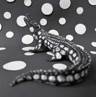
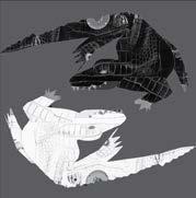
The main premise of the Interpretive Illustration Project from my perspective was taking art from the real world and placing it in the digital realm. For the Interpretive Illustration Project, we had to choose an animal or object to make one single line drawing, two artistic illustrations and three collages. I chose the American Alligator with my artist illustration referencing Yayoi Kusama and Keith Haring. The three colleges were all different forms like pictures, text, abstraction. Once all pieces were complete, they were put onto a poster in black and white.
Interpretive Illustration Final
I learned that my animal (alligator) is smaller and weaker than the crocodile. I also learned about the different ways their skeleton allows them to bend and move. This was to make sure that I did not create anything unrealistic. I think the media that was the most challenging was the Photographic Collage. Getting the right textures and having enough of that texture to use became difficult at times. The most enjoyable was making the Art-
ist’s baste pieces. I like using a median that does not require glue. I learned multiple different ways to remove a background in Photoshop and how to save it properly, so it stays that way. I learned in InDesign how to use Grayscale and frames. I would rework my single line more. Maybe if there were less requirements for this project, I would have done a cool close-up on the eye of the reptile so the viewer could barely see the teeth.
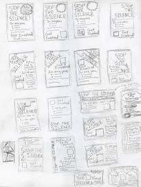
PSA Draft
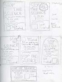
The main premise of the PSA project was to simulate working with a client. The PSA project required us to make a black and white, all text, Public Service Announcement for another student in the classroom. Fin, the student I was assigned to choose to spread awareness of the War in Gaza against the Palestinians and Israelites. He required that I make his poster look like a newspaper and not use the word “War.”
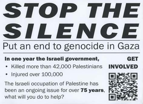
STOP THE SILENCE
Put an end to genocide in Gaza
In one year,
• Killed more than 42,000 Palestinians
• Injured over 100,000
The Israeli occupation of Palestine has been an ongoing issue for over 75 years, what will you do to help?
PSA Final
My challenge was getting the QR code to fit on the poster without leaving an awkward amount of space. I had to restart about 3 times in order to satisfy my customer and myself.
I made the scale of the title the largest in comparison to all the other text. I stretched out the spacing in the word “silence” to make the top line of the text flush with the word. I learned a LOT from the PSA poster. I learned how to change fonts, size, add italics and bold. I also learned how to add lines and boxes on to my poster to separate text. Before I picked out my font, I researched the types of fonts news stations often used so I could make sure I grabbed people’s attention. I plan to use this research and lessons I learned to create for other posters in the future.
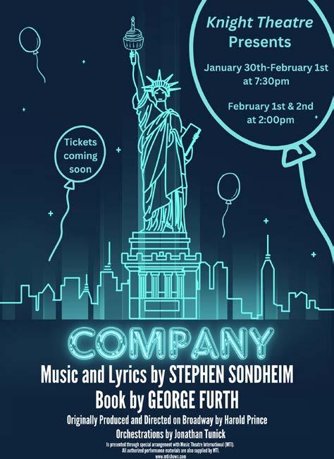
Knight Theatre
Something I am very proud of making within this year would have to be the Knight Theatre poster for the J-Term musical Company. The Company poster is the first real graphic design project I have ever completed. I did not make it in Adobe, but I feel like I did learn how to navigate the world of design pretty well in Canva. Company is a musical about a 35-yearold, New York bachelor’s birthday party. To portray these musicals vibes, I found a neon sign of the Statue of Liberty on the internet and thought the piece captured New York bright lights perfectly. The background became a dark blue to
impersonate the night sky. The title turned into a neon sign with a glow falling below the city. I added birthday elements like a cupcake to replace Madam Liberty’s touch with some birthday balloons surrounding her. For being my first time working with anything in the digital sphere, I am very proud of myself.
Hi Blake,
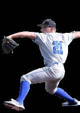
I am called to creative work. I have learned if I do not have a creative outlet then, I get really antsy. This would happen all the time at my brother’s baseball tournaments. I would always be crafting, designing, and even writing at different points of his games. One year, I made my baba and my mom scarves. At my brother’s more recent tournament in Alabama, I designed all of Knight Theatre’s Instagram posts for an entire week just because I was getting so antsy sitting around having nothing to do. Plus, on top of that, I came up with 20+ theme ideas for my social group just because I need to fill the void. In all if I complete a project, I always find myself wanting to start another one immediately.