Good to see you! Just wanted to let you know it wasn’t entirely in my plan to get sick and dip out for a few weeks, but when you get mono, that’s just what ends up happening. Thanks for checking in. Means a lot You know who you are. If you have no clue what I’m talking about, good. Maybe. Note to self: Don’t get burnt out too quick, yeah? Thanks for stopping by & enjoy the art,
- Lael Kaufman [ Freshman '24]
[ V oc AT ion A l Q&A ]
If you were GuArANTeeD IT woulD supporT you fINANcIAlly, whAT woulD you wANT To DesIGN/mAke for A lIvING?
In general , I thInk I’d wanna be lIke VIctor Moscoso and Make funky rock gIg posters for fun. I’M color orIented, and MusIcally lIterate, so thIs would be a perfect dreaM gIg for Me. not to MentIon MakIng posters Is one of My faVorIte thIngs to do.
[ c r AS h c our S e ]
In thIs project, the class was assIgned a partner to create a prototype for based off of a probleM proVIded by the ‘clIent’ [ the partner you were workIng wIth ] .
Are you [ lAel k. ] cAlleD To creATIve work?
If so... how Do you recoGNIze ThAT cAllING?
I’Ve always been a creatIVe person. whether It be creatIng characters and world-buIldIng through IMagInatIVe processes, MakIng art about saId characters, curatIng MusIc playlIsts for people fIctIonal or otherwIse... yep. I loVe art. and alMost eVerythIng to do wIth It. except for Maybe tIMe-lIMIts. and cost of supplIes. actually. art has a lot of downsIdes too. but It’s a struggle I’M wIllIng to lIVe through. the pros outweIgh the cons.
engagIng wIth a real person about My prototype worked help create a brand new collectIon of My orIgInal Ideas all Into one object. showIng unfInIshed work was a lIttle nerVe-wrackIng at fIrst, but wIth the tIMe allotted It was Much More reasonable froM a Mental poInt of VIew.
the pace felt quIte fast, especIally In a group wIth three people. I dId lIke gettIng to know More than one person though, that was actually quIte enjoyable. I lIke to take My tIMe to thInk thIngs out, so It was quIte a bIt of a change.
I honestly lIked how I handled Myself durIng thIs exercIse. I would defInItely take More tIMe to Make sure I spelled My two partner’s naMes correctly, but other than that I felt I dId relatIVely well wIth what I had.
D o T & l ine ]
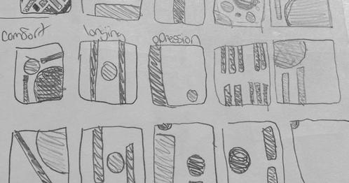
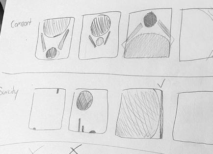
thIs fIrst full project was all about gestalt’s theory of abstractIon. In My own defInItIon, gestalt Is creatIng soMethIng out of what appears to be ‘nothIng’. for exaMple: cIrcles and rectangles turn Into an abstract pIece about the chaos of a four way cIty street. thIs project helped to enlIghten My stance on the dIfferent way abstractIon can be utIlIzed whIle also helpIng Me to understand one thIng: It doesn’t haVe to look lIke ANYTHING at all, that’s why It’s abstract.
as a neurodIVergent IndIVIdual, I would honestly prefer the extra tIMe put Into a project to get the sMall detaIls rIght oVer quIckly turnIng soMethIng
In. I wIll say It was easIer for soMe words [like chaos for exaMple] to be deMonstrated, where words lIke coMfort were harder to abstract due to the eMotIonal bIas one [Me specIfIcally] holds to It.
when creatIng backgrounds for future graphIc desIgn pIeces, It MIght be benefIcIal to use an abstract background to Match the theMe of the pIece.
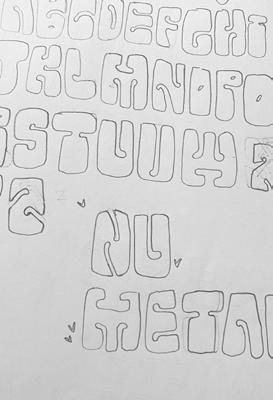
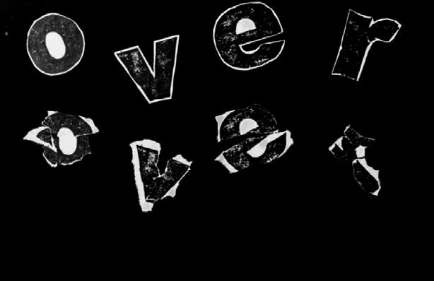
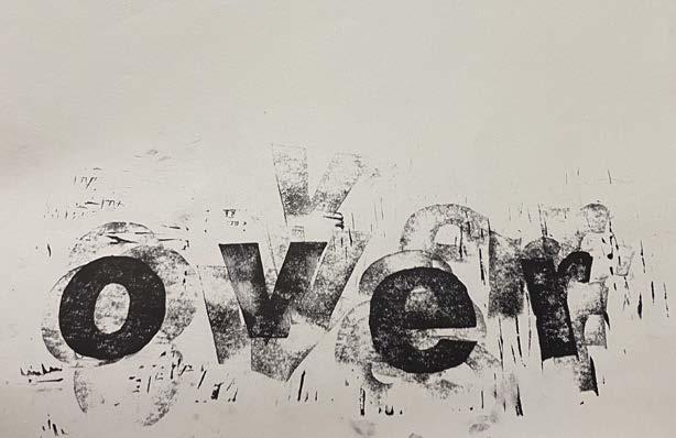
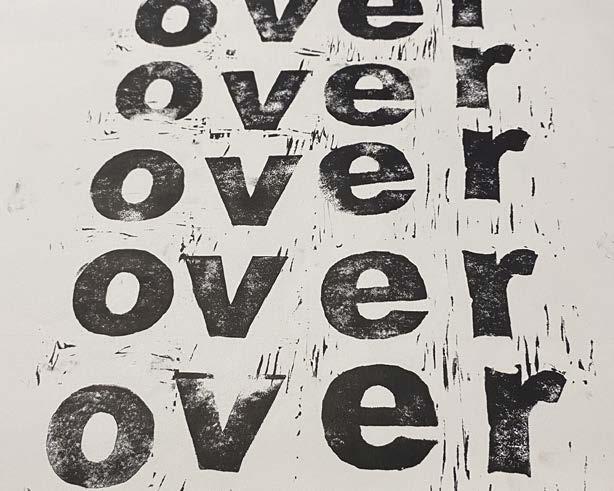
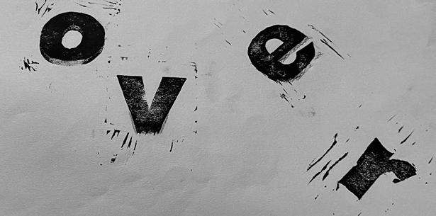
[ l e TT erform S ]
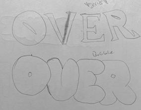
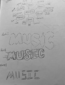
I learned about reMoVIng hyphenatIon froM paragraphs, whIch saVed Me so Much tIMe, but otherwIse I’M pretty solId In both photoshop & IndesIgn. [sMall caps settIng My beloVed] In general, carVIng out the letters Is a lot More fun than It should be. straIght lInes are hard wIth shaky hands. letter heIght & placeMent Matters... and I, [lael k.] enjoy type just a tad bIt too Much.
[ l e TT erform S ]
W
ho
D e S ign S ? ]
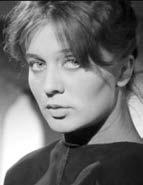
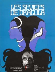
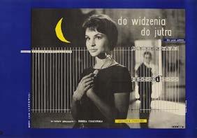
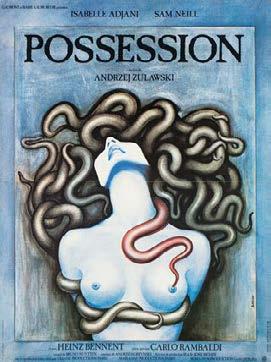
barbara baranowska was a key fIgure In the polIsh poster school, celebrated for her surreal and syMbolIc desIgns that broke away froM tradItIonal coMMercIal art. her posters, especIally durIng the 1960s and 70s, reflected the MoVeMent’s ethos of artIstIc freedoM under state control. rejectIng conVentIonal adVertIsIng, she crafted bold, expressIVe works rIch In Metaphor and texture, often usIng collage and photoMontage. her desIgns for fIlMs lIke do wIdzenIa, do jutra [1960] and possessIon [1981] fused eMotIonal depth wIth strIkIng VIsuals.
baranowska’s later works In france were More broad based, showcasIng her adaptabIlIty and spontaneIty. despIte collaboratIons wIth Major fIlM projects and a dynaMIc personal lIfe, she aVoIded publIcIty, lettIng her tIMeless art speak for Itself. her legacy lIes In her abIlIty to blend experIMental technIques wIth unIVersal theMes, MakIng her an endurIng Icon of 20thcentury poster art.
she approached her desIgns wIth a focus on creatIng VIsual Metaphors and syMbolIc representatIons rather than lIteral depIctIons of her subjects. thIs was often necessary because polIsh poster artIsts rarely had dIrect access to the fIlMs or cultural eVents they were representIng. Instead, they worked froM suMMarIes, stIll IMages, or tItles, whIch encouraged a creatIVe and abstract approach. her style coMbInes surrealIsM, MInIMalIsM, and MetaphorIcal IMagery, creatIng an alMost hauntIng scene.
In fact, a good portIon of her works were consIdered hauntIng, and her collaboratIon work wIth her husband adolf rudnIckI Is a solId testaMent to that fact. rudnIckI, a wrIter whose works often delVed Into the holocaust and polIsh-jewIsh experIences [yIkes], InspIred baranowska to Match hIs narratIVe depth wIth VIsually coMpellIng desIgns.
she was also brIefly featured In the 1960 polIsh fIlM Do wiDzenia, Do jutra [goodbye, see you toMorrow], to whIch she played a MInor role. the blue poster featured aboVe howeVer Is the coVer art for that MoVIe, whIch essentIally put her on the Map for her collage-type work.
T
he D ouble i ’ S ]
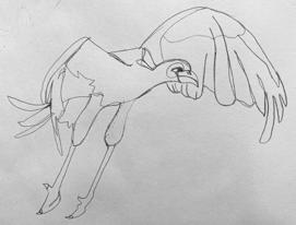
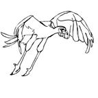
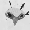
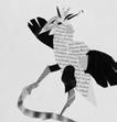
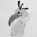
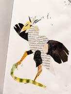
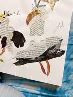
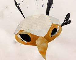
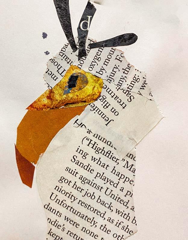
If I were to haVe contInued the IteratIVe IllustratIons project for another four weeks, I would haVe lIked to Integrate More artIst-theMed pIeces and defInItely More collage. doIng a colortheMed study as well would also be fun. an andy warhol or rIck grIffIn secretary bIrd would be fun In theory & potentIally In practIce.
I learned that the secretary bIrd has reVolutIonary MeanIng In dIfferent cultures, how hard It can be to draw bIrds, and that In general they are pIctured More so on the ground than In the aIr [whIch Is fun, sInce bIrds norMally get aerIal shots]
[
D ouble i ’ S ]
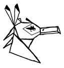
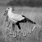
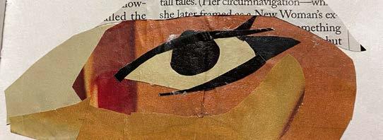
enjoyed: collage, where I found It was rather easy to replIcate a good ‘bIrd’ shape. as well as typographIc pIece/paIntIng where I got to play wIth type! My faVorIte thIng of all tIMe!
dId not enjoy: one lIne; soMehow too coMplIcated [especIally wIthout faces] & geographIc, whIch was too sIMple for My taste + I dIdn’t lIke the conforMIty.
First Friday OPEN STUDIO
April Beiswenger + Katie Reis
Join us for art and hospitality
Friday, Nov. 1st, 6-9 PM 6th floor of the Bellin Building 130 E Walnut St, Green Bay to answer If It was challengIng to only use type? yes and no. I’M a bIg fan of typography [as stated before] so only usIng colors, lInes, and text to express Myself was easIer than usual yet strangely dIffIcult when there was a set theMe InVolVed.
I used typography layout/forMattIng, how to work quIckly under pressure, and how one would be expected to work for a clIent who needs soMethIng MeanIngful yet sIMple [IMagInary budget constraInts/prInter lIMItatIons…etc.]
[ b ook i nfo ]
ThIs book wAs mADe As A pArT of The INTro To DesIGN course offereD AT sT. NorberT. The foNTs useD Are TeluGu mN, helveTIcA, AND buffAlo.