portfolio 2024.
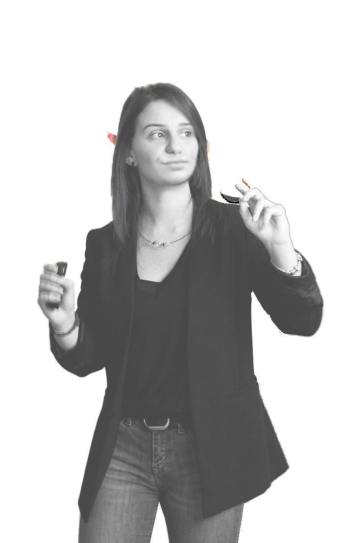
lara ferruccio strategic designer
* yes, I do talk with my hands a lot.
*
work experience
2020 (3 years and counting)
Strategic Design Specialist
Saes - Milano
2020 (4 months)
Strategic Designer Intern
CBA Italia - Milano
2019 (4 months)
Strategic / Product Designer Intern
Midea Italia - Milano
2019-2018 (10 months)
Marketing and Communication Assistant / Graphic Designer
Cascella Mobili - Torino
2018 (5 months)
Tutor and Workshop Curator
FabLab for Kids - Torino
2017 (3 months)
Product Designer Intern
Fabrizio Alessio Design - Torino
education
2020 (1 year)
IED Istituto Europeo di Design
Master 1 Liv. - Innovation, Strategy and Design
2014-2018 (3 years)
Politecnico di Torino Design e Comunicazione Visiva (Design and Visual Communication)
courses
2020 (5 weeks)
Georgia Institute of Technology User Experience Design (introduction)
2020 (5 weeks)
University of Sydney Innovation through Design
2019 (4 weeks)
DDMP
Co-Design for people with disabilities
languages
Italian (mother tongue)
English (C1)
French (basic)
Hand Gesticulation (advanced)
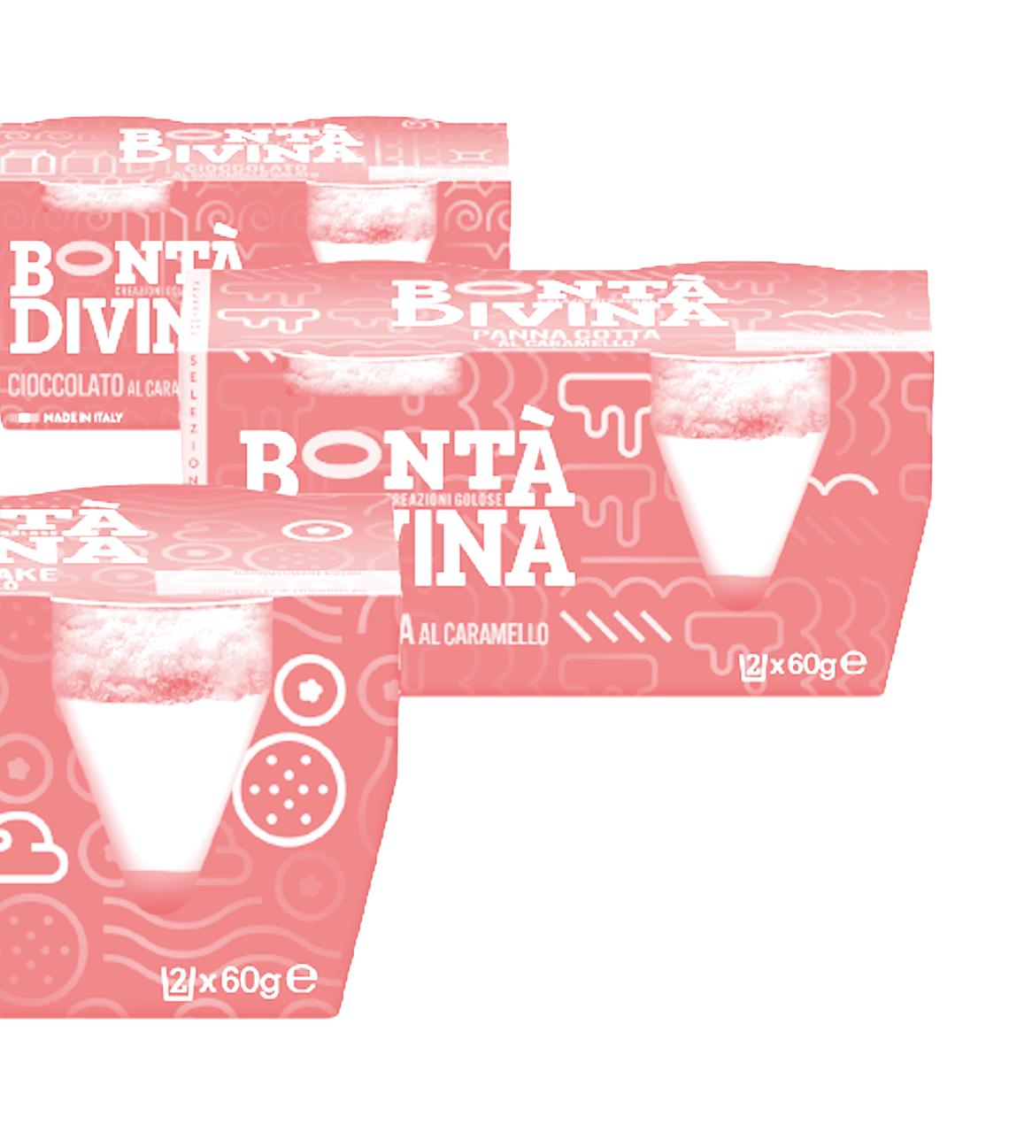
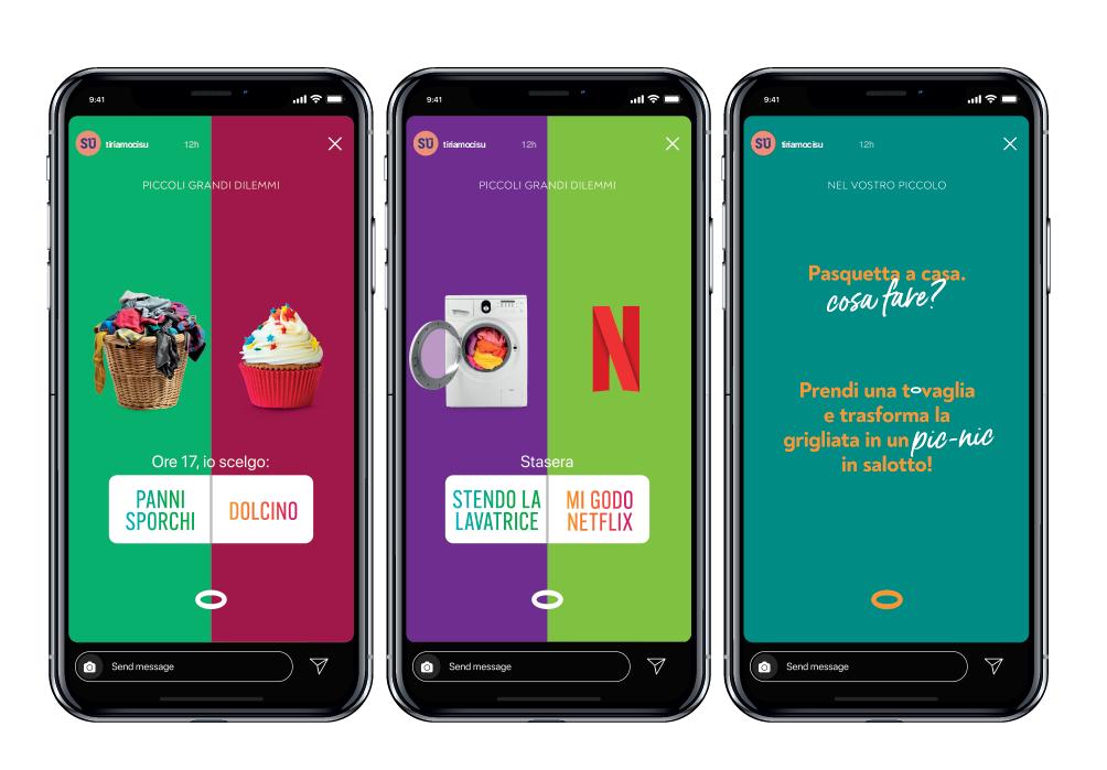
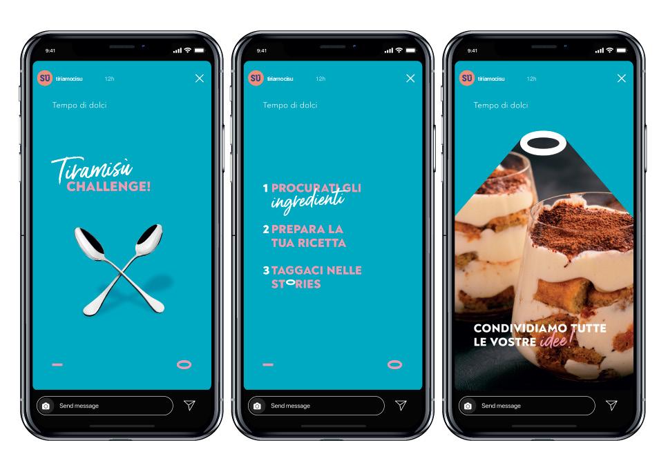
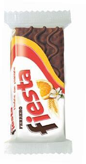
bontà divina
need
Bontà Divina is on the market since the 70s, but it’s not up to date and it’s clearly different from all other products on the shelf.
It needs a total restyling and positioning, to bring back such a powerful brand in 2020.
How can we improve the brand?
Digital strategy for a whole new brand Developed at
ONLINE WORKSHOP
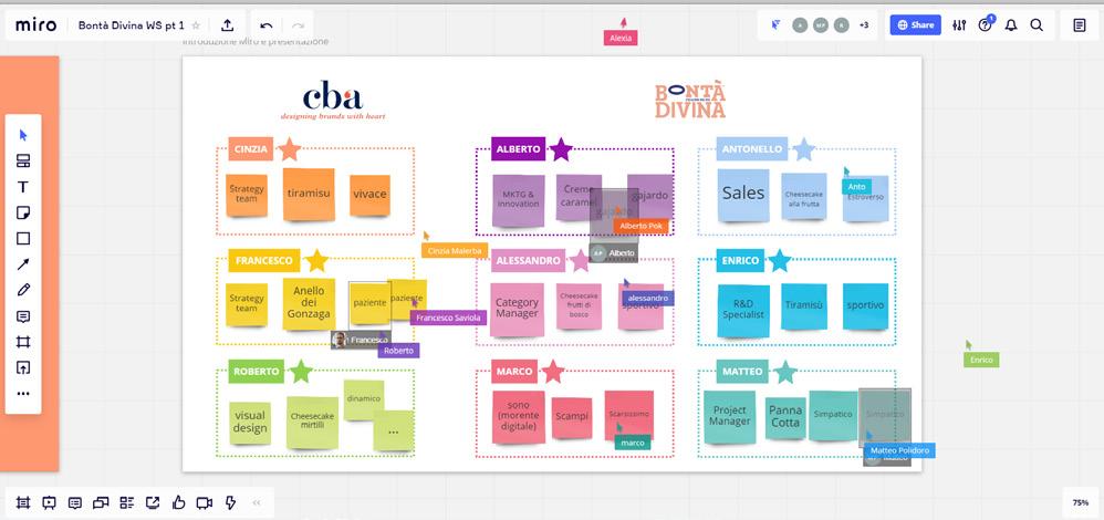
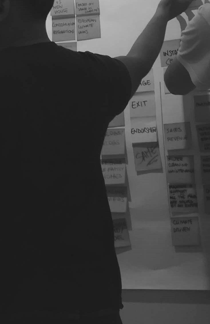
We organized a workshop with people from CBA and Bontà Divina, to brainstorm about the brand and its digital presence.
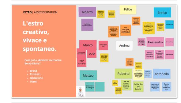
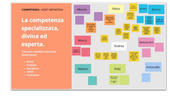
BRAND ASSETS
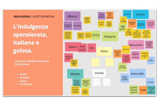
We made a brainstorming session on every key value of the brand platform, in order to find topics and stories the brand wants to tell.
We gathered useful informations about the company, the products, the user’s needs, the inspiring things behind the production phases.
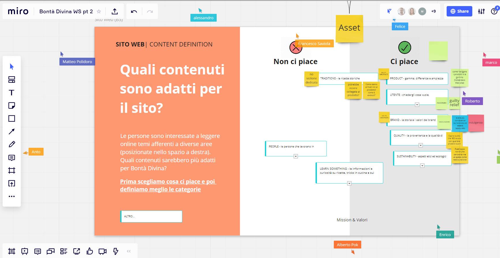
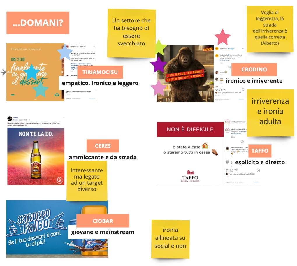
TONE OF VOICE
How Bontà Divina will communicate in the future?
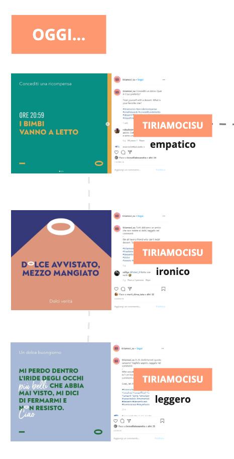
Experimenting with a more irreverent and pungent TOV Bontà Divina wants to innovate itself, to freshen up in a substantial way the target market with an incisive TOV.
online workshop.
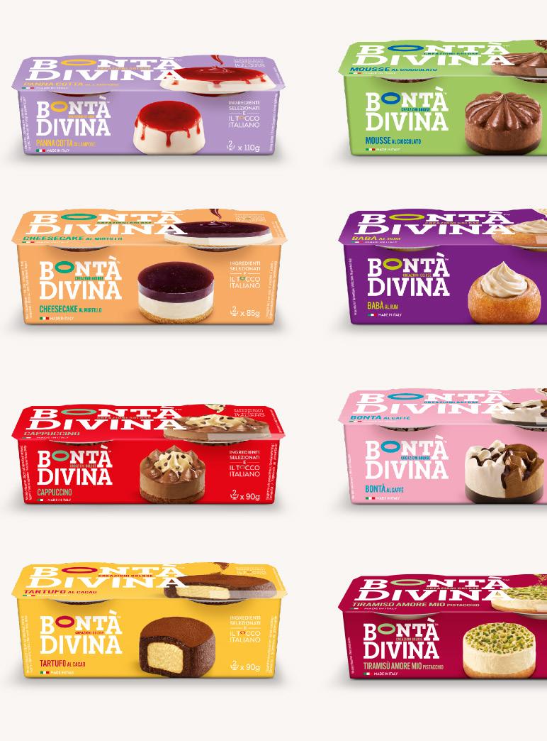
PACKAGING and COMMUNICATION
A total new visual identity was designed.
The divine element can be seen in the logo itself (the O it’s actually a halo).
New, young and fresh colours were introduced, as well as a new way of communicating.
final product.
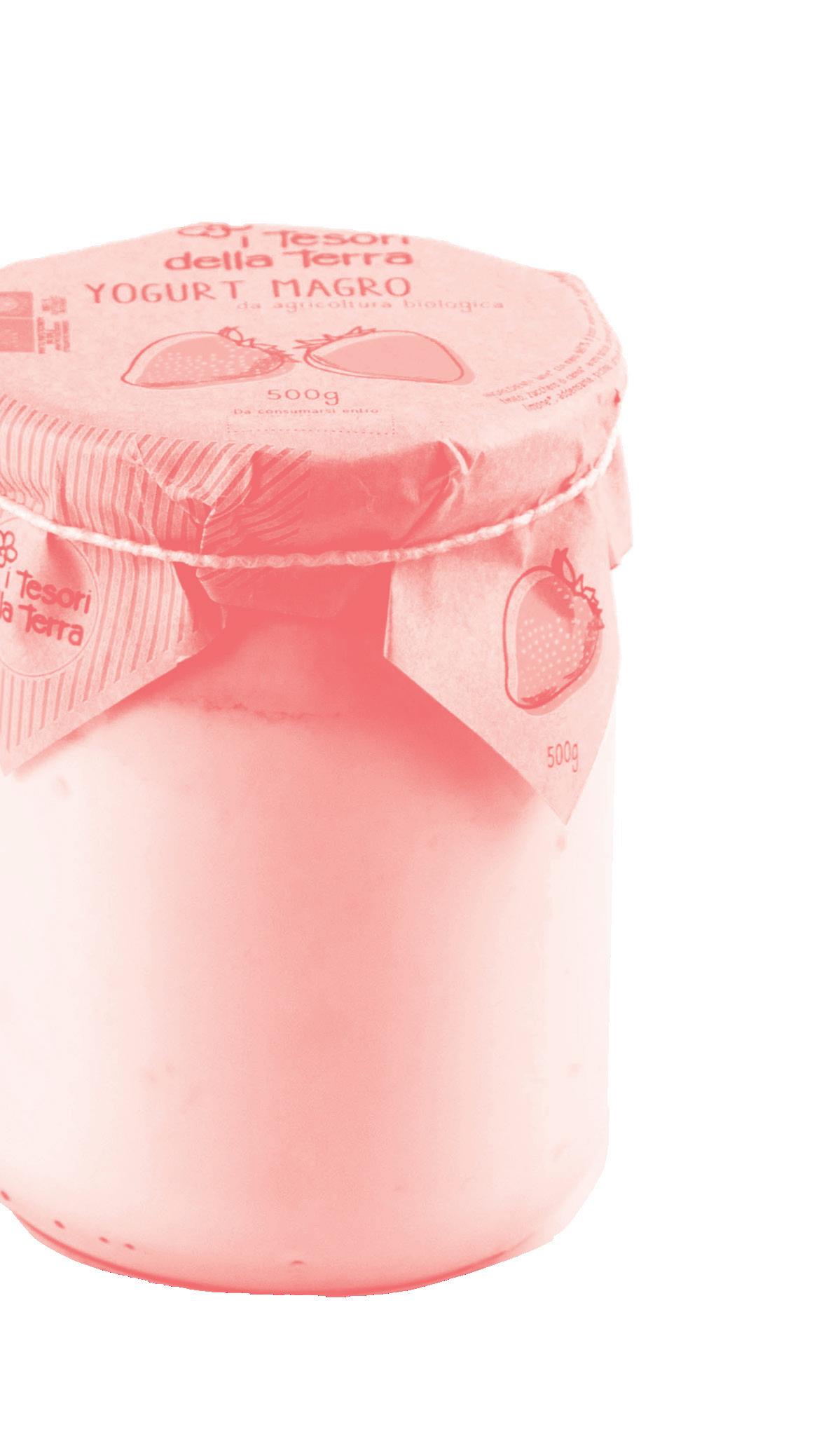
i tesori della terra
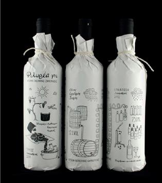
Sustainable packaging redesign and brand strategy
problem
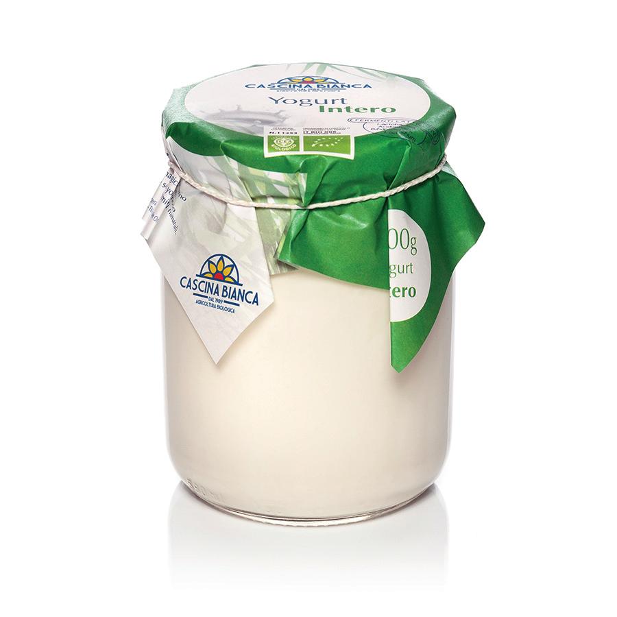
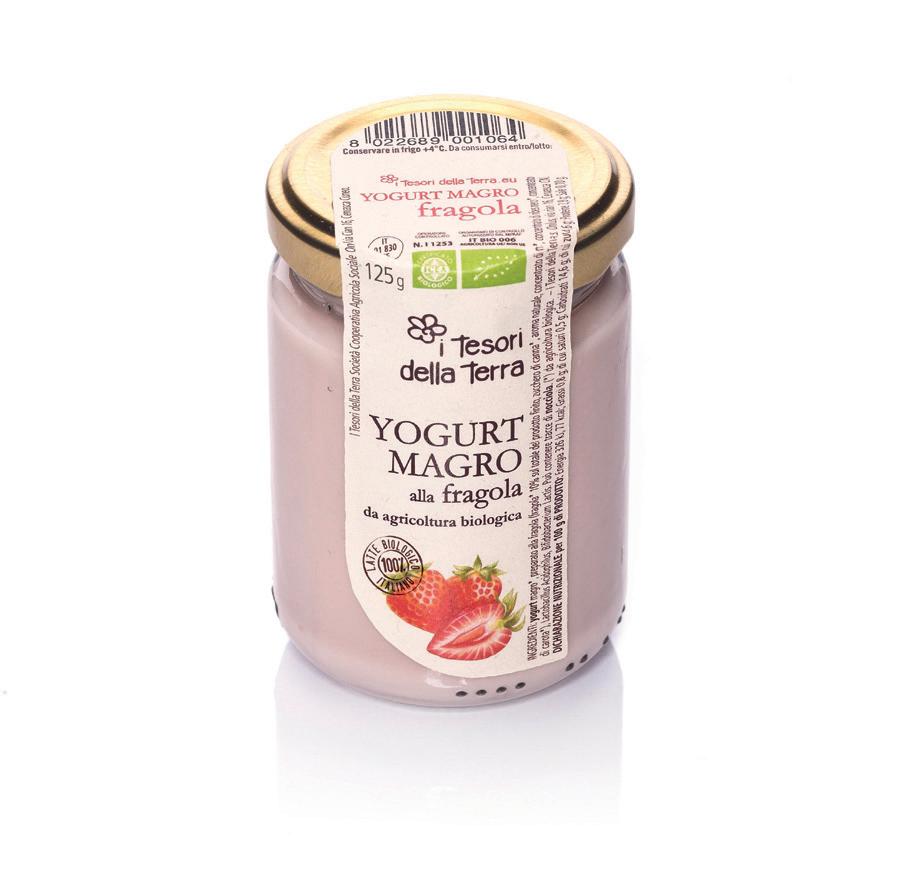
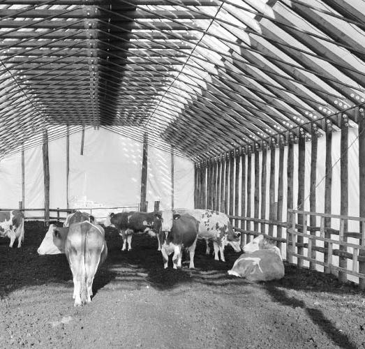
Cooperativa Agricola e Sociale I Tesori della Terra produces and sells biological products, especially yogurt.
Their packaging and communication although is not promoting all the values of the company.
How can we improve this?
THE STARTING POINT
CLUSTER
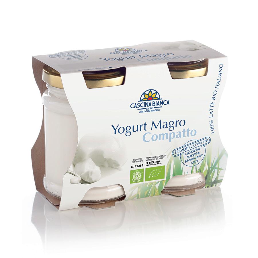
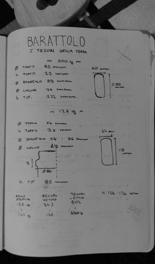
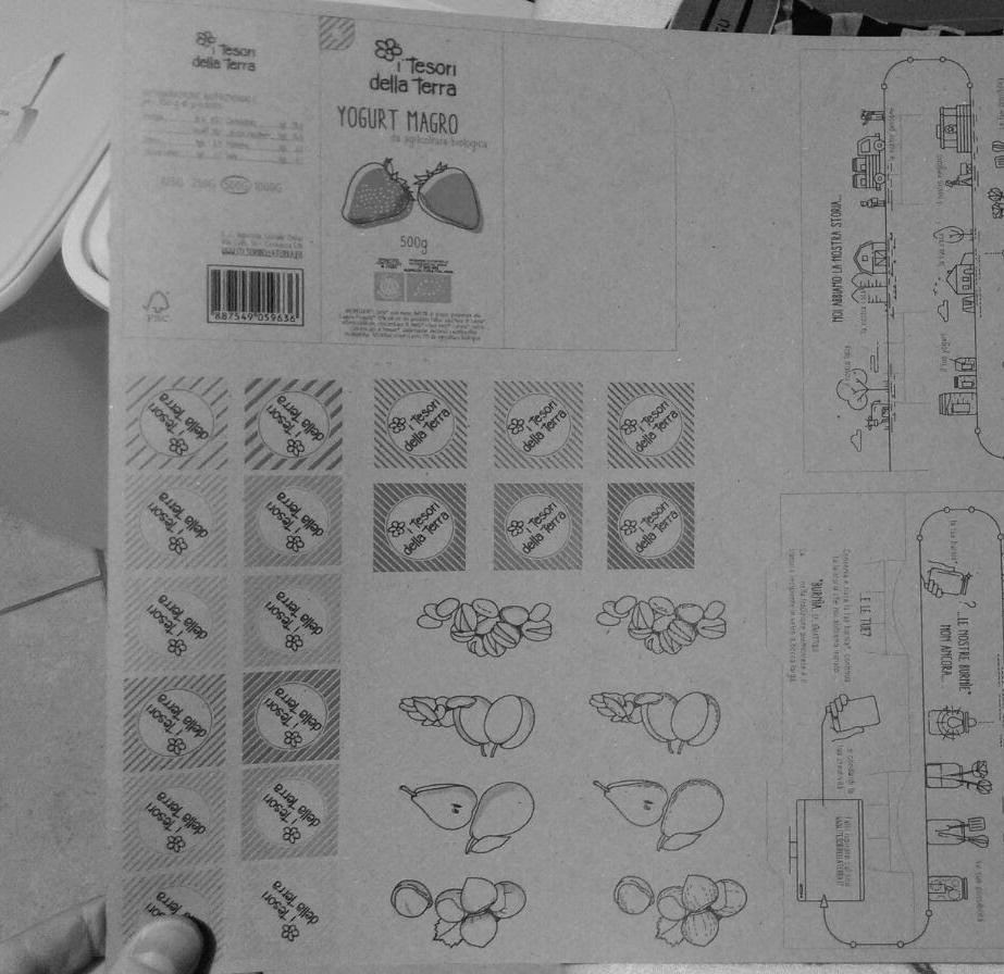
In cartoncino, ≈ 112 x 288 mm
RACCONTO persone
RACCONTO stile
RIVESTIMENTO
STAKEHOLDERS AND BRAND ECOSYSTEM
RACCONTO tecnica
RACCONTO luogo
Sfruttare la carta wrap per trasmettere ideali e valori di prodotto e produttore.
Adottare una comunicazione immediata leggibile e visivamente impattante.
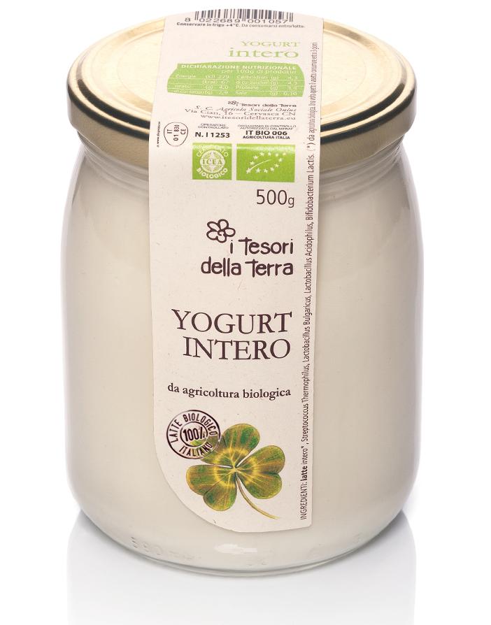
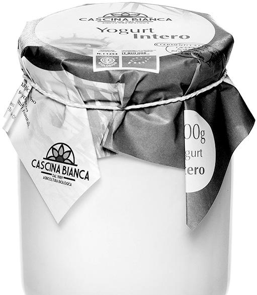
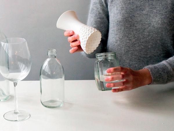
In vetro, 500g e 1000g
BICCHIERI
COLLAGE
VASI
Indagare le classiche tecniche decorative che sfruttano carta e cartoncino.
Sfruttare la stampa 3D per realizzare componenti implementabili all’ogetto riutilizzato.
Lavorazioni più accessibili anche con poca manualità.
Dare accesso ad un sito web con contenuti scaricabili e realizzabili.
CANDELE
LAMPADE
SOSTENIBILITÀ
RESPONSABILIT À
CONDIVISIONE
Introdurre componenti supplementari, essenziali per un riuso in ambiti alternativi.
Mantenere il pack essenziale adattabile a di erenti ambiti e esigenze.
CONTENITORI bagno
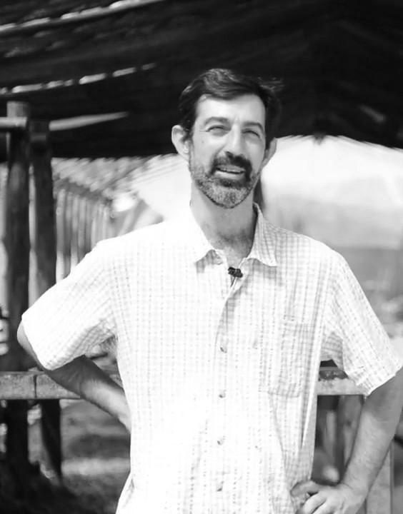
First, we interviewed the stakeholders and the people working with Fabrizio Oggero, the boss of the company. We understood the brand ecosystem, the products and how the communication is organized inside the company.
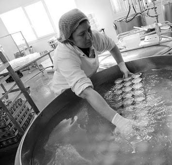

brand research.
I bambini, di qualunque età, sono soggetti creativi e desiderosi di conoscere.
HOW THE YOGURT IS CONSUMED BY THE USER? | survey THE USERS
Il creativo è un soggetto che svolge lavori artistici o di DIY, raramente è un professionista in questo settore.
THE DIY MOM
THE ARTSY KID THE FABLAB MAKER
Il maker è un’evoluzione tecnologica del tradizionale mondo artigianale.
Hanno una strumentazione estremamente limitata, anche per la loro sicurezza personale, solitamente hanno a disposizione pochi e basilari attrezzi, non sempre di buona qualità.
Non hanno bisogno di ispirazione o di modelli da imitare, poichè la loro creatività li spinge a creare senza confini.
Ha una strumentazione limitata, basata sui comuni attrezzi per il fai da te, per il bricolage o per piccoli lavori manuali.
Ha abilità convenzionali, riguardanti lavorazione di metalli o legno, ma anche interessi nel campo ingegneristico, elettronico, stampa 3D e dispositivi a controllo numerico.
Il riuso è svolto quasi inconsapevolmente, sia a casa che a scuola, come attività ludica e ricreativa.
Spesso ricerca ispirazione dal web o dai social Network, prova ad imitare i progetti che più gli piacciono adattandoli alle proprie esigenze e alla propria vita.
Ha tendenzialmente una base scolastica/universitaria riguardante il mondo della progettazione e dell’autoproduzione, oppure ha sviluppato queste abilità nel corso degli anni.
Svolge essenzialmente progetti di riuso nel tempo libero, come hobby e passatempo, per ottenere soddisfazioni personali e per decorare casa.
Tutti
Nessuno
I progetti di riuso sono svolti con un’attenta progettazione, alcune volte possono essere pensati per la vendita in serie limitate.
Un membro
Due membri
Tre o più membri
MANUAL
CREATIVITY TOOLS
SKILLS
CONSUMO IN FAMIGLIA 15% 36% 15% 5% 29%
FORMATI ACQUISTATI 4%
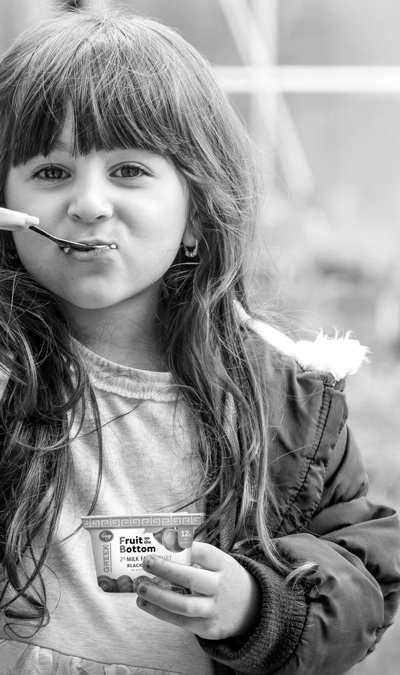
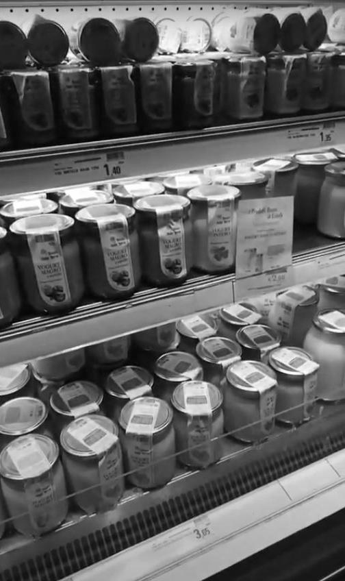
We then interviewed the final users. We managed to talk with almost 200 people, thank to 1:1 interview, phone calls, mystery shopping at the local supermarkets and online surveys.
primary research.
We discovered that we needed a more simple, rustic and traditional communication, keeping the feasibility for the company as high as possible.
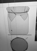
ideation and development.
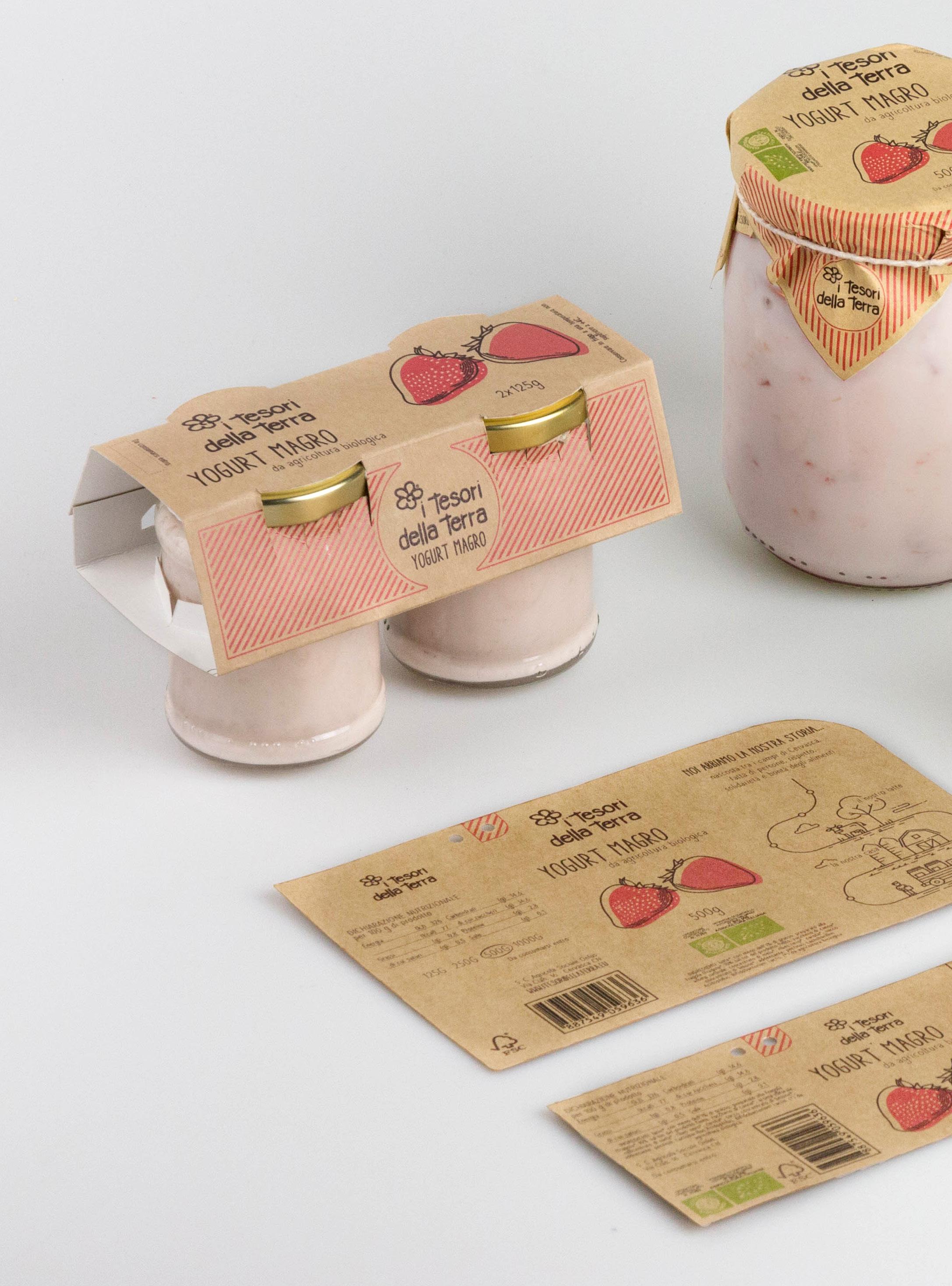
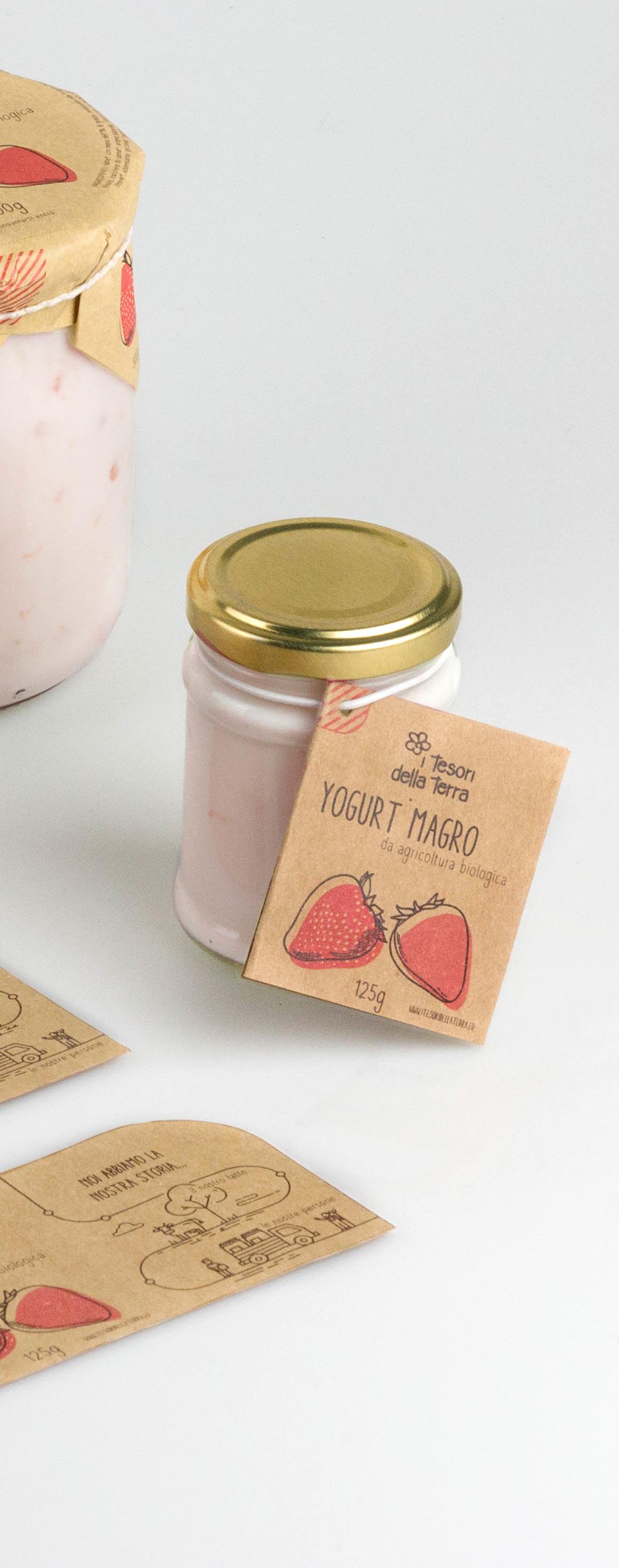
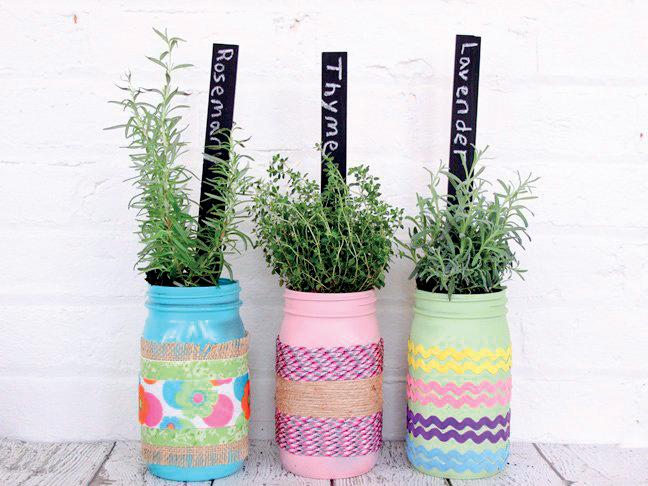
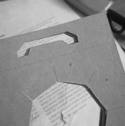
The packaging has three different formats: the wrap paper, the tag (in two different dimensions), and the cluster.
Each of these is made with the same Kraft Paper, with the same texture, and has all the information needed, adapted to all the different supports.
product.
final
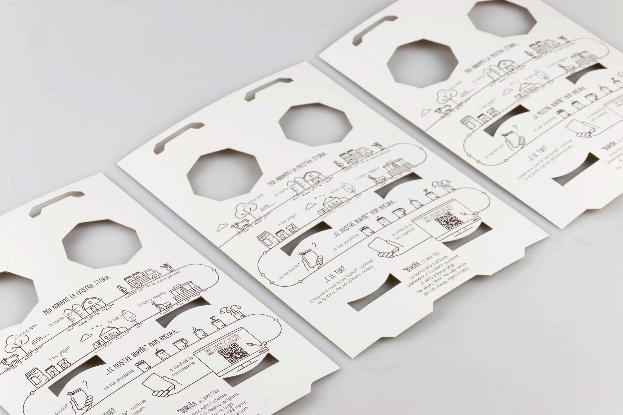
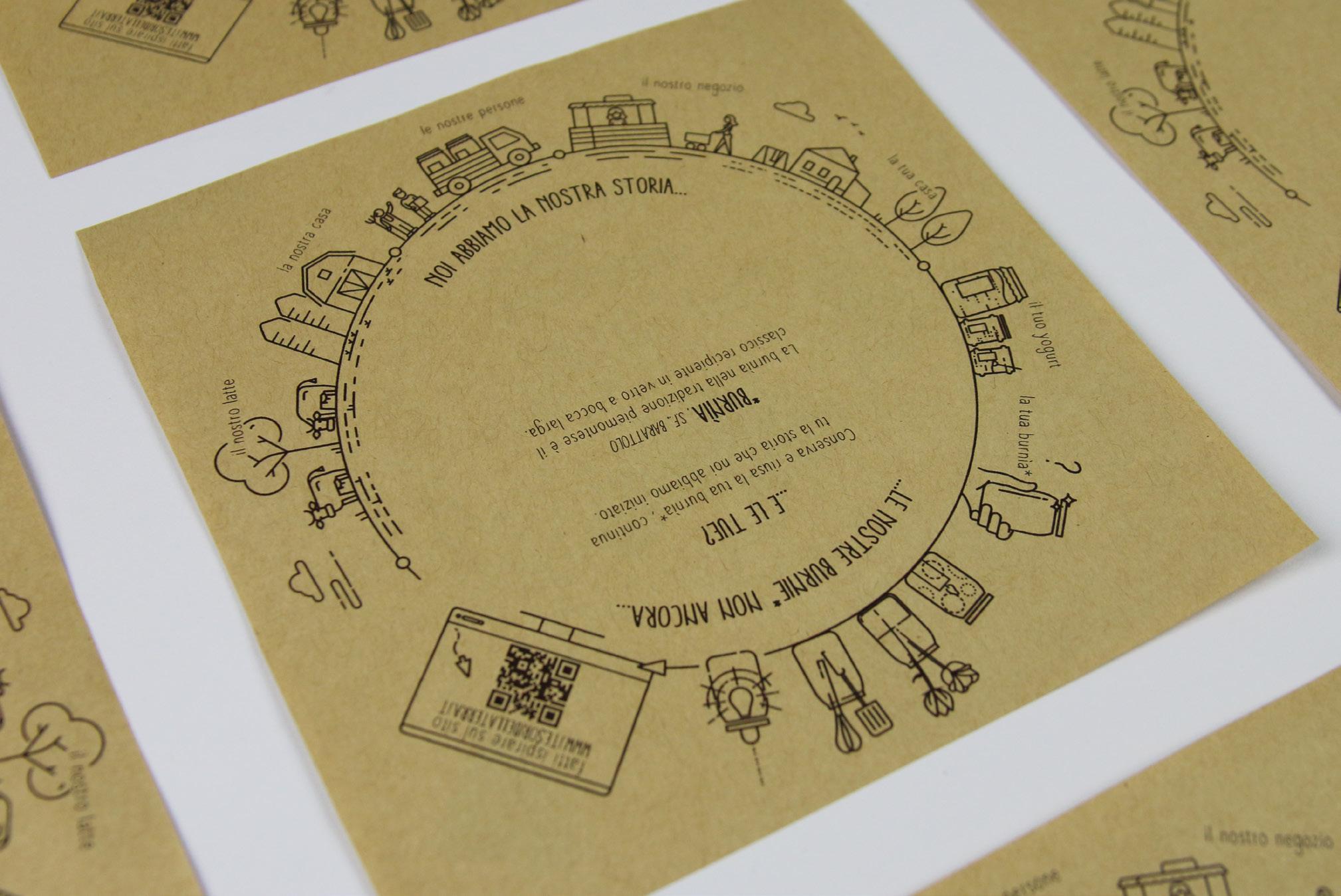
NOI ABBIAMO LA NOSTRA STORIA...
il nostro latte
la nostra casa i
le nostre persone
la tua casa
il tuo yogurt
fatti ispirare sul sito www.itesoridellaterra.it
...LE NOSTRE BURNìE* NON ANCORA
il nostro negozio
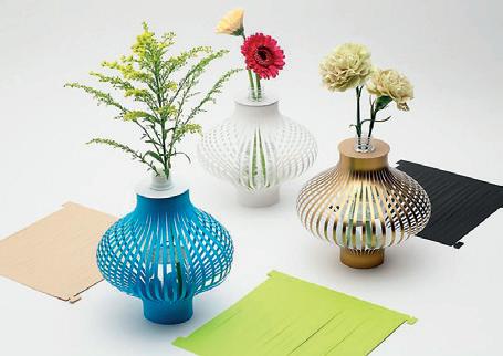
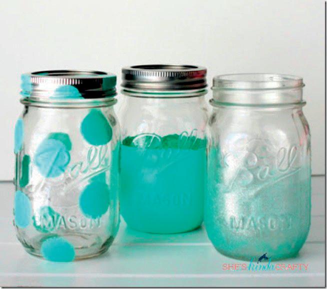
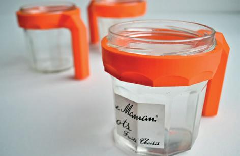
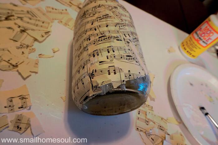
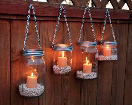
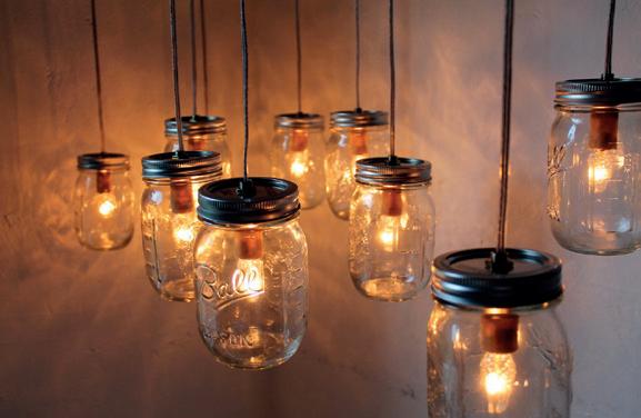
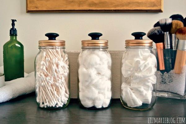
On the inside of every packaging we can also find a story about the life of the product itself: from production to the end user and the possibility to
upcycle the glass jar.
Thank to a QR code the user can find the website with different ideas for a DIY upcycle.
?
midea surround
Brand strategy and portfolio expansion
problem
Midea is a Chinese electrical appliance manufacturer, specialized in air treatment products. A couple of years ago they decided to expand their market in Europe, but it wasn’t a successful start.
How can we help a chinese brand?
Developed at

USERS AND INSTALLER
COMFORT SEEKER
“We trust the brand we choose”

MONOBRAND
SEEKER
COMFORT
PRICE (SERVICE) SPEED (SERVICE) INFORMATION CUSTOMER CARE WARM ADVISOR easy needy health cautious picky shopper showy manager ENTECHPRENEUR ONE SHOT 2. CONTACT 3. VALIDATIONS 5. INSTALLATION 6. AFTER SALE 8. ENDORSEMENT
AWARENESS € €
1.
DISLOYAL (BRAND)
I LEARN I THINK
NEED I WANT
CONSERVATIVE MULTIBRAND LOYAL (BRAND) NOVELTIES
I
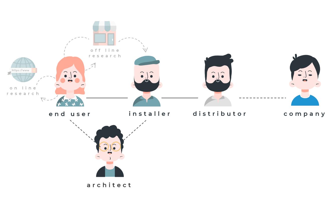
PURCHASE CHAIN
Italy and China has very different purchase chains. In Italy, but also Europe, the key actor is the installer. He is not only someone with technical expertise, but he can also be a trend setter. He is the one who will suggest you the best product, will install it, and will come the next years for the maintainence.
research.
PROBLEMS
ONE WAY COMMUNICATION
HIDING THE PRODUCT
On the other hand, we tried to solve the main problems that the users have with their regular ACs: cold balde of air, lack of feedback and communication within user and machine and no different air settings. user needs.
NEEDS
35% of your DAY activities
SLEEP REST RELAX air need SOFT
bedroom living room
20% of your DAY activities
FITNESS
RELAX WORK air need from STRONG to SOFT
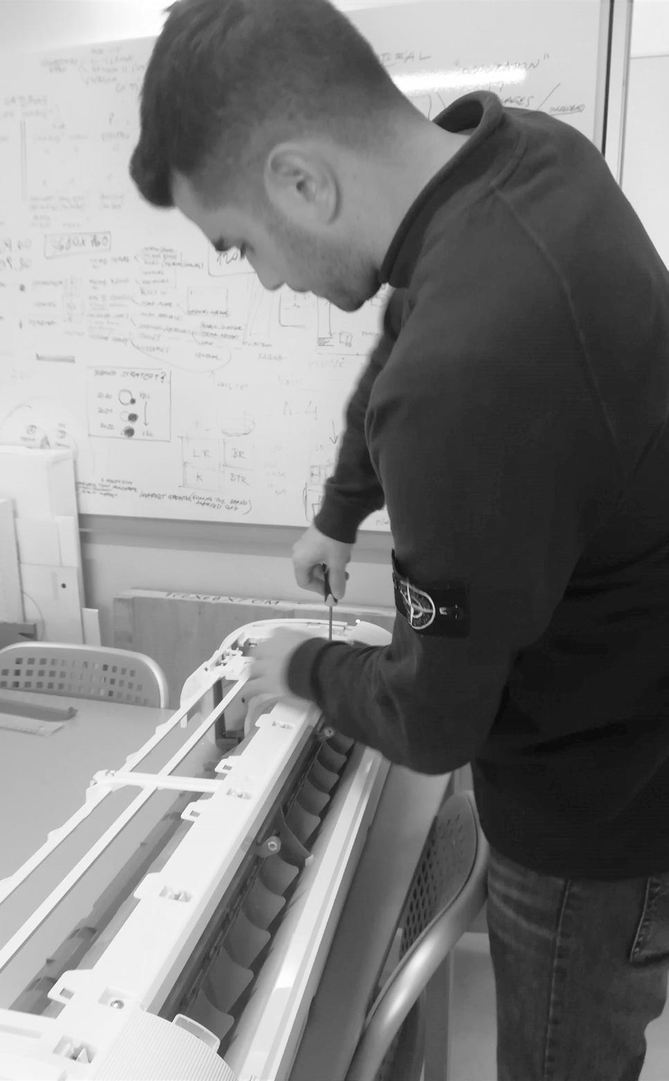
We studied existing products to understand the technical details and the technology used in similar products. We had to develop a
new product for the european market, without interfering with the tecnical know how of the chinese manufacturers.
study and development.
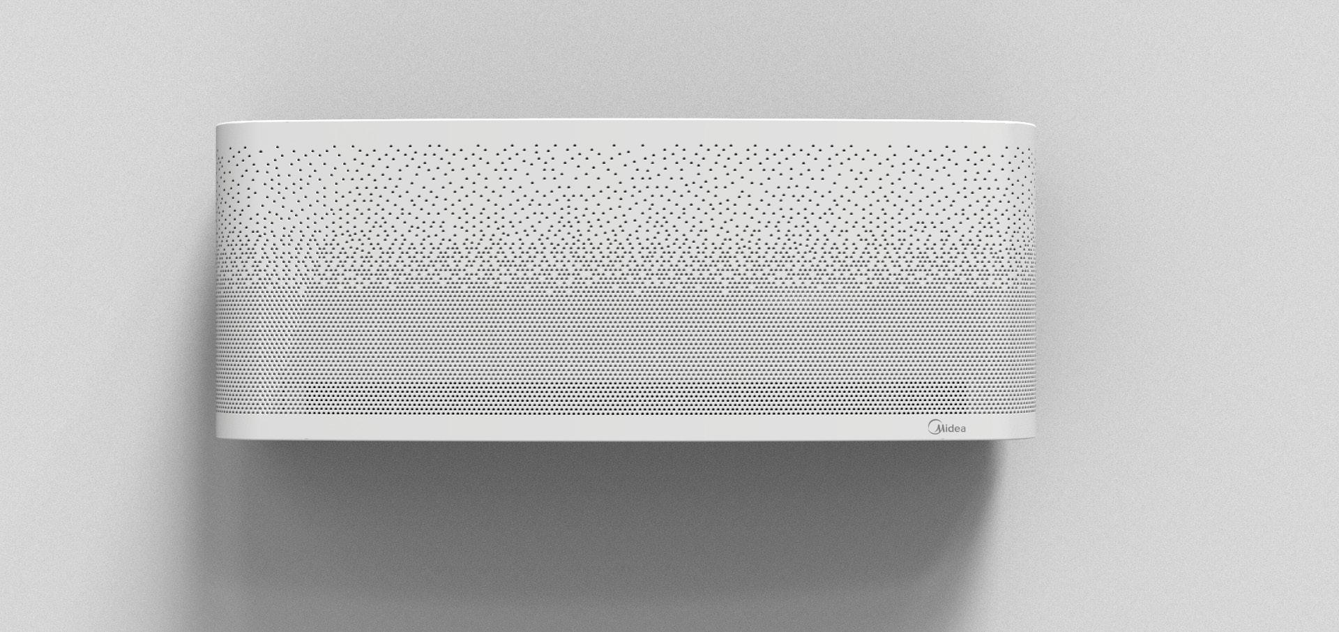
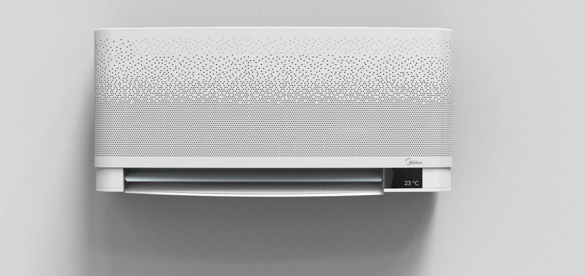
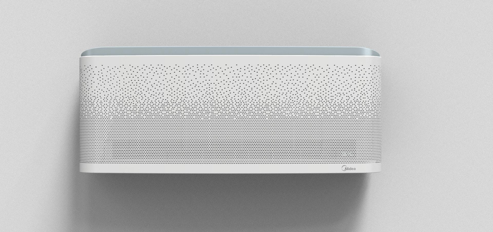

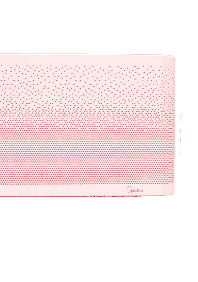
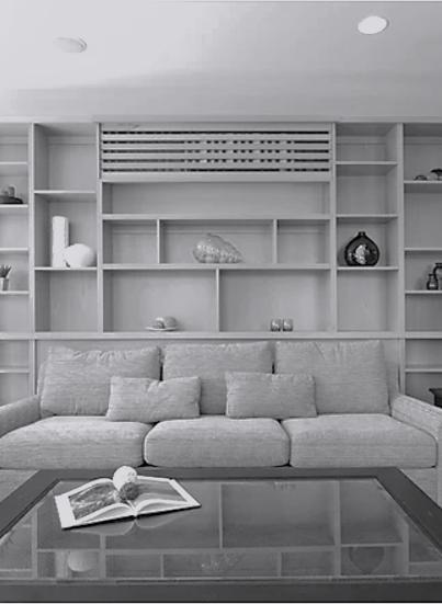
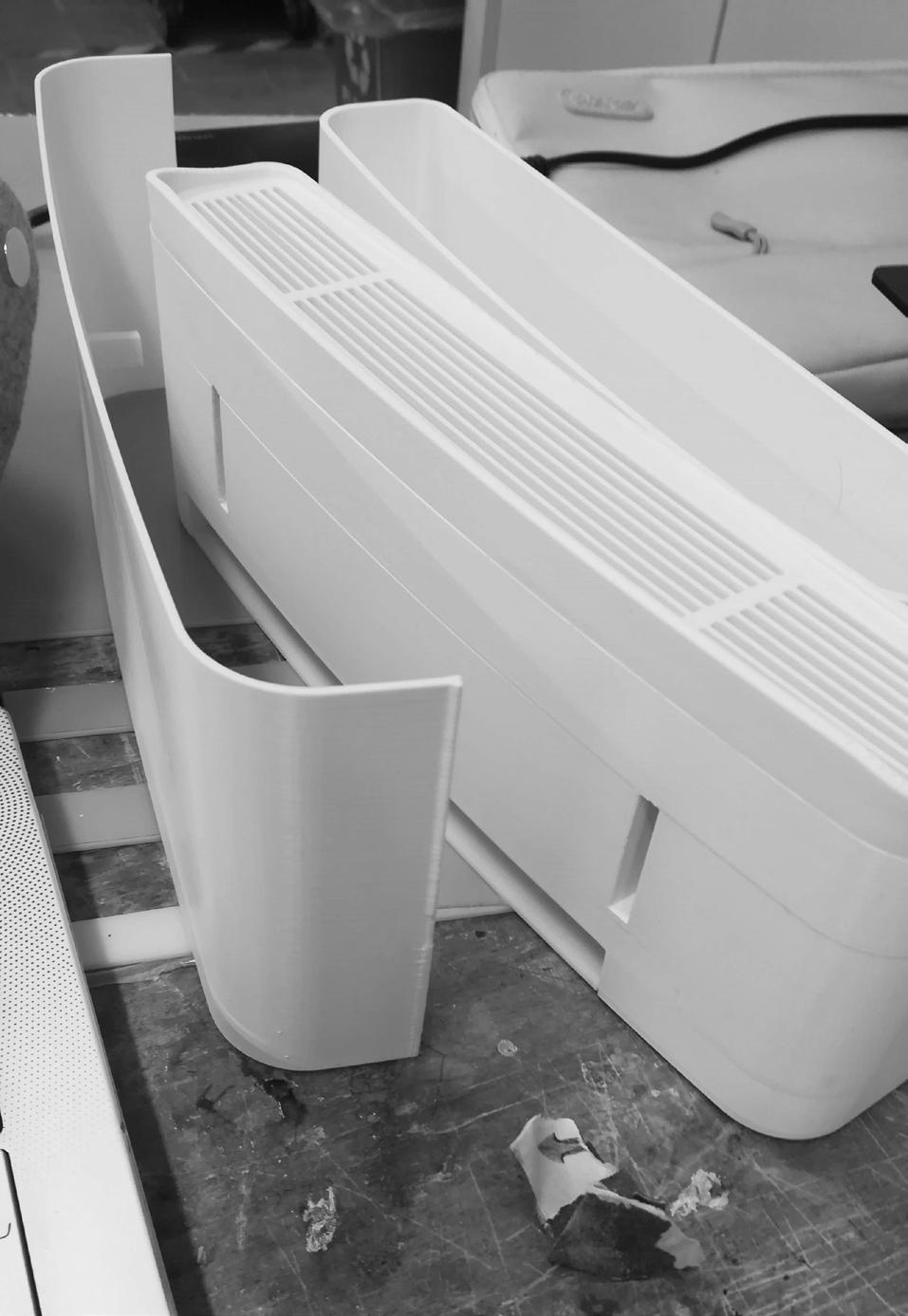
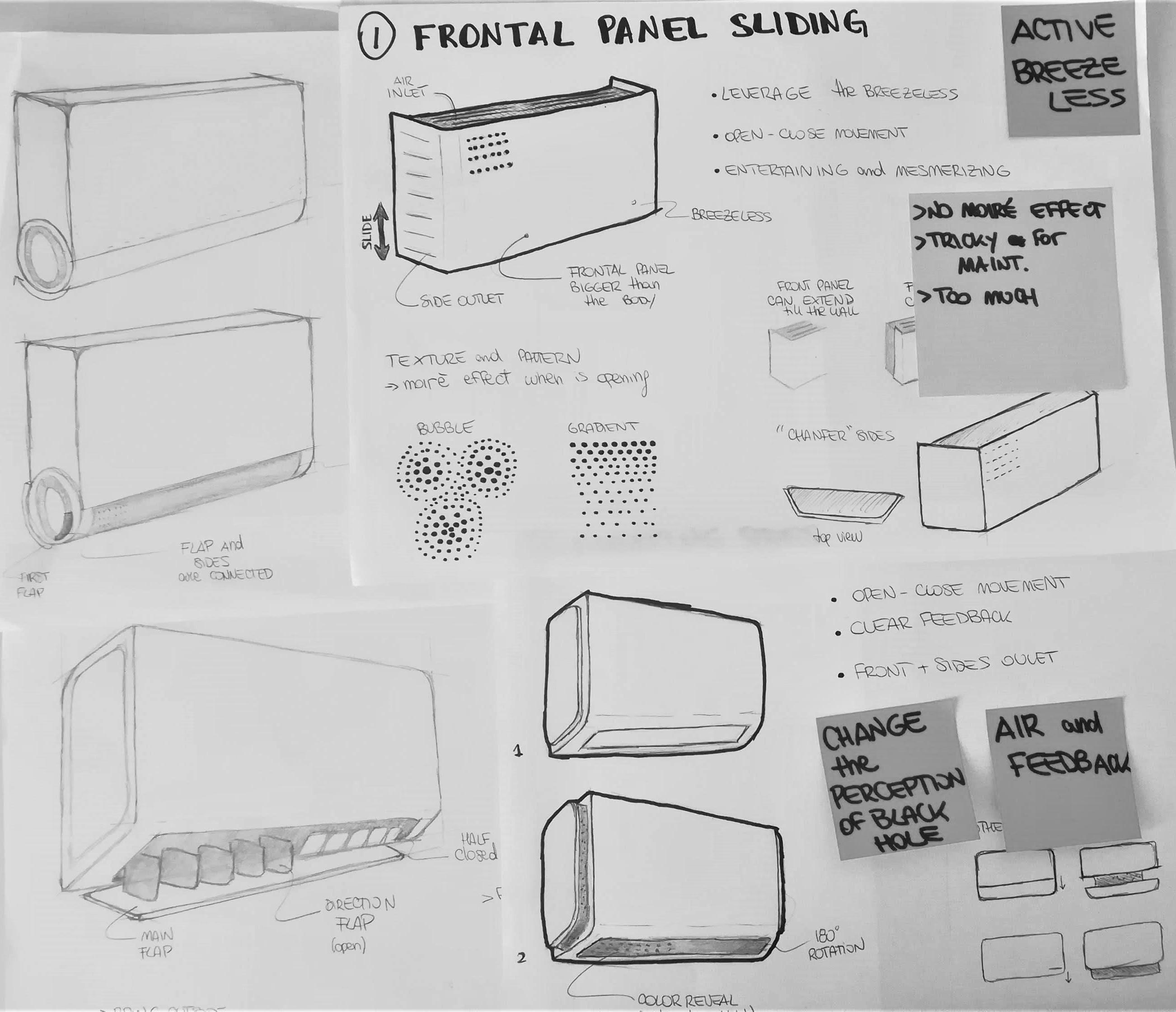
Midea Surround has been designed to satisfy different air needs.
When it’s off, a frontal panel surrounds the entire body of the AC, giving a clean and elegant aspect.
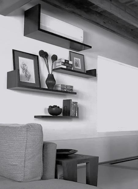
When the AC is turned on, the panel slides up, unveiling the main frontal outlet. We can observe two flaps: the internal one is greysh with a cold light
blu undertone, that tells you the air is coming out from that part.
In breezeless mode the panel slides completely down, unveiling the top part. This curve has the same colour of the internal flap and, with a total analog feedback, tells you that your AC is in breezeless mode, and not off.
final product.
forno bonomi
A new brand strategy
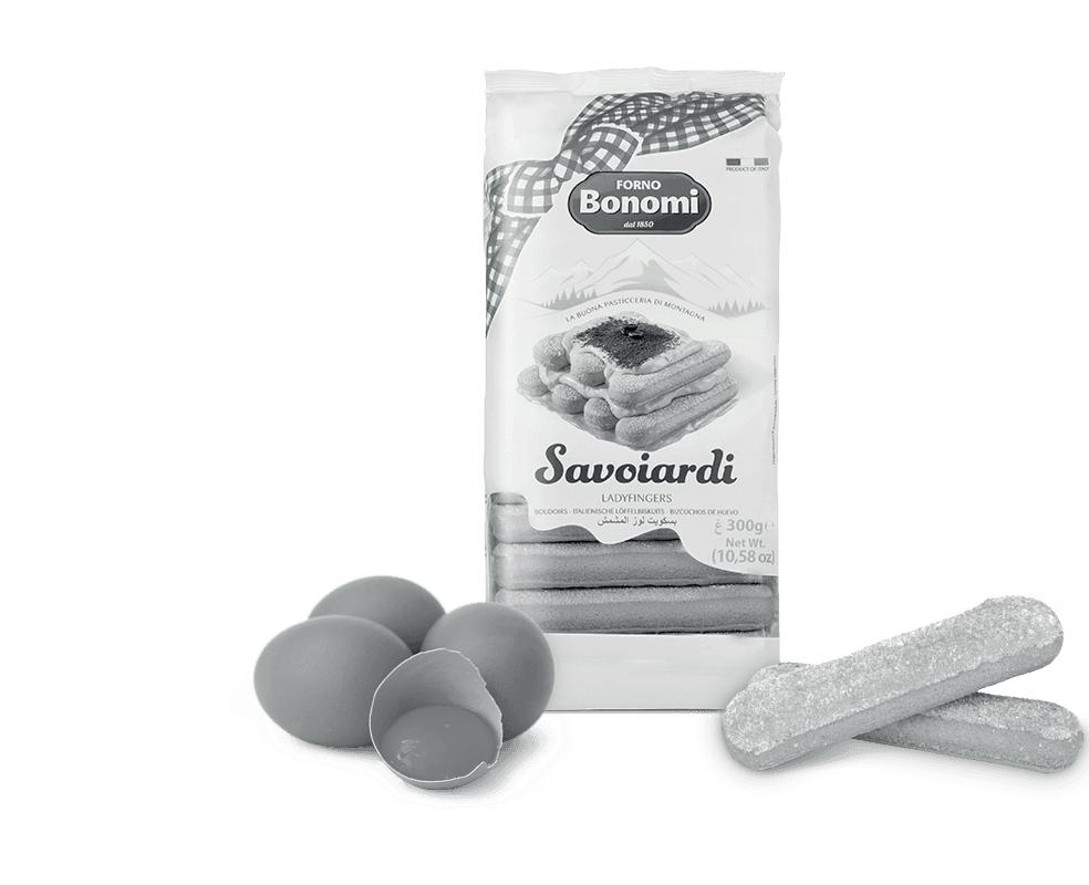
Forno Bonomi is an historic brand from Verona. They are specialized in typical italian desserts and biscuits, such as savoiardi. They are really well known locally, but they are aiming to expand their business.
How can we help the brand?
Developed at need
1:1 INTERVIEWS
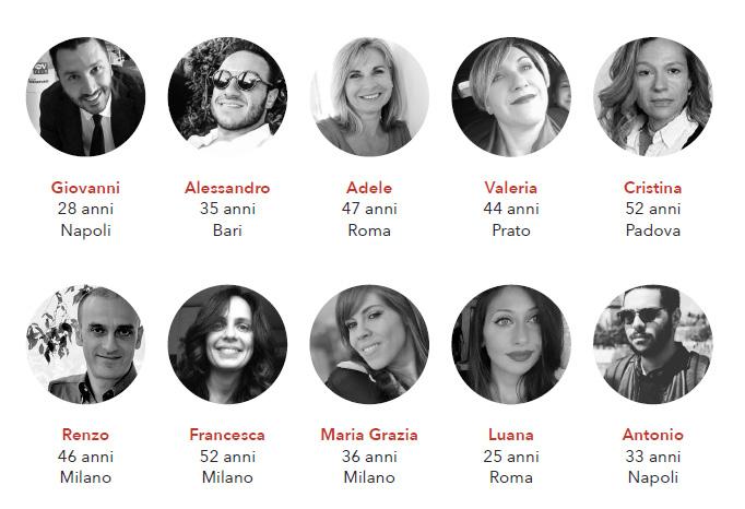
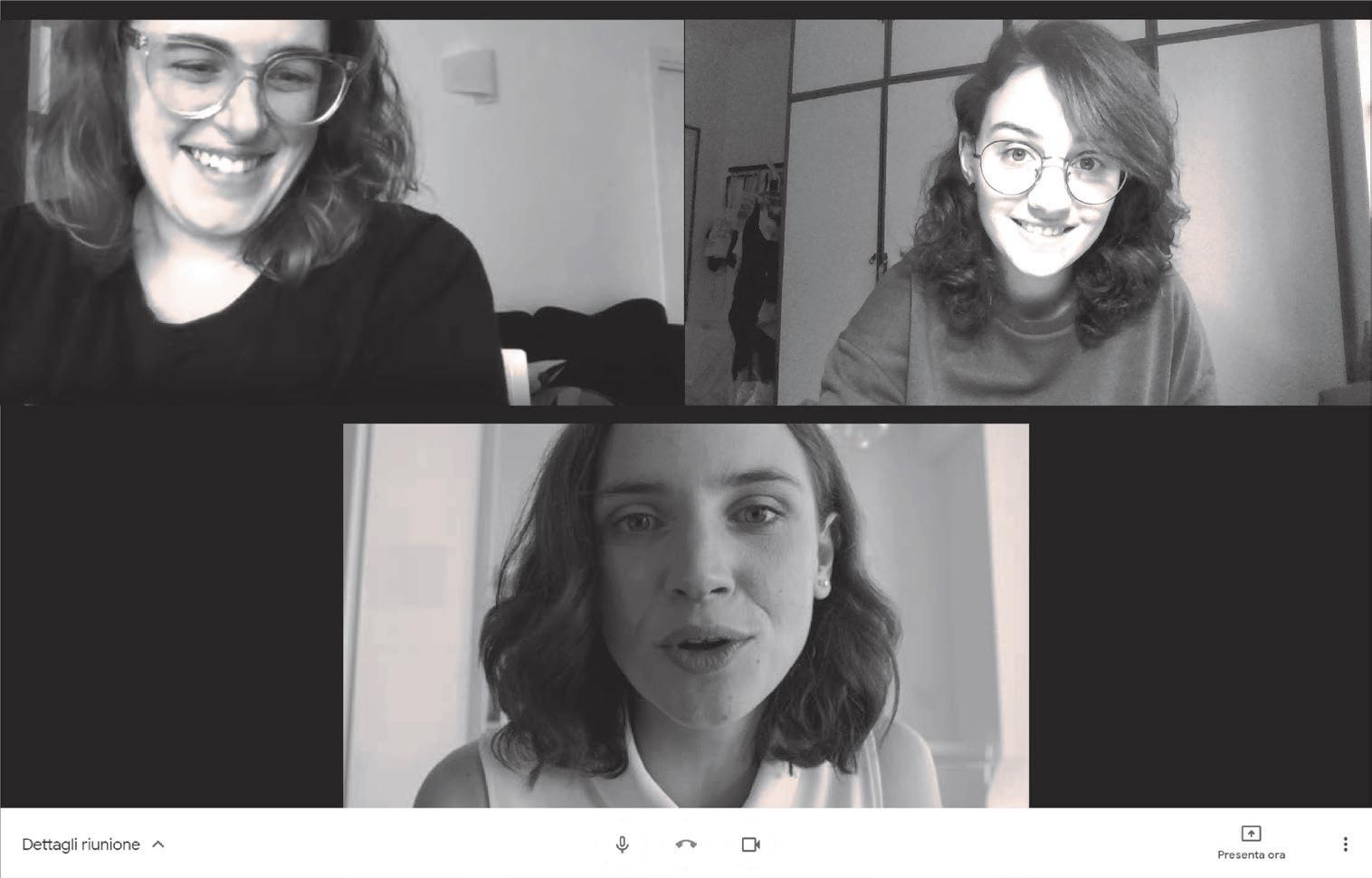
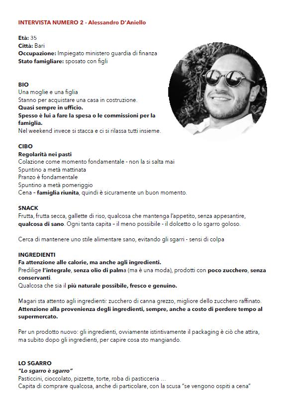
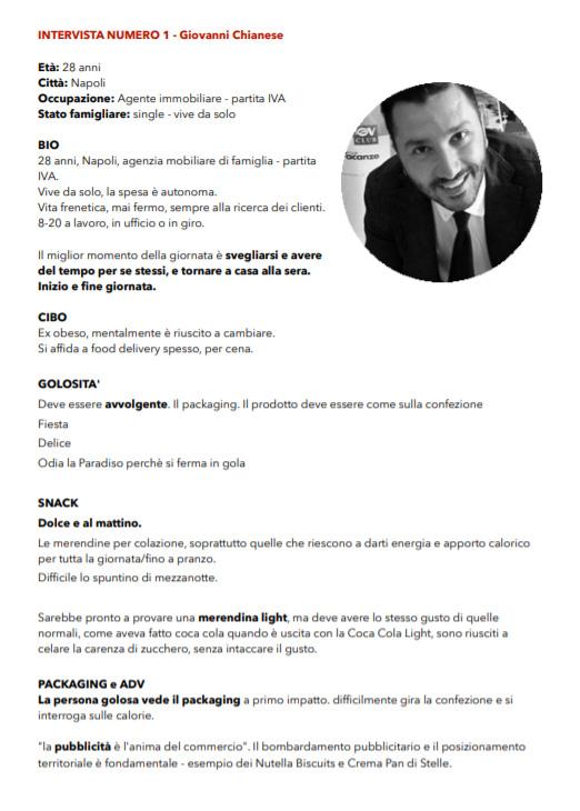
We interviewed 10 people from different cities in Italy (North, Middle and South) and we asked them about their relationship with food and industrial desserts.
“il gusto autentico”
“il gusto per tutti i sensi”
“il gusto della semplicità”
IL GOLOSO SENZA COMPROMESSI
“Piccolo o grande che sia, quando mi concedo una coccola deve essere un’esplosione di gusto in bocca.”
- ANTONIO
The dessert as ...
HABIT
VARIETY FUNCTION EMOTION PERSONAL MOMENT SHARED MOMENT
The snack is ...
“il gusto senza sensi di colpa”
primary research.
TRADIZIONE
IL GUSTO AUTENTICO
IL GUSTO DELLA SEMPLICITÀ
FORNO BONOMI
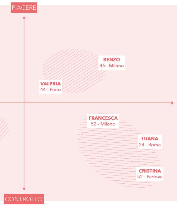
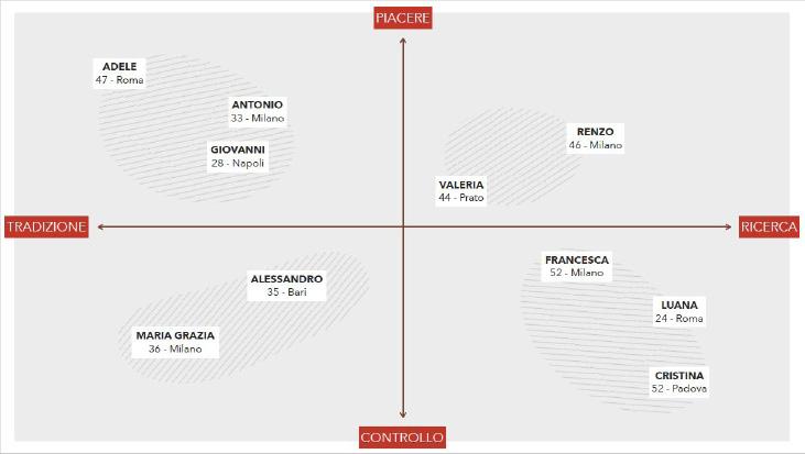
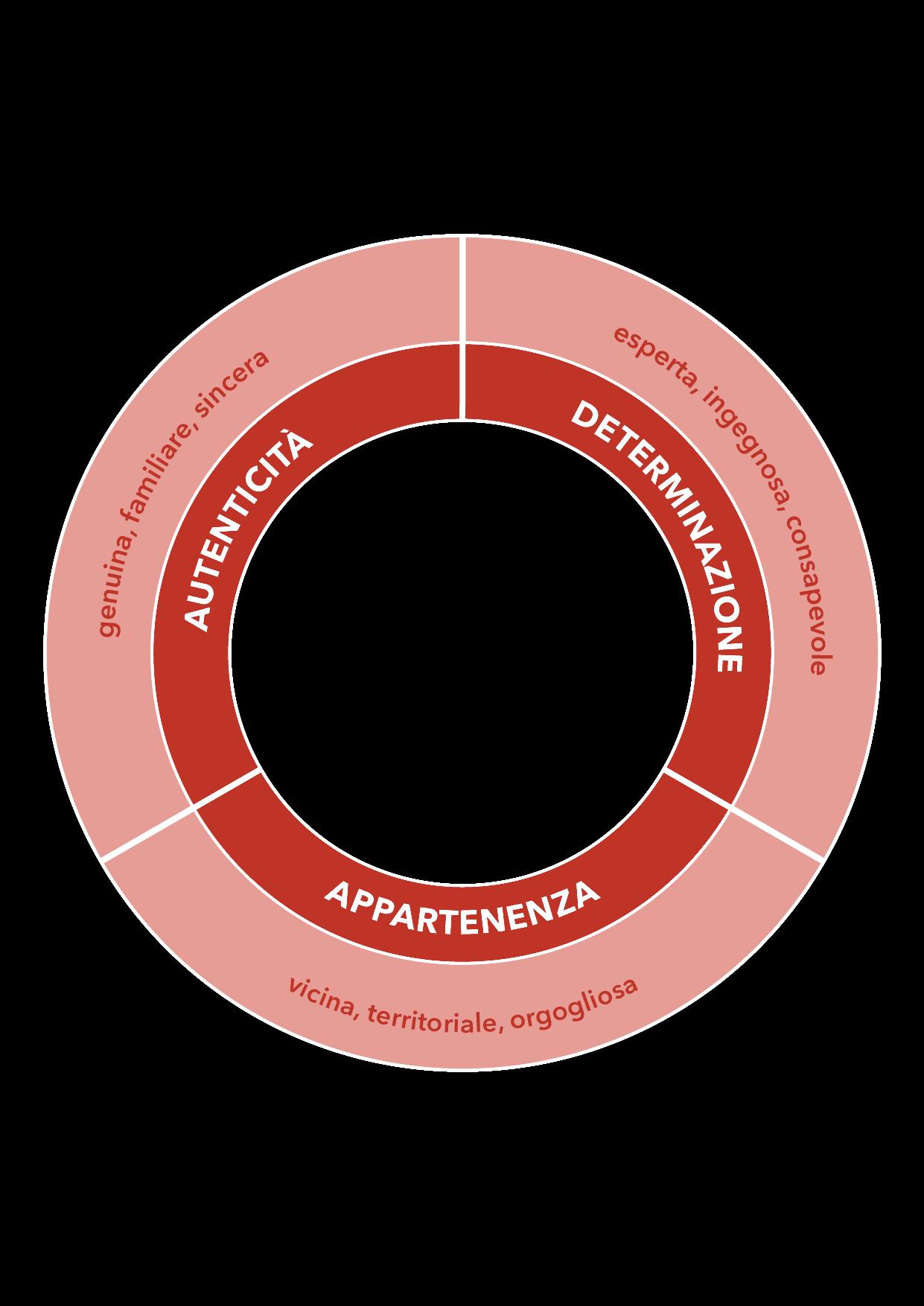
We discovered that Forno Bonomi main values are Authenticity, Determination and belonging. As a brand they should always express this points in every aspects of their communication.
NEW POSITIONING CONTROLLO PIACERE
RICERCA
VALUES
AUTENTICITÀ
Autenticità
Una marca genuina e sincera, dove tutto quello che si vede è esattamente così com’è Radici solide che affondano in una storia di famiglia, fatta di impegno e dedizione, che regalano lo slancio sicuro verso obiettivi sempre nuovi. Una marca che sa evolvere, restando sempre fedele a se stessa: buona fino in fondo e capace di regalare momenti golosi, pieni, indulgenti.
GENUINA
FAMIGLIARE
SINCERA
REASON TO BELIEVE
Una storia di famiglia, dal 1850, fondata su valori autentici come l’impegno, la fatica, la trasparenza la sincerità. Un’azienda che da sempre ha fatte delle sue origini un punto di forza, un valore da cui partire per raggiungere nuovi obiettivi.
DETERMINAZIONE
Determinazione
Fare le cose come si deve, senza prendere scorciatoie e senza scendere a compromessi, ricercando soluzioni nuove e funzionali, per garantire l’alto standard qualitativo di sempre. Una marca che sa mettersi in gioco, consapevole di chi è, di cosa fa e di cosa vuole diventare, forte di un metodo tramandato da generazioni.
ESPERTA
INGEGNOSA
CONSAPEVOLE
REASON TO BELIEVE
L’essere di montagna è un valore aggiunto e l’ attitudine di chi la vive è non solo modo d’essere, ma anche modo di fare le cose, con coraggio, ingegno e forza di volontà Queste qualità li hanno guidati fin dall’inizio della loro attività, dall’approccio alla filiera sino alla tecnologia: pasticceri e periti meccanici, capaci di trasformare le macchine per creare il prodotto esattamente come lo volevano
Far vivere la montagna, dando voce alle persone, al territorio e ai valori che li legano e li accomunano.
Forno Bonomi è simbolo di una realtà aziendale che non ha mai dimenticato le sue origini, radicate nel cuore della Lessinia. Ha sempre dedicato tempo ai suoi lavoratori, a tutti gli individui della comunità, ma anche al territorio stesso, facendolo conoscere e riscoprire in tutta Italia e nel mondo.
brand platform.
tequila clase azul
Luxury upcycling and brand strategy
problem
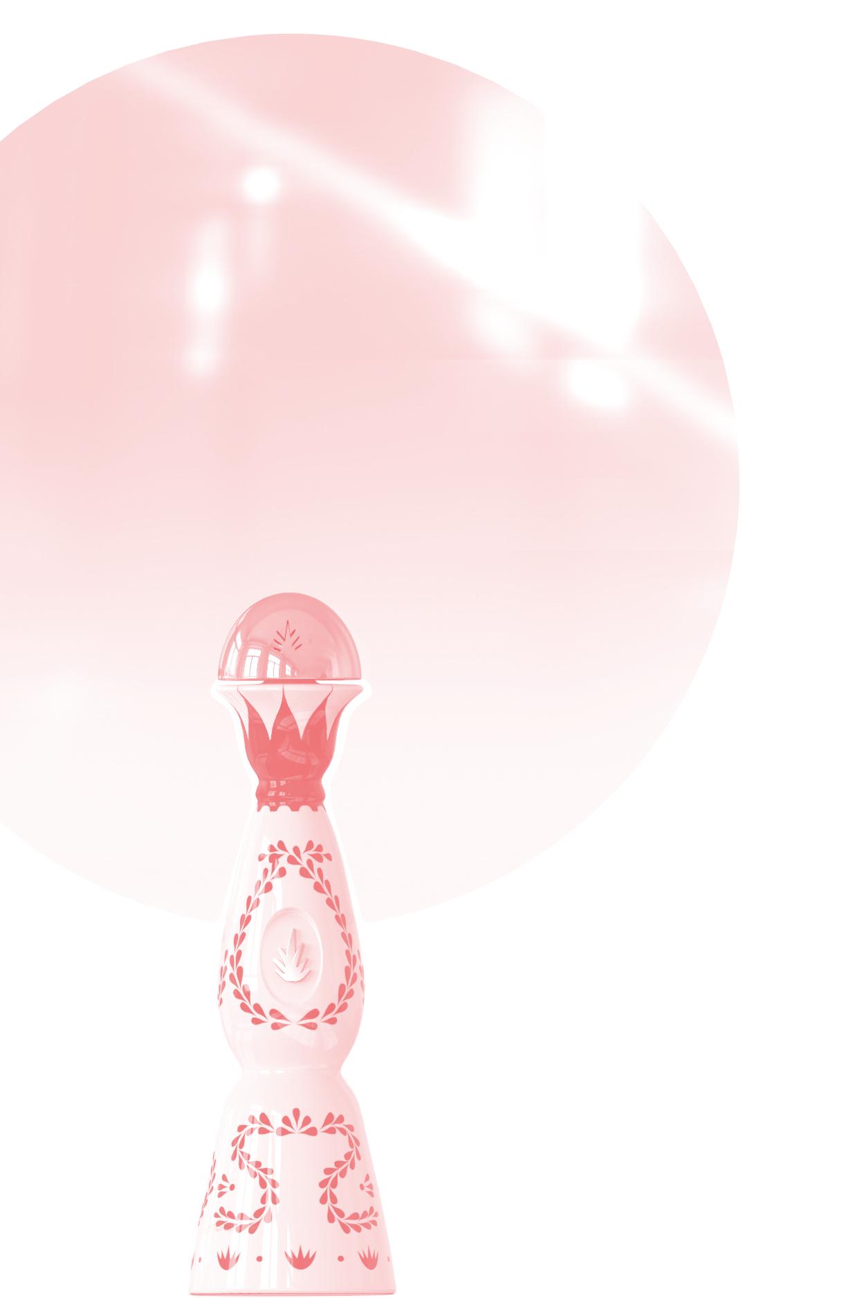
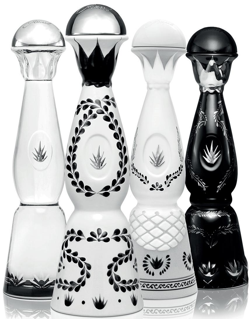
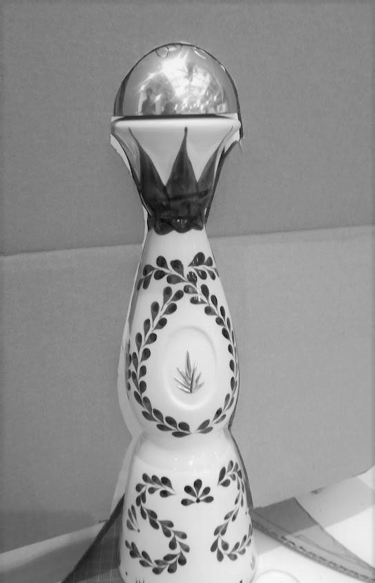
Tequila Clase Azul is a luxury tequila brand. Each bottle is handmade by several mexican artisans and is a unique piece of art. For this reason people tend to keep the bottles even when they are empty, without using it.
How can we give a second life to these bottles?
The typical user is someone who wants to reach for the luxury, but also has a “eco mindset”.
Knowing this, the best way to give a dignified second life to this beautiful pieces of art, is upcycling. Upcycling that needs to be as luxurious as the brand itself, so needs to be a collaboration whitin artists.
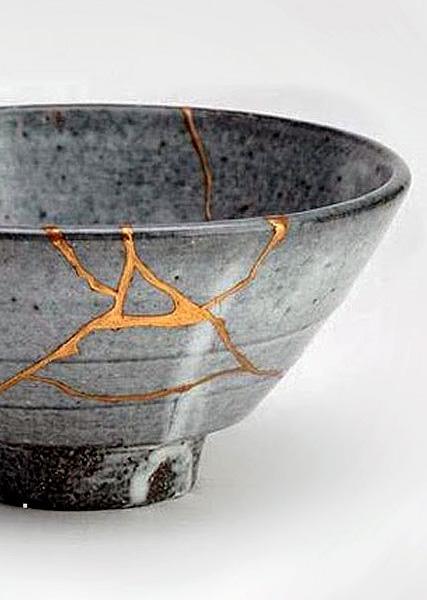
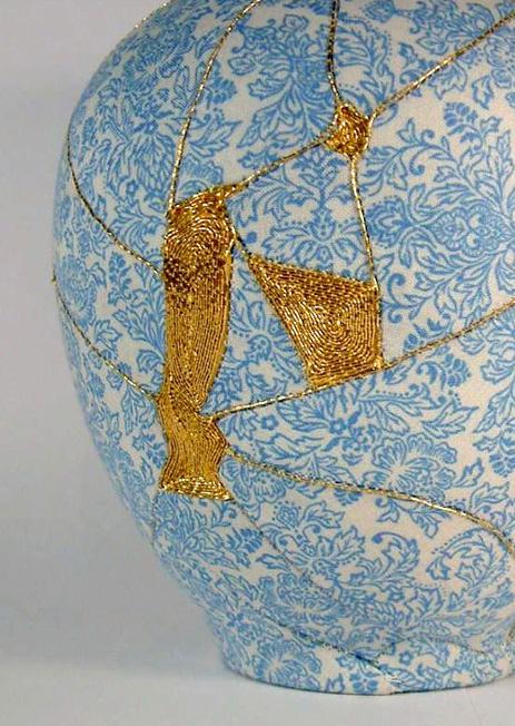
research. LUXURY PREMIUM EGO ECO Status Seeker Showing Off Guilt-free Betterment brand KINTSUGI upcyclingcollaboratingwith artists brand KINTSUGI upcyclingcollaboratingwith artists
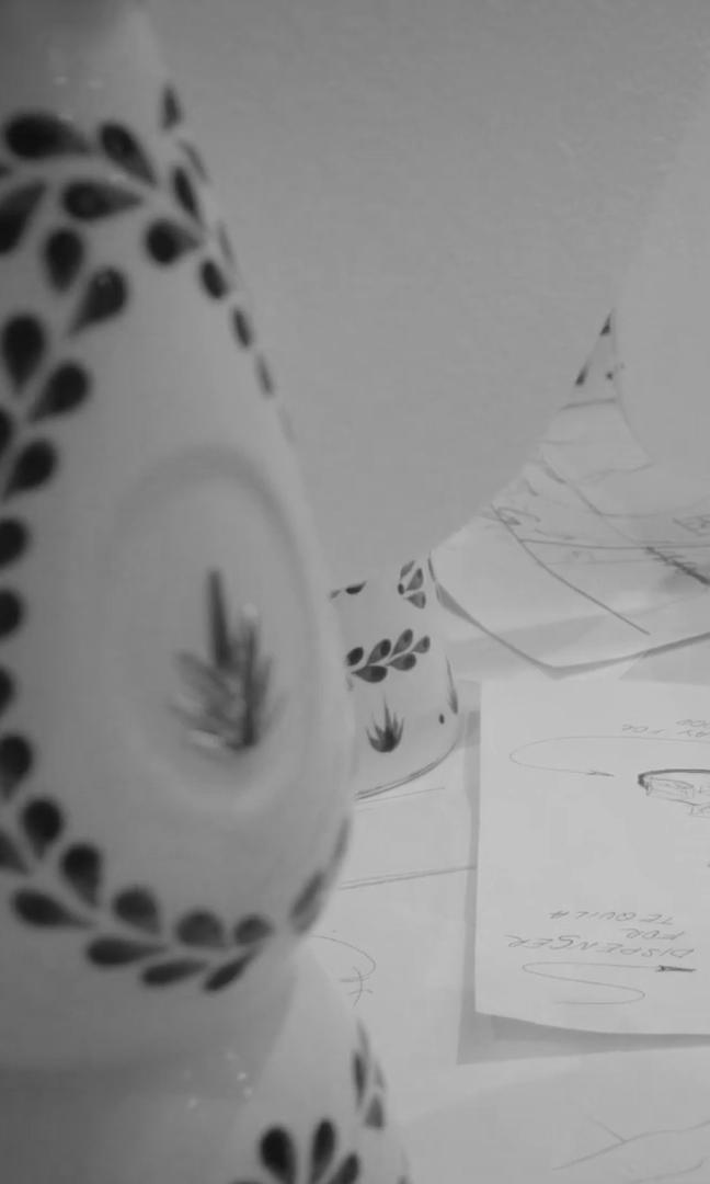
We started to think where the majority of the bottles is bought, and we found out that the HORECA channel is the one with the highest number of unused bottles.
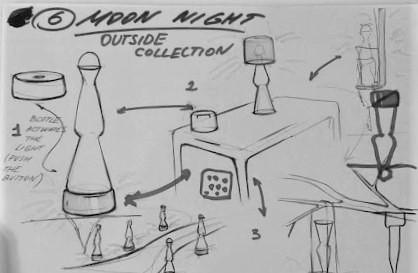
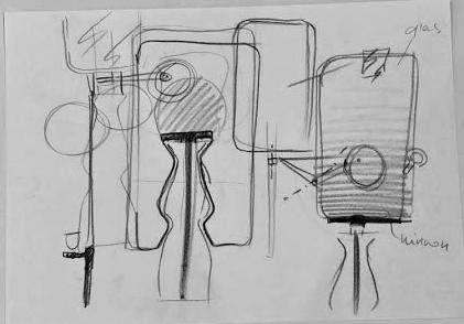
So we developed something that can be used in hotels and resorts: a mirror collection.
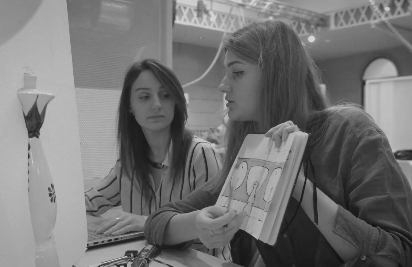
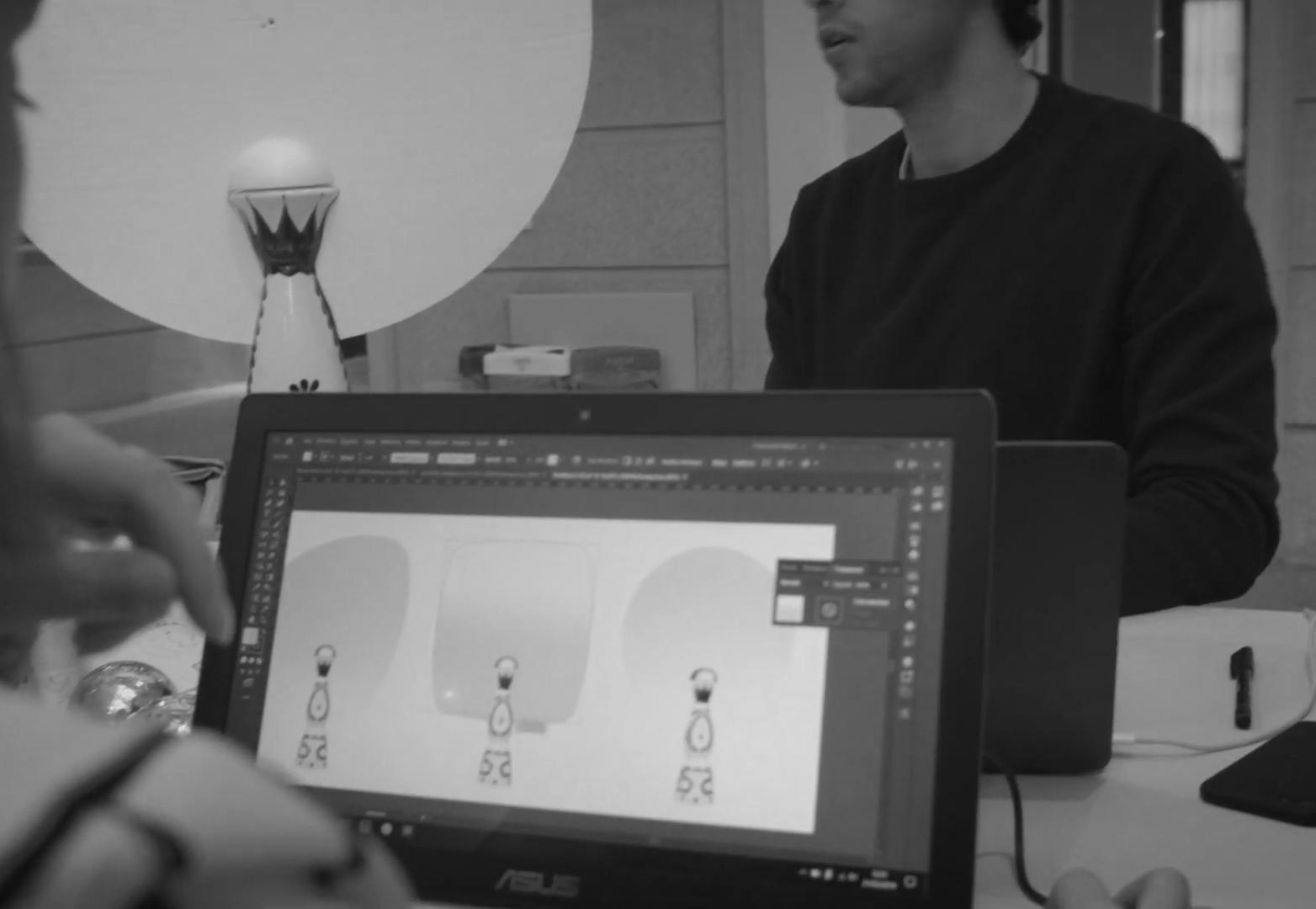
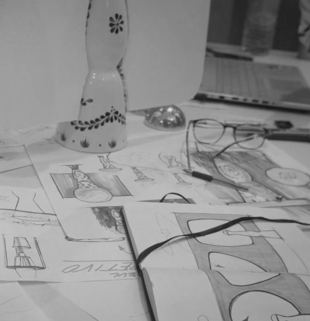
ideation and development
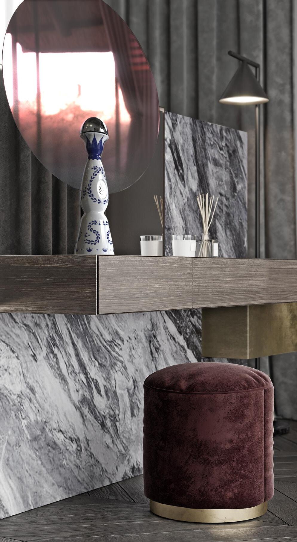
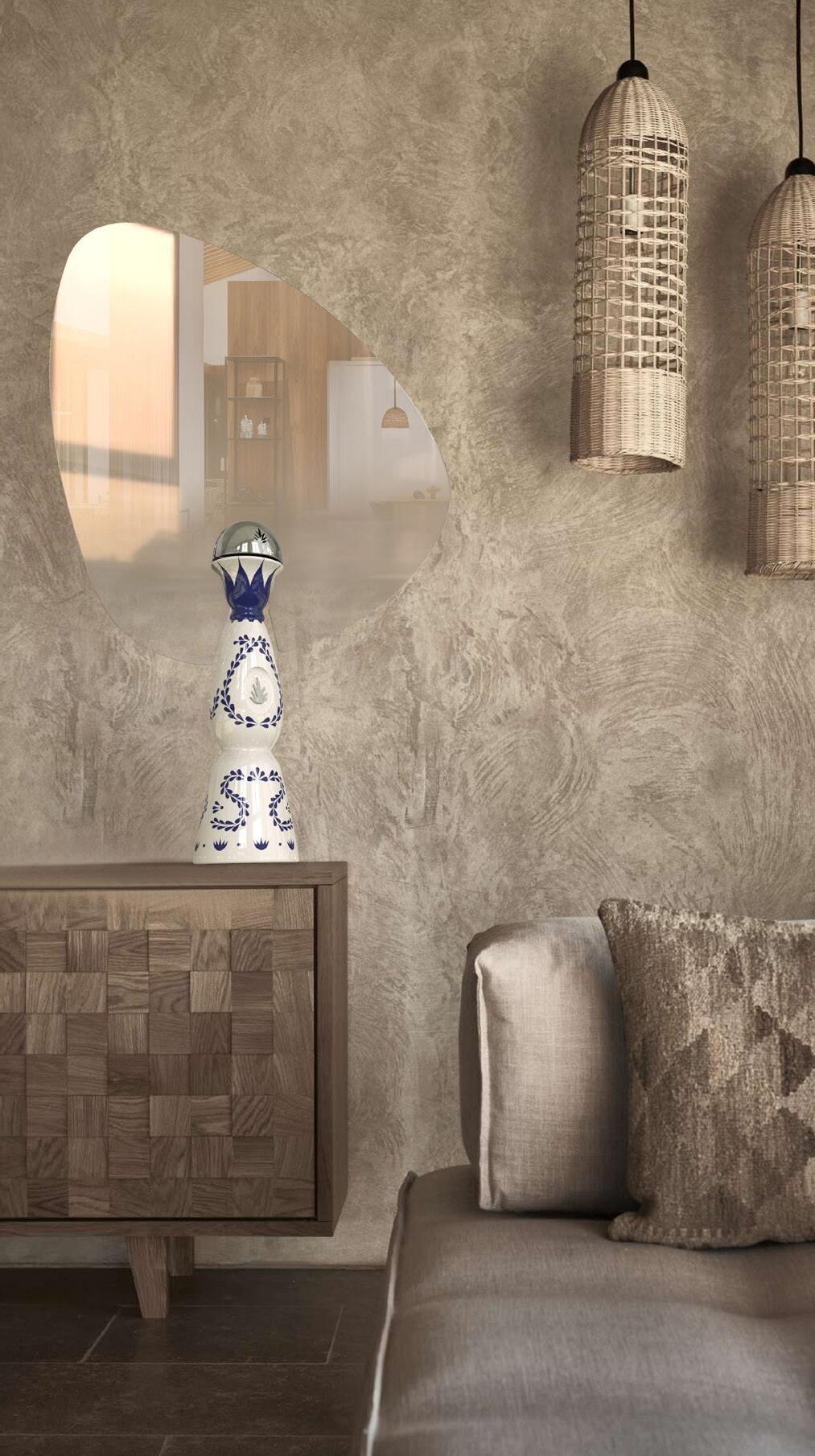
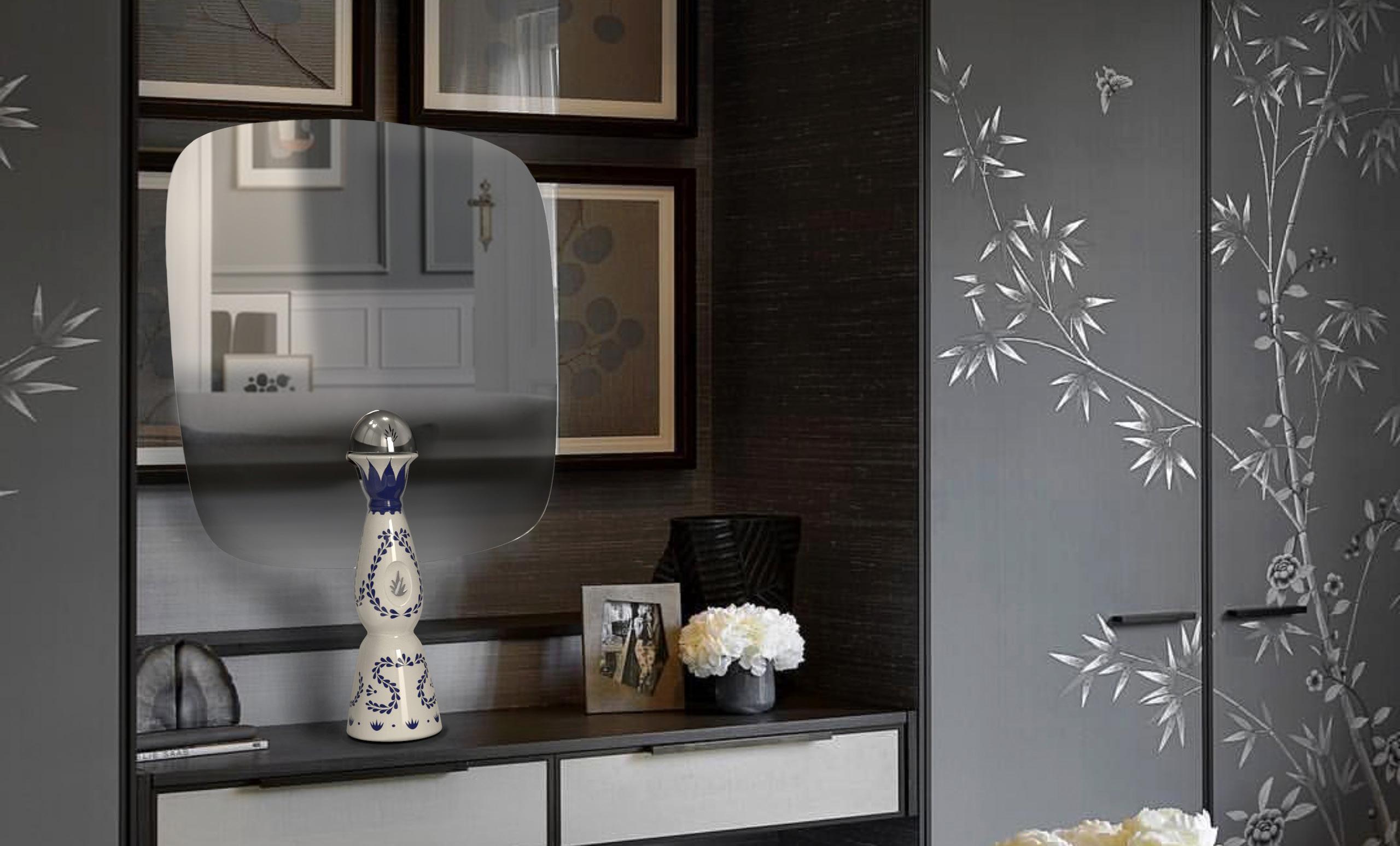
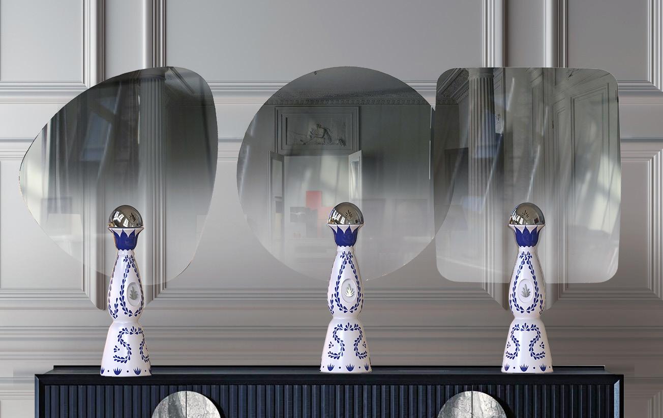
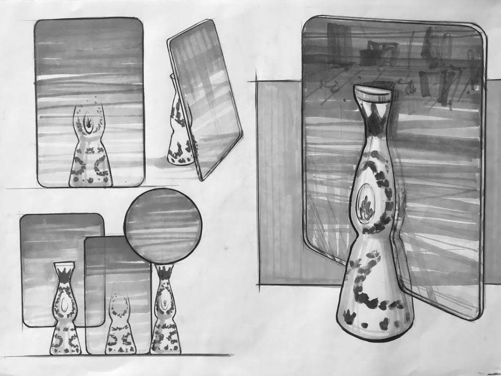
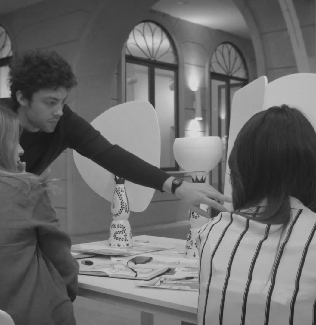
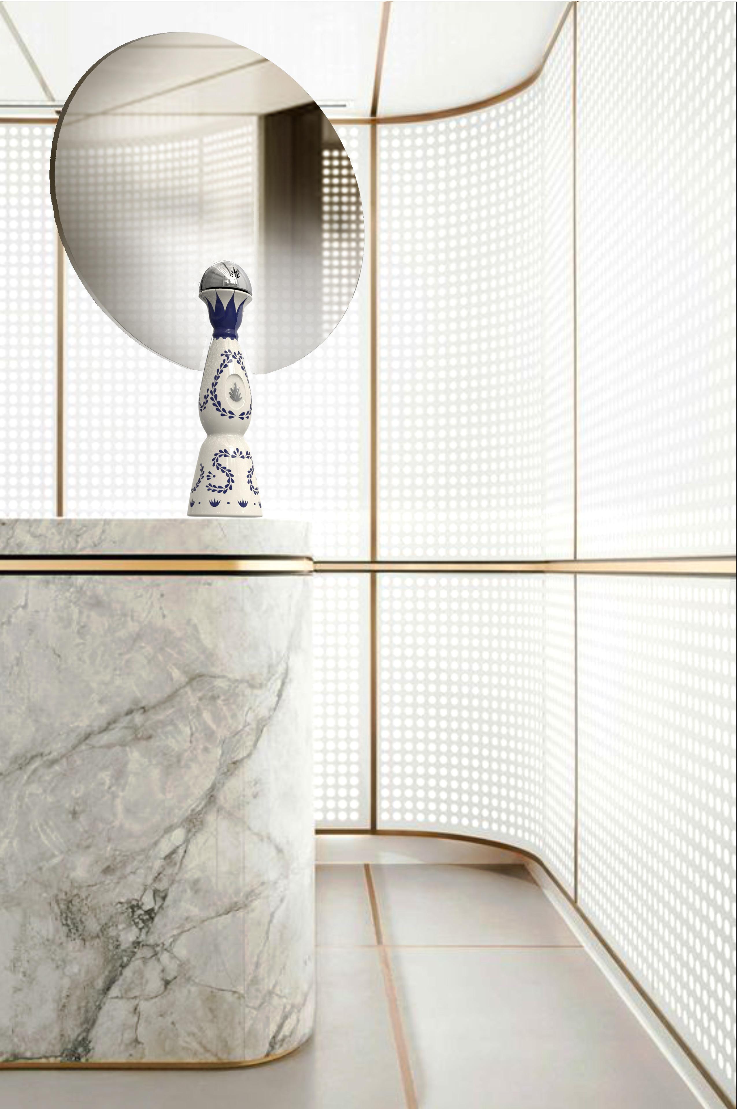
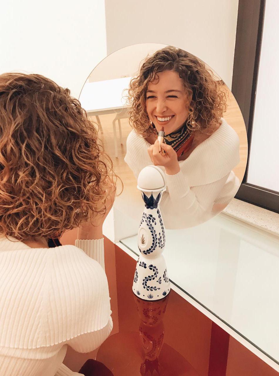
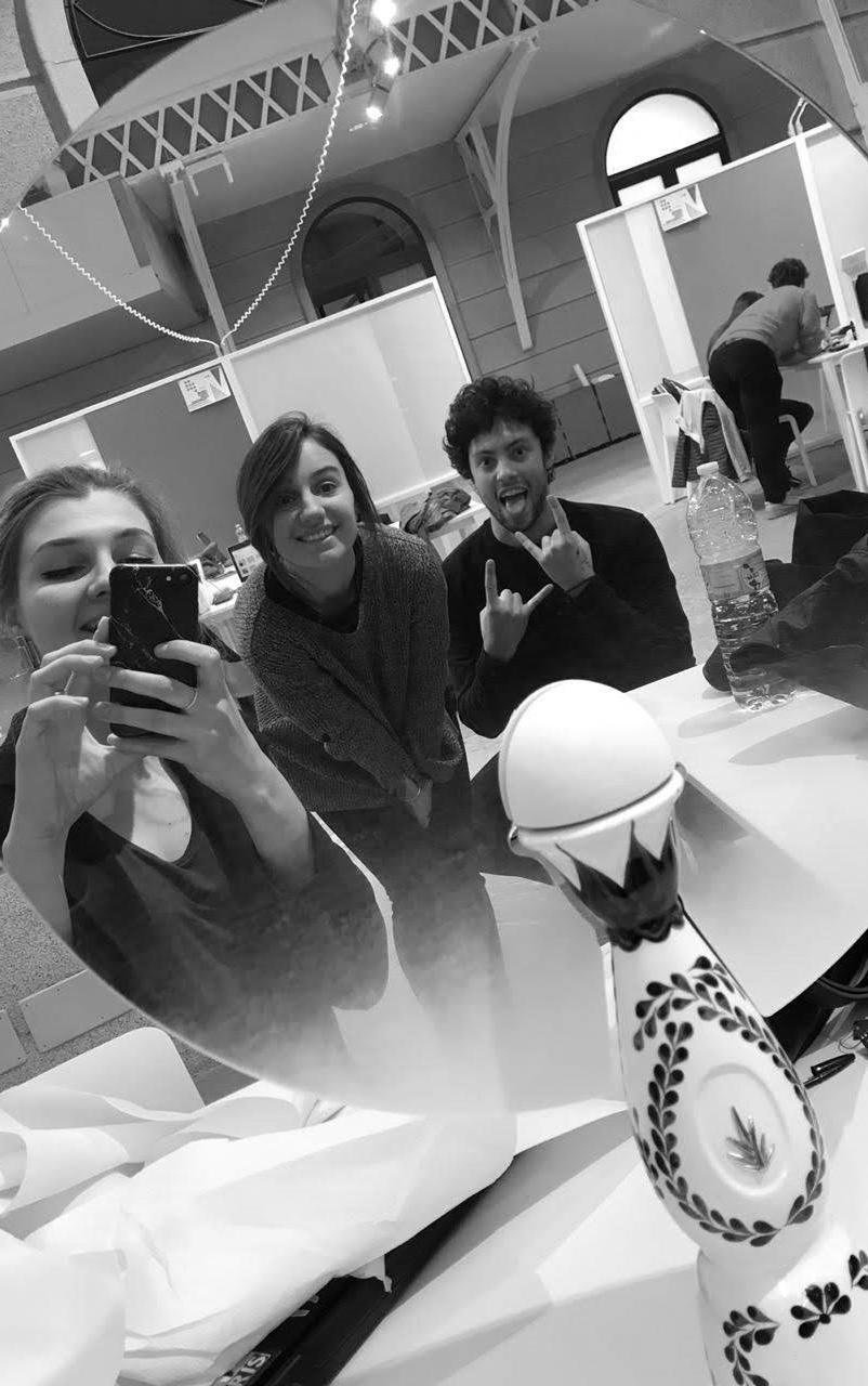
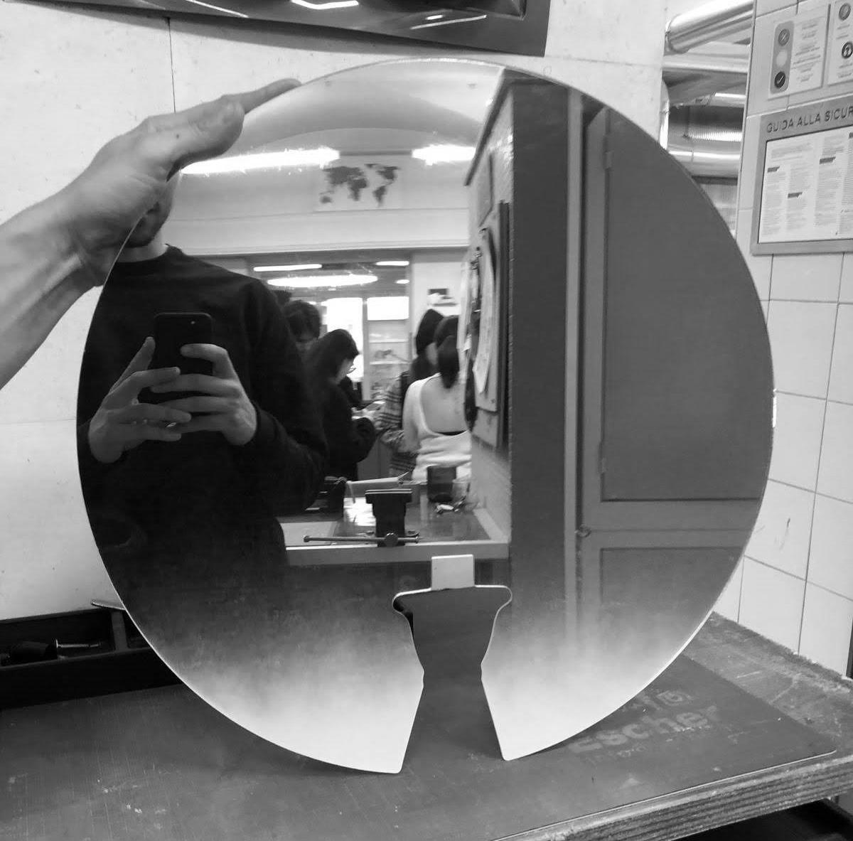
nabla
Nabla is a capsule collection composed by three mirrors with different geometric shapes (circles, square and triangle).
The mirror, with a gradient effect, can reflect the environment, giving the sensation that the bottle is perfectly integrated in the room.
final product.


CARRY IT LEAN IT
TAKE IT
6. 7. FILL IT OPEN IT 3. 4. TAKE IT PLACE IT INSERT IT 8. 9. LEAN IT FILL IT 2. 3. IT TAKE IT PLACE IT INSERT IT
7. 8. 9.
1.
2.
5.
6.
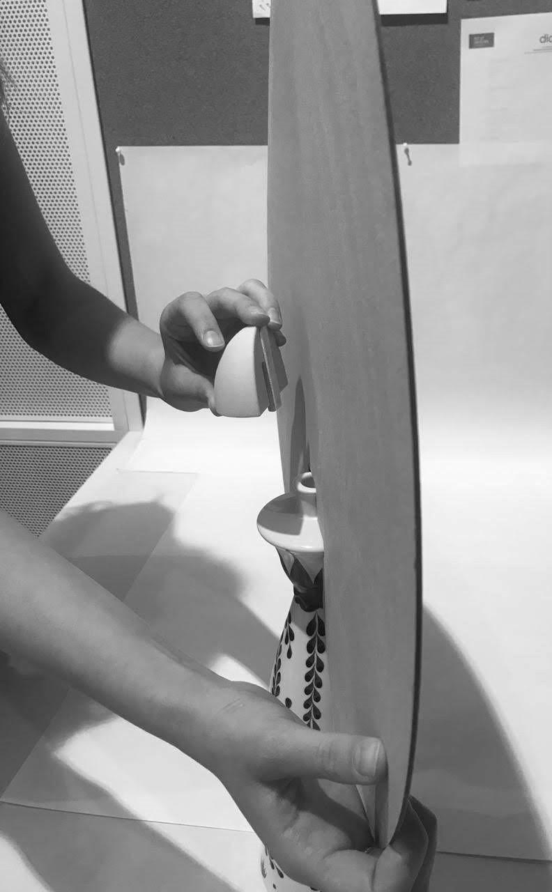
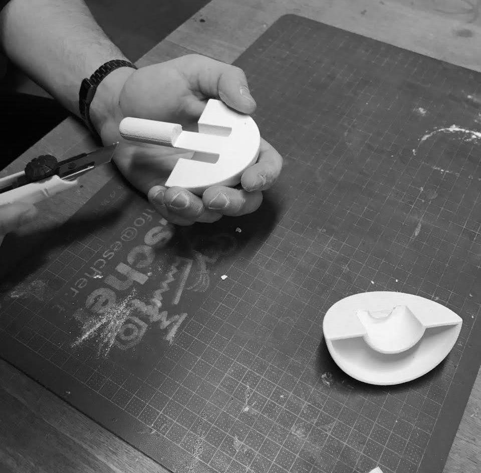
test and make.
contacts e-mail: laraferruccio@gmail.com cellphone: 3496371795
