
6 minute read
EXPERIMENT WITH ACCESSORIES

from vhdsdjbvd

An eclectic mix of colour, pattern and texture is perfectly fitting for this blended family’s first home.
TEXT SARA CATION
Advertisement
PHOTOGRAPHY STACEY BRANDFORD
STYLING ANN MARIE FAVOT
experiment with ACCESS
BOLD CONTRAST + EXOTIC TOUCHES = MODERN ECLECTIC
ORIES
OPPOSITE A collection 25 years in the making, the grouping of new and vintage vases atop the living room fireplace mantel was the jumping-off point for the space’s palette. “I used to be a stylist, and I inherited a few vases from photo shoots,” says homeowner and designer Shirley Meisels. “I’m drawn to the sculptural quality of their various shapes, so ever since then I’ve bought whatever catches my eye.” She removed all the white ones for a saturated dose of colour – you’ll find them on the top shelf in the kitchen.

DESIGN, MHouse, mhouseinc.com; Chantilly Lace OC-65 WALL PAINT (throughout), Benjamin Moore; juju feather HEADDRESS, Snob; wooden SIDE TABLE, TABLE LAMP (with linen-coloured shade), HomeSense.
This is the story of a lovely lady,
bringing up one very lovely girl, who met a man – no, not named Brady – who was busy with a boy and girl of his own. Fast-forward from falling in love to finding their dream house and (on much more than a hunch, as the song says) moving into their first blended-family home together, thus becoming a brand new bunch.
“We were keen to move in and begin our life together,” says homeowner and designer Shirley Meisels (of MHouse design firm) about wanting to find a place that required only minor renovations. So when, three years ago, they found this spacious three-storey Edwardian house in midtown Toronto, Shirley and her partner, Mitch Altman, were sold on the home’s original mouldings and coffered ceiling as well as the fact that it had been modernized by its previous owners.
Before Shirley and her daughter, Lili, 11, could move in with Mitch and his kids, Noah, 12, and Maddie, 10, the three-bedroom home needed a facelift and, most important, another bedroom. The previous owners had knocked down a second-floor wall, turning the floor’s three bedrooms into two, so Shirley simply had the wall replaced and the third

bedroom restored so each kid could have his or her own. The third floor – formerly a small bedroom and a den – saw the largest transformation, becoming a master bedroom with a walk-in closet and dramatic master bath for Mom and Dad.
But the fun part for this designer was delving into the decor. For an airy space with flourishes of sunny colours, Shirley had the dark oak mouldings and walls painted white. “I wanted it to feel bright and cheerful,” she says.
LEFT Elegant and stately yet warm and eclectic, the entryway sets the mood for the rest of the home.
Custom CABINET, Millworx; CONSOLE, IKEA; CONSOLE HARDWARE, RUG, Elte; RUNNER, eFloor; MIRROR, Decor- ium; white TABLE LAMP, HomeSense.
TOP Black, white, wood and metal – the glam neutral palette repeated throughout the house – is punched up with winks of colour, such as the vintage green painting here in the living room.
Chandelier Series ARTWORK by Daniel Schneider, Art Interiors; Cauda Equina ARTWORK by Keith W. Bentley, Lonsdale Gallery; gold PITCHER, Zara Home; black PITCHER, Suite 22 Interiors.
Circular shapes, in everything from the furnishings to the accessories, keep the eye moving around the living room. “The space is long and narrow, and the roundness creates a more cozy and intimate, cocoon-like seating area at the front of the house,” says Shirley. Cheerful colour is introduced through accents, such as the striking chartreuse ombré drapery that lends a fun, sun-kissed look – even on dreary days.
SOFA, Elte; Schumacher Antibes Chevron ARMCHAIR FABRIC in Jet, Bilbrough & Co.; COFFEE TABLE, Zig Zag; SIDE TABLE, blue and green TOSS CUSHION, white dot ARTWORK, West Elm; Designers Guild Saraille DRAPERY FABRIC in Acacia, Primavera; RUG, FLOOR LAMP, EQ3; custom TOSS CUSHIONS, MHouse; BOWL, Crate and Barrel; black VASE, IKEA.

Bright? Check – just look at the way the sun streams into every main-floor room, embraced by the white walls and bounced around by the metallic accents. Cheerful? Double check – especially in the living room, where happy colours like chartreuse, turquoise and grape playfully intermingle. “I tend to go for colours that are disparate but alike at the same time,” says Shirley. “They’re all connected by their grey undertone. You’ll almost never find me using primary colours.” Used throughout the house are pattern and texture to boot. Bold wallpapers and textured fabrics just beg to be touched, lending the space an eclec- tic liveliness that complements the quiet elegance of its architecture.
“It’s not so much the style, but the flow that makes a home com- fortable,” says Shirley. “And here, though everyone’s carved out their own space, we’re all still together.” Indeed, life here as a blended family is harmonious. On any given night, Noah is on the computer in the kitchen, and Maddie might be drawing in the eat-in area or watching a movie with Lili in the living room. And with a view of everyone from the cozy armchair in the eating nook, Shirley takes it all in while Mitch cooks dinner – which the new, now complete, bunch will enjoy together at the dining table. It’s too bad, though, that they don’t have a live-in maid named Alice to clean up after the feast.
FOR SOURCES, SEE OUR WORKBOOK
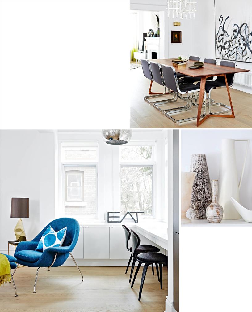
LEFT The multi-functional eat- in area off the kitchen sees a lot of action: It’s where the kids have breakfast and do their homework, it’s where Shirley sets out food when entertaining, and it’s her fav- ourite place to relax at day’s end.
Perforated-metal PENDANT LIGHT, Universal Lamp; vintage “Eat” SIGN, Queen West Antique Centre.
Since her previous kitchen was all white, Shirley changed things up with dark walnut lower cabinetry here. “It suits the sophisticated old architecture of this house,” she says. Besides refacing the lower cabinets, Shirley had the uppers removed in favour of airy open shelving and added the textured porcelain backsplash. The layered whites – warm on the countertop, cool on the walls and mixed in her collection of vases on the top shelf – keep the space from looking too stark.

CABINETRY, Millworx; COUNTERTOP, Caesarstone Canada; BACKSPLASH TILES, Mettro Source; GLASSES, Crate and Barrel; TRAYS, Pimlico.
OPPOSITE, TOP Central to the largely open-concept first floor, the dining room acts as a hall- way between the living room, kitchen and eat-in area, so Shirley kept the space neutral with black, white and wood. “The coffered ceiling and graphic artwork were all the texture it needed,” she says. The family of five eats here nightly, and Shirley loves that there’s ample space for extra tables to comfortably seat up to 30 people without knocking elbows.
DINING TABLE, Avenue Road; Black and White ARTWORK, Jason Schwartz; CHANDELIER, Urban Mode; brass SCONCE, Union Lighting and Furnishings; VASE (on table), Crate and Barrel.


