5 minute read
JANN ARDEN’S HAPPY PLACE
from Xggcbfdhvxfjbcd
ART SCENE
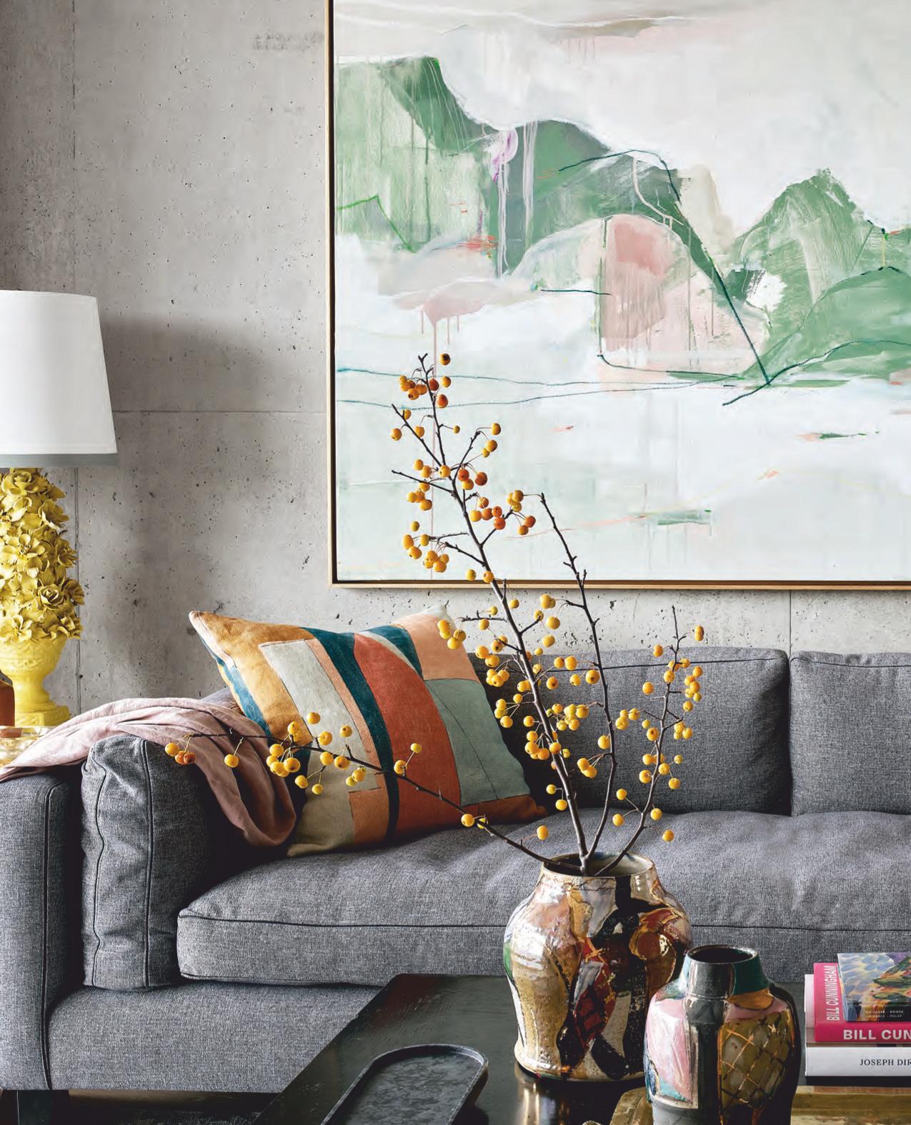
“The condo’s greatest deficiency was its utter lack of colour, ” says designer Tommy Smythe. “I had long lock-down conversations with Jann about places she loves and colours she’s drawn to, like the shades of Calgary sunsets and Albertan grass. ” He commissioned artist Johanna Reynolds to paint something reflecting that palette. “She took it so deeply to heart, she ended up making her own vegan pigments and painted to Jann’s music. When an artist creates for a fellow artist, magic happens. ”
Advertisement
DESIGN, Tommy Smythe, Laura Fremont, TOM Interior Design Studio. CEILING PAINT, Peach Parfait 2175-70, Benjamin Moore. ARTWORK, Johanna Reynolds. SOFA, Montauk. SIDE TABLE, CHAIR, Guff. LAMP, Decorum. COFFEE TABLE, Elle & Eve. VASES, Hollace Cluny. WOODEN CATCHALL, Casa Cubista. RUG, Kate Thornley Hall.
Jann Arden’s HAPPY PLACE
Tommy Smythe and Laura Fremont turn a condo into a colourful, cruelty-free home away from home.
TEXT CHRISTY WRIGHT PHOTOGRAPHY PATRICK BILLER STYLING ME & MO
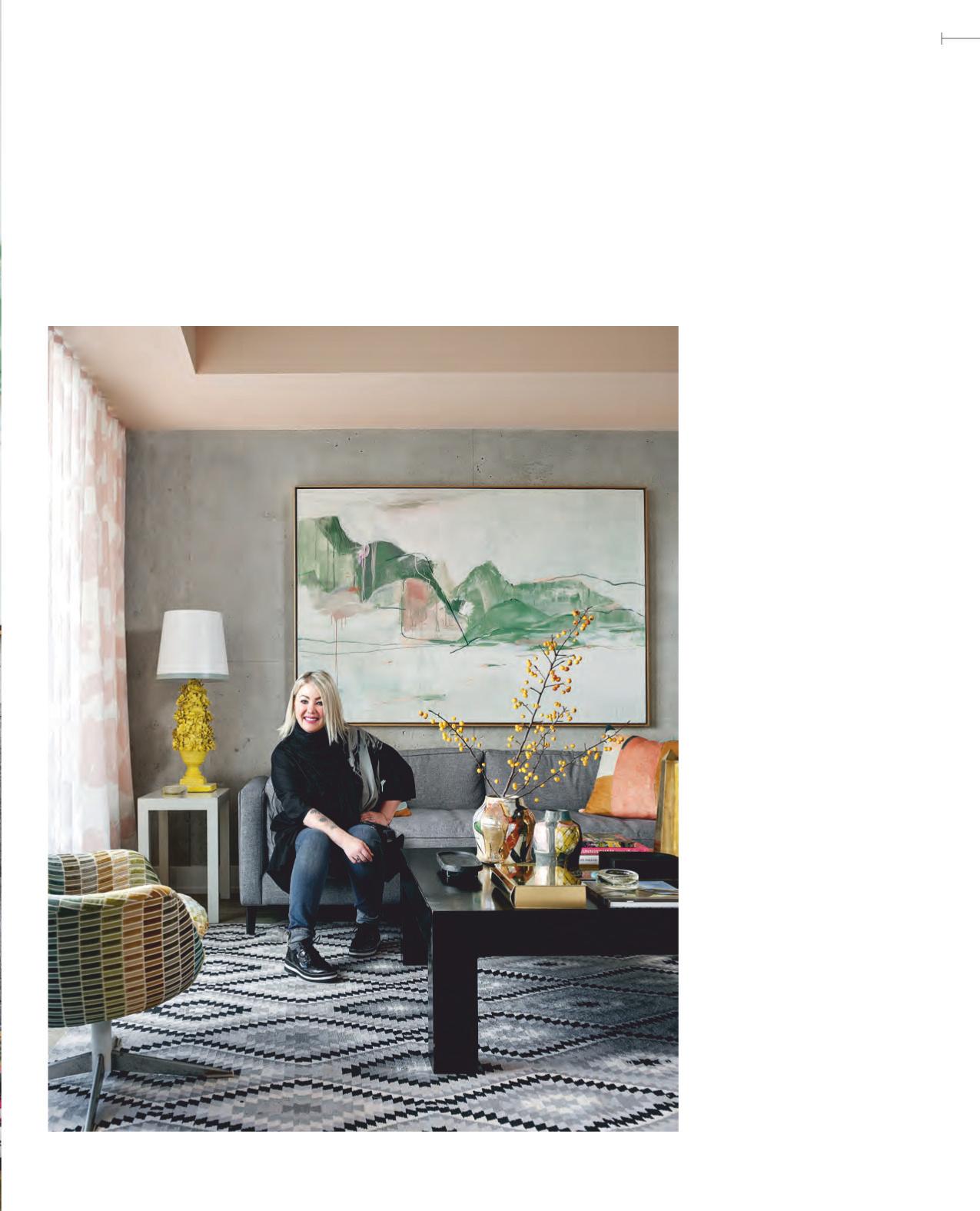
ommy Smythe, I need you so badly!” That’ s what multiplatinum singer, songwriter, actor, author and animal rights activist Jann Arden said after attempting to furnish her Toronto condo. Jann, who lives in Alberta, travels regularly to Toronto for work and was sick of staying at hotels. “I bought the condo just before the pandemic and plunked in some furniture, ” she says. “It looked so dull, I thought I might as well be back in a hotel room. ” A Tommy Smythe intervention was needed ASAP.
Tommy and lead designer Laura Fremont’ s plan for the 900-squarefoot space: a colourful palette, new furniture and lots of pattern. And since Tommy and Jann are vegans, everything had to be cruelty-free.
After communicating digitally during lockdown, Jann flew out for the big reveal. She says,
T
“Designing a cruelty-free home isn’t really that different. Jann’s place has all the essentials and luxuries. It’s simply about making better choices. ” - Tommy Smythe
EXUBERANCE:CHECK
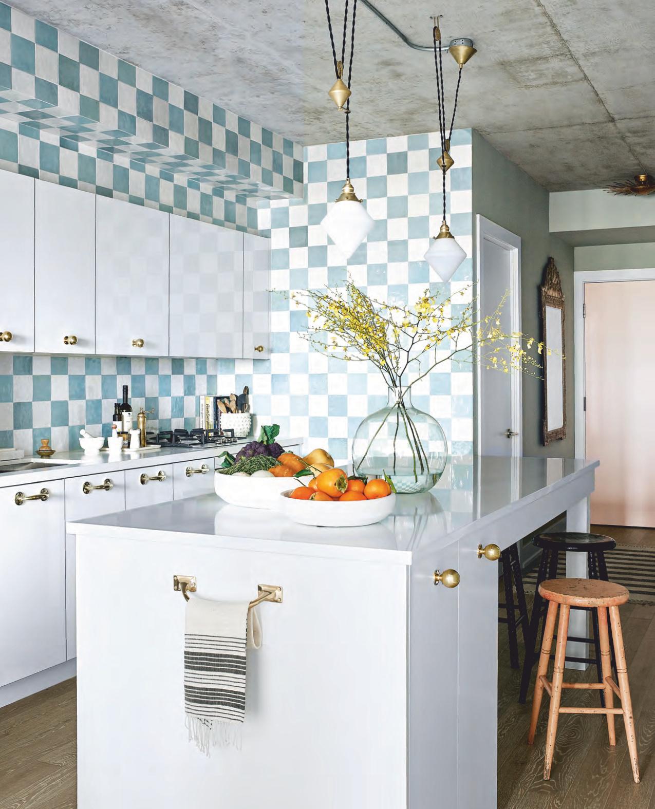
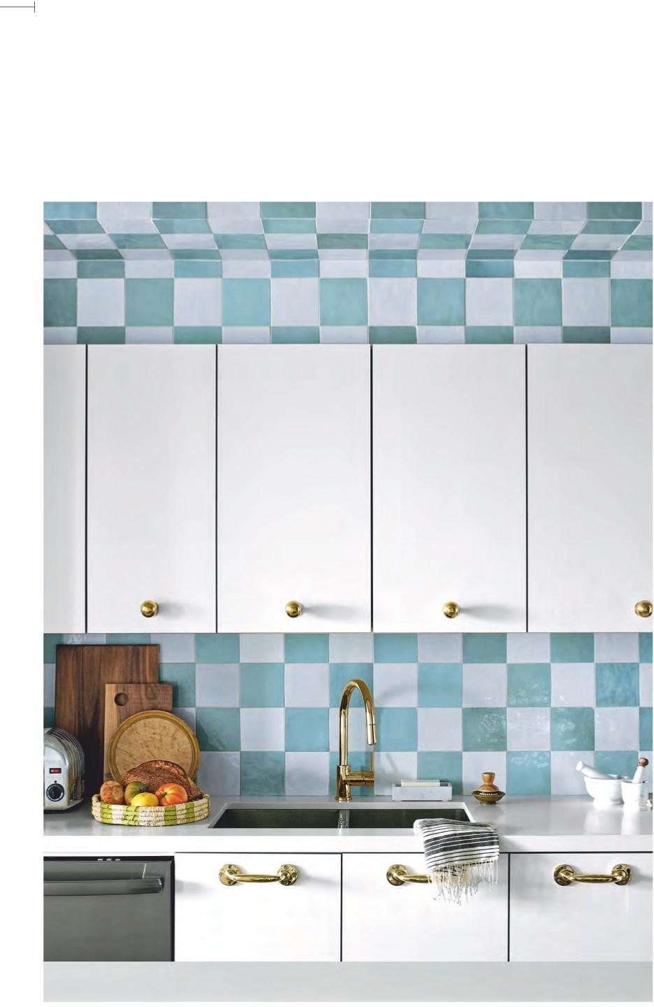
OPPOSITE When designer Laura Fremont suggested checkerboard tiles for the kitchen, Tommy was all in. “I knew that it was the bold stroke this plain-Jane kitchen was longing for, ” he says. The new island has a tabletop that seats seven. Even the front door is lavished with attention. “I wanted the pink from the living room to make an appearance in the entrance hall, ” says Tommy. “It’s meant to be a warm goodbye when Jann heads home to Alberta. ”
COOL COLOURS
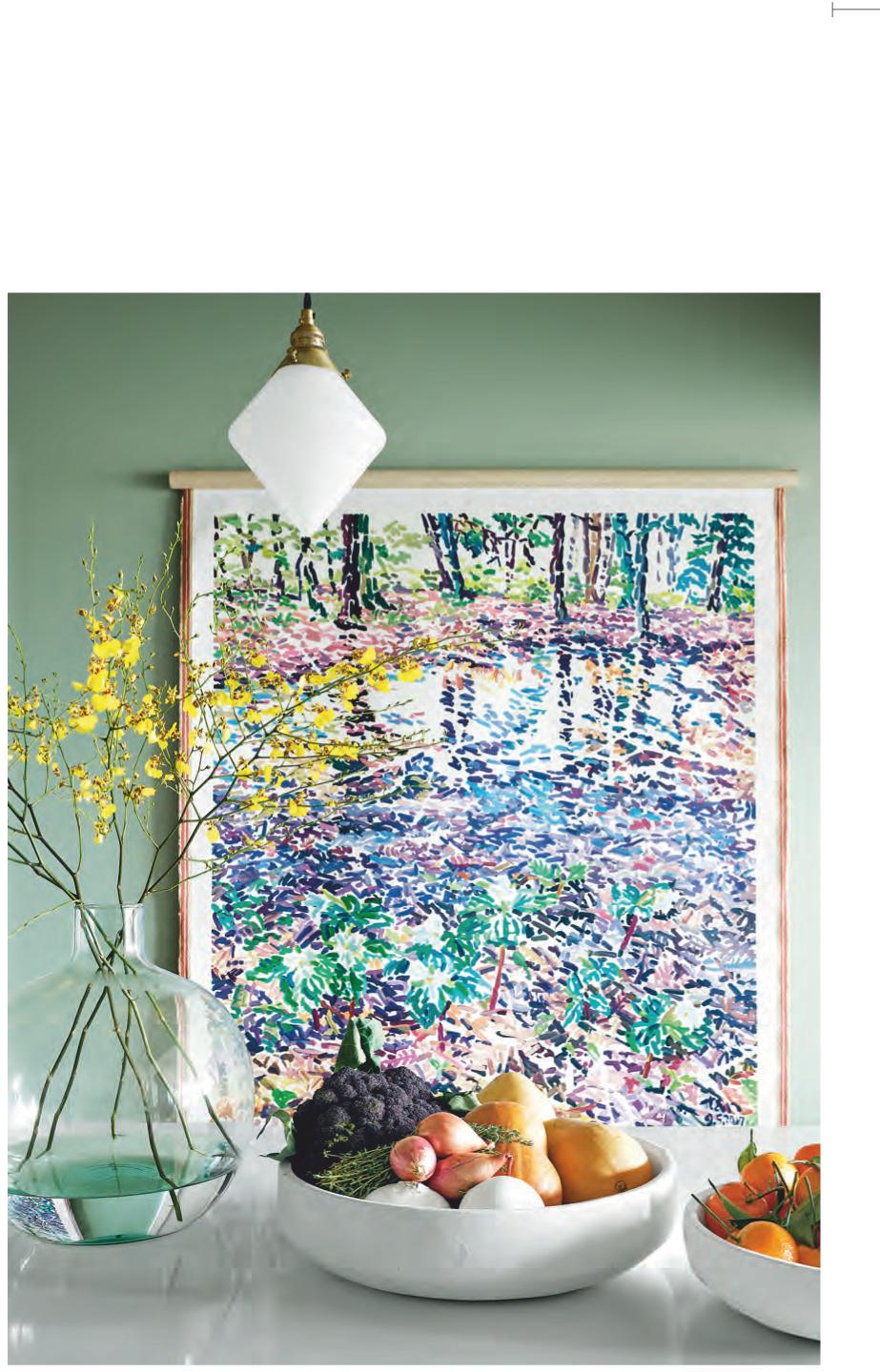
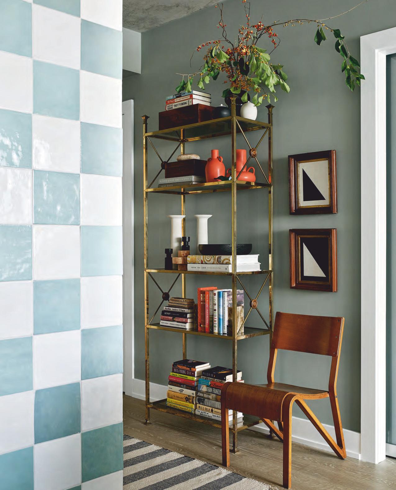
RIGHT Tommy used the green glaze of the kitchen’s artisanal tiles as inspiration for the paint colour here. “It creates a transition between the kitchen and living room, ” he says. “Breaking up a small space with colour can actually make it feel bigger because it ups the number of individual rooms. With little effort, one big open space becomes two or even three. ” The artwork was taken out of Jann’s storage and works perfectly with the new scheme.
PAINT, Misted Green 2138-50 (wall), Light Salmon 2175-60 (door), Benjamin Moore. CEILING LIGHT (entryway), FOC! MIRROR, Vintage Fine Objects. KITCHEN CONTRACTOR, Greentech Contracting. WALL TILES, Saltillo Tile. PENDANT LIGHTS, Mjolk. Royale Blanc COUNTERTOPS, HanStone. COUNTERTOP FABRICATION, Latitude. Brass HARDWARE, The Door Store. BOWLS, Bettencourt Manor. ARTWORK, Chinkok Tan.
“There’s colour, my books are at the front door, and it no longer feels temporary. It really feels like I’m home. ” - Jann Arden
GETA HANDLE
LEFT The choice of brass hardware feels warm in the kitchen’s cool palette. “The original kitchen had no upper-door hardware and very generic chrome handles on the lower drawers and cupboards, ” says Tommy. “Laura and I wanted statement hardware, so we scaled up and changed the program from cool to warm metal. Knobs this big command centre stage, so they were placed accordingly!”
BOOK KEEPER
OPPOSITE Finding a bookcase (a specific Jann request) that worked in the small entryway was challenging, so Tommy opted for an étagère. “The great thing about it, especially in a small space, is that it feels light. No sides, glass shelves, plenty of book storage for the resident avid reader, and surface area left over for mail, keys and keepsakes, ” says Tommy. The contemporary chair and artwork are edgy foils to the étagère’s pretty brass and glass.
ÉTAGÈRE, Decorum. ARTWORK, Housebound Interiors. CHAIR, Smash Salvage. RUG, HomeSense.
“The space is cruelty-free, colour rich and made by friends with joy. I think the result is exactly what Jann, and the world, needs now. ” - Tommy Smythe
MIX MASTER
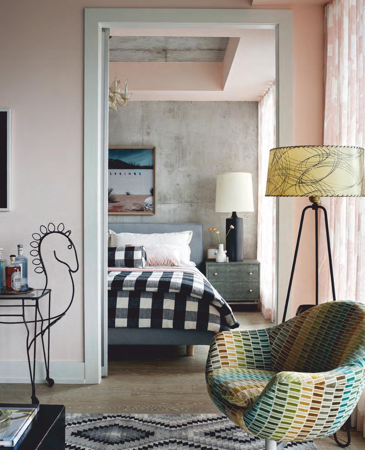
OPPOSITE While all of the furniture in Jann’s condo is new, you’d never know it, thanks to the masterful mix of fabrics and vintage silhouettes. The ’50s floor lamp has a bit of the desired rock-and-roll look, and the vintage chair comes to life re-covered in an unabashedly playful fabric. The spirited equine bar cart is more than just whimsical. “Jann is passionate about ending live horse export, ” says Tommy. “This funny, quirky little piece reminded me immediately of her spirit, her home in Alberta and her important activism. ”

PRETTY,PLEASE
RIGHT “I love how the whimsical pink living room drapes continue in the bedroom, ” says Jann. “They make the small rooms feel big. ” Tommy and Laura had originally sourced a contemporary light fixture for over the bed, but Jann requested something prettier; a Venetian chandelier fit the bill. They tempered the bedroom’s soft elements and pink with bold black and white checks. “We like a little punk with our pretty, ” says Tommy.
FLOOR LAMP, Era. BAR CART, Eclectisaurus. CHANDELIER, Around the Block. BED, Gus. LAMP, Zig Zag. ARTWORK, Patrick Biller. FRAMING, The Frame Maker.
FOR SOURCES, SEE OUR WORKBOOK


