5 minute read
EYE OF THE STORM
from dsfvhiovryoj
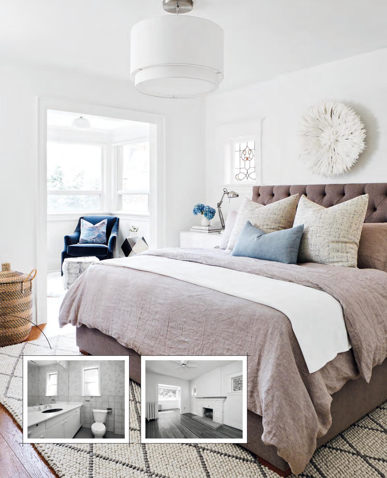
That aesthetic continues upstairs, where the owners were happy to lose one of their four bedrooms to create a master suite. The one caveat? They would have to remove a fireplace to accommodate the new floor plan – something most homeowners are reluctant to do. But these ones were game. After all, they got to keep the original stained glass windows that flanked it, and a custom king headboard fit perfectly in-between.
The other two bedrooms? Well, those stayed intact for future family members. For now, these homeowners are happy hosting friends or enjoying some one-onone time. But one day, the chitter-chatter of their wicked dinner parties may give way to the pitter-patter of little feet. And when that day comes, they can rest assured that at least their home is ready.
Advertisement
FOR SOURCES, SEE OUR WORKBOOK
BEFORE BEFORE
In the heat of summer, we look back at how a snowstorm led a couple to their dream home.
stormEYE of the TEXT LAURA MUIR | PHOTOGRAPHY ASHLEY ERB

While many people think blizzards are absolutely apocalyptic,
Fredericton homeowners Jenna and Steve Holland see them as a positive omen. Jenna, a kindergarten teacher with an eye for interior design, and Steve, a contractor who runs Holland Home Renovations, have purchased, updated and flipped several houses – “and we always seem to buy homes on stormy days,” says Steve. This one, which they ended up keeping for themselves, was no exception.
The couple weren’t necessarily looking to move when they stumbled across the 2,100-square-foot four-bedroom abode two years ago. “We were newlyweds sharing a three-unit house – living upstairs while renting out the two basement apartments – when one day we got a call from a real estate agent friend about a place that had just come on the market,” says Jenna. (Yes, it was snowing outside.) Feeling bored and hemmed in by the weather, they went to check out the house as a potential flipping project.
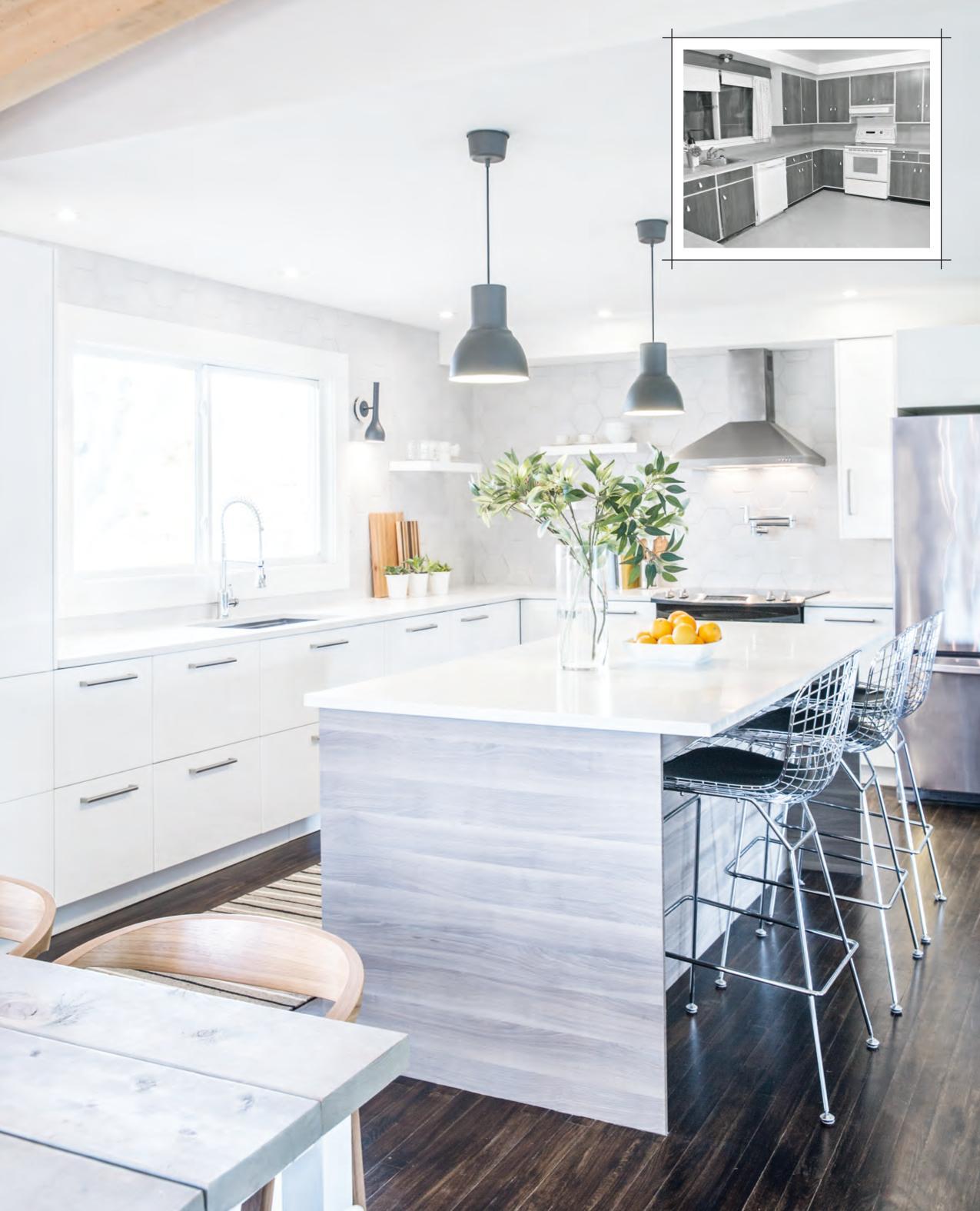
In this mid-century-style Fredericton home, three walls came down to open up the entryway, dining, living and kitchen areas on the main floor. The latter’s new white colour scheme, with contrasting hits of black, grey and brown (via the wood tones), enhances the brightness of the space.
DESIGN, Reimagine Designs, reimaginedesigns.ca, Holland Home Renovations, facebook.com/ hollandhomerenos; CONTRACTING, Holland Home Renovations; Snowfall White 2144-70 WALL PAINT (throughout), Benjamin Moore;
CABINETRY, ISLAND, RANGE HOOD, PENDANT LIGHTS,
CABINETRY HARDWARE, IKEA; COUNTERTOPS, Caesarstone Canada; RANGE, REFRIGERATOR, Sears; FAUCET, The Home Depot; FLOATING SHELVES, The Home Depot; hardwood FLOORING, Eaglewood Specialty Products; FLOOR STAIN, Kent; RUNNER, HomeSense; SCONCE (customized), Attica Furnishings.
BEFORE
But when they saw the property, they were enthralled by the house’s Mid-Century Modern vibe. Intriguing architectural features included vaulted ceilings with exposed beams, two wood-burning fireplaces, hardwood floors and large windows. “It had good structural lines and great potential,” says Steve.
It was an exceptional find in this city, which boasts a pedigree of turn-of-the-century Victorian and Craftsmanstyle homes. “There’s not much like this in Fredericton,” says Steve. “You don’t see a whole lot of mid-century- style architecture here.”
The lot was also a big draw. Located in a family- oriented neighbourhood, the yard backs onto a farm, offering a bucolic setting that’s conveniently close to the downtown core. Recognizing they could make the house great but that it required too much work for a flip, the couple decided, on the spot, to keep it for themselves. They put in an offer and purchased the house within a few days.
The pair later discovered the house had an intriguing history: Built in 1965, it was a West Coast design that had been adapted for the East. “The original owner, who was an engineer, was going to have it built out West,” says Jenna. “But then he got a job at the university here and decided to stay, so he had to modify the drawings to suit our colder winters.”
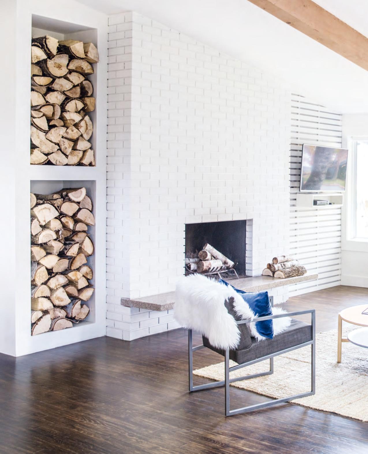
The white-painted brick fireplace, with its original granite hearth, references mid- century style, and the built-in wood storage is both practical and decorative. To complete the look, homeowners Jenna and Steve Holland covered up a window and built a wood-slat wall to mount the TV on. “[Designer] Mallory [Lennon] was quite adamant that we didn’t hang the TV above the fireplace,” says Steve, “and this [new wall] allowed us to position it without making it a focal point.”
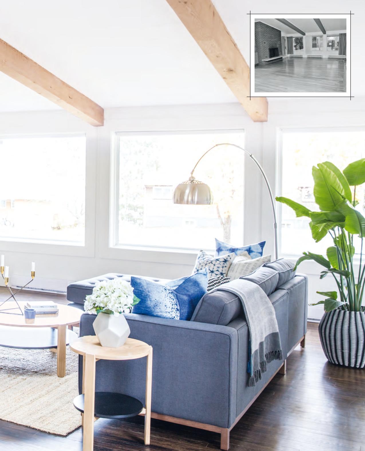
SECTIONAL, COFFEE TABLE,
SIDE TABLE, Tuck Studio; RUG, IKEA; PLANTER, THROW, blue and white TOSS CUSHIONS (except speckled cushion), HomeSense; sheepskin THROW, black and white TOSS CUSHION, IKEA; blue speckled TOSS CUSHION, Scandimodern; CANDELABRA, Attica Furnishings.
BEFORE
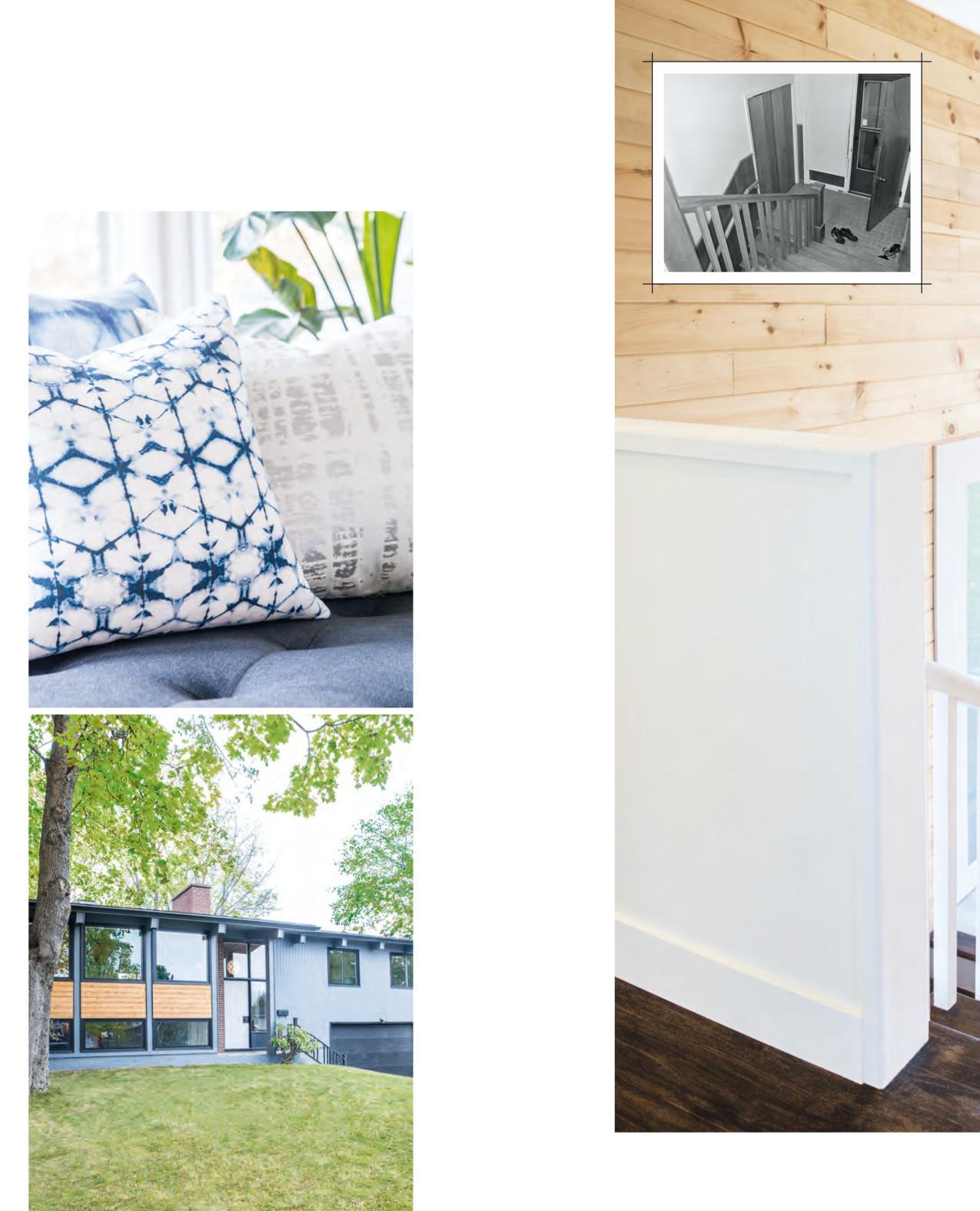
LEFT, BOTTOM The house’s exterior was transformed with a rich slate-grey paint colour, new black-framed windows and cedar accents. “We nicknamed the house Project Blueberry because everything had been painted in two shades of blue – including the shutters. It didn’t do the house justice,” says Jenna. “Now it has a more up-to-date feel.”
Gray Shower 2125-30 EXTERIOR PAINT, Benjamin Moore.
RIGHT In the entryway, orangey stained wood wainscotting was ripped out and replaced with floor-to-ceiling pine tongueand-groove panelling. The space was accented with a mid-century-style pendant light for a modern-country Scandinavian feel.
RUNNER, HomeSense; PANELLING, Ridge Cedar; PENDANT LIGHT, Scandimodern; CLOSET DOORS, The Home Depot.
OPPOSITE Jenna and Steve continued the house’s cleanlined unfussy aesthetic in the main-floor bathroom, where a high-gloss white floating vanity with a vessel sink and wallmounted faucet look sleek and understated. Grey-toned elements like the industriallook sconce and quartz countertop offer contrast to the clean white and tie in with the palette used throughout the main living space.
VANITY, MIRROR, SCONCE,
IKEA; VANITY COUNTERTOP, Caesarstone Canada; HAND TOWEL, HomeSense.
FOR SOURCES, SEE OUR WORKBOOK


