8 minute read
Signature style
Let three unique kitchens add a dash of inspiration to your own culinary corner.
Story by Chino L. Cruz Photography by Sonny Thakur Styling and Pictorial Direction by Devi de Veyra Produced by Anna Felipe
Advertisement
Bright and breezy
Priscilla Meirelles-Estrada’s sleek, modern kitchen is an effortless mix of form and function.
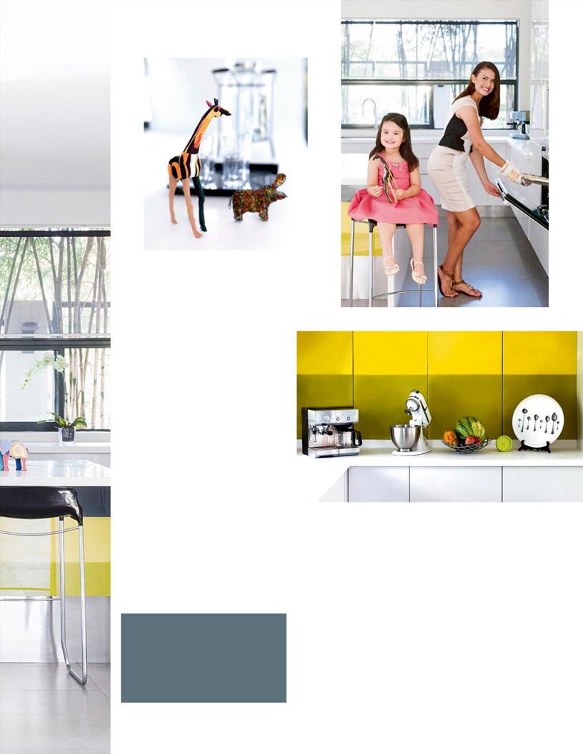
Priscilla Meirelles-Estrada has a knack for connecting with people. Whether she’s selling cheese buns at the Salcedo Market or hosting a dinner party for 50 people at home, the Brazilian beauty queen-turned-entrepreneur glows with an easy, modest charm that draws you in.
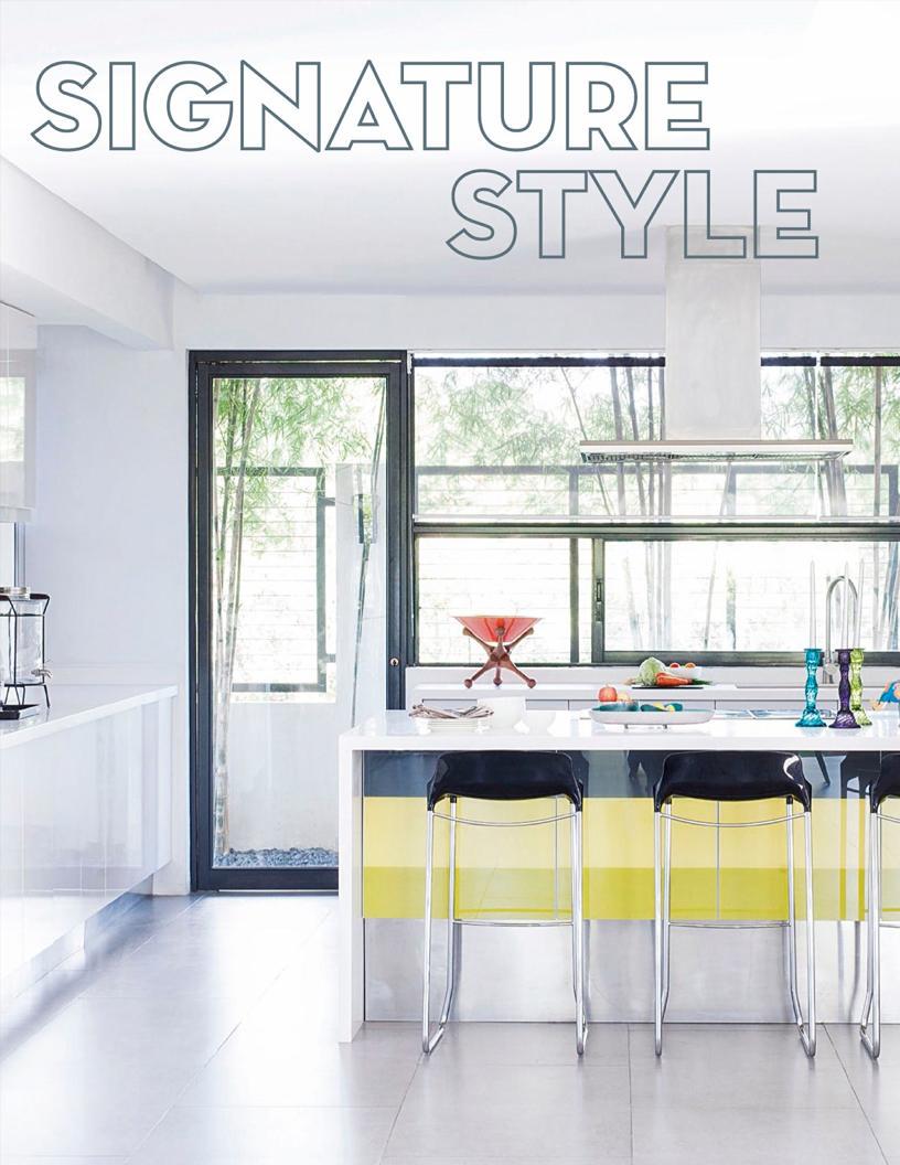
Her bright home kitchen evokes a similar sort of easy effortlessness. The space is clean and straightforward, with its open American-style floor plan and mostly white color scheme. There are also few to no divisions between the kitchen and the rest of the home, making it a space that is airy, expansive, and fluid—perfect for Priscilla and The Brazilian Bakery, her burgeoning food business. “One of my favorite things about my kitchen is that it flows into the dining area,” she says. “It really helps that it’s big; I have enough space to put out and arrange everything that I need for what I’m cooking.”
Priscilla also takes great pride in her kitchen’s seamlessly integrated storage and appliances. Much of the room’s clutter is kept away in sleek white cabinetry ingeniously hidden in the kitchen island and along the walls. Unsightly electrical switches and wires are also tucked away behind a vibrant limegreen glass backsplash, which also serves as a vivid accent wall to match the little indoor garden right across it.
“We made sure to consider air circulation when we built the kitchen,” shares Priscilla. “The use of glass and a predominantly white color scheme helped make the space feel bigger than it actually is. And even if it’s an indoor space and all cement, we made sure to include some greenery. My small garden complements the kitchen.”
For all its cool, modern trimmings, though, Priscilla’s kitchen really revolves around producing great food. At the heart of the gorgeous, contemporary space is a love for making people happy. “Sometimes it gets a bit crazy but everybody enjoys and that’s what’s most important to me,” she says. “It’s all about the food. When you’re around the people you love and care about, you have to make sure you serve only the best.”
Opposite page: One of the highlights of Priscilla’s kitchen is its open floor plan, which makes it perfect for hosting parties and prepping for her food business. This page, clockwise from left: Priscilla gives the space a splash of fun with quirky accents. She also loves to bake for her daughter Anechka, and swears by her white stand mixer that she brings with her everywhere she goes.
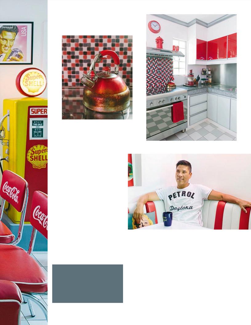
For Tito Herbosa’s kitchen, it all started with the tiles. “When I first moved into the house, the only thing I kept from the original kitchen was the floor—the grayand-white tiles. That immediately gave me the inspiration for a retro diner,” he says. “I used to live in the States and I loved going to diners. Seeing the checkered floor here reminded me so much of them.”
That moment of inspiration resulted in an entire space devoted to playful 1950s America. Tito, a real estate developer, filled the little space with all sorts of wildly colorful, vintageinspired bric-a-brac. The walls are plastered with old movie posters and magazine covers featuring classic ’50s icons like Audrey Hepburn, James Dean, and Marilyn Monroe.
Tito’s most obvious homage to the stateside greasy spoon, however, is his little collection of Coca-Cola-inspired memorabilia. The oldfashioned booth that sits in one corner even features the soda’s signature cherry-red sheen. “That area has original Coke chairs and a cafeteria-style table,” he says.
It took Tito quite a bit of effort to achieve the space’s overall look. Many of the key pieces in the room are actually custom made, including the bright yellow Shell gas-tank cabinet and the vivid neon light hanging over the cafeteria booth. “I put up the lighted sign, which says ‘24-hour diner’ because I want people to know that food is available 24 hours a day, seven days a week,” he explains. “I want my friends to come over at two in the morning and know that they can eat something, maybe some burgers and fries. My refrigerator is always well stocked!”
With his kitchen’s lively, tongue-in-cheek warmth, it would be a surprise if anyone didn’t feel welcome at any time of the day.
Opposite page: Tito’s kitchen is a playful mix of antiques and newer, custom pieces, including a retro neon sign that welcomes guests as they enter. This page: Red was the key color when it came to designing the space, and features on most of the room’s pieces, including the tiled backsplash, see-through cabinets, and Tito’s favorite water kettle.
Gabby Cantero’s kitchen is nononsense. The moment you walk in, you notice an air of absolute orderliness to the room, as if everything is in its place for a reason. You can easily imagine cooks shifting methodically from the counter to the stove in a single, almost choreographed motion. It makes sense, considering the amount of space that Gabby had to work with when she first moved in. “It was originally a pocket garden, but nobody ever used it,” she explains. “It’s not big, so we had to work around it. It’s now an efficient kitchen, and with every move, you know where the pots and pans are, where the chopping boards are. It can fit four people cooking at the same time, even if the area is small.”
That isn’t to say, though, that the organized space is devoid of any sort of warmth or character. On the contrary, the open-style kitchen is often filled with warm sunlight, giving the space a soft, relaxed glow. Gabby, a professional food photographer, wanted her kitchen to be picture-perfect from every possible angle. “I really like natural light, so the main concern for me was putting in a skylight. Although it can get hot here, at least I have this kind of illumination the whole day,” she says. “That’s why the kitchen always looks good—even if there are times that the space is messy.” To add to the personality of the space, Gabby had the floors painted with an intricate pattern inspired by Machuca tiles, which deftly spills out to the adjacent dining room and serves as an easy transition from room to room, as opposed to using walls or a door.
But Gabby’s main goal, really, was to create a smart and tidy unenclosed space where she could easily entertain guests, have them join in on the cooking, and most of all, make them feel welcome. “I wanted to have a working kitchen where everyone could come together and help out,” Gabby says. “When I have get-togethers here, sometimes my friends would do the prep work while I cook something on the stove. It’s a friendly kitchen; it’s like a commune.”
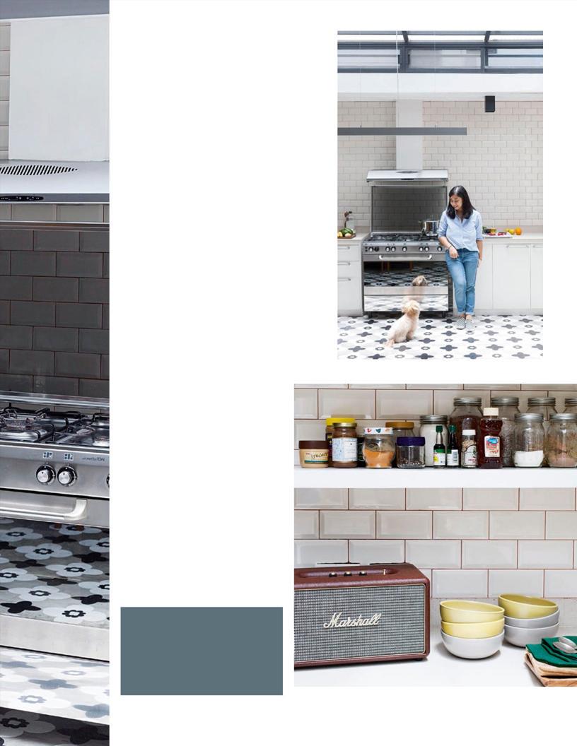
Opposite page: Gabby’s kitchen is laid out in a simple, straightforward manner in order to maximize movement. This page, from top: Gabby’s use of white helps make the kitchen feel bigger than it is and keeps the space from getting too hot. The skylight allows gorgeous natural light to stream through the space. Gabby admits to occasionally dancing to music while she cooks.
ArroZeria Don Andres TuanTuan Dish
Paella de Pato y Setas

King of the grain
ArroZeria is where the humble local staple shines, front and center.
REVIEW BY SASHA LIM UY
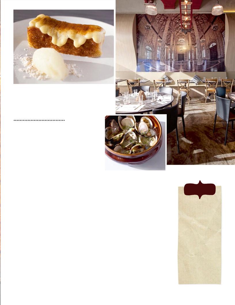
Torrija de Coco Caramelizada
Idon’t know exactly when chef Chele Gonzalez fi rst encountered rice, but I can say with confi dence that the meeting blossomed into a deep friendship. The El Bulli-, Noma-, and Mugaritz-trained Spanish chef impressed Manila with his kitchen wizardry at VASK and is now appealing to the core of the Filipino’s culinary heritage. At ArroZeria, rice is the hero—he whips up paella dishes that marry familiarity with just the right amount of exotic thrill. Every dish is a celebration of fl avors. Bring a date, your family, your friends—this is a restaurant where you’ll want to share and talk about every compelling fl avor combination.
The chef knows rice so well that he effortlessly draws out its full potential with the best and most precise seasonings. You can taste the duck and chanterelle mushrooms in each spoonful of the Paella de Pato y Setas—rich, earthy notes grace the salty, paprika-heavy sauce that embraces each grain. They recommended cooking the rice al dente (you can request it in a softer style), resulting in a wonderful crust at the bottom of the shallow pan.
At ArroZeria, rice isn’t only served as paella— you can take your pick from creamy risotto and saucy meloso, too. But it’s the grain-free Fideua that presents itself as the understudy to the main act. Thin, vermicelli-like noodles soak up a great depth of fl avor. In the Negra, the freshest seafood fl avors are reinforced by the tangles of tender octopus. On some occasions, Chele would reward his creations with an extra embellishment, like large, juicy scallops last May.
The other dishes on the menu are given meticulous thought as well, and deserve a second glance. The Pollo a la Cazadora is superb: It’s fried to a crisp and stewed in a white-wine sauce, with Jamon Serrano, potatoes, and caramelized onions bolstering the rather gentle combination. The simple sprinkling of garlic, parsley, salt, and pepper in the creamy Almejas a la Marinera shows an understanding of how subtlety can make the most impact.
A bright dessert is the best way to round out the intensity of an ArroZeria meal. There’s one that comes with rice, but order the stellar Torrija de Coco Caramelizada—caramelized coconut brioche paired with peppy pineapple sorbet—for a change.
So really, it’s not just with rice. Chele turns every ingredient he meets into a cherished friend, and turns chance encounters into beautiful relationships every time.
Almejas a la Marinera
in a nutshell
ARROZERIA
4/F Century City Mall, Kalayaan Avenue, Makati City; mobile no. 0920-9744742
MUST-TRIES Almejas a la Marinera (P250), Paella de Pato y Setas (P375), Paella Valenciana (P295), Fideua Negra (P285), Pollo a la Cazadora (P395), Torrija de Coco Caramelizada (P195)
THUMBS UP Having a party at home? You can order paella in advance for takeaway.


