18 minute read
Alan Dyer’s retrospective
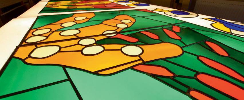
given free rein it must have been a daunting prospect, even for Hockney, to walk into the Abbey and to see that window as a canvas for the very first time. The 20 foot (6.1m) high x 6 foot (1.8m) wide window consists of three openings in the north transept of the Abbey and it will join with another stained glass window celebrating the Queen’s Diamond Jubilee which was installed two years before. Westminster Abbey finally revealed the window in all its glory in September 2018, following the two years that it took to design and construct using pieces of coloured glass and supervised, of course, by Mr Hockney himself. This new medium for him was, befittingly, constructed by stained-glass experts at Barley Studios, also in Yorkshire.
David Hockney based his design on his favourite subject – the Yorkshire countryside and landscape. It features blossoming hawthorn trees in hues of blue, green, yellow, orange, pink and red. All truly in the Hockney style. Westminster Abbey said the result “reflects the Queen as a country woman and her widespread delight in, and yearning for, the countryside”.
Advertisement
The window is both stunning, extraordinarily fresh and in keeping with the times – wonderful in fact! It will definitely be appreciated by contemporary art lovers.
Hockney drew this colourful countryside scene – on his iPad. There is some controversy in the art world regarding the use of this technology, using the strokes drawn by a stylus on an iPad and pixels from an ink jet printer to enlarge the image. This is what has raised eyebrows and questions amongst some art critics about whether iPad drawings qualify as art. The following comments appeared in an article on the subject in the New York Times as early as 2014. “Art critics have shown mixed reactions to Mr Hockney’s use of this technology:
“They could never hide their electronic origin no matter how painterly they appear,” wrote Andrew Searle in The Guardian. “There’s something inescapably dead and bland and gutless about them. Openness to technical innovation is one thing, art another,” Mr Searle added.” But in the New York Times Roberta Smith called the iPad work “deft”. She wrote, “this array forms an in-depth portrait of the artist as a tradition-fluent progressive working non-stop at the height of his powers, deftly juggling digital and analog modes of representation and energetically pursuing newness on several fronts.”
Hockney himself defends the use of these tools in simpler terms and says “the iPad is back-lit like a window. It’s a natural thing to use.” It is also interesting to note that he had previously created a collection of 52 separate iPad drawings The Arrival of Spring in Woldgate, East Yorkshire, printed on paper, which were much acclaimed at his Royal Academy exhibition in 2011. In addition, his fabulous Yosemite Suite launched at the Pace Gallery in New York in the same year, was also admired and accepted as art.
David Hockney is well known for drawing and painting outdoors and the iPad has simplified that process for him. He and his work defend the criticisms well. He has long defended the use of technology in art and has even written a book containing evidence that the old masters often used devices like camera lucida. Maybe this Royal stained glass window, along with all the other priceless art and artefacts within Westminster Abbey, will help settle this matter once and for all. .
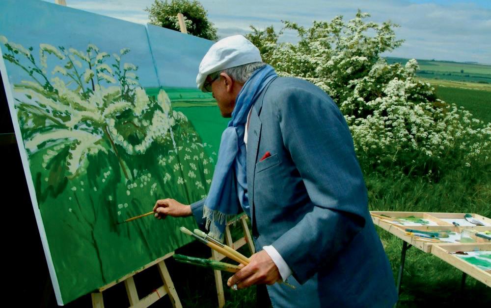
Above: The Queen’s window in the making
PHOTOGRAPH: DAVID HOCKNEY FOUNDATION
Left: Hockney paints his beloved hawthorn
Alan Dyer: Image+Text, Retrospective Exhibition 1966–2018 Lanchester Research Gallery 15 November–7 December 2018
As the proud owner of three artworks by Alan Dyer I greeted the prospect of his retrospective exhibition Alan Dyer: Image + Text with some enthusiasm. In many ways the Lanchester Research Gallery at Coventry University was the ideal setting for this comprehensive survey of a particular strand of Alan Dyer’s work which was beautifully curated by Professor Jill Journeaux. Seventy-five framed works were on show in addition to four glass covered vitrines containing sketch books, research material and the paraphernalia of the artist’s studio. Alan Dyer studied Fine Art at Burnley School of Art before moving onto Bristol Polytechnic and then the University of Reading in the 1970s where he gained an MPhil for his research into the psychology of perception. Alan taught art theory at Coventry School of Art & Design for twenty-four years before leaving to run the Canal Basin Trust studios and focussing on his research and his painting.
Broadly divided into three sections: the ‘Early Works’, the ‘Digital Research Studies’ and the ‘Late Composites’, the exhibition revealed the extent to which Alan Dyer’s preoccupation with image and text has continued unabated over a period of five decades with an extraordinary degree of consistency of approach and purpose. Each piece of work in the exhibition was framed in black giving a sense of thematic and aesthetic similarity across the entire show. The exhibition catalogue designed by Clive Richards is in itself a valuable research document and contains a statement by the artist, an essay by Jill Journeaux and colour plates of the works on show. In addition, there is a very useful visual index presented as strips of postage stamp size images. I found this extremely useful as an aide memoire and I found myself returning time and time again to these tiny images which increasingly reminded me of the pages of an illuminated manuscript. In Alan’s catalogue statement he helpfully refers to the tension between the ‘dualistic character’ of both the ‘conceptual’ and the ‘aesthetic’ aspects of his practice and his ambition to reconcile these modes within an orchestrated whole. It is perhaps fair to say that Alan Dyer’s approach to making art has always been somewhat mercurial and try as one might, it is not easy to identify with any certainty how the dynamic of the works and the process of making art dovetails with the theoretical underpinning of the research. This is perhaps why the works are so intriguing! As Jill Journeaux rightly points out in the catalogue essay “the paintings, drawings and prints are engrossing, meditative and demanding of the viewer”.
The richness of Alan Dyer’s work always invites close scrutiny, but this is where things get difficult. What are we meant to make of these complex icon-like images containing spidery handwriting, anatomical drawings, symbols and notations embedded in wax? Are we meant to try and read the content or simply think about it? It is probably a mistake to see them just as aesthetic objects, but I can’t be alone in having to begin to look at them in that way. In room one, Triple Heads (Fig. 1) caught my eye straight away although it is not typical of Alan’s approach in the sense that the picture contains figurative images of heads in profile (a recurrent motif
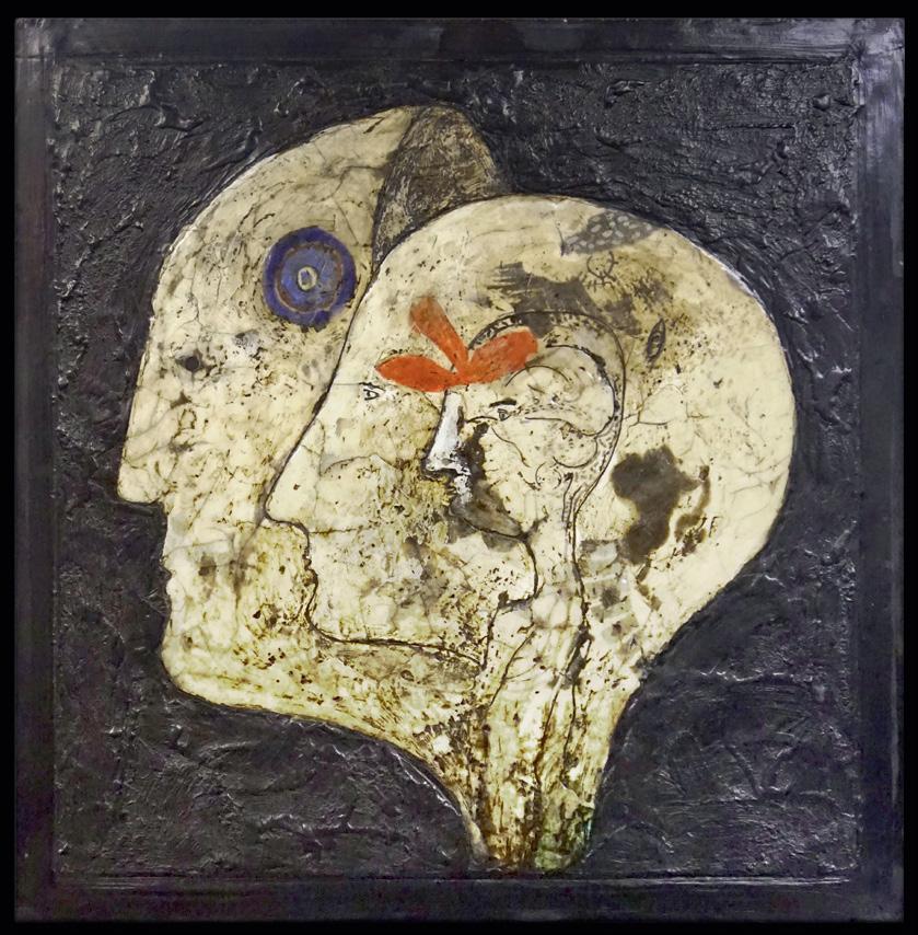
Figure 1. Left: Triple Heads (1984) mixed media and wax 55 x 53cm
in Alan’s oeuvre) isolated against a heavily worked black surface of wax. One of the few images in the show without text, lettering or annotations of any kind. Also, in room one: Prelude 1, Prelude 11, Prelude 111 and Rhapsody (interestingly dated 1966-96) are lithographs started when Alan was a student at Burnley College of Art and reference T. S. Eliot’s The Waste Land. In my view the aesthetic dynamic of the mature works is to be found in embryonic form in these enigmatic responses to Eliot’s poem. In particular, the relationship to print is an important factor in how the visual imagery begins to compete alongside the handwritten annotations resulting in the ‘image and text’ dynamic that would be Alan Dyer’s lifelong project.
Looking at Alan Dyer’s work is a bit like visiting the Pitt Rivers Museum in the sense that there is too much to take in at one sitting. The overwhelming layering of largely indecipherable text combined with enigmatic and often obscure references to symbolism, anatomy and psychology provides the viewer with a sense of visual overload and maybe the only way to deal with this is to simply stand slightly further away and view each picture as an art object. I am always intrigued by the ingenious way Alan disrupts the two-dimensional surface of the works with found objects and small artefacts redolent of votive offerings. Some of the earlier pictures incorporate sunken cavities and furrows in addition to raised surfaces, found objects, rivulets of colour and forms embossed in gold. The surface is often heavily worked, distressed and scratched in much the same way that the American artist Albert Pinkham Ryder worked and distressed his pictures to imply a sense of mystery and the passage of time. The perimeter edges of the ‘waxes’ (as Alan calls them) are invariably blackened

with paint or wax which eases the eye into the black moulding of the frame. This accentuates the notion of illumination in the glowing centre of each work. The quasi-religious dimension of Alan’s work is occasionally overt as in the case of L’Ultima Cena (Fig.2) a bespoke work from 2011 made in response to the theme of the Last Supper which contains a rusty nail in a red edged container placed right in the centre of the image. As with many of the early works wax has been incorporated as a key ingredient of the image. The use of wax or encaustic in art has a lengthy history dating back thousands of years and in Alan Dyer’s work it serves both symbolic and metaphoric purposes but on a more simplistic level it is also reminiscent of old newsprint. The wax gives a subtle creamy colouration to the image which suggests it has mellowed with age and this also provides the leitmotif for the iconography that forms the core of each image. The newsprint reference is also important in the sense that the distribution of text and image in most of the works (early and more recent) seems to work like the layout of a page of a newspaper. Thinking about thinking (Fig.3) is one of the strongest and perhaps most typical of Alan Dyer’s works in that it contains the trademark head in profile and overlapping and adjacent ‘image and text’ seamlessly combined in one complete image. The Art & Language (A&L) movement left an indelible mark on the culture of Fine Art in the Coventry School of Art & Design in part because of the challenge it raised about the conventional relationship between practice and theory. This dynamic was always at the centre of any discussion about the Fine Art curriculum and Alan Dyer (although not directly linked with A&L) was instrumental in driving forward a strong theoretical dimension to the Fine Art course over a period of two decades. This theoretical underpinning was hugely successful and resulted in
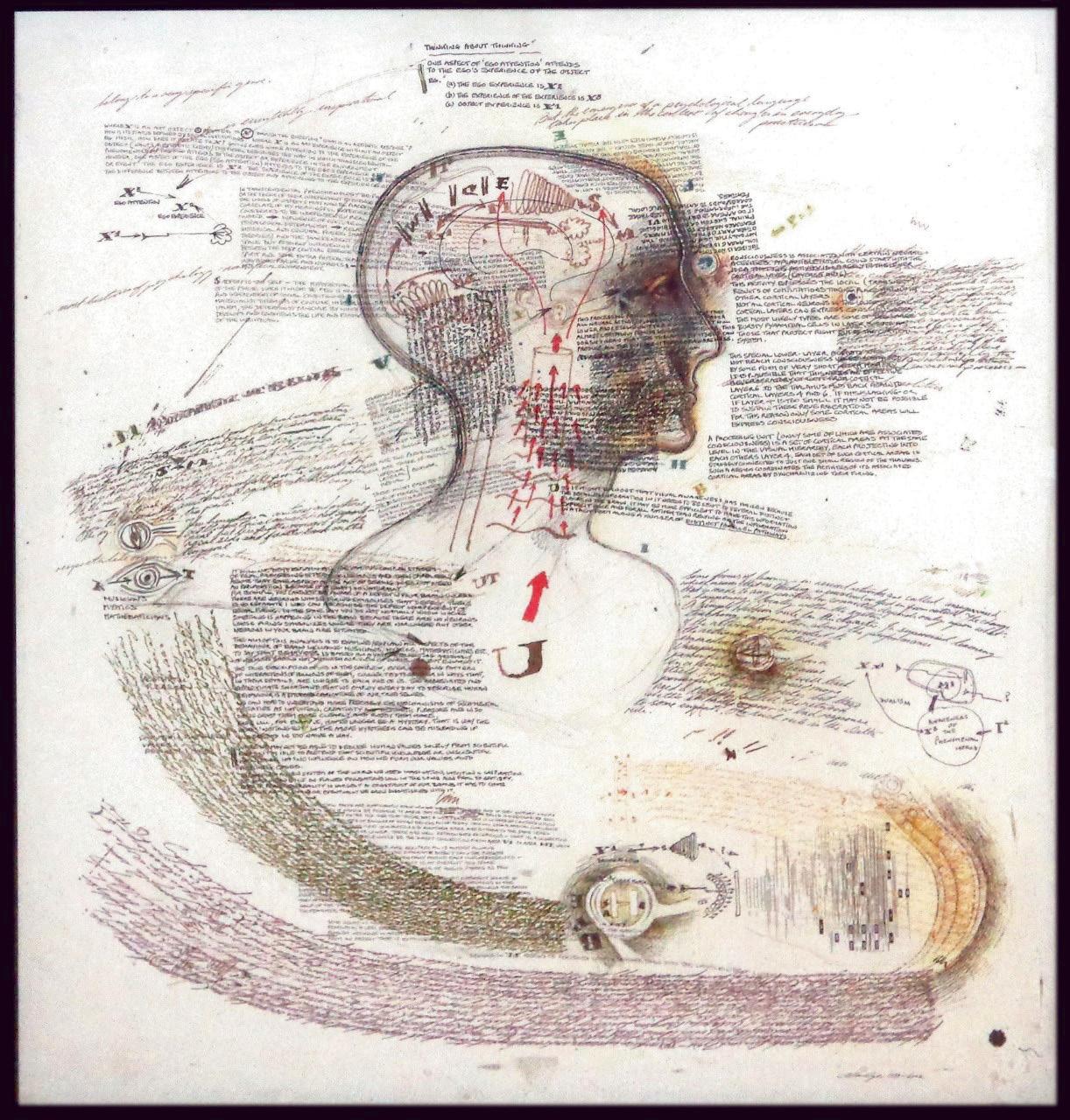
Figure 3. Left: Thinking about thinking (1999–2002) Ink on paper 60 x 56cm
students being able to elect to do a weightier theoretical component as part of their Fine Art course. This became known as the ‘double module’ and effectively provided the space and time for students to excel in this area if they felt compelled to do so. Alan’s delivery of this module resulted in a significant number of students moving on to Master’s level theory courses on the strength of their final dissertation. This was a real success story but as with many success stories its significance was perhaps not fully appreciated at the time. As a frequent visitor to the Canal Basin Trust in Coventry where Alan has his studio, I have had many opportunities to see his work in progress and to reflect on the many facets of his art practice. In our age of ‘constructed identity’ it is interesting to consider the extent to which Alan Dyer the polymath has managed to develop a number of interconnected but also quite distinctly separate approaches to making art, each of which is worthy of discussion and debate. The Lanchester Research Gallery show revealed one aspect of this prolific output, but there are also the complex figurative paintings that he has been preoccupied with for many years some of which were exhibited at Gallery 150 in Leamington Spa in 2014 and discussed by John Yeadon in his article: Alan Dyer at 70 (ArtSpace issue 41). In addition, Alan Dyer has produced a completely discreet and separate series of paintings inspired by Cezanne. These pictures constitute another aspect of genuine visual research through making. Although they incorporate the motif of figure in landscape and are constructed with Cezanne like faceted brush marks, they are perplexing and strange. Alan has effectively reimagined Cezanne in Lancashire and thus the iconography of the pictures
is more Pendle Hill than Mont SainteVictoire. I felt it was important to mention these other aspects of his practice in order to contextualise the Image+text show and as an indication of the degree of focus and attention that he brings to his artistic endeavour. Alan never embarks on anything in a halfhearted way and each aspect of his practice is rigorously pursued and interrogated in the spirit of a lifelong research project.
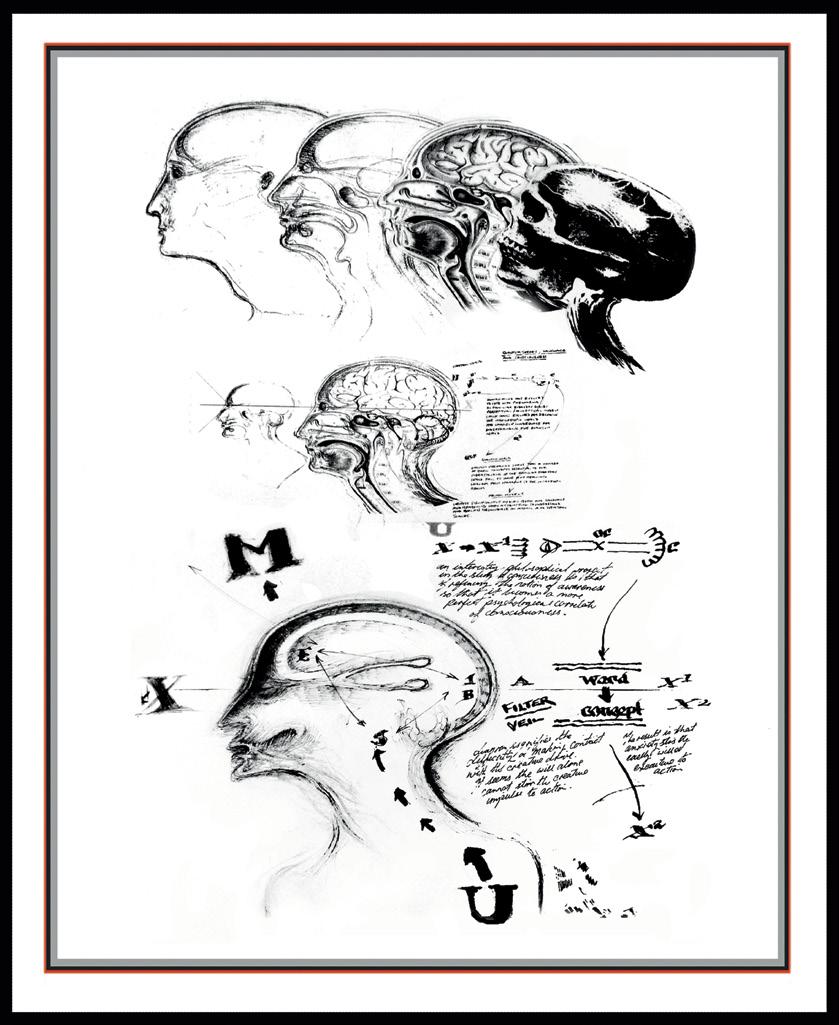
This is especially evident in the series of images identified as ‘Digital Research Studies’ and the arrangement of the catalogue allows the viewer to scan images as though each is a page from a journal. The aesthetic and practical considerations of arranging text and image perhaps achieved a level of perfection in the illuminated manuscripts of the medieval period and one might argue that the legacy of that aesthetic is still present in the journalistic conventions of printed media today. The idea of incorporating the capital letter at the beginning of a chapter in a larger and more decorative font appears in Alan Dyer’s work time and time again although not with that original logic. In Alan’s work, a capital m or u might appear as though adrift from the main body of text. In x-u-m Study (Fig.4) the now familiar heads in profile (seven in all) are drawn with great fluency and are linked together as a sequence moving seamlessly from skull to person. In this series of works the physical patina and substance of the earlier works is absent. Each piece has one layer of visual information which has been produced digitally. The rectilinear device is still present in the form of a printed window mount-like edge to each image an inch or so in from the edge of the frame. Once again, the relationship between image and text in

Figure 5. Left: u-Spiral (2011–17) Notebooks composite digital print 33 x 27cm

Alan’s work is at the core of his endeavour. Sometimes images are overlaid and overlap each other as though competing for the same space, however in this series they coexist on the same physical plane. Alan is faithful to the conventions that he has determined for himself and therefore the borders and margins allow for contained blocks or galleys of handwritten script that act like building blocks and aesthetic space-fillers in each image. Alan’s ‘text boxes’ never stray too close to the edge of the image and thus the rectangular frame is reinforced and echoed throughout each image. u-Spiral (Fig.5) is an example of how the resulting sense of the completeness of each image is continually reinforced by this adherence to compositional unity and harmony.
The final section of the exhibition identified as ‘Late Composites’ continues the iconography of the previous works but again it incorporates digital versions of works in sketchbooks combined with the addition of pen and ink used like watercolour. It is as though the diagrammatic imagery has started to break free from its moorings and a more fluent expressivity is evident. In Photon 1 (Fig.6) we see a controlled splash of blood red ink occupying centre stage. In Photon 11 (Fig.7) the red splash has begun to break-up and appears to be morphing into an indeterminate form. Curiously perhaps, I spent more time looking at these later works in the catalogue than in the gallery. With the benefit of hindsight, I should have devoted more time to the later works as I am now unsure about the extent to which I was looking at digitally manipulated imagery arranged in printed form. The early works have more obvious gallery gravitas and perhaps the mystery and complexity that they exude elicits a different kind of approach to viewing. In crude terms, they are more like ‘art’. Having said that, it is clear that on closer inspection we can see that things are not quite what they seem. The later series of works are more emphatically print-like and take us back full circle to the Prelude series of lithographs at the beginning of the show. There is a layering process, albeit a subtle one and we can see the torn edge of the central motif which has been glued to another sheet of paper. Once again, blocks of handwriting often frame the central motif but the relationship is assured and controlled in a way that suggests that the idea is more paramount than the execution. Perhaps the more recent works are easier to understand as a form of research endeavour because they are less encumbered by the patina of art? Perhaps the middle to later images work beautifully in the catalogue because they are the product of digital manipulation and remind the viewer of the earlier images albeit through a form of simulacrum? Notwithstanding, it was a treat to see such a coherent and comprehensive body of work under one roof. The show gave me a lot to think about and that’s always a good thing. We may never get another opportunity to see such a complete chronology of Alan Dyer’s works again. .

Figure 7. Below: Photon 11 (2016–17) Pen and ink with digital print on paper 43 x 51cm
John Devane is Professor of Painting in the Faculty of Arts & Humanities at Coventry University and Professor of Painting at the RBSA (Royal Birmingham Society of Artists).
Both Alan Dyer and John Devane are long-standing members of the LSA. 13
Jessie Walker curating Kenilworth Arts Festival
Being a final year student at the University of Warwick, one question that I get asked too regularly, especially as a humanities student, is “so what do you plan on doing after this?” When asked this, my answer changes every time. Humanities subjects open up so many creative opportunities for students which allow involvement in unique projects and ideas, and it makes it hard to decide and tie down one particular and definite career path. This is because, like myself, students can have several interests within their subject which could lead in many different directions career-wise. When this question first began being asked, my answer was always one of uncertainty. Due to this constant questioning, combined with my own uncertainty in contemplating my future career, when an email advertising a volunteer role at a local Arts Festival appeared in my inbox, I hastily replied.
Admittedly, the opportunity of curating my own exhibition came into being with a great deal of luck. I was originally interested in helping promote Kenilworth Arts Festival to the student demographic at Warwick through social media and advertising, and learning about the marketing sector with future jobs in mind. After some meetings and many coffees, I was presented with the unexpected opportunity of curating a companion exhibition to the main festival, at which I leapt. Under the very trusting guidance of Kenilworth Arts Festival’s director Lewis Smith, I was provided with a space, a budget and a deadline. With the key ideas of the Arts Festival encompassing the celebration of new and emerging talent, the community and the local area (i.e Kenilworth and the West Midlands) my aim was to produce an exhibition which reflected this. With this sense of community in mind, we set up an ‘open call’ asking artists to engage with the title ‘community’ and to present their own interpretations of what the word can mean to individuals as well as in a wider group. This thematic decision came mostly off the back of the Arts Festival’s encompassing ethos of inclusion and celebration, and I believe the events during the festival heavily reflected and complemented this decision. After roughly 6 months of emailing, planning and emailing some more, whilst attempting to keep up with exams, a summer job, and university work, the set-up day arrived. After meeting with the artists to collect all their work, standing in the empty space of the soon to be the exhibition felt daunting, and one of the greatest challenges was attempting to make the art work in the context of a challenging space. A large part of this difficulty came with the issues surrounding planning, and as I was working remotely for the majority of the summer, I had yet to see the room until the morning that the artworks had to be hung. This gave me a practical and unexpected insight into the way in which curators work, with the challenge of coordinating artworks into a single, cohesive arrangement from a distance representing a key aspect to this type of career.
The artworks which were selected to be displayed in the exhibition all held very key representations of what the term ‘community’ meant to them. For example, the photographer and community workshop leader Tia Bryant produced a documented format of one of her classes at a Coventry community centre with children aged 6–16, teaching them the technical skills of
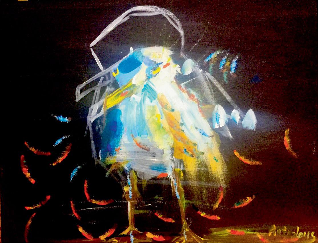
Figure 2. Below: Magdalena Antrobus Illegal Alien: Trying to Fit In


