
12 minute read
LSA Winter Exhibition
LSA Winter Exhibition Mike Patrick
LSA East Lodge Art Gallery, Jephson Gardens, Leamington Spa, 20th November to 22nd December 2019
Advertisement
East Lodge was again bustling throughout the last two months of the year with the Winter Exhibition showcasing some eighty-two LSA members’ work covering abstract, portraits, landscapes, and drawings.
Being a Friday afternoon volunteer, I was able to spend quite some time at the exhibition and look at the pictures from multiple viewpoints. Instead of looking at them as if just flicking through a magazine, I actually paid attention to the detail and craft gone into each piece. Being myself a watercolour artist, the exhibition broadened my horizons into the work of acrylics, charcoal, pastels, oil, pencil, mixed media and even beeswax!
Firstly, many thanks indeed to our judge of the exhibition, James Fotheringhame. Having studied at the Royal Academy of Art, as well as having exhibited at the Royal Academy, it was very valuable to gain his insight on the art produced in Leamington.
Janette George was selected winner by James for her piece Pura Vida (Fig. 1), and Carolyn Bonthrone and Sue Southorn were highly commended for their pieces Plumptuous (Fig. 2) and Milldale/Riverside III (Fig. 3).
Pura Vida translated means “simple or pure life” and is a great title for Janette’s work in oil. An economy of brush strokes gives both perspective and depth and made me feel I was standing right on the shoreline. I was also impressed with the interplay of light and dark, the eye repeatedly drawn to the horizon and then back to the foreground. A much deserved 2019 exhibition winner.
Carolyn Bonthrone’s acrylic painting Plumptuous made me smile. Surely everyone loves birds and there is a look of contentment here that makes the viewer feel relaxed. This is not an anatomical design for a book about birds but a heartfelt response to one of our delightful garden birds.
The other runner up was Sue Southorn whose oil and acrylic painting Milldale/ Riverside III transported me right into the Peak District as if I were hiking through it. This is no picture postcard image but nature in all its majesty with more than a hint of danger. The raw quality of the scene makes looking at it a sensory experience: the wind in your face, the spray from the water, the call of an untamed landscape whistling past your ear.
Hilary Roberts won the most votes from the public with her picture Santorini Sunset (Fig. 4) and won the £50 prize money. Well done Hilary!
Notable Entries
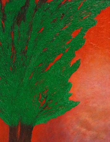
My first selection is an oil by Giuseppe Pittarello called Splitting (Fig. 5). I was drawn to this painting by its vibrant, bold colours and the more I looked, the more I could see. At first, I took the title at face value: splitting is the action of dividing or being divided into parts. Here was a tree, some kind of fir tree perhaps, with its trunk split and its many branches divided. Then I noticed the image in the bottom right corner and thought of the psychological meaning of splitting as blackand-white or all-or-nothing thinking. When we do that, we inevitably burn bridges between people. Is that the reason for the fiery colour chosen by the artist? The colour of hell?
Would I have had any of these thought processes if the painting had been called “Untitled”? Just how important are titles in the artistic process? This would be an interesting topic for one of LSA members to write an article about for the next edition of the magazine. Any volunteers?
My second choice is an acrylic by Brian Edden called The Best Marigold Hotel Garden (Fig. 6). This painting made me smile, as did the title. I loved the use of colour ranging from a verdant backdrop to the exotic flowers in the middle and the almost daisy-like flowers at the front. The pillars link top and bottom together and hint at some of the very different architectural styles to be found in India. The patch of soil resembles a reclining figure and gives this painting a peaceful feel. Having lived in India I am sure any hotel would have been proud to have such a fine exotic garden!
My third choice is a watercolour by Jo Young called Seasons (Fig. 7). I chose this painting for its use of colour, its depth and the delicacy of the trees. Climate change has brought a blurring of the seasons in this country and this painting seems to hint at the chaos yet to come. In many ways it makes for uncomfortable viewing and yet it holds your attention. You are responsible for this, it seems to be saying; there is a way out, but you need to do your bit. The trees are almost feminine in form and their fragility contrasts with the ominous darkness beyond. Not a picture I’m going to forget in a hurry.
My fourth choice is in mixed media by Soner Britton called Geometric Patience (Fig. 8). There is such great movement in this picture and fantastic use of colour. I would have been much more patient in my maths lessons in school if geometry had been presented like this! I love the feeling of space and the way the different shapes interact with each other in the central area, almost like a dance. Are the pieces around the darker edges waiting patiently to join in? Or have they been discarded? Either way, it’s a visual delight.
Reasons to Smile and Ponder
I was recently asked “Why do you paint?” and it is a question every artist should ask themselves. Are you doing it for the process or the end result? Are you painting for yourself or someone else? Is it a form of expression or a means of control? Are you giving or taking?
I very much feel that art is the artist revealed and anyone who paints, sketches or sculpts shows a bit of his or her soul. I do also believe that your sub-conscious comes to the fore in the process of artistic endeavour and it is a way of connecting with your inner self.
Fig. 2: “Plumptuous”, Acrylics by Carolyn Bonthrone

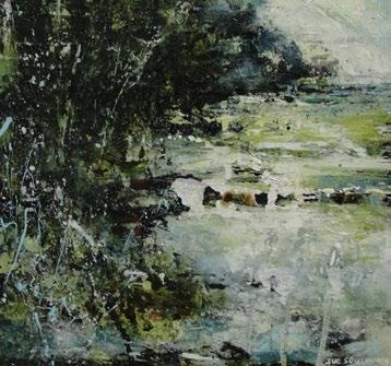
Fig. 3: “Milldale/ Riverside III”, Acrylics by Sue Southorn


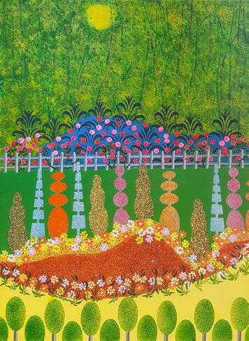
Fig. 8: “Geometric Patience”, Mixed media by Soner Britton
That concludes my selection for this edition of ArtSpace. One key factor from this exhibition that really hit me is the sheer talent that we have in our membership; it was a feast for the eyes and the soul. I have been given food for thought, a great deal of pleasure and, perhaps most importantly of all, inspiration to get back to my own painting.
Before I sign off, I’d like to pay tribute to Soolie and her team for setting the exhibition up. We sometimes forget our silent heroes who make all of this happen at East Lodge so thank you all for an excellent exhibition. I’m already looking forward to the next one! .
Fig. 6: “The Best Marigold Hotel Garden”, Acrylics by Brian Edden

Garima Dhawan, Helena Verrill & Hilary Roberts Tatty Culley & Charlie Colville
East Lodge has started the decade on a high note with a strong display from female artists - from vibrant collages and crisp geometric lines, to glowing photographs and floral illustrations.
LSA East Lodge Art Gallery, Jephson Gardens, Leamington Spa, 8th January to 2nd February
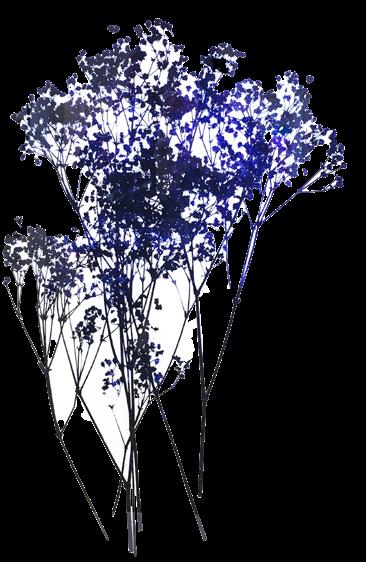
Fig. 2: “Baby’s Breath 1” by Garima Dhawan Giclée print 59.4cm by 84.1cm
Garima Dhawan: ‘Forest Bathing’. Garima is an Indian artist who specialises in collage and hand printed forms including traditional printmaking and digital manipulation through photoshop. As an alumnus of the Rhode Island School of Design in the United States, Garima has an eclectic and visually engaging art style which focuses on the use of bright and colourful forms that convey a vibrant energy. Her inspirations include music nature, poetry, literature and spiritual teachings, giving her artworks a diverse range of sources to draw from.
Garima’s images of the natural world are conveyed through simplified outlines and shapes with a vibrant but minimal colour palette. This can be seen in Lily 20 (fig. 1), where the dark background contrasts with the flowers at the top of the composition. As such, the viewer is encouraged to examine the intermingling colours created by the collaged layers, adding dimension to the initially flat composition. Despite the background, there is a sense of warmth conveyed by the orange flowers at the front; they relay an energy and growth associated with blooming flowers.
Baby’s Breath 1 (fig. 2), in contrast, has a much cooler tone with an emphasis of silhouettes and solid forms. The overall effect is striking, as the eye follows the outline and studies the layering of shapes and colour. The thin lines making up the stems, however, have a delicacy which prevents the image from appearing completely flat. Indeed, despite the emphasis of outline, the image retains a depth from the variation of colour formed from the printing process.
The sense of handcrafting and labour in Garima’s oeuvre is evident in Flowering (fig. 3), where the artist used both printmaking and collage to construct the image. This handmade rendering of the natural world appeals to the senses through the layering of images, textures and colours; we are able to see the silhouette of the flowers and visualise the colours of the blossoms from the tissue paper beneath it. The use of tissue paper, as indicated, also conveys a sense of texture and delicacy associated with flower petals, conveying an added sensory dimension to the composition. Garima’s works convey the vibrancy and beauty of nature’s products; they are overall a delight to see!
Written by Charlie Colville

Fig. 3: “Flowering” by Garima Dhawan Print (photolithography plates printed and collage on an etching press) 20cm by 25cm
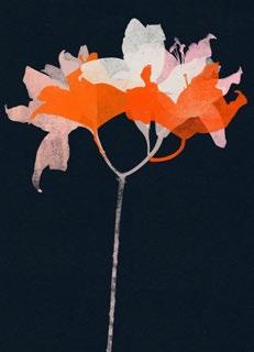
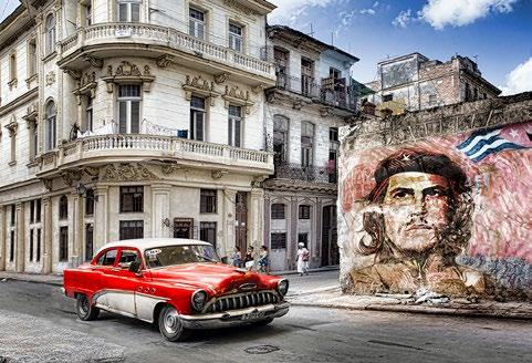
Fig. 6: “Cuba Libre” by Hilary Roberts Photograph/Giclée print on archival, textured paper, Dimensions alterable H ilary Roberts: ‘Painting with Light’. With nearly thirty years of photography experience, membership to the Royal Photographic Society, and the title of Master of the International Federation of Photographic Art under her belt, Hilary is wellrecognised for her talents both in and beyond Leamington Spa. Referring to herself as an image-maker rather than a photographer, Hilary’s works emphasise digital manipulation- or as she fondly says “fiddling”! Hilary takes inspiration from a diverse range of subjects and locations, and often tries to incorporate humour in her finished products.
This is true of Outnumbered (fig. 4), a humorous appeal which will appeal to both cat and dog lovers alike. The focal point of the image rests on the tense body of the dog leaning on a gate as a group of nonplussed felines casually perch on the other side, setting up a witty contrast which perfectly illustrates the classic struggle between the two animals. The viewer can feel the desperation of

the dog, who obviously wants to give chase, as it meets the nonchalant eye of one of the cats. The cats, settled with an air of self-assured complacency, appear to enjoy the dog’s irritation as they sit tantalisingly out of reach.
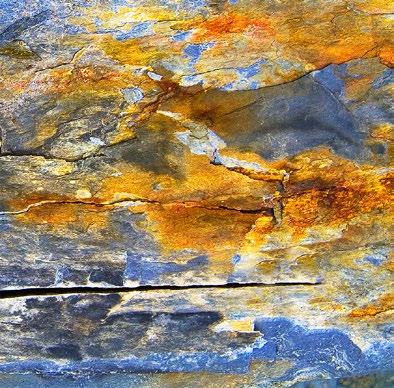
Slate (fig. 5) showcases the diversity of Hilary’s interests in its emphasis of surfaces and sensory imagery. The vibrancy and texture in this piece provides a contrast to the more narrative and location-based subjects of Hilary’s other works, but is still able to capture the viewer’s attention through the sheer amount of details available to observe. The effect of colour on the slate echoes the topography of a landscape, skyscape or seascape, allowing for individual interpretations of the image.
When speaking to Hilary about her piece, Cuba Libre (fig. 6), we found out that she manipulated several elements of the image. Taking the street as her base image, she had proceeded to photoshop elements onto it to fill up the space; the most prominent being the retro car and wall mural. The image is testament to Hilary’s skill with digital manipulation and photoshop, demonstrating her ability to seamlessly intertwine separate image in one space.
Hilary has a range of her prints available to purchase on her website.
Written by Charlie Colville
Helena Verrill: ‘Circles & Straight Lines’. Helena Verrill is a mathematics teaching fellow at the University of Warwick. She combines her passion for mathematics and art in her paintings and origami artworks.
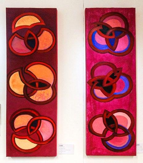
Magenta Circles Variations/Cream and Magenta Circles Variations/ Purple (fig. 7) are two oil on canvas paintings depicting overlapping circles, reminiscent of Venn diagrams. The focus is on the interlocking forms and the play of colours. The colour palettes are limited; as the titles suggest, the paintings focus on magenta responding to shades of one other colour, either cream or purple. The paintings are visually striking.
More remarkable is Helena Verrill’s skill with origami. Helena is an expert at the Japanese art of paper-folding and uses this in her artworks. Again, this shows the artist’s interest in mathematics and geometry. Red Origami Sequence (fig. 8) is created from the folding of tant paper, an ideal paper for origami, into tessellations. Origami tessellations are created from folding a single piece of paper to make a repeating pattern. Red Origami Sequence consists of a grid of three by four squares of tessellations. As with the aforementioned oil paintings, there is a definite colour scheme; all of the tant paper selected is of a slightly different red or orange hue. The squares are placed in a green frame decorated with tumbling foliage. The green provides a pleasing contrast to the warmer shades, just as the natural form of the greenery acts as a foil to the carefully constructed tessellations.
Helena’s works are unusual and demonstrate a capable handling of different media. .

Fig. 8: “Red Origami Sequence”, Origami tant paper tessellations by Helena Verrill
Written by Tattey Culley
Fig. 7: (Left) “Magenta Circles Variations/Cream”, (Right) “Magenta Circles Variations/Purple”, Oil on canvas by Helena Verrill


