
13 minute read
Grids, Margins, Columns and Modules


For us Graphic Design is “organization of information.” There are other types of graphic design more concerned with illustration or of a narrative nature.
Nothing could be more useful to reach our intention than the Grid. The grid represents the basic structure of our graphic design, it helps to organize the content, it provides consistency, it gives an orderly look and it projects a level of intellectual elegance that we like to express. There are infinite kinds of grids, but just one - the most appropriate - for any problem. Therefore, it becomes important to know which kind of grid is the most appropriate. The basic understanding is that the smaller the module of the grid the least helpful it could be. We could say that an empty page is a page with an infinitesimal small grid. Therefore, it is equivalent to not being there. Conversely a page with a coarse grid is a very restricting grid offering too few alternatives. The secret is to find the proper kind of grid for the job at hand. Sometimes, in designing a grid we want to have the outside margins small enough to provide a certain tension between the edges of the page and the content. After that we divide the page in a certain number of columns according to the content, three, two, four, five, six, etc. Columns provide only one kind of consistency, but we also need to have an horizontal frame of reference to assure certain levels of continuity throughout the publication. Therefore, we will divide the page from top to bottom in a certain number of Modules, four, six, eight, or more, according to size and need. Once we have structured the page, we will begin to structure the information and place it in the grid in such a way that the clarity of the message will be enhanced by the placement of the text on the grid. There are infinite ways of doing this and that is why the grid is a useful tool, rather than a constricting device. However, one should learn to use it so as to retrieve the most advantageous results.
Advertisement
3x6 Grid 6x6 Grid
4x8 Grid
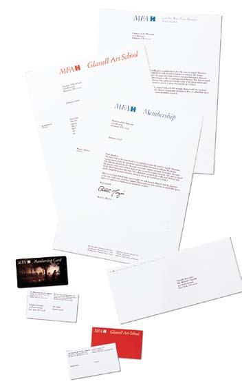
After setting the outside margins at 10mm. from the edges of the paper, we will divide the space in three columns, leaving the left one blank for the use of a logo, or names, or just empty space.
The remaining two columns will be for the text. The overall asymmetrical layout conveys a feeling of modernity.
At the top we will put the name of the Company starting and containing it in the second column, in a way that it will look centered on the page.
If we have established a horizontal grid of six modules, we will position the address of the receiver on the second module, second column.
The first fold of the letter will be in conjunction with the third module and just below that, the letter will start, typing the text flush left from the second column toward the right margin. Sometimes we will position the logo (or the symbol) on the first column, right below the first fold.
Usually, we will place the sender’s address at the bottom of the page splitting the information between the second and the third columns.
The over all look of the letterhead is accomplished when the letter is typed with the message, and in this example, every component has its proper place, with the proper hierarchy and clarity. The proper choice of a typeface will give the appropriate final look to the stationary. Naturally, this is only one of the many possible combinations for a letterhead, according to our canon. The intention of this example is only to demonstrate the use of a grid in a letterhead. Another typical example of a letterhead is the one with a central axis.
For this kind of letterhead we will design a grid of five columns, of which, one is for the left margin, three are for the text and one is for the right margin. We will place the logo at the very top of the letter positioned in the center column.
The addressee will be positioned on the second module from the top and flush left with the second
Mr. Recepient’s name Recepient’s Title Recepient’s address City, Province Zip code City, Date, Year
Dear Mr. Smith,
Lorem ipsum dolor sit amet, consectetuer adipiscing elit, sed diam nonummy nibh euismod tincidunt ut laoreet dolore magna aliquam erat volutpat. Ut wisi enim ad minim veniam, quis nostrud exerci tation ullamcorper suscipit lobortis nisl ut aliquip ex ea commodo.
Duis autem vel eum iriure dolor in hendrerit in vulputate velit esse molestie consequat, vel illum dolore eu feugiat nulla facilisis at vero eros et accumsan et iusto odio dignissim qui blandit praesent lup tatum zzril delenit augue duis scing elit, sed diam nonummy nibh euismod tincidunt ut laoreet dolore magna aliquam erat volutpat.
Ut wisi enim ad minim veniam, quis nostrud exerci tation ullamcorper suscipit dolor in hendrerit in vulputate velit esse molestie consequat, vel illum dolore eu feugiat nulla facilisis at vero eros et accumsan et iusto odio dignissim qui blandit praesent luptatum zzril delenit augue duis dolore te feugait nulla facilisi. Ut laoreet dolore magna aliquam erat volutpat. Ut wisi enim ad minim veniam, quis nostrud exerci tation ullamcorper suscipit lobortis nisl ut aliquip ex ea commodo consequat.
Sincerely,
Massimo Vignelli
Mr. Recepient’s name, Recepient’s Title Recepient’s address City, Province Zip code City, Date, Year
Dear Mr. Smith,
Lorem ipsum dolor sit amet, consectetuer adipiscing elit, sed diam nonummy nibh euismod tincidunt ut laoreet dolore magna aliquam erat volutpat. Ut wisi enim ad minim veniam, quis nostrud exerci tation ullamcorper suscipit lobortis nisl ut aliquip ex ea commodo.
Duis autem vel eum iriure dolor in hendrerit in vulputate velit esse molestie consequat, vel illum dolore eu feugiat nulla facilisis at vero eros et accumsan et iusto odio dignissim qui blandit praesent lup tatum zzril delenit augue duis scing elit, sed diam nonummy nibh euismod tincidunt ut laoreet dolore magna aliquam erat volutpat.
Ut wisi enim ad minim veniam, quis nostrud exerci tation ullamcorper suscipit dolor in hendrerit in vulputate velit esse molestie consequat, vel illum dolore eu feugiat nulla facilisis at vero eros et accumsan et iusto odio dignissim qui blandit praesent luptatum zzril delenit augue duis dolore te feugait nulla facilisi. Ut laoreet dolore magna aliquam erat volutpat. Ut wisi enim ad minim veniam, quis nostrud exerci tation ullamcorper suscipit lobortis nisl ut aliquip ex ea commodo consequat.
Sincerely,
Massimo Vignelli
Aziende Agricole Spa Via Filande, 6 Località Pianodardine 83100 Avellino T. +39 0825 626406 F. +39 0825 610733 E. acasa@cantineacasa.it www.cantineacasa.it column. The letter will then start from the first fold down. At the bottom of the page, the name of the Company and its addresses all set centered. The final look is quite appropriate for more conservative situations.
For the envelopes we will place the logo on the front of the envelope centered all the way to the left, and the return address on the square flap of the back of the envelope. Naturally the same approach will be used to design a fax form, or an invoice, or any other piece of stationary. The concept is basically the same. A page is structured by the grid and the information falls in the proper place, which is always somehow connected to the grid.
The purpose of the grid is to help to prevent arbitrary, meaningless placements of the information on the printed page. Obviously, there are many ways of doing even that - some more inspired than others.
The illustrations provide several examples for stationary layouts.
It is just like in music, where five lines and seven notes allow one to make infinite compositions. That is the magic of the grid.
City, Date, Year
Dear Mr. Smith, Lorem ipsum dolor sit amet, consectetuer adipiscing elit, sed diam nonummy nibh euismod tincidunt ut laoreet dolore magna aliquam erat volutpat. Ut wisi enim ad minim veniam, quis nostrud exerci tation ullamcorper suscipit lobortis nisl ut aliquip ex ea commodo.
Duis autem vel eum iriure dolor in hendrerit in vulputate velit esse molestie consequat, vel illum dolore eu feugiat nulla facilisis at vero eros et accumsan et iusto odio dignissim qui blandit praesent lup tatum zzril delenit augue duis scing elit, sed diam nonummy nibh euismod tincidunt ut laoreet dolore magna aliquam erat volutpat.
Ut wisi enim ad minim veniam, quis nostrud exerci tation ullamcorper suscipit dolor in hendrerit in vulputate velit esse molestie consequat, vel illum dolore eu feugiat nulla facilisis at vero eros et accumsan et iusto odio dignissim qui blandit praesent luptatum zzril delenit augue duis dolore te feugait nulla facilisi. Ut laoreet dolore magna aliquam erat volutpat. Ut wisi enim ad minim veniam, quis nostrud exerci tation ullamcorper suscipit lobortis nisl ut aliquip ex ea commodo consequat.
Sincerely,
Lorem ipsum dolor sit amet, consectetuer adipiscing elit, sed diam nonummy nibh euismod tincidunt ut laoreet dolore magna aliquam erat volutpat. Ut wisi enim ad minim veniam, quis nostrud exerci tation ullamcorper suscipit lobortis nisl ut aliquip ex ea commodo.
Duis autem vel eum iriure dolor in hendrerit in vulputate velit esse molestie consequat, vel illum dolore eu feugiat nulla facilisis at vero eros et accumsan et iusto odio dignissim qui blandit praesent lup tatum zzril delenit augue duis scing elit, sed diam nonummy nibh euismod tincidunt ut laoreet dolore magna aliquam erat volutpat.
Sincerely,
Massimo Vignelli
For the design of a book the grid provides again structure and continuity from cover to cover.
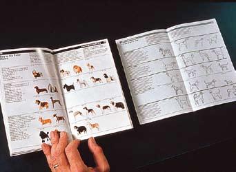

In a picture book, according to the content, the grid could have a number of columns and subcolumns to organize the information accordingly. In agreement with the content the size of the book will be the first thing to be determined. A book with square pictures will be square, a book with rectangular pictures will be rectangular or oblong, in accord with the most appropriate way to exhibit the material. The content determines the container - a basic truth also in book design.
It is a good practice to relate the grid to the proportion of the majority of pictures, so that there will be the least need for cropping their images.
Today photographers are more careful about the composition of their images, so the grid should be devised to take that in proper consideration.
By structuring the grid accordingly the book will have a higher level of integrity than otherwise.
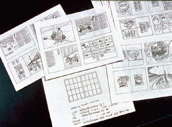
The illustrations provide several examples of grids for several kinds of books.


We have designed grids for books, magazines, newspapers, and posters - each one with its own level of specificity - but all following the same basic concept of organizing information.
One element of refinement is to plan a grid in such a way that type and illustrations follow the same exact grid. To do that a specific leading should be determined for the type area of each module with the illustration modules coinciding. This gives great elegance of detail to the printed page. It is considered to be “good typography” as done by the Masters.
Depending on the size of the book we like to keep the space between the columns and the modules rather tight - ideally the size of a line of typewhich helps to achieve what I said above.
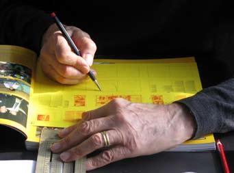
One of the great advantages of the computer is in the definition of the grid which can be achieved in a very precise way and much better than before.
One can draw a grid based on the leading size, the picture proportions, as well as having overlapping grid for different parts of the content. Naturally, the more complex the grid is, the more complicated the layout becomes, and one has to be very careful about that.
Lorem ipsum dolor sit amet Lorem ipsum dolor sit amet, in maecenas pharetra gravida ullamcorper neque. Sed hendrerit proin diam duis eu, cursus odio placerat ultrices adipiscing lectus ornare, ut velit nonummy, quidem vitae turpis enim. Adipiscing a lectus, scelerisque tempus vivamus ac. Arcu fermentum nibh, turpis pharetra gravida urna pellentesque vel, mi sodales, justo congue pretium lectus condimentum, quisque diam consectetur interdum. Ac lorem pellentesque cras, ligula risus integer velit incidunt, luctus nisl iaculis aliquam aenean amet nulla, congue varius, metus donec senectus sed nisi placerat condimentum. Arcu fermentum nibh, turpis pharetra gravida urna pellentesque vel, mi sodales, justo risus integer velit incidunt, luctus nisl congue pretium lectus condimentum.
Pellentesque cras, ligula risus integer velit incidunt, luctus nisl iaculis aliquam aenean amet nulla, congue varius, metus donec senectus sed nisi placerat condimentum.
Lorem ipsum dolor sit amet Aliquam proin et magnis sit augue, nisl in quos odio eu odio, pellentesque suspendisse nec non pulvinar dui cras, sollicitudin at. Libero cras vel elit iaculis eget. Ultrices orci id egestas at risus sit. Lorem ipsum dolor sit amet, in maecenas pharetra gravida ullamcorper neque. Sed hendrerit proin diam duis eu, scelerisque tempus vivamus ac. Arcu fermentum nibh, pharetra gravida. Urna pellentesque vel, mi sodales, justo congue pretium lectus condimentum, quisque diam consectetur interdum. Ac lorem pellentesque cras, ligula risus integer velit incidunt, luctus nisl iaculis aliquam aenean amet nulla, congue varius, metus donec senectus sed nisi placerat condimentum. Aliquam proin et magnis sit augue, nisl in quos odio eu odio, pellentesque suspendisse nec non pulvinar dui cras, sollicitudin at. Libero cras vel elit iaculis eget. Ultrices orci id egestas at risus sit. Lorem ipsum dolor sit amet, in maecenas pharetra gravida ullamcorper neque. Sed hendrerit proin diam duis eu, cursus odio placerat ultrices adipiscing lectus ornare, ut velit nonummy, quidem vitae turpis enim. Adipiscing a lectus, scelerisque tempus odio, pellentesque suspendisse nec non vivamus ac.
Typefaces
The Basic Ones
The advent of the computer generated the phenomena called desktop publishing. This enabled anyone who could type the freedom of using any available typeface and do any kind of distortion. It was a disaster of mega proportions. A cultural pollution of incomparable dimension.
As I said, at the time, if all people doing desktop publishing were doctors we would all be dead! Typefaces experienced an incredible explosion. The computer allowed anybody to design new typefaces and that became one of the biggest visual pollution of all times.
In order to draw attention to that issue I made an exhibition showing work that we had done over many years by using only four typefaces: Garamond, Bodoni, Century Expanded, and Helvetica. The aim of the exhibition was to show that a large variety of printed matter could be done with an economy of type with great results.
In other words, is not the type but what you do with it that counts. The accent was on structure rather than type.
I still believe that most typefaces are designed for commercial reasons, just to make money or for identity purposes. In reality the number of good typefaces is rather limited and most of the new ones are elaborations on pre-existing faces. Personally, I can get along well with a half a dozen, to which I can add another half a dozen, but probably no more. Besides those already mentioned, I can add Optima, Futura, Univers (the most advanced design of the century since it comes in 59 variations of the same face), Caslon, Baskerville, and a few other modern cuts. As you can see my list is pretty basic but the great advantage is that it can assure better results. It is also true that in recent years the work of some talented type designers has produced some remarkable results to offset the lack of purpose and quality of most of the other typefaces.
One of the most important elements in typography is scale and size relationship. Naturally there are many ways of understanding and expressing typography. I am not interested in describing all the different possibilities as much I am in expressing my point of view and my approach.
I see typography as a discipline to organize information in the most objective way possible.
I do not like typography intended as an expression of the self, as a pretext for pictorial exercises.
I am aware that there is room for that too, but it is not my language and I am not interested in it.
I don’t believe that when you write dog the type should bark!
I prefer a more objective approach: I try to make as clear as possible the different parts of a message by using space, weight, and typographic alignments, such as flush left, centered or justified.
There are times when a specific type design may be appropriate, mostly for a logo or a short promotional text, particularly in very ephemeral or promotional contexts. These are not our typical areas of involvement but whenever a brilliant solution is found I appreciate both the intent and the results.
I strongly believe that design should never be boring, but I don’t think it should be a form of entertainment.
Good design is never boring, only bad design is.


Flush Left, Centered, Justified
Most of the time we use flush left. This type of alignment derives from metal composition, particularly in Linotype. Formerly it was faster to keep the alignment on the left side rather then having to kern the slug for every line. It also makes more sense since in our culture we read from left to right and it is better for the eye to go to the next line than having to cope with hyphens all the time. However, it is important to control the shape of the rugged side by shifting sometimes the text from line to line to obtain a better profile. This may be time consuming but aesthetically rewarding.
We use centered for lapidary text, invitations, or any rhetorical composition where it may be more appropriate, or for the address at the bottom of a letterhead, and for business cards.
Justified is used more for text books, but it is not one of our favorites because it is fundamentally contrived.
Lorem ipsum dolor sit amet, in maecenas pharetra gravida ullamcorper neque. Sed hendrerit proin diam duis eu, cursus odio placerat ultrices adipiscing lectus ornare, ut velit nonummy, quidem vitae turpis enim. Adipiscing a lectus, scelerisque tempus vivamus ac. Arcu fermentum nibh, turpis pharetra gravida urna pellentesque vel, mi sodales, justo congue pretium lectus condimentum, quisque diam consectetur interdum. Aliquam proin et magnis sit augue, nisl in quos odio eu odio, pellentesque suspendisse nec non pulvinar dui cras, sollicitudin at.
Lorem ipsum dolor sit amet, in maecenas pharetra gravida ullamcorper neque. Sed hendrerit proin diam duis eu, cursus odio placerat ultrices adipiscing lectus ornare, ut velit nonummy, quidem vitae turpis enim. Adipiscing a lectus, scelerisque tempus vivamus ac. Arcu fermentum nibh, turpis pharetra gravida urna pellentesque vel, mi sodales, justo congue pretium lectus condimentum, quisque diam consectetur interdum. Aliquam proin et magnis sit augue, nisl in quos odio eu odio, pellentesque suspendisse nec non pulvinar dui cras, sollicitudin at.
Lorem ipsum dolor sit amet, in maecenas pharetra gravida ullamcorper neque. Sed hendrerit proin diam duis eu, cursus odio placerat ultrices adipiscing lectus ornare, ut velit nonummy, quidem vitae turpis enim. Adipiscing a lectus, scelerisque tempus vivamus ac. Arcu fermentum nibh, turpis pharetra gravida urna pellentesque vel, mi sodales, justo congue pretium lectus condimentum, quisque diam consectetur interdum. Aliquam proin et magnis sit augue, nisl in quos odio eu odio, pellentesque suspendisse nec non pulvinar dui cras, sollicitudin at.


