LEJIAN OUYANG GATEWAY PORTFOLIO
2020 Fall -2023 Fall
Master of Architecture I
South California Institute of Achitecture
Email: aouleo@hotmail.com
Phone: +1 626 898 0385, +86 186 0148 1067
Wechat: aouleo

2020 Fall -2023 Fall
Master of Architecture I
South California Institute of Achitecture
Email: aouleo@hotmail.com
Phone: +1 626 898 0385, +86 186 0148 1067
Wechat: aouleo
Hi, I am Lejian Ouyang from M.Arch 1. Before I start this semester, I have an internship at URBANUS. This is a famous architectural studio in Shenzhen, China. I learn so much from there. I do construction documentation for Shekou Commercial Bank History Museum. I design the bathroom layout and modeling according to the plan and section. Doing render images for my leader and designing the entrance of the museum as well as the ceiling pattern.
This is a challenging semester that has five intense classes. The first one is Vertical studio which is quite different and interesting to me. I am required to work with someone whom I never meet. This kind of adventure is so much challenging. need to learn how to communicate with my teammate and talk about my idea in good manners. Sometimes, we have different ideas and disagree with each other. We try to find evidence and background to support our argument. I would say how to deal with different ideas and make them synthesize into one concept is a tough, attractive assignment. Finally, we got a pretty good design project. We learn so many tricks of Cinema 4D and produce beautiful animation which you can check later. The class Project Delivery gives me a chance to walk through a big part of the architecture design phase. I learn how they work, what software they use, and what kind of detail level they need.
Thus, II am looking forward to get back to physical model and can’t wait to embrace the next vertical studio and semester! Cheers, Lejian
Design Studio Visual Study Applied Study History
Vertical Studio Studio Arc Intervention Architectures Integration Studio Fundmtl Arc 2 Studio Fundmtl Arc 1 2GB 2GA 1GB 1GA 3GA 3GA 2GB 2GA 1GA 2GB 2GA 1GA
3GA 2GB 2GA 1GB 1GA
Instructional Constructs Visual Studies III Visual Studies II Visual Studies Dressing A Column Adv Project Delivery Design Dev GR Environmental Systems GR Materials and Tectonics Hist or Arch Urb III GR History of Arc Urb II GR Intro to Cont Arch
04 14 26 34 48 68 74 80 84 90 100 110 114 120 126 142 150
Fall 2022
Instructor: Peter Testa
AT: Austin Lightle
Collaborators: Casey Pan

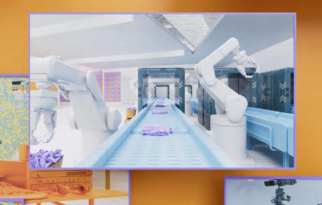
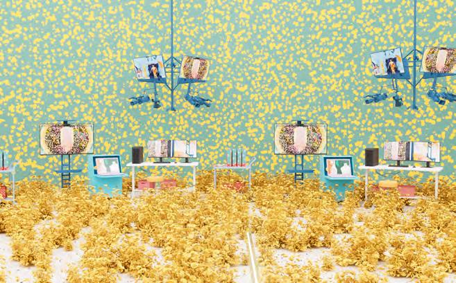
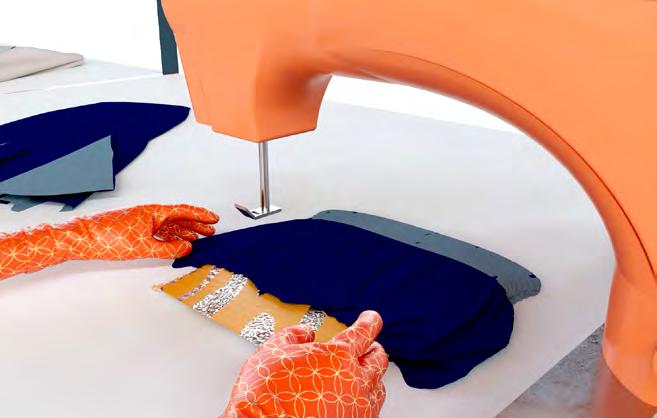
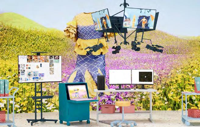
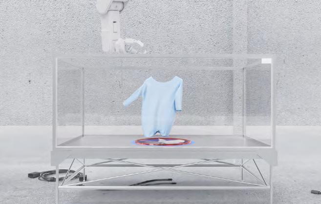
The studio begins with the research of exhibition spaces, the design method, and manufacturing of fashion brands, and the concept of independent fashion designers, supplemented by the study of Upcycle design. Through the above research, we need to develop a new set of fashion design spaces that has programs for the catwalk, storage, production, design, and cooperation. With virtual production, a new space model has been designed. Artists come here not only to enjoy the familiar workflow, but with the help of Virtual Screen, they can upload their own products to ensure that their designs are on topic.
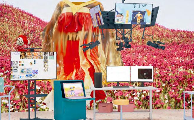
V-eality questions nowadays conventional design process and proposes a new model for fashion production. This is a new factory of perpetual fashion space where constant interaction between people and technological environment happens. The relationship among space, people, and objects is constantly being viewed, adjusted, and evaluated.
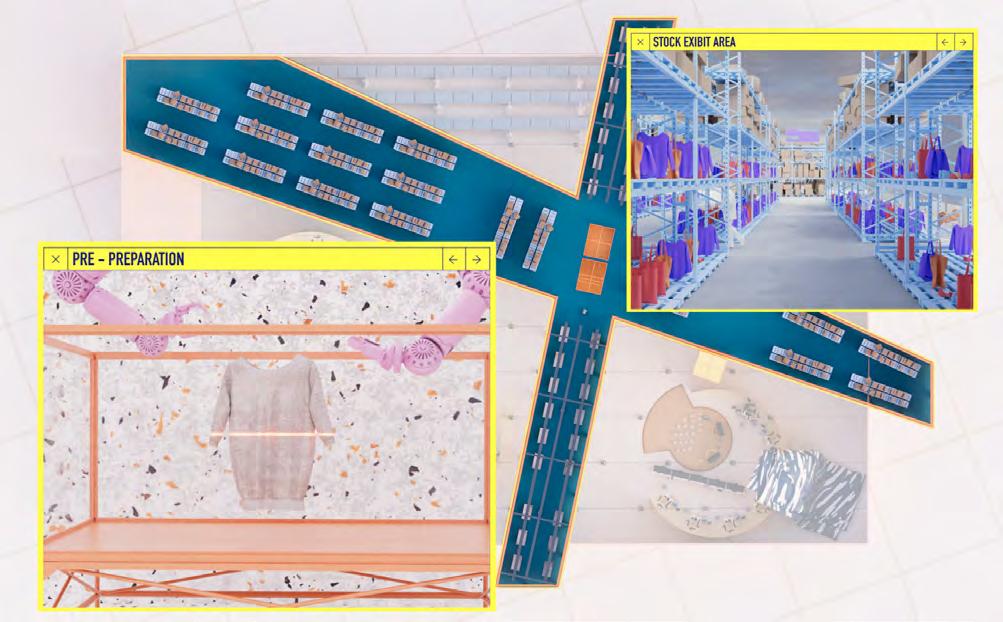
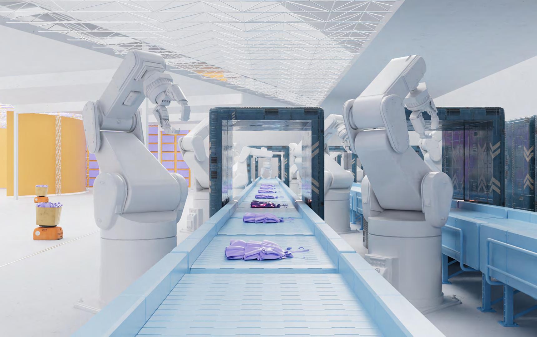
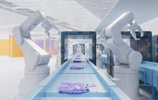
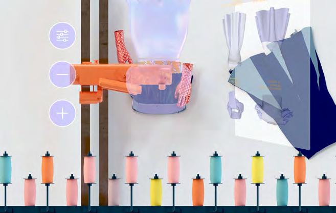
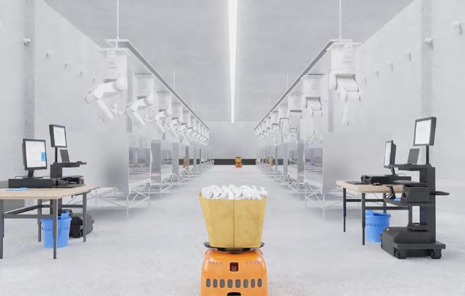
Adjoint to the existing Prada Distribution Center, the new factory benefits from the convenience of accessing old stock. Stock exhibition and pre-prep process are taken place on the second floor, on top of the upcycle workshops. The workshops are the leading role on the ground floor, where the magic of repurposing old stocks happen. The negative spaces between workshops are used for storing prototypes on hold. Finished clothes are scanned and carried on the conveyors back to the Distribution center.
After the dead stocks, pieces in good condition and up for upcycling are brought to the second-floor shopping area for designers to pick. Here, designers can enjoy a shopping tour of walking through isles of pieces that are out-season, yet still charming. [Prepare scene]
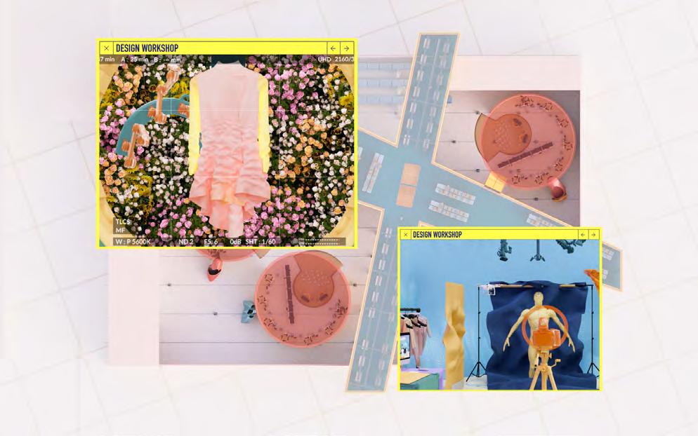

After designers picked their beloved old stock, they can return to their workshop area to get ready to design, while the ground transporters would take the selected pieces to the cleaning section, getting them ready to use

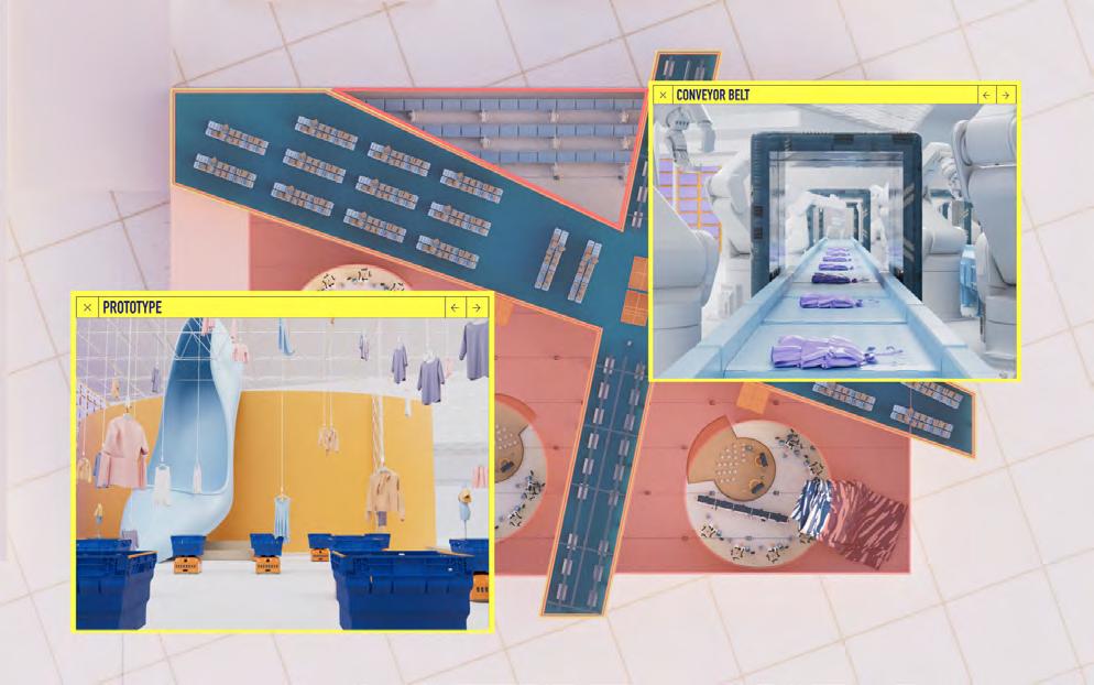
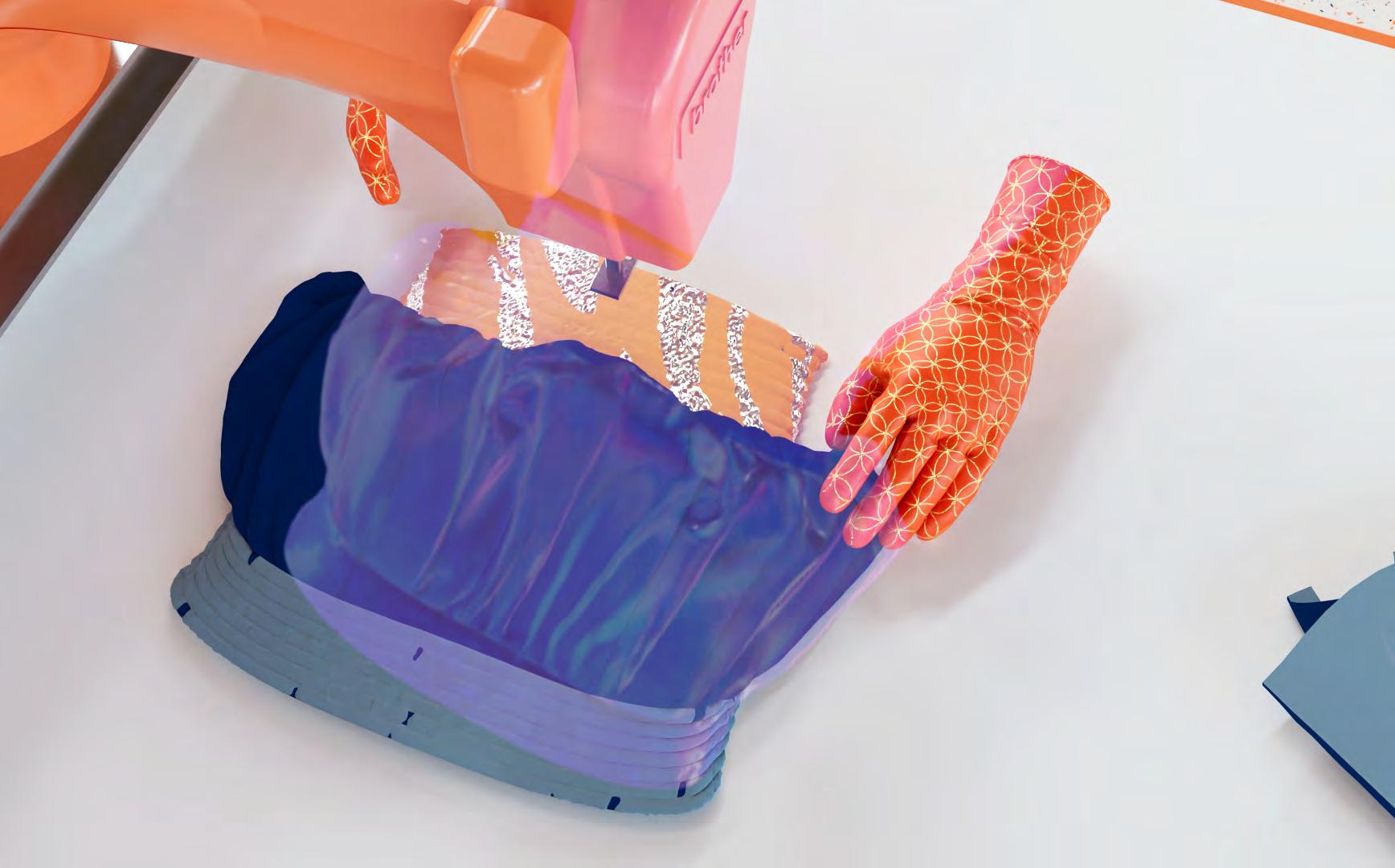

Following the transporter with cleaned stocks downstairs, we pass by the supplementary fabric machines aligned under the bridge, and enter the workshop space. Here, ordinary separation walls between rooms in a traditional factory are replaced by several large virtual production screens. Each design group has its workshop area encircled by a screen, where design, production, test-runway are happening simultaneously in the same space.
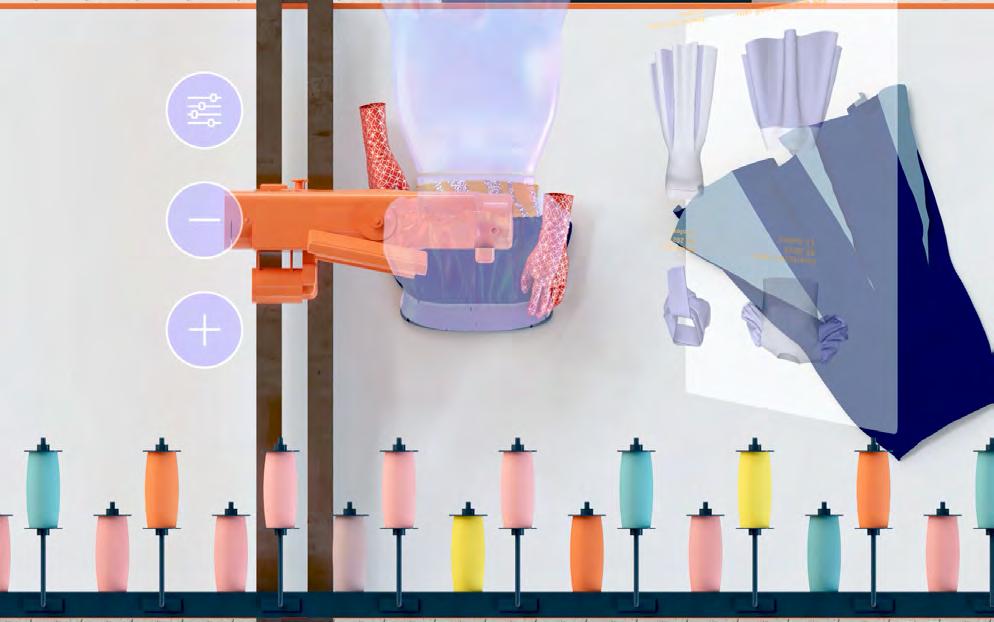
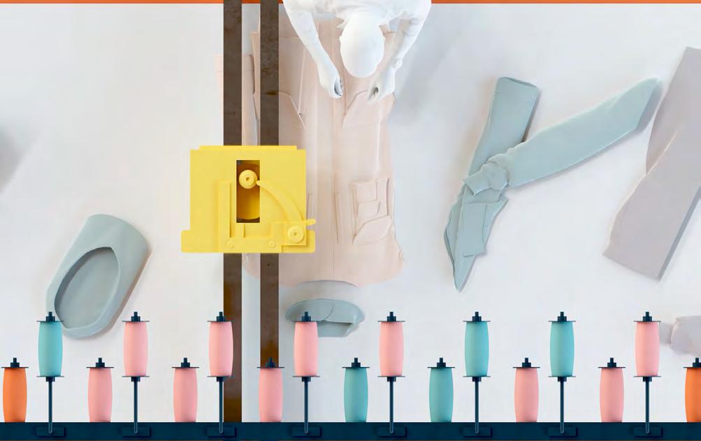
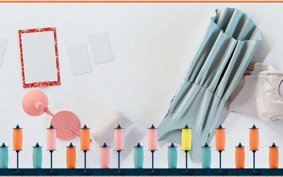
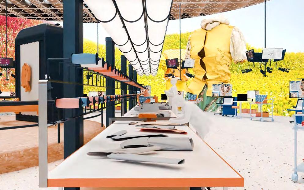

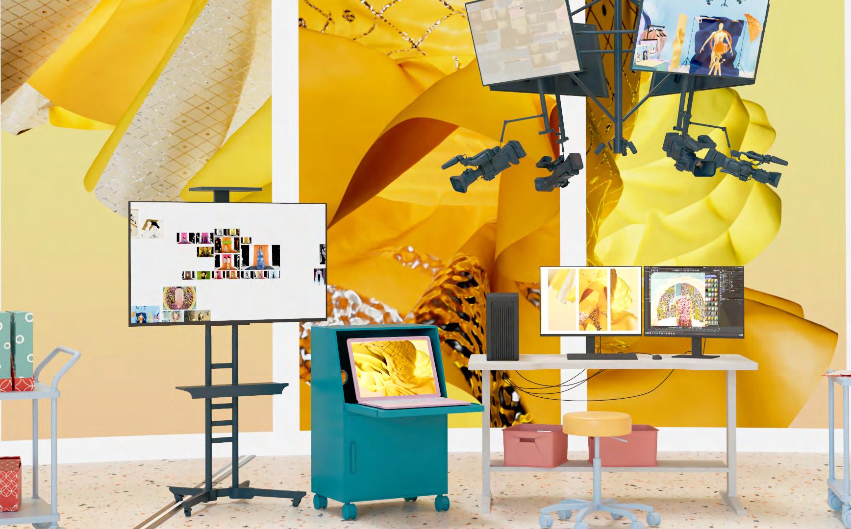
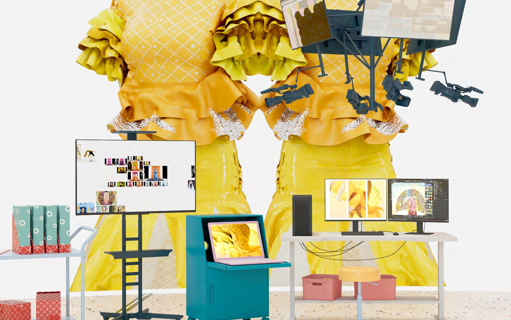
Pieces that did not make to the current collection are stored in the high-ceiling spaces between workshops. These prototypes are constantly hanging and dangling up and down, giving designers new inspiration while walking through the space. Some are enlarged and sculpted across the factory, creating new space arrangements.
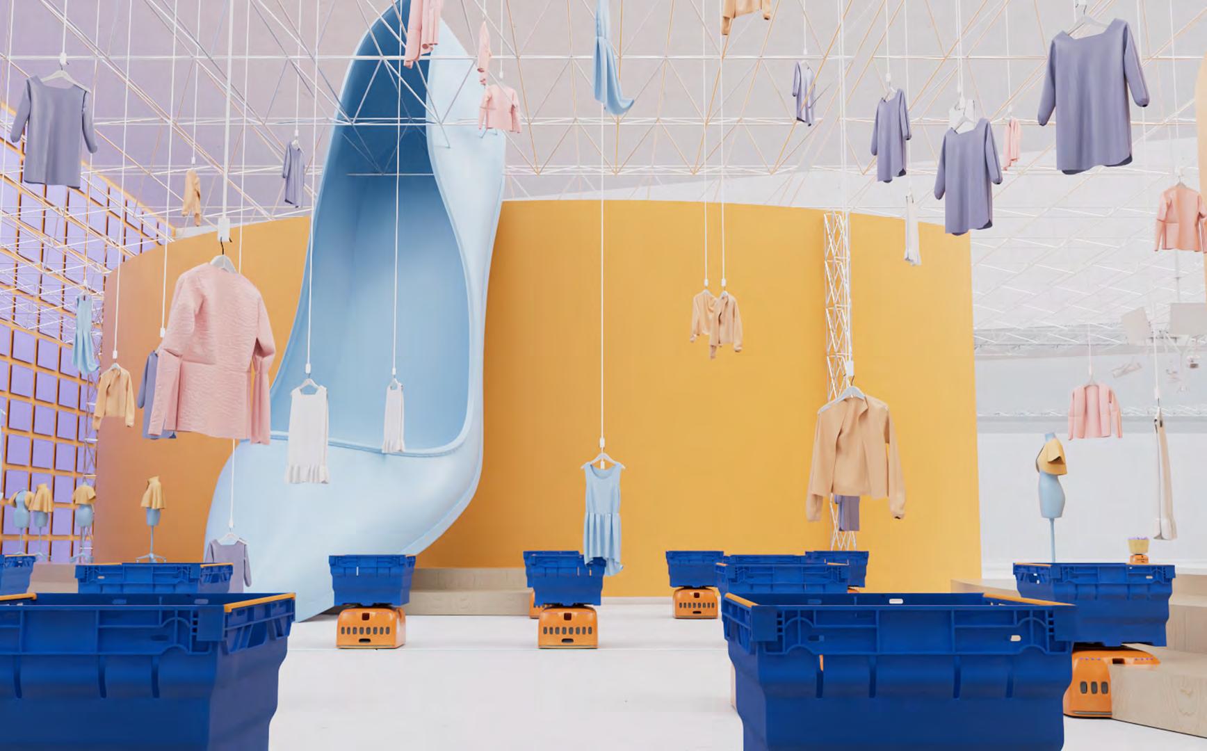


Transporters would take the finished upcycled pieces to the conveyor belts on the side, which will carry the rejuvenated pieces back to the distribution center, to be packed and shipped away for a new life cycle.

Everyone is linked to everyone, everywhere and anytime behind the cameras, through the screens. Humans and robots function together in this factory. As spectators, cameras monitor different spaces of humans and robots working throughout the factory: robots execute humans’ requests, meantime we humans monitor the designs behind the lens.
A new method of manufacturing is coming into being.










Spring 2022
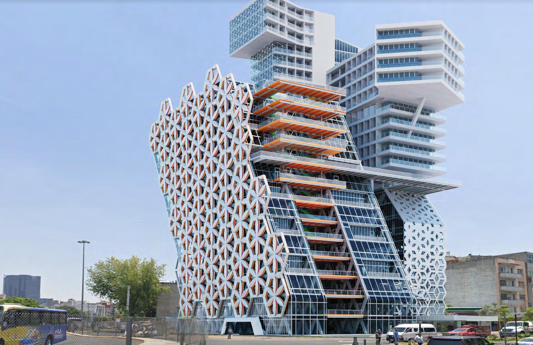
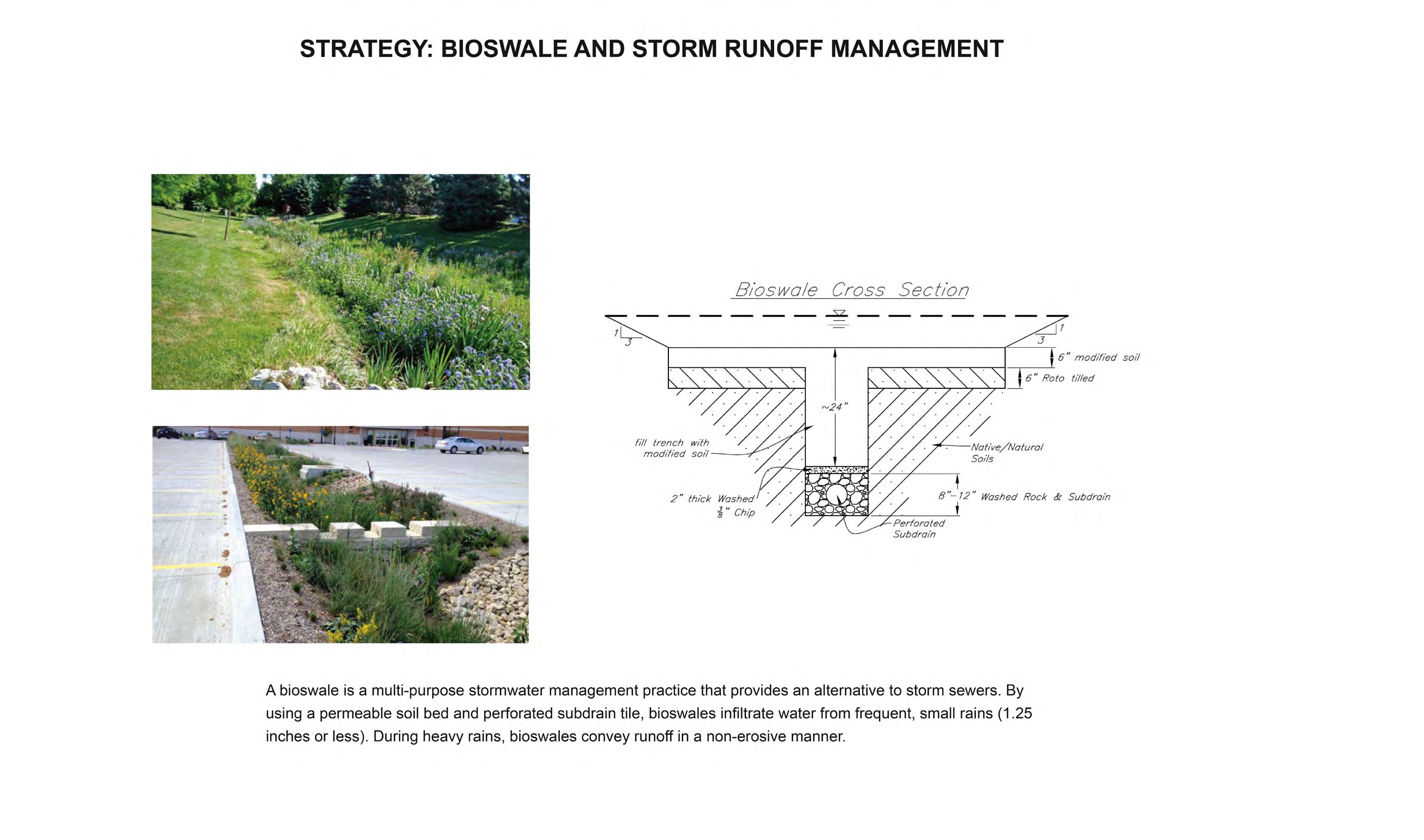
Instructor: Gordon Kipping TA: Kelly KohBegin to investigate the idiosyncrasies of Mexico City in terms of climate, culture, geography, and more. In addition to assembling responses based on known site conditions and assignments, architects also need to have the ability to identify problems. The city’s water resources and transportation systems are the focus of attention. Mexico City is a water-scarce city per capita. Compared to the United States and Canada, Mexico City’s average is less than one-tenth that of the United States and Canada. Due to less runoff in the city, the excessive exploitation of groundwater in the city leads to subsidence. This makes infrastructure and building safety buried a huge hidden danger. Not only will the government struggle to repair infrastructure, but it will also cause buildings to sink. The design starts from the deep foundation, combined with the landscape intervention of bioswale to slow down or avoid the occurrence of subsidence. The site is located in a busy traffic interchange, opposite the Grand Park. The sloping and raised building allows the public to enjoy the green space. At the same time, the corridor extending from the interior forms a viewing platform, which has become an important place for teachers and students to rest and communicate. Only when we feel nature enough, the sensitivity of human thinking will be released.


Mexico City faces the problem of insufficient water resources per capita and overexploitation of groundwater. Compared with the United States and Canada, the citizens of Mexico City are less than one-twentieth of the former. The loss of groundwater has led to subsidence. It can damage the infrastructure, damage the ground, and eventually cause the building to tilt, and in severe cases, the building will become a dangerous building and have to be demolished. This situation causes great harm to the economy and life. Therefore, in the design stage, the characteristics of the school and the locality of the building will be considered.
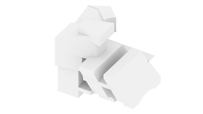
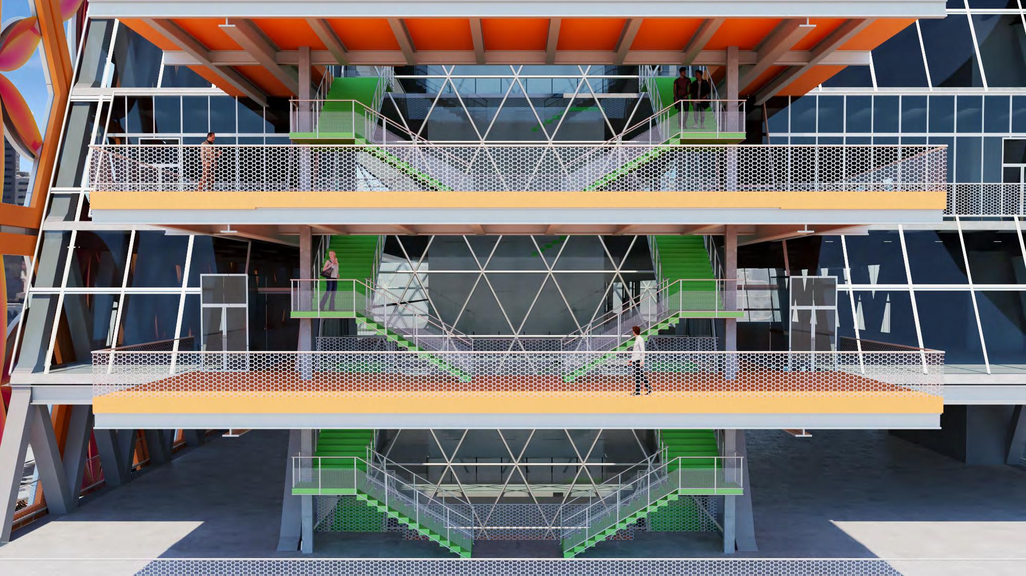
First, the functional area is divided into service area and learning area. Considering the academic support and gym will be open to the public, it needs to be separated from the study area to ensure the safety of teachers and students and the quality of teaching. The buildings on the left focus on residence and services, and the buildings on the right focus on academics. The overall building is raised to create public areas while reserving area for subsequent additional functions. The sloping shape makes the corridor that was originally located indoors separate from the building, and the air corridor connects the two buildings, which will become a place for teachers and students to rest and relax. Here, you can see the historic charm of Mexico City from far away Chapultepec Park. At the same time twist the form to capture the scenery of the city skyline.
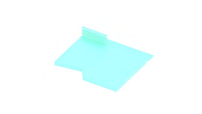
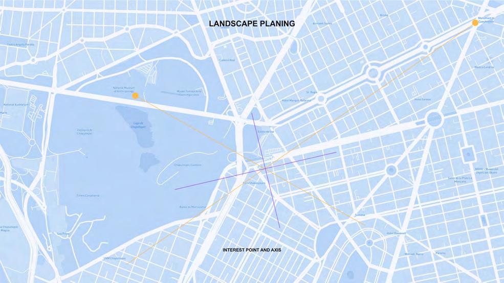
Bioswale's ground planning logic comes from its relationship with the city. First establish the connection between the base and the surrounding scenic spots, and then generate the basic type according to the axis of the city block. Offset the base line to prepare for greenfields and deep foundations. Finally, give the width of the road to allow citizens to enter the base and realize the open area. On the one hand, it relieves the crowded and busy flow of people around, and returns the ground floor to the citizens. On the other hand, it has become an important place for citizens' social activities.




Hexagon Flower Modular “DAHILIA”
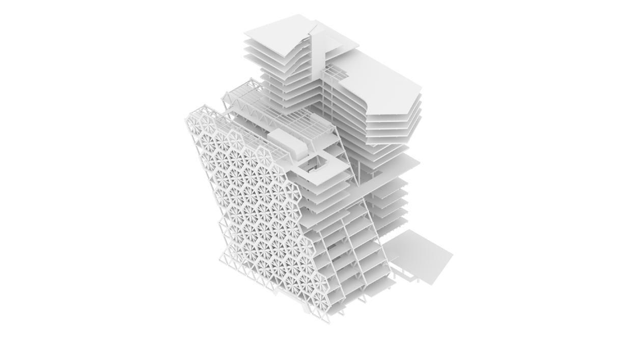


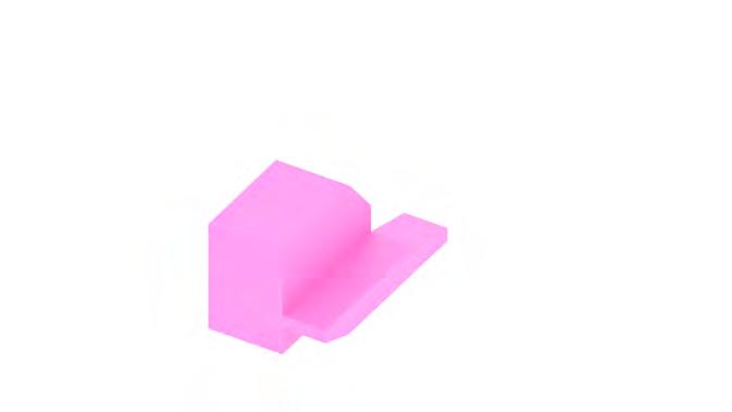
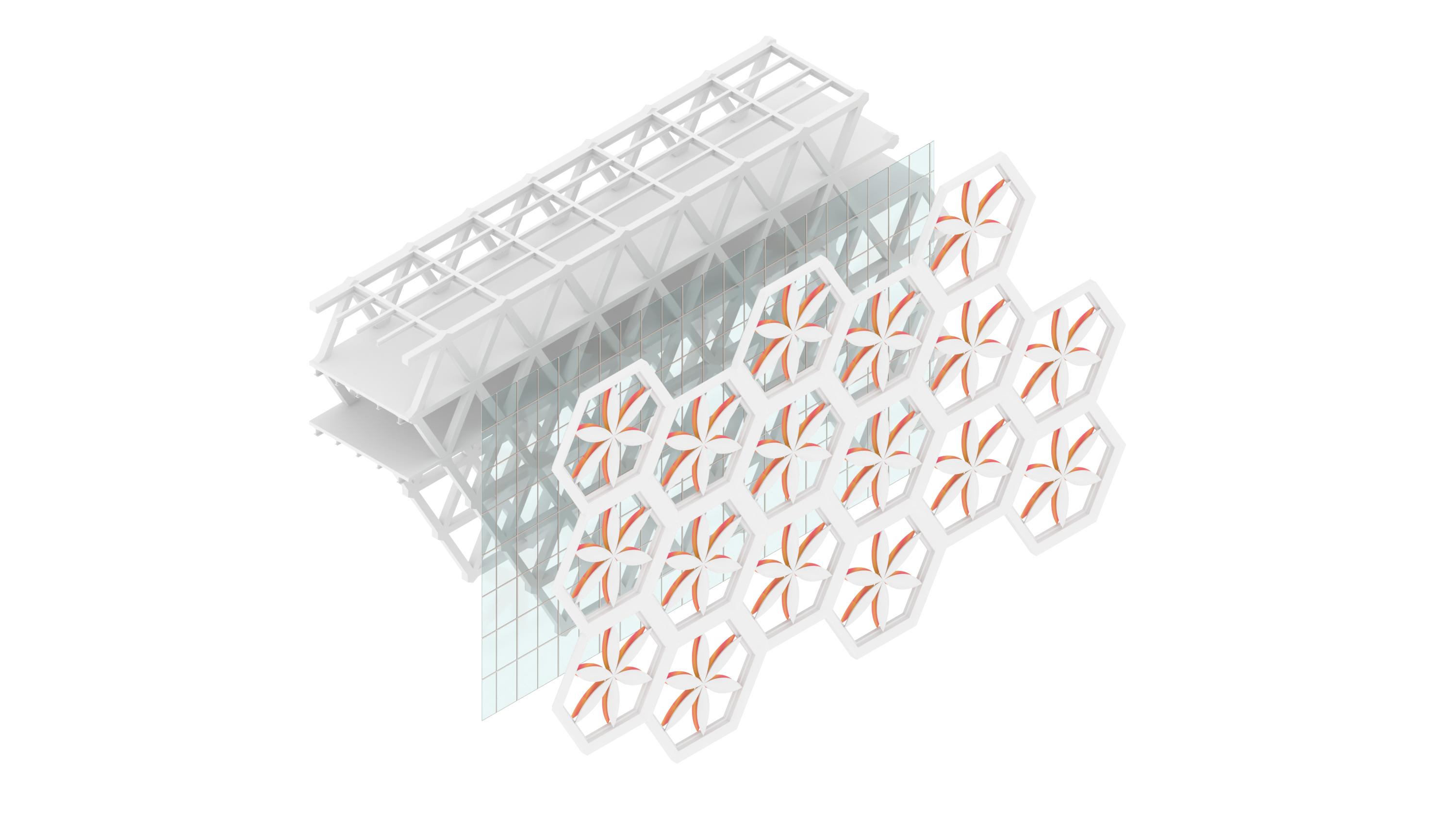
Mexico City once had a splendid Mayan culture. As a cultural building (a school), it is located on the diagonal of Pultepec Castle. The school needs to combine local cultural symbols to demonstrate its charm as a cultural and academic exchange. The wedge-shaped building form wraps the atrium formed by the hexagonal glass curtain wall. It inherits the sanctity of the Mayan temple. The north facade is inspired by Mexico's national flower, the dahlia, by using the regular hexagon as the basic unit to embed the highly geometric dahlia shape into the aluminum frame. The double-layered blades create a refined and vivid visual experience.

The
After intense study and work, there is nothing more enjoyable than a wide-open field of vision, lush green parks, and warm sunshine.


Fall 2021
Instructor:
The studio is structured to support each student’s awareness of the issues involved in the design of a complex architectural project. Elemental spatial constructs and organizational systems are seen as resulting from and reacting to site conditions, program distribution, structural systems, building envelope systems and assemblies, environmental factors, and building regulations. These influences are considered at once physical and virtual, permanent and ephemeral, situational and circumstantial. Qualities of site, situation, and environment, as well as cultural contexts, are considered potential tools to challenge conventional approaches to architectural design.
My project experiments with a series of offset rectilinear boundaries. Working with varied notions of scale, contrast is created between an exterior border layer and interior massing-----establishing a hierarchy between the street condition and building. The tight border condition is used as a landscape element, reinforcing a perimeter, whilst the mass arranges along a series of centralized void spaces. Carefully crafted pieces of said mass break the border between layers to create entrances on each side. Further offsetting of the perimeter organizes circulation and program around a dynamic flow, moving inside and outside of the building to circulate. Lastly, program is inserted and merged at precise moments within the massing, reinforcing pattern and void conditions.

Figure Ground
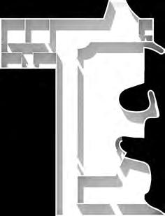
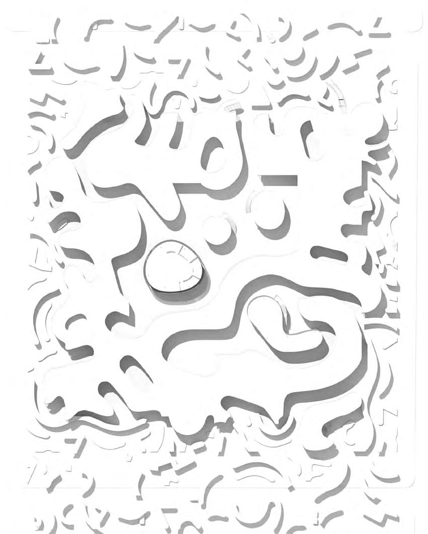
Double mat building adopts the Turing pattern as a source of morphological thinking, through its translation, deviation and dissolution to form a new positive and negative relationship.
The relationship between volume and streamline complements each other. Through the transformation of solid and stroke, the space is shaped. The small peripheral volume acts as a warm flush between the street and the main building.
Underground
Birdview from perimeter and leisure space
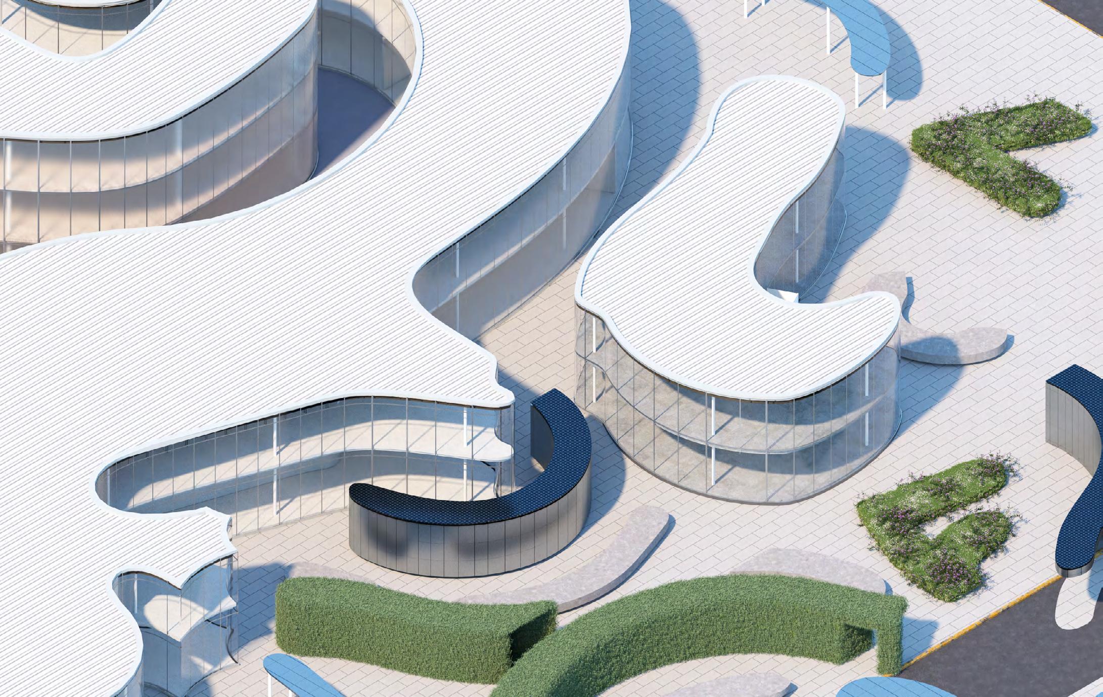
As a means of blocking noise, the variable shapes on the periphery are strengthened by green plants. At the same time, it is also a place for nearby residents to rest during their leisure time.
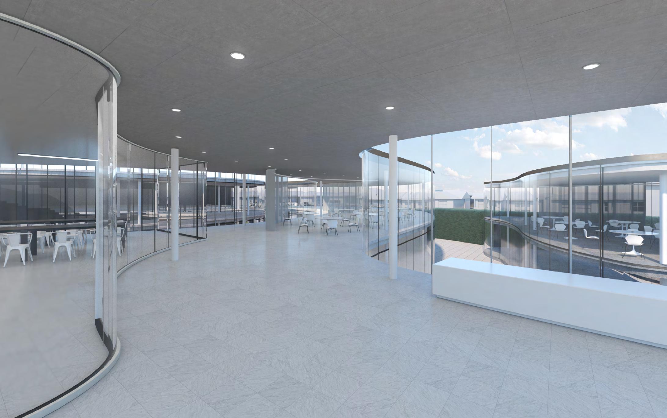
Interior from classroom and semi-open space
Light-colored materials and multiple layers of insulating glass ensure ample light and a comfortable thermal environment
SPRING 2021
 Instructor: Andrea Cadioli
Inset mini-malls and parking lots replace the small street-facing business just a few blocks east. By the end of this stretch of Pico, the low and long single-story blocks compress in plan and grow in height. Churches, nightclubs, hotels, and public storage vary the elevation of the street. In one mile of Pico we see a complex portrait of LA: the overlap of communities (working-class, immigrant, ethnic, religious, LGBTQI, etc); the sudden and dramatic shifts in scale, from pedestrian to car-centered; and the accumulation of built forms that index the shifting dynamics
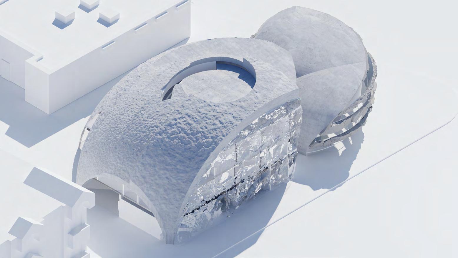
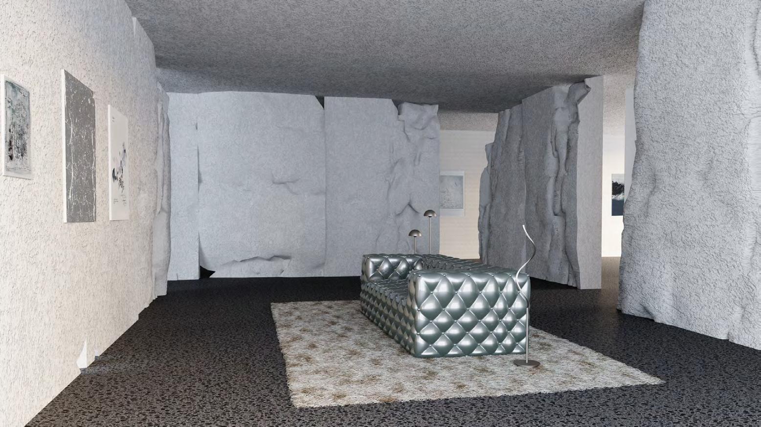
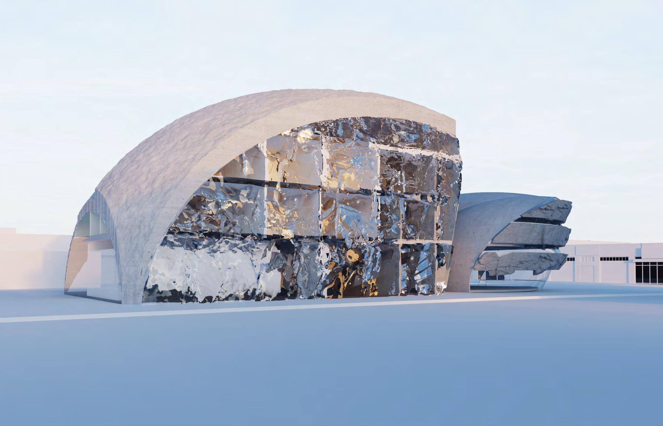
The building is a four-story residence located in PICO BLVD which has living and exhibition space. It redesigned the space of traditional residential buildings and established a new relationship between public and private areas. This design aims to create a special aesthetic effect through the use of rock as a material. At the same time, a new space division system and flexible movable baffle were set up to prepare for the event. Provide residents with a different life experience. The unique facade design gives the street a lively atmosphere, which attracts the audience passing by hereof the city.
5` 10`
Axonometric 1/4`` = 1`: 00
5` 10`
Ground floor 1/4`` = 1`: 00
2nd floor 1/4`` = 1`: 00

5` 10` 3rd floor 1/4`` = 1`: 00

5` 10` 4th floor 1/4`` = 1`: 00

5` 10`
Elevation - East 1/4`` = 1`: 00

5` 10`
5` 10`
Elevation - North 1/4`` = 1`: 00

Section - Aa 1/4`` = 1`: 00

Rocks interact with light, whether it’s rough rocks producing subtle changes or demonstrating the mysterious feel of a shape-like glass facade that makes people yearn for.

Fall 2020
Instructor: David Eskenazi
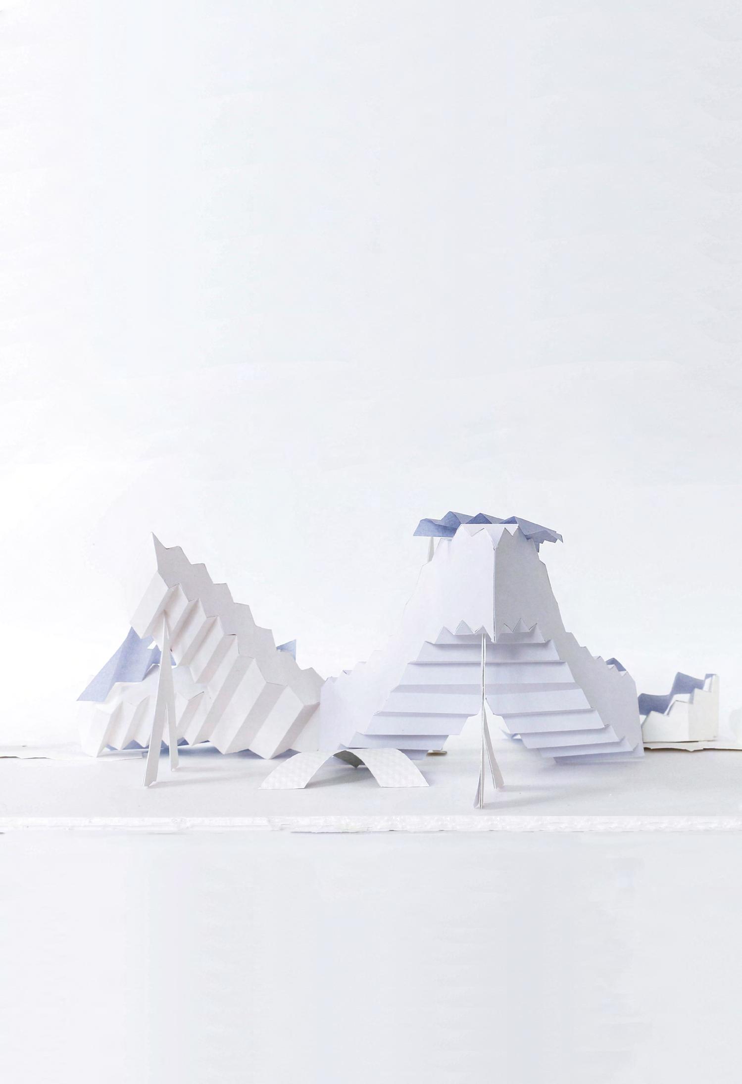
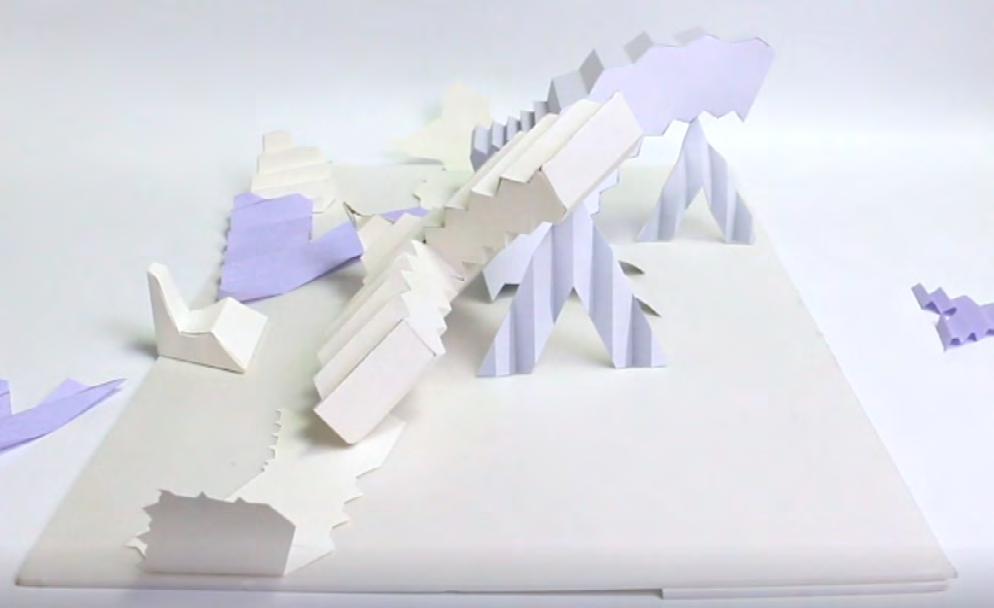
1GB Design Studio I introduces basic concept of architecture ; geometry, form and space. Through a series of learning, Students are able to present the space through line , make physical paper model the technique orthographic drawing and oblique drawing. Finally, Students build on our conversations and inquiries throughout the semester to design a civic building of Los Angeles.
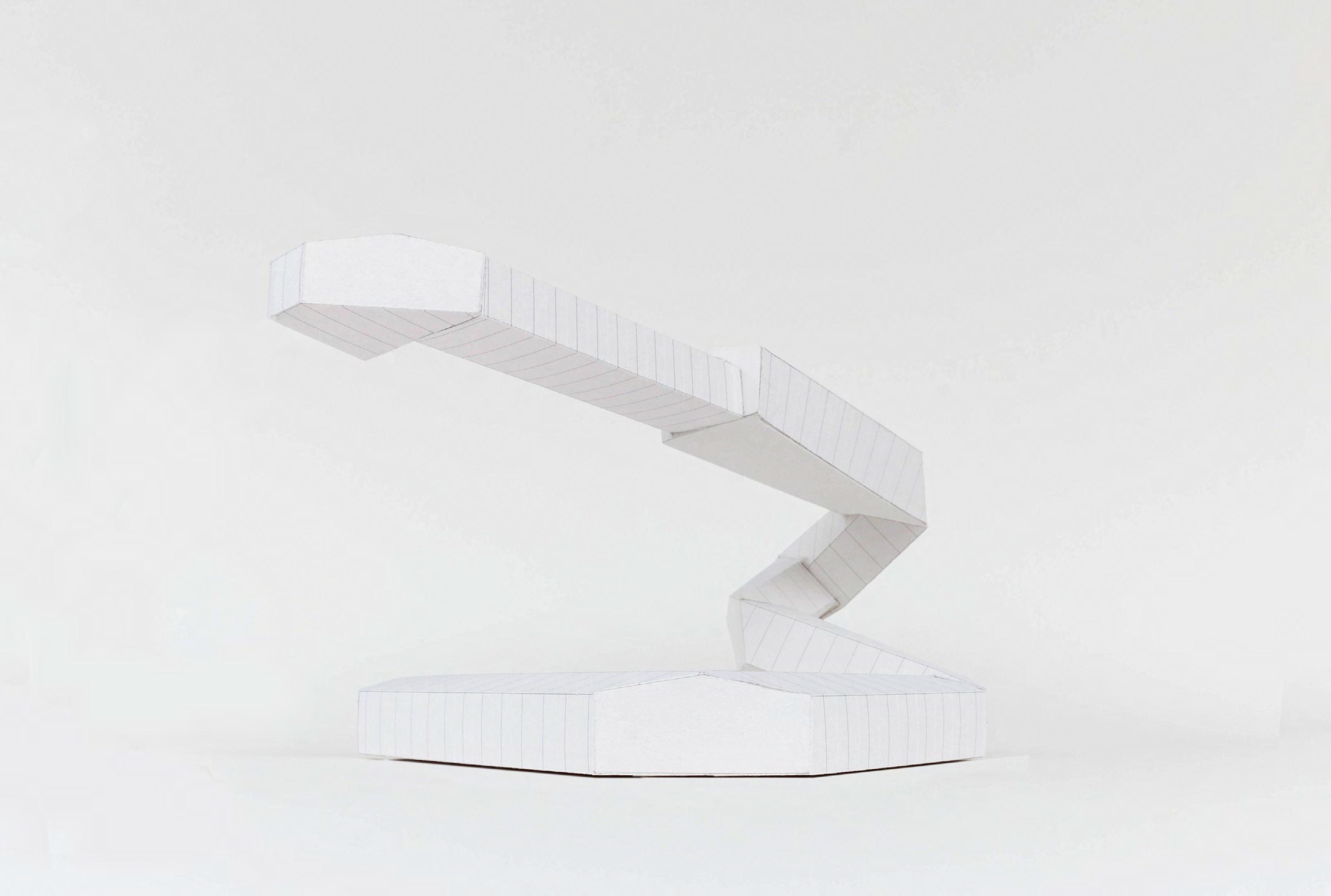
First of all, we used our own ruler to measure our own room, and regarded the room as a bounding box with a limit line. The line continuously interacts with the room. Mirror it when it hits the wall, rotating until the line is fully utilized. Then through the thread, we created the shape. In the process of ascending, the size of the body is continuously changed, and the body material is given at the same time. Through these series of abstract training, we will develop the relationship between the forming body and the venue. Study the attributes of the body, through reconstruction, new spatial relationships are combined. Finally, in the project of community center, its spatial form is applied.
Lejian OuyangElevation and section drawing Sketch paper model

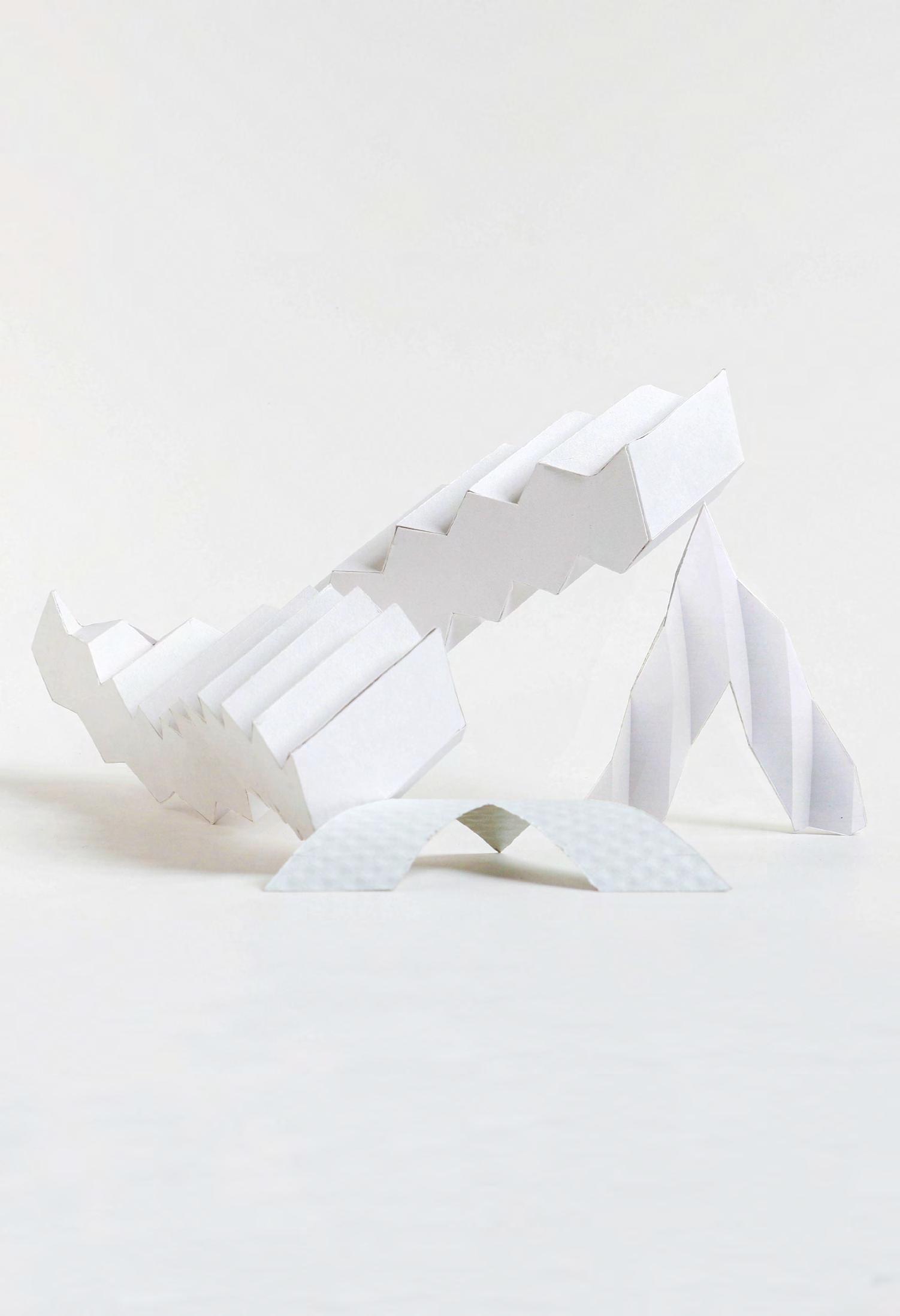
Dialogue between figure and field Physical model of right view



Elevation rendering of front view
Elevation rendering of right view


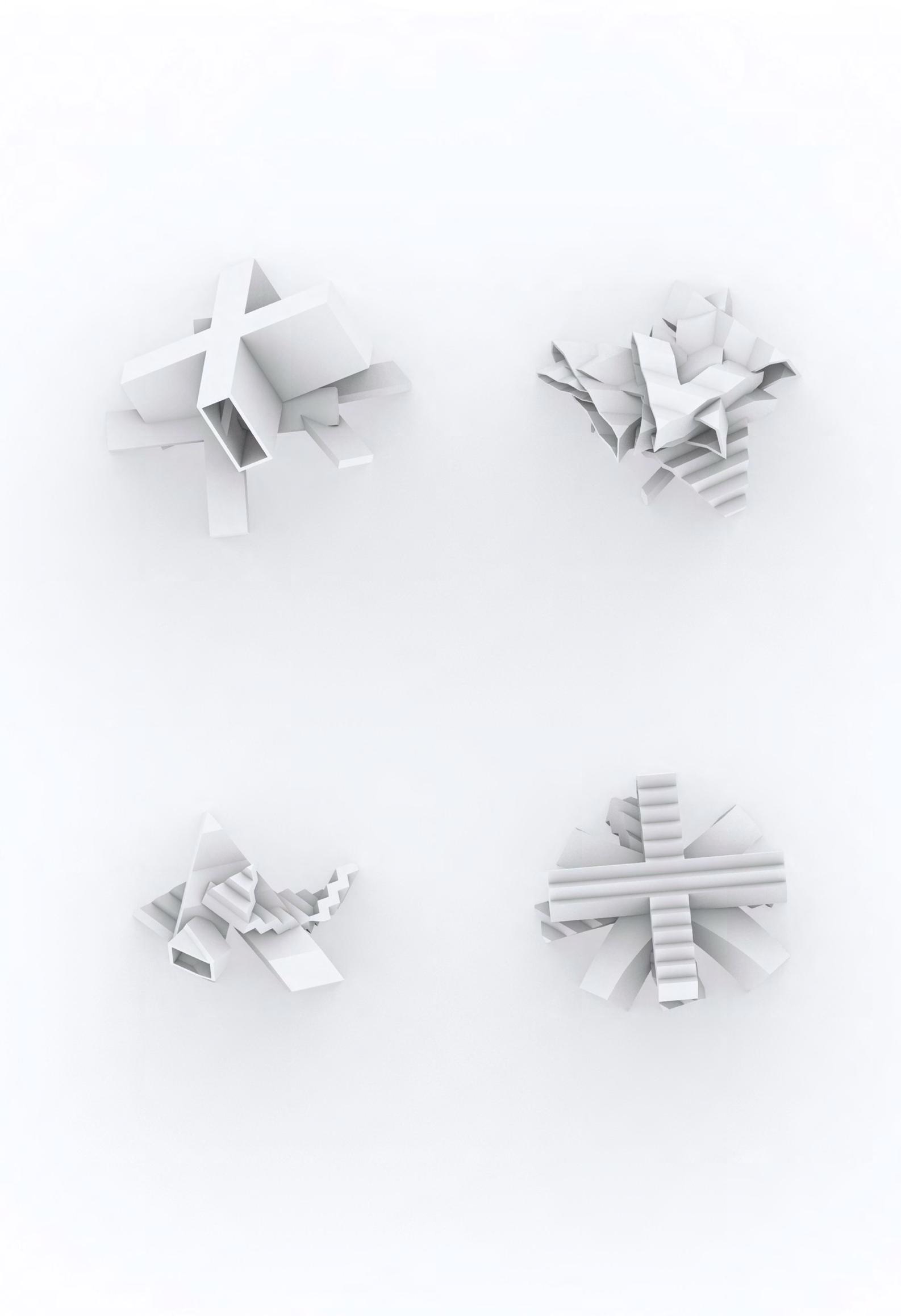
First floor plan
Scale 1/32″=1′-0″
First floor plan
Scale 1/32″=1′-0″
Section A-A
Scale 1/32″=1′-0″
Section B-B
Scale 1/32″=1′-0″
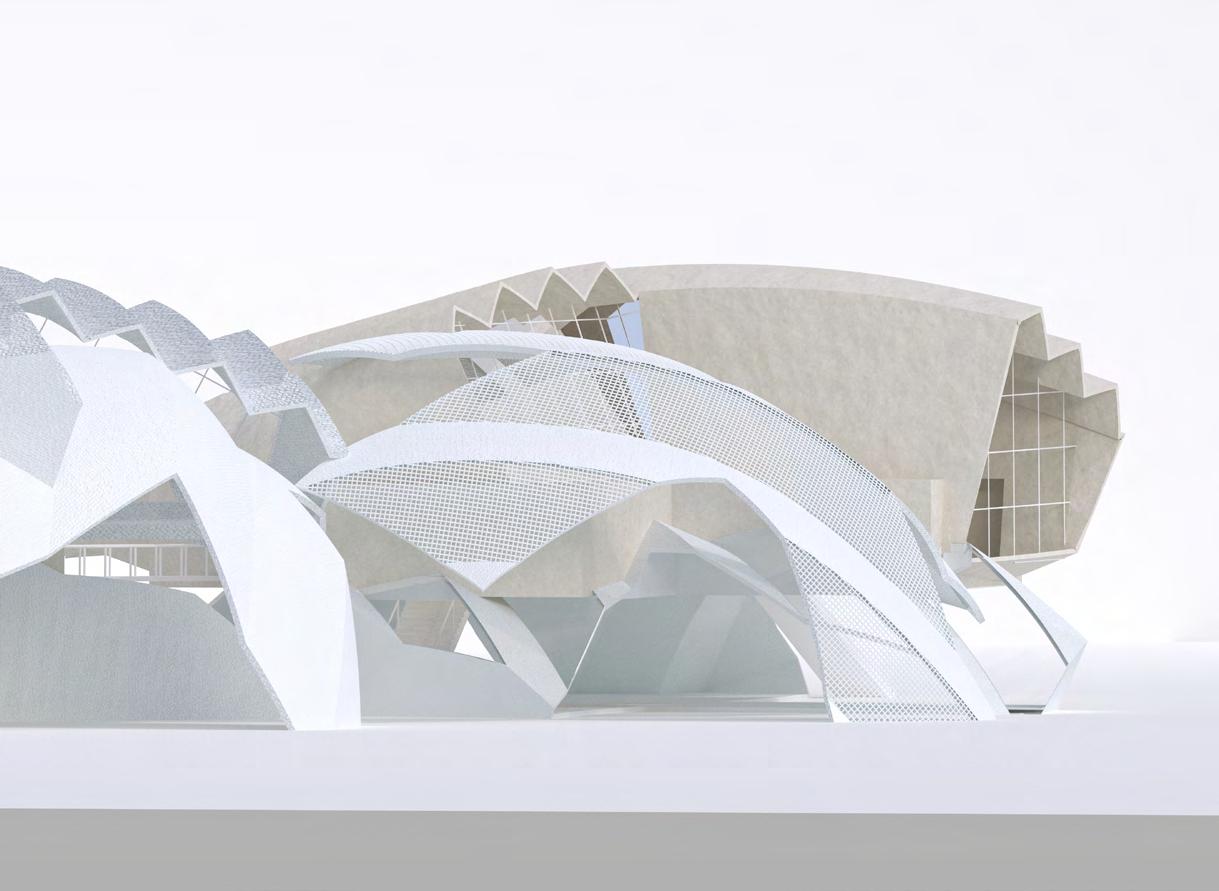
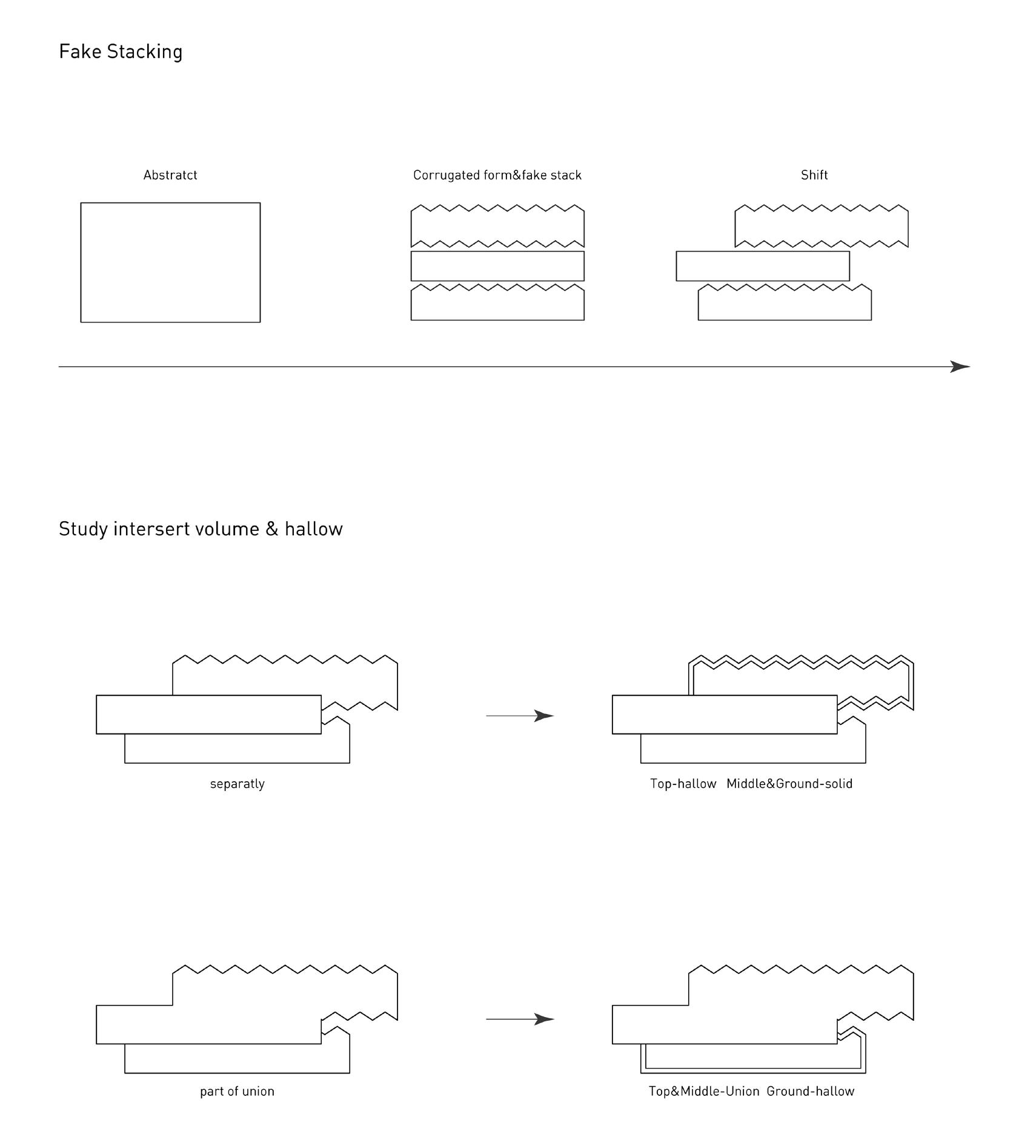
Using studies from figure and field. I proposed new idea of community center in Venice , CA with a mix of gyms, classrooms, private offices, playgrounds. Soft paper , corrugated cardboard inspire the form of building.
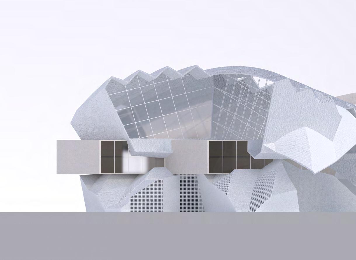


View from multipurpose room
View from cafe ground
View from reception and class room
Spring 2022
Instructor: Jenny Wu
TA: Kai Johnson
Collaborate: BingKun Liu
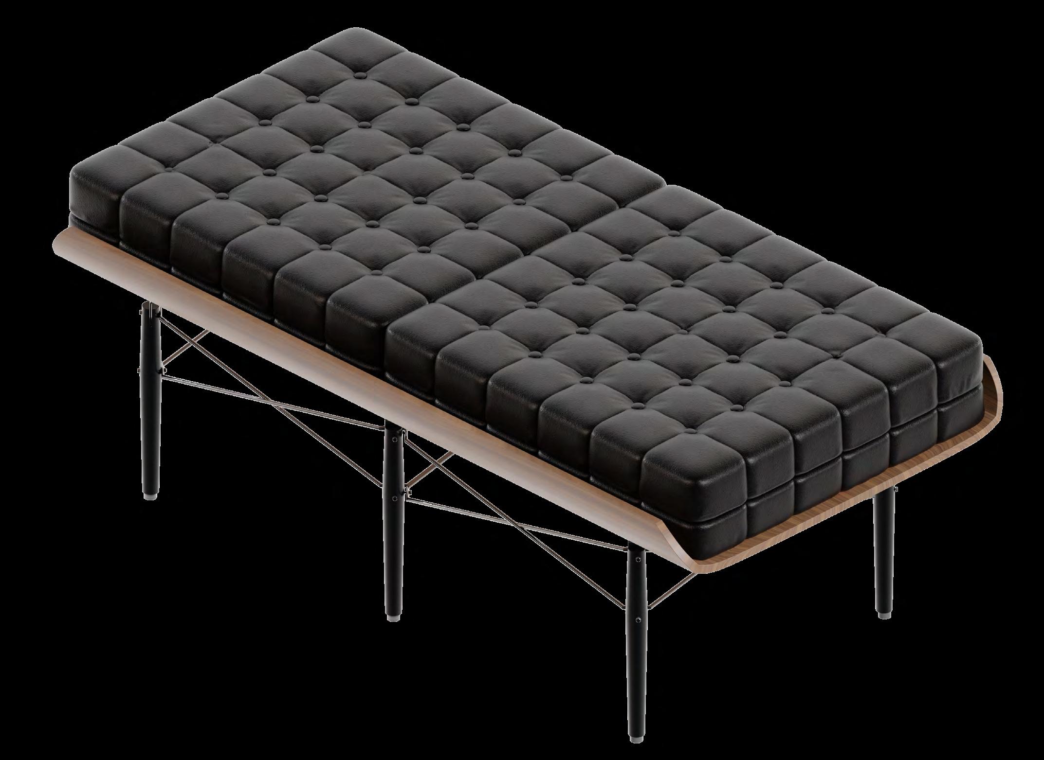
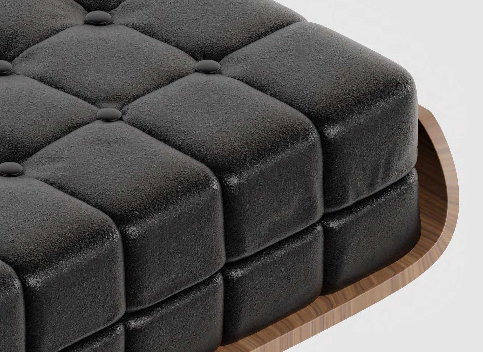
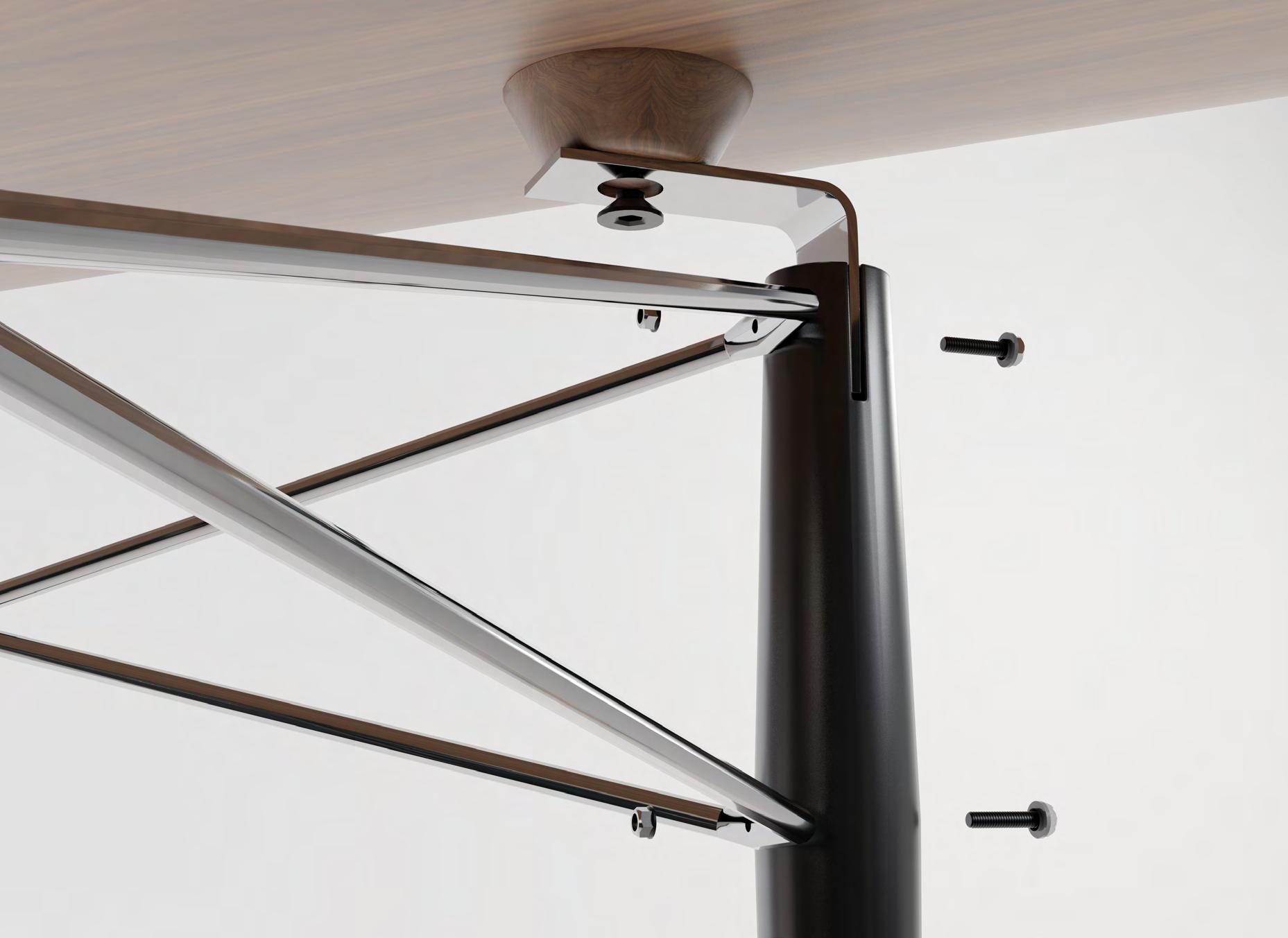
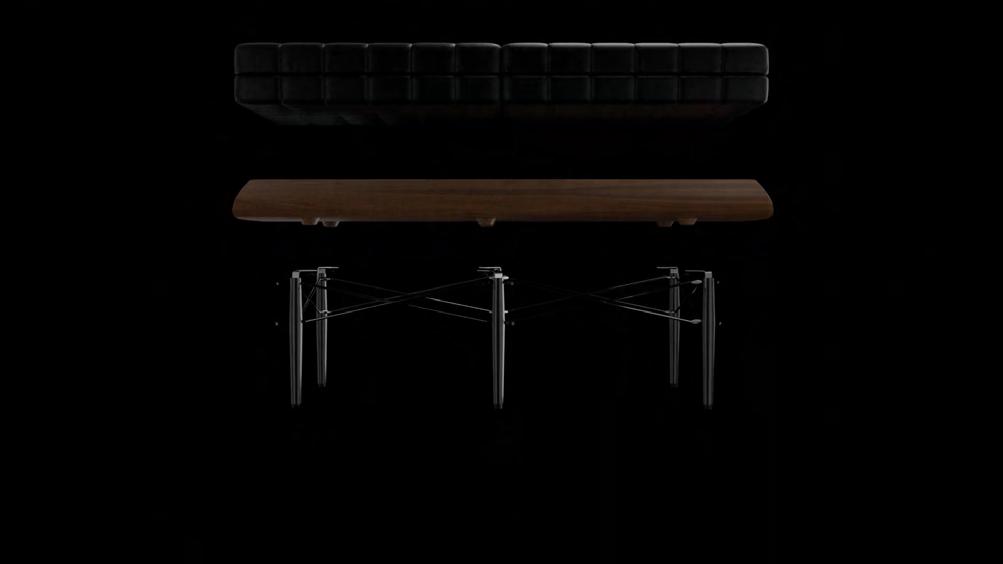
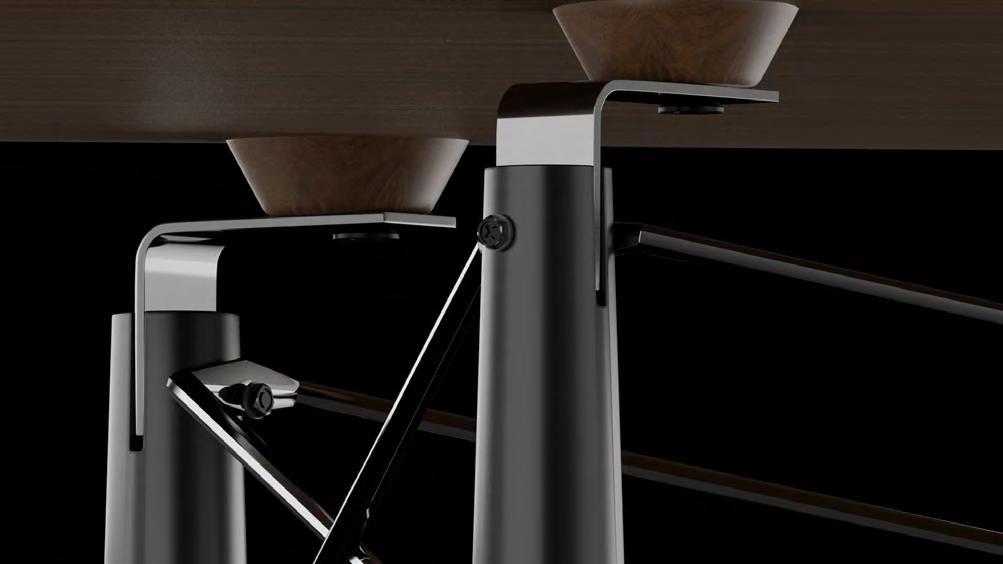
In his book, “Exquisite Corpse,” Michael Sork in explained that Exquisite Corpse was a game played by the surrealists in which someone drew on a piece of paper,folded it and passed it to the next person to draw on until, finally, the sheet was opened to reveal a calculated yet random composition. He also suggests that cities are similarly assembled by many players acting with varying autonomy in a complicit framework. This seminar will take on this premise by exploring the merging and assembly of disparate furniture components. Before beginning our drawing exploration, I create a furniture design by assembling components from 2-3 iconic furniture pieces. In the spirit of the original Exquisite Corpse game, the goal is not to completely merge the pieces so that you no longer recognize its origin. The parts should still be recognizable but now mechanically assembled together to make a new whole.
I find 3D digital models of the furniture pieces on line,but you will be expected to edit and remodel them so that they reflect well the qualities of the original furniture piece, like the softness of a cushion and details like screws and reveals. The final design should define a new whole and not just a mash-up of parts.






Fall 2021
Instructor: Marcelo Spina Jeffrey Halstead
TA: Yuxing Xu

Visual Studies III provides an introduction to modeling, advanced projection, composite drawing and photo-realistic rendering techniques. Over the course of the semester there will be a research assignment and two related exercises as well as lectures, readings, tutorials and discussions around the conceptual framework of the class. The seminar will tie into the 2GA Design Studio representational narrative and analytical discourse.
The course aims to introduce means of understanding, representing, analyzing, dissecting and transforming architectural objects [buildings and projects] in a cultural context. The intention is to provide both, a rigorous and disciplinary means to analyze and understand important architectural projects and buildings, but also with the necessary technical, projective and speculative resources for using them as foundations in the generation and production of contemporary and culturally significant work.
Projecting object with drawings
By analyzing the plane of the project, its characteristics are filtered out.
Projecting object with drawings
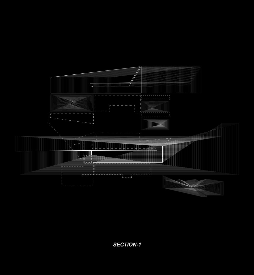

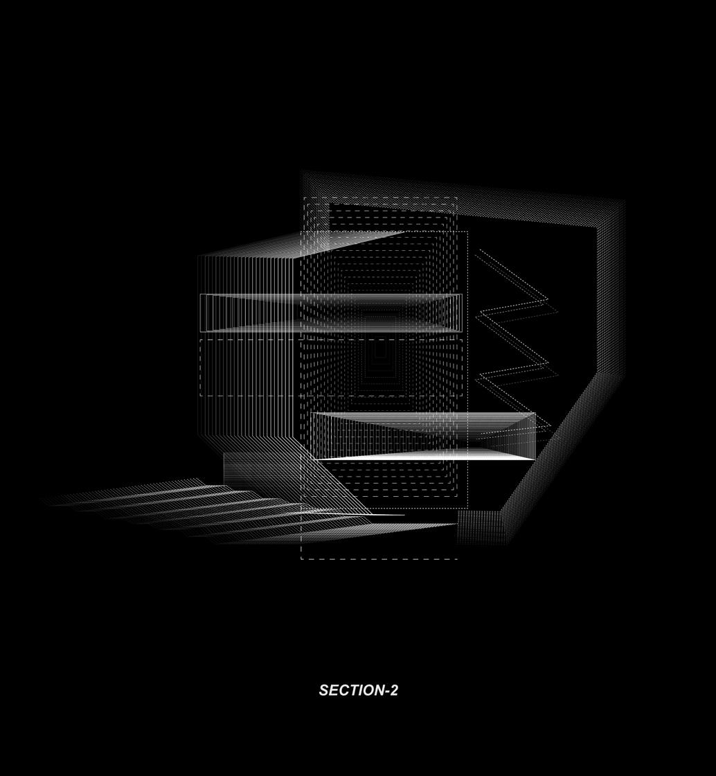
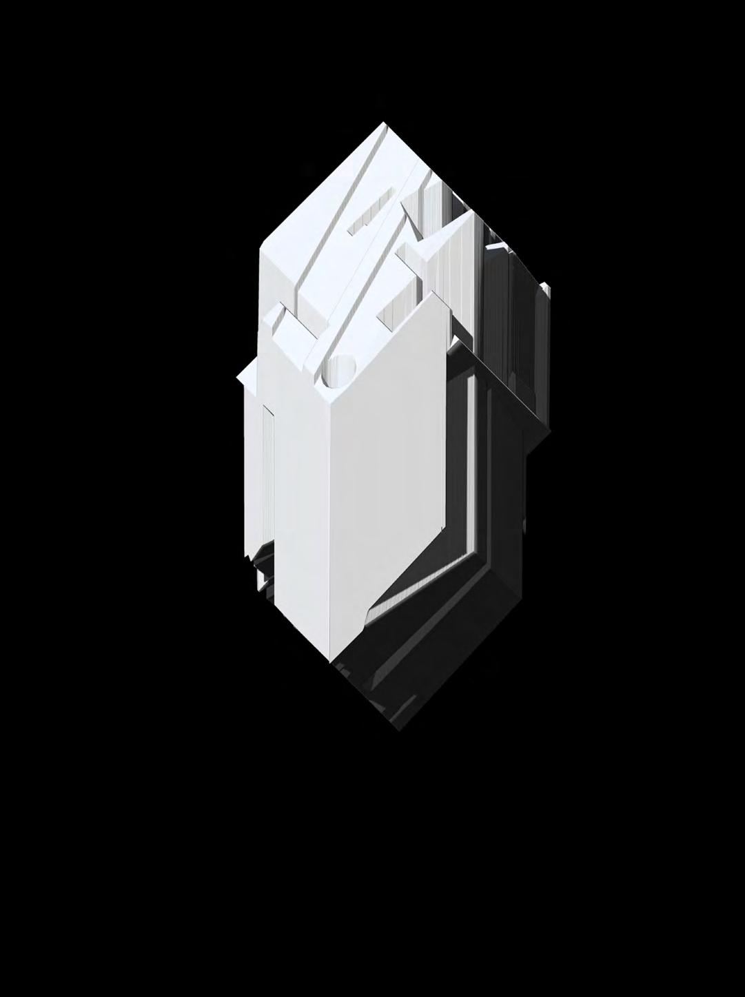

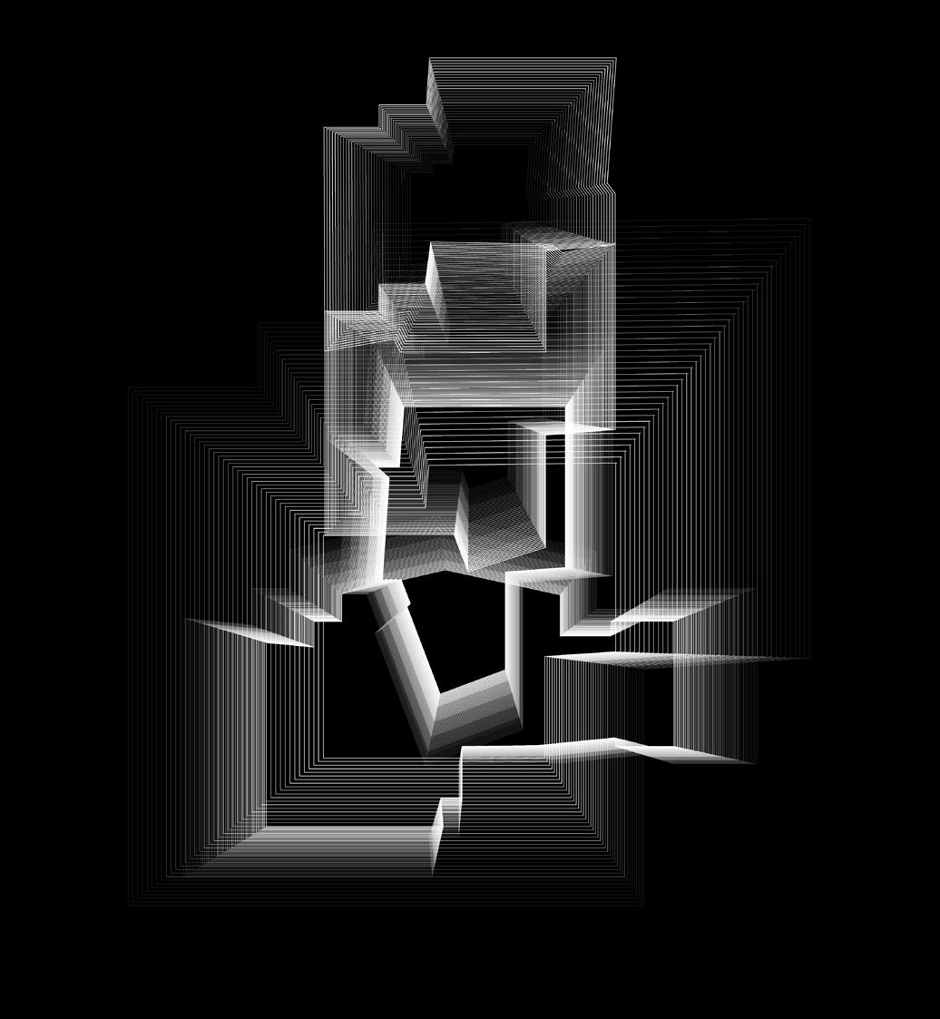

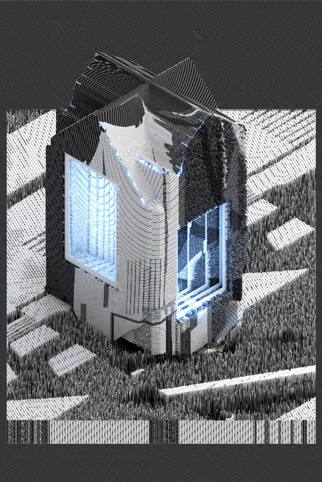
The enhancement of these elements highlights their positive and negative operations to construct a new drawing form. These forms, as translations, regenerate new volumes

By analyzing the plane of the project, its characteristics are filtered out. The enhancement of these elements highlights their positive and negative operations to construct a new drawing form. These forms, as translations, regenerate new volumes

Through the refining, cutting and combination of the body, a new volume is formed. Projects the new mass to the specified box using the planar projection method. All four dimensions are affected by different body speed, resulting in a new model. Use the black and white information of the pattern as the height information to give the model details


SPRING 2021
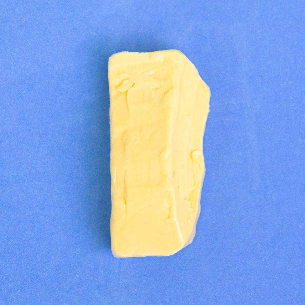
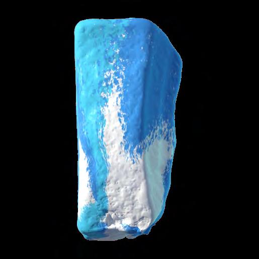
Instructor: Matthew Au & Zeina KoreitemOver the past three decades, the architectural process has been drastically reorganized by what historian Jonathan Crary calls “a transformation in the nature of visuality probably more profound than the break that separates medieval imagery from Renaissance perspective.” Architecture’s previously stable graphical conventions have dissolved and been replaced with an ever-expanding repertoire of computational mediums, originally not designed for the architectural imagination.
If we acknowledge that architecture has for centuries produced new ideas and forms by treating representational media as spaces of visual exploration, how might techniques that belong to computational media—which often, however unintentionally, seem to prioritize “workflow optimization” at the expense of experimentation—be made to serve this same experimental function? Any such inquiry entails imagining and testing methods by which computational image-making (or what Friedrich A. Kittler calls computer graphics) might be at times used to disrupt the smooth workflows which presently define digital culture. It also involves thinking carefully about how the history of form and tectonics—which architectural drawing managed so well for centuries—might be preserved and extended within the paradigm of these new digital media.



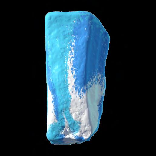
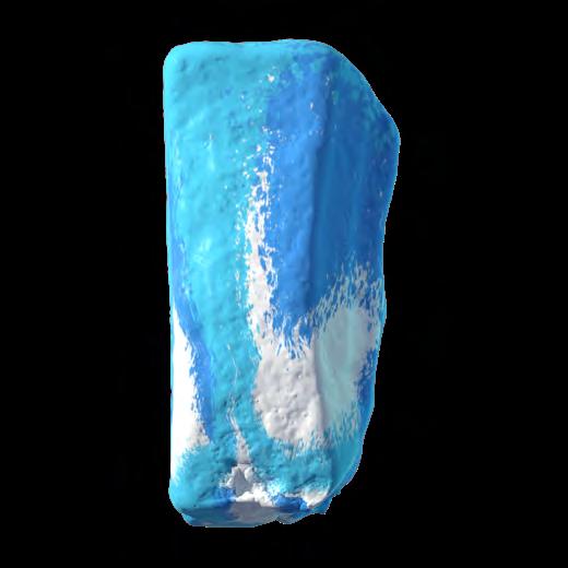


Fall 2020
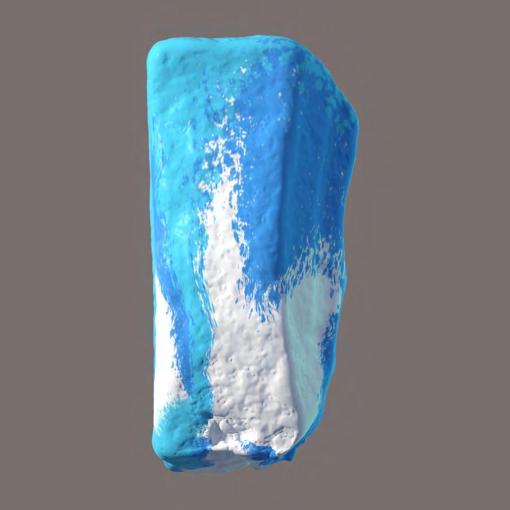
Instructor: Matthew Au & BallietThis project is based on AR technique. First, Draw three cubes in the app, they are intertwined, they are large, medium and small. Then I prepare the 3d model for printing.
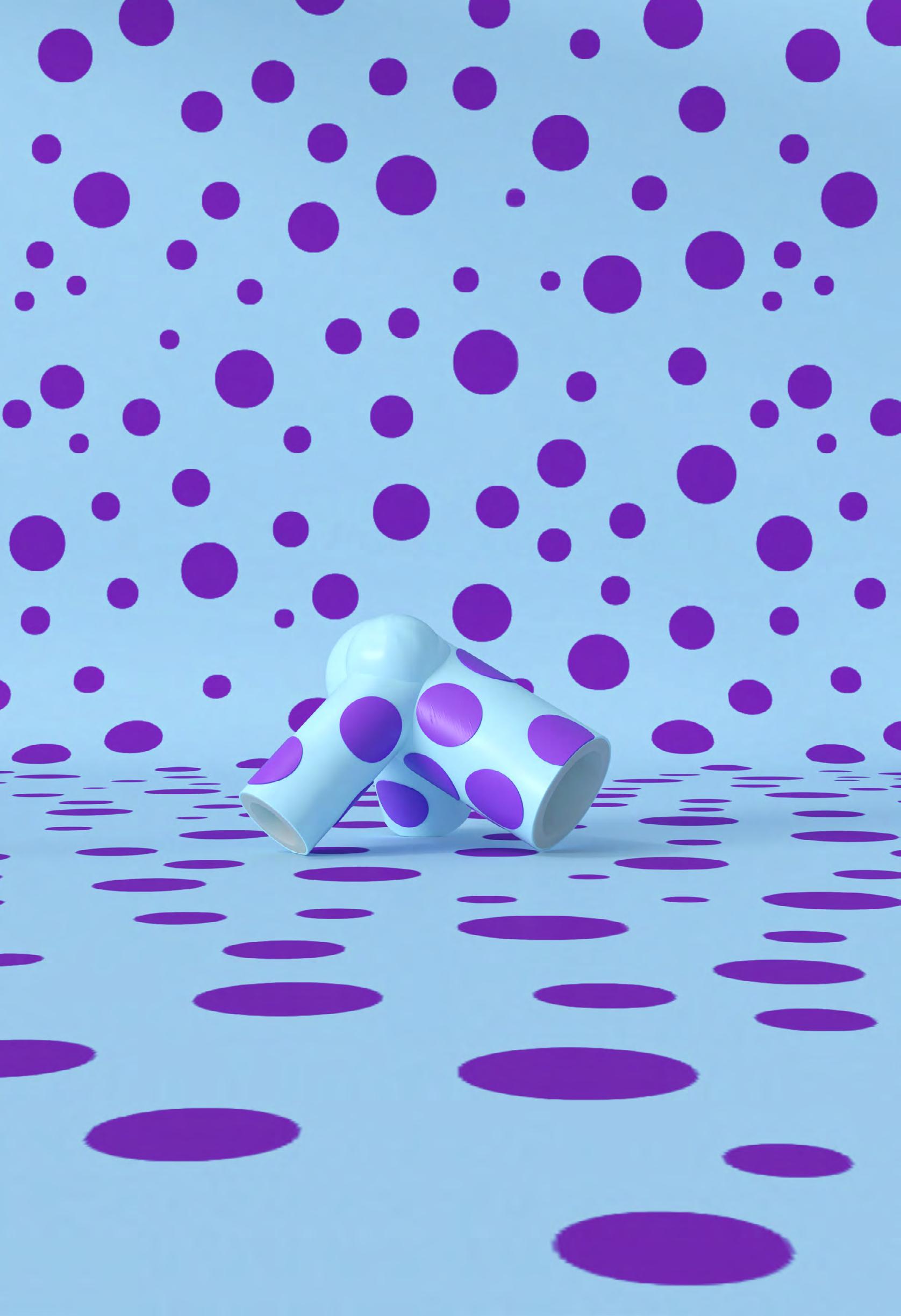
In the remodeling process, I turn different cubes into wire-frames, and then use the line as the center. Pipe it, so that we can create tubes with different radius. Then exported the model to a 3D printable format, turning the digital model into a real model. I design the material of the actual model to minimize its 3dprintsense. At the same time add patterns and add color contrast. This constitutes an interesting composition.
The training of this course mainly focuses on the control of colors, the rendering of materials, and the control of line drafts.


Fall 2022
Instructor: Curime Baliner TA: Kelly Dix Van Collaborate: Bingkun Liu, Jiaxin Zhao, Haocun Zou
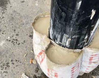
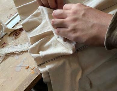
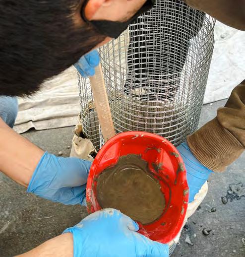
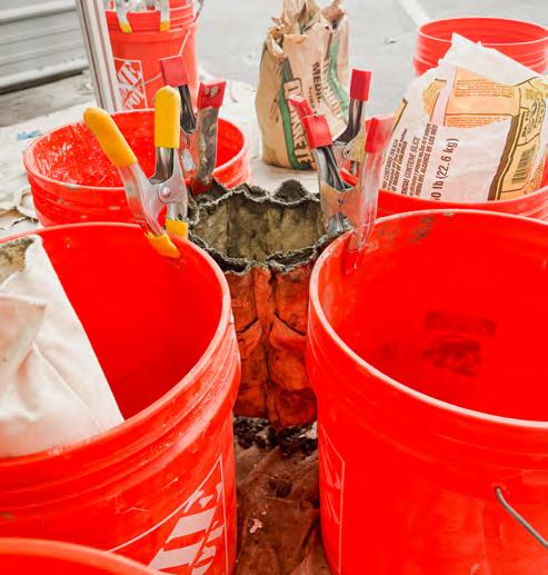
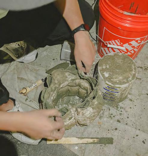
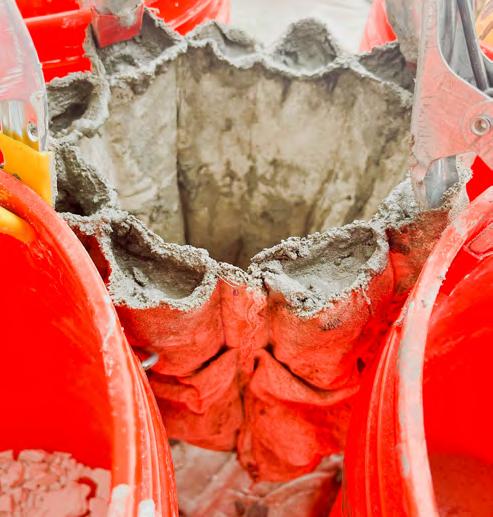
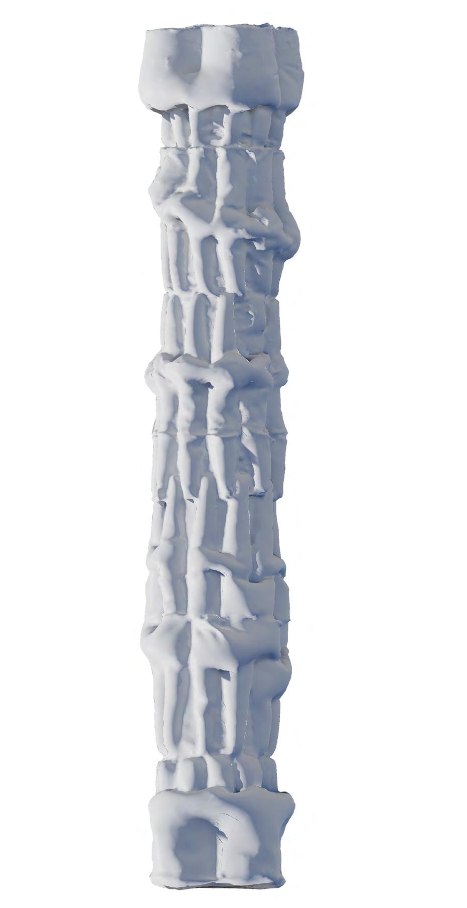
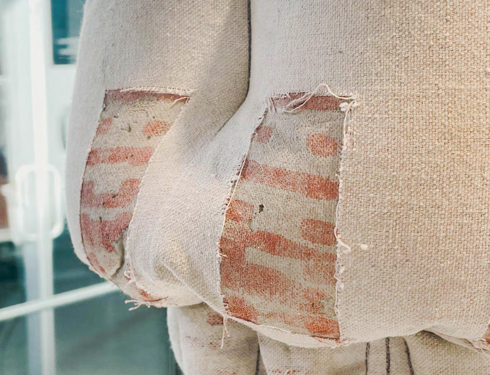
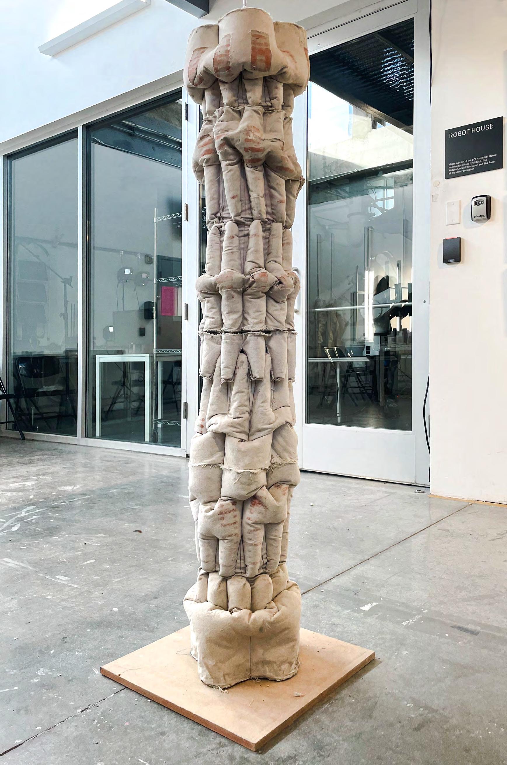
This lesson focuses on the combination of materials, construction, and technology. Our goal was to create a column. We would use the fabric as the casting mold. The sewing method of the fabric would affect the shape of the column. There will be patterns on the cloth which are generated by the grasshopper and arranged in specific places on the cloth by algorithms of our design. This algorithm produces a pattern according to input image brightness, hue, and saturation so that we can control the shape and organization.
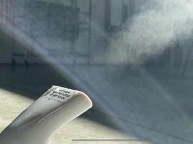
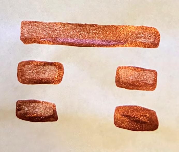
Using the moisture released by the concrete during the solidification process, the cloth will be wet, allowing the pigments on the cloth to acquire the ability to transfer. The pigment is transferred from the cloth to the concrete surface, creating a special texture. At the same time, the attractive texture of the fabric is transferred. Since the color of the concrete brand we chose is similar to the cloth, they cannot be recognized by people at a specific moment. The appearance attributes of the cloth and concrete are blurred from each other.


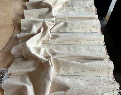






Each line In B cloth matches a center line in A cloth, which keeps the pocket in a same size, as well as every column segment
Control Robot arm to draw sewing lines then turn the cloth upside down with the grids by laser measure. Leaving the sewing guidelines attach to each other and transferring the pattern simultaneously
matches cloth, which in a same every column

Each line in B cloth matches a center line in A cloth, which keeps the pocket in a same size, as well as every column segment.
3D Scan Column segment


Draft How the column stand Sewing

The difference between two fabrics creates bulge to hold the concrete
The difference between two fabrics creates bulge to hold the concrete
Control Robotarm to draw sewing lines then turn the cloth upside down with the grids by laser measure. Leaving the sewing guidelines attach to each other and transfering the pattern simultaneously
Control draw turn down laser the sewing attach and transfering tern simultaneously
Paint transfer
With the paint we use, the color successfully transfered onto the column
3D Scan Column segment Hollowed interior
Although we would like to get rid of the cloth, the thread blocked the way of the concrete.
Paint transfer
With the paint we use, the color successfully transfered onto the column


Column segments follow the continiuity of the pattern, and the cloth creates unique texture for the concrete.
Hollowed interior
Although we would like to get rid of the cloth, the thread blocked the way of the concrete.
Column
Column the continiuity tern, and unique concrete.









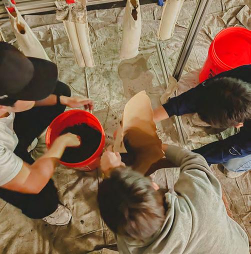
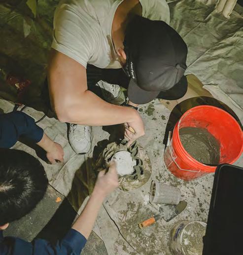

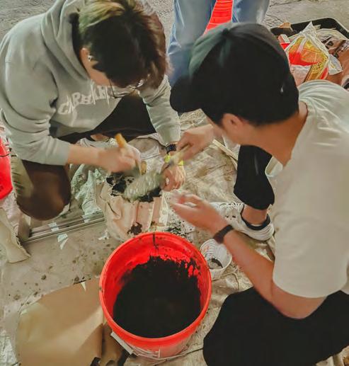

Fall 2022
Instructor: Kerenza Harris, Pavel Getov
Collaborate: Bingkun Liu, Kaiyan Chan, Yuexiao Yang
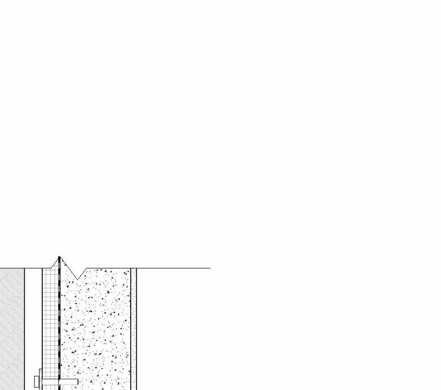
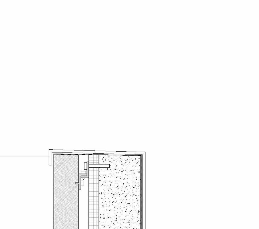
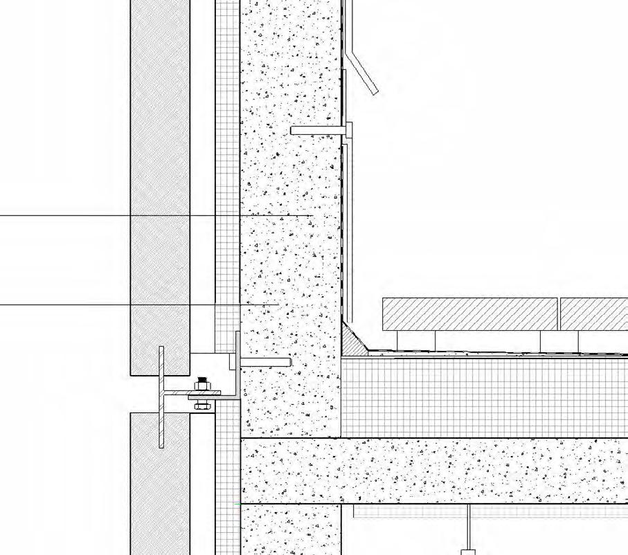
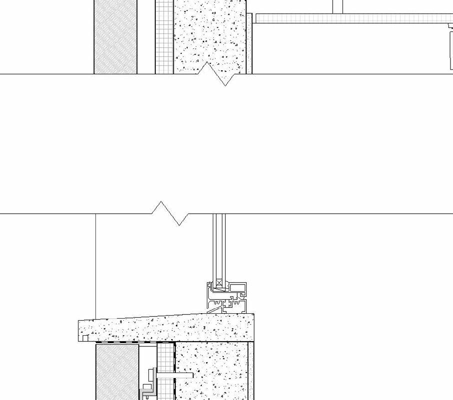
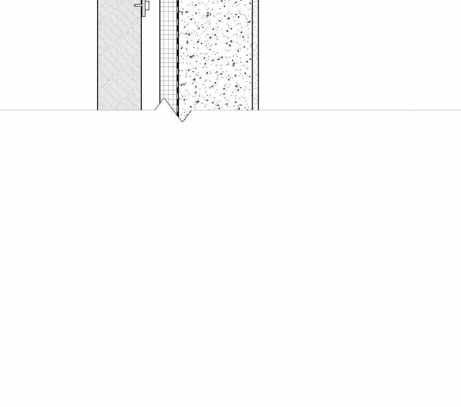
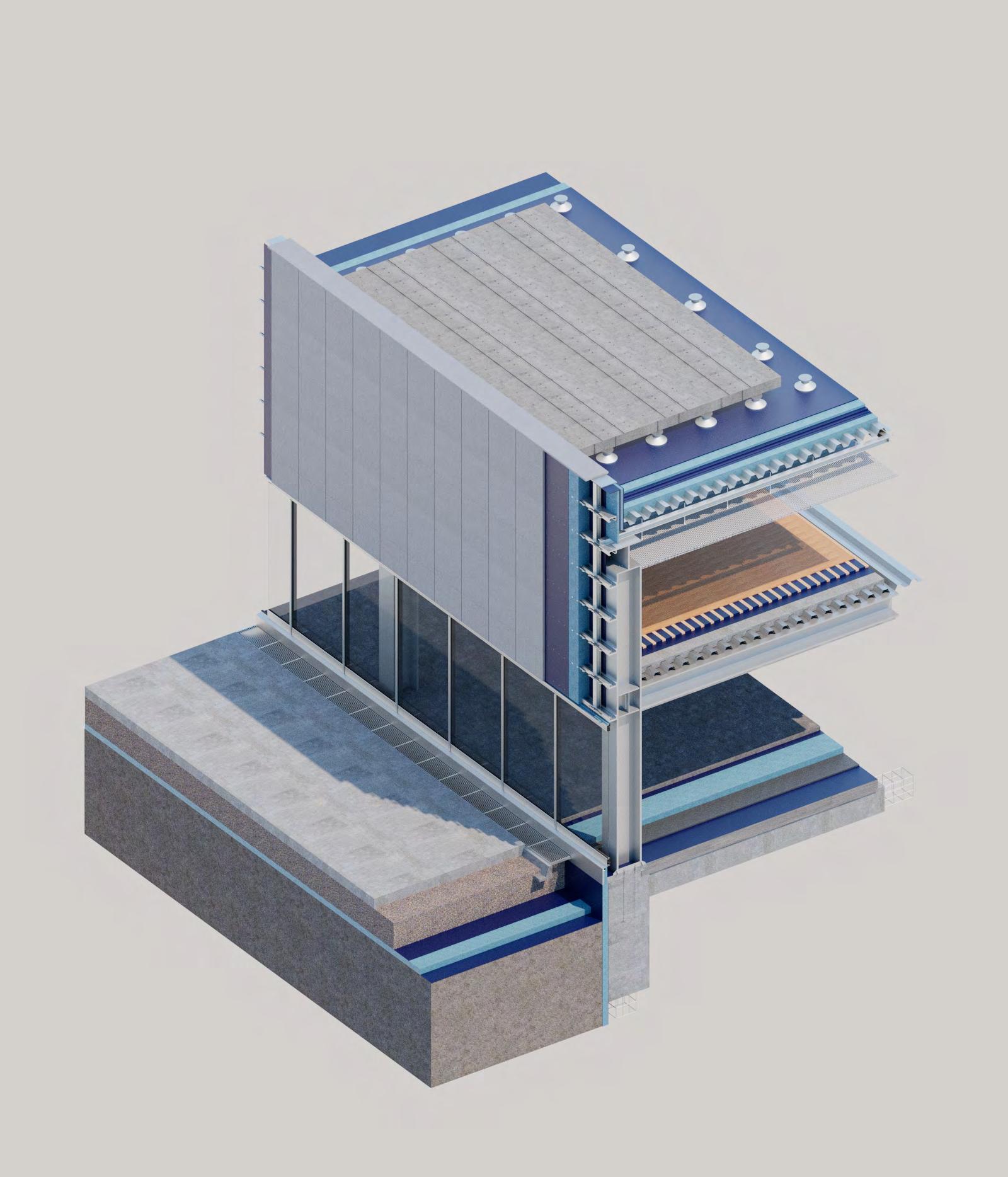
The class of Project Delivery aims to walk through the architectural design phase which is construction documentation. We begin with a concept, schematic design, design development to construction design. My responsibility is to compile all the documentation created by my teammate and make sure they follow a standard graphic representation of architecture. I do wall section and detail drawings as well as residential layout which is 3F to 4F. Checking minor mistakes and making sure they are done correctly is my daily assignment for this project.
The owner would like the facades facing main street to be visually expressive and communicate the goals of the project. The Owner is interested in contemporary architecture and the use of advanced methods of design and construction. Therefore, the project has to be developed using advance Building Modeling tools and comply with all active codes and regulations that apply to the project’s lot.
314-8100
11
PROJECT:
KEY PLAN: THE OWNER SITEPLAN A-1.0
10/10/22 3/32" 1'-0" A-1.0 SITE PLAN
OBKJ ARCHITECT:
Checker
9 10 A-4.3
1001 Sunset Drive LOS ANGELES, 90232
A-4.2
17'0"
A-4.1
RAMP 9' 2" "
A-3.2 2 4 5 7 G
9' 0" 8' 10 1/2" 5' 11 1/2" " 9'0" 9' 0" " 9' 2" " 9' 2" 9' 0" " 3' 6" 9' 5 1/2"
20' 0" " 4' 0 1/2"
8' 1/2" 30' 11 1/2" 25' 9" " 24' 10 1/2"
REVISIONS SYMBOL DESCRIPTION
LOBBY
929, 933, 941 San Julian Street Angeles, CA 90015 1/8" 1'-0" A-1.1 BASEMENT
10/11/22 Project Overview
plan and parking lot
Checker Site
B C D
A
OBKJ ARCHITECT:
1001 Sunset Drive LOS ANGELES, 90232
STRUCTURAL ENGINEER: 800 Wilshire Blvd, 16FL Angeles, (310) 945-4800 KPFF Consulting Engineers 700 South Flower Street, Suite 2000 2100Los Angeles, 90017(213) 418-0201 Einwiller Kuehl 318 Harrison Street, Suite 301Oakland, MECHANICAL ELECTRICAL PLUMBING: Buro Happold (310) 945-4800 Langan 515 South Flower StreetSuite 2860, Los Angeles, 90071(213) 314-8100
A-4.1
Room LOFT Room 311 Room 312 Room 313
OPEN TO BELOW PATIO STAIR LOFT 301
LOFT 308
Room 307
SPRINKLER DOWNLIGTH FIXTURES SMOKE SENSOR A-7.2
LOFT 306
302 LOFT 303
PROJECT: KEY PLAN: THE OWNER RCP-THIRD
CHK DRAWING BY: PRELIMINARY NOT FOR CONSTRUCTION
FLOOR
A-2.3 Checker 10/18/22 1/8" 1'-0" A-2.3 THIRD FLOOR BY L.O ISSUES REVISIONS A-3.3 3 6 8 B C D E G 1 10 11 A SPRINKER DOWNLIGTH FIXTURES SMOKE SENSOR LOFT 301 LOFT 303 LOFT 304 LOFT 305 LOFT 306 LOFT 310 LOFT 308
PRELIMINARY NOT FOR CONSTRUCTION
ARCHITECT:
CHK DRAWING BY:
A B C D PROJECT: KEY PLAN: THE OWNER RCP-FOURTH FLOOR A-2.4 Checker 10/18/22 929, 933, 941 San Julian Street Angeles, CA 90015 1/8" 1'-0" A-2.4 FOURTH FLOOR BY L.O ISSUES REVISIONS SYMBOL DESCRIPTION Residential plan’s RCP
945-4800


GEOTECHNICAL ENGINEER: Langan 515 South Flower StreetSuite 2860, Los Angeles, CA 90071(213) 314-8100






LANDSCAPE ARCHITECT: Einwiller Kuehl 318 Harrison Street, Suite 301Oakland, CA 94607(510) 891-1696
MECHANICAL ELECTRICAL PLUMBING: Buro Happold 800 Wilshire Blvd, 16FL Los Angeles, CA 90017. +1 (310) 945-4800
GEOTECHNICAL ENGINEER: Langan 515 South Flower StreetSuite 2860, Los Angeles, CA 90071(213) 314-8100
Spring 2022
This course investigates issues related to design implementation: technology, material use, system integration, and force strategies, prototype analysis of system design and characterization Courses include review of basic and advanced construction, analysis of building codes, structural and mechanical, environmental systems, architectural Service systems, development of building materials and integration of building components and systems. The purpose of this course is how architects connect complex building systems for the built environment, develop a through-the-ground understanding of integrated building systems, and demonstrate the ability to document architectural projects and environmental management.
Take advantage of the animated discussions from last semester’s Project Studio video section with multi-faceted drawing discussions and multi-faceted work. One of the main themes of each class is one of the core themes of the workshop, different, components, sizes, descriptions, a starting point, the faction of BIM. The components to the crowd simulation, the environment and scenario simulation, to the construction and cycle cost model of the project and the model to another impact.
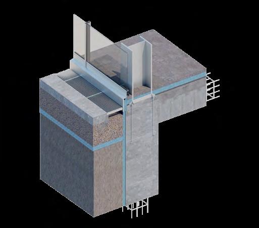
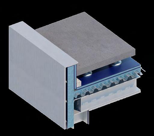
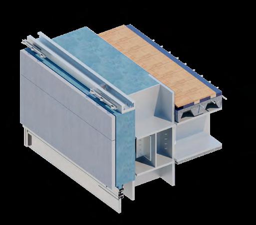
Fall 2021
Instructor: Russell Fortmeyer
Collaborate: Hinojosa Evelyn, Carballo Charite
Every year is now the hottest year on record. Our cities trap heat and exacerbate harsh conditions for occupancy. Rampant development encroaching into impossible ecosystems turn to firestorms and then wash away. Coastal cities face near ruin. Our global political system sits idle, frozen in paralysis and focused on maintaining wealth in the hands of the privileged.
Architecture can play a significant role in shaping humanity’s response to the needs of sustainability, climate change, and resilience. The performance of architecture—how it modulates energy and resource consumption and production, creates comfortable and productive spaces for people, and actively responds to dynamic environmental conditions—is increasingly its primary role in our cities, often at the expense of aesthetic and cultural criteria. Architecture must now actively and productively engage our stressed natural systems.

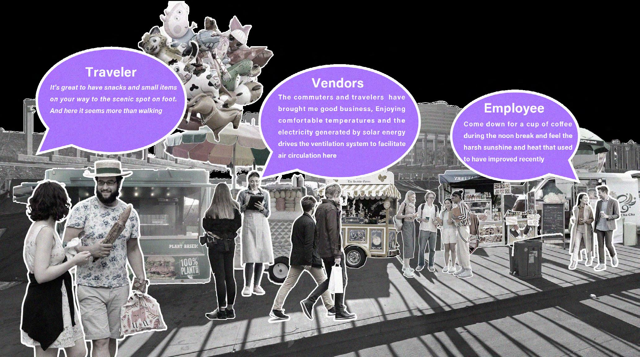
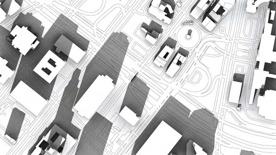
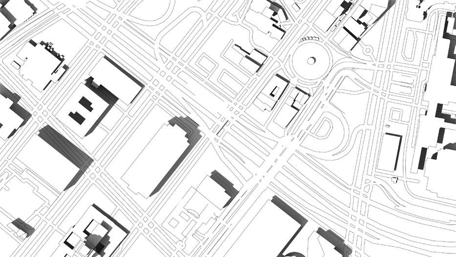
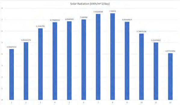
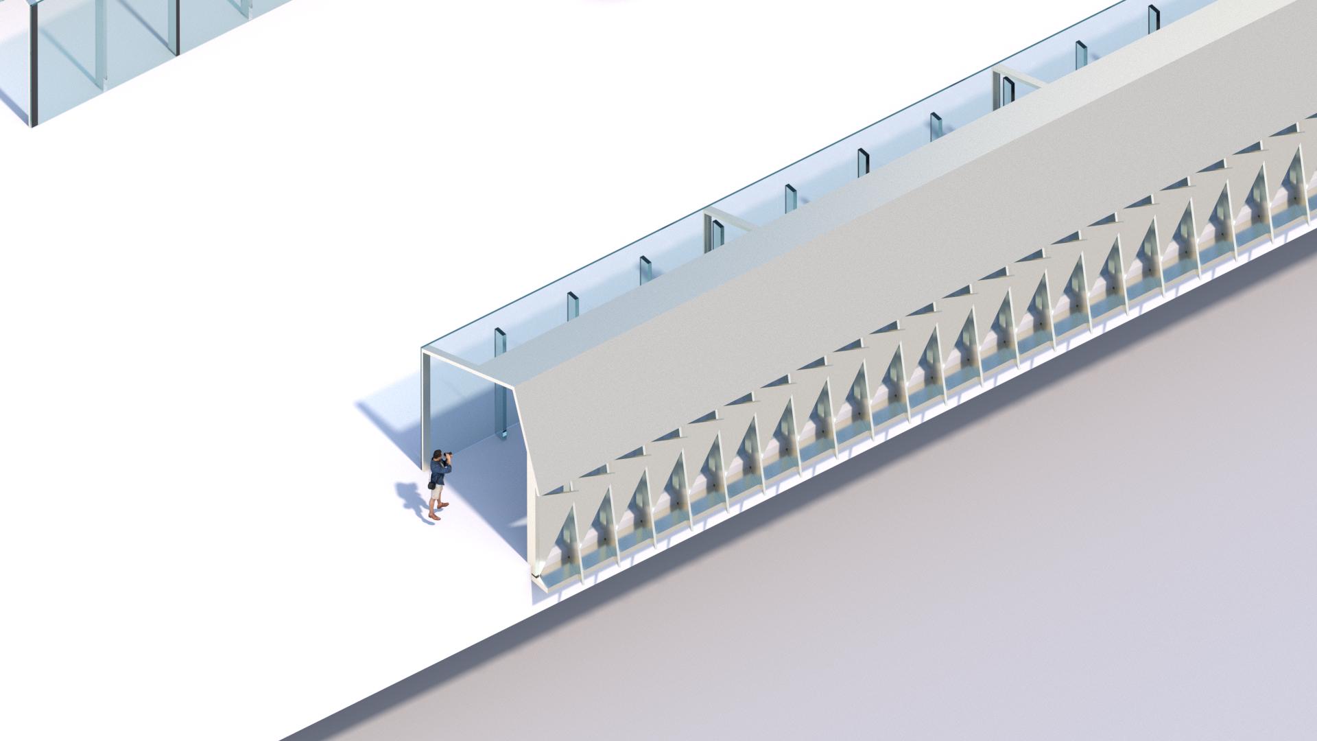
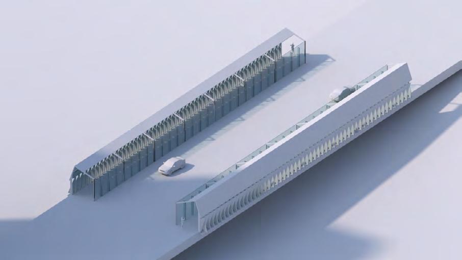
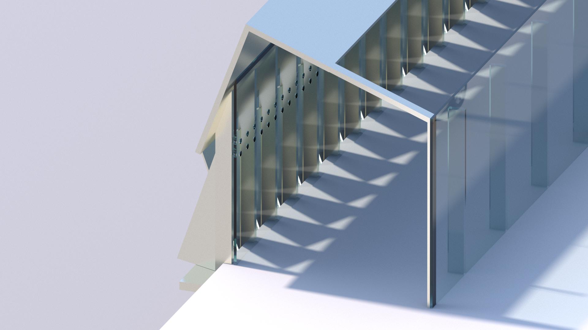
Los Angeles has unparalleled sun and beaches. Sunlight brings nutrients to plants and supports the human body to synthesize specific elements. However, in some public areas in Los Angeles, due to the lack of a good shading system and appropriate environmental intervention. They are gradually dilapidated, and the citizens passing by here are all disgusted. Our team selected a section of the bridge in the city center, tried to use environmental analysis tools to get the results, and then designed based on the data







Fall 2020
Instructor: Pavel Getov
Team Names: Bingkun Liu, Yuexiao Yang, Rui Zhao
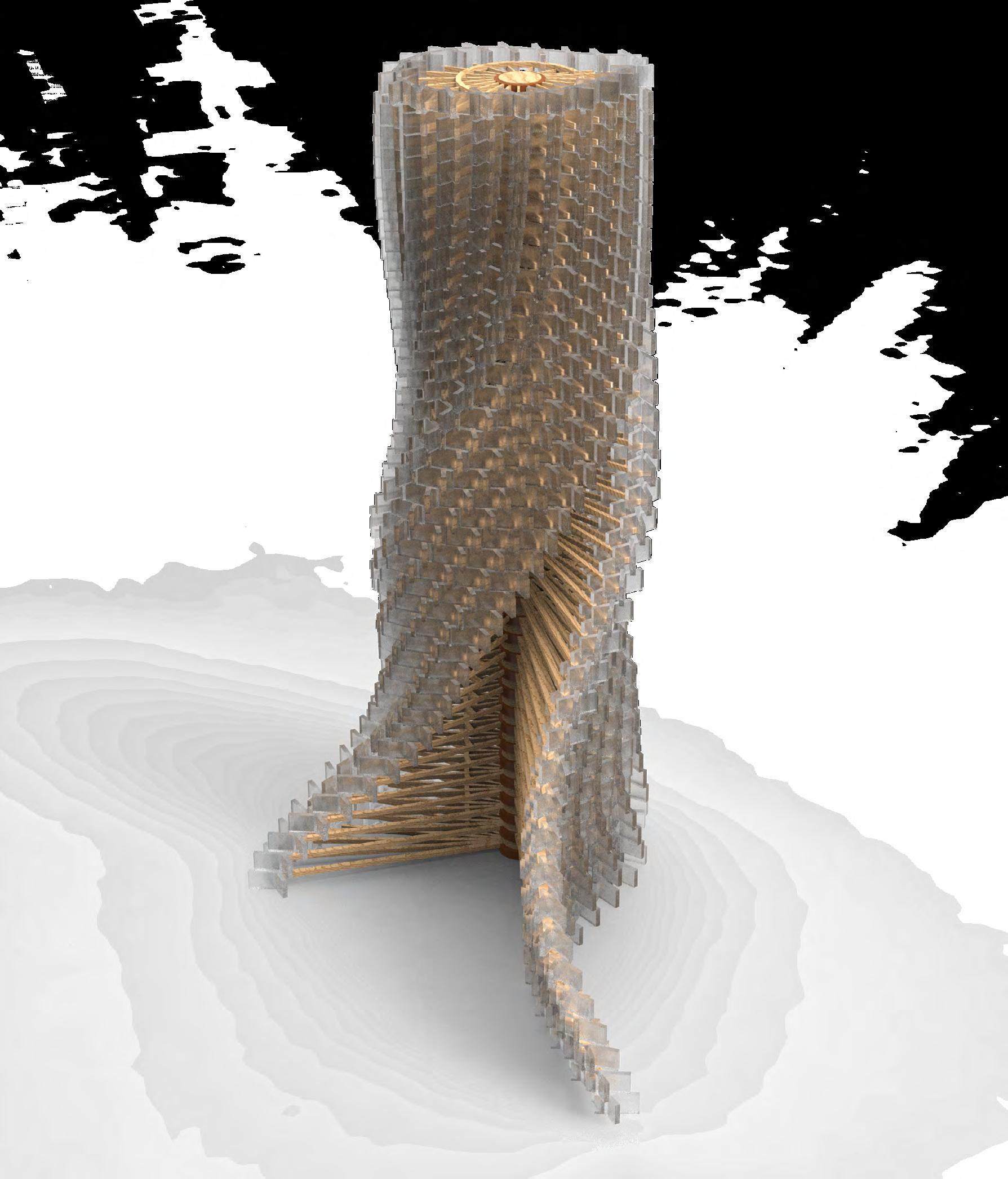
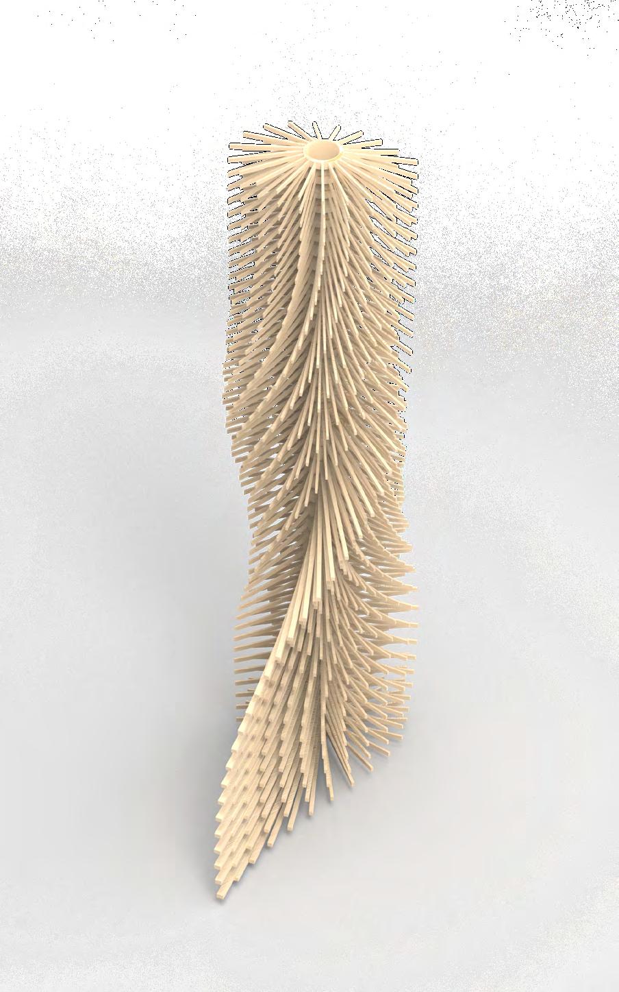
This course mainly introduces basic material knowledge to students, making students understand the history of various materials and their modern application. Through weekly research on the construction of specific materials, we have understood the importance of materials to architecture. Finally, the course ends with a group assignment. My team and I need to create a device dedicated to the expression of materials and structures through midterm research combined with the materials we are interested in.
The whole project is based on thinking about Chinese towers, learning about their wooden structures, and studying the application of slug structures in modern times. Use this as a basis to explore the potential of wood materials.



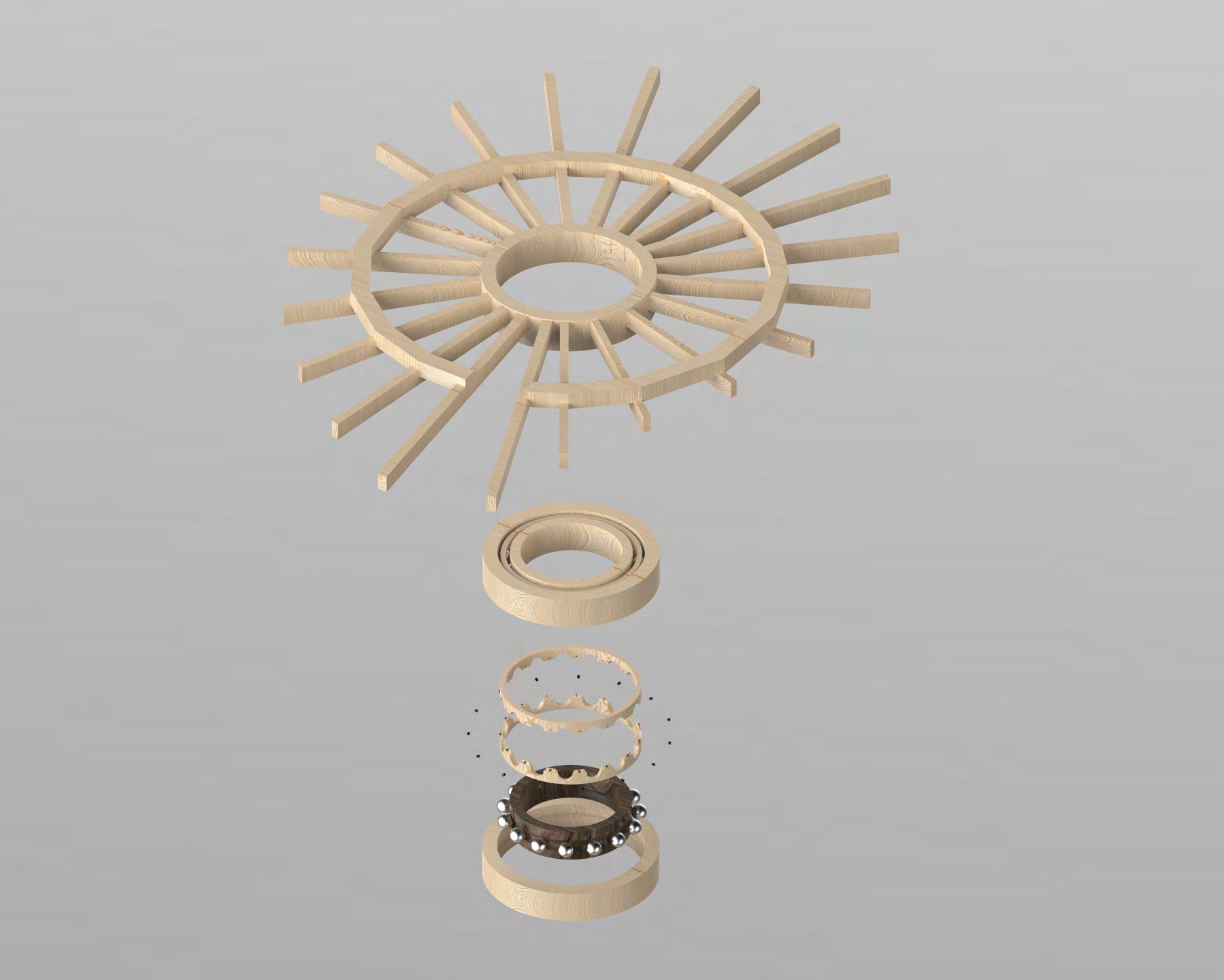
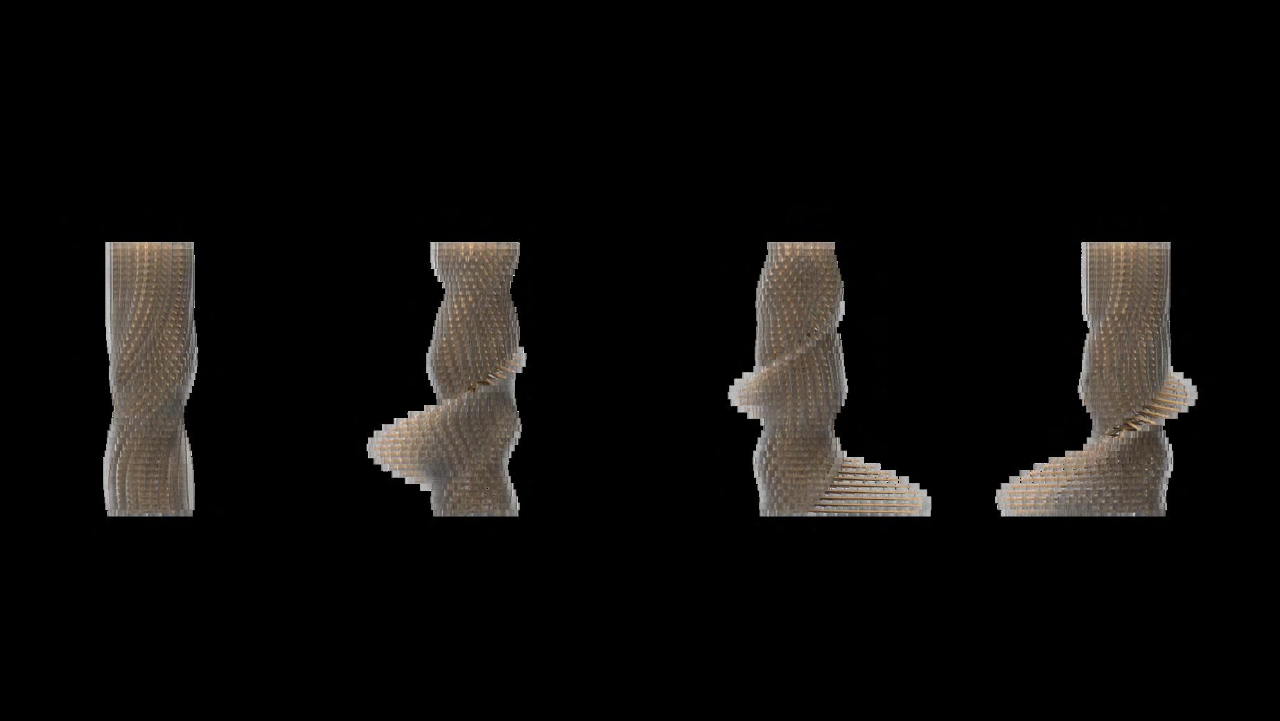
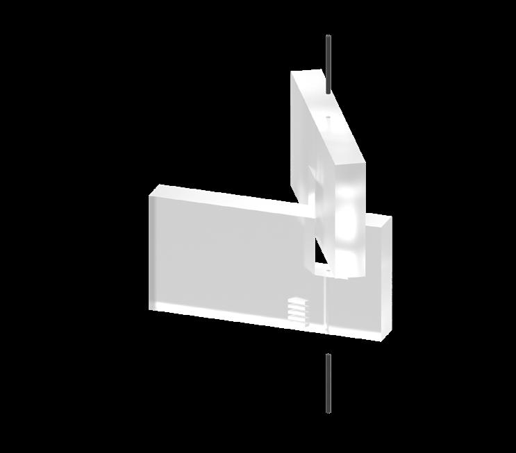
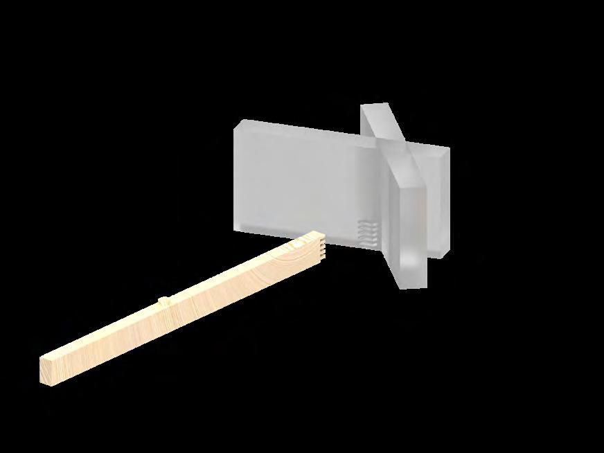
Spring 2022
Instructor: Erik Ghenoiu
TA:Megan Meulemans
This course provides a chronological overview of the evolution of architecture: major movements, styles, and developments in global architecture and urbanism from the 20th to the 21th century. Students will analyze major movements and key works in order to understand the cultural, religious, anthropological, and sociological factors involved in the design of buildings and cities throughout the world. Particular attention will be paid to the analysis of specific relationships between the organization, configuration, and articulation of buildings and cities as well as the historical, conceptual, and political contexts with which they are associated. Lectures and discussions will focus on issues of technology, nature, representation, and communication, and on understanding the diversity of needs, values, behavioral norms that shape architecture and the responsibility of architects.
Hollyhock House, Origin of Wright's Urban philosophy
Lejian Ouyang
04/18/2022
Instructor: Erik Ghenoiu
TA: Megan Meulemans
Abstract: Hollyhock house has an unconventional character than Wright's previous projects. The original brief was to build an art community, which was changed into a private residence due to the shelving of the project. The special topography of the site, the road disconnected from the urban network, and the accumulation of culture take place here. The actor's identity of the client brings a new perspective to the project. Returning to the Greek form, the idea of building an Amphitheatre to stimulate the performance of the actors makes the building a place of cultural mingling. The appearance of Mayan culture is properly integrated with the plane and spiritual core of Greek theater. Unlike the Prairie houses, the plan of this house shows a classicism. It has a pivot-centric plan. It shares the same quality with prairie architecture and reflects Wright's ideas of anti-family symbolism. The difference lies in the introversion of the hollyhock house. From the outside, the whole solid building cannot be seen through. After the design of the open-air theater refers to European classicism, it unexpectedly presents the flat form of the Basilica church, which makes the building full of monumentality and seriousness. So, whether it is Cranbrook Greek or the Cranbrook
Greek Theater, Hollyhock house bears a striking resemblance to them.
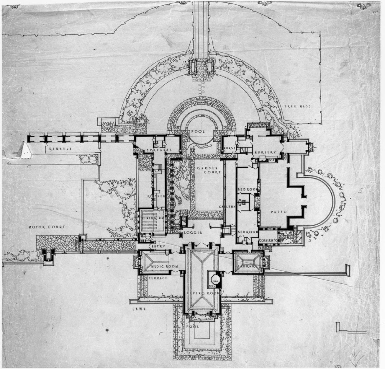
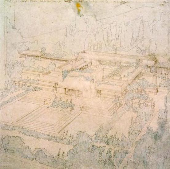
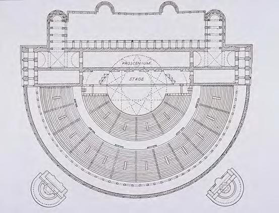
Hollyhock House is not just a house, it is the embodiment of the will of the owner and the architect. It has a floor plan with classicism. From the floor plan (See fig. 1) we can see that the entrance to the house is on the left, which is the long side. The lengths of the two axes are different, with the axis field in the east-west direction and short in the north-south direction. The swimming pool is located at the top, and there are corridors with columns on both sides of the courtyard. These features are like classical Basilica churches. The pool is like the apes of the church, and the garden in the middle is like the nave of the church. These forms make the hollyhock house a sublime, which has the shell of Mexican culture and the form of classical qualities. (See fig. 2) In fact, Alice T. Friedman also mentioned that Wright was influenced by the classical theatre form and Barnsdall. As a performer, Barnsdall has traveled across Europe, and she is also committed to creating a stage that serves society. Bringing the stage back from dim, crowded modern theaters back to Greece's open, exciting open spaces is her philosophy. 1 We can find some clues from the plane of this Roman semicircular theater. (See fig. 3) The seats in the theater are divided into two types of seats according to social status. The seats closest to the stage are for the upper class, and the rectangular stage is in front of you. 2 And the plan of hollyhock house also uses this form. But the difference between Wright's building and the classical theater is that although he adopts a classical plan, he also adopts new thinking. First, he extended the stage to the atrium, making the entire atrium a place for performances and activities. Second, what was
Friedman, Alice T. “A House Is Not a Home: Hollyhock House as ‘Art-Theater Garden.’” Journal of the Society of Architectural Historians 51, no. 3 (1992): 239–60. https://doi.org/10.2307/990686.
Friedman, Alice T. “A House Is Not a Home: Hollyhock House as ‘Art-Theater Garden.’” Journal of the Society of Architectural Historians 51, no. 3 (1992): 239–60. https://doi.org/10.2307/990686.
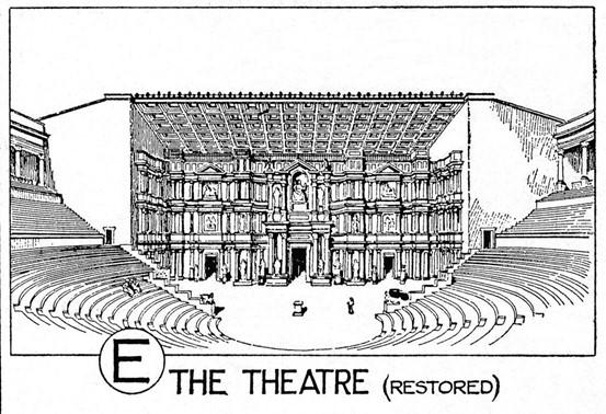
supposed to be a seat in a Roman theater (See fig. 4) became a step for a pool in a hollyhock house. The best viewing position comes from the second floor, which is reached by stairs. Class divisions are abolished, and everyone has the best point of view. This is a manifestation of equality. The seats at the back of the original second floor in Rome were extended to both sides of the building to form a platform. This is in line with Wright's philosophy of prairie architecture. Horizontally distributed buildings and wide views create an equal experience for every guest and resident.
From the Hollyhock house Wright began to think about the relationship between architecture and urban landscape. The winding roads within the site are alien to the Los Angeles urban network. Wright creates a park-like entrance here. Hollyhock house tried to integrate with the local cultural context and designed the shape of the truncated pyramid according to the history, urban and landscape characteristics of Southern California. 3Although the whole building is spread out in the horizontal, the sightline is not as wide as the buildings designed in the past, but it feels that the sightline is blocked. Thus, the truncated shape guides the eye from horizontal to vertical. Get the audience's attention to the Los Angeles sky. 4 (See fig. 5) When designing the Imperial Hotel, Wright felt the symbol of Japanese culture - Mount Fuji, and experienced architectural strategies to resist natural disasters. When designing the hollyhock house, Wright also
Levine, Neil. “LANDSCAPE INTO ARCHITECTURE: FRANK LLOYD WRIGHT’S HOLLYHOCK HOUSE AND THE ROMANCE OF SOUTHERN CALIFORNIA.” AA Files, no. 3 (1983): 22–41. http://www.jstor.org/stable/29543343.
Levine, Neil. “LANDSCAPE INTO ARCHITECTURE: FRANK LLOYD WRIGHT’S HOLLYHOCK HOUSE AND THE ROMANCE OF SOUTHERN CALIFORNIA.” AA Files, no. 3 (1983): 22–41. http://www.jstor.org/stable/29543343.
Hollyhock
considered the geographical environment and cities of Southern California context. That shows Wright's new understanding of the relationship between architecture and landscape. The transition from self-expression to context-expression. From deliberate industrial aesthetics to seamless romantic freedom. It can be said that the Imperial Hotel gave Wright a new landscape thinking. Both Japan and California are on the edge of the Pacific Ocean. Similar geographical conditions made Wright apply his knowledge and experience in Japan to the Holly hock house (See fig. 6)
Wright believed that democracy was a way of life and embedded it in the theory of urban development. Holly hock house known for its artists and art community. Has influenced Wright's theory of the city. Both the Falling Water Villa and the hollyhock are located on a site higher than the ground, surrounded by flowing water and greenery. 5Wright once described his virtual urban design project Broadacre City, which consists of four parts, from hills to plains, flowing water through the flat land, and each family has an acre of planting land. This project has hollyhock house and falling water villa. Spirit. Perhaps influenced by Barnsdall, in broadacre city, Wright emphasized a value, that is, to build urban settlements centered on the arts plus the arts community. The idea of democratic equality applies to architecture, everyone has their own green space, every family has different plants, they grow according to their preferences, and finally this way of life constitutes the city. It also reflects Wright's criticism of the urban development of the United States at that time, just like the hollyhock house built a
5 Friedman, Alice T. “A House Is Not a Home: Hollyhock House as ‘Art-Theater Garden.’” Journal of the Society of Architectural Historians 51, no. 3 (1992): 239–60. https://doi.org/10.2307/990686.
winding road and a house centered on the art community in the grid city of Los Angeles. He emphasized that his urban theory was not a utopian ideal, but the result of the free development of architecture. A city is the result of human activities and life. This is a living broadacre city. 6 It has some connection to the Metabolism of the 1960s. Metabolism emphasizes the self-renewal of architecture, which is an architecture with renewed meaning and life. The resulting city is also a collection of architectural living organisms. Considering that Wright's urban theory emerged in the 1930s, it is difficult to deny that Wright did not influence the Metabolism theory. The same is true Links from two countries, Japan, and the United States. Wright designed the Imperial hotel in Japan and hollyhock in the United States, from which the idea of the urban landscape was born. There is a metabolism's connection to Wright's theory of broadacre city.
He proposed the idea of using the regional market to drive the development of local culture. From the current urban development, it is the current central business district. It is just that modern times use high-rise or super-high rise as a gathering place for cultural business. But Wright's urban theory has a decentralized mindset, and every settlement has such a regional market, because broadacre city's settlement is not an exceptionally large city scale. 7 The highest point of the city in Wright's project is the church, which as a concentrated embodiment of the spirit, is a gathering place for cultural life. It is also an anchor point for the settlement to confirm the entire site. (See
6 Alofsin, Anthony. “Broadacre City Ideal and Nemesis.” American Art 25, no. 2 (2011): 21–25. https://doi.org/10.1086/661965.
7 Alofsin, Anthony. “Broadacre City Ideal and Nemesis.” American Art 25, no. 2 (2011): 21–25. https://doi.org/10.1086/661965.
Hollyhock House,
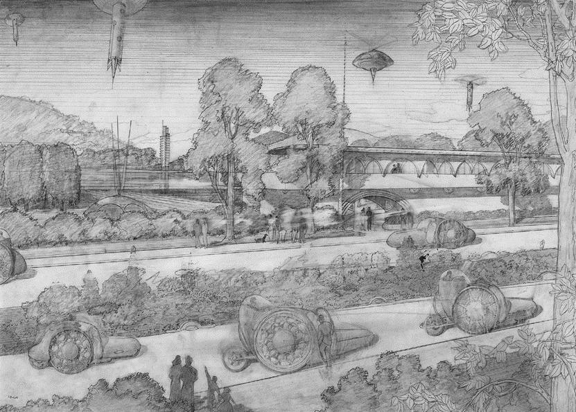
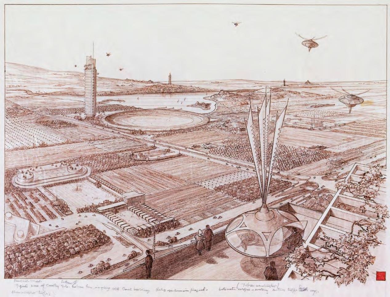
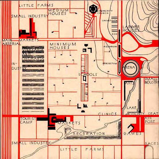
fig. 7 & 8) Wright himself was influenced by classicism, the concept of a cultural gathering place that evolved over the course of historical urban development. 8 For example, the obelisks in the square, the Gothic churches. They all have a characteristic that draws people's perspective to the sky. Isn't this a way out of the secular and sinful cities? On the map, the center is a school that, according to Wright's vision, is the birthplace of art and culture. On the left there is an industrial area, which is believed to be light industry, because it cannot pollute the school. The whole map looks at the scale is not large, hospitals, schools, industrial areas, recreation, zoos around Wright proposed this plan quite utopian. But decision-makers who made the city of architects seemed to have been criticized by the critics of the time, which was a utopian idea, though Wright did not think so. Holly houses also have this kind of drawing people's eyes from the streets, the city, to the sky. The shape of the building has a Mayan temple charm. The wedge's lines sloping toward the sky, visually making people look upwards, while the walls are less open. Reduce the chances of people looking at surrounding cities. 9It was also a manifestation of Wright's opposition to the urban environment of the time. The utopia of Broadacre City is also reflected in the transportation in the figure. Vehicles on the street can be seen to be edgy (See fig. 9), and even now it seems. Vehicles flying in the sky are remarkably similar to today's drones. This shows that Wright is not against machinery, not against the convenience of industry. 10 This tool is
8 Dougherty, James. “BROADACRE CITY: FRANK LLOYD WRIGHT’S UTOPIA.” The Centennial Review 25, no. 3 (1981): 239–56. http://www.jstor.org/stable/23739336.
9 Friedman, Alice T. “A House Is Not a Home: Hollyhock House as ‘Art-Theater Garden.’” Journal of the Society of Architectural Historians 51, no. 3 (1992): 239–60. https://doi.org/10.2307/990686.
10 Dougherty, James. “BROADACRE CITY: FRANK LLOYD WRIGHT’S UTOPIA.” The Centennial Review 25, no. 3 (1981): 239–56. http://www.jstor.org/stable/23739336.
in the service of values, that is, the dissemination and establishment of culture. Traffic arteries are used for transportation, and Wright also mentions in this plan that cars and traffic road networks are used to connect different settlements. In fact, from the map, the overall layout is also connected in the form of a grid. Different from the regular and uniform squares of Los Angeles, different functional areas have varied sizes, and the largest is of course the cultural area, which is the focus of the Wright project. Wright believes that architects as cultural advocates, driving the development of the art community and the redistribution of urban resources in the regional market. But in fact, this kind of thinking is limited to the architect's point of view. Although the development of the city is inseparable from the design of the architect, it is also affected by policies and economy. For example, under the Great Depression, American cities began to focus on the construction of infrastructure and the construction of affordable housing. Completely laissez-faire urban development will reduce the utilization of resources. At the same time, it will reduce the quality of urban life. Cities are everywhere, cities have no center, or every area is the center of the city. We draw this conclusion from Wright's urban project. He advocated that each region has its own cultural center, in connection with the country in which he lived and the California he later visited. As one of the most developed regions of the United States, California's administration is more independent than other states. This is also related to the cultural diversity advocated by the United States, which not only implements intercontinental but also profoundly affects the self-awakening of various parts of the
Hollyhock House, Origin of Wright's Urban philosophy
city.
Although Wright claims that his projects are not utopian, it is inevitable that concentric hexagons are used in buildings such as churches that express spiritual connotations. Just as many utopian projects take many symmetrical forms to combat the chaos of the real world. In terms of the setting of the highway. Wright set it up on the left side of the city, that is, on the periphery. 11Do not let it be the axis of the whole city. At the same time, we can see that although the roads in the city are horizontal and vertical, the area between the areas is different. Some are rectangular, some are square, and some are not even aligned. He is more like a pizza; each part of the area is different but can make up a complete pizza.
Wright's attempts to ease the relationship between man and machine, to create the human subject position through the artistic communities of each area of the city, his urban projects were influenced by Japanese palaces, California topography, and his early experiences. Unlike Le Corbusier, his urban project does not have many high-rise buildings, while retaining convenient transportation roads, while trying to preserve the tranquility and greenery of people's living spaces. The site under the hills is reminiscent of the waterfalling and hollyhock houses of his buildings. Broadacre City It reflects on the enslavement of humans by machines in the context of industrial society.
11 Dougherty, James. “BROADACRE CITY: FRANK LLOYD WRIGHT’S UTOPIA.” The Centennial Review 25, no. 3 (1981): 239–56. http://www.jstor.org/stable/23739336.
city. Although Wright claims that his projects are not utopian, it is inevitable that concentric hexagons are used in buildings such as churches that express spiritual connotations. Just as many utopian projects take many symmetrical forms to combat the chaos of the real world. the setting of the highway. Wright set it up on the left side of the city let it be the axis of the whole city. At the same time, we can see that although the roads in the city are horizontal and vertical, the area between the areas is different. Some are rectangular, some are square, and so each part of the area is different but can make up a complete pizza.
Figure 1 Aline Barnsdall house (Los Angeles, California). Hollyhock house, Object title: Publication Plan, Drawing number: 1705.052. Place: Avery Architectural and Fine Arts Library, Columbia University. https://library-artstor-org.sciarc.idm.oclc.org/asset/28512092.
Wright's attempts to ease the relationship between man and machine, to create the 3 (1981): 239 56. http://www.jstor.org/stable/23739336.
Figure 2 Unknown. Abbey Church. Plan of Markthaler’s Investigations (after Croquison). Farfa. n.d. Images. https://jstor.org/stable/community.12206886.

of Wright's Urban philosophy LEJIAN OUYANG but can make up a complete pizza.
Figure 3 Rome: Theatre of Marcellus: Plan. n.d. Images. https://jstor.org/stable/community.13898770.
Wright's attempts to ease the relationship between man and machine, to create the human subject position through the artistic communities of each area of the city, his urban projects were influenced by Japanese palaces, California topography, and his early experiences. Unlike Le Corbusier, his urban project does not have many high-rise buildings, while retaining convenient transportation roads, while trying to preserve the tranquility and greenery of people's living spaces. The site under the hills is reminiscent of the waterfalling and hollyhock houses of his buildings. Broadacre City It reflects on the enslavement of humans by machines in the context of industrial society.
11 Dougherty, James. “BROADACRE CITY: FRANK LLOYD WRIGHT’S UTOPIA.” The Centennial Review 25, no. 3 (1981): 239–56. http://www.jstor.org/stable/23739336.
Figure 4 Theater at Orange (Arausio) Reconstruction Drawing. n.d. Images. https://jstor.org/stable/community.12092893.

Hollyhock House, Origin of Wright's Urban philosophy
city. Although Wright claims that his projects are not utopian, it is inevitable that concentric hexagons are used in buildings such as churches that express spiritual connotations. Just as many utopian projects take many symmetrical forms to combat the chaos of the real world. In terms of the setting of the highway. Wright set it up on the left side of the city, that is, on the periphery. 11Do not let it be the axis of the whole city. At the same time, we can see that although the roads in the city are horizontal and vertical, the area between the areas is different. Some are rectangular, some are square, and some are not even aligned. He is more like a pizza; each part of the area is different but can make up a complete pizza.
Wright's attempts to ease the relationship between man and machine, to create the human subject position through the artistic communities of each area of the city, his urban projects were influenced by Japanese palaces, California topography, and his early experiences. Unlike Le Corbusier, his urban project does not have many high-rise buildings, while retaining convenient transportation roads, while trying to preserve the tranquility and greenery of people's living spaces. The site under the hills is reminiscent of the waterfalling and hollyhock houses of his buildings. Broadacre City It reflects on the enslavement of humans by machines in the context of industrial society.
Figure 5 Wright, Frank Lloyd. Barnsdall House. n.d. Images. https://jstor.org/stable/community.16518020.
11 Dougherty, James. “BROADACRE CITY: FRANK LLOYD WRIGHT’S UTOPIA.” The Centennial Review 25, no. 3 (1981): 239–56. http://www.jstor.org/stable/23739336.
Figure 6 Wright, Frank Lloyd. Imperial Hotel. n.d. Images. https://jstor.org/stable/community.10814395.
136 137
city.
Although Wright claims that his projects are not utopian, it is inevitable that concentric hexagons are used in buildings such as churches that express spiritual connotations. Just as many utopian projects take many symmetrical forms to combat the chaos of the real world. In terms of the setting of the highway. Wright set it up on the left side of the city, that is, on the periphery. 11Do not let it be the axis of the whole city. At the same time, we can see that although the roads in the city are horizontal and vertical, the area between the areas is different. Some are rectangular, some are square, and some are not even aligned. He is more like a pizza; each part of the area is different but can make up a complete pizza.
Wright's attempts to ease the relationship between man and machine, to create the human subject position through the artistic communities of each area of the city, his urban projects were influenced by Japanese palaces, California topography, and his early experiences. Unlike Le Corbusier, his urban project does not have many high-rise buildings, while retaining convenient transportation roads, while trying to preserve the tranquility and greenery of people's living spaces. The site under the hills is reminiscent of the waterfalling and hollyhock houses of his buildings. Broadacre City It reflects on the enslavement of humans by machines in the context of industrial society.
city. Although Wright claims that his projects are not utopian, it is inevitable that concentric hexagons are used in buildings such as churches that express spiritual connotations. Just as many utopian projects take many symmetrical forms to combat the chaos of the real world. In terms of the setting of the highway. Wright set it up on the left side of the city, that is, on the periphery. 11Do not let it be the axis of the whole city. At the same time, we can see that although the roads in the city are horizontal and vertical, the area between the areas is different. Some are rectangular, some are square, and some are not even aligned. He is more like a pizza; each part of the area is different but can make up a complete pizza.
11 Dougherty, James. “BROADACRE CITY: FRANK LLOYD
UTOPIA.” The Centennial Review 25, no. 3 (1981): 239–56. http://www.jstor.org/stable/23739336.
11 Dougherty, James. “BROADACRE CITY: FRANK LLOYD WRIGHT’S UTOPIA.” The Centennial Review 25, no. 3 (1981): 239–56. http://www.jstor.org/stable/23739336.
Figure 8 Broadarcre map
Friedman, Alice T. “A House Is Not a Home: Hollyhock House as ‘Art-Theater
Garden.’” Journal of the Society of Architectural Historians 51, no. 3 (1992): 239–60. https://doi.org/10.2307/990686.
Levine, Neil. “LANDSCAPE INTO ARCHITECTURE: FRANK LLOYD WRIGHT’S HOLLYHOCK HOUSE AND THE ROMANCE OF SOUTHERN CALIFORNIA.”
AA Files, no. 3 (1983): 22–41. http://www.jstor.org/stable/29543343
Alofsin, Anthony. “Broadacre City Ideal and Nemesis.” American Art 25, no. 2 (2011): 21–25. https://doi.org/10.1086/661965.
Dougherty, James. “BROADACRE CITY: FRANK LLOYD WRIGHT’S UTOPIA.”
The Centennial Review 25, no. 3 (1981): 239–56. http://www.jstor.org/stable/23739336.
FALL 2021
Instructor: Marrikka Trotter
TA: Megan Meulemans
Following on History I, History II focuses on narratives of meaning and innovation from within our field as these have landed (or failed to land) in particular embodied, ecological, and political milieus. The core of the course material is drawn from the Baroque (17th century) through the dawn of modernity (20th century), although, as was the case in History I, the organizing principle of this class is thematic rather than strictly chronological.
I will explore architectural history synoptically rather than merely factually, and selectively, via case studies, as opposed to comprehensively: depth is privileged over breadth. Our overarching goal will be to consider architecture as a way of thinking and acting in the world with its own unique set of agendas, agencies, and objects.
HT 2120 HISTORY OF ARCHITECTURE AND URBANISM II 12/16/2021
Nakagin Capsule Tower: Beyond Architecture
Nakagin Capsule Tower, Tokyo, Japan, Kisho Kurokawa
Clean color, pure material. This is the greatest experience in pursuit of economic efficiency, with no extra decoration. There is a clear gap between the stairwell in the middle and each house. From the construction site, each room is independently mounted to the core barrel, the middle stairwell is the core cylinder. This greatly increases the speed of construction and allows it to be assembled without having to be transported to the site From the size of the stairs and the dimension of each room, you can see that these rooms are for single. The arrangement of furniture tightly implies that the area of the site is narrow They are trying maximum the use of land.
Regrettably, the concept of cell-like building believed by the Metabolists was finally demolished by the citizens of Tokyo after experiencing the birth, old age, sickness, and death of the building. This building with the concept of self-renewal is now in some disrepair and eventually lost trust from resident. 1 This also reflects from the side that
1 LIN, ZHONGJIE. “Nakagin Capsule Tower Revisiting the Future of the Recent Past.” Journal of Architectural Education (1984-) 65, no. 1 (2011): 13–32. http://www.jstor.org/stable/41319216.
Tokyo is a very fast-changing city. Things that are of no value to the economy will be discarded by it. And the Japanese independent architecture it expresses still shines in the world 2
Metabolism puts cities as organic creatures, not cold machines. He tried to create a new social order. Flexible prefabricated models, assembly systems, and constantly selfrenewing buildings are their practice of the city's vision. Nakagin Capsule Tower is their representation, with unchanging concrete structures and prefabricated rooms for future replacement. 3 Perhaps it was a huge blow to the Japanese economy after the war, they urgently needed a model that could be quickly adapted, and the historical concept of efficient production methods in Japan influenced the urban development and architectural concepts here. Here, the ise grand shrine also undergoes a reconstruction every twenty years. The Japanese value exist in spiritual way, not material permanence. This is one of the reasons why the tenants insisted on demolition.
Some scholars regard Metabolists as architectural advocacy based on aesthetics. Metabolists consider the future development of architecture and cities. The population
bloom, the land area decline, and the scarcity of resources make the lifespan of
2 LIN, ZHONGJIE. “Nakagin Capsule Tower Revisiting the Future of the Recent Past.” Journal of Architectural Education (1984-) 65, no. 1 (2011): 13–32. http://www.jstor.org/stable/41319216.
3 LIN, ZHONGJIE. “Nakagin Capsule Tower Revisiting the Future of the Recent Past.” Journal of Architectural Education (1984-) 65, no. 1 (2011): 13–32. http://www.jstor.org/stable/41319216.
buildings on land continue to decrease. Plan for Tokyo is Tange's response to this issue, which is the same situation as Le Corbusier at the time. In the economic depression after the First World War, construction needs to find an economically compatible one. 4 Metabolist needs to find a way to cope with the rapid changes in the future. 5 His spirit and history are worthy of re-study by contemporary designers. Nowadays, the climate has become worse, and the pandemic is raging around the world. Metabolist needs to be re-examined. 6 Fortunately, we are now starting to think about how architecture can respond to environmental challenges. LEED's evaluation criteria allow architects to think about how to make buildings reach carbon neutral standards. How to use the characteristics and special structure of one's own space to create a comfortable and lowenergy building. The idea of self-iteration is that the building undergoes a process of aging and renewal. The purpose is to create sustainable buildings. The contemporary green building concept is more like a new self-iterative concept. It does not refer to the high efficiency of building components or construction methods. Indeed, the contemporary construction process has generally used modular construction, but the detection of space, the use of new graphics concepts, and powerful mesh to analyze the energy consumption of the building. Constantly modify the design plan to achieve
4 Angelidou, Ioanna, and Hajime Yatsuka. “Metabolism and After: A Correspondence With Hajime Yatsuka.” Log, no. 24 (2012): 33–41. http://www.jstor.org/stable/41765464
5 Angelidou, Ioanna, and Hajime Yatsuka. “Metabolism and After: A Correspondence With Hajime Yatsuka.” Log, no. 24 (2012): 33–41. http://www.jstor.org/stable/41765464
6 Angelidou, Ioanna, and Hajime Yatsuka. “Metabolism and After: A Correspondence With Hajime Yatsuka.” Log, no. 24 (2012): 33–41. http://www.jstor.org/stable/41765464
environmental protection. It ensures that for a long period, the building itself can deal with environmental challenges.
4.
The source of the concept of Metabolism is that the architect was influenced by the special economic system and ideology of the Soviet Union at that time. 7 At that time, the Soviet Union's industrial rise and becoming an industrial power shocked capitalism, especially Japan, which was scarce of resources. Japan, which has experienced the blows of World War II and desperately needs to restore its economy after the war, is attracted by this force. Architects began to pay attention to the positive impact of construction technology on society. 8 The starting point of the prefab model is to be economical and practical. The architectural avant-garde movement is to get rid of the economic difficulties of the time. Absorbing the advantages of different systems to fill its shortcomings, metabolism has managed to make Japanese architecture develop a different trajectory. 9 Unfortunately, the idea of self-iteration put forward by metabolism does not consider social factors. That is, when the building is built, who will supervise the maintenance, and what role the residents play. What are the responsibilities of the
7 Angelidou, Ioanna, and Hajime Yatsuka. “Metabolism and After: A Correspondence With Hajime Yatsuka.” Log, no. 24 (2012): 33–41. http://www.jstor.org/stable/41765464.
8 Angelidou, Ioanna, and Hajime Yatsuka. “Metabolism and After: A Correspondence With Hajime Yatsuka.” Log, no. 24 (2012): 33–41. http://www.jstor.org/stable/41765464.
9 Angelidou, Ioanna, and Hajime Yatsuka. “Metabolism and After: A Correspondence With Hajime Yatsuka.” Log, no. 24 (2012): 33–41. http://www.jstor.org/stable/41765464.
institutions in society? Is there a process in the industry involved in this concept, and if not, how can architects reach an agreement with them?
Interesting point: As the Japanese pioneer movement of the time, it provided positive support for the beginning of Japanese architecture to become independent of the world.
It Help Japan begin to get rid of the Western architectural discourse. 10Many developing countries have lost their culture in the process of economic development. To achieve economic growth, at the expense of their own values, gradually become a country without cultural characteristics. To gain a voice in aesthetics in the international community, in addition to the necessary technology, it is necessary to have its own cultural output. The Japanese Metabolism is an important reference. Today's Japanese architects have inherited the spirit of metabolism. They seek loyalty to materials, lightness, and minimalism, and consider balancing economics and aesthetics. For example, Kazuyo Sejima, Jun'ya Ishigami. They often use glass and aluminum to create a feeling of lightness. Their creation seems to have inherited Mies van der Rohe's less is more, but in fact, their concept is different. The philosophy represented by Mies van der Rohe requires less intervention in space and more energy in the details of the building. Such as the connection of glass and steel, how to eliminate the rigidity of steel. And the idea represented by the two Japanese architects I talked about is to think about
10
(1984- 65, no. 1 (2011): 13–32. http://www.jstor.org/stable/41319216.
materials to express lightness. They work hard to create a counter-intuition. Sometimes we can see that light glass boxes seem to support huge buildings, and they make good use of structure and optical illusions.
From internationalism to critical regionalism, the emergence of Japanese metabolism has allowed Western scholars to realize that new architectural trends will show different contexts and development styles due to differences in culture and development in various regions of the world. Forcibly imposing Western standards on every country is a kind of cultural colonial thinking. 11 With the continuous progress of developing countries, the world will become a situation where multiple centers and multiple architectural styles coexist. Each region has its unique architectural charm, standing in the historical trend of world architecture.
To get rid of the dependence of local architecture on pure technology is to find a balance between humanistic concepts and technological hegemony. If a country’s architectural theory is pure technology cultism, it will only be bullied by technology. Through its unique cultural symbols, the combination of philosophy and technology, can we have an irreplaceable regionalist architectural philosophy. 12
11 URBAN, FLORIAN. “Japanese ‘Occidentalism’ and the Emergence of Postmodern Architecture.” Journal of Architectural Education (1984-) 65, no. 2 (2012): 89–102. http://www.jstor.org/stable/41820041.
12 URBAN, FLORIAN. “Japanese ‘Occidentalism’ and the Emergence of Postmodern Architecture.” Journal of Architectural Education (1984-) 65, no. 2 (2012): 89–102. http://www.jstor.org/stable/41820041.
Fall 2020 Instructor: John Cooper
This course is mainly to introduce the various ideas of contemporary architecture. Through the study of lectures, we will conduct regular analysis of contemporary architecture to strengthen the absorption of knowledge.
In addition to understanding the content of the lecture, we also need to put forward our own opinions in the paper.
In the final homework, we chose to always use architectural thinking as the theme to analyze contemporary architecture.
HT2100 Intro to cont Arch 11/19/2020
Adolf Loos is a Viennese architect who is well known because of his statement “Ornament and Crime”. He also has a subtle theory of disjunction called Raumplan. This paper will introduce the principle of raumplan theory and analyze the project which adolf loos build. Finally , I would talk about what’s value this theory for now.
The term of Raumplan is introduced by Kulka who is Loos’s student. It is believed that Raumplan at that time is suitable for Loos’s work only . However, this 1 theory subtly stay in some architect’s mind . They use it intentionally or otherwise to their project. I will talk about my view to Raumplan.
The fundamental concept of Raumplan theory is the space economy. Within the limited space ,Loos try to make more space. How did he do? He puts the path off the center of the house, leaving the space in center. He using the split level to create more space vertically. Even though he didn’t change the production of architecture , he enlightened Le Corbusier according to Raumplan Versus Plan Libre: Adolf Loos [and] Le Corbusier. Le Corbusier proposes the Dom-Ino House which is prototype as the physical platform for the mass production of housing. What Le Corbusier dose is change the method for building. Mass production guarantee the low cost for architecture. What different between Le Corbusier and Adolf Loos is that the former takes advantage of mass production to achieve space economy, the latter takes
2
advantage of design strategy to achieve that. I’m interested in this special design strategy.
Raumplan has a three principle: space plan, living plan and material plan2
Space plan is include sense , feel , space. In Moller and Muller houses, Loos use the furniture to create certain atmosphere for different room. For Muller houseThe sofa , the opening shine windows from right and the desk create a sense of semi-public space.
This place give a hint for people . Here for meeting friends, talking business. Loos likes to use furniture to deÞne the space , not space itself . For Moller house the soft sofa , the bookcase in the wall give sense of living . Also , in Moller house , there is a interesting section from sitting area to back garden. When you stand at the garden ,you can’t see through the whole interior since the different level. There a at lease three level within the house. Even though the house has different level , Loos didn’t consider it as three ßoor. I will talk this concept latter. Since the house has different level , from the
Þgure1. Moller house , Vienna, 1928, The living room

top one can see people enter the house ,Not vice versa. Top people can obverse the shadow from the garden. They got a sense of security . That is how space function.
Also, at the top level , we have a window through which you can see the entering people from street. At this position , people can watch overall the activities happening in the house . They have a safe sense. Different level not only give sense of spiritual security.
Living plan is compact living. Loos’s houses are marked by a maximum of threedimensional compacting. Increasing the accessible space within the house. Loos 3 keep exterior as simple as possible and keep interior experience as much as possible. He design the house by experience ,not by plan ,section . So , that creates the different level and different left and right. Scholar, WangKai, said that “The "space economy" of loos is the economy that has nothing to do with the production method, which is to pack as much space as possible in a box. This does not bring about the economical
Þgure3. Moller house . Section from sitting area to the back garden
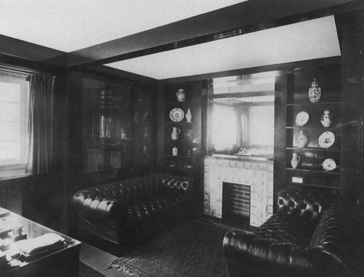
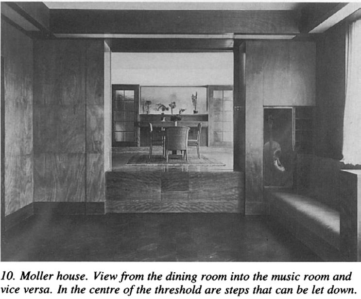
effect of the construction system” I don’t totally agree with that. It’s still valuable to use 4 this design strategy , especially in Countries and regions with tight land use, like Japan. Different level can create more space.It enables the limited space have a more space in visual sense and perception. We can see a set of photo for elaborating. The top right one(Þg.4) : there are two room here , dinning room and music room. Between them , we have a threshold there. This threshold is used for dividing the space. Loos used level to deÞne and differentiate space instead of using only wall. That will separate our sense between perception and visual sense. Our eyes can see through music room to dinning room. The information that comes from eyes tells our is accessible without any block. However , if you would like to have a dinner ,you need to across the threshold. Meanwhile , you feel officially enter the dinning room. I would say different
View Adolf Loos (1870-1933)'s architectural ideas from Raumplan. Min Jing. Accessed November 25, 2020. https:// 4 site.douban.com/126029/widget/notes/192204710/note/612045264/.

level they feel space movement. Also, splitting level will create extra space within a limited volume. Like the bookcase , It’s located in vertically space. Splitting space create more vertical space . In my opinion, it’s valuable for people who have a limited area to build. In this strategy , they have more space. They have more activities happen in their house .

Þgure4 .Moller house view from music room to dining room
Þgure5 .Ruffer house , Vienna, 1992 , library
level give us a chance to change our sense. A sense of having dinner . Different level prepare us a different atmosphere. Colomina said that “The most intimate room(private room, the highest room, I think) is like a theatre box.” In my opinion , he see house as 5 theatre and see actor as resident. Actor play in theatre , resident live in house. They both enlighten the house . What I mean enlighten the house is to leave trace. For example,Actors leave a trace of voice and movement . Residents leave trace of life. A trace of live is atmosphere of live. In terms of visual, it’s continue space but not for 6 perception. Imagine someone has an eyes-handicap , if he lived in this house he maybe given a hint by these different levels . First threshold for music room, second threshold for dinning room. He can imagine the room even though he has a weak sight. On the other hand .For Þg.5, we can Þnd out how loos deals with the split level. He emphasize intentionally the transition in different level. Column and bookcase inserted within wall 7 is used for split level. Those things emphasize that when people step up to another
Colomina, Beatriz. "INTIMACY AND SPECTACLE: THE INTERIORS OF ADOLF LOOS." AA Files, no. 20 (1990): 5 5-15. Accessed November 12, 2020. http://www.jstor.org/stable/29543700.

Colomina, Beatriz, Max Risselada, Adolf Loos, and Le Corbusier. ÒAdolf Loos-Pattern of Town House .Ó Essay. In 7 Raumplan versus Plan Libre: Adolf Loos and Le Corbusier. Rotterdam: 010 Publishers, 2008.
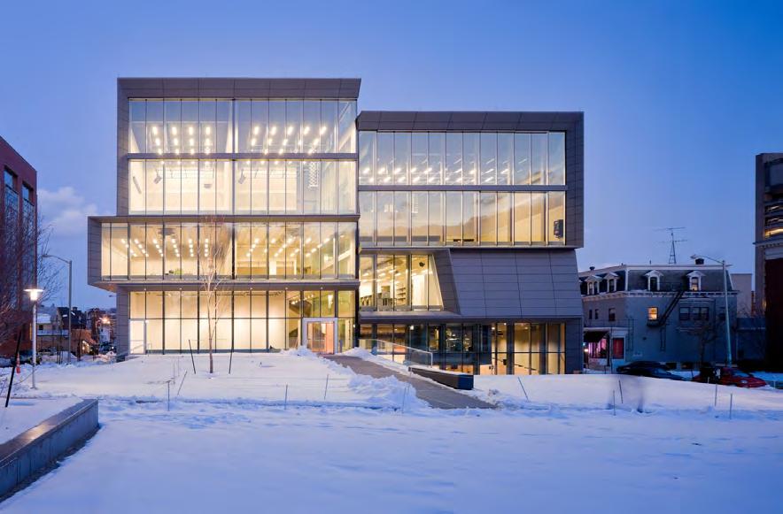
Here is the project from Diller ScoÞdio + Renfro. That will show how modern architect use Raumplan theory. According to Charles Renfro, partner-in-charge for the project, stated the following about Diller ScoÞdio + Renfro's design: In creating the design for the Granoff Center, we needed structural elements that would stimulate the Þgure7 . Diagram Þgure8. Perry and Marty Granoff Center for the Creative Arts, Brown University Diller ScoÞdio + Renfro Þgure9. Part of section

Þgure6 .Dancing room
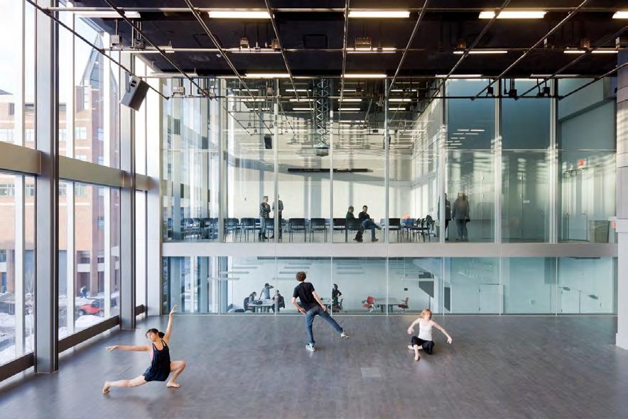
creative process from virtually every aspect of the building. The Granoff Center is a merger of architectural gesture and academic pedagogy. Our strategy was to encourage and illustrate collaboration across every level. As you can see in Þgure 6. 8
When you stand in the community room, you can see the dancing room on your below. Visual contact will inspire people. Different activities happen almost exactly at the same level. They will not interfere with each other since the building has excellent Noise insulation. Nowadays, mass production is common sense. The space economy is not just space itself, but also how space can produce a rich inspiring program. This project, for instance, has abundant activities. The Center for production of performance art, installations, visual art, music, audio, video, and Þlm. Recording studio suite. Media Lab for production via computer. Physical Media Lab for production and research in sensors, robotics, and physical computing. Five project studios, allowing for individual, rather than collective, work. Gallery. Smart classroom. Modern architects are not only pursuing how to produce more space within limited space but also pursue how to create more cheerful activities within the building. They focus on a program which makes people feel happy and self satisfactory.
Raumplan Versus Plan Libre: Adolf Loos [and] Le Corbusier By Adolf Loos, Le Corbusier, Johan van de Beek
View Adolf Loos (1870-1933)'s architectural ideas from Raumplan. Min Jing. Accessed November 25, 2020. https://site.douban.com/126029/widget/notes/192204710/note/ 612045264/.
Colomina, Beatriz. "INTIMACY AND SPECTACLE: THE INTERIORS OF ADOLF LOOS." AA Files, no. 20 (1990): 5-15. Accessed November 12, 2020. http://www.jstor.org/ stable/29543700.
Kelly Minner, “Perry and Marty Granoff Center for the Creative Arts, Brown University / Diller Sco Þ dio + Renfro,” ArchDaily (ArchDaily, February 15, 2011), https:// www.archdaily.com/112338/perry-and-marty-grano ff -center-for-the-creative-artsbrown-university-diller-scoÞdio-renfro.
Kelly
+ Renfro,Ó 8 ArchDaily (ArchDaily, February 15, 2011), https://www.archdaily.com/112338/perry-and-marty-granoff-center-for-thecreative-arts-brown-university-diller-scoÞdio-renfro.
Email: aouleo@hotmail.com Phone: +1 626 898 0385 +86 186 0148 1067
Wechat: aouleo