HEALTHCARE PORTFOLIO
L&H COMPANIES
SIGNAGE SOLUTIONS


L&H COMPANIES
SIGNAGE SOLUTIONS


L&H Companies has established itself as a prominent supplier of signage programs across Healthcare Facilities throughout the country. Over the past three decades, our dedication has centered on breathing life into our client’s brands and offering crucial guidance where it’s most needed. We excel in collaborating with facilities in the throes of new construction, overhauls, or rebranding ventures.
Our team delivers an expansive array of services, tailored specifically to the healthcare industry, and can be customized to achieve your distinct project objectives. Whether you’re embarking on a nationwide rebranding effort or striving to enhance navigational clarity and boost brand recognition within your facility, you can count on L&H to be your reliable partner in this endeavour.
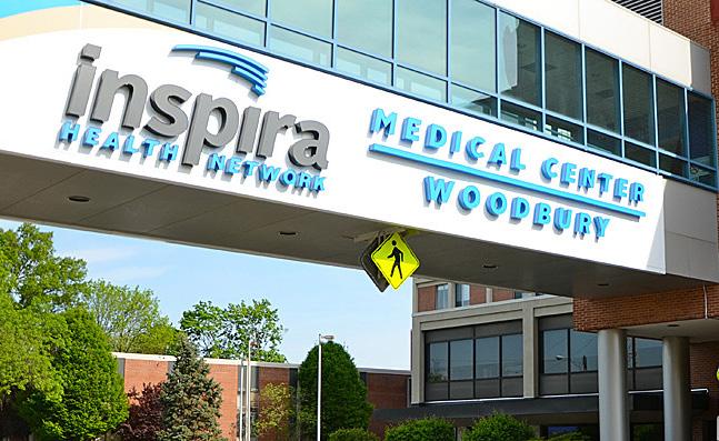
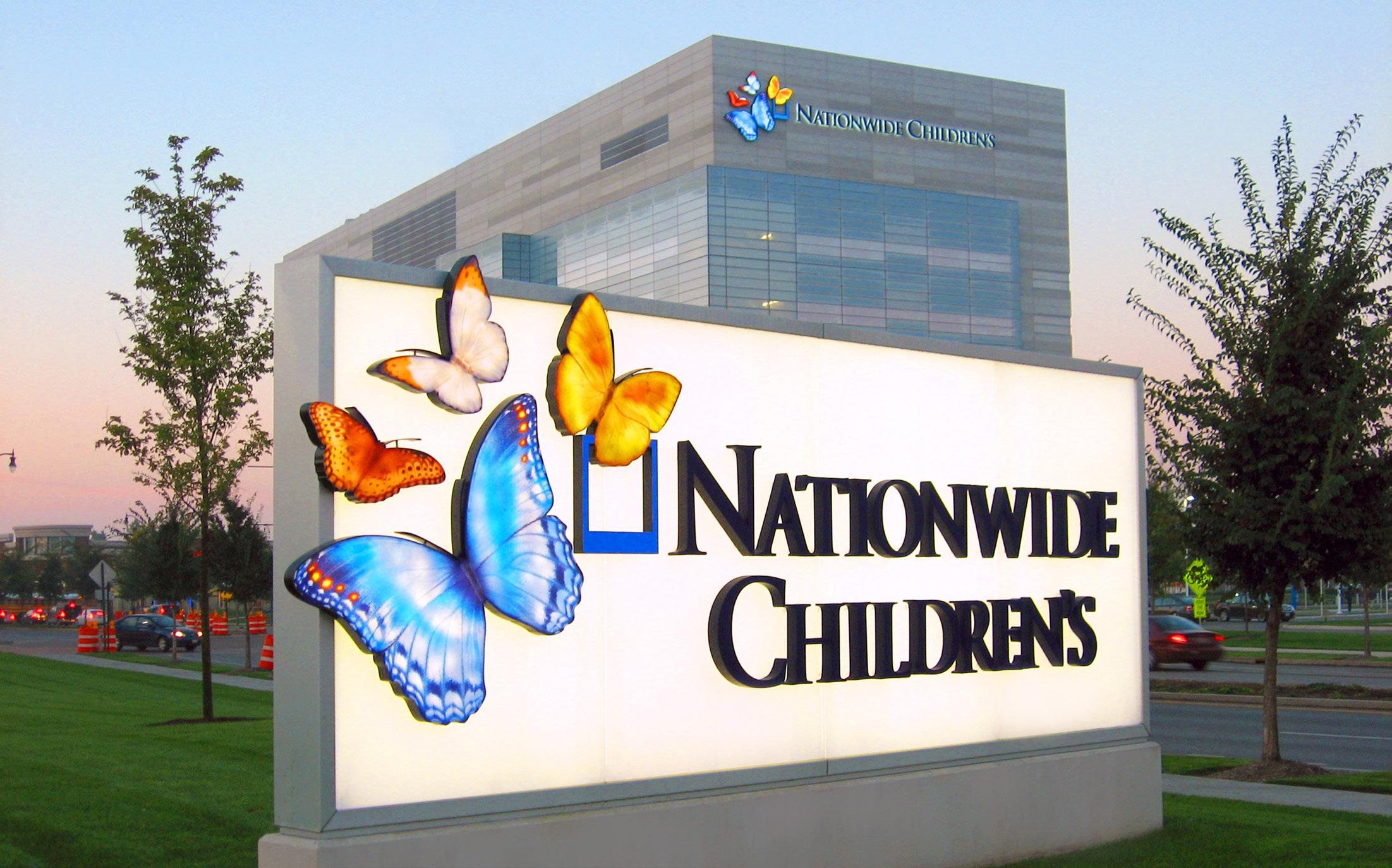
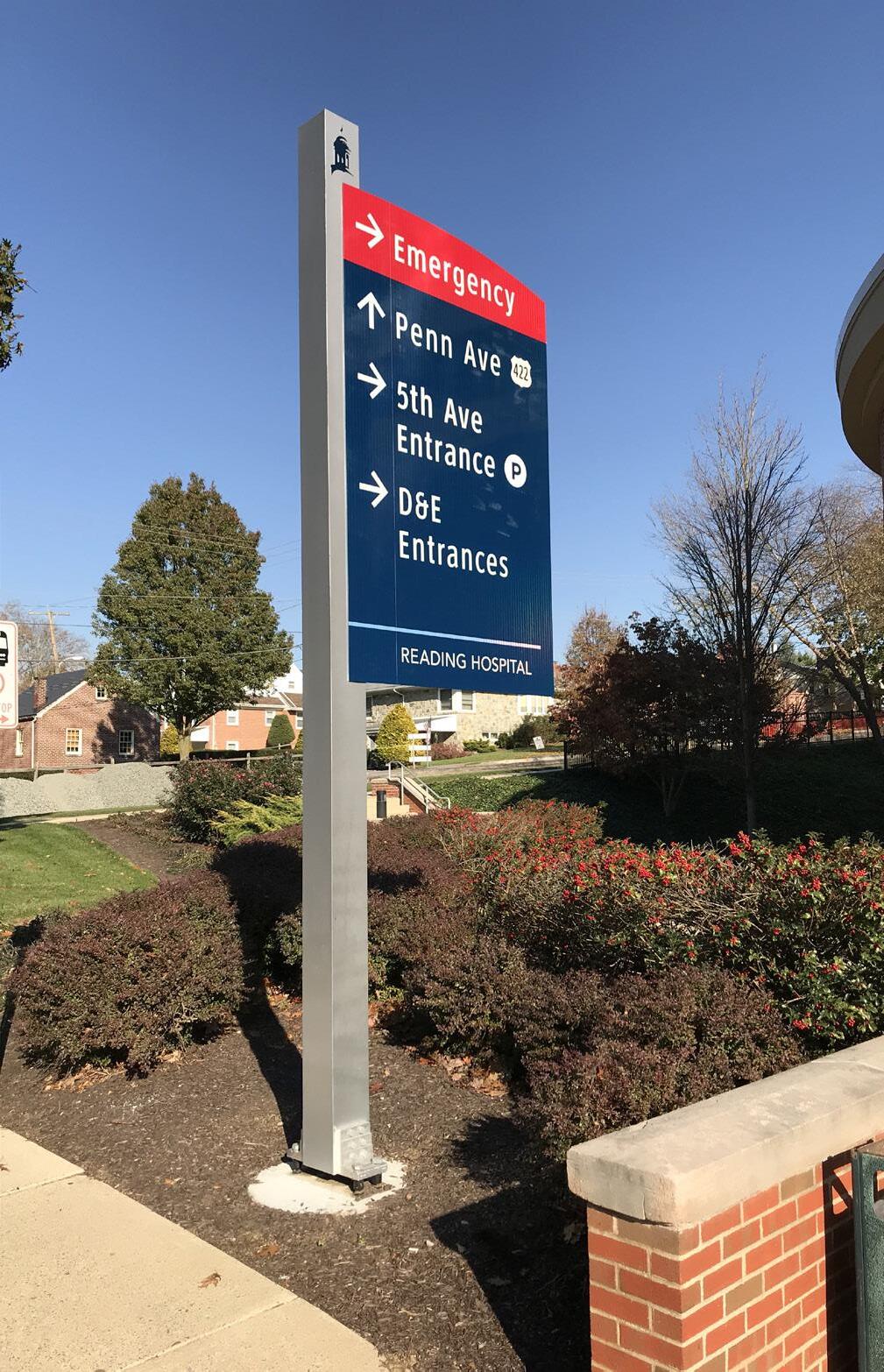
The acclaimed creative team at L&H excels in crafting a cohesive signage system that accurately embodies your brand and caters to the distinct requirements of your facility. Our focus is on designing a durable and efficient sign program that guides visitors smoothly to their destination, simultaneously strengthening your brand’s presence throughout the route. Our inventive services extend to designing both interior and exterior sign systems, skyline letter sets, donor acknowledgment initiatives, tailormade entrance features, and everything else that elevates your brand’s visibility. In all our endeavors, we are driven by our commitment to enhance the customer experience while aligning our work with your brand’s core values and vision.
Visitors to a healthcare facility often arrive burdened with anxiety. Therefore, your signage system should be designed to reduce, not amplify, this stress. L&H offers comprehensive wayfinding services designed to ensure effortless navigation across even the most intricate campuses. Healthcare systems frequently suffer from outdated and complex signage programs due to ongoing renovations and expansions over the years. The L&H Wayfinding team addresses this by assessing the flow of traffic to and from each point, and collaborates with your team to develop the most efficient wayfinding route.

L&H Companies operates a sizable 75,000 square foot manufacturing facility, furnished with stateof-the-art machinery and manned by proficient fabricators. Our continual reinvestment ensures the in-house production of even the most intricate features, offering us full control over project quality and timelines. Further, L&H places significant emphasis on the precision and efficiency of signage installation. With our own fleet and OSHA-certified professionals, we maintain high-quality control across projects. When necessary, we also employ a network of vetted local contractors. Regardless of the project’s scope, our unwavering commitment is to ensure exceptional service and client satisfaction through meticulous fabrication and installation.
Project Management is the pivotal element ensuring success, irrespective of your project’s nature. With over thirty years of experience in delivering healthcare signage services, our project management program offers you the assurance that your project will be completed within the defined timeline and budget, all while upholding the highest quality standards. Our project management team skillfully steers you through the process, from design review and shop drawing submissions to prototyping, permitting, fabrication, and installation. They provide meticulous, real-time scheduling updates, ensuring smooth progress at every stage.
Chris Heinly, the visionary of L&H founded the company in 1992 as a small signs and graphics provider for local businesses. The company’s origins were as modest as they come, operating out of Chris’s very own basement.
A graduate of the prestigious Pennsylvania School of Arts, Chris understood the power of strong design. This realization infused every aspect of L&H’s operations, setting a precedent for excellence that would guide them through the years to come.
Throughout our years, L&H Companies expanded into a national provider of custom signage, graphics, ornamental metal, and visual solutions. The L&H family grew to encompass more than 90 talented individuals, working hand in hand to bring brands to life through custom fabricated visual solutions. Through success came expansion, and L&H Companies established a state-of-the-art 75,000 square foot headquarters in Reading, PA as well as satellite offices in Charlotte, NC and St. Petersburg, FL.
Throughout the changes and growth, L&H remains true to our roots founded in family and faith. As the heart and soul of the company, Chris Heinly remains at the helm, serving as the beacon of inspiration, the owner, President, and CEO. Continuing with the next generation, as his son, Quinten Heinly, operates as the VP of Sales, and his daughter, Carmen Heinly, as a Sales Executive.
If ever you find yourself in need of a remarkable partner to bring your brand to life, look no further than L&H Companies. With L&H, you will find more than just a company – you will find a family, eager to transform your vision into a captivating reality.
 The Heinly Family













 DAVID BAKER Sr. Account Manager
LYNNE MEDLIN Account Executive
CARMEN HEINLY Account Executive CRAIG BEACH Sr. Account Manager
DAVE WALIGURSKI Account Executive
ROBERT BLAUSER VP Of Operations
BARB PRESTONDANIELS Human Resources
KELLI HECK Director of Estimating & Wayfinding
CHAD EVERETT Project Manager
QUINTEN HEINLY VP of Sales
COURTNEY WOYTKO Marketing Coordinator
SCOTT LONG Director of Design
DAWN MCGOVERN Project Manager
GEOFF YOUNG Executive Advisor to the President
JEREMY DETWILER Manager of Project Management
JOSEPH ROGERS Project Manager
ERICA SEIDERS Controller WILL WRAY Director of Engineering & Manufacturing
MIKE TOMLINSON Production Manager
CASEY BUCKS Project Coordinator
KAREN BEACH Project Coordinator RAPHAEL PERSAUD Project Coordinator
L&H offers expert solutions for healthcare facilities looking to upgrade their signage and wayfinding systems. Drawing from over thirty years of experience, we begin by gaining a deep understanding of the navigation issues at hand.
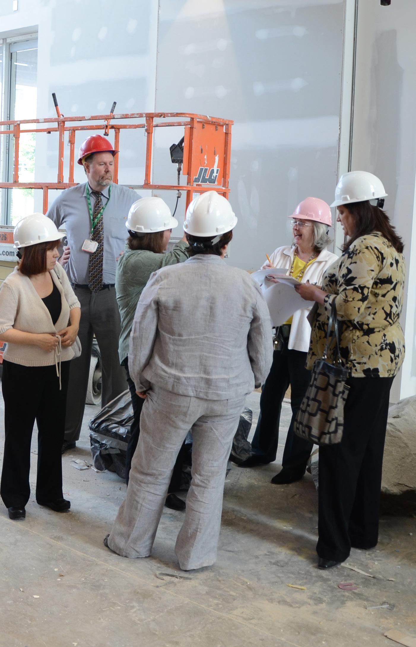
Our process starts with a meticulous site analysis by our Research Team, examining the current signage’s placement, visibility, and terminology use. This comprehensive study grants us a clear overview of the existing system’s strengths and weaknesses. We then engage with on-site focus groups, consisting of hospital staff and visitors, to gain firsthand insights into their wayfinding experiences. We believe that open dialogue with these groups allows us to identify key areas of confusion and improvement.
We also conduct visitor interviews, respectfully and non-intrusively, collecting both qualitative and quantitative data to understand common issues and personal experiences.
Finally, after a few days of comprehensive research, we compile a detailed Research Report. This report enables us to develop a bespoke solution to significantly improve the visitor experience, minimize staff interruptions, and create an efficient, Intuitive wayfinding system.
At L&H Companies, we offer comprehensive in-house services that carry your project seamlessly from the initial creative concept to its final implementation. Our design-build process, which includes creative design, wayfinding strategy, signage placemaking, engineering, permitting, and final production and installation, provides our healthcare clients with a single point of contact. This approach facilitates smooth communication and ensures that the end product faithfully embodies your vision, exceeding your expectations in every aspect.
When your project demands punctual delivery, adherence to budget, and unmatched quality standards, the team at L&H is ready to step up to the task. We acknowledge the crucial role of brand management and the accurate conveyance of design intent. Be it new construction, renovation, or rebranding, L&H stands as your reliable partner. We house all necessary services, from engineering and prototyping to permitting, production, and installation of both interior and exterior signage. When your brand image is at stake, trust L&H to deliver excellence! For any inquiries or to discuss your project needs with an L&H representative, please reach out to us at sales@lhsigns.com.
Product Spotlight:
Say hello to the Patient Care Sign® (PCS), our trailblazing signage system designed to supercharge communication among your healthcare professionals. Imagine a world where critical patient information seamlessly flows between doctors, nurses, and clinicians, where damaging medical errors due to miscommunication become a thing of the past. That’s what our PCS promises, and it delivers. Molded to meet your unique requirements, our PCS stands as your unwavering ally to amplify communication and fine-tune your workflow.
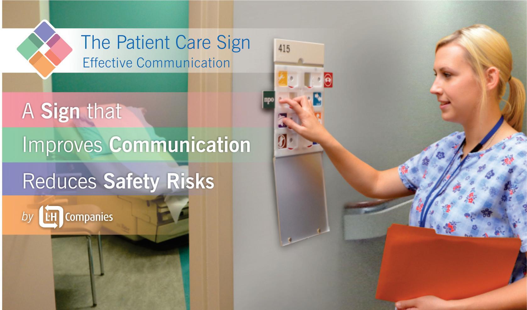
Our PCS is packed with patented, tamper-resistant locking tabs, putting an end to the nightmare of misinterpreted or obscured icons. Rest easy knowing your critical information is securely displayed, and updating patient details is as swift as a push-and-slide action. We understand that every healthcare facility has unique needs; that’s why our PCS provides a vast selection of standard icons and custom icons tailored just for you, ensuring that relevant patient information is at your team’s fingertips.
In sync with ADA and HIPAA guidelines, our PCS comes in a flexible design that is a breeze to install. It serves as an all-in-one communication center, integrating useful features such as chart holders, writing surfaces, and notification rails. With its adaptable look and clinically validated, patented design, the PCS is your secret weapon for stellar patient results and superior HCAHPS scores.
The PCS Difference:
Whether you are a hospital, clinic, outpatient center, or long-term care facility, if enhancing caregiver communication, boosting patient safety, and optimizing workflow are on your agenda, the PCS is your solution. It is the optimal signage system that fits seamlessly into any healthcare setting.
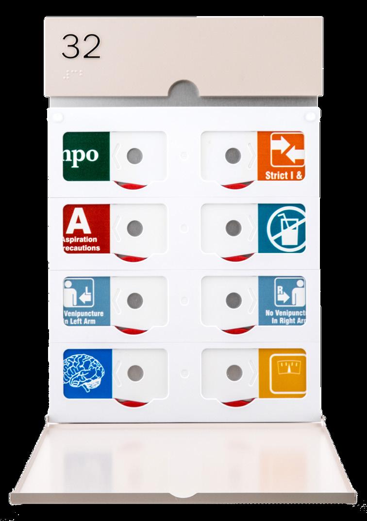
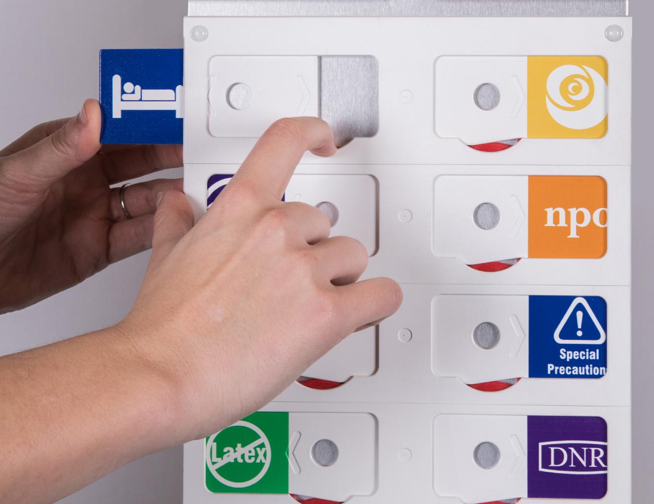
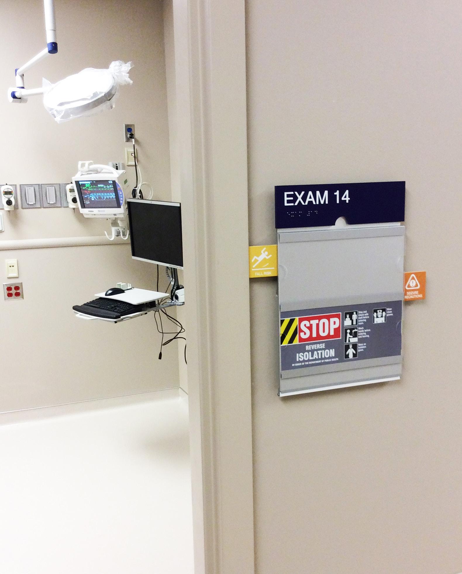
Embrace the future of healthcare communication with the Patient Care Sign. It’s more than a signage system; it’s a commitment to better patient safety and caregiver communication. Our PCS, a flexible and regulatory-compliant solution, helps you stride towards extraordinary patient outcomes, raising the bar on the overall quality of care. Stand out in the healthcare landscape, choose PCS - your partner in delivering exceptional healthcare.
L&H Companies is proud to unveil our esteemed healthcare portfolio, a testament to our enduring commitment to merging aesthetic excellence with practicality. Our legacy thrives in our collaborations with a diverse array of hospitals, clinics , and health centers across the country. Here, we’ve seamlessly integrated functionality and design, ensuring that every sign isn’t just a direction, but an extension of brand identity, a nod to ADA compliance, and a and a guide for patient navigation.
Explore the meticulous craftsmanship and innovation that L&H Companies brings to the forefront of healthcare signage. We recognize the nuanced demands of the healthcare industry, and with a blend of artistry and dedication, we’re reshaping the way patients experience healthcare spaces. Our portfolio serves as a canvas, reflecting our dedication to thoughtful signage design, strategic implementation, and the consistent drive to exceed client expectations.
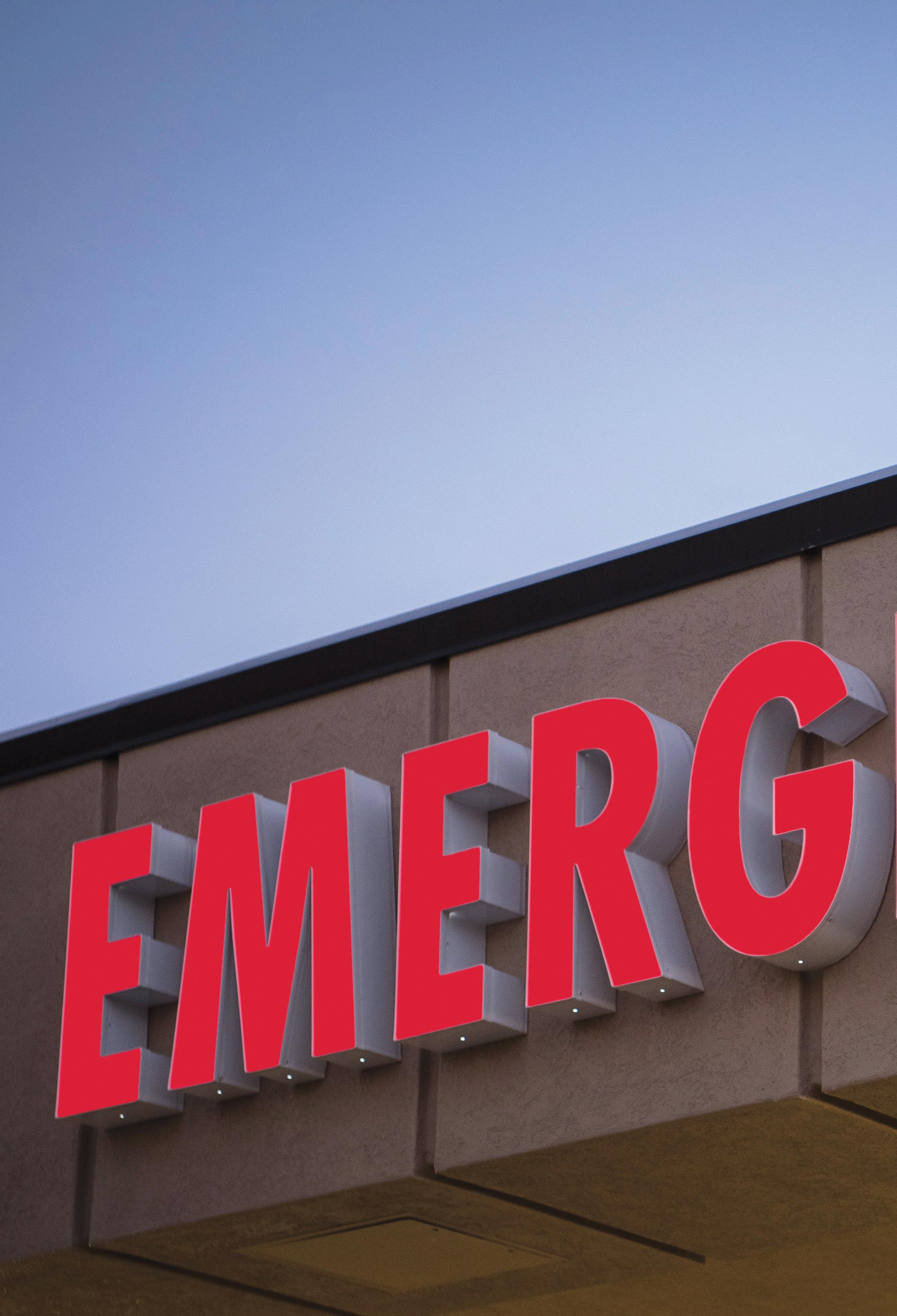
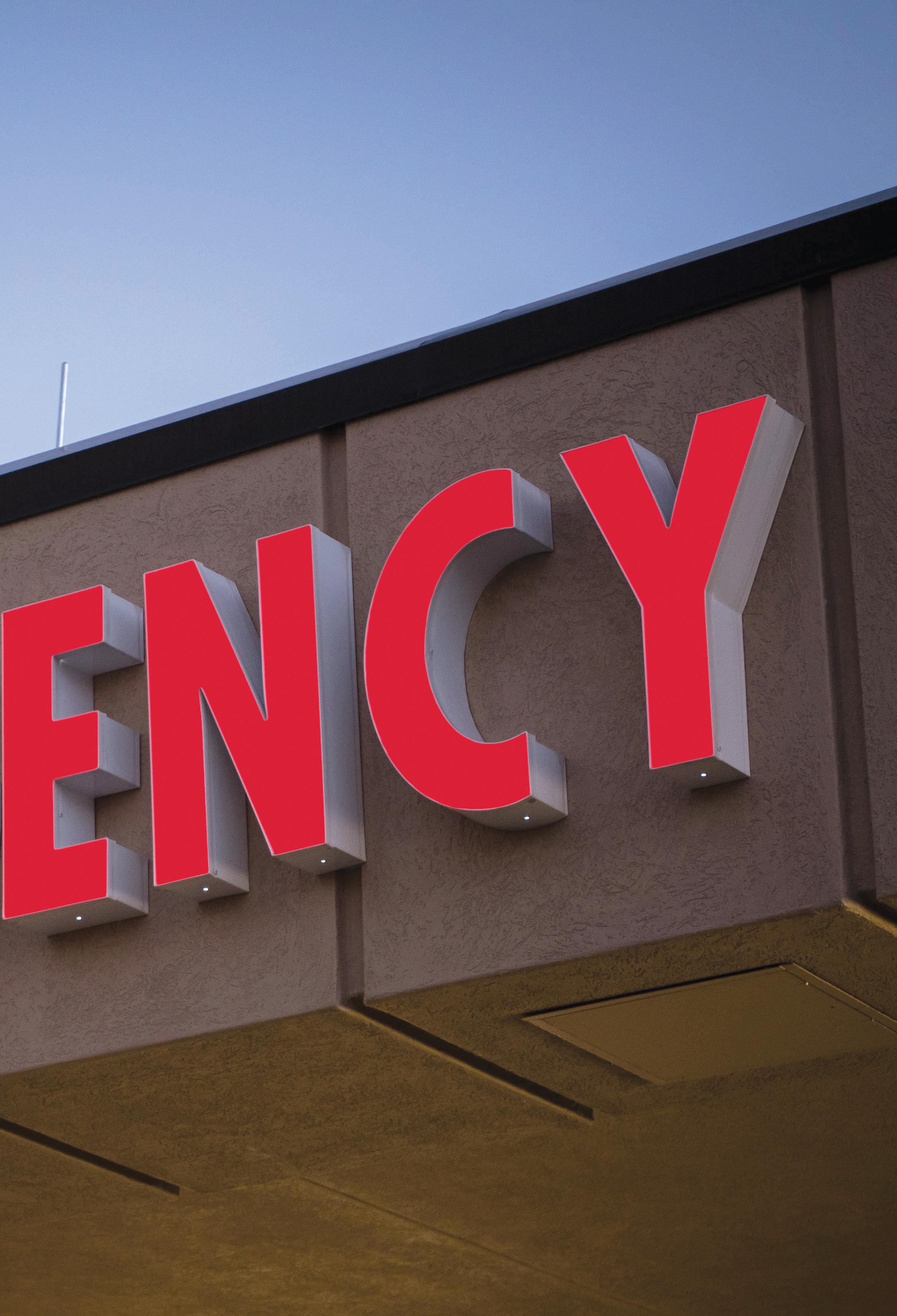
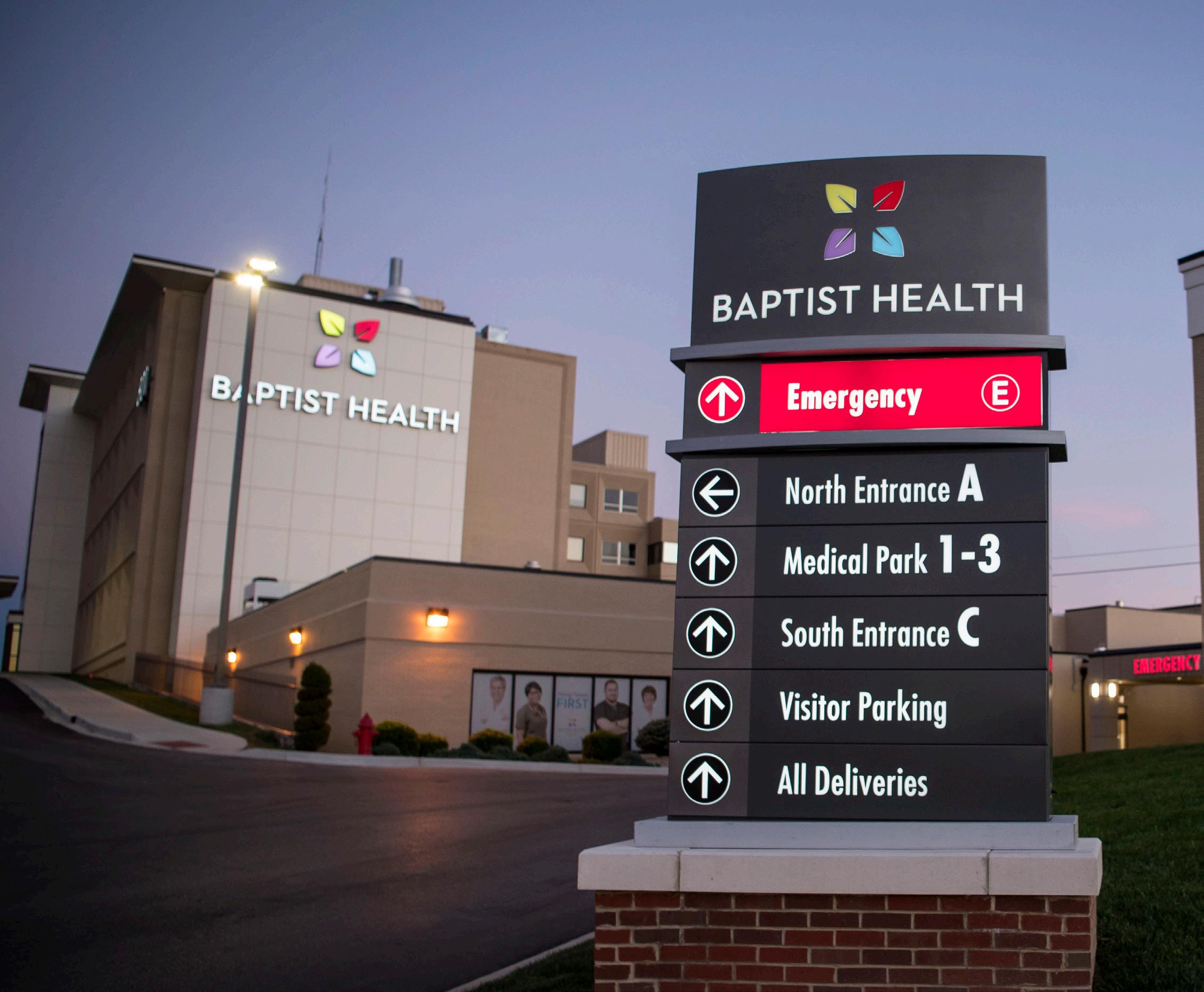
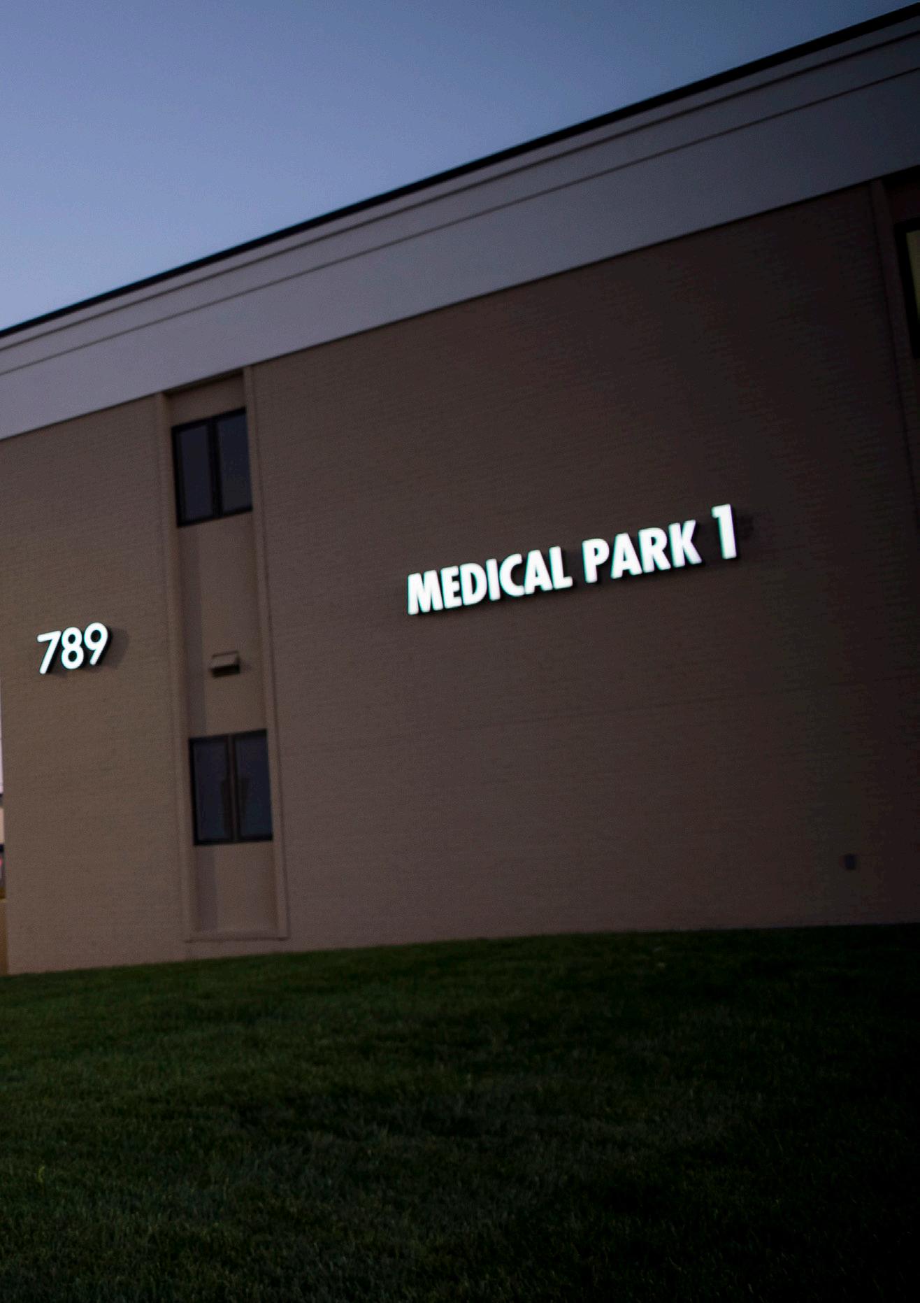
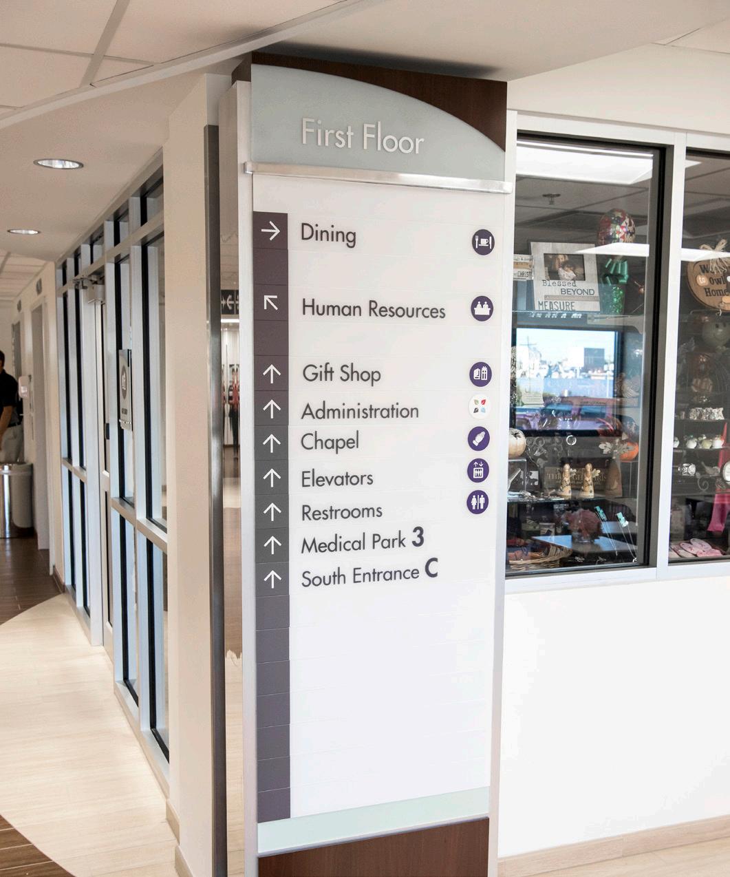
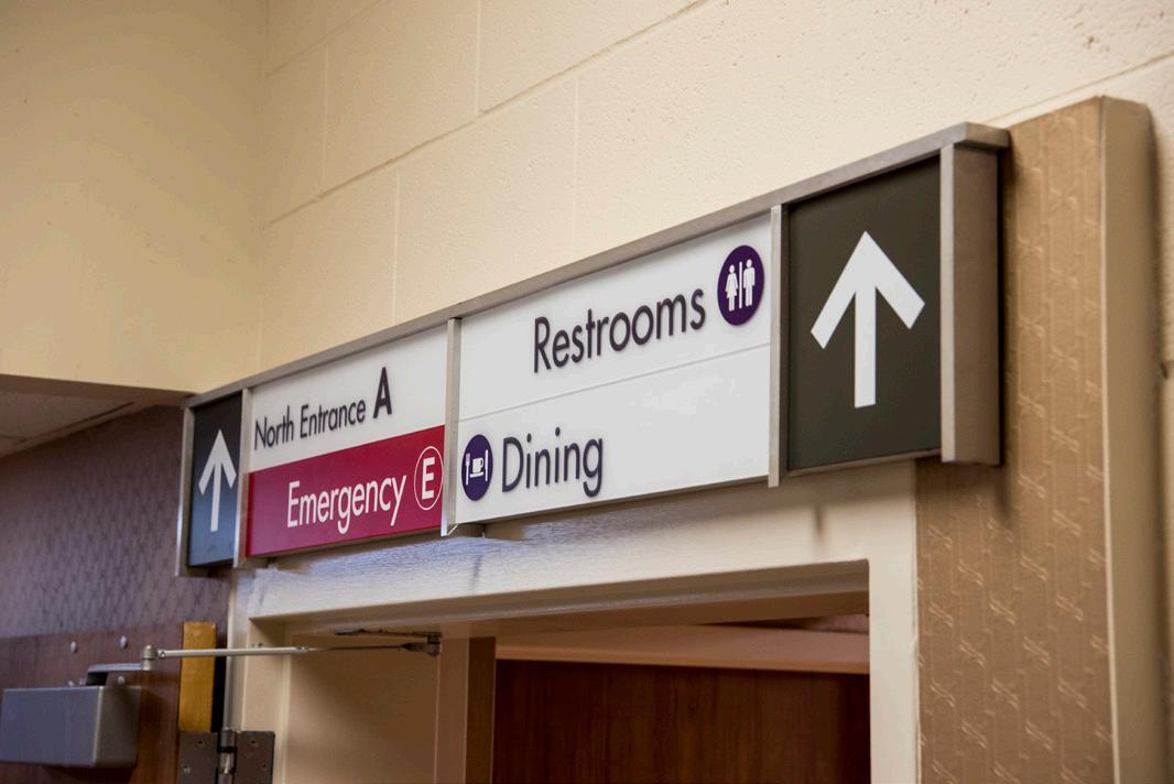
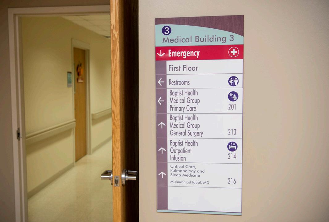
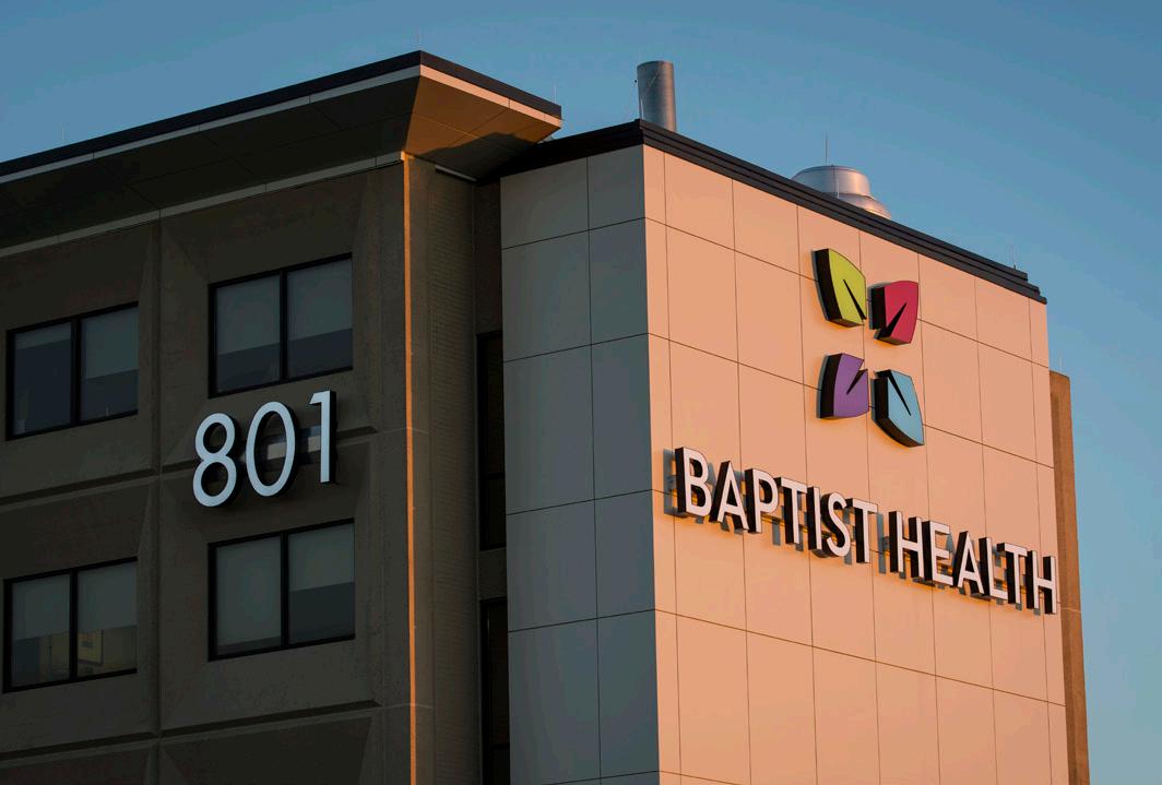
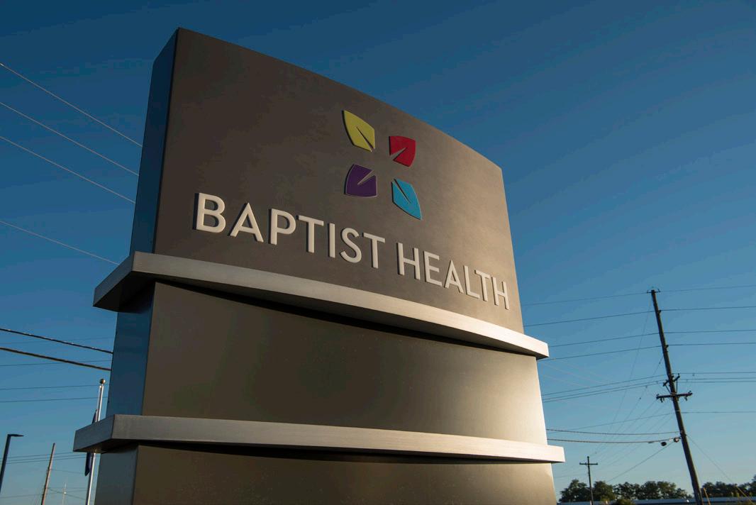
In 2013, the Baptist Healthcare System underwent a major rebranding initiative, adopting the new name, Baptist Health. This significant change included all 7 of its hospitals and 60 medical office buildings across Kentucky and Southeastern Indiana, necessitating a comprehensive update of both interior and exterior signage.
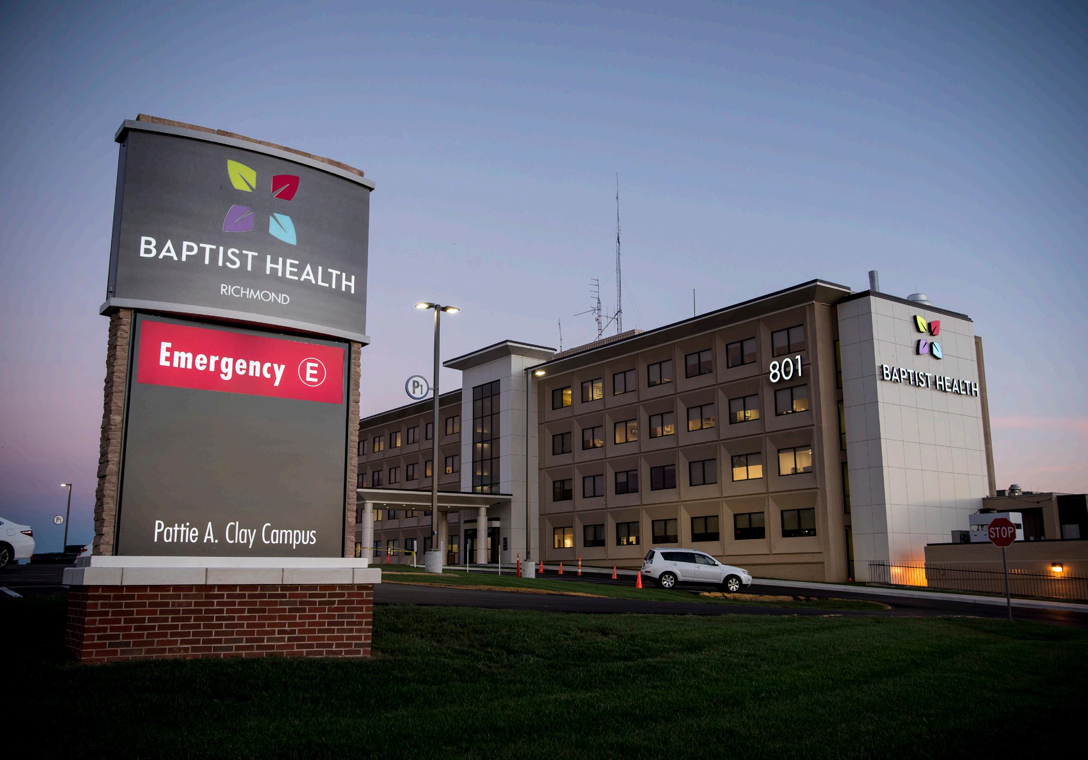
L&H Companies, in close partnership with FMG Design, took the helm to ensure the new brand was effectively communicated through the signage. They effectively project managed, manufactured, and installed various types of signs across the multiple locations involved in the project. Their efforts resulted in signage that embodies the new Baptist Health brand identity, offering easy-to-read entry features and pedestrian wayfinding.
These new signs help guide patients to their destinations, thereby reducing potential confusion. The project’s success was due to the concerted effort to optimize the brand’s impact across all locations.
Exterior Signage
Interior Signage
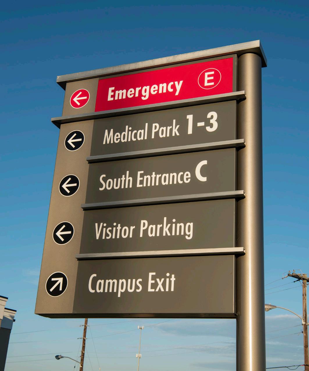
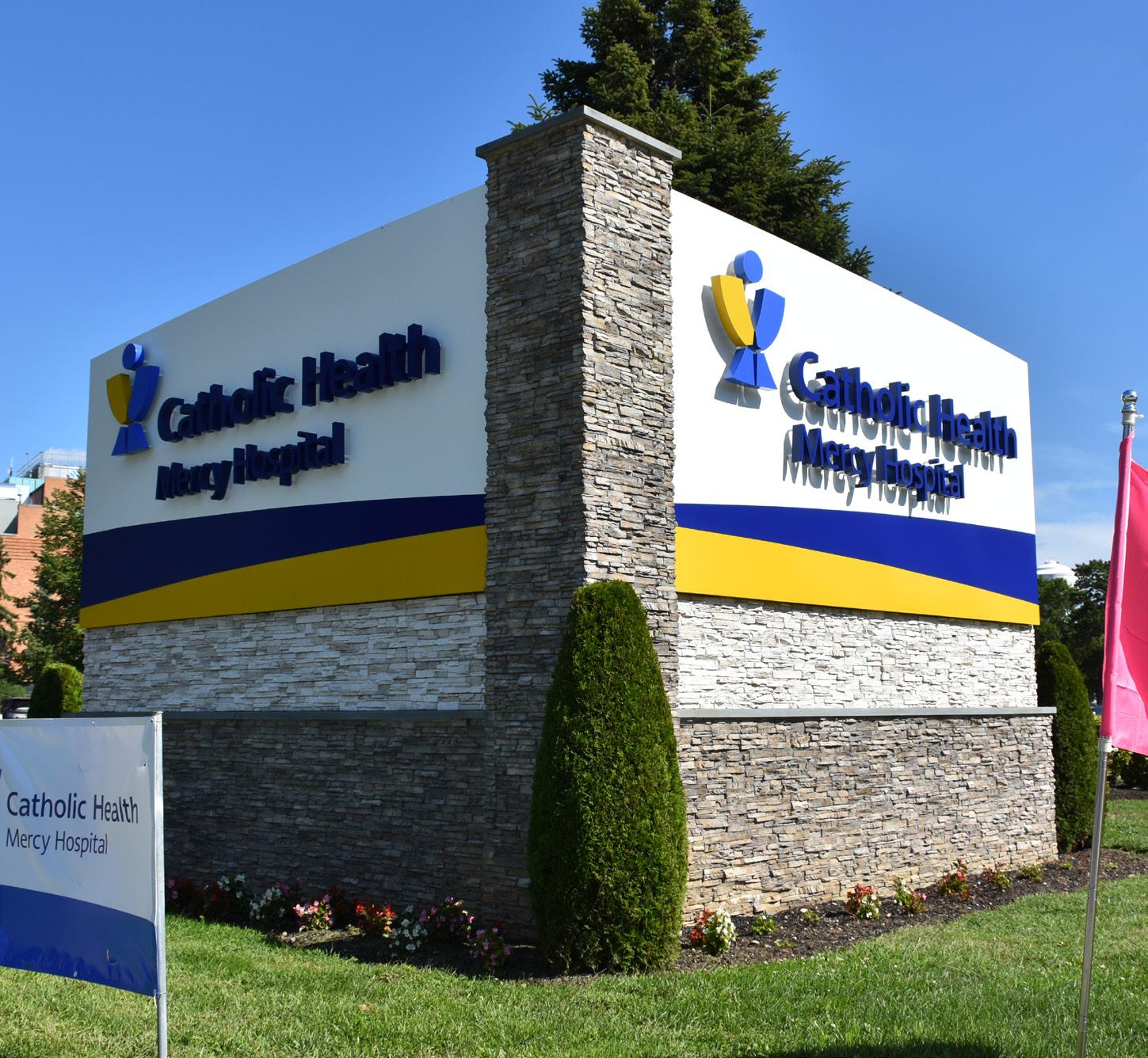
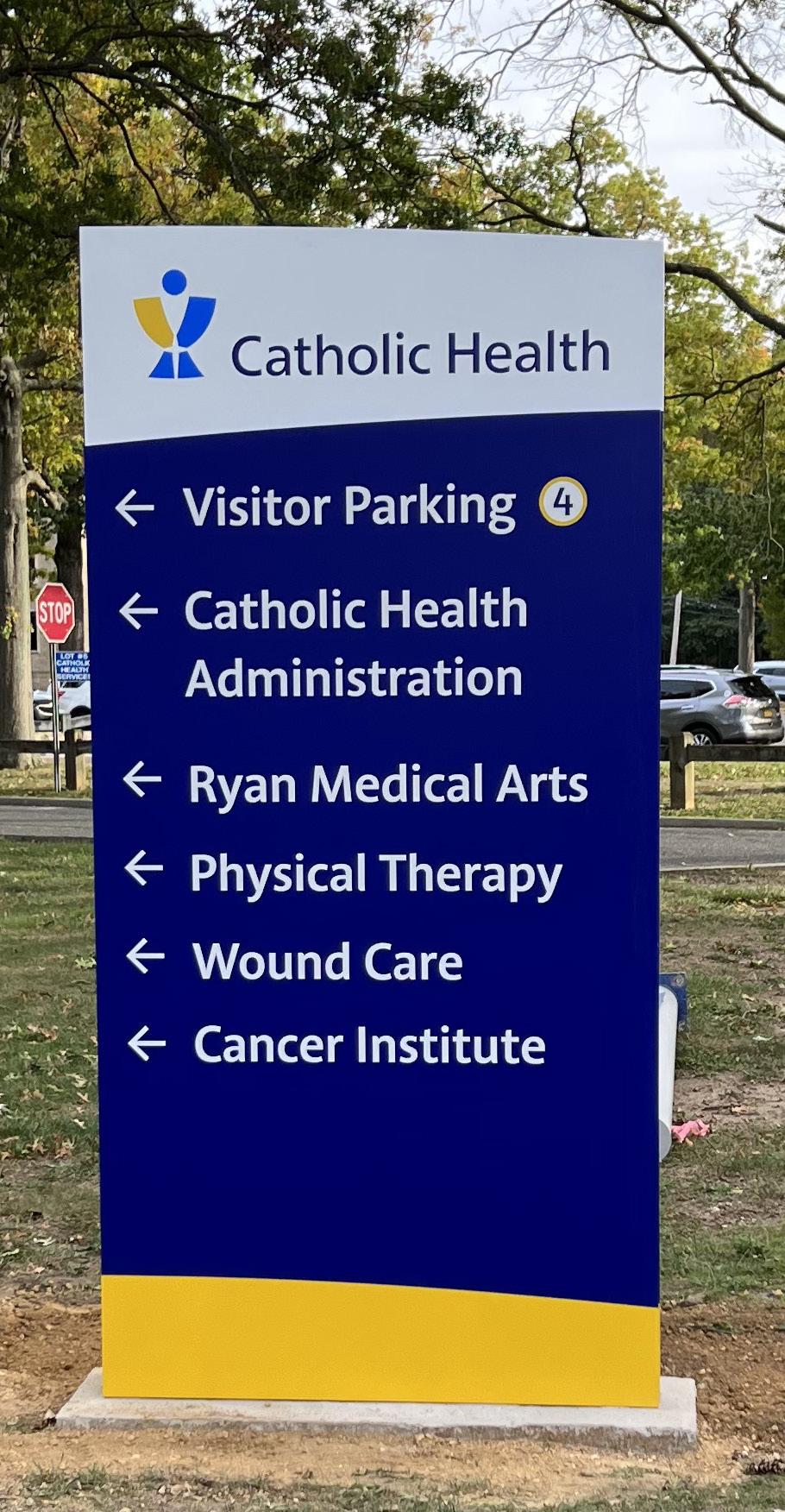
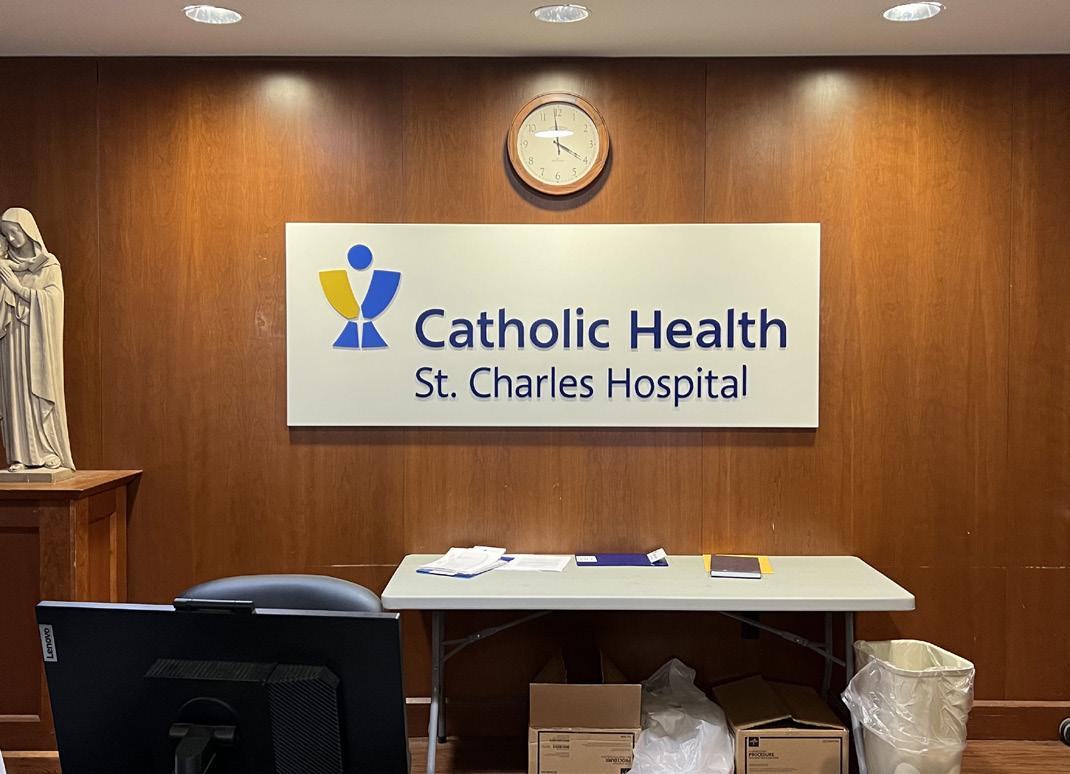
Catholic Health stands as a premier integrated system in the region, boasting a network that includes six acute care hospitals, three nursing homes, a home health service, hospice, and a multitude of physician practices, all supported by nearly 16,000 dedicated employees.
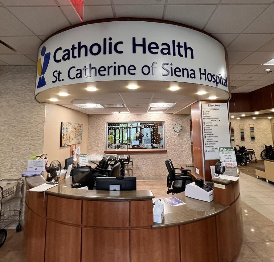
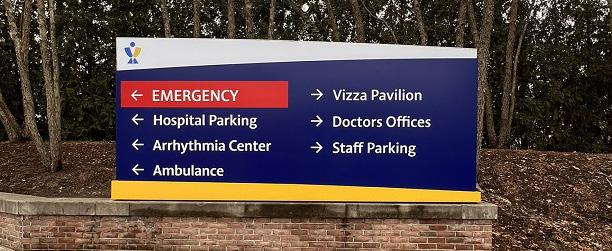
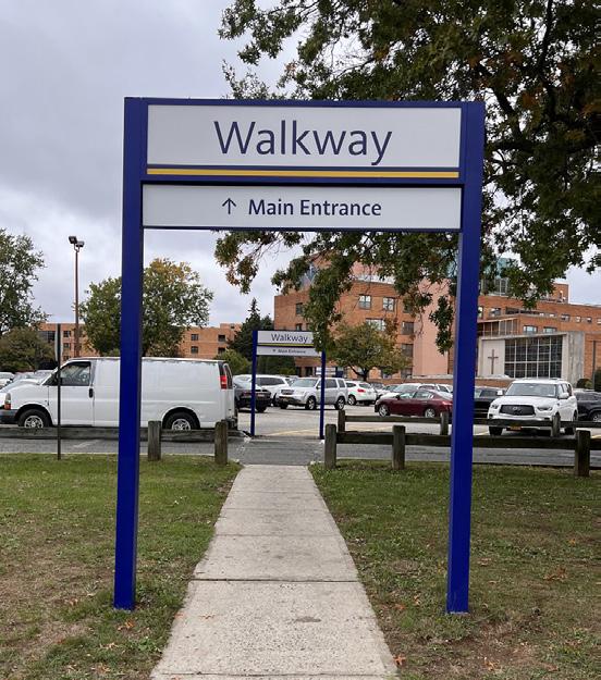
Collaborating closely with this esteemed health organization, L&H Companies, in partnership with Monigle Associates as the design consultant, takes pride in providing comprehensive exterior signage solutions. Our expertise ranges from engineering and prototyping to permit research, acquisition, production, and installation, ensuring seamless branding across Catholic Health’s six main hospitals and 59 off-site facilities.
Exterior Signage
Interior Signage
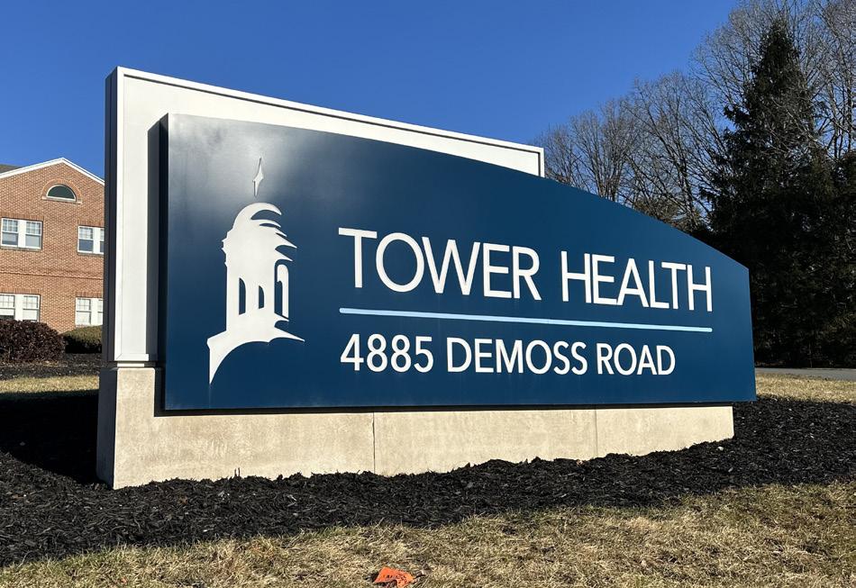
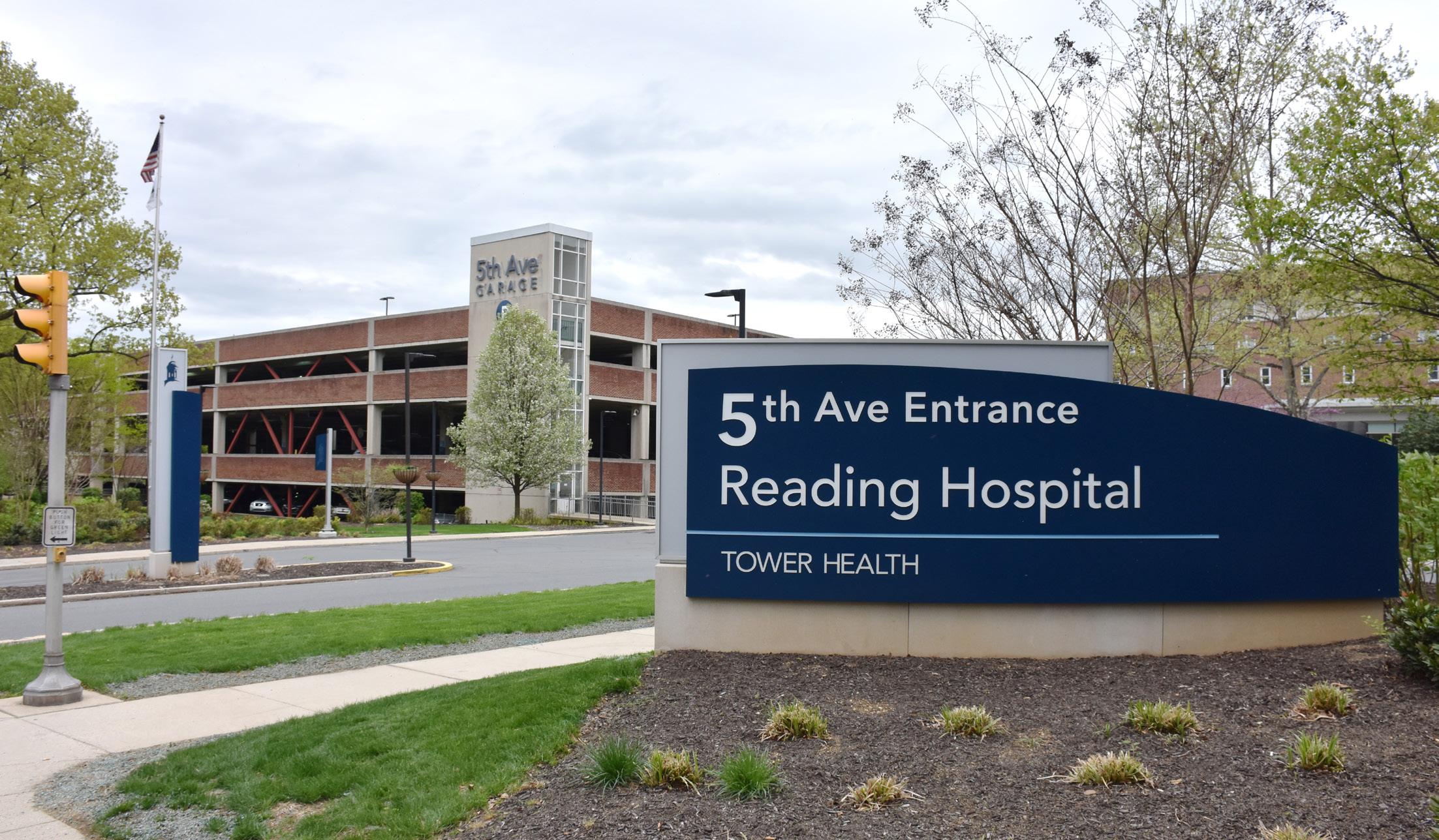
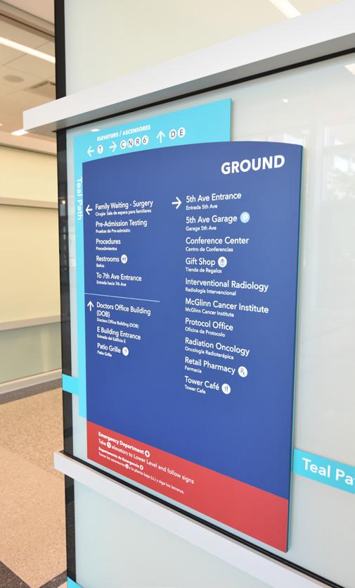
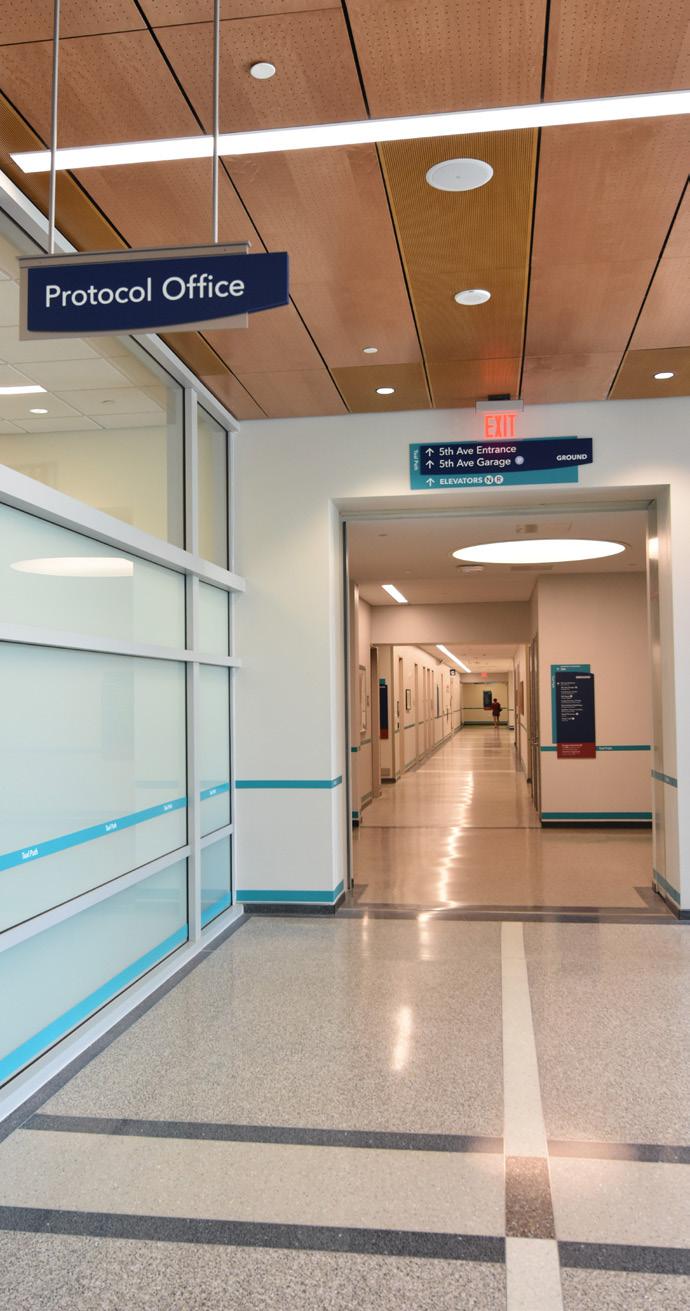
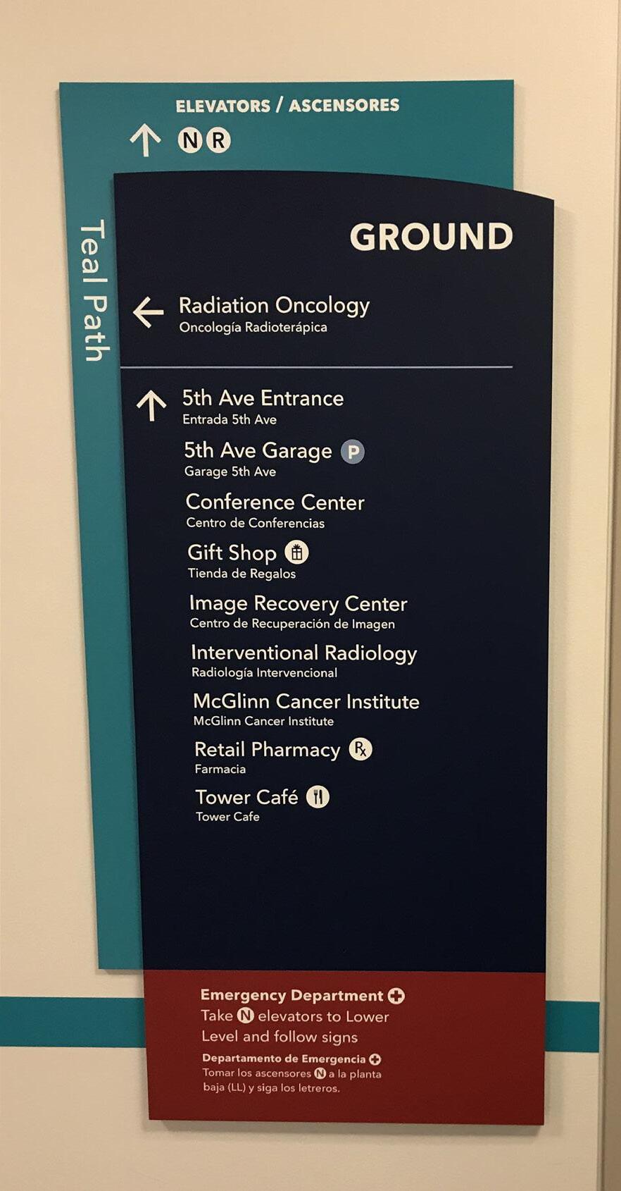
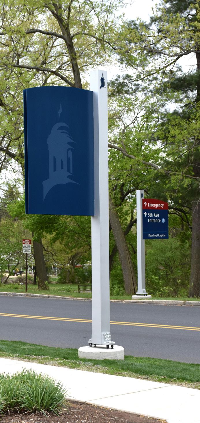
Tower Health, a vast conglomerate of over 11,000 members and 2,000 nationally accredited healthcare providers across 65 locations, sought to underscore their ambitious goal of elevating healthcare services by adopting a fitting new name. To physically embody this mission, they turned to L&H Companies, celebrated for their groundbreaking sign-making methods such as the novel flush mount panel system.
Understanding the importance of wayfinding — the use of information signage that directs people and enhances their familiarity with a location — became critical, particularly given the complexities of their healthcare and educational campuses. As environments grow more intricate, the need for visual cues like directions, maps, and symbols becomes paramount to guide individuals to their destination.
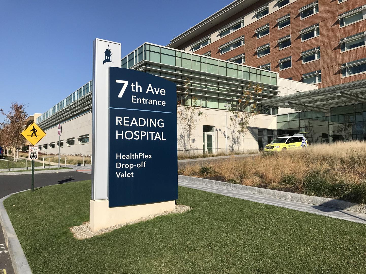
L&H Companies undertook an in-depth research process to grasp the unique navigational challenges posed by Tower Health’s premises. This knowledge guided their collaboration with Cloud Gehshan, the design firm on the project, to develop both exterior and interior signage for the Reading Hospital and the exterior signage for the remaining five hospitals. The main focus was to mitigate any directional difficulties, making navigation intuitive and efficient for all visitors, thereby directly enhancing their experience on these campuses.
Exterior Signage
Interior Signage
Design-Build
Patient Care Signage
Universal Health Services, Inc., a renowned healthcare provider with nearly 94,000 employees, faced challenges with their communication programs. They engaged L&H Companies to address these issues, resulting in the implementation of the Patient Care Sign, a door-side signage and nursing communication system. Simultaneously, L&H performed on-site research to rectify wayfinding challenges as UHS underwent a rebranding transition.
L&H developed a comprehensive wayfinding solution based on their research, incorporating both exterior and interior sign programs. Using their online platform, SignAgent, the client was able to review and approve all aspects of the signage. The design phase yielded detailed plans, including exterior site and interior floor layouts, and schedules for messaging and location design.
After design approval, L&H delivered an updated cost estimate for fabrication and installation, along with a detailed production schedule. This strategic approach resulted in a successful rebranding and effective wayfinding program, enhancing visitor experience and improving the efficiency of hospital staff.
Exterior Signage
Interior Signage
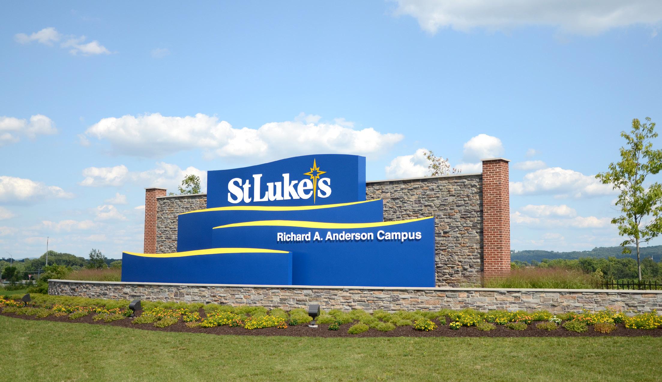
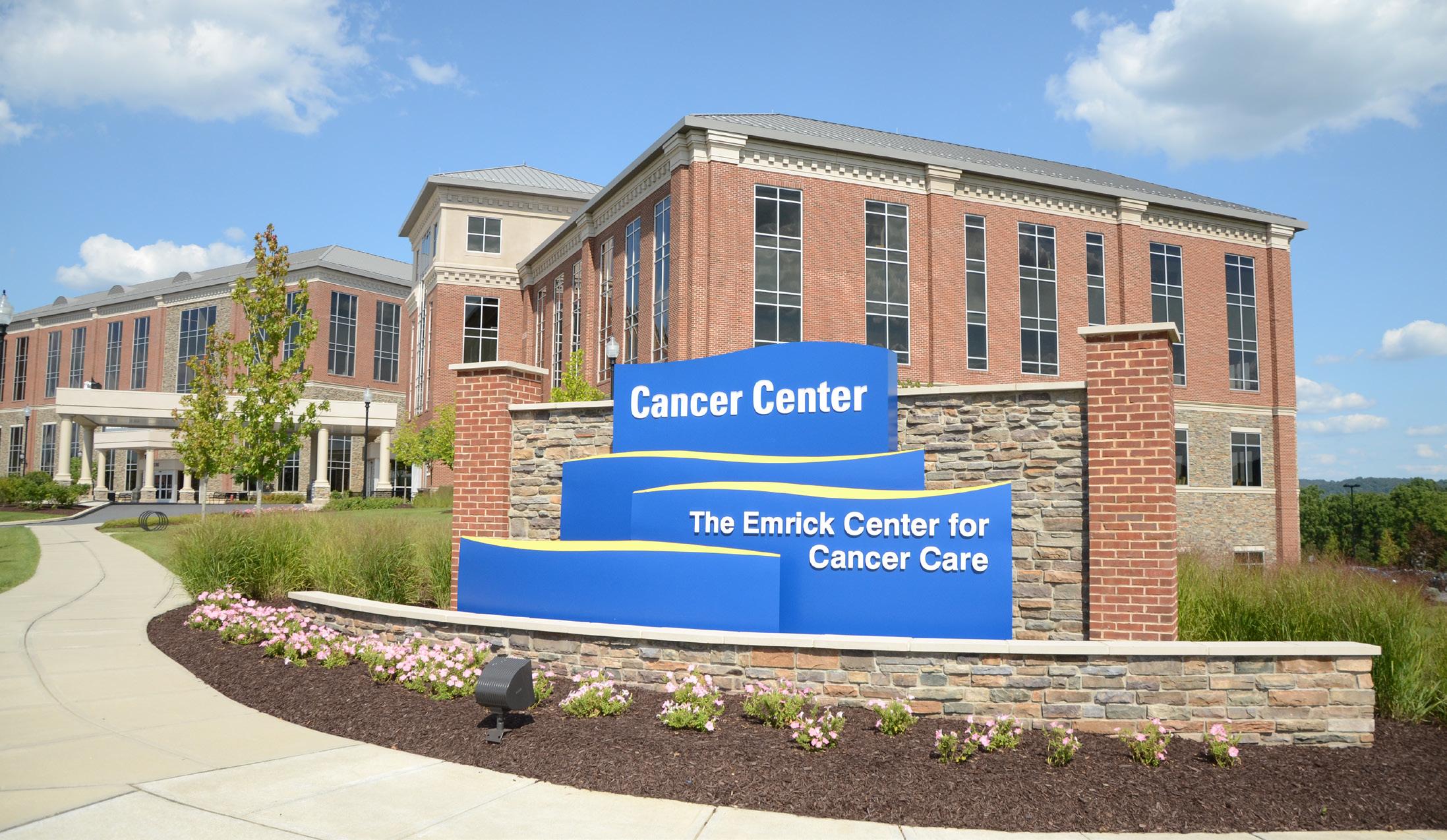
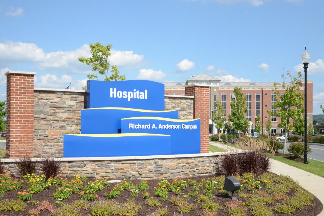
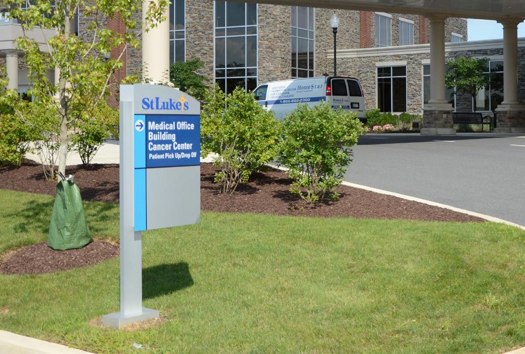
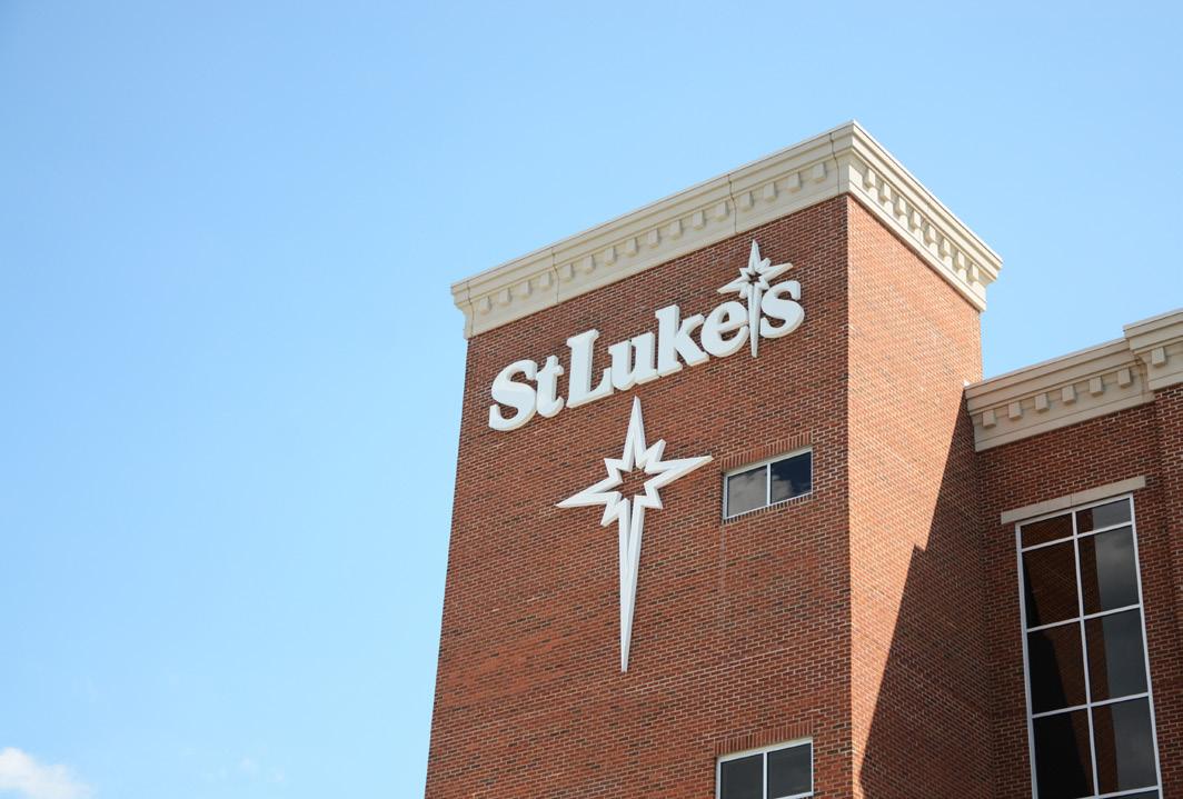
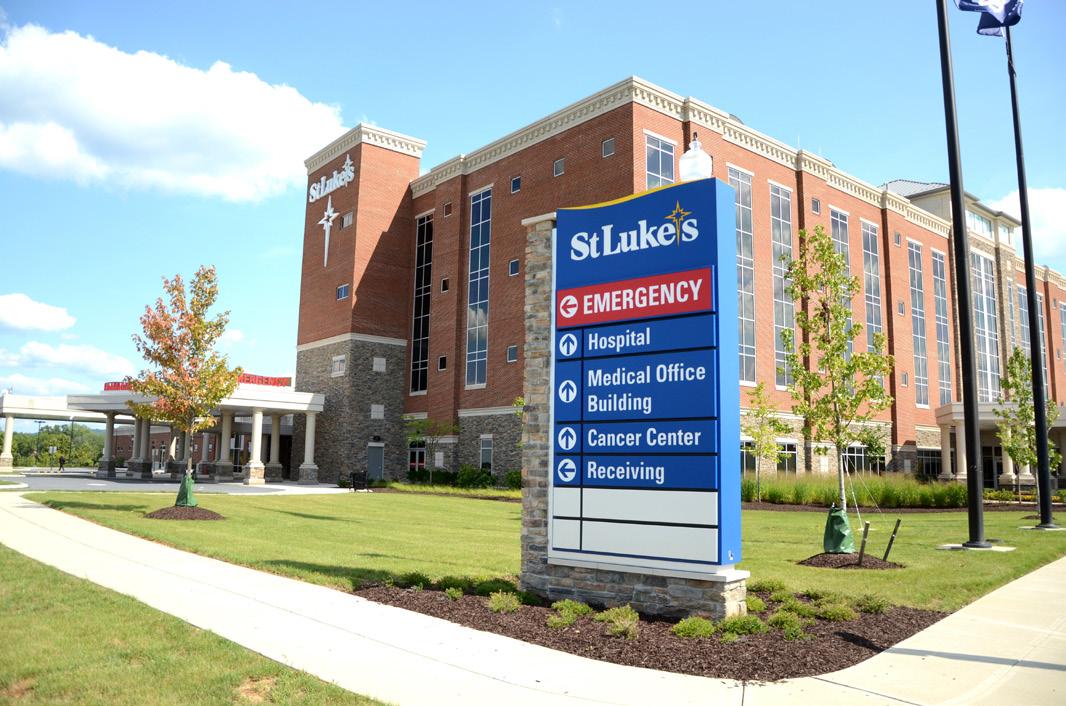
The newly inaugurated Richard A. Anderson Riverside campus of St. Luke’s, located in Easton, Pennsylvania, sprawls over a vast area of more than 500 acres. Positioned hundreds of yards away from the main entrance, which is accessed via a broad multi-lane secondary road, the hospital required prominent, largescale gateway signage for proper identification. The unique design of the signage, featuring curves and multiple levels reminiscent of water and waves, creates a striking three-dimensional effect. This fusion of aesthetic beauty and functionality not only guides visitors but also aligns with St. Luke’s commitment to delivering superior healthcare. Reflecting the serenity of its riverside location, the sign has become an iconic landmark, effortlessly guiding visitors to the hospital while conveying the nurturing and healing ambiance of the St. Luke’s Riverside campus.
In a move to enhance patient experience and care, St. Luke’s Riverside campus has introduced custom patient care signs from PatientCareSign.com. These signs, strategically placed across the campus, provide essential details like medical instructions, safety protocols, and information about the care team in a simple, easily understandable format. This addition emphasizes St. Luke’s commitment to innovation in patient care, facilitating efficient communication and personalized care within the campus.
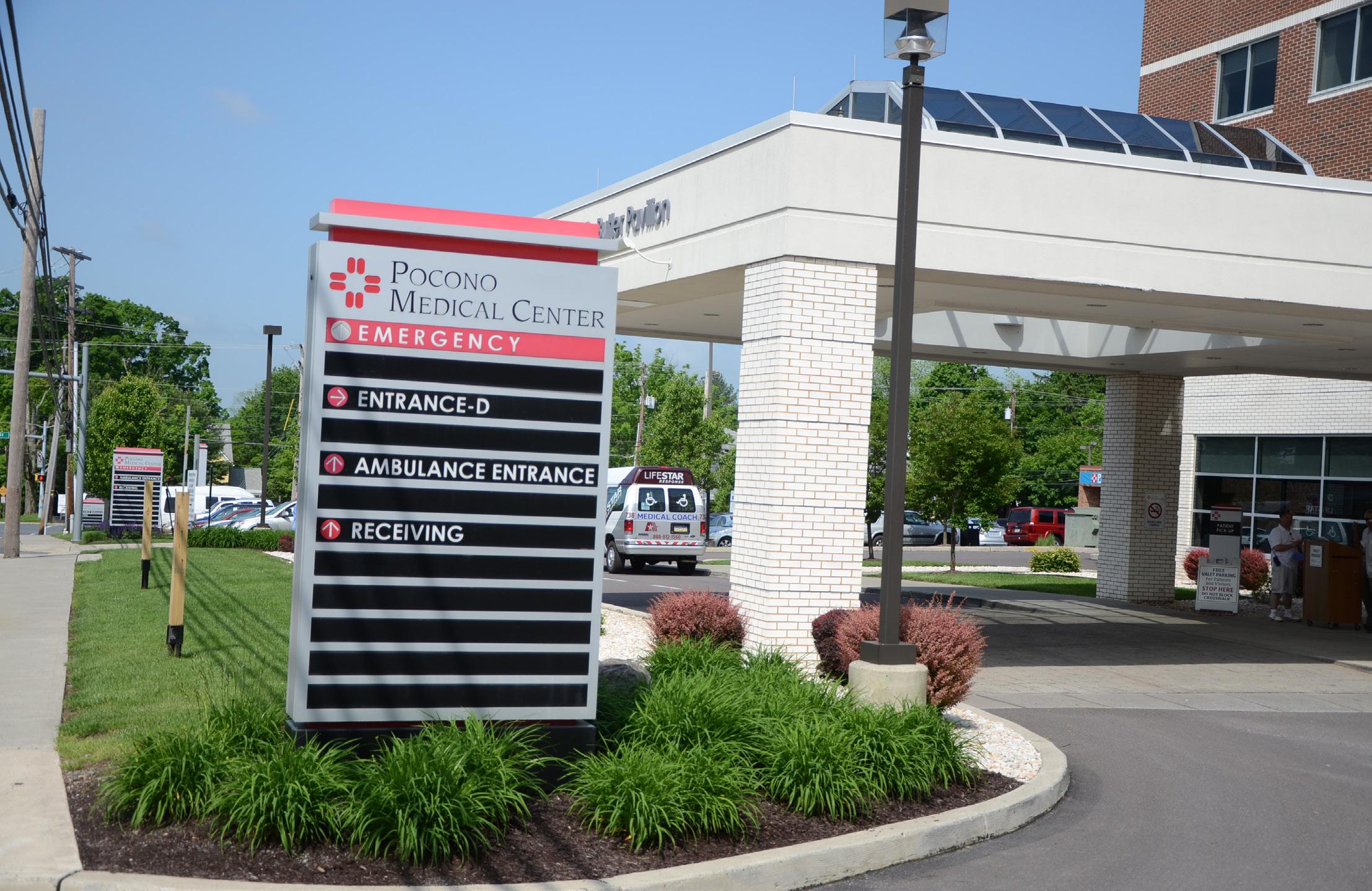
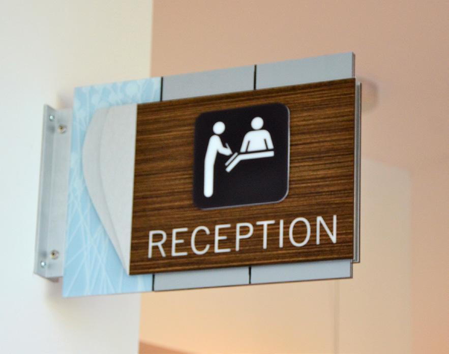
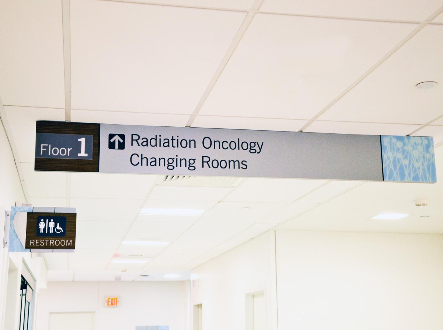
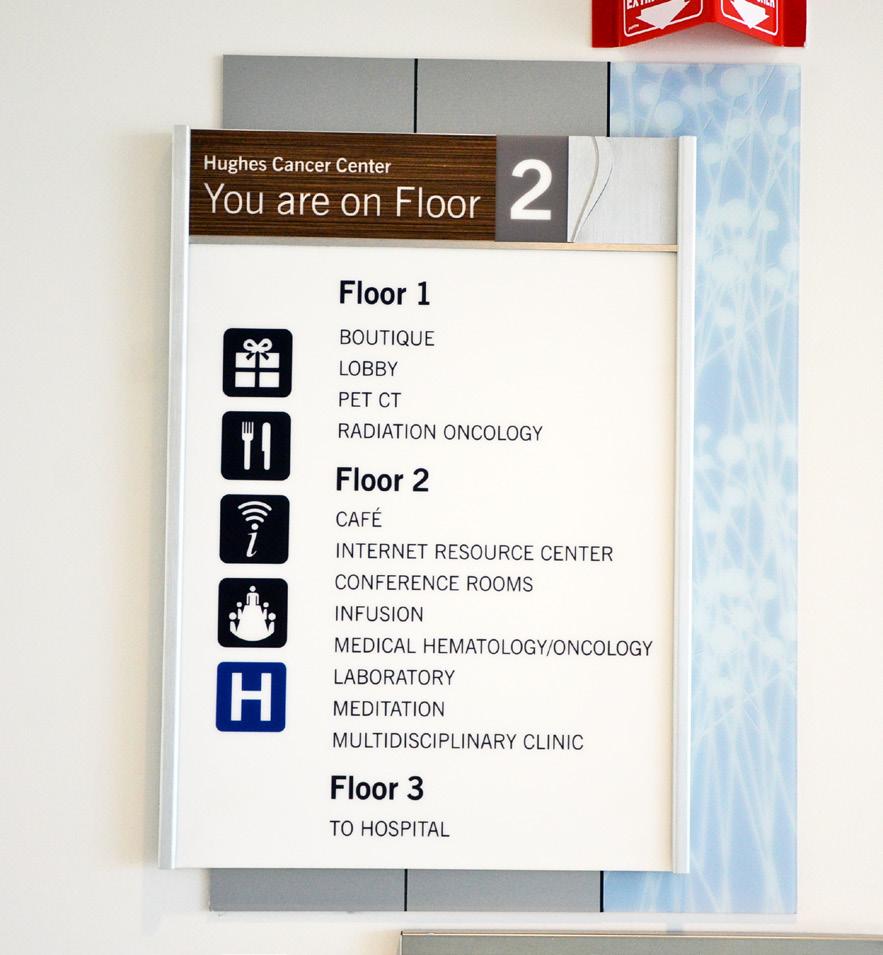
At L&H Companies, we understand that a visit to a cancer center can be fraught with anxiety and uncertainty. With this in mind, we collaborated with the Hughes Cancer Center at the Pocono Medical Center to develop an environment that would alleviate patient stress. Utilizing a distinctive nature-themed design, our aim was to cultivate a soothing and tranquil atmosphere for all who walk through the center’s doors.
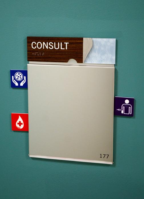
As guests enter the center, they are welcomed by a bright, spacious lobby embellished with large boulders and a calming fountain - a testament to our commitment to enhancing both the aesthetic and functionality of the space. At L&H, we took a comprehensive approach, designing and installing a meticulous system of interior wayfinding signage, allowing for seamless navigation for patients and their families. To facilitate efficient communication, we strategically situated patient care signs at treatment rooms. In recognition of the invaluable contributions that help sustain the cancer center’s high standards of care, we also incorporated donor recognition signage throughout the facility. This project showcases our dedication to creating spaces that are not only visually appealing, but also functionally effective and emotionally supportive.
Exterior Signage
Interior Sigange
Patient Care Signage
Wayfinding Signage
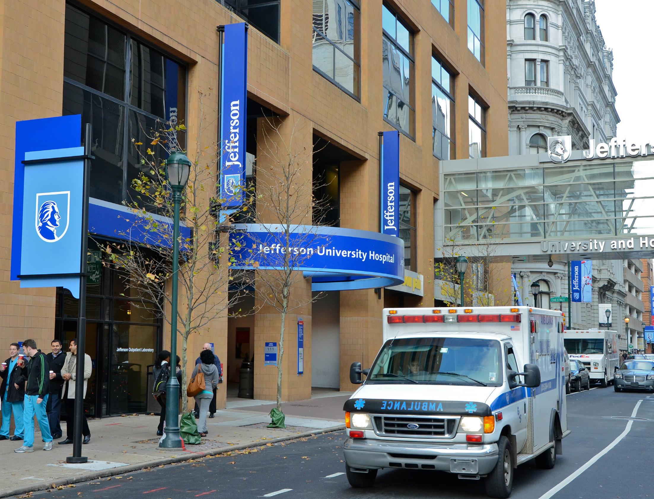
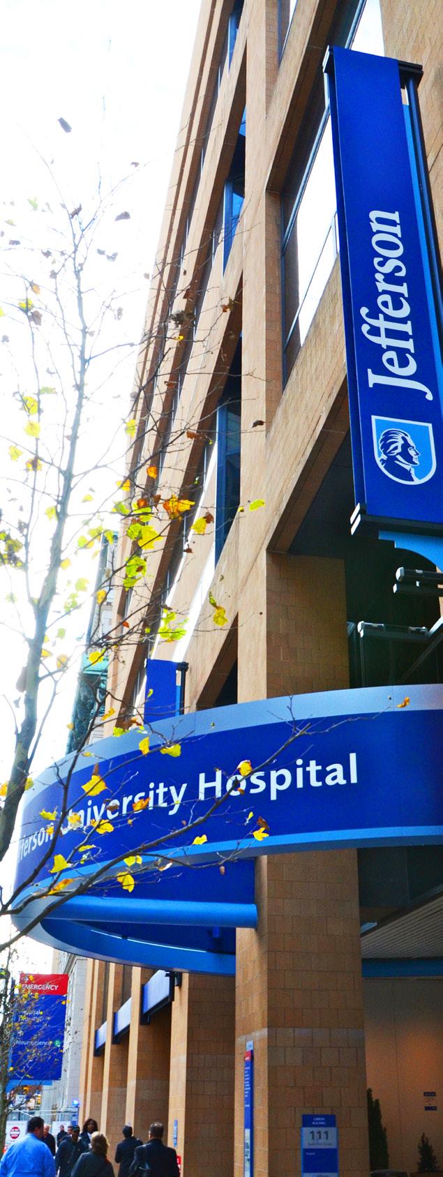
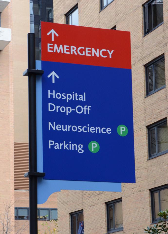
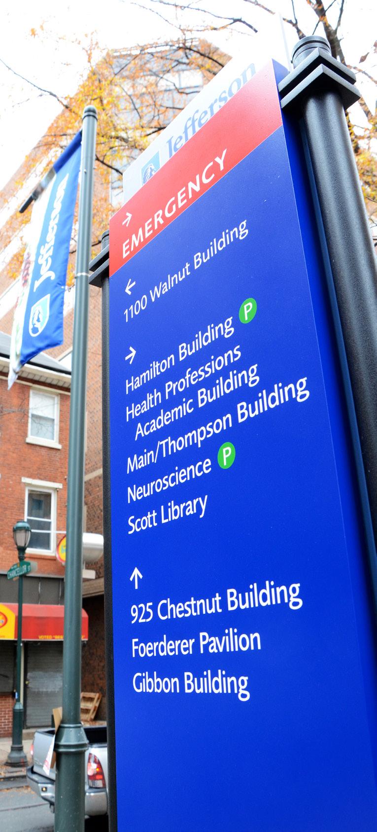
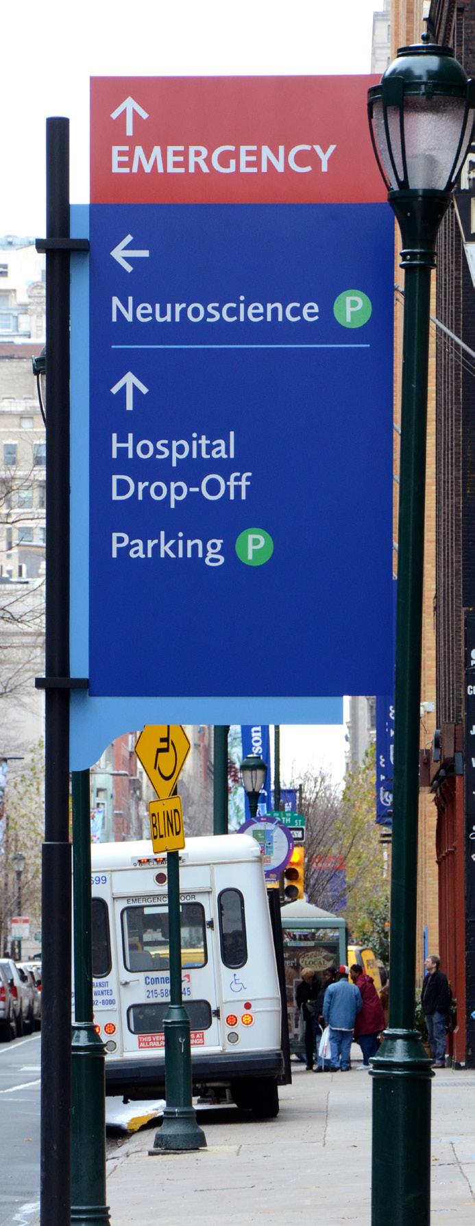
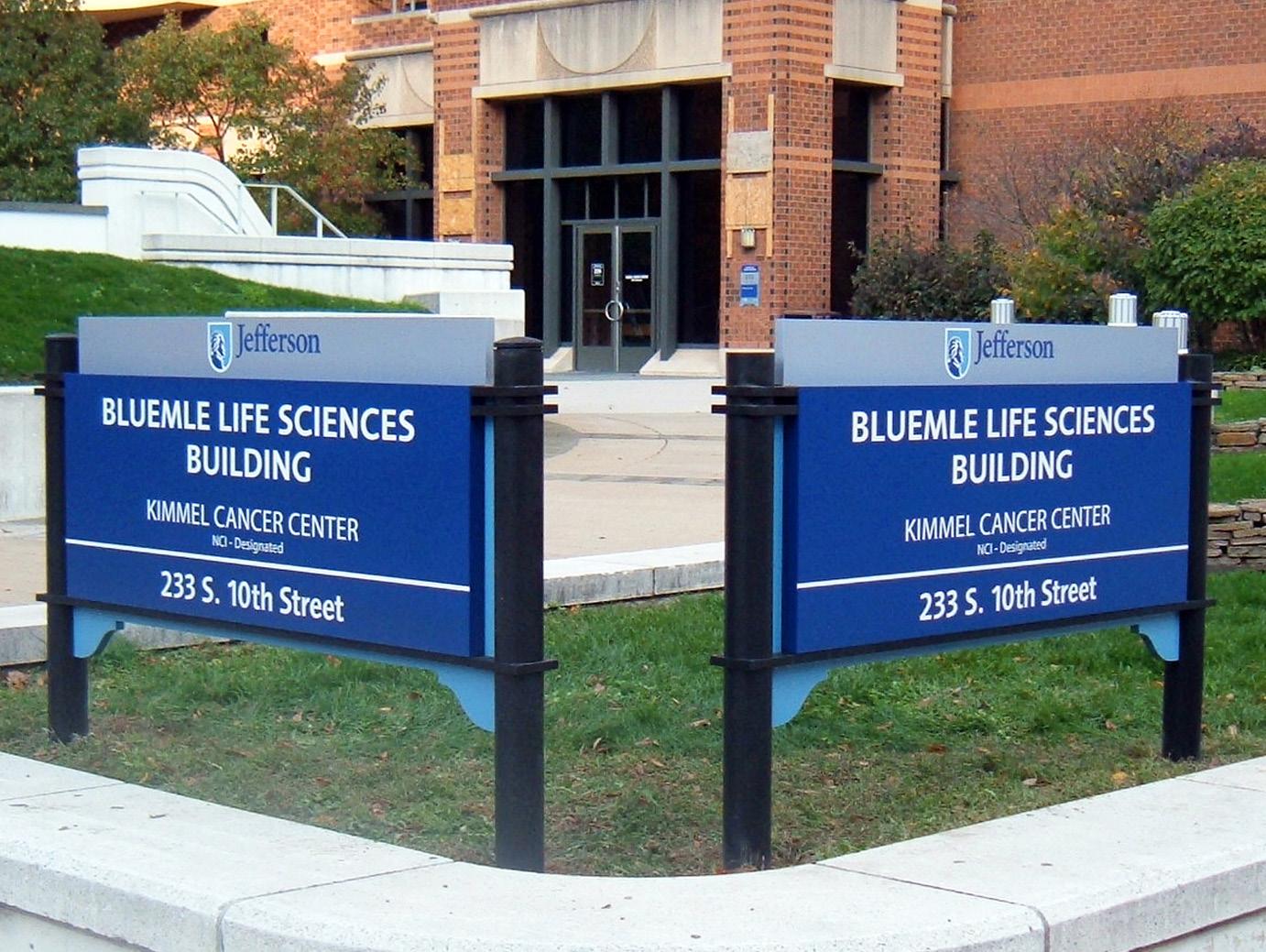
Cloud Gehshan Associates and L&H Companies had been partners since 2008, embarking on a mission to create a vibrant campus at the Thomas Jefferson University Hospital, centrally located in Philadelphia. This joint venture had given rise to an essential signage-based communication system. This system was of particular significance in areas of the city district that, despite not being owned by Jefferson, fell within the circumference of the campus.
The system comprised four pivotal elements that together, contributed to a distinctive urban wayfinding and hospital architectural signage system, giving the location a unique sense of place. These elements were illuminated banner signs that acted as vivid landmarks, vehicular directional signs to guide drivers, pedestrian directional signs for those on foot, and building identification signage to clearly label each establishment within the campus.
Exterior Signage
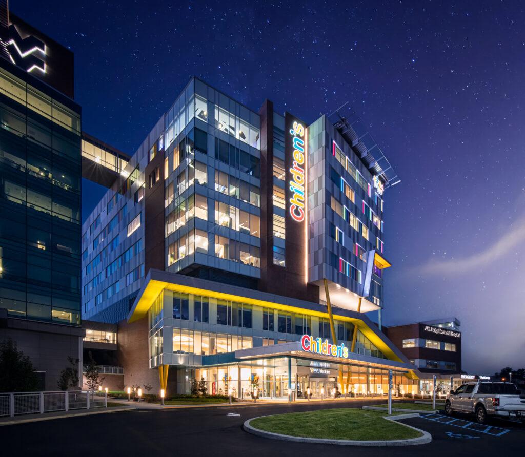
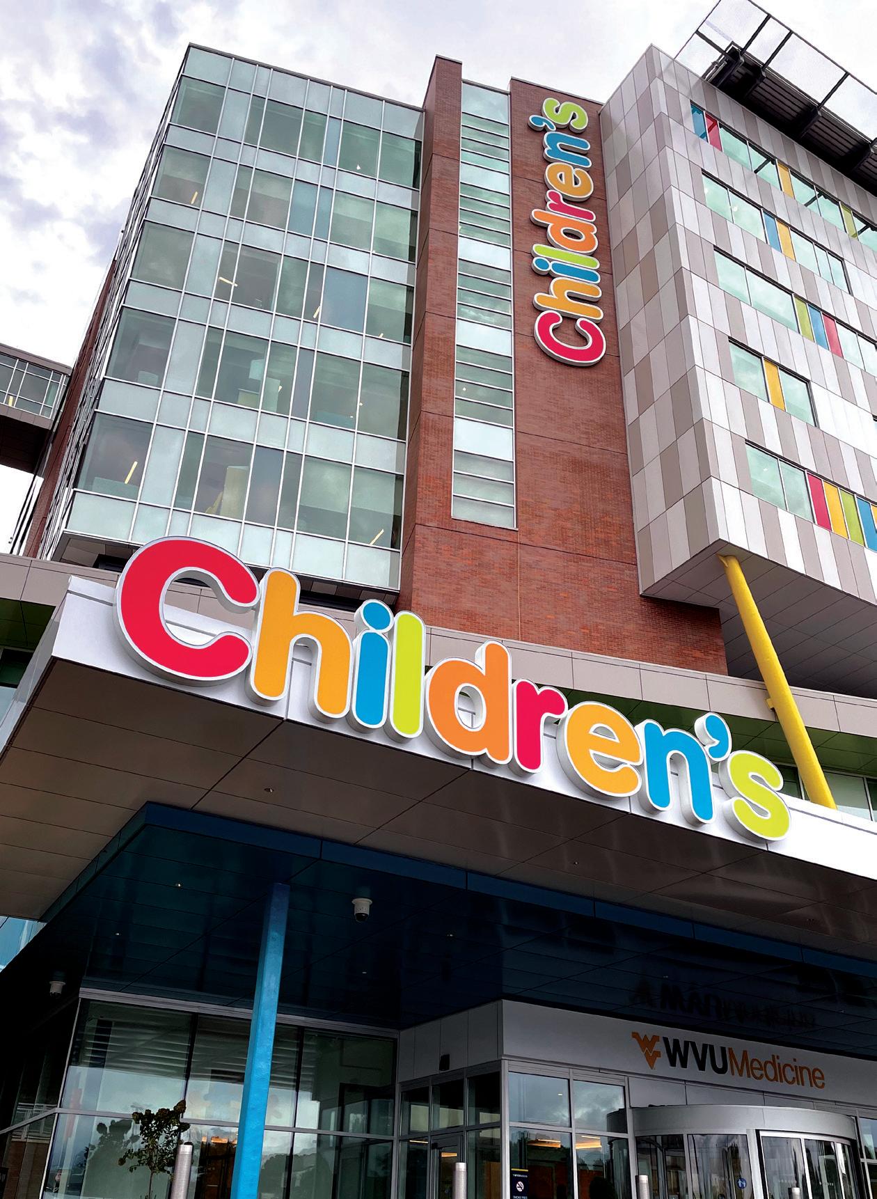
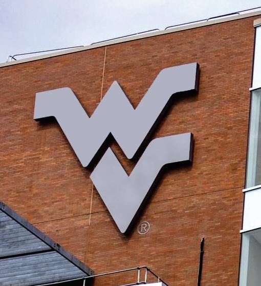
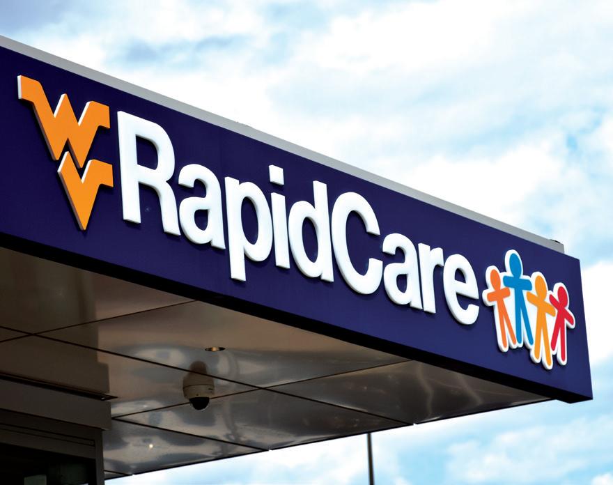
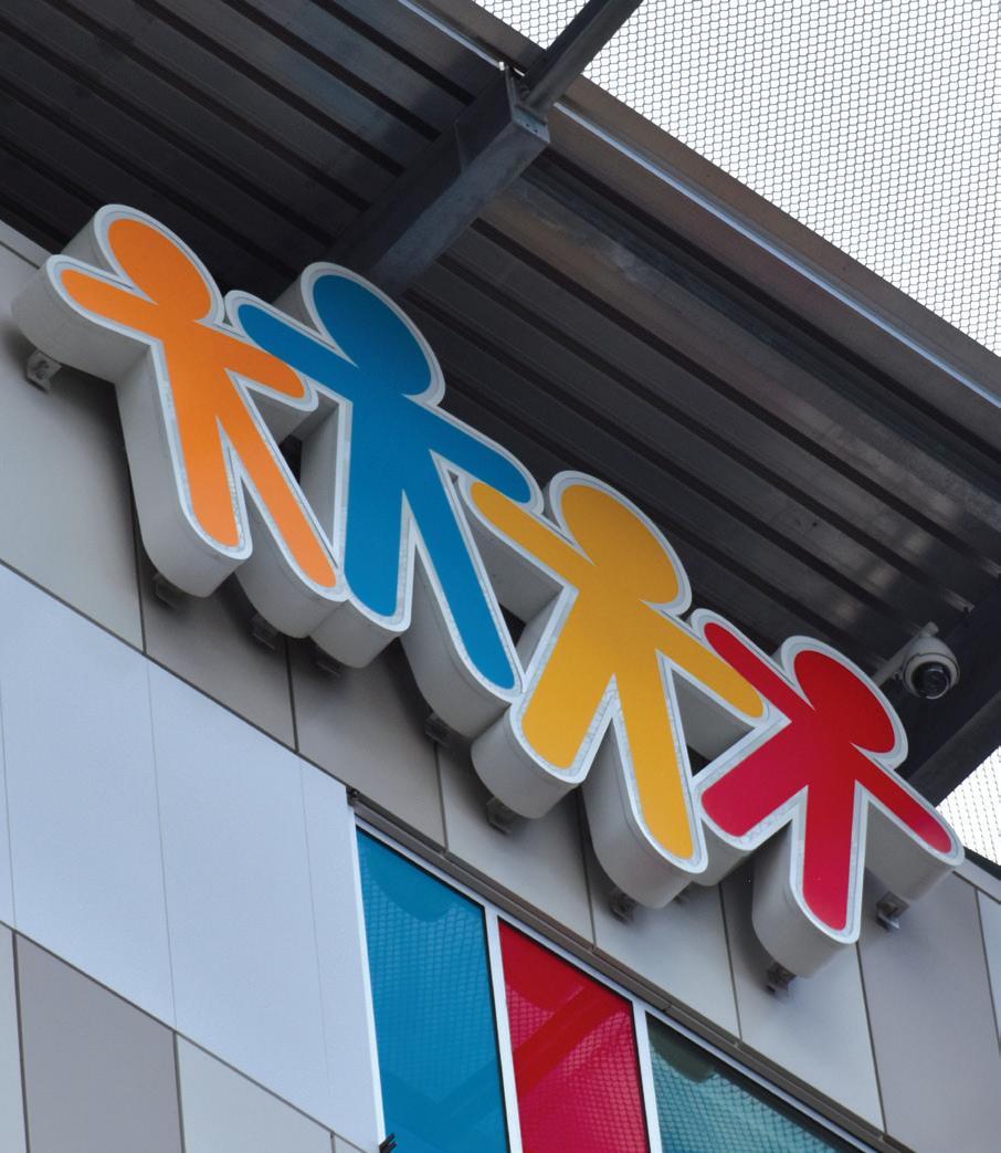
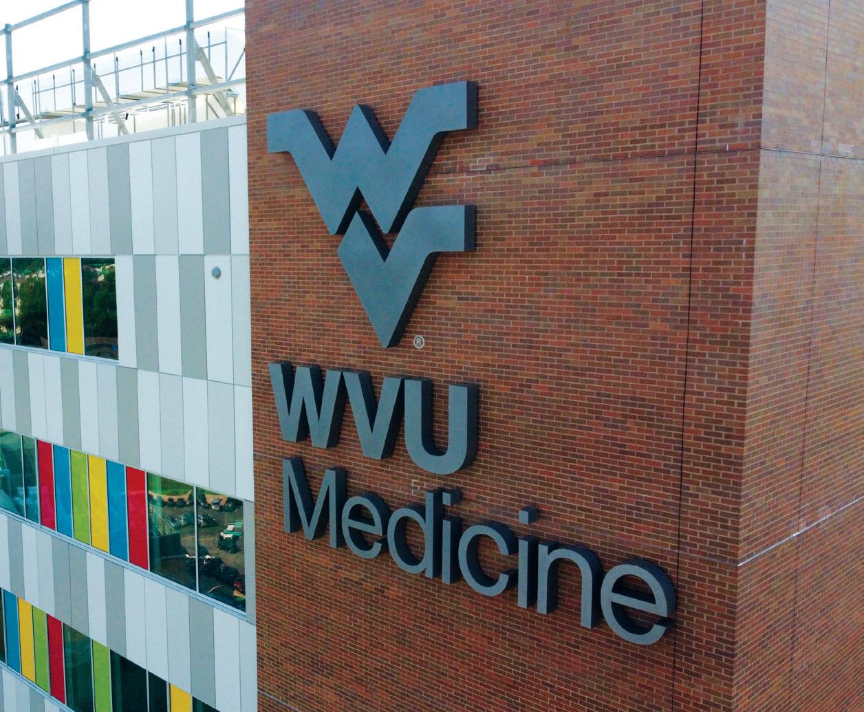
West Virginia University (WVU) Children’s Hospital, in collaboration with WVU Medicine, undertook an ambitious project to revamp its signage system, aiming to enhance the hospital’s visual presence and accessibility. The scope of work encompassed exterior and interior signage, which were meticulously crafted to not only offer clear wayfinding but also embody the hospital’s ethos. Additional elements like wall graphics were integrated to inject warmth and positivity, catering especially to the young patients. The project also involved robust engineering processes to ensure the signage’s longevity and safety, as well as precise fabrication and installation that adhered to the highest standards of quality and aesthetics.
Exterior Signage
Interior Signage
Wall Graphics
UHS faced persistent wayfinding problems causing visitor stress, department location difficulties, and parking confusion. To address this, an evaluation was conducted to identify and resolve the root cause, ensuring a comprehensive and long-term solution.
L&H and UHS collaborated on a successful wayfinding solution, implementing the Patient Care Sign program. Through on-site research and data analysis, L&H identified the root cause and developed a comprehensive signage program, reducing visitor stress and minimizing staff interruptions.
With a workforce of nearly 94,000 individuals committed to enhancing people’s well-being and revolutionizing healthcare delivery, Universal Health Services, Inc. is among the most prominent and esteemed providers of hospital and healthcare services in the country.
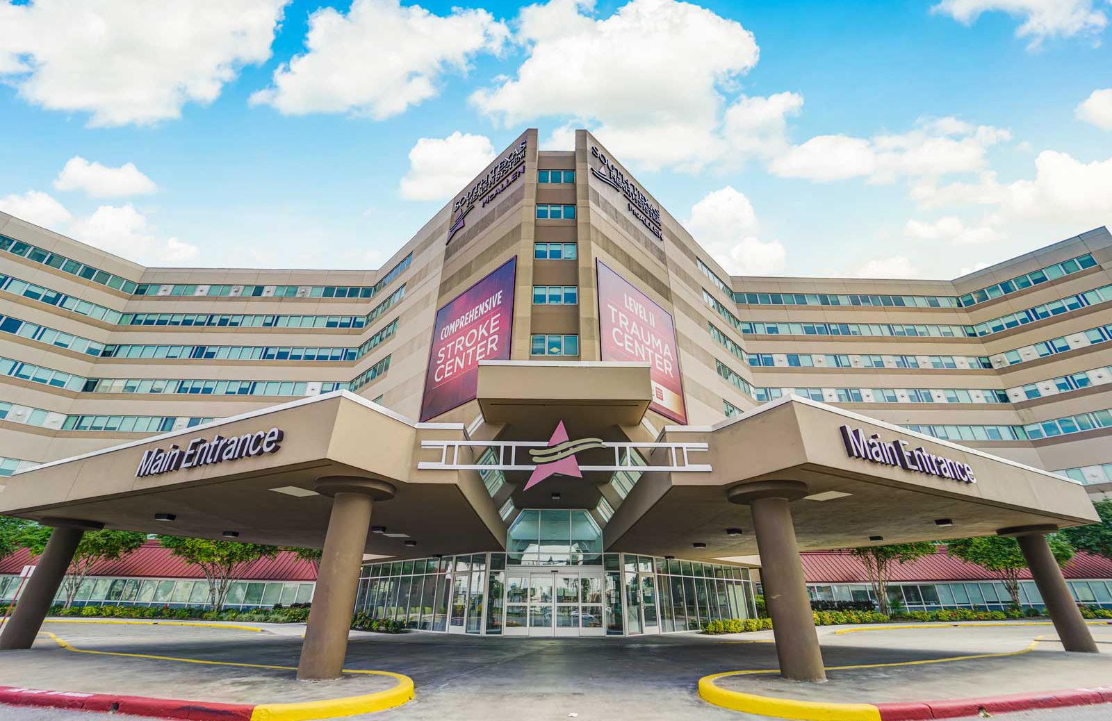
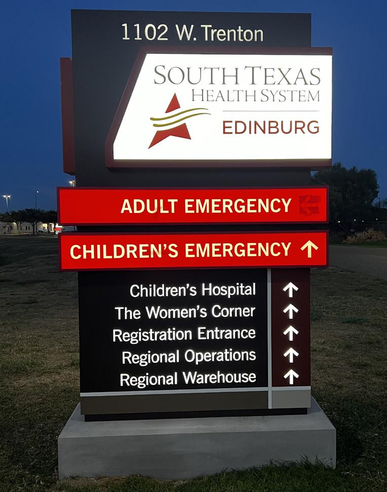
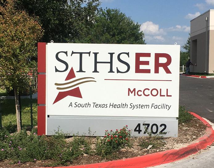
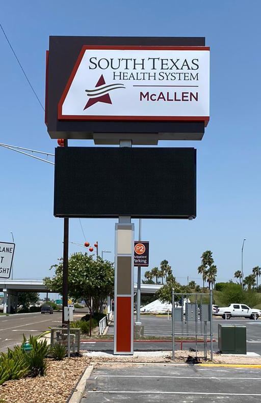
Universal Health Services (UHS) approached L&H Companies with the common problem of defective communication programs, which led to the implementation of the Patient Care Sign as a door-side signage and nursing communication system. L&H conducted on-site research to identify persistent wayfinding issues within the healthcare system, including difficulty finding departments and unclear parking identification. Additionally, UHS was undergoing a rebranding process, transitioning from STHS to the South Texas Healthcare System.
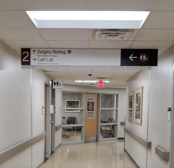
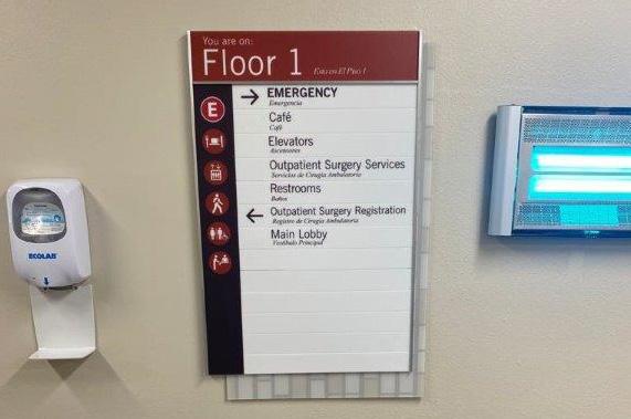
Based on the research findings, L&H Companies developed a comprehensive wayfinding solution that included the design and development of an exterior and interior sign program. The exterior sign family consisted of a primary pylon, vehicular directional signage, parking lot directionals, parking lot area identification, building identification, and canopy and entrance signage. The interior sign program included patient room signage, room identification, overhead and wall-mounted directional signage, area identification, and exit route and stairwell identification signage.
L&H utilized its online platform, SignAgent, to provide the client with an easy-touse platform to review and approve sign location, messaging, size, and scale. The final product of the design phase included an exterior site plan, interior floor plan, interior and exterior message schedule, and location design package.
After final design approval, L&H provided updated costing for fabrication and installation, and a production schedule was submitted to the client with routine updates. The installation plan was also submitted, including a check-in procedure for badging and security clearance, on-site personnel contact points, areas of work being completed, and timelines for completion.
The final result was a successful rebranding and an effective wayfinding program that reduced stress for visitors and allowed hospital staff to perform their daily functions without constant interruption.
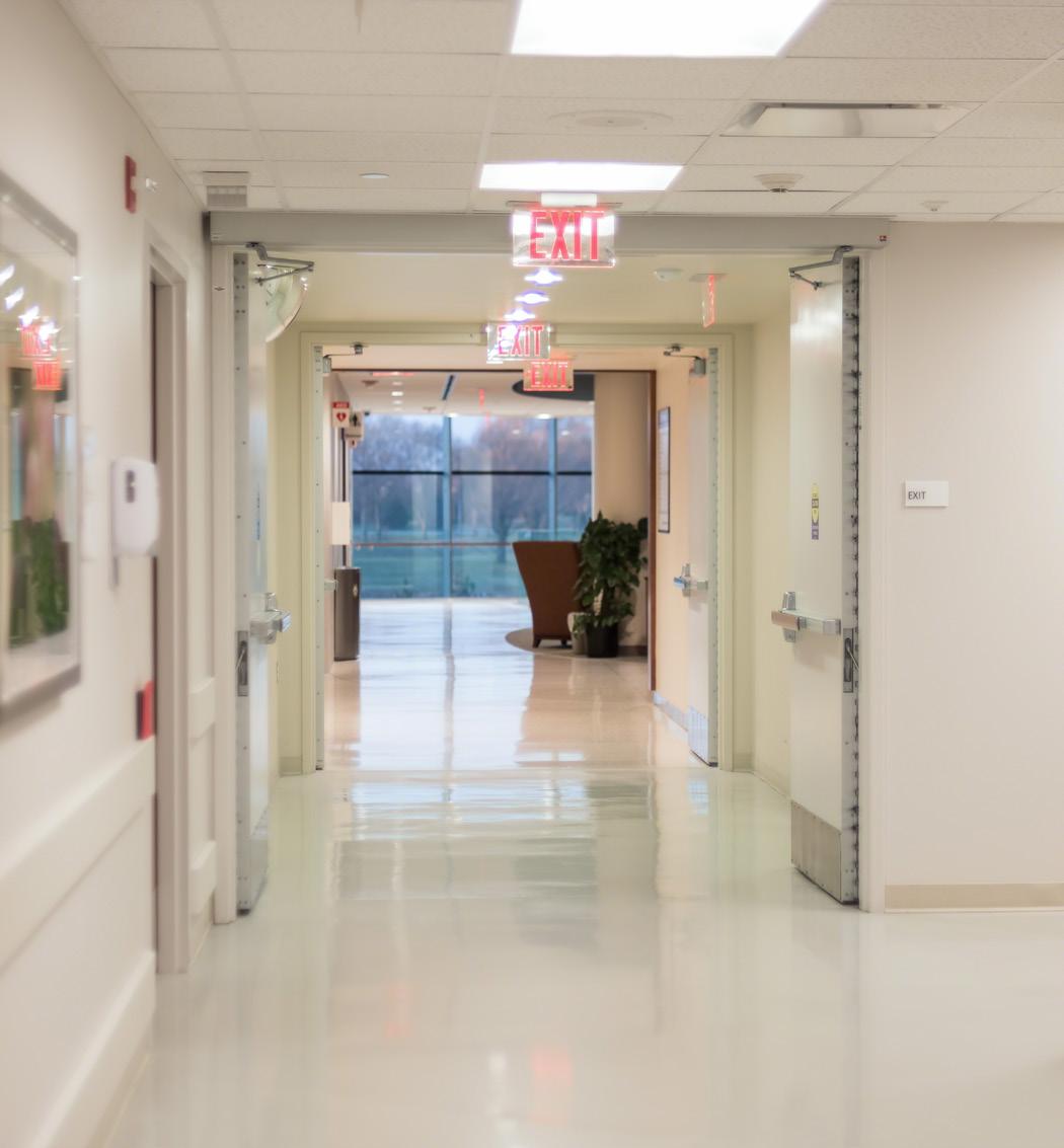
Through Focus Groups, Visitor Intercepts, and Documentation, L&H Uncovers Root Cause of Visitor Confusion and Develops Effective Solution to Streamline Navigation at UHS.
L&H was engaged as a research consultant to identify the reasons behind the visitors getting lost, which provided an opportunity to conduct on-site research.
• Focus Groups: Interview employees within the healthcare system who are constantly being stopped by visitors and patients for directions.
• Visitor intercepts: Our team of professionals respectfully identifies visitors and asks them to share their experience in navigating the facility – typically we incentivize with a small gift card for coffee or amazon gift card.
• Survey & Documentation: Our team conducted surveys and documented the experience of a new visitor, from identifying the campus to reaching their destination and exiting. We identified “decision-making points” and documented areas where visitors commonly became confused or lost through photos.
After completing the on-site research, L&H provided UHS with a report containing both quantitative and qualitative data. The quantitative data included statistics and percentages with binary answers, such as the fact that 20% of visitors reported a language barrier with signage. The qualitative data included emotional and experiential circumstances, such as a visitor spending over an hour trying to find their car after checking out their sick elderly parent, or an employee being constantly distracted by people asking for directions. This information was kept anonymous to ensure transparency from the interviewees.
Based on the findings, L&H began developing a solution, starting with designing a sign family that would represent the new identity of the healthcare system while directing vehicular and pedestrian traffic to their final destinations.
Quantitative Data involves numerical measurements and statistics, while Qualitative Data is based on subjective experiences and judgments.
In a recent study, it was revealed that at least onethird of patients and visitors experienced getting lost in the studied hospital, with 59% of participants finding the hospital’s wayfinding system challenging to understand.
This highlights the importance of addressing wayfinding issues in healthcare facilities to ensure a better experience for patients and their families.
O’Neill, M.,Coulter, M., & Kennedy,
A.(2019). The Effectiveness of Wayfinding Systems in Healthcare Facilities. ResearchGate.

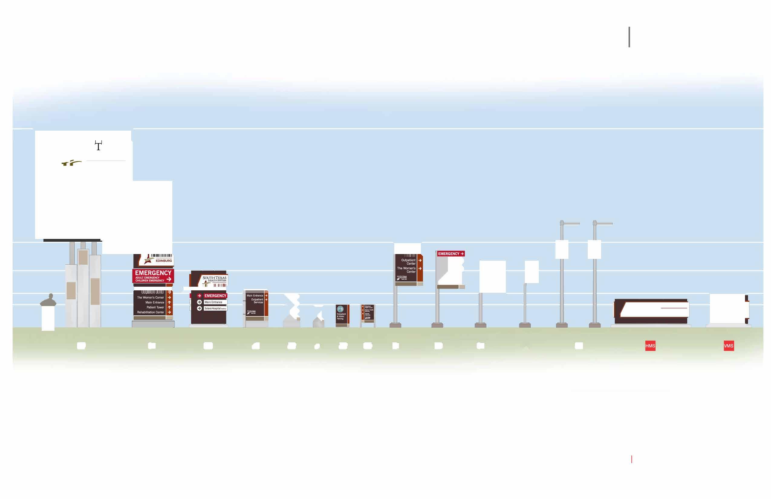
The L&H Creative Team creates a standardized sign family based on information gathered during the discovery phase. The sign family is designed to meet the needs of branding, directional services, and area and building identification.

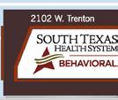
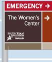
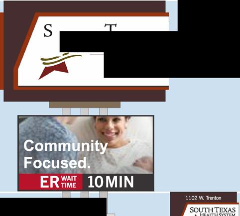
The exterior sign family includes:


The Primary Pylon is a sign that stands at least 35 feet tall to ensure visibility from nearby roadways. It includes a video board message center and functions to identify the campus from long distances and advertise to the community. However, it does not provide specific directions for vehicular traffic or include destination points as these would not be functional from the viewing distance.
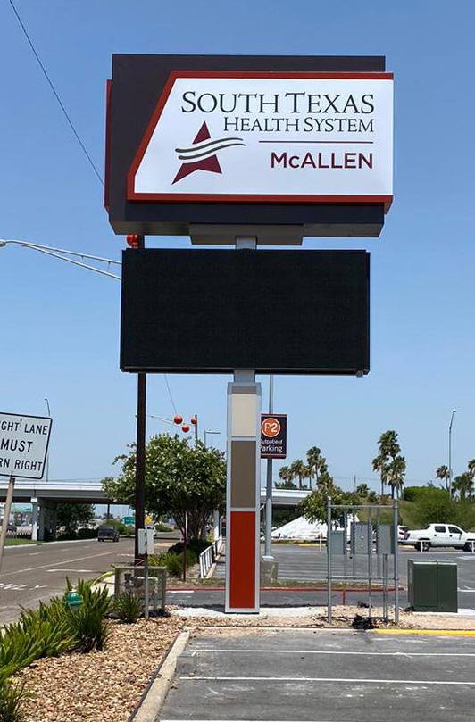
Vehicular Directional Signage
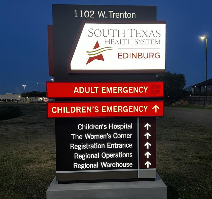
Vehicular Directional Signage (VDS) includes logo branding and directional arrows to guide vehicular travelers to service destinations and parking areas. These signs are illuminated and provide critical directions during both day and night. They are strategically placed throughout campus entrances and decision-making points such as intersections and lot entrances.
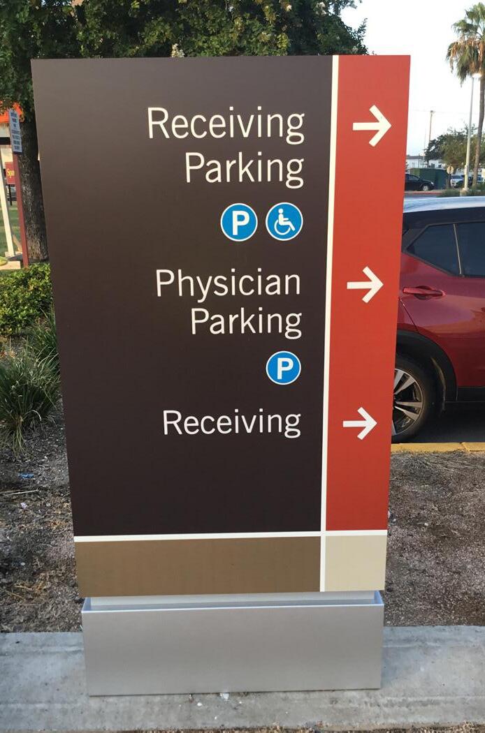


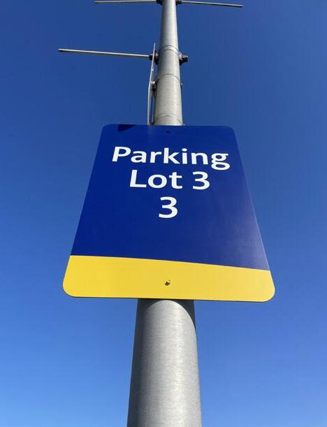
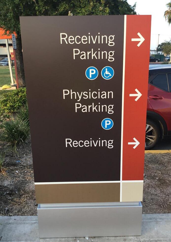
Parking Lot Directionals are freestanding post and panel signs that provide directional messaging to entrances and parking lot areas. They are placed throughout the interior of the parking lot to aid vehicular and pedestrian wayfinding. These signs are non-illuminated but include reflective film to ensure clear visibility at night.
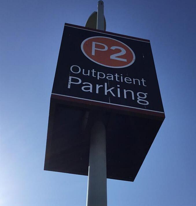
Parking Lot Area Identification signs are typically mounted to existing light poles throughout the interior of the parking lot. They depict the location of the area and lot where visitors park, including messaging to correlate with lot locations such as Lot B1 through B5. The exact terminology for these signs is developed during the Wayfinding Process.
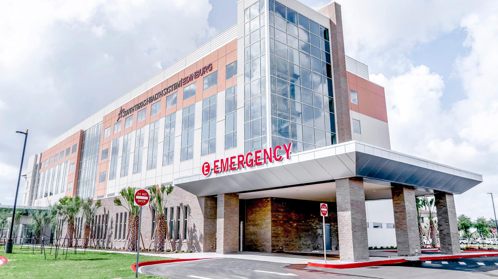
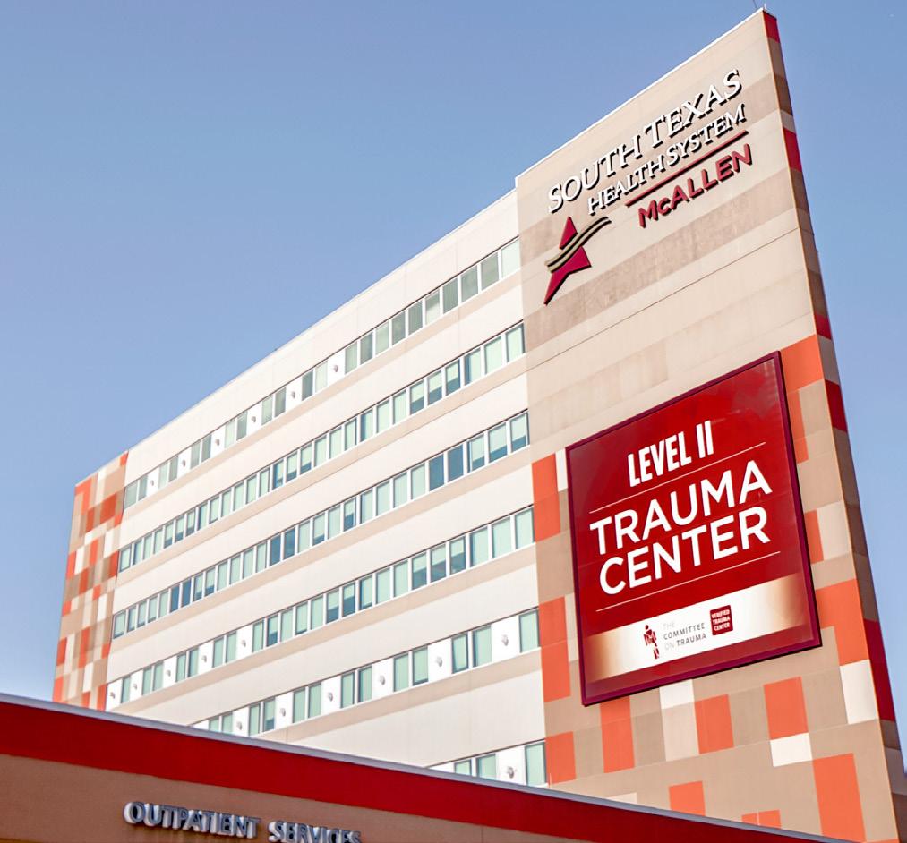
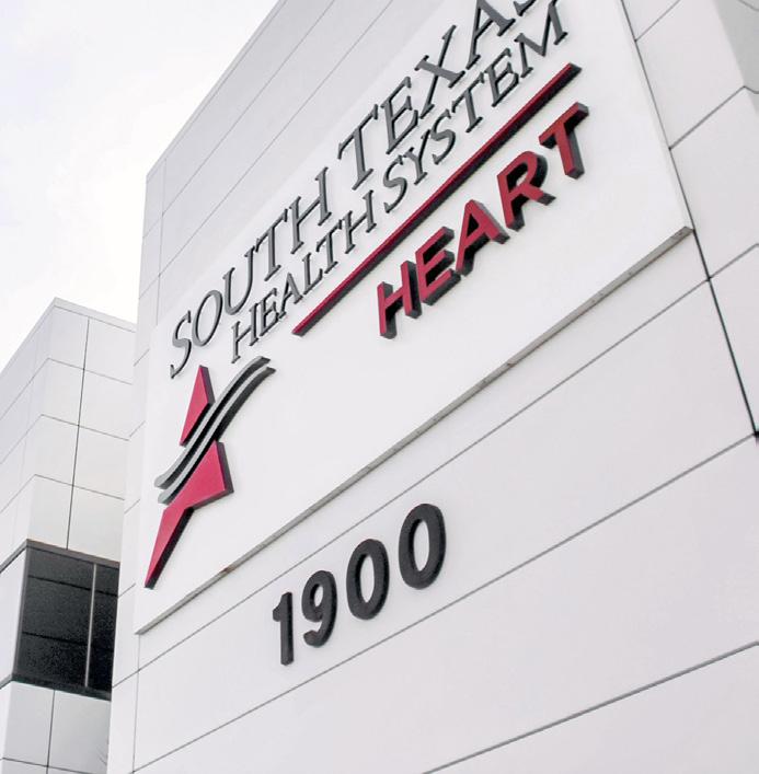
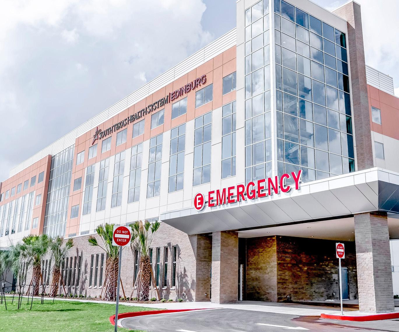
Building Identification comprises large scale illuminated lettersets mounted atop the building for visibility from nearby roadways by vehicular traffic at a distance. This serves as an important landmark that can be used for wayfinding and also reinforces the brand identity of the facility.
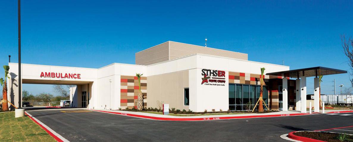

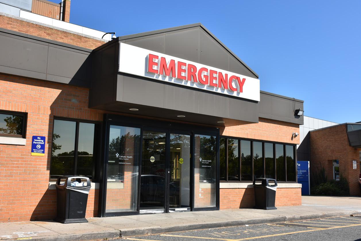
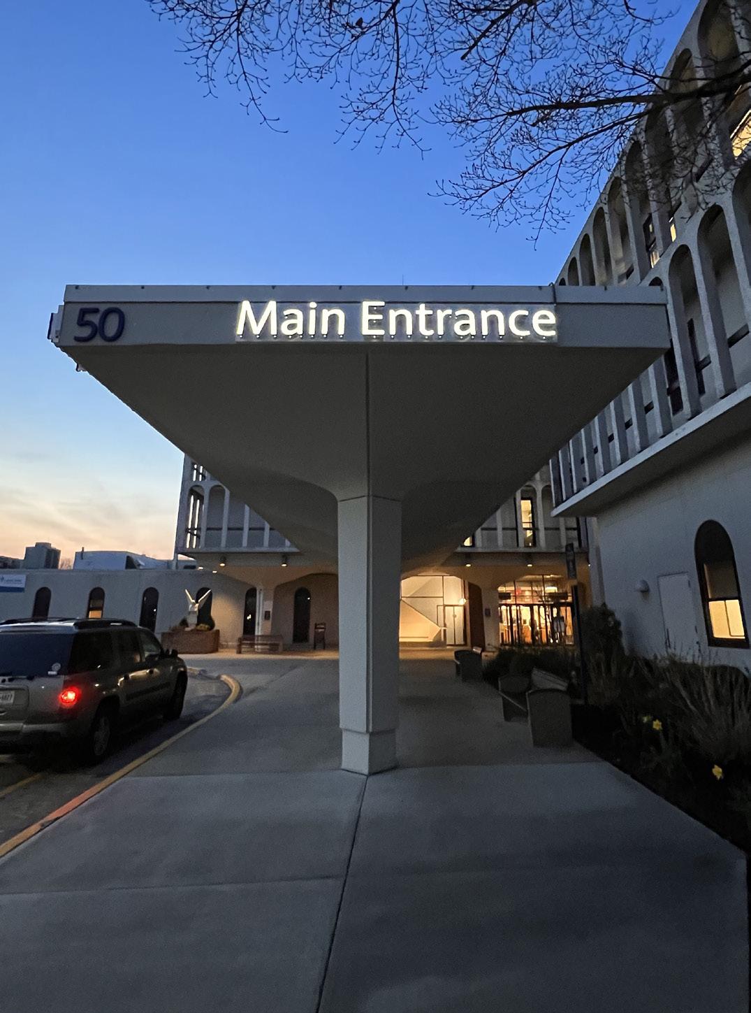
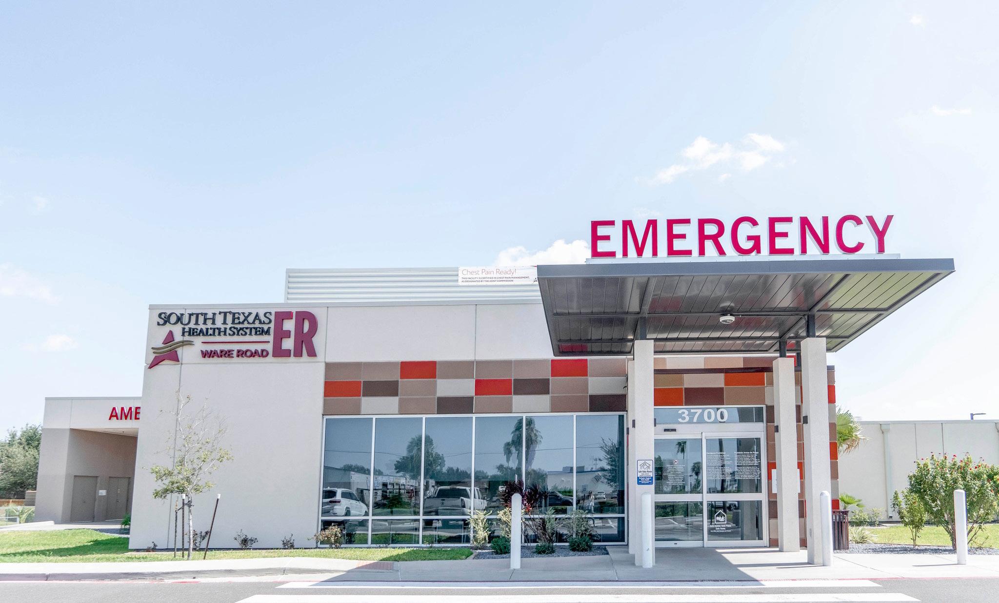
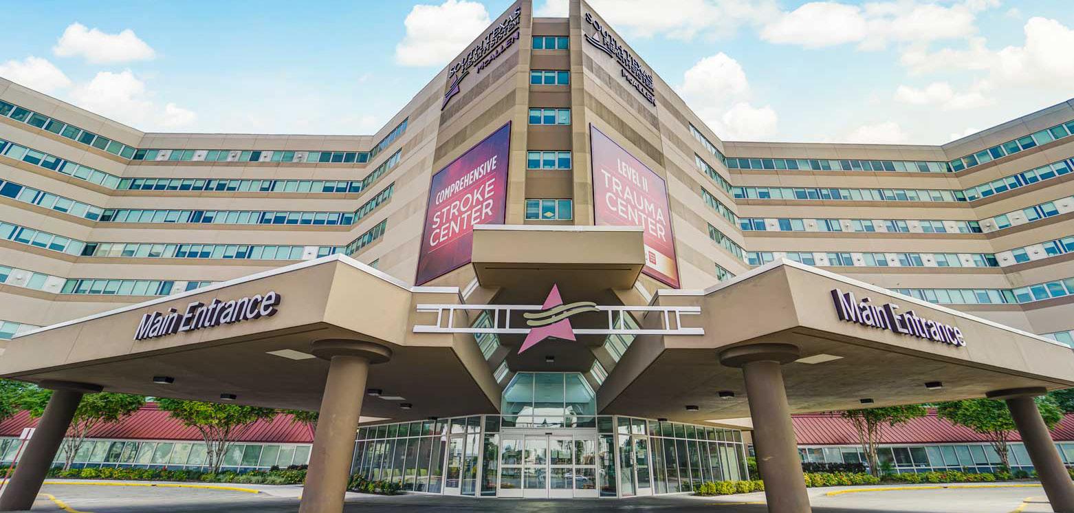
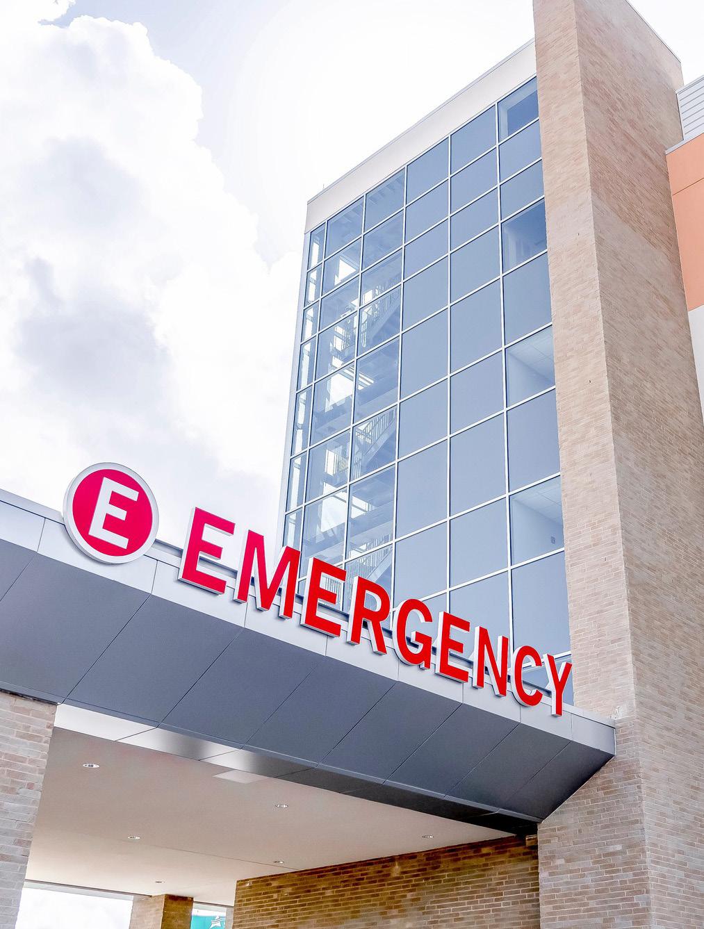
Canopy and Entrance Signage consists of illuminated lettersets that are mounted to the canopy entrance for clear identification of entrances. Examples of signage include “EMERGENCY,” “AMBULANCE,” and “MAIN ENTRANCE.” Canopy and Entrance Signage not only facilitates wayfinding but also enhances the overall visitor experience.
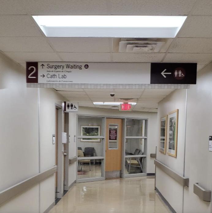
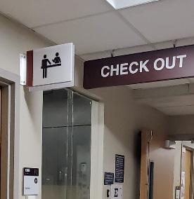
Directional signs with arrows indicating room numbers and destinations are placed throughout the current floor level, as well as area and department identification for additional floor levels. These signs are strategically placed at decision-making points such as elevator lobbies, entrance lobbies, and hallway intersections.
Overhead directional signs mounted above head throughout hallways provide direction to room numbers and departments within the current floor level, with arrows strategically placed at decision-making points to reassure travelers on their way to the destination.
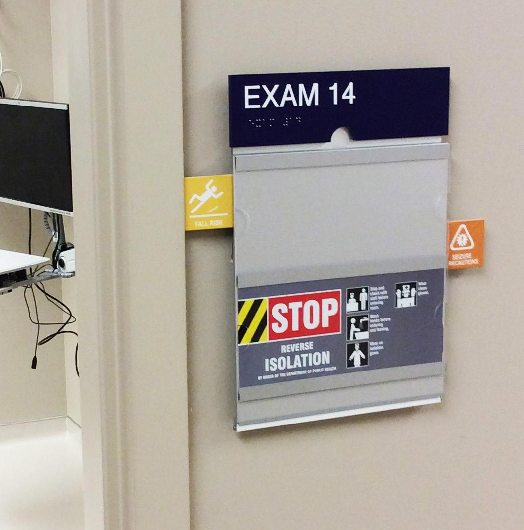
The Patient Care Sign system serves as both room identification and nursing communication system, featuring a header with embossed room number and braille for full ADA compliance. This comprehensive system allows patients and healthcare professionals to quickly and accurately identify patient rooms and provide timely care.
Letterforms are commonly applied to drywall overhangs or lobby walls to clearly indicate the final destination for departments, such as “Medical Documents,” “Med Surg Unit,” and “Emergency Room.”
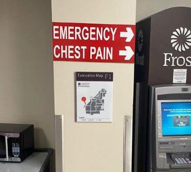
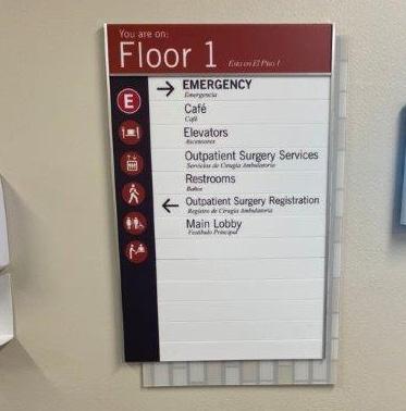
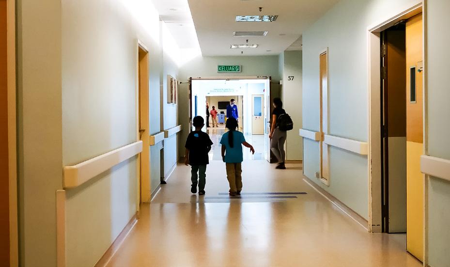
ADA-compliant exit route signage is installed at elevator lobbies and stairwell entrances to indicate the most efficient way to exit.
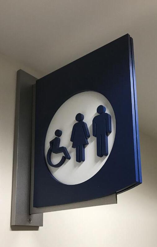
The room identification signage is ADA compliant and features embossed room numbers and braille to identify rooms, offices, and back-of-house locations.
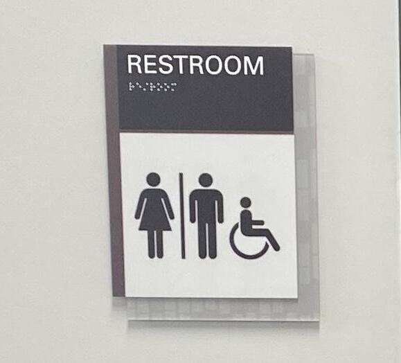
L&H Companies’ wayfinding experts utilize onsite research data to create a visitor circulation strategy while designing the sign family.
The SignAgent online platform positions exterior and interior signs on a campus site plan and architectural floor plan, respectively, for client review and approval.
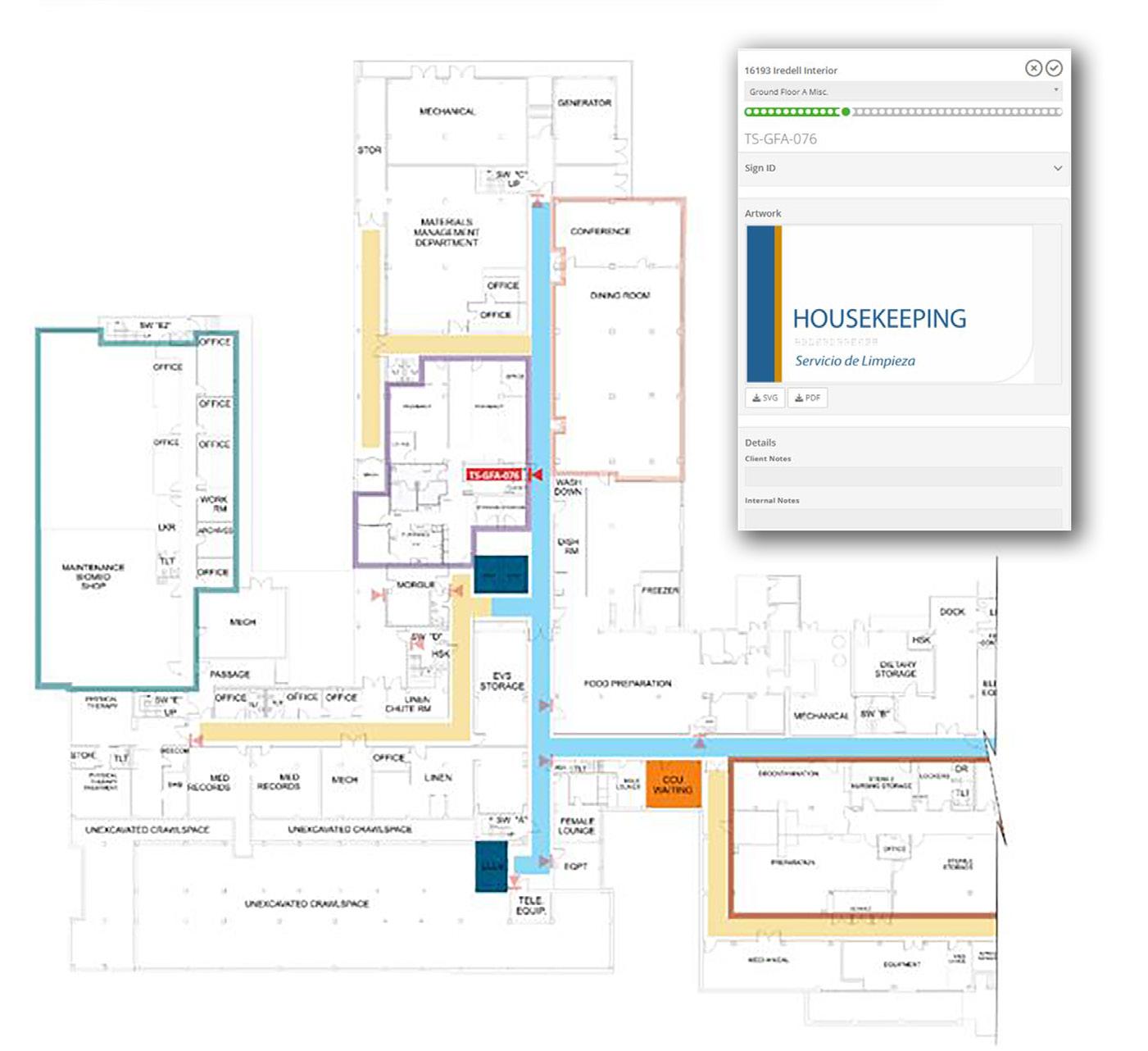
Collaborating with the client during the review process refines the signage plan to produce a comprehensive program that seamlessly navigates first-time visitors while visually reinforcing the brand.

Throughout the review process, the L&H team presents the signage plan to the client for review and feedback in a digital format. The SignAgent platform allows the client to easily walk through the interior and exterior signage location plan to confirm location and messaging with assistance from the L&H team to define the methodology and reasoning for signage placement.
The final product of the design phase includes:

Exterior Site Plan
Architectural site plan showing final locations for all signage throughout the location with signage identifiers to correlate to message schedule with typography and sign type.
Interior Floor Plan
As the final design deliverable is completed, L&H provides updated costing for fabrication and installation. Costing is based upon the finalized design and sign count. At the onset of the project, L&H submits a GMP costing value with low and high-end values for budgeting purposes. As the sign plan and design is developed, pricing is updated for client review and feedback. This process allows the client complete budget control.
L&H presents the updated budgets for review and approval prior to fabrication. Once approved, L&H is released to fabrication. For exterior signage, permits are obtained where applicable.
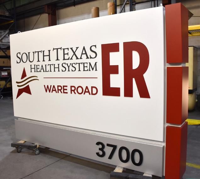
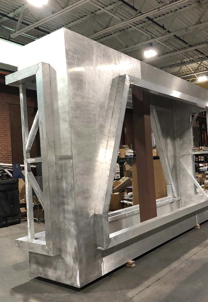
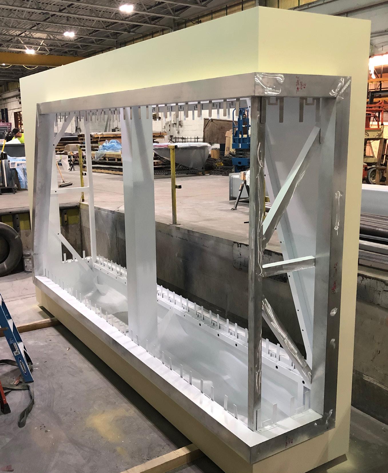
A production schedule is submitted, and client is routinely updated as product moves through the various stages of production. During this time we confirm the phased installation plan and prioritize signs and locations based on project goals discussed with the client. Production photos are sent with routine updates.
At L&H, we believe that efficient installation of specific areas in the healthcare environment is crucial for uninterrupted delivery of quality patient care.
To this end, we have established an open line of communication with our clients to coordinate the installation process and minimize any disruptions that may occur. Our team works closely with clients to understand their priorities for installation and tailors our efforts accordingly.
We recognize that every healthcare facility is unique, which is why we strive to deliver a customized experience that meets the specific needs of each client.
L&H will submit a detailed installation plan for client review including:
• Check in procedure for badging and security clearance.
• On-site personnel contact points with phone and email.
• Areas of work being completed with timelines to completion.
• Equipment and crane with lift plan where applicable.
• Interior floor plan by area with work scheduled to be completed and timelines or when personnel will be in each area.
• Coordination of any parking lot or lane closures where applicable for exterior signage.
• At the end of each installation day, the progress report is updated and sent for client review noting what was completed, any on-site issues or changes in priority, and completion photos.
The final result is not only a successful re-branding, but the implementation of an effective wayfinding program that reduces stress of visitors.
This allows hospital staff to go about their daily functions without constant interruption.
