1 minute read
Warm and Inviting


Traditional colors representing warmth are dark, saturated hues in the red, orange, gold or brown family, but the deepest shades of cool colors can be very comforting. Entryway walls painted with Benjamin Moore’s Yellowstone (HC-10) with Cotton Balls (OC-122) wainscoting invites people in. Adding America’s Heartland (#197) as a flow color extends the warmth from the entry and ties in Nightshade (2116-10) on the kitchen island. Racoon Hollow (#978) in the bathroom or office pulls the interior look together but is also a versatile exterior color option.
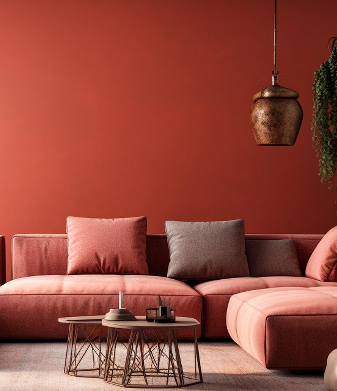
Vibrant and Lively
After several years of cool color trends, vibrant colors are making a big comeback. Benjamin Moore’s 2023 color of the year, Raspberry Blush (2008-30), is a bold statement color that energizes a room or front door. Include other rich colors like their Wenge (AF-180) for a moody bathroom or exterior accent color and North Sea Green (2053-30) in the formal dining room for a more balanced feeling. Coupling Stone Harbor (2111-50) for the flow walls or main exterior paint and White Heron (OC-57) for trim helps highlight the vibrant colors without making them seem overwhelming.


05


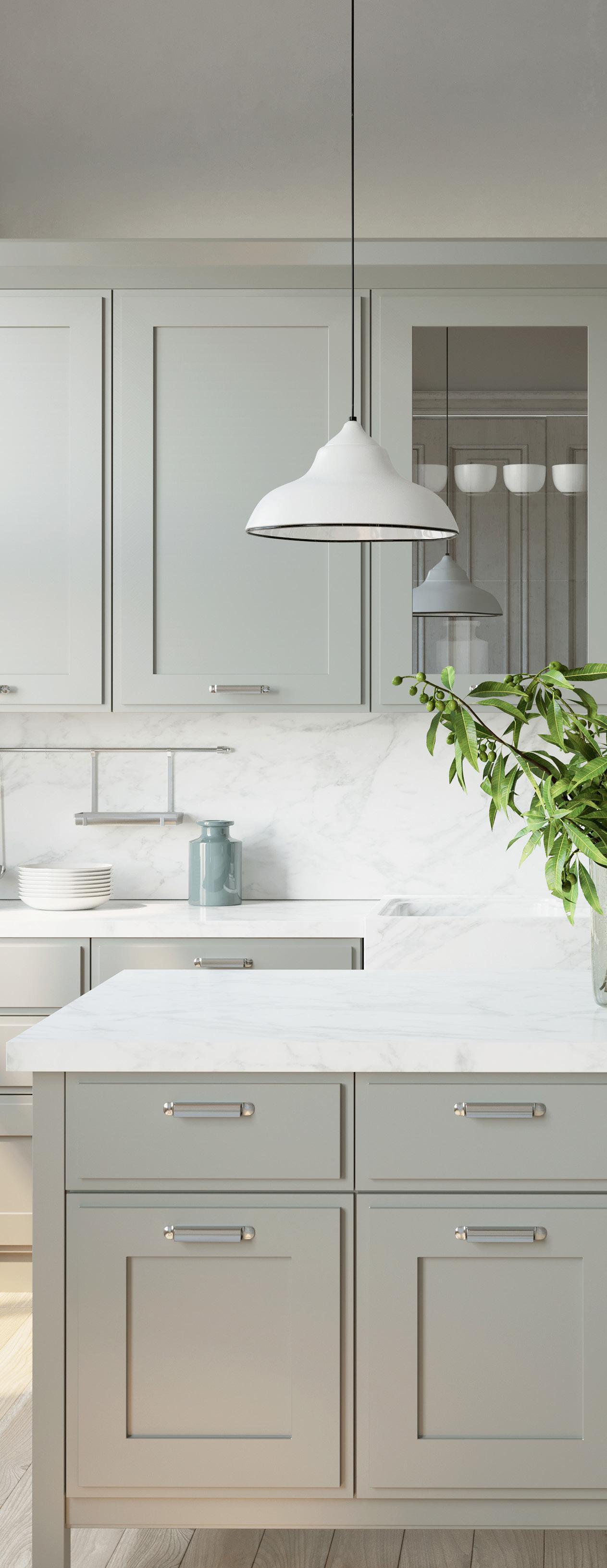
Calm and Relaxing
Hues of green can reduce anxiety, invite harmony and bring the serenity of nature indoors. A fresh green/blue/gray shade like Benjamin Moore’s Hollingsworth Green (HC-141) on lower kitchen cabinets radiates relaxation while adding a deep green like Sherwin Williams’ Billiard Green (SW 0016) in the office or powder room is reminiscent of a peaceful rainforest retreat. Warm white colors like Benjamin Moore’s Swiss Coffee (OC-45) on the walls and crisp white Chantilly Lace (OC-65) on the trim paired with soft charcoal Wrought Iron (212410) accents complement the interior green shades and highlight the colors of nature when used on the exterior.


Classic and Timeless
Finding a color palette that can transcend time and bringing in color with furniture, art or wallpaper is always in style. Sherwin Williams’ neutral greige shades like Agreeable Gray (SW 7029) for walls or cabinets and Pure White (SW 7005) on trim are versatile options that coordinate well with warm or cool tones. A monochrome design in Dovetail (SW 7018) for the dining or powder room adds elegance, while a chameleon hue, like Seasalt (SW 6204), adds depth by appearing to change color depending on the light. Finish this palette with Iron Ore (SW 7069) interior accents or as a dramatic exterior color.