Leaf It To Me
Lily Wangler Art 130
Norbert College

For the pinnatisect leaves, that died so that I might breathe.

Introduction

This process book is a collection of all the work I have completed throughout Art 130-Introduction to Design in the fall of 2024. In this book you will find my work as well as the process it took for me to get to the finished outcome.
The projects that you will find within this book include: A crash course prototype, 3 compositions composed of just dots and lines, a letterform print, an illustration iteration poster of a kinkajou, and a PSA poster. Within this book you will also find a presentation of a designer as well as some of my thoughts, and art outside of Art 130.

Crash Course

In the beginning of the semester we had a quick project that involved us coming up with a prototype to help solve a classmate’s problem. The classmate I was partnered up with was having trouble with when to eat. They had classes throughout the day and softball practice right afterwards and didn’t have enough time to run home and eat nor did they have a meal plan through the school. Through their problem I was able to come up with a few different solutions. The solution that made the most sense was bringing a lunchbox with them to school so they would still be able to eat lunch. After coming up with the solution I drew a thumbnail of what the prototype would look like.
When creating the prototype I only had the remainder of class and I felt rushed. The tape I used to hold the cardboard together to form the lunchbox’s shape was coming undone which resulted in the box collapsing. I was able to save the cardboard boxes shape by the end of class although if I had more time to work on the prototype I would have made it more stable.


These are 2 sketches that i made as to help come up with the prototype.
Engaging with a real person let me know better which prototype to make when it came to helping the problem that was being faced. Showing unfinished work to another person was very stressful as my prototype was falling apart, and wasn’t looking as I anticipated it to be. The pace felt fast and rushed compared to how I normally work. Based on what I learned I would not use painters tape on bumpy cardboard although if I had more time and decided to continue my project I would have found something other than the painters tape to stabilize the shape then I would have put some sort of material over the shape and wrote lunch box and added a handle to the prototype.


Finished prototype.
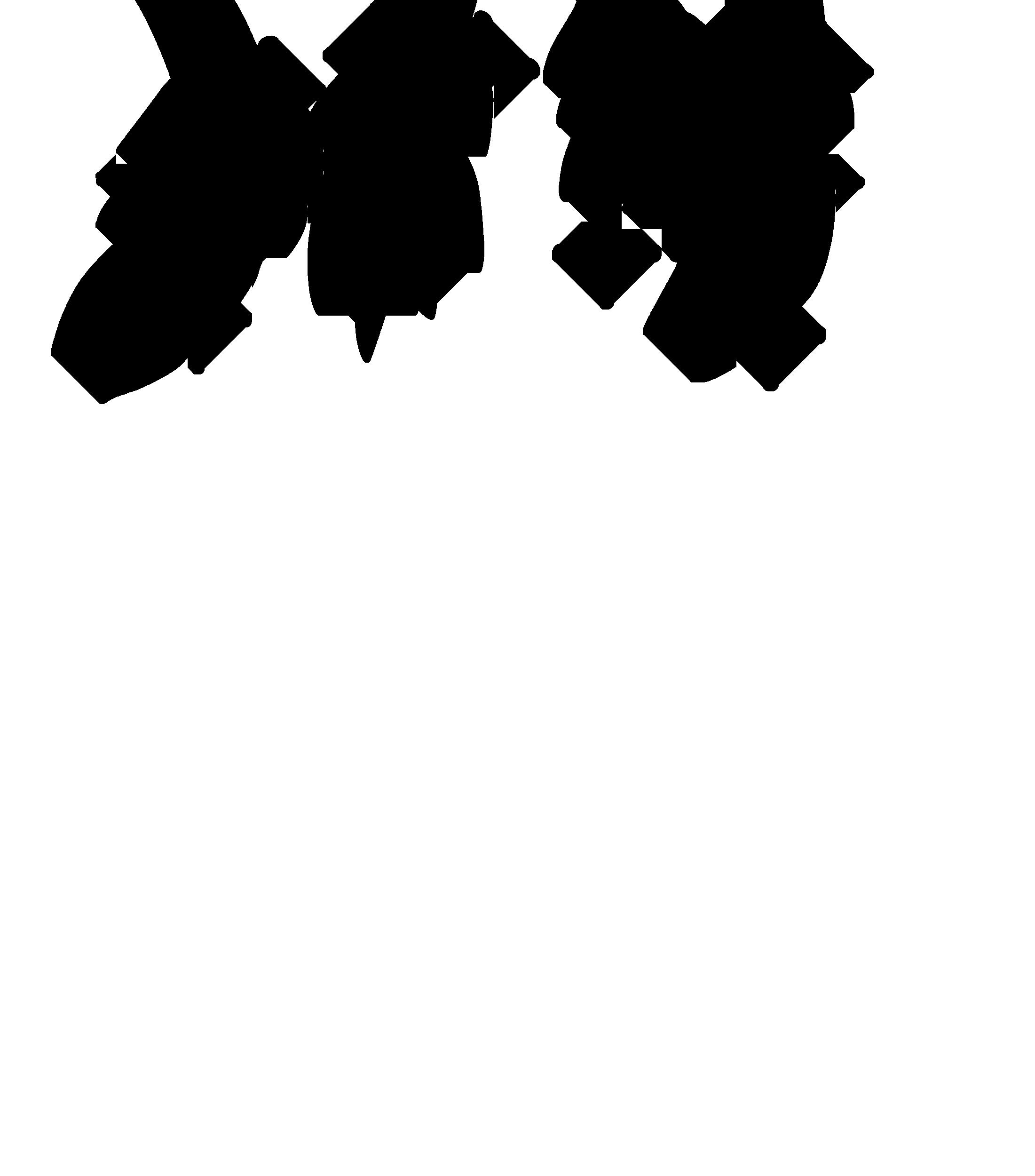
Dot Line

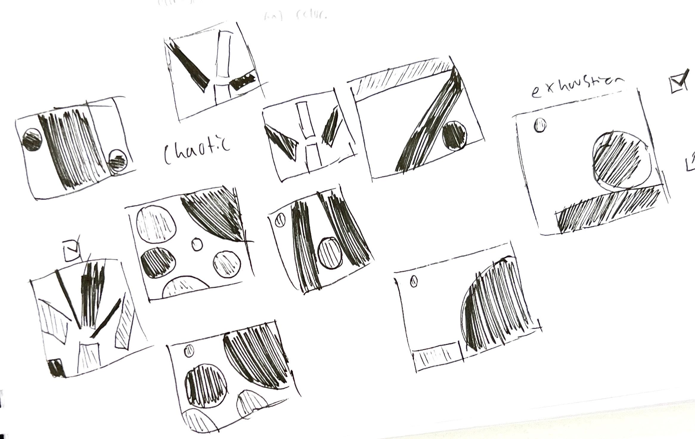
The 2nd project of the semester was creating three compositions 4” x 4” and mounted, centered, on black boards, 6” x 6” using just black and gray lines and dots. Each composition was made with a word in mind. The words I was representing through my 3 compositions were “longing”, “exhaustion”, and “chaotic”. I found it challenging at first coming up with ideas to represent my word just through lines and dots but after creating some thumbnails for each word I was able to visualize how I wanted my compositions to look.


Here are some thumbnails of different variations of line and dots. Each thumbnail represents a word.


Gestalt is a word that describes how we see images as a whole instead of focusing on the tiny details. This Dot line project helped us see the compositions as a whole instead of focusing on little details that made up the composition. I struggled coming up with compositions with only using dots and lines although given enough time I was able to come up with things that well suited my themes.

I would rather make things quickly as a way to see all my options and not focus on a single aspect of my compositions. In terms of abstraction it was interesting how others would look at the same composition under a theme and try to illustrate how they thought the lines or dots felt and what the shapes were doing. I found it difficult not to illustrate ideas while trying to understand how the compositions worked well with the themes. Some compositions were easy not to illustrate as their placement left little room for me to interpret into other things although I found myself seeing other things within the compositions.
I could see myself using gestalt and abstraction in other works in the future. I find it important to not get sucked into little details and focus on the big picture as a whole although adding in those small details is fun. I haven’t made that many abstracted works in the past although I do like

More thumbnails.


“Exhaustion”
“Chaos”
“Longing”
Letterforms
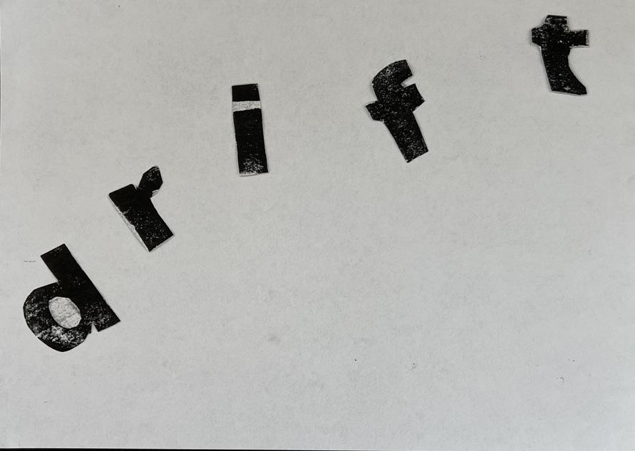
The 3rd project within Art 130 involved creating four typographic samples of the same word composed on sheets 8.5” x 11”, mounted or otherwise cleanly presented. For this project I used letters that the class and I carved out of linoleum. After deciding on the word I would be using for my typographic samples I created a mind map to figure out how I wanted to represent my word. The word I chose for this project was “drift”. There are a few different ways that the word “drift” can be used. Within each different print I tried to capture a different meaning.


Letterform sketches.
Anatomy of words.

By working with printmaking and the printer copier I learned how to represent a theme through the placement and modifications. This project helped me get an idea across through visual representation through how I edited my word. If I had more time to continue with my letterforms I would try to express my word through different variations of its meaning. One of my compositions in particular came across in different perceptions to others although I was trying to convey something else so I would have worked on that more closely although I do like when others perceive things differently.


These 4 compositions were my final variations of the project.
Iterative Illustration
My 4rth project within Art 130 was creating a digitally printed 12” x 18” black and white poster featuring six well-refined images of a subject. Those six must include: 1 continuous line iteration, 1 geometric iteration, 1 collage iteration, 1 typographic collage iteration, and 2 artist-inspired iterations. For my artist-inspired iterations Marcel Dzama, and Beatrix Potter. I chose to represent a kinkajou through this project. A kinkajou is a small tropical rainforest mammal. They are closely related to raccoons and are known as honey bears.

design.


Through this process I was able to collectively learn a lot more about kinkajous such as their diet, habitat, and a bunch of random fun facts. None of the media were challenging for me although it did take me a while to realize I didn’t need to color search when I was making my collage for my kinkajou and instead focus on values. My favorite media for this project was my first artist iteration of Beatrix Potter’s art work. I enjoyed anthropomorphising my kinkajou. I learned how to make a grid using indesign and that could be useful in the future if I continue to use adobe for formatting other projects. If I continued making different iterations of the kinkajous I might play around with the idea of kinkajous as “honeybears” and try to capture a kinkajou stealing some honey with its long tongue.

Here are some iterations that did not make it to the final


For this project I made lots of different variations of kinkajous through different materials and techniques. I found it quite hard to pick which illustrations to use in my final poster although for me the most difficult part of the project was choosing how I wanted to set up my poster. I was unsure of which of my pieces were stronger as they all had their strengths and flaws in my eyes. In the end I ended up keeping the hierarchy of the poster evenly so each kinkajou would be seen well. I balanced the placement through tree branches and value.


First draft of kinkajou poster.
Final version of kinkajou poster.
PSA Posters

The 5th project within Art 130 was creating a PSA poster based on a partner’s creative brief for the project. We each were able to come up with a PSA poster’s creative brief based on something we thought was a problem. My partner’s creative brief was based on cleaning up after oneself. Using the creative brief and what my partner preferred within my thumbnails I was able to create a poster to influence people to clean up after themselves.
CleanUpYourAct orDon’tBeMean, Come Clean
Help out housekeeping and other residents by cleaning up after yourself
This isnt housekeeping’s job to fix, it’s ours.
Contact: https://tinyurl.com/Keeping-school-clean

I didn’t find it difficult to work only with type although if other elements were allowed within the psa poster I’m sure things would be easier for me. I used the size of things to depict their importance and to show what I wanted my viewers to notice first. I was able to contrast my title by framing a black box behind white words which helped people see my poster from afar. This project helped me understand more about visual hierarchy especially when it comes to posters. It also helped me learn to navigate Indesign better.


First draft of poster.
PSA poster thumbnails.
Final version of PSA poster.
Who Designs
For this project we had to research a designer we were interested in. Dana Tanamachis work instantly stood out to me as it was something I have previously seen before through book covers. I also loved Tanamachis use of different mediums through her art. Not only does she work digitally but she can work with several traditional mediums.


Dana Tanamachi is a New York based artist and designer who opened her own studio, Tanamachi studio, which specializes in typography. She has been commissioned by many well known brands such as Google, Target, and Nike. I picked Tanamachi as my designer as her work is really evocative and it interests me. Her fonts within her work are always well thought out and match the aesthetic and tone of the piece.
Her career fortuitously started when she attended a friend’s party and started sketching with chalk. People at the party were amazed by her work and posted it on their social media. Desiron, a furniture company in New York saw the art through social media and got in touch with Tanamachi and commissioned her to design for them.


Dana Tanamachi typically works by computer first then she paints or uses chalk to draw her typography out traditionally. Her artwork is inspired by her own journey, and her family’s journey. She hopes by others looking at her artwork they are inspired as well, and are able to recognise their own journey and origins.
I’ve noticed within her typography she blends modern and timeless type from the past creating a unique and expressive typeface to get her ideas across. Tanamachi will also use different fonts within her work to better suit the message she is trying to get across. Within her typography compositions Tanamachi will incorporate designs into the background. For example in the composition above Tanamachi has drawn a cloud-like shape around some of the text while other words are mapped onto a ribbon. Small plants can also be seen in the negative space where there is no text. The small illustrations within her works background really bring attention back to the type based on how it’s all framed together.
Vocational Questions
Are you called to creative work? If so, how do you recognize that calling?
I do feel called to creative work in a way. Ever since I was younger I aspired to be a graphic novelist, or a children’s book illustrator. My aspirations changed as I grew older although they still centered around the idea of art. I’m currently in school to become an art educator. As I continue to pursue my career and grow as an artist my creativity develops deeper as well. I’m typically a very indecisive person but when I’m working within art I’m able to generate ideas quickly and convey my reflections through different mediums.
What, if anything, distinguishes art and design?
I consider myself an artist but not a designer. Art 130 helped me see things through the “eyes of a designer” although before this class I often did not consider the design of compositions. Art and design are often used interchangeably. The two concepts share similar visual principles such as color, line, and balance, however as much as both concepts are alike they are both in fact two separate things. Art is often used to express an idea and to evoke emotions. Design on the other hand is often used in order to solve a problem. Both art, and design can be used together as they often overlap but they aren’t the same thing.


Iris Ink and Pencil 2024
Tindra Acrylic on canvas 2024
Here are some of my recent compositions outside of Art 130.


Yebby Acrylic on canvas 2024
Perennial Dracas Ceramic Sculpture 2024
Conclusion
Each of these projects was intended for a specific purpose. When it came to the “Crash Course” project I was rushed to create a prototype of a solution to my partner’s problems. While creating this prototype I didn’t fully understand why I had a few minutes to solve a problem although now I can say that this project’s intentions were to help generate ideas and solve problems swiftly. This project ultimately helped me set up for the rest of Art 130s projects.
The “Dot Line” project was intended for me to be able to explore a concept (chaotic, exhaustion, and longing) depicting nothing but dots and lines without illustrating. This project helped me come to terms with gestalt, looking at a composition as a whole and not focusing on little details.
The intention of the “Letterforms” project was for me to explore different ways to express and get my ideas across using a word. For this project I used the word “drift” which has many different meanings. Through this project I was able to depict different meanings through various iterations.
The “Iterative Illustration” project had a similar purpose to the “Letterforms” project although instead of representing a word I was representing an animal. This project also gave me more insights of how hierarchy is important within a design although the “PSA Poster” project helped me understand this concept more.
The “PSA Poster” project’s intended purpose was to help me understand hierarchy when it came to designs. Through this project I was able to understand how placement and other elements help the development of a good poster without using any illustration. All of these projects have helped me as a student understand design better as a whole.