
2 minute read
Spec Sheet &Costing


Advertisement


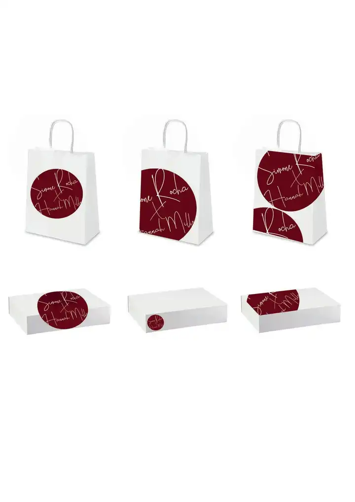
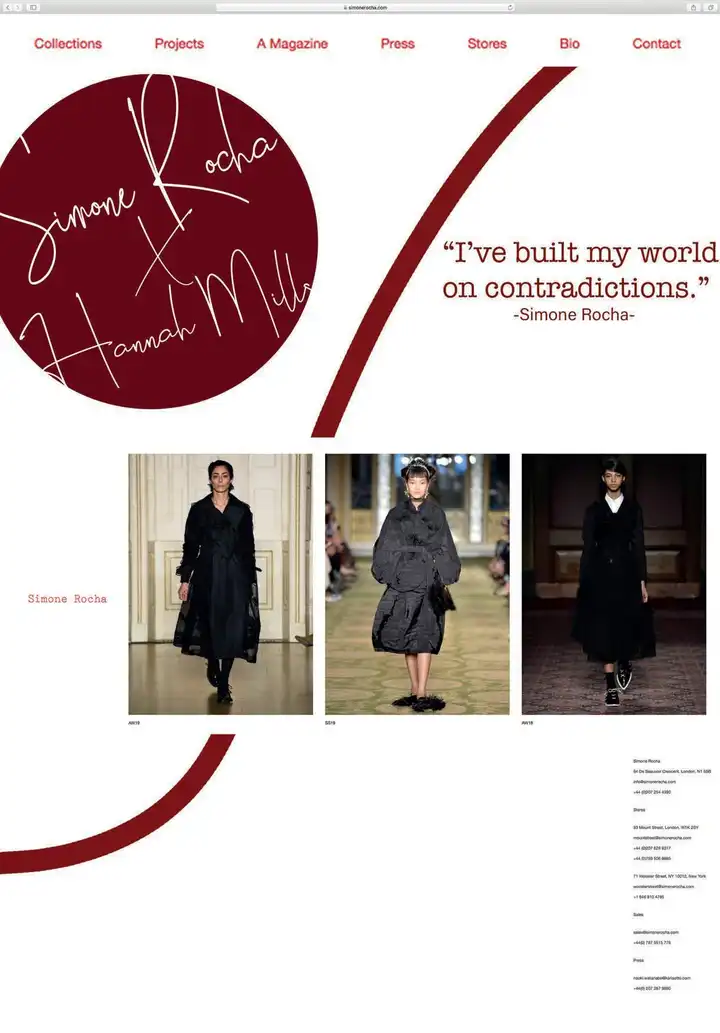
Final Logo, Tag &Packaging

For this project I was required to produce a digital Look Book in collaboration with a designer for Dover Street Market. The piece of work had to demonstrate my creativity, originality and understanding of digital tools. I decided to create my collection with Simone Rocha, because I felt it was the best fit with my own personal style.
To collect primary research, I went to the Dover Street Market store and had a look at Simone Rocha’s current collection. It was really interesting to see the collection in the store setting. Visiting the store and looking at the point of sale display, helped me to pick up on key themes within the collection. This including the colour red, which was very prominent in Simone Rocha’s work, along with other designers in the store. This inspired me to make this a running theme throughout my Look Book. It was also good to see Simone Rocha’s competitors throughout the store and the target customer profile. This allowed me to gauge where the brand position was placed for sale.
I gained secondary research by following Simone Rocha’s social media platforms and by looking at her website. By following Instagram specifically, I could identify social media influencers, which had also tagged the brand. This allowed me to very quickly distinguish the target market group for the brand and put into place an influencing figure for the project.
After researching the brand and looking at WGSN, I decided on the concept for my project to be based on ‘Modern Renaissance.’ I thought that this would be a very good fit for Simone Rocha as a brand, my own personal style and also the rebellion towards the technology which is increasingly part of our lives today. I tried to communicate this idea mainly through the prints that I designed. I think that this worked quite well, although I might have used more obvious garment silhouettes to more clearly communicate the theme.
I have tried to present my work in a way, which is coherent throughout and works well with my chosen theme and brand. I feel that I have successfully done this throughout most of my portfolio, although I think that the theme may have lost some focus in my print section. I struggled to lay the prints out in a way, which was interesting but didn’t detract from them. I also don’t think that all of them fitted well with the overall theme. I could improve this by allowing myself more time, to produce surface designs.
Before starting this project, I had very little digital experience and felt that it was a weaker skill set of mine. I particularly enjoyed learning how to create fashion illustrations. It was something I would have had no idea how to do before and I am really proud of the illustrations I produced. I feel that I organised the project reasonably well, although towards the end of the project, I wished that I had allowed more time to produce the fashion illustrations and prints. The fashion illustrations in particular, were difficult to produce to a high standard and I would have liked to have spent more time perfecting them. In the future, I will try to plan extra time to allow for harder sections of project work. This would allow me to spend more time using more technical skills, for example creating brushes.
