PORTFOLIO
Elizabeth Putnam Selected Works


Lizzieputnam44@gmail.com 913.9079380
Hello! I am currently a fifth year in the M. Arch program at the University of Kansas. I am currently in Studio 804 and I have always been passionate about art and design. I am excited to design comfortable and beautiful spaces for the community.

Blue Valley School District
1st Place EKL Award Handbuilt Ceramic Piece
1st Place EKL Award in Photography Challenge 2nd Place EKL Award Film Photograph
University of Kansas
Professor nilou.vakil@ku.edu
Nilou Vakil Anne Patterson
Professor anne.patt@ku.edu Ann Hossler
Professor ann.hossler@ku.edu
2017 Fall Class Honor Roll
2017 Spring Class Honor Roll
2018 Fall Honor Roll
4th Year Portfolio Finalist
August 2017May 2023
University of Kansas
Master of Arts in Architecture Cumulative GPA // 3.85 Expected May 2023
Study Abroad in Costa Rica December 2021January 2022
Studio 804 Acceptance
The Univeristy of Kansas
Acccepted into 2022 - 2023 Studio 804
multistudio (formerly gouldevans)
Architectural Intern Summer 2022
BRR Architecture
Architectural Intern Summer 2021
Electrical Corporation of America
BIM Modeling Intern Summer 2019
August 2017May 2023
University of Kansas Architectural Mentor Spring 2021
- Assist first year students and studio professors with their needs regarding different adobe and modeling softwares.
- Attended reviews and provided feedback on their projects.
- Supported first year students as they adjusted into architecture school.
Starbucks
Certified Barista Summer & Fall 2020
- Advanced communication skills by creating connections with co-workers and customers.

Architectural Studio 608
Lead by Nilou Vakil Partnered with Bridgett Espino
Pages 5 - 32
Architectural Studio 208
Lead by Gregory Crichlow
Pages 33 - 42
Architectural Studio 609
Partnered with Bridgett Espino
Lead by Nilou Vakil Pages 43 - 68
Partnered with Bridgett Espino Lead by Nilou Vakil Studio 608
10 E 6th St. Lawrence, KS 66044
Environmental, social, and economic ties are critical aspects of urban design. Our design addresses the environmental aspects of Lawrence, Kansas through the Tallgrass Discovery Center and Farmers Market that intertwines people with nature. The social aspect is addressed by creating a space for people to learn, gather, and reside through open workspaces, active courtyards, and apartments. Providing spaces for local businesses to expand and grow within the community ties into the economic growth of the city
In response to the agricultural background of Kansas, we plan to incorporate a discovery center that features several educational areas and an opportunity to learn more about the natural elements of Kansas. Located south of downtown Lawrence, the Baker Wetlands features walking trails, lookouts to the beautiful scenery, and educational opportunities to learn about the prairie creatures and wetlands. As the sun rises over the prairie, layers of fog rise above the wetlands. The feeling of being intertwined between fog and fields creates a tranquil experience unique to Lawrence, Kansas. This phenomenon inspired the site design around the Tallgrass Discovery Center. We intend to create a layering effect with fog and prairie grass throughout our softscape to create a similar experience. The water and mist elements will be placed along the north side of the site and will pay homage to the stunning scenery at the Baker Wetlands. Visitors are welcomed with these unique Kansas elements that work together to create a natural gateway; a gateway that is not tangible but is a sense of place.

Considering the site location when designing can bring about important connections with the community and also gives the building a sense of place in that location. The state of Kansas is regarded as an agricultural and farming state to many individuals, and it has been for decades. When leaving any major city in Kansas, it is likely that you will be driving through farmland. Farmland surrounds most, if not all, of the cities in Kansas. It is not unlikely to see old, rusted farm equipment entangled within wheat fields and cattle. Through the Industrial Revolution, new equipment and technology was integrated into the agricultural realm and brought
into Kansas. In Lawrence, the core of industrialization was focused along the Kansas River. Our site, located on Sixth Street and Massachusetts street, adjacent to the Kansas River, aims to respond to the industrialization and agricultural background of Kansas. Our intention with the design is to bring in materials that reflect these thoughts. We intend to use perforated corten steel to reflect off the rusted charm of old farm equipment found in Kansas fields. Steel structure will be used to respond to the existing surrounding context and will be used to reference its use in the Industrial Revolution.

Freestate Brewing Co.
La Prima Tazza Liberty Hall
City Hall
Starbucks & Coldstone Winfield House
Silver Lake Bank Deciphera Pharmaceuticals
Black Stag Brewery
Globe Indian Food


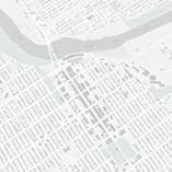


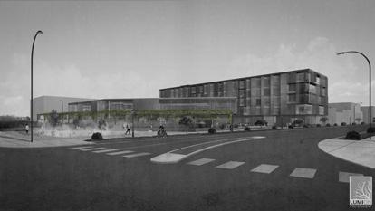
Massachusetts street is dynamic and full of life, and unfortunately, this activity tends to fade away as you approach Sixth street and the Kansas River. We intend to bring the dynamic character to Sixth and Massachusetts street by increasing transparency and incorporating movable elements in our design. There is a strong datum line of transparency along Massachusetts street that will be continued. Incorporating moving elements throughout the facade would allow the building to

bring life and movement to the site. The movable elements of the building echoes the movement of activity that will be taking place on the ground level. These movable elements allow for residents to customize their space. The discovery center’s facade faces the most used intersection in Downtown Lawrence. Turning the facade to face the 6th and Massachusetts street intersection, attracts visitors to enjoy the vibrant gateway.

The existing conditions resemble the rest of Downtown Lawrence, with a large vacant massing
The existing conditions resemble the rest of Downtown Lawrence, with a large vacant massing


This creates more space for businesses and two large active alleyways, and a sense of relief at the North side of Mass St.
This creates more space for businesses and two large active alleyways, and a sense of relief at the North side of Mass St.

Pushing the Northernmost breathing room and the building’s to the gateway
Pushing the Northernmost breathing room for and the building’s facade to the gateway
businesses and two relief at the
and two relief at the
Pushing the Northernmost building in allows breathing room for the new gateway to Lawrence, and the building’s facade can serve as a backdrop to the gateway
Pushing the Northernmost building in allows breathing room for the new gateway to Lawrence, and the building’s facade can serve as a backdrop to the gateway
Designing the courtyards with active elements encourages activity from pedestrians and fills the space with life
Designing the courtyards with active elements encourages activity from pedestrians and fills the space with life


We wanted to reflect the beauty of Baker Wetlands into our design, inspired by the layered scenery of a morning in the wetlands. Our first layer, the public courtyard, steps down into a water feature that consists of fog, which directly relates to the layer of fog seen at Baker.
The second layer consists of large planters with prairie grass which emulates the Tallgrass Prairie seen at the Baker Wetlands and all throughout western Kansas.
The third layer echos the treeline seen at the Wetlands. In our design, this layer is very active and serves as a space to host the Lawrence Famers Market, Art Festival, along with many other local events.
The fourth and final layer is the building backdrop, the use of Corten Rusted Steel paneling reflects the warm hues of the sunrise and sunset at the Baker Wetlands.



SCALE: 1’ = 1/160”


LEVEL ONE PLAN
FIRST FLOOR PLAN
SCALE: 1’ = 1/32”
1ST FLOOR PLAN 1 2 3 4
Visualization 21,076 SF Market 5,522 SF
Total Area:
Butterfly Sanctuary 795 SF Greenhouse 887 SF Service 667 SF
Mechanical 238 SF 5
TALLGRASS APARTMENTS
Total Area:
TALLGRASS DISCOVERY CENTER & MARKET 72,426 SF
1ST FLOOR PLAN 1 2 3 4

Open Retail Spaces approx. 866 SF
Coffee Shop 676 SF Residence Lobby 3,126 SF Waste Room 82 SF
Service 120 SF 5
Mechanical 250 SF 6
Bike Storage 225 SF 7
Mail Room 225 SF 8
COMBINED TOTAL 93,502 SF
C


LEVEL TWO PLAN
SCALE: 1’ = 1/32”
Visualization 21,076 SF
2ND FLOOR PLAN 1 2 3
Discovery Center 5,628 SF Greenhouse 1,710 SF
Open Work Space 903 SF
TALLGRASS APARTMENTS
Total Area: Total Area:
TALLGRASS DISCOVERY CENTER & MARKET 72,426 SF
2ND FLOOR PLAN 4 5 6 8

Shared Media Room 877 SF Small Group Room 90 SF Waste Room 82 SF
Residence Gym 2,844 SF 7
1 Bed 1 Bath 541 SF
2 Bed 1 Bath 1,005 SF 9
2 Bed 2 Bath 1,079 SF 10
2 Bed 2.5 Bath 1,153 SF 11
3 Bed 3 Bath 1,584 SF 12
COMBINED TOTAL 93,502 SF

Visualization
LEVEL THREE - FIVE PLAN
SCALE: 1’ = 1/32”
TALLGRASS APARTMENT
Total Area:

THIRD - FIFTH FLOOR PLAN 72,426 SF

3RD - 5TH FLOOR PLAN 1 2 3 4
Shared Media Room 877 SF Small Group Room 90 SF
Waste Room 82 SF
1 Bed 1 Bath 541 SF
2 Bed 1 Bath 1,005 SF 5
2 Bed 2 Bath 1,079 SF 6
2 Bed 2.5 Bath 1,153 SF 7
3 Bed 3 Bath 1,584 SF 8
COMBINED TOTAL 93,502 SF
C


Residential

Tallgrass


SCALE: 1’ = 1/32”
SCALE: 1’ = 1/32”


SCALE: 1’ = 1/32”
Residential Roof
71’ - 0”
Level 5 50’ - 0”
Level 4 38’ - 0” Level 3 26’ - 0” Level 2 14’ - 0” Level 1 0’ - 0”

SCALE: 1’ = 1/32”
Residential Roof
71’ - 0”
Level 5 50’ - 0”
Level 4 38’ - 0” Level 3 26’ - 0” Level 2 14’ - 0”
Level 1 0’ - 0”


Lead by Gregory Crichlow Studio 208 1047 Massachusetts St. Lawrence, KS 66044
In order to activate this lot and draw attention to the people who occupy Downtown Lawrence, the display needed to be strategically placed. To me, the most interesting display would be active and should show the craftsmen and builders designing and creating bikes in the workshop. The display features large open windows, facing the 11th and Massachusetts intersection, to allow an outside viewer to see and watch bikes being made and tested on the fit machines as an active display. The western side of the building does have all of the retail space and more public areas. Individual private offices are placed in the back of the bike shop. The overall form was inspired by the movement and transportation patterns recognized along historic Massachusetts street.


Given that the structure would be placed on a corner lot, diagonally across the street from Syla’s and Maddie’s; I figured that the most interesting display would be craftsmen and builders designing and creating bikes in the workshop. Large open windows allow an outside viewer to see and watch bikes being made and tested on the fit machines as a form of display. Individual offices are placed in the back of the bike shop. The overall form was inspired by the movement patterns recognized along historic Massachusetts street.


 East Section
East Elevation
The spatial inspiration is shown in the elevations, sections, floor plan, and roof plan. The design was influenced by the movement patterns observed on the site. When studying the site map, there was a sense of unity within the rooftops of the buildings on Massachusetts Street. Although there were many varying sizes of buildings, every building was rectilinear which created a very static environment. The uniformity within the main roadways, sidewalks, alleyways, and bike paths really stood out to me. The structure was created from the intersecting lines and shapes experienced on the existing site. Intersecting lines created walls and the rectangular shapes created ceilings and shading systems. Although the site was very static and the design was driven by this, the final design results are still very dynamic.
Scale:


The intersecting planes that created the interior spaces were then spatially organized. The desire to get people into the store would be the deciding factor of the interior organization. The building design had no logo or symbol, therefore, having the display face
Massachusetts street would be ideal. Massachusetts street is very kinetic, with people walking, talking, driving, biking, running, and sitting all along the sidewalks and intersections of the main street. So it was fitting to create a display that matched this kinetic environment. Therefore, the workshop would serve as a display showing the bike designers creating custom bikes.
North Elevation
North Section
Scale:


Partnered with Bridgett Espino
Lead by Nilou Vakil Studio 609 - Current Project
2400 Quebec St. Denver, CO 80207
Colorado is a beautiful state known for its breathtaking views and diverse landscapes. The Rocky Mountain Range, the Great Sand Dunes, deep rivers, bright canyons, and sweeping valleys make up this environmentally diverse state. Within Colorado’s landscape, there are numerous mountain ranges and valleys. These valleys have rivers that sculpt into the earth. It is a difficult journey for the water to carve into the rock. Likewise, the visually-impaired population has a difficult journey navigating through a world designed for the visually capable. These people face unique challenges foreign to the rest of the world. Yet, despite the challenging circumstances, they are able to carve beautiful pathways through their lives. A school emphasizing reliance on the senses other than sight will facilitate as well as enrich their learning experience.

QuebecStreet QuebecStreet
23rdAvenue FOUNDERS CIRCLE SITE
SyracuseStreet
Walking Paths CENTRAL PARK 1 Minute Radius 3 Minute Radius
WALKABILITY DIAGRAM 5 Minute Radius


KEY

The Central Park neighborhood has done what it can to push people to ride more bikes when possible by incorporating bike lanes on many of the main roads. The neighborhood has done what it can to incorporate different bus routes and stops, as well as made its sidewalks wider and more pedestrianfriendly.


ITERATION ONE ITERATION TWO


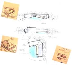

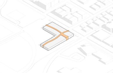
Form opens up towards Fred Thomas park and allows connections with the existing trails and other park amenities.
Strong circulation carves through the building, breaking up the public and private spaces.

Differentiating spaces by varying heights. Recessed entries highlight the access points into the building. Learning nooks pulled up.


- Egress Paths
- Elevator Egress
- Main Circulation
- Egress Paths


- Elevator Egress
- Main Circulation

Red Rock Elementary School
Scale: 1” = 40’ - 0”


Red Rock Elementary School

Scale: 1” = 40’ - 0”
Gym Music Room
Art Room
Auditorium Library Mechanical Room Restroom Kitchen Cafeteria Reception & Faculty Rooms
Electrical Room Light Sensory Room Garden Sensory Room Storage Room Classroom Modules

Red Rock Elementary School
1

Scale: 1” = 40’ - 0”
Library

Materiality & Color Shaping Spaces Wayfinding throughout Space


Sensory Room with Texture Wall, Braille Trail & Object Wall
Color Shaping Important Spaces Cubbies Built into Wall
Materiality & Color Shaping Spaces Storage Tucked into Wall
Sensory Room with Color Glass Wall Braille of Colors
Rammed Earth Textured Hallway Wall Transparency from Hallway


SCALE: 1” = 20’ - 0” 20’ 10’
SCALE: 1” = 20’ - 0”


SCALE: 1” = 20’ - 0”


Nilou Vakil Anne Patterson Professor anne.patt@ku.edu Ann Hossler Professor ann.hossler@ku.edu
Professor nilou.vakil@ku.edu