2 minute read
IN THE SHADE


Colour is a fabulous way to transform a home’s look and feel. In this special, we look at Little Greene’s latest collection and, over the page, meet the design team brightening up properties
Designed to make choosing colours a pleasure and intuitive for the user, Little Greene’s two new colour cards bring together the best of its capsule collections. It showcases 196 colours in a new format, presented together, providing customers with a refined and refreshed ‘Colours of England’ collection alongside an expanded range of graduated shades in the new ‘Colour Scales’ offering.
Advertisement
With confidence in colour central to the Little Greene ethos, the new cards span over 300 years of historic interior design and include many authentic 18th, 19th and 20th century shades. These historic colours are presented alongside a carefully adjusted palette of contemporary shades, embracing modern interior design aesthetics and current decorating trends.
The new ‘Colours of England’ card has been updated to meet the growing desire for classic, timeless colours that are both simple to choose and a joy to live with. The collection includes many significant shades from all over the British Isles that have contributed to the internationally renowned style of ‘English Interior Design’.
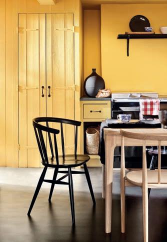
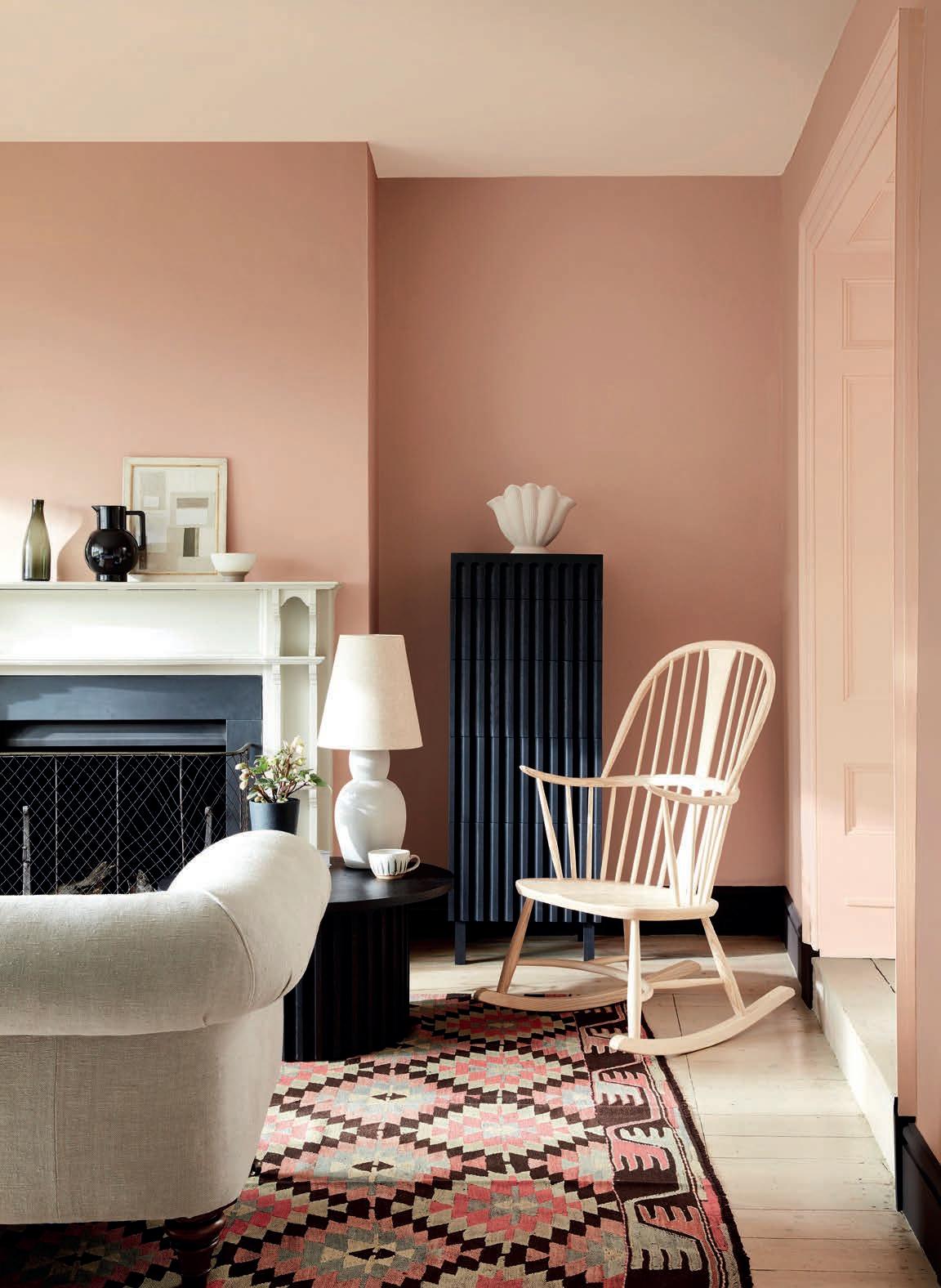
Ruth Mottershead, Marketing Director for Little Greene, says: “Alongside the cherished Little Greene signature colour palette, it is wonderful to be able to introduce new colours that celebrate the desire for warmth and joy such as ‘Indian Yellow’ named after the traditional oil pigment used by fine artists, ‘Bassoon’ with its deep-ochre undertone, and ‘Giallo’, an uncompromising, yet very easy-to-use, burst of golden sunshine. These bold and charming yellows illustrate our desire to return to warmth without regressing to cream. The punchy new yellows are accompanied by a host of new colours that include gentle powdery pink ‘Masquerade’, rich and charismatic charcoal grey ‘Vulcan’, the beautiful and inviting new midstrength blue ‘Etruria’ and ‘Silent White’ – the answer to the everlasting quest for the perfectly balanced, calming and elegant neutral-warm white.
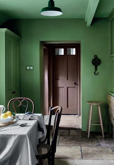
“The neutral trend for 2021 continues subtly away from cold greys and traditional country creams, towards neutral stone tones, complex greys and nature’s favourite: green,” she continues. “By providing these soft tonal colours in families we can offer a subtle spectral range that consumers can combine with confidence. The lightest four shades work beautifully to add discreet depth to a room, softly defining characterful architectural features, or reducing the contrast of walls and ceilings, which might be subjected to different light levels. The deeper shades can be used to complete a coordinated, harmonious scheme that, whilst monochromatic in hue, makes a strong statement with an expansive depth of colour.”