

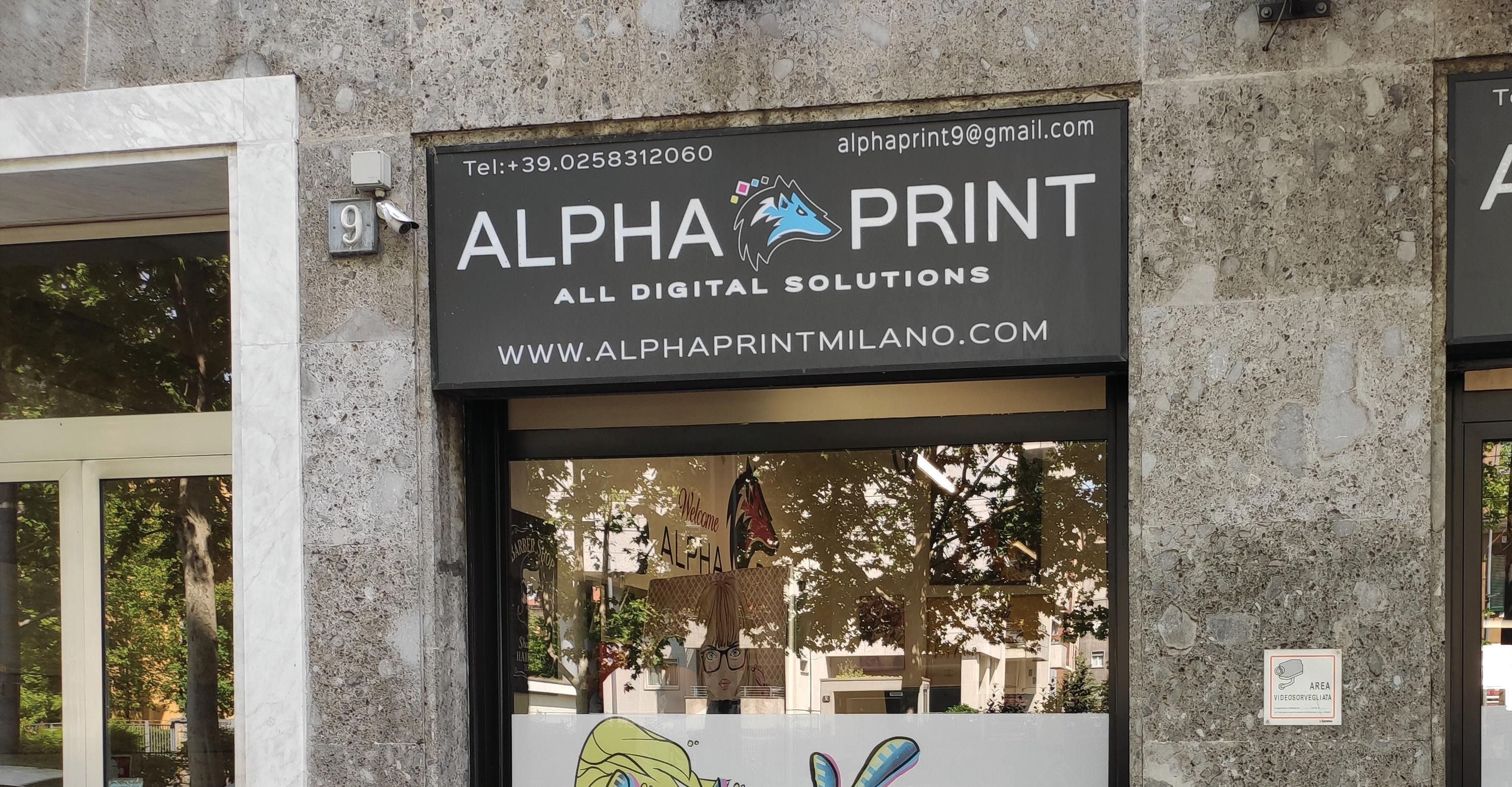
Welcome to my portfolio. My work, enriched by my experience at Alpha Print company, showcases a harmonious blend of technical skill and creative flair across various mediums. Each piece is a testament to my dedication to learning and excellence, reflecting a journey that spans from precise engineering to the artistry of digital design.
With an academic foundation from the Politecnico di Milano and a rich professional background, I have cultivated a unique expertise straddling the domains of architecture and graphic design. Over eight years, my journey has led to the cofounding of Alpha Print, where I synergized digital design with cutting-edge printing technologies. This dual capability allows me to offer comprehensive solutions that enhance architectural and brand presentations with aesthetic and functional finesse. My dedication to pushing the boundaries of design and technology manifests in a portfolio that spans from intricate architectural renderings to vibrant graphic designs, each project underscoring my commitment to exceeding client expectations. I possess a deep understanding of visual communication, adept in creating impactful designs that resonate across diverse media. My skills range from precise technical drawings and 3D modeling to creative problem solving and project management, ensuring excellence in every aspect of production. Proficient in a suite of design software including Adobe Creative Suite, AutoCAD, and Revit, I bring projects to life with precision and creativity. As a professional who thrives on innovation and detail, I continually seek to set new standards in design and printing, aiming to deliver not just solutions, but visionary projects that define the cutting edge of the industry.

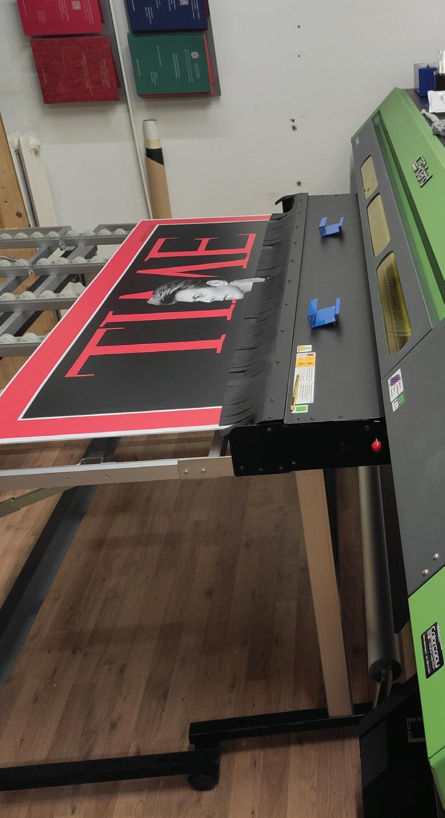
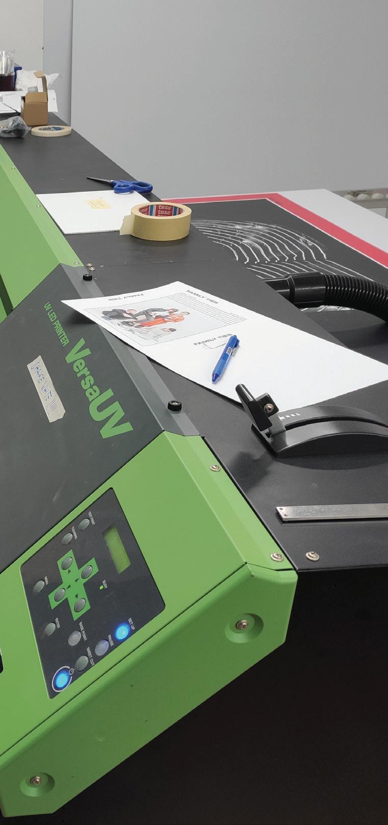
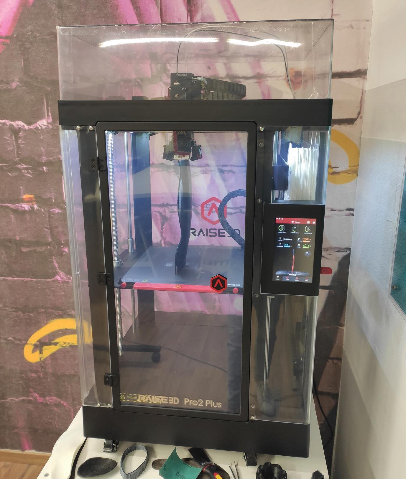
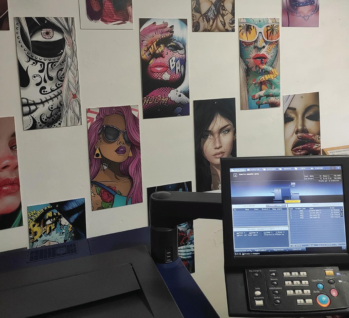
My experience with Alpha Print has been incredibly formative, providing me with all the essential knowledge of the printing world in its various forms, including digital, typography, 3D printing, and more.
I am eternally grateful for this experience, as it has shaped my understanding and expertise in the printing industry. The comprehensive training and exposure to diverse printing technologies at Alpha Print have been invaluable, contributing significantly to my professional development and skills acquisition.
I cannot overstate the impact this experience has had on my career trajectory, and I remain deeply appreciative of the opportunities and insights gained through Alpha Print..

In the realm of 2D graphic design, the principle that “Good design is as little design as possible” encapsulates a philosophy that prioritizes simplicity, clarity, and user experience over ornate and complex visuals. This approach, deeply rooted in minimalism, emphasizes the essential elements of a design by stripping away all unnecessary components.
The core of this philosophy lies in the understanding that each element in a design should serve a purpose. Good design is not about embellishing with unnecessary adornments, but about creating a clear, uncluttered visual message. It’s about reducing the design to its most effective form, ensuring that every line, color, and shape serves a direct function.
In practice, this means favoring simplicity in layouts, using a limited color palette, and choosing typography that enhances readability. It’s about creating a hierarchy of information where the most critical elements are immediately visible and comprehensible to the viewer. This
minimalist approach does not imply a lack of creativity; rather, it challenges the designer to express a message or a brand’s identity in the most straightforward and impactful way possible.
Moreover, this principle is not just an aesthetic choice but also a functional one. In a world where we are constantly bombarded with information, a design that communicates its message quickly and clearly is more likely to engage and be remembered by its audience. It respects the viewer’s time and attention, providing them with a pleasing and effective visual experience.
In conclusion, embracing the idea that “Good design is as little design as possible” means understanding the power of simplicity in 2D graphic design. It’s about focusing on the essentials, removing redundant elements, and creating designs that are both aesthetically pleasing and functionally effective. This approach not only makes a design stand out in its clarity and purpose but also ensures that it is accessible, memorable, and impactful.
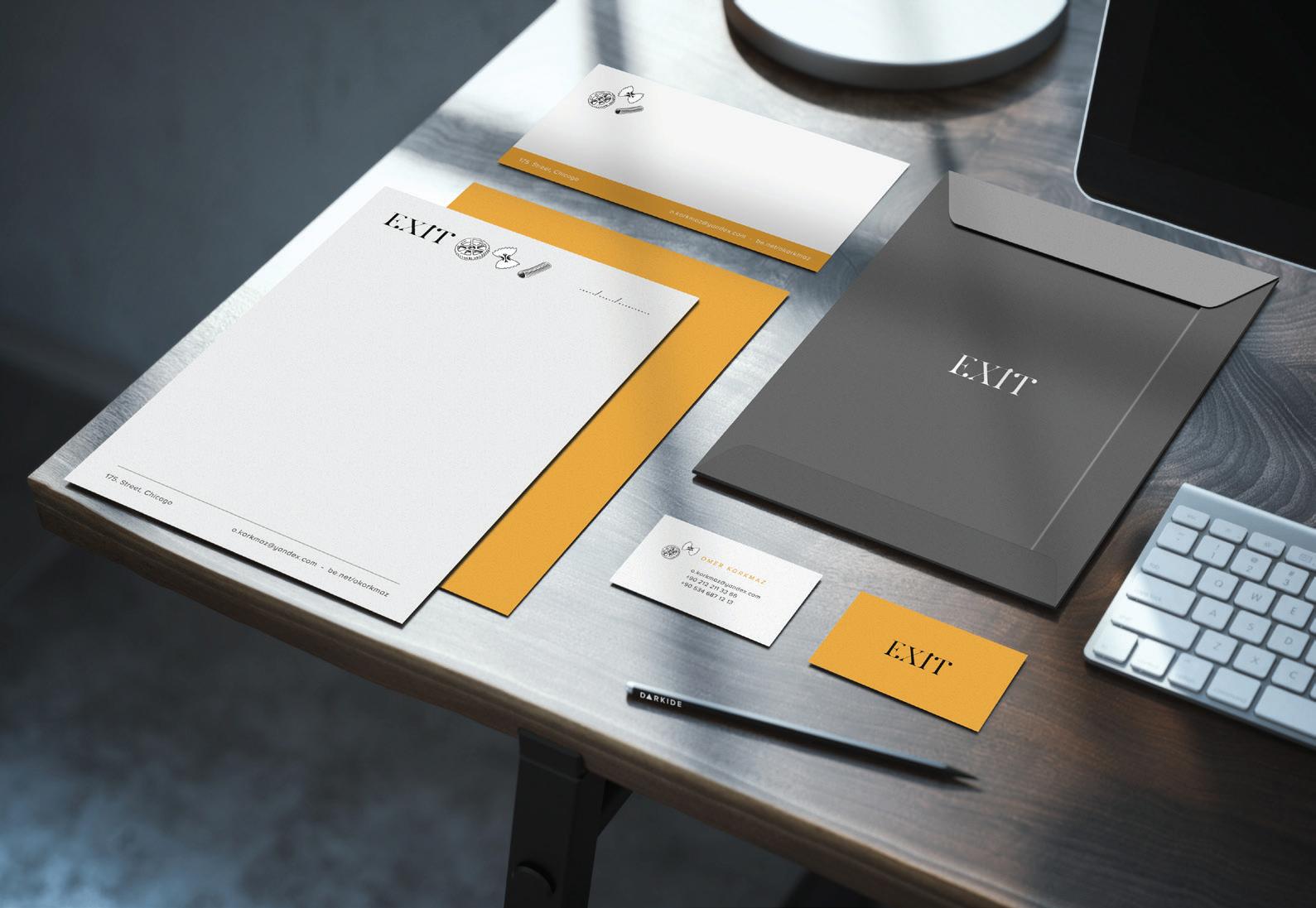



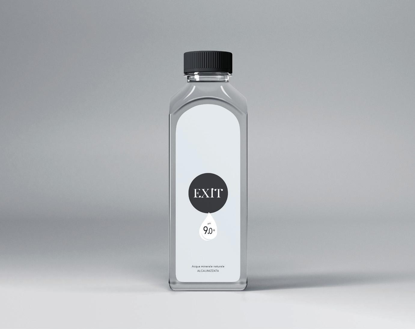
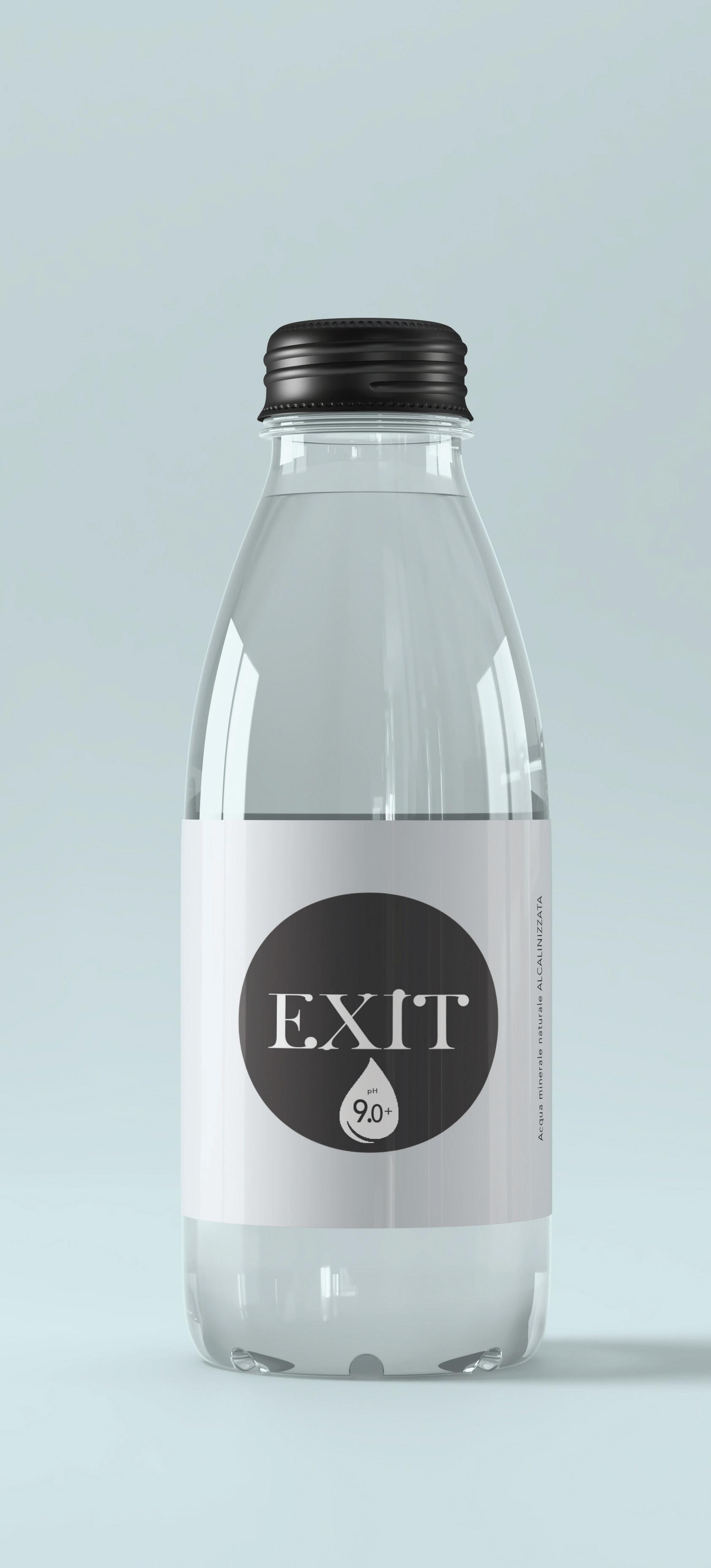
As part of my project for EXIT, a restaurant factory, I developed three distinctive water bottle designs to showcase the uniquely alkalinized water produced by their specialized device. The first design is a compact glass bottle, topped with a black cap, featuring a sleek, circular label that bears the EXIT logo and the water’s pH value. The label’s stark black and white colors stand against the bottle’s clarity, reflecting my intent for a simple yet sophisticated presentation.
For the second bottle, I chose a more elongated and elegant glass shape, which upholds the brand’s minimalist ethos with a consistent label design. The EXIT logo and pH indication are prominently displayed, embodying the premium quality of the water.
Moving to a different material for the third design, I created a plastic bottle with a pragmatic yet stylish flat profile. It sports a larger label that continues the minimalist black and white theme and includes additional descriptive text beneath the logo. This design aims to cater to a more casual setting, without compromising the refined image of EXIT’s brand.
Together, these bottles represent my vision for EXIT’s brand identity—sophisticated, clean, and focused on the unique selling proposition of their alkalinized water, tailored for a variety of dining contexts and customer preferences.



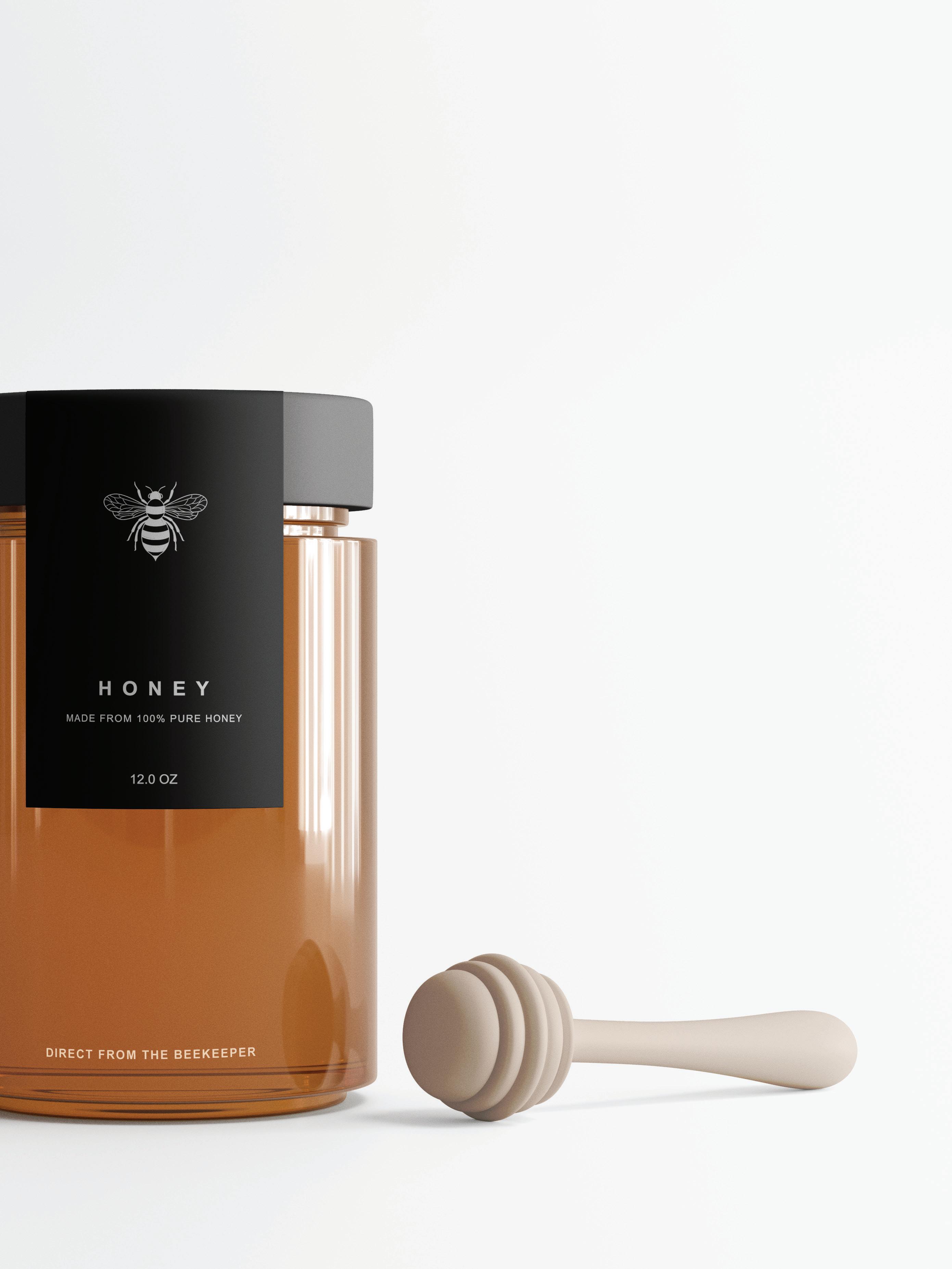
The image displays a sophisticatedly designed honey jar, which speaks to the ethos of M. Bio E-Tech FARM, a company evidently proud of its beekeeping activities and the pure honey their bees produce. The jar, a transparent container filled with golden honey, is capped with a sleek black lid that complements the modern minimalistic label wrapped around it. The label bears the word “HONEY” in bold, signaling the product’s natural origins, followed by a subtitle “MADE FROM 100% PURE HONEY” which emphasizes its purity and quality. The quantity “12.0 OZ” is clearly stated, indicating the volume of honey within.
Below, in smaller font, “DIRECT FROM THE BEEKEEPER” is a testament to the honey’s source, ensuring consumers of its authenticity and the care taken in its harvesting. The centerpiece of the label is a stylized bee illustration, which not only serves as a brand identifier but also as a tribute to the creatures responsible for the product. The image is complete with a honey dipper lying next to the jar, its wood material and natural color suggesting a handcrafted tool for serving the honey.
The overall design of the jar and the presentation of the image reflect an ecoconscious brand that values not just the quality of its product but also the environmental impact of its production. The clean background and professional photography underscore the premium nature of the honey, inviting consumers to indulge in the rich, sweet product while supporting a company that is aware of and engaged in the current ecological challenges bees face.



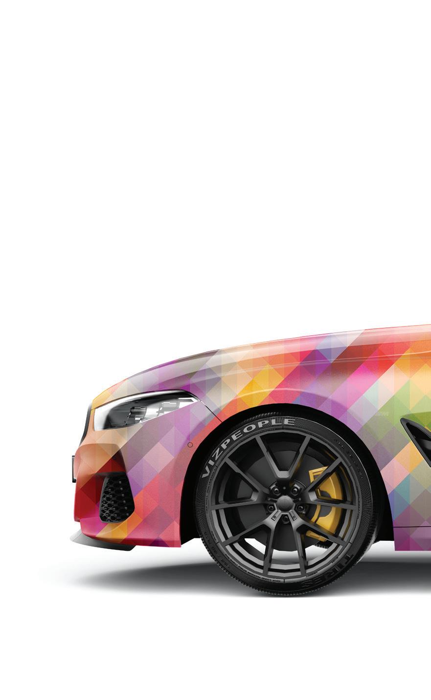
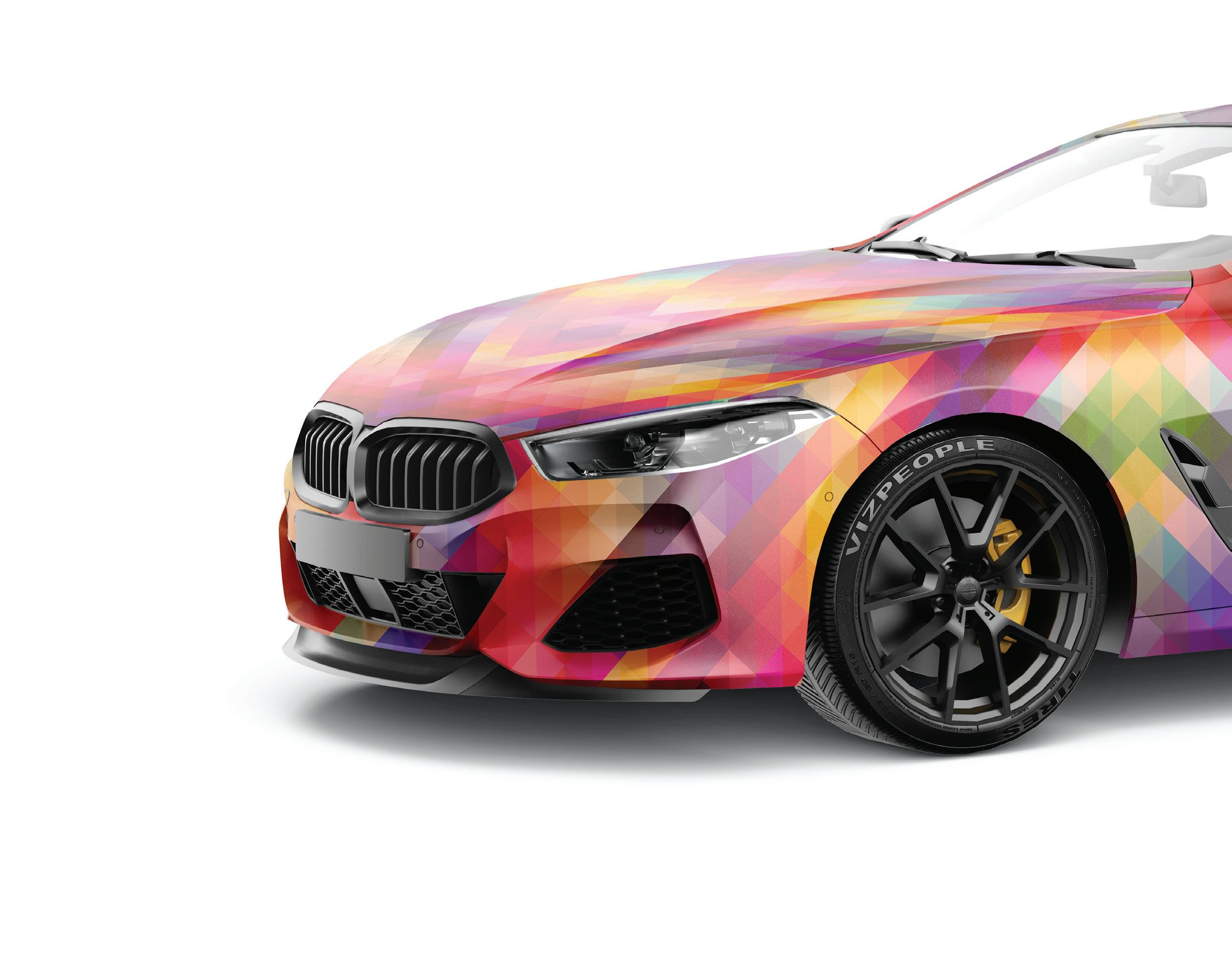
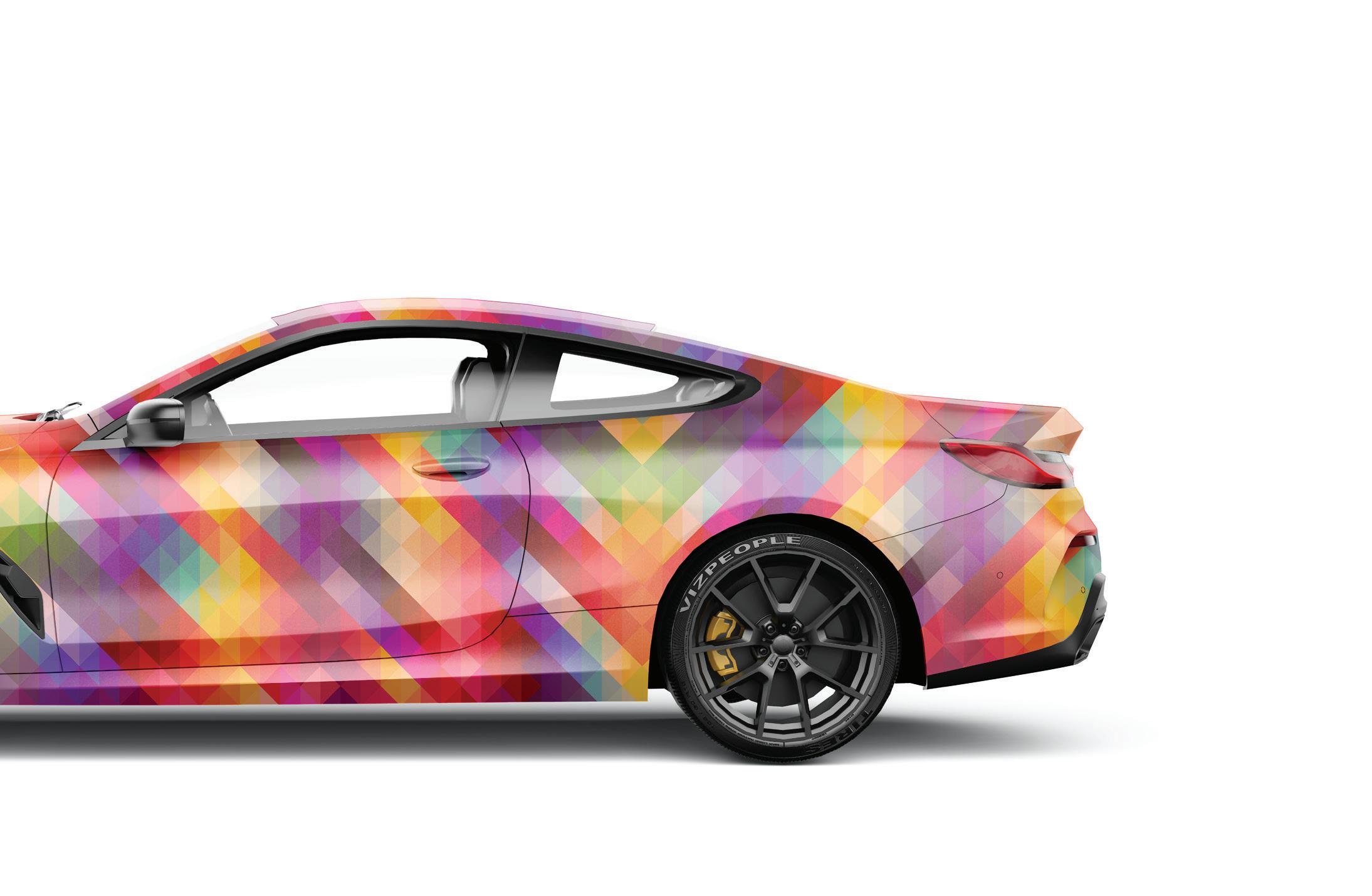
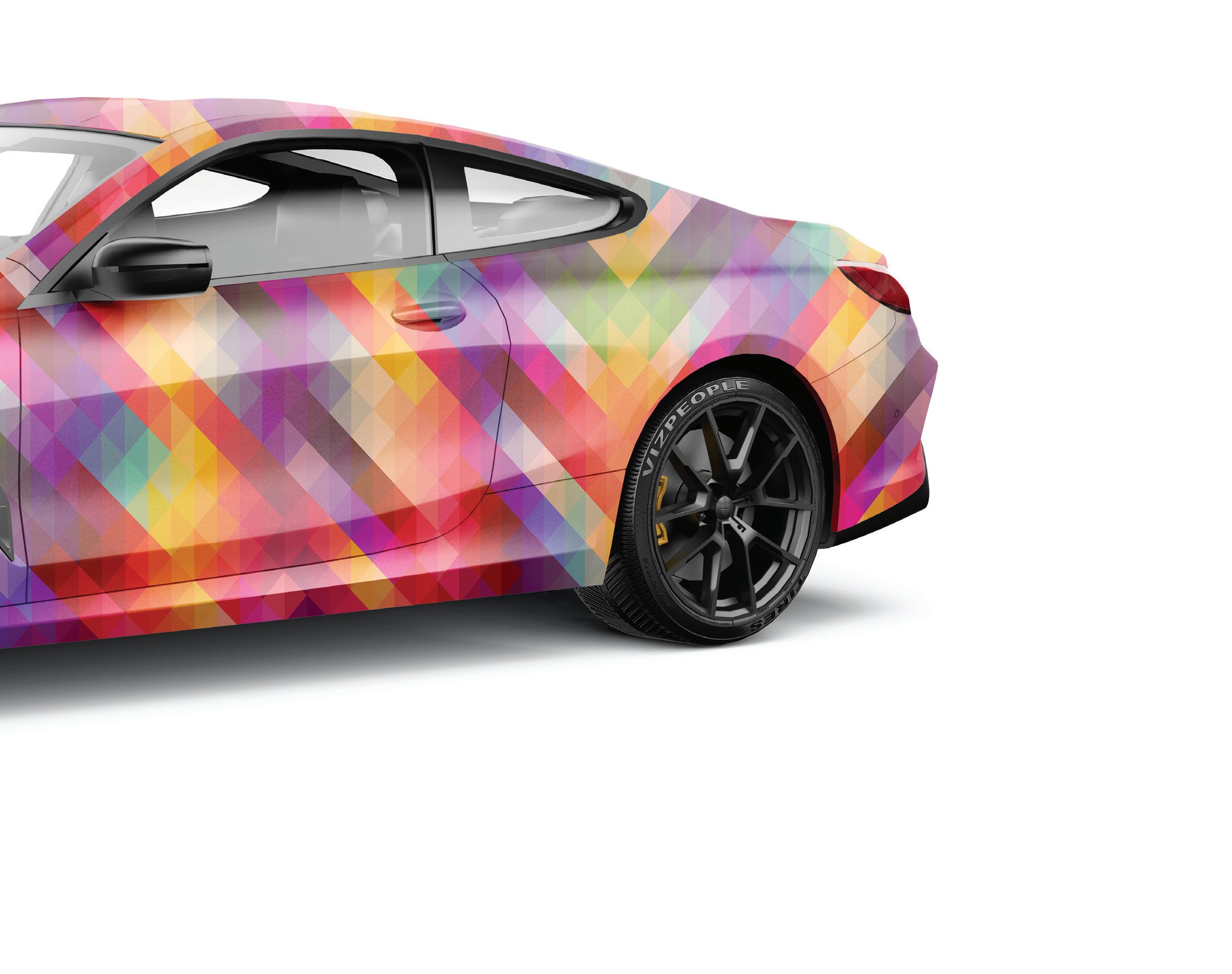
This image presents a modern sports car with a striking abstract design, featuring a kaleidoscope of geometric triangles in a full spectrum of colors. The car’s dynamic stance is enhanced by its aerodynamic contours, sharp lines, and sleek, tapered windows. It sits on bold black multi-spoke wheels, underscoring its performance-oriented nature. The rear view accentuates the slim, integrated taillights and hints at a powerful engine, indicated by the dual exhaust outlets. Set against a stark white background, the vehicle’s vibrant colors and design make it a standout piece
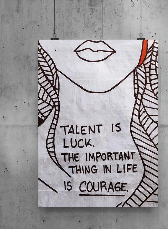
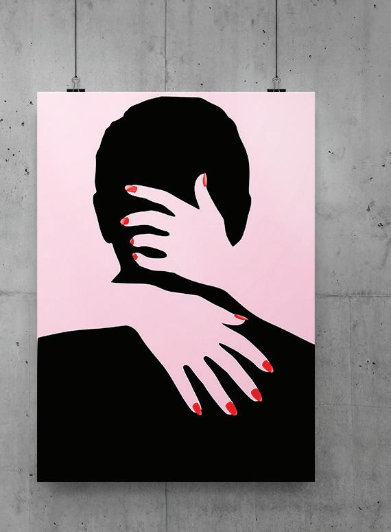
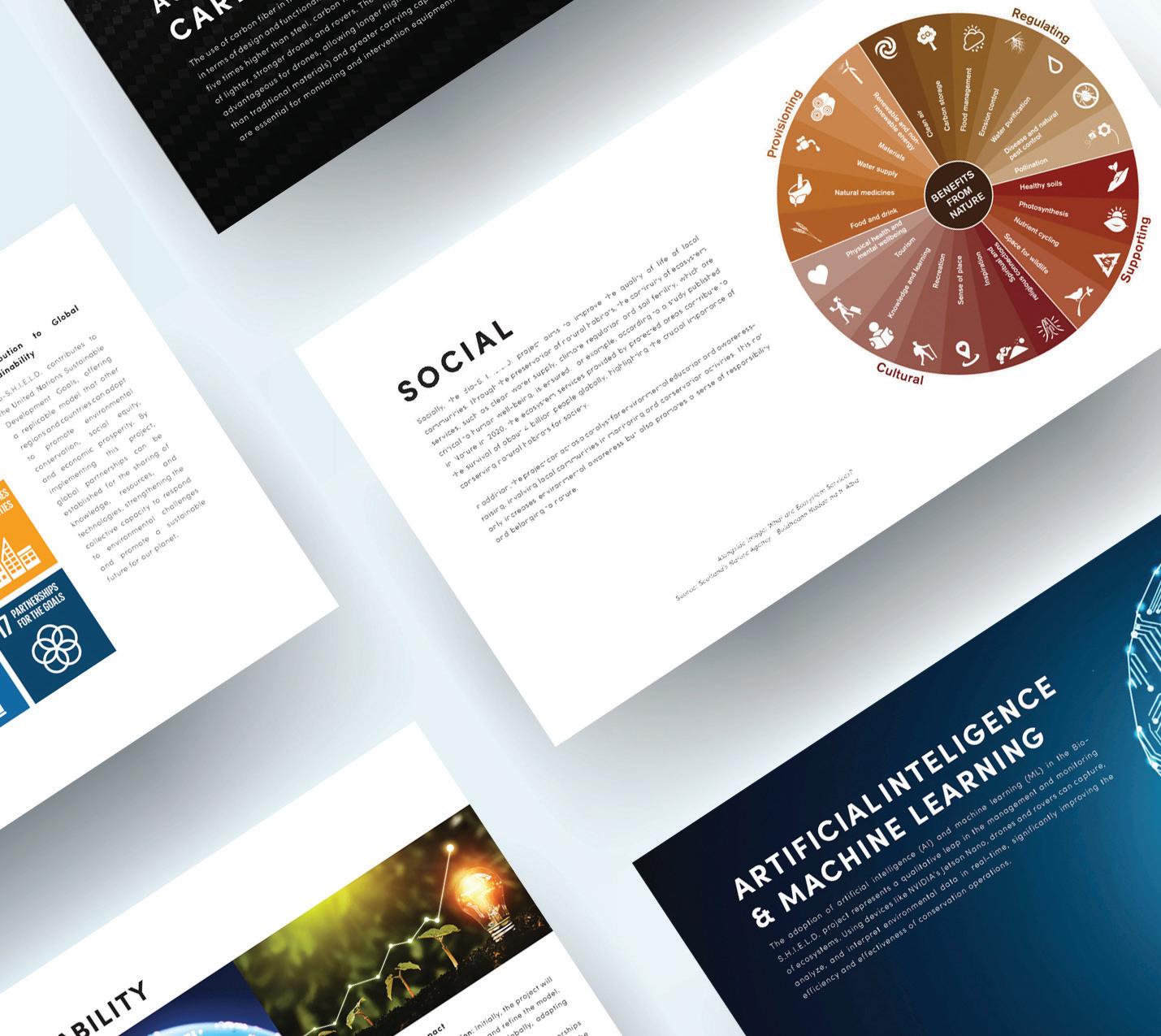
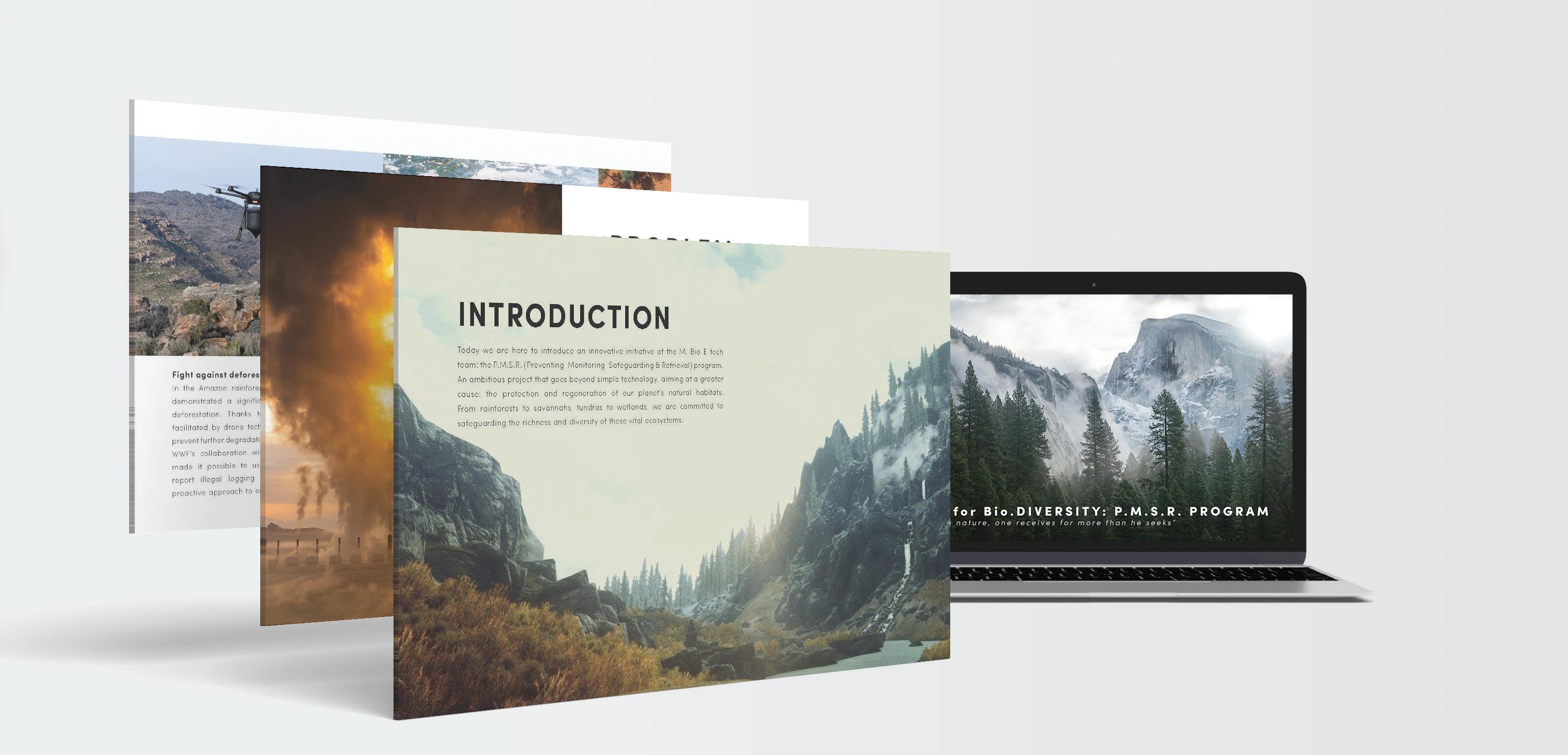
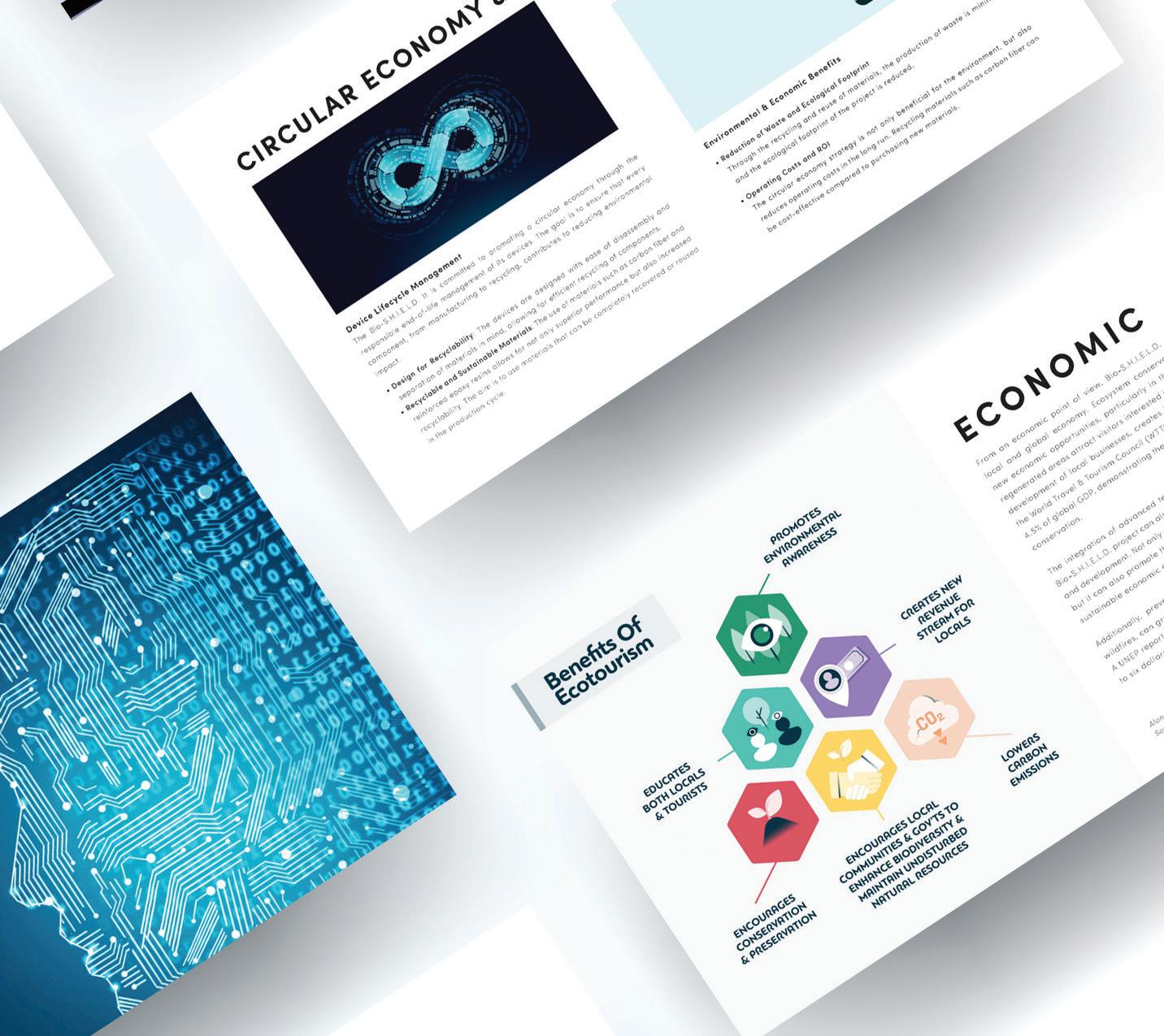
Explore the graphic works of Bio.S.H.I.E.L.D., a pioneering foundation dedicated to the preservation, monitoring, safeguarding, and retrieval of natural habitats and animals. This project exemplifies the fusion of technology and conservation efforts, showcasing how advancements in digital design can amplify the mission of preserving natural habitats. Through visually engaging presentations and meticulously crafted graphics, Bio.S.H.I.E.L.D. demonstrates its commitment to leveraging technology for the betterment of our planet. Join us in celebrating this extraordinary example of how innovative design can contribute to the preservation of our natural world.
Visualizing Assumptions , Reality, and Challenges
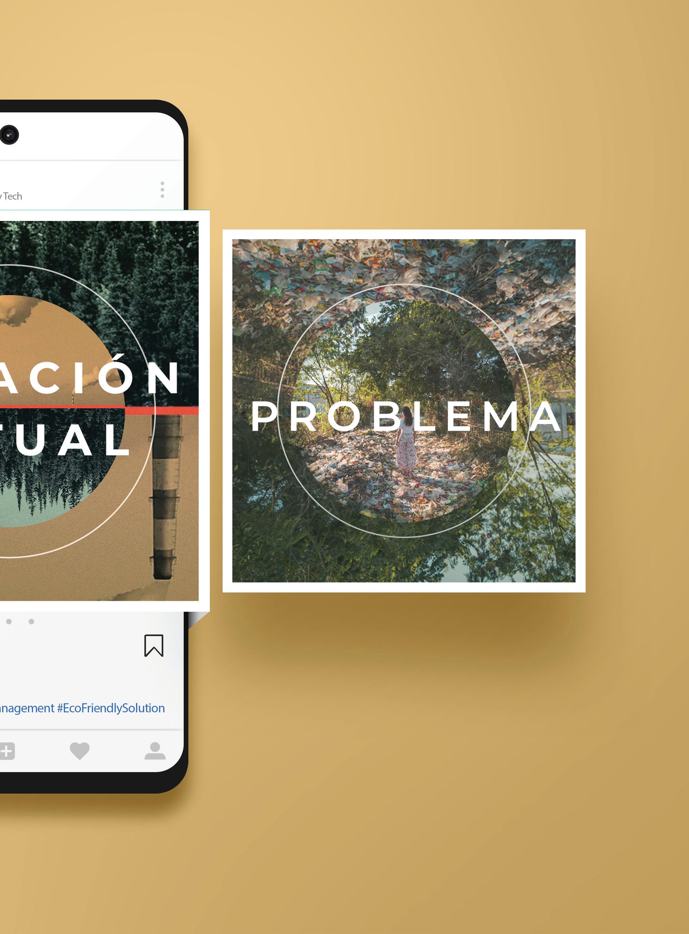
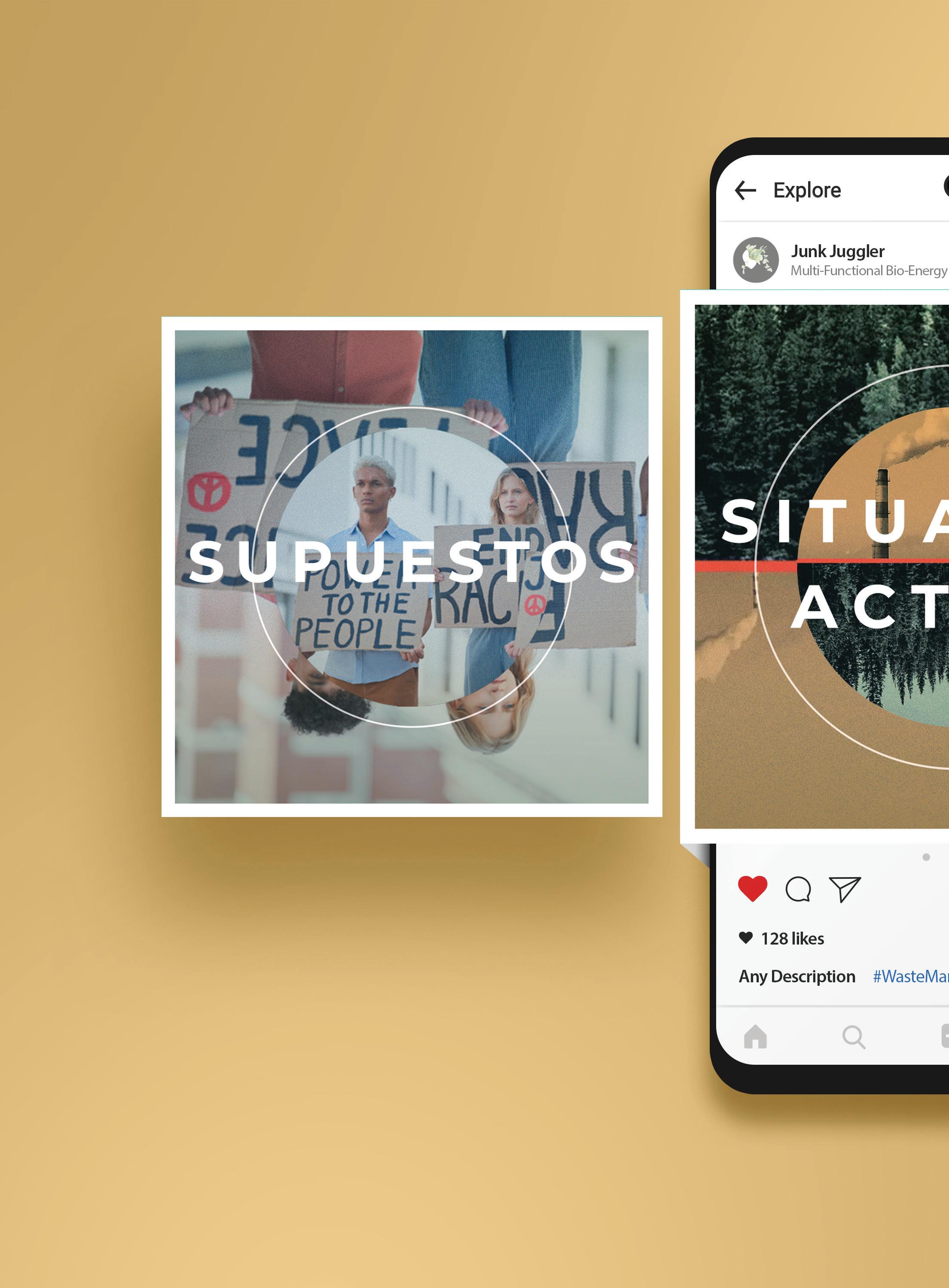
Embark on a visual journey through the ethos of M. Bio E-Tech, a pioneering company dedicated to harnessing bioenergy and bio-fuel production from agricultural residuals. This meticulously designed Instagram profile mock-up encapsulates the essence of M. Bio E-Tech’s mission, seamlessly blending impactful imagery with thought-provoking messaging. From raising awareness about sustainable practices to promoting eco-friendly solutions, each post is a testament to the company’s commitment to environmental stewardship. Join us as we explore the intersection of technology and sustainability, one captivating image at a time.
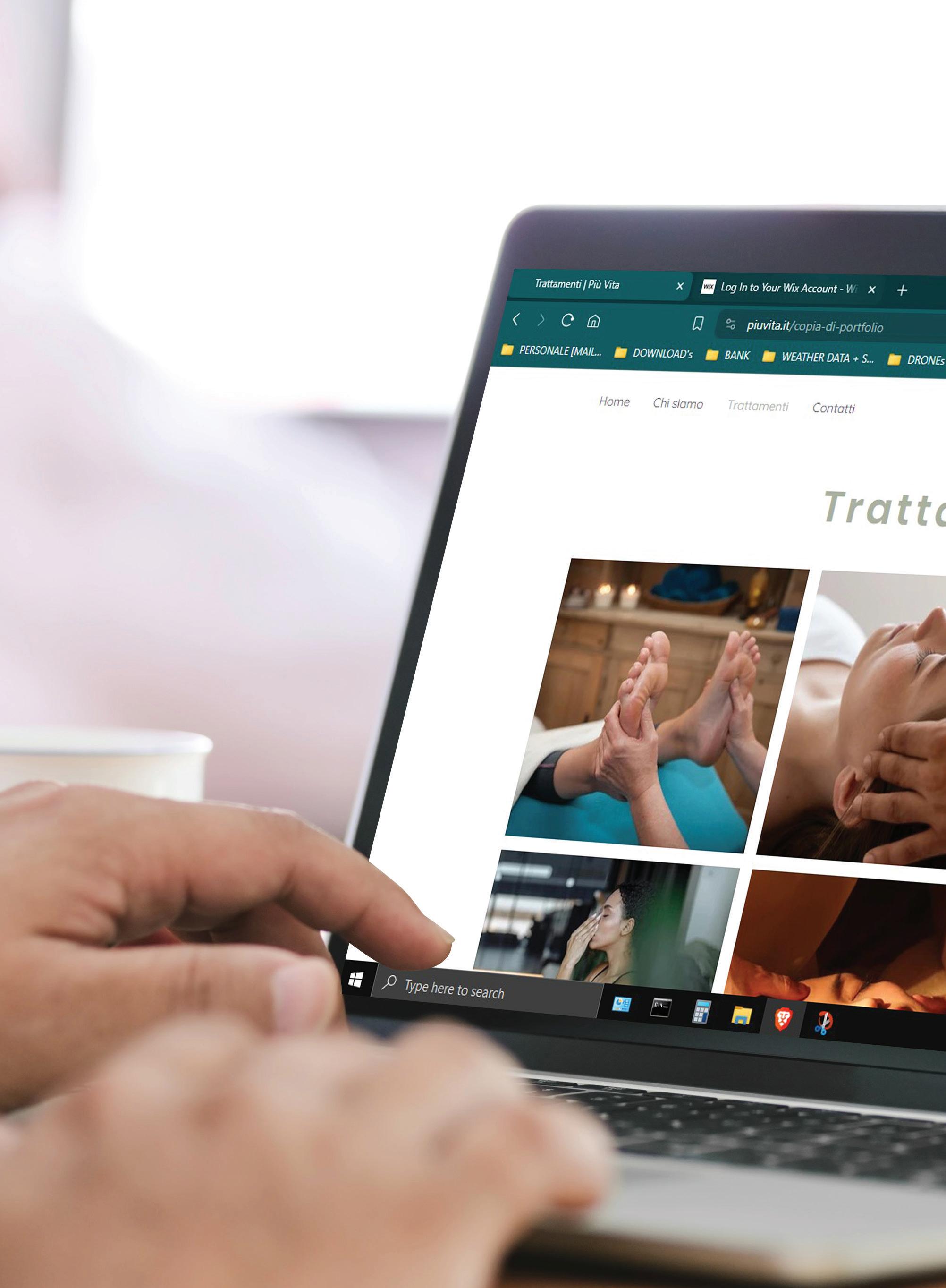
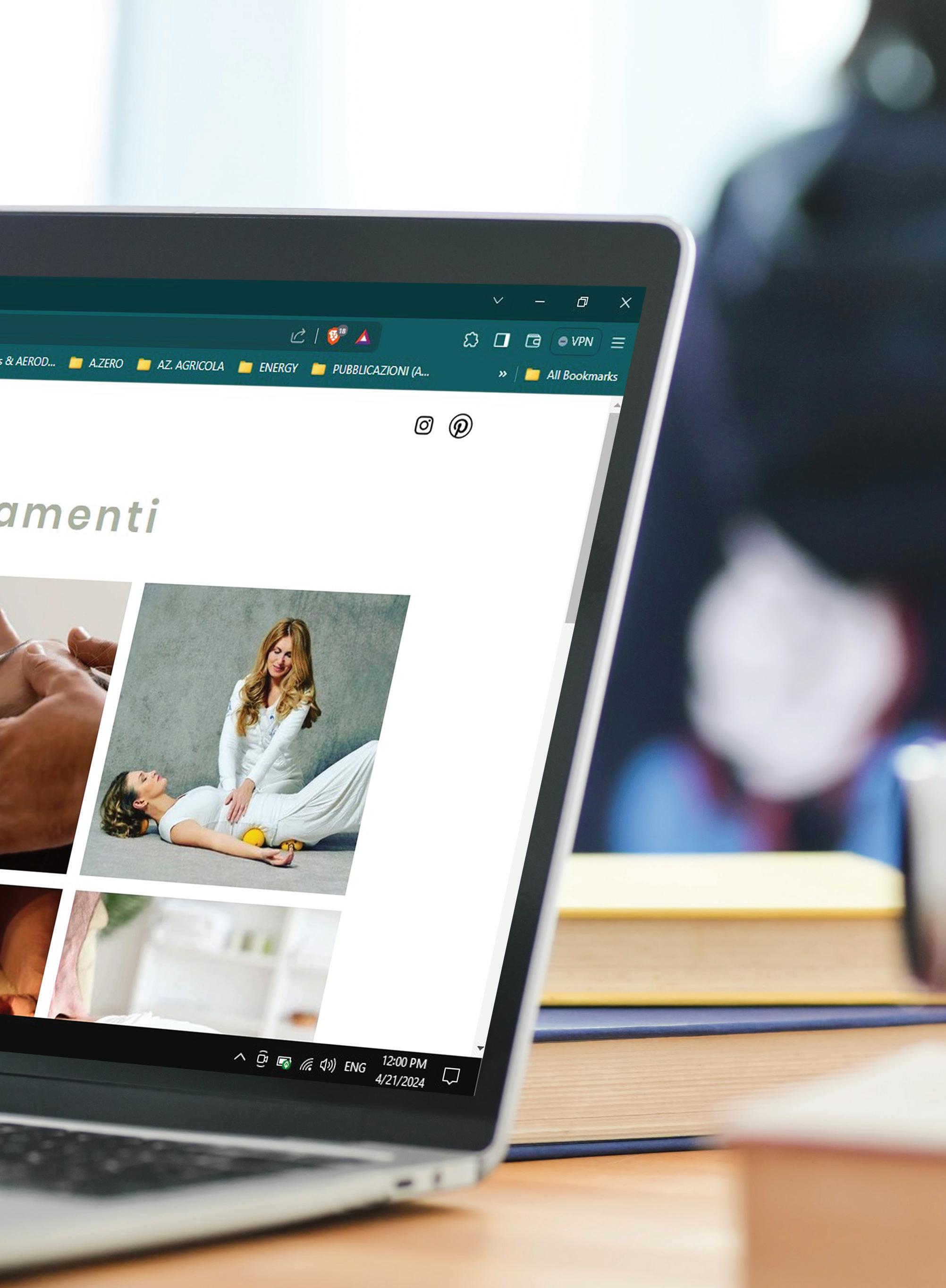
Embark on a journey of self-discovery and holistic healing with Piu’ Vita Holistic Center, nestled on the serene shores of Lake Maggiore in Italy. Our website design reflects the essence of our center, offering a tranquil digital oasis where visitors can explore a diverse range of holistic treatments aimed at nurturing the mind, body, and spirit. From rejuvenating massages to energy-balancing therapies, each treatment is thoughtfully curated to promote holistic well-being and inner harmony. Immerse yourself in a world of holistic wellness as you navigate through our user-friendly website, designed to inspire and empower you on your path to vitality and balance.
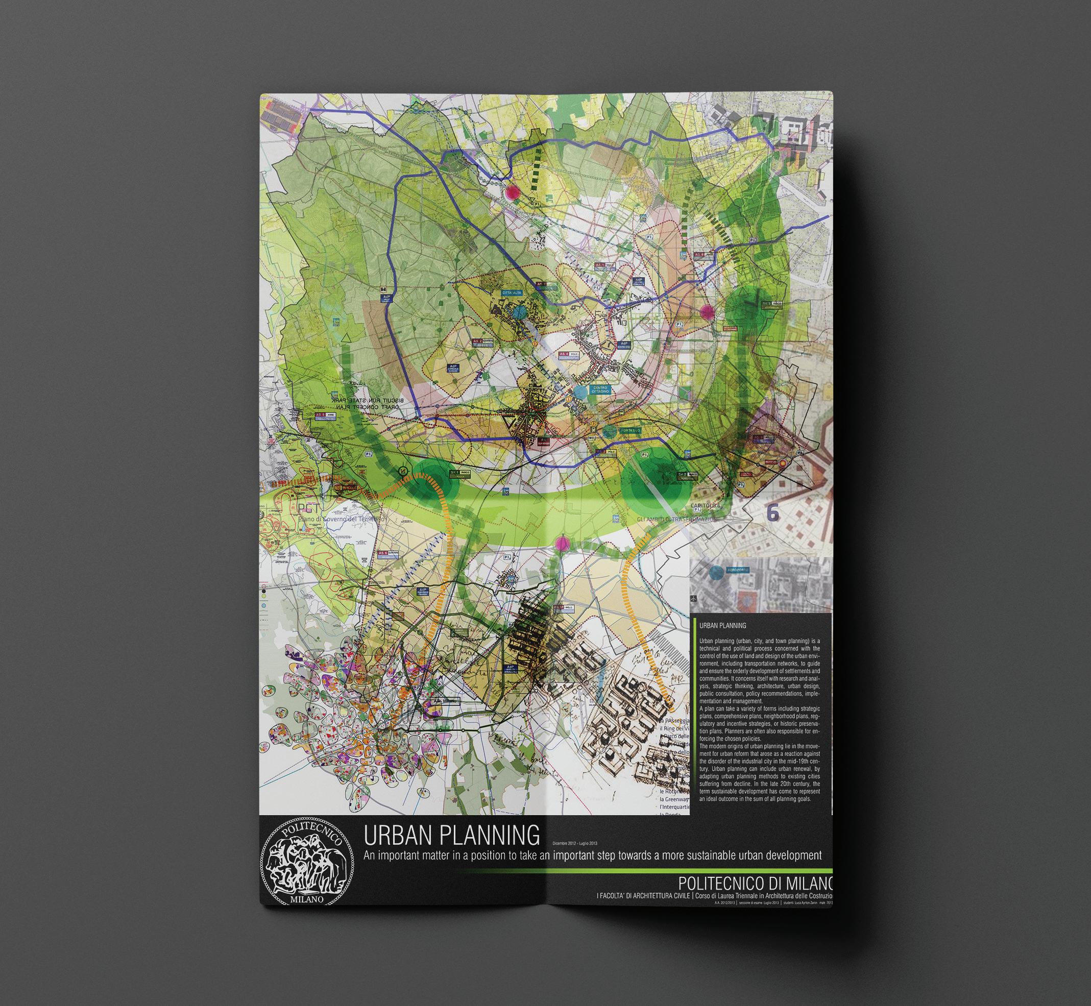

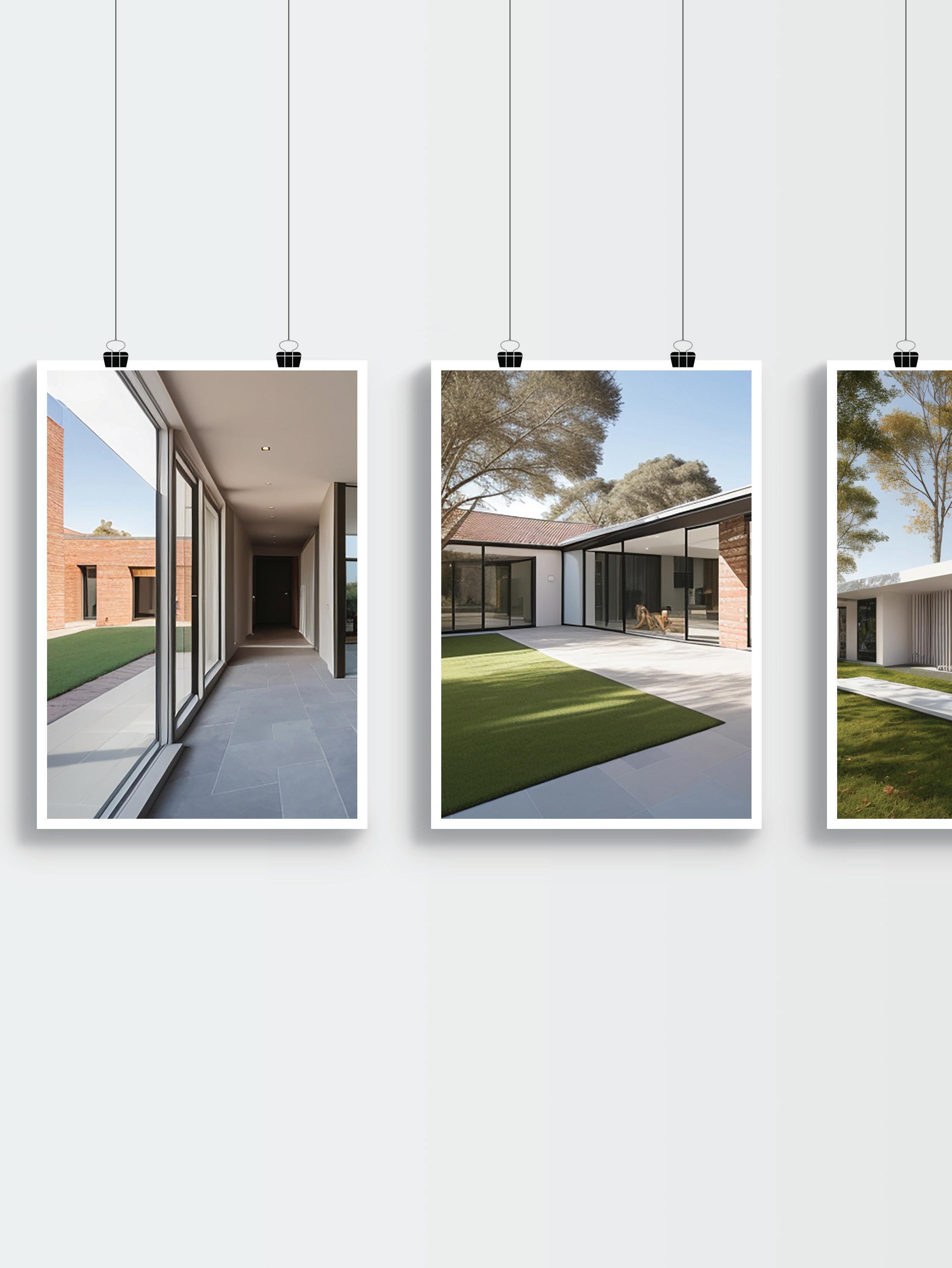
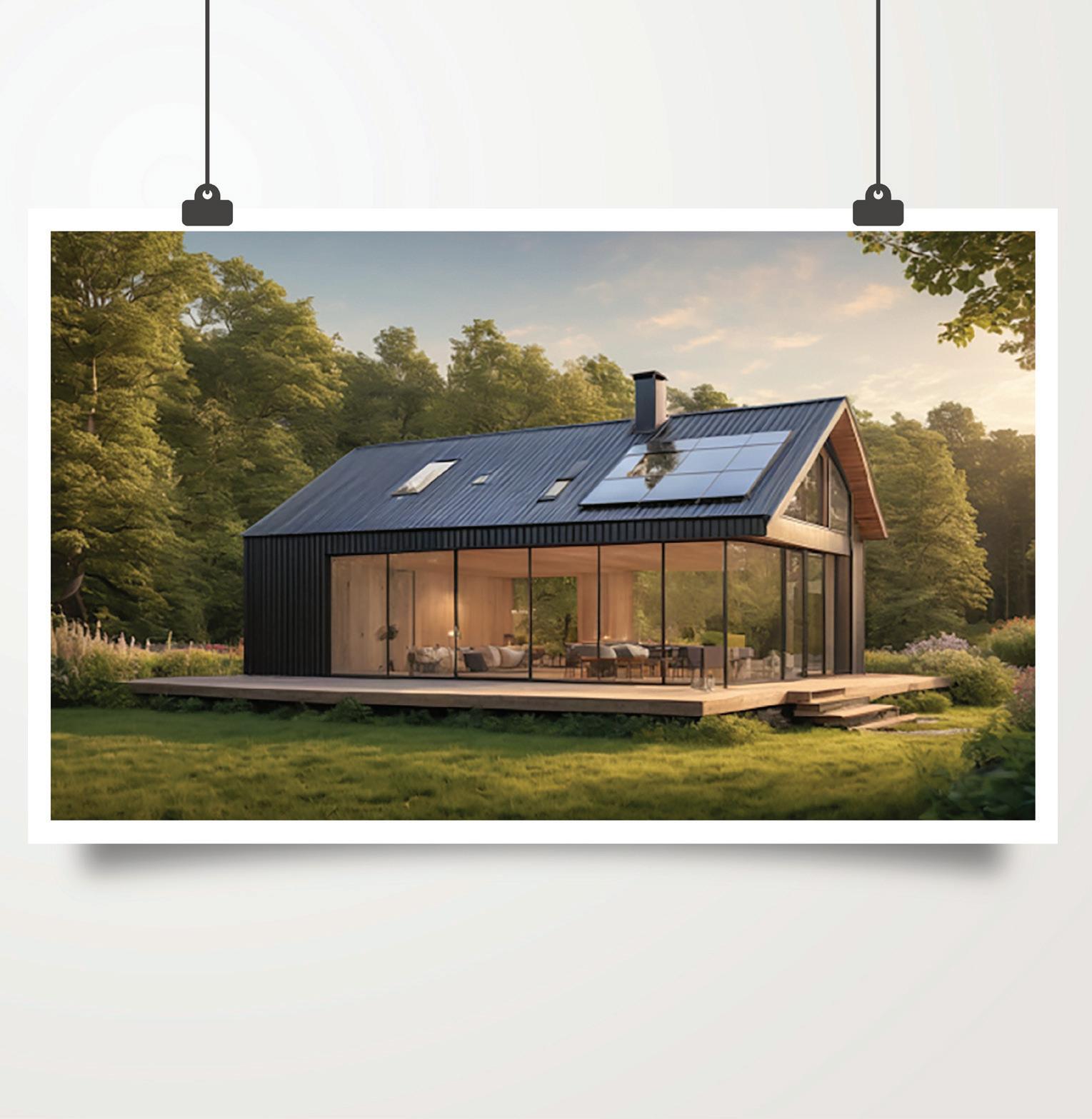
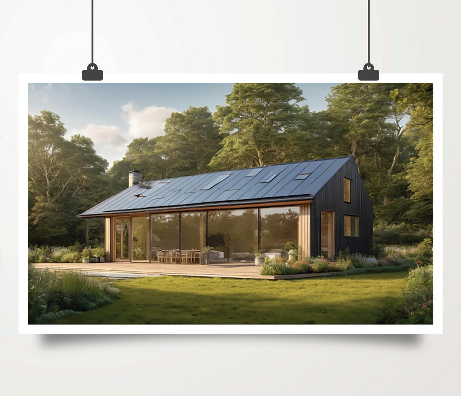
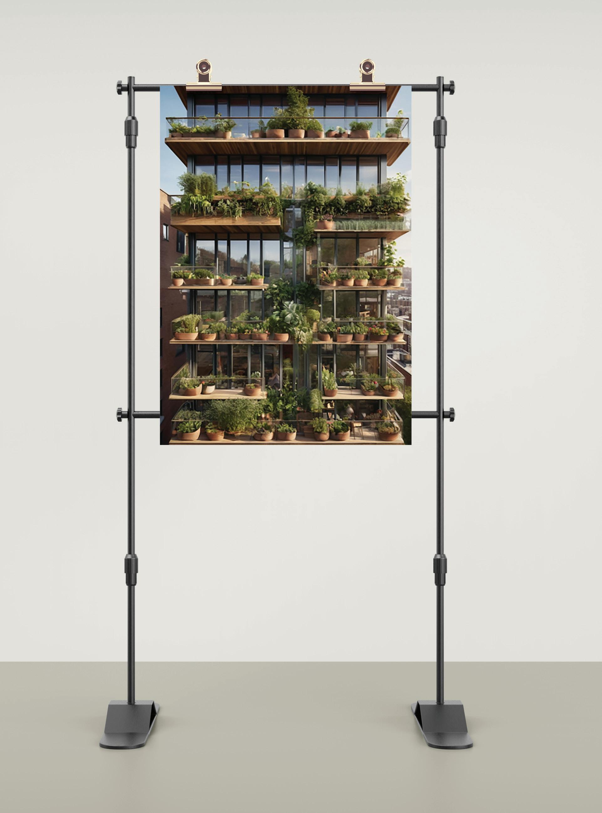
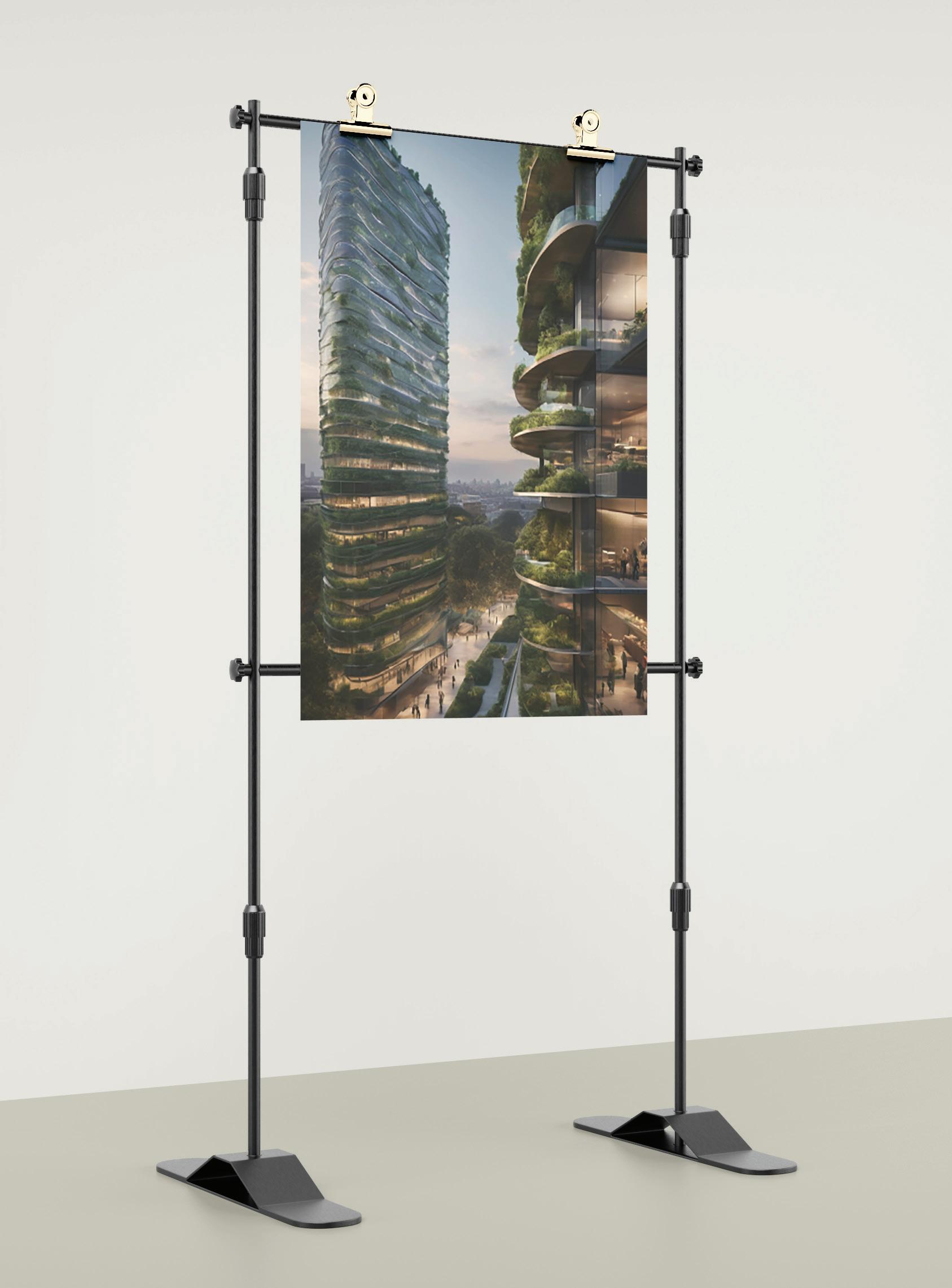
This gallery display highlights select works from my portfolio of 3D architectural renderings, artistically reimagined as paintings. Each canvas captures a unique design, from the eco-friendly vertical gardens of a high-rise social housing complex to the serene, sustainable features of a passive barnhouse. The renderings, set against a modern gallery backdrop, showcase my dedication to blending sustainable architecture with aesthetic innovation. The pieces represent my vision for harmonious living spaces that are intimately connected with their natural surroundings.

