
FOUNDATIONS OF INFORMATION DESIGN FALL 2022 EDITION

Foundations of Information Design: Fall 2022 Edition Written and designed by Madison Snell, MA, BCMM Copyright © 2022, Madison Snell
This book has been written to accompany the lectures and course material taught in INFO 1600: Foundations of Information Design, a first-year course in the Bachelor of Communication Studies – Information Design program at Mount Royal University in Calgary, Alberta.
Special thanks to Glenn Ruhl and the rest of the information design faculty at Mount Royal. Additional support provided by Cordelia Snowdon. Further thanks to Ella Shtaif, Martha Boulianne, Charlene Kaye, and Jessica Sanders. Most photos supplied by Unsplash, Pixabay, Pexels, and Disabled and Here. For updates, questions, and clarifications, please contact msnell@mtroyal.ca.
FOUNDATIONS OF INFORMATION DESIGN FALL 2022 EDITION
4 WHAT DESIGN?INFORMATIONIS PRINCIPLESDESIGNINFORMATIONTHEORIES,&STRATEGIES RELEVANCE INFORMATIONOF DESIGN DEFINING INFORMATION DESIGN UNDERSTANDING “GOOD” INFORMATION DESIGN MILLER’SLATCHAIDA MAGIC NUMBER DIFFERENCEHIERARCHYGRIDS THRESHOLD GESTALT PRINCIPLES COLOUR SEMIOTICSCONSIDERATIONS CHAPTER ONE CHAPTER TWO 121067 14151617181920222426
5 TYPES DESIGNOF READINGRECOMMENDEDPHOTOREFERENCESSUMMARYLISTWAYFINDING DESIGN INCLUSIVE CHAPTERUSERINSTRUCTIONALTYPOGRAPHYTECHNICALDESIGNWRITINGDESIGNEXPERIENCEDESIGNTHREE28293640424652 60595654
CHAPTER ONE WHAT DESIGN?INFORMATIONIS

7
RELEVANCE OF INFORMATION DESIGN
We are more connected than ever. As communication technologies were developed and improved, the world started talking to one another. The printing press of the 1400s brought literacy to the masses, and the spread of information has not slowed down since. Television and radio brought informa tion into the homes of millions, and the birth of the internet connected people from across time zones and political boundaries. We carry information in our pocket wherever we go. We are constantly connected. The internet is basically a human right – to be connected is to be Thisinformed.globalconnectivity means that the role information designers play in the world is grow ing more complicated each day. Not only must information be delivered around the world, it must meet the needs of several audiences. As Jenn and Ken Visocky O’Grady write in The Information Design Handbook, “Designers must now communicate ideas to people who may or may not share their native language, aesthetic sensibilities, or cultural understanding.” Designers do not create in a bubble, delivering information only to those who asked for it. Designers create for the global masses.
– JENN AND KEN VISOCKY O’GRADY “
The demand for modernpacestepincreasingknowledgeaccessibleuniversallyisinwiththeoftheworld.”
Information design is becoming more and more relevant every single day. As information designers, it is important to recognize why information design is needed, and which trends have impacted how we communicate. Here, we will explore three of those trends.
RISE OF NEW TECHNOLOGIES AND GLOBAL CONNECTIVITY
Red notifications on our phones remind us of how connected we are –and how connected we choose to be.
RISE OF PERSONAL CONNECTIVITY AND DIVIDED FOCUS
With the increase in global connectivity comes an increase in personal connectivity. Our phones keep us connected to each other. We are almost always “online” in some form or another. The world is full of distractions, and our focus is being pulled in a dozen different ways every moment. You sit in front of your computer, ready to start your essay. Then your phone dings – it’s your friend shar ing a meme with you. You laugh and forward the meme to one of your group chats. Then you see you’ve got a Facebook notification, and before you know it, an hour has passed since you sat down to write. Even in the so-called “real world,” our atten tion is being pulled. This divided focus on an individual level means that the communication of information must happen quickly and clearly to pull our focus and limit potential misunder standings. The design of information must be on par with the accelerated pace of modern, day-to-day living. It is our job as designers to help our audiences immediately know what is relevant to them, amidst all the chaos.
Imagine a traveller rushing through the airport. Notifications are coming in left and right on their phone – last goodbyes from family, followed by a notice from the airline that their gate has changed. The traveller is dragging their suitcase through the crowded airport, desperately trying to locate their new gate. The traveller’s boarding time is swiftly approaching. The airport’s signage needs to quickly and clearly help the traveller find their new gate. With the traveller’s mind running in a million different directions and the stress of making the flight on time looming over them, the design of that airport signage is key to ensuring that the traveller’s mind can be put at ease if they can quickly locate their new gate.
Ultimately, to help pull focus and provide the right information at the right time for our audiences, designers must be adaptable, efficient, and clear, and make use of multiple methods of communication. Otherwise, we risk leaving our audiences confused, stressed, and misinformed.
8

Information lag is a thing of the past. Accurate or not, information about global events is con stantly flowing throughout the world. For years now, since the birth of the internet, information has been coming from all outlets at all times.
People use Twitter for minute-by-minute updates on global events happening a world away, and check Facebook’s curated feed each morning to see what happened while they were asleep. How we communicate with each other, and how information is delivered to us, is constantly changing. It is essential that designers understand how and why audiences use certain methods of media consumption.
For designers to stay relevant above the sea of information, we must keep up with trends in technology and information delivery.
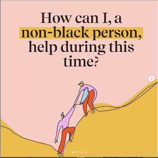
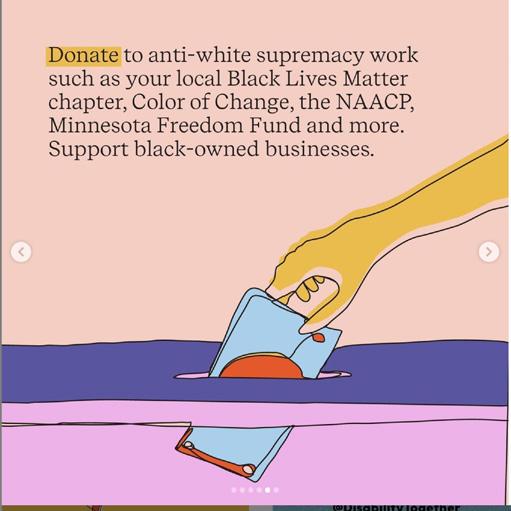
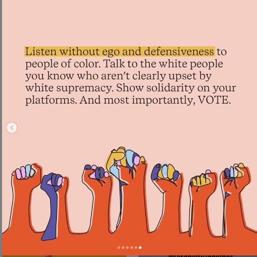
Illustrators, designers, and activists haven taken to Instagram to share statistics and strategies related to social justice movements. designersupportingillustrationsInstagramaboutBlackLivesMatterarecourtesyofandmusicianCharleneKaye.
RISE OF REAL-TIME INFORMATION FROM MULTIPLE OUTLETS
Consider how COVID-19 and the increased attention to the Black Lives Matter move ment have changed our media landscape. Instagram feeds and stories have been full of bite-sized infographics and carousels of key quotes, illustrations, and statistics. People have taken Instagram’s platform – built for sharing one’s daily life, and often as a curated feed of select moments – and turned it into a place to share information about police bru tality, healthcare and disease prevention, and protests one can participate in. This demon strates how quickly we are able to change the ways we communicate with each other. The rise of real-time information from multiple outlets can, however, lead to information bub bles, resulting in the proliferation and spread of false information – either by accident or on purpose. A single tweet can be taken out of context, screencapped and spread across the feeds of thousands, even though the informa tion in the tweet was misconstrued, proven false, or entirely fabricated. This constant flow of information can be incredibly damaging. Our role as designers is to constantly question the information appearing on our feeds – first to determine the quality of its source, then to determine whether or not it is true. This, of course, makes our jobs harder, but the result is accurate, honest, and impactful information.
In a similar vein to the rise of global and personal connectivity comes the trend of real-time information. The 24-hour news cycle has changed how we receive information.
9
INFORMATION DESIGN IS EVERYWHERE As information designers, it is important for us to observe and consider how information design manifests in our world, and how the communication of clear information improves the human experience. Whether we realize it or not, we encounter information in our daily lives almost constantly. We look for road signs as we drive. We look for identifying charac teristics in a parking structure so we don’t lose our car. We follow instructions when assembling a piece of furniture or learning a new skill. Information is all around us, and it has all been designed. As designer Brenda Dervin writes, “There is nothing natural about information, no matter what it is called – data, knowledge, or fact, song, story, or metaphor –information has always been designed.” We cannot design information if we do not understand the information ourselves, how the information is meant to be used, and by whom. Information designers do not need to be an expert in every field. Rather, an information designer needs to understand what their audience needs to know and when they need to know it. In a way, information designers are like transla tors. We ensure that the designed information is clear, relevant, helpful, and aesthetically pleasing. Information design is a way of making sense of the world around us.
INFORMATION
INFORMATION DESIGN AS A PROFESSION
Professionally speaking, information design acts as an umbrella term for multiple disci plines. Aspects of information design appear in UX design, instructional design, wayfinding and experience design, game design, product design, and so many more. These areas of design may require certain developed skill sets, but at the heart of all these specializations is the communication and design of information. Some information designers go the more generalist route and find themselves flitting across industries, designing information for a variety of audiences in a variety of ways. Others choose to specialize and find them selves focusing on certain aspects of design in certain industries, such as the user experience of an app or the player’s experience of a game. All of these types of design overlap and inter act with each other. These are not standalone subsets of professions. They are all about the communication of information to people because information design, no matter how it manifests, is a human-centered process.
10
DEFINING DESIGN
When it comes to information design, there really is no singular definition. In some ways, that is the beauty of the profession. Simply put, information design is the design of information. It is about making clarity out of complexity, no matter the final design outcome. Whether it is a poster, an app, a brochure, or a street sign, the clarity of the information presented is what matters.
REWRITE KEY CONCEPTS: Write the content in your own words, and check your rewrites with subject matter experts.
STRATEGIES FOR BREAKING DOWN UNFAMILIAR CONTENT
CREATE OR FIND METAPHORS AND ANALOGIES: Look for existing ways the content has been communicated using metaphors and analogies, or create your own.
READ HEADINGS AND SUBHEADINGS: Scan the content for key words and phrases that appear in headings and subheadings, as well as the captions of diagrams and illustrations.
LOOK UP DEFINITIONS AND SYNONYMS: Define new or confusing words, acronyms, or phrases.
When it comes to understanding the content that you are designing, note that while you do not need to be an expert, you do need to be able to understand the content yourself. If you do not understand the content, you will not know how to communicate it, and ultimately your intended audience will not understand the content. Below are some strategies for breaking down and understanding complex, confusing, or new material. When in doubt, ask your client, look for expert opinions, and talk to your audience.
TALK TO SUBJECT MATTER EXPERTS: Locate who is an expert in the content and make time to meet with them and ask questions.
SEEK OUT VARIETY OF MEDIUMS: Look for the same or similar content explained in different mediums, such as books, audio books, podcasts, or videos.
11
TEACH KEY CONCEPTS: Find willing volunteers and attempt to teach the content to them.


GETTING FROM POINT A TO POINT B: What is the physical and mental state of my audience? What information do they need at which points in their journey? How can I reduce stress and confusion?
12
PASSING A TEST: Will my audience retain this information? How can I enable memorability and recall? How can I instill good practices and behaviours that persist after the test?
UNDERSTANDING “GOOD” INFORMATION DESIGN
COMPLETING A TASK: Does my audience have the tools and materials they need? Where can they go to troubleshoot any issues?
MAKING A DECISION: How can I ensure my audience is informed? How can I meet my audience where they are? What are some callsto-action I can use to inspire my audience? How can I help my audience feel confident in making the decision that’s right for them?
AUDIENCE GOALS For an information design product to success fully meet the needs of its audience, designers must consider what the audience needs to know in order to achieve their goal, such as:
In many ways, good information design is invisible. Good design is rarely noticed, but people know bad design when they see or experience it. The design of information can mean the difference between a good day and a bad day for an individual. The right infor mation at the right time can save someone money – and can even save lives. Good information design is content-focused and audience-driven. These two pieces work together to help designers create information design products that are clear, relevant, contextualized, and visually appealing.


How can you account for multiple demo graphics who need to interact with the same information design product?
PHYSICAL REQUIREMENTS: Consider how your audience will be interacting with the infor mation design product. Will they be walking, seated at a desk, in a car? Is the information meant to be read all at once or spread out over time? Is it information the audience only needs once, in the moment, or is it meant to serve as reference material? Think about instructions for furniture assembly. Once the furniture is built, will the audience ever need to reference the instructions again? Is there maintenance that needs to be done to the furniture, thus requiring the audience to quickly find that information later?
EMOTIONAL REQUIREMENTS: Consider two aspects of emotions: first, the response you want the audience to have to your information design product, and second, the emotional state your audience may be in when they need the information you are designing.
13
demographic of your audience, and how that changes their physical and emotional requirements. Consider age, language, culture, and ability. How does the design change as the demographic changes?
AUDIENCE REQUIREMENTS
Think about the frazzled airport traveller trying to make their connection, or the recently diagnosed cancer patient trying to understand their treatment plan. What can you, as an information designer, to limit confusion, ease pain, or inspire confidence?
Once you narrow down what the audience needs to know in order to achieve their goal, ask yourself the following: What are the emotional and physical requirements of my Consideraudience?alsothe
CHAPTER THEORIESDESIGNINFORMATIONTWOPRINCIPLES,&STRATEGIES
The AIDA theory was developed by the American pioneer of advertising and market ing, E. St. Elmo in the early 1900s. It describes how marketers and advertisers hook people in, generate interest in a product or service, and ultimately end with the audience feeling a desire to own that product or seek out that service. This theory clearly applies to marketing and advertising design. Advertisers and marketers want to hook potential customers in, get them emotionally invested in the brand, and get them to purchase the product or service.
The concept also applies to information design. You want to draw people into the infor mation design product you have developed. You want them to be interested in what the information has to say. The audience then buys into whatever you have to say, and takes action. Unlike with marketing and advertising, that action does not have to be a purchase – it could be a retweet, a repost on your Instagram story, a like or a save, a signed petition. Callsto-action can be incredibly powerful in the world of information design, and can lead to the spread of information across audiences.
Advertisers and marketers know how to draw our attention with striking typography,interestingvisuals,andcalls-to-action.
I NTEREST: Audience is intrigued by what the product or service can do for their life. How are you going to get people interested int he information? Is the information rele vant? Is it memorable? Are you challenging assumptions?
D ESIRE: Audience has bought into the product or service’s messaging and brand positioning. How do you get people to care about this information? Are you going for an emotional pull or a financial pull?
15 AIDA (ATTENTION / INTEREST / DESIRE / ACTION)
ATTENTION: Audience becomes aware of a product or service, usually through advertising. How does your information design product stand out? Does it use bright colours, bold or interesting type, striking imagery, or powerful words in a statement, quote, or story?
A CTION: Audience purchases the product or seeks out the service. How do you get people to take action on the information you have provided? Are they liking, retweeting, saving, reposting? Are they signing a petition or donating? Are they visiting an important location?

In many instances, it makes sense to incorpo rate multiple layers of LATCH. For instance, if your audience needs to recognize which countries in the world are on the continent of Africa, you would likely provide them with a list of all countries in the world, organized by continent, and then alphabetically within each continent. This would help the audience quickly locate which countries in the world are in Africa, and then the audience can locate specific countries based on where they fall alphabetically.
T IME: Sequential or chronological, such as birth dates or eras.
L OCATION: By spaces or place, such as conti nent, country, province, city, neighbourhood.
C ATEGORY: Types or groups, such as scientific classifications for animals. Can be subjective.
In a step further, let’s say that in addition to recognizing which countries are located in Africa, your audience needs to learn specific details about the countries in Africa. In this case, you could sort the list of African coun tries into categories, perhaps based on each country’s primary export. Or perhaps they could be sorted by lowest to highest GDP. Another example of using LATCH for the benefit of your audience is the seating chart for a wedding. The traditional format is to sort the information by category (table) and then alphabetically. However, this usually means that guests stand in front of the seating chart for a long time, examining each list until they find their name. This way of organizing the information is only helpful to the couple getting married, the wedding planner, and perhaps the caterer. A better way to structure this information for the benefit of the guests would be to simply organize the list alphabet ically and indicate the table number beside each guest’s name. Now, instead of scanning potentially a dozen or more lists, depending on the number of tables, a guest simply locates their name according to the alphabet. Ultimately, the organization of any informa tion relies on the end goal of the audience and what you can do as the designer to help them achieve that goal.
The acronym ‘LATCH’ is a strategy for remem bering the five ways to organize information, as developed by information designer Richard Saul Wurman. He first published the theory in his book Information Anxiety. According to Wurman, information can be organized in just five simple ways:
A LPHABET: Useful when there is no stronger organizational opportunity. When sorting names, sorting by first name is becoming more common than sorting by last name.
H IERARCHY: Ranked according to sometimes subjective qualities, such as best to worst, most to least, biggest to smallest. Whenever you are tasked with organizing information, use LATCH to determine the best way to organize it, based on the needs of your audience. Does it make sense to organize the information in categories, or chronologically? How can you organize the information to help your audience find what they need quickly and in the most intuitive way possible?
16 LATCH (LOCATION / ALPHABET / TIME / CATEGORY / HIERARCHY)
Miller’s Magic Number, also commonly referred to as “chunking,” is a key element of design. Think about a phone number. A phone number is just a string of numbers, but with a bit of structure and organization, 4032583829 becomes three memorable “chunks:” 403, 258, 3829.
Chunking, in combination with a strong hierar chy, helps designers organize the content, and helps the reader understand the content. This book is an example of chunking. It is broken out into chapters, and within each chapter, the book is further broken down into sections. These sections are indicated with placement, size, and colour for easy separation from the body text. Chunking does not necessarily have to follow Miller’s Magic Number, but the notion of breaking out information into smaller, easier to digest parts remains the same.
Miller’s Magic Number was developed in the 1950s by scientist George Miller, after conducting experiments to determine the limits of our short-term memory. Through his research, George Miller determined that we can retain 7, give or take 2, “chunks” of information in our short-term memory.
Miller’s Magic Number also comes into play with mnemonic devices. Consider the order of colours in a rainbow and the mnemonic device of ROY G. BIV. The number of colours in a rainbow is already Miller’s Magic Number of 7, but simplifying them even further into a mnemonic device of 3 “chunks,” combined with the chunks sounding like a name, helps with remembering the information.
17
MILLER’S MAGIC NUMBER
Chunking is key when it comes to design. Designers decide how to group information in such a way that the audience actually wants to engage with the information, and the informa tion must be organized in a thoughtful way so that the audience retains some of the content.
You do not have to live and die by grid lines as a designer. When necessary, you can break the grid, and “step outside the box” of the grid. Whatever you do, make sure you are guiding the audience through the content and effectively communicating what they need to know so they can achieve their goal.
Think of grids like a canvas for information designers. Whenever you start a new design, begin by determining what kind of grid you want to use. If you know you are going to use several different-sized images, you might want more columns in your grid to account for the varying sizes. If the content is mostly text, you might use fewer columns. If you want a really dynamic design, you might again want several columns so you can switch up layouts more frequently throughout the design file.
Grids are an important tool for effectively designing and organizing information. Designer Drew de Soto describes grids as the “hidden architecture” behind design. Designers align content within grids to establish a sense of clarity, direction, hierarchy, and organization. Grids help audiences move through the con tent. By controlling the layout of the content, the designer tells the audience where to look, what to read next, and what to absorb. Grids also help designers group content by pro viding structure to the page or design space. Images can fit closely to their related written content so the audience does not have to go far to immediately make the connection between word and image. Obvious examples of grids are in magazines and newspapers. Grids provide structure and continuity to a magazine or newspaper’s page. Grids are particularly important when it comes to print work because they help designers make sure that important information is not lost in the gutter or margins of a design. Grids are also present in web design. The navigation, sidebar content, and central content all exist on a grid. The separation and alignment of elements on the screen organizes the content and informs the user’s interaction with the site. Grid systems are not meant to be rigid and inflexible. A good grid system provides fluidity and flexibility to the design space. You can create consistency and information flow with a good grid system. Let the content inform the grid system you choose for a design.
18 GRIDS
HIERARCHY
Jenn and Ken Visocky O’Grady define hierarchy as “the ordering of pictorial and typographic information sets so the viewer can quickly gain an understanding of their relative importance.”
When it comes to creating a solid hierarchy, consider what you want the audience to see and acknowledge first, and how you can communicate that. Hierarchy can be achieved through variations in size, colour, and place ment, among other strategies. There is no one singular way to establish hierarchy, but there are general conventions that provide a good starting point. For example, headings are usually bigger than subheadings, and captions are typically smaller than body text. Experiment with different hierarchical strate gies to see what works for your audience and the particular information design product you are creating.
CHAPTER TITLE
Think about a newspaper or magazine article. The first thing that grabs your attention is likely the headline, or even a large image or illustration. Then, your eye might go to a pull quote or subheading. Before you start reading the actual article, your eye might also catch the byline with the author’s name. By the time you actually get to the body of the article, you have an idea of what to expect and already know what the article is going to be about – all thanks to the hierarchy of the design elements. Good hierarchy can guide the audience into the information in a proper flow that lets them know what they are getting into. Bad hierarchy, or a lack of hierarchy, can over whelm the audience and turn them away from engaging with the information design product.
19
SECTION TITLE EMPHASISSUBHEADING Body text.
20
The difference threshold concept was devel oped by psychologist Ernst Weber in the 19th century. The full name of the scientific theory is Weber’s Law of Just Noticeable Difference, and it comes with a complicated equation. As information designers, the most important part of this theory is not the science and the math behind it – instead, we focus on how the general concept behind the theory applies to information design. Generally speaking, the difference threshold is the minimum amount of change between two sources of stimuli for an audience to notice that a change has occurred. For example, if an audience first sees a 100-watt light, and the intensity slowly rises while the audience con tinues to observe it, they will notice the light is brighter when it reaches 110 watts. That 10-watt difference is the difference threshold for light intensity, and this difference thresh old will hold true as the light intensity grows: the audience will again notice a difference at 120 watts, 130 watts, and so on. For information designers, difference thresh old is important when it comes to the size and weight (thickness) of typefaces. When designing a text-heavy document, such as a magazine or book – anything that will require headings and subheadings – it is important to make sure the distinctions between levels of hierarchy are apparent to the reader.
DIFFERENCE THRESHOLD
According to The Information Design Handbook, the difference threshold for type size is 2, meaning that an audience will notice a difference when type is sized at 10 points, 12 points, 14 points, et cetera. In the same vein, an audience will notice a difference in the weight of a typeface every other weight. For example, the eye notices a more significant difference when the weight shifts from light to medium to bold. Understanding the difference threshold for type will help you develop a strong hierarchi cal structure for more text-heavy information design products. Many designers tend to go higher than the just-noticeable difference threshold of 2 to ensure the audience notices the change in size and weight. Designers are often more in tune with changes in type size and weight than audiences. Designers also tend to combine difference threshold (changes in size and weight) with other strate gies to establish hierarchy, such as colour and placement. When using difference threshold in the devel opment of your design hierarchy, consider your audience – it may be worthwhile to test out a variety of type sizes and weights, among other strategies, to see when people notice a change.
This is what 6pt looks like. This is what 8pt looks like. This is what 10pt looks like. This is what 12pt looks like. This is what 14pt looks like. This is what 16pt looks like. This is what 18pt looks like. This is what 20pt looks like.
21
This is what thin looks like. This is what light looks like. This is what medium looks like. This is what bold looks like. This is what black looks like.
This is what 6pt looks like. This is what 7pt looks like. This is what 8pt looks like. This is what 9pt looks like. This is what 10pt looks like. This is what 11pt looks like. This is what 12pt looks like. This is what 13pt looks like. This is what 14pt looks like. This is what 15pt looks like. This is what 16pt looks like. This is what 17pt looks like. This is what 18pt looks like. This is what 19pt looks like. This is what 20pt looks like. This is what thin looks like. This is what extralight looks like. This is what light looks like. This is what regular looks like. This is what medium looks like. This is what semibold looks like. This is what bold looks like. This is what extrabold looks like. This is what black looks like.
COMMON REGION: When we see objects contained within a boundary, we assume those objects are related or associated. Our brains process these circles in three groups, even though the items within them are all circles of the same size, shape, and colour.
22 GESTALT PRINCIPLES
PROXIMITY: When we see objects next to each other, we assume those objects or design elements are related or associated. We do not process all 50 of these circles at the same time. We see them in three groups. Their proximity tells our brains that they are related not as one group, but as three.
Gestalt is a German word meaning form, pattern or configuration. German psycholo gists Max Wertheimer, Wolfgang Köhler, and Kurt Koffka developed the gestalt psychology school of thought in the early 20th century. This school of thought is about how humans perceive, structure, and organize stimuli. The principles behind gestalt psychology, described below, have clear implications for information design, because information design is centred on how we can get our audiences to quickly understand new or complex information.
SIMILARITY: When we see objects with similar properties or attributes, such as colour, size, shape, direction, orientation, or texture, we assume those objects are related or associated. We do not see 50 individual circles. Instead, we see green circles and orange circles. Our brains decide that because they are different colours, we should associate the circles by colour, not by shape.
CLOSURE: Our brains are always going to “fill in the blanks” when we are presented with a seemingly unfinished design element. Our brains fill in what is missing based on our previous experiences with shapes. In the example to the right, we first see a white square, not the four broken circles, because we often do not see broken shapes like the circles, but we often see square shapes.
This may be one of the most widely used of the gestalt principles. Examples include titles and captions, which are always within close proximity to the body text or image they relate to. Appropriate application of this principle reduces mental headache for audiences because they do not have to figure out which design elements are related to which.
CLOSURE: This principle is often applied in logo or pictogram design. Creative use of this principle leads to inventive brand identities and design elements. In the World Wildlife Foundation logo to the right, our brains inter pret it as a panda bear despite the unfinished shape, largely due to our brains mapping the unfinished shape against our previous experiences with the shape of panda bears.
APPLICATIONS OF GESTALT PROXIMITY:PRINCIPLES
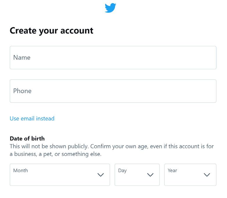
SIMILARITY: In terms of web design, we can see examples of this principle in sign-up pages, such as in the Twitter sign-up page on the right. Designers of these pages indicate which fields are for entering information by making them visually similar to each other. This principle is also evident in print design. Headings across a document are designed to match and be distinct from subheadings and body text. This helps the reader recognize when a new section or chapter is beginning.
23
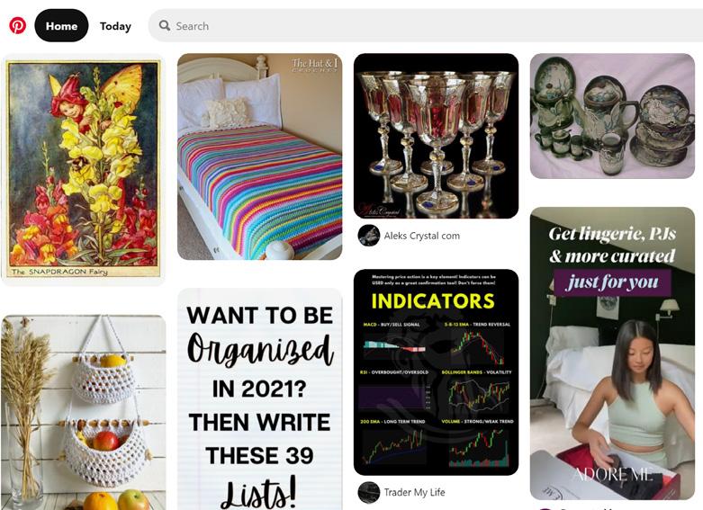
COMMON REGION: Social media sites use this principle to distinguish individual posts from one another, as shown in the Pinterest screenshot on the right. Each post is given a designated boundary, and we recognize each post on its own because of this boundary.

ContrastContrastContrast Contrast Contrast Contrast Contrast Contrast Contrast The saturationhue,value,andofacolourcanall impact the legibility and DesignTheAdaptedreadabilityofcontent.fromInformationHandbookbyJennandKenVisockyO’Grady.
CONTRAST Presented below are nine colour combi nations. The colours in the top row, while contrasting in hue, are too similar in value and almost appear to vibrate. Colour combinations like this directly impact an audience’s ability to understand the content. The colours in the middle row are also too similar in value, making the content difficult to read. The colours in the bottom row have good contrast in terms of value and hue. Combinations like these ensure the content is legible and easily read. To test if the contrast in your chosen colour palette is high enough, set your design space to greyscale. From there, see if the differences in hue, value, and saturation are enough to make the text or other design elements distinct from one another. It may be beneficial to test your colour palettes with others.
24 COLOUR CONSIDERATIONS
Colour is a key element in establishing aes thetics and clarity in design. When building a colour palette, keep in mind the physical and emotional states that your audience might be in while engaging with your information design product. How does the hue, value, and saturation of colours impact the legibility of text? How does the environment impact colour perception or influences actions? How do audiences process colours? How do various cultures apply meaning to colours?
CULTURAL CONNOTATIONS
Do not rely on colour as the sole indicator of information. A person who has low to no vision may miss out on important information that was only communicated with colour. This is why, for example, stop signs are octa gon-shaped in addition to being red, and traffic lights are always in a consistent order from left-to-right or top-to-bottom.
There are several cultural connotations of colour throughout the world. For example, brides in many Western cultures often wear white wedding gowns, while brides in countries like China and India often wear red, as demon strated in the images below. This means that there is not one single colour that can be used to represent the concept of a wedding.
Colour is one key reason why it is important to understand your audience before beginning the design phase, especially for information design products that will be seen by a more global audience. Be considerate of culture when choosing a colour palette, but be mindful of avoiding stereotypes.
Consider how the environment will impact your colour choice. You cannot assume that every person who interacts with your information design product will be in the same conditions that you were in during the design phase. Ask yourself these two questions when considering colour and environment:
25
ENVIRONMENT
HOW DO THE COLOURS APPEAR AT NIGHT OR IN LOW-LIGHT SITUATIONS? Colours in intense lighting will wash out, and colours in low light will appear much darker, which might make it more difficult to interpret changes or differ ences in colour.
HOW DO THE COLOURS APPEAR IN DIFFERENT WEATHER CONDITIONS, SUCH AS HEAVY FOG, SNOW, OR RAIN? Consider road signage. How much more difficult would it be to navigate a route during a snowstorm if the road signs were primarily white?
VISUAL PROCESSING
Consider also the possibility that a decent chunk of your audience, upwards of 20% in many cases, might be colourblind. There are several tools available online that can check whether or not a design’s colour combinations are distinct enough for individuals with various kinds of colourblindness. Note that there may be other factors that contribute to a person’s lowered ability to differentiate colours, such as age or conditions like near- or far-sightedness.


26 SEMIOTICS
SIGNIFIER: The form that the sign takes. A sign can be anything that is intended to convey meaning: an image, a facial expression, a gesture, a word, a sound – anything that represents some element of communication. In a set of traffic lights, the sign is taking the form of a green light.
SIGNIFIED: The concept or object represented in the sign. It is the historical, cultural, or social meaning of the sign. In a set of traffic lights, the green light signifies to drivers that they can proceed safely.
Semiotics is the study of how we make meaning through communication. The original theory is related to linguistics and language, but communication theorists and philosophers have also applied the general ideas of semi otics to communication design. The study of semiotics helps us understand how we make meaning in the words and visuals we use, and helps us understand how changing cultural and conventional norms can change the mean ings of those words and visuals. For example, the stereotypical colour association with binary gender changed in the 1920s to what we know today. Before then, pink was commonly associated with boys, and blue with girls. The study of semiotics is commonly asso ciated with two key theorists: Ferdinand de Saussure, the father of linguistics, and Charles Sanders Peirce, an American philosopher. While these two didn’t work together, they both discuss meaning-making and how we identify patterns in our communication. Both discuss the concept of signs – the basic unit of meaning. According to Ferdinand de Saussure, all signs are made up of two parts: the signifier, and the signified.
This notion of signifier/signified is the basis of semiotics. A sign takes a certain form – the signifier – and that form has meaning – the signified. That meaning can change over time or across cultures.
Let’s turn to emoji for an example. Despite being a collection of seemingly straightforward illustrations of average, conventional items and gestures, modern internet society has applied various meanings to these little illus trations. The emoji of a peach, for instance, is a signifier. What is signified by the peach emoji, however, is not the same as what would be signified by the image of a peach. The peach emoji has its very own significance in popular culture. It is unlikely that people are using the peach emoji when discussing the recipe for a peach cobbler, like perhaps they would if the signifier was an image of a peach instead of an emoji. Instead, people are much more likely to use the peach emoji on a dating app. What is signified by the peach emoji is the result of years of humans interacting online and looking for ways to adapt what we have been given. We took a simple fruit emoji and made it signify something quite different.

27
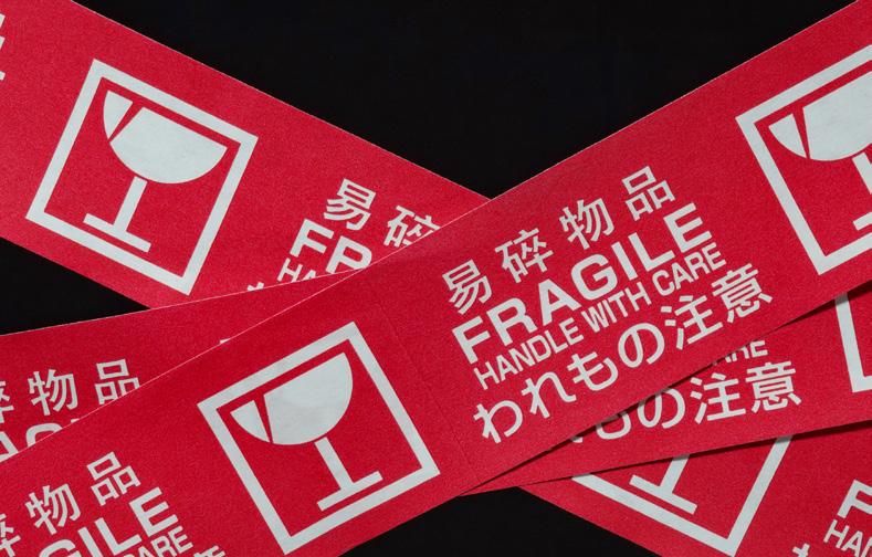
INDEX: Something that creates connections between objects in order to create meaning. An umbrella indicates wet weather. Smoke indi cates fire. A broken wine glass pictogram on a box, like the one pictured to the right, indicates fragile items inside. A paint bucket pictogram in Photoshop indicates the colour selection panel. These meanings are prone to change over time and in different contexts.
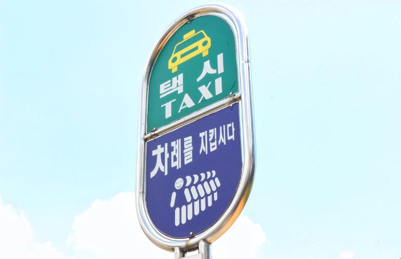
TYPES OF SIGNS Charles Sanders Peirce’s main contribution to semiotics is his description of the three types of signs: ICON: A literal visual representation of the concept or object being signified by the sign. A photo of a car for sale is a literal, visual representation of the car that is for sale. A taxi pictogram above the taxi drop-off at an airport, as shown to the right, is a literal, visual representation of the type of vehicle that stops there. A folder on our computer’s desktop looks like an actual paper folder, to indicate that it is a place that holds documents.
SYMBOL: Often abstract, and is usually some thing that has gained meaning over time. The universal symbol for biohazard, shown on the right, is a seemingly random collection of shapes, but it has become synonymous with biohazards across many industries and in many countries. An icon or index can become a symbol over time, once the original literal representation or other connections fall out of common use or practice. When it comes to thinking about signs, and about icons, indexes, and symbols, it is import ant to consider the context in which they are being used. A skull and crossbones design placed on the bottle of a cleaning solution is an indication of its toxicity or poison level, whereas a skull and crossbones design on a t-shirt in Hot Topic indicates something completely different and unrelated. This is again where it becomes important to know your audience and know the context for which you are designing. When visual meaning is constantly shifting, it is important to stay “in the know.”

CHAPTER THREE TYPES DESIGNOF

FORMAL: Going on guided tours, following signage and physical layouts, and using help kiosks to locate where to go.
TYPES OF WAYFINDING
RECREATIONAL: Allowing yourself to get lost in a new city to see what the city has to offer, going through a corn maze, or taking a leisurely drive with no destina tion in mind.
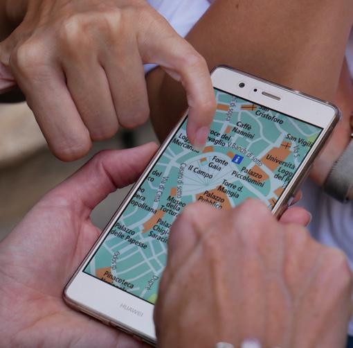
Using an app like Google Maps to locate your destination and following its suggested directions is an example of formal wayfinding.
WAYFINDING DESIGN
29
INFORMAL/SOCIAL: Asking for directions, looking for worn-down spots or paths, or following a crowd.
Wayfinding is the process of how people navigate through and experience physical environments, often aided by elements such as signage, colour coding, kiosks, physical layout, or even sound. The term is thought to be coined by designer Kevin A. Lynch in the 1960s, with the release of his book, The Image of the City How people navigate a space can directly impact their experience of the space. Good wayfinding means people can move through a space and get to their destination with ease. Bad wayfinding can leave people feeling lost, confused, frustrated, and angry. Information design comes into play with wayfinding because the design of physical spaces involves conveying information about the spaces to the people in those spaces. Strategies and theories, such as Miller’s Magic Number, hierarchy, colour, and typography, help designers develop effective wayfinding systems.

MODERN WAYFINDING
INDOOR WAYFINDING: On a space-by-space basis. It is often the most common form of wayfinding discussed in design circles. Indoor wayfinding usually involves some combination of signage, physical layout, kiosks, and maps.
30
HISTORICAL WAYFINDING
URBAN PLANNING: Wayfinding on the city level. It involves more than the signs you see throughout the city – the ones identifying where city parks and transit hubs are located. Urban planning is about how the city itself is organized, and where public utilities infra structure is located. In Calgary, we see urban planning and urban wayfinding in the +15 network, painted crosswalks, and C-Train stops.
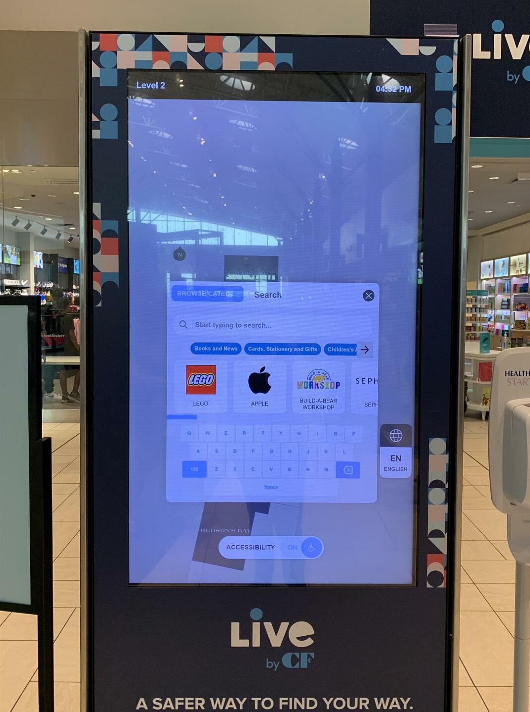
Digital wayfinding is a key part of many modern indoor wayfinding systems. Think of the touch screen kiosk at a mall. The kiosk shows you exactly where you are in the mall, and shows key locations such as escalators, elevators, bathrooms, and mall security. A good digital kiosk will be searchable and allow you to look for exactly the store you want, or show you all the stores that sell a certain type of item. It will also identify which route to take, showing you which stores are nearby to help you look for landmarks as you navigate the mall.
Examples of historical wayfinding exist all throughout history and in all cultures. Ancient people used the stars and the position of the sun to navigate through the world, and early roads were marked with stone pillars to help travellers find their way. The development of early technologies like compasses and astro labes assisted people in navigating the world. While early maps were not always made with the intention of navigating space, we have always needed to position where we are in the world in relation to where we want to go.
We can think of modern wayfinding in terms of two concepts: urban planning and indoor wayfinding. Advances in technology and archi tectural developments are always leading to improvements in how we navigate our chang ing environments – both indoors and outdoors.
Courtesy of Jessica Sanders.
31
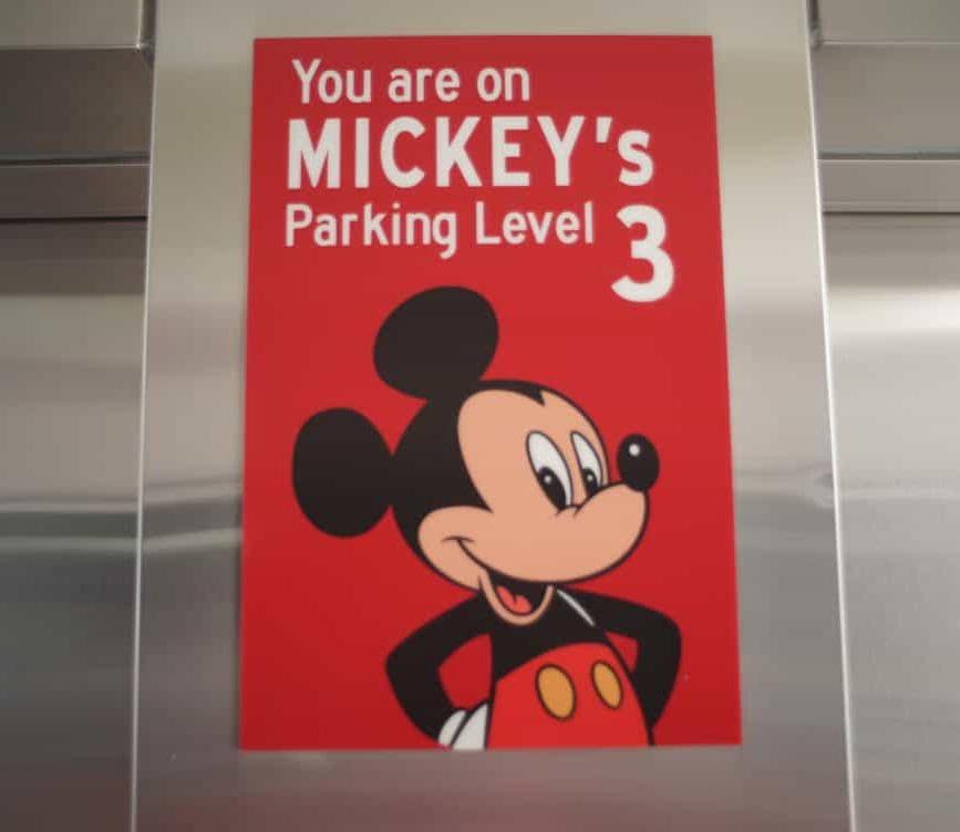
BRANDING AND WAYFINDING In addition to helping people find their way, businesses also use wayfinding to further their brand connection with audiences. Take Disneyland, for example. Even the parking structures have touches of the Disneyland brand. Instead of remembering you parked your car on Level 3, you remember that you parked it on the Mickey Mouse level. In this way, wayfinding can be both fun and functional, which helps people move through spaces with confidence.
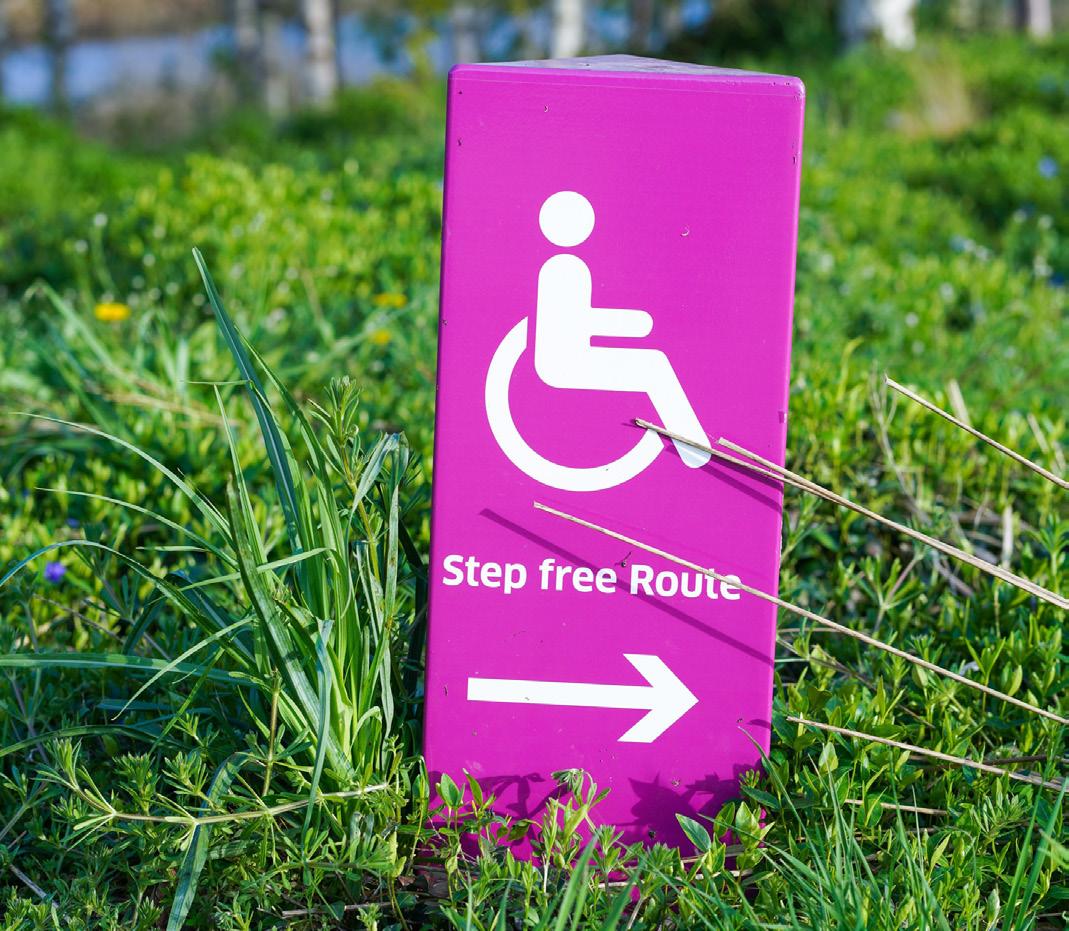
We still have a long way to go when it comes to designing and implementing accessible and inclusive wayfinding systems. Various laws and bylaws, such as the Accessible Canada Act, identify the minimum requirements for acces sible wayfinding systems, such as the heights, colours, materials, and typefaces for signage, and the inclusion of Braille. Not all businesses and not all types of signage are mandated to incorporate these accessibility requirements, but that is not a reason to ignore them. Accessibility also comes into play when considering the physical layout of the space through which people navigate. If the location has stairs, those in wheelchairs, on crutches, or with strollers are likely unable to get the full experience. Locations with narrow hallways or aisles make it difficult to manoeu vre through, and some people might have to take a different path or be entirely unable to go somewhere.
ACCESSIBILITY AND WAYFINDING
32
STRATEGIES NAVIGATINGFORSPACES
Per Mollerup is a Danish designer known for his work on the wayfinding system designs for the Copenhagen, Oslo, and Stockholm airports, and for the Copenhagen Metro. In his various publications, he identified nine strat egies for how we navigate through spaces. These strategies help designers build strong wayfinding systems and recognize where design interventions might need to occur.
4. DESTINATION RECOGNITION: We arrive at our destination. This could be signalled by seeing a sign, a virtual assistant like Siri ending our route, or the tour guide ending the tour.
2. ROUTE DECISION: We choose a course of direction. This might involve checking a map, looking for signage, or following given directions.
1. ORIENTATION: We attempt to determine where we are, in relation to landmarks or objects near us. For example, when you arrive in a new location and check your pin on Google Maps, you are orienting yourself based on the shops and street signs near you, compared to what you see on the map.
The basic process of wayfinding is something we have all done countless times. It might look a little different because of advances in map ping technology, but the underlying process of navigating space remains the same. The steps in this process all offer opportunities for wayfinding system designers to intervene and help improve experiences.
3. ROUTE MONITORING: We ensure that our selected course of direction is accurate and will take us to our destination. This might involve checking your map, asking for help, or looking for key landmarks or signs.
BASIC PROCESS OF WAYFINDING
SCREENING: To systematically search the area for a helpful clue, such as when you want a coffee, so you look around to see if anyone is carrying coffee, then observe where they might be coming from.
TRACK FOLLOWING: To rely on directional signs on the road, such as when you follow street signs in an unfamiliar location.
33
INFERENCE: To apply norms and expectations of where things are, such as assuming there might be a water fountain near a washroom in a public place, so when you decide you need water, you head towards the washroom.
MAP READING: To use a map on the wall, your phone, or a kiosk to figure out where you are, in relation to where you want to go.
SOCIAL NAVIGATION: To follow the crowd and learn from other people’s actions, such as when exiting the Saddledome after a hockey game and going with the flow of people.
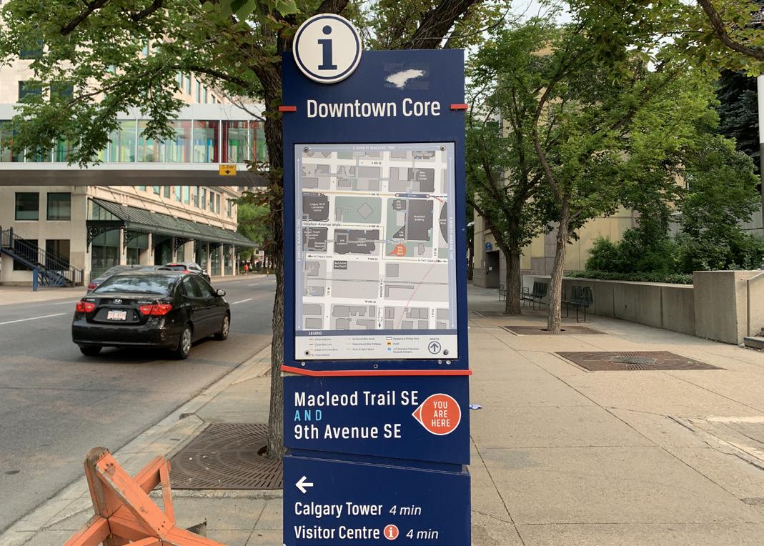
COMPASSING: To use a “compass” to figure out where to go, such as the location of the sun or a landmark, like the Calgary Tower.
EDUCATED SEEKING: To draw on your past experiences to figure out where to go, such as an airport you have been to several times, where the gate locations are familiar.
ROUTE FOLLOWING: To follow a given route, such as a pre-planned route before starting a trip, or listening to Siri as she talks you through an inputted route on your phone.
AIMING: To find a target and move in that specific direction. For example, when you are looking for the bar in a crowded club, you might look for a server and watch where they go.

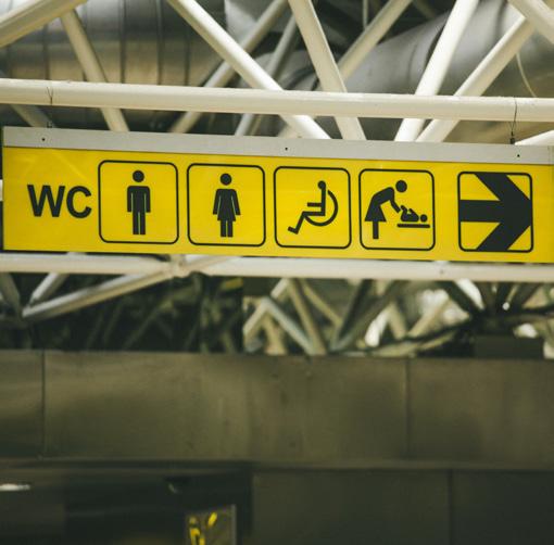


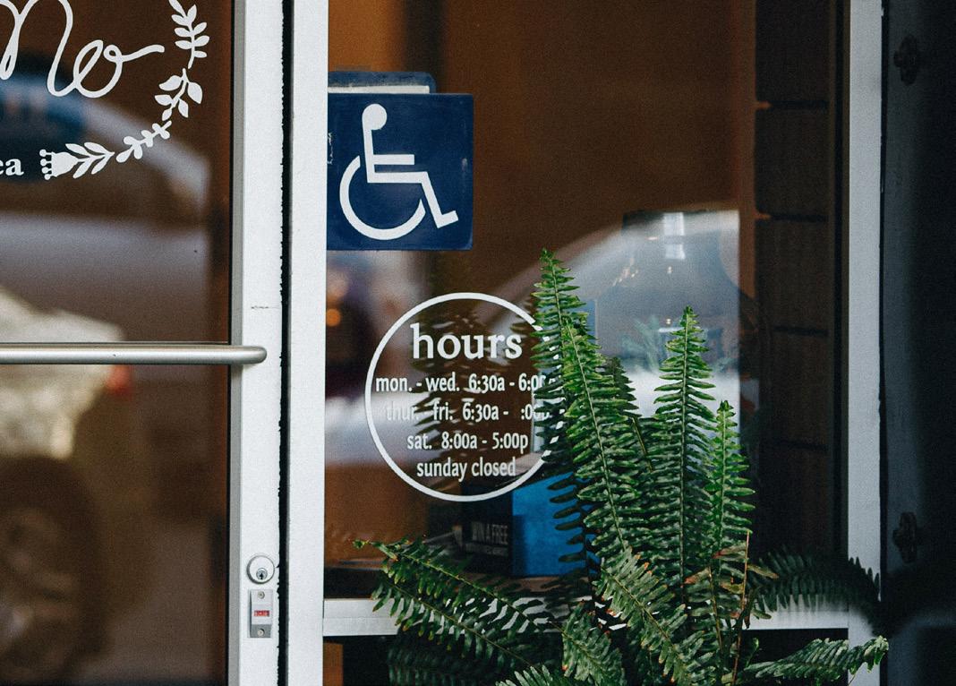
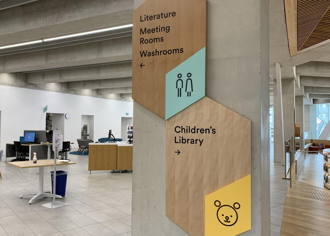
TYPES OF SIGNAGE
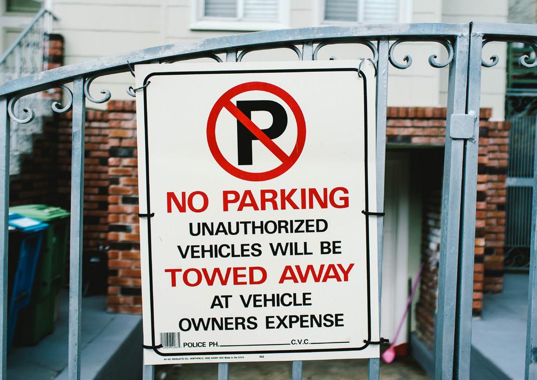
REGULATORY: Informs people what they can and cannot do in an area. Examples include “No Smoking,” “No Parking,” and “Restricted Area.”
INFORMATIONAL: Provides key information about the space. Examples include opening hours, wifi login details, and plaques contain ing historical details.
DIRECTIONAL: Points people in the direction of specific areas. Often located at junctions where people have to make decisions about their route or next steps. Examples include lists of which offices are on which floor in a building, and arrows pointing to locations like bathrooms, airport gates, or parkades.
IDENTIFICATION: Helps people recognize where they currently are. Often located at building entrances, in parkades, and in the middle of large areas, usually in the form of “You Are Here” stickers or pictograms.
34
LIGHTING: Ensure signage is appropriately lit. If the signage will be viewed in different environ ments throughout the day, ensure the signage can be viewed in all levels of light.
CONSIDERATIONS FOR GOOD WAYFINDING SYSTEMS DECISION AND ENTRY POINTS: Ensure signage is located at junctions where people need to make decisions about where to go, or when people enter a location, such as at an elevator, in a hallway, a front lobby, or any where else where there are multiple potential directions to go.
CONSISTENCY: Ensure signage and wayfinding elements use consistent colours, symbols, and type systems. Consider how you can ingrain wayfinding elements in people’s minds, such as assigning a colour to each floor and using that colour liberally throughout the space.
ACCESSIBILITY AND INCLUSIVITY: Ensure signage meets and potentially exceeds acces sibility recommendations and requirements, including colour, type, and height.
VISIBILITY: Ensure signage or wayfinding elements are not obstructed by trees, pillars, or other signs.
35
AUDIENCE EXPECTATIONS: Ensure signage does not depart too far from people’s expectations. For example, we expect to see some form of guiding signage when we exit an elevator, or upon entering a building.
CLUSTERING: Ensure that when signs must be grouped together, either for lack of space or because there are several things that must be communicated in one spot, the signage and wayfinding elements are still clear and understandable. This might mean creating a sense of hierarchy, such as order ing based on the busiest locations or the most important information.


INCLUSIVE DESIGN
In her book Mismatch, Kat Holmes writes about how she came to the book’s title. The World Health Organization defines “disability” as a “mismatched interaction between the features of a person’s body and the features of the environment in which they live.” Broadly speak ing, it should be the job of every designer – whether an architect, an urban planner, a user experience designer, a teacher, a videographer, a product designer – to reduce the number of mismatched interactions that people experience in their daily lives. One example of a mismatched interaction is a sidewalk. The slope at the end of a sidewalk or start of a crosswalk is called a curb cut. These curb cuts, which are fairly common nowadays, did not always exist. It took years of advocacy by those in wheelchairs and other disabled individuals for city officials and urban planners to realize that the built environment in its current state was excluding people from being able to move around freely, and thus excluding people from fully participating in society. Thanks to the advocacy of the people most impacted, we have curb cuts. And those curb cuts do not just help people in wheelchairs –they also help the new parent pushing their baby in a stroller, and they help the older adult with knee troubles get to the grocery store down the street. With the addition of Inclusive design doesn’t mean you’re designing one thing for all people. You’re designing a diversity of ways to participate so that everyone has a sense of belonging.”
& INCLUSIVE
URBAN
– GOLTSMAN, DESIGNER DESIGN THOUGHT LEADER
36 Designers have a responsibility to the people of this world. What you do as a designer can inspire change, fuel anger, and affect the course of someone’s life. You will hear a lot of talk in the design world of “the user.” “The user” interacts with what you design, and is either able to successfully use what you have designed, or will fail. This “user” is a myth. There is no average person. There is no normal experience. Humans are so individual, so diverse, and so not normal that it is impossible to design one solution that works for everyone. To design for “normal” is to exclude. To exclude is to leave people behind. This is where inclusive design comes in. The term has been around for several years –initially in academic areas, but more recently in a broader context thanks to designers like Susan Goltsman and Kat Holmes. In particular, designer Kat Holmes pioneered the broader conversation of inclusive design while working at Microsoft. According to Microsoft, “Inclusive design is a methodology that enables and draws on the full range of human diversity.” Inclusive design is about making sure that nobody gets left behind. To borrow a common analogy from both Kat and Susan, inclusive design means that everyone gets to play on the playground.
SUSAN
“
Vegetable peelers with ergonomic handles help those with joint issues cook and prepare food comfortably – and are just plain com fortable for anyone to use. Even touchscreens have inclusive design origins. We can thank Wayne Westerman, an engineer with carpal tunnel syndrome, for the touchscreens on our smartphones. His company created a touchpad alternative to a typical keyboard so that those with hand inju ries could still interact with computers. Now, touchscreens are the cornerstone of so many pieces of technology – phones, tablets, digital kiosks at the mall, fast food ordering screens.
Inclusive design certainly takes accessibility into account – ideally, anything designed through inclusive design processes should be acces sible and meet all accessibility standards and requirements. Overall, accessibility is just one piece of the broader inclusive design puzzle. Thanks to the advocacy of the impacted,individualsdisabledmostcurbcutshavemadeiteasier for people of all abilities to move around urban spaces.
37
INCLUSIVE DESIGN AND ACCESSIBILITY
Inclusive design processes should result in final products that can be used not just by people with disabilities, but really by anyone. Inclusive design takes our social and cultural differences into account – not just our physical differences. Speaking English as an additional language is not a disability. Being a parent is not a disability. Having limited internet access is not a disability. And yet these examples would benefit from products and services designed through inclusive design processes.
curb cuts, so many more people are able to get around safely, no matter their situation. More people can play on the playground. Many products in our world have inclusive design origins. Office chairs with adjustable backs, arms, and heights help people of all shapes and sizes work comfortably.
These two concepts are often discussed in the same spaces, and sometimes people use the terms interchangeably. However, they are not the same thing. Accessibility is a term specifically used to describe accommodations for those with disabilities. Inclusive design, while being about the design of things to accommodate more people, is not exclusively about disability.
Touchscreens let more people play on the playground. And they make the playground even more fun.

SOLVE FOR ONE, EXTEND TO MANY: Microsoft’s Persona Spectrum describes this principle in terms of three states: Permanent, Temporary, and Situational. For our sense of hearing, a permanent state would be some one who is deaf. A temporary state would be someone dealing with an ear infection. A situational state would be someone who is in a crowded and noisy environment, such as at a concert or in a bar. If you design with the deaf person in mind – the person whose hearing is permanently impacted – you end up designing for all those people who may find themselves having their hearing tempo rarily or situationally impacted. And, of course, you end up designing for people who have not had their hearing impacted at all. Address a need for one state, you design for all states.
MICROSOFT & KAT HOLMES’ INCLUSIVE DESIGN PRINCIPLES
LEARN FROM DIVERSITY: This principle is simple: to understand who we are designing for, we have to understand all potential use cases. We actually have to talk to people in wheelchairs or who use hearing aids to find out what works for them and what doesn’t. We have to invite diversity into our design spaces – as designers, as product testers, as consultants. We can learn from each other as designers and as people.
RECOGNIZE EXCLUSION: We need to seek out and examine the mismatches that exist in our world, and work to understand why that mismatch might be happening. This principle is also about recognizing our own biases, and acknowledging that our experiences are not everyone’s experiences. As designers, it is important to balance your knowledge as a designer with the knowledge and lived experiences of the people for whom you are designing.
38
39 PERMANENT TEMPORARY SITUATIONAL TOUCHSPEAKHEARSEE Arm injury New parent Blind Cataract Distracted driver Deaf Ear infection Bartender Non-verbal Laryngitis Heavy accent One arm Adapted from the Persona Spectrum by Microsoft..


Just like good information design, good techni cal writing goes by mostly unnoticed, whereas bad technical writing is immediately evident and results in frustration and confusion. From a business perspective, bad technical writing can be extremely costly. A good technical writer will apply the key theories, principles, and strategies outlined in Chapter Two, as well as the technical writing-specific concepts outlined in this section.
Technical writers often work with complicated material that people need to quickly
Technical writers play an important role in the business world. A good technical writer acts as the advocate for an end user. They translate complex business jargon and obscure words, phrases, and acronyms into useful information.
TECHNICAL WRITING
40
The work done by a technical writer helps accomplish key business objectives, such as getting products released and certified, and bringing employees and customers up to speed on new products and features.
Technical writing is an important piece of the information design puzzle. The profession of technical writing applies many of the theories, principles, and strategies we described in Chapter Two – in particular, LATCH, Miller’s Magic Number, hierarchy, grids, and difference threshold are the bread and butter of tech nical writers. Recall as well the strategies for breaking down complex content on page 13.
The Society for Technical Communication defines technical writing as “any form of com munication that exhibits one or more of the following characteristics: (1) Communicating about technical or specialized topics, such as computer applications, medical procedures, or environmental regulations. (2) Communicating by using technology, such as web pages, help files, or social media sites. (3) Providing instructions about how to do something, regardless of how technical the task is or even if technology is used to create or distribute that communication.” Essentially, technical writers are responsible for telling people what something means and how it works.
Technical writers are often not an expert in the field they are writing for – many even freelance across industries – and thus must have finely honed skills in breaking down complexity.
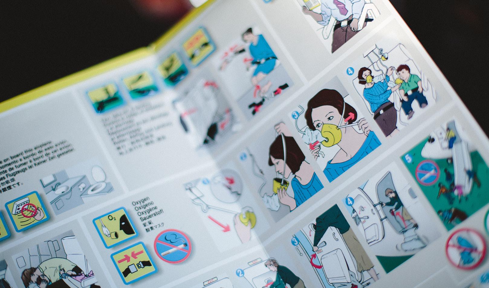
situations,inunderstanddangerouslikehowtoproperlyuseoxygenmasksonanairplane.
Examples of projects that a technical writer may work on include instructions for product assembly, new product manuals, trouble shooting steps, recipes, glossaries, annual reports, and orientation materials for new employees that outline dress codes, employee responsibilities, and key contacts.
Legacy documentation refers to all the existing documentation in a business or organization that may or may not be stylisti cally or technically outdated. Technical writers will often review legacy documentation to get a feel for the organization’s writing style. This knowledge will often inform the development of or update to a style guide for future documentation. Technical writers may or may not go back and “correct” the legacy documentation, depending on how frequently those documents are still being used.
LEGACY DOCUMENTATION
41
A style guide is a document that outlines the rules for writing in a particular way, including grammar and syntax. Some include specific ways to write citations and references.
Consistency is king in the world of technical writing – consistency in wordings and ter minology, consistency in document design, consistency in file naming conventions, et cetera. Many technical writers will use a style guide to help achieve this consistency.
You are likely familiar with some style guides already, as academic institutions usually follow one or more style guides when it comes to assignment formatting and citation lists.
Structured authoring is the automated exten sion to a style guide. This type of software can be implemented by a technical writing team to ensure consistency across multiple writers and multiple documents. Within the software, teams can define certain rules that must be followed within all writing projects. These rules could specify the mini mum and maximum number of bullets allowed in a list, the number of hyphens allowed in a paragraph, or that all imagery or illustrations must be accompanied by a caption. When implemented, the software automat ically searches documents and flags issues based on the set rules. The introduction of structured authoring software can help streamline workflows and automate consis tency, but the usual processes of editing and revision will still be needed.
STYLE GUIDES
Examples of style guides you may know are the Chicago Manual of Style, the American Psychology Association (APA) style, and the Associated Press (AP) style. Style guides are also developed to define the specific look, feel, and voice of businesses and organizations. These style guides usually include more than just rules for writing. They often include information on appropriate typefaces, logo usage, colour combinations, and photo styles. A technical writer at an organization would likely use one general style guide to determine the basic rules for writing, and then refer to the organization’s specific style guide to determine how to reference products and features, as well as how to design the final document according to the brand identity of the organization. Style guides get everyone involved with writing and documentation on the same page. Proper adherence to the style guide will cut down on editing and revision time, and ultimately streamline the communication of information to the end user.
STRUCTURED AUTHORING
TYPOGRAPHY
Typography is the creation of readable and aesthetically pleasing arrangements of letters and text. This aspect of design is tied very closely to the broader notion of information design, as information often comes in the form of text. The artful application of typo graphical principles can elevate an infor mation design product from good to great. This section of the textbook will focus on typography in terms of Latin typefaces. Other letterforms, such as Kanji or Arabic letters, may follow similar principles of typography. Typography has been a part of human history for as long as humans have been communi cating by written word. The most significant advancements came with the printing press, which sped up the creation and distribution of information. With the advent of the computer, the art of typography became more accessible to the average person. Now, many typefaces are household names – Arial, Helvetica, Times New Roman – and our world is constantly inundated with typographical marvels and nightmares. Many of the theories, principles, and strategies outlined in Chapter Two rely on a good handle of typography basics. Take, for example, hierar chy. Hierarchical systems are often a carefully considered combination of typeface size, weight, proportion, and style, along with colour, placement, and alignment, which can help audiences navigate the flow of information.
CHOOSING A TYPEFACE
Designer Jim Williams likens typefaces to “clothes for language.” He writes in his book Type Matters! that clothing, like typefaces, “come in thousands of different styles, and all say something different about the wearer.” When it comes to choosing a typeface, the choice must be informed by the message it is being used to communicate. Imagine you are developing the logo and brand identity for a lawyer’s office. Which typeface will inspire more confidence in potential clients – a quirky one, or a classic serif? There may be times in which it is acceptable to break these typographical conventions, but generally speaking, the goal is to match the typeface to the message.
42
Family Law Office ATTORNEYS AT LAW Family Law Office ATTORNEYS AT LAW
43 KINDS OF TYPEFACES SERIFMODERN SERIF SLAB SERIF SANS SERIF MONOSPACED SCRIPT Aa Aa Aa Aa Aa Aa GEOMETRIC SANS SERIF DISPLAY / DECORATIVE AaAa
DESCENDER: Letter parts that fall below the baseline. Often seen in lowercase q, y, p, g, and j. descender ascender stem serif baseline x-height cap height bowl counter ascender height
ASCENDER HEIGHT: The top of ascenders. Often extends above the cap height. BEAK: Left-hand side of the crossing line on lowercase t and f.
BASELINE: Central line where the body of most letters sit. BOWL: Rounded part of a letter. Often seen in uppercase R, O, P, D, and B, and lowercase e, o, p, d, g, and b.
CAP HEIGHT: Top of capital letters. COUNTER: Inside of the rounded part of a letter. Often seen in uppercase R, O, P, D, and B, and lowercase o, p, d, g, and b.
EYE: Inner part of a lowercase e. OVERHANG: Rounded parts of letters that rise just above the x-height or cap height, or below the baseline. SERIF: Little flicks at the feet and angles of a letter. Often mimics the stylistic flourishes of calligraphy.
SPUR: Little flick at the end of certain styles of lowercase a. STEM: Vertical, upright, and straight lines of a letter. Often seen in uppercase T, Y, P, F, and K. TAIL: Specific descenders on letters like lowercase y. X-HEIGHT: Top of the main body of most let ters. Defined by the letter x for each typeface. beak tail spur eye overhang
44
ASCENDER: Letter parts that rise above the x-height. Often seen in lowercase t, f, h, and k.
PARTS OF A LETTER
WIDOW: When the last line of a paragraph ends up at the top of a new column.
READABILITY: The ability to visually compre hend a chunk of text.
TYPEFACE: The particular design of a set of letters. FONT: The delivery method for a set of letters, such as a software file. In modern times, this word is used interchangeably with typeface.
LOWERCASE: Minuscule letters. Named for the traditional lower drawer storage of small letterforms in printing press setups.
45
TYPE DESIGN: The creation of a typeface for standardized use.
LEADING: The white space between lines of type.
TRACKING: The white space between letters or characters across a line of text.
TYPE FAMILY: A group of typefaces that share a name but vary in terms of weight (light, bold, extrabold, etc.), proportion (condensed, extra wide, etc.), and angle (italic, backslanted, etc.).
LEGIBILITY: The ability to distinguish individual characters from one another.
LETTERING: The integration of words and art to create unique instances of text-as-visual-elements.
UPPERCASE: Capital letters. Named for the traditional upper drawer storage of capital letterforms in printing press setups.
ORPHAN: When a word or very short line of text ends up as the last line in a paragraph.
RIVERS: Visually distracting streaks of white space that occur when spaces between words horizontally stack up in a chunk of text, usually when the paragraph style is set to justified.
KERNING: The white space between two indi vidual letters or characters in a single word.
KEY TERMINOLOGY
A common example of instructional design is the development of e-learning, or the use of electronic resources to create a learning experience. Instructional design is present in any field where learning must occur, including anywhere from formal academic spaces to the corporate world. Typically, when an information designer ends up in an instructional designer role, they will be in a corporate or non-profit environment. That being said, some academic institutions seek out instructional designers to help facilitate course development alongside professors or instructors who may serve as the subject matter expert.
THE E-LEARNING PIE Designer Ellen Wagner developed the concept of the “e-learning pie” as a way to explain all the elements that go into course development, particularly from a corporate perspective. While the name implies it is only relevant to e-learning, the broader notions can be applied to the development of nearly any learning experience.
46
Instructional design is another umbrella term that encapsulates many professions and skill sets. At its core, instructional design is about the combination of instructional design theory (methods of instruction) and learning theory (methods of learning) to create engaging learning experiences that result in new knowl edge, new skills, or changed behaviours.
INSTRUCTIONAL DESIGN
CREATIVITY: Involves the imaginative and innovative use of design principles to design engaging learning experiences that result in observable, measurable changes.
LEARNING: Involves exploration into how we learn and the identification of strategies to ensure knowledge retention. Also involves the identification of strategies for assessing the extent to which learning has (or has not) occurred.
BUSINESS: Involves the examination of how learning experiences fit into the busi ness’ goals and objectives, and ensuring learning projects are completed on time and on budget.
TECHNOLOGY: Involves the combination of technological skill sets – programmers, developers, designers, etc. – and techno logical programs – Learning Management Systems (LMS) for hosting training and resources, design programs for creating training assets, and data collection.
This pushback against the concept of learning styles is not intended to discount the impor tance of accommodations. Respecting the needs of learners with disabilities is not the same thing as making a video just because Joe Smith from the accounting department says he’s a visual learner. Instead, making a video with closed captioning and a supplementary written handout distributed prior to an instructor-led training session provides a pro active and more inclusive learning experience.
Ultimately, how someone thinks they learn best is not as important as ensuring the learning experience is informed by the content, and how learners will be expected to use the knowledge gained by the learning experience. Give learners a variety of ways to engage in the content and respect accom modations for any learners with disabilities. Let the complexity of the content inform the resulting learning experience.
The resulting training package could involve a pocket book with clear diagrams of first aid techniques, accompanied by a 2-hour hands-on course. To further recall and reinforce the training, you could institute a six-month refresher course, or create a video series that occasionally gets promoted on the company’s intranet.
Even if you say you are a visual learner and learn best from pictures or videos, if you read something enough times, it is eventually going to sink in. And some skills are just best learned from hands-on experience. You wouldn’t call yourself an expert at CPR if you had just read a book about it, would you?
The notion that someone learns better from reading than from watching a video, or vice versa, is provably false. The way the brain forms memories and retains new information is fairly standard from person to person.
You may have heard people say things like, “Oh, I’m a visual learner so videos work best for me,” or, “The only way I learn something new is by practicing it myself.” You may have even said or thought things like this about yourself. The concept of learning styles has had a deep foothold in the learning com munity for decades. Lately, the conversation has been shifting away from learning styles – mostly due to a lack of evidence that there are, indeed, tried-and-true learning styles.
LEARNING STYLES
47
Let’s return to the CPR example for a moment. Say you have been tasked with developing training on basic first aid for your department. Under the notion of learning styles, you would perhaps survey your department on how they learn best. If most people say they are visual learners, you may just produce a video and call it a day. If we instead forego the concept of learning styles, you would look at the knowledge and skills you are trying to impart in order to determine what kinds of learning experiences you will create. First aid cannot be learned simply from watch ing a video or reading a list of instructions. Even just doing hands-on practice removes the nuance from first aid care. To truly create an authentic and effective learning experience that supplies learners with all the skills they need, you would likely create a comprehensive training package that imparts basic knowledge, provides hands-on practice, and compiles resources for quick reference and recall.
Designer and author Tim Slade frequently pushes back against the notion of learn ing styles. Slade argues that someone’s supposed learning style should not be the deciding factor in the creation of a learning experience. In The Elearning Designer’s Handbook, Slade writes that “the content and the complexity of the task or skill being taught” should be the driving force in the creation of the learning experience.
THE SPACING EFFECT This cognitive psychology concept demon strates that more information is retained if learning is spaced out over time, rather than crammed into one session. Think back to high school – did you ever cram the night before a test? You might have done well on the test because the information was fresh in your brain, but if you tried to recall it later, you would likely struggle. Over and over again, cognitive psychologists have studied the difference in performance between those who crammed and those who spaced out their study sessions. Those who crammed failed to recall as much information later than those who spaced out their sessions. To fully ingrain new knowledge and skills in the learner, it is important for instructional designers to space out learning experiences over time. You may begin with one central learning experience – an e-learning course taken in the first week of employment, for example. Then, a week later, you might send out a quick four-question quiz to all new employees who took that e-learning course. Then, two months down the line, you might send another little quiz to those employees, or you might put up some posters around the office. In this way, you are ensur ing that the information is retained because employees are having to recall that informa tion more frequently. The spacing effect also applies when creating a package of learning experiences. It may completely overwhelm the learner to have one e-learning course, three videos, and a role-playing game all in one day. Spreading these learning experiences out over time –even if they are about different topics – will give the brain time to process the new information.
48
Spacing out study sessions has been proven to be more effective than cram sessions. The same concept can be applied to corporate training.

D ESIGN: Creation of learning objectives, discussions with subject matter experts, selection of learning assets to be developed (documents, podcasts, e-learning, videos, etc.), and the brainstorming of potential activities, exercises, assessments, and tests.
This framework describes the learning experience development process. Its five phases involve a close examination of who will be taking the learning, what gaps the learning experience is hoping to fill, which strategies will result in the best learning experience, and how the learning experience was received after implementation.
49
ADDIE (ANALYZE DESIGN DEVELOP / IMPLEMENT / EVALUATE)
The ADDIE model has faced criticism that it is a restrictive and prescriptive process with little room for experimentation, iteration, and creativity. However, actual application of the model in real-world situations is not as regimented as some may think. The ADDIE model is simply a way to think through the steps of creating a solid learning experience so that important things like audience analysis are not missed.
/
A NALYZE: Identification of who will be taking the learning, why the learning is needed, how the learning can take place, which constraints may impact development, and the estimated timeline for completion.
D EVELOP: Creation of learning assets as previ ously selected in the Design phase. This phase is iterative and requires rounds of testing, feedback, and review.
/
E VALUATE: Assessment of the success of the implemented learning experience. This may include releasing a post-training survey, reviewing test scores, and observing on-thejob behaviour changes. Results of this phase will likely send the developer back into the design or develop phase to make changes.
I MPLEMENT: Release of the learning experi ence into the world. This may include upload ing the course to an LMS like Blackboard or Google Classroom, publishing a video on YouTube, or distributing a physical or emailed document, among other methods.
WEAK LEARNING OBJECTIVES
By the end of this course, students should:
Bloom’s Taxonomy was developed in 1956 by educational psychologist Benjamin Bloom and his collaborators, Max Englehart, Edward Furst, Walter Hill, and David Krathwohl. This framework provides educators with a way to categorize the goals of a learning experience based on the desired outcome of the learning.
Some educators and psychologists view Bloom’s Taxonomy as a pyramid, where the bottom layer of learning must be achieved before progressing up the pyramid. However, others view the framework more flatly, and that the desired outcome will dictate which part of the taxonomy is applicable. The original 1956 taxonomy was revised in 2001 by a group of researchers, psychologists, and educators. The new version is much less prescriptive than Bloom’s original framework, and provides educators with more flexibility in how they choose to apply the framework to their curriculum.
• Categorize food items as either a fruit, vegetable, or legume based on its characteristics.
Educators often use Bloom’s Taxonomy when developing learning objectives. A learning objective is a simple, clear, and measurable statement about what the learners should be able to do or accomplish upon completing the learning experience. These can get very granular on a lesson-to-lesson basis, or can be sweeping statements about a year-long course. Learning objectives help educators target the development of the learning experience to the specific and tangible things that learners need to be able to know or do. The verbs that fall under each part of Bloom’s Taxonomy are the driving force in the development of strong learning objectives. Weak verbs like “under stand” or “know” are difficult to observe and quantify, whereas stronger verbs like “explain,” “describe,” and “compare” are more tangible. Explore the examples of weak and strong objectives below. Note how being specific with the initial verb can inform what kind of learning experience will accomplish the objective.
• Grasp that tomatoes are a fruit.
• List which planets are located in the Milky Way.
50
By the end of this course, students will be able to:
STRONG LEARNING OBJECTIVES
BLOOM’S TAXONOMY
• Understand that Earth is in the Milky Way. • Know when Calgary hosted the Olympics.
• Describe the economic impact that the 1988 Winter Olympics had on the city of Calgary.
51 REMEMBER UNDERSTAND APPLY ANALYZE EVALUATE CREATE Copy Define MemorizeHighlightFindListMatchNameQuoteReciteRepeatStateTell ParaphraseDescribeClassifyCiteDiscussExplainExpressGroupIdentifyIndicateInferRecognizeSelectSummarize DemonstrateCompleteChooseActDiscoverImplementPresentProduceSketchSolveUse BreakAnalyzedownCalculateCategorizeCompareConnectContrastCorrelateDeduce Differentiate DistinguishDivideEstimateExamineOrganizeSurvey RecommendConvinceAppraiseArgueCritiqueDefendJudgeJustifyPredictPrioritize Re-frame SupportSelectTestValue CollaborateAssembleBuildComposeComposeDesignDevelopFacilitateGeneralizeInventInvestigateManageModifyProgramRearrangeSimulateWrite
USING PERSONAS Personas are usually created in the early stages of a user experience design project, and best practices dictate that they should be informed not by assumptions, but by the UX researcher’s explorations into potential and existing cus tomers. They are more than just surface-level generalizations and demographics. Personas are a way to understand the values, needs, and desires of potential and existing customers.
User experience design unites several facets of design: user experience research, user interface design, brand and identity design, and product design, to name a few. These user experience designers examine the entire lifecycle of a product or service, from con ception to execution, to troubleshooting and next generations. User experience designers aim to create experiences around and within products and services for people that are functional, useful, and aesthetically pleasing. We see examples of user experience design in the apps we use to communicate and share information, and in the websites we use for online shopping. User experience design is evident in the cars we drive, the appliances we use, and the packages we open. The experience of the user has been carefully considered each step of the way: from the moment we hear about a product or service, to our decision to purchase or use a product or service, and through to any troubleshoot ing issues that may arise. Every touchpoint has been designed with people in mind. In the corporate world, one person may wear the hats of many UX roles: researcher, designer, and visual (or interface) designer. Sometimes these roles are split among teams or individuals. Generally, the UX researcher is responsible for determining the ins and outs of the audience’s needs. They will talk with potential or existing customers to get a feel for pain points and issues that can be addressed with the new product or service.
This research is then compiled and passed onto the UX designers, who will brainstorm concepts that address the identified pain points and issues. This process is iterative and cyclical, and at certain points, the customer is brought back into the fold to assess if the concept meets their needs and addresses their pain points. Once the UX designers feel that the product or service is ready for refinement, the user interface (UI) designer steps in. This may involve connecting with other teams, such as software developers or product manufactur ing. Ultimately, the UI designer is responsible for ensuring the visuals of the product or service aligns with the business’ brand and is cohesive across the product or service. A good user experience team will conclude each project with a post-release debrief. This usually involves a close examination of the resulting product or service: did we build what we set out to build? Did the final product or service match the needs of the user?
52 USER EXPERIENCE DESIGN
The post-release debrief may result in a list of considerations for future evolutions or updates to the product or service, and the team will often keep track of problems that arise and any requests for new features. The design process remains cyclical and iterative, even once a “final” product or service has entered the world.
Building one or more personas is also a great way to help designers empathize with their customers. Personas humanize the cus tomer, and make the mythical “end user” feel more real. Throughout the design process, designers reflect on the personas and ask themselves, will this design help or hinder my persona? Am I meeting their needs or just adding to the chaos and distraction of their life? Ultimately, when done right, personas can be a useful way to ground designers in reality and help them create meaningful products and services.
There are several strategies applied by UX and UI designers during the design process. These strategies keep them on track with addressing the pain points and needs of potential and existing customers. For the purposes of this book, we will focus on three strategies for visualizing and testing concepts.
53
MOCK-UP: Mid- to high-fidelity designs of concepts. Usually filled with dummy text or unfinished content. Brand identity elements like colour, logos, and typefaces are applied. Useful for helping users visualize the potential end product, and for making decisions about logo placement, hierarchical systems, and brand colour application.
PROTOTYPE: Mid- to high-fidelity usable ver sions of concepts. Can be filled with dummy or final content. May or may not be fully designed to incorporate the brand identity. Useful for testing functionality to see if people have any issues with button or navigation placements, or if they are unsure of what to do next after completing certain interactions.
Testing out concepts is a vital part of the cyclical user experience design process. The lower the fidelity, the more likely you will receive better feedback.
WIREFRAME: Low-fidelity and simplified versions of concepts. Usually involve squares, rectangles, X’s, and lines to represent areas where content will be. Useful for quickly testing layout options and exploring locations of buttons, text entries, content, and naviga tion. Generally, the lower the fidelity, the more likely people will give more useful feedback, as the unfinished, sketch-like nature of the design indicates that nothing is set in stone.
VISUALIZING AND TESTING CONCEPTS
SUMMARY

The design of information is present in nearly every part of the human experience. From the time humans could communicate, information design has been present. As the world continues to connect on a global scale, the design of good information that respects the needs and situations of its audience has become increasingly important.
The theories, principles, and strategies identified in this book provide the groundwork for effective and meaningful communication design. Appropriate application of these concepts is the hallmark of good information design. However, there may be times where breaking from standards and norms of communication design may be valuable and impactful. Knowing when to stay true to audi ence expectations and when to break away is an important skill to develop in budding information designers. Information design contains multitudes, and is not restricted to just one or two forms of communication design. We see the design of information in our city streets and on our phones. We see it when we unbox a package and when we set out to build our brand-new IKEA furniture. Every touchpoint in our lives has been carefully designed by someone, or teams of someones. Ultimately, information design is the difference between feeling confi dent and informed, or confused and alone.
Design is an opportunity to everythingjuststory,tellingcontinuethenottosumup.”
– TATE LINDEN, BRAND STRATEGIST “
As you embark on your information design journey, consider this: how can you, as a designer and communicator of information, make a difference? No matter big or small, every information design product has an impact. What will your impact be?
55
Dirksen, J. (2016). Design for How People Learn: Second Edition. New Riders. Dubey, P. (2020, August 25). Role of Semiotics in Design Thinking & UX Design. UX Magazine. role-of-semiotics-in-design-thinking-ux-designuxmag.com/articles/
56
ADDIE Model. (2020, November 27). In Wikipedia. en.wikipedia.org/wiki/ADDIE_Model. Adobe. (2018, January 9). Structured authoring. help. framemaker-2017/frm_structauth_sa/Structured_authoring-.adobe.com/en_US/framemaker/2017/using/usingApostolopoulos,authoring,guides%20and%20enforced%20by%20editors.htm#:~:text=Structured%20authoring%20is%20an%20A.(2021,March26).
ADDIE training model: What is it and how to use it in eLearning. TalentLMS. talentlms. com/blog/addie-training-model-definition-stages/ Armstrong, P. (n.d.). Bloom’s Taxonomy. Vanderbilt University Center for Teaching. cft.vanderbilt.edu/guides-sub-pages/ blooms-taxonomy/ Baer, K. (2008). Information Design Workbook Rockport Publishers Inc. Benjamin Bloom. (2021, March 26). In Wikipedia en.wikipedia.org/wiki/Benjamin_Bloom Boller, S., & Fletcher, L. (2020). Design Thinking for Training and Development: Creating Learning Journeys That Get Results ATD Bradley,Press.S. (2014, March 29). Design Principles: Visual Perception And The Principles of Gestalt. Smashing Magazine perception-and-the-principles-of-gestalt/smashingmagazine.com/2014/03/design-principles-visualChapman, C. (n.d.). Exploring the Gestalt Principles of Design Toptal. toptal.com/designers/ui/gestalt-principles-of-design Charlene Kaye [@charlenekaye]. (2020, June 1). My wise and brilliant sister @liann.kaye has been writing these Q&As in her stories about how to help during this time [Photograph]. Instagram. instagram.com/p/CA6n_1wJDIT/ de Soto, D. (2015). Know Your Onions: Graphic Design BIS Publishers.
REFERENCES
Holmes, K. (2018). Mismatch: How Inclusion Shapes Design The MIT InclusivePress.design. (2021, June 21). In Wikipedia en.wikipedia.org/wiki/Inclusive_design
Hamilton, M. (2021, March 3). What is Structured Authoring? MadCap Flare. what-is-structured-authoring/madcapsoftware.com/blog/ Hannah, J. (2021, January 10). What Is Typography, And Why Is It Important? A Beginner’s Guide CareerFoundry. beginners-guide-to-typography/careerfoundry.com/en/blog/ui-design/ Heller, S., & Vienne, V. (2012). 100 Ideas that Changed Graphic Design. Laurence King Publishing Ltd. Hodge, C. (2003, August 11). Semiotics: A Primer for Designers. Boxes and Arrows. semiotics-a-primer-for-designers/boxesandarrows.com/
Holmes, K. (2016, October 15). Who Gets to Play? Medium. who-gets-to-play-f4a12d8aba47medium.com/microsoft-design/
Gestalt psychology. (2021, July 12). In Wikipedia en.wikipedia.org/wiki/Gestalt_psychology
Fabrik. (n.d.). Where do we go now? Exploring the wonders of wayfinding design. the-wonders-of-wayfinding-design/fabrikbrands.com/
Grilo, A. (2017, July 2). Why semiotics matters in product design. Medium. why-semiotics-matters-in-product-design-43ec49d11d04andregrilo.medium.com/
Slade, T. (2020). The Elearning Designer’s Handbook: Second Edition. Tim Slade. Society for Technical Communication. (n.d.). Defining Technical Communication. Spacingdefining-technical-communication/stc.org/about-stc/effect.(2021,May6).In Wikipedia en.wikipedia.org/wiki/Spacing_effect Style guide. (2021, May 31). In Wikipedia. en.wikipedia.org/ wiki/Style_guide Technical Writing Aid. (n.d.). Examples of Technical Writing technicalwritingaid.com/examples_of_technical_writing.html
Interaction Design Foundation. (n.d.). Personas interaction-design.org/literature/topics/personas
Technical writing. (2021, May 19). In Wikipedia Twoen.wikipedia.org/wiki/Technical_writingTwelveProjects.(n.d.).
57 Interaction Design Foundation. (n.d.) Gestalt Principles. interaction-design.org/literature/topics/gestalt-principles
Interaction Design Foundation. (n.d.). User Experience (UX) Design. interaction-design.org/literature/topics/ux-design
Lupton, L., & Phillips, J. C. (2008). Graphic Design: The New Basics. Princeton Architectural Press. Lupton, L. (2010). Thinking With Type: A Critical Guide for Designers, Writers, Editors, & Student: 2nd Edition Princeton Architectural Press. Lynch, K. (1960). The Image of the City. The MIT Press. Mackereth, J. (2020, June 24). Wayfinding Is Where Place Meets Information Design. Medium. wayfinding-is-where-place-meets-information-design-medium.com/nightingale/ Microsoft.b668aa224349(n.d.).
Inclusive Design. microsoft.com/ design/inclusive/ Mollerup, P. (2005). Wayshowing – A Guide to Environmental Signage: Principles and Practices. Lars Müller Publications. Nguyen, T. (2020, August 12). How social justice slideshows took over Instagram. Vox. social-justice-slideshows-instagram-activismvox.com/the-goods/21359098/
Disneyland Resort Parking Garage. resort-parking-garage.htmltwotwelve.com/wayfinding-systems/disneyland-
O’Grady, J. V., & O’Grady, K. V. (2008). The Information Design Handbook. HOW Books. Roberts, K. B. (2014, May 27). Tech pioneers. UDaily. www1.udel.edu/udaily/2014/may/nai-fellows-052714.html
Sanders, J. (2019, August 7). Quick Guide to Disneyland Parking The Happiest Blog on Earth. thehappiestblogonearth.com/ disneyland-parking-tips/ SEGD. (n.d.). What is Wayfinding? segd.org/what-wayfinding Shedroff, N. (2014, September 2). Information Interaction Design: A Unified Field Theory of Design. Nathan. information-interaction-design-a-unified-field-theory-of-design/nathan.com/
USD Internet Sensation & Perception Laboratory. (n.d.) Weber’s Law of Just Noticeable Differences. University of South Dakota. apps.usd.edu/coglab/WebersLaw.html
Jacobson, R. (Ed.). (2000). Information Design. The MIT Press. Kovarik, B. (2013). Revolutions in Communication: Media History from Gutenberg to the Digital Age. Bloomsbury Academic. Lidwell, W., Holden, K., & Butler, J. (2010). The Pocket Universal Principles of Design: 125 Ways to Enhance Usability, Influence Perception, Increase Appeal, Make Better Design Decisions, and Teach through Design. Rockport Publishers.
UserTesting.58 (2019, April 9). 7 Gestalt principles of visual perception: cognitive psychology for UX. usertesting.com/ blog/gestalt-principles
White, A. W. (2011). The Elements of Graphic Design: Second Edition. Allworth Press Widows and orphans. (2021, April 25). In Wikipedia en.wikipedia.org/wiki/Widows_and_orphans
Williams, J. (2012). Type Matters! Merrell Publishers Limited. Winter, T. (2016, March 1). Praise & Criticism: ADDIE Model Human Performance Technology. blog.dtssydney.com/ praise-criticism-addie-model
UXPin. (n.d.). Wireframes: What They Are & How They Support UX. what-is-a-wireframe-designing-your-ux-backbone/uxpin.com/studio/ui-design/ Van der Meulen, M. (2019, May 12). This means this, this means that: Semiotics – the study of meaning. UX Collective. uxdesign. Wayfinding.meaning-84cd9e800214cc/this-means-this-this-means-that-semiotics-the-study-of-(2021,June10).In Wikipedia. en.wikipedia.org/ wiki/Wayfinding Weber, K. (2011, August 15). Top 4 tactics to structure legacy documentation. Kai’s Tech Writing Blog. top-tactics-to-structure-legacy-documentation/kaiweber.wordpress.com/2011/08/15/
59 PHOTO LIST
CHAPTER ONE pg. 6 pg. 8 pg. 9 pg. 11 (top to bottom)pg.12 (top to bottom) CHAPTER TWO pg. 14 pg. 15 pg. 23 (top to bottom)pg.25 (left topg.pg.right)2627 (top to bottom)
HANNAH OLINGER, UNSPLASH XPS, PHILISAACMEADOWTHEJESSICAYOMEXMADISONHENRYAMELIEANDREASFLY:D,HYUNKATIAALOKJONATHANTAYLORWWF,MADISONMADISONTOMBALAZSARTSEMENERIKELLIOTTHANNAHPISITAMYDILLONCHARLENEJAMESUNSPLASHLEE,UNSPLASHKAYE,INSTAGRAMSHOOK,UNSPLASHHIRSCHI,UNSPLASHHENG,UNSPLASHOLINGER,UNSPLASHSTALLION,UNSPLASHODIIN,UNSPLASHBORISOV,UNSPLASHMARKIV,UNSPLASHKETYI,UNSPLASHDILLON,UNSPLASHSNELL,SCREENSHOTSNELL,SCREENSHOTWORLDWILDLIFE.ORGSIMPSON,UNSPLASHBORBA,UNSPLASHVERMA,UNSPLASHSCARPIGNATO,UNSPLASHWOOJEON,PIXABAYUNSPLASHLISCHKA,PIXABAYMOURICHON,UNSPLASHPERKS,UNSPLASHSNELLOWO,UNSPLASHSANDERS,HAPPIESTBLOGONEARTHMARIE,UNSPLASHMENEGAN,UNSPLASHMOSLEY,UNSPLASH
CHAPTER THREE pg. 28 pg. 29 pg. 30 pg. 31 (left topg.right)33 (top row, left to right) pg. 33 (middle row, left topg.right)33 (bottom row, left topg.right)34 (top row, left topg.right)34 (bottom row, left topg.right)35 (top to bottom)pg.37pg.39 (top row, left topg.right)39 (second row, left topg.right)39 (third row, left topg.right)39 (bottom row, left topg.pg.pg.pg.right)40454853
SUMMARY pg. 54
PAUL GREEN, UNSPLASH CALEB GEORGE, UNSPLASH ALEXANDER POPOV, UNSPLASH SEBASTIAN HIETSCH, UNSPLASH NATALIIA KVITOVSKA, UNSPLASH NICHOLAS GREEN, UNSPLASH STEVEN LELHAM, UNSPLASH MADISON SNELL MADISON SNELL ADAM GRIFFITH, UNSPLASH MADISON SNELL NICK VAN DER BERG, UNSPLASH MADISON SNELL PATRICK ROBERT DOYLE, UNSPLASH GERVYN LOUIS, UNSPLASH THIS IS ENGINEERING, UNSPLASH TOM CLAES, UNSPLASH WILLIAM FORTUNATO, PEXELS EREN LI, PEXELS PAUL DIACONU, PIXABAY ALEXANDRE BOUCHER, UNSPLASH CHONA UXAMELIERAMSHABRETTCALLEANDREAENGINEMILYDANIELHAYESDISABLEDKASINGER,ANDHEREPOTTER,UNSPLASHANGELE,UNSPLASHWADE,UNSPLASHAKYURT,UNSPLASHTUMMONS,UNSPLASHMACARONE,UNSPLASHJORDAN,UNSPLASHASAD,UNSPLASHMOURICHOM,UNSPLASHSTORE,UNSPLASH
Cover
THE GRAPHIC DESIGN EXERCISE BOOK Jessica Glaser GRAPHIC DESIGN: THE NEW BASICS Ellen Lupton and Jennifer Cole Phillips BASELINE SHIFT: UNTOLD STORIES OF WOMEN IN GRAPHIC DESIGN HISTORY Edited by Briar Levit KNOW YOUR ONIONS: GRAPHIC DESIGN Drew de Soto DESIGN FUNNY: A GRAPHIC DESIGNER’S GUIDE TO HUMOR Heather Bradley GRAPHIC DESIGN THEORY Edited by Helen Armstrong THE ELEMENTS OF GRAPHIC DESIGN: SECOND EDITION Alex W. White 100 IDEAS THAT CHANGED GRAPHIC DESIGN Steven Heller and Veronique Vienne USER EXPERIENCE DESIGN USER FRIENDLY Cliff Kuang with Robert Fabricant MEASURING THE USER EXPERIENCE Tom Tullis and Bill Albert
60 GENERAL DESIGN THE BLACK EXPERIENCE IN DESIGN Anne H. Berry, Kareem Collie, Penina Acayo Laker, Lesley-Ann Noel, Jennifer Rittner, Kelly Walters
RECOMMENDED READING
INSTRUCTIONAL DESIGN THE ACCIDENTAL INSTRUCTIONAL DESIGNER Cammy Bean DESIGN THINKING FOR TRAINING AND DEVELOPMENT Sharon Boller and Laura Fletcher HOW WE LEARN Benedict Carey DESIGN FOR HOW PEOPLE LEARN Julie Dirksen INSTRUCTIONAL STORY DESIGN Rance Greene DESIGNING FOR MODERN LEARNING Crystal Kadakia and Lisa M.D. Owens THE ELEARNING DESIGNER’S HANDBOOK: SECOND EDITION Tim Slade INCLUSIVE DESIGN AND ACCESSIBILITY MISMATCH: HOW INCLUSION SHAPES DESIGN Kat Holmes THE SENSES: DESIGN BEYOND VISION Ellen Lupton and Andrea Lipps INCLUSIVE DESIGN FOR A DIGITAL WORLD: DESIGNING WITH ACCESSIBILITY IN MIND Regine M. Gilbert DESIGN THINKING THIS IS SERVICE DESIGN DOING Mark Stickdorn, Adam Lawrence, Markus Hormess, Jakob Schneider
COLOR FOR DESIGNERS Jim Krause INTERACTION OF COLOR Josef Alberts THE POLITICS OF DESIGN: A (NOT SO) GLOBAL MANUAL FOR VISUAL COMMUNICATION Ruben Pater WOMEN DESIGN Libby Sellers INFORMATION DESIGN INFORMATION DESIGN WORKBOOK: REVISED AND UPDATED Kim Baer THE INFORMATION DESIGN HANDBOOK Jenn and Ken Visocky O’Grady INFORMATION DESIGN Edited by Robert Jacobson GRAPHIC DESIGN
HEALTH DESIGN THINKING: SECOND EDITION Bon Ku, MD and Ellen Lupton
BIAS IN DESIGN AND TECH INVISIBLE WOMEN: DATA BIAS IN A WORLD DESIGNED FOR MEN Caroline Criado Perez ARTIFICIAL UNINTELLIGENCE: HOW COMPUTERS MISUNDERSTAND THE WORLD Meredith Broussard WEAPONS OF MATH DESTRUCTION Cathy O’Neil
AUTOMATING INEQUALITY Virginia Eubanks DATA AND DATA VISUALIZATION
TECHNICALLY WRONG: SEXIST APPS, BIASED ALGORITHMS, AND OTHER THREATS OF TOXIC TECH Sara Wachter-Boettcher
61
INFOGRAPHICS: THE POWER OF VISUAL STORYTELLING Joseph Lankow, Josh Ritchie, Ross Crooks BEAUTIFUL EVIDENCE Edward Tufte DEAR DATA Giorgia Lupi and Stephanie Posavec INFOGRAPHIC DESIGN IN MEDIA Wang Kai INFOGRAPHIC DESIGNERS’ SKETCHBOOKS Rick Landers and Steven Heller DATA FEMINISM Catherine D’Ignazio and Lauren F. Klein
SELF-TRACKING Gina Neff and Dawn Nafus COOL INFOGRAPHICS Randy Krum
LIVING IN DATA Jer Thorp HOW CHARTS LIE: GETTING SMARTER ABOUT VISUAL INFORMATION Alberto Cairo HOW TO LIE WITH MAPS Mark Monmonier
EFFECTIVE DATA VISUALIZATION: SECOND EDITION Stephanie Evergreen DATA DESIGN Per Mollerup DESIGN FOR INFORMATION Isabel Meirelles
RESEARCH AND DESIGN DESIGN RESEARCH THROUGH PRACTICE Ilpo Koskinen, John Zimmerman, Thomas Binder, Jonah Redstrom, Stephan Wensveen IN THE BUBBLE: DESIGNING IN A COMPLEX WORLD John Thackara
HOWTYPOGRAPHYMANYFEMALE TYPE DESIGNERS DO YOU KNOW? Yulia Popova CULTURAL CONNECTIVES Rana Abou Rjeily TWENTIETH CENTURY TYPE AND BEYOND Lewis Blackwell TYPOGRAPHIC SYSTEMS Kimberly Elam TYPE ON SCREEN Ellen Lupton TYPE MATTERS! Jim Williams JUST MY TYPE Simon Garfield HANDBOOKWRITING OF TECHNICAL WRITING Gerald J. Alred, Charles T. Brusaw, Walter E. Oliu BECAUSE INTERNET Gretchen McCulloch