through the l o a t i n g f SEMESTER
Madi Crossman

This book was made as part of Introduction to Design at St. Norbert College in the fall of 2024. Fonts that were used were Shine Bubble (by HansCo, from dafont. com), and MV Boli. It was digitally printed and saddle stapled at the St. Norbert College Print Center.
Intro to Design was a great class to learn many skills in art. It introduces you to many different projects that push you outside of your comfort zone. In this class, some of the many projects we completed included: the crash course, dot-line project, letterforms, who designs? project, iterative illustratioons, the PSA poster and finally this book. This class helped me grow in my graphic design abilities. I really enjoyed this class as it taught me a lot. This class is a great way for students to be intoduced into the art world and help them adjust to things such as critiques. I am glad I took this class and got to have professor Ries to teach us new methods and help us make our designs the best they can be.
This was our first project we did in Art 130. This crash course was designed to get us out of our comfortzones and to introduce us to working with a partner. In the beginning we had an interview with our partner that gave us some insight as to what we needed to create to make their life easier/better. The next step was stating their problem and then creating sketches of how to fix their problem. My parteners problem was that she didn’t attend musicals on campus. After we created sketches we discussed with our partner about what they liked/wanted to change about the ideas. Finally we had a few short minutes to put our invention together. In the end, you were mostly showing them unfinished work.

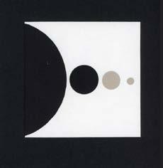
This image shows the ideas I created to help create a solution to my partners problem.

This was my final sketch after I discussionns with my partner about the previous designs.
Showing unfinished work to another person felt weird. I’m usually the type of person that likes to show others my steps to get feedback but I felt that the prototype I had created was rushed as we only had limited time to create it; making me feel like my work shouldn’t have been presented when it was.
The pace felt very quick. Because of this, it left little time for me to think of ideas for the project. I’m someone who usually likes to take their time and put a lot of thought into everything I do. Since I do that, it opens up more time for me to be indecisive.
The exercises today put me out of my comfort zone and I enjoyed how it pushed me to be quick on my feet. Engaging with a real person really didn’t change the way my prototype looked; it more so changed the function of it. Later on my partner and I discussed a way that could make it a lot more effective based on looks after the prototype was made. My partner and I discussed combining some of the ideas out of the five I had drawn into one piece of work that my partner had liked the best; as this would improve their experience here on campus.
Based on what I learned, something I would go back and do next is try to think of one thing at a time and pace myself better; I was a little all over the place with my thinking since we had such a short amount of time to come up with our ideas. This happened because I usually take a longer time to think of something for me to create. One thing I would do over again is having discussions with someone else on how my ideas could be improved upon and discussing with them how their ideas could be improved. I particularly enjoyed the communication amongst my peers to get their insight on how the project could be better.


^This is my final deisgn
This project was about creating a piece based off of a word selcted in class. Three words were selected and many designs were created before the finals were created. The designs were difficult as you could only use dots and lines, and some of the design options were very limited (ex. one dot one line, two dots and one line, etc.) This project was also difficult to do as you couldn’t make an illustration out of the dots and lines to represent your word

^This is my first rough drafts of the project. I sketeched up ideas I had for the words I selected (Energetic, Opression, and Exhaustion)
Gestalt is where your brain takes complicated concepts and makes them more simple. It relates to the dot-line project because some of the pieces we created in our brain would make the complexity of the piece become simple. The complex part of the piece was that it couldn’t be an illustration; so our minds had to come up with ideas on how to make a simple way to represent a word that wouldn’t make it an illustration which would be much more complex.
Overall, it wasn’t super difficult to make a well-crafted object. I never really created projects with paper and glue up until this point; but I really enjoyed it. It definitely expanded my knowledge on projects that I can work on in the future. I prefer to make things by taking my time and spending extra time on small details and making sure it all looks the best it can.
Abstraction allows you to focus on shapes, the relationship with the shape, colors, directions and much more. This project affected my idea of abstraction as we only used shapes and two colors; so it made me really focus on how to present the shapes and colors to represent the word well; as I really didn’t pay much attention to the idea of abstraction on past projects. In this project you really had to focus on where each line or circle was placed and the size of the shape as well. If a color or placement was the wrong color ( for example you wanted a black circle but a gray circle was placed instead) it could throw off your piece and could represent a completely different word from what you wanted.
For some words, it was difficult to represent them without illustrating them. My mind would immediately come up with images on how to represent this word but I couldn’t use them as it would end up illustrating them in the end. As I started to play with some of the designs however, it made it easier to come up with ways to represent the word without illustrating them. On the other hand, there were a few words that I immediately came up with ideas for that wouldn’t illustrate them. I think it helps if you’re feeling close to the word that you picked so it makes it easier to show it in other ways without illustrating them.
You could use this exercise for your future designs. If for instance you were stuck on a project, you could fall back on this project and the ideas of gestalt and abstraction to give you new ideas to make your current project better. Not every project needs to be overly complicated and by having learned these ideas it will help you with ideas for future projects.

^Second round of sketches to narrow down my options for the final

^This is my first design for exhaustion I created for the in process critique


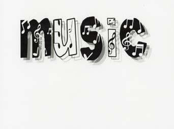
The letterforms project introduced us to typography. It was a fun project that allowed us to explore a word we picked at new depths and had us think of different ways to represent the word we picked through typography. The first part of this project was exploring different letterforms. We created our own sketches of different types letterforms. Next, we selected a word to do the project on (I selected the word music). After a word was selected, we created a mind map to show different meanings of the word and how else we can represent it. We also carved out the entire alphabet (each classmate carved out about one to two letters each). We then pressed it on paper with ink, and explored different methods of pressing them (such as ghosting). We also discovered that we could use the the printer to scan our designs to modify them even more.

^These were some of the first modifications we made on our own to get a feel for the project

^This was my mind map for the word I selected for our letterforms project.
There was quite a bit that I learned from working with letterforms in the way we did. The first thing that I learned was how important spacing was and how much a letter can throw off the piece by being slightly (by millimeters!) more spaced out than the others or if it’s slightly below the other letters it really shows. Another thing I learned was how much you can do with the letterforms as well.
One my favorite things I learned was ghosting the letters after we pressed them, I felt that it had a very cool effect on the piece if used properly. Additionally, I learned how much the scanner on the printer can enhance your piece. Some of this included making the letters wavey, or even adjusting them to make them straight. Overall there was a lot of takeaways from this project.
If I were to continue to work with these letters and the word that I picked I would play around with another meaning with the word music. I know that during our critique today it was mentioned that someone would like to see the emotion aspect of music in a piece and I would like to try that at some point if I could continue with the project. Another thing I would do next time is try new things with digital design. I could probably try to make a piece with the emotion aspect that is with digital design. There are quite a few things that I could do if I were to continue working with these letterforms but these were just the main things I would like to do if I were to continue working with them.

^This was my first letters + modifications piece

^This was my original typographic variation

^This was my original straight print I turned in for the in-process critique
I N A L D E S I G N S

^Final straight print
^Final of letters + typographic variations

^Final letters + modifications

^Final of my choice
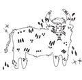
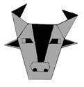
In this project, we worked to distill, translate, and transform our selected object/ animal with a variety of illustrations. In this project we created one continuous line iteration, one geometric iteration, one collage iteration, and one typographic collage iteration. And to tie it all together we needed to create two artist-inspired iterations. The artists I chose were Saul Bass and Sage Perrott. For this project, I picked a buffalo to do my iterations on. Overall, I really enjoyed this project as it involved work by hand and it also introduced us to Adobe Photoshop and Indesign.
There were quite a few things I learned about my animal during this process. I learned that the animal itself not only represents American culture but also Native American culture as well. Additionally, there are many different takes you could have on the buffalo. For some, you could have where the buffalo is aggressive as sometimes they can be. Or other times you could have them calm as that’s what the buffalo is most of the time until it’s frightened or threatened. Another thing to add that I learned is that it is somewhat difficult to draw a buffalo. Over time I became more familiar with how the buffalo was though which made it a lot easier to draw.
The most challenging media for me was the continuous line drawing. Although it got better over time I felt that was because I became more familiar with the buffalo and tried many different angles to draw the buffalo at. My favorite media was inspired by Sage Perrott (Hay Peep) design. I enjoyed this design as it was something completely different and new from what I already knew in design. I enjoyed it because designing my version of it was difficult but I enjoyed the process of it because I enjoyed the challenge.


Since I had a background in using Photoshop and InDesign I didn’t learn a whole bunch of new information but there were some things I did learn. A lot of the information I had already known how to use I just had to recall back from when I used both of those platforms in high school. Some things I did learn was using the magic wand tool. We never really used that tool in high school so it was nice to learn a more efficient way of removing the background on designs.
If I had to continue with this project for another four weeks there are a few ways I’d represent the bison in new ways. I think I would find ways to make my regular collage more complex while keeping the American aspect of it (the superman/American flag background for the face). Another thing I would consider doing is trying different geometric designs. Maybe try simpler geometric designs and more complex ones and see which one represents the buffalo better. Another thing I would consider doing is working with continuous line drawing more. I would like to see where I could go with that now that I have done it quite a few times.


I N A L D E S I G N S


^This was the design I turned in for the final critique.


^This was my final for the iterative illustrations project. I turned this one in after the final critique, after some changes were made.
The PSA poster was one of our final projects. In this project you played both client and designer. We started out by creating our creative brief to give to our designer to make the poster. After we recived our clients creative brief we started sketching ideas for the posters in our sketch books. We were required to use all the words our client wanted on the poster. My client wanted me to create a poster that pushed people away from vaping. We used adobe indesign to create the poster.

^These are some of the first sketches I made for the poster
^This one of the bigger sketches I made to decide the layout for the poster

^ This is one of the bigger designs I made that I liked but felt that it didn’t fit what the client wanted.
> Increases chances of getting anxiety, depression, or mood swings
> Causes shortness of breath, nicotine addictions, cancer, and popcorn lung
> Ask for help
> Make a plan
> Know you’re not alone
> 90% of people who said they quit vaping said to feel less anxious or depressed
> Withdrawals from nicotine make you a different person. It gives you cravings/urges to vape while also creating feelings of irritation, makes it difÞcult to concentrate, and even changes your sleep and eating habits.
> Over 2,800 hospitalizations due to vaping
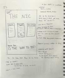
^ This was my demo poster for the in process critique
Using only type was difficult in a few ways. When I think of a PSA poster many of them are seen with images that help get the message across or draw the view in. It was a little difficult to get the audience’s attention with only type.
Scale was used through my PSA poster. My title was the largest part of the poster as it’s an important part of the poster. The headings are smaller than the title but large enough for the audience to see so that way they know it’s important as well as them being placed above the smaller type which was the facts, how to get help information and side effects of vaping. Negative space was also important as all the type were evenly spaced through the poster. I went for a simpler design to make it more appealing to the eye so that the main points in the text could be focused on.
In this project I learned how powerful text can be by itself. Sometimes having a visual in your design can take away from the text so it’s important to see how it can be used on its own. Another thing I learned is bleed prints and how effective they can be as well.
> 90% of people who said they quit vaping said to feel less anxious or depressed
> Withdrawals from nicotine make you a different person
> Over 2,800 hospitalizations due to vaping
> Withdrawls create feelings of irritation, makes it difficult to concentrate, and even affects your eating and sleeping habits
> Ask for help > Make a plan
> Know you’re not alone

> Increases chances of getting anxiety, depression, or mood swings
> Causes shortness of breath, nicotine addictions, cancer, and popcorn lung
If you were guaranteed it would support you financially, what would you want to design or make for a living?
Something I would make/design for a living if I was guaranteed it would support me financially is making posters. They could be any kind of posters such as band posters ( I really enjoy looking at 90s rock posters, I think they are all unique in their own way and I feel like I would enjoy making them). This could be because I have a love for 90s rock music but I just thought the designs were always well thought out and represented the band well. Another thing I would consider making is duck posters. This is because I made a duck on Illustrator for this project as my book is bubble bath/ duckie themed. I thought it was fun making a cute little duckie so I would make some of those for posters if it supported me financially.
What’s something you’ve made in the last two years that you’re proud of?
Something I made recently in the past two years was a lake map. I made the lake map my senior year of high school in my graphic design class. I chose to do lake Nakomis because that’s the lake I live on. This project was challenging but I really enjoyed making it because it involved working on adobe illustrator and a lot of hands on work. I started by tracing the lake layers on adobe illustrator and creating some designs around the lake such as adding roads and restaurant locations. My graphic design teacher at the time helped me out with this process as I was completely new to making a lake map. Next, I used a laser engraver to cut out layers of wood and engrave the designs into it. Then after that I spray painted the parts that would be seen and the little islands that were underwater. After letting it dry the next step was really time consuming. This was lining up and gluing the pieces together. But you could only do two at a time and then you had to let it sit for a day or two to let the glue completely dry. This can take a long time because for my lake at least the lake was quite deep so it involved many layers. After this was completed you could do any touch up work to the paint that was covered in glue. Finally the map was trimmed up to make the edges all even and could fit in the frame I selected. Overall that was a really fun project that I would like to do again.


