C O L O R T H E O R Y.



Since I was very young, I have had a love/passion for art and design. and drawing became my first love, I used to get in trouble for drawing in class, until I met Mario, my art and histoy professor. He was a recognized Architect in Colombia that decided to teach after he retired. He saw a talent in me and gave me the tools and motivation to pursue it as my career. I also realized that design significantly impacts our every day life, and architecture fulfilled my drive to design and improve the world around me.
I found in design so many possibilities, that i had the opportunity to merged my love for skating and fashion, so... from the age of 9 at every championship, I designed all my dresses. On the left, one of my first designs.


- Born in Bogota, Colombia BUT I was raised in a small town called TUNJA
Tunja is a city in the county of Boyaca, well known for its beautiful Architecture and because our weather allows to grow one of the best potato for exportation in the world... now that you know this,I want to tell you that, I consider myself lucky because i had the best of two worlds. Tunja is a city with their malls, universities, and buildings but also had the fields,villas, and animals. It was a very safe place to grow, I had the opportunity to play in the street with other kids, my school was nominated one of the best schools in the country, and I help my grandparents raised pigs, cows, chickens, etc.
- My family is my Mom, Dad, and a little sister.
- I speak Espanol and English, and I want to learn FRENCH
- I have lived in Tunja, Bogota, Miami

- I was first interested in art when my parents got me a coloring kit
- I thought I had everything before coming to US, life was wayyy simpler...I moved to the US when I was 18ish and had to postpone life to work, making friends was hard, I was denied opportunities for my status, etc, etc. I lose a little of myself in the process but I will always be grateful because I have found a different version of me.

Travel became a hobbie for me (roadtrips are my favorite) there is no feeling like getting to a new place and feel the new smells, heard the new sounds , and meet new people.

When I was younger, I traveled to participate in tennis and skating championships, and since then, I have enjoyed traveling. Currently, I travel because one of my jobs is connecting to people around the US and because I enjoy hiking and I prefer to do so outside Florida
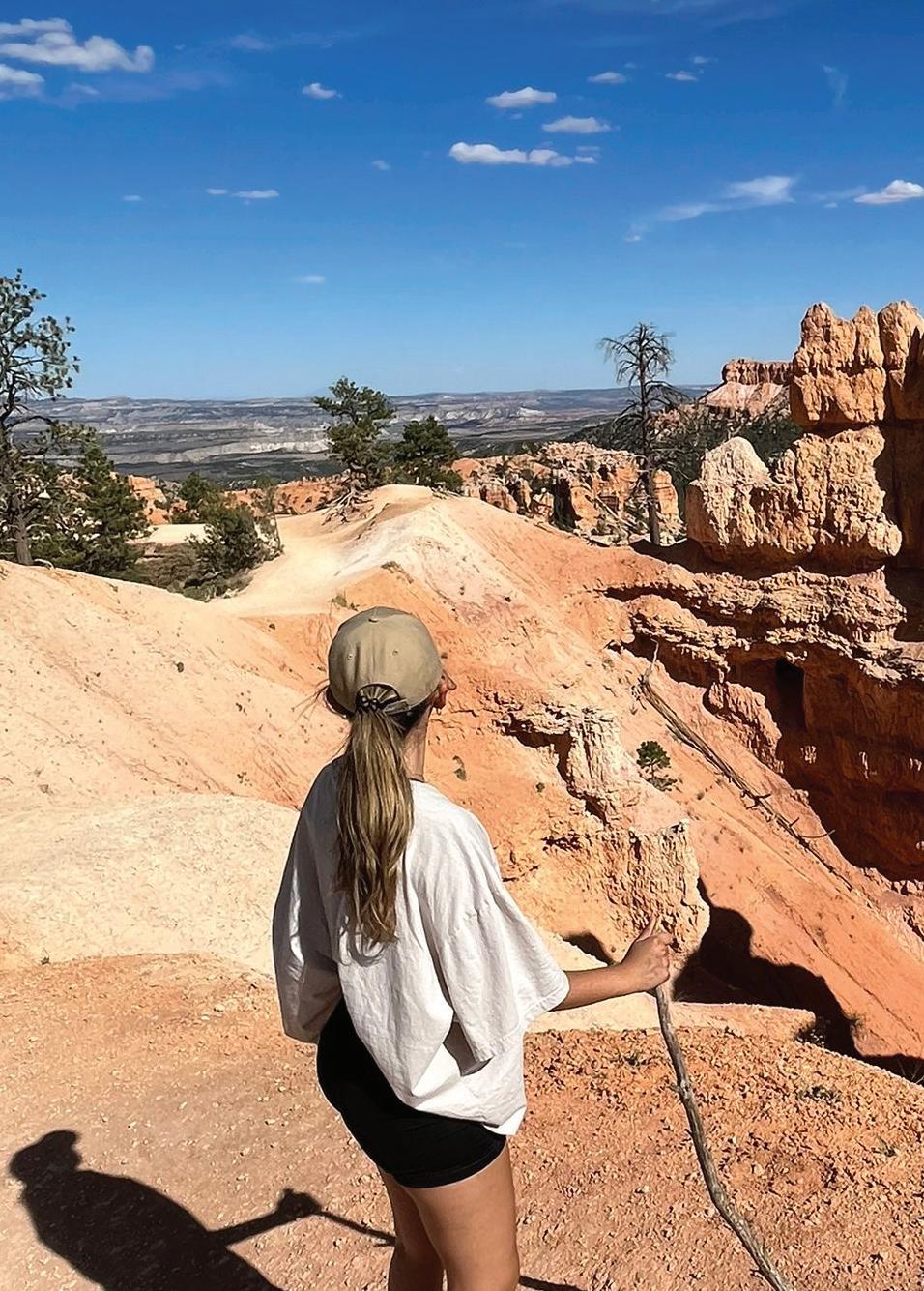
I have not been able to travel outside the United States yet, but I have been trying to go to all possible places here. Also, I traveled almost all of Colombia but the Amazonas, which is still on my bucket list.

One of my motos is to “enjoy life to the fullest” and hobbies is what make my life happy and complete.
I consider myself a FOODIE, I love DRAWING, PAINTING, HIKING, TRAVELING (mostly to see animals in the wild), THRIFTING and go out with my friends. I also like to play tennis with my sister, collect books from famous Architects, listen to true crime podcasts, visit museums, among other little things.


The colors I like the most: Black, white, nudes, green and blue. I enjoy minimalism, that is why most of my clothes are neutrals from black and everything in between to beige. For me, those colors represent calmness, elegance, and cleanliness. Blue and green is my take on nature, it gives me peace and happiness.
The colors I dislike the most: Red, expect on my lipstick, and the color yellow.


The flag colors have two meanings one by Francisco De Miranda, a Venezuelan commander who designed the flag in 1861 after the independece from Spain, where yellow symbolizes sovereignty and justice, blue as loyalty and vigilance, and red represents the valor shown and the victory achieved during the battles for independence from Spain. The other popular interpretation claims that yellow represents the gold Colombia once owned until the arrival of the Spanish, blue indicates the country’s contact with two oceans and red represents the blood poured in the battleship.

The country counts with more than 44% of South America moors. as well as jungles, plains, Caribbean Savannas, and a large number of forest types. Colombia also houses more than 40,000 different species of plants, one of the largest in the world.
Colombia is characterize by its variety of colors because of the richness in the landscape from animals, to plants, to unanimated materials that conforms it. Indigenous communities until today based their textiles, clothes, and handcrafts on the nature.


The history of Colombia is represented in the different architectural styles that we can find, from pre-Colombian architecture, through colonial, republican, modern and, finally, contemporary architecture, with great examples that follow the current world. Colonial architecture was brought by the spanish as the same time of color, the lack of resources made difficult to build extravagant so color made it possible to differentiate between statuses. Yellow is the most repetitive color in the colombian palette for its meaning of happiness and wealth.


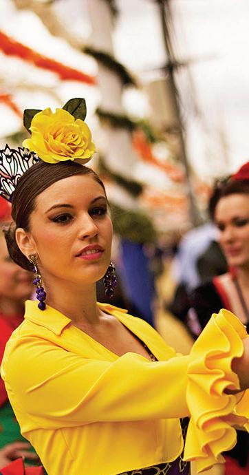
Flags are the representation of a country’s culture and history, as well as Colombia, Spain have popular meaning to its colors. Spain flag consists of two red stripes and a yellow stripe in the middle. The red represents hardiness, streght, and bravery, wheereas Yellow represents generosity. It is also believe that the red represents the blood poured during the bullfights and yellow for the spaniard happiness.

Spain have a big cultural influence from Muslim and Jew communities, these religions have a heavy believe in the meaning of colors like white means purity, green means luck, red means blood and strenght, etc. Even thought Spain regained its freedom, the culture of spain is now a combination of all from art, music, religion and language.
Spain is one of the favorite places to visit because of its Architecture, among its most important representatives, Antoni Gaudi with the Sagrada Familia in Barcelona. La Sagrada Familia is an example of how color and religion are tide up into architecture. On the Portal of Nativity, there’s yellow, green, and blue glass to symbolize the birth of Christ, poverty, and light. The bolder yellow, orange, and red windows on the Facade of the Passion allude to water, light, and resurrection. there’s rhyme and reason behind the placement of the windows themselves: The glass is transparent on top to illuminate the church, while deeper hues work their way down the facade to create an appropriate setting for prayer, meditation, and reflection.
I chose Spain because the same way Spaniards were colonized and influence by others, Spain came to Colombia to colonize and switch our history and culture.


Three properties of light are commonly experienced in the design of physical environment:

1. Refraction: occurs when light strikes an object
2. Diffraction: occurs when light is partially obstructed by an object.
3. Refraction: results when one or more lights rays moves through a light medium to another.
CMYK: substractive/primary colors. Applies to paints, dyes, colorants, and inks.
RGB: additive/primary colors.
Percentage of light that is reflected from a colored surface.It is a scale that determines the quantity of visible light reflected and all wavelenghts when a material or color is illuminated. In the image we can appreciate the color of the surroundings areas in this living room change in appearance depending on whether these surfaces illuminates by natural or articial lighting
 LUIS BARRAGAN


Luis Barragan was a Mexican Engineer and Architect (born March 9, 1902, in Guadalajara, Mexico, and died Nov. 22, 1988, in Mexico City), well known for his evocative houses, gardens, plazas, and fountains that won him the Pritzker Price in 1980.

Barragan was influenced by landscape architect and painter Ferdinand Bac and re-known architect Le Corbusier. Later, he developed his own style and interest in elements like natural siting, simple surfaces, and water features, but primarily the use of color.
Most of the projects undertaken by Barragan are located in Guadalajara and Mexico City, his most celebrated works include El Pedregal (Mexico City) and our subject of analysis the Casa Barragan (Guadalajara)
“ I think that the ideal place must contain elements of magic, serenity, socery and mystery”
The house and studio for Luis Barragan were constructed in 1947; this construction was parallel in time to his most iconic residential development El Pedregal. Casa Barragan rises on two adjacent lots in a vital street called General Francisco Ramirez, in the modest neighborhood of Daniel Garza in Mexico City.

The main façade is aligned to the main street, and it camouflages as having the same appearance on humble materials as the neighboring houses; the only noticeable difference from the exterior is the scale of the property. The exterior conserves the color and naturality of the concrete and only the library window projects from it.
Upon Luis Barrangan’s death in 1988, Casa Barragan became a museum to be enjoyed by the public. The house became one of UNESCO’s World Heritage sites in 2004.
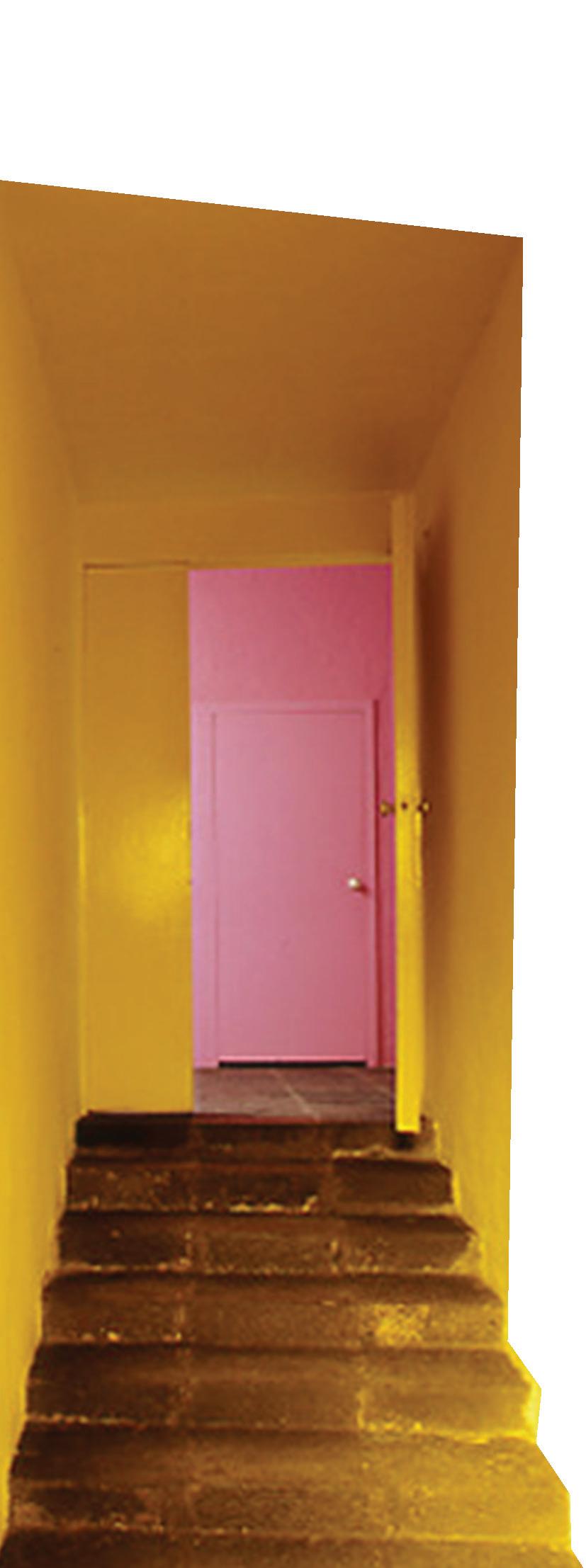
The entrance hall intends to configure the rough façade into a waiting area where Barragan uses lights dyed with yellow glass to reinterpret traditional spaces and the sensation of welcomeness. This bright yellow entrance opens the brain to a less predictable sensorial room, where a golden abstract altarpiece creates the illusion of sacred space at the end of the stairway. When gold is reflected in the pink wall, this casts a faint touch of pink in the room. Barragan uses pink in his design as a preparator or catalysis to the green of nature framed in the next room.
Along the house, Barragan keeps using yellow and its variations, as well as white and pink, following the same pattern of framing, reflection, and shadows to accomplish private and public spaces.


One of the characteristicis of Barragan’s style is that he does not use green to color its elements because he believes that green is better achieved by nature.

Critics can interpret Barragan’s color scheme as a reference to indigenous buildings in Mexico. Still, for him, it is more than a remembrance of Mexican culture. It is his interpretation of the relationship between the human eye and nature. Casa Barragan presents us with three important characteristics of Barragan’s style and use of color: yellow as the decompression of the green in nature, and pink, the opposite color in the color wheel, to create contrast and a sensory experience for the user. The use of red on the roof differentiates the house from the blue sky and its surroundings, and last, the use of white as the actual color to reflect and create shadows.
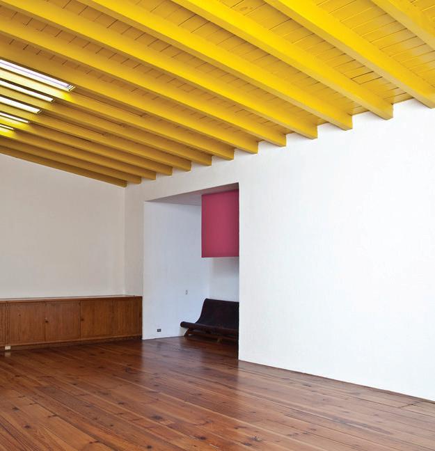
The use of color for Barragan’s design had two functions: to give life to simple materials like concrete, wood, and glass, and to create a sensory experience for the user.
 Studio at Casa Barragan
Room at Casa Barragan
Relationship and association of color to moods and health conditions:
RED under red lighting, our body secretes more adrenalin, increasing our blood pressure and our rate of breathing.
PINK to soothe upset stomach BLUE blue light will slow your heartbeat, drease your temperature, and relax your muscles
GREEN assists with balance and equilibrium YELLOW speeds up the human metabolism PURPLE violet- the color closer to blue than red- has ben known to calm anxiety ORANGE has been known to increase the amount of oxygen supply to the brain
WHITE is an indicator of spleen disorder based on whitening of skin color BLACK in color therapy is associated with the kidney and bladder: can induce sadness, fear and despair

BROWN has been know to be negatively received by those identified with depression and anxiety
GRAY if overly used, may cause depression and loneliness. Also it is associated with high level of anxiety
Health is defined as “ the condition of being sound in body, mind, or spirit” (Merriam- Webster, 2020)

This is the love story of Clementine and Joel; everything starts when they meet at the beach. Clementine, with her strong personality and curiosity, approaches a shy but charming Joel; they have an immediate connection and start a relationship. Throughout the movie, they jump into their memories after Clementine decides to erase him from her memories to solve their problems. Eternal Sunshine of the Spotless mind is a realistic narrative of all the feelings and stages of a romantic relationship, and we can compare those to the four seasons. Clementine’s hair symbolizes these stages where; Spring when everything is born and blooming, Summer when it is warm and intense as the sun, Fall when the trees are losing their bright green color and die, and Winter when it is cold but serves as preparation for a new spring.


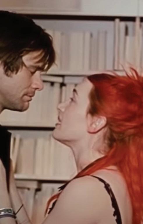


Clementine’s hair in this scene at the beach represents the freshness of the spring time and the excitement of meeting Joel for the first time.

When they meet at the beach they decide to go into a house where Joel opens up about his present relationship with Naomi, the green of her hair evoques an earthy, powerful, and sudden feeling to the scene, and that is how Joel perceive her in the moment, as a powerful force of nature that revitalize his life.

On this phase the image is darker, different shades of grey and blue where used to dim the attention of the background and make the green of her hair stand out. Symbolizing the growth that occurs during the spring time.

Clementine’s red hair symbolizes the summer and the honeymoon of their love; red can also be interpreted as fierce, warm, and energetic; during these scenes, we can see her strong personality and why Joel falls for her. Her red hair also embodies Joel’s best memories of their relationship, and when in their dreams, they have the most connection and understanding of each other. In the background and throughout the scenes we can also identify a warm tone to it as well as red objects and references in the different shades of red.


After red-menance Clementine dye her hair orange, orange symbolizes the fall of the passion. Orange is representantive of fall when the green of the plants vanish to later die. On this phase they noticed the passion is laso dying and they start seeing their flaws and defects.


This last color dye is an intense blue that represents the winter of their relationship, it is the moment where Joel finds out he was erased from her memory, and he decides to do the same after feeling overwhelming sadness and confusion about her decision. Blue represents all the feelings Joel is having, but as we approach the end of this love story, after winter, there is spring. They fight to come back to their memories, but those disappear. At this stage, they accept their flaws and let die what was holding them. As a miracle, after both forgetting each other, they meet again on the train.


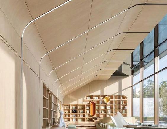


Assymetry: Asymmetry is the lack of symmetry or equality between halves of your design. While both halves of a symmetrical design will be the same (or similar)


Radial: Radial balance is symmetry or balance in multiple directions and has a clear central focal point that extends outwards toward other elements.
Symmetry: The balanced distribution and arrangement of equipment of equivalent forms and spaces on opposite sides of a dividing line or plane, or about a center or axis

 BILLIONAIRES BOYS CLUB, WYNWOOD, FL
In a strategy to highlight and give hierarchy to the most valuable products in the store, the designer used bright green roms that contrast the solemness of the rest of the store.

The store was inspired by Florida and the green of its Everglades. Along the space the designer applied the different light and dark tones of green, in the picture we can see that the designer used the contrast of value to separate the figure from the ground, in this case the furniture and the brand from others, this technique is used throughout the room.


A soft blue and green color palette sets the tone for the space, along the perimeter, a flexible display system is integrated with a central axis that features the cash wrap and the main window display by Snarkitecture co-founder Daniel Arsham.The green bronze sculpture is illuminated by a round track of light suspended in the ceiling and elevated, facing one of the two windows that opens to the street for the walkerbys to observe from the outside.

The design makes use of environmentally friendly materials, such as recycled plastics, glass and wood panels. The recycled plastics are used for the wall coverings and the recycled wood panels are used to create repetition on the roof. For the floor the designer used a combination of high gloos cement and carpet working as an imaginary enclose for each brand.

 NORTH AMERICA HEADQUARTERS, NEW YORK
These days, workplaces often contain cafes, wellness rooms, and lounges galore... Campari North America Headquarters located in New York, precisely in the landmarked WR Grace building, overlooking Bryant park; offers to its workers and guests a two-story experience where corporate space and coctail bars complement.
Gensler helped the brand materializing the essence of Campari, they were inspired by its famous bright-red namesake aperitif, this color can be found along the space, specially in the stairs when transitioning from the first to second floor.

After reviewing the different projects suggested in class, I chose to talk about the Campari New York headquarters because it calls my attention that compared to the other workplace projects, Campari did not have the feel of a common workplace. To successfully approach Campari’s concept, Gensler designers used elements such as, texture, lines, shapes, patterns, and colors. The textures throughout the space help us differentiate workspaces, from lounging/bar areas; the working areas are characterized by the sobriety of the plain white roofs, concrete floors and carpets, unlike lounging/bar where the designers made use of ribbed wood, metal curtains, and taupe damask patterns. Lines play an important role in this space, the designer used lines to frame the city views, and the focal point of the bar/café. We can also encounter square shapes mostly on the roof to give emphasis to spaces and circular shapes for the important openings. Patterns throughout the public/open spaces like the bathroom, the interior of the bar and the mid-rest step in the stairs.


The color pattern was inspired by the original color of the brand, it is mostly bright-red with a contrast hue of blue, and soft white and yellow tones to contrast the colors.


 Lounge/bar area
Courtain Detail
Bathroom


One hotel is a sustainable oasis in the city of Miami. This experience of sustainability and luxury is approached using a plenty soothing palette, wood, sand, and ocean tones. We can capture the essence of both concepts throughout the building with various lines, shapes, textures, and patterns.

LINEFrom the entrance, the lobby presents an interesting model for public space programming. A perpendicular axis, “LINE” from side to side, splits the lobby and its ceilings in two, where a double-height entry cuts the ceiling and drops it to a grotto-like level. This method allows the lobby to have privacy in the openness of this space.


The entrance/lobby gives us a glance at the PATTERNS, such as a massive mural of a swimmer rendered in live moss growing through slits in a white-painted wall.


TEXTURE can be highly found and appreciated along the building with the different physical characteristics the designer gave to the wood, such as the white-painted wood of the walls, a Porte-cochere in reclaimed redwood, and the covered area at the bar outside one of the pools, where the roughness of the texture is not only inviting and exciting but creates a place for shelter.

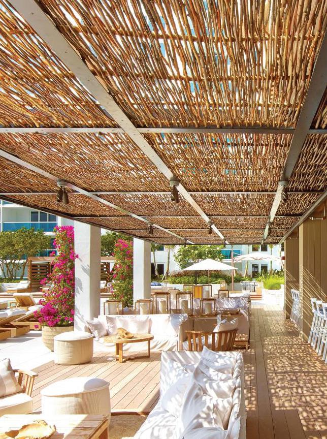
Two predominant SHAPES are the square and the circle. The square is mostly used to create an imaginary separation between spaces and the circle is used on décor elements like chandeliers, mirrors, umbrellas, and furniture to soften the horizontal and vertical lines of the squares.


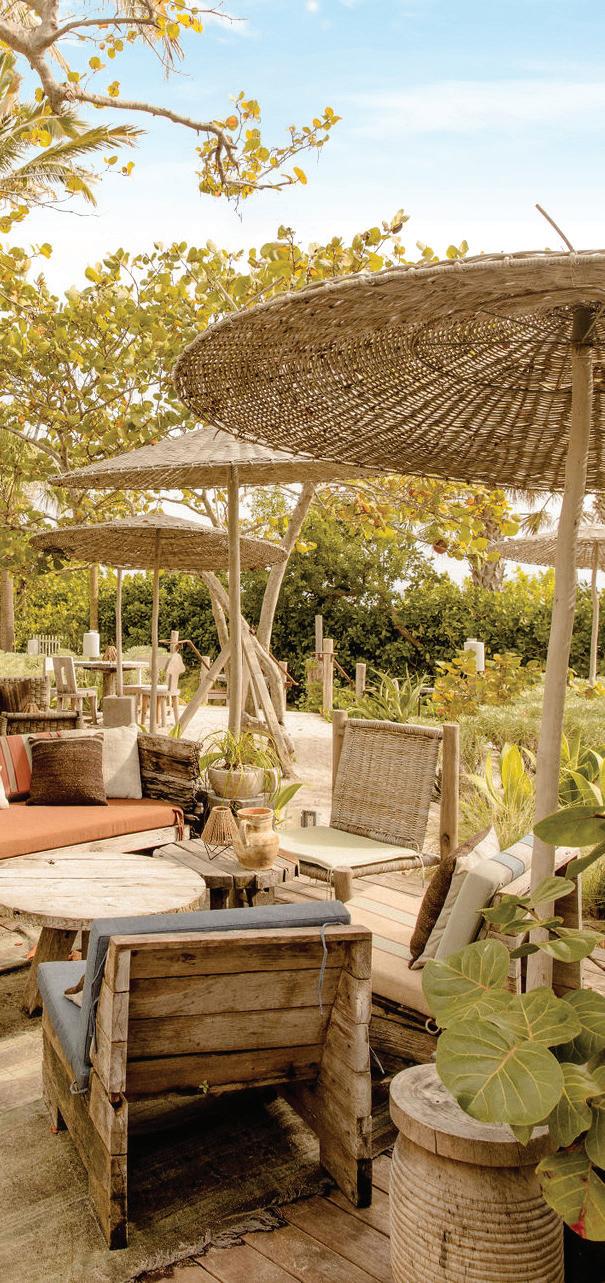
I conclude after the class and all the information gathered through the book that; as designers we have the opportunity to impact people’s lives through our profession and a very important part to succeed, is to understand the importance and the effects of COLOR to the environment and us.
I learned through practice and analysis, and THIS BOOK is the highlight of my journey and my process of thought.
Thank you for your time!
- “CASA LUIS BARRAGÁN.” Www.casaluisbarragan.org, www.casaluisbarragan.org/ index.html. Accessed 16 Sept. 2022.
- BarragánLuis, et al. Barragán : The Complete Works. New York, Princeton Architectural Press, 1996.
- Hackney, Rod, and Emilio Ambasz. “The Architecture of Luis Barragan.” Leonardo, vol. 13, no. 3, 1980, p. 258, 10.2307/1577859. Accessed 10 Nov. 2019.

- Eternal Sunshine of the Spotless mind. Michael Gondry. 2004
- Reed, R. (2021). Color Plus Design : Transforming Interior Space (3rd Edition). Fairchild Books.
- Blanco Blanco, Jacqueline (2007). “De la gran Colombia a la Nueva Granada, contexto histórico-político de la transición constitucional” (PDF) (in Spanish). Universidad Militar Nueva Granada. Archived (PDF) from the original on 9 October 2022.

- Alexander Walker (1822). (Gran) Colombia, relación geográfica, topográfica, agrícola, comercial y política de este país: Adaptada para todo lector en general y para el comerciante y colono en particular, Volume 1 (in Spanish). Banco de la República. -Piñol, Pere Ríos, Àngels (27 October 2017). “El Parlament de Cataluña aprueba la resolución para declarar la independencia”. El País (in Spanish). Archived from the original on 29 October 2017.
- Snarkitecture | Home. (n.d.). Retrieved October 30, 2022, from https://www. snarkitecture.com/
- Castro, E. de. (2022, October 25). Grand Opening of the Billionaire Boys Club ICECREAM Miami Flagship with Pharrell Williams & Special Guests. World Red Eye. https://worldredeye.com/2022/10/grand-opening-of-the-bbc-icecream-miami-flagshipwith-pharrell-williams-special-guests/
- Smith, C. (2021, August 14). Gensler Blends Corporate Space and Cocktail Bars at Campari’s New York Headquarters. Interior Design. https://interiordesign.net/ projects/gensler-blends-corporate-space-and-cocktail-bars-at-campari-s-new-yorkheadquarters/

- You’re the One: 1 Hotel’s Miami Beach Debut by Meyer Davis Studio. (n.d.). Interior Design. Retrieved December 11, 2022, from https://interiordesign.net/projects/yourethe-one-1-hotels-miami-beach-debut-by-meyer-davis-studio/
-1 Hotel South Beach. (n.d.). Www.1hotels.com. https://www.1hotels.com/south-beach


