................................................................................................................................................................................................................................................................................................. maryam jafari 2023
P RTF LI O
I am an architect with experience in interior design, construction and renovation. I can be a part of the design process from start to finish, I am passionate about what I do, I am young, energetic and restless. As an architect, I am my own harshest critic, constantly seeking to improve my vision, knowledge, and understanding of society’s needs.
I am interested in designing with a scenario that aligns with the context, focusing on minimalism and attention to detail.
Maryam Jafari

Architect, Ceramic Artist
Born in Tehran,Iran
April1987
English, Persian mh.jafari87@gmail.com
+989122445985


P E R S O N A L S K I L L S
Creativity, Communication, Teamwork, Eager to learn, Problem solving, Adaptiability
C
Revit, AutoCAD, Photoshop, InDesign, 3ds Max, V-ray, Corrona, Mocrosoft Office
Decamber2020-Now
Architect and interior designer of Brandium Commercial and Administrative complex Project
Novmber 2018-Now
Ceramic Artist
Shift Ceramic Studio . Founder
2018-2016
Senior Architect In Dash Consulting Engineers
Architectural rendering and animation department:
-Villa Zibadasht
-Kiakola Villa Complex
-Sumsung Electronics Office
-Sadeghieh Residential Building Project
-Kaj Residential Building Project
-Tehran-Chalus Freeway Administration Bulding
-Animation of Smart Homes in Sepahan, Isfahan
-Animation of Mashhad Mall Project
-International Landscape & architectural Competition Iland RSA
2016-2014
Senior Architect In Alef Architects


-Interior design and renovation of numerous branches of Mellat, Melli, and Saderat banks, including -Corporate banking branch design.
-Interior design and renovation of the facade of the administration building of Mellat Bank
2013-2014 Designer In Shoadan Consulting Engineers

-Architectural design of government buildings such as hospitals and clinics. -Interior design and facade of one of the branches of Persia Khodro (car company).
- Roof Garden design for a residential project in Saadat Abad
2006-2012
Ceramic Artist
Shizer Ceramic Studio . Co-founder
December 202 2
Interior design & renovation of offices of a factory with small courtyard
March 202 2
Flower Time Group Exhibition of Ceramic selected by Behnam Kamrani & Narges Farahani
January 2021
Interior design & renovation of Amin Beton Qarn’s office and laboratory
May 2021
Interior design & renovation renovation of Fatah Concrete Institute and Laboratory
Agust 2021
Interior design & renovation of Abdi apartment
July 2019
Forty Visions. Group Exhibition of Ceramic selected by Azadeh Shooli
January 2021
A member Of The Set Design Team For The Film “Zero Day”
https://www.imdb.com/title/tt11768018/
February 2018
Designing architectural plans for a 5-story residentional and commercial project with a 1600 sqm. Iranshar
May 2018
A member Of The Set Design Team For The Film “ A Hairy Tale”
https://www.imdb.com/title/tt9755660/
October 2017
Interior design & renovation of Shademan apartment
Septamber 2017
A member Of The Set Design Team For The Theatre
“Oliver Twist”
October 2016
Design & renovation of the bookstore of the Academy of Arts.
Vali-Asr St. Tehran
2006-2012
Shizar Ceramic Studio. Co-founder
2006-2012
Voluntary summer camps teaching pottery to children and adolescents.
2004-2006
Teaching painting to children under 6 years old at a neighborhood center during summer vacations
E D U C A T I O N
2016-2014
Bachelor Degree in Architectural Engineering Tehran,Iran
School of Art, Architecture and Urban Planning of Islamic
Azad University South Tehran Branch GPA:18.48 (out of 20)
Title of the Thesis: Shadgan Ecotourism Village Grade :18.25 (out of 20)
2010-2008
Associate Degree in Architecture Tehran,Iran
University of Applied Sciences
Department of Construction and Urban Planning GPA:16.82 (out of 20)
2004-2002
Diploma of Art
Tehran, Iran. Noor Conservatory
O M P U T E R S K I L L S
E X P E R I E N C E
Linkedin
Instagram
Issuu Behance
PROFESSIONAL EXPERIENCES
PROFESSIONAL EXPERIENCES
COMPETITION
1-Brandium Commercial and Administrative complex Project
Personal experience
Page.5
December2020-Now
2-Offices of a factory with small courtyard
Personal experience December 2022 Page.9
8-Set Design of The Theatre “Oliver Twist” Member of a team Septamber 2017 Page.20
12-International Landscape & architectural Competitio Iland RSA
Dash Consulating Engineers May 2018
Page.33
3-Bank Mellat Administration Building
Alef Architects March 2016 Page.11
4-Villa Zibadasht
Dash Consulating Engineers April 2018
Page.12
5-Tehran-Chalus Freeway Administration Bulding
Dash Consulating Engineers October 2017
Page.14
6 -Amin Beton Qarn’s office and laboratory
Personal experience January 2021
Page.16
7-Set Design of The Film “A Hairy Tale”
Member of a team May 2018 Page.18
9-Bookstore of the Academy of Arts. Personal experience October 2016 Page.21
ACADEMIC PROJECTS
10-Shadgan Ecotourism Village Thesis 2016 Page.24
CERAMIC PIECES
13-Scupture Inspired by Nature
11-Sattarkhan Residential Architecture Design 5 2015 Page.29
COMPETITION
12-International Landscape & architectural Competitio Iland RSA

Dash Consulating Engineers May 2018
Personal experience
Since2018 Page.38
14-Modoular Ceramic Pieces
Personal experience
Since2018 Page.41
C O N T E N T S
PROFESSIONAL EXPERIENCE
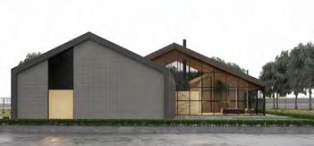

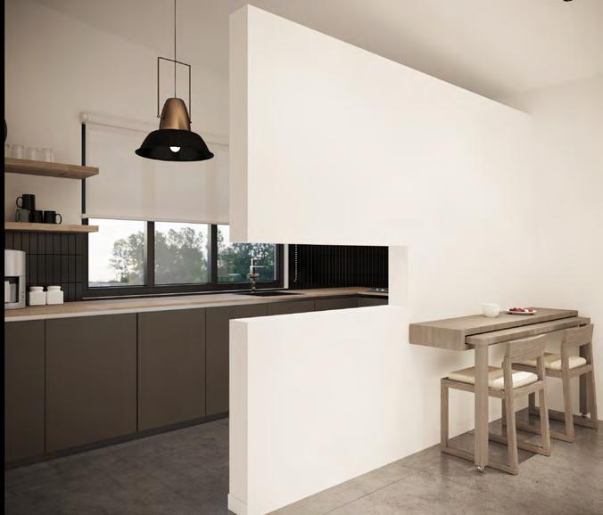
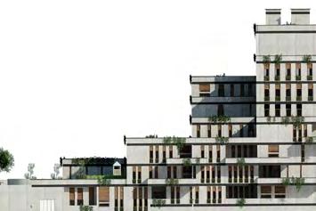
BRANDIUM COMMERCIAL AND ADMINISTRATIVE COMPLEX PROJECT
Location : Tehran | Area : 23000m² | Function : Commercial and Administrative |
Condition : Designed & Under Construction


The experience of collaborating on this project was exceptional for me as I was confronted with problem-solving. It provided me with invaluable experience in teamwork and acquainting myself with new and professional individuals in the field of mechanical and electrical installations. I learned a lot from these individuals.
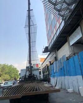
The Brandium project, with an area of approximately 23,000 square meters, started 12 years ago with four levels of underground parking, four levels of commercial space, four levels of offices, and a restaurant on the rooftop. It was stopped after some time due to certain reasons during the intermediate phase of construction..
As an interior architect, I started working on this project about two and a half years ago, and due to the long pause and changes in standards and client requirements, this project needed to be reviewed and redesigned
One of the notable challenges in this project was the weakness in the physical program and the detailed spaces. For example, there was a lack of service spaces such as restrooms, prayer rooms, cloackrooms for shops, staff break areas, cleaning equipment storage, monitoring spaces, and more. In some cases, there was a need to relocate spaces from one floor to another based on prioritization and spatial importance.
In fact, the façade of the levels, except for the entrance, was done with composite materials and curtain walls, with 80% of the commercial levels being completed with thin workmanship.
This project had many design and infrastructure problems, such as mechanical installation issues. For instance, since the design of this project was done years ago, in some cases, it was not feasible to demolish the executed elements, such as the façade elements mostly with broken and polygonal angles, which had been considered in many interior spaces.
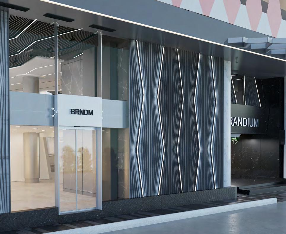
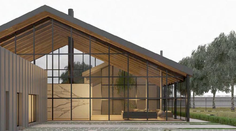
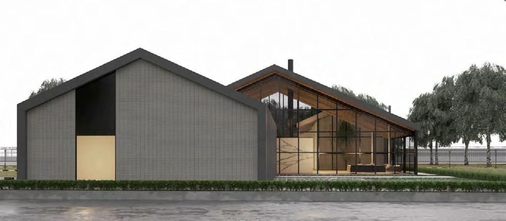
The design of the entrance facade and the half floor was based on the existing facades of the upper floors and was executed using the same triangular element to maintain consistency with the previous design and to create an inviting and attractive look for the observer. In the design of the entrance facade, the vitrine section of the shops was connected to the ceiling using a four-sided connector and a clamp made of steel, which held the glass facade with a height of about 3 meters. Triangular-shaped elements made of steel sheets were used for the entrance facade, and the gaps between these elements were filled with white stones. In areas that led to the staircase box, the remaining gaps were left empty and covered with glass from the back, in accordance with fire safety regulations.
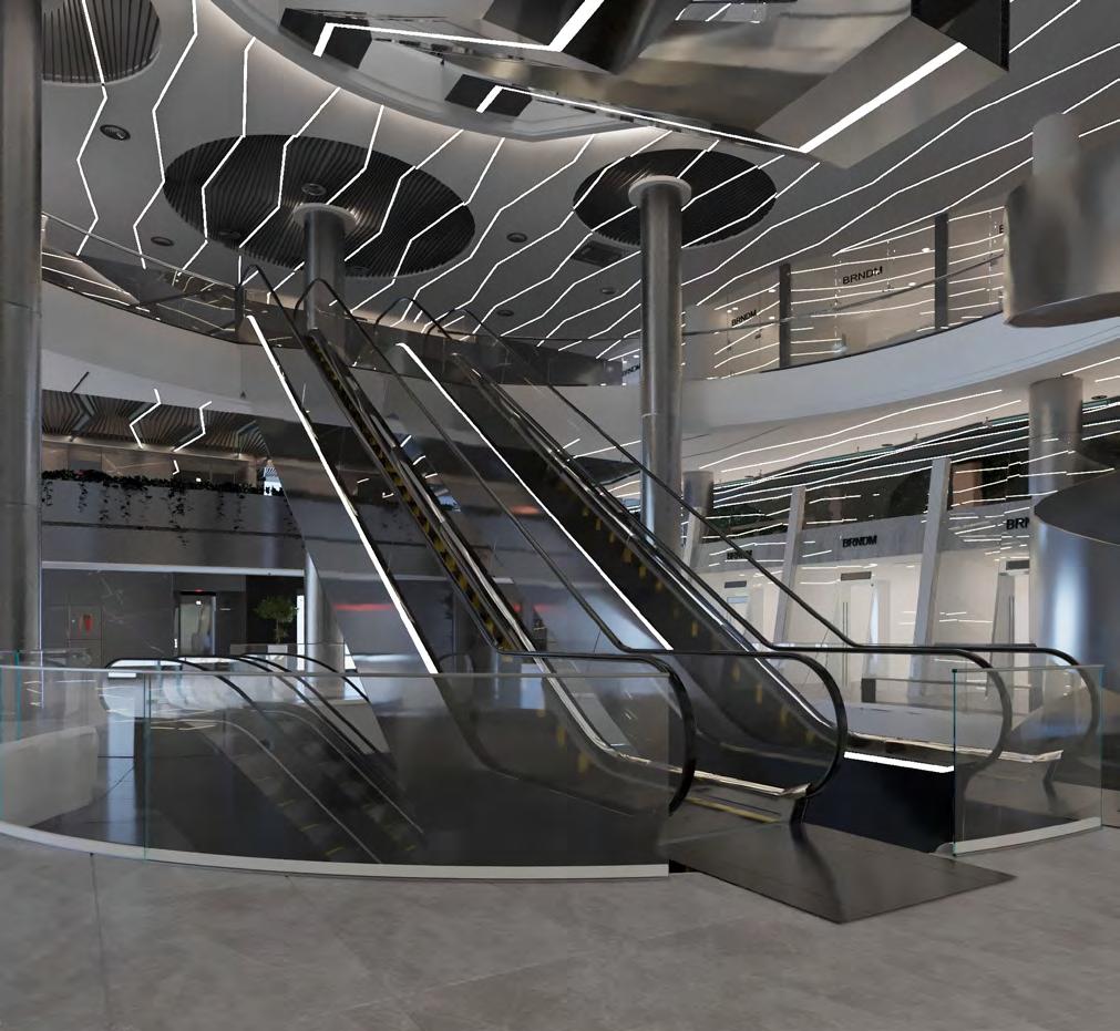
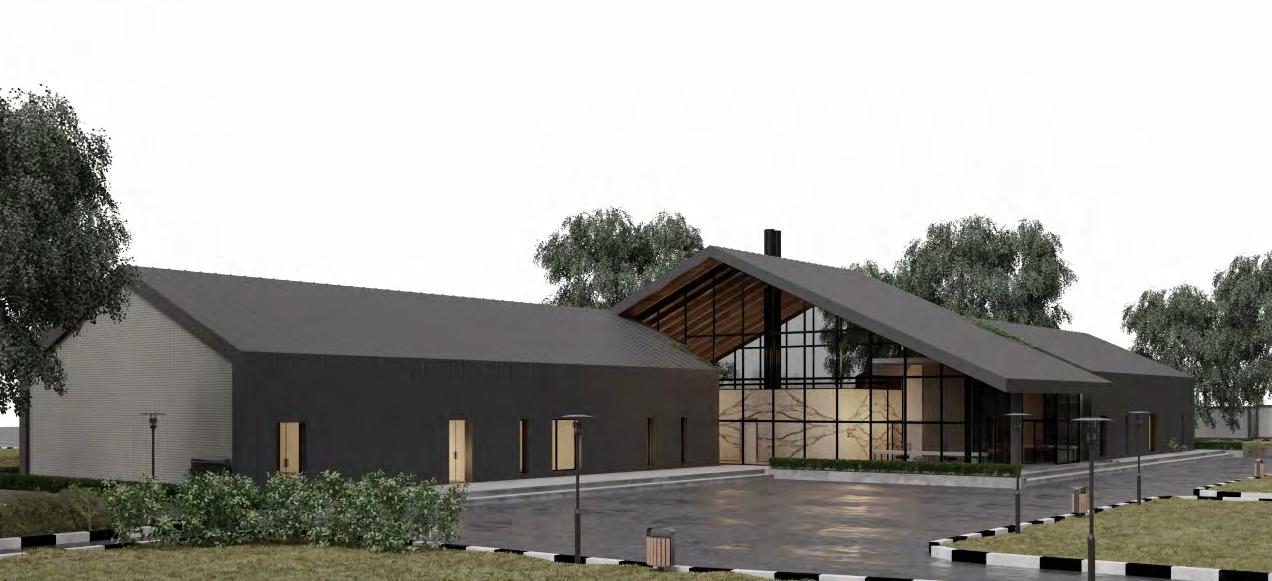
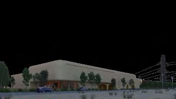
Exterior picture of Project
1 1 2 3 4 5 6 0.070 0.080 0.090 0.100 0.110 0.120 0.035 0.040 0.045 0.050 0.055 0.060 1 2 3 5 6 1.989 1.982 1.977 1.973 1.971 1 2 3 4 5 6 1 3 4 5 6 1 4 5 2 3 4 1 2 3 4 5 6 0.070 0.080 0.090 0.100 0.110 0.120 0.035 0.040 0.045 0.050 0.055 0.060 1 2 3 5 6 1.989 1.982 1.977 1.973 1.971 2 3 4 5 6 1 3 4 5 6 1 4 5 2 3 4 1 2 3 5 6 1 2 3 5 6 1 2 3 4 5 6 1 2 3 4 5 6 1 2 3 5 6


BRANDIUM BRANDIUM BRANDIUM BRANDIUM BRANDIUM BRANDIUM BRANDIUM BRANDIUM Complex BRANDIUM BRANDIUM BRANDIUM BRANDIUM BRANDIUM BRANDIUM BRANDIUM BRANDIUM BRANDIUM BRANDIUM BRANDIUM BRANDIUM BRANDIUM BRANDIUM BRANDIUM BRANDIUM Complex 0.255 0.402 0.450
Main entrance render
Wide view of the ground floor and half floor facade (main entrance)
Therefore, I used the same polygonal element in the interior design and entrance façade, trying to preserve the main concept of the project, as if the project designer had not changed and the same line of thought had continued over the years. Thus, I tried to use this element in the interior design and entrance façade. The false ceiling design was presented in several alternatives, and after approving the main form, I decided to design it modularly for better accessibility, considering the mechanical installations and inspection hatches for each level, with a combination of plasterboard and louvers in levels and the restaurant, each with a polygonal form. This allowed for incorporating inspection hatches into any part of the ceiling.
0.10 0.05 0.025 0.15 0.06
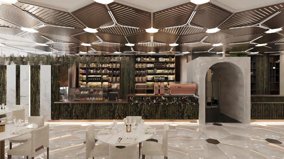
The interior of the project restaurant
Interior rendering of commercial floors
False ceiling proposals for commercial floors
In continuation of the issues related to the building’s facilities, one problem was the incorrect selection of GHP systems. After thorough investigations and with the help of the mechanical engineering team from GHP, the Cooled Chiller was replaced, resulting in a change in the electrical capacity and the need for a new transformer, its installation, and the installation of a duct system to supply electricity to the motor room. Since JHP did not require a motor room, space had to be allocated for the new motor room with the help of structural engineers, primarily by assigning space from the roof facing the motor room. This part of the building’s structure needed reinforcement to account for the added dead load to the project.
Additionally, the supply of fresh air to the project had been overlooked. Since its infrastructure had not been taken into account, the space for the motor room and the channel paths to supply fresh air to the units were problematic and needed a solution. Therefore, at the recommendation of the facilities team, instead of supplying fresh air through a central motor room, vents were installed on the project facade. The ductwork carrying air was drawn from outside through the channel path and filtered through exclusive fan coil ducts before being circulated inside the units. This solution required an examination of the path of these channels in commercial and administrative units, which presented a problem. In office spaces, the solution was more comfortable since all units had access to fresh air through windows. However, in commercial spaces, such as stores located in corners with no access to fresh air, and common areas, a more serious solution was required. Therefore, as an architect, I had to coordinate all disciplines and, in collaboration with the structural engineer, designed vents on the facade.
Considering the area of each floor, which is around 1500 square meters, we divided each floor into three zones. Therefore, for each floor, we added three windows to the façade for fresh air and connected them to 2000-capacity fan coils.
Since the commercial floors were from -1 to 2, three inlets were taken from the façade in each of the first and second floors. However, for the negative first floor, the ground floor and the half commercial floor did not have access to the façade inlets, especially for the negative first floor. Therefore, all nine inlets were taken from the half commercial floor for these three floors. But to move towards the units, especially in the ground and negative first floors, we needed vertical channels that were created shafts in the structure with the help of structural engineers, and the channels were extended to the floors. Considering that the structure of this project was provided with tension cables, it was necessary to review and be precise in designing the path of the channels so as not to interfere with other mechanical and electrical facilities.
As mentioned, due to the increased power consumption capacity for the engine room, it was necessary to comply with the electricity administration standards for the new transformer, taking into account the intake for entrance and repair and, of course, the power panel and the path to the engine room, which was considered on the roof. This movement, given that no duct was previously embedded, was very difficult. Therefore, we used the existing duct in the project that moved from the negative fifth to the second commercial floor and used it as a duct to move towards the administrative floors and finally reach the engine room. In fact, we were forced to move horizontally from the last commercial floor towards the administrative units to move with the duct along the length of the administrative units. Eventually, we had to create a new duct with a inspection hatches in the common space with the help of structural engineers to solve this problem. Collaborating on this project was full of unique challenges that perhaps no other project could provide, especially with such dimensions and scale and solving the mentioned issues, design constraints, and working with a professional engineering team was full of learning and exciteme
BRANDIUM BRANDIUM BRANDIUM BRANDIUM BRANDIUM
13 14 16 15 17 18 12
-1 BASEMENT FLOOR PLAN
Mechanical facility’s vents for fresh air
Vertical diagram of movement of fresh air channels
Mechanical facility’s vents for fresh air Exterior render
INTERIOR DESIGN OF OFFICES OF A FACTORY
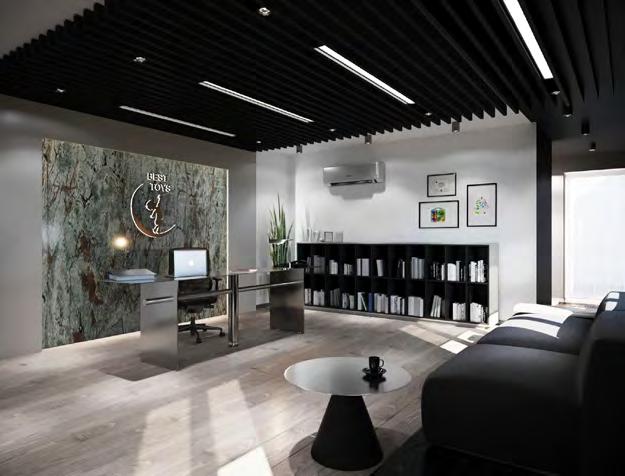
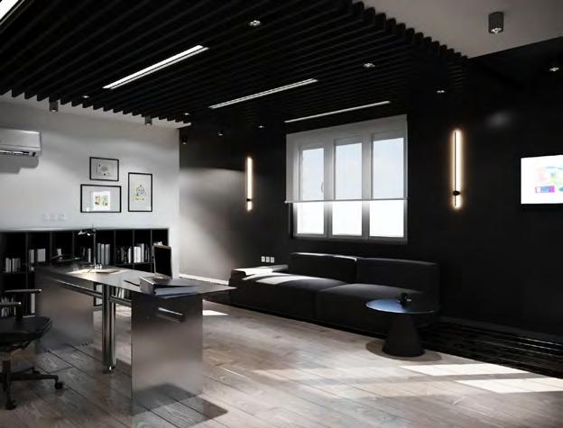
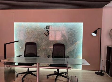

In the design of the management office of a plastic parts production factory, which is managed by a couple and divided into two parts of parts production and assembly with a distance of about 500 meters for ease of use, two separate spaces were needed. In the production area, an office of about 20 square meters was designed for the gentleman, along with a pantry and restroom, and a half-floor was designed for monitoring equipment. In the assembly section, a room of about 30 square meters with a small courtyard was renovated, which was designed to be the workplace for both the lady and the gentleman. In the renovation of the assembly section office, due to the existing plumbing layout, there was no possibility of changing the plan, although it had a good function. Warm and more vivid colors were used in the design process because this office provided a more casual space for socializing with colleagues and family.The furniture selection for this space was chosen to be more casual and self-expressive. According to the client’s request, a logo was considered for background of the desk as a slab stone distinctive color emphasis. As per the requirements of the collection, bookshelves and cabinets were designed for clothes and documents.

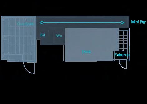
There was a depression in the living room area, for which a mini bar I designed for serving drinks. In line with this mini bar, a separate service line was created with a different color from the management living space, and ultimately ended up in the kitchen area. The furniture selection for this space was chosen to be more casual and self-expressive.
Location : Tehran | Area : 80m² | Function : Administrative | Condition : Designed & Constructed2
Rendering of the large office
Large office furniture
Pictures of the big office
In the design of the smaller office, light colors were considered due to the small area, and the favorite color yellow was added. Since the space was small and the restroom door opened to the main area, a decorative divider was designed as a ladder leading to the monitoring area to separate the space. Due to the limited space, part of the kitchen cabinets facing the work table was used as a filing cabinet, and in the selection of furniture, an aluminum set that has better compatibility with the performance of the collection was chosen with a special design.

In designing the courtyard, a minimal design with bright colors was chosen due to the limited area. Because the sun shines intensely at certain times of the day, a mobile pergola made of wood-plastic was considered to serve as a reminder of a traditional pergola. The steel material selection for the flower boxes, door coverings, and gabion walls was made based on their industrial performance. Due to the client’s interest in barbecue gatherings, a gas and charcoal grill with a table beside it was designed. Also, due to the limited space, a gabion table with a wood-plastic surface that doubles as a fire pit in the winter was designed.
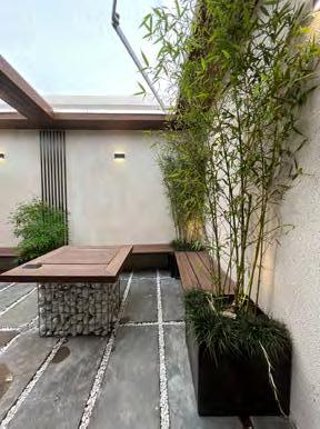
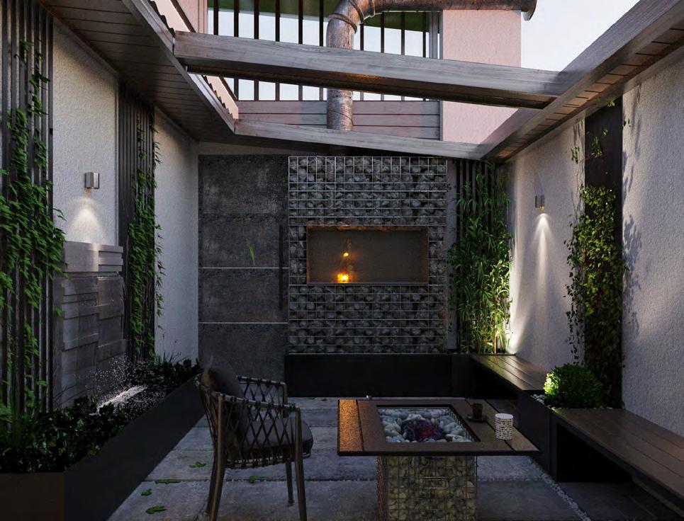
To make the space more comfortable, fixed benches were defined along the walls, and movable chairs were provided as needed. A modern fountain was designed to soften the space, with a variety of plants and the dominant choice of non-deciduous plants with an automatic irrigation system controlled by a timer. Overall, the design was intended to make the space more functional and enjoyable, while also taking into account the limited space available.
 Small office rendering
Small office furniture
Render of the large office yard
Pictures of the large office yard
Small office rendering
Small office furniture
Render of the large office yard
Pictures of the large office yard
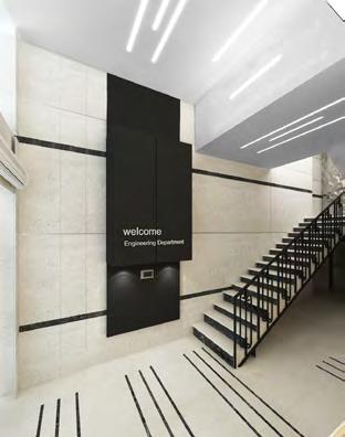
BANK MELLAT ADMINISTRATION BUILDING

Location : Tehran | Function : Aminisrration | Condition : Designed & Constructed
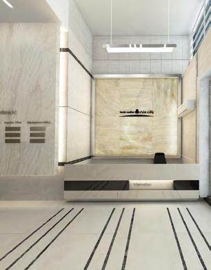

In collaboration with Company ALEF Architects, I primarily worked on the design and renovation of branches and offices for Mellat Bank. For the interior design of the branches, predefined charters with specific templates were established. As a result, the main challenge involved solving functional issues and spatial problems. One of my significant experiences with this company was designing the facade of the administration building for Mellat Bank. Three alternatives were designed by three members of the company, and my design was selected as the winning proposal. Consequently, I was entrusted with the task of creating the detailed execution drawings, which provided me with valuable experience in detailed and technical design as well as implementation.


+14.80 +34.80 +38.60 -2.20 -1.10 3
Exterior render Interior render Interior render Exterior Picture
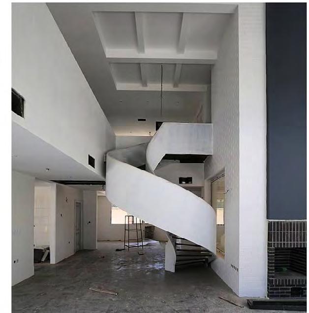
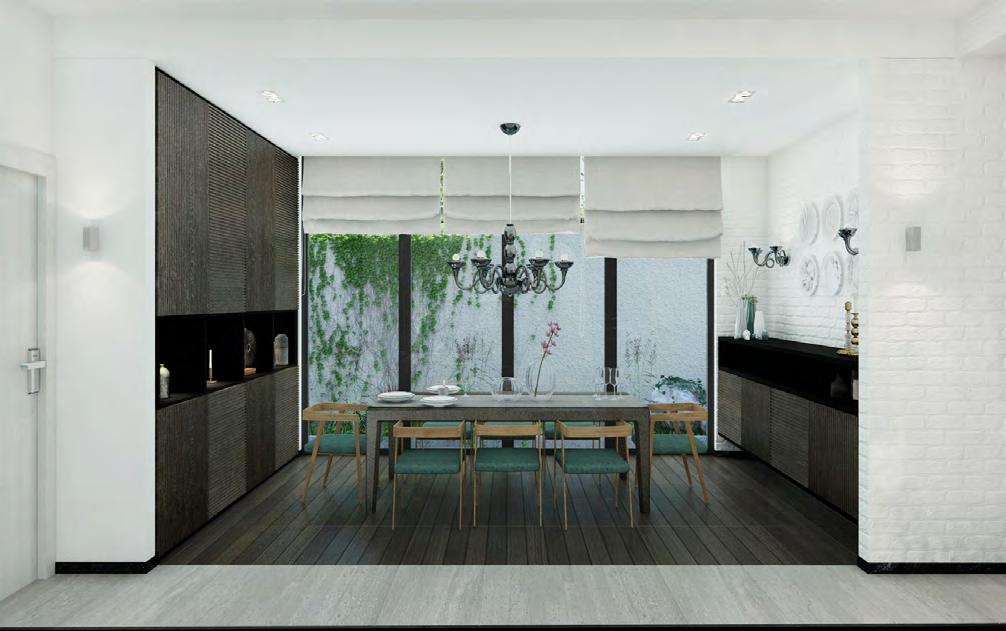
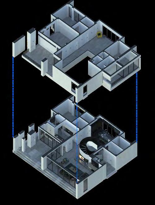
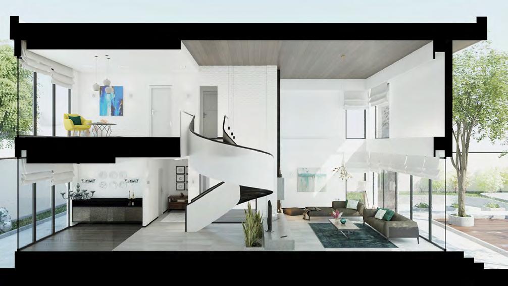
The interior design of this villa was commissioned by a private client in 2017. The villa, which is a two-story (concrete frame) duplex, has been designed with a modern and minimalist interior to provide a peaceful space for residents to rest. The first floor features a living room with a wooden fireplace, a kitchen and bar adjacent to a 40 square meter covered courtyard, and a dining room. The upper floor consists of four large bedrooms and a sitting area. A precast sculptural and iconic staircase provides connectivity between the two floors.
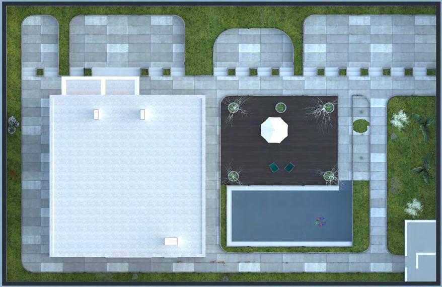
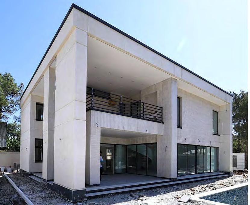

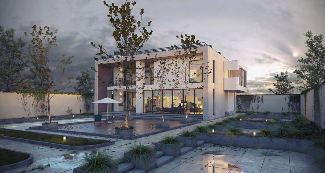
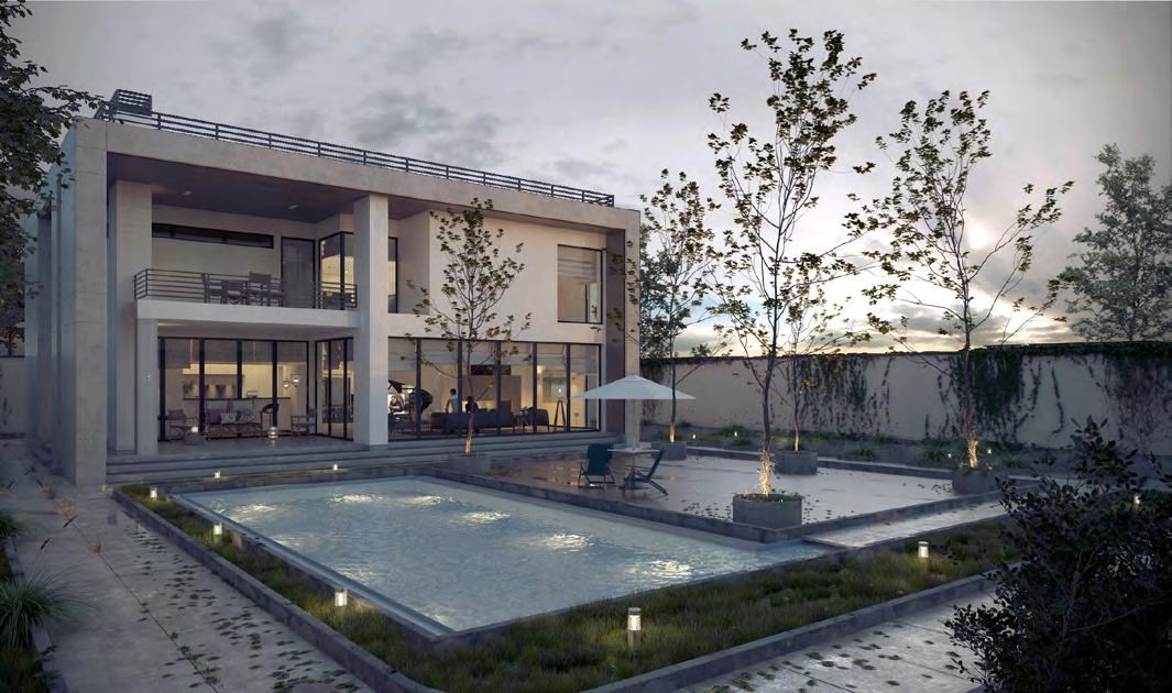
: Zibadasht | Area : 350m² | Function : Villa | Condition : Designed & Constructed 4
VILLA ZIBADASHT Location
Exterior Picture Exterior Renders
Site Plan Render
In the design process of the Zibadshat villa, I was responsible for the interior design and rendering. For the interior design, I aimed to maintain a minimalistic approach and chose neutral materials. In designing the dining area, I considered a console and cabinet that would provide individuals with easy access to tableware in the closest possible manner. By using a rotating wooden material from console to cabinet, I separated the dining area from the other spaces, creating a warm and pleasant atmosphere. In terms of materials, for the spiral staircase, which was a prominent element in the interior space, I ensured the outer wall matched the other walls in a white color, while the black color was allocated to the inner structure to accentuate its presence. I dedicated the space under the staircase to accommodate a TV setup, and for the remaining space behind the television, I incorporated plants, covering horizontal space below the staircase and vertically covering the area behind the TV. In the kitchen design, considering its limited area, I kept it white but added wooden touches from the dining area to enhance its appeal. Working on this project provided me with achievements in interior design, material selection, and details. Additionally, rendering the project with meticulous attention to detail, especially in the exterior space, was a special experience as it aimed to depict the true ambiance of the project.
 Interior Renders
Interior Pictures
Interior Renders
Interior Pictures
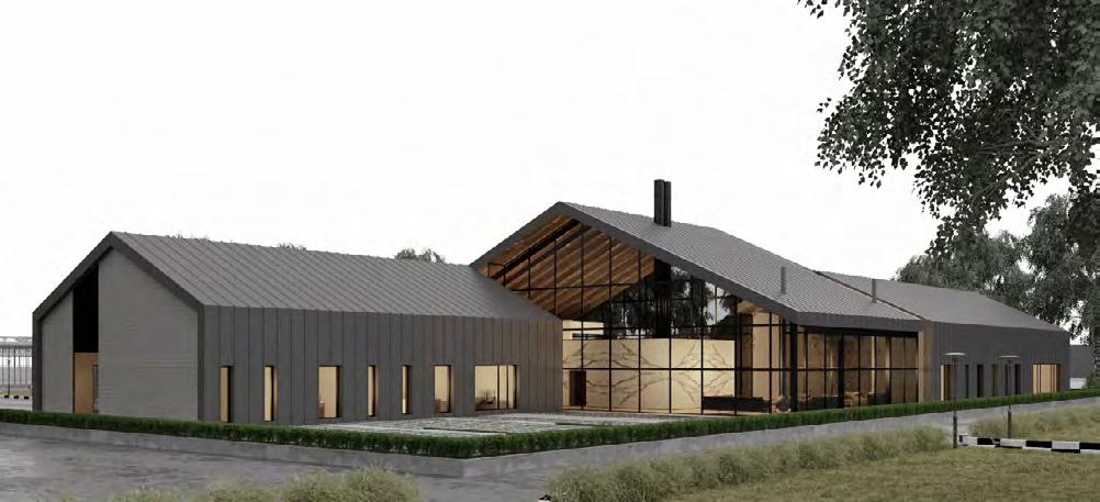
TEHRAN-CHALUS FREEWAY ADMINISTRATION BULDING

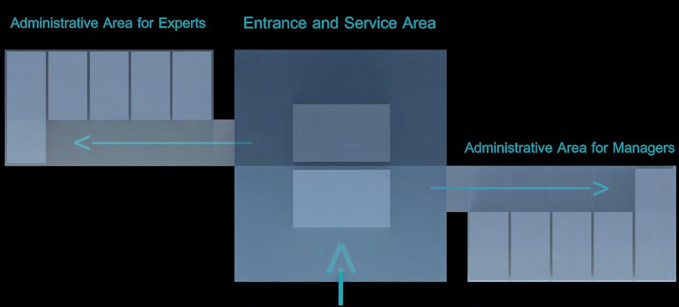
In the design of the Tehran-Chalus Expressway office building, I collaborated with one of the managers from the Dash company, considering the climatic and functional conditions in the design. Based on the performance and physical program, we divided it into three main parts: waiting area and service area dedicated , office space for managers, and office space for experts. To enhance the readability of the layout, we designed it as three sections, with the main section being the central service area and two wings on the sides, separating the office spaces for managers and experts. Considering the humid and cold weather of the region, we incorporated a sloping roof and shifted each wing to one side of the slope , increasing its length. As a result, more windows aid in natural ventilation.
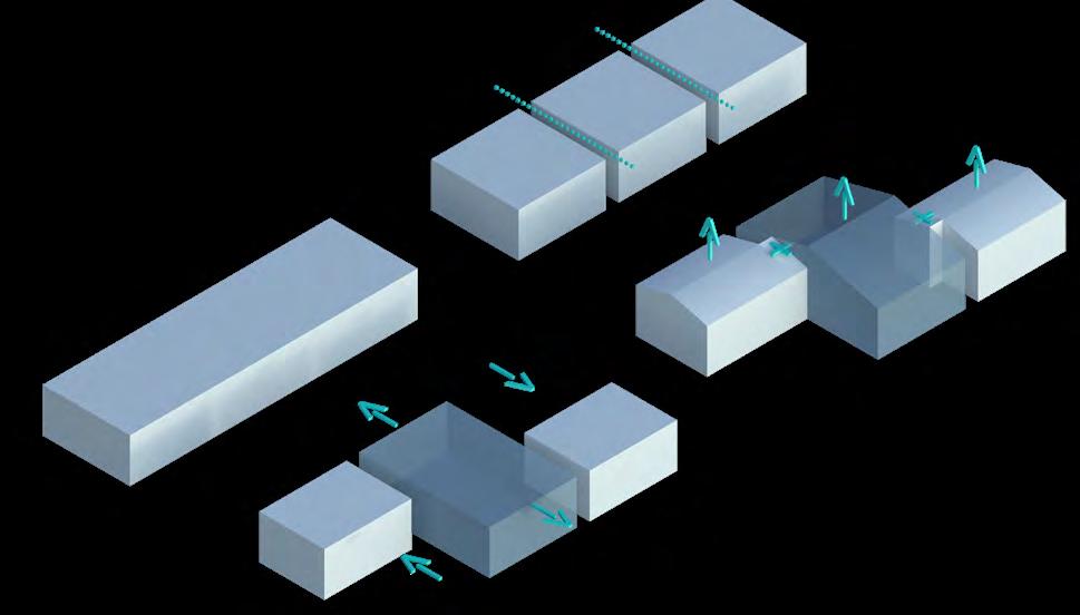
Unfortunately, designing this project was terminated during the initial stages. However, the experience of designing this project was filled with achievements for me. It involved teamwork and indigenous design, taking into account climatic conditions, among other notable factors.
Location : Chalus | Area : 480m² | Function : Official | Condition : Designed
5
Exterior Renders
 Exterior Render
AMIN BETON COMPANY
Location : Tehran | Area : 112m² | Function : Official & Laboratory |

Condition : Designed & Under Construction
Amin Beton Company, a concrete production factory, requested an expansion of their laboratory space. Currently, they had a small building for a physical laboratory and wanted to add a chemical laboratory, administrative and management offices to it. The site had a height difference of approximately 90 cm that divided the space in half. In the design, minimum employee movement between the laboratory and administrative spaces was considered, as well as a management archive area with a glass view. Additionally, a cafeteria, and restroom facilities were included. Stairs were placed at the entrance, and a glass divider separated the management space from the laboratory. A portion of the common wall was made of glass to provide a relative view of the laboratory. The use of glass was chosen to allow for a wider view given the area’s square footage, as well as for entry and archive separation.
39° N Size Project name Client Architect DWG No. Approved by Ckecked by Designed by Mr. Zameni Maryam Jafari Isssued for DWG title Description 0.80 0.90 1.20 0.80 2.10 1.50 0.80 0.90 1.50 1.60 2.00 1.65 2.70 0.90 1.50 2.00 Sheet A-07 39° N Size Project name Client Architect DWG No. Approved by Ckecked by Designed by Mr. Zameni Maryam Jafari 99/11/24 Isssued for Date DWG title Description Scale 1/100 Rail Railing table book case Chemical laboratory plan Sheet A-01 1.20 1.27 Lift 0.90 1.20 1.20 0.90 Acid Fume Hood Bench Fume Hood Room Sink W Acid Cabinet Balance Overhead Shelves Eye Wash station Shower Fire Extinguisher Upright Cabinet Bench Sink Chemical Locker Bench Water outlet Water outlet 10.45
6 Archive Render
Considering the region’s climate and rainfall, a lightweight and easily executable roof design was chosen. The variable height of the sloped ceiling led to the decision to shorten the walls of the restroom and kitchen to create a desirable visual effect. A built-in library was used to restrict direct views to restroom, creating spatial separation between management and service areas.
All laboratory furniture was designed to meet the appropriate standards and was supervised by the relevant engineering team.
The flooring material was consistent with the company’s performance and concrete production, and microcement was used for the restroom facilities.
39° N Size Project name Client Architect DWG No. Approved by Ckecked by Designed by Mr. Zameni Maryam Jafari 99/11/24 Isssued for Date DWG title Description Scale :1/100 1.50 0.07 1.43 0.80 0.40 0.36 0.04 0.36 0.04 0.36 0.04 0.36 0.04 0.36 0.30 0.45 2.10 3.00 1.20 1.20 0.95 1.30 0.70 Sheet A-06
laboratory Render
Entrance Render
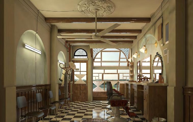
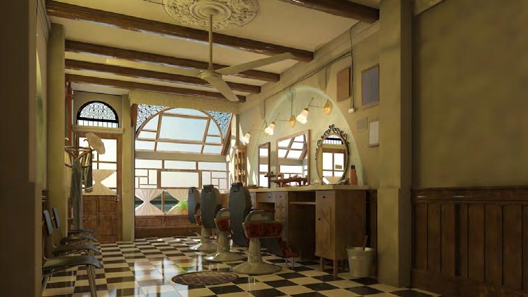
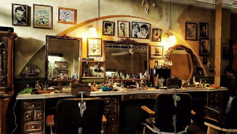
SET DESIGN OF FILM “ A HAIRY TALE”

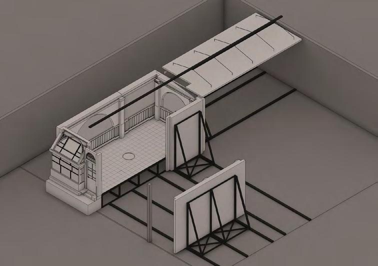
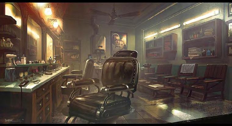
The film “A Hairy Tale” is a unique fantasy movie set in a location that is actually just a 30 square meter hair salon. One notable aspect of this film is that it is not dependent on a specific time or place. The scene design was done by Soheil Danesh Eshraghi, and after the initial study and considering the location limitations, we began designing the maps. The main constraint for executing the location was that the filming was limited to a three-meter space, so at the request of the director and cinematographer, we made all the walls and ceiling movable. As seen in the maps, we designed gaps that would disappear behind spatial elements. For example, we considered this gap in columns and outside the camera’s view in the walls or behind a tool in the ceiling that was out of sight.
SITE PLAN Scale 1/200 97/02 /20 Sheet : A-00 PLAN WLL C WLL WLL D WLL F Scale 1/50 97/02 /20 Sheet A-03 WLL E Sheet A-05 Sheet A-06 Sheet A-07 Sheet A-08
Tehran | Area : 30m² | Function : Set Design | Condition : Designed & Constructed 7
Location :
Initial Sketches by Soheil Danesh
Render
Salon Arrengment in Site and Movement Space for Wall Render
Salon Arrengment in Site plan and Movement Space for Wall
Guide Plan for Moveable Wall Details
Another challenge we had to consider was the well in the salon. There were scenes where the well opened up, and we had to imagine its depth. At the end of the movie, an earthquake occurred, and the salon floor collapsed. Therefore, for these two reasons, the scene was executed with a height of about one meter above the ground. In designing the scene details, I paid attention to the furniture and mentioned that all the execution maps have been drawn with details.

Scale 1/50 97/02 /20 Sheet :C-05 WLL A SECTION A-A Scale 1/50 97/02 /20 Sheet :B-13
Picture Picture
Render
View of Moving Walls
View of Moving Walls
Render
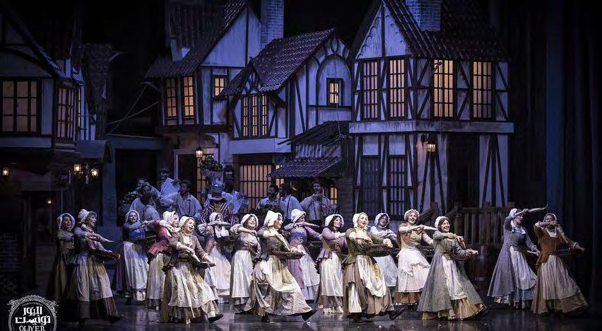
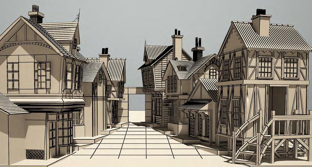
SET DESIGN OF THEATRE “OLIVER TWIST”
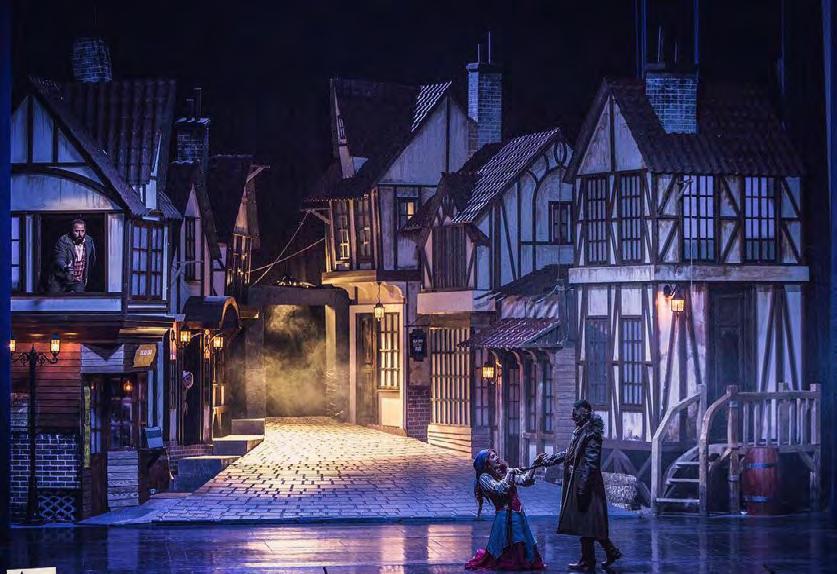
Location : Tehran | Function : Set Design | Condition : Designed & Constructed

In the design of the stage for the musical theater production of “Oliver Twist,” I worked with sketches created by Soheil Danesh Eshraghi. After reviewing the sketches, we had to use forced perspective to create the desired feeling in the limited space of the theater stage. For example, for the main scene, which depicted an alleyway, I executed the buildings in perspective to intensify the feeling of narrowness, and the buildings were designed to have a lower height to give the impression of a longer length. I also used a slope for better visibility, which is illustrated in the site plan. In designing other locations similar to the main location, I examined the initial sketches and created renderings and execution plans based on the space and dimensions. My goal was to ensure that the final design matched the initial sketches with all the angles and details.
B_2 B_1 B_7 B_6 B_5 B_4 B_3 B_6 B_6 B_6 B_6 8
Initial Sketches by Soheil Danesh
Guid Plan
Render
Picture
Picture
THE BOOKSTORE OF THE ACADEMY OF ARTS
In the upcoming project aimed to pay attention to the following points and standards, which are briefly referred to as follows:
• Valuation and proportionality of the design with the main building: Since the Academy building is a durable and specially designed structure, in its renovation, an attempt has been made to use these characteristics in a contemporary way. The selection of materials such as wood, brick, and concrete, as well as colors compatible with Iranian architecture, is influenced by this approach. The use of these elements pays tribute to the main building.
• Low-cost design:

To reduce project costs as much as possible, efforts have been made to reuse existing materials. For example, the current libraries with a new appearance (color) will be reused in the first section. In the second section, floors have been designed using inexpensive and accessible materials, which have a new appearance while being coordinated with the first section.


• Encouragement of people to read and buy books:
The designed space is attractive enough to encourage people to browse through the books, read summaries, and ultimately buy them. The readability of the space is such that as soon as the person enters, they get a general view of the presented books, and the selection becomes easy for them. Regarding the ground coils in the library design, although it is suggested that the same split system be used in the second section as in the first, the existing coils can be hidden behind the porous color boxes for air circulation.
Finally, with all these features in mind, we have come up with a design that focuses on performance as its main feature. Despite its simplicity and speed of execution, the design is durable and free from passing trends.
• Flexibility of the design:
Unfortunately, in most projects, neglecting this point leads to the user making unforeseen changes to the design based on their needs, which after a while will cause the design to deviate completely from its original goals. In the proposed design, this problem is solved by simple and modular design, allowing the user to easily increase or decrease the shelves and move them without disrupting the overall design.
Some of the elements and factors that have had an impact on creating an attractive spatial design include:
1.Categorizing books and designing title signs
Designing thematic signs made of colored Plexiglas and placing them perpendicular to the floors in a way that catches the eye immediately upon entering and guides the person towards their favorite section. Additionally, colored floors in each section contain reference books of the same color. Furthermore, the connection of title signs to the metal frame of the library allows for easy movement for the user.
Our suggestions: They are introduced weekly to readers by the Academy of Arts and include books that are hung on the sales counter in the first section, and the person can use them while waiting in line at the cash register.
Gift Suggestions: Each section includes books that are placed on shorter floors.
2.Introducing books under different titles
In addition to the new release section that was among the client’s requirements and was placed in the central section of the bookstore, other sections have been scattered around the different points to introduce books to readers and simplify book selection for them, including:
Bestsellers: This section is located on the divider wall of the bookstore and includes books that have had the highest sales in recent months.
Bestseller Wall: This wall, which is one of the recommended reading sections, is located exactly between the two spaces and in its previous location, and with changes such as creating more openings to establish maximum communication between the two spaces and brickwork, in addition to being a reminder of the brickwork of the main building and bearing its address, offers a new look and new suggestions. Reference books and books that have won international or domestic awards are placed in color boxes inside each compartment. The color of these boxes is the same as the sign of the corresponding section.


: Tehran | Area : -m² | Function : Set Design | Condition : Designed & Constructed
Location
9
Sitting areas Section Render Book Shelves Render
Bestsellers Section Render
Academy of Art Building picture
Entrance of Bookstore picture
3. Predictive Spaces for Sitting and General Reading:
It seems that in such spaces, predicting individual and scattered spaces is better than a centralized space to provide comfort and independence for each person. In this way, each person can use a seat in any section according to their needs and do not need to move to find a chair. For this purpose, several space models have been designed for sitting:
Colored Boxes: These boxes are embedded under all library floors with easy and light mobility. Everyone pulls it out according to their own needs and sits on it for a while. The accessibility of this type of seat was a priority.

Sitting areas: These chairs, which are located in the middle of the library floors, provide a suitable space for...
More comfortable seating areas: These types of seats include more comfortable sofas with the ability to lean back and have been provided in the central space and the new book section for longer readings.

4. Lighting

The overall lighting of the library space is provided by linear lights installed on the metal structure of the ceiling. These lights have the ability to spread light up to 4 meters and are sufficient for general lighting of the hall. In addition, other lights with spot and focused lighting functions have been designed, including:
• Focused lights on the library floors: These lights are installed on rails on the highest floor of the library and can be moved around as needed.
• Decorative pendants: The selection of pendants has been made so that they not only have a special and different form but also match the other elements of the space. These pendants, which are located in places such as the counters and the central section of the new books, are a good symbol for identifying the space and its readability.
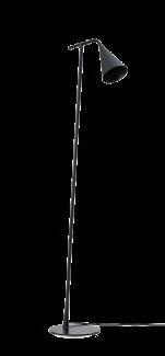
• Lighting for the new book section: In addition to the ceiling pendants, there are high-base floor lamps located next to the lounge areas in this section, with the ability to adjust their angle and height by the user.


Bench lighting: These are wall lights connected to the library walls and are adjustable like reading lamps.


-Wall of Frame
The end wall of the bookstore in the second section, facing the counter, is covered with the faces of artists and famous paintings that remind us of a part of the art and literature of this land and the farthest points of the world.
5.Counters
One counter has been designed for each of the spaces, which, while having similar materials, are completely different.

•The first counter, located in the center of the space with a round shape, is very inviting for the entrance space due to its form and multiple sides.
The second section of the counter: In addition to sales performance, it includes another section that is completely hidden from view. All employees can use this section for eating and warming up. Additionally, the possibility of predicting a location for placing personal belongings of employees, which was also requested by the employer, is provided in this area.
Wall of Frame Render Counters Render
ACADEMIC EXPERIENCE

SHADEGAN ECOTOURISM VILLAGE (Thesis Project)


Location : Shadegan | Function : Ecotourism | Condition : Designed

Professor: Mr. Azimi
The initial interest in this subject of research was due to the fascination with indigenous tourism. After considering all the potentials and risks associated with it, an ecological approach was adopted to preserve and organize a particular atrisk area of the region. The aim was to combine the natural and cultural elements to create a collective space formation. Thus, an ecotourism village was designed with a variety of functions that respond to the culture, economy, and environment of the region. The village comprises a collection of buildings located in the heart of the Pond, where visitors can experience the peacefulness of the area by walking on a hanging bridge and passing through the buildings. The design of this complex incorporates buildings with different functions, such as a market, museum, research institute, service centers, recreational and residential locations, and more.

PREGOLA

BIRD WATCHING TURRET

10
PIER............ BAZAR.................................................................................
COMPLEX...............................................
ENTRANCE
RESORTS ........................................ RESEARCH MUSEUM FISHING AREA RESORT SERVICES ............................................... .................................. ......................... .............................
It was tried to have visual and convergent coherence with surroundings, so the result was far different from the initial designs by considering the warm and humid climate of the area, and they became to some low volume forms and, less massive buildings and lighter structures with spacing distance between them to have more air flow..


The ellipsoid shape is considered according to the traditional architecture (MOZYF) and the nature of the area, with soft angles, stagnant air flow stops and fits with the humidity of the area. Because of the high temperature of this region, to have better air conditioning, the height of the buildings are more than the normal size and some valves are fitted on the roof to the desirable winds com from the mountain. With help of stretched tall windows, it helps to ventilate and airflow inside the building. Also by creating distance from the ground floor (CAT PATH), it was tried to exacerbate the flow of air from all directions of the building specially from the ground with the high water level.


Finally by combining the similar function buildings together and form some functional building blocks, there is the possibility for readability in movement between spaces and shadings so the structures are tied together and are coherent. While a lighter volume which is consonant with the natural and cultural context is formed, but is very different from the original heavy structure which was designed in the beginning
Ecotourism is a kind of trip to the natural areas with special respon sibility towards keeping the environment safe and improve the life of local residents.


In 1996, the union of the conservation of nature and natural re source, expanded the above explanation of ecotourism as below: It is a viable ecological visit of the pristine natural area which its pur pose is, to enjoy the nature, realize its blessing aspects and fact with its related cultural features. This would lead to promote the protection and would keep the area safe from negative effects of the visitors on the nature. Also it would provide conditions to create jobs and employing benefits for them.
 South Elevation North Elevation
ENTRANCE COMPLEX ENTRANCE COMPLEX
East Elevation West Elevation Section A-A
Apply rendering to a bird’s eye view photo
Labi & Reception Area Renders
Shadegan international wildlife refuge and its international pond, with an area of more than 400 thousands hectares, of plain green lands, are located at Shedegan city in Khozestan province of IRAN. But there is no location for staying the tourists in the city.
Shadegan Pond has a great Potential for attracting the tourists because of the Variety of vegetables and green lands,its biological creatures and also the fresh water and salty water both. The purpose of this research:


-Attention to its culture, economical &enviromental condition and infranstructures.


-accurte planning for the fundamental examples & how to manage them.
-provide attractions for the visitors
-promotethe level of scientific and enviromental knowldge.

-coordination of economic and scientific development with the job creations in soci ety and sustainable enviromental development.
 Section C-C
Research Buildings Render
Resort complex Render Research & Museum Buildings Render
Research Render
Museum Plan
Section C-C
Research Buildings Render
Resort complex Render Research & Museum Buildings Render
Research Render
Museum Plan

Resorts Render
 Bird Eye View of Resorts Render
SATTARKHAN RESIDENTIAL COMPLEX ARCHITECTURE DESIGN 5

Location : Tehran | Area :25000m² | Function :Residentional | Condition : Designed Professor: Mr. Motallebipour
Starkhan Residential Project
The project started with an analysis of the existing apartments on the site. The strengths and weaknesses were evaluated, and the good features that should be repeated in the new design and the problems that should be resolved were identified. The Starkhan complex consists of 360 units in three 21-story towers on a 25,000 square meter land with an 8,000 square meter footprint and a useful area of 56,000 square meters. Apart from the buildings being outdated and neglected, the lack of identity and typical plans was seen as the first problem. Living in homes that have no visual differences from each other can never meet the needs of all residents.
-Strengths

Good green space in the courtyard.
The presence of a meeting room on the ground floor of each tower. Predicted shops on the ground floor that meet the needs of residents. These shops belong to the complex and their rental provides income for the residents.
Proper positioning of the towers in relation to the street and in communication with each other.
-Weaknesses
In addition to architectural problems, residents of the complex face numerous problems. Most of them complain about insecurity, uncontrolled movements, theft, drug dealing, etc.
-Solving the Problems
Although it may not seem at first that these social problems are related to architecture, a little contemplation leads to the conclusion that ensuring the security of the complex by predicting children’s play areas in controllable locations, defining proper entrances and exits that are controllable, avoiding designing cramped and dark spaces, and predicting usage for all open spaces of the complex are some of the points that, if observed in the design of the new complex, can prevent future problems.
One of the issues that leads to insecurity is the large number of units that make it difficult, and sometimes impossible, to control the movement of residents and guests. These relatively affordable and densely populated neighborhoods, due to the insecurity caused by the inability to control movement, have become safe havens for drug dealers and buyers all over the world. This project, with 360 units and more than 900 residents, can be compared to such neighborhoods.
It seems that creating a complex with fewer units, where the residents at least recognize each other’s faces, can be useful in identifying unfamiliar individuals and preventing potential crimes. A complex that is reminiscent of old alleys and neighborhoods.
Considering the relative alleviation of the housing shortage problem in recent years, building three towers with less density and fewer units will not be unrealistic. Avoiding the high-rise apartment trend, occupying more land to preserve the connection with existing green space, and distancing the project as much as possible from resembling an apartment.
-Project manifestation
Given the manifestation of the towers in the current project and the surrounding vegetation, it has been decided to place the buildings in the location of existing buildings. However, due to the reasons mentioned above, it is possible to shorten the buildings as much as the trees allow and expand them. Where trees conflict with buildings, the structure is hollowed out, creating space for the tree. This form of manifestation, while reminiscent of the form of placement of previous towers, seems to be distributed according to the needs of each family, as if breaking their dry and icy forms, and each has settled in a peaceful place.

-Volumetric concept

Considering the importance of the plan and the function between spaces in residential spaces, it seemed impossible to follow a particular volumetric form and place the functions within it. Therefore, a new concept of volumetric design has been proposed. Instead of a predefined and fixed form, the structure is designed as a flexible, three-dimensional framework. In this framework, the residents can flexibly place their preferred functions and living spaces. The flexibility of the structure allows for changes in the layout of the building according to the needs of residents over time.
The result of this approach is a complex that is not limited to predetermined spatial functions but instead can adapt and evolve over time to accommodate the changing needs and desires of the residents translated into the design of a spiral staircase, both in plan and elevation. This idea, in addition to opening up the designer’s hands for planning, creates the possibility of creating unique covered terraces and courtyards for each unit by stepping back and forth between the floors. At the top of this staircase, we reach the special units, which are located on the least crowded floor with the best light and view due to the pyramid shape of the volume. The interplay of full and empty spaces created by stacking the floors on top of each other completely solves the problem of lighting and ventilation, in addition to using some of the ceiling lighting in some places.

11
-Pedestrian entrance
-The entrance to the residents’ parking
-Sports equipment
-Public greenhouse
-Brief greenhouse
-Residents parking exit -parking entrance & exit guest car
-Children’s play area
................................................................................................................................................................................. <
< <
-Tree house
NORTH Sec A-A Sec B-B
Summary of ideas:
1- Avoidance of apartment typologies:

Although this idea multiplies the difficulty of design several times, it is undeniable that moving the project away from typical apartment examples is essential. The uniqueness of each unit from the other units plays a crucial role in defining the identity and concept of the home for individuals.

2- Strengthening the relationship between neighbors:
Initially, we introduce projects where communication between residents of different ages is considered one of the main points of design. The results of this communication between residents are very significant. These projects are called Intergeneration architecture. In these projects, different generations are placed side by side, each person’s needs are met separately, and by predicting collective spaces, the possibility of creating a connection between them is provided. In examples executed in Europe, adding a nursing home and a kindergarten to a residential complex and their relationship with each other has strengthened this connection and created a deep emotional relationship between generations. In numerous reports from these complexes, it has been stated that a child who does not have a grandmother has found herself in one of the elderly or neighbors and the elderly person has replaced her distant grandchild with a child from her neighborhood
Fist Floor Plan
Sec A-A
Prediction of communal spaces in floors:
Creating such spaces in floors, in addition to predicting them on the ground floor as sports and social halls, provides the possibility of creating connections on a smaller scale and between neighbors living in a shared floor.
Moreover, placing age-specific spaces in close proximity to each other, such as a nursery next to a sports and a shared green space with other blocks, is very effective in strengthening this connection. Emphasis on more connection with nature and green space:
The existing site is very rich in plant coverage. Ancient plane and tall pine trees are abundant on the site between the blocks.
In addition to maintaining and emphasizing the existing vegetation coverage, efforts have been made to add to it and establish a relationship between residents and the targeted green space.
To this end, the following points have been considered in the design:
Design of open rooftop terraces for all units


These private courtyards, designed independently for each unit, include flower boxes designed for planting short-rooted shrubs. The view of these plants from inside the units provides a new definition of apartment living. Their appearance from different angles of the facade provides the possibility of growing diverse plants and doubles the beauty of the facade.
• Greenhouse design
Two greenhouses have been designed in the southeast and west corners of the site. One of them plays the role of a flower shop due to its close proximity to the street, serving not only the complex residents but also outsiders.
The other greenhouse, located exactly opposite it, is divided in a way to encourage people to plant flowers, and each unit has a section for planting different plants for personal use.
Treehouse design
Living in a treehouse is everyone’s childhood dream. By building a sample of these houses in the central courtyard of the complex... (the sentence is incomplete and needs to be finished).
Treehouse Design
The experience of living in a treehouse is a childhood dream for all of us. By building a model of these houses in the central courtyard of the Lablab complex, surrounded by tall trees, the opportunity to experience this feeling has been given to both children of today and yesterday.
• Green Architecture
Valuing nature and being close to it is not just limited to plants and flowers. In the design of this complex, an effort was made to use sustainable architectural features, including:
Greywater system: treating wastewater from showers, laundry, and washing machines and reusing it for irrigation of plants, flush tanks, and firefighting purposes. Using solar energy for electricity and hot water consumption
Creating a green wall: using this type of wall on the courtyard walls and some facade points Throughout all of these stages, the aim has always been to present a new definition of apartment living in the final project. To some extent, it addresses the problems of today’s apartment living and creates a pleasant space for everyone to live together.
-The architectural plan includes a basement-level parking lot with independent entrances and exits, a groundfloor lobby, and public spaces shared between all units. -The design also features a courtyard on the first floor
Sec B-B

COMPETITION
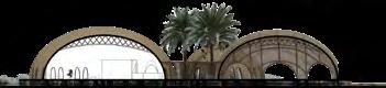
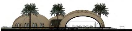
INTERNATIONAL LANDSCAPE & ARCHITECTURAL COMPETITION ILAND RSA


Location : Tehran | Function : Rest and Service Area | Condition : Honorable Mention in Competition& Approved
The caravanserais of the central plateau of Iran have always been a place for travelers to rest and renew their energy on long journeys. These buildings divided the distance of the route before and after them, not only as a temporary place but also as a place for staying and trading. The design of the Iranian roadside building is based on this principle. To create a place outside the hustle and bustle of the road and outside the harsh climate of the region for urban people today, to separate travelers from the rush to continue their journey and reach their destination, because the land of Iran can be a destination for travelers. Our idea is different from the usual form of roadside complexes that are located alongside the road and cars park between the building and the road, and the view of the building is inevitably towards the roads and cars.
Considering the dimensions of the project land, our proposal is to create an introverted building that takes travelers out of the weather on the road and allows them to rest for a short or long time.

Since the conditions of the land and the path of the power transmission towers have a strong pressure, the volume created can be opened towards the western green space, and travelers and the fast-food restaurant can benefit from its view.
Due to the large courtyard created in front and the central courtyard of the building, the connection of these two courtyards creates a long green axis that includes activities such as mini golf, children’s playground, camping, etc.
The location of this project is in the middle of the road for travelers from south to north of the country and vice versa. Our proposal is to create residential spaces for independent competitions on the second floor of the northern side.
In view of the dimensions of the project land, our proposal is to create an introverted building that takes travelers out of the weather on the road and allows them to rest for a short or long time.

Considering the dimensions of the building and the future development of the Iranian land complex, we decided to open parts of the central courtyard that, in addition to future traffic routes, help keep the central courtyard cool during the day by creating bright shades.


12
DASH Office Mojtaba Mirhosseini Maryam Jafari Amin Rezazadeh

Ground Floor Plan 1 Children’s Play Area 2 Café 3 Restaurant 4 Office 5 Supermarket 6 Hotel Lobby 7 Medical Center 8 Staff Rest Area 9 Lobby 1 Food Court Stalls 2 Food Court 3 Restrooms 4 Shop 5 Prayer Room 6 Void 1 Parking 2 Storage 3 Canopy 4 Facilities 1 Residential Space 2 Service Area First Floor Plan Second Floor Plan Basement Floor Plan
 View under Pilot to Central Courtyard and Eastern Porch
View from Central Courtyard to Western Landscape
Longitudinal Section of Central Courtyard
Longitudinal Section of Food Court Corridor
Cross-sectional view of Central Courtyard
North Elevation
South Elevation
East Elevation
West Elevation
View under Pilot to Central Courtyard and Eastern Porch
View from Central Courtyard to Western Landscape
Longitudinal Section of Central Courtyard
Longitudinal Section of Food Court Corridor
Cross-sectional view of Central Courtyard
North Elevation
South Elevation
East Elevation
West Elevation
Food court, brand stores and view of the central courtyard
Food court for dining and view of the western landscape
Food court, view from the location of the stalls
Camping and shelter
Exit route for cars
Car wash and servicing for passenger cars
Gasoline and gasoline station for passenger cars
Diesel pump for heavy vehicles
Heavy machinery repair and parts shop
Parking for heavy vehicles
Car movement route without using the gasoline station.........................................
Car movement route for using the gasoline station without entering the complex.............

Car movement route after using the gasoline station................................................
..........Entrance and exit communication space to the central courtyard.............
. . . . . . . . . . . . . . . . . . . . . . . . .
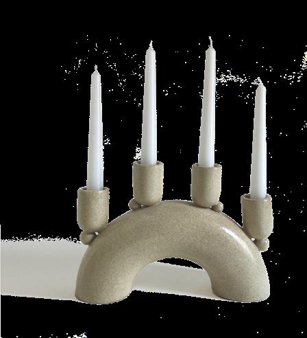
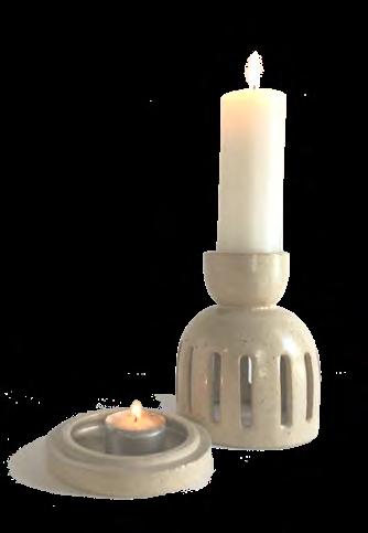
CERAMIC PIECES


SCULPTURES INSPIRED BY NATURE
I am interested in contemporary art with simple lines which are informed by my passion for architectrue.

As a ceramic artist I enjoy the impact of sharing experience that can be found in the immediacy and sensuality of working with clay. Through my ceramic work, I love to experiment with contrast of colors in slips or glazes and texture, which I use to explore the world of design. My practice embraces sustainable process; i recycle clay and try to make chamootte from my Broken thing.
 SHIFT Ceramic Studio
Limited Edition 13
I Believe in transformative power of raw material and the benefits of meditative time spent on making together. I believe in power of art as a device for inquiry and an agent for Change.

The presented works of art are the product of observation and photography of a pristine nature.
These sculptures aim to showcase examples of texture, contrast of colors and light stem from combination of natural elements.


Eventually, by adding light, not only dose emphasize the mentioned features, but also an architect’s demand for the function

_46×30×15 (Lamp)
_32×25×15 (Lamp)

I have been interested in origami and playing with Legos since childhood, and this interest is evident in the field of my architectural design and ceramic pieces, as I reach new forms by combining primary patterns. In leading forms, inspired by nature and using mineral pigments, efforts have been made to bring forth the texture, contrast of colors, and light resulting from the coexistence of natural elements. As a result, a natural and spontaneous texture is formed, with the nature of these shapes resembling stones, which sometimes appear through the play of colors and in some cases in the form of fine locks during the construction process.


Modouls


+ > + > + > + > + > + > > > > -----------------> > + > + > + > + > + > + > + > + + > + >
MODOULAR CERAMIC PIECES Functional Minimal Modoular
14
In designing lights, the aim is to allow the user to create their desired form based on their personal taste and spatial combination by playing with modular components. Overall, considering the limitations of ceramic, efforts have been made to design flexibility, for example, in the design of the sunflower table lamp, the ability to rotate and change direction has been taken into account, and it can also be used as a pendant lamp.


...................................................................................................................................................................................................................................................................................................... + + + > > > > > > > > > > >