IKEA WAY FINDING
1
Kaitlin Laine, Maya Pajevic Alison Govier, Keyanna Hall
TABLE OF CONTENTS 5 - 7 9 11 - 12 13 15 - 16 17 19 - 20 21 - 22 23 - 24 25 - 26 27 - 28 29 - 30 31 - 32 33 Commute to IKEA Location Parking The Entrance Elevators and Accessibility Washrooms Cafeteria Graphic, Audible and Tactile Communication Consistent Cues Identification and Directional Signs Information and Regulatory Signs Information Desks Lighting and Consistency Security
4
OUR Journey to IKea
IKEA

5
Pink - Kaitlin Blue - Keyanna Burgundy - Alison Green - Maya
KAITLIN AND MAYA’S JOURNEY

Maya’s Commute - My commute wasn’t horrible. As I live in the Erlton/Stampede area, in Mission- I took the Erlton train station, taking Somerset, heading south towards Chinook station. The time it took me from station to station was roughly fifteen minutes. As I often don’t go to IKEA by Calgary Transit, I relied on Google Maps to tell me which station to get off, which bus to take and approximately how long the commute would take. As I got off Chinook Station, I took the 43- McNight bus and it dropped me off the outer perimeter of the shopping district. From there, I walked approximately 10 minutes, through the open parking lot- to the sign that said IKEA and welcome. That’s how I knew I was at IKEA.
Kaitlin’s Commute - On my way to IKEA I drove there from my house. I took Southland drive down to Deerfoot Trail, heading North until I got to Heritage Meadows Way SE, which then lead me straight down the road to turn left onto an exit to bring me down by IKEA. Waiting at the entrance to turn left into the IKEA parking lot was a very long wait. There was lots of traffic going into and out of the IKEA parking lot making it hard to enter. My way to IKEA was easy, and straight forward, not confusing in any way, expect for maybe when I got closer and I had to do the exits to bring me onto Deerfoot, other than that though, my commute to IKEA was not a hassle and did not take long at all, only about 17 minutes to IKEA from where I live.

6
ALISON AND KEYANNA’S JOURNEY
Alison’s Commute - My journey to IKEA was an easy one. I looked up the address on Google Maps and followed Siri’s directions. She took me from Tuscany onto Crowchild Trail, which I followed all the way down south for about twenty minutes, where I turned east onto Glenmore Trail. After about five minutes on Glenmore, I merged onto Deerfoot Trail very briefly, and then exited onto 11th Street SE. I then turned right and found myself in front of IKEA. In total, my drive took just under half an hour, and besides the construction on Crowchild, there was almost no delay. I was not used to driving in the South, but I managed to make my way across the city with no incidents or problems.

Keyanna’s Commute - My commute was fairly easy as i only had to take one bus to get there thanks to the MAX colour lines in Calgary’s transit system. I had to use Google Maps the whole time as to not get lost on the way, I had never been to IKEA by way of transit before. I walked about 5 minutes from my dorm room to the bus stop and from there it was an hour long ride on the MAX Teal to the Deerfoot meadows stop by taking the Heritage entrance into the shopping district. I could not see the IKEA from the bus stop and had a 12 minute walk using google maps to find the location. Overall the trip was fairly simple if difficult to find the store once off the bus and difficult to time the buses correctly when leaving the IKEA.

7
8
LOCATION
Location:
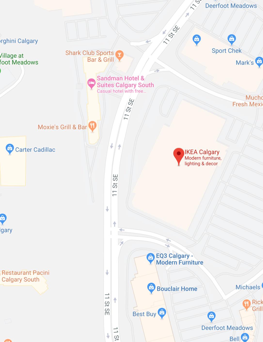
The Calgary IKEA is ideal for those who have families with vehicles as it is located in the southeast of Calgary making it quite a journey from those living in the northwest. By bus requires at most a 12 minute walk from the nearest bus stop to the building. The store itself is located off of a major roadway making it fairly easy to get to should traffic be light. Parking is plentiful though chaotic and clear signs dictate where to go and boast segregated areas for those who have mobility impairments and those with large families nearest to the entrance.
Given that IKEA is a low budget retailer for household items it would be ideal to have the location more centralized for those consumers on the other end of the city, or to have a secondary location in the northwest to maximize impact.
9
10
PARKING
Parking:
The parking lot of IKEA is large, designed with massive amounts of people in mind. There is an entrance driveway on every corner of the parking lot, however the driveway on the north end of the parking lot exits out onto a small, single-lane street. There is a pregnancy/family/disability section of parking stalls quite close to the store, and there are stop signs almost everywhere to enforce a relatively safe and mediated journey from car to building and back. While the vast majority of parking spaces were in the front of the store, where they are expected to be, there is also an entire lot behind the store, which is only visible if you approach IKEA from 11th Street. This back-lot was completely empty, while the front lot is much more congested and chaotic. However, it was surprisingly easy to find a parking spot, and the designers of the lot were able to fit a large amount of stalls, without making them too narrow.


11
Point of View:
While driving into the parking lot, I found it very easy to find a spot, the parking lot was large and very spacious. No lack of parking in the IKEA lot. There was a back lot too, the signage to this lot, though, was not very noticeable. You would not know there was a back lot, which was mostly empty, if you had not gone in the back area, instead of the main lot area. The signage in the main lot was good, they had a welcome sign, as well as a sign directly at the entrance of where family and disability parking was, which was in it’s own lot closer to the entrance of the building.


12
Kaitlin’s
The Entrance:

THE ENTRANCE
The entrance of IKEA is designed to serve its purpose. Its wide, inviting and engages guests with various senses. As you walk through the sliding doors, on the left side is a showroom of either a bedroom, kitchen or living room concept. On your right are some chairs to lounge in- either finishing up your frozen yogurt or getting ready to depart. The stairs are the main attraction, making guests aware that taking the stairs is the start of their IKEA experience. Interestingly enough, the stairs have two handrails. One for the average individual, and underneath one- where kids can hold onto. This is designed so that kids are encouraged to take part in the IKEA experience and therefore, most likely means more things in your yellow bag. As well, there is a divider for the stairsencouraging efficient flow from the main entrance to the upper level. This is to ensure that there is no congestion and that people move in a proper way. The main entrance also contains an information booth, a day care place (which is strategically hidden) and if you look hard enough, washrooms and elevators. Overall, it’s a good welcome space before guests start on their IKEA journey. Once inside IKEA, we found ourselves in a small foyer, with a tiny showroom on the left and a seating area on our right. There was no employee to greet us, instead there was a selfhelp information booth beside the staircase that an employee didn’t start attending until after we had been there for more than five minutes. However, watching people enter the building revealed that most of them knew exactly where to go, and they followed the arrows that pointed them up the stairs.

13
14
ELEVATORS and ACCESSIBILITY
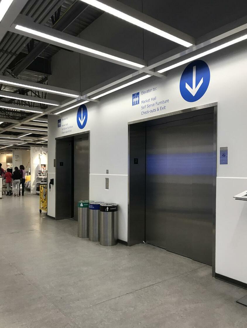
Elevators and Accessibility:
As IKEA is a household name for well-priced furniture, it’s interesting to note that they don’t advertise the locations of the elevators very well. IKEA, from my perspective is not very forward thinking when it comes to their accessibility audience. The information booth, located next to the stairs mislead guests for the location of the elevator. Even an experienced IKEA shopper would have a hard time locating the elevator, as its hidden from the main parts of IKEA. On the main floor, the elevators are hidden, forcing people to walk behind the stairs to use the elevators. And on the second floor, the elevator is parallel to the food courtwhich can cause confusion and is again hidden from the main part of IKEA. This is concerning as people with disabilities are wanting more and more to be engaged and involved in society, and IKEA can be a key player in that if they improve their wayfinding when it comes to locations of such things like the elevator.

15
Elevators and accessibility:

Their were only two stair cases, at the beginning and end of the store. As well as elevators are hidden, and not well pointed out for disabled people or parents who need to bring their children upstairs. The stairs have two railings as well, one for adults (higher one) and one for children (lower one). IKEA did this so it is not just adult friendly, but it is also children friendly. The elevators are also large so that multiple people can fit in with larger objects, such as strollers or wheelchairs.

16
WASHROOMS

Washrooms:
As IKEA is a massive department store, you would think they would have labels about where their washrooms are. But unfortunately, that is not the case. From my experience, I was able to locate just one washroom- where there was an entrance for both genders, but not one that is gender neutral. On the main floor. This is where IKEA can improve, installing a washroom in areas that are convenient for people to use, without distributing the layout of the space. Because one washroom for a store as massive as IKEA needs a restructuring of space.
17
18
CAFETERIA
Cafeteria:
The cafeteria is quite large with an open floor plan. Guests enter the area and are greeted to a food station that serves a mix of grab and go cold foods as well as hot meals for low prices. The service area winds in an M pattern with the two sides coming to meet at the cashier. Metal guardrails keep the guests single file and in an orderly fashion as like in an assembly line they collect their meal. Then guests enter the open dining area with various seating styles to suit the patrons wishes such as, cosy cafe like nooks for a more intimate setting, larger tables for families, and raised seating for those that enjoy a bar setting. The drink dispensers are almost always within eye shot as well meaning that parents can keep an eye on their children while still collecting beverages for them. The massive floor to ceiling windows give the area an open air feel and provide an excellent natural light source for the space.


19
Cafeteria:
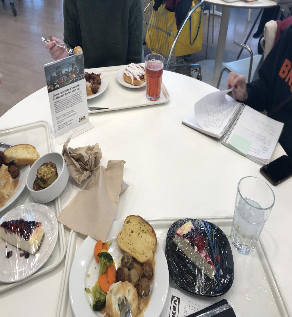
The food was great, cheap and plentiful. The line area for getting food could be expanded because only about one person could stand in the area to get food. There also was only one part of the cafeteria open, not the other side too.

20
GRAPHIC, AUDIBLE AND TACTILE COMMUNICATION
Graphic, Audible and Tactile Communication:
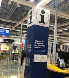
Being an international company means that much of the communication is done within the store must be universal in its appeal as well as easy to understand. The written cues on signs are placed throughout the store in the easy to read “IKEA-sans” to encourage clarity, information signs are also written in English as it is the most commonly spoken language in the area. There are also info-graphics placed on some of the information boards that are clear and easy to understand- for example the info-graphics for the plants dictate how much sun and water the plants may need along with whether or not the plant is edible. The auditory communication is in the form of intercom that is most commonly heard in the cafeteria. A small beep plays before the announcement and a soft voice quickly follows, it is set at a low to moderate volume as not to be too abrasive but is still easy to hear over the din of dining chatter. Physical communication can be found in the floor of the display areas as different types of flooring separate the main pathways from the displays themselves. Additionally touch screen kiosks are able to be located throughout the building.


21
Product Displays:

IKEA displays are well known for their widereaching appeal. In their displays, IKEA aims to create inspirational living and business spaces that reflect individual aesthetic and targeted business audiences. All are comprised of IKEA’s wide array of products to demonstrate the versatility and availability of the merchandise. The products are colour coordinated, well thought out and incredibly comforting in their atmosphere. The displays themselves feel like a complete living space in a home rather than a merchandise display commonly found in other retailers.

22
Consistent cues

Consistent Cues:
IKEA being the international giant that it is relies heavily on universal symbols such as the serif “i” for information desks and stations. Parking areas also employ the use of universal symbols to direct and guide patrons to designated areas with special parking close to the main entrance for those with families and mobility issues. In the display areas wide clear walkways guide the customer through the building, The main walkway is differentiated by grey flooring next to the beige wooden floor indicating when customers have gone off the main path. LED projected directional signs also help to guide the customer through the building. There’s also arrows on the floor projected on the floor using lights, as well as some floor stickers leading people down the walk ways.

23
Atmosphere:

The ceilings are made of exposed beams, scaffolding, lights and bars, but the atmosphere in each showroom setup is far from cold or unwelcoming. Each individual showroom is themed and decorated to look lived in and well-used. The furniture and decor that is selected for advertising each style of the room work together to make the scene seem real. One can feel relaxed and not rushed or pressured as they wind their way through the showrooms on the upper floor. The market floor, with all of the smaller household decor items, is unsurprisingly less cozy. Here, there are more walls, narrower walkways, and no themed showrooms. The purpose of this area is to keep you moving. While it doesn’t feel imposing or commanding, one finds their feet moving almost automatically, flushing you towards the warehouse and eventually the exit

24
Identification and directional signs
Identification and Directional Signs:

All signs around IKEA are written in IKEA sans, while most signs are written in English, product names are written in the companies native Swedish. Due to the uncommon nature of written Swedish in Canada, finding the products In the warehouse becomes slightly less confusing as all names are distinct from one another and written in the same font. Directional signs are placed perpendicular to the main pathways and are IKEA blue with directions written in white IKEA-sans font. Additionally the blue information stands placed about the display areas also have directions similarly written in white but boast a fairly easy to read map. Finally there are the White directional arrows projected onto the ground.


25
Identification and Directional Signs:


IKEA does a great job at using graphic symbols to show direction, they use very common and simple arrows, nothing difficult. No words saying “this way” only arrows [pointing in directions on the floor and above on the roof. IKEA was innovative too, as they project the arrows on the ground because the stickers they used to use got worn off from people walking on them so much.

26
INFORMATION AND REGULATORY SIGNS
Information and Regulatory Signs:
As for the regulation safety signs, they are surprisingly difficult to find as the colours chosen resemble the colour scheme of the displays and other signs around the store making them difficult to spot. The fire exit sign is a shade of green and the emergency doors themselves, while the signs upon them are a bright red and say not to block, were blocked by carts. All in all the safety of IKEA could be improved in both signs and for those with accessibility issues that can’t make it down stairs. There are many different information signs placed around IKEA, warranties are displayed on walls by the related product. Blue Information posts placed around the display areas boast a map, written directions and a touch screen for further aid. In the cafeteria pictures of food and the respective prices are placed on fairly big, easy to read screens


27
Information and Regulatory Signs:

The emergency signs were hard to spot as they were green, which does not symbolize anything important, but it is more subtle because of the soft colour. They also have some areas closed off to the public, but you are able to see into the areas that are restricted, they also have small signs saying the areas are restricted, as well as gates prohibiting you from entering.

28
INFORMATION DESKS

Information Desks:
There were small information pillars scattered throughout the showrooms on the main floor. Only a few of them had employees actually manning them, but most of them seemed to be self-serve. There were no info desks on the market floor however, and there were also very few employees until we entered the warehouse. Here, there were employees everywhere and help desks were abundant. This disparity between areas was most likely due to the fact that more people have questions or difficulties when they are trying to pick up the furniture they want, rather than when they are simply looking at smaller items like decor or dishware.
29
Information Desks:

Downstairs there is a large bundle of information desks as you walk into the self serve area. Unfortunately, there were not many people at the information desks to help anyone if need be.

30
LIGHTING AND CONSISTENCY

Lighting and Consistency:
Due to the lack of windows within the IKEA display, market and warehouse areas IKEA’s lighting has been designed in such a way to temporarily negate the need for natural light. In the product showrooms LED lights are used in a number of ways. First LED projectors create directional arrows to help navigate the display areas, and are used to bring focus and attention to the stationary information signs placed near and above the main walkways. Secondly IKEA’s displays do utilize LED, however, the lighting is much softer and atmospheric than that of the hallway in an attempt to sell and aesthetic rather than a product. Additionally The marketplace demonstrates an opposite goal, as piles of products are intermittently lit from the long LED tubes placed on both the rafters and walls creating a relaxed grab and go “market” feel to the area, especially around the children’s products. Third the Warehouse lighting adds to the industrial environment as boxes of products line the shelves however they themselves are not lit with the notable exception of the seasonal display areas. Finally the Cafeteria employs the largest use of natural lighting as the towering second floor windows give the area a rather open feel. LED pot lights are still used in the dining area as well as in the display cases for the various food items available for purchase.

31
Naming Conventions:
IKEA, a Swedish company, has all of its product names in Swedish. While they may be hard to read or remember at first glance, they also provide notepads and pencils to write down products that interest you. Their signs also feature an English description of the product. IKEA itself is an acronym of “Ingvar Kamprad Elmtaryd Agunnaryd”, the first two words being the name of the company’s founder and the last two words being his family farm and local parish, respectively.


32
SECURITY
Security:
The security in IKEA was seemingly rather lax and barely noticeable. in the upper display area by the entrance there were the Magnetic detectors commonly found in other retailers. Security cameras were virtually unnoticeable and could only be seen if one searched for them. As for physical security personnel, on the second floor there were help desks but no one present. The lack of personnel on the second floor is frustrating if one is searching for a product but also gives the consumer a feeling of trust within the area. In the first floor market place there were more people around to help, talk to and monitor the situation but not so many that it felt like your every move was being watched. Finally, the warehouse and check out area were the most guarded and secure as there were employees scattered around the warehouse floor and were readily visible. The security plan works well for the lay out of the building as there are so few entrances and exits that it streamlines the availability of where a person can go and adds to the difficulty of attempted theft


33
