MINNEAP OLIS
CO L LEGE OF ART AND DE SIGN
MFA CATALOG 2014


Welcome from the Director
This has been another extraordinary year for the 2014 graduates of our Master of Fine Arts Program. As you look through the following pages you will experience the creative work of 25 talented artists and designers who have completed the degree program in Visual Studies at the Minneapolis College of Art and Design. These creative explorations represent the capstone activity of two years of rigorous studio practice, directed individual mentorship, research, critical thinking, and intense discourse. The interdisciplinary mix of the students and the high level of talent present in this group is exciting, relevant, and accomplished. The work vividly demonstrates the lively and dynamic interaction of a diverse group of students, ideas, and creativity that has made this a unique class.
These MFA students represent the best of what is in a graduate experience and all of the faculty and staff are proud of their work and are honored to have contributed significantly to their education.
As these graduates enter professional practice we are confident of their future success and look forward to following their developing careers as their creative contributions change and enrich the global cultural landscape.
Tom DeBiaso Director / Professor Master of Fine Arts Graduate Program01. Julie Boehmer
02. Allison Bolah
03. Sean Cairns
04. Zach Collins
05. Shannon Gilley
06. Adam Hamilton
07. Christina Huang
08. Ning Kang
09. Heeyun Kim
10. Trevor Knott
11. Azisa Noor Koesoema
12. Sieng Lee
13. Wenwen Liao
14. Jiyun Lou
15. Dennis Madamba
16. Alissa McCourt
17. Sreekishen Nair
18. Desiree Niu
19. Liyuan Tong
20. Kathryn Van Zante
21. Duoni Wang
22. Huiqian Wu
23. Xiaohua Yang
24. Xuancheng Zhang
25. Kelsey Zigmund
01. Julie Boehmer
McHenry, Illinois
Illustration
julieboehmer.com
IMAGES:
01. Gentlemen of Adventure Land, 36” x 44”, digital, 2013 02. Road Trip (1), 4” x 12”, digital, 2013
I come to illustration from a Fine Art and Liberal Arts background. In my undergraduate studies, my focus was in drawing, painting, and printmaking; but my sense of humor and playfulness led me toward the field of illustration. My initial inspirations came from the gig poster and screen-printing scene of Chicago, and eventually broadened to illustrators like Julia Rothman, Maira Kalman, and David Hughes.
Illustration appealed to me through the use of text and research, problem-solving, and conceptual thinking. At the same time, I always felt the drive to make work that serves as a reprieve from the heavy, serious, and abstract usually found in this sort of work. I strive to focus on humor, surprise, delight, and beauty.
My most recent work focuses on the experience of surprise provided by roadside attractions, and the road trip culture that accompanies their discovery. The context of my pieces derive from personal stories of road trips made with my family, which has become a way of honoring my father, who recently passed away. After losing my father, the project has become as much about the stories in between the roadside attractions, as it is about the attractions themselves.
My thesis exhibition will focus on one of the longest road trips made by my family: from McHenry, Illinois to Seattle, Washington. As a whole, the exhibition will show a family’s journey along I-90, the over-the-top moments as well as the quieter, more subtle moments. Still wanting to embody the surprise of coming across an absurd roadside statue, I intend to use illustrated works of various sizes, allowing a play of scale and proportion.
For me, the road trip provides an appropriate metaphor for daily life—sometimes monotonous, sometimes sublime, with occasional surprises (welcomed and otherwise)—but the interruptions and surprises are what make the trip worth taking.


02. Allison Bolah
Red Deer, Canada
Photography allisonbolah.com
IMAGES:
01. Charlie Brown / Our Town (Emily and George), one minute and 30 seconds, audio recording, 2013
02. Public Speaking (Marginalia), 69-minute video w/ artist book, multimedia installation, 2014
03. Public Speaking (Marginalia), 69-minute video w/ artist book, multimedia installation, 2014
My interdisciplinary practice draws on my experiences in literature and photography; in installations of video, sound, and paper-based objects, I document the ways gesture and language are shaped into specific narratives. Themes of reflection–literal and figurative-are also a feature of my work and I play with their ability to form and challenge ideas of self and place.
The human drive to build complete narratives out of tiny bits of information is as important to my work as are the ways a variety of media structure my finished pieces. I am deeply interested in reading text, context, and subtext via our assumptions about elements as seemingly minuscule as the title of a photograph, film, or passage of words. My work aims to subtly draw awareness to our reliance on absent information and non-verbal communication in creating and understanding narratives.
Throughout my work, I privilege my personal history. Who and where, how and why—and my perspective on them—matter immensely. As a middle class North American Black woman, I modify the terms of African American theorist and activist W. E. B. Du Bois’s notion of double-consciousness and am aware of its meanings in mainstream society, but focus on my work’s dialogues with my communities. Thus, I seek opportunities to show my work in non-traditional spaces.


03. Sean Cairns
Sparta, Illinois
Sculpture seancairnsartist.com
IMAGES:
01. Floodlines, 35” x 23” x 12”, mixed media, 2014
02. Food Stamps, 36” x 48” x 4”, mixed media, 2013
03. Bone of My Bones, 36” x 23” x 6”, mixed media, 2013
04. Gwlynn’s Palings, n/a, video still, 2013
My father is a year-round camper. He is a truck driver and after a few years of weekend camping rain or cold, he invited me along. Of course I remembered camping in lots of places growing up, but this didn’t mean I had ever driven myself to these campsites. What can I say, I got lost. I made a wrong turn and found myself being chased around by a beat-up red 1990’s Chevy Silverado, whose driver I would meet a year later…
Within a year of telling the full story to my father, he was living at that campsite. I found myself sitting in a tight makeshift cabin listening to stories and eating fried wild rabbit. The landowner, an old man, named Calvin, drunkenly told me of two rabbit hunters lost near Granite City, Illinois. Calvin never finished telling his story, but his telling had sparked interest in me for the beginning of my own story. I had found this form of writing to be much like a stylized observational drawing. Words were the vehicle for making the image.
While writing, I met the inspiration for my main character: I call him Wayne Kenneth Greer. In his burned-out meth-lab, I shot a documentary video called Gwlynn’s Palings. After piecing together my notes of the place, I expanded the story into a linear fulllength novel, I began to think how it could become a visual artwork. The Chapter Headings became a series of sculptural landscape paintings constructed from cast natural artifacts originally found in the flooded woods and leftover debris after meth lab explosions in Southern Illinois.
Along the way I am finding ways to record the oral storytelling of rural America, as well as find my roots in Little Egypt, better known as Southern Illinois.


04. Zach Collins
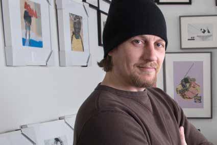
Chelsea, Iowa Collage/Collaboration zachcollinsart.com
IMAGES:
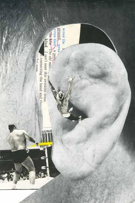
01. Wrestler, 6” x 9”, collage, 2013 02. 28zc13, 5” x 7”, collage, 2013 03. 63zc13, 10” x 10”, collage, 2013
Initially working in the digital realm, I felt the need to step away and began to use analog collages to illustrate my concepts, experience, and memories. Working in this way opened my eyes to the fascinating process of analog collage, but also I found increasing inspiration and community through social media, by finding the collage communities on the Internet, and joining several collage-related groups. Now I meet and collaborate with collage artists from around the world, currently I have collaborated with over one hundred artists. Through these collaborations, I have gained knowledge of different ways to work and uses of materials.
My process includes the concepts of a ‘mobile landscape’ and the element of ‘chance’ since I usually start with a couple of found pieces that intrigue me—an image, text, or a discolored, worn, marked-up piece of cultural ephemera. Then I like to arrange, cut, and move different pieces in and out of the composition, letting the fragments of paper help me stumble upon ideas, stories, personal associations, and happy accidents until I am comfortable gluing the pieces down.
Drawn to source materials that predate my existence because they were new to me and unfamiliar, I am attracted to the graphic typefaces and the style of old images along with elements of fading, uneven color blends, dot patterns, and off-registration. I enjoy the hunt for the materials, which tend to have aged elements and patina. The tactile nature of paper and the evidence of its history are important elements in my work.
My collage works follow a tradition of using collaboration and technology to further the art form. When two creative personalities collaborate, each one’s work is affected by that collaboration creating an exciting synergy.


05. Shannon Gilley
Montevideo, Minnesota
Digital Animation shannongilley.com
IMAGES:
01. Constellation of Energy Technologies, HD video (1280x720), Animation, 2013
02. CO2 Plume Geothermal System Diagram, HD video (1280x720), Animation, 2013
03. Heat-trapping blanket, HD video (1280x720), Animation, 2013
SCI-CANDY:
Animation-Based Learning and the Next Wave of Science Education
The educational animation “Geothermal Energy: Enhancing Our Future” illustrates recent advances in renewable energy research while examining current theory in using animation as a science education tool. A year in the making, this 14 minute-long animation uses carefully designed static and moving visual schemas and narration, built on a foundation of cognitive research on how people learn from animation. A broad array of decisions can tip the efficacy of an animated instructional tool: it is important to note that animation is not inherently effective in instruction, and the designer is called upon to understand and apply best practices that will aid the learner.
Working closely with a subject matter expert (such as a scientist in the field), the designer’s charge is to translate academic information into a format that can be digested by laypeople without sacrificing the integrity of that information–and do so in a way that holds the viewer’s interest. 3D animation’s ability to depict objects and spaces in a relatively literal fashion, controlling the level of detail as appropriate to the instructional goal, showing visuospatial elements from multiple angles by moving a virtual camera, distorting space and time for purposes of presentation and clarification, and using aural narration in concert with visual content are but some of the powerful arrows in the designer’s quiver … but they must be used wisely. For meaningful learning to result, an experienced artist’s creative intuition and technical mastery over the computer animation medium must coexist with pedagogical guidance to create an effective learning tool.
In creating this project, my hope is to cultivate appreciation for the value of animation as science education among the academic and animation communities, and to catalyze the working relationships that are starting to emerge between the two groups. Despite our very different points of reference, or perhaps because of them, we can share innovations and their potential impacts with the public in new and exciting ways. Together we can foster greater interest in the sciences (especially among the current “media generation” of K-12 students) and help produce the next wave of global problem-solvers.


06. Adam Hamilton
Denver, Colorado
Painting/Installation
brinkvisual.com
IMAGES:
01. The Primordial Poet (detail), 48” x 36”, oil on panel, 2013
02. Dead Air, 4’ x 10’ x 3’, multimedia, 2014
03. Dead Air (detail), multimedia, 2014
The core of my thesis work aims to reflect the perplexing nature of the ephemeral world by considering the power of emptiness and the curious absurdity of a modern spiritual pursuit. I created art that questions a fear of the sublime, the illusion of control, and the signals and signs of life’s ineffable mystery.
I encourage the viewer to leave preconceptions behind in order to explore a narrative amalgam of two-dimensional and three-dimensional work, illustrating reflections of my research findings, personal experiences, and various interpretations of the impermanent nature of life through installation. Some portions of the installation were constructed with the use of found objects, combined with hand-made elements in support of the history they inherently possess. There are investigations with painting and stark geometric pattern, in addition to sound as an experiential element, challenging and reacting to the stationary elements of the whole.
I am inspired here by the thundering silence of the void, interpreted as a signal indicating the importance of the present moment, devoid of the extraneous needs of the mind’s built-in safety mechanisms and distorted expectations. This work is ultimately a simple mediation on form and formlessness through the lens of absurdity.
Brought to you in Technicolor.


Taipei, Taiwan
Graphic Design
christina-huang.com
IMAGES:
01. Food Journ(al)ey, 6” x 6”, mixed media, 2012
02. 2013 Calendar, 17” x 24”, mixed media, 2012
03. K-Pattern, 45” x 118”, mixed media, 2013
04. Kata-type, 2013
I am fascinated by the way that the body movements of karate kata, when broken down to their simplest elements: speed, strength, and balance, are a universal language able to be interpreted without being filtered, unaffected by language and cultural differences. In this same way, I am also interested in the ways music transcends boundaries between countries, cultures, genders, and ages, and how it has always played an important role in our daily lives. Humans are easily affected by the power of music, either emotionally or physically. As a creator, music is constantly involved in my process and it influences the results. As a human being, music is an essential spiritual nutrition.

As a designer interested in working with moving forms, I want to explore the relationship between music and making by examining the intersections of music, performance, kata, and visual languages, while I push the boundary between performance art, visual imagery and music. My objective is not only to explore the relationship between different media, but to change the way an audience perceives a single element by uniting different subjects. I enhance the impact of each media by providing different sensations. Combining seemly-unrelated fields to create a new meaning is not impossible but instead, powerful. Through creating embu, it allows me to integrate all my interests, visual design, karate, and music. These elements physically work together in harmony to create fresh meaning in this new system. Through the exploration of the relationship between the karate movements, visual images, and music via multimedia, the outcome of my project articulates the karate spirit.
My thesis project takes the form of performance that accompanies music with projected motion graphics or animation. My work intends to push the boundaries between visual art, karate and music embodying the karate spirit and creating new meanings through multimedia.


Taipei, Taiwan
Graphic Design toothyooops.wix.com/conniek
IMAGES:
01. Pattern Study, 24” x 24”, pen/digital, 2014
02. 36 : MFA Open Studio Night, 11.5” x 16”, screen print, 2013
03. Pattern Study_Garden on the Plate, 26” x 20”, screen print, 2013
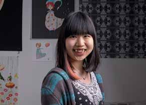
As a graphic designer, I use images as a vehicle to express my thoughts and feelings. In my work, I try to visualize the beauty and power of mundane objects in everyday life, which is made even more enriched through the different cultural backgrounds I have experienced so far, the re-imagination of my daily chores, and people’s weird behaviors. Consequently, I focus on the exploration of these objects and experiment with evolving colors and shapes, as well as bringing these elements into collision with each other, and how those factors cooperate, negotiate, or even reject each other.
My works are mostly inspired by my observation of everyday life, things that we are used to which we but barely pay attention. I usually see my surroundings and my daily chores in my own unique way, which means I add some fantastical elements to it. For example, when I have diarrhea, I imagine that the intestinal virus is having a carnival. When I walk in a rainy day, I imagine the rain-drop fairies are committing suicide. These humorous and fanciful imaginary scenes amuse me and perhaps make my life a bit different from others, but also make these mundane daily rituals more interesting and fun.
In my latest work I’m specifically focusing on pattern design, which is the conceptual reflection of daily routines. During our lifetime, we keep doing the same things, such as doing laundry and going to work. It is the repetitiveness of these mundane gestures that builds up our lives, which I use it as the core experience in my work. Repetitiveness is not only the essential character of patterns, but it does represent those core experiences layer upon layer, in our tedious lives. I am fascinated by these patterns as they are both systemic and chaotic-it seems complicated at the first sight, but there’s always an order underneath. Through this project, I am eager to explore the possibility of pattern design, practically and conceptually.


09. Heeyun Kim
Seoul, South Korea
Comic Arts
jackiehkim.tumblr.com
IMAGES:
01. T#1, 12” x 12”, color pencil on paper, 2013 02.T#1, 12” x 12”, color pencil on paper, 2013
I define myself as a visual storyteller who is strongly interested in discussions about changes and internal transformations through stories and sequential images. My academic and studio practice at MCAD is focused on understanding the “transformation” as an instinctive and embodied characteristic of human life.
I concentrate on the value and function of transformation in both the narrative and visual aspects of comics and its illustrations. In my research, transformation represents the changes in one’s internal reckonings based upon accumulated experiences and knowledge. For example, in a narrative structure, unless the characters meet in transformative moments or experiences, or do something that sets up a causal chain, nothing will happen and there will be no story. Characters create certain incidents as they interact with other characters, just like people in reality, in the experience of living making things to move forward. Stories are reflections of reality.
Understanding transformation in comics in both narrative and drawn expressions can produce the understanding of actual human life. I believe that for readers, it may help to engender problem solving skills and growing emotional strength to deal with obstacles.
I construct visual and narratives by focusing on relations and interactions between characters or narrative elements. Each interaction between characters must have a reason, and the reason can be an internal or external one – requiring different tactics of representation. I try not to decide what characters are, but what they do. This technique of representing character interactions becomes the very beginning of the character and narrative development.


10. Trevor Knott
Independence, Iowa
Sculpture/Performance trevorknott.com
IMAGES:
01. Water Drawing III, 5’ x 10’, water and charcoal on paper, 2013
02. The Pain of Separation, performance, plaster, steel, water, charcoal, and feathers, 2013
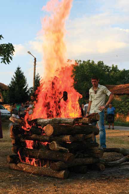
03. Balkan Fire Ceremony, performance, 2013
Water and Fire. Flesh and Stone. Life and Death. The rebirth of old philosophies and ancient remembrances, the continuation of reflection through the elements, and the abstraction and reconfiguration of ritual processes are elements and concepts brought to bear in the explication of these symbolic forms. These are the subjects of my work as I sculpt, draw, mix, and burn my way through my own spiritual becoming to develop a method for healing the self and transmuting personal potential.
Meditation and self-reflection are the foundations of my practice as I work to represent the human evolutionary process through interactions with elemental forces. In creating sculpture, tools, drawings, and rituals, I work to discover how these forces can help us understand ourselves. The artist’s process is important to my work and serves as a reflection of the spiritual process. So it is through my studio/performance work that I have chosen to confront my perception of nature, the soul, and material transformation. The creation of my sculptural works often involve some level of ritual and endurance such as walking barefoot in snow, completing arduous tasks without sleep, harvesting wood, and tending fire for long periods of time. These things reflect the possible methods and difficulties we can encounter in the effort to find our awakened selves, while the resulting installations and documentation represent the epiphanies and failures of such undertakings.
I also produce community-based work in an effort to connect people to the natural places that intersect with the city. I have put together events and installations near rivers and wooded areas that have involved cleanup projects and collaborative sculpture-making, such as a series of medicine wheels made near the Mississippi River, and a group of fire ceremonies conducted in Northern Bulgaria. Through these goodwill projects, I hope to foster a deeper appreciation of the natural resources available to us and strengthen our relationship to the land on which we dwell.


11. Azisa Noor Koesoema
Bandung, Indonesia
Comic Arts
azisanoor.com
IMAGES:
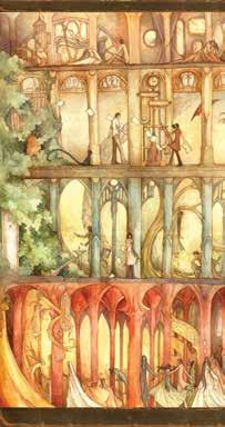
01. Lights Out, 15’’ x 24’’, ink on paper, 2014
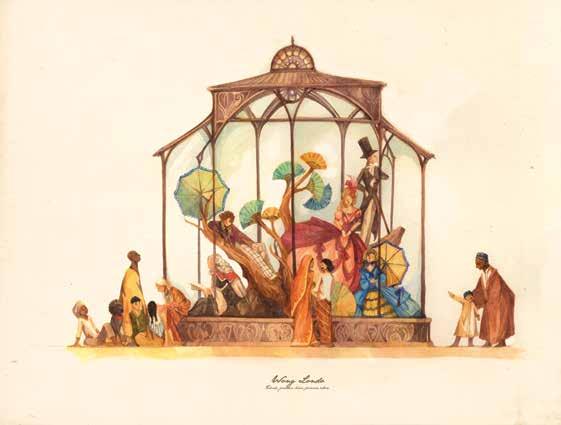
02. Noble Savages, 17” x 22”, watercolor on paper, 2014
03. Four Stories, 10” x 19”, watercolor on paper, 2012
Buildings used to tell us stories. Before mass printing or text materials were common, many structures possessed visual components that worked sequentially to convey information and stories for a community of people. In this regard, those structures share a basic principle with how comic art works, as Scott McCloud suggests: “Comics are juxtaposed pictorial and other images in a deliberate sequence, intended to convey information and/or produce an aesthetic response in the viewer.”
My thesis project seeks to explore the use of space as an integral narrative component in comics. By creating a sequential narrative space that ties into a traditional comic narrative, I am exploring the possibilities of how a spatial narrative can be read and how form and content affects and support each other in the process of interpreting it. The initial research for this thesis combines and compares methods of spatial way-finding and narrative way-finding alike, and makes use of the similarities between physical elements of structures and comics.
One of the strengths of the comic medium is that it requires active participation in the reader to flip the pages to further the narrative at a pace of their own making, much like how one would traverse and find their way through structures and spaces. By involving readers in a space that within which they can read and experience, their involvement may have the potential to become more tactile, opening doors for various other ways of interpreting and enjoying the narrative.


12. Sieng Lee
Kaukauna, Wisconsin
Graphic Design sienglee.com
IMAGES:
01. Becoming American (detail), 3’ x 9’, joss paper, 2013 02. Becoming American, 3’ x 9’, mixed media, 2013 03. Untitled, 3’ x 5’, mixed media, 2013
What does it mean to be Hmong as a visual artist? My exploration of cultural identity has been recent because I initially felt that the pursuit of personal identity was not practical. But after further thought, I have discovered that through using my Hmong identity as a medium, I have created work that attempts to bridge the yawning gaps existing in the immigrant’s experience, through an exploration, analysis, and a creative reinterpretation of Hmong cultural and traditional meanings.
Along with exploring my own identity I wanted to emphasize the importance of being bi-cultural and the advantages of living in two worlds. It is important that we do not disregard our own unique identities that reveal how we differ from other individuals. The goal is to empower and to be proud of being a minority within the mainstream contrasting culture, which may seem old fashioned and outdated, but provides a compelling perspective on the world.
The final part of my work is about community, and what it meant to engaged within it or, conversely, to be divorced from the mainstream culture. ‘Community’ is a word tossed around as if we-by using that word-are truly including every culture and individual that is a part of it. What I have learned about community is that as an artist, I am not simply creating a public art mural on the side of the wall, but more importantly, I am engaging in the larger discourse on the immigrant experience and further, I become a representative for the fledgling Hmong art community.


13. Wenwen Liao
Zhuhai, China
Animation cargocollective.com/wliao
IMAGES:
01. Rabbits Family, 7”x 5”, color, pen and watercolor, 2013 02. Square, 720 x 576, digital animation, 2013
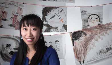
As a filmmaker, working with animation, I explore the ideas of personal narrative through imagery that reflects various states of mind. The significance of human existence and self-awareness is something that I find fascinating, and the translation of those elements into artistic forms has given me a storytelling technique in which I can express myself.
My animated films express among other feelings, confused emotions, reflecting isolation, existential stress, and the loss of childhood innocence. I use a labor-intensive style to achieve expressiveness and depth that is needed to create the illusions that evoke this sort of emotion. My works are fragments, visual poetry. Layers appear and disappear, creating new spaces and organically shifting the narrative as the layers fold and unfold, always with new insights and images through time. This continuous transformation of visual space results in a fluid visual experience of the universal emotions we all share.


14. Jiyun Lou
Hangzhou, China
Graphic Design miyayou.wix.com/jiyunlou
IMAGES:
01. Seasonal Poster (winter-spring ), 27” x 41”, digital print, 2014
02. “Collection of MFA Studies“ - Jiyun Lou, 29” x 44”, digital prints, 2013
03. Sea Series, 29” x 44”, digital print, 2013
04. Memory of cloud, memory inter-twisted, memory of mountain wave, 29” x 44”, digital print, 2013
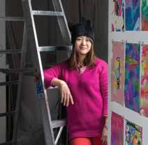
Nature is where I always find the inspiration to work. I think the aura that surrounds the objects in nature are there to hold something that is eternal, and people can find inspiration through the experience of it. Sometimes, nature is as mysterious as the universe; sometimes it is as simple and concrete as ash. Sometimes, it is vibrant and vivid; sometimes it is modest and calm. It is like design; think universally, but with the implementation of precision. As the material world is in continual motion, thinking reflects the movement of lived existence. My design is advancing with the times, and my thoughts on this are constantly changing.
My hometown Hangzhou is one of the tourism cities in China, famous for its natural beauty and historical cultural heritage. There is a famous lake called Westlake, which was made a UNESCO World Heritage Site in 2011, and is an example of reflecting an idealized fusion between humans and nature. It is the garden design that is perfectly suitable for day-to-day living. This has influenced my beliefs about design; I think the best design is a beautiful and pleasant art that is evident at the first sight. It then needs a good form to express those feelings and provide a space for human interactions. Finally, in this designed form, the finished design will bring the actual effect to human experience. My design ideas and aims need the interaction and communication of people to achieve my goals.
03,04


15. Dennis Madamba
IMAGES:
01. Tandang Sora, 8” x 12”, digital and graphite, 2012 02. Hack, 8” x 10”, digital and ink, 2013
I have always been fascinated by how certain stories came to be. I like to think that the stories we pass on to each other–these folktales, myths, and rumors-all came from one place, when there were fewer people and thus fewer stories to tell. And as people changed and moved around, the stories did too, taking on the characteristics and culture of wherever they were told, with characters, names, and settings adapting to the storyteller’s world. Essentially, perspective creates variation in the stories we tell.
As an illustrator, I am creating art that follows this tradition, taking existing narratives and re-telling them from my point of view. As a result, I hope to encourage viewers to consider the variety of perspectives that can arise from a single source of information and to challenge the viewer’s expectations when presented with something familiar, in this case music. Music presents a diversity of material to interpret, between lyrics and abstract sound, but more importantly it is something we can all relate to. In my process, I take lyrics and sound and examine the different contexts that could arise from this single collection of sounds and words. By presenting the various possibilities of meaning that songs represent, I hope to disrupt what the listener expects to perceive when hearing a specific song. Instead, in presenting a new narrative, I hope to question how we construct our own expectations.
I am focusing on a specific genre of music for this group of work: the theme song. Theme songs from movies and television are already associated with established narratives, with specific characters and story lines. These songs resonate with people on a personal level, and at a particular time and place. Creating parallel narratives for these theme songs creates a contrast that challenges the collective memory of what that song means and introduces a new way of thinking about an outdated thing.


17. Sreekishen Nair
Minneapolis, Minnesota
Sculpture/ Mixed Media Installation artsree.com
IMAGES:
01. Bajo El Sol, (detail of printed tapestry), 12” x 44”, digital print on sheer fabric, 2013 02. Untitled, 18”x24”, etching on mirrored acrylic, 2014
The title of my thesis show, BioNuminescence, celebrates the fascinating beauty of the small animals and plants that share the landscape with us. The name of the exhibition is a compound word designed to suggest the sacredness of the ecology. It fuses the prefix “bio,” which references the biological with the word “numinous” that indicates the presence of the sacred. BioNuminescence combines these terms into a pun on the word “bioluminescence,” which is the emission of light from living organisms like fireflies and glowworms.
The theme of radiance generated by living beings is made into an analogy for the amazing ways in which smaller organisms “light up” the world by their presence and their activities: for example the way insects pollinate plants, and the way plants turn sunlight into nutrition for so many other beings. Thus, the word BioNuminescence communicates the sacred brilliance of the small, the commonplace, and the often unnoticed life forms that teem around us, and that keep our world in balance.
As an artist, I derive tremendous inspiration from the elegance of biological shapes like flower stamens, micro-crustaceans and the bodies of different insects. In order to convey the reverence and feeling that I have for them, I render these subjects with heavy stylization, such as decorative halos and exaggerated colors. In BioNuminescence, this kind of stylization not only expresses the aura of sacredness within the subjects of the art, but also points to some of their less-tangible wonders: for example, bees can see infra-red light, and plants signal to them through the infra-red “colors” on their bodies. Bees and plants perceive and express colors that we humans cannot. In BioNuminescence, I use deeply saturated hues to suggest the richness of those that radiate beyond human perception, and the ecological relationships that these encapsulate.
If form is to follow function, then the function of this art is to share something beautiful with others, and I design my forms towards that purpose. Insofar as visual delight can uplift one’s spirit by pleasing the senses, I propose that there is an ethical aspect to the effect which beautiful adornment can generate. My art is thus highly ornamental, and combines the different processes that I have learned at MCAD in order to provide a richly decorative atmosphere. Developing from micro-lens photos of tiny living beings, BioNuminescence pulls together printed textiles, carved wood and laser-cut glass into a sacramental installation designed to elevate one’s appreciation of the microcosmos that flourishes right in one’s own backyard.


18. Desiree Niu
Taipei, Taiwan
Graphic Design
desiree-niu.com
IMAGES:
01. Navels, 8” x 10”, digital print, 2013
02. Typopo, 22” x 17”, digital prints, 2013
03. Twist Jokes, 6” x 6”, paper and wood panel, 2013
As a graphic designer, it is a fundamental aim to manipulate your visual language in order to communicate with your audience, especially when dealing with abstract topics. By building up both my text and image languages and presenting them through an appropriate aesthetic, I follow a notion from a Taiwanese illustrator, Dustin Yang, who believes that “serious issues should be presented attractively; subtle ideas should be examined”. When we deal with a theme that contains many sensitive issues, we cannot declare a universal solution. We can only understand in this moment, how to show the audience one promising solution.
“Distance” as a concept is a very subtle inspiration guiding my creations on various levels. Sometimes, the subject is too close to see the truth of things. In the process of developing my work I found the concept of distances deeply affecting my work. Because of my background in geography, I am interested in the representations of distances on the map that is the beauty of cartography. My two-dimensional work that represents the information concerning distances, scale, and motivations provides me a unique perspective to make graphic works.
While graphic design is mainly based on two-dimensional perspectives, my work attempts to create a space for the audience to “walk around” the work, in order to experience the a process of ‘relocating.’ Therefore, I use the lenticular, or 3-D printing as the fundamental method to illustrate a dynamic environment. To accompany the story I wrote, I have created 2D motion graphics and projected it on each side of a lenticular template. The lenticular effects will allow people to walk from side to side, when the viewers experience the art from a distance, they will have a different visual experience than when they interact with the art at close range. At a distance, they will be unable to experience the detailed elements, which that are deliberately scaled down and composed into a graphic, but close up they, the viewer, will lose the ability to see the bigger picture.


19. Liyuan Tong
Shenzhen, China
Graphic Design liyuantong.tumblr.com
IMAGES:
01. Keep, Seek, See-Ing, 5’ x 8’, wall painting, 2013 02. Frames in Frames - B&W, 24” x 36”, screen print, 2013 03. Hui Style Building, 5.5” x 4.25” x 1”, screen print, 2013
Typographic form is the most fundamental element of graphic design; it shows the beauty of graphic design in the most direct way. Graphic design is most often performed on a two-dimensional plane, it is narrower if we compare it to the three or four dimensions of space. Accordingly, typographic form needs to be recognized as a superior element of expression and tension.
My work is involved in exploring the typographic forms in space, which means integrating and balancing the cohesive forms of the abstract and the concrete, the three-dimensional space and two-dimensional surface, the monochrome and polychrome, and the object as a digital form.
The physical process of making the work reflects my dimensional thinking of graphic design as an anamorphic art. I intend to use the language of printmaking to address the sense of hand-made typographic forms instead of digital typographic forms.
I’m deeply influenced by El Lissitzky’s work of the “Proun” room of 1923. He was one of the first modern artists to experiment with the viewer as an integral part of a work of art. Lissitzky translated his geometric Proun compositions into a room-size environments. He intended the wall-size abstractions to engulf visitors and allow them to feel as if they were floating in space.
For any kind of object, as long as there is an objective reason for its existence, then it itself creates a sense of space, in graphic design. Space can be affected by visual, by mental, by light and shadow, and through the psychological comprehension of those elements. The aesthetic of the typographic form also needs to be considered carefully, consciously thinking, and constantly testing its efficacy in order to arrive at that most appropriate point of balance, proportion and color. Thus, changing the audience’s perception, their brains will rethink this space. The audience will be allowed to immerse themselves into a space, so they are changed through the whole experience of this psychological process. I am interested in integrating people into the spaces of graphic design and becoming a member within, not just simply seeing it.


20. Kathryn Van Zante
Baxter, Iowa
Drawing /Painting kvanzante.wordpress.com
IMAGES:
01. Family Retreat: (in)Visibility, 48” x 32” each, oil paint, pigment, and varnish on board, 2013
02. Family Retreat: Unpacking, 48” x 48”, oil paint, pigment, and varnish on board, 2013
03. Family Retreat: Creeping Embodiment, 48” x 28” each, oil paint, pigment, and varnish on board, 2014
By drawing on my own cultural background of a white woman raised in a small town in central Iowa, my work stems from the difficulties I have in answering the question ‘who am I?’ Thinking of identity as a cultural, social, and psychological construct, I am exploring the manipulation and materiality of identity representation in the context of individual identity formation. Specifically exploring ‘whiteness,’ my work is rooted in interpersonal relationships within racial terms, examining the gaps between definitions of normalcy and the desire to belong.
Through the manipulation of pigment and oil, my paintings reflect my struggle as well as my yearnings and my concerns relating to racial divides. The seams of racial construction—of cultural identity—begin to unravel through my distorted representational imagery of figures and their contexts. I am using memory as a departure point, without nostalgia, to dissect and discover the roots of my struggle. My snapshot-like paintings speak to notions of capturing a moment—often idealized—through a faked happiness and union. The posed snapshot works to contextualize and relive idealized memories, revealing another reality. Allowing the painting to serve as meditation on a specific moment, I see the process of painting itself as a contemplative act to open space for the ambiguities of an experience.
I seek to open the discourse, to question this identity, and to recognize the power, privilege, and entitlement I bear as I begin to unpack my own whiteness. I want my work to interrogate issues and raise questions that linger underneath the polite smiles in the snapshots and within my community. These snapshots have acted as an undetected blanket of conformity that has allowed me to sleep in the ignorance of my own whiteness. I need to see race. To see whiteness as race—and not as normalcy—is to see the consequences of race. How have I acted as the oppressor? And how do I begin to visually depict this thing that has secured power through its pervasive and insidious invisibility to those whom it privileges?


21. Duoni Wang
Shenyang, China
Graphic Design
IMAGES:
01. Swan Lake, 44” x 36”, digital print, 2013
02. Swan Lake, 44” x 36”, digital print, 2013
03. The Power of Silver, 44” x 31”, digital print, 2013
04. The Power of Silver, 44” x 31”, digital print, 2013
05. The Power of Silver, 44” x 31”, digital print, 2013
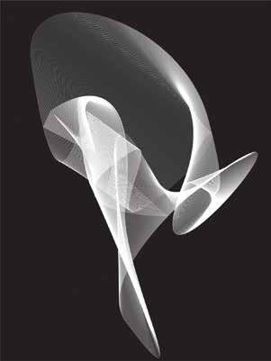
Whether visualizing sound or abstract concepts, I have always tried to bring difficult subject matter to light in my work. Materializing the ephemeral and the invisible represents a fascinating way of bridging the gap between human being’s conscious and unconscious ways of understanding and the intangible aspects of the sensual world.
I have always been intrigued by the differences as well as the similarities between seeing and hearing. Visual data are arranged spatially while audio data are arranged temporally. Pleasurable experiences in either domain depend heavily on the relationships between individual events, whether they are the individual notes of a symphony or the individual dots of light of an image. As a synesthetic, I can see certain music while I listen to it. Similarly, I can hear certain imagery while I look at them. I hope I can translate what the viewer can hear, and what my imagery sounds like.
In the imagery, patterns of color and form are developed by acoustic wave of music. By my project, I attempt to achieve a continuum of action and awareness—an invisible sensory link that connects music and visual art.




22. Huiqian Wu
Shenyang, China Graphic Design huiqianwu.tumblr.com
IMAGES:
01. Strip No.1, 40” x 30”, digital print, 2013 02. Dream life, 18” x 12”, digital print, 2013 03. In the fog, 17” x 140”, digital print and installation, 2013
As a designer, I believe in the limitless possibilities of graphic design, so when I’m making work, I’m trying to push the boundaries of what is considered Graphic Design.
I do graphic design using the idea of “dimension” by making work using 3D software and working with installation. My differentiated approaches to work are connected through the continuous study of space relationships and the balance between conflict and harmony of the various elements. Through mixing flat with 3-dimensional, real with imagined, I am trying to create a new kind of image space through which to communicate.
At the same time, “imperfection” is another desired element in my work. I believe that perfect things are complete and therefore isolated, however, since I would like the various elements in my works to both support and agitate each other and generate movement through difference, imperfection has become a quite important feature in my work. I use stretched fonts and some rough design aspects like Photoshop presets, trying to prove that if using them in a provocative way, one can still make good and professional works. Finally with these ideas, my work will hold together as an installation and it will push the power of every single piece of work toward the potential of graphic design to move to a new level.


23. Xiaohua Yang
Shanghai , China
Illustration yangxiaohuaillustration. tumblr.com
IMAGES:
01. Diver, 10” x 14”, graphite and digital, 2014 02. TPL, 11” x 16”, graphite and digital, 2014 03. Koi, 63”x 51”, graphite and digital, 2013
As an illustrator, I use symbols and signs-married from both Eastern and Western cultures-to produce work that visually articulates a narrative. Coming from China, I keep thinking about the ideology and the social forms of my country, and thus my work has evolved in a way that is more than a mere expression of myself, but has expanded to a platform on which to raise questions. I am also interested in the possibility of creating empathy from the audience with the issues and stories that are unique to my cultural background.
The idea of my thesis work is based on the topic of power and castration, which comes from a Chinese novel called ‘Testicles and Penises Under the Sky’ by Feng Tang.
I am referring in this work to a Chinese folding screen format to carry out my concept. On the front side, there will be an illustration based on my interpretation of the content of the novel. Meanwhile, on the backside, I am illustrating my own sense of the meanings of the story and its correspondence to the current political situation in modern China. To illustrate the concepts I have developed around the condition of political and ideological self-castration/being-castrated.
I wanted to create a series of illustrations that bring spectators to the center of the game of power in the palace of the emperor, and to contemplate the story for the story itself. Yet at the same time, I hope that these illustrations can also serve as a political allegory that enables the observer to question the systems they themselves were brought up in, the ways of thinking they were taught, and to suggest the ways in which we are all ‘eunuchs’ to political systems of power.


24. Xuancheng Zhang
Xi’an, China
Graphic Design
xuanchengzhang.tumblr.com
IMAGES:
01. Playing Cards Project, 2.5” x 3.5”, digital print, 2013
02. Playing Cards, 2.5” x 3.5”, digital print, 2013
03. Shadows of Hands, 24” x 36”, digital print, 2013
04. Christopher Columbus, 24” x 36”, digital print, 2013
Since I came to the United States, the enormous cultural distinctions I faced used to confuse me both in my daily life and my learning processes. This is especially evident in the written characters of a language, which are the most typical features for a culture. My work in this exhibition examines a Chinese graphic designer’s interpretation of the relation between two languages, which is the restructuring of both the character and the cultural amalgamation of them.
The modern Chinese and English languages both originated from pictography thousands of years ago; however, the evolved direction was in completely opposite directions. Chinese characters became more intricate and generated several kinds of structures. English characters concentrated down to 26 letters and followed one specific component rule, from left to right. Hence, this distinction comes into being through two visual perceptions, the dense punctuation array of Chinese characters, and the loose stripe array of English.
Meanwhile, these forms followed the sequence from small to big, from singularity to a collective, both can be disassembled in a procedure, which involves the stroke, component, character, word, sentence and paragraph in the language. Therefore, based on the differences and the similarities, this group of typographic pieces explores the various built-up effects of 26 English letters in conjoined with different formats of Chinese characters, which generates a new typographic system that can be interpreted through the two languages.


25. Kelsey Zigmund
Chicago, Illinois
Illustration
kelseyzigmund.com
IMAGES:
01. Dad is disappointed., ink and digital, 2013 02. Dog Park, pencil and digital, 2013 03. Helmets, ink and digital, 2013
I believe our visual culture is moving towards an emphasis on personalization and customization. The imagery I include in my artwork celebrates the music, fashion, and culture that I personally value and enjoy. I find happiness through drawing and invention and seek to communicate those feelings through my own visual language. I approach my illustration with a need to translate both a cultural concept and set of emotions.
My subject matter and media vary from editorial to children’s work to product design. I am excited by the spontaneity that the illustration field demands, and constant variety of creative problems that must be solved through pictures. Stylistically, I aim to create work with an energetic, playful spirit, and that displays a hand-drawn aesthetic, that is rooted in traditional materials.


MINNEAPOLIS COLLEGE OF ART AND DESIGN
2501 Stevens Avenue Minneapolis, Minnesota 55404 mcad.edu
©2014 Minneapolis College of Art and Design
All artists and their corresponding artwork published in this book are copyrighted materials. All rights reserved.
CREDITS
Tom DeBiaso Director / Professor Master of Fine Arts Program
Kiley Van Note Assistant to the Director
Brent Meyers Creative Director MCAD DesignWorks
Vadim Gershman Designer
Rik Sferra Photographer
Frenchy Lunning Copywriter and Editor
Modern Press Printing and Binding New Brighton, Minnesota
ABOUT MCAD
Recognized nationally and internationally for its innovative and interdisciplinary approaches to visual arts education, the Minneapolis College of Art and Design is home to more than 700 students and offers professional certificates, bachelor of fine arts and bachelor of science degrees, and graduate degrees.
Founded in 1886, MCAD was one of the first colleges to offer the BFA degree. The college has earned the highest accreditation possible and has the highest four-year graduation rate of all Midwestern visual arts colleges. And college facilities contain the latest in technology, with multiple studios and labs open 24 hours a day.
MASTER OF FINE ARTS IN VISUAL STUDIES AT MCAD
The MCAD MFA program is a community of makers, thinkers, theorists, researchers, and creative professionals working in a mentor-based, interdisciplinary educational environment. A majority of credits are earned through one-on-one work with a faculty mentor throughout the two years. In addition to the mentorship students take a critique and liberal arts seminar each semester and have the option to pursue internships and a range of engaging educational opportunities. The final year culminates with a capstone thesis exhibition and paper. Our student body is diverse with a robust international presence. The subject of student inquiry responds to social, cultural, and professional needs as well as to entrepreneurial opportunities, stretching across art and design practices. Students in the program pursue creative work in a mentor based, interdisciplinary environment that includes graphic design, printmaking, paper and book arts, painting, photography, illustration, sculpture, drawing, animation, interactive media, filmmaking, comic arts, furniture design, and installation art.
For more information, contact or visit the following sites:
ADMISSIONS
mcad.edu/admissions/prepare/graduate
OFFICIAL MFA PROGRAM SITE
mcad-mfa.com
+
mcad.edu/academic-programs/graduate/master-fine-arts
