5 minute read
Again, and again, and again


Advertisement


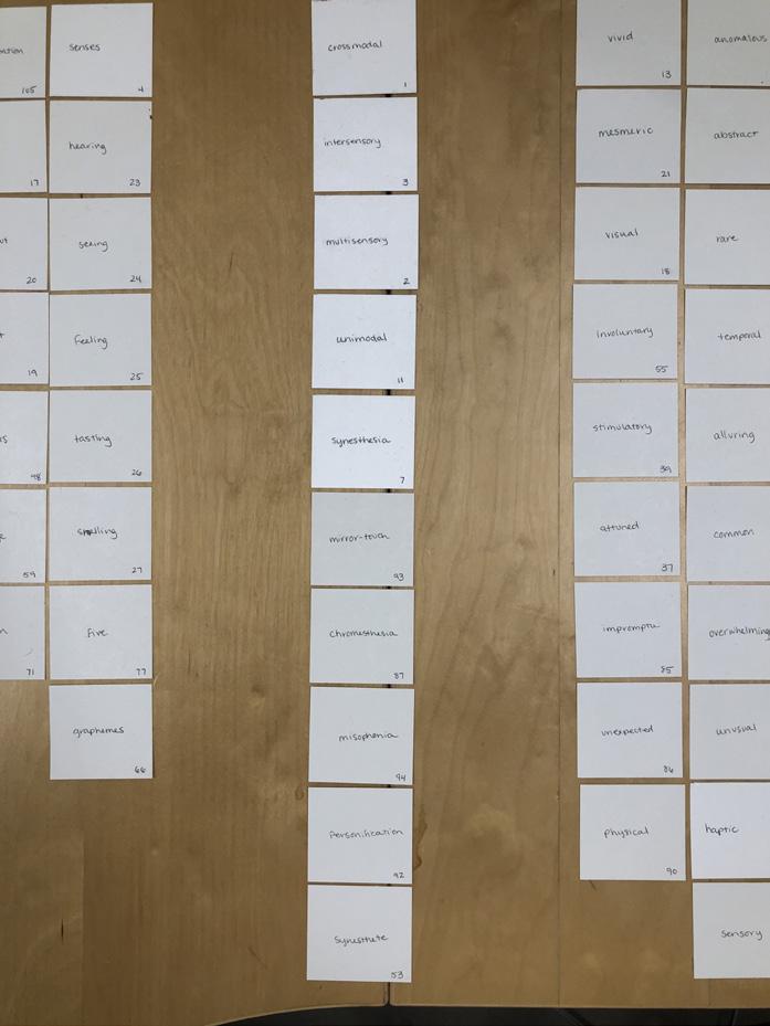
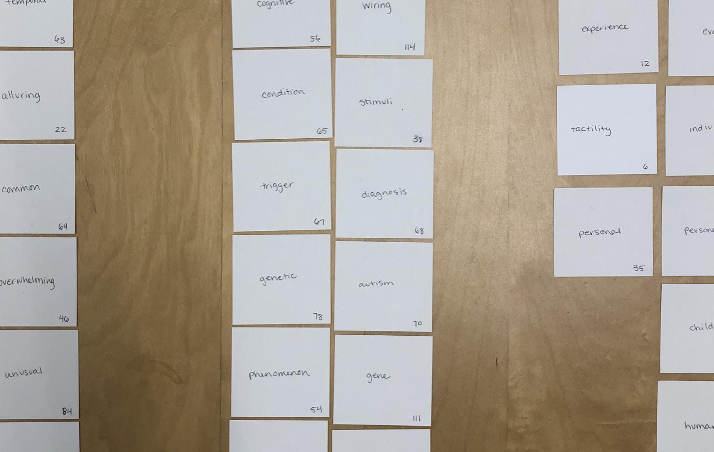

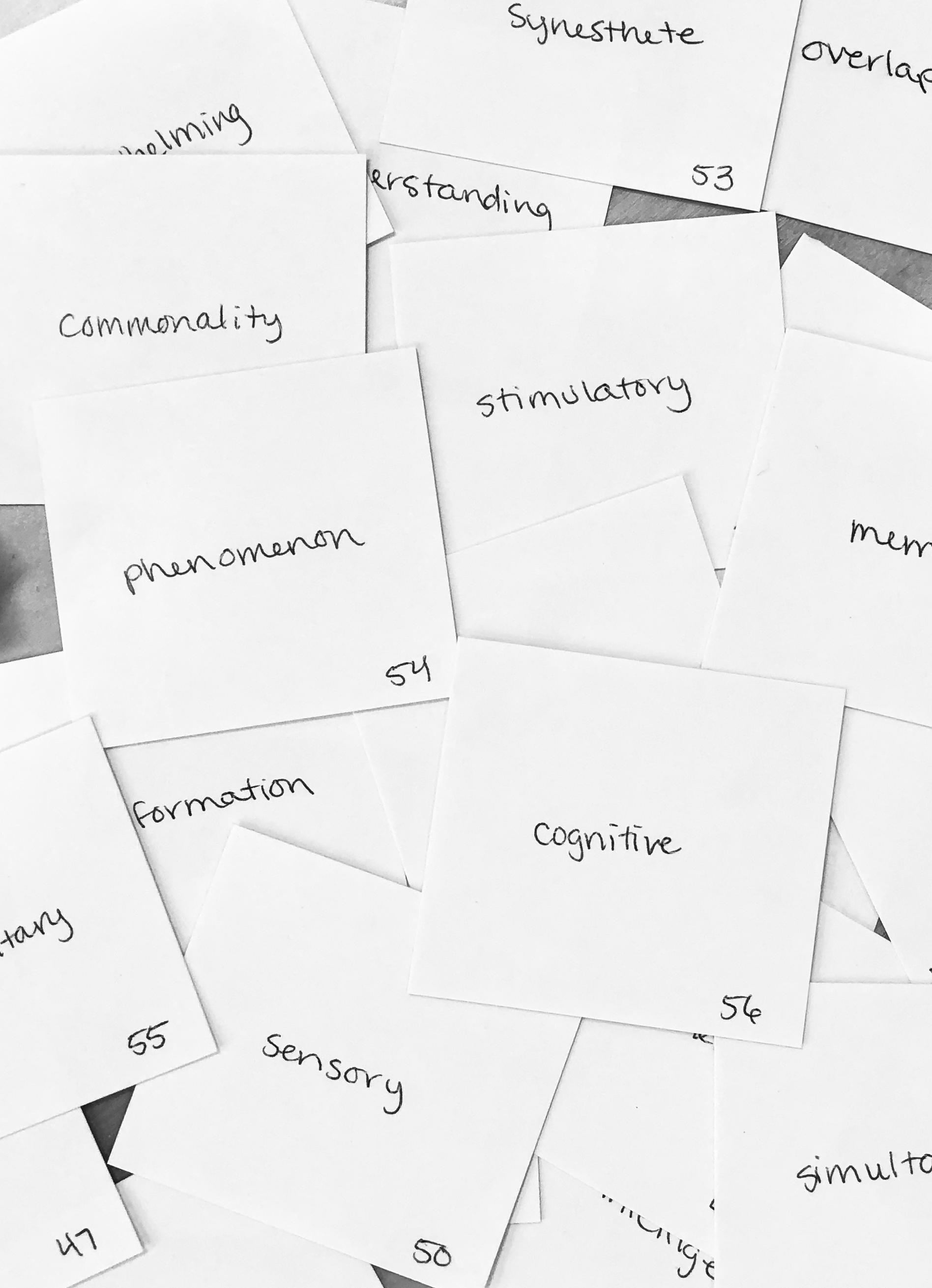
The project kicked off with a fairly quick and easy assignment. We were given 100 square note cards that we had to fill out with words and terms associated with our topic. We then took those words (above) and organized them by categories or avenues that we found could be used in a way that helped us start thinking about all the paths we could take to explain our thesis. Some of the words that stuck with me were cross-modal processing, unexpected, and stimulatory.
After we did this charette, we came back with iterations of teaser posters that could give someone an idea as to what our thesis is about. This thesis was about making something inex

pressible and highly interactive. I played around with techniques that seemed rhythmic. After all, this thing was heavily going to rely on sound as a major component.
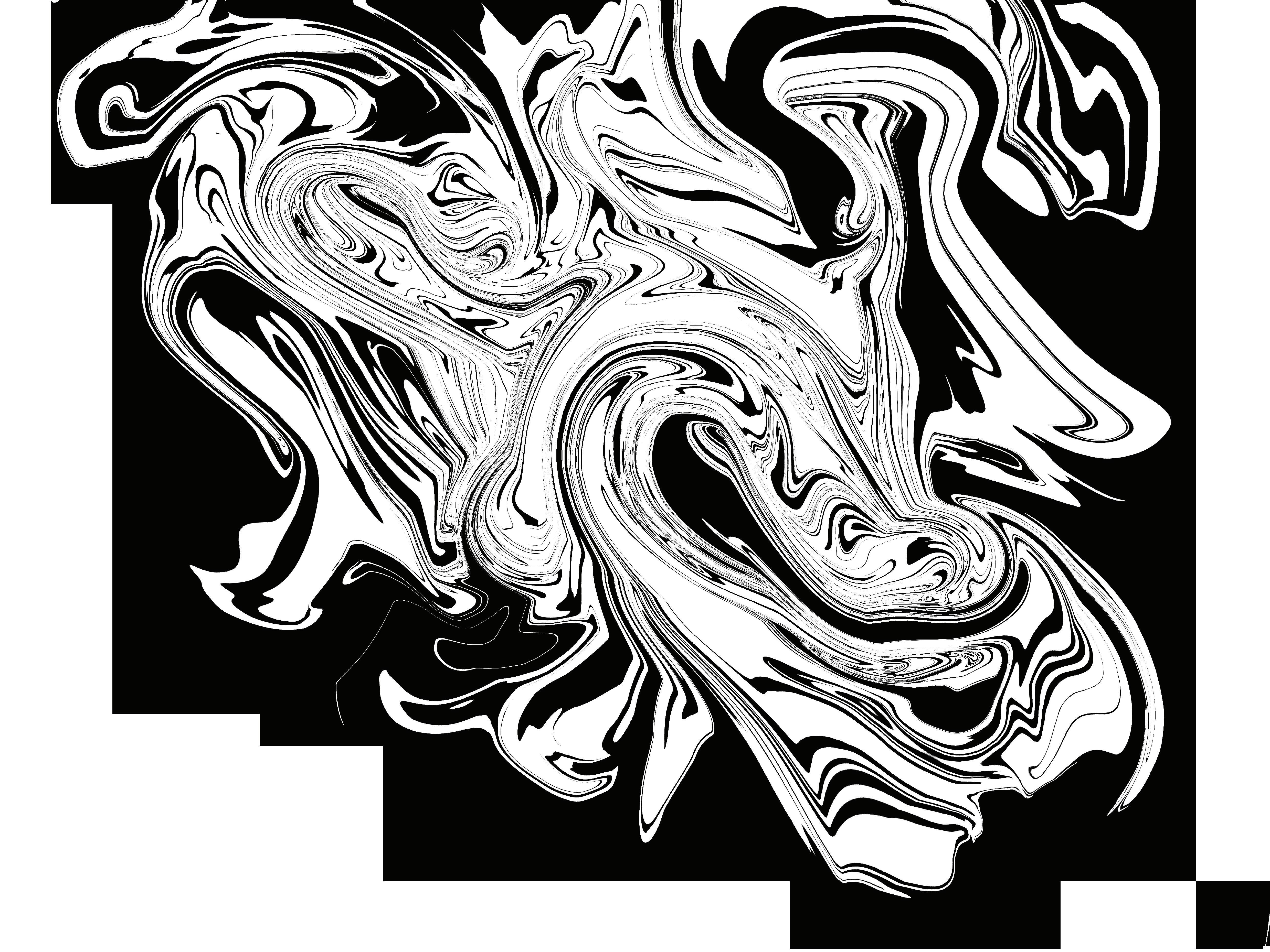
This took over 60 iterations until I got somewhere I was okay with. At this point, I had gathered some interviews from people I know have chromesthesia. Unanimously they all said the way they see the colors is in a sort of swirling blur, like all the colors are mingling together. I used a marbling technique to get this sort of effect they seemed to be describing.
Rhythmic visual experience comes from Wassily Kandinsky. One day whilst painting he was asked to describe his practice and he described it as such. Creating this poster helped me in starting to identify forms that my overall visual language might take. Going forward, I established a muddled, color mingling effect using all colors of the spectrum so as not to leave out any variance. One might just call this a rainbow gradient, but I think keeping it simple is what helps the interactive elements really stand out.
Left: Teaser Poster Iterations
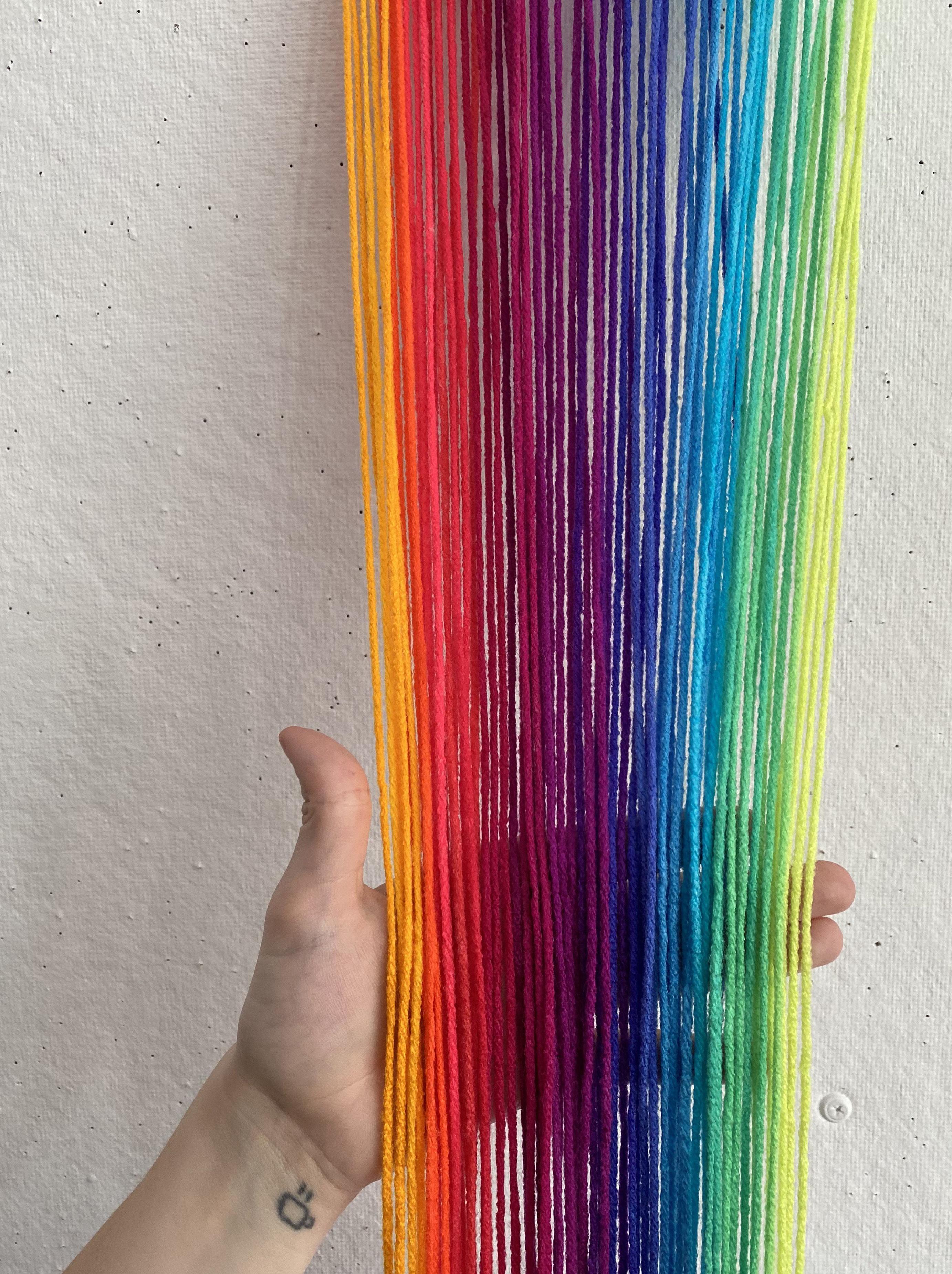
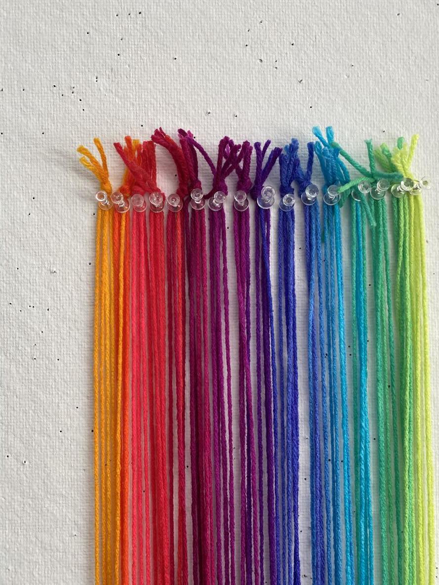
After my poster was close to final, I started to feel lost in where to head next. I’m not sure how many times David and Charles had said this, but it was drilled into my head. “Just start making something.” So I did. By some fate, I found yarn at Reny’s that had the exact color spectrum I had been envisioning from the beginning. I bought the string without hesitation, but when I got back to my studio I didn’t have the first clue what to do with it. So I just started cutting and pinning the different sections of color to my studio walls. When it was all together, I figured it could be used as an entryway or some tactile element, but it never quite made the cut. (Pun intended)
Although this small feat didn’t seem to get me anywhere, it at least got me to a visual place. I now had a color spectrum to work off of. With this, I created my thesis project color palette.
At this point, I thought it would be helpful to talk to more people who shared these experiences. It was also at this time that I started doing research for an interactive chromesthetic experience. I did some type exploration as well to nail done the visual aesthetic of my thesis.
Aa
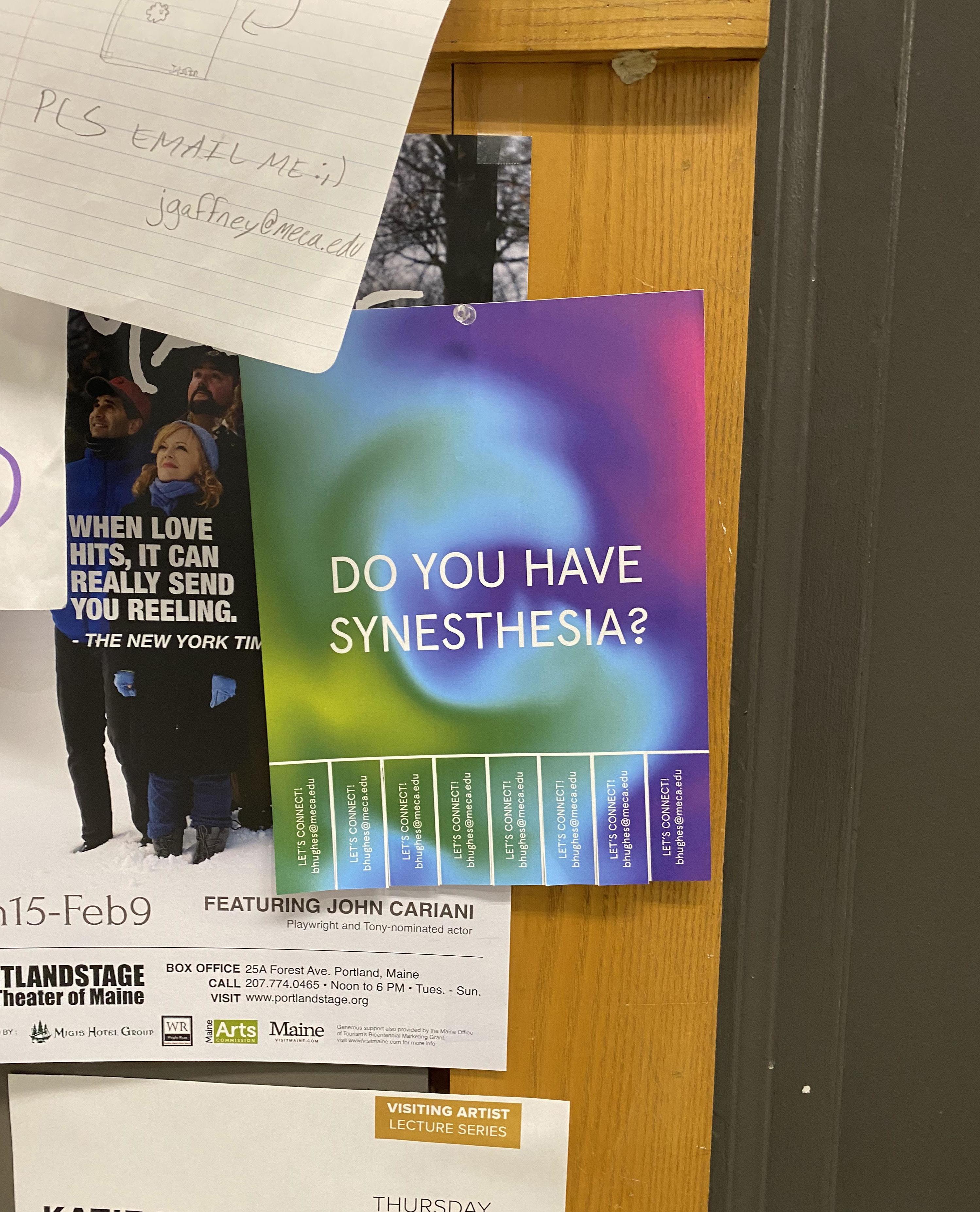
I then designed this flyer and hung a few in MECA, and around Portland in hopes that I could find out more firsthand; however, most of the responses I got were more or less people that were interested in learning about what synesthesia is. These were always interesting conversations as well, though. They gave me insight on how others think this sensation occurs and why.
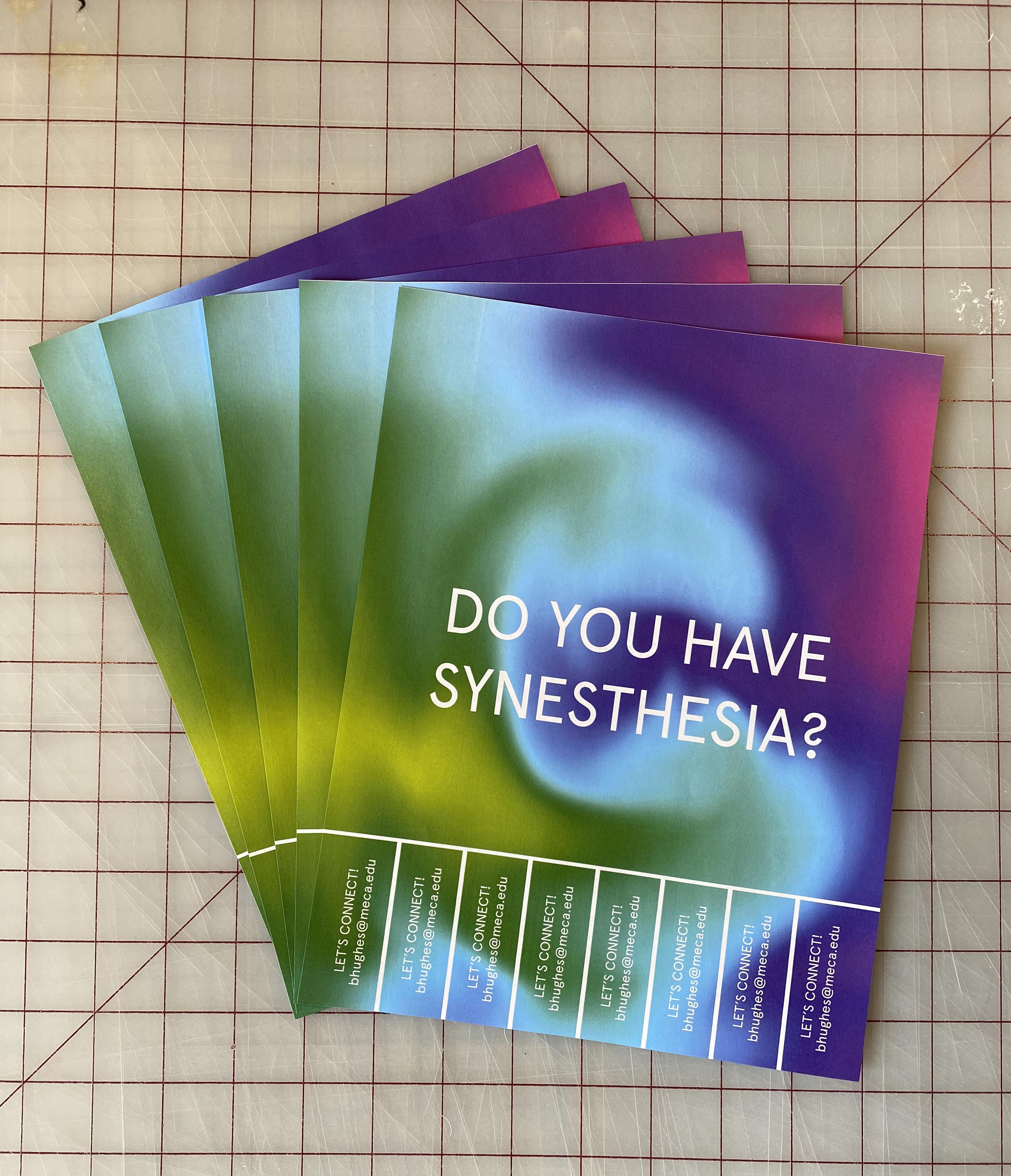
Take One – Flyer
Take One – Flyer In Context
Once I started to dissect how people with different backgrounds and understandings collectively experience color and sound, I decided I might want to show that evidence in my thesis.
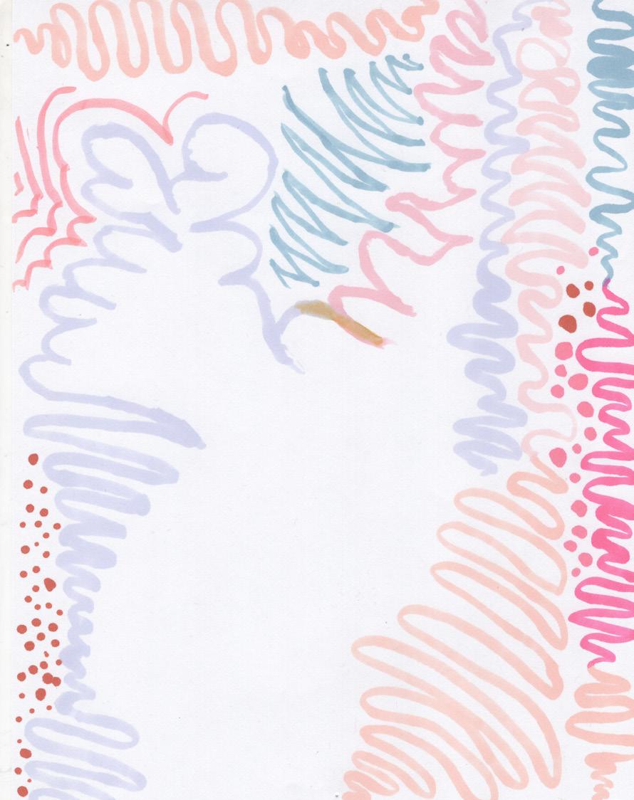
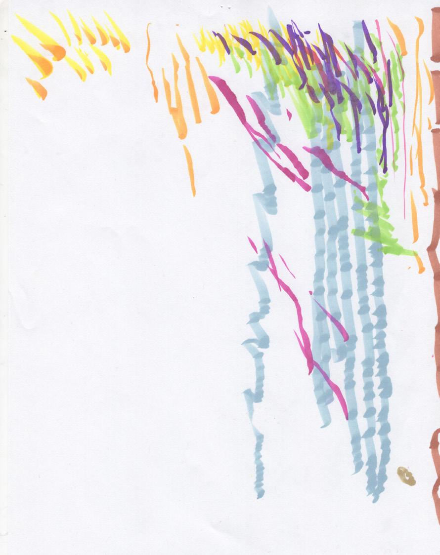
I had a fairly simple setup of noise canceling headphones, markers, and paper for people to use. I gave them headphones with music that I had chosen and asked them to draw what they felt. Some drawings were more obvious than others. Some drawings resonated with a lot of people, and some didn’t resonate with anyone. I then collaged all these drawings together and tried to apply the visual language I had just established to then document all of these understandings. Pictured (left) and also (right) are those collages.
I worked on this project for a couple weeks. I compiled a lot of imagery and spent several hours photoshopping things to a place I liked them. I got mylar and printed on mylar in hopes that I
could use all of these to create walls that a listener or viewer could stand within. Ultimately, the project didn’t last. I hadn’t been confident in it, and I felt as though I spent a lot of time forcing it to work because I felt like I had gotten nowhere with any of my previously failed experiments.
