15 minute read
SS20 EDIT What the best-dressed homes will be wearing this year
TOGETHER IN ECLECTIC DREAMS It’s the first year of a new decade. An opportunity to reassess and renew – if not your entire life choices, then at least your surroundings. Like a certain Doctor, it’s time to regenerate; so take our hand as we cautiously step into the SS20 trend zone…
Words by Deri Robins
Advertisement
Florals just got bolder (yet designs are more delicate) Cole & Sons’ Talvera, from Bracey Interiors
You could quite easily argue that the most woke trend of all for 2020 is not to do anything at all; there’s nothing especially eco about ripping out entire rooms and filling them with brand new stuff. So we’re not suggesting you do that. But we’re not killjoys, either; there’s nothing to say that you can’t still have a bit of fun tinkering with the mojo.
As ever, there are endless trends and micro-trends to baffle and beguile. Usefully, though, while recent years have seen interior design experts contradicting each other all over the shop, leaving us mere mortals to shrug our shoulders and say “OK, so, whatever, then?”, this year everyone seems to be mostly singing from the same hymn book, and the overriding trends fall into three distinct camps.
The first trend involves getting back to basics, with lots of calming pigments, natural materials and lashings of biophilia. The second, in total contrast, is for big, OTT statement patterns in wallpaper and furnishings. And thirdly – and helpfully – you can combine both, in the retro fusion trend.
Before we get stuck in, one final curve ball: we are assured that for 2020, ‘off trend will be on trend’ and ‘individuality’ and ‘authenticity’ is all-important. Good luck, everybody.
BIG TREND #1: GO ECO, OR GO HOME In fact, what we’re doing is going eco at home. Interiors trends are rarely divorced from the bigger picture, so no surprise that ditching the plastic in favour of more sustainable materials is huge for 2020, along with ‘biophilia’ – fi lling the home with nature and natural materials in order to feel a connection with the great outdoors.
Handmade crafted stuff is also key – great news for all small children bringing home from school the kind of shapeless clay things that previously would have been relegated to the back of a cupboard.
What this all means, of course, is that those clever Nordic types have been years ahead of the pack, with all their chilledout, comfy, hyggetastic havens fi lled with weathered woods, imperfect leather sofas, rattan and wicker, in bleached, faded hues and time-worn patinas: the ideal sanctuary in which to rest, regenerate, and if we absolutely have to (and frankly by now we’re feeling so laidback that we’re not sure we can be bothered), socialise.
Less is more; declutter. Collect carefully considered, pared-back pieces in raw materials, and add plenty of texture to stop the whole caboodle looking too minimalist and bland.
Colourwise, it all ties in beautifully with the pash for natural pigments; go for a mix of cool blues and greens mixed with plaster pinks and browns. Upcycle wherever you can. And if you want to make it all a bit edgier, mix in some vintage, mid-century or modern bits and pieces – see trend 3.
2


3

5

4


4
SHOPPING LIST 1. Sheepskin rug, £135, BoConcept 2. Walnut mantle clock, £55, Bristol Artisan 3. Kenneggy Downs Willow Basket, £115, Midgley Green 4. Wooden cake slices, £22, Midgley Green 5. Oslo rattan dining chair, £195, Graham and Green

left and above: Rocking Scandi cool long before anyone dreamed up the phrase: IKEA’s SS20 philosophy is ‘digital detox’ with rustic décor and natural materials; the home as sanctuary
WHAT THE EXPERTS SAY:
“The big trend for us this season is sustainable design, with a real trend towards bamboo and dried or faux flowers,” says Jamie Graham of Graham & Green.“Bamboo is becoming incredibly popular, both with the eco-conscious sourcing products made from sustainable materials, and the design-savvy who love its rich natural colour and versatility.”
“We’re loving an abundance of natural textures, rugs, throws, fabrics and wallpapers,” says Sarah Bailey of SJP Interiors,“coupled with nature at its simplest form, and as always, mixing old and new to breathe character into our projects.”
“In constantly digital times, embracing the physical is essential to our well-being,” says Mariagiovanna Palmiero of IKEA. “Bringing more tactile surfaces into the home, such as seagrass, cotton, and wood, is an easy way to engage and lift your senses. Living in the city is challenging, and homes become like cooling oases to relax, refresh, and most importantly: reload ourselves. Neutral colours, light wood furniture and plants are the essential kit to provide the sanctuary we need at home.
“And plants are part of your furniture, so adding to, or rearranging them, will bring some fresh notes to your interior, whether you prefer a few seedlings or full jungle.”
“The interiors we are increasingly designing are warm and tactile, shunning the digital for the analogue, the abstract for the tangible,” says Ruth Wainwright of commercial interiors specialists, Studio Cwtch. “The interiors you will start to see more of over the coming months will embrace this longing for the handmade and the tactile, with neutral, warmer colours creeping in, furnitures and fixtures with a conscience and a new ‘luxe-eco’ style emerging.’” “Clients are seeking a greater connection to nature, something as evident inside as it is out,” says Nick Woodhouse of Woodhouse and Law. “Inspired by natural elements, we’ve noticed a growing trend towards a more earthy palette of colours; ochres, browns, rust and terracotta. Often these might be accompanied by textured neutrals or house plants.”
“For so long we have been hardwired to believe that beige is dull and tired,” says Jasmine Main of Main Interiors. “However, get the right tone and it can be beautifully calming, especially mixed with soft pastels and natural textures. “With spring approaching, it’s the perfect time to jump feet-first into the biophilia trend; don’t forget about wallpapers and soft furnishings to bring in some plant influence. If you don’t have much space for large house plants, why not try some trailing plants hanging from the ceiling or popped on a shelf?”
BIG TREND #2 HOLDING PATTERNS In total contrast to the cool neutrals on the previous page, there’s also been a shift away from clean, bare interiors towards more fl amboyant décor – and SS20 offers us the wildly enticing option of going as bold as we dare, with a brilliant new range of statement wallpaper. And we’re not even talking a timid feature wall here or there, either; we’re covering whole rooms with blousy/jazzy/scenic designs, and sometimes even taking it up across the ceiling, and anything else that will stand still long enough for us to shower it with pattern. No? How about the revival of the statement sofa, last seen some time in the mid-1980s? Apart from anything else, those stain-camoufl aging patterns are highly practical.
Florals have been big (literally) for a while, but now we’re seeing them with a more delicate, gentler, nostalgic, even oldfashioned feel, with fi nely drawn outlines; this needn’t mean chintz (though it can), as many designers have translated the trend in a decidedly in modern, punchy way.

WHAT THE EXPERTS SAY:
“Everyone’s SS20 collections are super-exciting, as they are all showcasing an exciting mix of pattern and colour – the more the better,” says Alison Bracey. “Big, colourful designs in wallpapers are back, and there’s a welcome nod to classic prints; many designers have chosen to use their archive prints and to re-introduce them in more contemporary colourways. Geometric designs and botanicals are big, too.”
“Some wallpapers are like a work of art, and can add a statement or focal point to a room or a colourful backdrop,” says Finola Kelly of Nola Interiors. “Little Greene’s new ‘National Trust Papers’ collection are based on original designs from the NT property portfolio, and recreated into timeless patterns and colours, suitable for contemporary and period homes.” “The Alcazar Gardens wallpaper from Cole & Son’s new Seville collection ticks quite a few of this season’s trend boxes for me,” says Zoe Hewett of Stylemongers. “With its earthy tones and tropical palms, and the orange tree repeat, it’s not unlike the soft geometry that is gaining in popularity.
“Archways and strong curves are also creeping in, and using wallpaper like the Alcazar Gardens is a great way to feel the benefi ts of being surrounded by curves in the home without the disruption.”
“Wallpaper is having a glorious moment; especially the fl oral botanical patterns,” says Kay James of K-Interiors. “They bring a glamour and drama that are perfect for bedrooms and dining rooms; try toning your paint colour to complement. I also love a wall mural paper, especially in a bedroom; it creates such a whimsical romantic vibe.”
20 I BRISTOL LIFE I www.mediaclash.co.uk TOP: Rebel Walls are your go-to for mural wallpaper
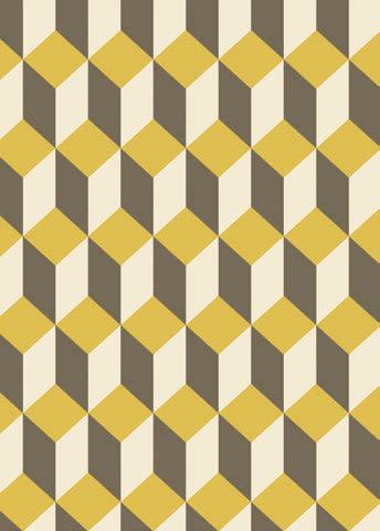
LEFT: are you bold enough for Cole & Sons’ new geometrics? Both from Bracey
BIG TREND #3 RETRO FUSION There’s nothing new about this trend, which basically mixes vintage and modern to an eclectic (yet stylish) eff ect; but now it’s going by the name of ‘grandmillenial style’.
What we’re doing here is mixing mid-century and Art Deco vintage pieces with 1970s colour palettes – yep, browns, reds and mustards (designers are even muttering darkly about smoked glass, don’t shoot the messenger) – but in a modern room. It’s an eco-friendly and nostalgic look, mixing handme-downs from your nan’s home: foxed mirrors, tassels and fringing, chinoiserie, topiary, fl oral prints. To avoid ending up with something that looks like Steptoe’s living room, limit yourself to just one or two statement vintage pieces. yourself to just one or two statement vintage pieces.
ABOVE: Timeless with a mid-centry vibe; wing chair by Archer + Co RIGHT: Rebel Walls do abstract BELOW: Jasmine Main pairs convex mirrors with mid-centry style for an eclectic vibe


BAUHAUS, IN THE MIDDLE OF OUR STREET The interiors world is celebrating 100 years of Bauhaus design this year; if you can’t spring for vintage pieces, choose contemporary pieces with clean lines; that should do the trick.
“We always try to refl ect a client’s personality and individuality on any scheme we work on, taking inspiration from their very personal pieces; perhaps a piece of artwork, or even an old radio or record player,” says Nick of Woodhouse and Law. “It’s always much more fun when there is a story behind each piece, and we’ll often layer these up with additional accessories, both new and old, that complement and refl ect their own style. These might be antique pieces for example, offering a more sustainable approach to design, with timeless pieces that can stay with the client for years or even generations ahead.”
Specialists in home & commercial Interior Design Beautiful show homes created via our large stock of furniture rental

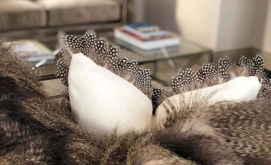

SJP Interior Design, 36 The Mall, Clifton Village, Bristol, BS8 4DS
Invincible Paris Cyanotype prints by Addicted to Patterns
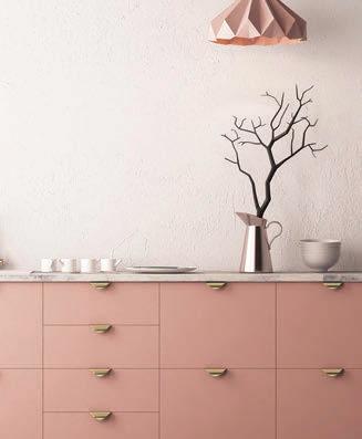
PINK Think a more sophisticated, earthy evolution of the millennial pink and candies we’ve seen in recent years. Ask yourself: would Barbie wear it? If the answer is ‘hell, yes!” it’s probably a no. Many interior designers hedge their bets, and murmur things like ‘combine it with green’, but Hannah Walkiewicz of Build Bristol is thinking even pinker. “If 2017 was 50 shades of grey, 2018 was navy and 2019 was rich greens, in 2020 it would appear that pink is strong enough to stand on its own two feet,” she says.
“It’s a bold move – some may think it’s too feminine, but with a strong accent colour – say green, grey or navy – it can incorporate a masculine feel. We think it’s smart, sleek and quite frankly cannot get enough of it.”

BLUE While interiors gurus in recent years may have bickered over which metallics were in or out, and whether we should be installing or ripping up the terrazzo, they were pretty much united in their loathing of Pantone’s colour of the year for 2018, the fl ashy 2018 Ultra Violet (Cadbury’s meets The Crown), and dislike of 2019’s Living Coral (we haven’t yearned for a peach bedroom since we were nine). But everyone seems to like this year’s hue of Classic Blue, a kind of royal/navy blue hybrid.
“Navy blue has held its own for a few seasons now, says Finola Kelly, “due to it being so versatile and sophisticated. Use it on its own to create a moody atmosphere or bold statement, or contrast it with a warm neutral for a dramatic lift.”
COLOUR TRENDS Grey has famously had its day. We’re so over living in homes that resemble a conference lounge. Warmer neutrals are sweeping in, such as pink, peach, lilac and oatmeal (Oh, okay, it’s beige), joined by the palest greens; meanwhile, just as our big trends divide into calm, natural hues and in-yer-face statements, we also have a strong alternative epitomised by Pantone’s Classic Blue.
GREEN Oh, the relief when we realised that Dulux’s Tranquil Dawn wasn’t the colour of a haliborange after all, but the softest, most neutral green imaginable. Dulux say it’s all about ‘the nation’s mood on the approach of a new decade’. We say, it ties in beautifully with the current preoccupation with nature and plants; and if it’s a bit too wishy-washy for you, try combining with darker greens or warm pinks.
“Green, from darks to more muted shades, has the ability to exude calm and relaxation, which sums up how to live our lives in this noisy world,” muses Charlotte Cosby of Farrow and Ball. “The key to this look is to avoid too much in the way in the way of pattern, and use diff erent textures and plants instead,” advises Zoe Hewett.




2 3
4


5


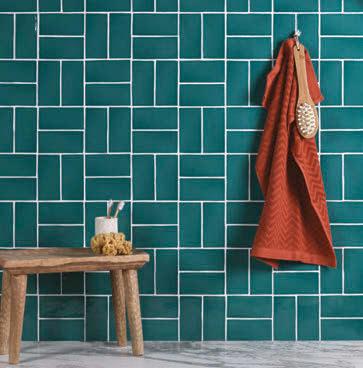
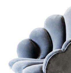
SHOPPING LIST 1. Crittal frames are everywhere – even in the bathroom (Ripples) 2, 6. As are coloured bathrooms - also Ripples 3. The shell-like shape of this chair says ‘Deco’, but the legs hint at an earlier era: we’re calling ‘retro fusion’ here. £795, Graham & Green 4. Whale soap dish, £10.50, Pod 5. Irridescent tiling, Fired Earth SHOPPING LIST
SO THERE WE HAVE IT. LET’S GO OUT ON AN IN/OUT…
IN Living walls. Short of outdoor space? If you can’t grow out, grow up Fringing – aka passementerie – all over the shop, from lampshades to wallhangings. Ideal for that must-have séance chic
Sea-inspired designs – Dave Attenborough’s Blue Planet chic, with shells, starfi sh etc, along with iridescence; aka the mermaid effect.
Chintz. No need to panic; it’s just a busy traditional design on a white background; nobody needs to get hurt here.
Curvy chairs and sofas; Deco-style shell chairs are especially lush.
Terrazzo. Innovative in the ’70s, naff in the ’80s, allegedly back for 2020. If you don’t fancy ripping up the fl ooring in 2030, maybe restrict it to accessories? A nice soap dish, perhaps?
Velvet. Yep, still big, don’t panic
Kitchens painted in several tones, especially dark hues; especially blues.
Natural materials; not just humble woods etc, but also glammy marble. Woven furniture – specifi cally, rattan and wicker: inexpensive, lightweight and sustainable. Try to avoid the
overwhelming temptation to pair with a spider plant in a macramé pot holder.
Chintzy china. Dine Downton Abbey style on vintage-inspired fl owered plates.
Crittal frames – not just for windows, but also doors, walls, room dividers and showers.
Animal prints – still in! But handle with restraint. Nobody wants to live in a cross between the Playboy mansion and Kat Slater’s wardrobe.
OUT Fake pot plants (though dried fl owers are in).
Pineapples, fl amingos, cactuses and parrots. Enough with the kitsch already. 6
Coloured bathroom suites (though we haven’t heard the dreaded word ‘avocado’ yet).
Plastic. Unless it’s recycled, into rugs, for example; Nola Interiors has some lovely ones.
Shiny metallics. Brass, gold and copper are brushed; chrome is yielding to pewter.
Boring fl at surfaces. If it keeps still, it will be covered in reeding.
Farmhouse kitchens. About as on-trend as a Keep Calm and Carry On print. Instead, see the retro revival trend, mixing pattern and vintage into fresh modern décor.
Industrial style. Only kidding! We’re still loving it, as long
as it comes softened up with natural, tactile fabrics – but maybe unscrew the Edison bulbs now, hey?
Granite worktops. Admittedly, the fact that some designers have gone off the stuff is unlikely to persuade you to rip out several grand’s worth of countertops; but if you’re starting from scratch, then ‘quartz’ is the word on the streets.


