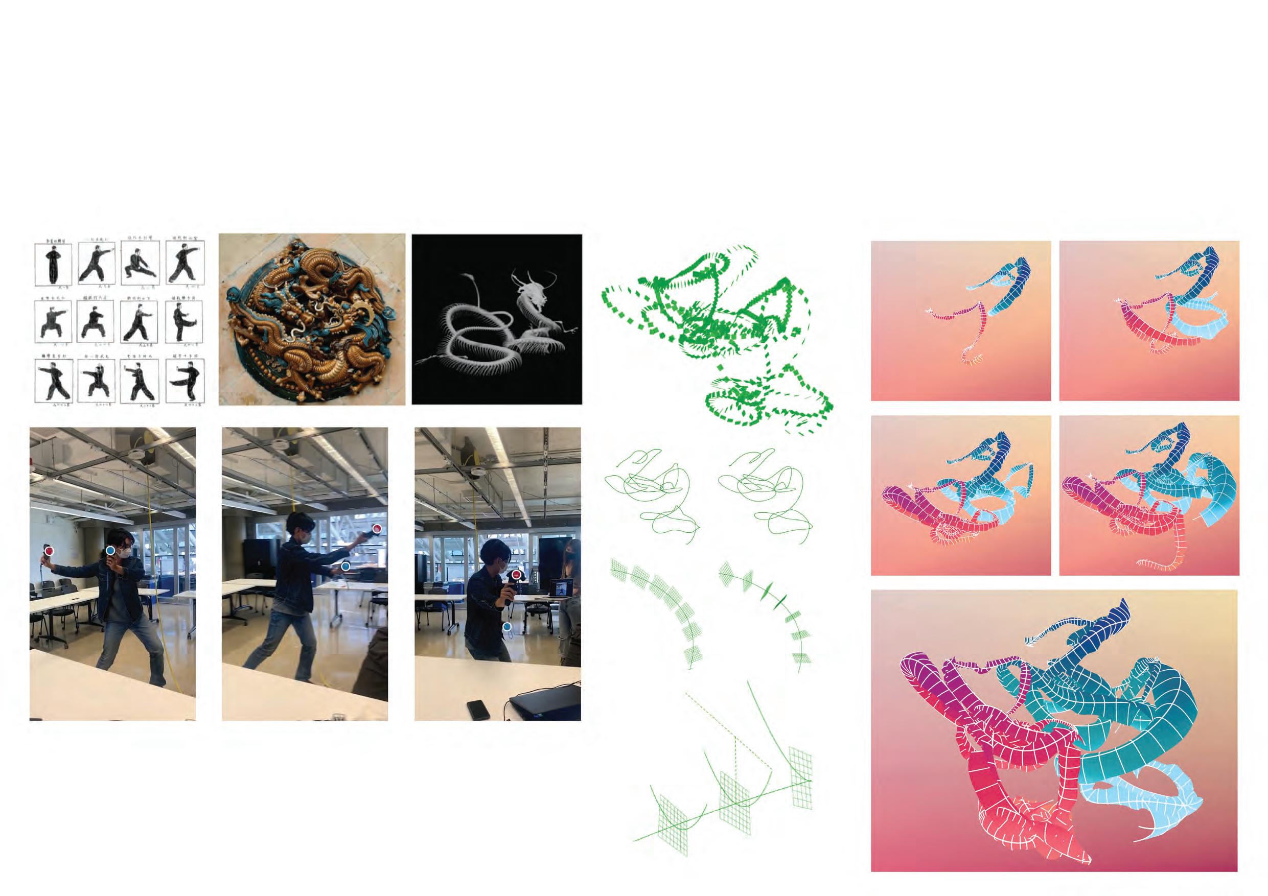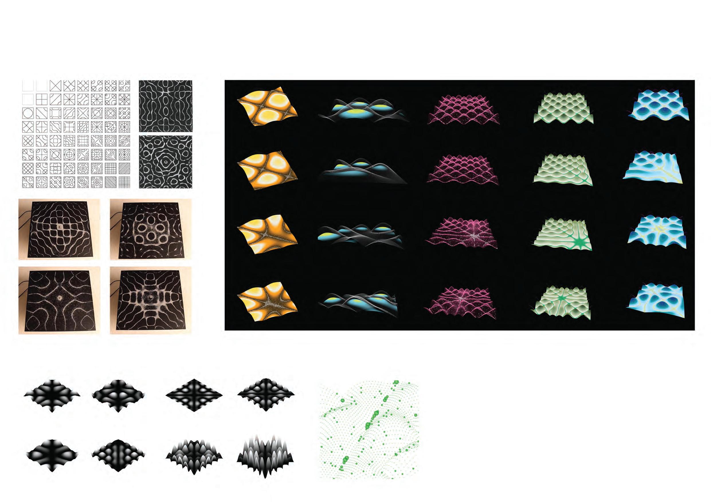
Selected
2016-2022
Mengyu Zhao
Works
Preface
Thank you for viewing my por�olio.
The por�olio is a collec�on of my previous works that I believe best reflect my interests in architecture, which are at the intersec�on of computa�onal design, formalism, and urbanism.
I see myself more as a “formalist” than a “social ac�vist” – I am always fascinated by the complexity of architecture forms and urban spaces, and how computa�on and other modern technologies could assist in the genera�on of form and space. Nevertheless, I have been trying to interrogate about how these formal aspects of architecture could reconcile with societal, poli�cal and ethical issues related to the built environment.
In my previous works, I have experimented with mul�ple design approaches that focus intensely on space and morphology, while speaking to the underlying social-poli�cal problems with architecture at the same �me. I delve into an inves�ga�on of space’s mul�ple facets – I look at and beyond architecture, thinking about how computa�onal techniques, aesthe�cs and social ideologies could inform design.
Contents
Architecture Projects
Where the Tracks Meet the Canal
Hostel in a 70-year-old Roof
Crossroads Theater
Low Cost, Low Carbon, High Density, High Resilience
Creek Commons: Reimagine Water as Cooperative Thread
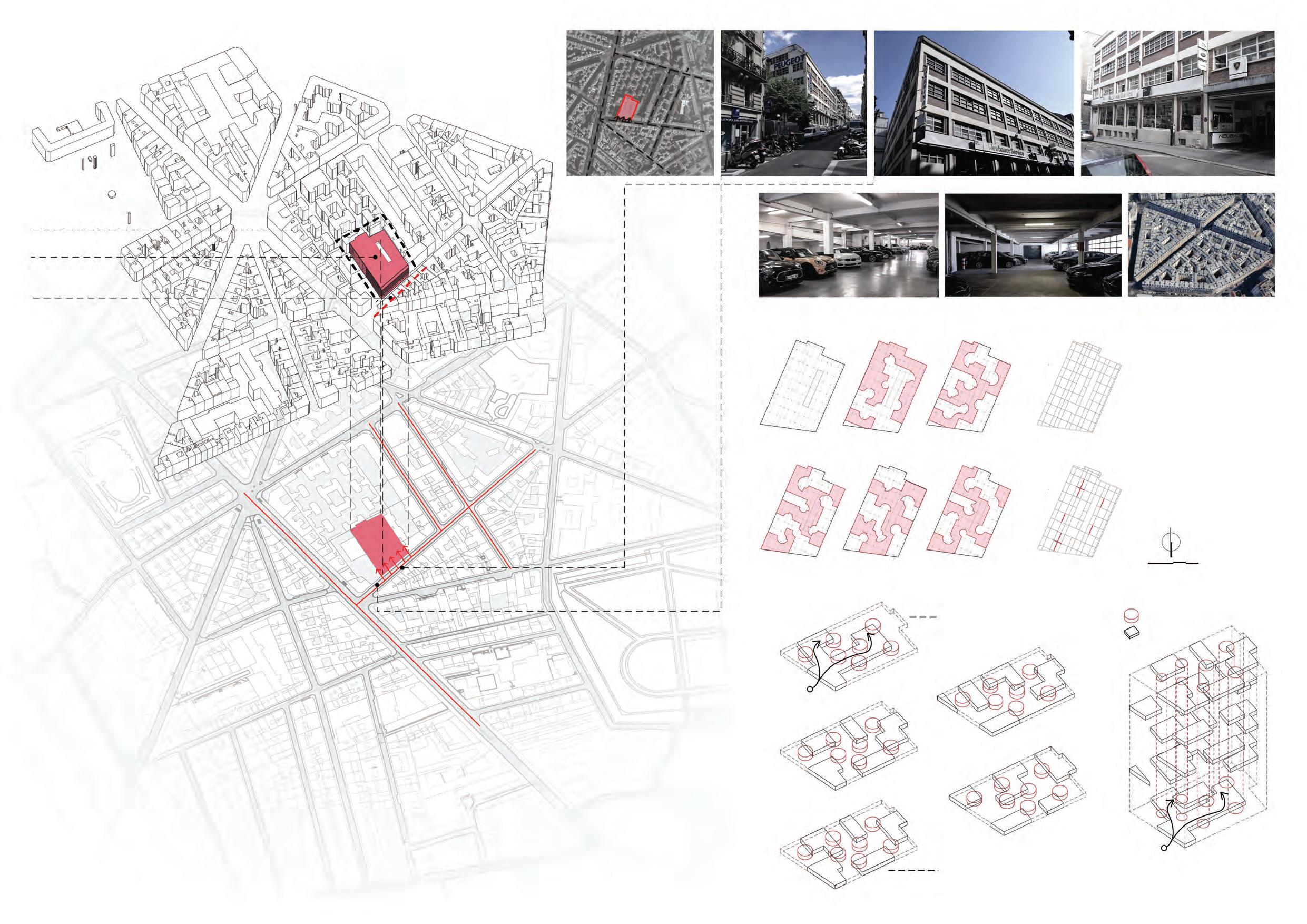
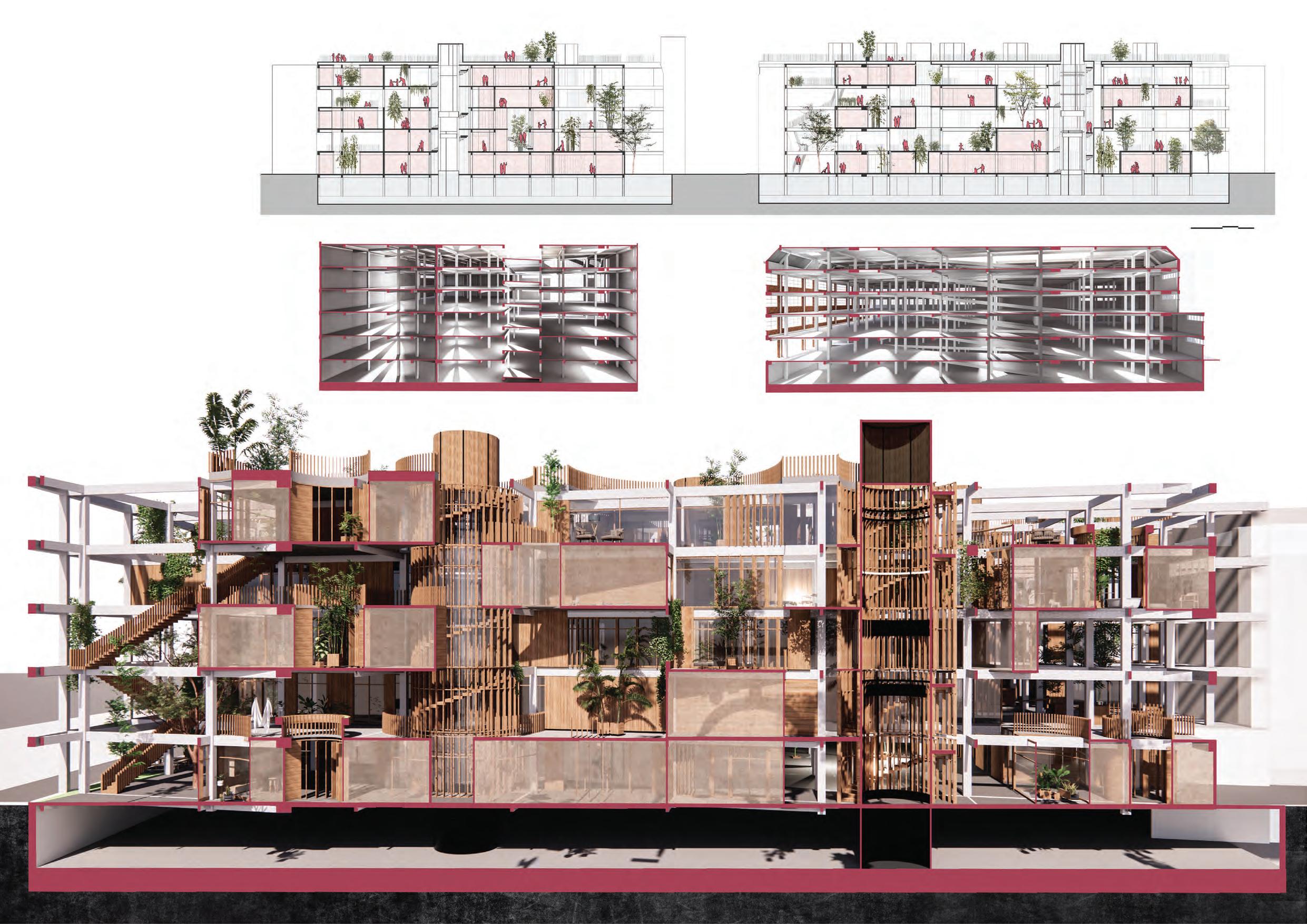
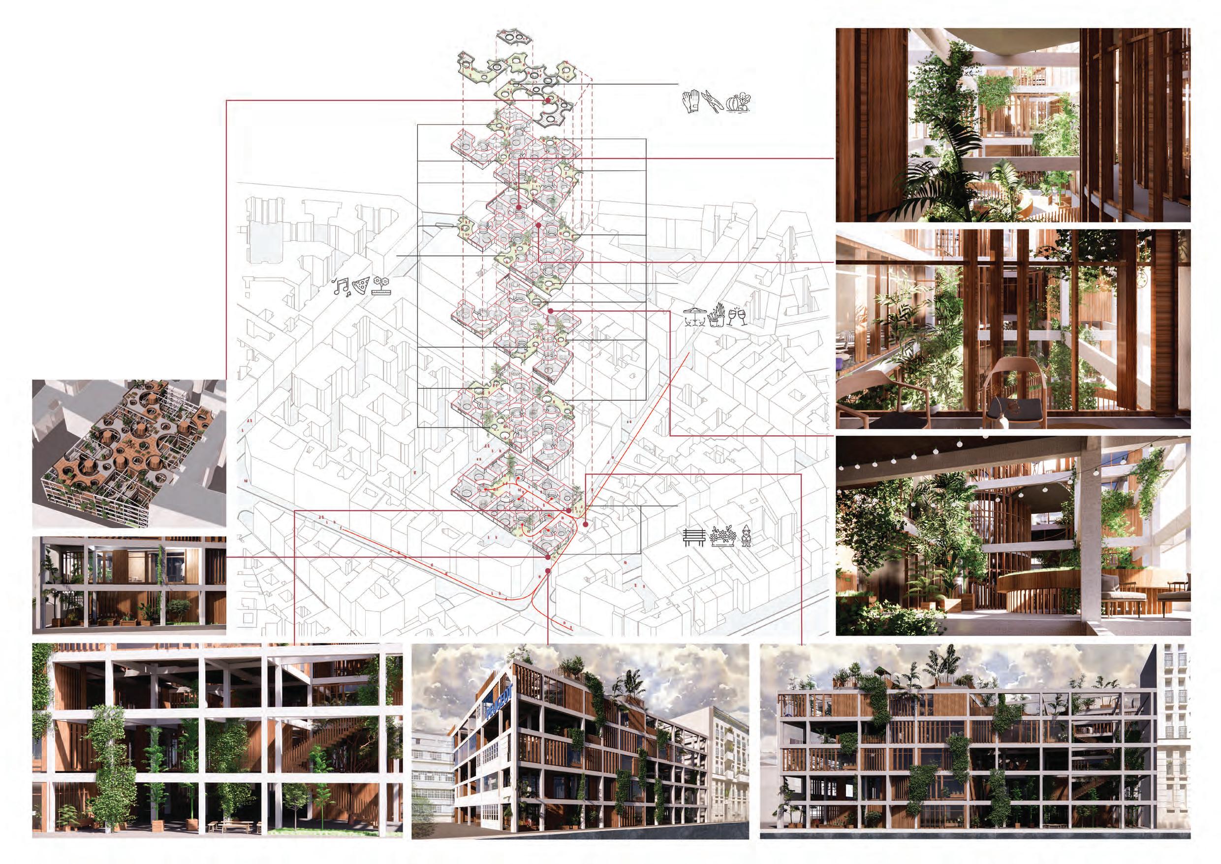
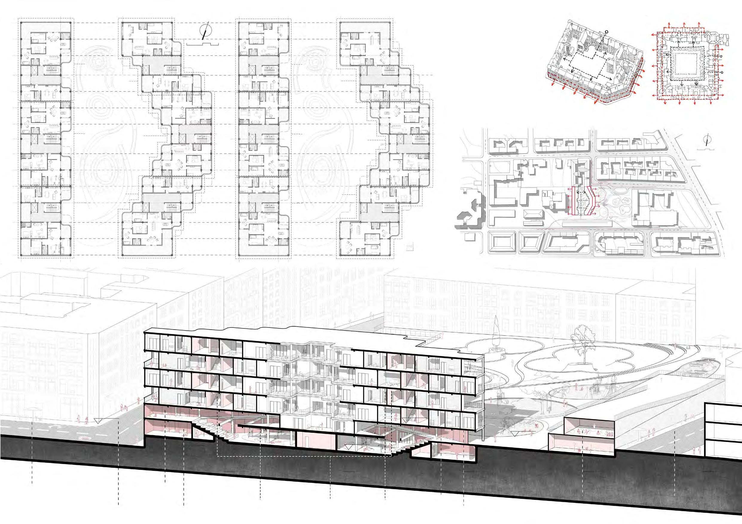
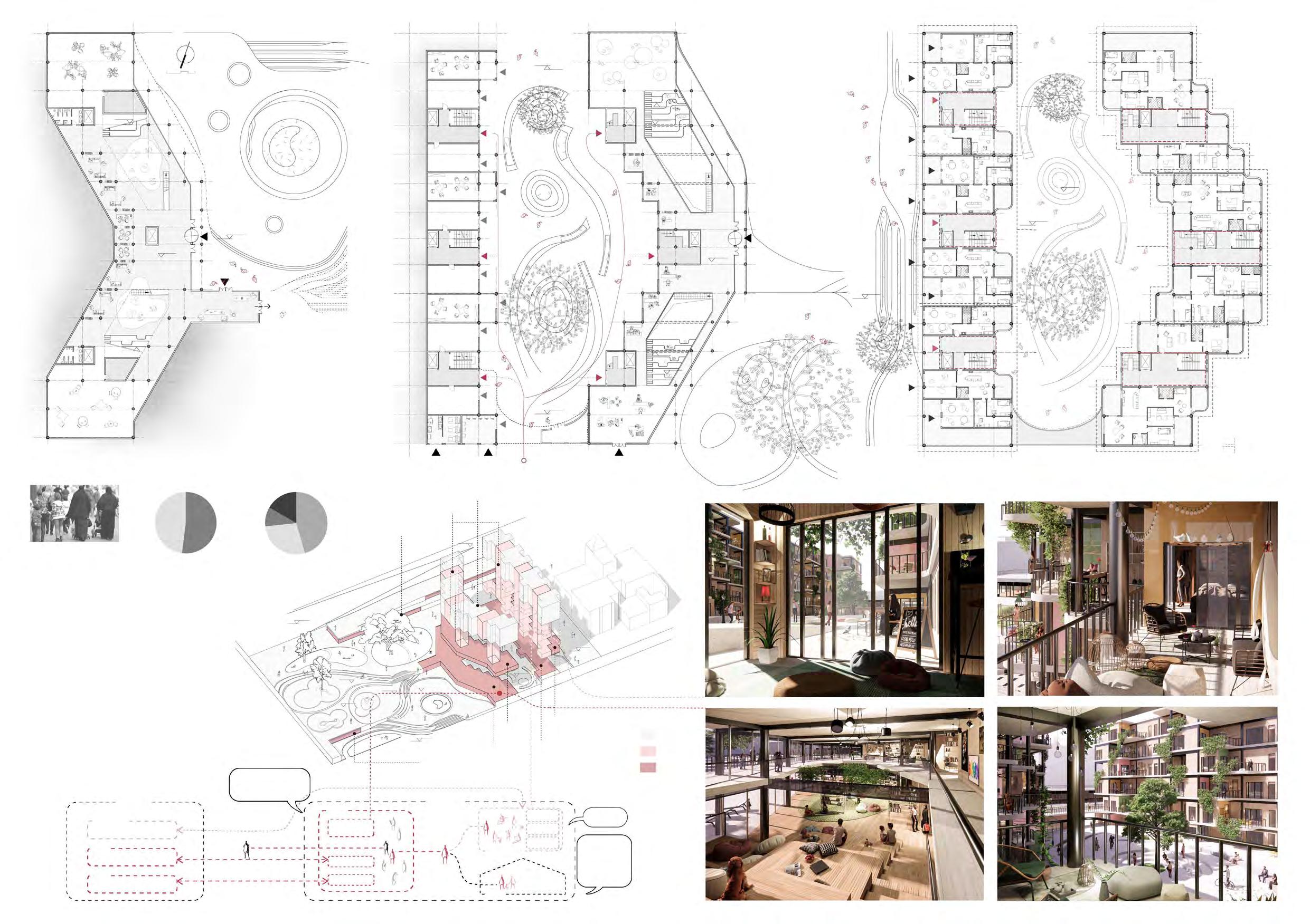
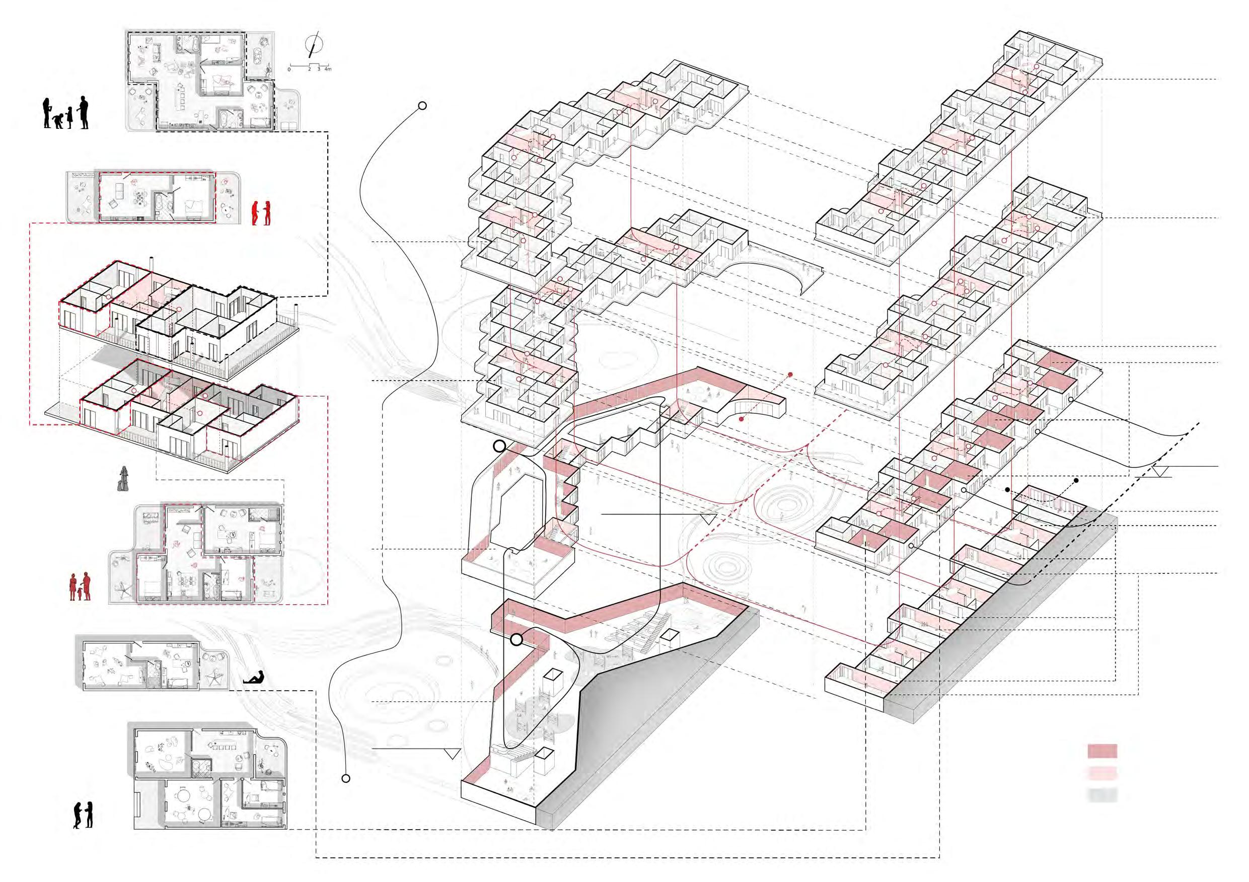
Porosity, Sustainability and Well-being: Rethinking the Haussmann Block
Bachelor’s Thesis: the Convergence of Art and Commerce in Contemporary Culture
The Rollberg Block
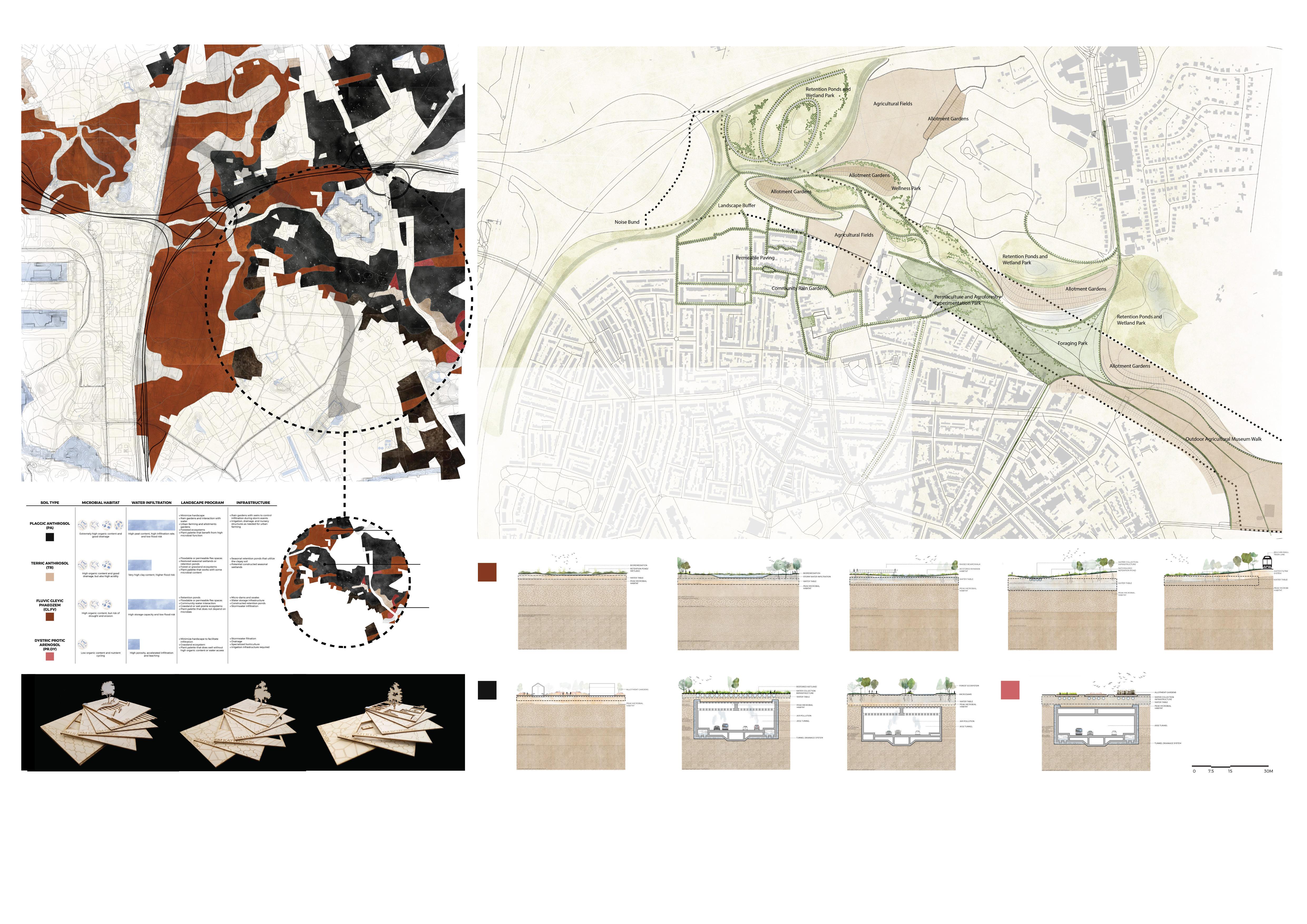
From Soil to Space Other Works
(Un)fold: Installa�on Design and Construc�on
Visual Representa�on: Aesthe�cs, Representa�on Techniques and Pop Culture
Computa�onal Design
Publica�on: the Escape
01 06 10 17 25 34 49 52 54 58 59
Internship
45 28 39
Where the Tracks Meet the Canal
Individual Work
From the core design studio ‘Urban Design’ at Tsinghua University
Completed in Fall 2019
Modified in November 2020 for this por�olio
Instructor: Prof. Ge ZHONG
Loca�on: Xizhimen, Beijing
01
the Notorious Railway Sta
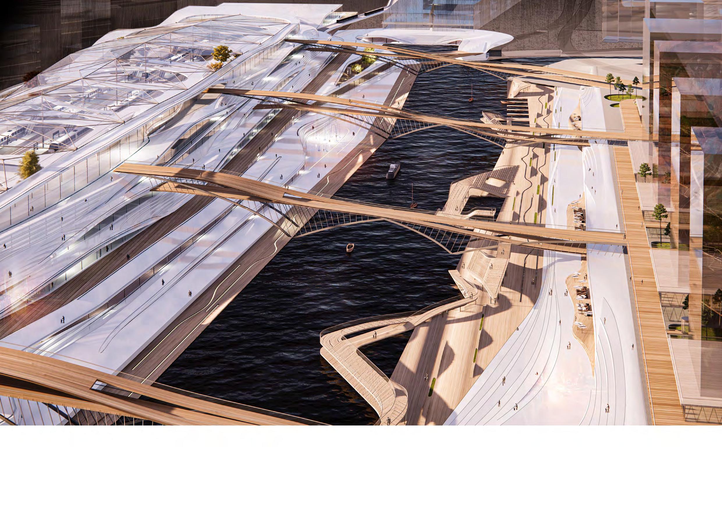
Although the area of Xizhimen is notorious as one of the city’s most chao�c transporta�on hub, I see its poten�al – it is where the old canal of Beijing meets and parallels the giant, expressionless railway sta�on. When I started the project in fall 2019, the sta�on was under construc�on for its re-opening in 2020, and I put forward another re-construc�on plan – to s�mulate interac�ons between the sta�on and the old canal throughout a though�ul arrangement of space and form. By doing this I hope to build connec�ons between the mul�ple func�ons that perceive the area to hold, between the interior and the exterior as well as the man-made and the natural, turning the area into an urban parlor that hosts not only passengers but every person in the city.
Transporta�on Facility as Public Space
I based the project on one important no�on: public facili�es, especially large transporta�on facili�es, have the poten�al of becoming the urban hot spots when they open up and provide public space for everyone – not just passengers. It is quite a formidable task, as conven�onally railway sta�ons in China are just enclosed containers that only allow �cket holders to enter. However, I aim to transform the railway sta�on and its surrounding area into an urban hot spot that cater to everyone.

Zhangjiakou September 1909 Xuanhua April 1909 Juyongguan 1906 Juyongguan 1906 Xizhimen, Beijing 1905 Railway Xizhimen Canal Ring Roads Xuanhua April 1909 4th Ring Road 4th Ring Road 3rd Ring Road 3rd Ring Road 2nd Ring Road Old City Yanqing 1908 Metro Railway Main Roads Train Terminal - Beijing North Railway Sta�on Xizhimen Metro Sta�on Residen�al & Bussiness Area Beijing Exhibi�on Center Area Xizhimen Metro Sta�on Kaide Mall Xizhimen Overpass Forming of Connec�ons Genesis of Form Site Analysis Railway & Canal Analysis Campus Area (Beijing Jiaotong University) Beijing North Railway Sta�on Area Beijing North Railway Sta�on RAILWAY OFFICES & APARTMENTS METRO CITY MAIN ROAD CITY MAIN ROAD CITY MAIN ROAD CITY MAIN ROAD RAILWAY METRO COMMERCIAL COMMERCIAL COMMERCIAL COMMERCIAL COMMERCIAL COMMERCIAL COMMERCIAL Interac�ons? Apartments & Offices Railway Sta�on River River Commercial Setback Commercial Anchor - Harbor Anchor - Visitor Center Anchor Harbor Plaza Node Fountain Plaza Anchor Visitor Center
�on
02
Sec�on a�er Transforma�on
Star�ng from the Sec�on
By looking at the sec�on I try to get an understanding of the interrela�on between each func�on, and to formulate new connec�ons by introducing new func�ons. aim to connect the railway sta�on on the east bank with the office buildings on the west bank. I also realize the importance of commercial facili�es in urban public spaces, and u�lize them as ‘connectors’ of the district. By implan�ng a considerable number of shops and restaurants I hope to make the railway sta�on and its surrounding area the mul�-func�onal space that serves as a standout urban des�na�on.
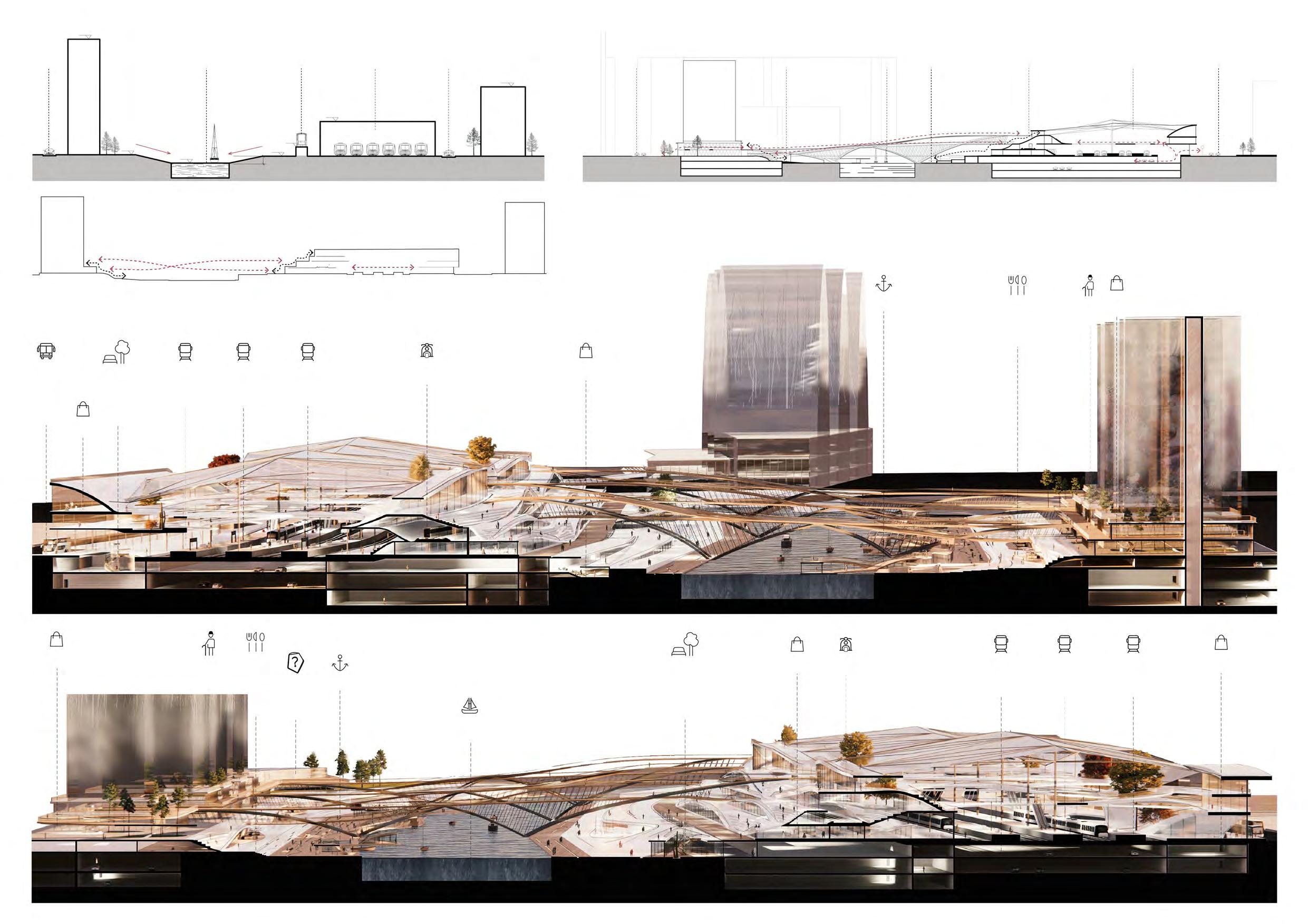
Pla�orm 1-2 Retail Retail Deck Channel Visitor Center Walkway Outdoor Restaurant Metro Retail Sunken Courtyard Pla�orm 3-4 Pla�orm 5-6 Bus Drop-off/Pickup Pla�orm 1-2 Retail Retail Deck Walkway Outdoor Restaurant Metro Retail Sunken Courtyard Pla�orm 3-4 Pla�orm 5-6 GALLERY RETAIL RETAIL OFFICE RETAIL EXHIBITION RETAIL RETAIL CITY MAIN ROAD RETAIL RESTAURANT RETAIL RETAIL EXHIBITION WATERFRONT RIVER WATERFRONT CAFETERIA RAILWAY UNDERGROUND PARKING UNDERGROUND PARKING RETAIL BUS STOP METRO RESTAURANT CAFETERIA OFFICES & APARTMENTS OFFICES & APARTMENTS OFFICES & APARTMENTS OFFICES & APARTMENTS ±0.00 ±0.00 -3.00 3.00 +3.50 +14.00 +50.00 +25.00 Roadway Roadway Railway Metro River Roadway Roadway Railway Metro River Waterfront Waterfront
Sec�on before Transforma�on Bridging the Func�ons
Sec�on B-B
Sec�on A-A
03
±0.00 ±0.00
West Bank hope to create strong connec�ons between the office buildings of the west bank, making the ground and the second floor of these buildings a commercial area that adds to the liveliness of the area.
East Bank
The landscape of the east bank is largely the extension of the railway sta�on’s fluid, boundaryless form that binds the interior of the sta�on with its exterior.
Railway Sta�on Interior
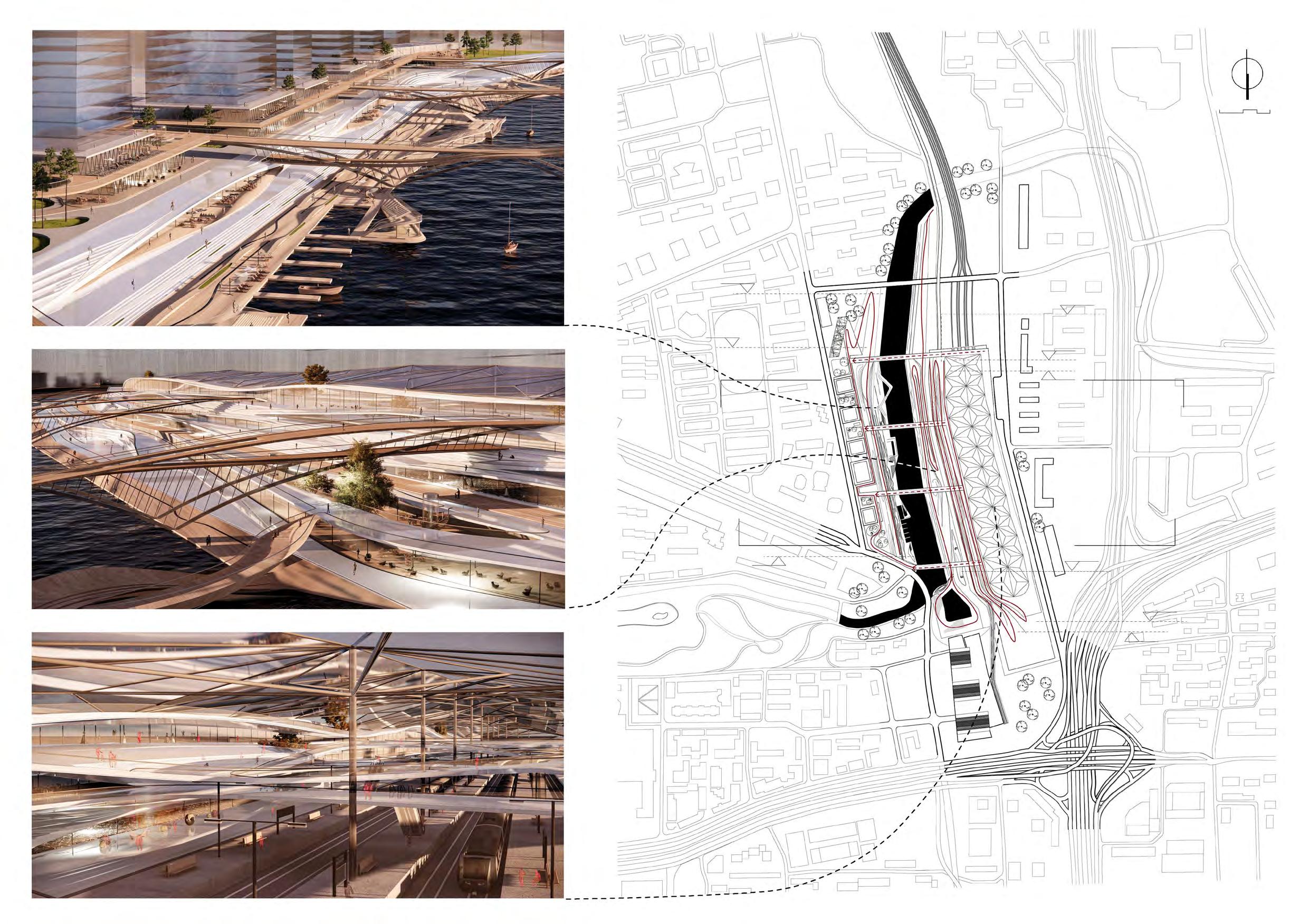
-3.00 +14.00 +7.00 -3.00 +3.50 +10.50 A A B B +3.50 Site Plan 1:6000 100km 75 0 50 04
The railway sta�on’s transporta�on func�on is surrounded by other commercial func�ons. The sta�on is not only a transporta�on hub but a shopping center, a weekend hangout spot, and an essen�al component of the city’s public space.
the Anchors and the Nodes
Within the project I create a sequence of spaces that is marked by two ‘anchors’ as the star�ng/end point and several nodes between them. The sequence begins with a visitor center at the northwest corner of the masterplan and ends with a small man-made harbor at the southeast corner. Various ‘nodes’, as one of the five elements of the city image that Kevin Lynch put forward, are woven into this sequence. The nodes include several plazas that are generated by the fluid volume of the railway sta�on on the east side of the canal, as well as the urban gardens formed between the walkways twining around the office buildings on the west side of the canal.
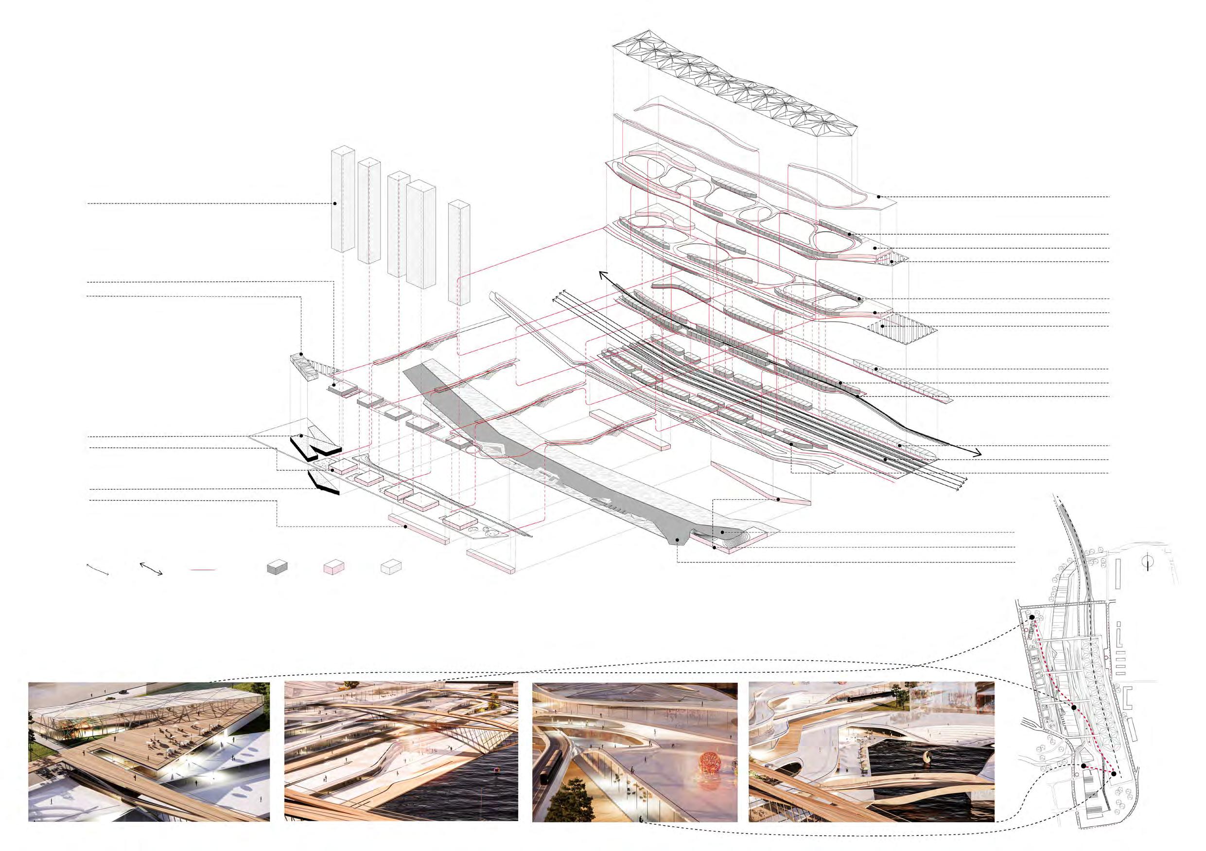
West Bank East Bank -3.00 Harbor River Shops Railway Shops Railway Metro Pedestrian Flow Anchor - Visitor Center Node - Fountain Plaza Node Rear Pla�orm Anchor - Harbor ±0.00 Office Shops Shops -3.00 Museum (1st Floor) Shops Metro +3.50 Office ±0.00 Museum (2nd Floor) Restaurants Terrace +7.00 Shops Restaurants & Shops +3.50 Museum (3rd Floor) +7.00 - +50.00 Offices & Apartments Restaurants Terrace +10.50 Shops +14.00 Terrace Office Retail Dinning
05
Hostel in a 70-year-old Roof
Individual Work
From the core design studio ‘Architecture, City, Landscape’, at Tsinghua University
Completed in Winter 2019
Modified in December 2020 for this Por�olio
Instructor: Prof. Yishi LIU
Architectural Measuring & Research Collaborators: Sifeng MO & Jun�an YE
Project Loca�on: Tsinghua University, Beijing
Site Plan 1:2500 1 1-4 Tsinghua Student Dormitory 5 Jing Zhai 6 Entertainment Building 7 Department of Environment 20km 1015 2 4 3 7 5 6
06
the Old Structure and the New U�lity

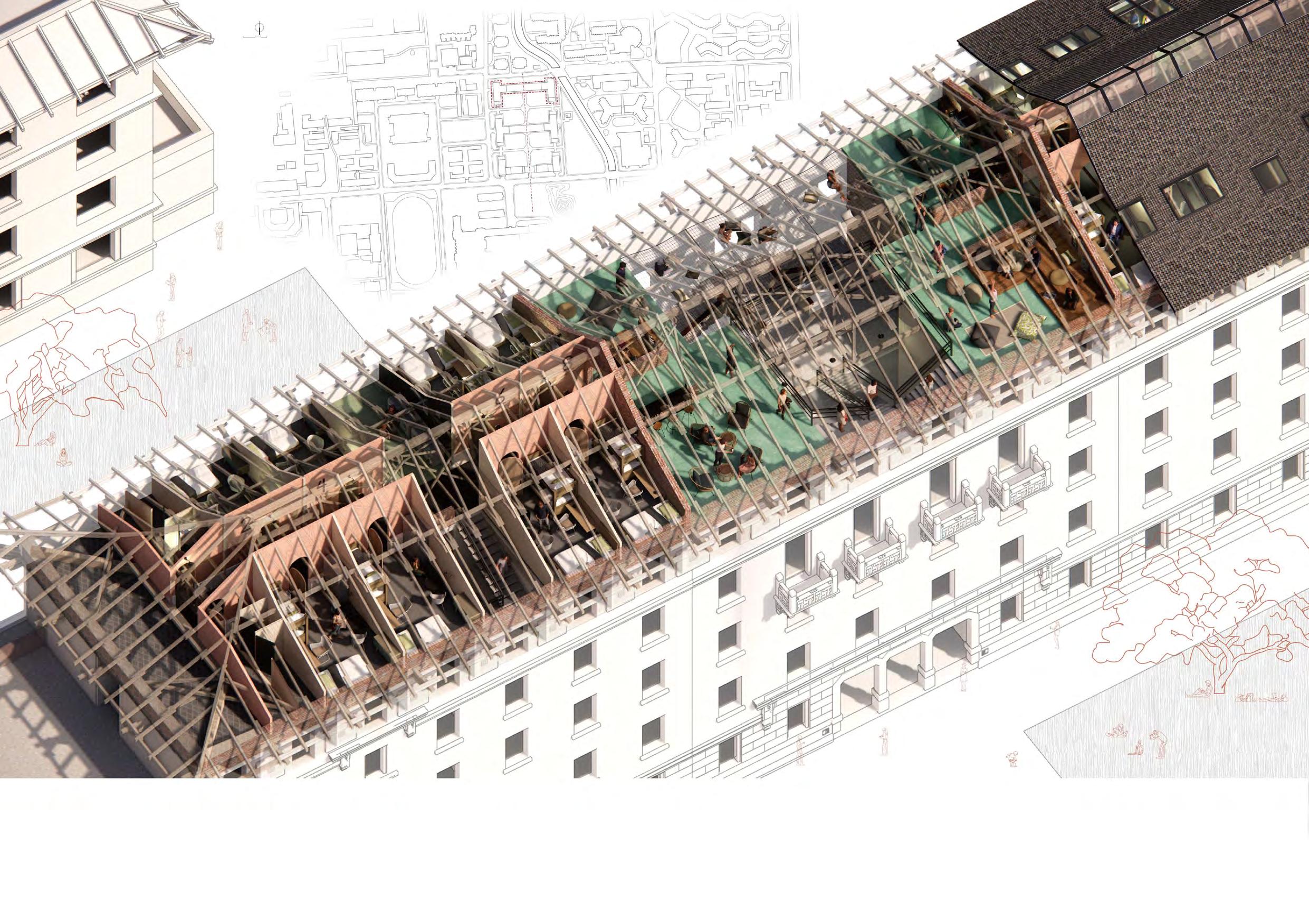
Tsinghua University has long faced the problem of a shortage of dormitories during the summer season when visi�ng students here require accommoda�on. In this project I propose a solu�on to the problem - transforming the roof of a 70-year-old building into a hostel. Me and my two research partners measured the building and the structure of the roof. Based on the findings of the research, I transformed the building with great respect to the original structure, trying my best to preserve the roof while crea�ng beau�ful spaces underneath and between it.
Physical Model of Two Jian (间)
Outer Surface
ROOM9ROOM11 ROOM13ROOM15 ROOM1 ROOM2ROOM4 ROOM6ROOM8 ROOM10ROOM12 ROOM14ROOM16 ROOM3 ROOM5ROOM7 5FTO TO 5F TO 5F Outer Surface Suppor�ng Structure
Dormitory Main Entrance Ver�cal Transporta�on Cafe Mini Bar Mini Bar Discussion Area Bathroom Bathroom Laundry Fitness Room Shower Shower Rear Mid Cenrtral Truss Gable
HostelStudent
Gable
Concrete Beam
Purlin
940mm 2080mm 1895mm 4760mm 2800mm
Triangular Roof Struss
Diagonal Brace
Room
1:100
Support
Sec�on
07
The hostel rooms are divided into two sets – the le� set and the right set – by the common area in the middle. Each set has its own stairway, and facing the stairway there is a common area: a laundry room and a fitness room, for the le� and right set respec�vely.
The common area is where the hostel guests interact with each other, and where the new hostel interacts with the rest of the building. It consists of a cafeteria, a bar, a living area and a discussion area. There is also a rope net above the original staircases of the building.
Each set of rooms is connected by a corridor, and the separa�on between the rooms responds to the structure of the roof above: each room occupies one single unit of the roof structure - one ‘jian’ (right) in tradi�onal Chinese architecture.
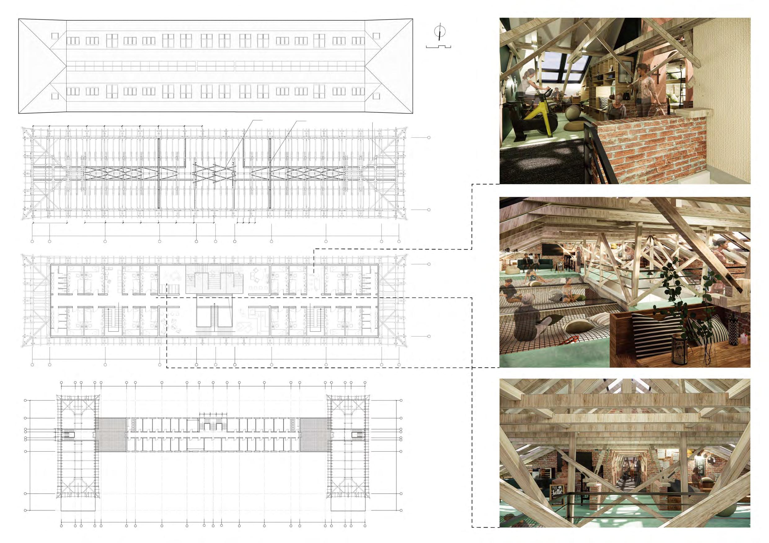
VOID Mini Bar Fitness Room Discussion Area Laundry Bathroom Shower Bathroom Shower Rope Net Common Area Cafe C 18 17 16 15 13 12 11 7 18 19 20 2122 21 17 16 15 13 12 11 8 45 32 18 19 20 2122 21 A B D 1/E 1/D G 1/E 1/D 17 16 15 14 12 10 1640 4170 6045 4620 130017001300 1640 21402140 2200 8 45 32 F C 18 17 16 15 13 12 11 9 8 7 gable truss concrete beam Outer Surface 1:300 023 4m Suppor�ng Structure 1:300 Roof - Plan +17.40m 1:300 the Original 5F Plan +13.60m 1:600 300030003000 3158 4412 3000 100010001000 3400 3000 3000 3000 30003000 3480 5725 3170 3170 2758 08

Sec�on A-A C C
Sec�on B-B
斜撑 Diagonal
斜撑
斗拱 Purlin 檩条 Horizontal
横斗 Gable 山墙 Triangular Truss at the Corner 角梁三角屋架 Truss 桁架 Triangular Roof Truss 三角屋架
Truss at the End of the Hip Roof 庑殿末端屋架 Common Area Shower Shower Laundry Cafe Bathroom Gym Bathroom Rope Net Discussion Area Mini Bar Roof Truss at the End of the Hip Roof 庑殿末端屋架 A A B B 09
Sec�on C-C Diagonal Brace
Brace
Dougong (Tradi�onal Chinese Bracket System)
Dougong
Roof
Crossroads Theater
Individual Work
From the core design studio ‘Public Buildings’ at Tsinghua University. Completed in Spring 2020.
Modified in December 2020 for this por�olio.
Instructor: Prof. Xiangdong LU
Project Loca�on: Haidian District, Beijing
10
Site Analysis
the Dichotomy
In the classical opera there is one clear dis�nguishment: the dis�nguishment between the public part of the theater – the ‘front of house’, where the foyers and galleries are – and the non-public part of the theater – the ‘back of house’, or the ‘factory’ as Koolhaas puts it, where the dressing rooms, rehearsal rooms and offices are. The auditorium lies between the two, surrounded half by the foyer and half by the factory.
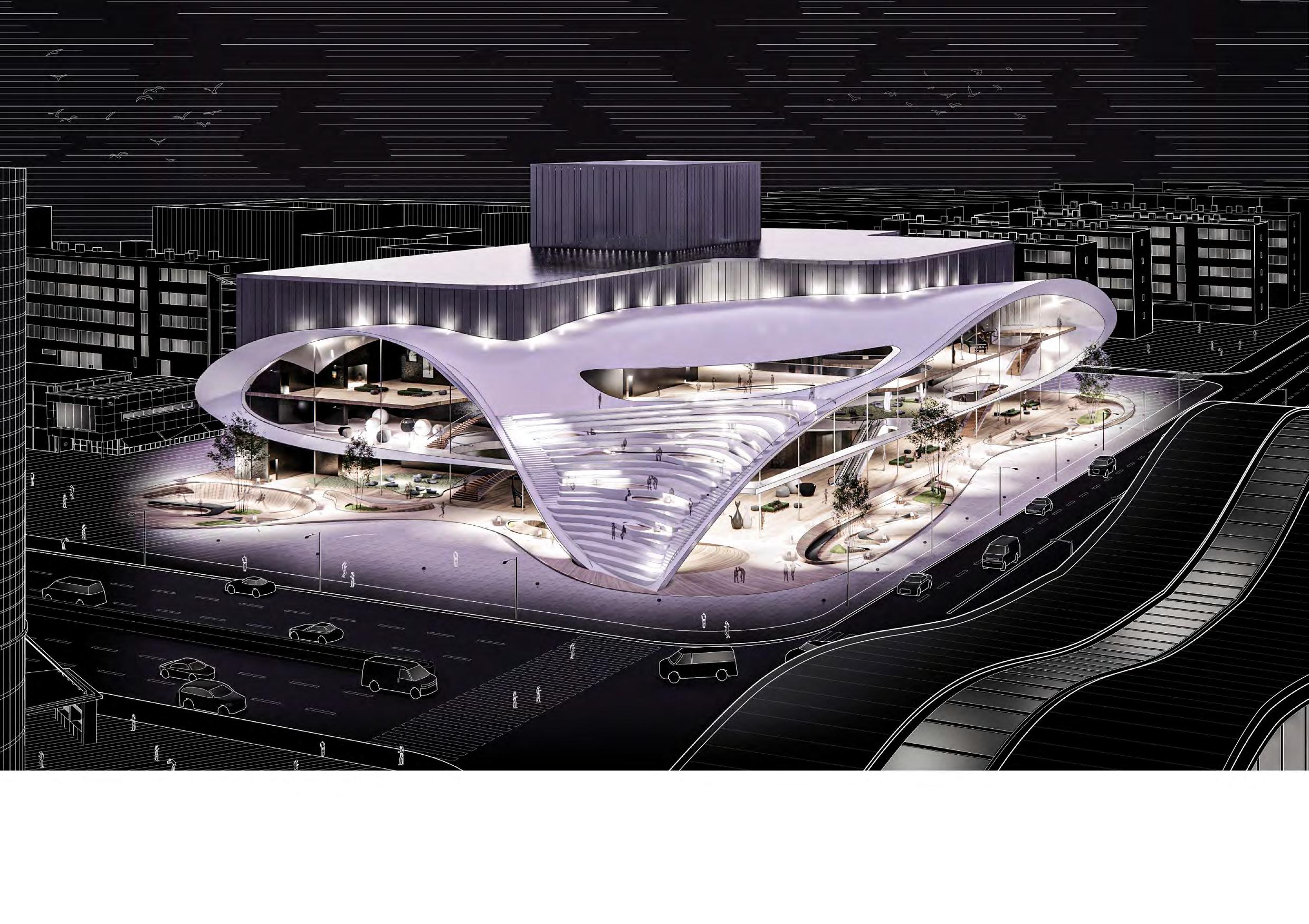
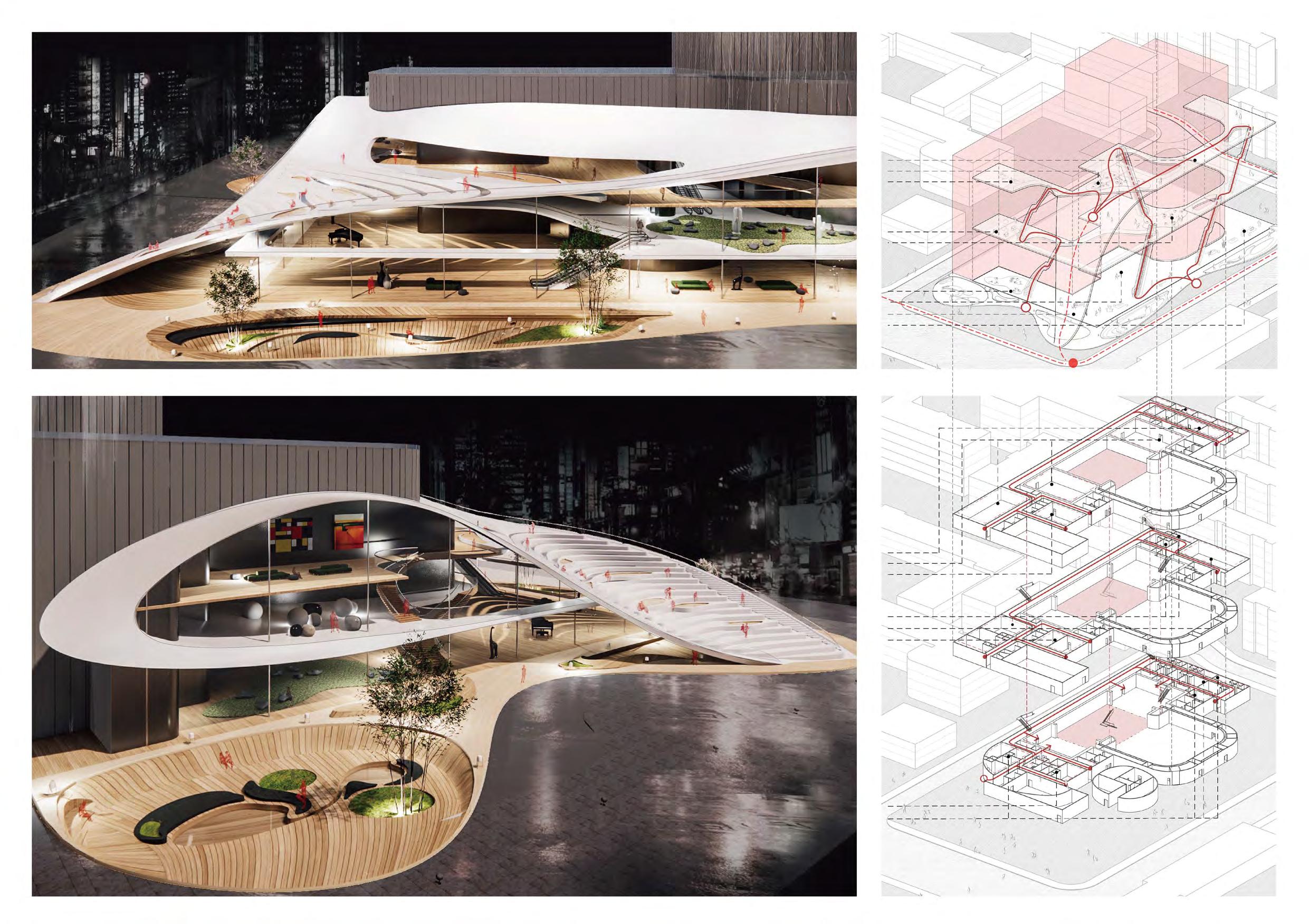
In OMA’s unrealized proposal of Guangzhou Opera House, Koolhaas challenged this separa�on. However, I decide to do the opposite thing – take the separa�on to an extreme. In my design, the public part and the non-public part are explicitly marked by two volumes that are dis�nc�vely different – the former wrapped in a white envelope, and the la�er hidden in a dark, double-layer skin.

North & West Facade South & East Facade South & East Facade Entrance Roof Entrance? Private Interface Public Interface Public Interface? Roof Metro Line Private Interface Public Interface Crossroads
Shopping Center Food Court Pocket Garden Metro Sta�on Sta�on Plaza private private crossroads public public public
Arterial
Roads Within Block
plaza plaza plaza plaza entrance
Roads
Forming Process Publicity and Privacy 11
Front of House
F3 +11.00m
Foyer for Auditorium 3rd Floor Entrance Lobby Exhibi�on Area
F2 +5.50m Entertainment Area Foyer for Auditorium
F1 ±0.00m
Cafeteria Audience Service Entrance Lobby Gallery
Back of House
F3 +11.00m
Staff Office Rehearsal Room Props Room
F2 +5.50m
Dressing Room Props Room Rehearsal Room
F1 +1.00m
Props Room Dressing Room
The Division
The
white envelope that wraps up the en�re front of house forms a showcase on the south and east facade of the building, and part of it has become the staircase leading to the entrance on the 3rd floor. From The south and east facade of the building visitors could see the crossroads, and people from the crossroads could equally see them. The transparent glazing allows the foyer to be an interface of the city.
12
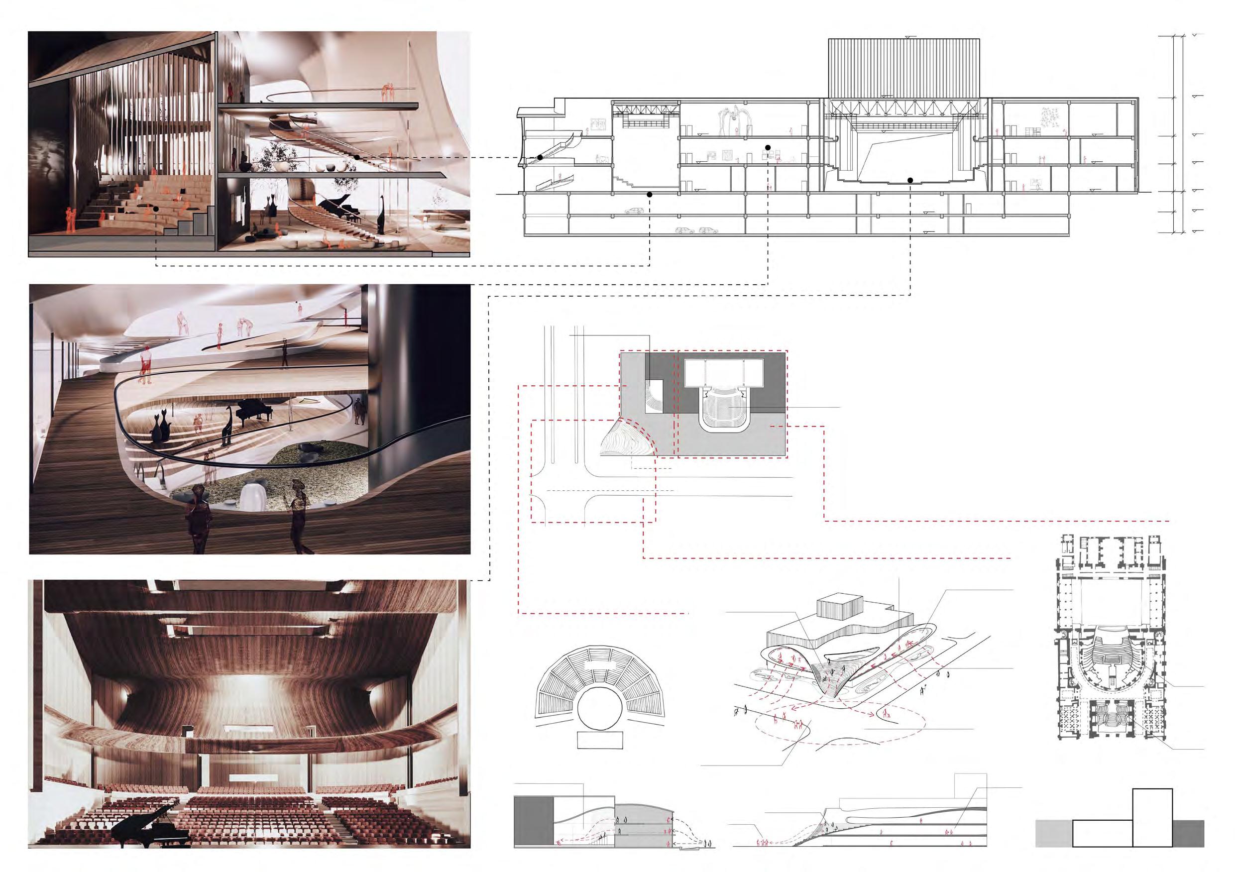
The back of house is enclosed in a more humble volume. Between it and the front of house are two auditoriums – a standard auditorium and an experi-mental auditorium.
Analysis of two Sets of Flows
I hope to make the public part more public while providing more in�macy for the non-publice part through the dis�nc�ve forms of the building, emphasizing the dis�nc�on between the two. However, the auditoriums become where the two parts intersect. The division that I insist throughout the project generates two sets of flows – one for the audience and one for the staff/performers - that intersect at the auditoriums, where the audience finally meet the performers.

Cloakroom Foyer Balcony Stalls Audience Staff House Back of House Front of House Lobby Auditorium Stage Gallery Props Room Rehearsal Rooms Offices Dressing Room Cafeteria Entertainment Shops Cloak Room Plenum Room Front Side Pit Understage Fly Tower 1 Cloakroom 2 REGIE 3 Plenum Room 4 Seat Storage Room 5 Storage Room 6 Orchestra Lounge 7 Corridor 8 Foyer 9 Front Side 10 Fly Tower 11 Understage Sec�on A-A 1:600 1 3 4 5 5 8 31.400 18.800 31.400 11.000 5.500 1.000 -4.100 -8.200 12.600 4.200 7.600 5.500 5.500 4.100 4.100 4.500 18.800 14.600 11.000 5.500 ±0.000 -4.100 -8.200 -12.700 9 10 11 6 7 7 2 2 AUDIENCE’S VIEW FIRSTFACELIGHT SECONDFACELIGHT
Intersec�on
The
13
the Prototype
The building consists of two auditoriums – a standard auditorium and an experimental auditorium. Their design derives from the prototypes of the classical thrust theater and the ancient Greek theater respec�vely.
There is actually a third auditorium in the building - the staircase on the white envelope of the building – with the city as the stage/performers and people on the staircase as the audience. Its design also comes from the Greek prototype: an outdoor space where people gather and observe the performers - in this case, the city itself. I perceive the public part of the building as another auditorium in which the architecture and the city interact, and such interac�on is realized through the building’s form and the spaces generated by the form.
Sec�on B-B 1:600 Standard Theater -the Classical Thrust Type Experimental Theater -the Greek type Orchestra Stage Foyer Chamber Staircases Parodos Parodos Theatron Skene Front of House as auditorium of the city -the Interac�ve Type Interior - Foyer Sec�on - Experimental Theater Interior - Auditorium 31.400 18.800 11.600 31.400 12.600 7.600 31.400 5.500 5.500 4.100 4.100 8.200 18.800 11.000 5.500 ±0.000 11.000 5.500 ±0.000 11.000 5.500 ±0.000 -4.100 -8.200 -4.100 -8.200 BACK OF HOUSE FRONT OF HOUSE AUDITORIUM STAGE BACK OF HOUSE FRONT OF HOUSE OUTDOOR STAIRCASE - AUDITORIUM OF THE CITY? Standard Auditorium Experimental Auditorium CITY STAGE? STAGE FRONT OF HOUSE BACK OF HOUSE Foyer as stage?
- as performers? Passersby - as performers? City - as auditorium? City - as stage? Staircase - as auditorium? Staircases display/observe City - display/observe Foyer display BACK OF HOUSE FRONT OF HOUSE Experimental Theater
Audience
Source Modified and redrawn by me. Aquileana. (2016). Parts of a Greek Theater [Online image]. La Audacia de Aquiles. h�ps://aquileana.wordpress.com Source Modified and redrawn by me. Plan of Palais Garnier [Online image]. (2020)Theatre Database. h�ps://www.theatre-architecture.eu/ 14

Site Plan 1:2000 20km15 0 10 UNDERGROUND PARKING ENTRANCE & EXIT STAFF ENTRANCE STAFF ENTRANCE B B A A STAFF ENTRANCE DELIVERY ENTRANCE MAIN ENTRANCE PUBLIC ENTRANCE PUBLIC ENTRANCE (3rd floor) West Facade 1:900 East Facade 1:900 South Facade 1:900 +31.40 +18.80 +31.40 +18.80 +14.60 +11.00 Twisted Louvers of North & West +31.40 Inner Facade Coa�ng Twisted Louvers +18.80 1F Plan 1:500 1 Entrance Lobby 2 Cafeteria 3 Gallery 4 VIP Lounge 5 Shop 6 Video Shop 7 Box Office 8 Cloakroom 9 Experimental auditorium 10 Elec. 11 Staff Office 12 Instrument Storage Room 13 Delivery Deck 14 Props Room 15 Wai�ng Hall 16 Stage Changing 1 4 5 UNDERGROUND PARKING ENTRANCE & EXIT STAFF ENTRANCE 2 8 13 +1.00 ±0.00 +1.00 14 12 15 16 8 10 10 11 11 7 6 8 3 A A STAFF ENTRANCE STAFF ENTRANCE DELIVERY ENTRANCE MAIN ENTRANCE PUBLIC ENTRANCE 20m 15 010 North Facade 1:900 +31.40 +18.80 +14.60 15

VOID VOID 2F Plan 1:600 1 REGIE 2 Elec. 3 Staff Office 4 Props Room 5 Piano Rehearsal Room 6 Custom Storage Room 7 Audio Equipment Storage Room 8 Dance Rehearsal Room 9 Experimental auditorium 10 Entertainment Area 1 2 3 3 6 9 7 4 4 8 5 5 5 10 2 VOID 3 6 7 8 1 1 1 2 2 55 444 44 4 4 4 4 4 VOID VOID 3F Plan 1:600 1 Rehearsal Room 2 Props Room 3 Custom Storage Room 4 Staff Office 5 Mee�ng Room 6 REGIE 7 Exhibi�on Area 8 3rd Floor Entrance Lobby PUBLIC ENTRANCE 10m 7.5 05 B2 Plan 1:1400 1 HVAC Machanic Room 2 Plumbing Room 3 Mechanic Room 4 Storage Room 5 Orchestra Pit 1 2 3 45 4 1 B1 Plan 1:1400 1 HVAC Mechanic Room Void 2 Electrical Room 3 Conductor Lounge 4 Orchestra Lounge 5 Instrument Storage Room 6 Seat Storage Room 7 Orchestra Pit 8 Staff Office 1 1 2 3 4 6 7 8 8 8 UNDERGROUND PARKING ENTRANCE & EXIT 16
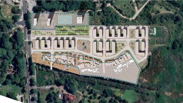
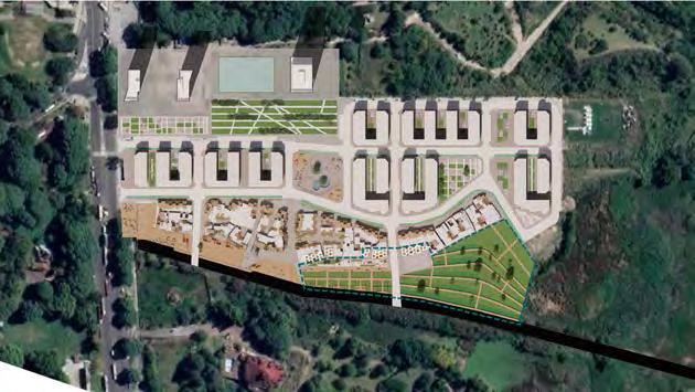
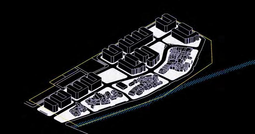
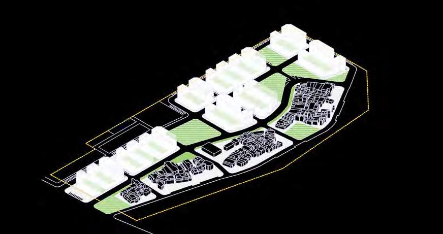
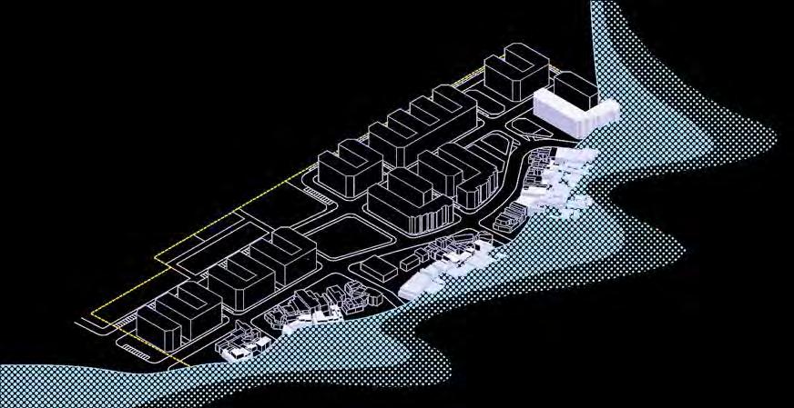
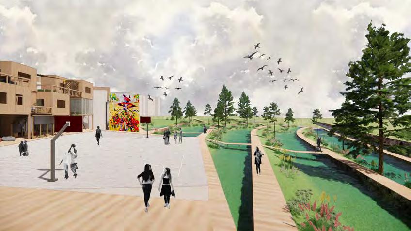
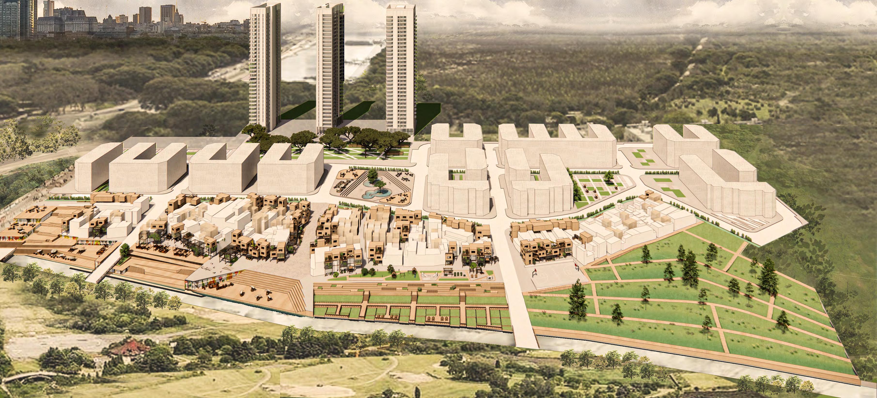
Rodrigo Bueno is an informal se�lement located on the east coast of Buenos Aires that suffers from environmental threats, social exclusion, and economic discrepancy. It is projected that the en�re southern part of the se�lement will be subject to flooding within 25 years. Though the government has implemented chunks of social housing, more than half of the community is s�ll le� in informal housing with deteriorat ed outlooks, overcrowded popula�ons, and insufficient public spaces and ameni�es. However, an approximately 30% increase in the number of residents in Rodrigo Bueno is expected due to migra�on and climate refugees in the foreseeable future.
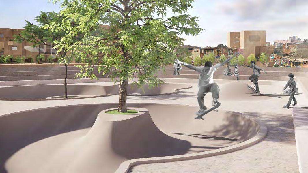
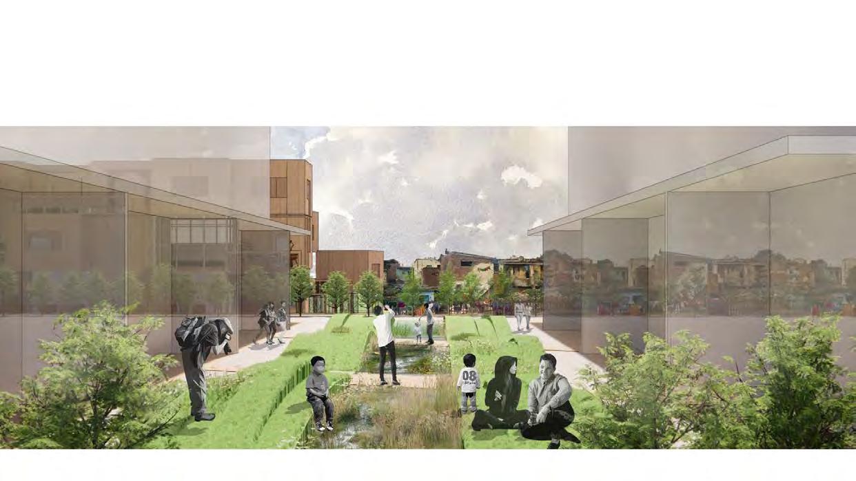
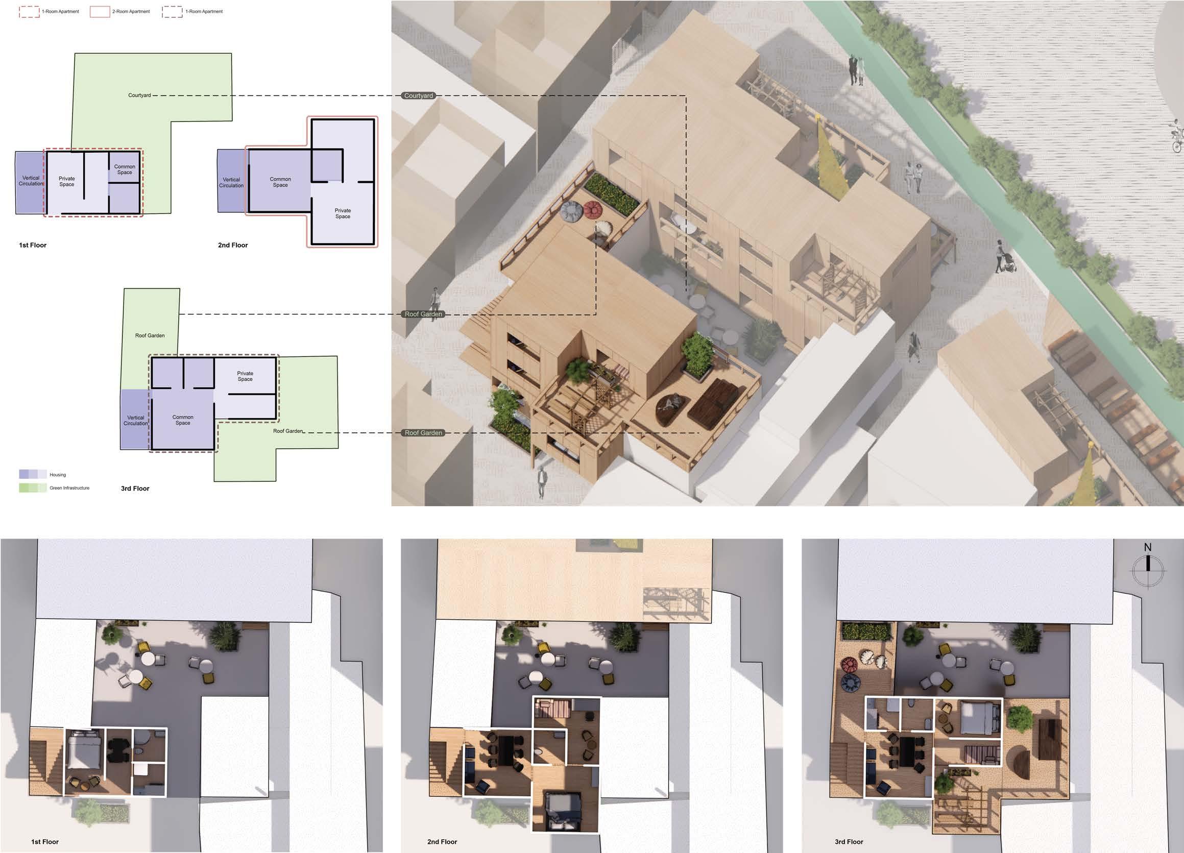
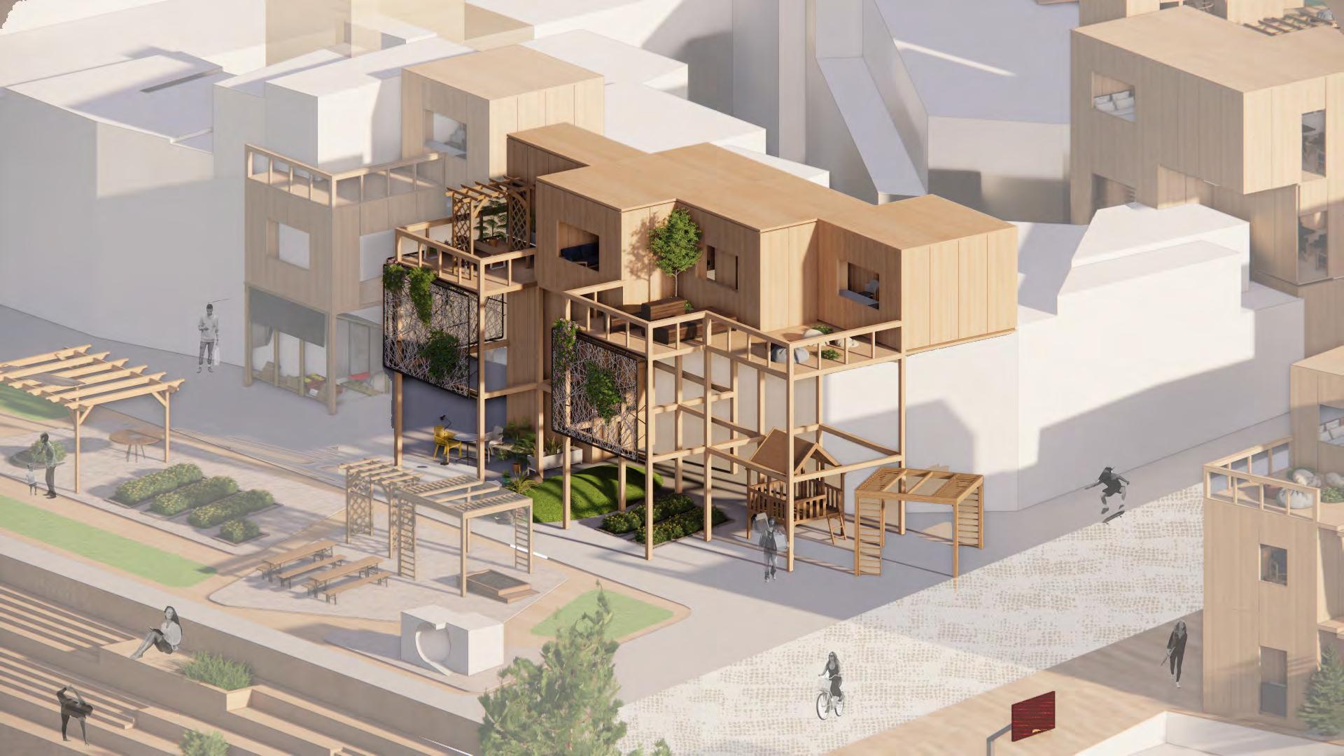
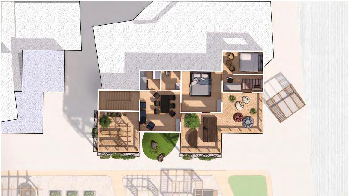
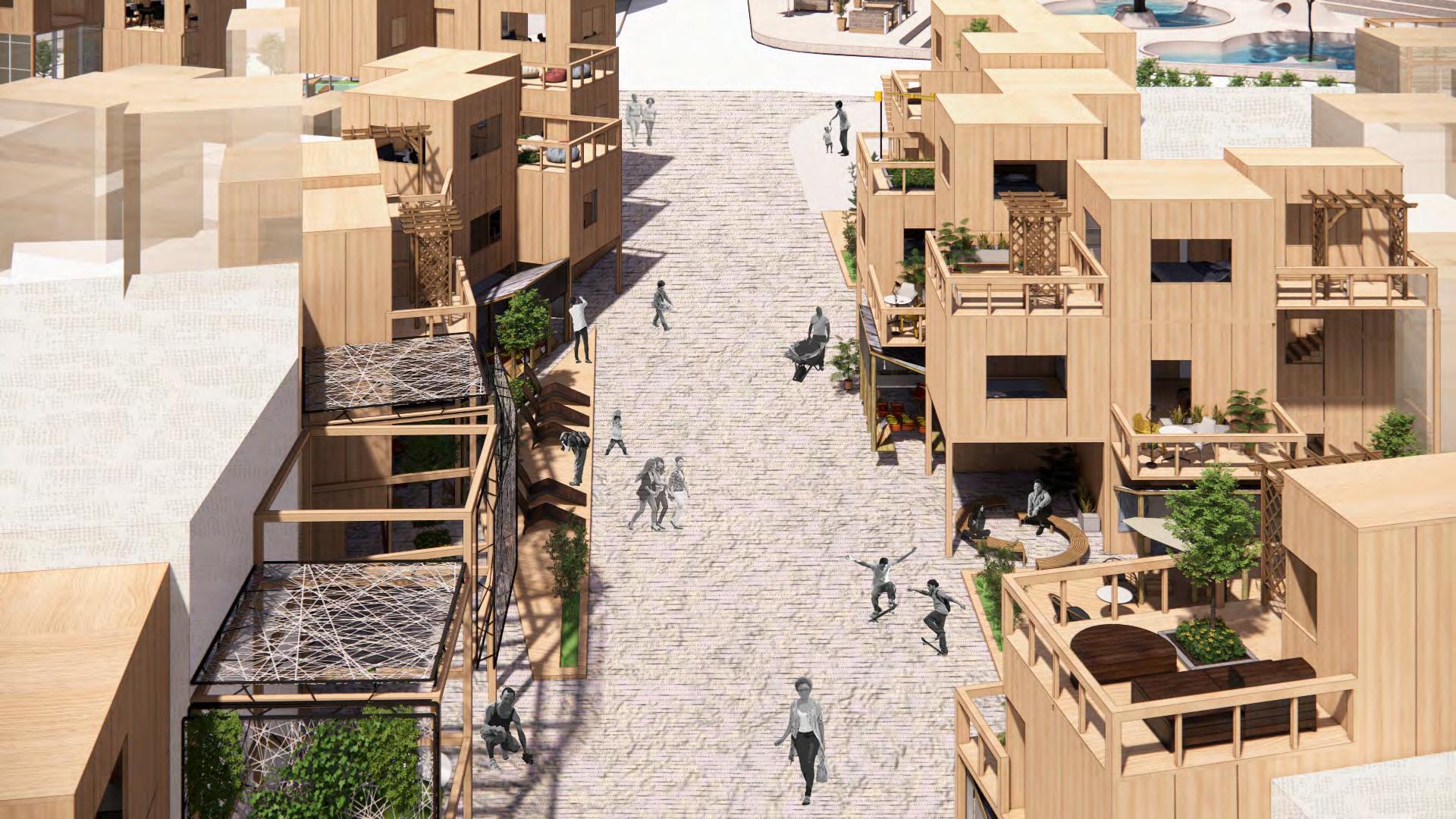
Confronted with the above dilemma, we propose a synthe�c regenera�on scheme for Rodrigo Bueno envisioning a more inclusive, resilient, and self-sustaining future for the community. Acknowledging that the southern part is prone to future flooding and the trending need for incoming migrants, we implement an incremental modular housing strategy to build both transi�onal and permanent prefabricated housing units that can easily adapt to the changing needs of residents with environmental-friendly materials.
The project will be developed in 3 phases considering the financial and labor constraints. In phase 1, the shared street, courtyards, floodable park as well as plaza will be developed as priori�es to improve infrastructure and generate more income. In phase 2, incremental housing units will be added. And when the densified housing units are ready, in phase 3, we will move residents in the southern part to their new homes. A�er demoli�on and cleaning up, new programs will be introduced to ac�vate the waterfront.
Low Cost, Low Carbon, High Density, High Resilience: a Modular Approach for Informal

Instructor: Felipe Vera, Soledad Pa�no
Teaching Assistant: Rolando Girodengo
Teammate: Siqi (Joyce) Zhu
Project Loca�on: Buenos Aires, Argen�na From

Se�lement
Upgrade in Buenos Aires
the op�on studio
LATIN AMERICA IN TRANSITION: Ecological Design for Se�lements & Climate Migra�on in Argen�na”, Fall 2022, at Harvard University Graduate School of Design
“STU 1505:
PHASE 1 PHASE 2 PHASE 3 Shared Street 3YR Phase 1 Housing 1YR Sponge Slope 2YR Je�y 3YR Riverfront Plaza 2YR Amphitheater 1YR Phase 2 Housing 3YR Phase 3 Housing 5-10YR Floodable Park 1YR Plazas 1YR Courtyard & Swales 3YR Country of Des�na�on Country of Origin Argen�na Cuba Bolivia Chile Colombia Dominican Republic Ecuador Guatemala Hai� Mexico Nicaragua Panama Peru Venezuela Dominican Republic Brazil Costa Rica Cuba El Salvador Honduras Paraguay Uruguay Hai� Belize Costa Rica Belize El Salvador Guatemala Honduras Mexico Nicaragua Panama Argen�na Bolivia Brazil Chile Colombia Ecuador Paraguay Peru Uruguay Venezuela 1995 1990 20002005201020152020 2025 20302035204020452050 Projected Percentage: 6.2 % Growth Rate: + 1.2% Projected Total Number: 3.8M Growth Rate: + 1.5M 5% 2.3 M 0 2.4 M 1.8 M 4.0 M 3.2 M 1.2 M 0.6 M 8% 6% 4% 2% Total number of migrants Migrant stock (% of total popula�on) 2016 20022009 2016 20022009 2016 20022009 Growth of Families: +320% Growth of Housing: +164% Growth of Popula�on: +329% 0 500 1,000 1,500 2,000 2,500 3,000 563 237 764 996 620 2139 2665 492 213 1.0 1.1 1.2 1.3 1.4 1.5 1.6 1.2 2.0 2.1 3.0 3.1 3.2 3.3 3.4 1.3 1.2 1.0 1.5 2.0 3.4 3.4 1.0 Shared Street 1.1 Floodable Park 1.2 Open Plazas 1.3 Ac�ve Courtyards 1.4 Biorenten�on Swales 1.5 Phase 1 Housing 1.6 Commercial Street PHASE 1 PLAN PHASE 2 PLAN PHASE 3 PLAN 2.0 Phase 2 Housing 2.1 Relocate and Clean the Waterfront 3.0 Phase 3 Housing 3.1 Riverfront Plaza 3.2 Amphitheater 3.3 The Je�y 3.4 Sponge Slope High Risk: 92 houses Moderare Risk: 38 houses Total: 130 houses nformal Se�lements: 305 houses Social Housing Units: 13 buildings Courtyards: 5449m Vacant Lots: 9375m 2 Streetscape: 1810m Total: 16634m 2 TIMELINE EXISTING CONDITIONS 50 YR FLOODING VOID PUBLIC SPACE PROMISING MIGRATION TREND

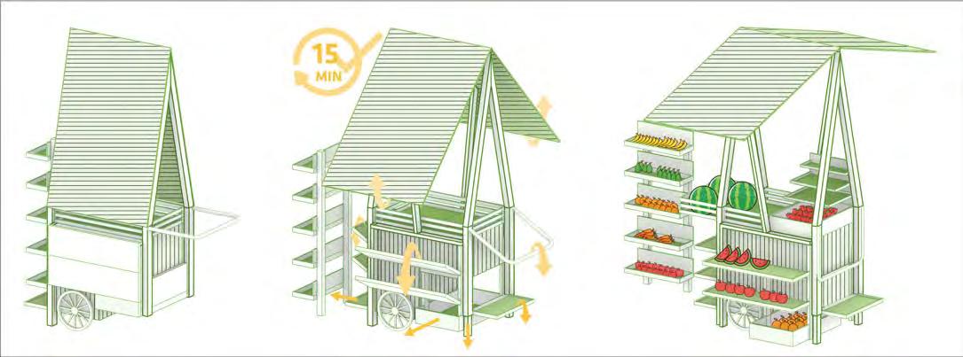


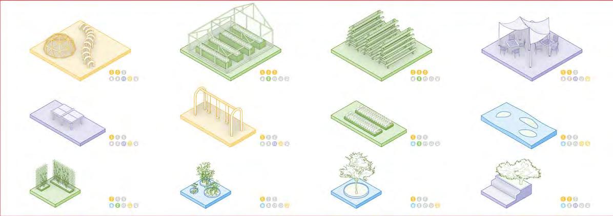
Shared Street 3YR Floodable Park 1YR Courtyard & Swales 3YR Plaza 1YR 1.3 1.2 1.4 1.4 1.0 1.1 1.3 Free Standing Shelf Foldable Canopy Foldable Shelves Display Basket Storage Foldable Handle Adjustable Posts Hidden drawer Adjustable Poles PUBLIC: OPEN STREET PLAZA FOR MULTIPLE USES PUBLIC: OPEN STREET PLAZA FOR MULTIPLE USES PUBLIC: OPEN STREET PLAZA FOR MULTIPLE USES PUBLIC: FLOODABLE PARK TO I NCRE AS E RE SI LIENC E SEMI-PUBLIC: BIORETENTION SWALES TO IN FILTRAT E STORM WATE R PRIVATE: AC TIV E COURTYARD TO IMP ROV E COMMUNI TY EN GAG EMEN T Fold and Move Easy to Set up Start your Business 6M x 6M 6M x 3M Playground Table Tennis Swing Set Farming Plots Grassy Dunes Trellis Planters Tree Pit Planter Bench Greenhouse Ver�cal Farming Outdoor Sea�ng 3M x 3M 1.1 1.2 1.4 1.3


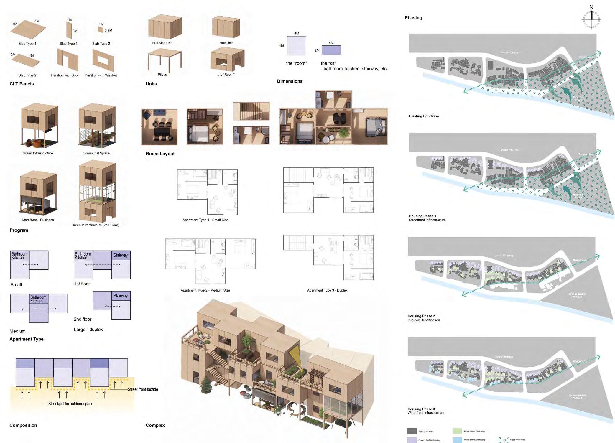
BASIC UNITS
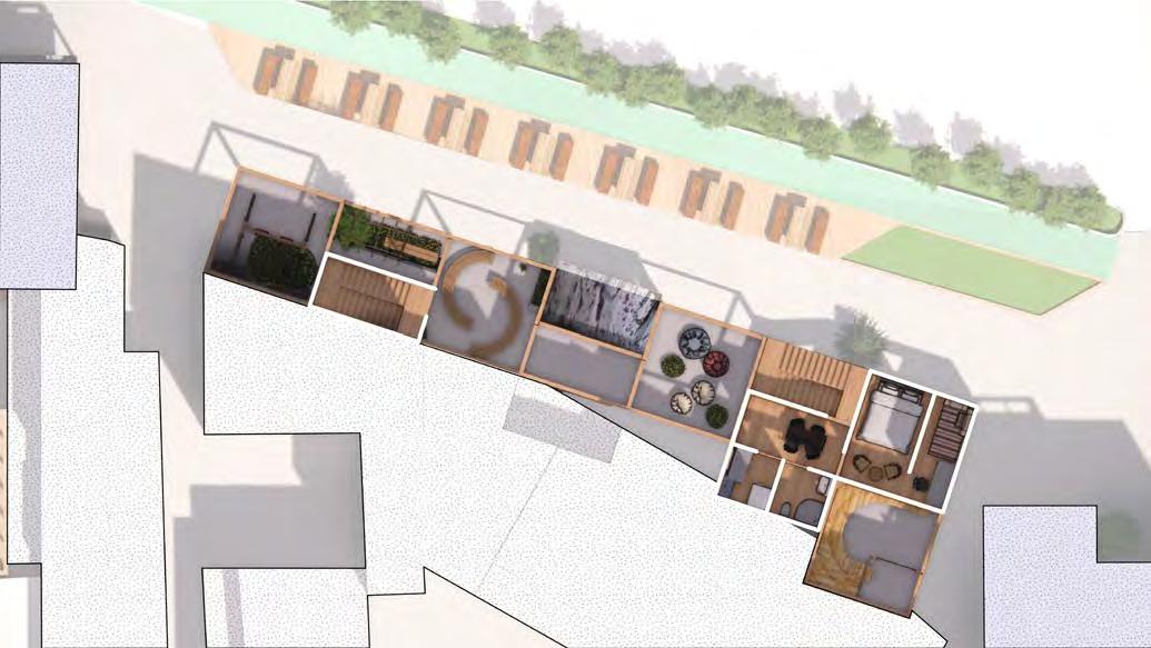


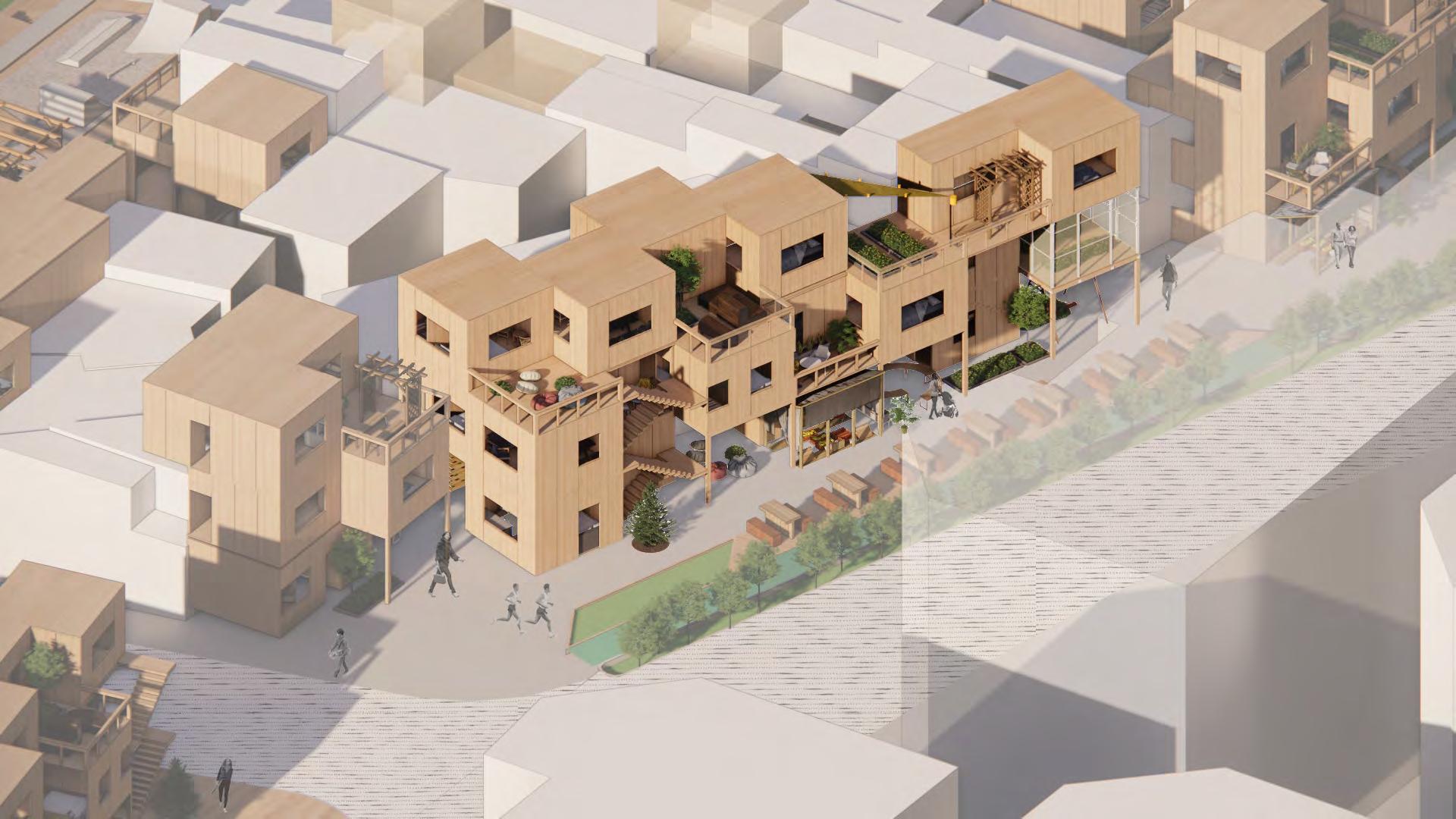

Ver�cal Circula�on Duplex Ver�cal Circula�on Common Space Private Space Private Space Level 2 2-Room Duplex 2-Room Apartment 3-Room Apartment 1-Room Apartment Private Space Shared Street Exis�ng Housing Housing Public/Commercial Green Infrastructure Ver�cal Circula�on Ver�cal Circula�on Common Space Common Space Green House Private Space Private Space Private Space Shared Street Exis�ng Housing Ver�cal Circula�on Ver�cal Circula�on Common Space Parklet Communal Space Communal Space Communal Space Communal Space Retail/ Business Private Space Shared Street Exis�ng Housing 1st Floor 2nd Floor 3rd Floor 1st Floor 2nd Floor 3rd Floor PHASE 1: HOUSING ALONG PUBLIC NETWORK 1.5 20


Sponge Slope 2YR Je�y 3YR Riverfront Plaza 2YR PHASE 2: IN-BLOCK HOUSING 2.0 21

2-Room Apartment Housing Public/Commercial Green Infrastructure Ver�cal Circula�on Common Space Private Space Waterfront Open Space Exis�ng Housing Ver�cal Circula�on Parklet Community Garden Communal Space Communal Space Waterfront Open Space Exis�ng Housing Parklet Community Garden Communal Space Communal Space 1st Floor 1st Floor 3rd Floor 3rd Floor Phase 1 Housing 1YR Phase 2 Housing 3YR Phase 3 Housing 5-10YR PHASE 3: WATERFRONT HOUSING 3.0 22



SPONGE SLOPE
Floodable Park 1.1
3.4
Commercial Street to Riverfront 1.6
JETTY 3.3
AMPHITHEATER 3.2
RIVERFRONT PLAZA 3.1

Scenario 1 - Not Flooded Amphitheater Plaza Amphitheater Sea�ng Riverfront Open Space Housing Water Remedia�on River Scenario 2 - Flooded Floodwater Sponge Stored Water Remedia�on Distribu�on Clean Water Household Water Remedia�on Flooded Plaza River Riverfront Open Space Housing Scenario 1 - Not Flooded Water Remedia�on River Sponge Slope Housing Scenario 2 - Flooded Floodwater Sponge Stored Water Remedia�on Distribu�on Clean Water Household Water Remedia�on River Sponge Slope Housing
the Bega (dry season)
the Belg (short rain season)
the Kiremt (long rain season)
Creek Commons: Reimagine Water as Coopera�ve Thread
Instructor: Prof. Marc Angelil
Teaching Assistant: Olani Ewunnet
Teammate: Yiyang Li
Project Loca�on: Addis Ababa, Ethiopia
From the op�on studio “STU 1603: Quo Vadis, Addis?”, Spring 2022, at Harvard University Graduate School of Design
1 2 3 4 5
Church Forest
flooding scenario
Flowerfield
Farmland
Restora�on Park
25
Marshland
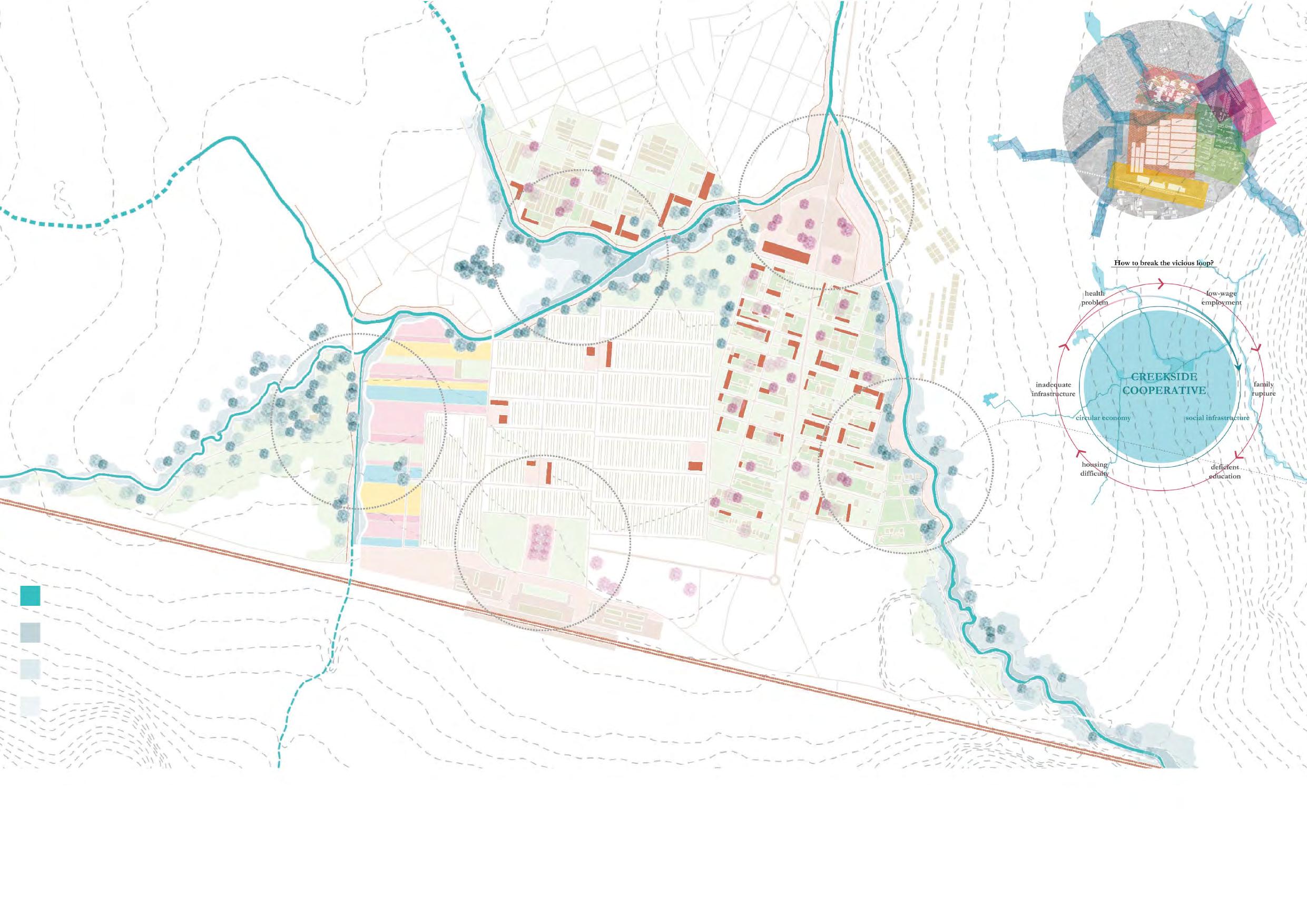
Reading the site as a spa�al text, Furi Lebu resembles the tex�le of heterogeneous mosaics, weaved together by one flowing thread - the creeks. We acknowledge the mul�-layered issues with the creeks of Addis Ababa: they are extremely polluted due to uncontrolled urbaniza�on, increasing migra�on, and inadequate sanita�on infrastructure. Government ac�ons remain controversial: Addis Ababa Riverside Project, led by Prime Minister Abiy Ahmed, is accused of “demolishing our shelters without any warning’’, causing displacement and disputes.
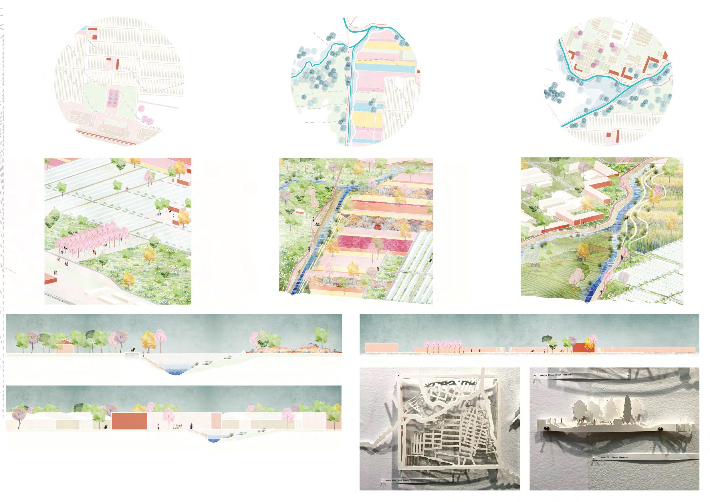
Node 1 Node 2 Node 3
Sec�on - Node 2
Sec�on - Node 3 1 Models - Plan & Sec�on (exhibited at the Druker Design Gallery, Harvard GSD)
Sec�on -
Node
As our site is dense with various se�lements and industries, the approaches we apply to the creeks are of fundamental importance. With reflec�on on the solu�on to local water problems, we propose to reimagine water as the catalyst that creates the virtuous cycle of creek commons. Our vision to establish a creekside coopera�ve aims to nourish the circular economy with three different scales of industries and social infrastructures located alongside the creek. We combine exis�ng and proposed programs to ac�vate the mul�ple produc�on models co-existent on our site, and to provide public infrastructures and spaces to the residents and workers of creek commons.
By imagining water as coopera�ve threads, we hope to reclaim the contested territory of waterfronts for the local community, both physically and conceptually. The vision of creek commons suggests that there could be autonomy within hegemony as long as we have a space to share collec�ve iden��es.

Node 4 Housing Densifica�on on Node 4 Node 5 Factory Trasforma�on on Node 5
27
Sec�on - Node 4
Bachelor’s Thesis - the Convergence of Art and Commerce in Contemporary Culture
Instructor: Prof. Mengzhen HAN
Individual design project

Site Research Collaborator: Xidian Wang, Yingying Zhou
Project Loca
Commercializing...
28
Consumerism in Contemporary Art or
The developments in greatly challenged the shopping, and online/virtue shopping has gained great popularity.
ART AND E-COMMERCE
the Icon of Art
Truss
intheConvergenceofArtandCommerce ContemporaryCulture
THE ROLE OF THE ARTIST
the Entrepreneur the Canonical Space for Displaying Art
SOCIAL MEDIA
becoming more similar to that of entrepreneurs, in examples such as Warhol and Pollock
THE EXPERIENCE OF THE CONSUMER
In the age of the social media, art consumers not only consume art wroks,
the Experience of “Shopping” the Experience of Apprecia
Prada Epicenter, New York, OMA, 2000-2001
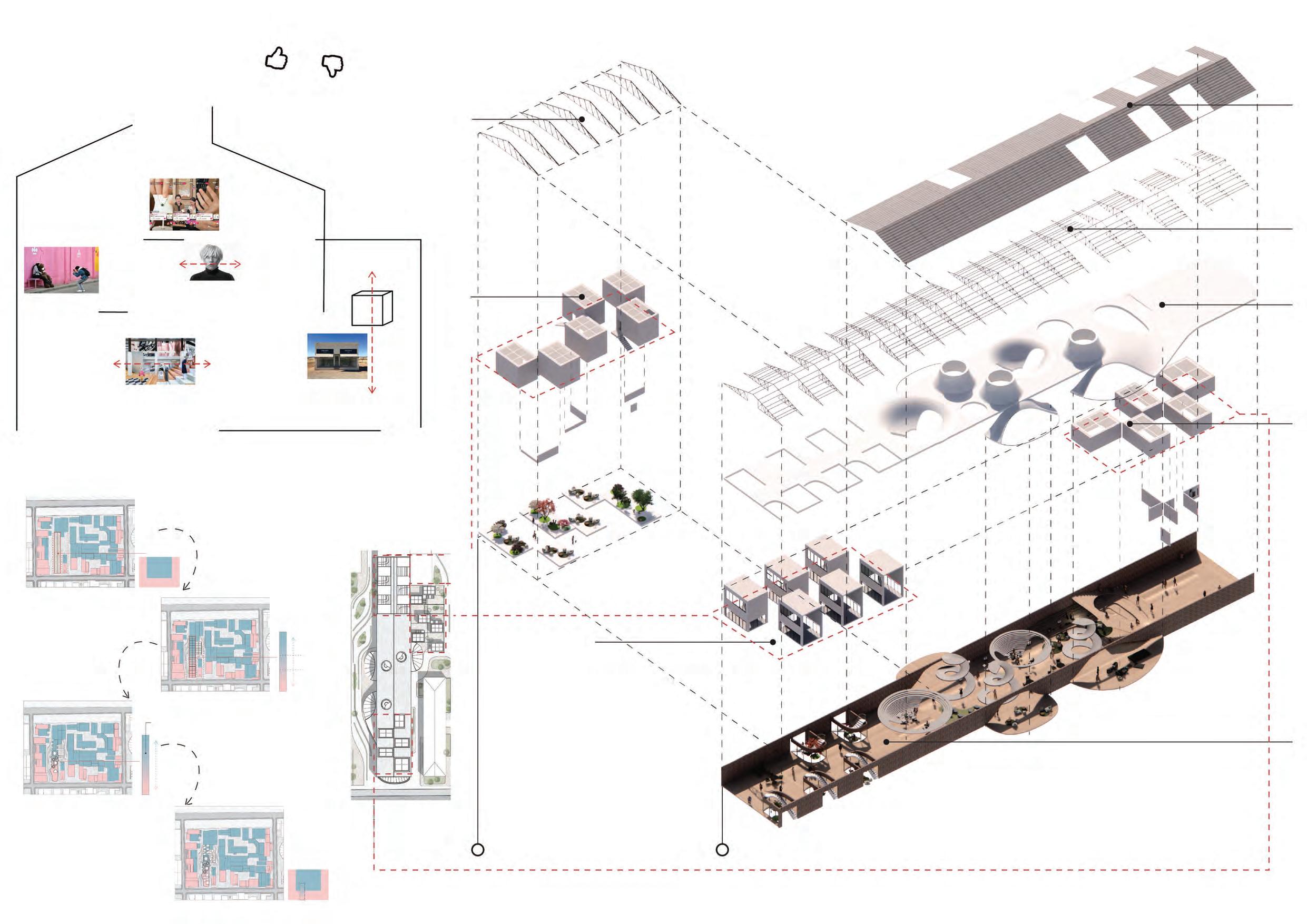
the “ the xperience” has become crucial
Spaces for art in consumer culture?
“the white cube” as an Exhibit itself
Prada Marfa, US 90,
Texas, Elmgreen and Dragset, 2005
the Neutral Space for Displa
System 1
SPACE
contemporary art, and aim to design spaces that speak to the radical changes contemporary art.
Site
The proposal studies the
Program Model
Based on the study programs, an idealenvisioned.
Transforma
Based on the model, an old factory building is converted into a two-story complex that realizes the transibeing produced to being
System 1
Approaches
Two systems are introduced to help with such -
?
Shed
Interior Truss Roof
Factory System 1 System 2
ConsumerisminBeijing 798ArtDistrict
29

Art Pr Commercializing... Art ConsumpBeing produced and refined Being discussed, experienced, evaluated Being consumed as c
White Cube for Live Streaming
Exterior
30
White Cube as Art Studio
The three sets of white cubes symbolize the convergence of art and commerce in contemporary culture.
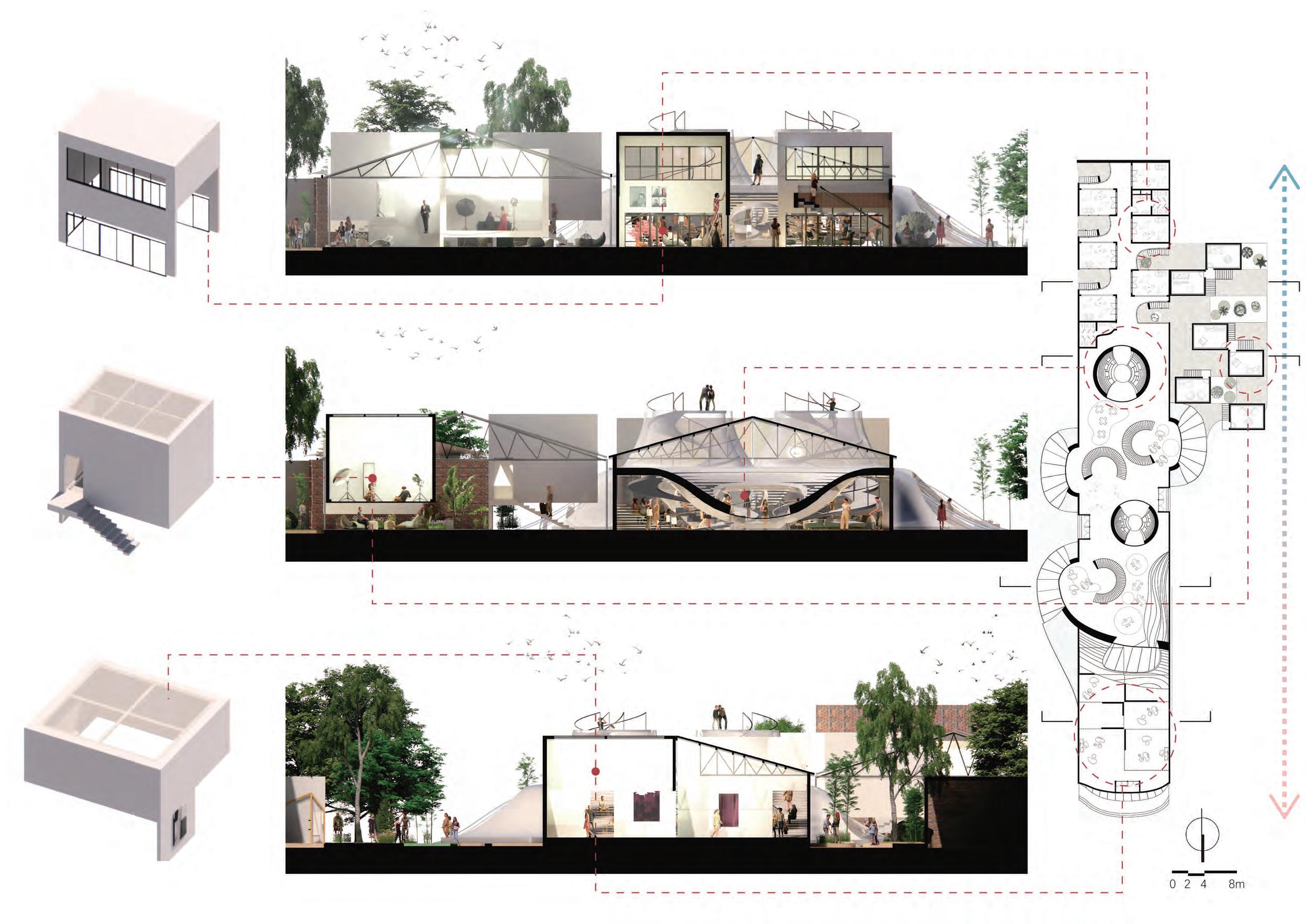 Type 1
Art Studio
A A
Type 2 Live Streaming Studio
1 -
B B C C D D 31
Type 3
System
the White Cubes
which art is produced, discussed, experienced and sold.

Pr Consump
White Cube
White Cube for Live Streaming White Cube as Art Studio Garden Watchtower
System 2 - the Con ace 32
White Cube for Live Streaming
beneath the Cube outside the Cube

2 Watchtowers 3 Space for audience experience 5 Live streaming studios 024 2 Common room 3 Space for audience experience 4 Cafeteria 5 Restaurant 6 Bar 7 Art studios 9 Restrooms 10 Live streaming studios Site Plan North Facade South Facade East Facade West Facade +1.50m Plan +4.50m Plan 33
Porosity, Sustainability and Well-being: Rethinking the Haussmann Block

Primary Instructor: Prof. Farshid Moussavi
Co-instructor: Yotam Ben Hur, Guillaume Choplain
Individual design project
Project Loca Paris
Section A-A (Perspective)
, Fall 2021, at Harvard University Graduate School of Design 34
the
The proposal speaks to several defects of the block of Paris: with the central communal space being a straight extrusion that serves only as
space, the Haussmann block lacks diversity in its outdoor spaces, and it is fresh air to penetrate.

10020 40
Improving accessibility to all vertical circulation cores on the ground level.
BMW MINI NEUBAUER Montmartre
Open Edge
Haussmann Block
Site the BMW MINI NEUBAUER Montmartre. facing the street, and the other three edges are not accessible to pedestrians.
Inaccessible Edges
Courtyard Vertical Circulation Core
Site Map Street View 1 Street View 2
Preserva es of the Orginal Structures
the Original Slab
Street View 3 1F 2F 4F 3F 5F the
Beams Want to Discard
erent
35
Interior of the Infrastructure 1 Interior of the Infrastructure 2 Haussmann Buildings of Paris
Original Beams
All
courtyards are organized around the vertical circulation cores. Each core is concatenated with de erent other cores by multiple courtyards on
di
levels.
Manifesto
All residents have the right to enjoy fresh air, adequate lights, plants, and amunal spaces.
Therefore, I propose to increase the porosity of the block and the diversity of public outdoor spaces, to counter the impermeable, homogeneous
By carefully placing a series of voids within the building - in contrast to the straight extrusion of a single Haussmann courtyard - the proposal increases the porosity of the block, the diversity of public outdoor space and light permeability.

10 05
Section A-A
Section A-A (Original)
Section B-B
B-B (Perspective)
Section B-B (Original) Section
Individual & Planetary Well-being
voids, as I believe that a crucial part of both individual and planetary well-being is to have public communal spaces with adequate plants. Walnut wood is used as a sustainable, durable material with a warm feeling for most parts of the new built infrastructures. It counters the cold tone of the remaining concrete materials.
the residents are introduced. On gardens that are accessible to pedestrians are created on the edge of the site that is adjacent to the street.
Voids
(Communal Space for Residents)
Roof Top Gardens
Voids
(Communal Space for Residents)
Pocket Gardens (Facing Rue Lamarck)

View of the Void 1 View of the Void 2 Street View 2 Street View 1 Pocket Garden 2 Pocket Garden 1 Rooftop Gardens View of the Void 3 37
10m05
Private Side
Public Side A
Unit Core
Unit Strategy
A/ No two units are the same
A-1/ Some apartments have one side facing the courtyard/edge, one side facing the core
A-2/ Other apartments have two sides facing the core
-Add one core within the unit that gets the sunlight
-Make it a duplex
Each apartment has at least one “open side” and one “private side”
B/ For layout - assigning each apartment unit with an open plan with one circular core in the middle that may be acts as the organizer of the apartment, and all the other funcions are arranged around the core.
the living room or the kitchen

A B
B
Interior Relatively Private Interior - Open Interior Private Operable Panels Fixed Panels Closed Circular Planter Open 1F 2F 4F 3F 5F 5 0 10m 38
the Rollberg Block
From the studio ‘Connector - Community’, Fall-Winter, 2018-2019, at Technical University of Berlin. Modified exlusively by me in November 2020 for this por�olio. Selected drawings are exclusively done by me.
Instructors: Prof. Lars Steffensen, Gesche Gerber, Mena Theißen, Esther Berkhoff
Collaborator: Noa Karmi
Contribu�on: design 50%, modeling 80%, diagram 60%
Project Loca�on: Rollberg, Neukölln, Berlin

39
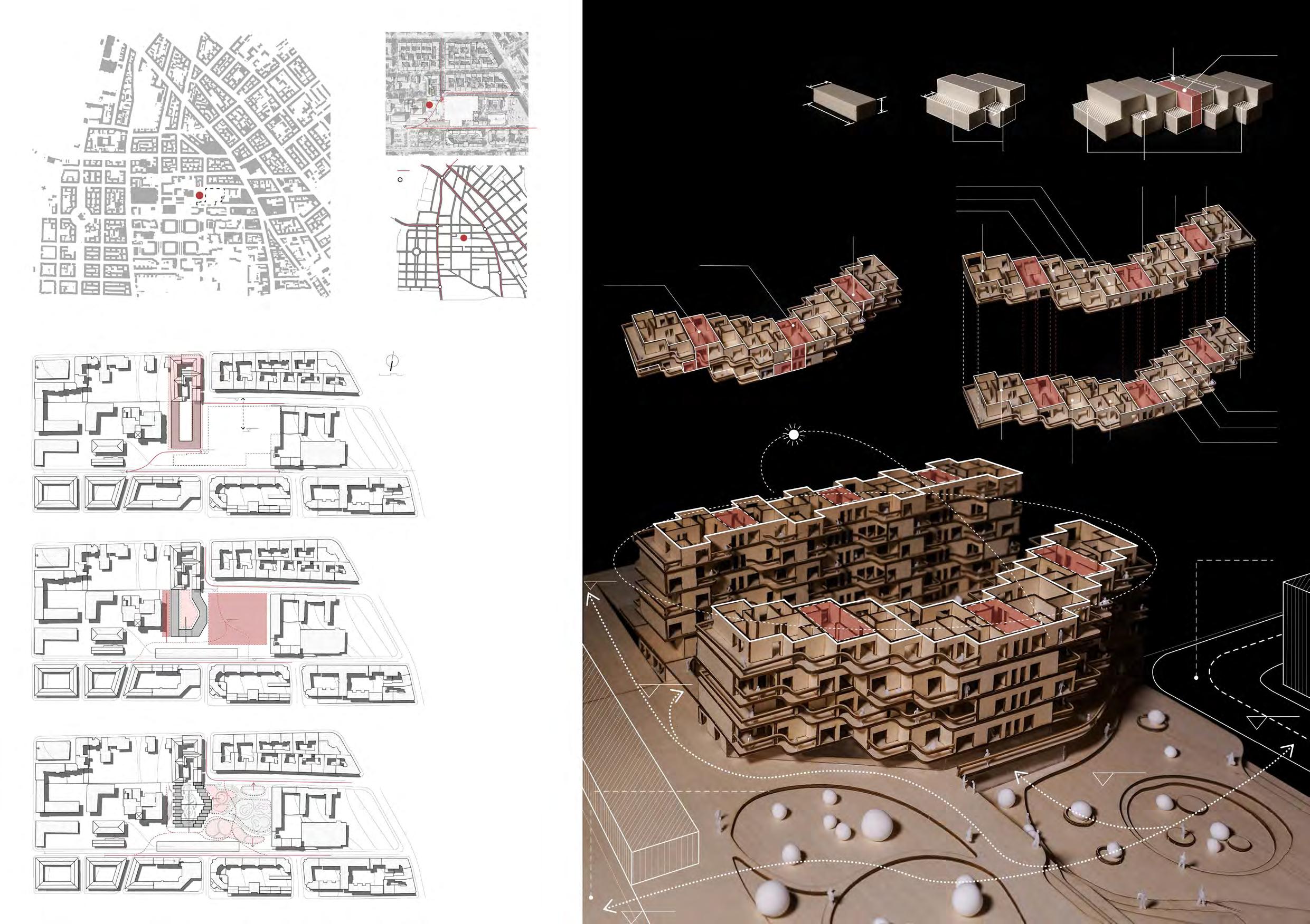
The project is situated on a slope that starts at a height of ±0.00m and ends at a height of +9.00m. We planned the project in accordance with the typology of other blocks in the neighborhood, placing a courtyard in the middle from which people enter the housing complex.

the Modules
Noa and I experimented on the dimensions of the housing modules with Styrofoam blocks. We decided to apply dimensions of 5×12×3.3 meters to the housing module, and dimensions of 6×9×3.3 meters to the transporta�on module. Each floor of a unit is composed of one housing module and 3 or 4 living modules, forming 2 or 3 different types of apartments respec�vely. Altogether 6 different types of apartments are formed through the placing of such modules.
The housing complex divides the site into 3 parts – the Rollberg Park, the inner courtyard and the lane between the block and the adjacent brewery, crea�ng spaces at various heights that stack together and bring about possibili�es of diverse spa�al experience.
We divided the housing complex into small units which we would further adjust and experiment on. We also designed the landscape of the park, the courtyard and the lane between the complex and the brewery.
ROLLBERG STREET NECKAR STREET BODDING STREET FLUGHAFEN STREET KARL-MARX STREET ISAR STREET +6.00 +6.00 ±0.00 ROLLBERG STREET NECKAR STREET ISAR STREET ROLLBERG STREET NECKAR STREET ISAR STREET ROLLBERG STREET NECKAR STREET ISAR STREET ROLLBERG PARK ±0.00+6.00) CENTRAL COURTYARD +6.00) SEMI-PRIVATE BREWERY LANE (+9.00) SEMI-PUBLIC PUBLIC +6.00 +6.00 +6.00 +2.00 +6.00 +6.00 ±0.00 ±0.00 ±0.00 ±0.00 +9.00 +9.00 City Main Road Railway Sta�on 20km15 3m 3m 6m 9m Balcony Transporta�on Module of Unit A Transporta�on Module of Unit B Transporta�on Module of Unit C FamilIy Apartment Couple Apartment Couple Apartment Couple Apartment Couple Apartment Single Apartment FamilIy Apartment II Single Apartment FamilIy Apartment II FamilIy Apartment FamilIy Apartment FamilIy Apartment FamilIy Apartment IFamilIy Apartment 5m 3.3m 12m Living Module Stack Unit of Apartments Balcony Neckar Street +9.00 ±0.00 +2.00 +6.00 +6.00 Rollberg Street Transporta�on Module Transporta�on Core
40

Skatepark SchwuZ Club Entrance Lobby Community Center Community Center Brewery Studio & Store Storage Rollberg Street
Rollberg Park & the West Facade of the Communit Center (public, accessible to all)
Courtyard of the Block (semi-private, shared between residents)
±0.00 +9.00 +6.00 +2.00 +4.00 +6.00 +4.50
Lane between the Brewery and the Block (public, accessible to all)
Entrance to Rollberg Park from Neckar Street
Brewery
Rollberg Street
Rollberg Park Rollberg Park
41
Neckar
Street
East Entrance to Rollberg Park from Rollberg Street West Entrance to Rollberg Park from Rollberg Street
Rollberg Street
Rollberg Park
Isar Street
Typology of the Berlin Blocks
We studied the typology of the Berlin blocks to design our Rollberg Block. A typical type of blocks is made up of rows of housing surrounding a courtyard. The ground floor of the housing complex accommodates the public func�ons –shops, restaurants and community services. The housing complex is divided into several units that consist of a variety of apartments, and can be entered from the inner courtyard.
In the Rollberg Block we acknowledged and u�lized this typology. We placed the inner courtyard at the +6.00m level, where residents could enter each of the 6 units of this housing complex. The public func�ons - the community center, the shops and the studios can be entered from either Rollberg Park or the Brewery Lane.

Digital Library Ver�cal Transporta�on (semi-public, shared between residents) Apartments (private) Community Center (public, accessible to all) Photography Studio IT Center Isar Street Neckar Street Rollberg Street Crea�ve Art Hub ±0.00 +2.50 +6.00 +9.00 Source Modified and redrawn by me. Plan of Block 31, Ri�erstrasse, Berlin; Ri�erstrassze Nord: Friedrichstadt, Architectural Review, 9 (1987): 5. Source Modified and redrawn by me. Axonometric view of Block 79, (b) 15 Adalbertstrasse, Berlin; Step by Step: Careful Urban Renewal in Kreuzberg, Berlin. Berlin S.T.E.R.N. GmbH, 1989. Site Plan 1:2500 40km30 Unit F Unit E Unit D Unit B Unit C Living Transporta�on Unit A Unit F Unit E Unit D Unit B Unit C Unit A Family Module Type A I I I I I III Couple Module IV Single Module II Family Module Type B II II III I III III III IV I I II III III IV IV I II I I III III IV VI Studio Module Type A V Studio Module Type B 20m 0 1510 +12.60, +19.80 Plan 1:550 +16.20, +23.40 Plan 1:550
Supermarket & Stores ±0.00 ±0.00 +6.00 42
ROLLBERGSTREET
the Hierarchy of Privacy
Knowing that approximately 50% of the Neukölln popula�on come from immigrant backgrounds I wonder how I could help the immigrants - and everybody else - blend into the community while obtaining a sense of privacy and security at the same �me.
My solu�on is to create a hierarchy of privacy, and assign each space of the block with a certain level of privacy: the community center on the ground floor as well as the stores and workshops facing the brewery are open to the public; the mee�ng rooms and storage rooms that can be entered from the semi-public courtyard are for all residents of the block; from the courtyard people get back to their homes - the private place they could keep to themselves. The balconies add a �nt of publicity to this privacy.

ROLLBERG
NECKARSTREET
+6.00 +6.60 +6.40 Unit F Unit E Unit D Unit B Unit C Unit A +5.40 +9.00 I II I I III III IV VI V VI VI VI V Living Transporta�on Family Module Type A III Couple Module IV Single Module II Family Module Type B VI Studio Module Type A V Studio Module Type B 10m 0 7.55 Interior Home Exterior Courtyard of the Block Community Center Storage Laundry Club Mee�ng Stores Workshops Rollberg Park Brewery Lane Ci�zens with immigrant background Ci�zens of only German ethnnic Middle Eastern origin European origin Others (East Asians, Americans, etc.) Afro-Germans 52% 45% 48% 16.5% 11% 27.5% As a woman from Turkish family, life in Berlin is quite parodoxical for me wish to blend in with the local community, but we also want more privacy at home. am Cigdem, a Turkish woman living in Neukölln. crave for more interac�ons with the local community, ge�ng to know people with similar cultural backgrounds as well as people who are different from us. hope to know our neighbors be�er. Semi-public shared with community Private living units Public shared with all Restaurants facing Neckar Street Public - Community Center Semi-Public Club Mee�ng Room Restaurants facing Neckar Street Community Center 1F Semi-Public Semi-Public Private Public Public Public the ‘Resident’ the ‘Visitor’ Community Center 2F Storage & Club Mee�ng Rooms Stores & Workshops Ver�cal Transporta�on Shops facing Rollberg Street and Rollberg Park
+6.00 +9.00 +9.00 +6.00 ±0.00 +2.00 +4.00 +4.50 +5.00
VOID 1 4 4 5 6 7 2 3 8 8 10 10 10 Community Center 1F (+2.50) 1:550 1 Foyer 2 Crea�ve Art Hub 3 Digital Library 4 Common Reading Area 5 Cubicle 6 Ladies’ Room 7 Men’s Room 8 BOH 9 Entrance Lobby & Informa�on Desk 10 Elevator Founda�on Pit Community Center 2F (+6.00) 1:550 1 Foyer 2 Photography Studio 3 IT Center 4 Common Area Staircases 5 Cubicle 6 Concierge Housing Units Ground Floor (+6.00) 1:550 1 Laundry 2 Beauty Salon 3 Storage 4 Club Mee�ng Room +9.00 Plan 1:550 Entrance of Block to SchwuZ Club 9 1 1 2 6 2 3 3 3 3 3 3 3 5 4 4 4 4 4 VOID +2.50 +2.00 +6.00 +6.00 +4.00 +4.00 +6.00 +5.00 +4.00 +4.00 +5.00 Source Modified by me. Wroe, D. et al. (2010). The streets of Neukölln: Has integra�on failed? [Online image]. the Local. h�ps://www.thelocal.de/ Balcony Facing Rollberg Park Balcony Facing the Courtyard 43

+6.00 Club Mee�ng Rooms Family Apartment I 120 sqm 2 adults & 2 children/ 3 adults & 1 child Couple Apartment 60 sqm, 2 adults Single Apartment 40 sqm, 1 adult Family Apartment II 80 sqm 2 adults & 1 child Studio Apartment I 25 sqm living area 35 sqm studio 1 adult Studio Apartment II 60 sqm living area 60 sqm studio 2 adults Storage Rooms Laundry +9.00 Apartments Stores & Workshops +12.00, +18.00 Apartments +15.00, +21.00 Apartments +2.50 Community Center F1 +6.00 Community Center F2 Neckar Street (±0.00 ) Rollberg Street
+9.00,+15.00 Apartments +12.00,+18.00 Apartments public semi-public (shared between residents) private +6.00 Courtyard for Residents +2.00 Rollberg Park +9.00 Brewery Lane 44
(+6.00)
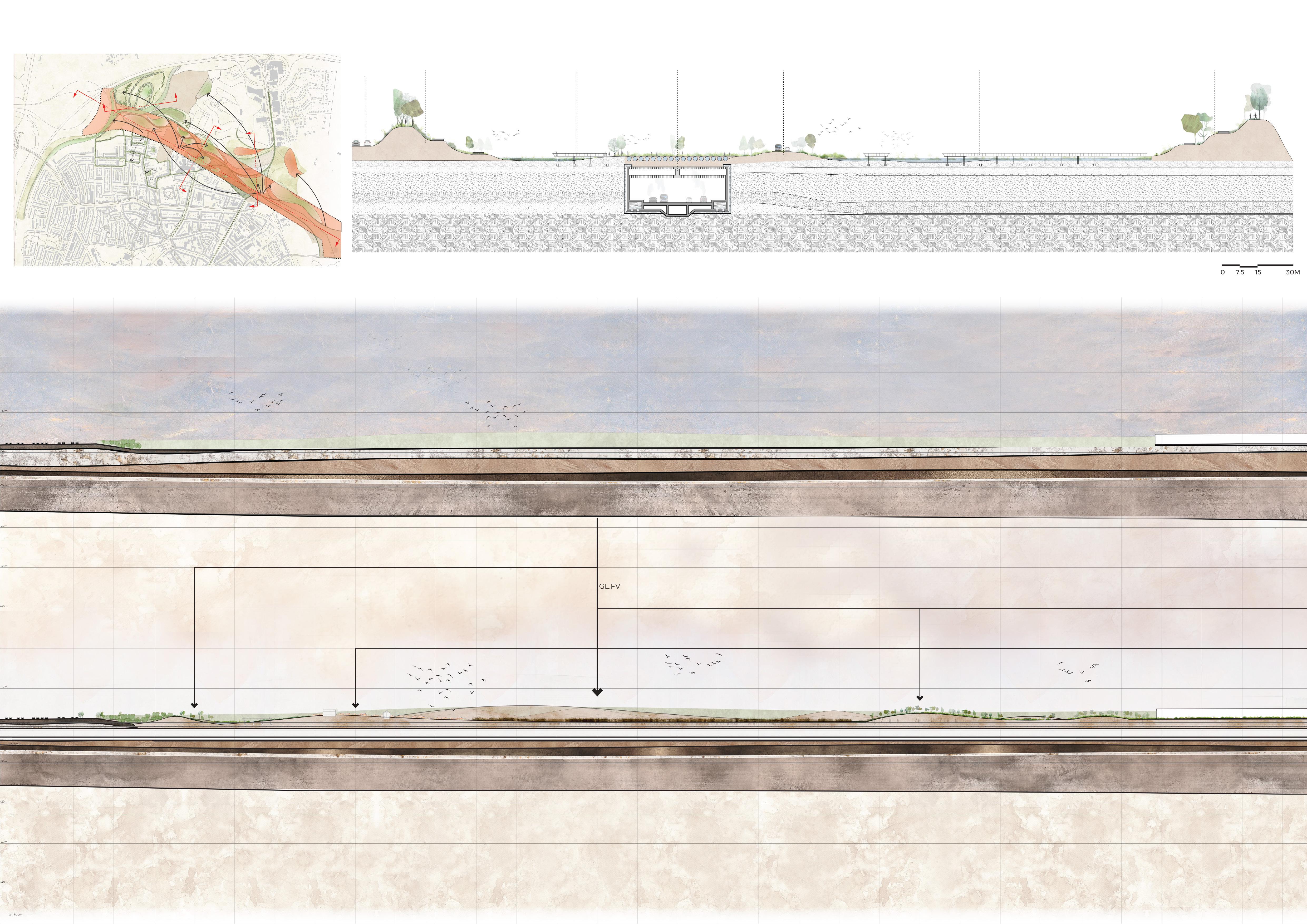
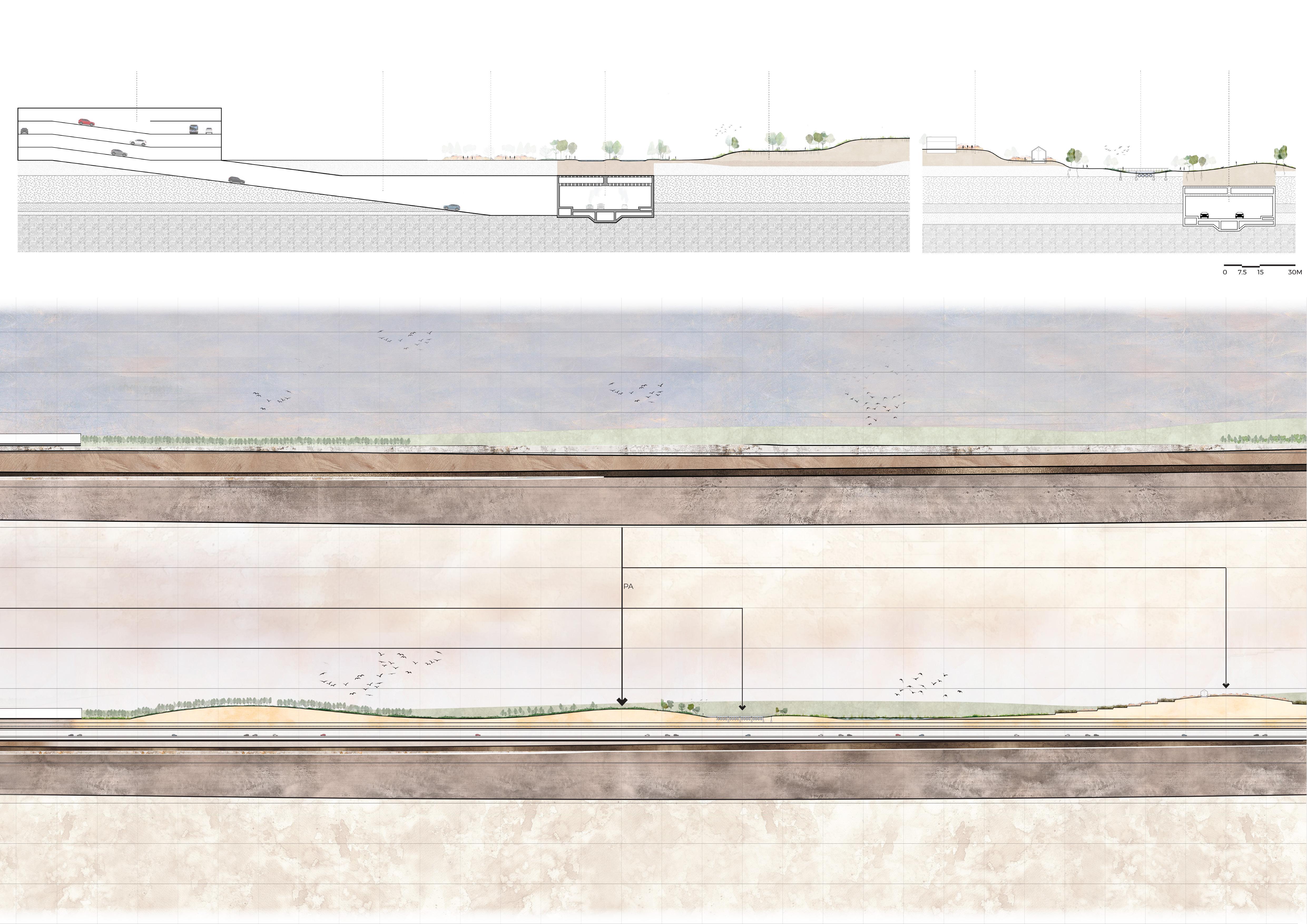
From Soil to Space is a landscape framework dedicated to allowing the soil to speak to the landscape above to create logical, informed, func�oning space for the people of Antwerp. The A102 is a massive underground highway excava�on project and will be displacing mul�ple square kilometers of undisturbed soils with highly diverse microbial communi�es. U�lizing soil as an impera�ve resource is therefore key for a successful design.
A�er excava�on, soils are placed strategically by type and substrate to create both a ver�cal and horizontal matrix. The ver�cal matrix relates to the underground highway, concerned with facilita�ng microbial bioremedia�on func�ons to sequester pollu�on being emi�ed from the cars. The horizontal matrix is concerned with u�lizing the deposi�on of soil types strategically to op�mize aboveground func�ons.
With From Soil to Space, these func�ons range from improved community garden and allotment space, a very popular exis�ng usage, to wellness parks with microclimate-controlling topographical devices, from noise cancelling berms, to improved water infiltra�on and flood preven�on techniques. This is all accomplished simply by observing the soil types and their quali�es and func�ons, and then placing them accordingly during the deposi�on process. The project sets a precedent for future underground and excava�on projects.
From Soil to Space
Instructor: Prof. Jungyoon Kim
Teaching Assistant: Lara Prebble
Teammate: Emily Menard
Project Loca�on: Merksem, Antwerp, Belgium
From the op�on studio “STU 1412: Below, Above, and Beyond: Future of Antwerp's Mobility and Public Space”, Spring 2023, at Harvard University Graduate School of Design

GL.FV SOIL TYPE ANALYSIS MAP SOIL-TYPE BASED LANDSCAPING Restored Wetland/Reten�on Ponds GL.FV Soil Forma�on PA Soil Forma�on PR.DY Soil Forma�on
Storm Water Infiltra�on Restored Watershed Park Water Filtra�on Landscape Train Line Filtra�on Buffer Allotment Gardens Agriculture Forest Grassland PA PR.DY
GL.FV PR.DY PA

CUT-FILL DIAGRAM TRAFFIC OVERPASS NOISE BUND NOISE BUND A102 ABOVE-GROUND SEGMENT WATERSHED PARK WATERSHED PARK A102 TUNNEL A B B C C D D A Sec�on B-B SECTION A-A -- BEFORE
A-A -- AFTER A102 EXCAVATION GL.FV CUT GL.FV CUT PA CUT
SECTION

AGRICULTURAL FIELDS HOSPITAL PARKING BUILDING ENTRANCE TO A102 WELLNESS PARK TERRACED ALLOTMENT GARDENS FORAGING PARK A102 TUNNEL A102 TUNNEL
Sec�on C-C
Sec�on D-D
Other Works Installa�on Design and Construc�on Visual Representa�on Computa�onal Design Publica�on Internship
(un)fold Installa�on Design & Construc�on

From the Construc�on Workshop at Tsinghua University, Summer 2017.
Instructor: Prof. Yong JIANG
Design team: me, Xinran HE, Jianan CHEN, Siyao CUI, Ziyu HUANG, Xiaowen LI, Shuang LIANG
Collaborators: Class A61 of the School of Architecture, Tsinghua University
Contribu�on: I first developed the design of the installa�on as a member of the design team. Upon the comple�on of its design, I built the 1:2 experimental model with the construc�on team, and finally par�cipated in construc�ng the installa�on.
Project Loca�on: Anshan Iron & Steel Group Co. Research Center, Changping District, Beijing
seats
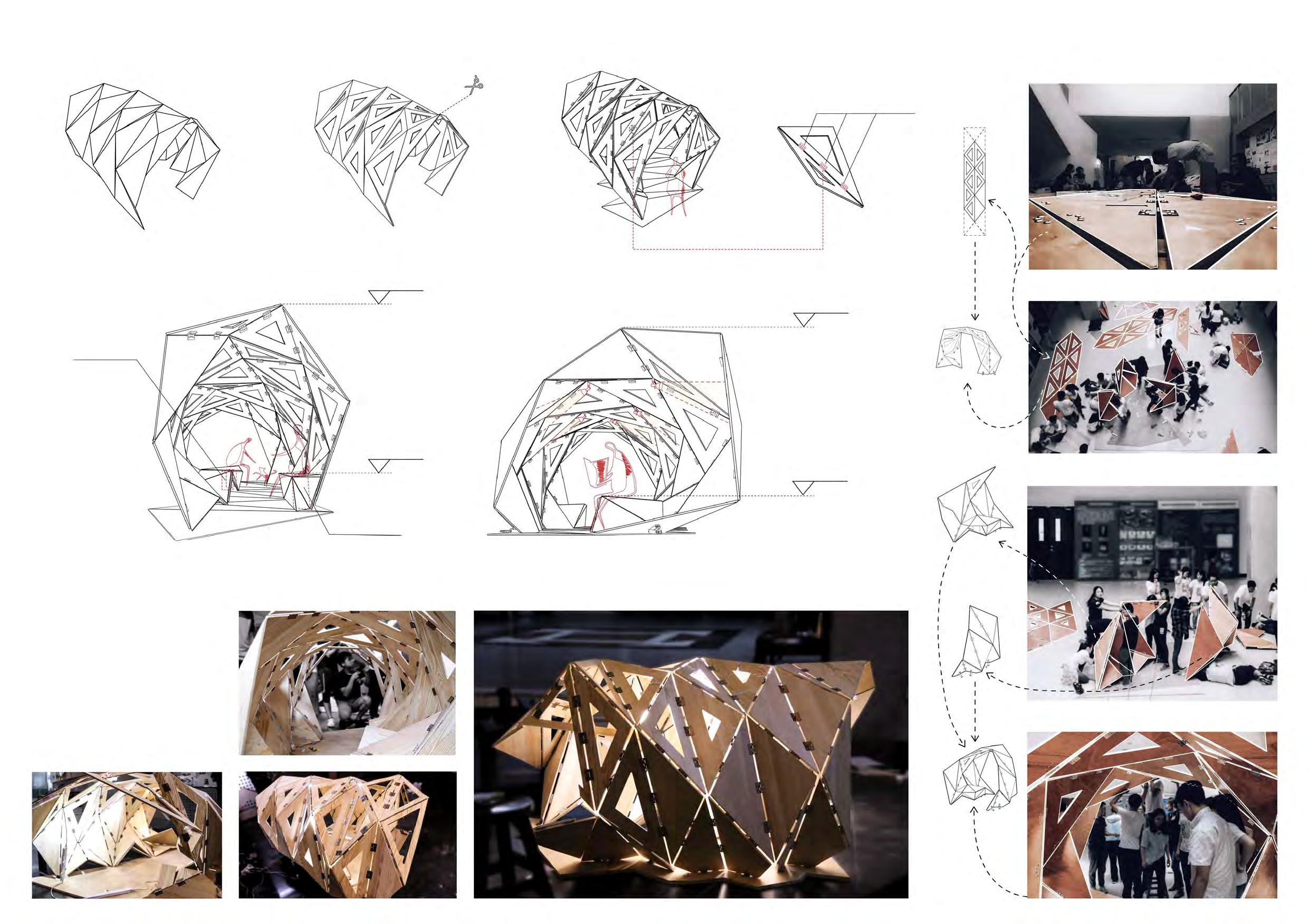
We experimented with a piece of A4 paper
seats
We folded it, then unfolded it.
We folded it in another direc�on, then unfolded it again
We rolled the paper up.
Sec�on A-A Sec�on B-B
lights
Sec�on C-C
46
II 1:2 Model Phase
To ascertain that the hinges could effec�vely bind the slabs together, and that the installa�on could actually support itself, we built an experimental model at a scale of 1:2 before we started the construc�on of the installa�on. We also tested out the ligh�ng design with the experimental model, and adjusted the dimensions of the triangular openings on each slab according to our test result.

Seats Seats +2.682 +0.475 +2.165 hinges +0.495 I Design Phase
III Construc�on Phase Sea�ng Ligh�ng
47
We completed the construc�on of the installa�on in the atrium of Anshan Iron & Steel Group Company’s research center. Although we got our inspira�on from folding a piece of A4 paper, we did not hope to build a sculpture, but an installa�on that would offer immersive spaces for people to stay in. We finally made the installa�on a pavilion, with the edges of the envelope transforming into seats, and lights penetra�ng through the triangular openings of the slabs.

4889 1620 1030 2671 2160 4195 Plan 1:60 Top View 1:60
+2.682 +2.682 +2.682 +2.165 +2.476 +2.476 +2.282 +2.282 +2.682 East Eleva�on 1:60 West Eleva�on 1:60 South Eleva�on 1:60 North Eleva�on 1:60 ±0.000 +2.165 +2.165 IV
48
Completed!
Instructor:
Instructor:

Visual Representa
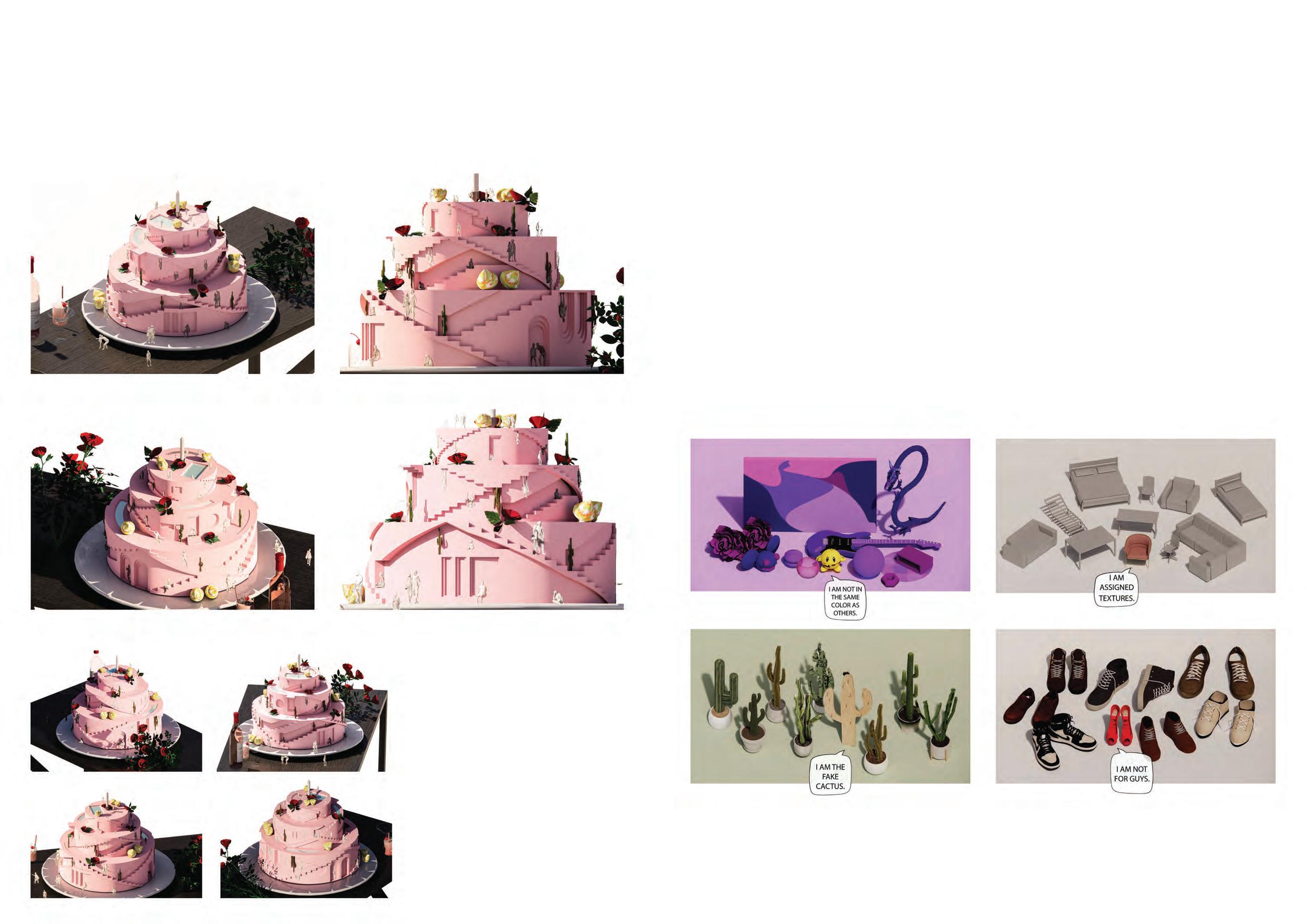
Frost A Cake
-
The cake is inspired by Ricardo Stairways and geometrical windows are recreated as bas-reliefs on the surfaces of the cake, and the color original work.
49
images express the feeling of “not belonging”.
Instructor:
Teammate: Sovona Ghatak
Using the technique of gel photography, Sovona and I played with foods and lights to create these photos. I took the experiment further to apply signs on these photos when processing them.
Instructor:

50
Instructor:
Teammate: Video Link: movements in nature.

Computa
Outcome 51
Recording Tachi Movements
Instructor:
Teammate:
Video Link: -
obtained from the previous step. Such spheres resemble the sand grains thating with diverse shapes and assigning them with various colors, we aimed to -

52
Instructor:
Teammate:
Video Link:
two lovers looking at each other through opaque veils. When looking at this piece of work in 2021 under the context of the on-going global health crisis, we see that
a more literal meaning. The pandemic has separated lovers, friends and family members. Social distancing has forced us to put on “face coverings” both literally and person, to talk face to face, and to build real-life connec-
In light of this, the project shows the process of veils gradually draping on the 3D-scanned face models of ourselves. By displaying this we hope to create a meta-stances.

Outcome 53
3D Scanning my Head
Instructor:
Teammate: Video Link:
Our inner light, the sun itself; such things are unreachable. Captured in small pixels in the vast screen, however, they become a part of our world.
down the screen. The fusion of physical movement and a virtual screen provides the audience with a unique experience.

Outcome 54
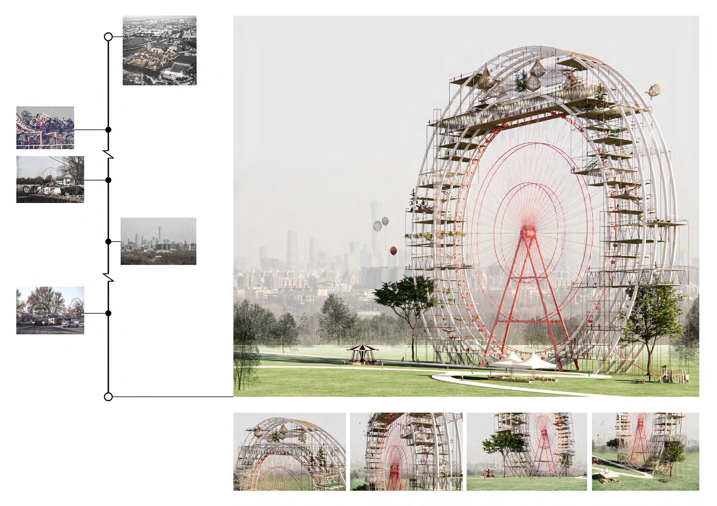
1987 marked the year when the old Beijing Amusement Park was first open to public. It was one of the earliest and largest amusement park in China. Its epic Ferris wheel was also one of the highest Ferris wheel at that �me, and it could be easily spo�ed on the city skyline.
the Escape
Self-ini�ated Work
Completed in September 2019. Published in the April issue of Urban Design Journal (ISSN 2096-1235), 2020.
Modified exclusively by me in December 2020.
Instructor: Prof. Wenyi ZHU
Design collaborators & co-writers: Junyu YANG, Tong LIU
Contribu�on: concept 70%, design development 50%, diagram 70%, essay wri�ng 30% Project Loca�on: Dongcheng District, Beijing Selected drawings are exclusively done by me.
Even though it is not longer in use, the Ferris wheel stands quietly among the buildings of Beijing’s ever-changing skyline, witnessing the emergence of the city’s many new ‘icons’.
In the 1990s the amusement park was among the most popular weekend a�rac�ons for Beijing families.
However in 2010, a�er 23 years of serving the public, Beijing Amusement Park was closed permenantly. The famous Ferris wheel has been abandoned since that �me.
Recently in 2019 a decision was made to tranform the old amusement park into a new leisure park. But the Ferris wheel has not become part of the plan. Instead it is scheduled to be demolished.
In our proposal, we hope to renovate the old Ferris wheel and make it part of the new public park. We hope that it would s�ll be there as it has always been, that it would be preserved as a living monument of the city.

Looking at the skyline of Beijing, I always ask myself: Does Beijing need one more icon, a�er having this many iconic buildings sprou�ng into existence in recent years? Coincidently heard about the new plan for the old Beijing Amusement Park in the city center. Ten years a�er its shut down, Beijing has decided to turn the amusement park into a new park with all its former recrea�onal facili�es removed, including the famous Ferris wheel that has stood in the city center for over 30 years.
Like us, many people disagree with the plan, arguing that the Ferris wheel has always had its place in their childhood memories. Thus, we put forward another proposal, in which we turn the Ferris wheel – the real ‘icon’ of the city – into a living monument for the old amusement park.
1987 1990s 2021 2019 2010s 2010
55
Internship at MAD Architects
Note: the using of all images in the portfolio has been approved by MAD Architects. Only publicized projects are introduced here.
Baiziwan Social Housing
Porject Architect: Li SHANG
Contribu�on: I joined the project team in its construc�on phase, when the clients asked the team to redesign the public areas on the ground floor and the second floor. I par�cipated in the design of storefronts and shop signs, as well as the interior design and rendering of the common rooms.
Time of Par�cipa�on: April - May, 2020
Project Loca�on: Chaoyang District, Beijing
JInshanling Cinema at the Foot of the Great Wall
Project Architect: Weili JIN


Contribu�on: I joined the project team at the end of its schema�c deisgn phase. I made diagrams and technical drawings from the 3D model, rendered the masterplan for this project, and modified details in the 3D model.
Time of Par�cipa�on: March- April, 2020
Project Loca�on: Jinshanling, Chengde, Heibei Province
Commercial Area - Second Floor Photo -
Ground Floor
Commercial Area - First Floor Note: the
above
1F Public Facili�es 1 Common Room 2 Charity Barber Shop 3 Public Laundry 4 Public Kitchen 5 Public Office 6 Mee�ng Room 1 Common Room Mee�ng Room Underground Storage Room Public Kitchen Public Office Public Laundry Charity Barber Shop 2 3 4 5 6 1F ±0.00m 1:1000 1 Lobby/Bookstore 2 Cashier Desk 3 Rear Projec�on Room 4 Storage 5 Restroom(woman) 6 Restroom(man) 7 Cafe 8 MEP 1 2 1 2 7 3 6 4 2F +9.00m 1:1000 1 Lobby/Bookstore 2 Reading Area Sec�on A-A 1:1000 Sec�on B-B 1:1000 A A B B
Photo - Second Floor
renderings
are made by other colleagues.
Note: the technical drawings are done by me. The renderings are made by other colleagues.
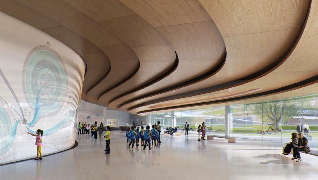
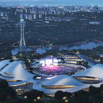
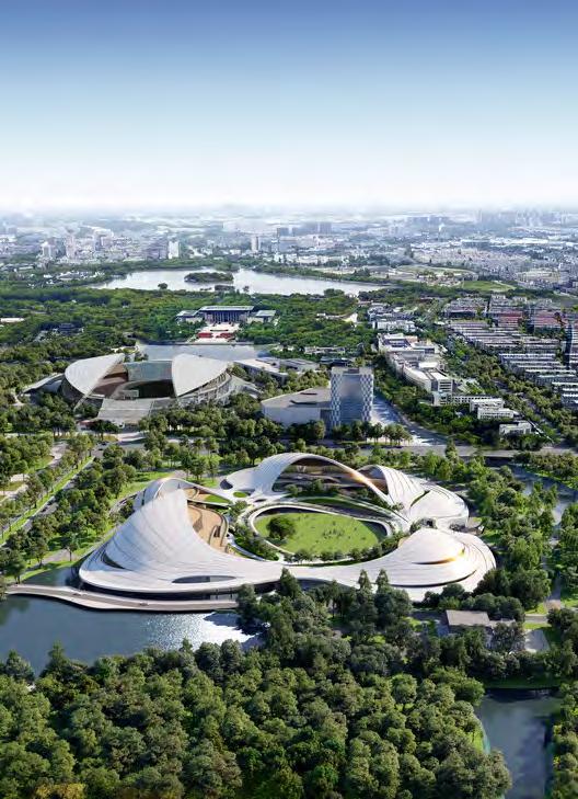
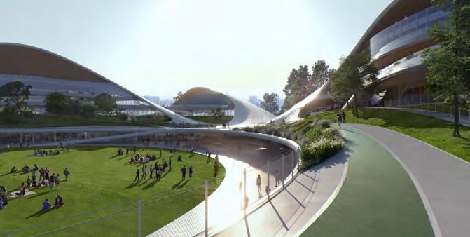
Jiaxing Civic Center


Contribu�on: I joined the project team in its conceptual design phase, helped with digital modeling, plan and diagram drawing, as well as client mee�ng package preparing.
Team Members: Yin Jianfeng, Alessandro Fisalli, Fu Xiaoyi, Chen-Hsiang Chao, He Yiming, Thoufeeq Ahmed, Chen Hao, He Xiaowen, Zhang Yaohui, Guo Xuan, Edgar Navarrete, Claudia Hertrich, Deng Wei, Zhang Xiaomei, Chen Nianhai, Li Cunhao, Sun Feifei, Punnin Sukkasem, Manchi Yeung, Li Yingzhou
Time of Par�cipa�on: August, 2020
Project Loca�on: South Lake, Jiaxing

Note: all images of the project below are from MAD Architects.

57
Mengyu Zhao
She/her
MArch II Candidate 2023
Harvard University Graduate School of Design
mengyu_zhao@gsd.harvard.edu


 Type 1
Art Studio


