Mary Immaculate College
This document contains the MIC Brand Guidelines and communicates the values and identity of the MIC brand.
These guidelines contain the visual elements necessary to work within the brand identity.

This document contains the MIC Brand Guidelines and communicates the values and identity of the MIC brand.
These guidelines contain the visual elements necessary to work within the brand identity.
Founded in 1898 Mary Immaculate College (MIC) is a distinctive and inclusive, university‑level, College of Education and the Liberal Arts, offering higher level opportunities and research of outstanding quality.
Serving the needs of a growing and diverse student population of over 5,000 students, MIC is recognised and appreciated for its excellence in teaching, learning and research and its essential contribution to the continuum of academic provision in effective and productive collaboration with its partners in the higher education sector.
MIC, with campuses in Limerick city and Thurles town, has made a positive and tangible difference to equity and to the creation of a just society through active promotion of educational inclusion and through the contribution of its excellent graduates.
For further information in how to apply the MIC brand please contact: Communications@mic.ul.ie
We have grown from our established position as a teacher training college to offer a broader choice of courses to a more diverse group of students.
We have grown beyond our home on the South Circular Road to open a new facility in Thurles. Our Limerick campus too has expanded to a new facility across the South Circular Road.
We foster growth in our students by nurturing their curiosity and sharing in their experiences.
In turn our graduates will inspire growth in those they share their knowledge with.
We continue to grow and develop our connections with the wider community through an inclusive and open approach.
MIC logo
Logo rules
Colour palette
Typography
Grid
Brand elements
Imagery
Video
Tone of voice
Ad templates
Applications. Editorial
Applications. Flyer Template
Applications. Billboard
Applications. Social media
Applications. Powerpoint
Commissioned campaigns
This is the official Mary Immaculate College Logo.
For the promotional material it is mainly used in white with orange flames reversed out of a dark colour background. It appears fully white when appearing against a medium colour background or when appearing on a white or light background it must always appear in full colour.
A minimum clear space equivalent to the width of the crest stripes is required for the Mary Immaculate College Logo.
The minimum size the logo should appear at for the sake of legibility is 20mm width.
MIC’s 3 core brand colours have been expanded out to create 3 extra sub ‑ colours for each one.
Designers should identify the most suitable colour combinations for their own specific communications.
Blue 1, Orange 1 and Grey 1 are the primary colours and the sub colours should work in conjunction with these.
MIC Blue 1 C80 M56 Y12 K0 MIC Blue 2 C80 M76 Y30 K27
MIC Blue 3 C80 M64 Y12 K8 MIC Blue 4
C64 M0 Y8 K0
MIC Orange 1 C0 M41 Y70 K0
MIC Orange 2 C0 M69 Y78 K0
Orange
Weissenhof is the main font and is used at a variety of sizes and weights. AaBbCcDdEeFfGgHhIiJj
Weissenhof Grotesk
Roboto Slab is the secondary font and is used generally for subheaders or preheaders.
Roboto Slab
The MIC Grid is a basic geometric pattern that acts as the building blocks for MIC’s promotional material brand guidelines.
The intersecting lines create a grid that allows us endless possibilities to create dynamic communications.
Using the grid as a starting point we are able to lay over colours, linear graphics, typography, photography and imagery to create a huge variety of brand elements.
Step 1. Create a box on top of the grid.
Step 2. Select a colour for the box and set to 100% opacity.
Step 3. Cut 1 corner at 45 degrees.
Step 4. Create a secondary box on the grid and place in the background of the cut corner.
Step 5. Select colour of the secondary box and change transparency to suit.
Step 6. Match the colour of the stripe under the box to secondary box.
Step 7. You may wish to follow the angle of the cut with an opaque background shape.
Step 8. Overlay your typographic message in the box.

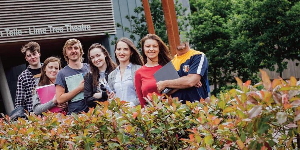
The imagery we use for MIC is of real people actively engaged with college life, whether it be through study, active learning, sports, or relaxing around campus.
The photography is not staged and captures a moment in time which underpins the dynamism of the brand concept.


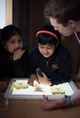




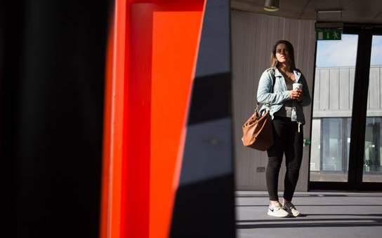
When deemed suitable the photographer will give more room to one side of the subject which affords us space to include branding and messaging.
Natural angles within the frame are exploited in some images such as architecture or natural forms which compliment the brand and give a sense of dynamic movement.


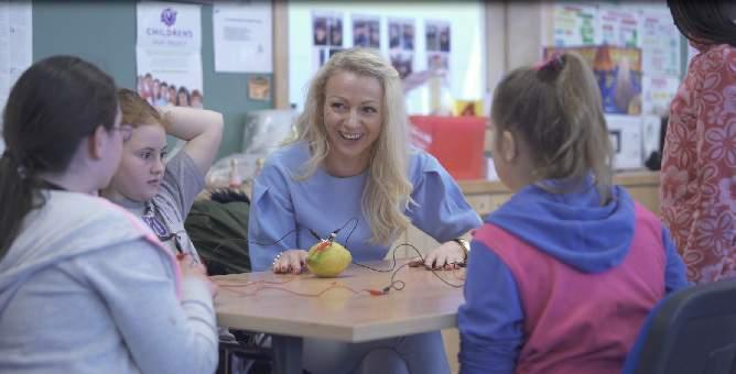
The video content focuses on real people. There are many stories to tell on the MIC campus, be they of current or past students, teachers, staff members or associates.
The videos should portray individuals or groups that have an interesting story to tell that relates to MIC’s core values.
Any graphic treatment to the videos such as titles or motion graphics should align with the brand guidelines in terms of typography, colour and graphic elements.
The end screen should contain the logo, url and #HelloMIC.



The tone of voice is direct, clear and positive.
The headlines should contain an aspirational message that highlights MIC’s unique selling points and grabs the viewers attention. The subheader gives context to the header.
The rest of text should have clear detailed information and a call to action about where to go and what to do.
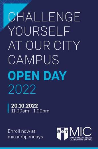







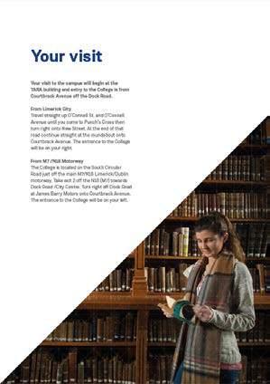
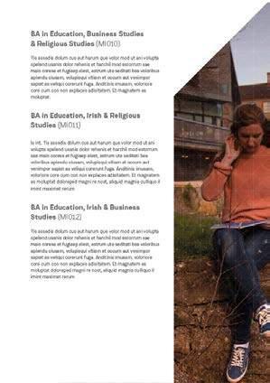
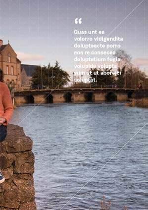



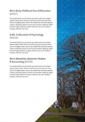
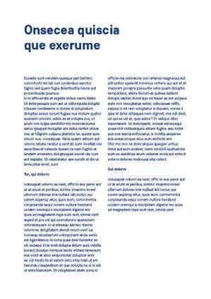
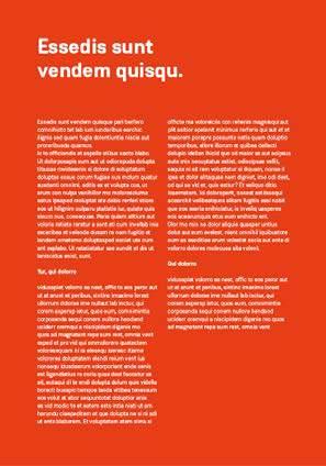
The format of the MIC flyers are an A5 gate fold. They are to be printed on 300gsm matte stock. Aim to have no more than 300 words per page to ensure legibility.
The front page will be dominated by a large image relating to the course. The title of the course, course code and MIC logo will appear in the ‘MIC message box’ which sits over the image. The top left corner will have a colour coded tab for ease of recognition.
Bachelor of Arts
B Sc of Psychology
BA in Early Childhood Care and Education
B Ed in Education and Psychology
Bachelor of Education
BA in Education, Business Studies and Accounting
BA in Education, Business Studies and Religious Studies
BA in Education, Gaeilge and Religious Studies
BA in Education, Gaeilge and Business Studies
BA in Education, Mathematics and Gaeilge
BA in Education, Mathematics and Business Studies


Use the system font Segoe UI for powerpoint.
Intro slide
Text slide
Text and image slide
Using the brand elements we can also commission campaigns with a specific message.
