Issue 2, Fall 2023
the Jet Age
Designing

Plus Sofa • Lapalma
Representing the most iconic designs and innovative brands, created by visionary designers around the world.
www.apartmentzero.com

3
FURNITURE • LIGHTING • FLOOR TEXTILES • OUTDOOR FURNITURE
Issue 2, Fall 2023 modernistcollection.com
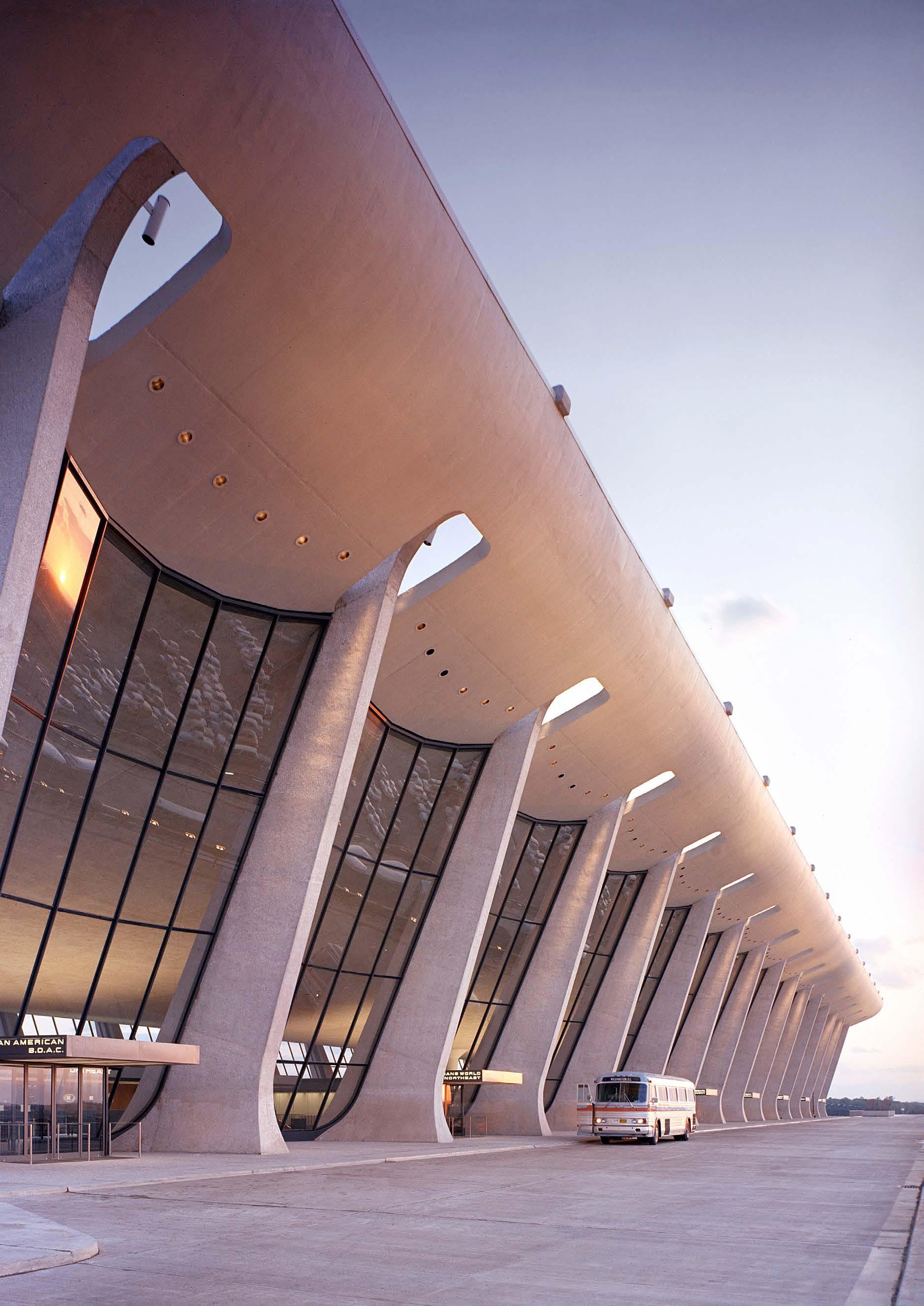
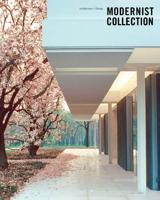
Cover: The newly-constructed Dulles International Airport in November, 1962. Photo by Balthazar Korab.
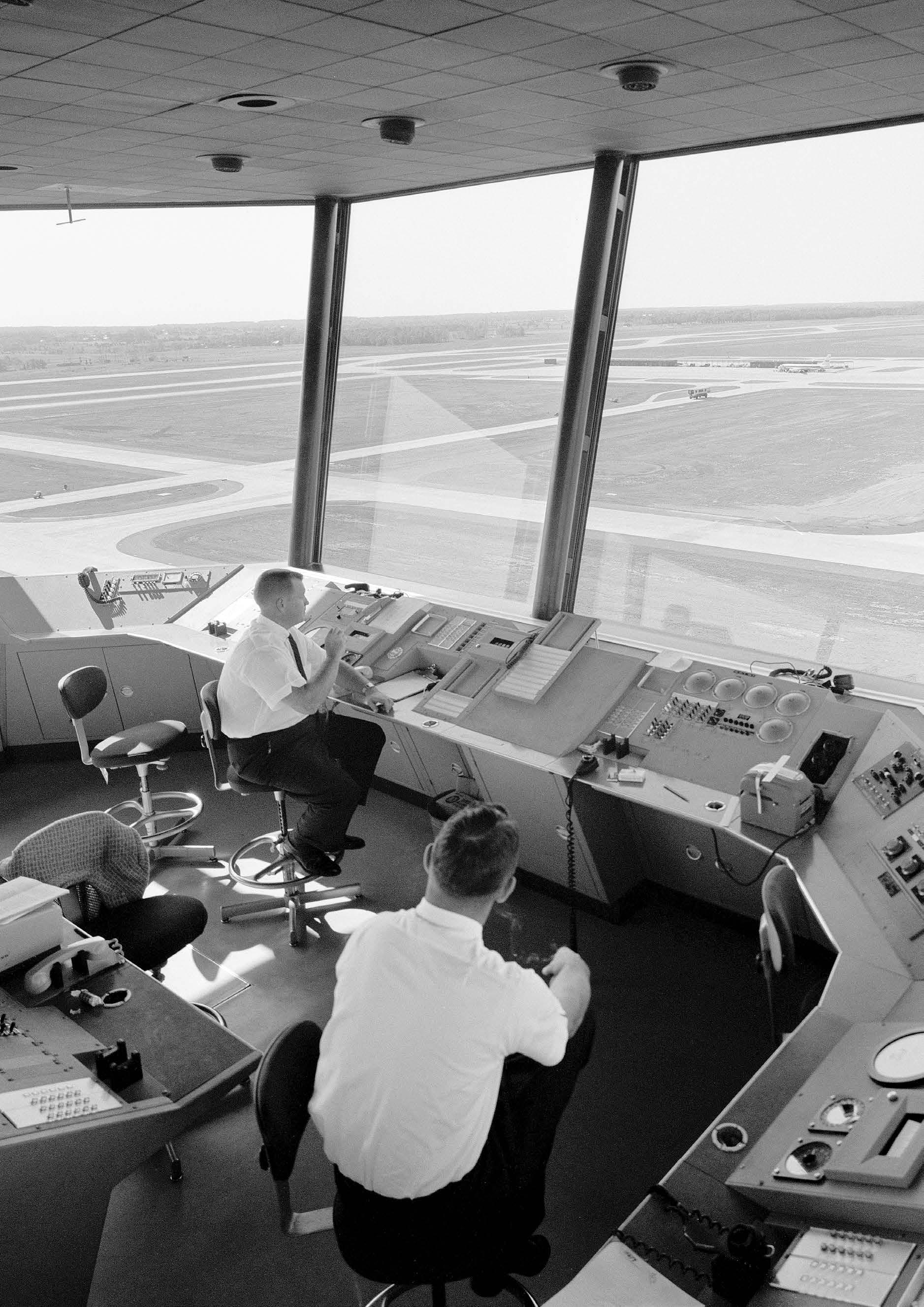
Left: Air Traffic controllers take a smoke break in the control tower at Dulles International Airport outside of Washington, DC.
From the Editor
Exploring the world of Jet Age design
Modernist Design News + Events
• Biomorphic ceramic sculptures
• Art deco poster art exhibition
• Brionvega’s 1960s radio designs
• The accessible midcentury sofa
• Rudolph de Harak’s graphic design innovations
• Clairtone’s groundbreaking stereo designs
• Reviving Paul McCobb’s Planner Group
• Artist Jessica Brilli’s mid-century memories
Richard Neutra’s Singleton House
Looking inside a late-1950s California masterpiece.
Special Section: Designing the Jet Age
Jet-engine technology revolutionized travel and captivated the public, influencing everything from architecture and fashion to graphic design and interiors.
Dulles Airport
Outside Washington, DC, Eero Saarinen and his team developed a thrilling structure that was practical, elegant and monumental.
Stan Galli Travel Posters
Graphically bold illustrations celebrate the excitement of air travel and the new accessibility of far-off destinations.
The Evolution of Flight Attendant Uniforms
The 1950s ushered in a fashion-forward new era for flight attendants, accelerating the glamorous allure of air travel.
TWA Flight Center
Eero Saarinen’s experimental design vision resulted in the ultimate icon of jet-age architecture.
Modernist Airline Visual Identities
Graphic designer Saul Bass brought a sleek new design esthetic to airlines in the 1960s and 1970s.
Pan Am Reinvents the Travel Poster
The principles of Swiss Modern graphic design are applied to airline travel posters with spectacular results.
Jet Age Marketplace
From model planets to vintage photographs, these artifacts of jet-age style make great gifts for the modernist aficionado.
5
9 12 24 40 46 60 66 78 90 100 104
Photo by Balthazar Korab, 1962

6
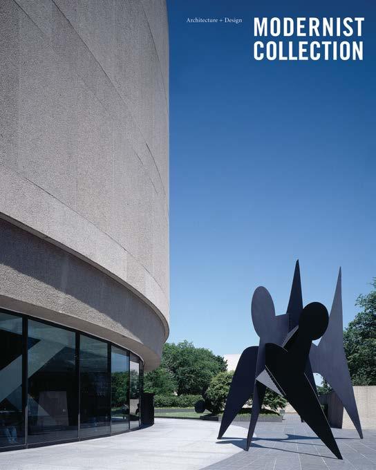
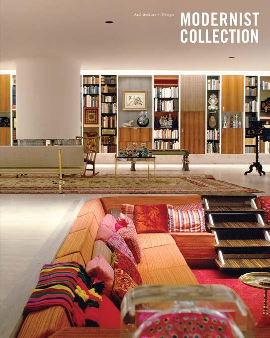
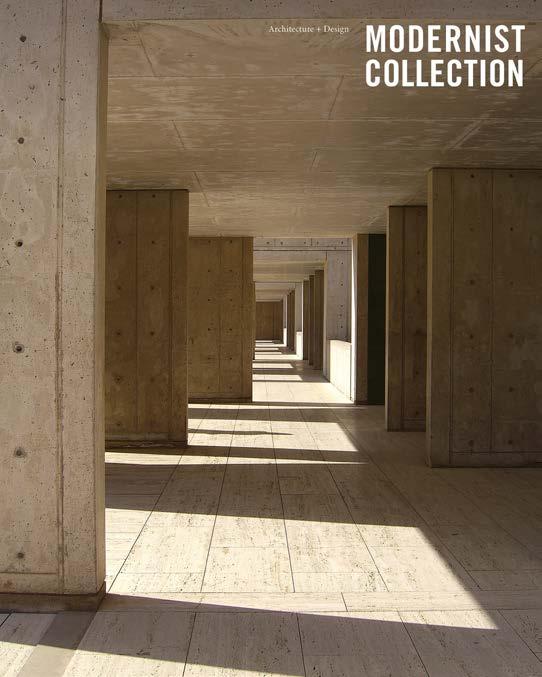
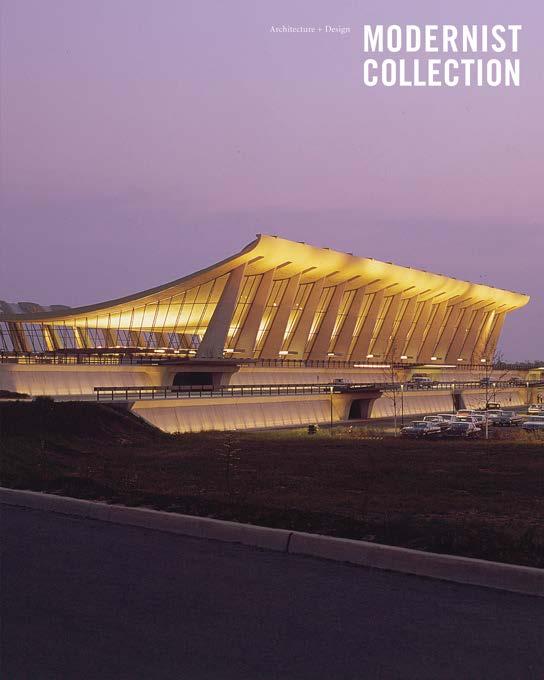

7 Subscribe. Modernist Collection is the new digital magazine celebrating 20th-century architecture & design. Sign up now to get each issue delivered to your inbox for free. FREE Click here to subscribe
MODERNDC
Docomomo DC is dedicated to preserving and protecting the area’s brilliant examples of modern architecture, landscape and design. Join us for tours, educational talks, and social events. www.docomomo-dc.org
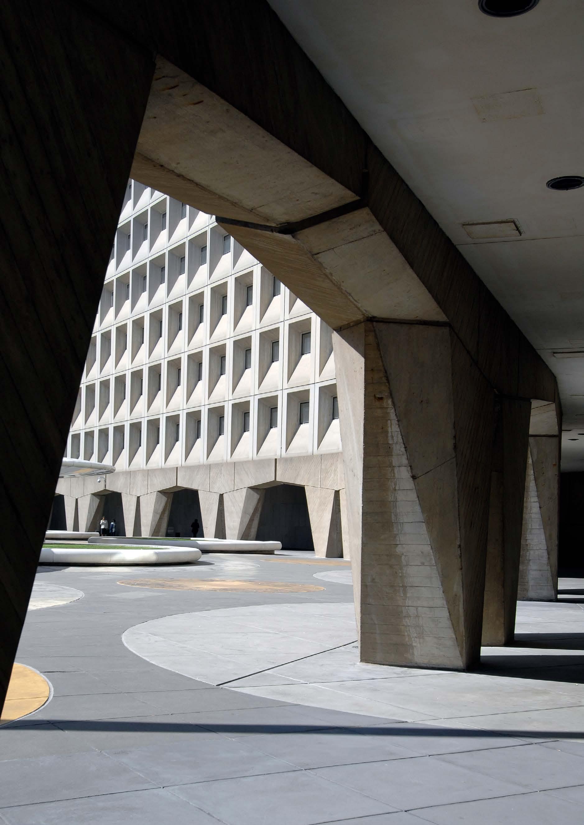
DC’s Robert C. Weaver Federal Building, designed in the mid-1960s by architect Marcel Breuer; Photo: HUD Staff
From the Editor
Publisher
Modernist Collection, LLC
Editor & Design Director
Robert King robertkingdesign.com
Photo Editor
Laura McAllister
Legacy Photography
Balthazar Korab
Julius Shulman
Editorial Assistance
Deane Madsen
Robert King Editor + Design Director www.robertkingdesign.com

Modernist Collection, Fall 2023, Issue #2, Copyright 2023 by Modernist Collection, LLC. All rights reserved.
Subscriptions
Sign up for a free subscription by sending your email address to: info@modernistcollection.com
Advertising
For ad rates and technical specifications, please email us at: info@modernistcollection.com
Contact Information
Modernist Collection
600 Pennsylvania Ave. SE, Suite 15194
Washington, DC 20003
Email us at: info@modernistcollection.com
Website and photography sales: modernistcollection.com
Unless otherwise indicated, the cover and contents of Modernist Collection are fully protected by copyright and may not be reproduced in any manner without written consent.
My beautiful aunt Ginny was a flight attendant in the early 1970s — they were actually called “air hostesses” then. I vividly remember car trips with my parents to Columbus International Airport to pick up my aunt from her latest jet-setting flight to some exotic-sounding place like Las Vegas or San Diego. These exciting destinations seemed like a world away from central Ohio, where I lived as a child. But the burgeoning Jet Age was changing the way people thought about travel and, to some extent, the way people lived their lives.
Technology made the Jet Age possible, but design made it appealing. For the glamorous new world of air travel, an entirely new series of spaces and experiences had to be designed from the ground up. Everything from airport interiors and crew uniform to airplane graphics and on-board dishes had to be conceived and executed to convey an esthetic of efficiency and progress.
The fussy and backward-looking motifs of traditional design seemed woefully out of place in the futuristic world of jet travel, so Modernism became the default setting for all things visual.
On the following pages, you’ll see how some of the 20th-century’s brightest designers used a Modernist vocabulary to build this exhilarating new world of air travel, bringing Modernism into people’s lives in a grandly captivating new way.
9
Fall 2023
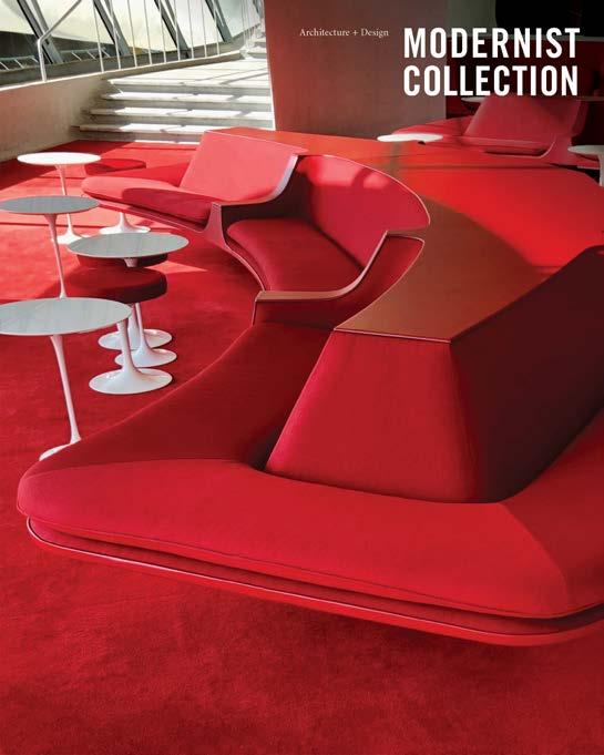
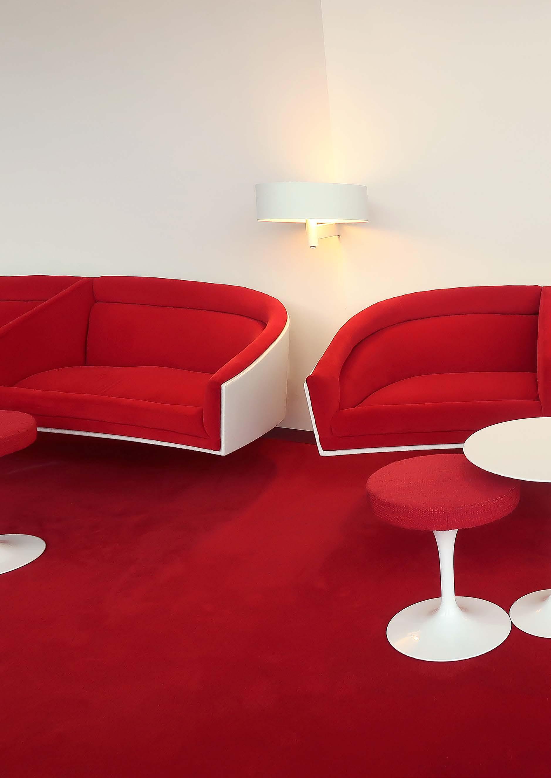
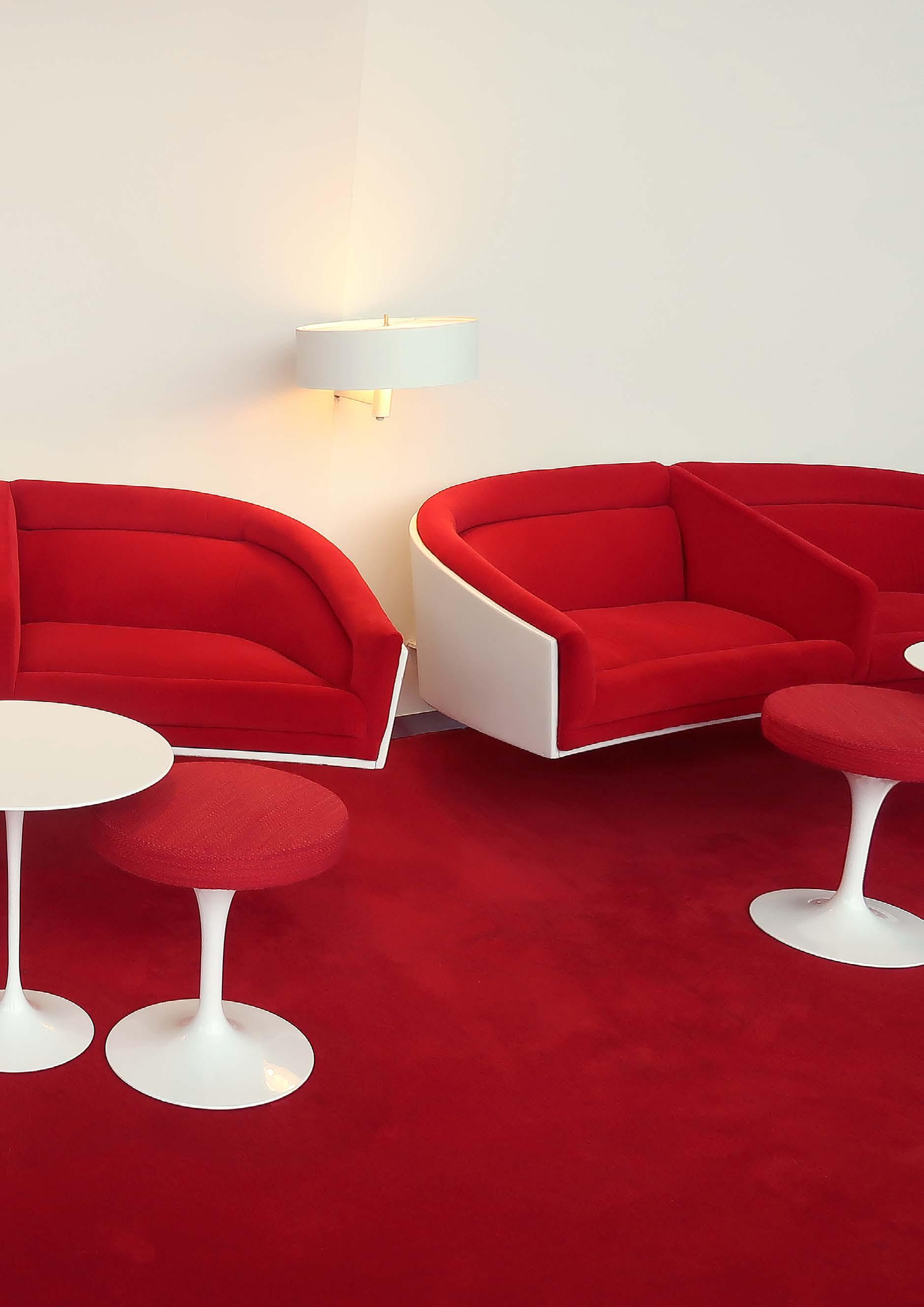
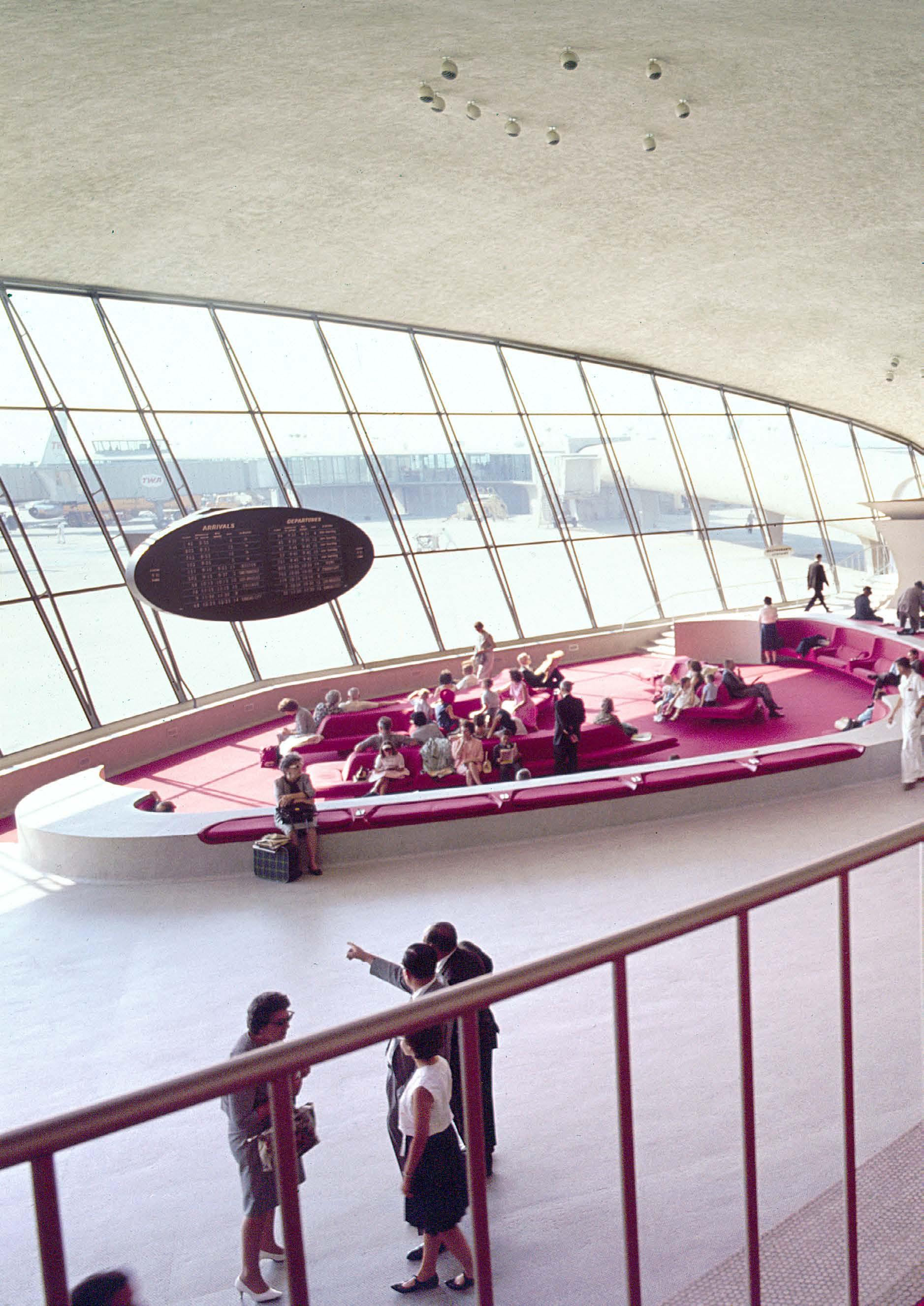
Eero Saarinen’s design for the TWA
Flight Center in the 1960s included this sleek seating area upholstered in TWA’s signature shade of vivid red, accompanied by Saarinen’s Tulip tables and stools. See more on page 78.
Sightings
Dorothee Loriquet’s Dynamic Abstraction
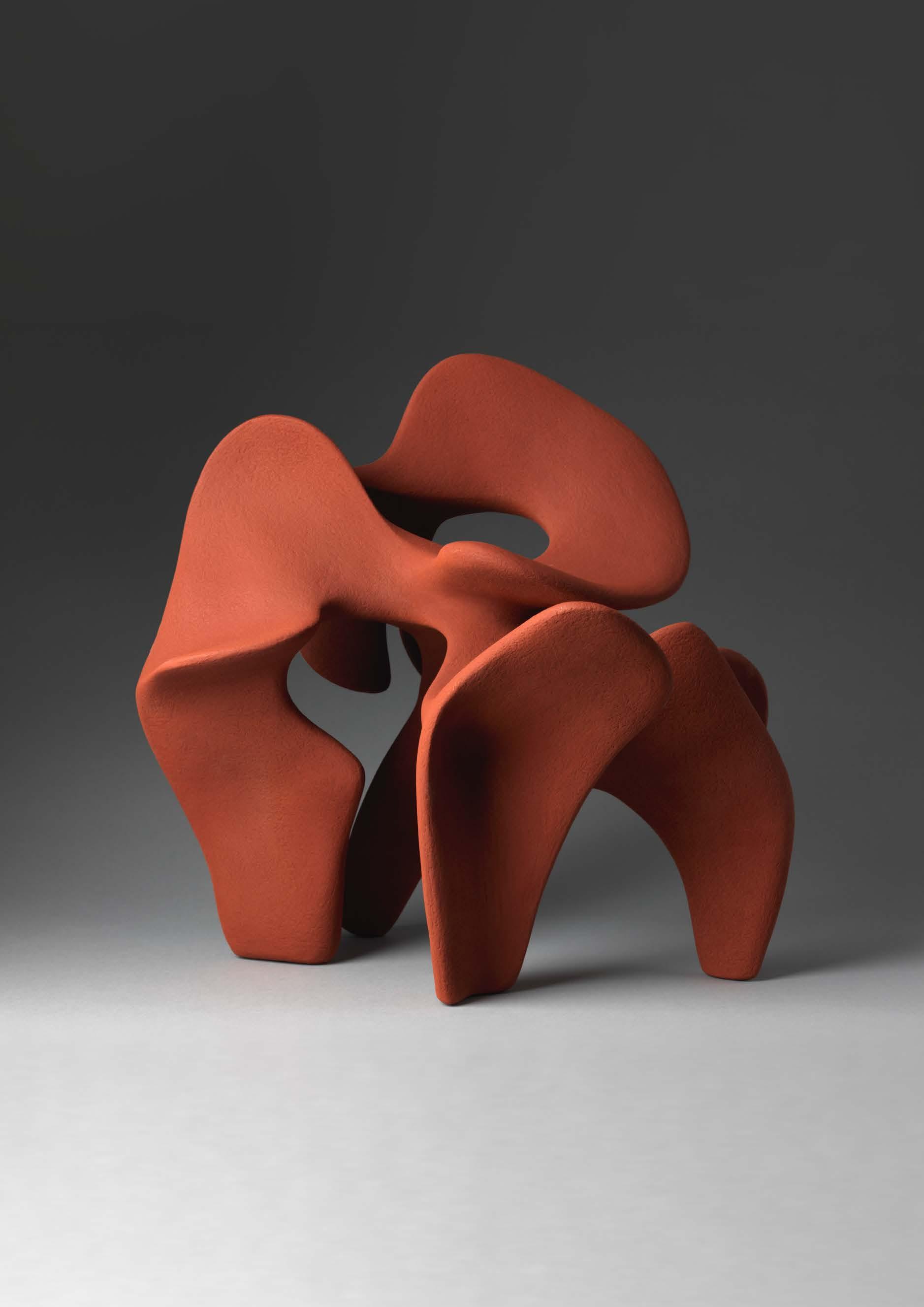
There’s nothing static about Dorothée Loriquet’s biomorphic sculptures, which undulate in space, subtly referencing vertebrae and other organic forms. “My main concern is not the contours,” she says, “but rather the empty spaces without which movement would not exist.” By viewing her work from different vantage points, multiple compositions are revealed. Loriquet currently lives and works in Gennevilliers, near Paris.
Dorothée Loriquet, Stoneware 2017, Australia Collection (sold)
ART: SCULPTURE
FINE
Photo by Thomas Deschamps; Loriquet’s work on Instagram: dorothee_loriquet
Art Deco: Commercializing the Avant-Garde
The term “Art Deco” did not exist until the 1960s. Prior to that, the geometrically bold, machine-influenced style now collectively packaged within that genre was known by many names, representing a variety of regional versions of Modernism. A new exhibition at Poster House in New York chronicles the rise and fall of what would come to be known as Art Deco, starting with the 1925 Paris Exhibition, and ending as Deco graphics became more nationalistic in the lead up to World War II.
This exhibition features over 50 posters by enduring masters of graphic design, including A.M. Cassandre, Charles Loupot, Marcello Nizzoli, Jean Dupas, Herbert Matter, Jean Carlu, Paul Colin, René Vincent, Edward McKnight Kauffer, Austin Cooper, Pierre Fix-Masseau, and Joseph Binder.

www.posterhouse.org • Sept. 28, 2023 – Feb. 25, 2024
Pictured: “Modiano,” by Róbert Berény, 1939
AUDIO DESIGN
Brionvega Radio Cubo 50

A reissue of the classic ts 502 transistor radio designed by Marco Zanuso and Richard Sapper in 1963, the Brionvega Radio Cubo 50 is a modernist design so iconic that it was part of David Bowie’s personal sound system. Named for its simple, open-and-shut, split-cube shape, this update of the original design incorporates a digital screen, FM radio and Bluetooth speaker. Available in black and yellow, the Radio Cubo is part of MoMA’s permanent collection.
store.moma.org
13
Spring 2022
MODERNIST DESIGN NEWS + EVENTS
MUSEUM EXHIBIT: NEW YORK
Sightings
Mid-Century Comfort: The Perfect Sofa
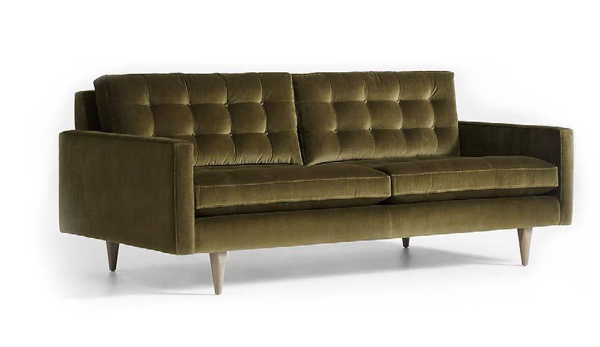
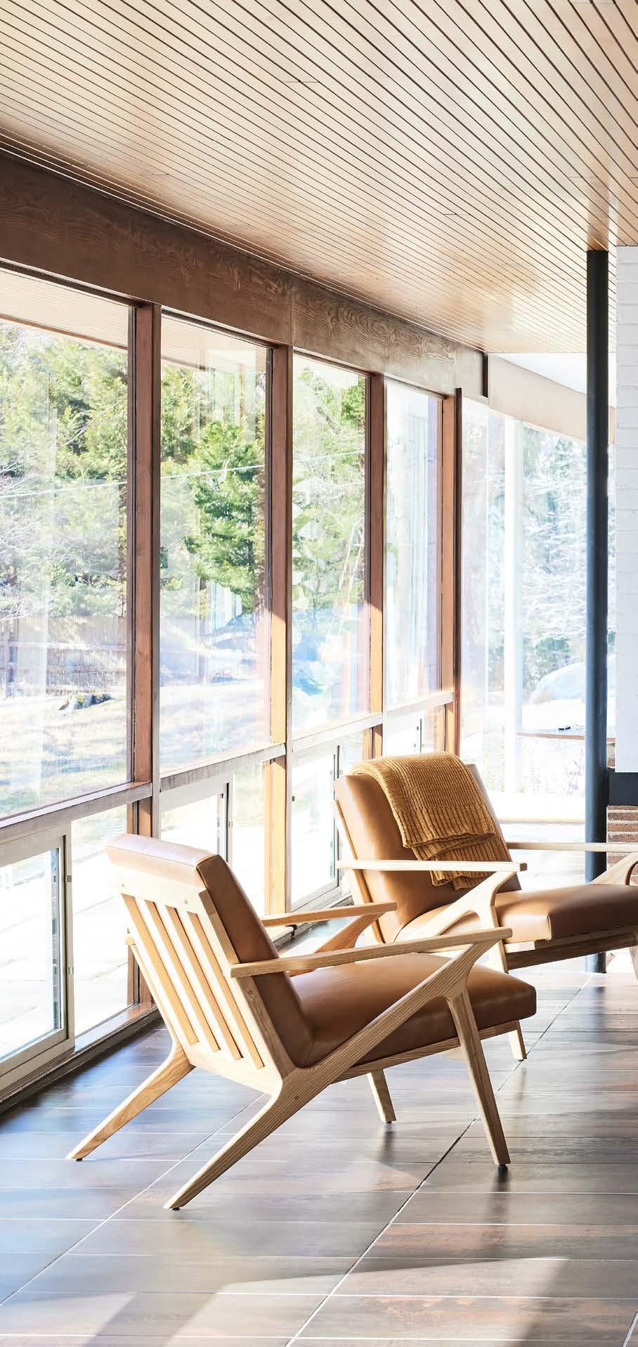
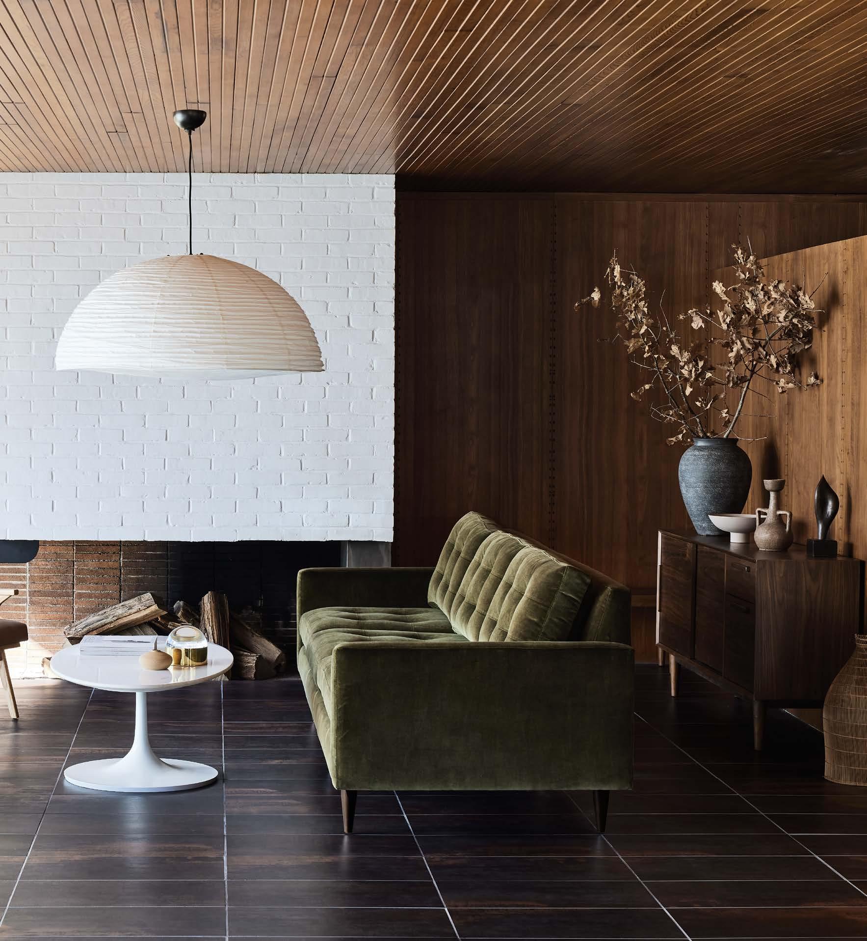
Crate & Barrel’s mid-century styled Petrie sofa has long been a modern favorite, with its clean lines and tailored cushions that are expertly button-tufted by hand. The sofa’s pure 1960 s aesthetic is now available in green cotton velvet that adds a note of luxury to the sofa’s sleek, boxy cushions and slim track arms. The Petrie Velvet sofa can be ordered in multiple sizes and also comes as a matching lounge chair and ottoman.
crateandbarrel.com
14 FURNITURE
DESIGN
15 MODERNIST DESIGN NEWS + EVENTS
Sightings


16
GRAPHIC DESIGN
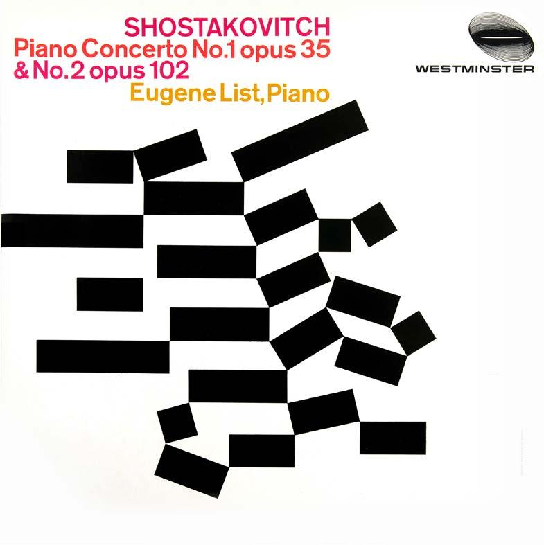
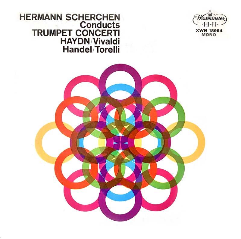
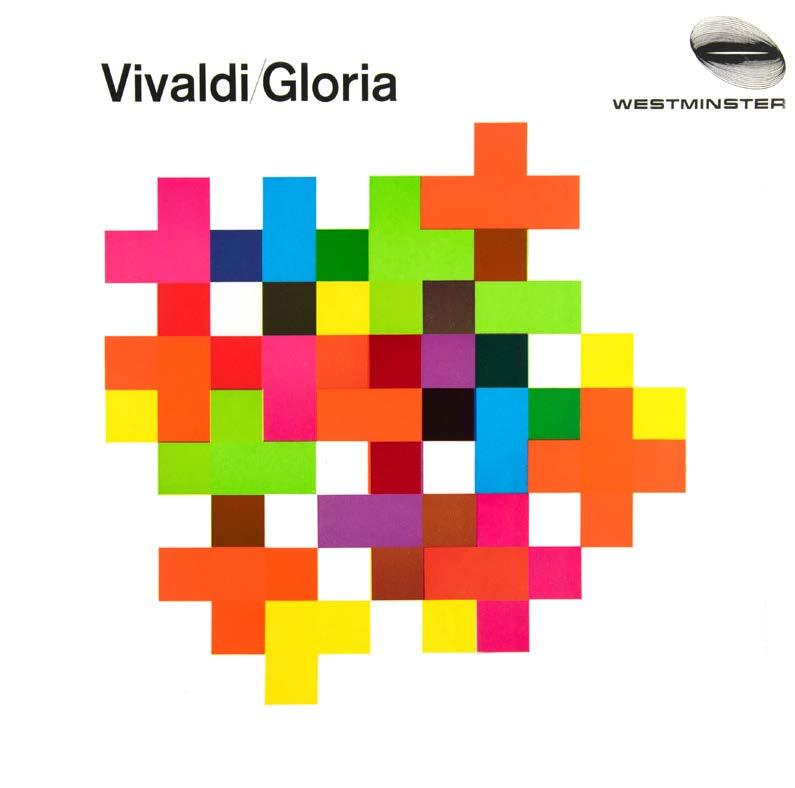
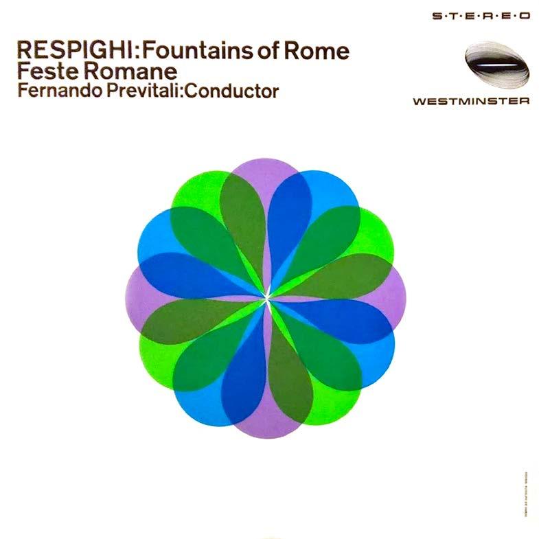
Rudolph de Harak’s Rational Simplicity
Rudolph de Harak (1924-2002) was one of the most influential graphic designers of the mid-twentieth century. Inspired by the simplicity and rationalism of the International Typographic Style, Abstract Expressionism, and Op Art, de Harak developed and refined his timeless and pioneering work from his early years in Los Angeles to his success as a design consultant and educator in New York City.
Throughout his illustrious career, he was continuously exploring the potential of abstraction, geometry, and color, as well as experimenting with photography and various photographic techniques in new and exciting ways. De Harak brought his pioneering inventiveness to everything he created, from album covers, book jackets, and branding to furniture, exhibitions, and museums.

Organized chronologically, Richard Poulin’s comprehensive monograph is the first book to document de Harak’s pioneering and prolific work for a wide range of clients, including The Metropolitan Museum of Art, Columbia Records, “Esquire” magazine, and many more.
Available from Thames & Hudson
Pictured: de Harak’s album cover designs from the 1960s
17
MODERNIST DESIGN NEWS + EVENTS
Sightings
MUSEUM EXHIBIT
18
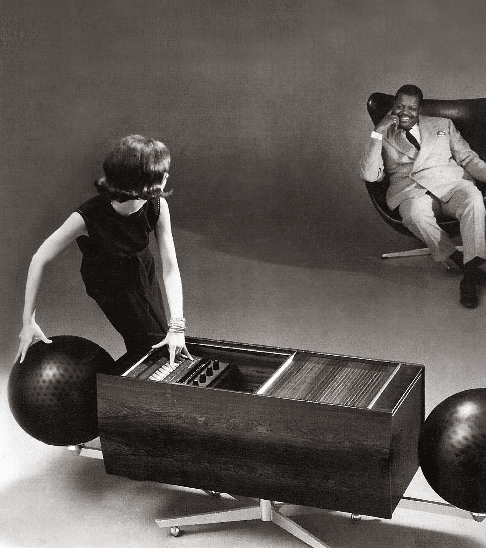
Right at home in a room furnished with mid-century Eames, Saarinen or Jacobsen furniture, the Project G exuded an air of sleek 1960s sophistication.
Canada Modern Celebrates an Audio Icon
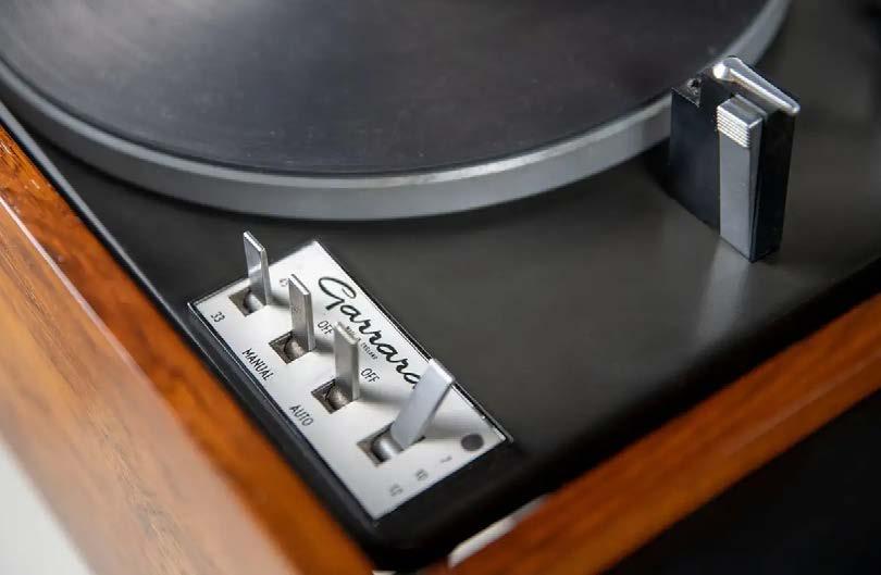
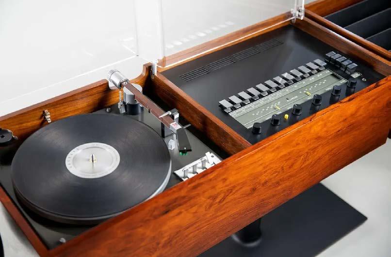
With its sophisticated rosewood cabinet and rotating “sound globe” speakers, there was nothing quite like the Project G stereo, which was produced by Canadian electronics company Clairtone from 1964 to 1967. The stereo’s futuristic design and superb audio quality made quite a splash: “Playboy” Magazine featured it in the June 1964 issue alongside the newly introduced Ford Mustang. Hugh Hefner placed one in the Playboy Mansion. Frank Sinatra got one for himself and gave a few more to his Rat-Pack pals. Clairtone’s Project G even appeared in several Hollywood productions, including the films “The Graduate,” Peter Sellers’ “The Party” and the tv show “Mannix.” Clairtone’s co-founder, Peter Munk once quipped that, “Canada’s prime minister has one, and if the local truck driver didn’t
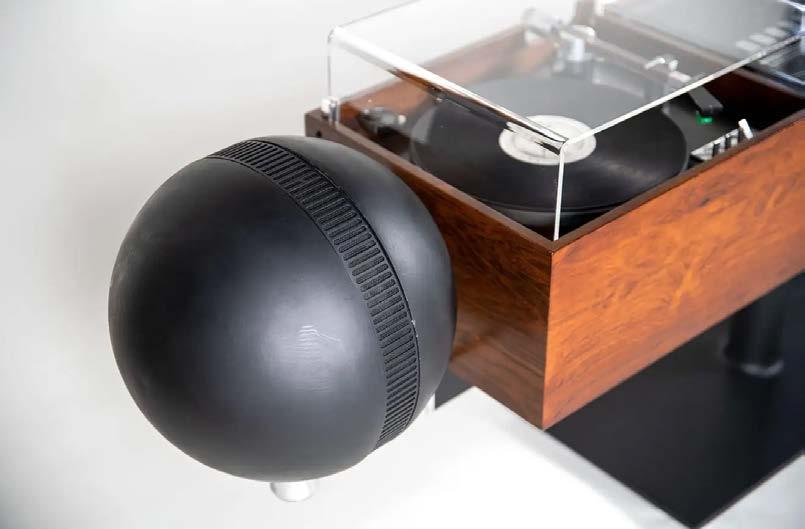
have one, he wants one.”
Unfortunately, the Project G’s hefty $2,000 price tag (about $20,000 today) kept it from becoming a mass-market success. Despite its innovative styling and sound, fewer than 400 Project G’s were manufactured and sold.
But in subsequent years, the Project G has gone on to become a collectible Canadian design icon, and perfectly embodies the suave 1960s Jet Age style. A beautifully preserved Project G is currently on display as part of the museum exhibit “Canada Modern,” at the ROM in Toronto.
Royal Ontario Museum
Vintage Clairtone Project G1 T4 for Sale

19
MODERNIST DESIGN NEWS + EVENTS
Sightings
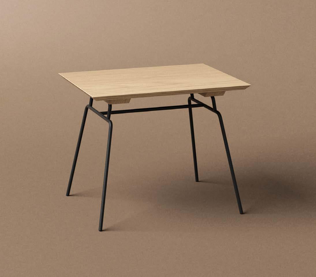
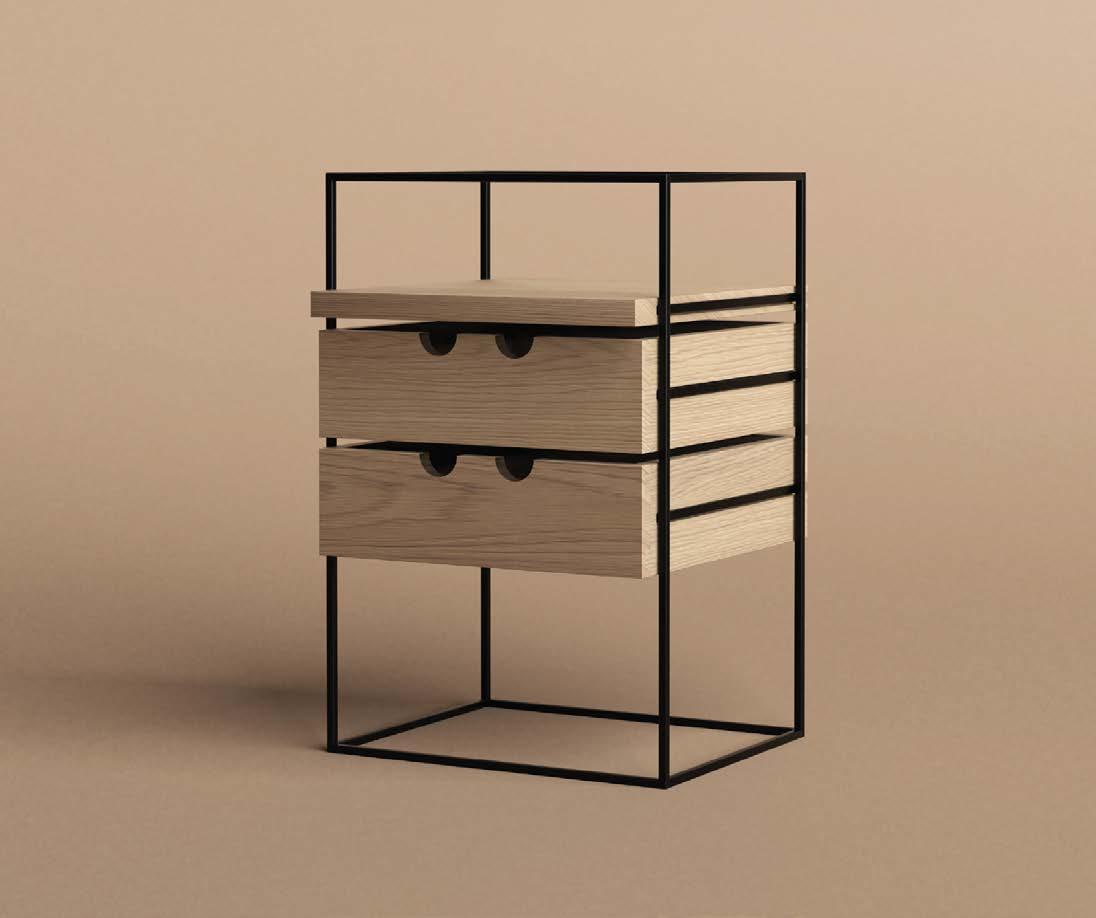
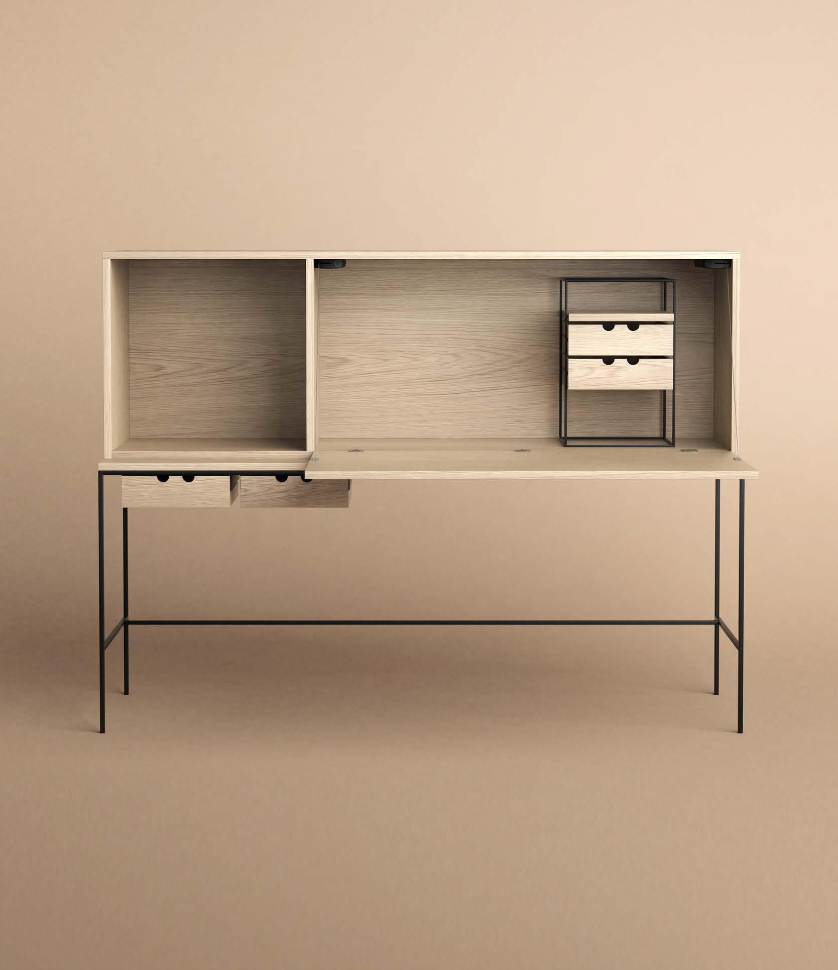
Reissuing Paul McCobb’s Planner Group
Paul McCobb (1917-1969) was one of the leading contemporary furniture designers on the American design scene in the 1950s and 1960s. Over a timespan of twenty years, he designed an impressive range of multifunctional furniture, accessories and textiles, as well as several notable interior design projects. McCobb often offered a playful take on traditional forms with hints of Scandinavian craftsmanship and International Style clarity, often made with affordable and robust materials such as iron, solid wood, and durable upholstery. Since McCobb’s early death in 1969 his designs have not been in production, but are now making a comeback of sorts.
Danish furniture company Karakter has re-issued several pieces from McCobb’s Planner Group, including tables, desks, and drawer units that are unified by a beautifully minimalist design which is absolutely timeless.
karakter-copenhagen.com
20
FURNITURE DESIGN
21 Spring 2022 MODERNIST DESIGN NEWS + EVENTS
Sightings
22 FINE ART: PAINTING
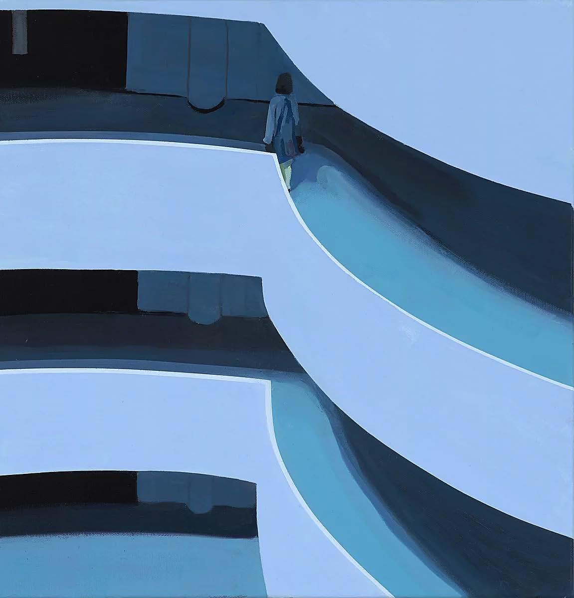
Jessica Brilli: Memory and Vision
Working in a style that encompasses American realism and 20th-century graphic design esthetics, Jessica Brilli’s paintings reveal the intriguing beauty in everyday scenes and objects.


“The suburban scenes I paint reflect my own childhood in New York on Long Island,” says Brilli. “The cars proudly displayed on driveways, the meticulously manicured lawns, the neighbors’ inviting pools, and the 1960’s architecture were all the backdrop of my youth. Though I don’t live in this setting anymore, I still feel a significant connection to it.”
“I’ve realized that my experiences are part of a common thread that many Americans share regardless of age, race and gender,” Brilli explains. “The images that produce a flood of involuntary memories for me often evoke similar cascades of feelings and thoughts in others. Why is this? Through these paintings I’m engaging with the past, and bringing the viewer along for the ride.”
Paintings and prints are available at jbrilli.com. Clockwise from far left: “Guggenheim Interior II”; “Doralice”; “Tuesday Lunch Spot”
23 MODERNIST DESIGN NEWS + EVENTS
Richard Neutra’s Singleton House
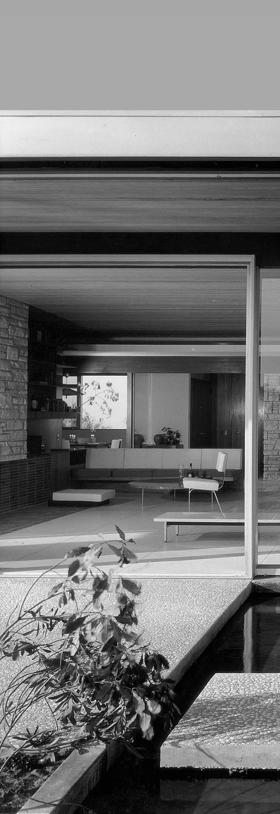
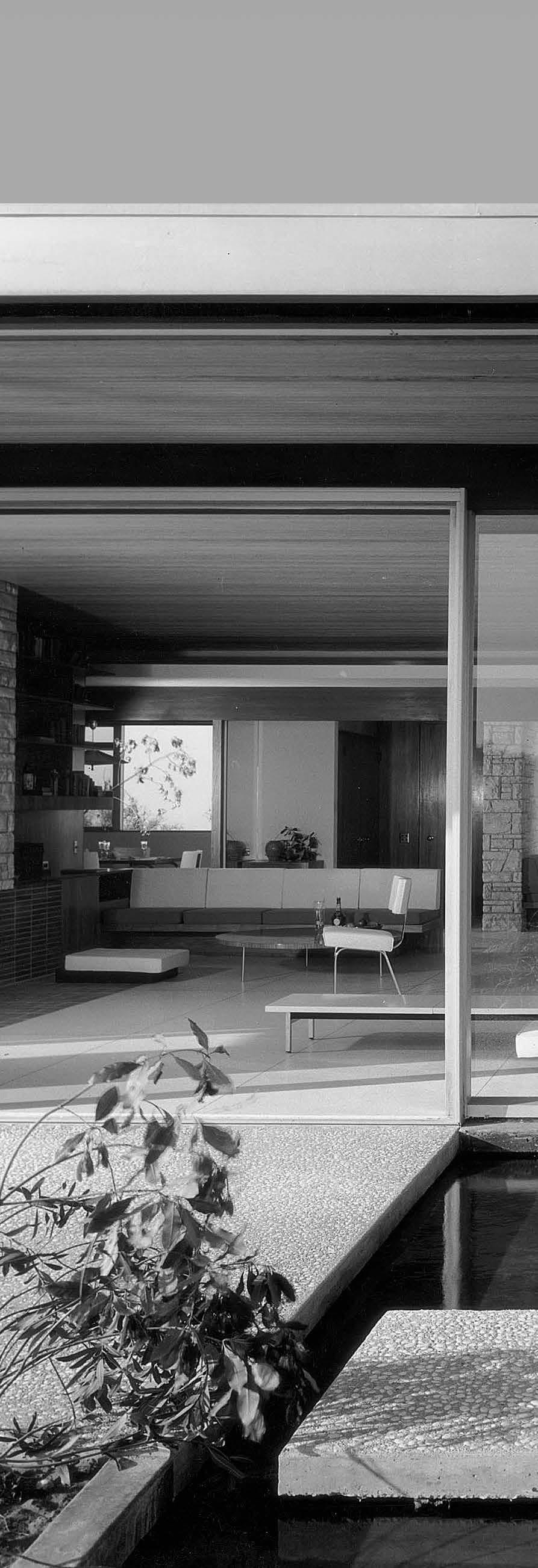
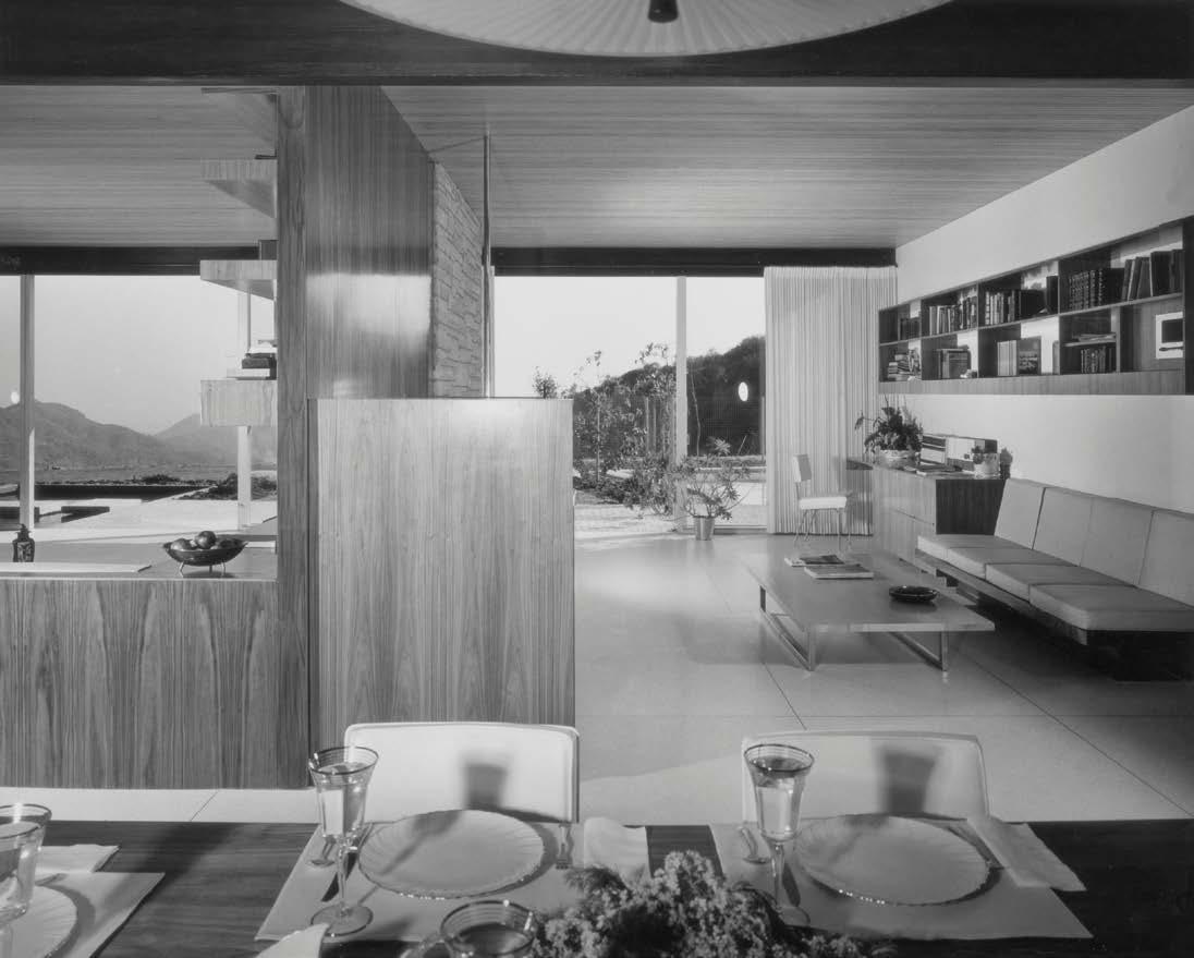
Richard Neutra (1892–1970) was an Austrian-American architect who became the leading light of Southern California’s modern movement in the mid-20th century. One of Neutra’s most inspiring projects is the expansive, single-story Los Angeles house he built in 1959 for the young industrialist Henry Singleton and his family.
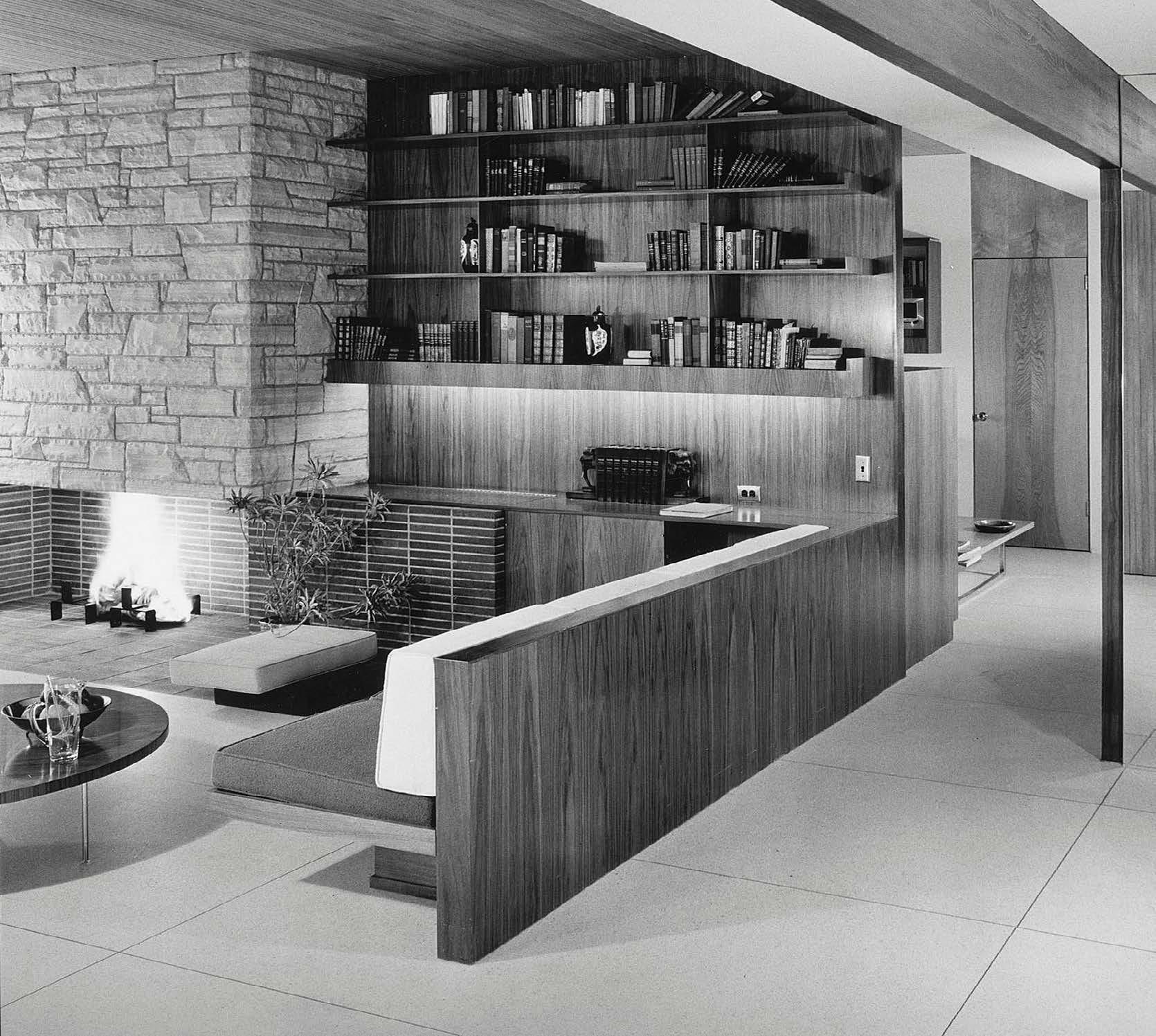
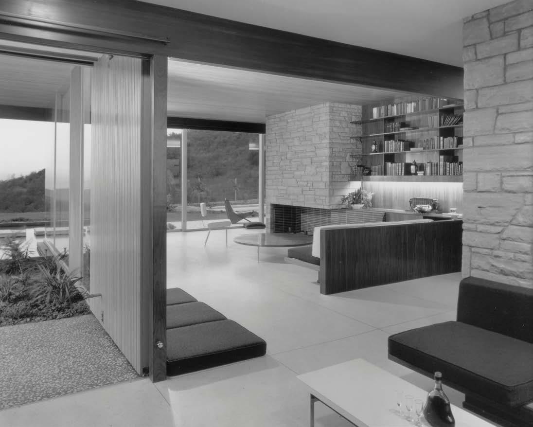
The four-bedroom, three-bathroom Singleton House is situated in the Bel Air neighborhood in the foothills of the Santa Monica Mountains. Polished terrazzo floors throughout the house are softened by exposed redwood ceilings and walnut/ birch cabinetry. Built-in furniture accentuates the clean lines of the minimalist interiors.
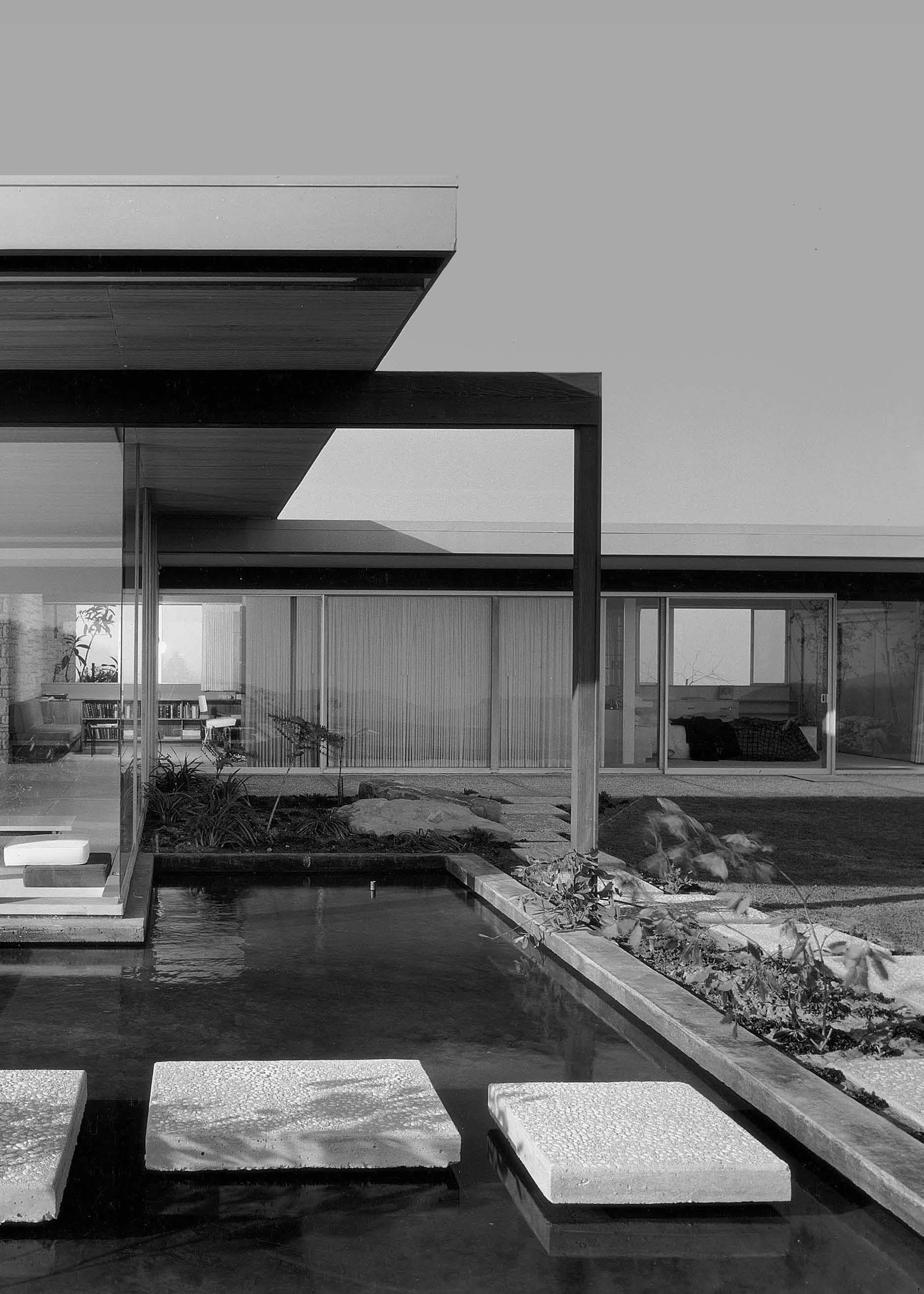
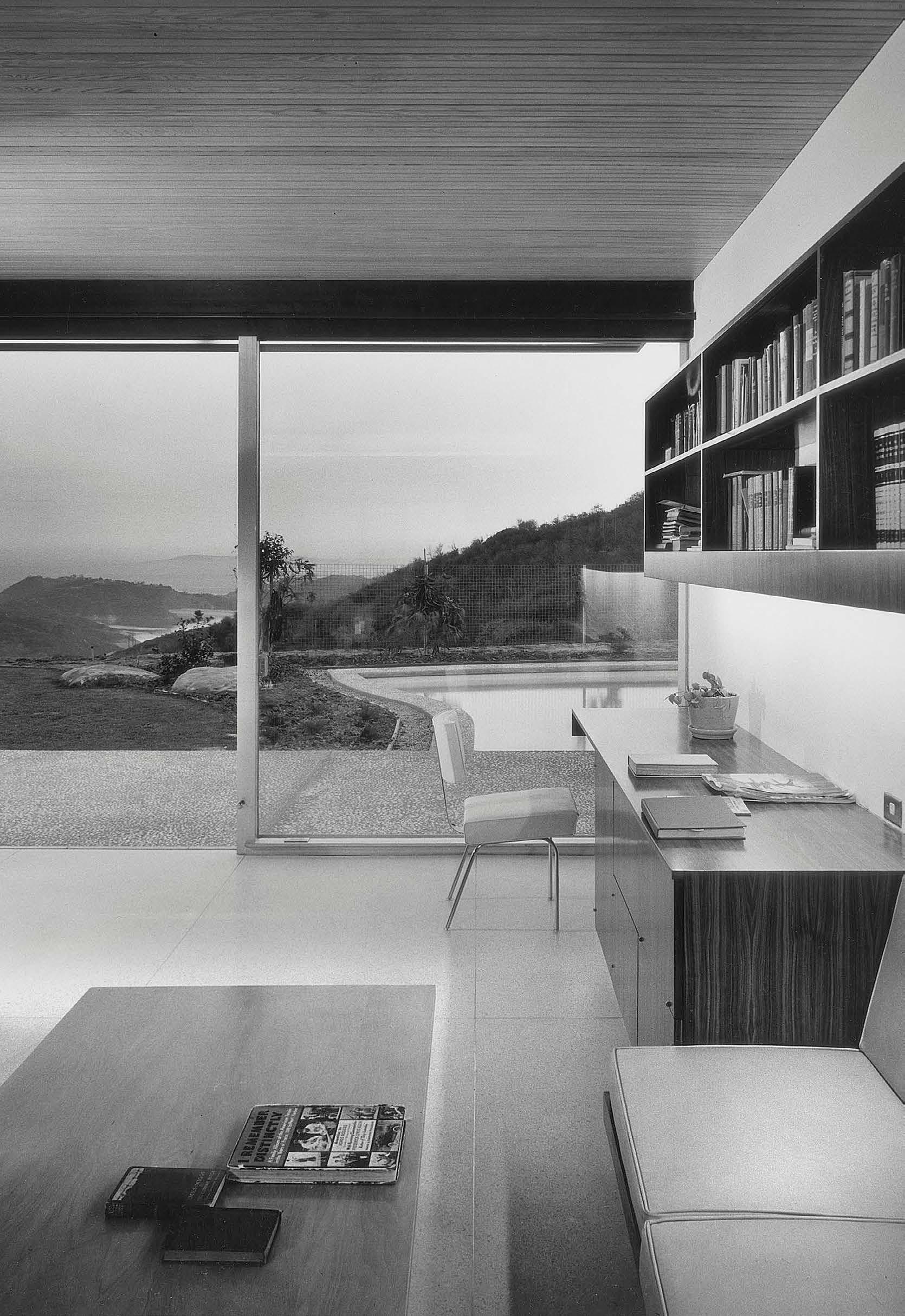
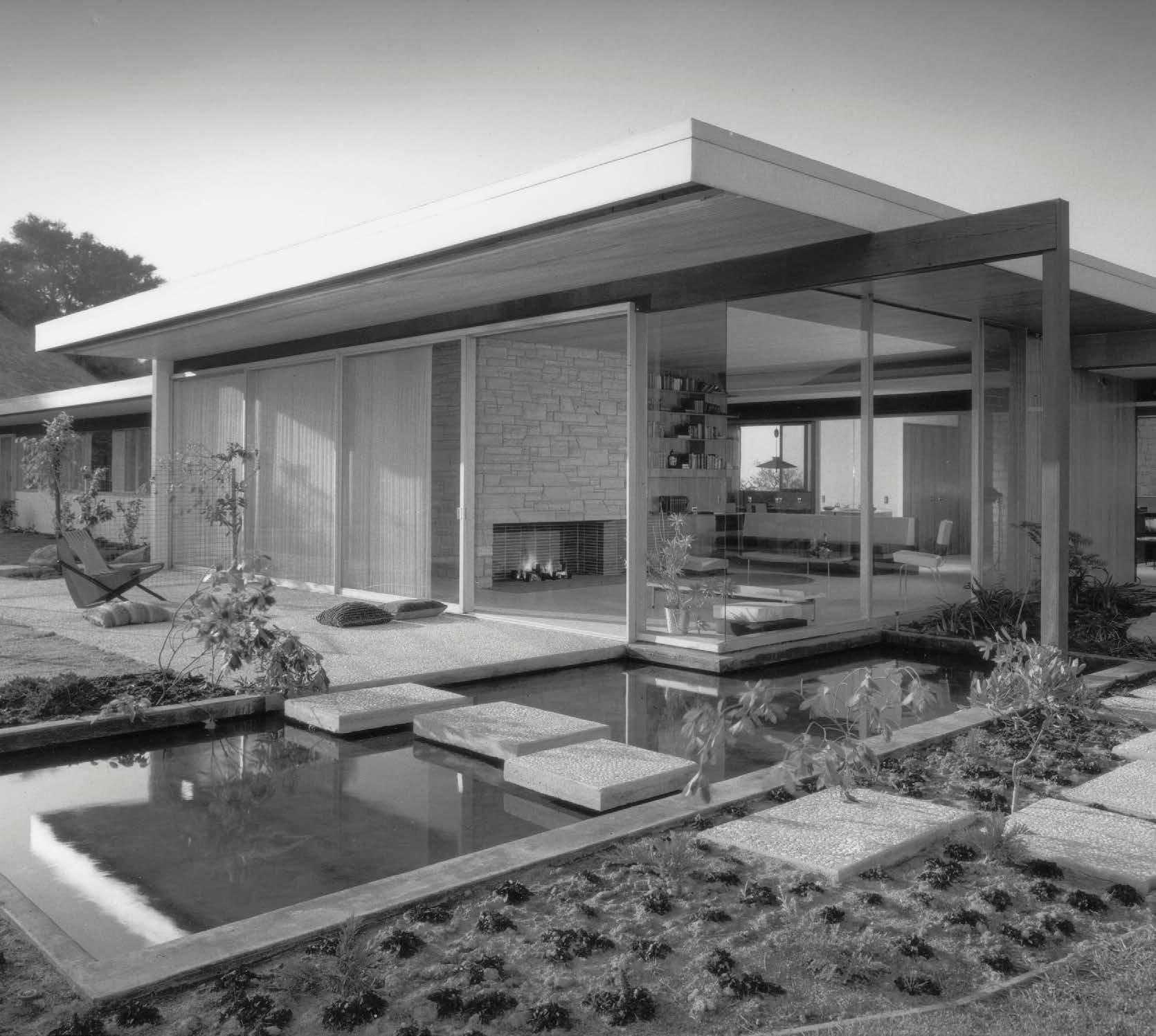
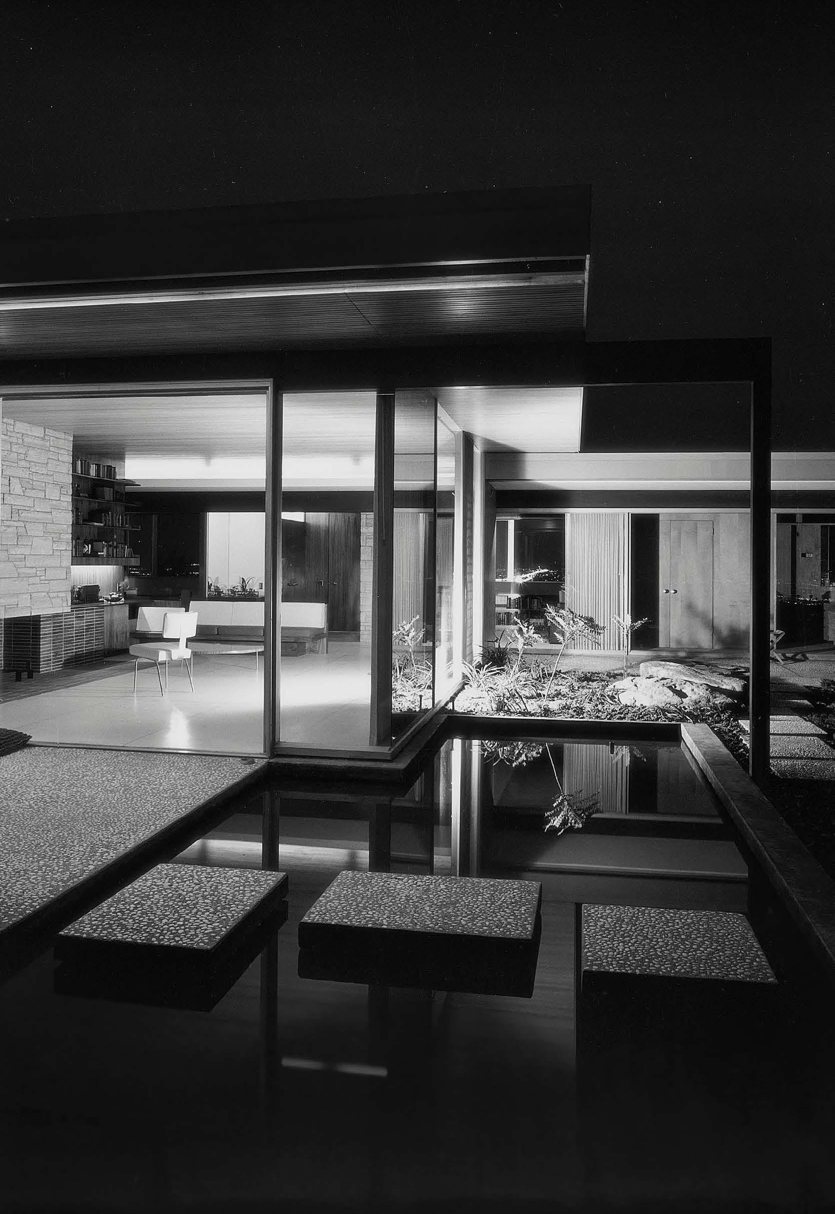
Characteristic of Neutra’s design philosophy, the Singleton House is a beautiful blending of indoors and outdoors. Huge walls of sliding glass doors create a feeling of openness and frame mountain views. Multiple terraces and a reflecting pool are complemented by Japanese-style plantings that were designed by landscape architect Jocelyn Domela.
Carefully restored in the early 2000’s by Vidal Sasson, the house remains a shining example of Neutra’s innovative architectural thinking and a time capsule of California’s golden age of Modernism.
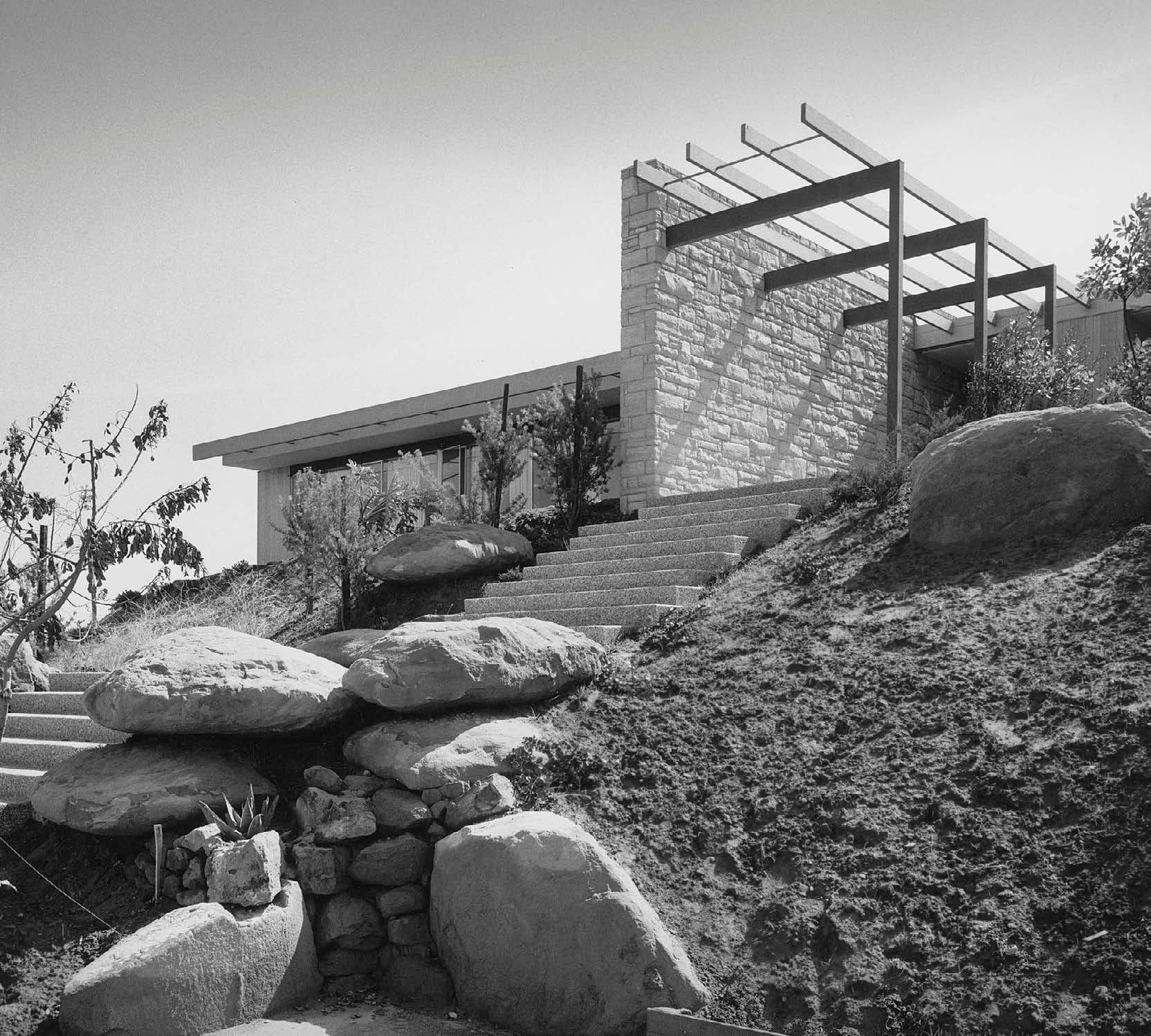
These photos were taken by Julius Shulman, shortly after the project’s completion in 1959.
24 Richard Neutra n 1959 n Los Angeles, California
The ideal setting for California indoor/outdoor living, situated at the base of the Santa Monica mountains.
 Photos by Julius Shulman
26
Left: Boulders found on the site were integrated into the landscape design. Note the stone on the exterior wall is repeated on the fireplace hearth pictured at right, helping to unify the exterior of the house with the interior.
Right: Sleek built-ins are a hallmark of Neutra’s house designs, demonstrated here with a cantilevered sofa and shelving unit designed as one unified composition.
27
 By extending support columns past the walls of the house, Neutra softens the traditional division between interior and exterior space. The Santa Monica mountains stretch into the horizon.

30
31
Left: the built-in desk hangs on the wall without the visual clutter of legs. Walls of glass bring in views of the Santa Monica mountains in the distance.
Above: even the stepping-stones across the reflecting pool are cantilevered, creating the effect of floating above the water.
32
Above: Neutra designed modular sofa units with detachable cushions that could also be spread out on the floor for extra seating or playing games with children.
Right: After dark, the Singleton House’s reflecting pool acts as a mirror that reflects the striking architecture and the night sky.
33
DESIGNING THE JET AGE
Jet-engine aircraft were developed for the military in the 1940s. But in the following two decades, jet-engine technology was quickly adopted by commercial airlines, sparking a revolution in travel so profound that it captured the public’s imagination and influenced a glamorous new era of airport architecture, airline fashion, graphics and interior design.

Special Section
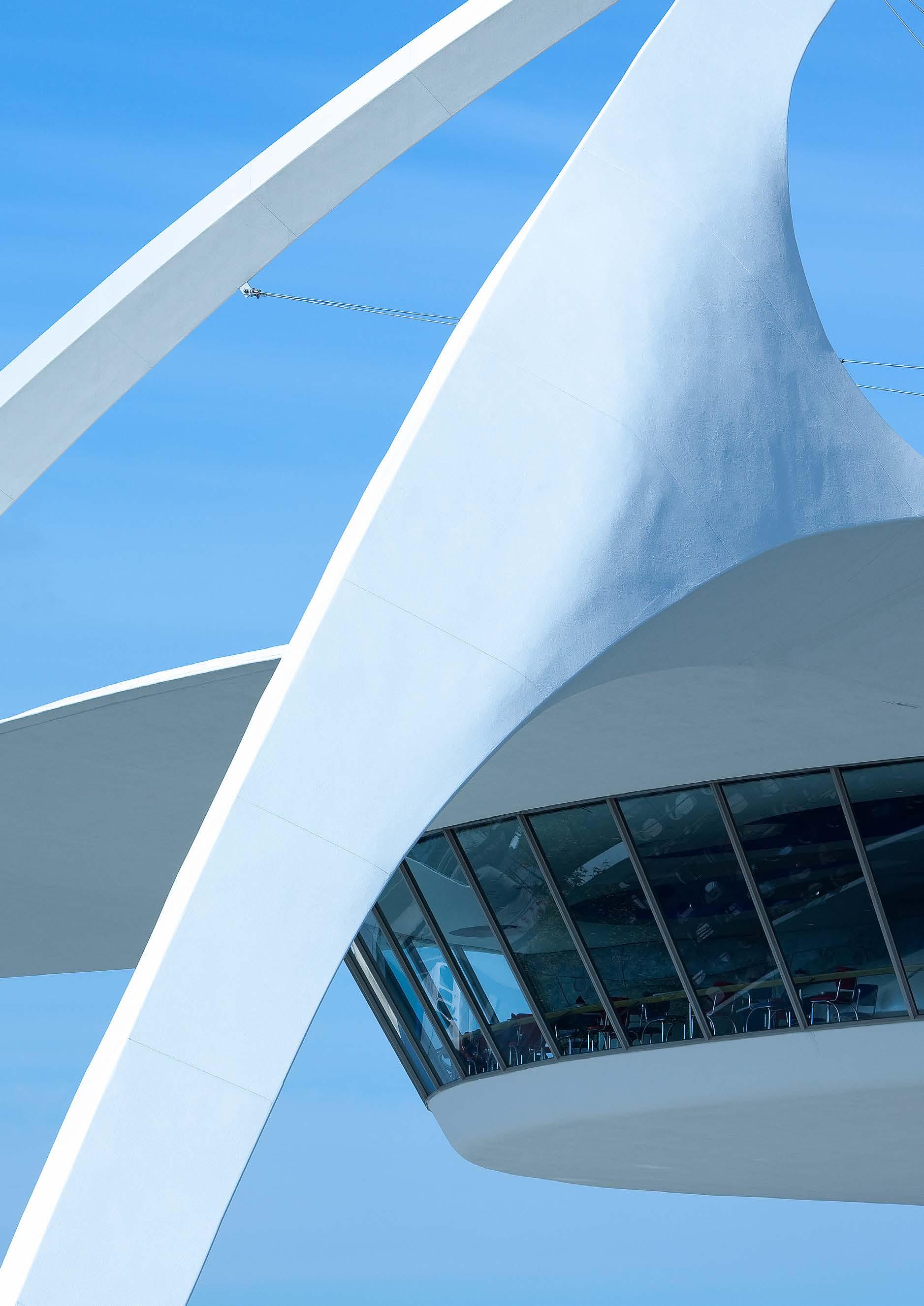 The Theme Building, Los Angeles International Airport, 1961 Architects: James Langenheim & Paul R. Williams

36
FASHION
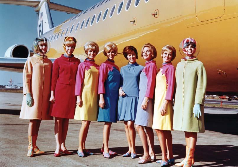
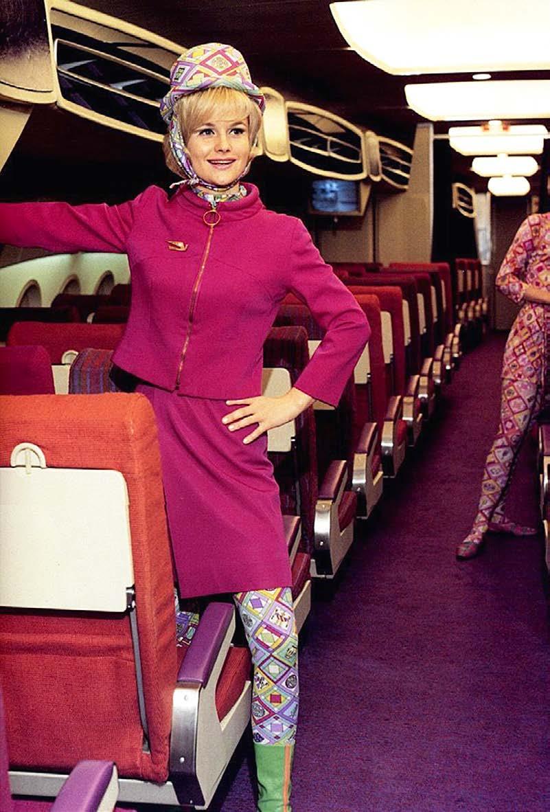
In the 1940s, utilitarian flight attendant uniforms were influenced by military styles. But all that had changed by the 1960s, when fashion designers were hired to bring style to the skies. Pictured here is a Braniff International “air hostess” in a uniform designed by Emilio Pucci in 1965. The astronaut-style headgear reflects America’s fascination with new developments in space exploration.

37

38
ARCHITECTURE
The excitement of jet travel was soon reflected in airport architecture, where dynamic new forms telegraphed a clear message to travelers: The future has arrived. Shown here is the soaring main terminal at St. Louis Lambert International Airport, designed by architect Minoru Yamasaki in 1956.

39

40
GRAPHICS
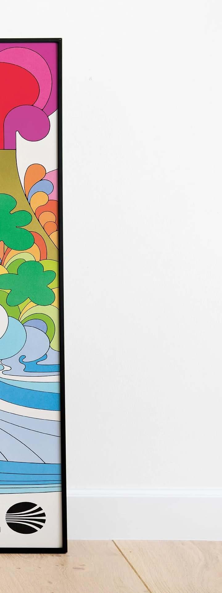
Traditional travel posters were in use from the early days of passenger trains, but the modern spirit of the Jet Age demanded a fresh new look in advertising and graphic design. This 1969 poster (artist unknown) features the modernist Continental Airlines’ logo and a vibrant illustration influenced by Peter Max, Psychedelic album covers, and Pop artists like Roy Lichtenstein. Has a volcano eruption ever looked groovier?
41
42
INTERIOR DESIGN
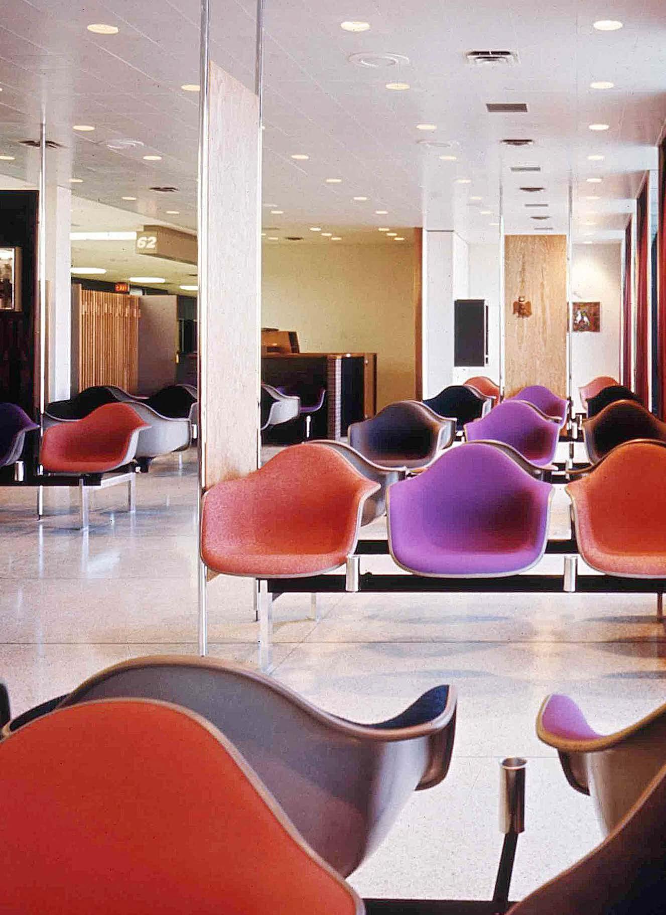
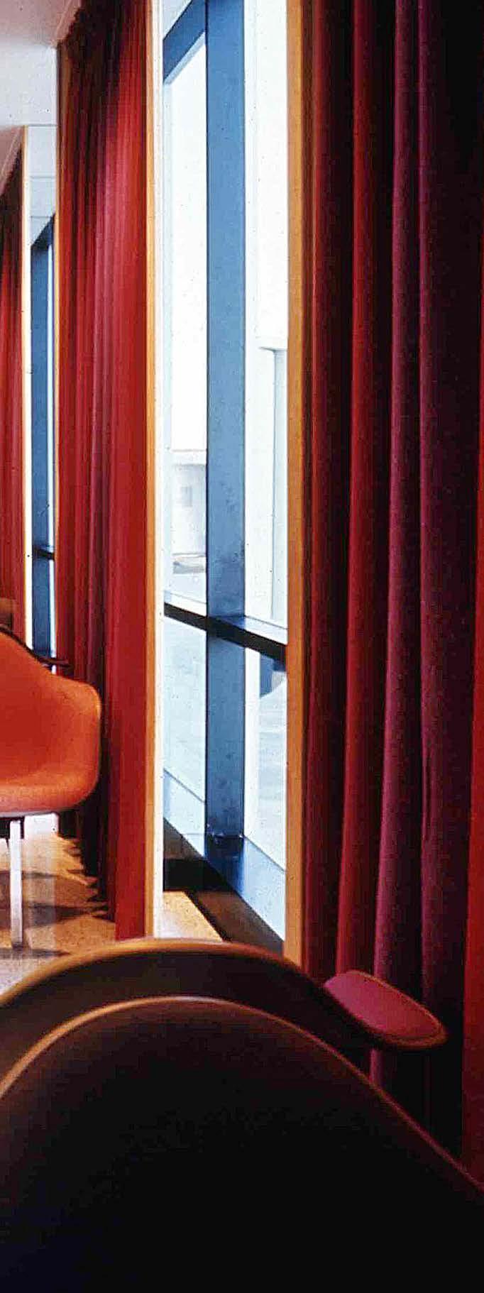
Traditional design styles seemed incompatible with jet travel, which was closely associated with technology and progress. As a result, airport interiors were furnished with brightlycolored textiles and modern furniture designs. At left is a late-1960s Braniff International airport lounge designed by Alexander Girard, incorporating Eames Shell Chair seating in multiple colors.
43
44
VISUAL IDENTITIES
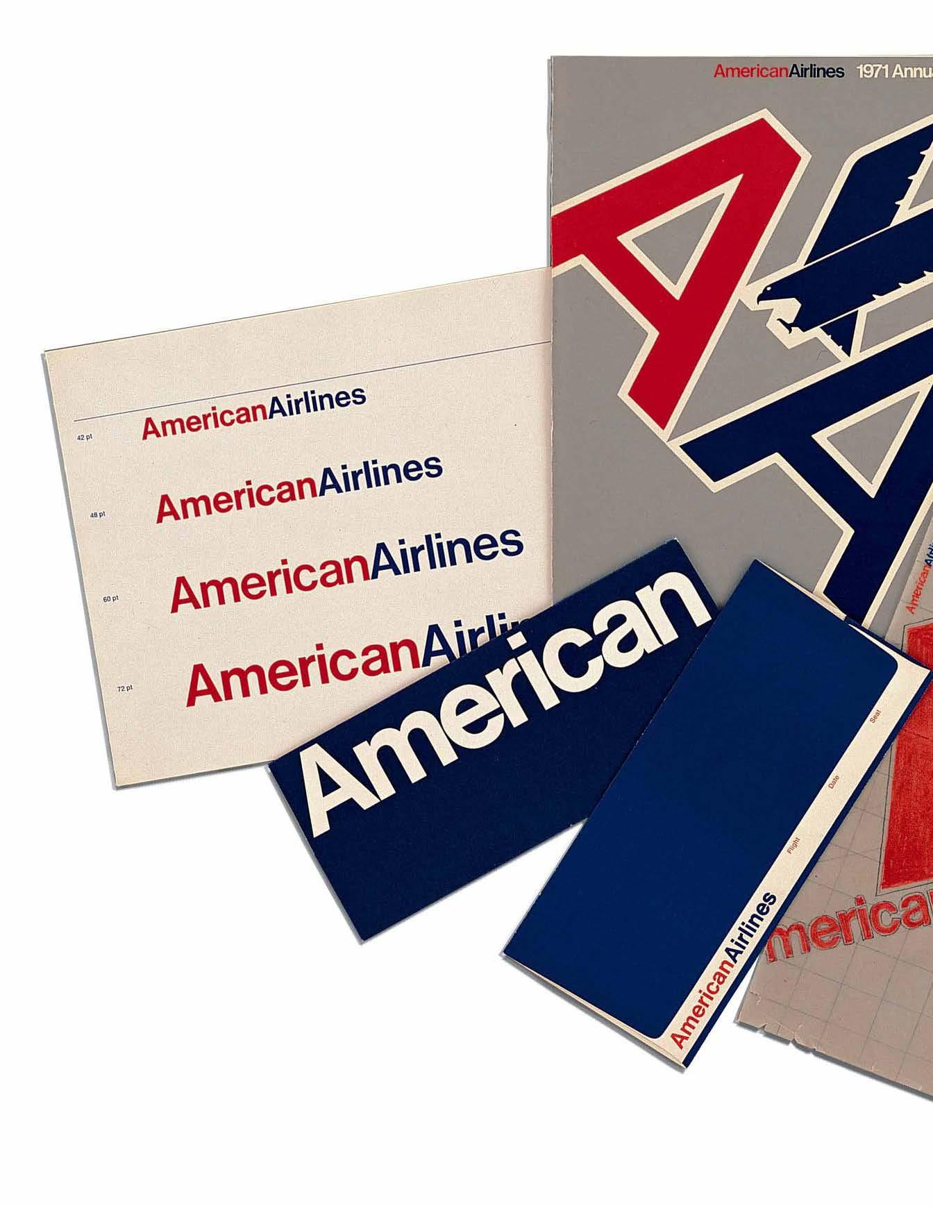
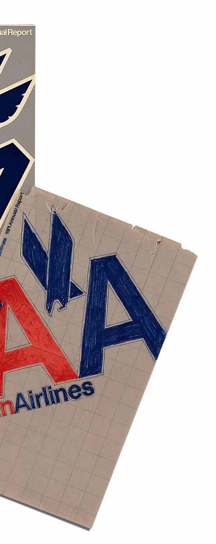
Streamlined and efficient, the modernist approach to graphic design was perfectly suited to identify and promote the airlines of the Jet Age. Vignelli Associates designed a new corporate identity for American Airlines in 1967 — an elegantly simple visual system consisting of two colors and one typeface (Helvetica, of course).
45
Dulles Airport: Modernist Masterpiece or Aging Infrastructure?
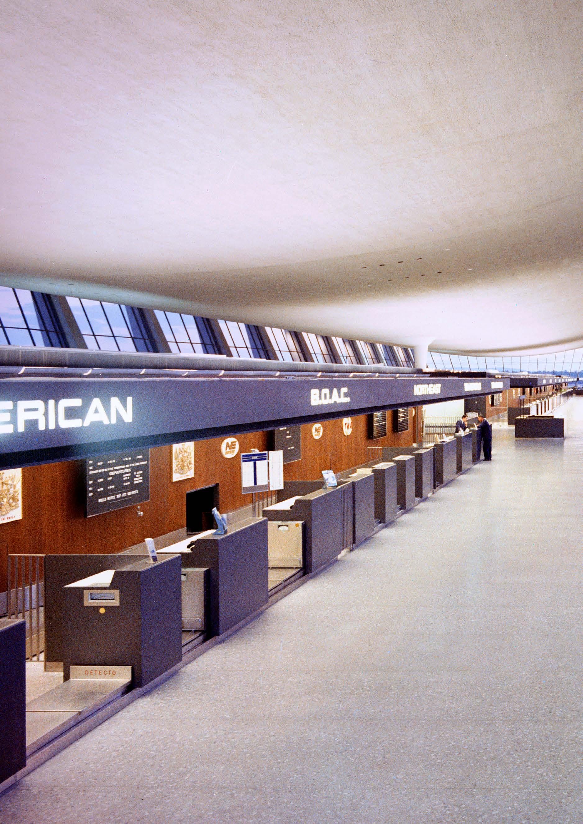 Article by Deane Madsen
Eero Saarinen n 1962 n Sterling, Virginia
Dulles’ main terminal was recognized by the American Institute of Architects in 1966 for its innovative design concept.

The commission for the International Airport for Washington, DC (now known as Washington Dulles International Airport) in Chantilly, VA, landed with Saarinen and Associates two years after that of the TWA Flight Center (see page 76), in 1958. For this project, Saarinen, along with the team of Ammann & Whitney (engineering), Charles Landrum (airport consultant), and Burns & McDonnell (mechanical) sought to make a statement piece of architecture to show that Washington, DC, was firmly embracing the jet age with a soaring terminal building evocative of grandeur.
To do that, they first had to grapple with technological advancements in the aeronautical industry that allowed larger planes to carry more passengers—namely, jets. In a roughly ten-minute film produced by designer Charles Eames, a narrator describes the problem in full over a soundtrack of footsteps: that passengers must traverse vast distances to get from curb to the gate—distances which were predicted to increase in proportion to the increases in passenger plane size. Larger planes would mean more distance between gates, in turn adding to the lengths of terminals until it was predicted that a passenger would travel 1,600 feet (about five times the length of a football field) between getting out of their personal conveyance at the airport edge and embarking upon their airplane at the gate.
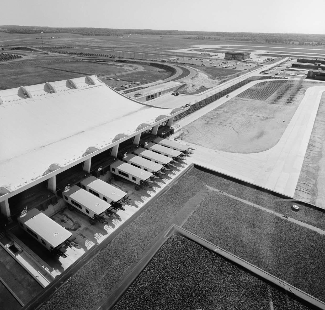
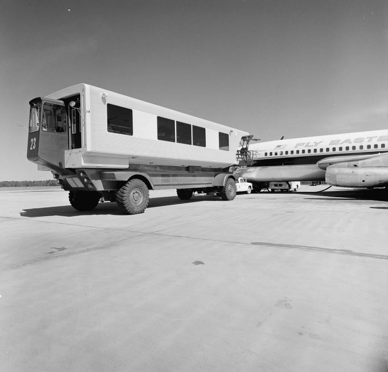
Where Dulles would be different from other airports around the country would be in its layout, forgoing the endless stretches of terminals for a single point of embarkation with innovative mobile lounges covering the rest of the distance. With airplanes parked offsite around service cores, passengers could be shuttled to the planes, effectively eliding the distance
traveled by passengers and compressing the boarding process as well. “The soundest system seemed to be one which brought the passenger to the plane rather than the plane to the passenger,” Saarinen said. “We became convinced that the mobile lounge was a logical solution to the critical problems.”
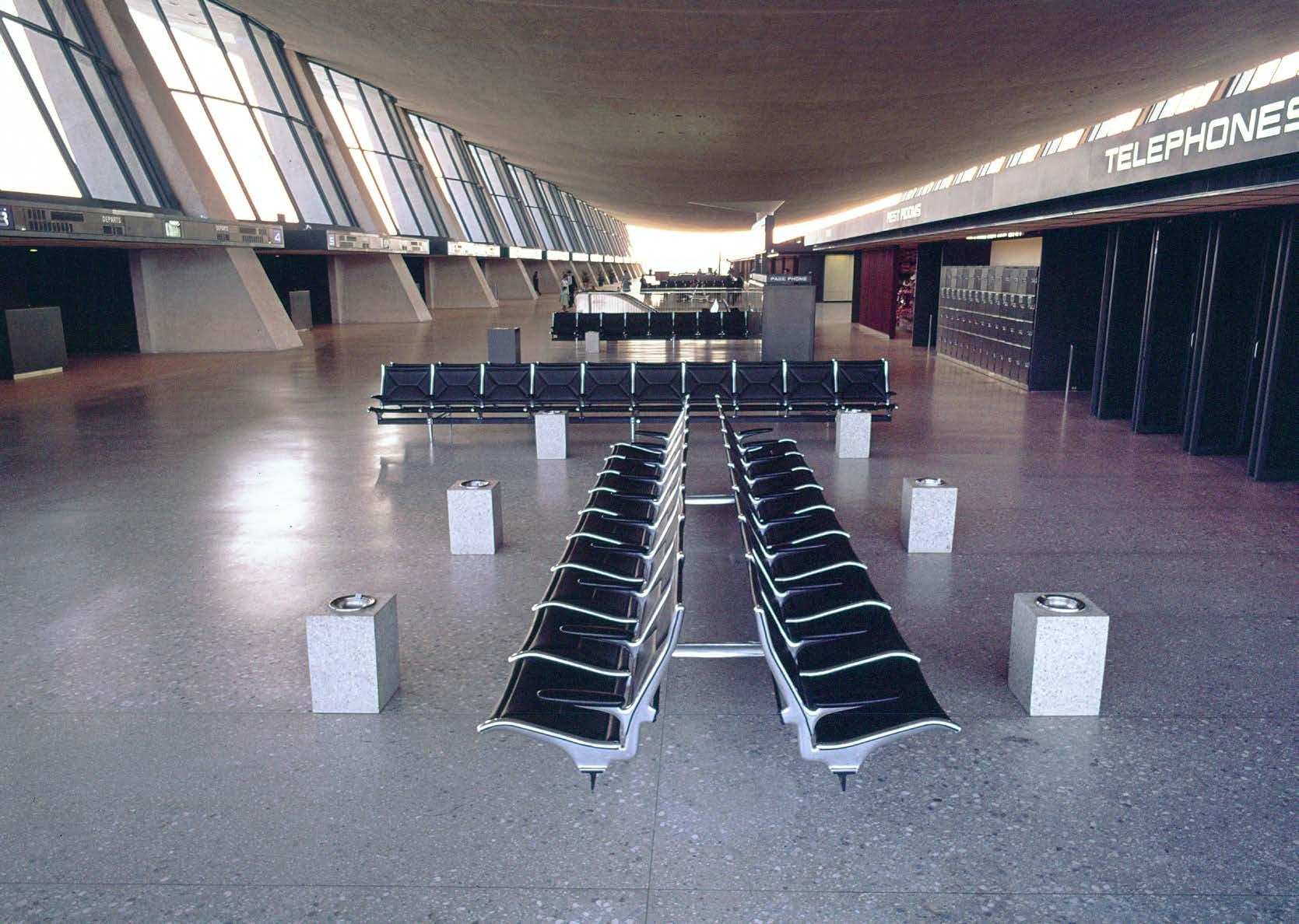
Convincing everyone else would be another matter altogether, hence Saarinen’s team enlisting the help of Charles Eames to produce the explanatory film, by the end of which their solution seems the only possible remedy to the jet-age distance dilemma. (The film itself was one of many collaborations between Saarinen and the Eames office; Saarinen would specify the Eames Tandem Sling seating units throughout the new airport, and, in a fitting tribute, Eero and Aline Saarinen named their son Eames.)
Designing the Terminal
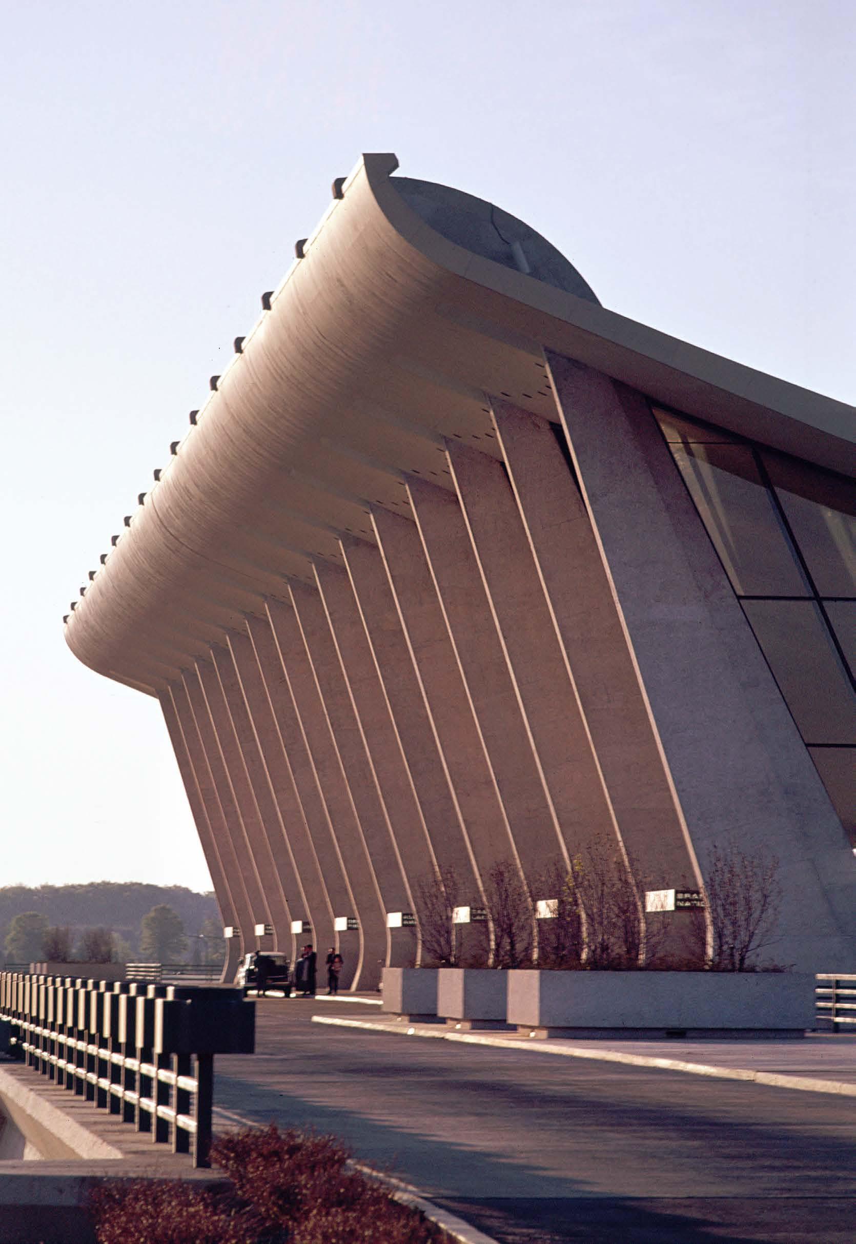
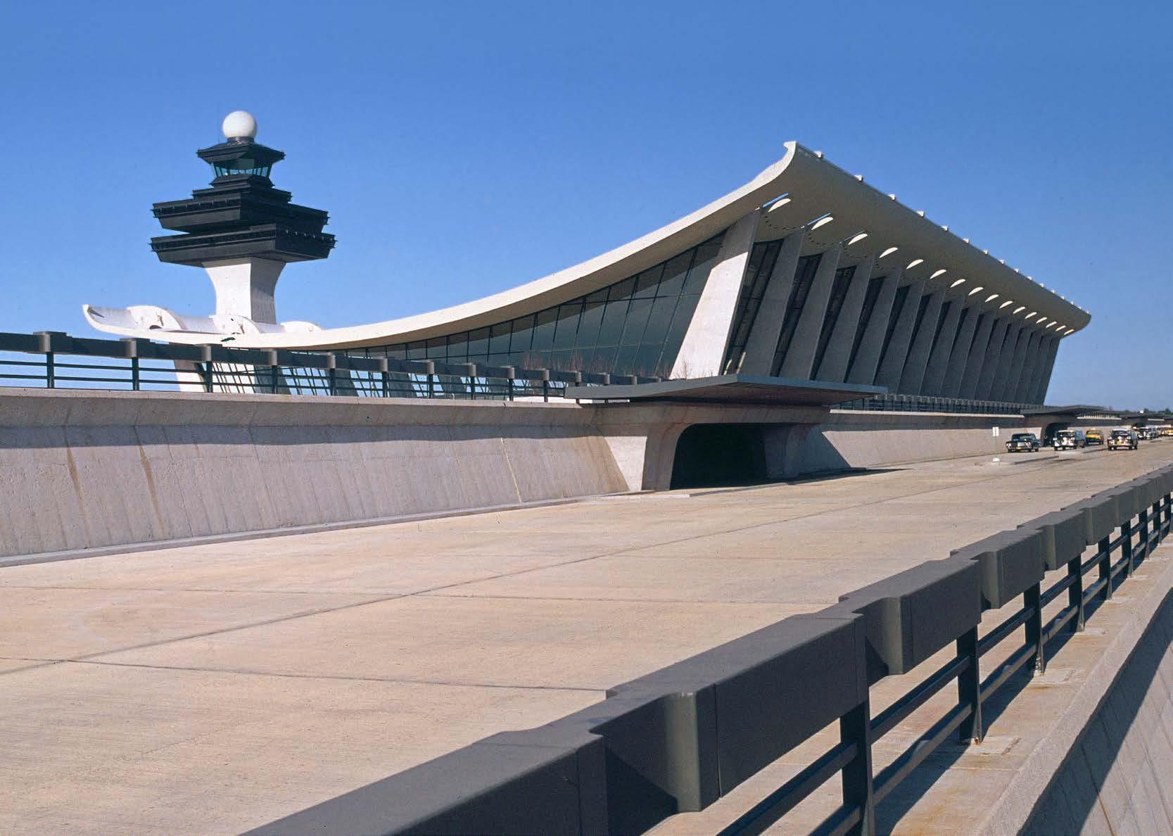
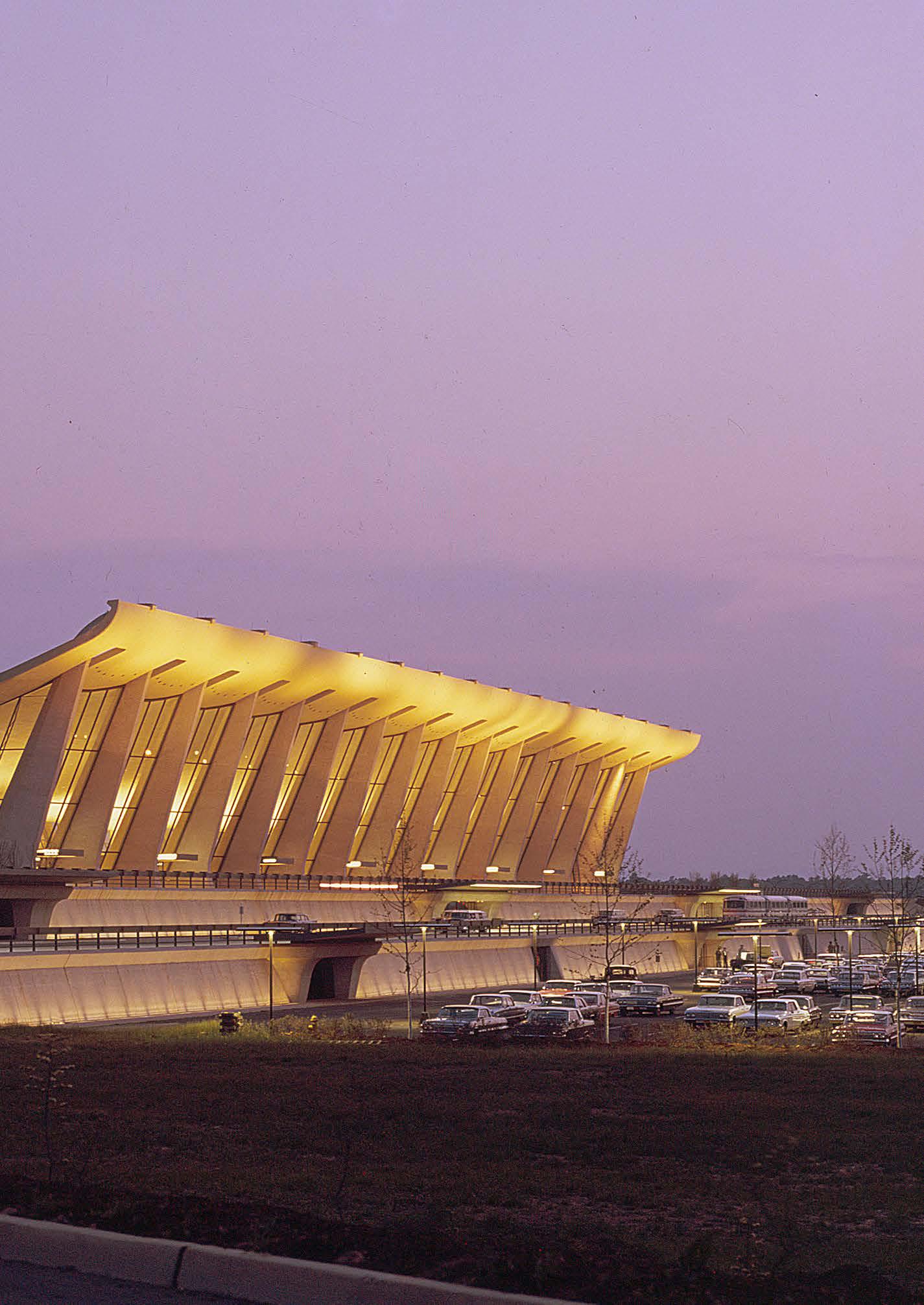
With mobile lounges as the solution for reducing the passenger travel distance, what remained was design of the terminal building, which Saarinen envisioned as “a strong form that seemed both to rise from the plain and to hover over it” with “a monumental scale … in the vastness of this huge airfield.” Desiring a building with a grand façade to greet arriving passengers that descended lower at its middle before rising up slightly at the back, Saarinen and co. arrived at a suspended roof, with its famously minimal cross-section. The catenary sag of the concrete roof is supported by cables suspended by columns spaced forty feet apart, which splay outward to further dramatize the sweeping curve of the roofline. Saarinen likened it to “a huge, continuous hammock suspended between concrete trees.”
In addition to considering the terminal as a new paradigm
48
“NO ONE ASKED US TO GRAPPLE WITH THE PROBLEM OF A JET-AGE TERMINAL BEYOND THE QUESTION OF PURE ARCHITECTURE. BUT I BELIEVE THE ARCHITECT HAS TO ASSUME THAT KIND OF RESPONSIBILITY.”
— Eero Saarinen
49
The newly-constructed Dulles Airport in November, 1962
50
for travel, Saarinen was aware that growth, not just in airplane size but in airport capacity, was on the horizon. As such, he and his team also proposed 320-foot additions that could extend outward from both ends of the original 600-foot length; the airport completed these additions in 1996. Along the way, Dulles expanded with outlying terminals that bring its current capacity to nearly 22 million yearly passengers, up from a yearly average of 2–3 million (1969–1983), with plans to accommodate 55 million passengers per year (150,000 per day) in the future.
Changes in Air Travel
Dulles was projected to handle some six million annual passengers when it opened, and while that total took several decades to achieve, what Saarinen could not have foreseen—he died suddenly in 1961, before Dulles was completed—was the continued growth both of airplanes and of passengers’ appetite for air travel; a DC-7 carried just over a hundred people—roughly equal to the capacity of the mobile lounges designed to serve them—while 747s are capable of carrying 416-524 people, and a380s have an astounding maximum capacity of 853 people. The same scale problems that pushed Saarinen to design Dulles with its main terminal and mobile lounges have now rendered the model somewhat obsolete; Dulles would need to
run at least four mobile lounges to fill a single 747, making the system unworkable from a logistical point of view. To that end, Dulles has retained its mobile lounges, but now uses them to ferry passengers from the main terminal to the outlying ones, with a subterranean tram providing a faster and more capacious alternative.
Yet Dulles Airport remains as a beautiful relic of a bygone era. Arriving at the main terminal today is no less glamorous than it was in the mid-1960s, where early morning sunlight coats the underside of the pendulous roof in a warm glow. The playful and uplifting swoop, visible on approach either by vehicle or now by Metro, still hearkens back to the days when jet travel was an exciting glimpse into the future. Now, even though the future has surpassed the visions for it, Saarinen’s work still holds up—with its cantilevered, uplifting columns indicative of the aspirations of the Jet Age and a befitting welcome to the nation’s capital.
Deane Madsen is a writer and architectural photographer living and working in Washington, D.C. He is the founder of Brutalist DC, an online appreciation society for Brutalist architecture in the nation’s capital. Follow him on Instagram at @deane_madsen and @brutalistdc.
51
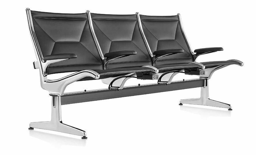
Above left: The Eames Tandem Sling seating system was designed by Charles Eames and the Eames office for Dulles Airport, and became a fixture in airports around the world. It’s still in production by the Herman Miller furniture company.
Left: Opened to the public in 1962, Dulles was the world’s first airport designed to accommodate a majority of jet planes.
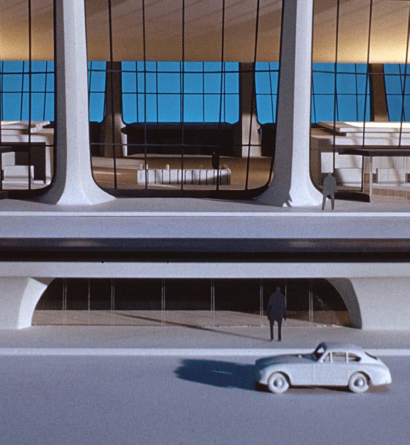
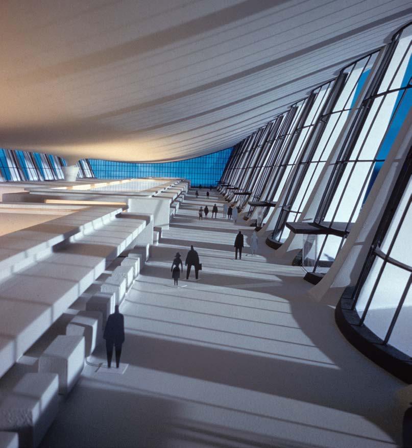
Eero Saarinen’s architectural model for Dulles Airport, created in 1960, helps to visually explain the structure’s primary engineering concept: Angled concrete columns on each side of the main concourse carry suspension cables that in turn support curved concrete roof panels.

52

53
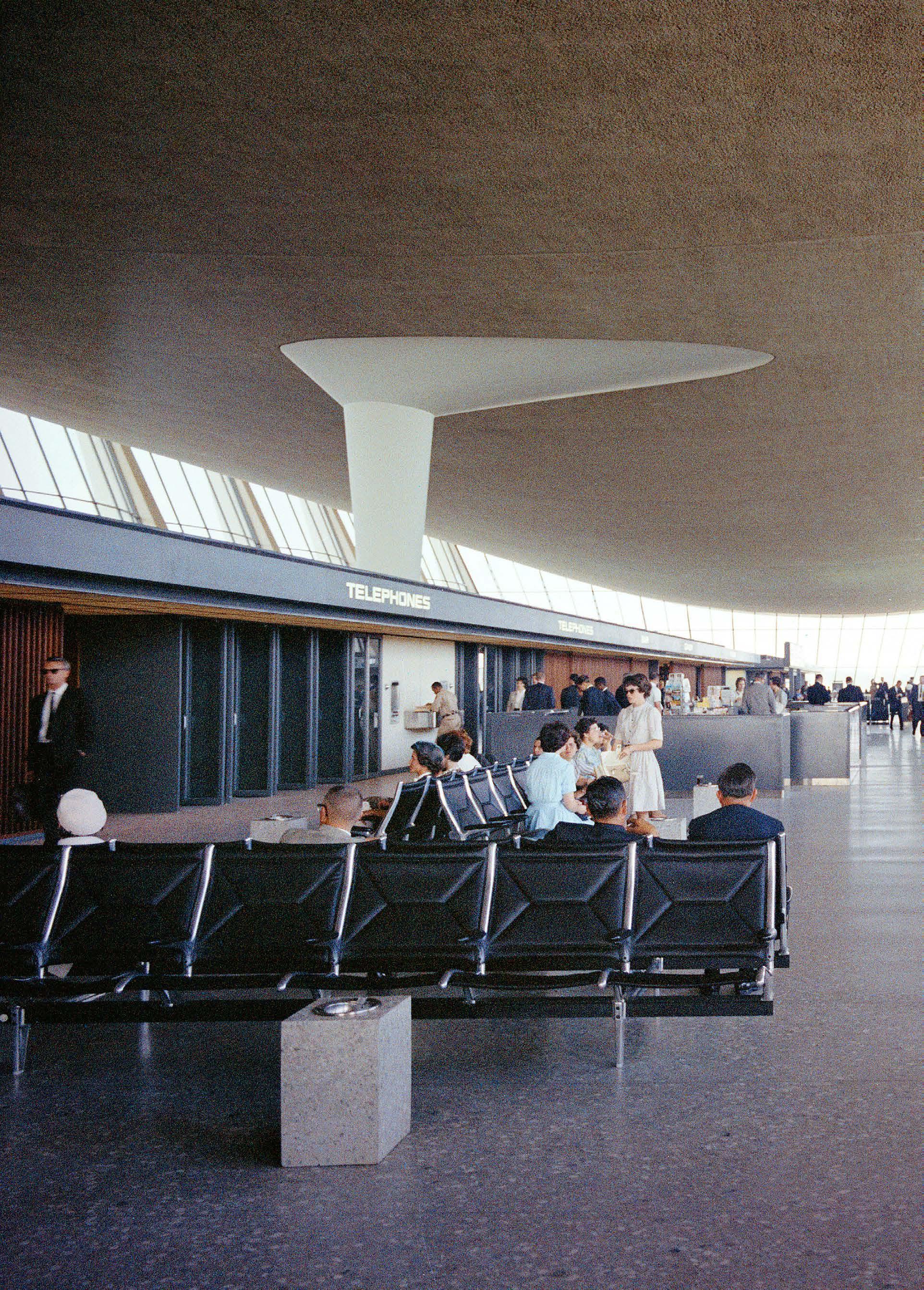
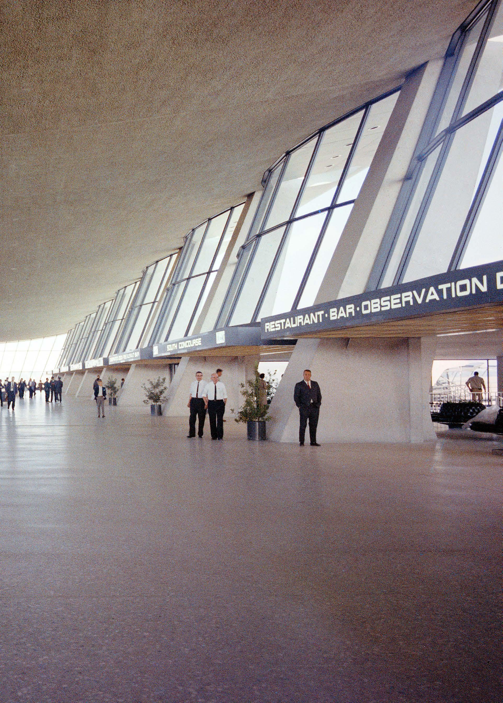 The streamlined typeface on Dulles Airport signage was custom-designed by Eero Saarinen in 1960.
Saarinen wanted to avoid the long walks and “finger terminals” common to most American airports and to enhance the esthetics of the flying experience. His solution was the introduction of “Mobile Lounges,” which were custom-designed bus-like vehicles that would convey passengers from the terminal to planes waiting at mid-field. The Mobile Lounges were designed to attach themselves to the airplane door, so travelers could step directly from the vehicle onto the plane.

56

57
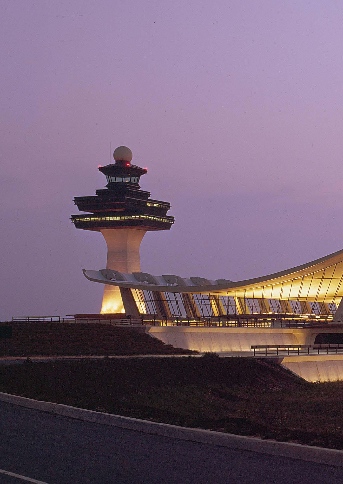
“THIS AIRPORT IS UNIQUE … IN BEING THE NATIONAL AND INTERNATIONAL GATEWAY TO THE NATION’S CAPITAL. IT IS UNIQUE IN ITS OWNERSHIP—THE FEDERAL GOVERNMENT. IT IS UNIQUE IN BEING A PART OF THE WHOLE COMPLEX OF BUILDINGS THAT CREATE THE IMAGE OF THE NATION’S CAPITAL. WE FELT THE TERMINAL SHOULD EXPRESS ALL THAT IN ITS ARCHITECTURAL DESIGN.”
— Eero Saarinen, as quoted in “Eero Saarinen On His Work: A selection of buildings dating 1947–1964 with Statements by the Architect,” Aline B. Saarinen (Editor), Yale University Press, 1962
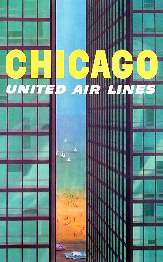
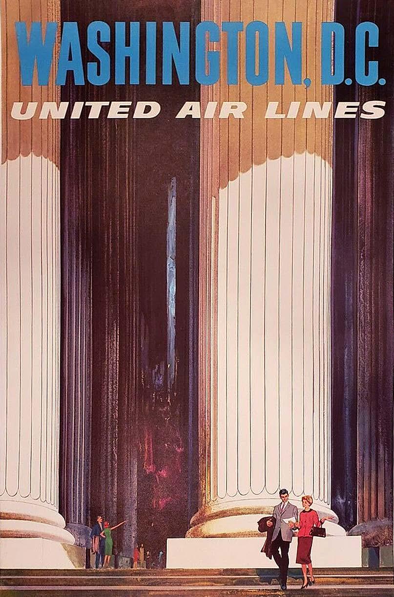
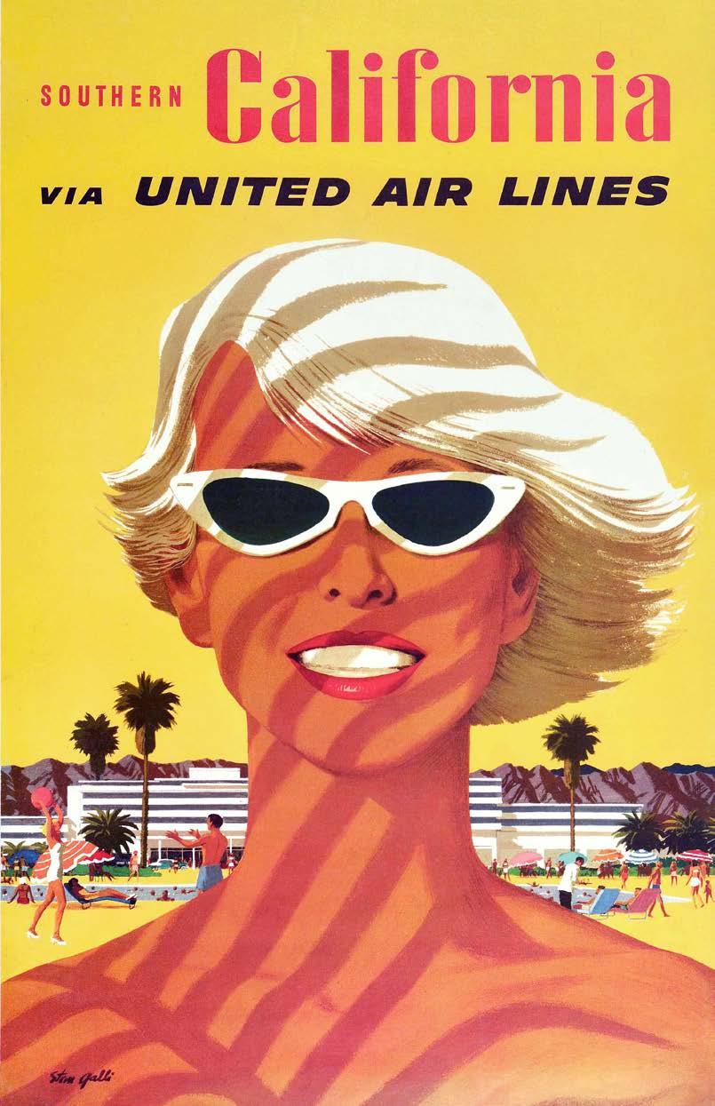
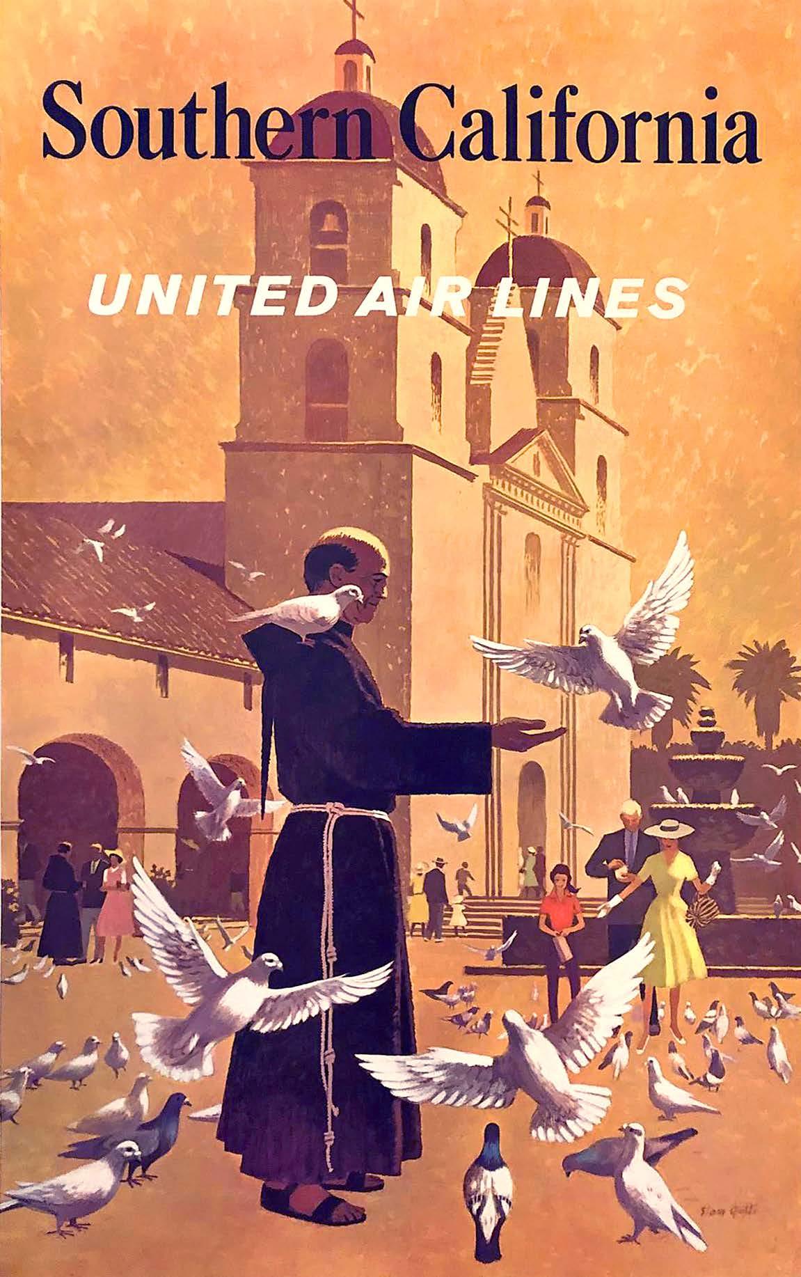
Illustrative Journeys: Stan Galli’s Travel Posters
In the early years of air travel, airlines didn’t just advertise their own brand, they promoted the idea of flying. Most Americans had never been on an airplane, but major airlines tempted potential customers by crafting ad campaigns around the glamour of air travel and the new accessibility of far-off destinations.

Continued on next page.
60
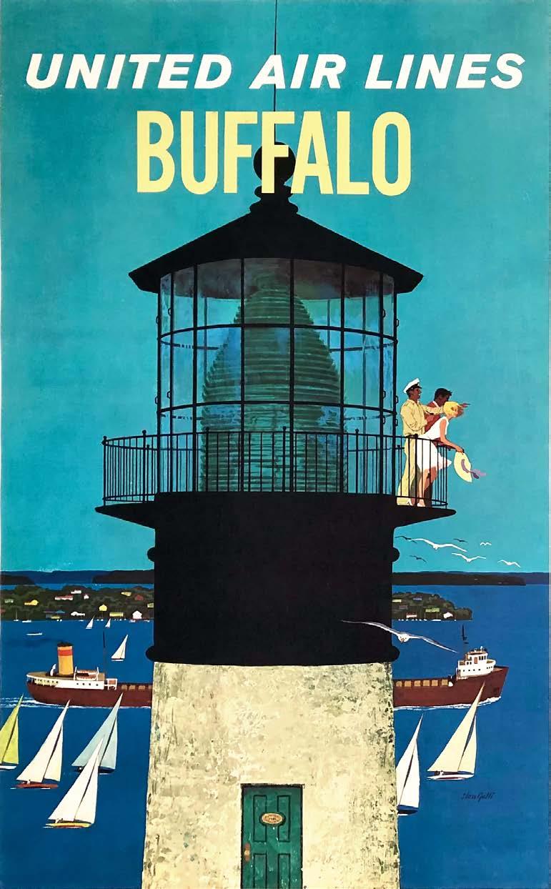
United Airlines n 1960s


62
United Airlines commissioned this series of posters in the early 1960 s for travel agents and for United Airlines’ regional sales offices.
Created by the talented West-Coast illustrator Stan Galli (19122009), these now-iconic posters depict happy tourists in exciting destinations across the country.

63
64
Galli’s illustrations for United are characterized by a sharp-focus realism and precise representation, held together by a clear color palette and a relentless mood of sunny optimism. Each of these thoughtfully-designed posters can now be seen as a little time capsule of sorts, telling a clear story about the perceived glamour and romance of the dawning jet age.

65
Style in the Sky: The Evolution of Flight Attendant Uniforms
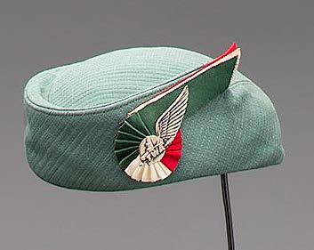

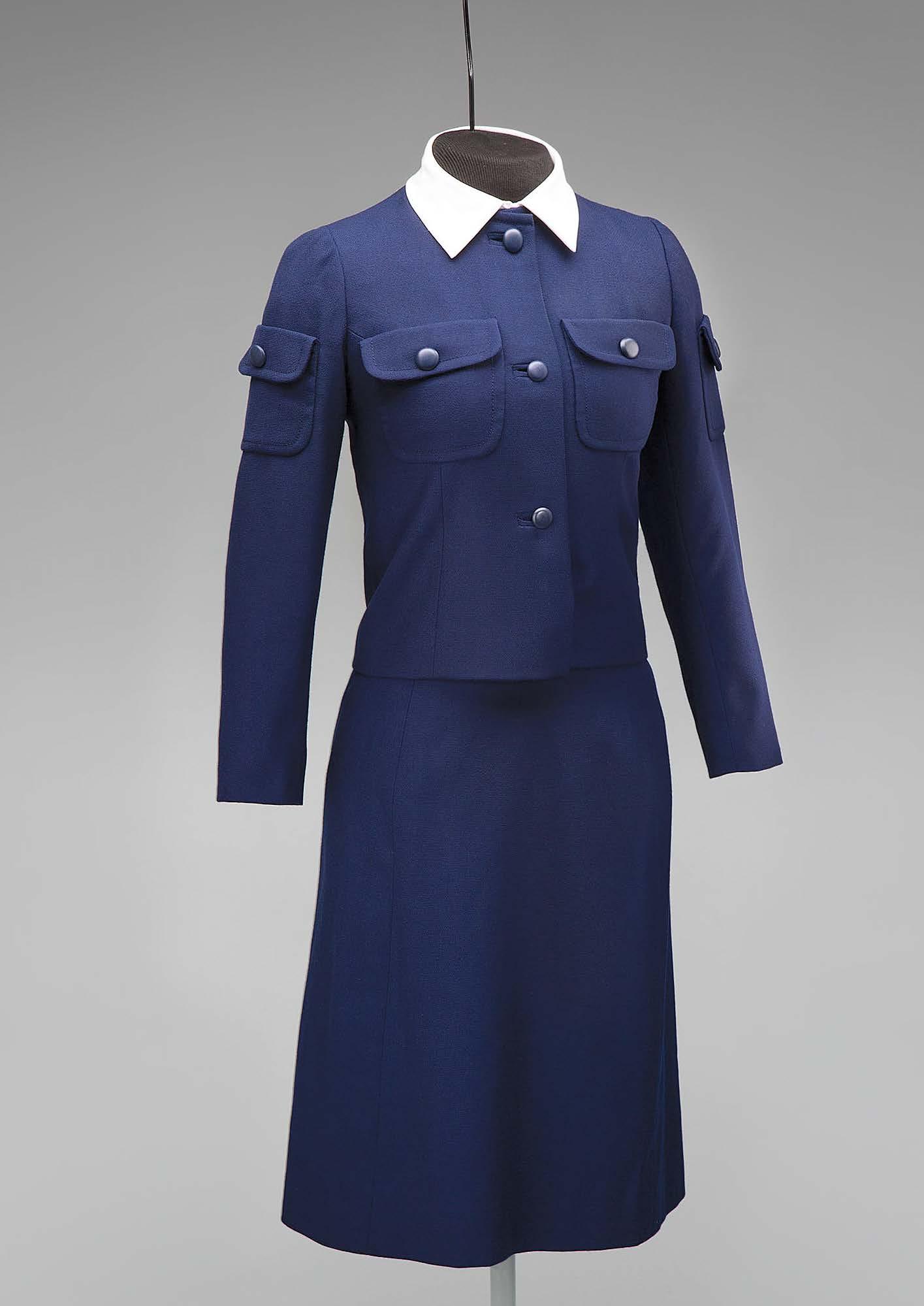
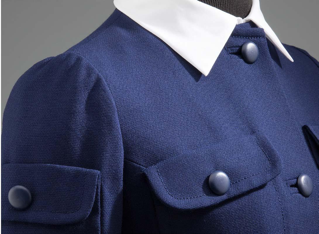
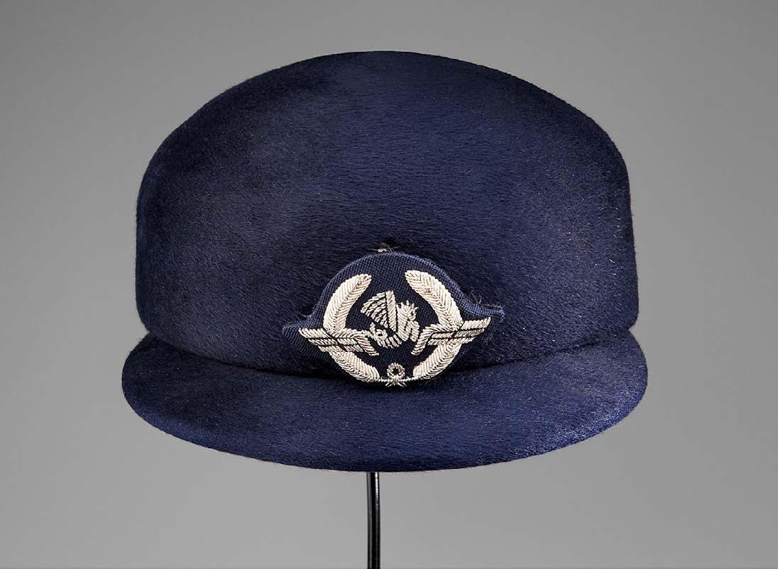
As air travel dramatically increased during the 1950s and 1960s, fashion designers were called upon by dozens of airlines to dress cabin crews in ways that projected brand identity, the excitement of the jet age, and the fashions of the times.
66
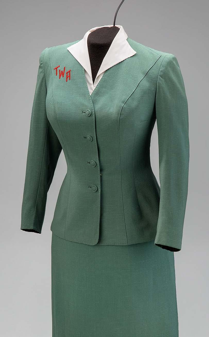
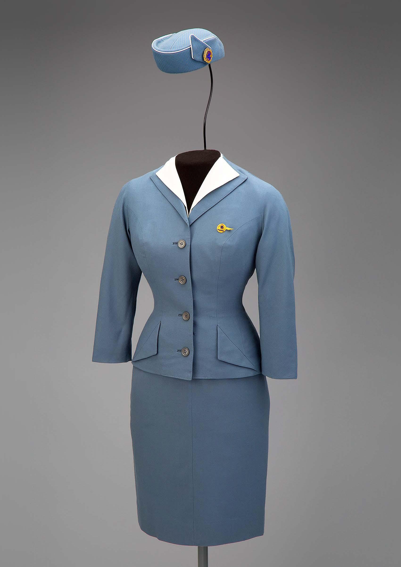
1958-1972 n Photos by SFO Museum
This page: Pan American World Airways (Pan Am) uniform, designed by Don Loper in 1958
Opposite page: Trans World Airlines (TWA) hostess uniform, designed by Oleg Cassini in 1955.
69
Left and below: Air France uniform designed by Cristóbal Balenciaga in 1969
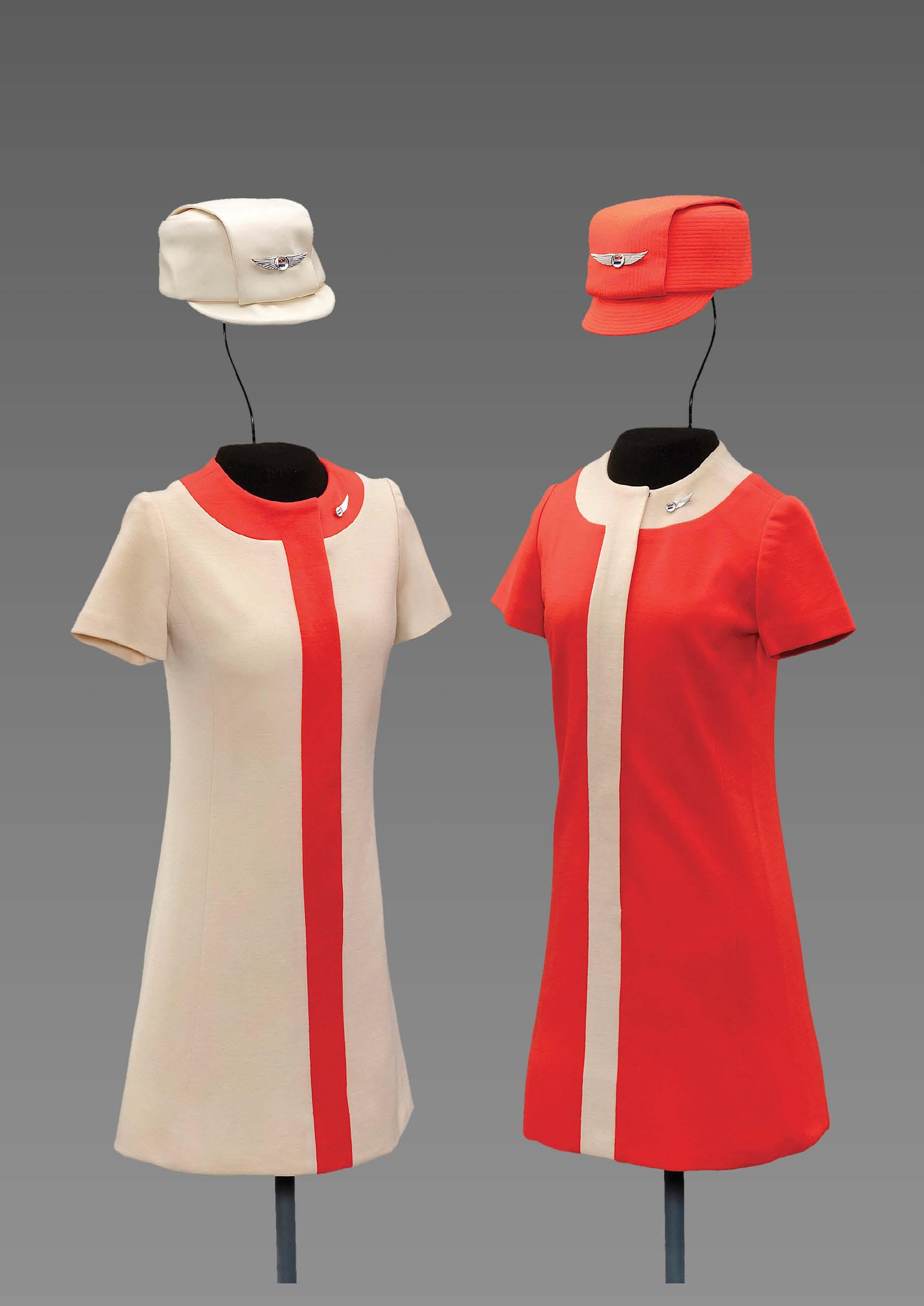
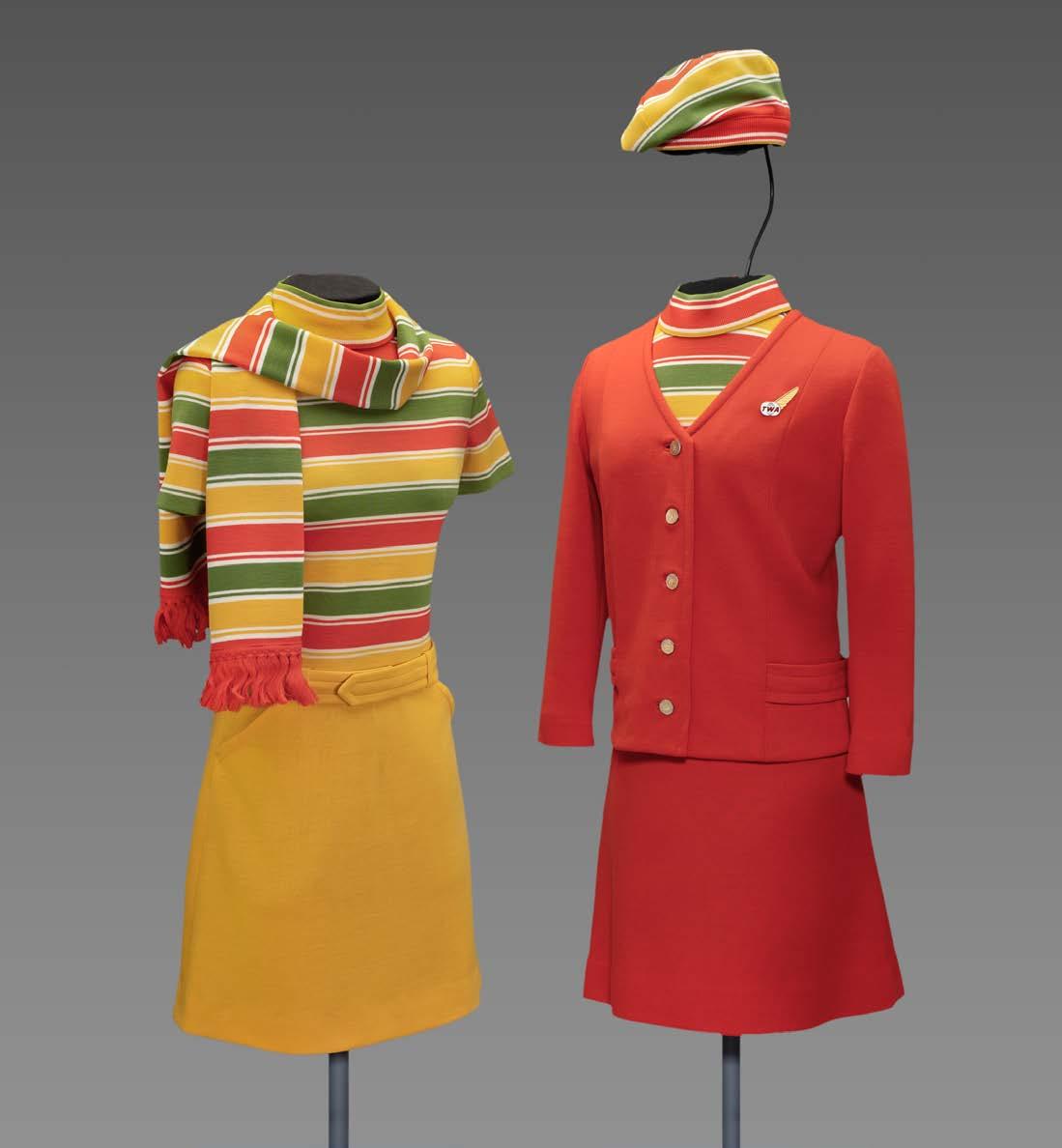
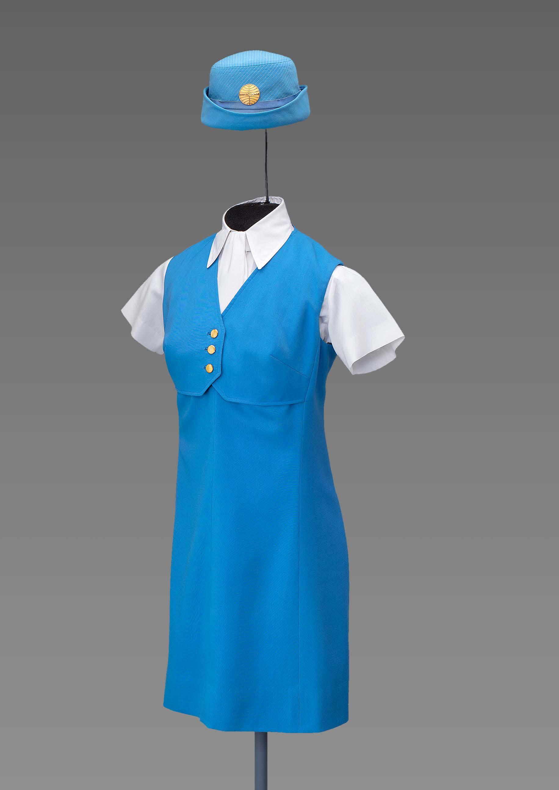
Women’s fashion underwent a massive transformation during the 1960s and 70s, driven by dramatic social change and a revolution in youth culture. As fashion designers experimented with new materials and styles on the runway, airlines gradually introduced more daring flight attendant uniforms to their cabins. During the 1960s, conservative-yet-elegant flight attendant suits evolved into ensembles that mirrored the fun-loving, free-spirit of the time. Influenced by Mod fashion and other trendy styles, these vibrant uniforms celebrated the allure of the jet-setting flight attendant. By the end of the decade, flight attendant uniforms became cool and chic rather than regimented and conservative.

71
Left: United Airlines uniforms, 1968
Designed by Jean Louis (1907–97)
Hats by Mae Hanauer
Right top: Stewardesses for Pacific Southwest Airlines were dressed in a distinctive color palette of pink and orange during the 1960 s.
Right bottom: Trans World Airlines (TWA) uniforms, 1968
 Pan American World Airways (Pan Am) uniforms, 1971
Designed by Frank Smith (1927-2007)
Evan-Picone | New York
Hats by Borsalino (left) and Mae Hanauer (right)

74
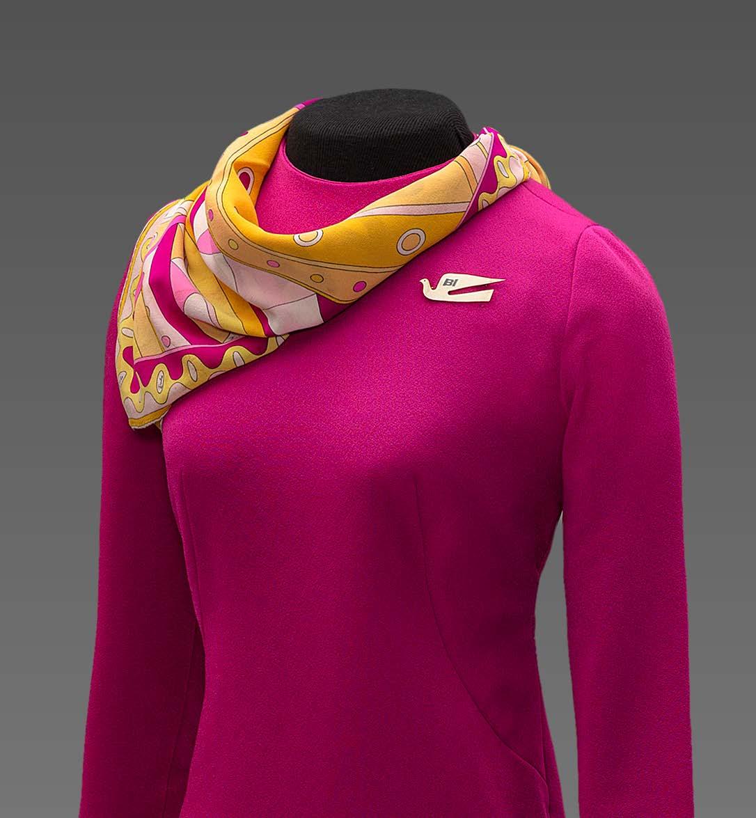
Left: Braniff International Airways uniforms, 1972
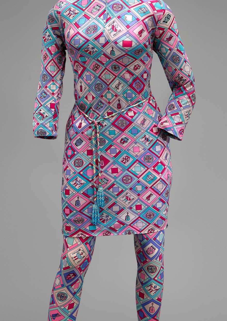
Designed by Emilio Pucci (1914–1992)
Insignia designed by Alexander Girard (1907–93)
75
Braniff International Airways uniform, 1968; Designed by Emilio Pucci
Insignia designed by Alexander Girard
The impact of modern style on airline uniforms continued into the 1970s. Synthetic fabrics in vivid colors and striking patterns showcased the glamour of the “Polyester Decade.” Airline fashion in the 1970s took note of the growing women’s liberation movement, evidenced by forward-thinking ensembles that included pants—a first for female flight attendant wear. However, color palettes became more traditional towards the end of the decade as shades of brown and navy blue were reintroduced. Check out the SFO Museum’s website for more fascinating examples of flight attendant uniforms made between 1967–74 for Braniff International Airways, Northwest Orient Airlines, Pan American World Airways, Trans World Airlines, and United Air Lines.

Designed by Emilio Pucci
SFO Museum, a division of San Francisco International Airport, is a cultural organization accredited by the American Alliance of Museums. The Museum is a multifaceted program with rotating exhibitions on a wide variety of subjects and interactive play areas featured throughout the terminals. www.sfomuseum.org
76
Braniff International Airways hostess uniform, 1966
TWA Flight Center
Eero Saarinen n 1956-62 n JFK Airport, New York City
Eero Saarinen’s futuristic architecture captures the exhilaration of flight and the bold spirit of air travel’s early days.
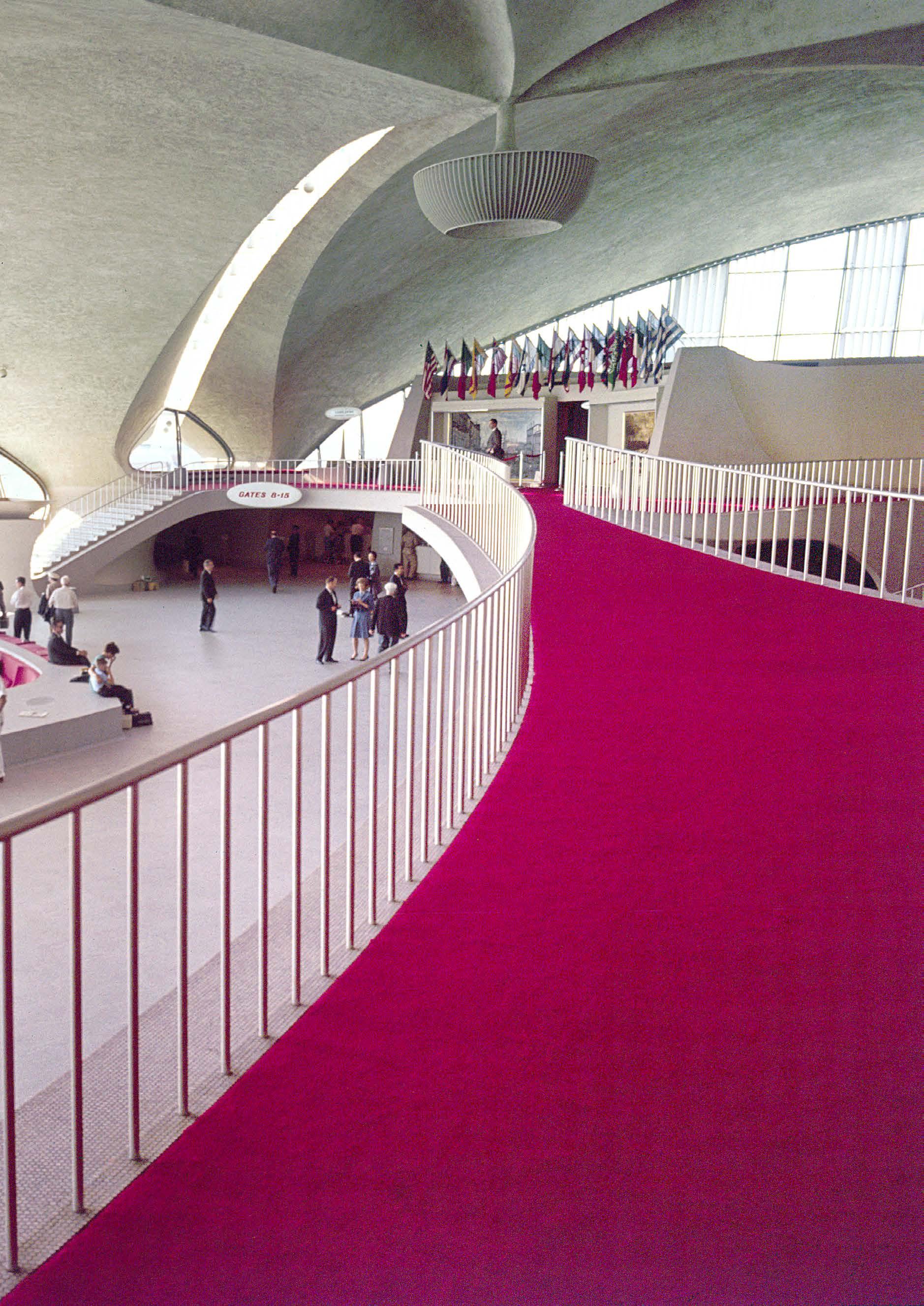
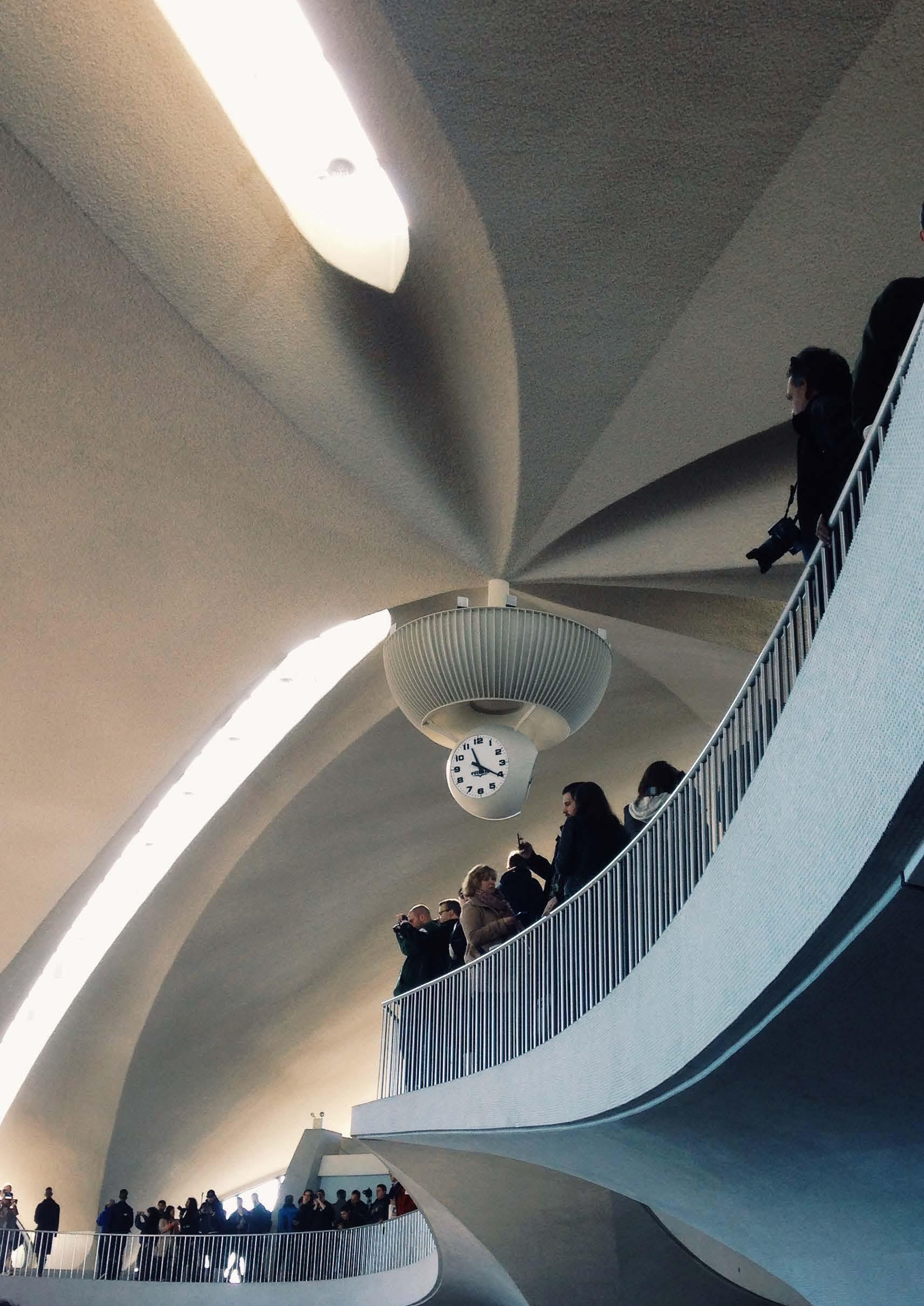
Previous spread: Travelers admire the stunning archi–tecture of the TWA Flight Center, seen here shortly after it opened to the public in 1962. Note that the spherical clock was not yet installed on the ceiling’s central support structure.
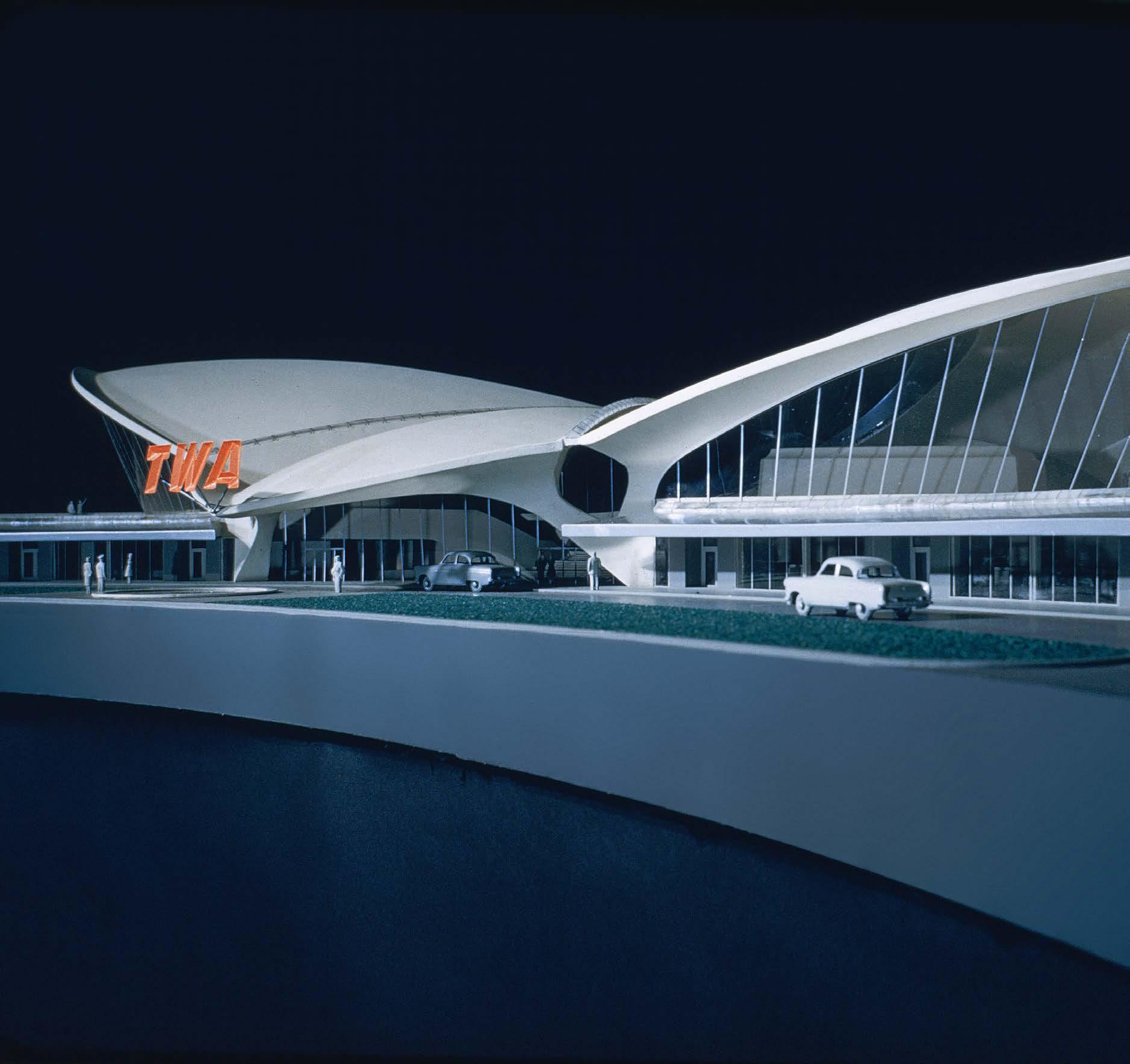
Below: Eero Saarinen’s architectural team created several scale models of the project to sell the design to the clients. The TWA corporate logo sign (seen hanging above the entrance) was eliminated from the plan before construction began.
80
A GRAND CENTRAL STATION FOR THE JET AGE: EERO SAARINEN DESIGNS A NEW LOOK FOR AIR TRAVEL.
Created in the early days of commercial air travel, the TWA Flight Center is a concrete manifestation of America’s infatuation with the burgeoning “Jet Age.” Architect Eero Saarinen sought to express the thrilling aspects of flight in the building’s form—from the open spaces of a curvilinear interior to the dynamic shapes of the concrete-shell roof, which resembled a bird’s wings. TWA asked and Saarinen delivered: not just an efficient and functional terminal, but also a marketing symbol for the airline and a dazzling monument to the spirit of aviation itself.
By 1954, New York’s Idlewild had the highest volume of international air traffic of any airport in the world. As the airport’s needs expanded, airlines were told they could each design and build their own individual terminals. TWA (Trans World Airlines) approached Eero Saarinen and asked for “a daring departure from conventional air terminal concepts.”
Even though his firm was already busy with multiple projects, Saarinen eagerly accepted the TWA commission, and said at the time he wanted the new terminal to “express the drama, the specialness, and the excitement of air travel.” Saarinen and his team began researching other airports and train stations. They studied travelers’ movement patterns and discovered most people walk in curvilinear paths, even when the building is rectangular.
A Groundbreaking Design
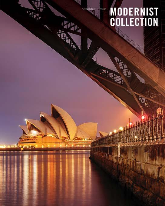
When developing the Flight Center’s basic shape, Saarinen is said to have been inspired by everything from Leonardo da Vinci’s flying machine to Jørn Utzon’s Sydney Opera House. Instead of initially sketching ideas on paper, Saarinen constructed quick “3D sketches” in the form of rough models that allowed him to
think more fully in three dimensions. As the design developed, Saarinen’s team created several wire, cardboard, and clay models of the terminal’s exterior, constructed at various scales.
The finished structure’s unifying visual theme was a dynamic fluidity of form and openness of space. The vaulting of the roof shell allowed for a spacious and free-flowing interior layout. Staircases were all curved, and even the columns supporting upper levels seamlessly transitioned from floor to wall to ceiling.
Ticketing spaces were at ground level with restaurants and meeting rooms above. A sunken waiting area offered a view of airport operations through immense windows. Nearby, two tube-shaped corridors led off toward the boarding gates.
The Future Arrives: Opening Day
Eero Saarinen spent years on the planning and design of the TWA Flight Center, but unfortunately he did not live to see the completed facility. Saarinen died suddenly in 1961, during surgery for a brain tumor. He was 51
When construction was finished, the TWA Flight Center began operating in 1962. The “New York Times” described the space as “having a startling effect” for first-time visitors. Another newspaper said the TWA terminal was “planned to combine the functional realities of a jet-age air terminal with the aesthetic drama of flight”. Architect Robert A. M. Stern called the TWA Flight Center a symbolic “Grand Central Station of the Jet Age.”
In the coming years, the building’s significant place in architectural history continued to grow. In 1994, “New York Times” architecture critic Herbert Muschamp called the TWA Flight Center “the most dynamically modeled space of its era.” The TWA Flight Center was designated a New York City
81
landmark in 1994. In 2005, the National Park Service listed the TWA Flight Center on the National Register of Historic Places.
The TWA Flight Center Reborn

TWA struggled financially during the 1990s and eventually went out of business in 2001. In the following years, Architectural preservationists rallied to save the TWA Flight Center from the wrecking ball. In the mid-2000s, Jet Blue used it as an air terminal for a few years, and the movie “Catch Me If You Can” was filmed there.
In 2015, it was announced that the historic TWA Flight
Center would be remodeled as an on-site hotel for airport passengers. During the structure’s conversion into a hotel and conference center, many original details, such as the custom ceramic floor tiles and the 486 variously-shaped window panels, were replaced with replicas of the originals. The departure board from the original construction was also restored. The hotel opened with much fanfare on May 15, 2019
And so the iconic TWA Flight Center lives on, in all its midcentury swagger. It continues to welcome visitors to experience the spirit of the Jet Age in an innovatively designed, beautifully preserved architectural icon.
82
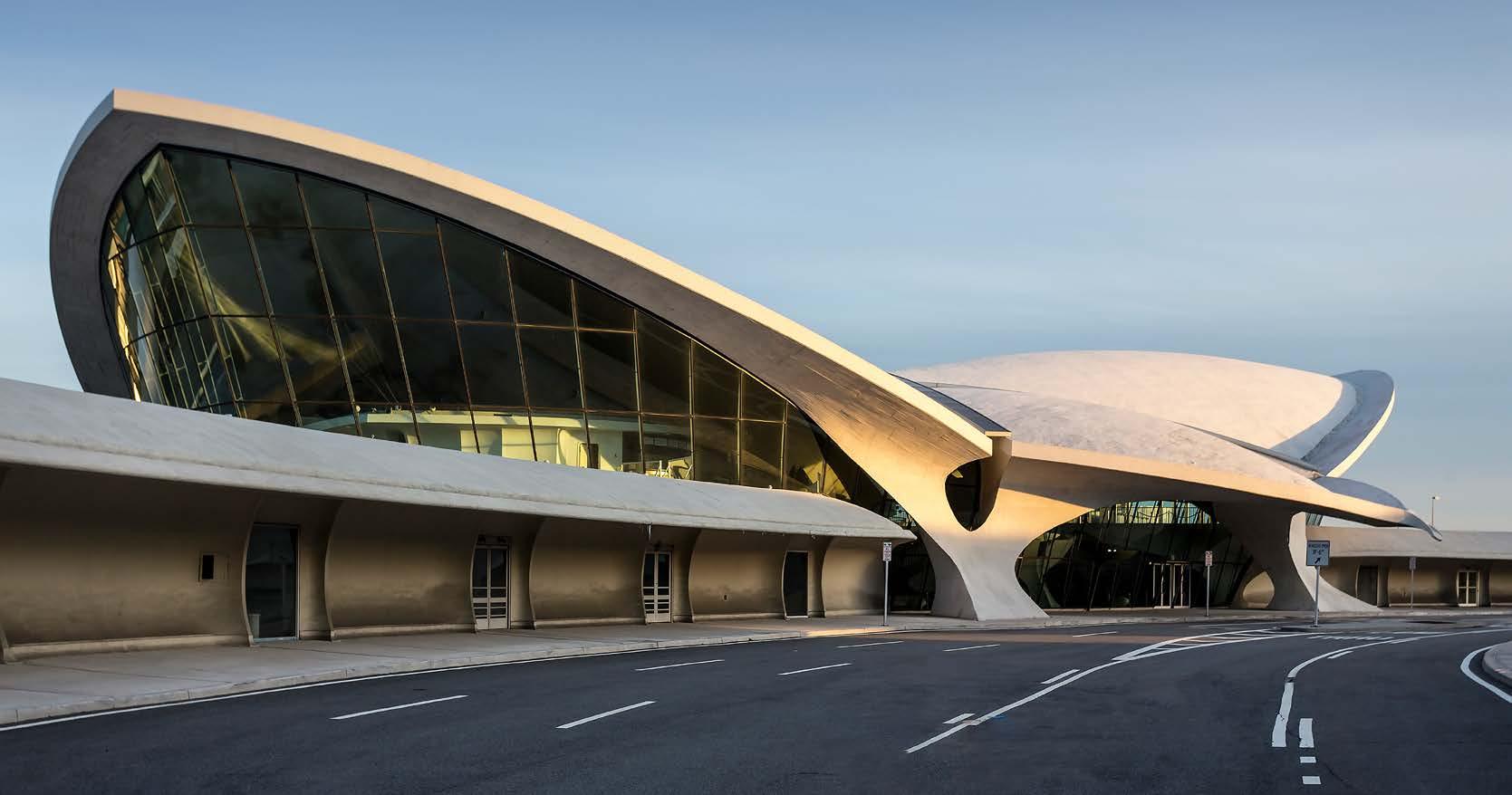
This spread: The project’s dynamic, curvilinear visual theme manifests itself in everything from rounded stairway balustrades to curved wall angles and swooping window panes.

83
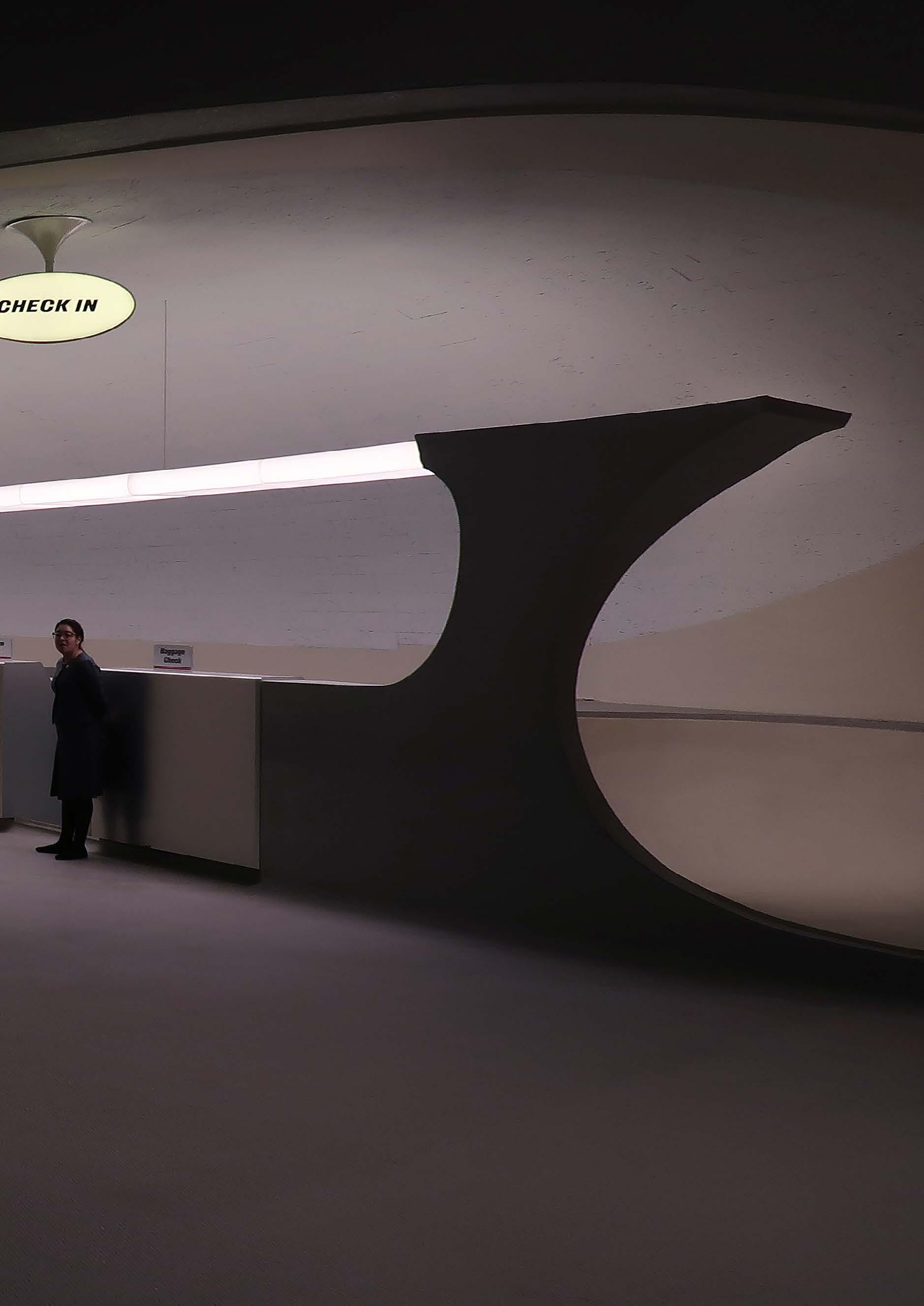
 Sleek check-in stations are illuminated by a continuous lighting fixture that spans the width of the entire area.
86
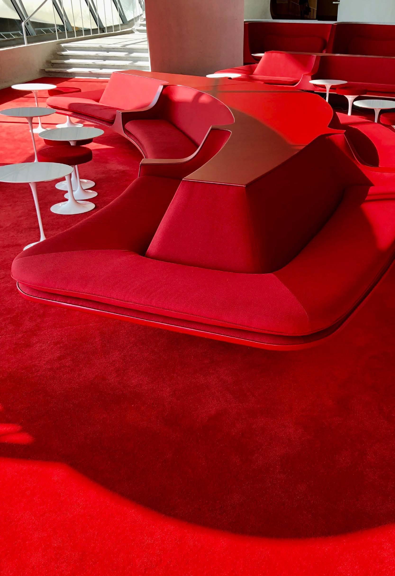
Left: TWA’s corporate color was a specific shade of red, which was used liberally throughout the TWA Flight Center. This passenger lounge area includes Saarinen’s Tulip tables and stools.
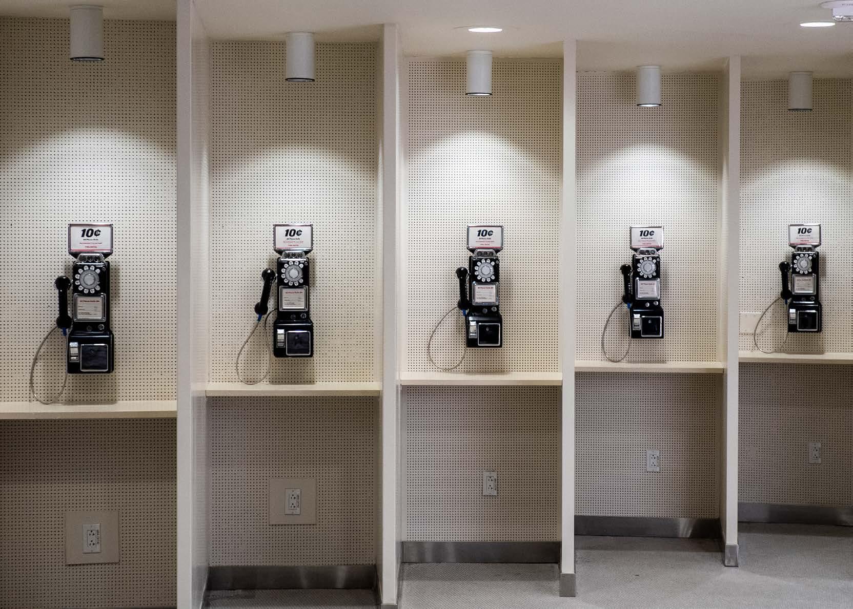
Below: Airport travelers in the pre-cell phone era had just one way to communicate with the outside world — and it only cost ten cents.
87

88
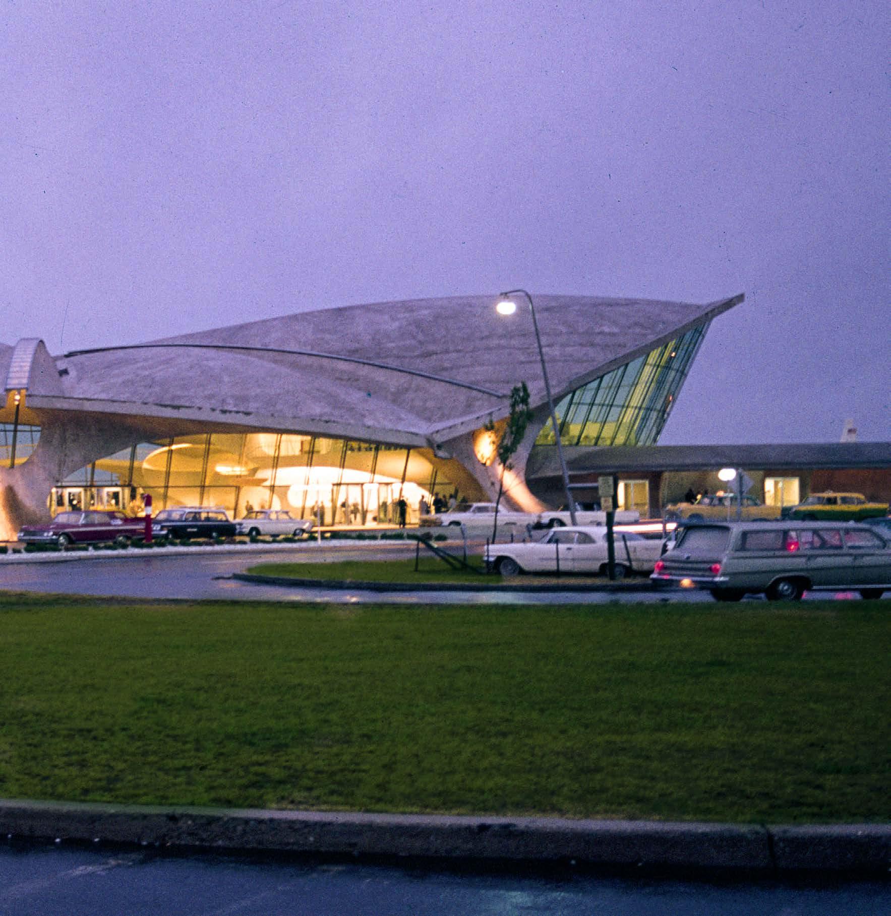
On a foggy evening in 1962, the TWA Flight Center glows from within like a lantern, lighting the way towards a new era of air travel.
89
Modernist Airline Identity Design by Saul
Bass
Abstraction and visual simplicity modernize Jet-Age graphic design systems
Born in the Bronx, New York, to Eastern European Jewish immigrant parents, Saul Bass studied art & design on a series of scholarships to the Art Students League in Manhattan and Brooklyn College. Bass moved to Los Angeles in 1946 and began freelancing in advertising design for several movie studios. In the 1950s, he opened his own studio called Saul Bass & Associates.
In the decades the followed, Bass designed spectacularly innovative motion-picture title sequences and film posters for movies like “Vertigo,” “North by Northwest,” and “Psycho.”
Bass also designed some of the most 20th-century’s most iconic corporate logos for companies such as Bell Telephone, AT&T, and Warner Communications. Bass applied the modernist design principles of abstraction and simplicity to his corporate identity projects, which grew to include several major airlines.
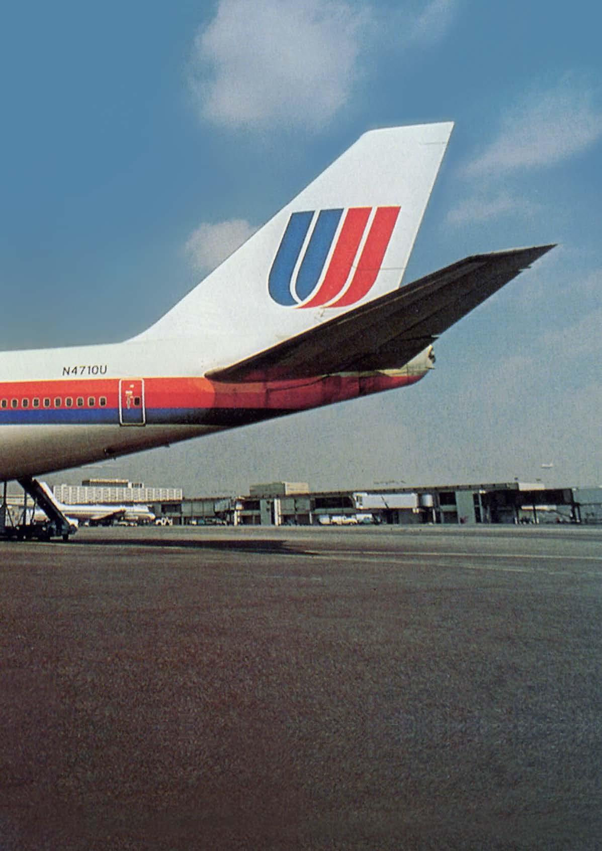
In 1968, Bass designed Continental Airlines “jet stream” logo, followed in 1974 by his development of United Airlines’ “tulip” logo, which became some of the most recognized airline industry symbols of the era.
United Airlines
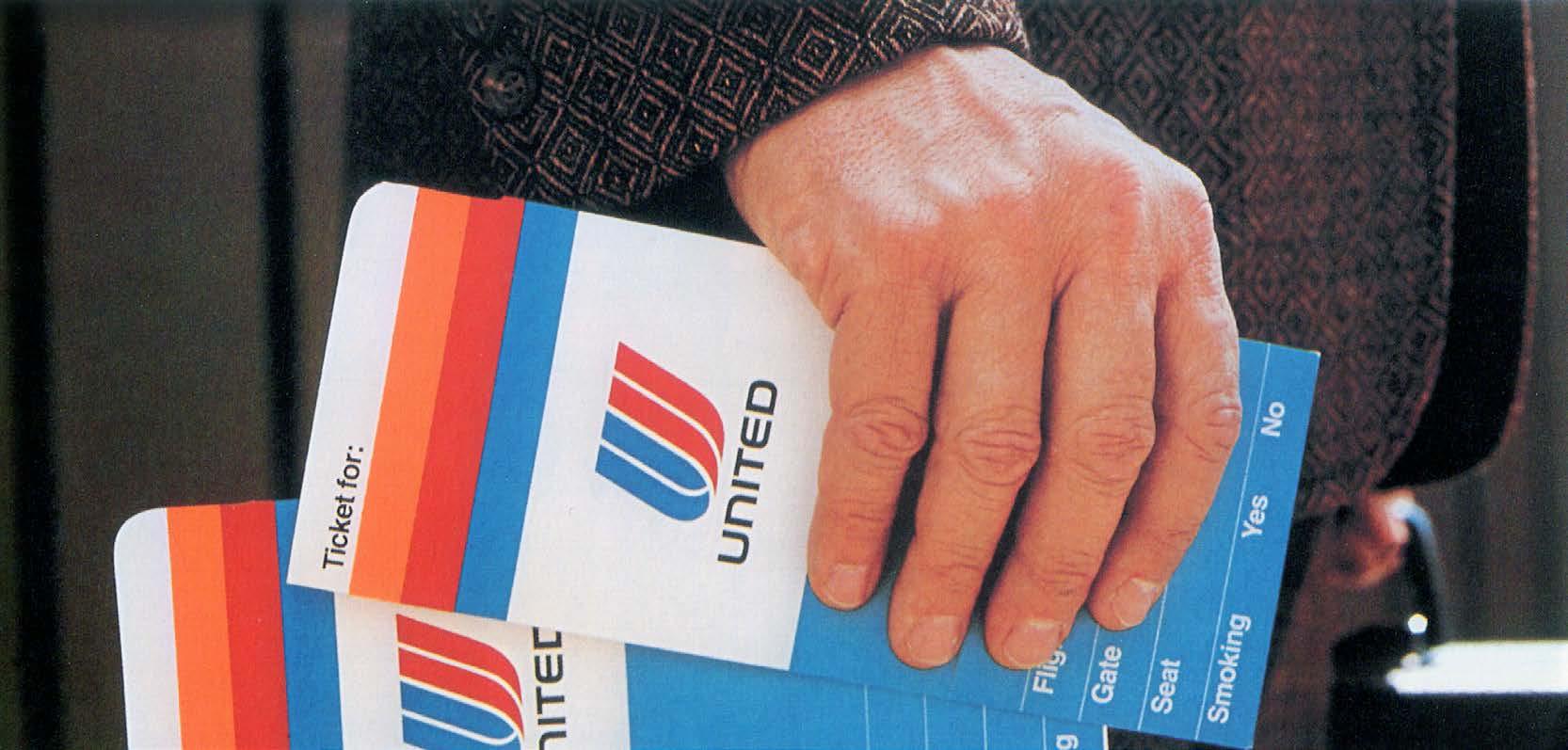
Founded in the early 1930s, United Airlines was one of the nation’s largest air carriers, but by the 1960s, its visual image had grown cluttered and muddy with dated logos and a stodgy overall look. The airline asked Saul Bass to create a new visual identity that would convey efficiency and modernity, bringing the decades-old airline into the modern era.

Bass & Associates developed a cohesive visual program based on four basic elements:
• A distinctive symbol based on the United “U.”
• A custom typeface for the wordmark “United” and related collateral pieces.
• A new color palette using the original United blue and red plus a vibrant orange.
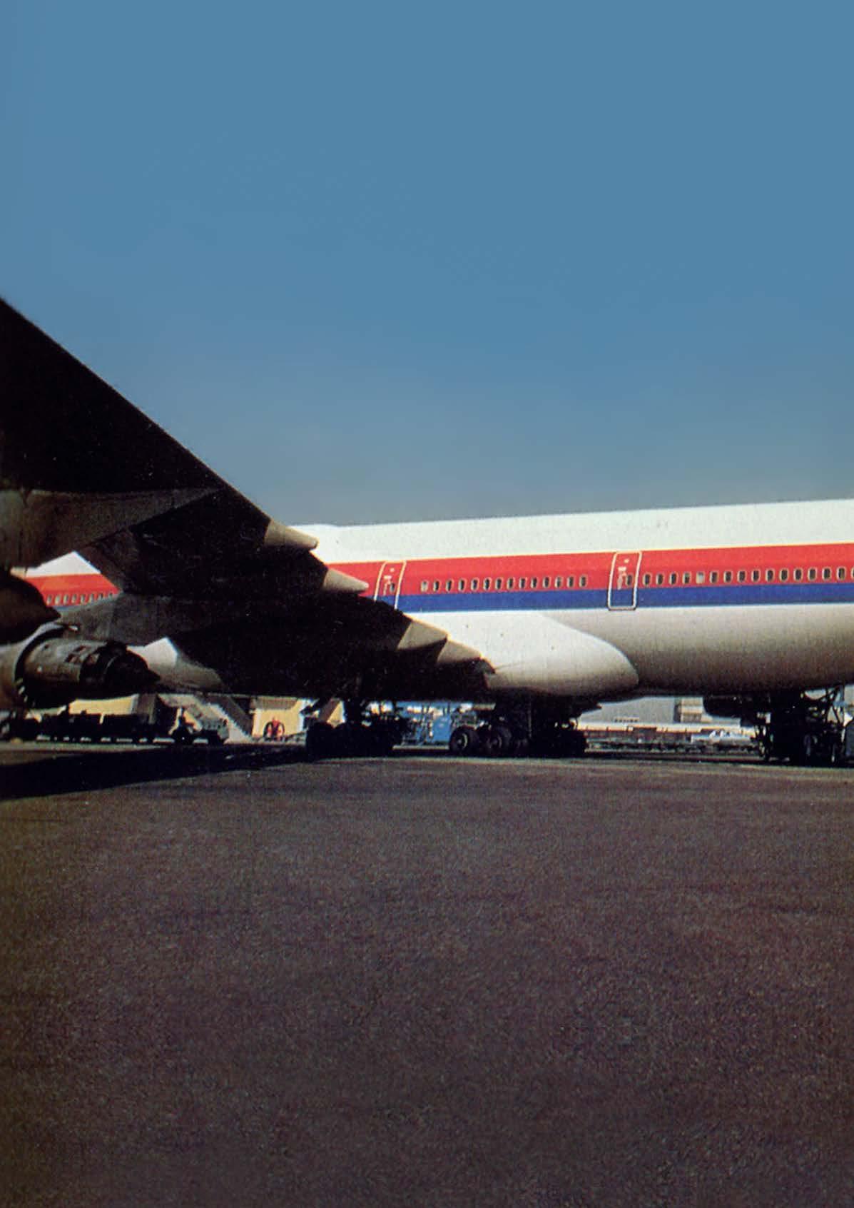
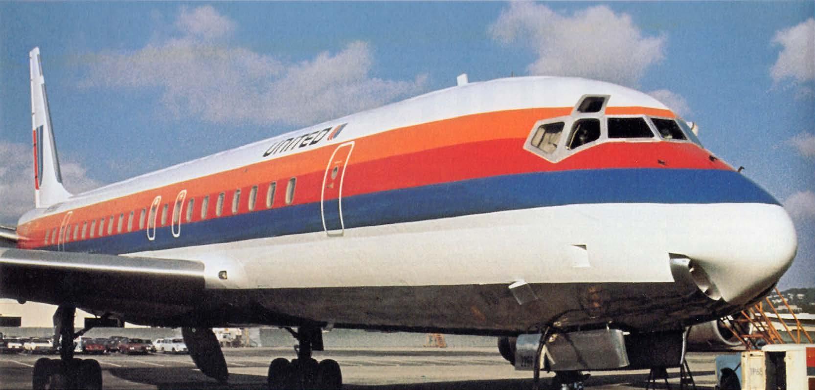
• A three-color horizontal stripe that was applied to United’s fleet of aircraft, which created an aerodynamic look and helped differentiate United from other airlines.
Bass’ new identity system would eventually be applied to 1,800 different items, from the planes themselves to boarding passes, airport terminal signage, food service items and more United’s Saul Bass visual identity was in use, in one form or another, until the airline merged with Continental in 2010.
92

93

94
Saul Bass designed three horizontal bands of color that became a secondary identifier for United, adding a visual element that conveyed speed and modernity.

95
Continental Airlines
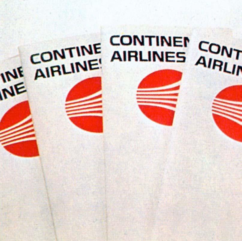
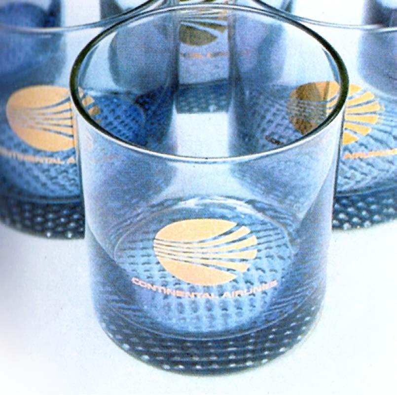
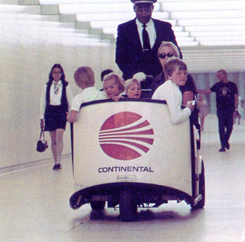
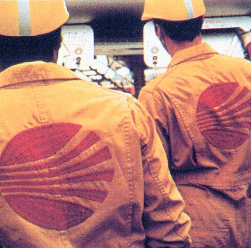
Under director Robert Six, Continental was an early entrant into the Jet Age, introducing the Boeing 707 into its fleet in 1959. In 1968, the airline hired Saul Bass to design a sweeping program of rebranding.

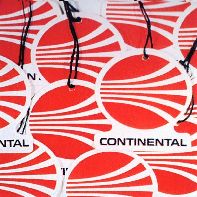
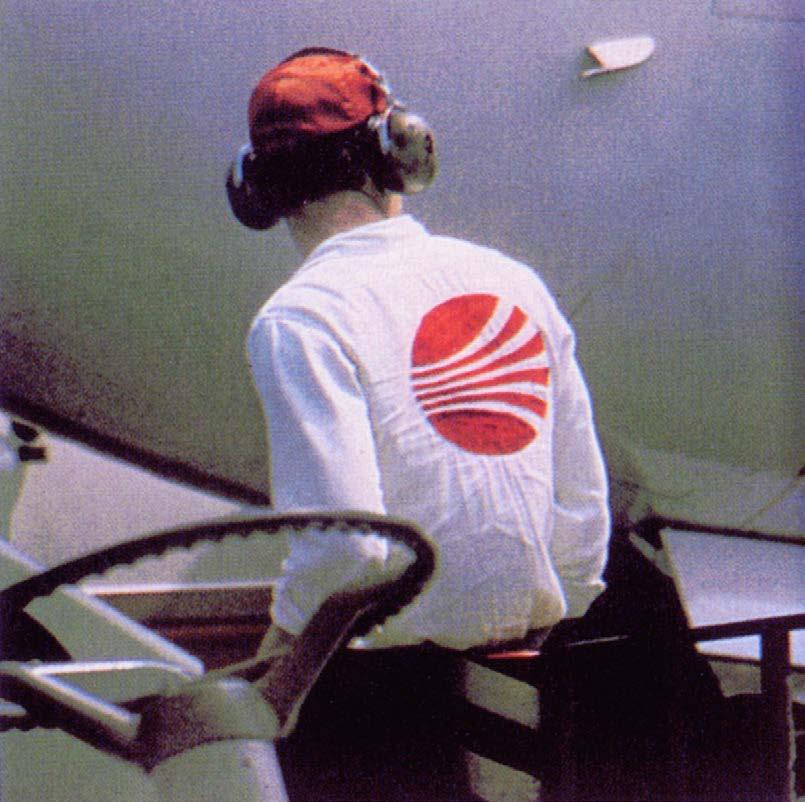
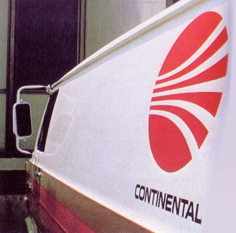
Bass designed a dynamic red oval that became known as the jetstream logo, reflecting Continental’s identity as an airline of the jet age. The objective of the new Continental symbol was to capture the concept of a jet engine’s thrust power, as well as the airflow patterns of high-speed flight.
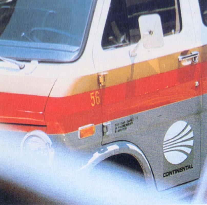
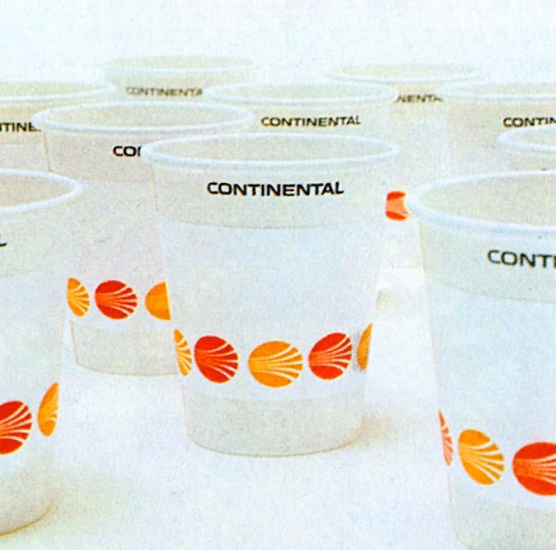
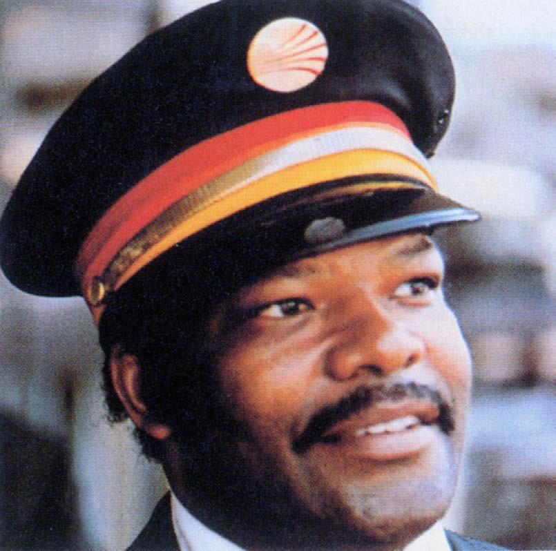
Saul Bass’ striking new logo appeared on Continental’s printed materials and collateral items shown here, as well as the tail of the airline’s jets. A secondary branding element was the distinctive gold color that became a signature element for the airline. Bass’s branding system for Continental was in continuous use until 1991
96
97
Previous spread: The extensive use of floor-to-ceiling windows opens the interior to its natural surroundings.
98


99
Saul Bass’ streamlined Continental symbol was applied to hundreds of objects, including signage, uniforms, glassware, and maintenance vehicles.
PanAm Reinvents the Travel Poster
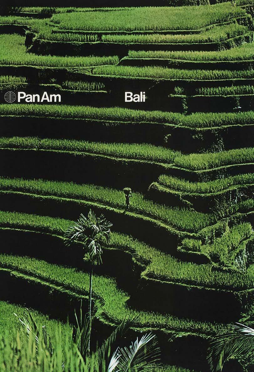

In 1970, design firm Chermayef and Geismer was already well-known for creating visual identities for large corporations like Mobil, Xerox, and Chase Manhattan Bank. The design agency was approached by a struggling airline that needed help modernizing its public image. The first thing Chermayef & Geismer did was change the airline’s awkwardly-long name — and overnight, Pan American World Airways became Pan Am. In the following months, a flurry of rebranding efforts resulted in a streamlined Modernist logo and a sophisticated new visual identity based on by Modernist design principles.
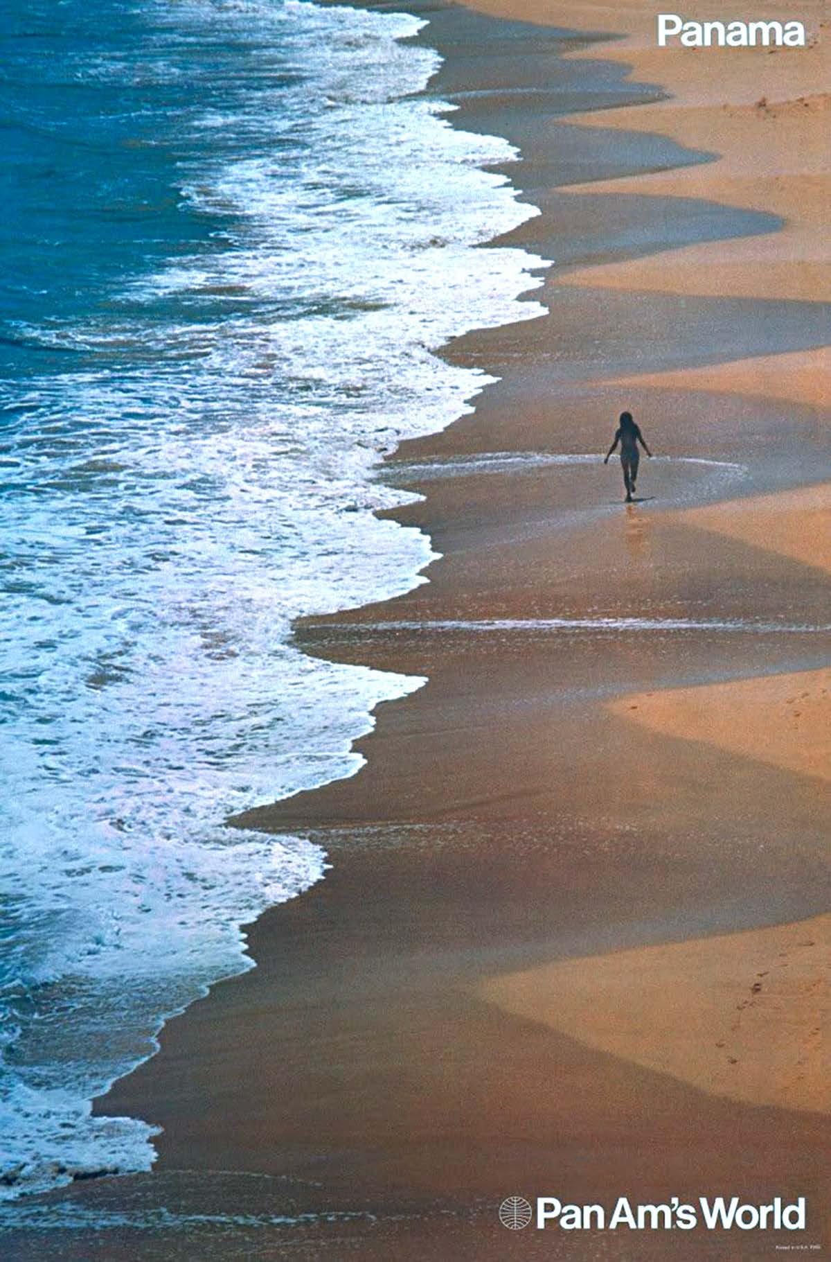
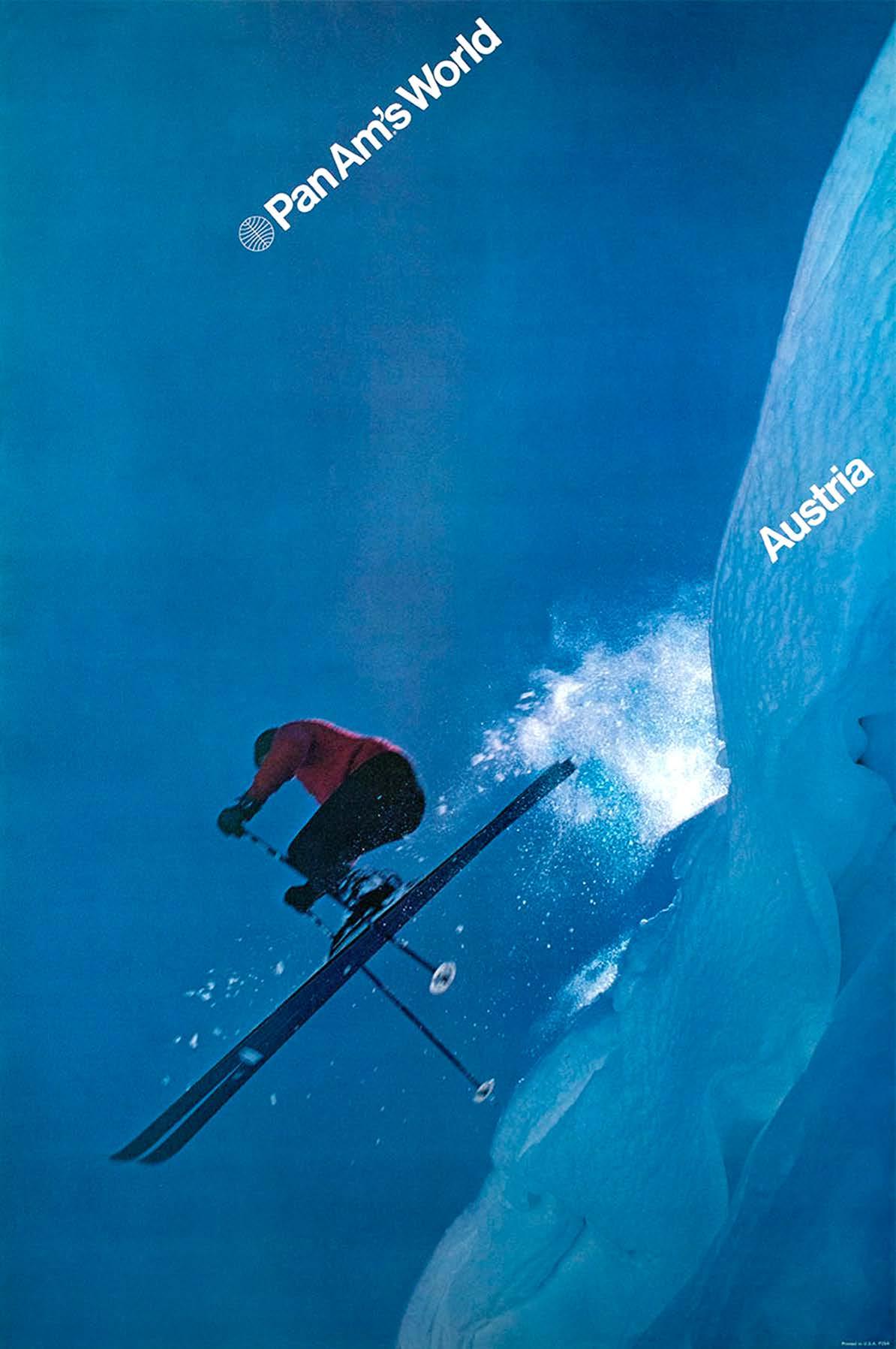
The airline also requested a series of travel posters for Pan Am offices and travel agents around the world. “The whole idea of this series,” Ivan Chermayef said in a 2009 interview, “was to make a simple visual statement about some part of the world … and to combine that simple, straightforward message with the Pan Am identity. We wanted to minimize the ‘corporate’ Pan Am elements, and focus instead on the sense of adventure when traveling to exotic destinations.”
100
Chermayef & Geismer n 1971 n New York
101
102
Rolled out in 1971, the first group of posters had minimal typography: just the Pan Am logotype and the name of the destination, both set in Helvetica Medium.
The photos avoided travel-industry cliches like the Eiffel Tower or the Pyramids, focusing instead on the ethereal beauty of the natural world. The posters convey a zen-like atmosphere of contemplative stillness and solitude. In a word, these posters are about escape.
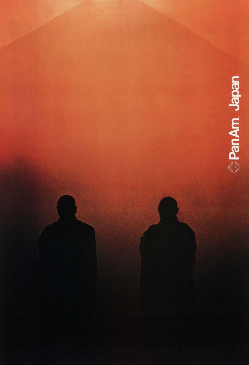
Fifty years later, this campaign is still regarded as a sophisticated visual statement, with six of the posters housed in the Museum of Modern Art. Pan Am’s 1970s posters also serve as a reminder of the power of modernism to convey big ideas that resonate with people in a profound way. This kind of elegantly sophisticated design is timeless and its visual vocabulary can be just as effective today.

103
Jet Age Marketplace
Bring home these artifacts of Jet-Age style: Click on item photo for link to purchase.
Eero Saarinen Photo Book By Balthazar Korab

A gorgeous visual sourcebook that illustrates 19 Saarinen projects, showing the buildings themselves and views of their construction and architectural models. buy here
Vinage-Style TWA Flight Bag

This modern take on a 1960s TWA classic boasts a graphic striped logo and, inside, a charming airplane print. Includes shoulder strap and zippered top. buy here
Classic Pan Am Logo T-Shirt

The airline’s famous blue and white logo first appeared in 1955 At one time, this was the most recognized logo in the world, thanks to Pan Am’s global route network. buy here
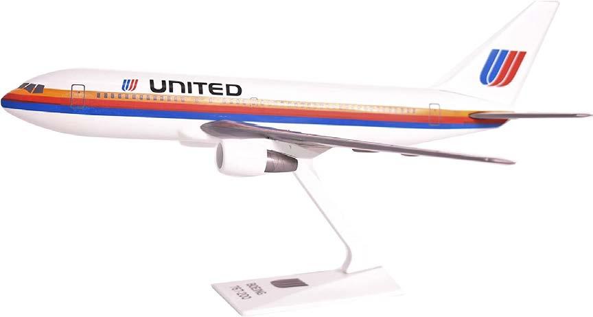
United Airlines Boeing / Saul Bass 737 Desk Model
This detailed nine-inch scale model of a vintage 737 includes Saul Bass’ signature multicolor stripe, mark, and logotype he created for United Airlines in 1974. buy here
104
Vintage-Style TWA Travel Poster

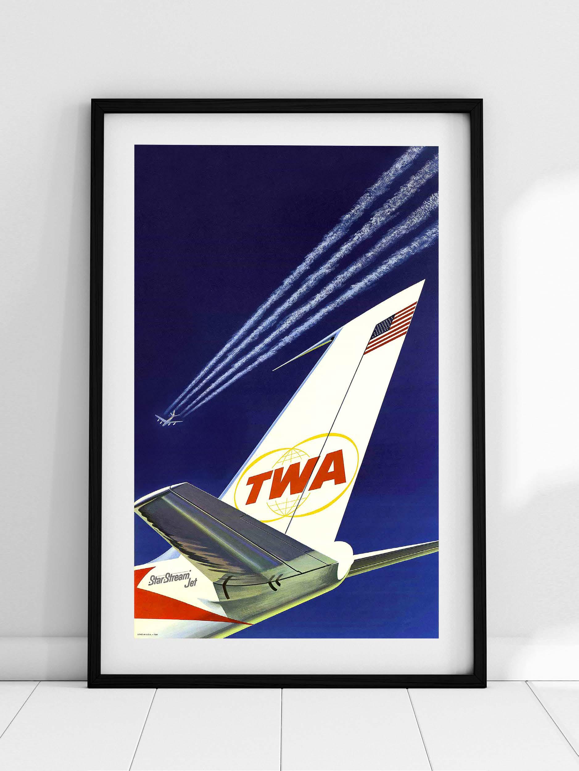 Beautiful reproduction of illustrator David Klein’s vintage advertising poster created for Howard Hughes and Trans World Airlines (TWA) during the 1950s. buy here
Jet Age Marketplace
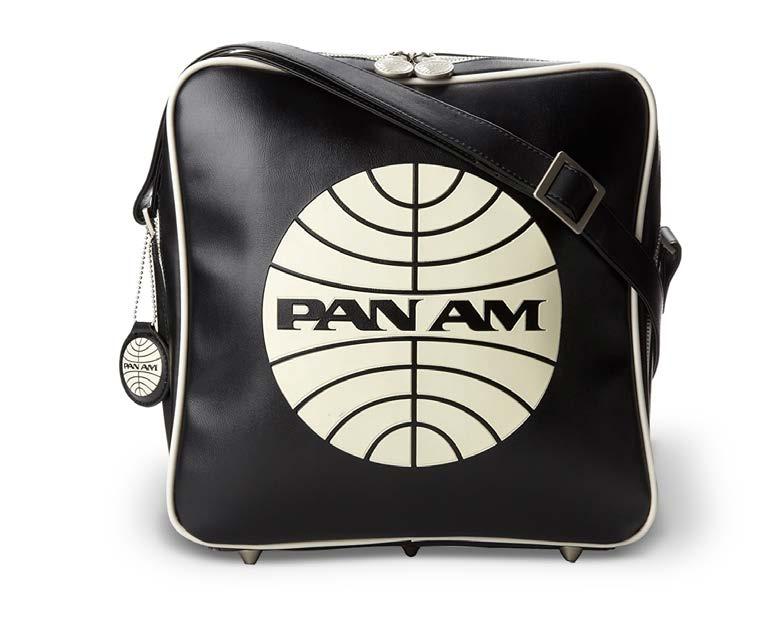
Pan Am Travel Bag with Shoulder Strap
A common site in 1960s airports, the Pan Am Innovator bag is reintroduced for today, available in two colors with an embossed version of the airline’s iconic logo. buy here
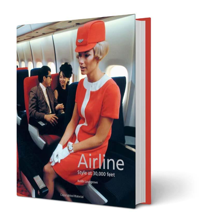
Airline: Style at 30,000 Feet
This fascinating book examines every aspect of vintage airline style, from the planes’ interior design and livery graphics to advertising, uniforms, and airborne cuisine. buy here
Pan Am: The Complete Series
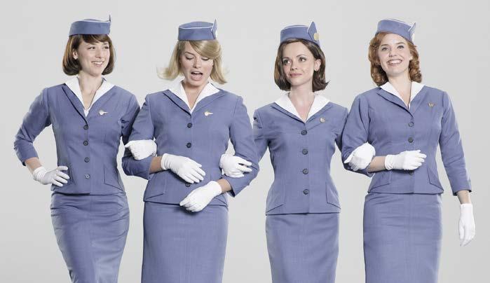
The elaborately-styled production design is a highlight of this 2013 tv series following the Jet-Age adventures of elite stewardesses in the 1960s. buy here
Photographic Art Print: TWA Flight Center
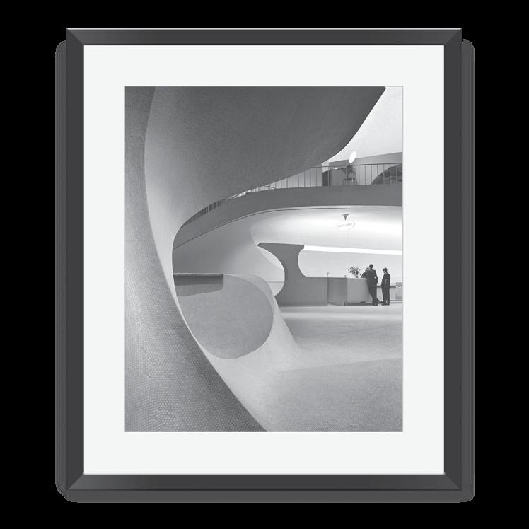
Custom-framed and ready to hang, this 1964 Balthazar Korab photo of TWA’s ticket counter perfectly captures the innovative architectural vision of Eero Saarinen. buy here
106
Refurbished Pan Am Drink Trolley
This one-of-a-kind storage piece is ideal for the aviation buff or collector of unique modern design. Works perfectly as a bar cart, office storage, or general conversation starter. buy here
Bring home these artifacts of Jet-Age style: Click on item photo for link to purchase.

Eames Tandem Sling Seating
Originally designed by Charles and Ray Eames in 1962 for Dulles Airport, this reconfigurable seating system design is still produced today by Herman Miller. learn more
Pan American 707 Scale Model
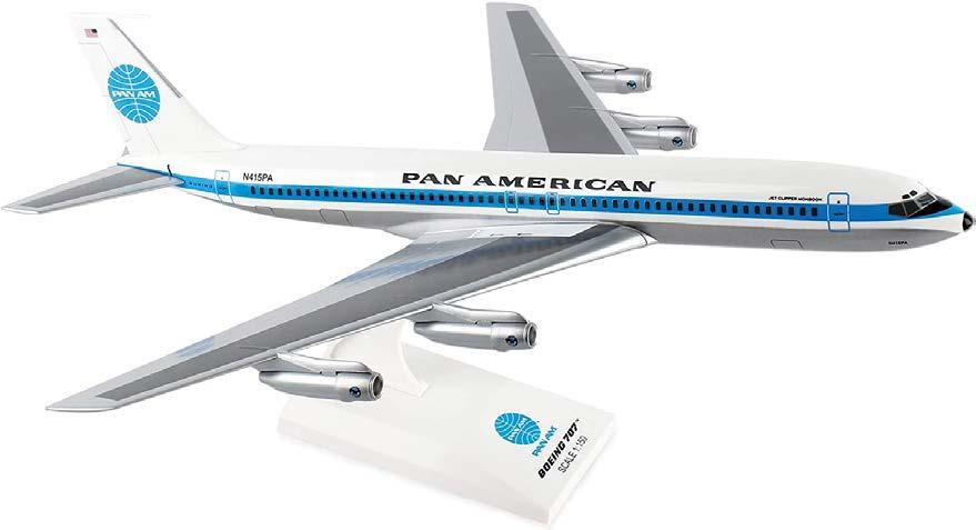
This highly-detailed desktop scale model of Pan Am’s 707 jetliner features accurate livery design/graphics and comes with its own stand. buy here
Airline Visual Identity 1945–1975
A fascinating sourcebook of the best airline graphic design from aviation’s “golden age.” Includes hundreds of spectacular aviation posters, photos and other illustrations. buy here

107
109 VINTAGE MODERN DESIGN simply mod FURNITURE CERAMICS+GLASS LIGHTING VINTAGE WATCHES WWW.SIMPLYMOD.COM
Photo & Art Credits
Pages 38
Photo: Balthazar Korab / 1956
Library of Congress, Prints & Photographs Division, Balthazar Korab Collection
Pages 40
Continental AirlinestTravel Poster: Artist unknown
Pages 42
Photo: Braniff Archive
Page 44
American Airlines corporate identity design by Massimo Vignelli / Vignelli Associates
Page 46-60
Photos: Balthazar Korab / 1962
Library of Congress, Prints & Photographs Division, Balthazar Korab Collection
Page 60-65
Travel posters designs by Stan Galli
Page 66-77
Photos: SFO Museum
Page 4
Photo: Balthazar Korab / 1962
Library of Congress, Prints & Photographs Division, Balthazar Korab Collection
Page 7
Photo credits
Top row, left to right: Ron Frazier; Rosie Steggles; House of Finn Juhl; Middle row, left to right: House of Finn Juhl; W. LeMay; Jason Taellious
Bottom row, left to right: Jason Taellious; Jean Philippe Delberghe; Balthazar Korab
Page 8
Photo: HUD Staff
Pages 10-11
Photo: John Arehart/Shutterstock
Page 12
Photo: Thomas Deschamps
Page 16-17
Album cover designs by Rudolph de Harak Book cover design by Richard Poulin
Page s 20-21
Photos: Karakter
Page 22
Artwork by Jessica Brilli / jbrilli.com
Page 24–32
Photos: Julius Shulman / 1960 © J. Paul Getty Trust. Getty Research Institute, Los Angeles (2004.R.10).
Pages 34
Photo: Jose Luis Stephens / Shutterstock
Page 36
Photo: Braniff Archive
Pages 78-80, 89-90
Photos: Balthazar Korab / 1960
Library of Congress, Prints & Photographs Division, Balthazar Korab Collection
Page 82, 86
Photo: W. LeMay / Wiki Commons
Page 83
Photo top: Rhododendrites / Wiki Commons
Photo bottom: Acroterion / Wiki Commons
Page 84
Photo: John Arehart/ Shutterstock
Page 87
Photo: Rhododendrites / Wiki Commons
Page 90–99
Photos: Saul Bass Archive
Page 100–103
Vintage poster designs: Chermayeff & Geismar Photographers unkown
Page 111
Photo: Balthazar Korab / 1962
Library of Congress, Prints & Photographs Division, Balthazar Korab Collection
110
Issue 1, Spring 2022
Mies Forever.
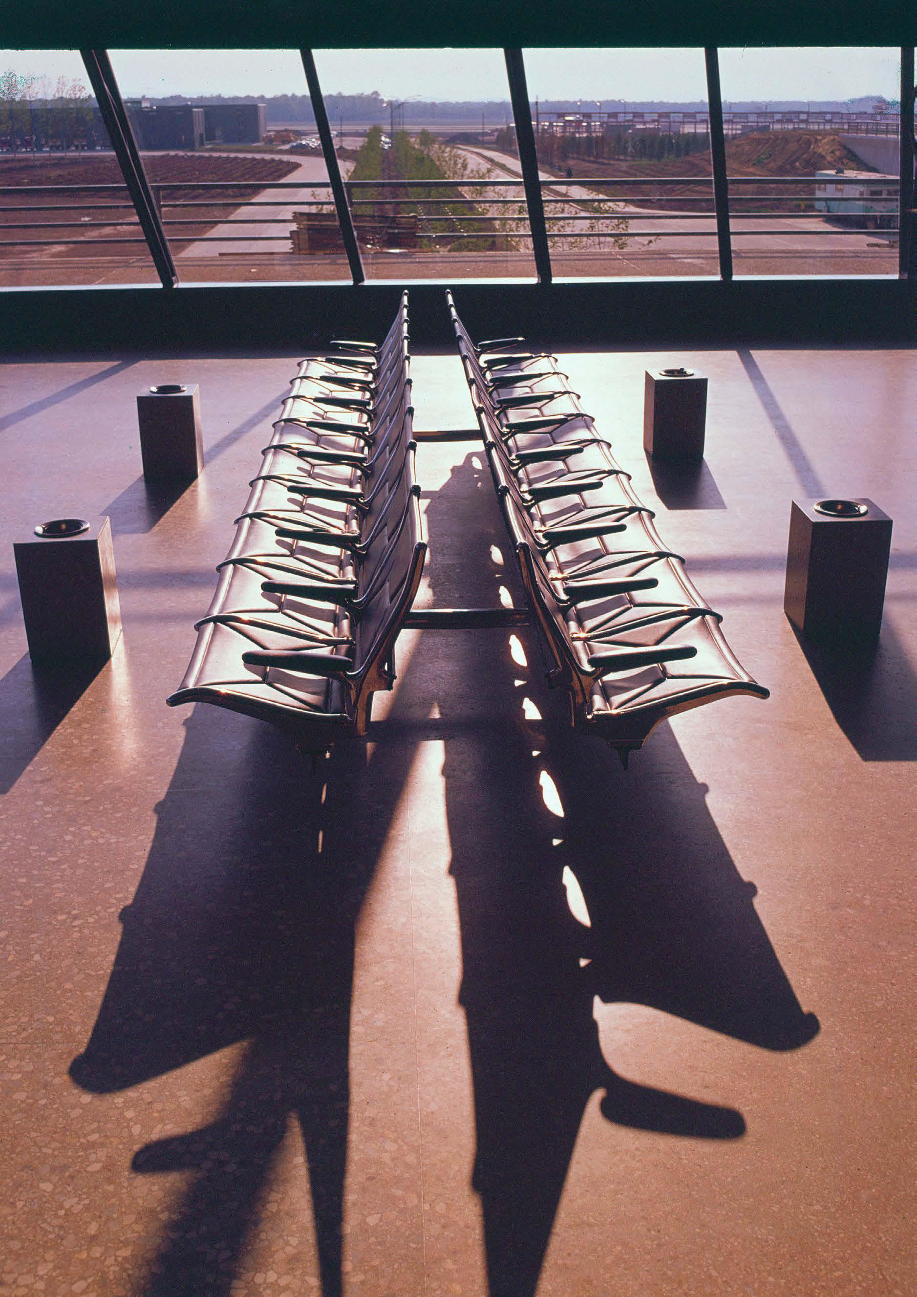 Charles Eames’ “Tandem Sling” seating in Dulles Airport, circa 1962.

that resonate & endure. Publication Design • Interactive Design • Visual Identity Systems www.RobertKingDesign.com
Visual branding systems


 Photos by Julius Shulman


 By extending support columns past the walls of the house, Neutra softens the traditional division between interior and exterior space. The Santa Monica mountains stretch into the horizon.


 The Theme Building, Los Angeles International Airport, 1961 Architects: James Langenheim & Paul R. Williams


 Article by Deane Madsen


 The streamlined typeface on Dulles Airport signage was custom-designed by Eero Saarinen in 1960.


 Pan American World Airways (Pan Am) uniforms, 1971
Designed by Frank Smith (1927-2007)
Evan-Picone | New York
Hats by Borsalino (left) and Mae Hanauer (right)


 Sleek check-in stations are illuminated by a continuous lighting fixture that spans the width of the entire area.


 Beautiful reproduction of illustrator David Klein’s vintage advertising poster created for Howard Hughes and Trans World Airlines (TWA) during the 1950s. buy here


 Charles Eames’ “Tandem Sling” seating in Dulles Airport, circa 1962.
