23 minute read
Lobby Lighting
from darc 42
High Lighting
As part of our Lobby Lighting feature, darc's Editor Sarah Cullen sits down with Fanny Englund, Lighting Designer at Light Bureau, to discover the key to successfully illuminating a beautiful lobby space.
Opening the discussion on lobby lighting, Englund went into the main considerations to undertake when approaching a new lobby lighting project. “A lobby for a business building needs to be representative of the company; what is the company image?” she explains. “The lighting design should contribute to that, of course in close collaboration with the architecture and the interior design. Generally, a lobby should be inviting and support social interactions. The light should help people orientate and to find their way further in the building. The lobby is often visible from the outside and therefore works like a display window for the building or company. The lighting and the space therefore must work well both during day and night,” she says. When it comes to choosing which fixtures will be most suited to the space, Englund explains that the lobby needs to “stand out” in some way, whether that’s using decorative fixtures, dynamic installations or a higher level of materials and design. “Since you spend a limited amount of time in a lobby, it is often possible to work with higher contrast between light and dark, or with colours, to create an exciting place that attracts people. “Lighting and the fixtures used always needs to support the design of the space and the company or building image. Sometimes the best way to light a lobby can be to use only hidden fixtures and let the light enhance materials and other design elements,” she tells darc. Looking specifically at the benefits of using decorative pieces in the large space, Englund highlights that a lobby is the perfect location to experiment and create unique light installations. “Decorative lighting is often a very important part of a lobby design and needs extra attention to make sure that the model of the fixture is the right choice for that particular space. A lobby is a perfect place to create a unique light installation, tailor-made for the space. The decorative lighting element in a lobby is key to attracting people since it is often visible from far away, and really helps to set the atmosphere. It is also important to inhabit the space and make it more inviting for social interactions due to the more human scale it gives. “When choosing a decorative fixture, I always work in close collaboration with the client and the interior designer to get a good understanding of the design intentions before making any suggestions,” continues Englund. “I work with visualisations or reference images to show my intentions. If it’s possible, we evaluate the fixture by looking at it together live. I use 3D models or sections to make sure the scale of the fixture fits the space in a good way.” Looking at the relationship between the decorative and architectural lighting in a lobby project, Englund explains how the architectural fixtures are used to set the general atmosphere in the lobby. “It should enhance the materials and the spatiality of the room. The decorative fixtures set the important finishing touch to the space and define the design. Architectural and decorative lighting of course must complement each other, so you need to plan it as one complete solution.” When asked about how to balance the correct light levels in such a vast space, Englund explains how they are not at the forefront of design details. “Due to the importance of the design intentions in a lobby, the light levels are not in focus. Still, you should be able to see well and find your way in the space comfortably. I work a lot with light on walls and other vertical elements to make the space feel bright even without a lot of light, and to facilitate orientation. When needed I make light calculations or mock-ups to verify that the light will be good. Lobbies should also have a control system to make it possible to dim the light up or down if needed, and to set different light scenes adapted to day - or night-time, or different events. “The use of automatic and dynamic light scenarios, liquid light, is something that can fit well in a lobby, both for unique light installations and for the general lighting. This will create an exciting environment and at the same time reduce the energy consumption.” www.lightbureau.com

Filling the Void
Light Bureau's Fanny Englund discusses the design choices the team made alongside Fojab Arkiteketer and Landén & Krantz interior design for the new Axis Communications HQ in Lund, including the stunning acrylic light installation.
Images: Lars Magnus Olsson, Light Bureau
Axis Communications is a Swedish security company that has been referred to as a success story in Swedish entrepreneurship. As market leaders in network video and video surveillance, the company has rapidly grown in staffing numbers since its inception in 1984, which has in turn put demands on larger premises in Lund where more than 2,500 employees are based. Fojab Arkitketer designed a unique new head office for the company, which was completed at the end of 2020. The 42,000sqm, 10-storey campus works as a meeting place and hub for all employees, with a roof terrace, sky lounge, around 150 meeting rooms, and six terraces. The entrance hall acts as the ‘living room’ for the company, providing a large daylight-filled space for welcoming clients, coffee meetings and as an exhibition space. The achievement also earned the building Sweden’s Most Beautiful Office award in 2020. Talking about the lighting design journey for this illustrious entrance lobby is Fanny Englund, lead lighting designer on the project from Light Bureau. “At the end of 2015 Åsa Krantz, interior designer at Landén & Krantz, contacted me and wanted help with lighting design for the Axis project. I had worked with Åsa before on other smaller projects, and Åsa had been working with Axis for a long time with


several different projects, developing their way of working and adapting their working environment. “The project started with a pre-study and a workshop together with Axis, the architect, the interior designer (Åsa), and the electrical consultant,” Englund tells darc. “Together we decided on key words and set the brief for the lighting design with a focus on the most important areas in the house: the entrance/lobby with its atrium and gathering space, the external meeting rooms, the restaurant, the sky lounge and the terraces. Axis take pride in caring for its employees and creates a good working environment for them. Since they now built a house for themselves, they wanted it to be tailor-made for their needs. “General key points for the design and for Axis as a company were a good and sustainable working environment. Sustainable not only for the environment but also for the social elements. Also, the building should be a place that boosts creativity, innovation and feels like a home away from home,” she says. The brief given to the team for the lobby was to brand the space as Axis-specific, but subtly. Also, to provide an exciting, surprising, and impressive wow experience to draw people inside, meet in the central hub and move further into the building. The client also wanted
to accentuate the surrounding wall surfaces to create a feeling of spaciousness and have a Scandinavian aesthetic that blended warmth and coolness together. It was important that it gave the first impression of being the beating heart of the business that pulsed with light, space, air, and energy, whilst exuding quality. “After we set the briefs for the different areas, we delivered the light scheme and the design of a combined light installation and sunscreen for the atrium in the beginning of 2016, it was then handed over to the contractor. “During 2016 - 2020 we were involved in commenting on the work of the contractor (who wanted to change a lot of things in the design), making the detailed design of the atrium installation, choosing the decorative lighting together with the interior designer and acting as a general support to Axis in the process. “We had great contact with the client and the architects involved so there were never any problems making adjustments to fit our lighting design into the architecture. The biggest challenge was the contractor who tried very hard to make everything as simple and cheap as possible. We supported Axis with arguments and material many times during the way, and we made visits on site etc to ensure the design intentions were being realised,” explains Englund. “The biggest challenge, design-wise, was the scale of some of the spaces. The lobby spans over two floors and a large atrium, with several stairs and has open views from the big restaurant and other surrounding areas,” she continues. “We handled this by lighting up all the walls around the lobby to frame the space and make it easy to orientate. Since there is a lot of meeting rooms with glass walls around the lobby, we designed integrated light for the curtains to be able to also light these vertical areas. We generally worked with hidden or very discrete fixtures so that the number of fixtures needed in a space this size wouldn’t be in focus. The space also had to be “filled” with something that, at the same time, didn’t take away the airy feeling. As a result, we designed the light installation in the atrium with a combination of opal and clear slim acrylic plates. Floor lamps also helped to create more human scale meeting places so that people would stop and inhabit the space, and not just pass through.” The dramatic light installation visitors and regulars are greeted with in the atrium is very on-brand for Axis. It consists of a combination of opal and clear acrylic plates from Acrylite LED in various sizes, hanging in a zig-zag pattern. The clear panels are electrified and can illuminate in differing colours, whilst the opal panels reflect the natural daylight during the day, and the coloured light of the electrified panels in the evening. Reflections from the panels dance colour across the nearby walls and fill the room when the sun sets. “Because the movement of light is irregular and unpredictable with scenarios that do not loop, it feels almost alive,” reflects Englund. “The plexiglass installation can be


OUR STATE-OF-THE-ART STUDIO AND FACTORY IS A SPACE WHERE WE COLLABORATE WITH DESIGNERS TO TURN THEIR BESPOKE LIGHTING IDEAS INTO REALITY.

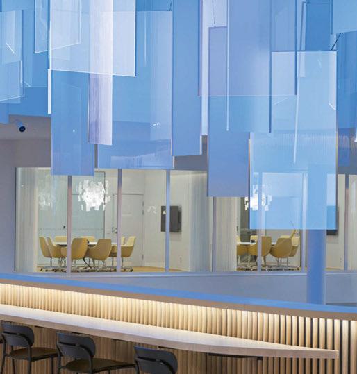

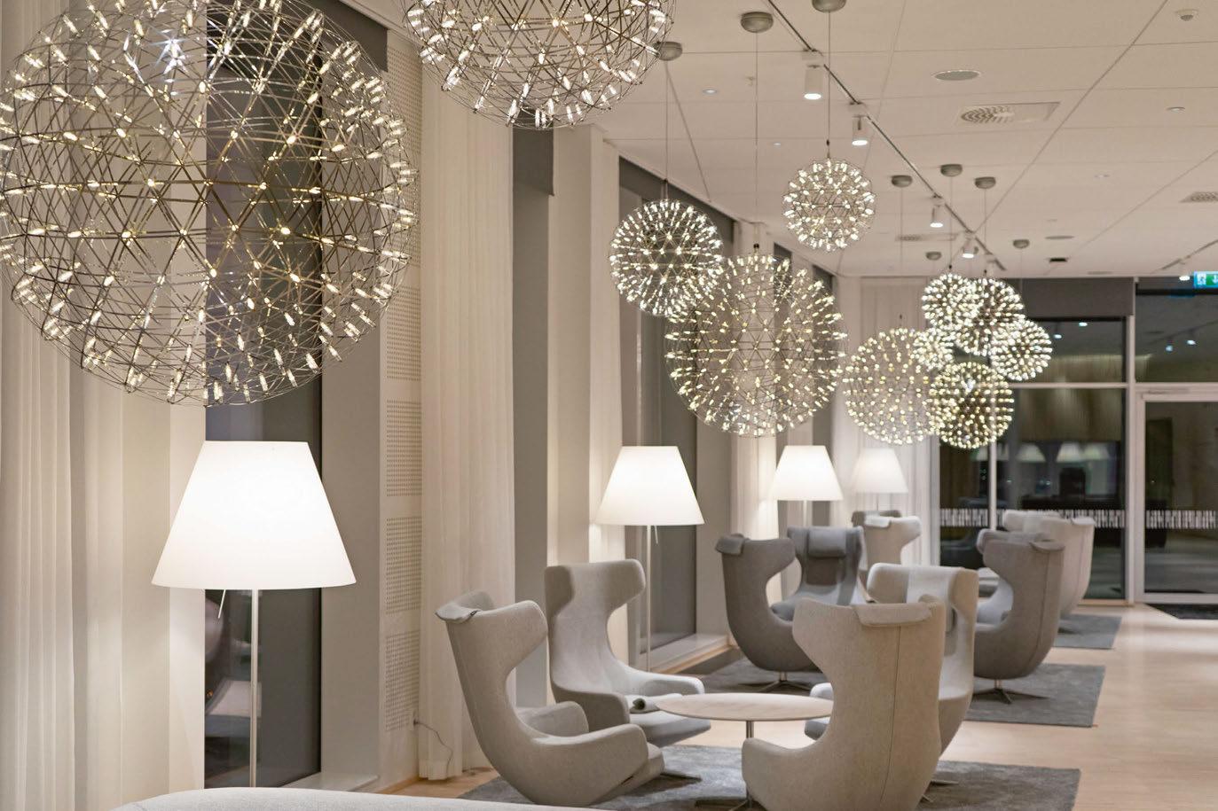
compared to pixels, and when the colour moves from glass to glass, it’s a bit like information that moves in a digital cloud formation – a lot of similarities to the work of Axis,” she adds. “For the architectural light we worked a lot with a combination of warm and cold light temperatures to create both an airy and at the same time cosy experience. The colder light (4000K) was used as the general light in the big lobby to enhance the daylight from the atrium and big windows. The walls and open staircases were covered in wooden panels so here we choose a warm light (2700K) to enhance the warmth in the material and to create a contrast to the daylight. When you reach the inner part of the lobby, where the internal workspaces are that have a more intimate scale, the light temperature shifts to a more neutral 3000K. “We also made sure all the fixtures used had very good colour rendering and minimal glare to create a good working environment for the employees.” The overall result and well-tuned balance between cold and warm light was achieved with a mix of decorative floor lamps, pendants, table lamps and wall lamps, which all contributed to the aim of bringing light and warmth down to human level. “The result of the contrast of cold and warm light worked even better when I saw the final outcome, from what I had envisioned,” says Englund. “It really gives a special feeling when you stand in the lobby. All the lighting of the vertical surfaces like wooden panels, curtains and walls also gives a great impression and describes the space very well. “The decorative lighting adds the intimacy needed in places where you want people to meet and be social. The softness of the decorative fixtures used creates a friendly and inviting atmosphere that works very well with the general concept. “All the decorative fixtures were chosen to fit the general concept for each space. In the meeting rooms they are enhancing intimacy and creativity, such as the Zette’z from Ingo Maurer and Dear Ingo from Moooi. In smaller meeting rooms and spaces decorative pendants also give functional light to meeting tables to create a more intimate atmosphere. “In the sky lounge, the sparkling Raimond from Moooi creates a sense of luxury business and can be seen from very far at night through the big windows. The pendants are big but still airy, so as not to block the magnificent view. “In the lobby the big floor lamps Big Shadow from Cappelini populate the large space and help bring down to human-scale to create inviting meeting places. “The decorative fixtures are important to create the cosy and inviting feeling that Axis wanted and is supported by the architectural lighting to enhance the space and the interior design to make the whole building inviting and functional for work requirements.”


This project proved to be a unique one for the team to work on, as the client built its headquarters around the concept of it being a large house for its employees. This allowed them to design the space exactly as they wanted it. “In Axis, the architecture and lighting design was tailormade for them according to their wishes. This made the design process very fun and effective with a very close collaboration with the client and the interior designer,” says Englund. “The most stand out feature is of course the light installation in the atrium. To get the opportunity to work with daylight and electric light combined in an artistic way was very fun. To suggest solutions like this is not unique but it’s not usual that the brief and design stays true through the whole process, unlike other commercial projects with budget constraints, for example.” Upon reflection of the completed project, Englund claims to continuously be a student to her career. “You always learn something from every project. In this circumstance, I would probably have put more focus early on in the project on the control system to make it easier for the users to change their lighting in offices and meeting rooms. The control system chosen by the entrepreneur might fill our function requirement, but it doesn’t have a user-friendly interface. This just creates annoyance instead of the flexibility we were planning for.” www.lightbureau.com Design Details
Axis Headquarters, Lund, Sweden Interior Design: Landén & Krantz Lighting Design: Light Bureau Architecture: Fojab Arkitketer Lighting Specified: Acrylite LED, Artek, Artemide, Blond, Cappellini, Flos, Foscarini, Handvärk, Herman Miller, Ingo Maurer, Le Klint, Luceplan, Moooi, Örsjö, Phloc, Santa & Cole, Wästberg, Zero
Light Bureau worked closely with the client, architects and interior designers to bring the beautiful new headquarters for Axis alive. The new build gave freedom for design choices as the teams worked together to create the homely atmosphere to the workspace, which caters to more than 2,500 employees. The large acrylic light installation in the lobby is an eye-catching and stunning addition to the daylight-filled space. The clear and pearl acrylic panels reflect daylight and electric light throughout the space, transitioning seamlessly between day and night. The installation adds that wow-factor yet maintains an airyness and simplicity the client desired in its initial brief.

Entrance Illuminations
The Hyperion Hotel Leipzig, Germany
Situated in Leipzig, Germany, the Hyperion Hotel by H-Hotels is an elegant, modern establishment sat in the heart of the city centre, opposite the central station. H-Hotels is a family-owned company that has been in the hospitality industry for almost 50 years, and within the group, you will find Hyperion, H2 & H4 Hotels as well as the H+ brand. Completed in 2020, this new build 189 key hotel is extremely modern and provides visitors to the city a wide range of room choices and facilities. Baulmann Leuchten, based in Sundern, Germany, manufactured this contemporary, custom-made chandelier from designs created by Geplan Design, an interior design practise based in Stuttgart. Baulmann are one of only a handful of manufacturers in Europe that still provides handmade, contract quality decorative lighting and illuminated mirrors to the international hospitality sector, and they have been doing so for well over 70 years. An incredibly contemporary design, this imposing, yet welcoming chandelier greets you as you enter the foyer of the hotel. The chandelier sits between two floors, dropping down into the lobby behind the reception desk. The design and construction is made-up of structural, layered rings with the outer surface wrapped in thousands of laser cut letters. The chandelier itself is finished in a satin brass and exudes a sophisticated feel to the foyer of the hotel. www.fw-lighting.com


Curzon Street London, UK
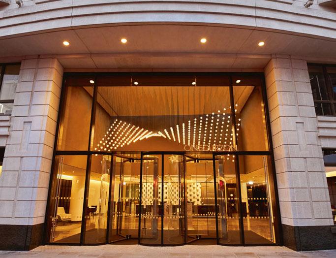
LSE Lighting was approached to design a large-scale bespoke feature for the entrance lobby at One Curzon street London. The design brief supplied to LSE from Jo White Design stated that the feature should emulate a waving twist of light and should consume the complete area for an immersive effect. It was also requested that there be no visible fixings to add to this seamless perfection that would span up to seven metres by four meters. Known for their skill and dexterity in manufacturing and design, LSE were ready for the challenge, as a company they are always working with new materials or the latest fabrication methods in order to continually deliver different innovative items. LSE recognised that capturing the building warmth was key to the aesthetics of this project. With this in mind the final design consisted of 338 individual glass balls all to be suspended perfectly at unique heights, making a smooth, relaxing wave of twisting light. The balls are internally illuminated via LED with warm white temperature, the complete installation is DALI controlled. This seamless and simple installation hides a complicated, well thought-out construction process that has enabled the installation to be delivered as requested with elegant, seamless style and pinpoint accuracy. www.lselighting.com
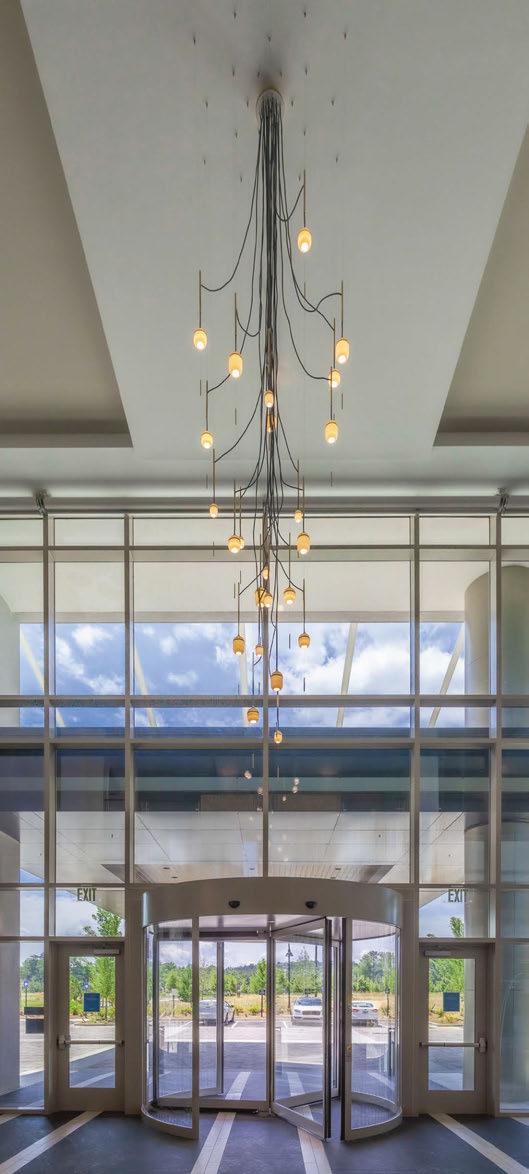
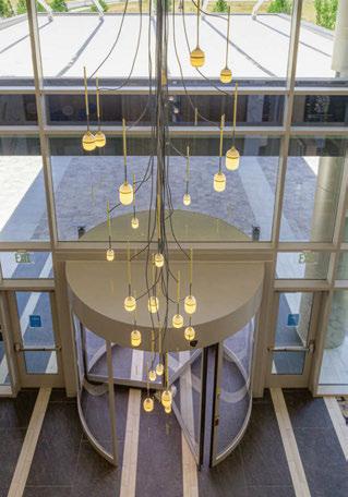
Hilton Hotel Alpharetta Alpharetta, USA
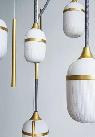
To welcome visitors within the entrance lobby of the Hilton Alpharetta Hotel in Atlanta, Designheure has been commissioned to create a custom sized chandelier as a sparkling focal point. The design brief was to create a light feature that captured the essence of this luxury hotel and be appreciated from numerous different points in the lobby; arriving through the entrance, along the top mezzanine and within the seating areas of this contemporary lobby. This new addition to the Hilton Hotels and Resorts is located in the heart of the Windward Business District, offering guests not only magnificent views of the North Georgia mountains but also great access to high end restaurant and retail experiences. From Designheure’s contemporary lighting portfolio, the Fleur de Kaolin collection was explored and customised to respond to the project concept. Composed of delicate porcelain, brushed brass and their signature textile cords, this chandelier design provides an elegant first impression as you enter the hotel lobby. Descending an impressive 28ft, the lobby has been adorned with a custom made version of the Fleur de Kaolin chandelier. As per all of the chandeliers in Designheure’s ever expanding portfolio, designers and architects are provided with the opportunity to tailor these decorative light features to suit their project ceiling heights. For the lobby of the Hilton Alpharetta Hotel, the Fleur de Kaolin chandelier was not only increased in size, but further decorative porcelain components were included to provide even further points of light throughout the full height of the space. For the Fleur de Kaolin lighting design collection, Designheure embarked upon a partnership with the French porcelain manufacturer Haviland. The Limoges-based establishment, which dates back to 1842, has a unique know-how and incredible expertise of creating luxury porcelain. Such qualities have been integrated into the decorative components of the Fleur de Kaolin collection, which are then delicately illuminated and poetically composed throughout all of the various products featured in the collection. From pendant lights, chandeliers to wall sconces, the essence of the Fleur de Kaolin design is adapted to suit a range of environments that desire a decorative solution. The spirit of this design is centred on the warm, white porcelain components, as well as the graphic verticality that can be seen in brass rods, steel cables and textile cords. Suspended like a mobile, this design adapts well to large ceiling heights, such as hotel lobbies, through its cascading, vertically composed forms. The warm glow of the 24 decorative porcelain components in the Hilton Alpharetta Hotel chandelier can be seen from afar, drawing you in through the main entrance to the lobby. To provide further texture and perspective throughout the chandelier, the components are also assembled in three different sizes, continuing a luxurious and jewel-like appearance, as well as capturing Designheure’s exquisite French touch. Through their lighting designs, Designheure continues to introduce beauty, poetry and elegance to exceptional spaces, enabling the creation of unique lighting solutions adapted to their destined environment. In compliance with the DNA of Designheure, each collection also offers infinite possibilities of colour customisations, providing clients the opportunity to sculpt their interiors even further. www.designheure.com Images: AJJN Photography


Two22 Minneapolis, USA
The Two22 office space is the fifth tallest building in Minneapolis, Minnesota, and has a central downtown location. The building has a storied history, encapsulating years of redesigns that left the space with a mish-mash of styles and a variety of metal finishes. Nelson Worldwide was brought on to elevate the space into the modern era and attract a workplace clientele worthy of the location. Yellow Goat Design worked with Nelson Worldwide to create a defining lobby statement sculptural lighting design that welcomes and “wows” employees in the workplace. First and foremost, Nelson Worldwide’s goal was to remove a set of clunky elevators that were providing issues with flow and wayfinding in the building. Once this was complete, the team needed a large-scale light sculpture to bring attention to the staircase and to add interest and unify the elements of a large atrium. The inspiration for the Yellow Goat Design piece was based on the architectural layout of the building as well as the various finishes found throughout. The building itself is a square with a large central circle (the atrium). Inspired by this concept, Yellow Goat Design worked with Nelson Worldwide to create a series of metal tubed rods with strategically placed metal cutouts that reflect the building’s structure. This piece uses almost 200 lit and unlit metal tubes that are powder-coated in brass, silver, and white finishes and layered within the piece to create a dynamic presentation. yellowgoatdesign.com

Built of harmony
The Secto Design lighting collection is designed by the award-winning architect Seppo Koho. The diligent handwork is carried out by highly talented craftsmen in Finland from top-quality local birch wood.
HTING FOCUS 040 | LOBBY LIG Hotel Zoo Berlin, Germany
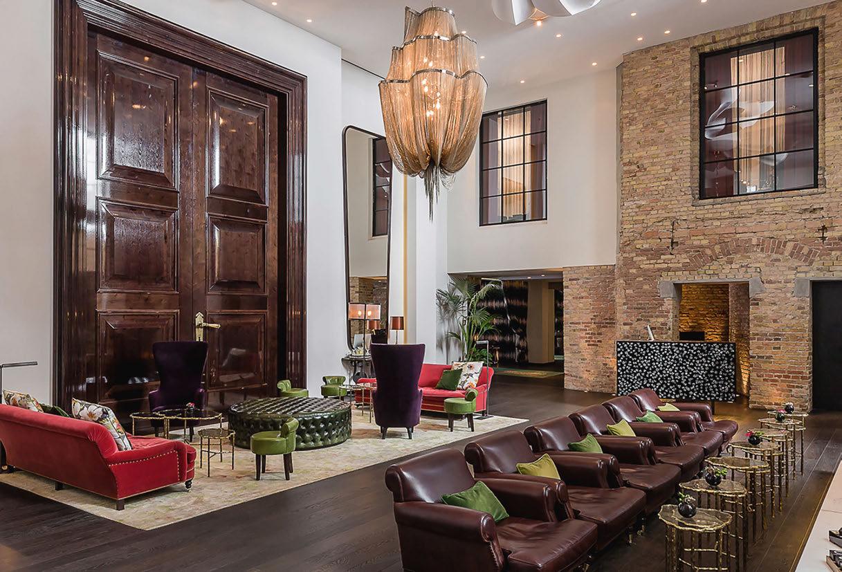
The unique style Terzani has established requires balancing several characteristics. Terzani is elegant and sophisticated, innovative yet original. Terzani uses the latest technology, but also incorporates fine materials traditionally hand-crafted by local artisans. Each lamp is an object/sculpture that is meant to be fully integrated into its surroundings, spreading a charming and enchanting play of light. Thus creating a constant interaction between the lamp and the space around it. For the lobby of Hotel Zoo, Terzani supplied its Atlantis and Stream fixtures. Stream, by Christian Lava, is an impressive presence in any room. Stream’s design exploits the physical characteristics of the materials used to envelop a room in a unique, immersive light. Several kilometers of metal chain flow down from the undulating, nickel-plated frame. These cascading tiers project a streaking, yet tranquil, shadow throughout the room. Atlantis’ shimmering light creates a vibrant source of energy. Its mesmerising, organic effect is created by hundreds of illuminated lengths of draped, nickel chain. Its chains appear liquid, cascading over its gloss nickel bands and falling down towards the abyss before turning back into itself. Designed Barlas Baylar, Atlantis is meticulously hand-crafted by master Italian artisans. www.terzani.com


Showroom: 67 Farringdon Rd. London EC1M 3JB www.bertfrank.co.uk

Hoefer Wysocki Architecture Dallas, USA
Hoefer Wysocki Architecture needed a large-scale overhead feature and lighting solution for an impressive 95ft high corporate lobby. The design team looked to award-winning, Seattle studio LightArt to customise a cluster of their signature LA2 Connected Rings. The installation at Park Central in Dallas, TX casts an even illumination across circular seating areas and reflects off of an adjacent wall feature, adding dynamic interest to a modern, white space. The result of LightArt’s research and development, LA2 technologies applies innovations in electronics, materials, and fabrication techniques to create fixtures that feature integrated, proprietary, solid-state LED systems; thin-gauge, lightweight material in more than 250 colour options; and a modular fabrication process to shorten lead time and minimise waste. LightArt’s LA2 collection combines LightArt’s handmade fabrication process and energy efficient LED illumination with 3form’s extensive colour portfolio to create a lightweight, small-scale lighting solution with a flawless glow. The collection also comes with cutting-edge dimming capabilities for ultralow dimming (0.1%) offering a breadth of lighting options in one fixture. The LA2 Connected Rings come in six size options ranging from 6 to 16ft in diameter, along with two height options of 4-inches to 8-inches high. lightart.com Images: Hoefer Wysocki Architecture

