

Welcome to issue #46, the first as we head into the second half of the year and the seasons begin to change. We are also headed in the direction of a full events calendar as we approach London Design Festival / Design London, Light + Building, Decorex, LiGHT22, and more!
It may not be until November, but we are super excited for the debut of LiGHT 22, as we recently released our talks programme with a stellar line-up of industry greats. Read more about each talk topic and find out who's on the panels over in our LiGHT 22 preview on p.62. Catch a glimpse of what’s happening during LDF this September over on p.68, including our partnership with Tala and our 10th Anniversary party with Haberdashery – hope to see you there!
Project-wise, we take a look at MAWD’s design for the I.M. Pei Tower in Denver, Colorado, which has transformed the entrance lobby Atrium Campus into a beautiful, human-scaled interior streetscape. Read more about this unique space on p.8.
Over on p.16 we take a closer look at our cover story, DesignLSM’s latest creation for UK-based chain The Alchemist, which incorporates cosmic vibes and a stunning array of decorative lighting pieces.
Carrying on with the anniversary celebrations, we sit down with Will Chelsom of Chelsom Lighting to discuss the brand’s 75th anniversary! The family-run business has been passed down through the generations and continues to grow stronger in the luxury lighting field. Learn a little more about Will’s upbringing and life in the family business on p.24.
Tekna’s latest launch comes in the form of a new material. Working in collaboration with Italian leather specialists GioBagnara, Tekna transforms some of its existing pieces with numerous leather finishes. Find out more on p.41.
In addition to much more inside, check out our Bespoke lighting feature, which starts on p.46 with a stunning Focal Point from Jason Bruges, and ends with a beautiful piece by ByBeau on p.59.
Enjoy reading, and I look forward to seeing you all at the upcoming industry events and parties!
Broadway
Th e Alchemist
for
Ho tel L'Europe
brand Catellani & Smith was selected by Decolighting to supply numerous decorative pieces to illuminate Hotel L'Europe in France. Gold is a key colour choice, bringing warmth and sophistication to the venue.
Bespoke Lighting
takes a look at some of the most recent projects across the world that feature stunning bespoke lighting pieces.
Li GHT 22 Preview
take a look at a collection of brands that carry a decorative lighting portfolio, which are exhibiting at the inaugral LiGHT 22 show in November this year. We also present the full talks programme put together by [d]arc media's editorial team.

Catch some of the events and new products that will be on show in London this September, including darc's much anticipated 10th anniversary party with Haberdashery.
073 Ma nufacturer Case Studies
darc covers some of the latest projects produced by brands from across the world.
Managing Editor | Helen Ankers h.ankers@mondiale.co.uk +44 161 476 8372
Editor | Sarah Cullen s.cullen@mondiale.co.uk +44 161 476 9401
Contributing Editor Matt Waring
Media Sales Manager | Stephen Quiligotti s.quiligotti@mondiale.co.uk +44 7742 019213
Artwork | Dan Seaton d.seaton@mondiale.co.uk
Editorial | Mel Capper m.capper@mondiale.co.uk
Finance
Finance Director | Amanda Giles a.giles@mondiale.co.uk
Credit Control | Lynette Levi l.levi@mondiale.co.uk
Chairman Mondiale Publishing | Damian Walsh
Managing Director [d]arc media | Paul James p.james@mondiale.co.uk
Marketing & Events | Moses Naeem m.naeem@mondiale.co.uk
[d]arc media ltd | Strawberry Studios, Watson Square, Stockport SK1 3AZ, UK | Printed by Buxton Press, Palace Road, Buxton, UK | ISSN 2052-9406




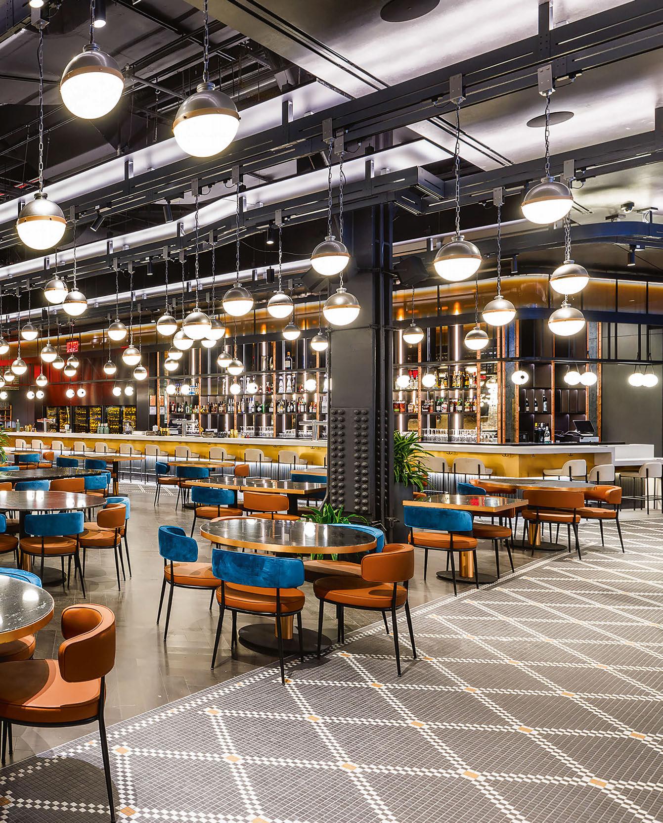
New York City, USA
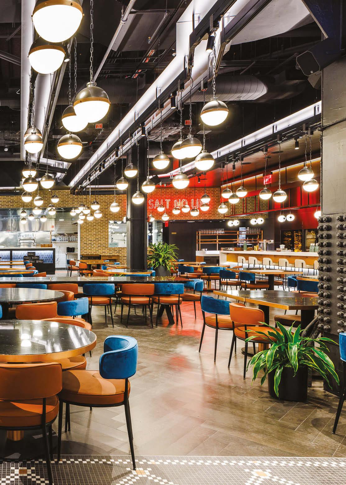
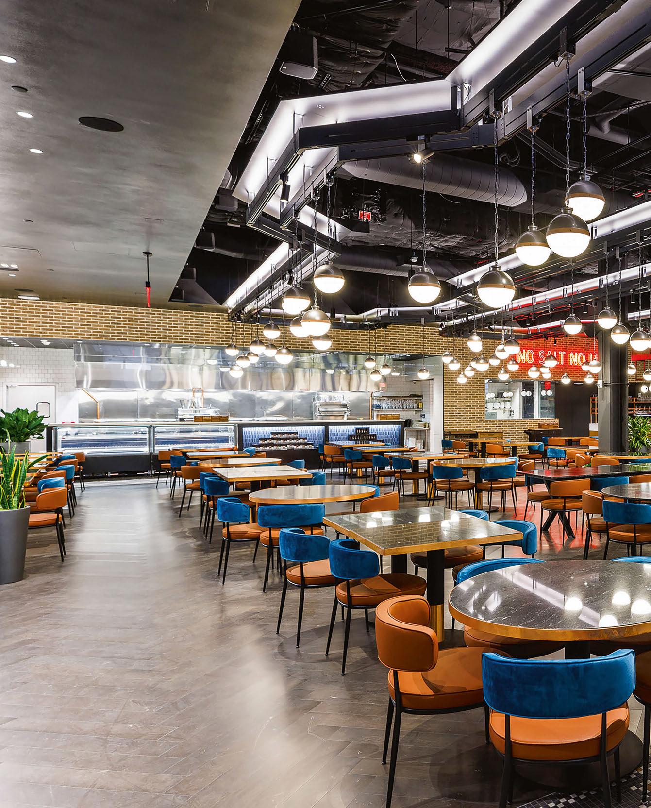
VISO worked with TPG Architecture to design-engineer a custom lighting package for Head Chef Nusret Gökçe’s New York restaurant location. VISO designengineered and fabricated an illuminated pendant track that spans across 72ft above the dining space. This resulted in creating an organic structure and flow of light symbolising the efficiency that is often found in a well-run assembly line. The continuous steel track is retrofitted into the space, moving around the existing ventilations, pipes, and ceiling. This modern installation fits right at home within Nusr-Et Fabrika and draws inspiration from the famous New York subway lines. The track rail lights up the ceiling through 743 linear feet of uplighting modules and suspends metal pendant light orbs that are staggered at different heights for additional illumination. Don’t miss the “Salt Bae” meat hooks that are also on the light track. www.visoinc.com
Image: Alex Staniloff
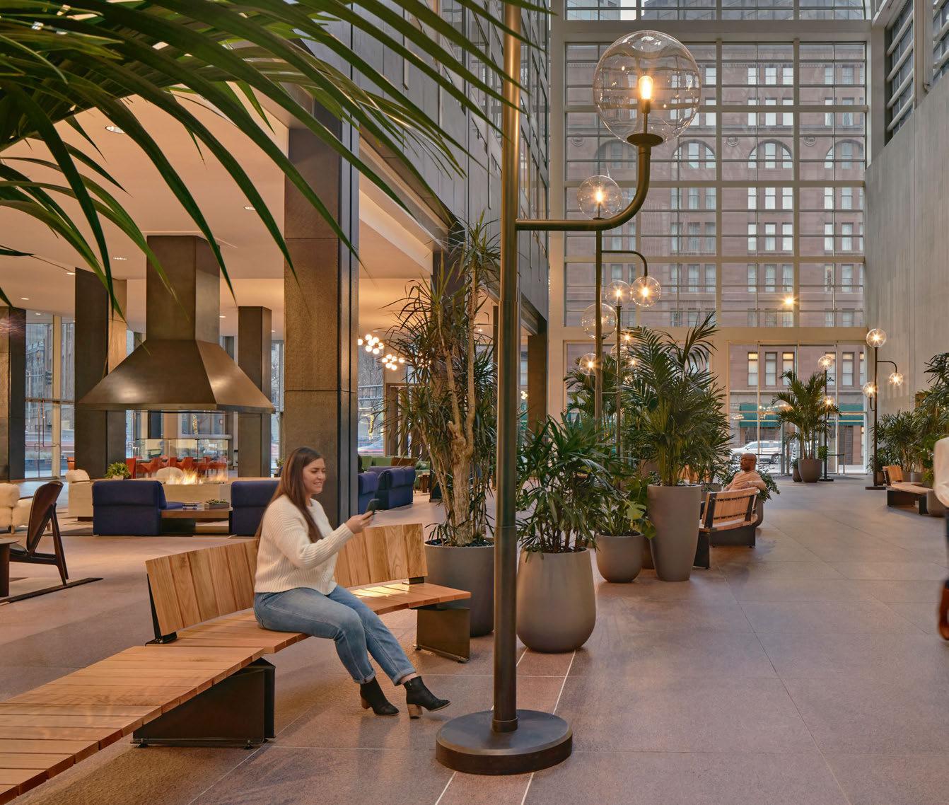
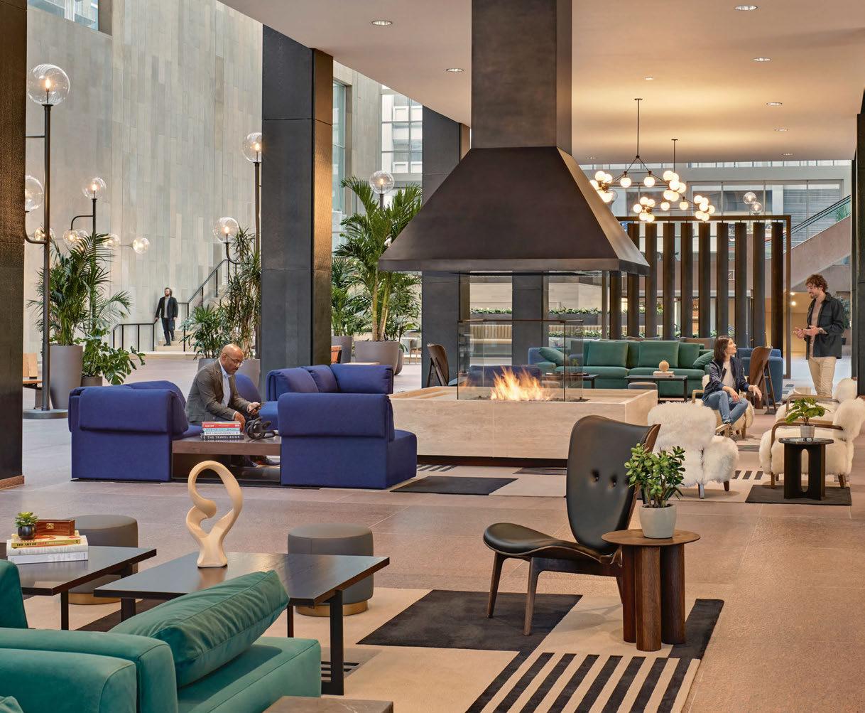
Interior design studio MAWD teamed up with Warbach lighting design to produce a stunning exterior-influenced scheme for the Denver-based Atrium Campus. Using lighting was key to making the vast space feel inviting.
Downtown Denver’s first high-rise, 1700 Broadway, was designed by I.M. Pei in 1954. Then, an adjoining Atrium by architect Philip Johnson was added much later in 1983. This iconic building has undergone a contemporary revival by UK and US-based Mawd design studio, with the new space now a nucleus meeting spot for tech firms and leading creatives in Colorado’s capital, providing a flexible and responsive workspace for today’s workers. Beacon Capital Partners, an American real estate investment firm which acquired 1700 Broadway in 2019, appointed Mawd to bring the expansive 27,000sqft glass atrium down to scale, providing a more comfortable, flexible workspace. Unique to the Atrium’s entryway, visitors can find a front-of-house bike
room, complete with lockers, makers tables, and tool storage space. The thoughtfully designed workshop not only supports the city’s biking trends but encourages individuals to enjoy time spent on campus. Expanding 9000sqft, the communal amenity space features inviting fireplaces perfect for Colorado’s mountainous climate, as well as a wellness space with gym and yoga/sound bath studio, all to enhance the active lifestyles of Denverites. Lighting pieces from Roll & Hill and Artemide add further conforting layers to the communal areas. darc spoke with Elliot March, Co-Founder of Mawd and Project Lead, to find out more about the firm’s approach to designing various spaces within the iconic building, as well as with Nathan Warner,
Principal of the two-person run, US-based lighting design practice Warbach who were appointed to complete both exterior and interior lighting elements.
“Initially, Mawd was brought on to develop and design the project’s amenity space. However, quickly after we presented the initial renderings, Beacon Capital asked if we could become more involved with the project’s overall scope - appointing us as the design lead for I.M. Pei’s lobby. As time went on, we were added to more and more projects, such as the campus’ Bike Room. We are still involved and are now working on F&B adjacent to the Atrium space,” explains March. Similarly to Mawd, Warbach was approached by Beacon Capital
initially for an exterior commission, which later developed into extended interior assignments. “We were approached by the developer and asked to create an extensive exterior light sculpture that would tie the three buildings together, and make them feel like one, unified campus,” says Warner. “After our initial talks with Beacon, they asked if we would expand the scope of our involvement and take on some interior projects as well. That’s how we were first introduced to Mawd.” March continues: “We drilled into the Mid-Century details that were prevalent, authentic and timeless. We focused on wellness and learning amenities, which we know through research are a major driver for businesses looking to attract and retain the best talent.
“Atrium Campus stands out in terms of sheer scale. The lobby required a large-scale intervention, which provided rare opportunities for innovation in terms of both design and interior architecture.
“Furthermore, while our studio specialises in working within heritage settings, it was a great opportunity to be involved in a Mid-Century project built not by one, but two architectural masters.
"While we work with a number of lighting fabricators worldwide, Warbach was an exceptional fit for the Denver project, not only in terms of regional geography, but in terms of what the Atrium Campus audience would be looking for. Warbach’s focus on craftsmanship was a great match for Denver’s creative and tech workers.”
Lighting, both decorative and architectural, was imperative for achieving the desired atmosphere in the grand, glass-surrounded spaces. As March explains further, the decorative elements aided this concept predominantly: “Compared to the project’s architectural lighting, which was geared towards pure functionality, the decorative lighting helped to fill the space, bringing the lobby and streetscape back down to human scale.
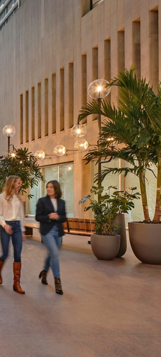
“The street lamps, for example, stand at around 10ft, but provide different levels of lighting just above eye-level.”
Warner adds: “For the street lamps, the size of each lamp post was absolutely massive. There were only two of us installing them, which
was difficult to manage due to the sheer weight and scale of the fixtures.
“Throughout the project, scale was our primary consideration. Due to the overwhelming size of the Atrium, we had to get the scale of each lighting fixture right. If the lighting sculptures were too big, they would be overwhelming for visitors. Conversely, if the lighting fixtures were too small, they would be overlooked.
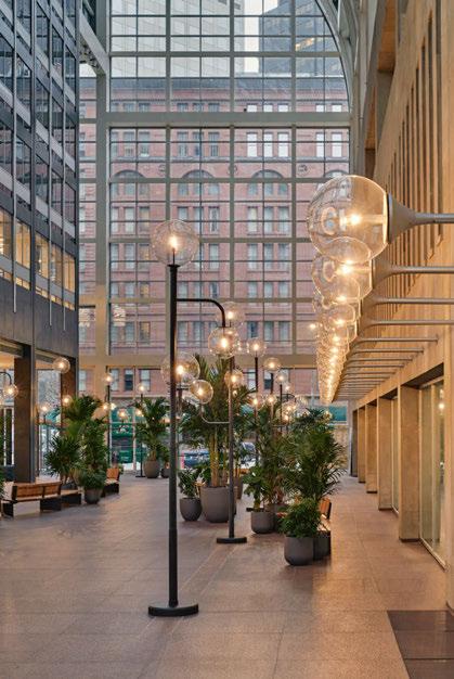
“For Philip Johnson’s glass atrium, we worked to ensure that the street lamps were alternating throughout the walkway to provide the tenant with variation as they moved through the ‘street.’
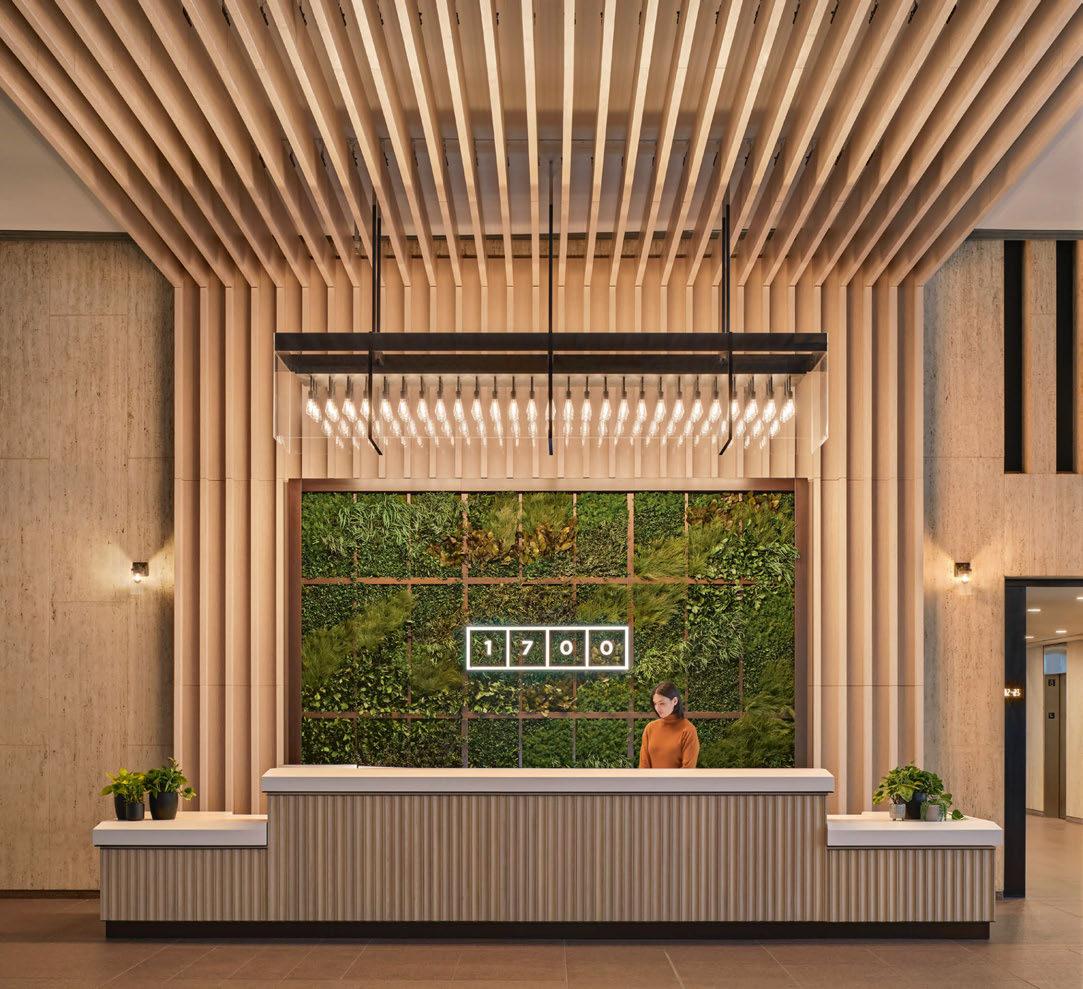
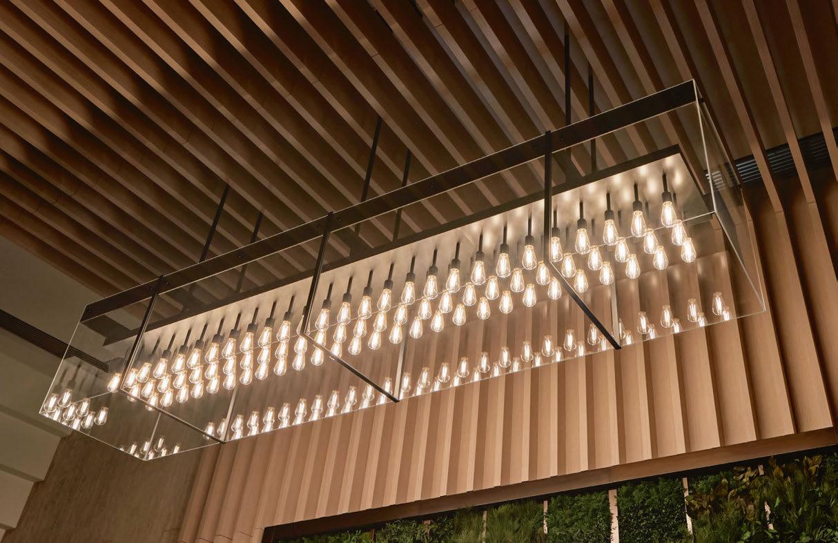
“For the pendant [custom made by Warbach, situated above the front desk], scale also remained key, ensuring that the installation height and dimensions were correct. For this pendant we had to work around the ceiling's existing conditions to properly fix the chandelier. The weight of the pendant meant adding in additional support.
“Working within such a large space, we wanted to ensure that the lighting fixtures were able to draw attention, and anchor visitors,” continues Warner.
“We felt that we were successfully able to accomplish this with the chandelier, which helps to show off the magnificence of the building. Although it was a challenge to install, the one large pendant was able to establish a greater presence compared to if we installed several
smaller pendants.
“In terms of the street lamps, we feel that the scale of the lamps were able to perfectly mimic the feeling of being outside. In this case, the lamps brought warmth at a familiar height within an expansive atrium.” March adds, with reference to the pendant: “A cost-effective approach would have been to opt for something along the lines of three smaller pendants. However, we were determined to stay true to our initial design plan. In the end, it was more than worth it. The grand effect of the chandelier creates an initial ‘wow’ moment upon entry. Additionally, the added bonus of the pendant doubling as a wayfinding mechanism is invaluable to the Lobby experience. While we didn’t necessarily need that large of a pendant to light the desk, the scale of the fixture helps to guide visitors as they enter the building.”
As designers that specialise in hospitality and residential environments, Mawd was continually looking to create spaces where “both tenants and employees are naturally encouraged to interact”.
“Lighting plays a major part in this interaction,” says March. “Lighting makes spaces warm and welcoming, and in the case of the Atrium Campus street lamps, provide a natural anchor for people to sit down and congregate around.
“Compared to most architects and designers who work within a
lighting range of 3000K, our team continually pushes for 2700K, which is closer to the incandescent lighting in your home. Working within this spectrum that we use frequently in our specialty fields of design, we are able to create an atmosphere that is welcoming, comfortable, and familiar. [Warbach’s team also ensured Edison light sources were used throughout to maintain consistency].
“While there was ample lighting in the tower to start, we saw decorative lighting as the jewellery of the space, as an opportunity to add warmth, and to create a inviting atmosphere,” continues March.
The street lamps within the glass atrium help reinforce directionality, guiding guests and visitors through the streetscape towards the Spanish Steps.
“Lastly, decorative lighting successfully helped to define each individual area, such as keeping the look and feel of the lobby distinct from the look and feel of the atrium’s streetscape. The light not only defines the space, but brings ambiance and atmosphere, which supports interaction.”
Throughout the process, Mawd’s approach evolved in two primary ways. March expands further: “Firstly, as the brief evolved to incorporate the lobby, it became an exercise in modern workplace design and architectural intervention. Not only was the lobby designed
as a public space, but the area’s scale allowed us to transform the welcome experience and the ground floor’s directional flow. This was primarily achieved through the addition of Spanish Steps and transformation of the streetscape.
“Secondly, the addition of Philip Johnson’s glass atrium and the lobby space help to shift the design focus to preservation. The historic significance of both Johnson and Pei’s work impacted our design process in the sense that we prioritised keeping the Mid-Century design details alive throughout the renovation. One such example includes the lobby’s flooring, which we maintained, in addition to adding in furniture and fixtures inspired by this period.
“One challenge we encountered during the design build-out involved the placement of the street lamps throughout Philip Johnson’s streetscape. Fabricated by Warbach, we designed these in the spirit of Johnson’s original fixtures. In order to add the new street lamps within the Atrium, we had to dig into the ground to extend power to the fixtures.
“In the end, the unexpected digging was well worth it. We were able to add convenience power to the base of each lamp - a contemporary upgrade that allows the building’s tenants and guests to sit, relax, and recharge their laptops or tablets.”
March also notes that the use of strong digital renderings at the beginning of a project can aid in the process going as smoothly as possible. “Our studio prides itself on our photo-realistic renderings, which remain an integral part of our process. Our team’s ability to deliver designs that stay true to our initial briefs is something our clients appreciate.
“This also holds true for the lighting designers we work with. Getting the renderings right for Warbach, for example, provided their team with a strong visual to work off.”
Overall, the project has been a great experience and success for all parties involved. Warner reflects on the pride he felt upon completing the project in a favoured city of his: “We specialise in large-scale projects, so this was well within our area of expertise. However, working on the Atrium Campus project was notable as I have admired the work of I.M. Pei for decades, and I have created many past works that were inspired by his architecture. It was an honour for my work to be installed within his building. Also, I have always loved Denver, and have wanted to create work for this city.
“We’re craftsmen, and between me and my business partner, we fabricate and finish everything. There is a lot of love that goes into these projects. We are happy with how the project turned out, and the
fact the entire project went smoothly, especially in terms of fabrication. We felt that the scale was spot on, and that all of the fixtures were oriented in the correct direction.
“In terms of working with the initial plan, renderings are so good these days, you know exactly what the final result is going to look like. “Denver is a working city, and we thought that its residents would appreciate something that was made with our working hands.”
March reflects on the relationship between Mawd and Warbach and the value he gives to lighting fabricators on projects in general: “Our experience working with Warbach was exceptional. We regularly work with lighting fabricators due to the technical aspect of lighting, and the designer’s vast knowledge of millwork and LED technology.
“Both our team and the client have been thrilled by the project, and we look forward to continuing to work with Beacon. We appreciate our client’s faith in us, and support for the design details we believed to be important.”
www.mawd.co
www.warbach.com
Design Details
Atrium Campus 1700 Broadway, Denver, USA
Interior Design: MAWD
Lighting Design: Warbach Studio
Lighting Specified: Allied Maker, Artemide, Roll & Hill, Warbach Studio
Images: Robert Benson, Courtesy of MAWD
MAWD and Warbach have created an inviting and intimate space in the large, glass surrounded atrium for I.M. Pei's tower in the heart of Denver, Colorado.
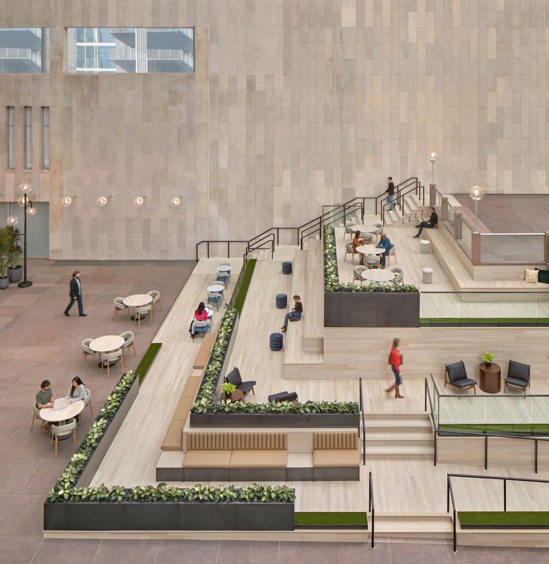
Custom-designed and manufactured streetlights line the interior of the atrium, bringing the volume down to a more human scale, creating a less overwhelming environment for users.
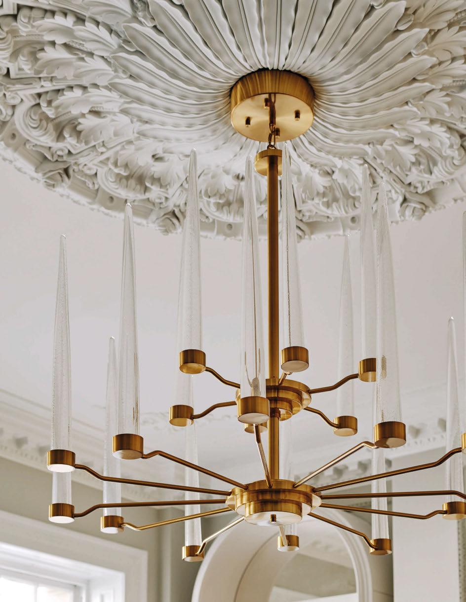
A large custom made pendant hangs above the front desk and acts as another layer to bringing the scale down, as well as a wayfinding focal point.

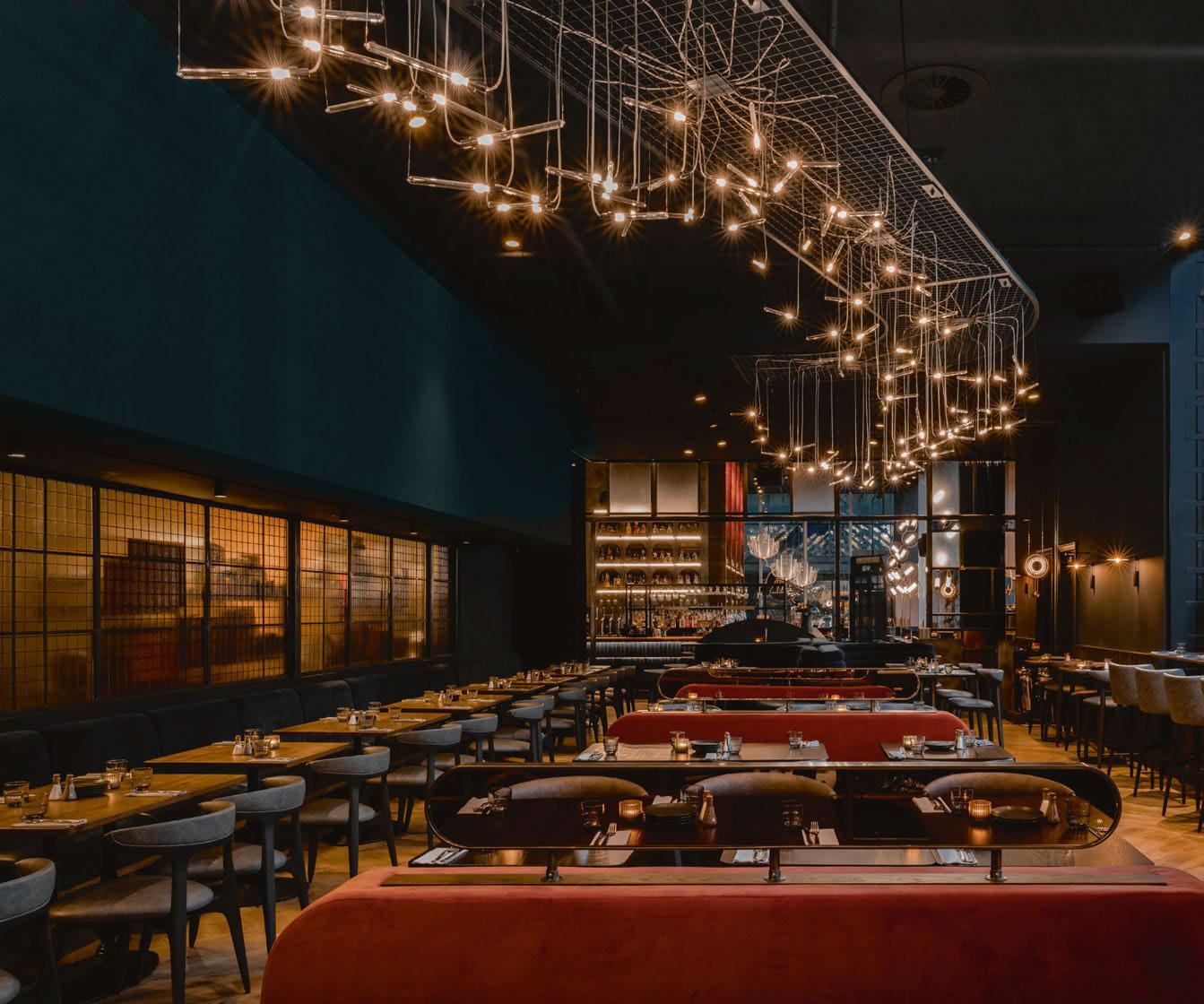
The Alchemist is a well-established cocktail and restaurant chain with 20 venues across the
was responsible for creating the new interiors for
Alchemist’s
Speaking with Karen Taylor, Design Director at DesignLSM, darc finds out more about their design intentions and stunning decorative lighting pieces selected for The Alchemist's moody and atmospheric destination in the north of the UK.
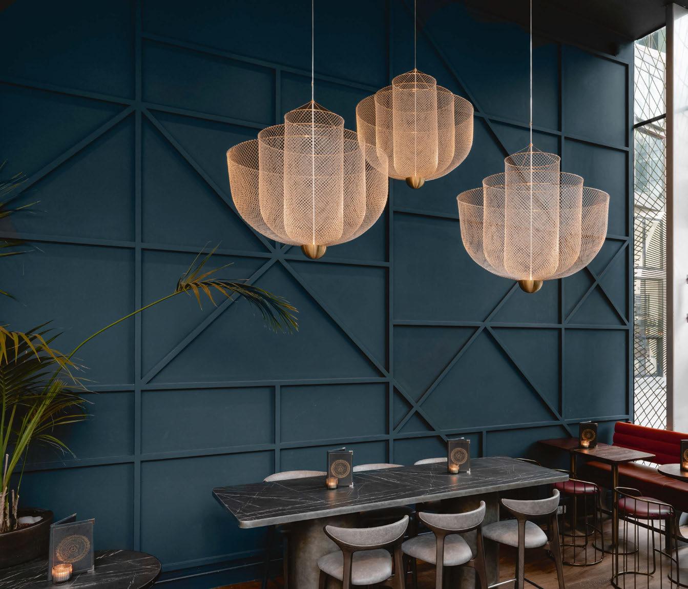
Thanks to the design firm’s extensive experience in hospitality design, The Alchemist team approached DesignLSM to transform and refresh their site located in the heart of Manchester’s Spinningfields.
“The brief included achieving greater operational efficiencies and updating the aesthetic to create an engaging and dynamic guest experience that transitioned through the day and better blended the bar and dining spaces,” says Taylor. “From concept to completion, the project was a very quick turnaround; we were only on site for one month!
“Usually we work with lighting designers, but for this project we successfully managed this in-house, working in collaboration with the manufacturer. We worked around the existing architectural lights within the venue, carefully curating a strong variety of additional feature lights to create the ambience and visual interest that we envisioned for the space. We worked closely with an electrical consultant, Nebro, to ensure we were using the right lamps to create a warm and glowing atmosphere.”
DesignLSM’s brief took the Manchester location in a new direction for the brand. “It was important to understand the DNA of The Alchemist and what their future aspirations were from a strategic perspective before establishing the design narrative,” explains Taylor.
“The site needed to work from day to night, but with extensive floor-
to-ceiling glazing around half of the venue, it was a challenge when it came to ensuring an organic ambience was created throughout the day.
“The typical challenge with refurbs is that you’re having to work with some existing elements whilst delivering a new look and feel for the space. In this venue, it had extremely high ceilings so it was essential to create big-scale drama otherwise the design would get lost. We selected decorative and immersive features and lighting that could hold the space, whilst embracing the layering of beautiful lighting (suspended lights, wall lights and integrated lighting) to create an intimate ambience in the evening.
“It was important for us to play with the drama of the narrative, reflecting the brand’s theatrical offering. It was key for us that the
space felt immersive and reflected the playful DNA of the brand,” she continues.
“Addressing the operational objectives of the brief, a lucid identity was well-thought-out for the two main spaces – the bar and main dining area, as well as designing an additional intimate PDR (private dining room), improving the fluidity of movement between the whole venue whilst also creating engaging zones.”
Understanding The Alchemist’s commercial, operational and experiential objectives ensured the team stayed on brief consistently throughout the project. These elements helped to “define a clear and thorough foundation for our team to work from”.
“The Alchemist pride themselves on creating theatrical experiences, showcasing their creativity and innovation through mixology.

With the brand’s strong reputation for its unique offering across the country, it provided DesignLSM with an excellent opportunity to push the boundaries on curating a compelling and unique concept that would reflect the evolution of the brand’s DNA and transitioning narrative, drawing inspiration from the origins of the universe and cosmic alchemy.
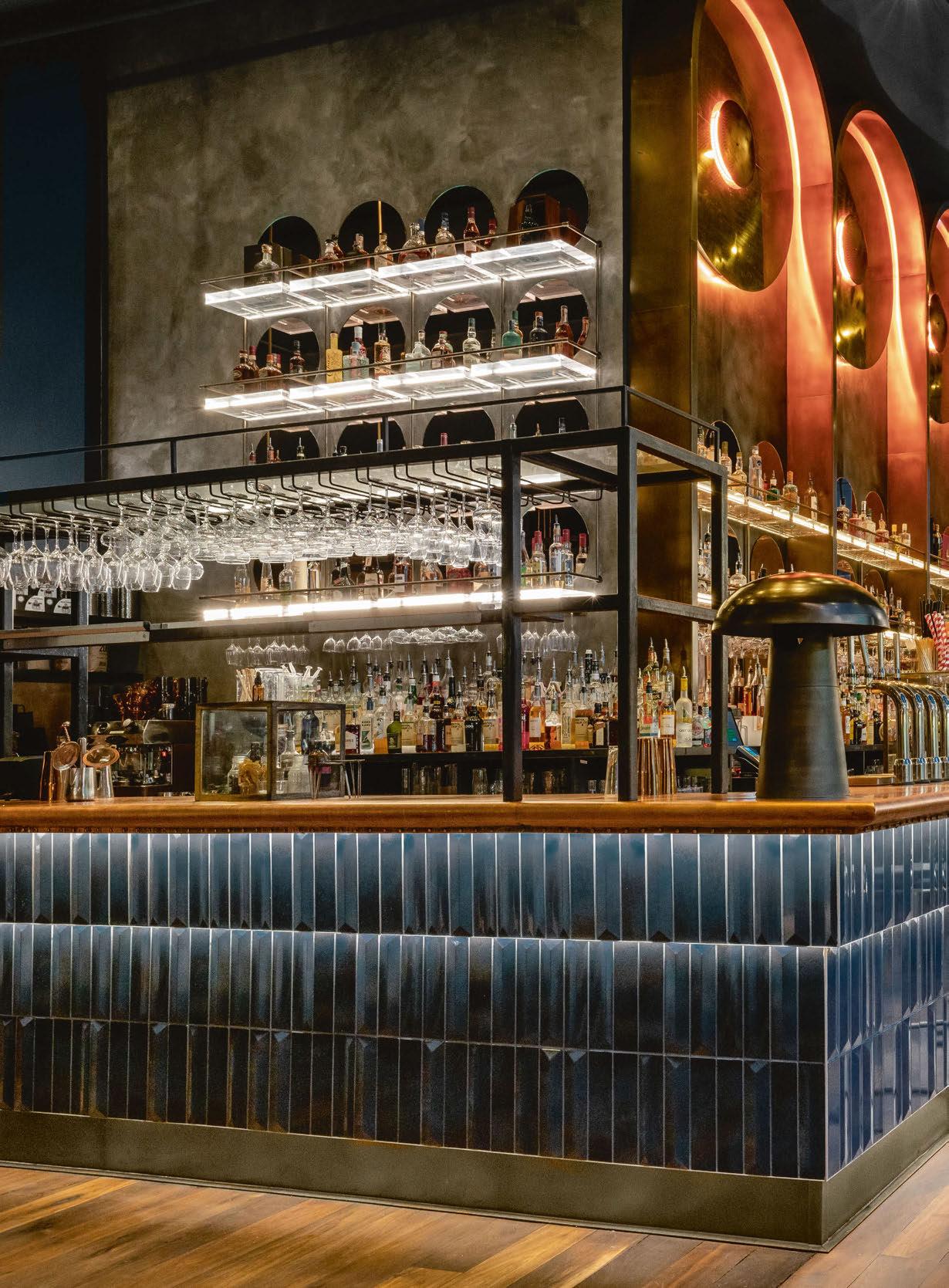
“Strategically considering the overall guest experience, curating hero features that would define the space, the back bar – playing upon astronomical dynamism - has now become a striking focal point, accentuating the relationship between light and dark with beautifully framed circular lights that emit a soft glow during the day that enhances and becomes richer in hue and bolder in strength as the evening progresses – marking the solar/lunar progression.”
As mentioned, the space the team were working with featured very high ceilings, and lighting played a key role in managing these comfortably.
“Lighting was one of the main elements of this project and nearly all features were bespoke except two wall lights,” explains Taylor. “All of the lighting formed part of the compelling concept - every piece was carefully chosen to enhance the cosmic alchemy narrative and represent orbital pathways of planets and supernovas.
“Specifically though, is the large bar feature, which dominates the space and reflects the transition from day to night. The large glowing
orbs that transition from warm white to amber to red represent the sun and its dominating/illuminating presence – as the day progresses, these orbs softly start to glow until darkness falls when they burn bright creating a striking and dominant golden glow.
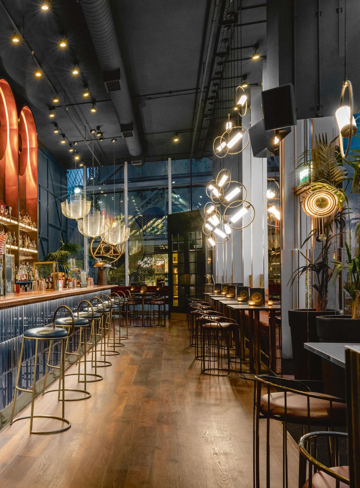
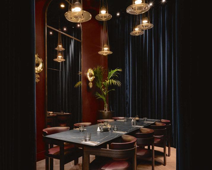
“We used several manufacturers to produce our different light features, which were all carefully selected or designed to enhance the cosmic concept. With 80% of the lighting bespoke, we worked with Illumination to manufacture all the custom features including the main restaurant lights, comprising of approximately 125 led suspended Perspex rods, which were created to represent the swirling gasses in space, the suspended lights in and the PDR emulating planets.
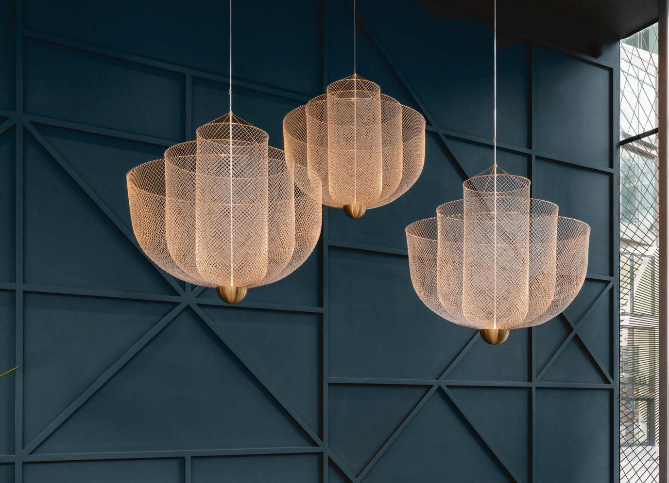
“The glass wall lights (sourced from Chelsom) were strategically positioned on the columns representing the sun and the moon, whilst the mesh lights from Moooi created dramatic sculptural statements at the entrance of the venue.”
Lighting was an important element in the curation and designation of different zones throughout the space. The pieces aided in creating intimate spaces whilst in the main restaurant and bar, it was important to the team to deliver dramatic focal points to fill and illuminate the open areas. The sculptural aspects also enhance the changing ambience of the day as it transitions to night.
“For the private dining room, we created The Alchemist’s version of space, with seven planet-inspired lights, helping to create a welcoming
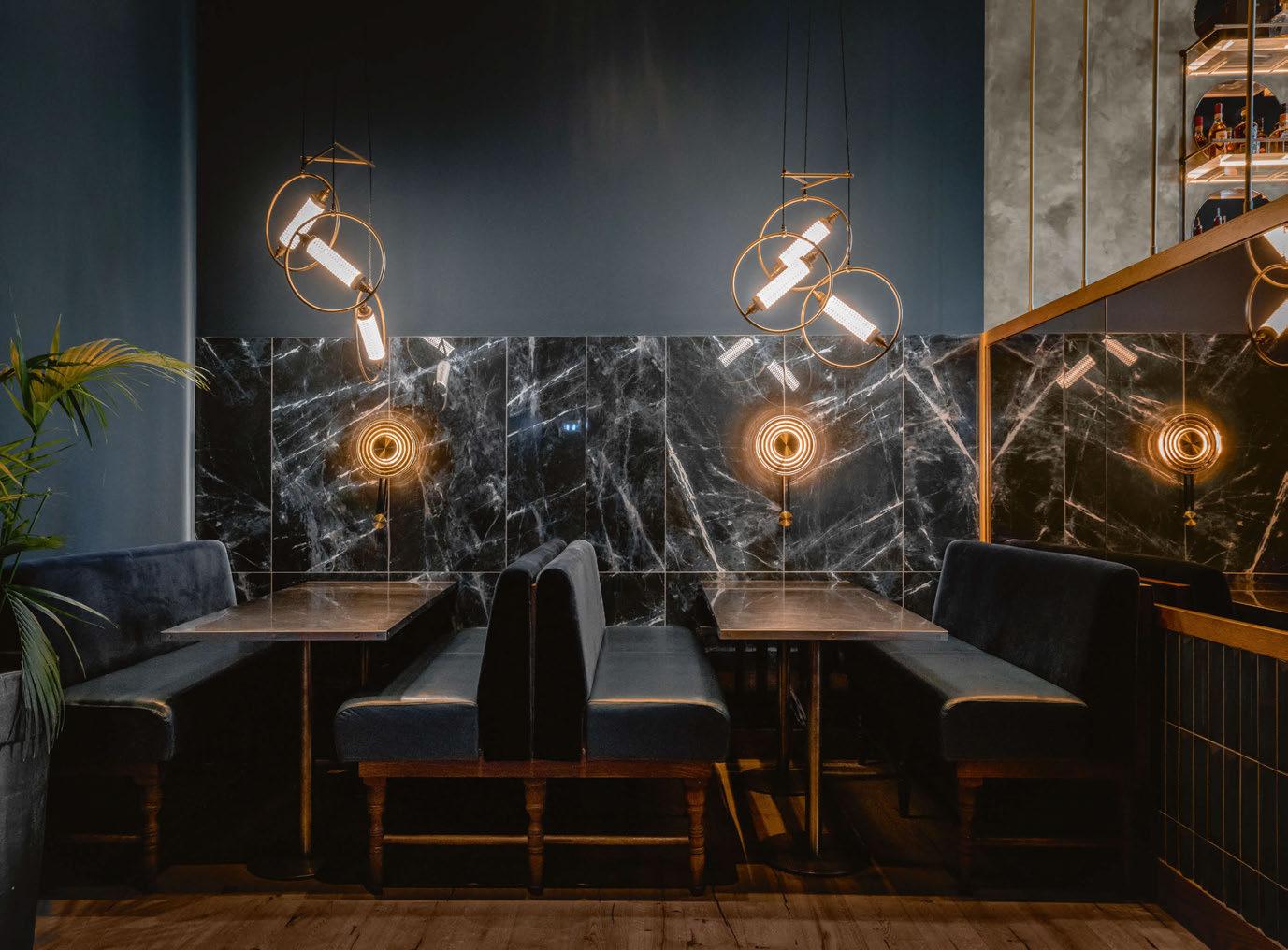
area for groups,” continues Taylor. “In the bar, we opted for planet pendants, visible from the exterior façade.
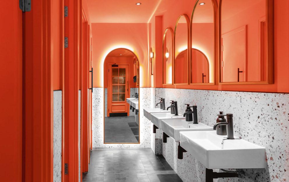
“The female toilets, a dichotomy from the dark moody tones of the front of house, take a confident contrasting approach with wall lights that radiate energy along with the lively orange colour palette creating a burst of vibrancy whilst complimenting the terrazzo walls – a representation of fragments floating in space as a result of an exploding supernova.”
Using the already existing architectural lighting, the team were fortunate that the system was already very flexible, allowing them to reposition and re-angle fixtures to complement the additional feature lighting.
“Due to the open and exposed surfaces to the ceilings, we utilised cable trays, which were sprayed out across the ceiling in the same dark
tone, accentuating the glow of the suspended lights whilst enhancing the cosmic narrative that each lighting feature played into. The main challenge was working with the existing surfaces, so feature lighting had to work around this.
“The lighting completely elevates the whole space, creating theatrical focal points throughout,” says Taylor on how the lighting accompanied the interior design scheme as a whole. “As soon as you step inside, you get a real sense of the narrative behind the design and the brand. Being an all-day drinking and dining destination, the lighting allows the space to subtly transition from a lunchtime spot to a vibrant drinking destination in the evening.”
The overall impression and reception from The Alchemist team has been resoundingly positive. “From the get-go, the concept was well interpreted and we’re extremely proud of the space we have created,
and the new direction we have delivered for The Alchemist,” explains Taylor. “Since re-opening, we’re thrilled with the positive feedback we have received from both the client and the public. Despite there being a vast selection of drinking and dining destinations in the city, The Alchemist sets itself apart from other bars and restaurants in the local vicinity and remains one of Manchester’s most renowned social hot spots.
“We’re extremely proud of what we have created, with the finished space being a strong replication of our visuals. As with all projects, we are continuing to identify innovative ways to incorporate digital integrations, layering the physical space with technical elements to further enhance the guest experience.” www.designlsm.com
The Alchemist, Manchester, UK
Interior Design: DesignLSM
Taking inspiration from The Alchemist's repetoir for theatrical and out of this world cocktail experiences, DesignLSM created a cosmic food and beverage destination in the heart of Manchester's Spinningfields district.

Decorative lighting played a key role in presenting a cosmic, planetary atmosphere, using colour temperatures, dimming controls, and bespoke fixtures that represented the glowing sun and supernova constellations throughout the spaces.

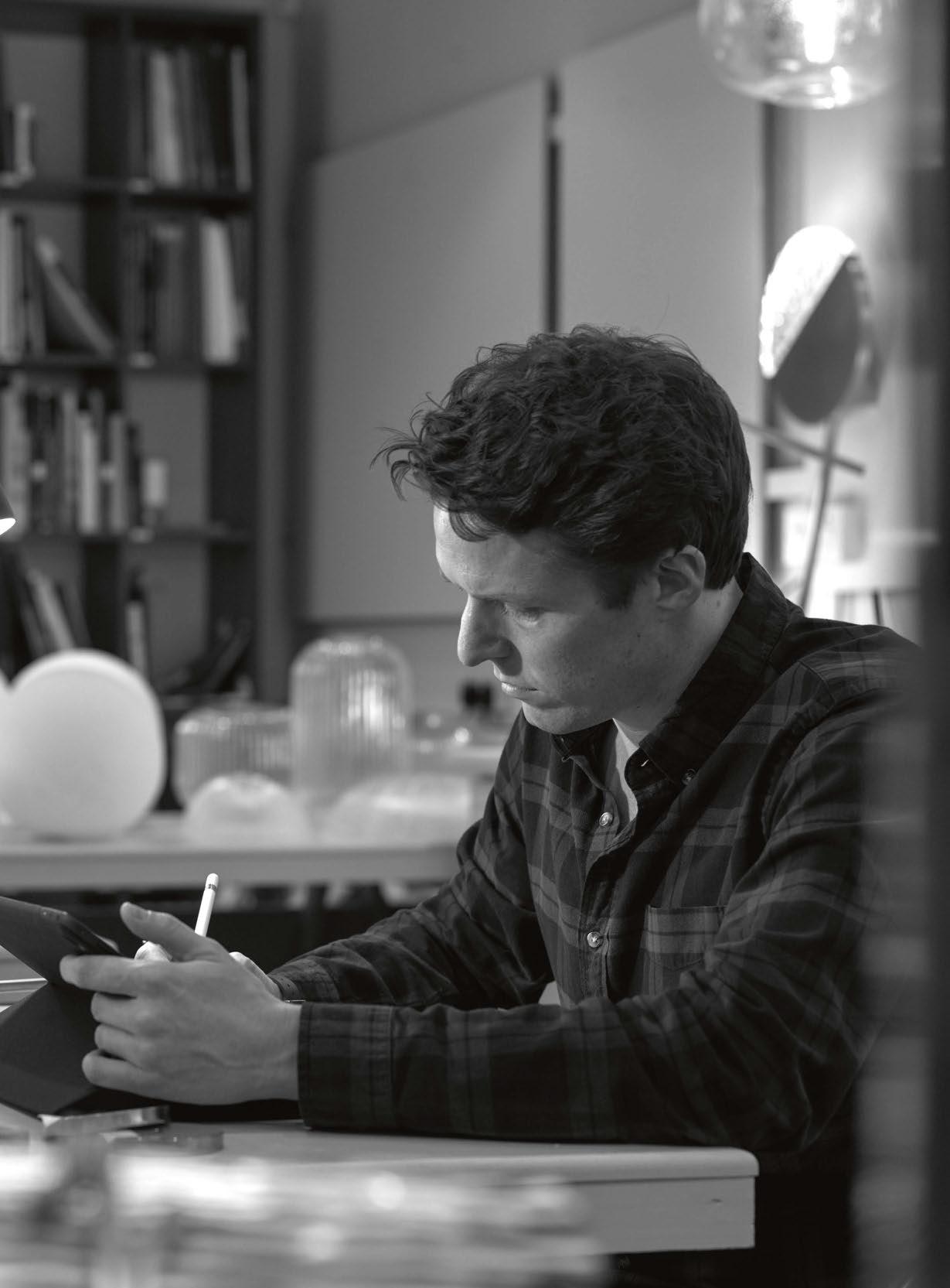
British luxury lighting brand Chelsom celebrates a milestone anniversary this year, turning the grand age of 75. In celebration of this achievement, darc sits down with current Managing Director Will Chelsom to discover more about his background entering the family business, and what the team has in store for its future.
“I grew up in Lytham St Annes, just south of Blackpool in North West England. My grandparents moved to Blackpool to set up our business in 1947 and my Father has lived in the area his whole life,” recalls Will. “Lytham has always been a slightly sleepier neighbour to the explosive tourist haven that is Blackpool, but it was a wonderful place to grow up and our business has been based here ever since. I went to the University of Leeds, where I studied Business Management with Asia Pacific Studies; a course that was hugely interesting and that I have been able to relate to throughout my career.
“I then worked in London for about 10 years as a head-hunter in the financial sector but it was really not for me at all. I hated it in fact, and it was the perfect catalyst to bringing me back to what I knew I always wanted to do, which was work within the family business. Sometimes you have to learn what you don’t want to do before you learn what you do.
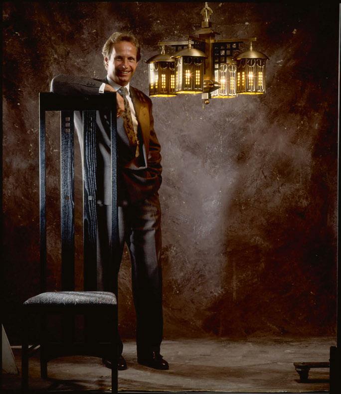
“Now I live just outside Manchester with my wife and our two children. My wife is an interior designer and we both share a passion for design, although I cannot say that she is 100% loyal to the Chelsom brand
when it comes to lighting on her projects! I feel very lucky to work in the space that we do, especially given Chelsom’s focus on hospitality, cruise and high-end residential because we are constantly working with some of the finest talents on the most prestigious projects around the world. If I wasn’t doing what I do today, I love music and would always have liked a career in that industry somehow… doing what I am not exactly sure!”
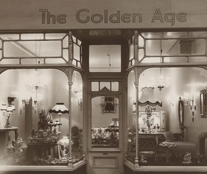
Chelsom is a traditional company in that it is a family-run business that has passed through the generations since its opening in 1947 by Reg and Kay Chelsom. It began as a small antique lighting shop in Blackpool under the name The Golden Age. This rapidly grew into three shops and then onto manufacturing period lighting pieces. In the 1970s, Will’s father Robert took over from his parents and brought the brand to the forefront of hospitality lighting, which it is well-known for now. Will joined later in 2006.
“Like many family businesses, as a child you tend to grow up being surrounded by the day-to-day of what is going on in the company. I remember from a very early age taking a strong interest in what my father did and I spent a lot of time in the factory observing what was going on,” reflects Will. “In my teens, I would get school holiday jobs in any area of the business that I could and simply grew up alongside the company. The design aspect was always very cool and the end product we worked with and the projects we worked on always interested me.
“We produce a new collection of products every two years and an
enormous amount of work goes into that process. I always remember the joy of seeing Dad’s early design concepts come to life. I always saw the huge potential in Chelsom and I knew there would always be a challenge in maintaining and developing the brand. Design never sits still so it was always appealing to me to work in a business like that, so when I joined in 2006 the move felt very right. “My early years in the business were in Business Development and client relations, something that really helped me better understand the industry and the important players that exist within the design community.”

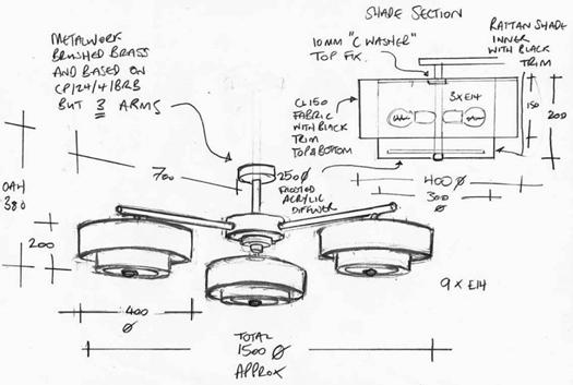
Going against the stereotype, Will has thoroughly enjoyed being a part of the family business. He explains that his experience has been “pretty much perfect”.
“You hear a lot of horror stories when it comes to family businesses and my Dad and I seem to have avoided all of that. As Chairman, Dad plays a more hands-off role now as he has moved towards retirement (an acceptable move after 50 years in the business!), but he has allowed for an incredibly smooth transition as I came up through the business and was appointed Managing Director in 2016. We seem to agree on most things, especially when it comes to design taste and trends, so that makes for a super partnership. He has been an excellent mentor to me from the start and I am able to balance his vast experience with new ideas in taking the business forward. We are very hands-on, both with our colleagues and our customers and I think that is important in a family business. It is a rare thing, but we work very well together.”
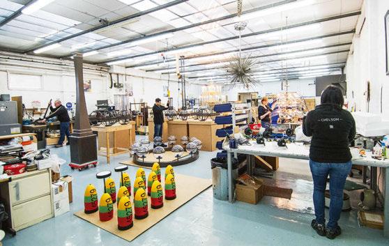
At the time of starting officially in the business, the majority of the fixtures in production at Chelsom were very classical pieces, which were popular at the time. Looking at the collections they produce now, the brand has removed that aspect of design almost entirely and has transitioned in style to more retro and vintage looks with contemporary and minimal features. “I was always interested in cutting-edge designers and how they have evolved the design world through the ages, whether someone like Frank Lloyd Wright in architecture or Terence Conran in multiple areas of design. Today, inspiration seems to come from a whole host of places,” explains Will. “We are fortunate enough to work with hundreds of interior designers around the world and we get to experience their work on a daily basis. All of this serves as inspiration, whether thinking about colour palettes, shapes and forms or even technology. Most of the inspiration for my lighting design concepts today doesn’t actually start out as a light fitting. Instead, it might be a piece of sculpture I have seen or a simple shape or form I notice in a completely unrelated product. I still find it hugely useful to search back through iconic lighting designs from the last century as it is amazing how many times trends come back around.”
Looking at the role Will plays now as Managing Director, he believes it is his responsibility to uphold the legacy that stands before him, while spreading the brand’s wings further internationally. “For tunately, Chelsom had a very strong presence in the market when I joined the company and we had worked on great projects around the world and had a great reputation. Alongside my father and the brilliant team we have at Chelsom now, we have really worked to constantly build upon that reputation. The power of the brand is hugely important to me and I am very careful in all aspects of our operation to make sure that we uphold our brand values and that we are consistent across everything we do. For example, I think we have a very specific design ‘handwriting’ and I believe we offer a very consistent and amenable level of customer service, all of which is in line with our family business ethos. I have certainly championed the family business attributes that we have, but I have also looked to grow and move into wider geographical markets since joining the business.”
When asked what key elements good design should include, Will believes good design comes from “originality, high quality, functionality, and value for money”.
“I see too often people under-bidding on project tenders and making things ‘cheaper’, but cheaper isn’t always better. Products have to be built to last at all levels.”
These good design principles are part of the fabric of Chelsom’s offerings, as Will explains further: “We have consolidated our overall portfolio of designs over the years and have tried to harness a level of consistency across every product type. Often we will use the same finishes or components to tie one product into another but I think the ‘Chelsom Look’ is certainly quite recognisable now. I think it is important that we reflect what our brand is about within our designs and we very much take that into consideration when we are sitting down to come up with new concepts. Each client will always want something slightly different and that is why we have a fully bespoke manufacturing capability as we know we must cater to all needs, but we certainly pick up trends and design directions from the projects we work on, which in some ways will influence our portfolio of designs.
“[Good lighting] depends on the type of space you are working within and what the budget is, but I do feel that lighting products should bring originality to a design scheme. So often today, it is the lighting that is the leading feature in an interior and that can be memorable for people.
It goes without saying that a lighting product has to bring the right light levels to a space but there must also be the option to heavily control
that light level. Sophisticated dimming methods and clever control systems mean that you can totally alter the look and vibe of an interior and I think that is important.
“We are lucky with lighting because it constantly evolves. If you think about the progression of the light bulb, for example, today we are able to achieve so much more with lighting than we were when I first started in the industry. By using LED tape or strip, you can create incredibly flat and flush shapes nowadays, whereas everything used to have to incorporate a standard light bulb. Technology allows for a huge amount of flexibility in lighting design and there are less restrictions than ever before. Light shouldn’t just be about illumination however, it needs to be about effect, colour, projection, ambience and control. Lighting is what defines or kills an interior space and you really notice when lighting is done badly. For me it is the most important aspect of an interior and I feel that the design world now values lighting far more than it did 10 years ago.
“The main difference in designing lights to other products and furniture is the need to massively incorporate functionality and technology. We have quite a spectrum of standard products in our collection and they all need slightly different design considerations. For example, our headboard reading lights need to be easy to use and give exactly the right light for guests to read, whereas some of the more flamboyant designs meant for public areas, are more about the initial wow-factor and impact.”
On the other hand, one of Will’s less-favoured developments is on the controls side. “I don’t want to appear totally old fashioned, but I am not quite on board with the need to control everything from a tablet in the room. It was never that hard to just open the blinds, why do we need an app for that now?”
He added that one of the most frustrating aspects about working in the design world is that of “juggling the aspirations of the interior or lighting designer with the budget of the client”.
“We are often involved in the middle of the process and it is important that we value engineer accordingly. We will never compromise on quality, so it is always challenging to strike that balance.
“[On the flip side], there is no doubt that the most rewarding thing is seeing the end product. That might be when we design a new collection and you see it move from a simple sketch, through the CAD modelling and design phase and then into a final prototype. When a product jumps from paper to reality, it is awesome. Equally when we have delivered products to a prestigious interior project and you walk into the space for the first time, seeing Chelsom products within a beautiful surrounding is hugely satisfying.”
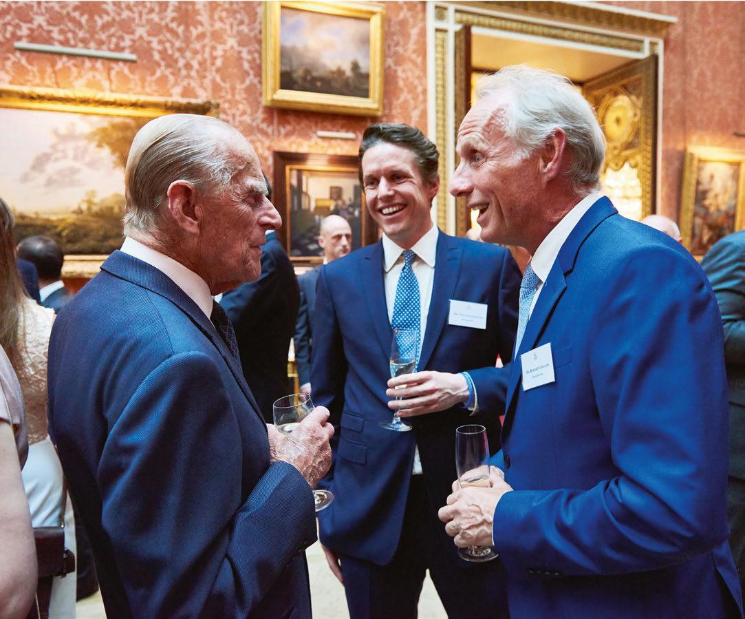
Reminiscing on some of the most significant moments in his career so far, Will references the moment Chelsom won its first Queen’s Award for Enterprise in the International Trade category in 2017. “This award acknowledged progressive growth in international trade and we were honoured with a trip to Buckingham Palace as a result that was fantastic. We subsequently won the same award in 2020 and I am immensely proud of what our company and all my colleagues have achieved, especially as this recognised Chelsom working on a global scale. More recently, we won a Red Dot Award for product design, which recognised our LED reading light range, LED Eye, for outstanding design.”
Continuing on some of Chelsom’s most notable projects, Will says: “We have recently delivered the majority of the bespoke lighting to the guestrooms at the brand-new Peninsula London. The quality requirement at Peninsula is off the scale and we have had to ensure that every single design detail and nuance has been captured in all of the products. The guestrooms have very sophisticated technology
and our products have had to incorporate the latest in control and dimming equipment.
“On a recent cruise ship project, we delivered an enormous lighting structure within an atrium of the ship where the brief was to create a ‘confetti’ effect across the ceiling and down the walls. Using specialist DMX technology the confetti panels change colour and illuminate in a sequence, which totally brings the space to life. It is undoubtedly the centrepiece of this massive space.”
Looking at the current design community and trends that Will is witnessing within lighting, it is the continued conversation around sustainability and lighting he is eager to see progressing. “It is interesting to see the role sustainability is playing design. I love the idea of biophilic design and I think it is important that nature plays a role in the design of interiors. I think sustainability and the environment will be one of the biggest factors moving forward in design and we embrace that massively at Chelsom as we strive to be more sustainable in everything we do. I think technology will continue to push the boundaries of interior design also, especially where lighting is concerned, and that is very exciting.”
More specifically, what can we expect to see from Chelsom in the
coming years? “I can safely say that we are not a company that stands still,” claims Will. “We are constantly looking at all aspects of our operation to ensure that we continuously improve in all areas and we work hard at perfecting our overall product and service offering.

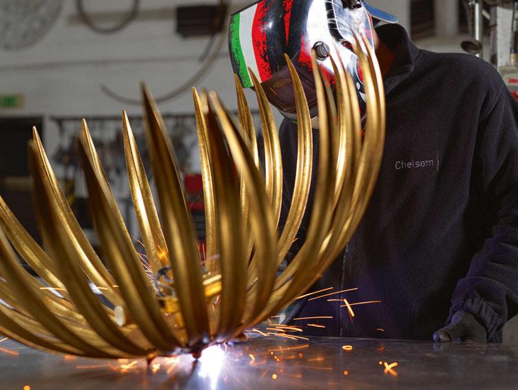
“I think I speak to all members of the family that have worked in the company before me in saying that we are all ambitious people and we constantly strive to improve at everything we do. 20 years ago the company was bigger in terms of employee numbers and there were other divisions within the company, including an architectural lighting business and a retail lighting business. The best thing the company has ever done is focus on what it does best. We are not against diversification but know the need to be a specialist in your field and when it comes to illuminating project interiors, that is what we do. I don’t think my Grandfather would ever have dreamed that the company would have got to where it is today and I am immensely proud of what we have achieved.
“Our new collection, Edition 28, is to be launched in May 2023 so we are coming to the final stages of designing product for that collection before we look to overhaul the catalogue and website. The products are distinctive, exciting and are yet a further step forward for Chelsom;
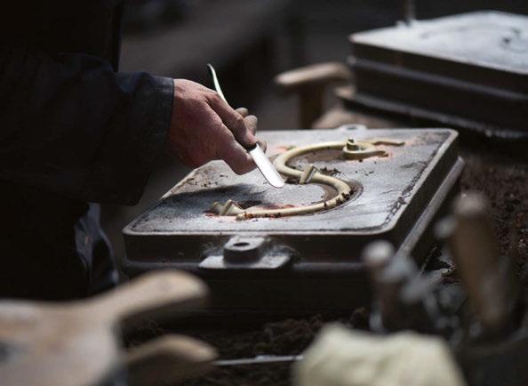
we cannot wait for people to see them.
“We are also launching HOME by Chelsom in September, which is a brand purely focussed on servicing the high-end residential market. Alongside that launch, we are adding some further new sub-brands to the Chelsom name that we are very excited about. You will have to watch this space for that.
“Internally, we are implementing a brand new ERP and CRM system later this year that will further enhance our customer service offering, and we are currently recruiting for new team members across a host of different areas, all while continuing with our drive to be more sustainable as a business.
“It is all go and there is much change ahead, but ultimately we are looking to continue working with our fantastic customers across the project interiors space in the same way that we do now. By being true specialists in the supply of lighting to the project sector, we have created somewhat of a niche business and we constantly look to build upon the reputation that we have earned over the years.”
www.chelsom.co.uk
Celebrating 75 years of product design, Chelsom’s family-run business has evolved through the generations to become a leading brand in luxury lighting.
Speaking with Will Chelsom, Managing Director, darc finds out more about life entering a family business and following on his family’s legacy in lighting design. Furthermore, Will gives insight into Chelsom’s plans for the future and what the industry is to expect from them in the coming years.
Design duo Anna Burles and Chris Trotman, Founders of design practice
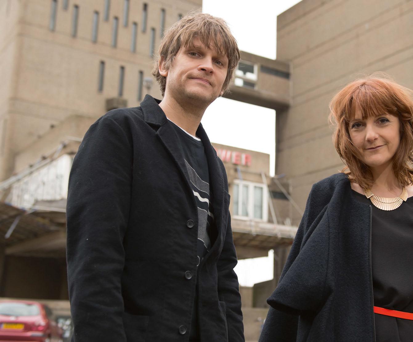
Run For the Hills, renovated their London home on Douglas Road during 2020/21. darc asked Burles to provide commentary on their decisions and influences behind the lighting pieces used throughout their home.
During the height of the UK's national lockdown, Co-Founders of London-based design house Run For The Hills, Anna Burles and husband Chris Trotman decided to renovate their private home.
The couple's recently renovated, dated Victorian house in West London, was previously set up as two unmodernised flats. It needed to be formally de-converted back into a family home before planning could be granted for a side return and a three-room loft conversion.
The finished house is now a five-bedroom, three bathroom property, with a stunning design bearing all the hallmarks of the creative duo’s personal style, flair and imagination.
Works began in August 2020 and finished in February 2021, a design-build collaboration with long-time construction partners JNJ Building Services. The team gutted the ground floor completely and reconfigured the layout, removing the double front living/dining room that many people opt for, instead keeping a small adult living room at the front, a small utility/guest bathroom, and then a large open-plan family space at the rear onto the garden, rebuilding all the brickwork to the old part of the house with full width crittal doors in a dark bronze metal.
In keeping with the studio’s design aesthetic for clients, their own home is very creative, cosy, and comfortable for their family-orientated life.
“As we’re designers, we knew we could push things and be innovative and daring, so we let our imagination run riot," says Burles. "The concept is very personal to us and we spent all of our waking hours and weekends, outside of running the studio, to develop the design and to specify everything needed.”
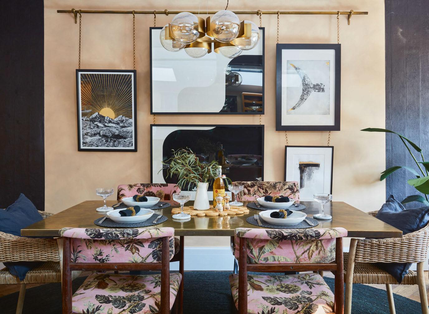
The house has a stylishly modern feel, with crittal doors throughout the ground floor bringing refined urban styling. The design also boasts dramatic, oversized decorative covings, flower petal ceiling roses, and a vintage-feel but with new herringbone floors, all of which keeps the house feeling warm, inviting and full of period character.
Lighting is always an integral part of any design, and as such, darc asked Burles to walk us through the lighting choices throughout her new home.
"Lighting is such a huge part of any interior design and we wanted our home to be lit beautifully. Great lighting needs to be designed carefully into the scheme from day one and it’s utterly transformative and can elevate great design details to be real show-stoppers. As such, we wanted to ensure full control over the lighting in the property to allow for spaces to operate as cosy and relaxing or more task-focused
depending on the needs. So, after doing the first cut of the lighting design ourselves, we enlisted the help of a lighting designer and a mood control company to add a smart lighting system to the property, using key pads with tailored settings input to suit the family’s needs with a flick of a switch, allowing maximum control over the light settings in the house.
We had big plans for the lighting in the house to be great – something we’ve learned from our commercial bar and restaurant design work – a great design can be transformed into an amazing, jaw-dropping design with great lighting, so we knew we’d need help specifying the right kind of architectural lights, beam angles, colour temperatures, and optics (which is such a specialist skill). We also had plans to install a mood lighting system in the property, to transform the atmosphere of a room from bright to moody and candle-lit dinner party at the flick of a switch, so we decided we needed to enlist the help of professional lighting designer Guy Kornetzki of GKLD.
Kornetzki sprang off from our initial lighting concepts and decorative CAD lighting and electrical plans (with our initial suggestions of what
lights could go where and how we’d like them to be controlled – with all decorative lamps and floor lamps coming on at the same time for example, or a pendant or chandelier being controlled separately). Kornetzki would import our CAD plans and then bounce back ideas to us, confirming the ones he thought we’d got right, and making alternate suggestions. Once we had a range of ideas we all loved, he then calculated and estimated the fittings we’d need, the quantities, where they’d be sited, and how the light would project and highlight what we wanted it to showcase. We’d then run that all by JNJ’s lead electrician, Ben Jenkins, to sense check it from a wiring and load perspective. It’s a technical process and great to have someone who can act as the bridge with the electrical contractor, who can talk knowledgably about hidden drivers, connectors, and widgets, which make systems and circuits talk to each other.
I then researched and found the best lamps to use in the decorative lights, wall lights, floor lamps, and table lamps, all of which needed to be intelligent LED dimmers to work well on the lighting system, running my findings by Kornetzki to check. Researching the wattages needed per fitting and finding nice products, which would harmonise an overall colour

temperature and mood that was warm not cold. I ended up selecting a mix of G9s and lovely filament and porcelain style lamps from Tala in warm whites and super warm whites to create a really cosy effect.
For the LED strip lighting under the shelves in the kitchen Kornetzki specified an IP65 rated strip in a warm white 2200k for a comfortable look. All of the architectural downlights were specified by Kornetzki and came from Orluna. They create a really lovely light, in warm white in a variety of beam angles depending on what we want to illuminate.
Lights specifically illuminating art were a bit cooler, to keep colours true, but still warm white. Lamps illuminating finishes and upholstery were kept soft and warm.
Kornetzki also helped us research and find our mood lighting controls partner, helping refine the brief, scope and costing, and continued as liaison with them through the life of the project, helping us understand the technical side of the system and how we could get it to work the
way we wanted. You wouldn’t believe how much wiring is in the house to control the system, it was like spaghetti junction. It’s expensive, and much more than just having dimmer switches everywhere, but it takes the lighting to a completely different level. We’re so pleased to be able to control the lighting in a really sophisticated, super speedy way. Some of these mood systems allow you to control the lighting from your phone, and to change the settings of each light source within a scene.
The lighting design was a really close-knit collaboration between us as the main designers, the Electrical Contractor Jenkins from JNJ, Lighting Designer Kornetzki, and the mood controls system team.
When designing the ‘scenes’ on the control panel it’s essential to do it at different times of the day, including late into the evening, to make sure you’re getting it right. In most zones we opted for five control settings including: Bright, Dimmed, Moody, Dinner Party Candlelight,



Reading Lights-only and Off. Some keypads have double click functionality, switching control to another room, setting it at the same scene you’re using (useful in an open-plan room where you want to set the whole room to cosy, without having to walk over to all of the keypads). Other keypads have press and hold to set a timer for lights to turn off after 10 seconds or so, allowing you to get up the first flight of stairs before they turn off. The ‘All Off’ button by the front door is great for turning off every single light in the house before you leave.
One of the big signature in the house design is the art, which fills so many of the walls and is picked out beautifully by the lighting design. Many of the art prints are by Chris (aka artist Dex) and myself. All of
the art was planned and fittings chosen to wash certain sized pieces displayed on walls, fireplace mantels, and on shelves.
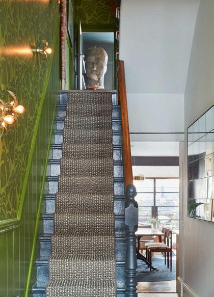
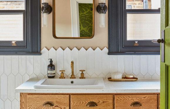
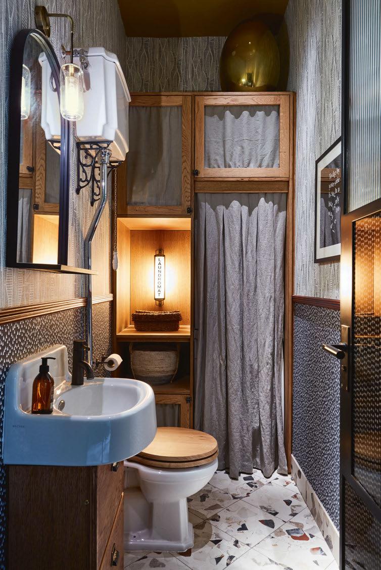
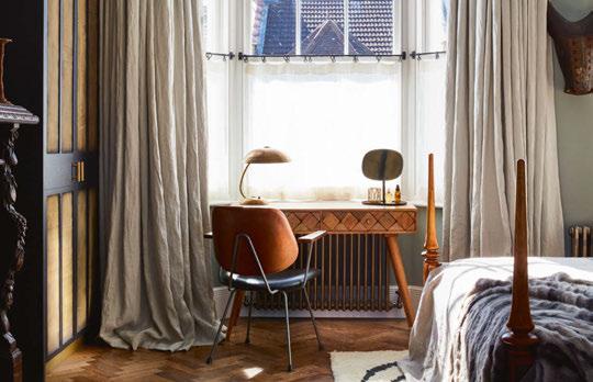
Art is also homed in a large, glazed display case-come-curiosity cabinet in the kitchen/diner family room, which was originally designed as a wardrobe, but which we turned into a museum style display cabinet filled with props, accessories, curios and art. This cabinet also has integrated lighting to make the contents glow as if in an art gallery or museum.
The lighting controls are discreetly hidden on both the ground floor
and first floor in pieces of joinery. For the main ground floor hub, we designed a really complex but great understairs set of storage pieces, some of which are fixed and some pull out on wheels to give access to the sizeable Helvar lighting control system and fuse boards behind. The drawers unit has a mix of sizes, including a deep one for kids helmets and school bags and then lots of little drawers with labels for small tools, batteries, bike lights, first aid, and sunglasses – literally a place for everything. Then some post racks above for notices from the kids' school, umbrellas, and other small items that would usually be stashed in a drawer of doom.
www.runforthehills.com
House Images: Philip Durrant
Italian brand Catellani & Smith was selected by Decolighting to supply numerous decorative pieces to illuminate Hotel L'Europe in France. Gold is a key colour choice, bringing a warmth and sophistication to the venue.
Hotel L’Europe is just a few kilometres from the delightful French town of Colmar, in Alsace, also known as “la Petite Venise” for its numerous canals and engagingly romantic atmosphere. With its timber-framed architectural style, typical of Alsace, this exclusive hotel has 120 rooms and suites, a bistronomy restaurant, and a large function room for events.
The hotel entrusted the lighting project for some of the areas to Decolighting, which chose a number of creations designed by Catellani & Smith, and installed by Michelsonne.
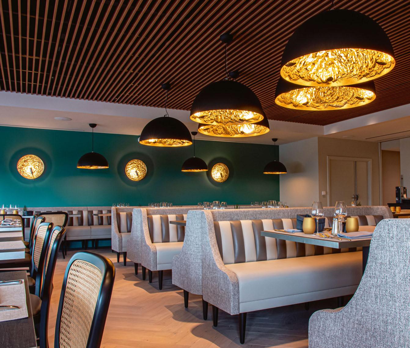
In the spacious restaurant, Viennese cane chairs alternate with bench seating, both in neutral shades such as taupe, beige, and a range of light greys.
This neutral colour scheme is broken up by the vivid green of the walls, highlighted by the rhythmical sequence of the Stchu-Moon wall lights, with their uneven, golden surface.
The restaurant also features a number of niches that host the golden Stchu-Moon 05 model, with its distinctive spoon shape, which contains the LED board.
In keeping with the style chosen for the lighting of the walls, the choice fell to the Stchu-Moon 02 suspension lamp to light up the restaurant tables, coordinated with the gold colour of the wall lights. This gold-coloured leaf thus forms the fil rouge that runs through the various areas, making a strikingly expressive return in the cocktail bar, where individual Gold Moon pendants embellish and illuminate the bar counter. This golden theme continues in the hall with Lederam W and a large, custom Macchina della Luce installed in the centre of the glass dome that allows natural light to flood through the whole setting. A

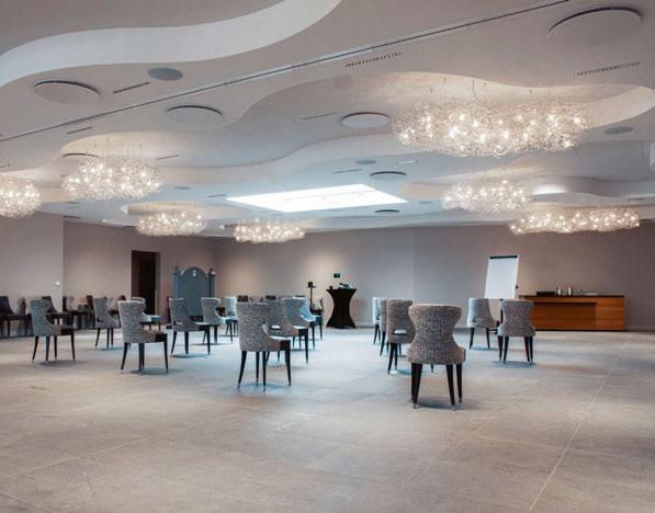
succession of six discs in gold-coloured leaf in descending diameter size form an eye-catching creation. Lastly, the function room is enhanced with decorative Fil de Fer Nuvola ceiling lamps, created with a light, airy aluminium wire structure hosting numerous small lighting elements. www.catellaniandsmith.com
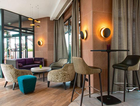
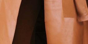
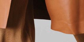
Working together with Italian leather brand GioBagnara, Tekna has produced a new collection consisting of exisiting fixtures but finished in a sleek leather, available in numerous colours.
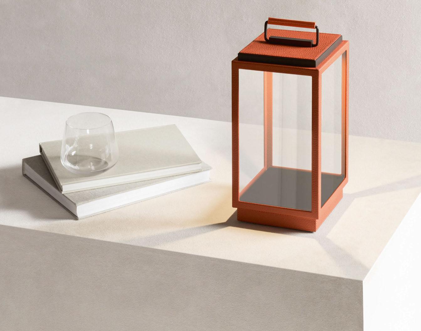
Tekna’s recently released collection was formed in collaboration with Italian leather brand GioBagnara. Bringing together leather and lighting is a new approach for the Belgium-based brand and one that brings a less-common material to the lighting market. The new collection is comprised of the Blakes table lamp, Marquesse floor lamp, and Walcott and Walcott Twin wall lamps.
“The Tekna x GioBagnara collection aims to create pieces able to generate unique atmospheres and enhance spaces, giving birth to a union where traditional Italian and Belgian lifestyles meet,” says Tekna. “[We] have loved unique and durable materials including brass and bronze since day one. Leather is a great addition to this, as it is unique and in this way distinguishable.
“We have chosen to work with leather because, in addition to the qualitative aspect, it also gives an extra structure to the finish. Leather can do a lot to your interior. It all depends on the way you use it as to what kind of leather you use and with which colours you combine. “Leather lends itself very well to the upholstery of our appliances as they contain a lot of details including ledges and glasswork. All of these details must be finished according to high-quality standards, which we felt was not something that could be achieved with alternative materials.”
The collaboration between Tekna and GioBagnara was born from Tekna’s long-standing admiration for the leather brand and its craftsmanship. Since approaching GioBagnara a few years ago, the
Manufacturing Processes

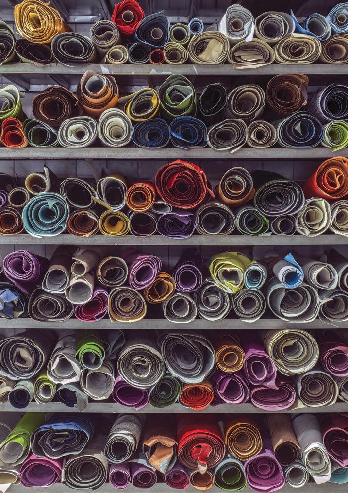
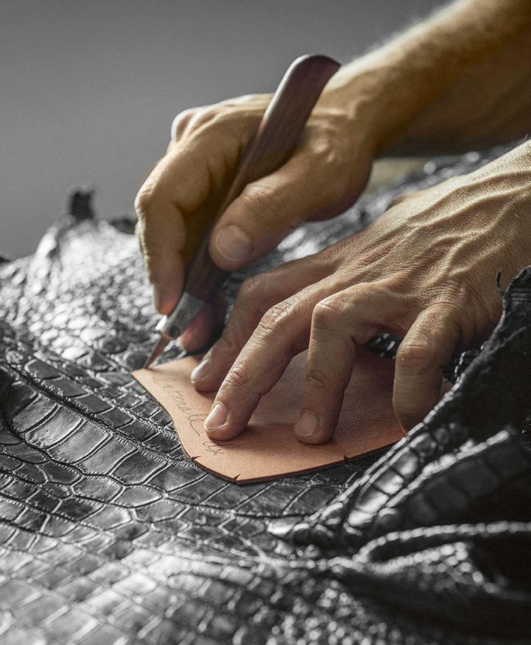
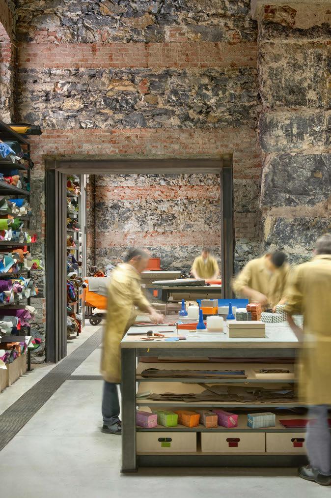
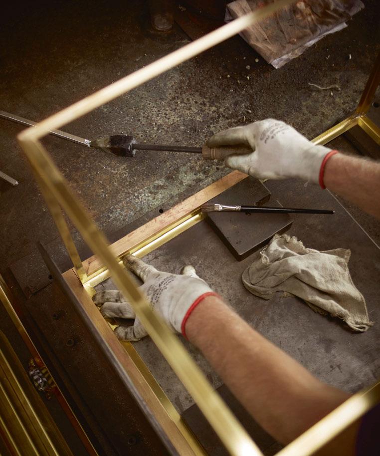
GioBagnara is known for its attention to detail when it comes to handcrafting its leather products. Using its refined techniques, its team worked closely with Tekna's to create this collection with ensuring high-quality aesthetics and functionality were maintained.
teams worked together to produce this new collection after numerous design meetings and product prototypes.
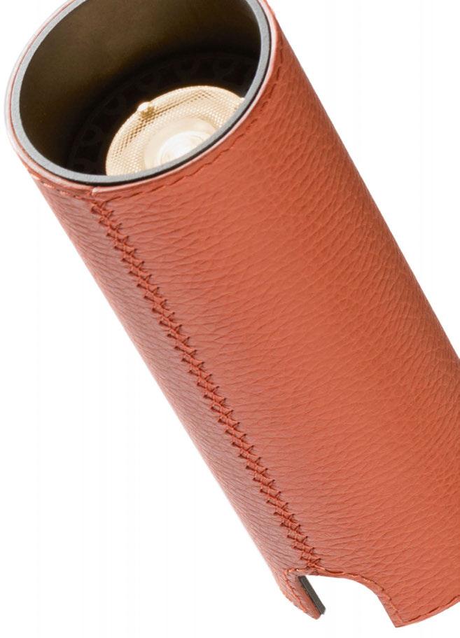
“The concept is simple but works tremendously. We cover existing lighting fixtures with leather, which creates a totally new approach to lighting. By working with leather the light produces a very different glow,” continues Tekna.
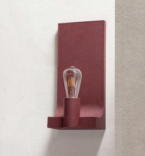
“For this collection, we chose to transform some of our bestsellers into works of art in leather. And this combination resulted in great success. This is found in the details, and the fine craftsmanship, the hand-applied leather and stitching details, which in all have created an enhanced decorative element of this collection.”
One of the challenges the teams found throughout the process of working with a new material was ensuring that the aesthetics and functionality were not compromised. The hand-crafted approach meant they could keep an eye on the details and finishes, and make tweaks along the way that supported each individual fixture.
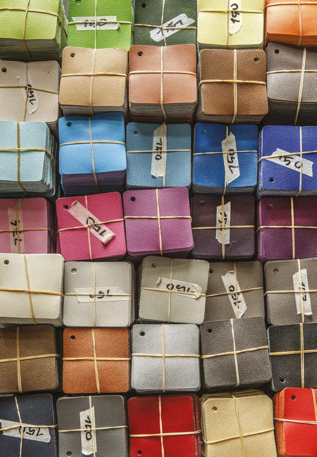
Wanting to maximise the customisable features of these lamps, it is possible to choose from more than 370 leather finishes and more than 100 colour swatches and stitch colours. This enables the user to select a unique combination for their product to suit their residential or hospitality space. “This way you can choose the eye-catcher for your home or opt for a more simple and “ton sur ton” piece,” says Tekna. “We want Tekna to be known for its exclusive lighting. This collection complements it perfectly,” it concludes. www.tekna.be
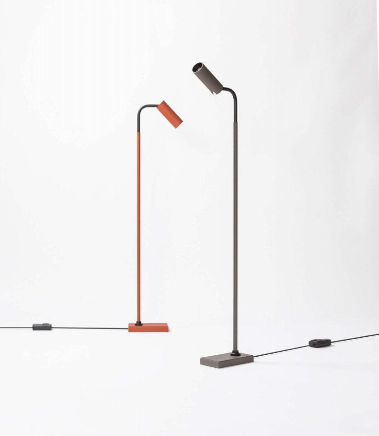
Working closely with Italian leather experts GioBagnara, Tekna has produced its first collection that steps away from the typical brass finish.
The new collection brings with it a vast amount of customisation through its hundreds of colour, finish, and stitching options, it allows specifiers and users to create a unique finish that suits any setting.
London, UK
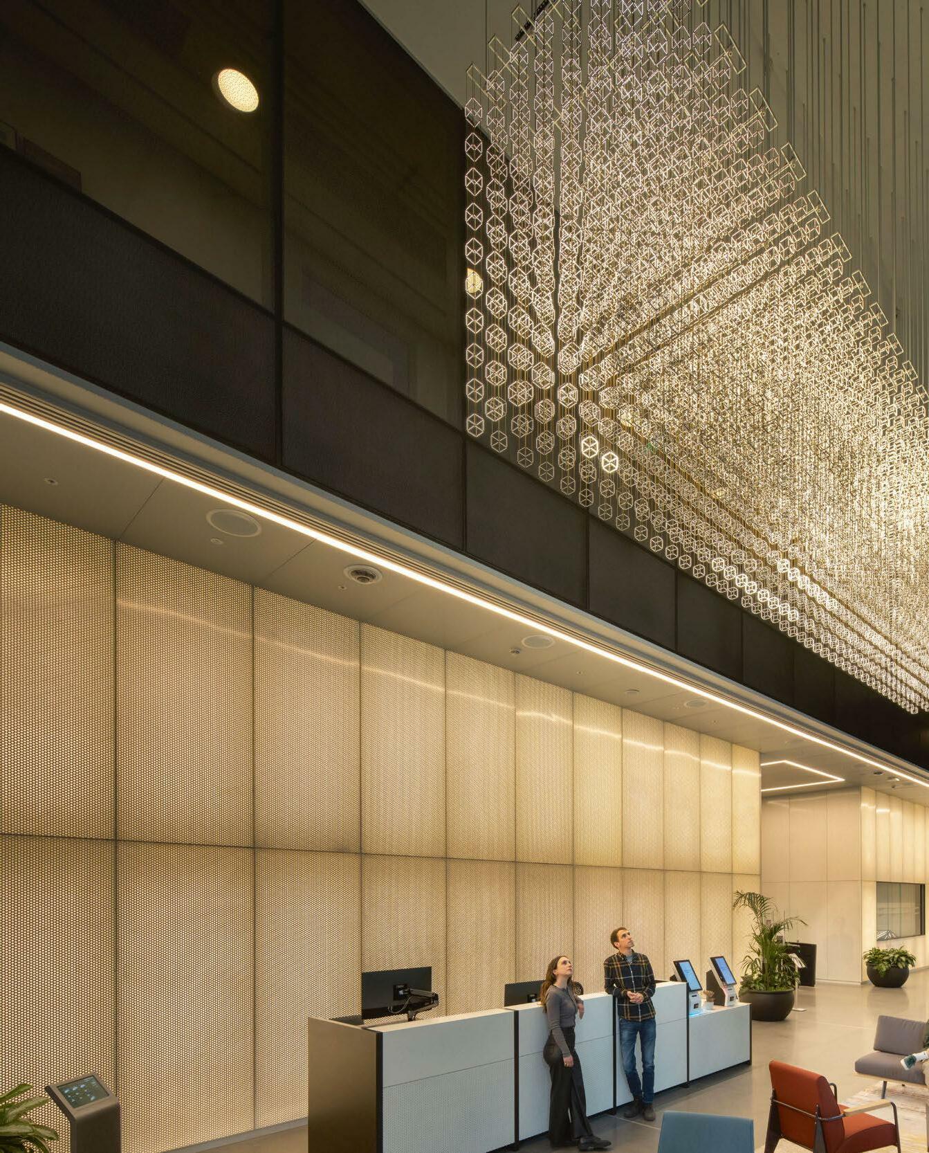
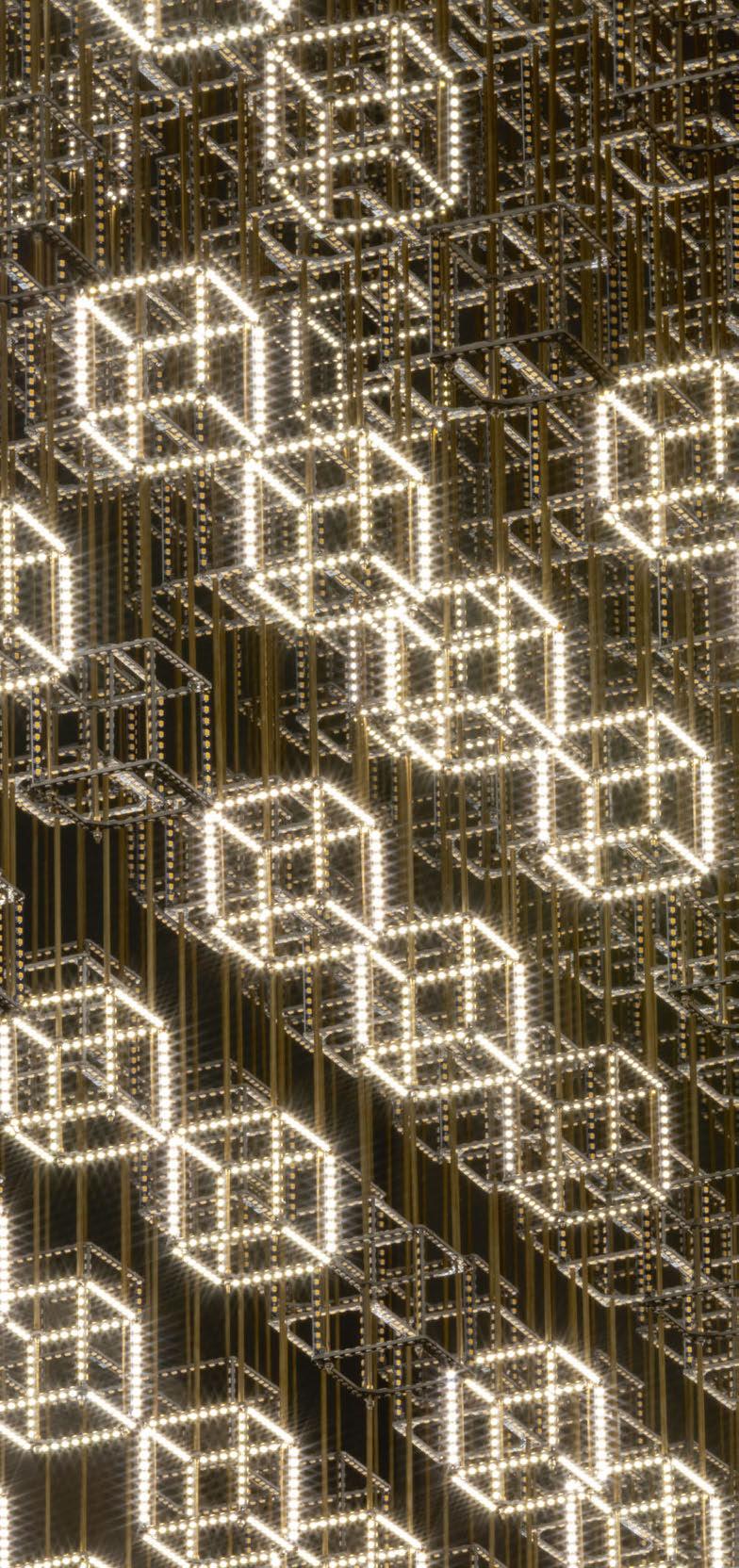
Lux Automata is a living, breathing media sculpture consisting of 2,940 cellular LED cubes. Suspended in a voxel above its observers, the ephemeral artwork adapts and self-curates its own content in response to a series of stimuli. An exploration of the creative limits of artificial intelligence, the artwork uses a coded set of rules to exhibit a complex set of behaviours. Dynamic patterns of light emerge, repeat, mutate, and dissipate in a constant state of metamorphosis.
Lux Automata is the result of a three-year collaborative project conducted by Jason Bruges Studio and DeepMind, which set out to explore the coming together of artificial intelligence and media art. The artwork uses a 3D Cellular Automata as its foundational principles and is guided by AI. Patterns are produced by a diversity of algorithms, including RL agents, evolving neural networks and rule-systems, agent simulations, and hand-designed rules and algorithms. Some are still learning or evolving over time. The artwork is now situated in the lobby of DeepMind’s new headquarters in Kings Cross, London.
Jason Bruges, Creative Director and Founder, says: "I’ve always enjoyed using algorithms and rule-based systems in my work. Working with DeepMind was an incredible opportunity to push the creative boundaries of artificial intelligence. The studio took on the role of orchestrator, putting parameters in place to guide an outcome but allowing the technology to choreograph the artwork. It’s an incredibly freeing way to work and really exciting to see the artwork continually unearthing new, unexpected results.
"I think as an artist it’s important to let go, to not try and control everything but to create the conditions for something unforeseen to happen." www.jasonbruges.com

darc covers some of the latest international projects where bespoke decorative lighting has been created for specific requirements.
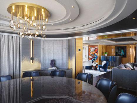
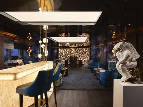
Re-delivered to her owner in March 2022, the opulent Galaxy Superyacht was transformed by Njord by Bergman interior design. The brief called for entertainment-led social areas with cosmic-inspired accents, personal touches, and eye-catching details. In just a short time, the yacht’s interior had been transformed into an “entertainment spaceship”, according to Sarah Colbon, co-founder of Njord by Bergman. The wallpaper is designed by Dylan Cole, concept art director of the Academy Award-winning film Avatar, to resemble a futuristic forest. Northern Lights has previously enjoyed forays into the world of marine architecture, however, this particular project provided its design team with new challenges, as this was for a much more personal vesselessentially a residence on water.
The yacht’s main saloon benefits from a diverse range of beautiful bespoke decorative lighting that has been carefully handcrafted and skillfully finished by Northern Lights’ artisans. Towards the rear of the room, where the sea views encompass one’s vision, its sightful quartz chandelier haloes a marvellous round table surrounded by individual plush leather seats. The fitting comprises 32 individual old English brass drops that each hold small, medium and large quartz rocks that refract the light from the recessed lamps beautifully. The chandelier uses shakeproof washers to ensure that the vibration caused by the boat travelling does not compromise the fitting.
The round table and other parts of the living areas are delicately enlightened by its contemporary old English brass wall lights. The metrehigh fixtures profit from a laser-cut rod that takes the form of a column.
The installations are fixed to fabricated brass outer pans to match, while radiant LED strips fixed within the fixtures shine beautifully onto the walls behind them.
Illuminating the corners of the walk-in wardrobe is a duo of pillarlike alabaster and old English brass wall sconces. The lamps benefit significantly from a built-in LED lamp that produces a mesmerising aura, which beautifully displays the natural veining within the stone. The elegant brass details have been grooved using Northern Lights’ CNC machinery.
In the lounge and bar area, Joseph Klibansky’s ‘The Thinker’ statue sits atop a purpose-built white gloss pillar adjacent to a fully illuminated marble bar. Fixed to the marble bar is Northern Lights’ patinated natural brass framework that houses seven brass ‘drums’, each complete with natural alabaster discs. The intricate framework ensures that the light travels to every corner of the room, maintaining thorough luminance throughout the area.
The master bedroom uses a pair of entirely bespoke, wall-fixed, light old English brass and alabaster bedside lamps. Delicately turned white alabaster shades are amplified by interior puck lamps refracted by quartz smoked crystal.
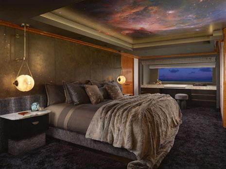
The guest bedroom bedsides are illuminated by two Iveston lamps from its Signature Range. The Iveston table lamp has a unique design that comprises an old English brass body atop a granite base with an English brass shade. www.northern-lights.co.uk
Images: Jack Hardy
Nulty Bespoke has produced a cast glass pendant for the reception area of a luxury residential development in Fitzrovia. Designed to draw the eye to the concierge desk, the cluster pendant consists of 27 glass globes arranged in a powder coated metallic frame. Each of the cast glass globes features a swirl of pigment that creates a beautiful painterly effect throughout the glass. An LED filament lamp in each sphere highlights the movement of the pigment detail and emits a soft glow of diffuse light to illuminate the concierge desk beneath. The glass components were made by a specialist glass worker who used an injection mould process to create the globes, then carefully inserted the pigment to create a subtle flow of colour that follows a different pattern every time. The geometric composition of the luminaire was designed to work in parallel with the structured lines and materiality of the interior scheme. The juxtaposition of glass and metal directly references a pair of framed glass doors that surround the piece, while the smoke-like tone of the pigment corresponds with the rich wood used for the concierge desk and panelled walls.
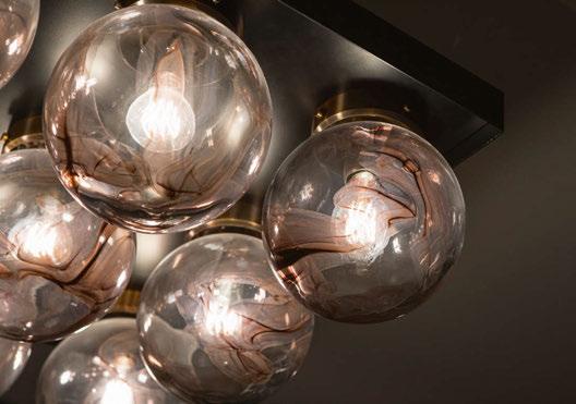
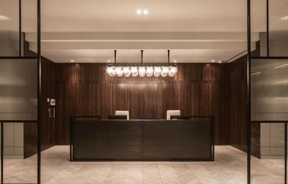
The delicacy of the design masks the technical precision that went into the production and installation of the piece. Three metallic drop rods were used to affix the luminaire to the ceiling and deliver a sleek, understated finish that works in complete precision with the rectilinear lines of the room. A subtle lip detail on the frame conceals the functional components of the luminaire from view. Each of the collars used to attach the glass globes to the steel and aluminium frame have been bronze plated to ensure every single element works seamlessly with the overall scheme.
Alex Craig, Senior Product Designer, Nulty Bespoke comments: “The glass globe pendant is a perfect example of how artistic touches during the manufacturing process can make all the difference. Whilst the composition of the piece is measured and restrained, the fluidity of the swirling pigment elevates each glass globe and brings a sense of playfulness to the overall piece.” www.nultybespoke.co.uk
Hand & Eye Studio’s recently launched Melina family of lights is a circular story of bespoke lighting. Born as a design for a site-specific one-off project it is now available in a range of standard options as well as bespoke configurations.
Long-time Hand & Eye collaborators, design duo Mentsen, created a new light for Hand & Eye in 2021 called the Mela (‘apple’ in Italian) due to its rounded shape with bottom dimple and stalk-like fitting.
When Mentsen was commissioned by The Crown Estate to design the furniture and feature lighting for the renovation of a listed office building at 2 Bessborough Street in Pimlico, the duo decided a feature chandelier would be perfect in the oak-panelled lift-hall. They used a miniature version of the Mela glass shade to create a 3.8-metre installation, hanging the shades on loops of gently swagged flex. Along with the glass shades in their soft shape and translucent glass, this added fluidity and softened the look of the rigid hallway as well as adding a stunning focal point to the space.
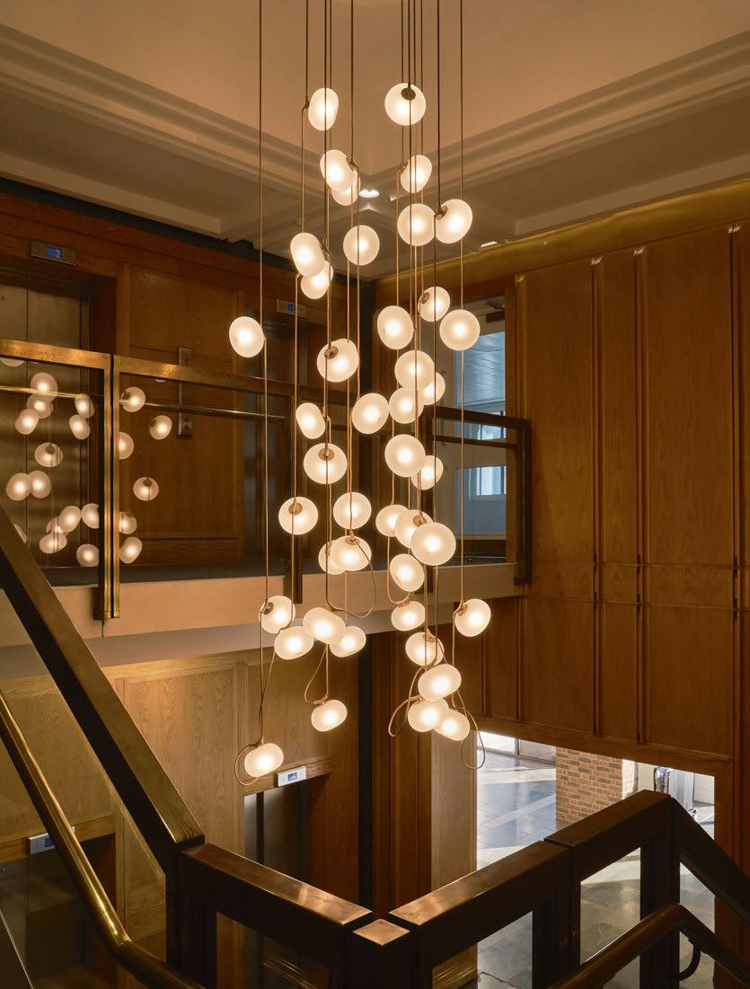
Mentsen and Hand & Eye loved the chandelier design so much that they decided to turn this into a series of standard pendants available
to the market. The pendants share the same aesthetic as the original project, designed as a series of vertical chandelier arrangements.
Strung onto the bronze-coloured flexes like jewels, the clear-etched glass shades hang delicately from their bespoke cast bronze fittings and emit a gentle inner glow. Each cluster creates a sense of suspended animation, connecting spaces vertically with its delicately floating and glowing shades.
These pendants are available in standard set-ups of single, double, and triple shades on one loop, or as four, five or six shades on a double loop of flex. These can be customised for different spaces by changing the flex lengths and, going full circle back to their original inception, can be designed as much larger bespoke configurations.
The range also includes two wall light options and coming later this year will be two versions that allow for more horizontal arrangements, the Melina Ribbon using the same fluid flex design, and the Melina Linear using a metal bar to suspend the shades. www.handandeyestudio.co.uk



























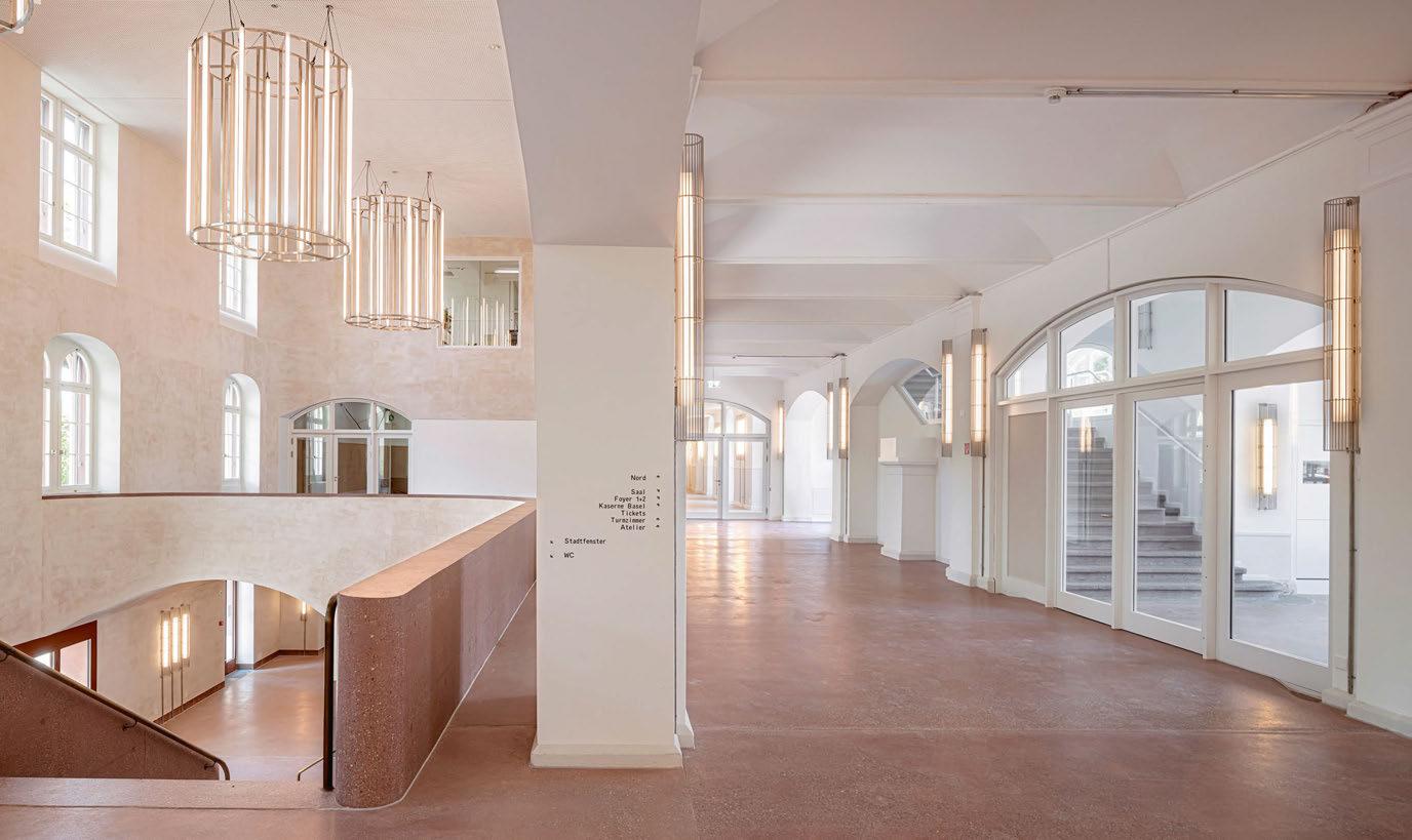
The transformation of a pre-existing building into a new cultural centre has become a model for circular architecture and re-use: built 150 years ago as a military barracks, this seminal building has just become a new public nexus in the heart of Basel. In 2013, Miquel del Rio and Hans Focketyn of Focketyn del Rio Studio won the international competition to reconceptualise the existing Basel Barracks main building, creating a cultural beacon that, after an eight-year transformation process, is now open to the public, the city, and the future.
The new and updated kHaus provides the city of Basel with a contemporary and multifunctional cultural facility and new public areas in a historic and central location. The conversion unites two of the most iconic public spaces in Basel: the river and the Kaserne courtyard, which are now linked for the first time and publicly accessible on both sides. This new urban hub facilitates connections on a city-wide scale, creating a new gathering place for the community, animated by multiple activities. The large pendant lights hanging in the atrium of the space were designed by del Rio and Focketyn and made by Durlum. The pieces add a contemporary addition to the new scheme, with sleek clean lines that complement the smooth lines and curves of the architecture.
Unique Timeless Lighting, Handmade in England
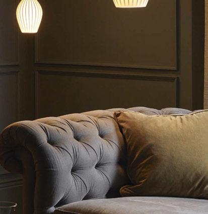
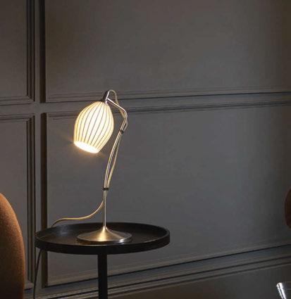
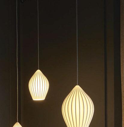

Authenticity, attention to detail and an interesting mix of materials are hallmarks of our lights. These are created by skilled craftspeople across our UK-based factories, using the best quality raw materials to ensure the longevity of every light.
Discover the complete collection at originalbtc.com

3 Brindley Place Birmingham, UK
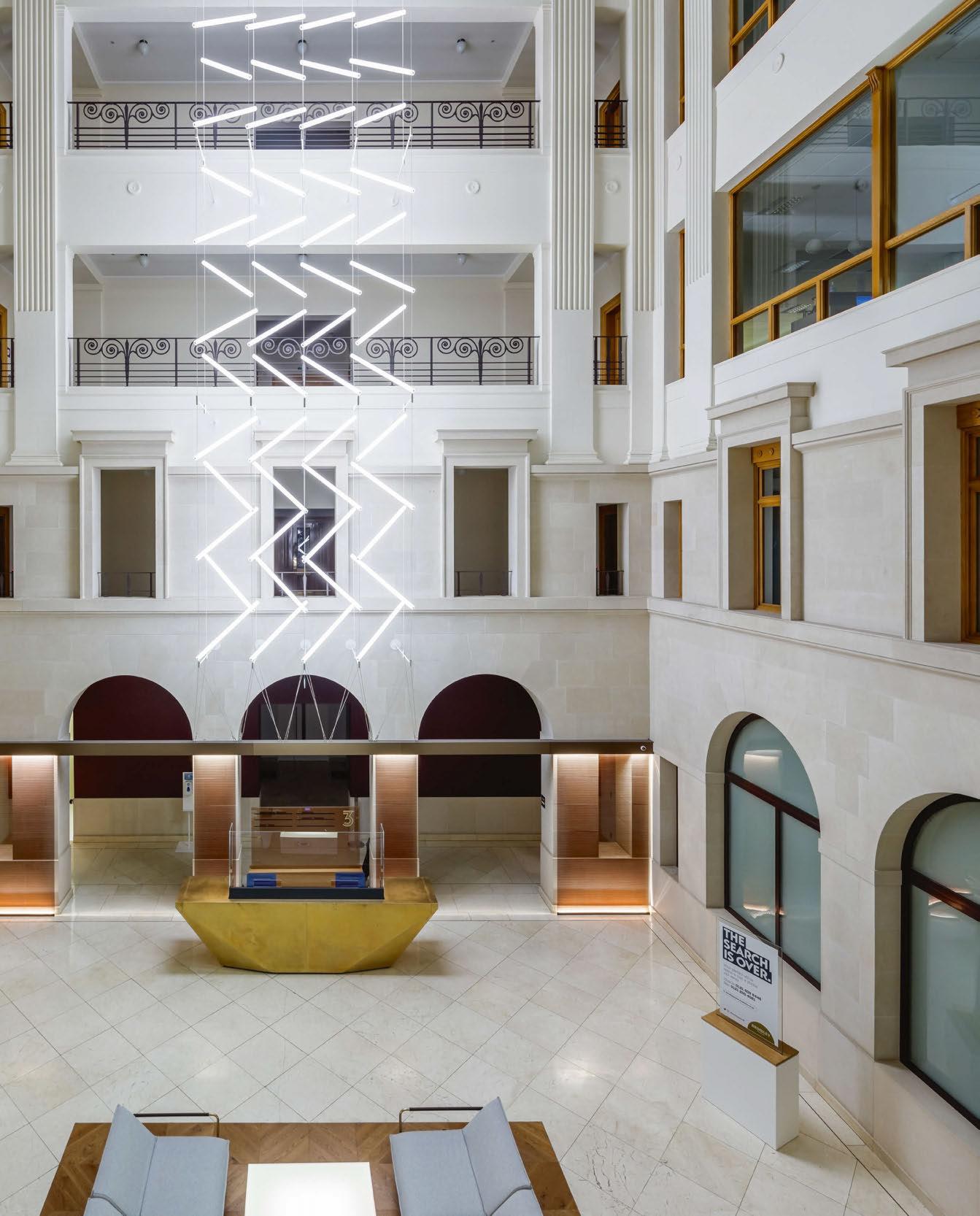
3 Brindley Place is a striking building located on Brindley Place Square in Birmingham, UK. Tasked with refurbishing this high profile, 1990s development in the city centre to a new commercial precinct, HK Architects commissioned Luum to develop a custom lighting installation to be the focal point of the atrium.
60 custom LED light tubes were suspended on a grid of tensioned steel cables in a zig zag pattern, projecting from the interior face of the atrium in the centre of the building. Within the vast atrium, the installation covers four storeys and hangs above a central bronze reception desk.

Chris Fox, Design Director at Luum comments:
“Following a tight brief to have no wiring on display, we had to find a way to power each LED light tube within the required zig-zag pattern. Our inhouse design team developed a completely custom grid of steel cables and LED connections to allow us to suspend and power the LEDs with the same cables, running them at a safe voltage but with enough power to keep them bright in the daylight of the Atrium.”
www.madebyluum.com



ByBeau's newest bespoke creation Dusk has been a work in progress as the team waited for technology to catch up to fulfill the aesthetic desires. The stunning installation transforms any space from dawn to dusk.
Dusk, created by studio ByBeau, is inspired by the time of day where shadows grow and light becomes copper-gold; dusk.
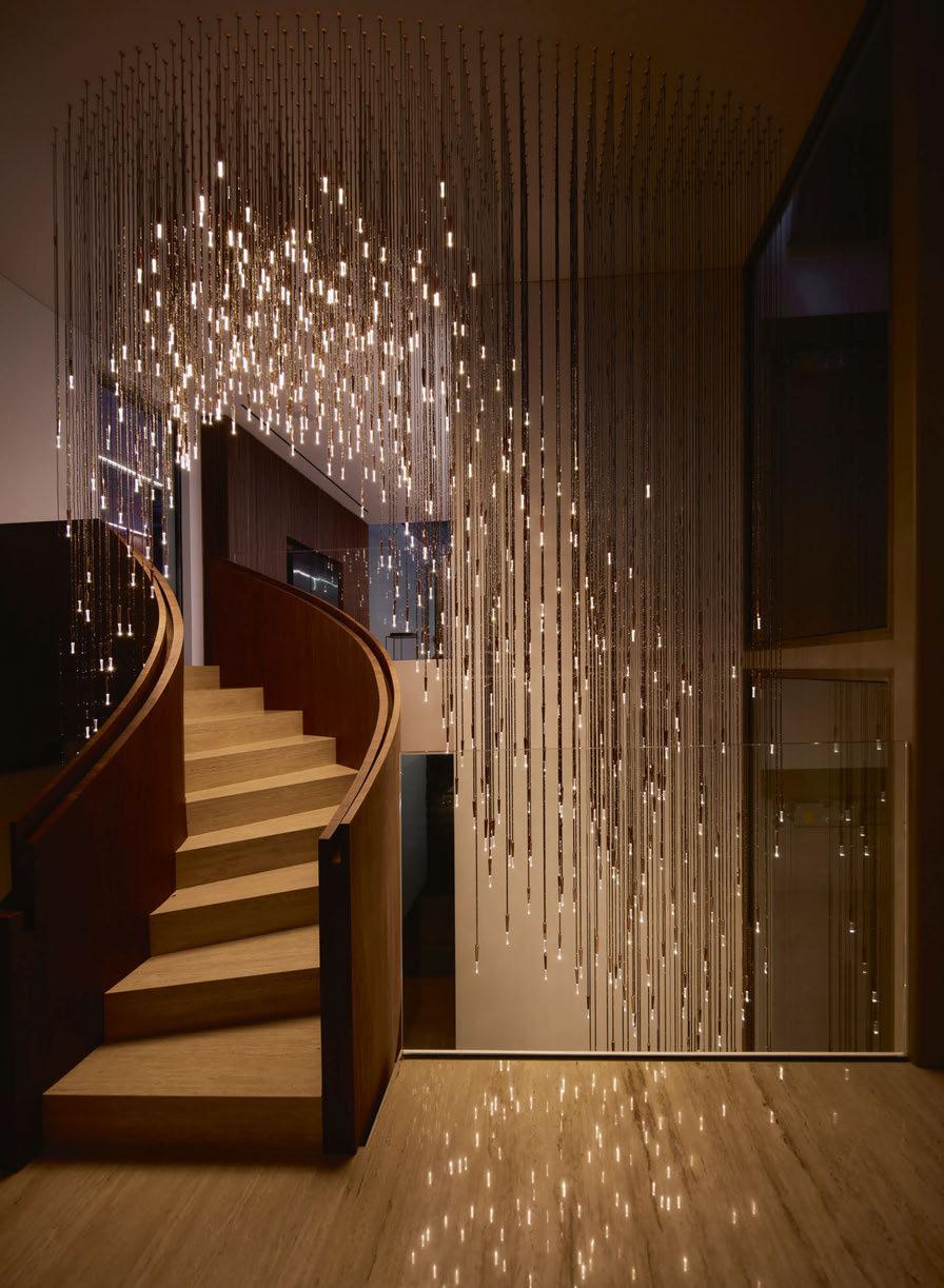
Each copper body of Dusks’ stalactites forms the base to apply precious metals like gold, silver or a myriad of non-precious finishes. This flexibility allows full customisation to create a "personalised sunset".
Beau McClellan, Creative Director, says: "The ideology behind Dusk was a form that would work equally well within both classical and
contemporary environments. Dusk soon became an exploration in temporality; waiting for technology to catch up with a design intended to prevent time from doing the same to its aesthetic."
Hand-ground crystal tips are seamlessly attached to each copper finger, with each angle precisely aligned. Great care was taken to ensure that no trace of manufacturing threatened the organic feel of Dusk. The angles refract and reflect light throughout the chandelier, bouncing
it from element to element. "This produces a sensory experience reactive to the configuration and scale of the whole piece. Flickering and glistening; alive with the arcs and patterns created," adds McClellan.
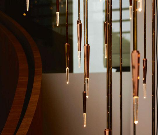
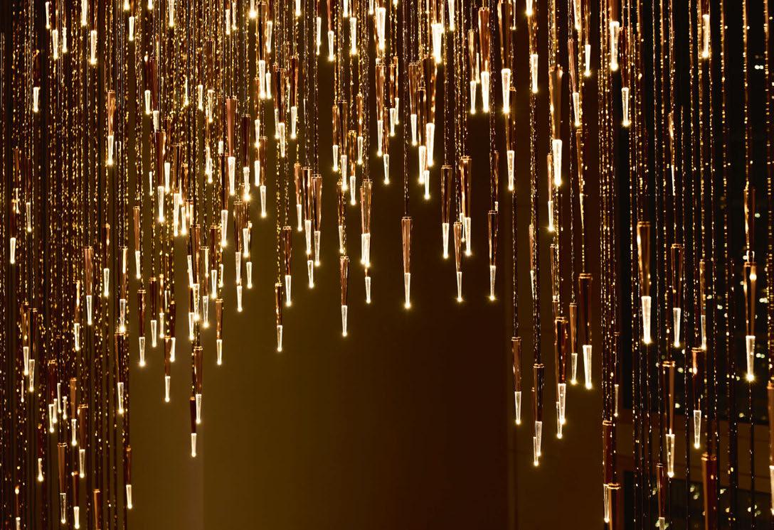
Each finger houses a powerful LED - of specific colour temperature - that is small enough to fit comfortably within. "The breakthrough unit used in Dusk combines extraordinary power with compact size. A challenge to the clean lines of the design was posed by the more powerful LED requiring the incorporation of a far more effective heat sink to dissipate the temperature.
"Dusk aptly transitions between day and night without imposing the ambiance of either. Twilight has an illusionary nature with the sun
neither above the horizon nor below it; a balance of day and nightthere cannot be one without the other, yet they cannot exist at the same time. Our Dusk represents dualism; a bond of form and function, of classical and contemporary…of night and day.
"Dusk is a piece that showcases many of the philosophies that define the work of ByBeau. The time it took to produce is a testament to our team’s dedication to their art. As artists we seek to challenge ourselves; to produce the creative, rather than the easy," McClellan concludes.
www.bybeau.com
Images: Vasco Celio/stills
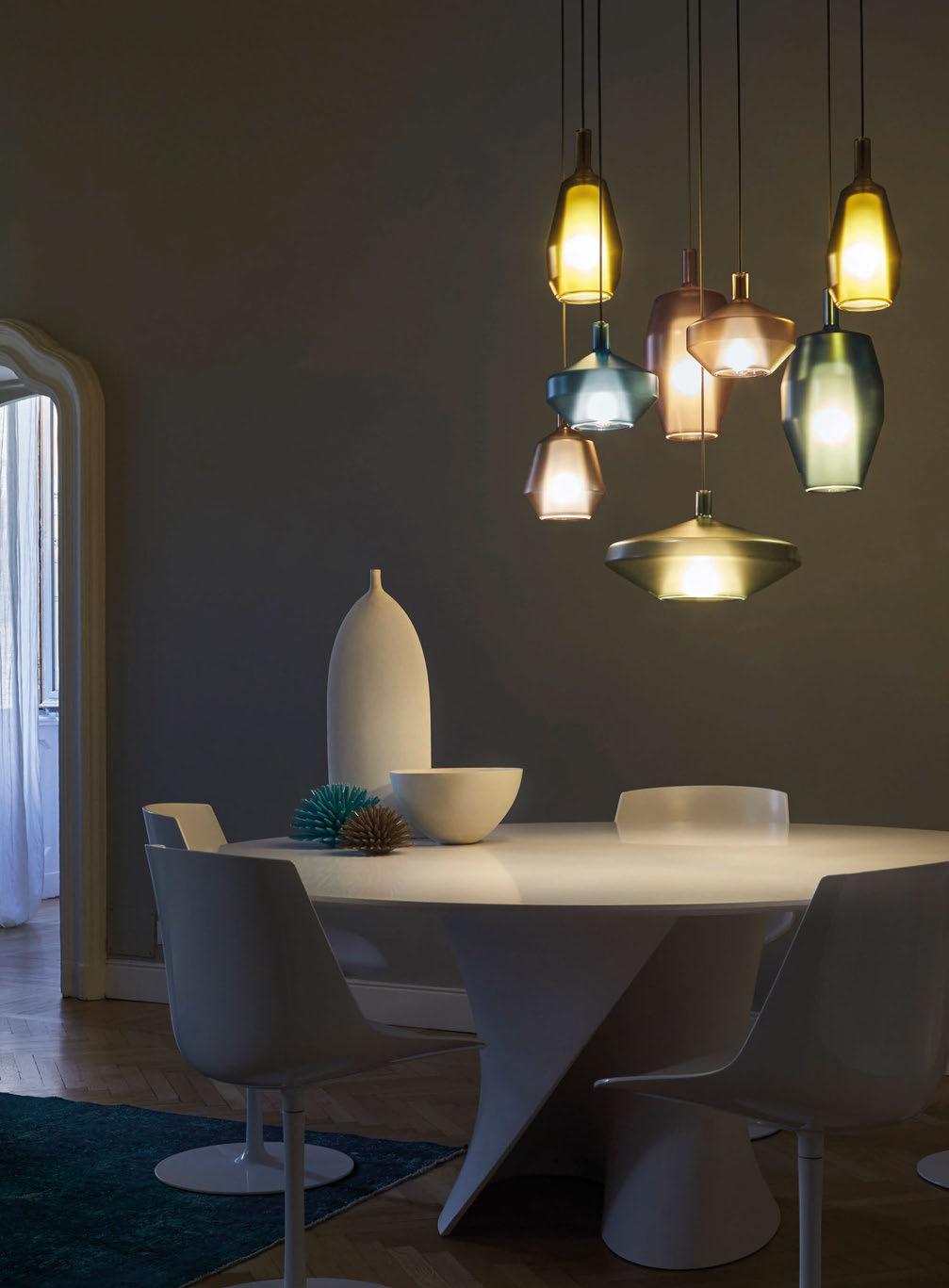
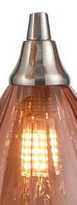
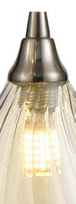
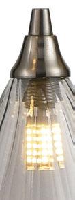
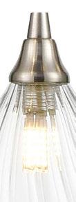
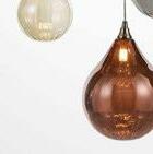
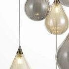
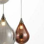
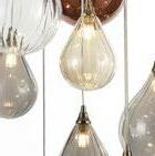
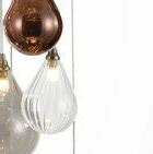
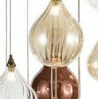
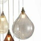
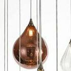
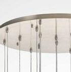
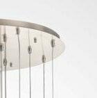
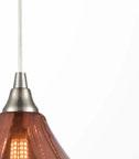
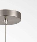
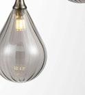
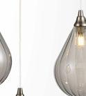
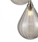
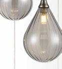
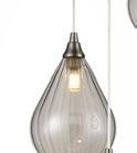
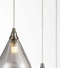
The Perry range a collection of pear shaped textured glasses in 4 colours and 2 size options, hung on single and multiple adjustable suspensions with satin nickel metalwork.

















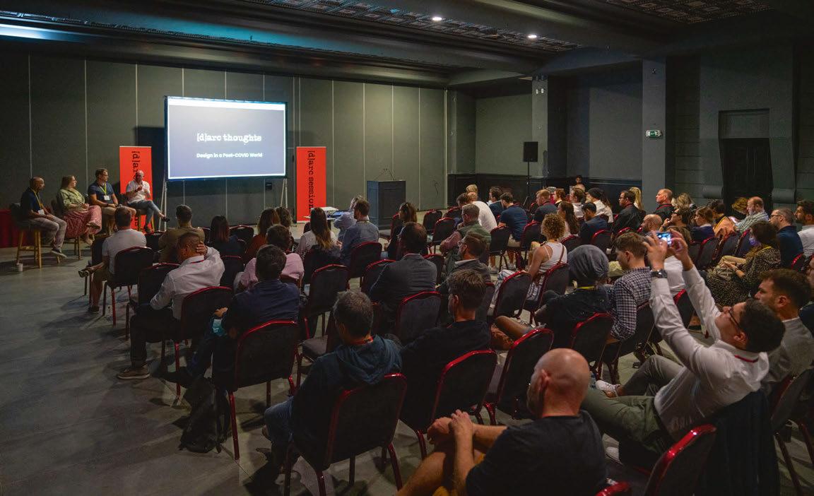
Join the [d]arc media team from 22 - 23 November for the inaugural LiGHT – the UK’s only dedicated high-end lighting specification exhibition for designers, architects and specifiers – the ideal destination to source the latest lighting products, connect with peers and meet with the best established and emerging lighting brands.
With more than 80 leading brands showcasing their latest products, the event will also host the latest instalment of the hugely popular [d]arc thoughts talks programme featuring 30 speakers.
The UK has the second largest design industry in the world and is the largest in Europe. London has seen design-led businesses more than double since 2010. Lighting is a vital aspect of the design industry and the design process.
Of the 217 lighting design practices in the UK, over half (116) are in the Greater London area (source ILDS 2021).
This is by far the biggest concentration of lighting designers in one city in the world. And that’s not to mention the thousands of interior designers and architects that are
based in the UK’s capital and beyond. Most of these designers not only specify in the UK but have a significant portfolio overseas. This makes London the capital of international specification.
To cater for this sector, LiGHT 22 is a curated, boutique lighting exhibition for specifiers and designers brought to you by [d]arc media, publishers of arc and darc magazines, and the team behind the incredibly popular [d]arc awards and [d]arc sessions, with an in-depth knowledge of the lighting specification sector. Held at the stunning Business Design Centre in Islington, London, LiGHT 22 will revive the lighting design and specification exhibition that has been lacking for too long. www.lightexpo.london
Image: GavriiLuxModerator: Sarah Cullen, darc magazine
Panelists: Esther Patterson of Curiousa; Oksana Bondar of BIOHM; Massimiliano Tosetto of Lodes
This panel will look at The Future of Materials within lighting design and look to address questions such as: Should manufacturers and product designers be looking at new and environmentally friendly resources? How does technology play a role in the materials available? How does the current economic climate affect the availability of materials?
As a teacher of students with special educational needs, Paolo Creati has recently conducted research into lighting for students with visual impairments. Off the back of his recent comment piece in arc magazine, he joins us at LiGHT 22 to explain more about the research project.
Moderator: Emma Cogswell, Skills Army
Panelists: Isaac Nwaku – United in Design Graduate; Marci Song –Seam Design / Silhouette Awards mentor
This panel will discuss what it takes to become established in the world of design; whether the opportunities presented are always fair and available to all; and what lead designers could do to promote marginal groups within design.
Moderator: Sarah Cullen, darc magazine
Panelists: Carmela Dagnello of WSP & Women in Lighting; Colin Ball of BDP
The lifespan of a project is something of increasing importance. Designers must continue to ask themselves; how can you make a project last the distance, but when the time does come to replace components or refresh the design, how do you achieve this successfully while remaining mindful of budgets and eco-considerations.
[d]arc media’s managing editor, Helen Ankers sits down with internationally celebrated product designer Michael Anastassiades to discuss how decorative lighting has changed over the past decade; take a closer look at his approach to design, while revisiting some of the designer’s most important collections.
Moderator: Matt Waring, arc magazine
Panelists: Sally Storey of LDI; Nick Hoggett of dpa lighting consultants; Mark Major of Speirs Major
We bring together founding members of the UK’s lighting design community to share their thoughts and insight on the profession. The designers will look at how the industry has grown, predictions for the future and reflect on past projects and trends.
The Institute of Lighting Professionals bring their much loved How to be Brilliant series to this year’s LiGHT exhibition. A series of events supporting people in the early part of their lighting career – How to be Brilliant sees successful senior lighting designers agree to share their time and expertise with students, juniors and new entrants to the profession.
Moderator: Matt Waring, arc magazine
Panelists: Jason Bruges; Frankie Boyle; Helen Marriage of Artichoke
The Light Art discussion will look at the distinction between ‘Light Art’ and ‘Art that uses Light’; what makes an installation a work of light art and how the medium is changing. The panel will also look to address diversity within the light art world.
Moderator: Sarah Cullen, darc magazine
Panelists: Unibox; Miguel Aguado of Lutron; Kaye Preston of Designers Mind
Designing with wellness in mind can mean different things to different people. This panel will consider how we design effectively, while ensuring different groups are catered for so that health is always the focus – both physically and mentally.
Moderator: Sarah Cullen, darc magazine
Panelists: Simon Shuck of Inspired by Design; Darren Orrow of Into; Mark Sutton Vane of Sutton Vane Associates
How popular are bespoke lighting services becoming? What kind of projects call for it? What are some of the complexities and processes involved? Featuring some of the leading designers in bespoke lighting, this talk will aim to answer all of these questions and more.
Moderator: Matt Waring, arc magazine
Panelists: Edward Bartholomew of Light Justice; independent designer, Satu Streatfield, Ruth-Kelly Waskett of Hoare Lee
Continuing the conversation around Diversity in Design, this talk will look at the hierarchy of lighting; particularly how lighting in under-priviledged areas can contribute to societal inequalities.
Moderator: Matt Waring, arc magazine
Panelists: Nathalie Quadrio of Nature in Light; Raluca Dascalita of Delta Lighting Design; Inessa Demidova of Arup; Dan Oakley – Dark Skies Specialist
The issue of Dark Sky protection is very pertinent at the moment; as such this panel will explore this further and what lighting designers and manufacturers can do to help dark sky environments.
Stand
Applelec Lighting is a UK manufacturer and supplier of premium backlighting solutions, such as its award-winning, light panel Applelec LED Light Sheet. Along with its UK manufactured Applelec LED Light Sheet, Applelec Lighting supplies a range of premium LED modules and systems, including its extremely flexible light tile Auragami from Applelec Lighting and range of superior LED solutions from SloanLED.
Specified to bring illumination to a wide variety of lighting design schemes and light art installations, Applelec Lighting’s LED systems help widen creative possibilities by providing the perfect lighting solution to meet individual project needs.
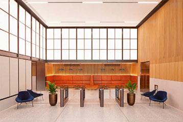
www.appleleclighting.co.uk
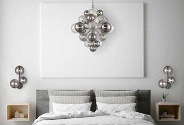
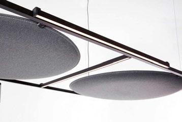
Stand 19
Delta Light designs and manufactures architectural lighting for both interior and exterior applications. With an extensive range of solutions, Delta Light has the capabilities, vision, and passion to deliver any desired effect for any project. Delta Light offers an unrivalled choice in architectural lighting. With a longstanding history of collaborating with architects, designers, contractors, and investors to integrate light into their projects, Delta Light luminaires can be found in highprofile installations across the globe. The brand has built up an enviable reputation for projects that offer ambiance and elegance, underpinned by outstanding functionality, quality, and design.
www.deltalight.co.uk
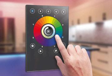
Stand
For over 12 years, Chromateq has been answering the needs of DMX lighting professionals around the world. With headquarters in Europe, and operations in Asia and the Americas, Chromateq is a global manufacturer dedicated to developing advanced, efficient and cost-effective lighting DMX software and DMX hardware control devices. Chromateq is globally recognised developer, manufacturer and supplier for our stable, efficient and cost-effective lighting control solutions. Its solutions are found in architectural, commercial, entertainment and stage-lighting projects worldwide. Its devices come with a five-year warranty, unconditional access to free updates, and live worldwide technical support.
www.chromateq.com
Franklite Stand 73
Founded in 1973, Franklite is one of the leading innovators in high-quality decorative lighting. Working with clients, architects, lighting consultants, interior designers, M & E consultants and distributors for the residential, hospitality and commercial markets throughout the UK, Europe, Middle and Far East, it strives to offer products that balance optimal performance with beautiful aesthetics. With incredible in-house technology, and highly-skilled design and technical teams who continue to develop new designs, Franklite remains at the forefront of the lighting industry. www.franklite.co.uk
Curiousa Stand 59
Combining the organic nature of freeblown glass with a modern aesthetic, Esther Patterson, founder of Curiousa, draws on historical references to create contemporary sculptural lighting forms. Each piece is carefully curated and hand-assembled in their Midlands workshop, with every piece of glass free-blown in the UK, without the use of moulds, using just the skill of hand and eye to guide each shape. Now in their twelfth year, Curiousa continues to develop new collections, working closely with each client on small or large projects alike. www.curiousa.co.uk
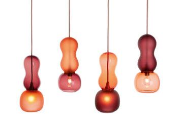
Innermost Plus Stand 38
Since its launch in 1999, Innermost has always collaborated with designers from around the world to bring customers the best lighting and furniture design. Steve Jones and Russell Cameron have created a diverse brand, making products of the absolute highest quality. With the launch of Innermost Plus, the original manufacturing skills and innovative Innermost own brand remain, and new, complementary, brands including Umage, Pilke, EOQ and Shropshire Shades, have been welcomed to the fold alongside it. The brands are stocked at the Innermost Plus distribution centre and factory in Telford, which has facilities for bespoke finishing and assembly. www.innermost.net
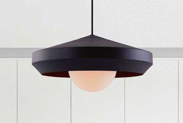
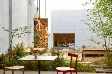
Inspired by Design is a British lighting supplier of bespoke and custom designs for commercial and interior projects worldwide. Specialised in commissioning, creating and supplying unique lighting from artisanal partners worldwide. With 20 years experience to draw upon to aid and guide your projects ensuring that your light is exactly what you envisioned; there is no limit to either concept or materials – if you can imagine it, the team can create it. If you need to create your own signature range then the design team is uniquely placed to help you create it, whether it’s a single showpiece or a complete project, Inspired by Design can make your vision a reality. www.inspired-by-design.co.uk
Kreon is an international organisation manufacturing architectural interior lighting products (lighting tools) and complete metal ceiling solutions, creating contextually appropriate systems within an increasingly changing world. Committed to excellence since 1982, the premise for Kreon’s design is a very clear, characteristic visualisation of the company’s philosophy: purity and simplicity. Wherever possible the team draws upon pure three-dimensional architectural forms, highlighting the essential and extracting the structural minimum. Architects and light planners are Kreon’s major clients. www.kreon.com
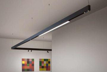
Labra believes that conscious and creative solutions are essential steps to improving the quality of our lives. A Polish manufacturer of architectural and decorative lighting fixtures, the brand is helped by the idea of light thinking, which combines the awareness of using appropriate solutions and materials that are beneficial for both ourselves and the environment we live in. A family-run company open to people, ideas, and creative solutions, Labra believes that good relationships are the foundation of growth, success, and good energy. By designing and manufacturing fixtures in Poland for over a decade, Labra is pursuing an important principle of production – by being local. Represented in the UK by FW Lighting. www.labra.pl
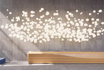
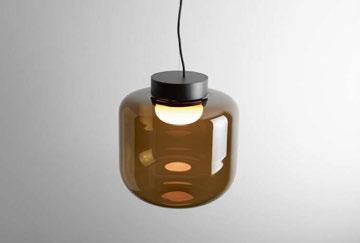
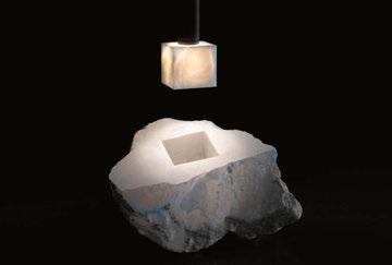
Imagine a team of research departments that study technical lighting solutions that are fully customised to meet your project requirements. Cutting edge know-how in LED technology that guarantees quality, sustainability, and efficiency in any situation. A group of companies that is organised into a flexible network of technologies and skills, capable of dealing with each step of the process to create products for all demands with 100% Italian quality. Together with Linea Light Group all your ideas come to light.
Balancing technical know-how and the best ‘Made in Italy’ design, Venice-based Lodes has been designing and producing lighting solutions for interiors and exteriors since 1950. Originating in the founder’s passion for glass and informed by continuous technological research, the company has evolved into one of Europe’s leading designers and manufacturers of decorative lighting, currently present in 90 markets worldwide. Today, Lodes represents a threegeneration evolution from pure passion to brilliant lighting solutions, creating light sources that fuse contemporary design and innovative technology with materials of the highest quality, scrupulously developed with the best processing techniques.
Stand 6B
Tala launched in London in 2015 with an innovative approach to LED lighting. The brand was founded by three friends whilst studying together at The University of Edinburgh. With a shared passion for design, technology, and sustainability, Tala believes that conservation and beauty can be combined as we progress to a low carbon world. Tala creates high-quality, sustainable LED lights for homes, offices and every space in between. Lights people can be proud to switch on because they look great, lift the soul and are gentle on the planet.
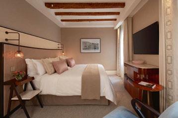
Lutron
Stand
Beautiful light. Powerful shades. Intelligent controls. That’s Lutron – the world leader in architectural lighting & shading solutions. Realise your vision with our distinctly crafted aesthetics and innovative technologies, thoughtfully composed to enhance design and transform space with light. Prismatic is made possible by the Athena solution –Lutron’s simple and flexible lighting and shading control solution that puts the power to personalise light in the palm of your hands. Athena marries best-in-class control, unparalleled flexibility, and simple app-based setup in a lighting and blinds control solution that is ideally suited to handle the evolving needs of commercial spaces throughout the world.
www.lutron.com
Pilke Stand 38
Pilke Light Collection creates sustainable wood design lamps. It is an inspiring, warm, unique and intelligent brand. The story of the brand’s design starts in Finnish forests. Birch, oak and ash trees inspire the designers to create beautiful and intelligent Nordic lightfulness. Pilke Light Collection is the combination of Finnish handicraft technique and modern computer geometry. The Pilke Light Collection’s thin Finnish plywood raw material is FSC certified. Quality design and sustainability acts matter to the brand’s local production team in Southern Finland, who create lights to last from generation to generation. Classics of tomorrow.
www.pilkelights.com
Stand
Lighting your movement: Three words that contain an entrepreneurial philosophy that is transferred daily to the product and company processes.
Established in 2017, Lym is a young industry of excellence in technological and design lighting, with entirely Italian production and collaborations with international designers and companies. It constantly looks to the future by intercepting styles and needs in the living of the new generations, in a entrepreneurial dimension that looks at and respects history and tradition, transposing it to the future.
www.lym.it
Stand
Established in 2017, Project Collection was created as a toolkit for residential lighting in the UK market. The range has since expanded to cover commercial applications, including hotels, student accommodation, leisure, offices and education. Customer and application are at the forefront of the Project Collection team’s minds when designing lighting elements, or when building a bespoke installation. The company’s ethos is to always provide the customer with a single solution that will enable them to effectively specify lighting for any project. The company believes great lighting should be both functional and aesthetically pleasing, enhancing and highlighting its environment, whilst also being long lasting and sustainable.
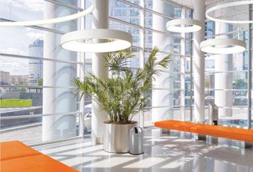
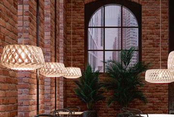
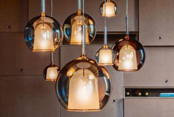
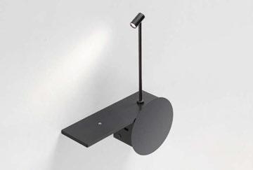
www.projectcollection.co.uk
Stand
Penta designs and produces high-quality lamps, with a contemporary design. In the course of its history it has interpreted the ideas of sought-after and never predictable designers, transforming their vision into objects in which formal beauty meets functional utility. While remaining faithful to its origins, the brand experiments with new solutions and is able to enrich its tradition with new expressive and aesthetic codes, with a special new attention to the smart building needs.
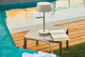
www.pentalight.com
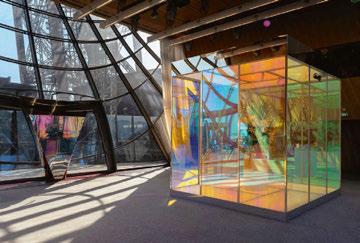
Stand
PUK Italia Group was established in 1967 in Lissone, Milan, Italy. Given its high level of technological innovation, ongoing research and development activities, along with the experience and know-how gained over the years, the company has slowly but surely modified its product range. The company’s focus today is on architectural lighting for outdoor areas, which requires very highquality technical production and the use of specific materials to guarantee a long lifespan of the products offered.
www.puk.it
Rako Controls is one of the leading UK manufacturers of wireless, wired and combined control systems for lighting controls and shading solutions. With a wealth of industry experience and expertise, its UKbased design team has lead Rako to develop precise control of all light sources and smooth dimming of all varieties of LEDs. Offering an unparalleled range of products backed by a support service that is second to none, Rako provides lighting controls that offer luxury, comfort and convenience in the hospitality, commercial and residential sectors with control options ranging from luxury keypads, smartphone apps and voice command. www.rakocontrols.com
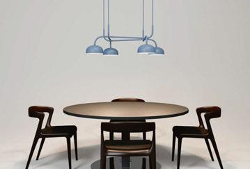
Umage Stand 38
Umage is a Danish word meaning ‘making an effort’, and that’s what the brand aims to do every day. Umage is where beautiful Danish design meets affordability, highquality materials and a genuine care for the environment.
Umage combines aesthetics, simplicity and functionality, and infuses it with thoughtful craftsmanship and environmental care. The result is exquisite designs with a sustainable edge. Its designs are flat-packed in stylish boxes, to optimise global logistics and make the designs more accessible and affordable. In the process, it minimises the carbon footprint on our planet and maximises its ethical commitment to environmental responsibility. www.uk.umage.com
Handmade to order from the finest materials, with bespoke options also available, Shropshire Shades is the leading UK contemporary lampshade maker, showcased by Innermost in the UK, redefining the modern lampshade with, shape, materials and all round style. www.innermost.net
Tyson are a multi discipline family company. For six decades it has been working tirelessly with its customers to deliver lighting to projects worldwide and now with a curated collection of furniture brands to complete its portfolio it can offer a complete package whatever the project. www.tysonlighting.com
Zero Stand 23
Represented by UK Agent, Inform Furniture, Zero Interiör was founded in 1978 with the vision of producing unique light fittings for a design-interested audience. These products, in combination with a deep understanding of how best to illuminate indoor and outdoor environments, is at the heart of its identity.
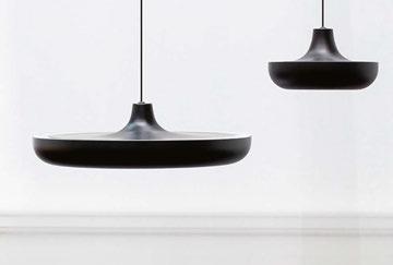
From the start, its creation of unique environments has received accolades in both Sweden and abroad, thanks to the brand’s guiding principles: quality, environmental care and innovation.
More than 80% of manufacturing takes place within 200km of Nybro, Southern Sweden, and all assembly occurs in its workshop in Nybro.
www.zerolighting.com
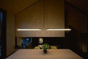
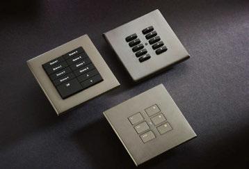
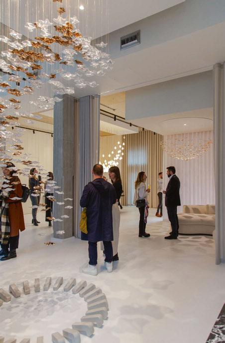
Tala in partnership with darc magazine

Tala will be launching its first pop-up showroom on Club Row in Shoreditch. For its first offsite showroom concept, 'On Balance' it will feature a mix of exhibition, retail, and experiential installation to immerse visitors in the power of good lighting.
Showcasing a new technical lighting series called Kilter, Tala will also reveal new designs in collaboration with colour specialists Farrow & Ball, as well as highlights from its existing catalogue.
darc magazine joins Tala as the official media partners for the two-week long event. Join the team on the evening of Tuesday 20 September for the launch party of 'On Balance' and catch Editor Sarah Cullen hosting a panel talk the following week. Keep an eye on social media and newsletters for more details on upcoming events. www.tala.co.uk www.darcmagazine.com
As part of darc magazine's continued celebrations of its 10th anniversary, it has teamed up with British lighting brand Haberdashery to host an exclusive party during LDF. Held at Haberdashery's showroom in the Design District, Greenwich, the evening will celebrate designers and manufacturers who have supported the magazine throughout its first decade in publishing.
Ben Rigby, Creative Director and Co-Founder of Haberdashery, says: "In 2021 we opened our first showroom, located in the inspiring new design district in Greenwich; a flexible space for showcasing our work whilst engaging with the design industry via events and thought leadership.
"Over our 15-year history, we have worked closely with the lighting design community on incredible projects; the darc magazine 10th-anniversary party is a wonderful way to reconnect with this passionate community during LDF." darc magazine's Managing Editor Helen Ankers adds: “I can’t wait to celebrate this important milestone in darc’s story so far. I couldn’t be prouder of the team and how far the magazine has come - we’ve met some amazing people in this time and it’ll be a lovely way to thank everyone for their continued support.” www.haberdashery.com www.darcmagazine.com
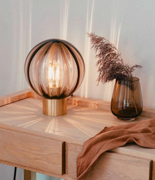
Design enthusiasts will be invited to explore the values that tie Norwegian design brands together through a dedicated series of events under the umbrella of the “Inside Norway Design Trail” this September. Four of the brands are housed in the Chelsea Design Centre and will be participating in the hub’s annual Focus event with product launches and an industry expert talk. Glass manufacturer Hadeland Glassverk has just moved into a highprofile showroom space at the Centre. In addition to its glass lighting collections, the beautiful Hadeland Glassverk showroom is also home to displays of durable and natural stone countertops by Lundhs (celebrating 60 years in business) and classic Norwegian furniture pieces by Eikund. Established in 1762, Hadeland Glassverk produces the most exquisite handmade crystal glass lighting, stemware, and art glass from its glassblowing studio, located by the edge of the Randsfjord near Oslo. With an infinite capacity for bespoke pieces, Hadeland Glassverk curates lighting for residential design requirements and contract projects alike. www.hadeland.com
For London Design Festival 2022, renowned British designer Lee Broom will showcase Divine Inspiration, his new collection of ethereal lighting pieces. Six new lighting collections were introduced during Salone del Mobile in Milan, and the lights will be presented in the lifestyle environment of the Lee Broom showroom in Shoreditch, alongside existing Lee Broom designs.
Divine Inspiration is the first lighting release in four years and celebrates 15 years of the Lee Broom brand. The collection showcases a series of new ethereal lighting pieces in a range of materials, including a limited-edition collection in white plaster, hand crafted by the designer himself. Known for pushing the boundaries of how materials can be used and for examining the intersection between architecture, art and design, the six collections – Vesper, Pantheum, Altar, Hail, Chant and Requiem – are available in multiple configurations, finishes and materials. These include carved oak, extruded aluminium, plaster and Jesmonite www.leebroom.com
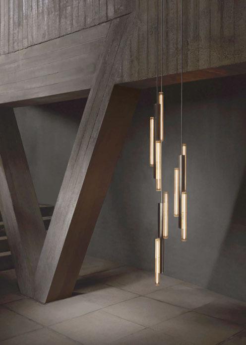 Image: Arthur Woodcroft
Now in its second year, LDF's largest official contemporary design fair will return to North Greenwich's Magazine London on 21-24 September. This year, it doubles its size and comprises the main show space and a new temporary pavilion, the “Showground".
Made of natural wood, lacquered in a wide variety of colours or upholstered in soundabsorbing fabric, the panels are architectural details suggesting the aesthetics of the Bauhaus. “Walking through Venice and seeing a cable stretched between houses with washed clothes hanging, we came up with the idea of designing a light”, says designers Alberto Brogliato and Federico Traverso. www pentalight.com
Cirkus approaches function and technology with a playful gesture. U-shape modules can be moved and directed in diverse orientation. The Cirkus collection comes with a wall lamp, a track rail lamp, and two types of chandeliers to become a playful customised centerpiece in diverse spaces. www.agolighting.com
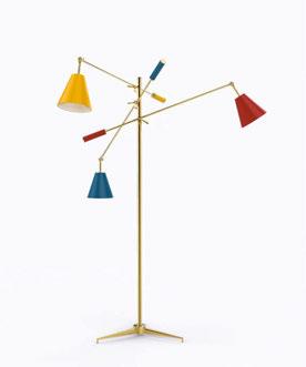
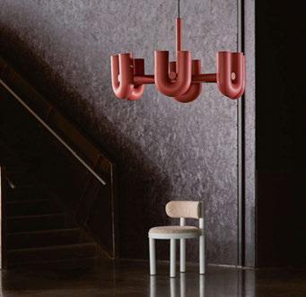
An icon of Arredoluce, symbol of an era and source of inspiration for many objects to follow over time, Triennale is perhaps the best known project by Angelo Lellii. Presented at the VII Milan Triennale in 1947, it is a floor lamp with a linear structure and three adjustable arms, each ending with a diffuser coloured in red, yellow and blue. www.karmanitalia.it
Akoya is made of two metal discs (available in white, anthracite, corten and bronze finishes) containing a blown glass diffuser. The light source is a high-efficiency LED with integrated power supply and dimmable with phase cut. Akoya was born from the geometric evolution of the circumference, which first became a two-dimensional surface – the circle – and then a threedimensional volume – the sphere. www.fabbian.com
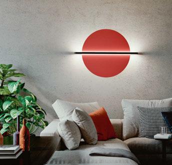
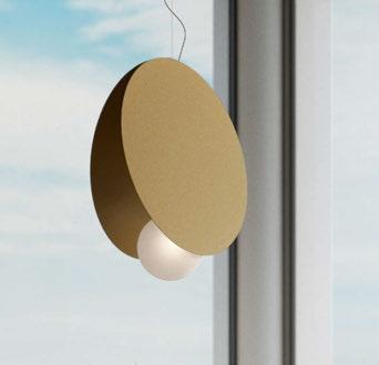
Launching early autumn 2022, a new range of dimmer knobs and toggle switches offer a greater choice of designs with increased degrees of customisation – within its standard range. Machine turned from satin brass, three new dimmer knob and three new toggle switch designs are currently available in satin brass or matte black finish – achieved through a high-quality powder coating process using RAL 9005. www.hamilton-litestat.com
Finials' take on the classic Edison light source pendant, but with an added feature; you can now update it’s appearance with a simple twist. Each lamp has a single modular core, which enables the outer housing (the Finial) to be intuitively twisted in and out. No rewiring, no tools needed. The pendant is also compatible with any E27 light source. www.finials.ink
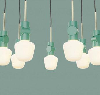
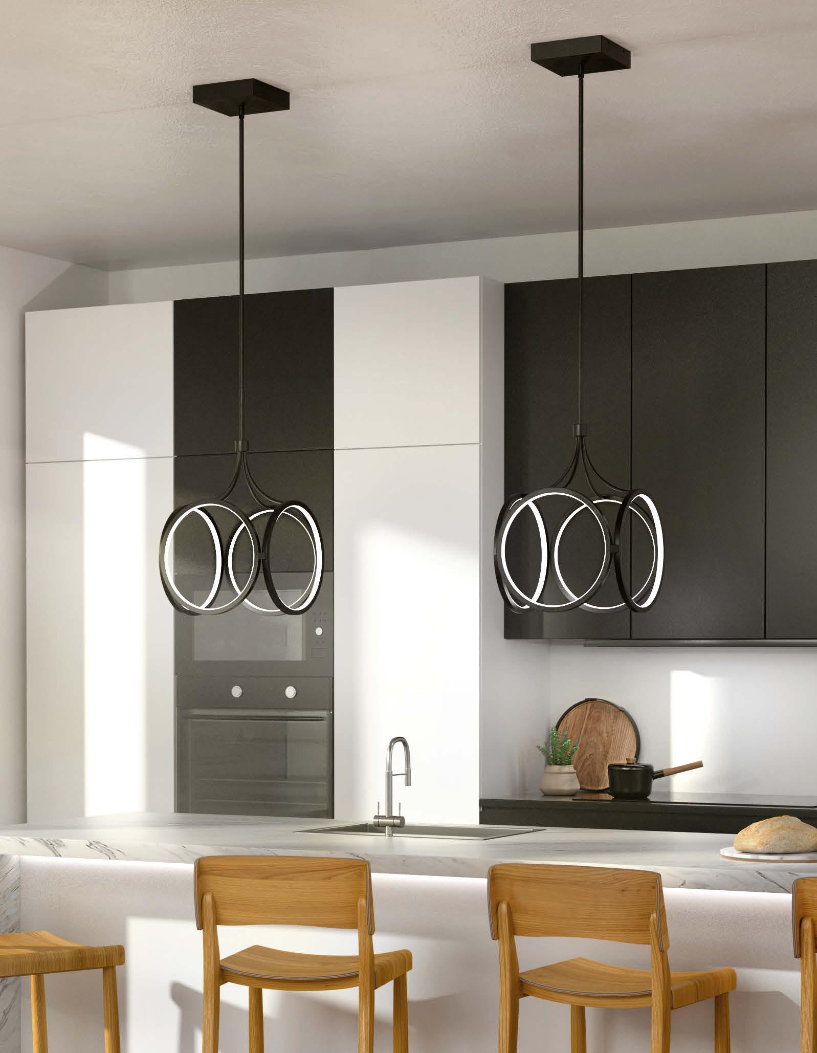
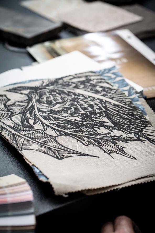

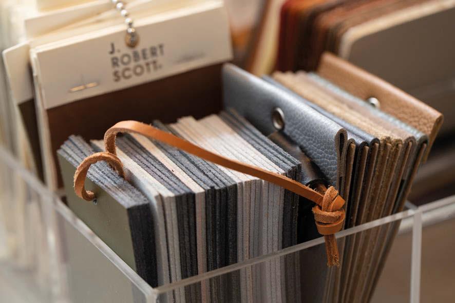
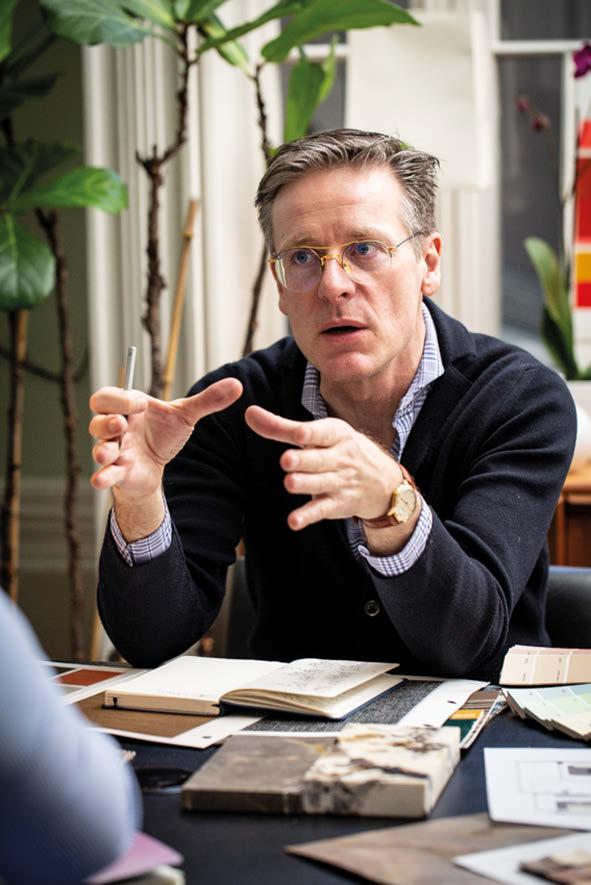
For this new project, Luxxu pays homage to the architectural style of Hong Kong, introducing a modern and contemporary feel to the luxury oasis. Structure alone, the penthouse was imagined as a sort of paradisial landscape with sweeping city views, and then, Luxxu decorated the interiors with high-end designs that epitomised the modern notion of luxury but in a lighter yet vigorous colour scheme, especially playing on the timeless appeal of various shades of brown and neutral hues, eye-catching gold accents, and an abundance of greenery. All divisions benefit from a bright atmosphere with floor-toceiling windows that allow one to embrace the region’s phenomenal skyline.
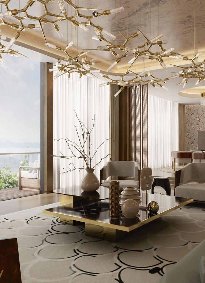
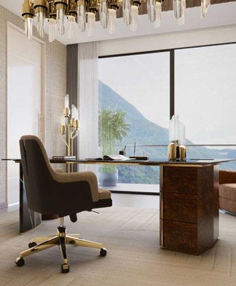
As we move through the apartment, multiple Luxxu products illuminate the way. Starting in the hallway, Luxxu’s Waterfall II wall lamp illuminates the area with a unique glow courtesy of its goldplated brass frames and crystal tubes. For the living room, every detail
was thoroughly thought out to make a statement. The tray ceiling and the lighted brass walls immediately set the tone whereas the Shard suspension by Luxxu becomes a lighting installation in its own right. In the dining room, the Burj chandelier offers a more opulent nature while becoming an ode to the modern age. In the bathroom, besides plenty of natural lighting, this space also benefits from the harmonious and architectural allure of the Pharo lighting fixtures. What better way to boost your creativity than to work to the sight of the most magnificent mountain views. Luxxu took this concept and designed a highly simulative interior with floor-to-ceiling windows in the office. Here, the Tycho rectangular suspension was selected as the main luminaire, while the Waterfall technical wall lamp and the Tycho table lamp back up its stately layout.
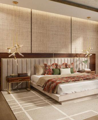
London, UK
The Hyde Park Chateâu was envisioned as a French chateâu-style inspired residence with monumental architectural proportions and refined luxurious materials.
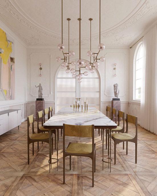
Every room in the house unveils as a sequence of narratives framed by contemporary art and furniture. Interiors and architecture was completed by Javier Robles Studio, with bespoke lighting and furniture by Robles’ brand, Lumifer.
A major focal point of the project is Lumifer’s monumental custom Helix lighting installation, which accentuates the materials and geometry of the grand staircase.
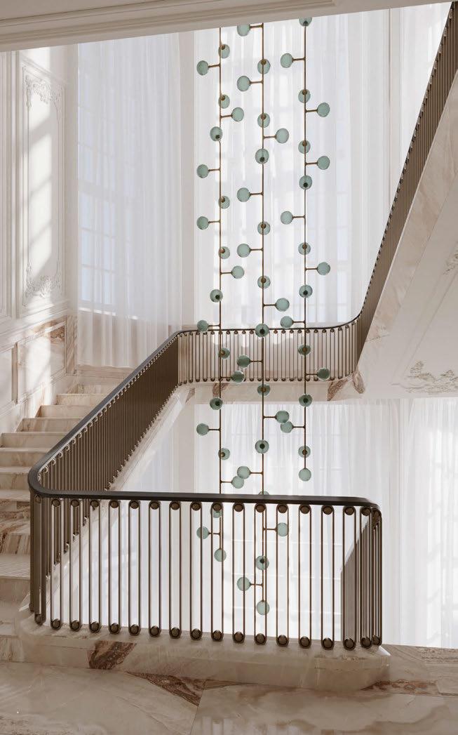
The living room, dining room, and foyer follow the same style and
architectural proportions, adorned by minimal decorative themes that are unified by the diverse and harmonious lighting and furniture collections designed by Robles and made by Lumifer. Each Lumifer piece was carefully selected, customised, and coordinated to create a seamless and timeless design vocabulary magnified by the craftsmanship and richness of materials and finishes that are synonymous with the brand.
Lighting collections featured throughout the property include Helix, Navis, NYX, Switch, Titan, and Bouy. www.lumifer.us
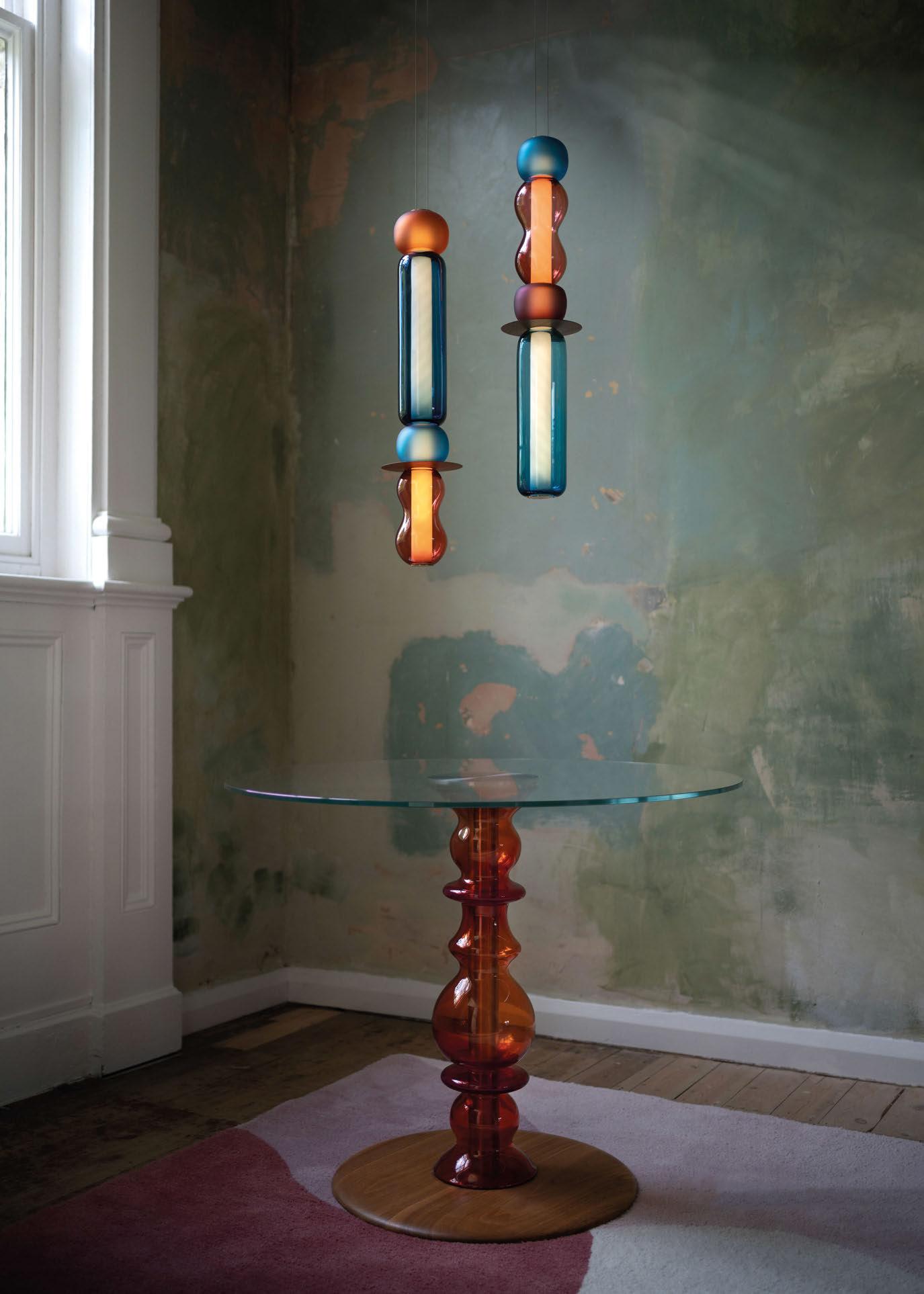
A private Dutch client, who is an entrepreneur, hobby pianist, and racing driver, was not entirely satisfied with his cluttered layout of a chalet design that was included with the purchase of a building plot. As such, he approached Czech lighting brand Brokis for its design consultation.
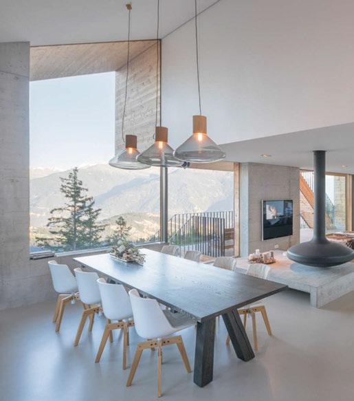
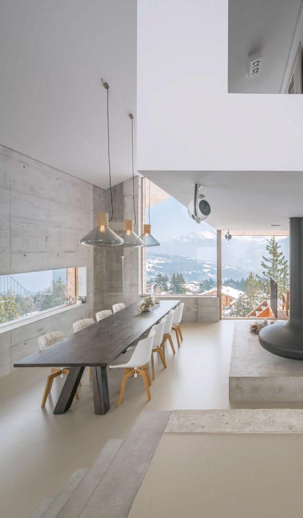
The traditional chalet consists of a solid wooden house with shutters and gable roof resting on a stone foundation. In the Swiss Alps, the chalet has gradually become a multigabled pastiche as a luxury ski chalet or grown to mega proportions with a maximum number of apartments for affordable tourism.
As part of the new scheme in the residential space, Brokis selected its Muffins fixtures to sit about the dining table. The Muffins collection was designed by Lucie Koldova and Dan Yeffet.
The lights, featuring a blown glass shade set in a handcrafted wood base together with a naked filament light source, breathe new life into any space and elicit a festive ambience. The collection offers multiple shape and size variants as well as a broad palette of glass colours and woods. To celebrate 10 years since the introduction of Muffins, a special anniversary edition was created in 2020. Brokis has chosen singular materials, combining satinated grigio talami marble from Southern Italy and rare satinated rosso francia marble, with different colours of glass to underline the exceptional design of this timeless collection.
www.brokis.cz
Images: Ossip van Duivenbode & Martin Chum
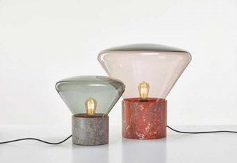
quality
interior
more than 25 years
Bloomsbury brass floor lamp Edwardian Early 20th Century. Adjustable arm lamp, finished in soft bronze. Customisable shade, sold separately.
UK
Stoane Lighting worked with Pritchard Themis on its meticulous lighting design at the multi-award winning 77 Coleman in London, refurbished by BGY Architects.
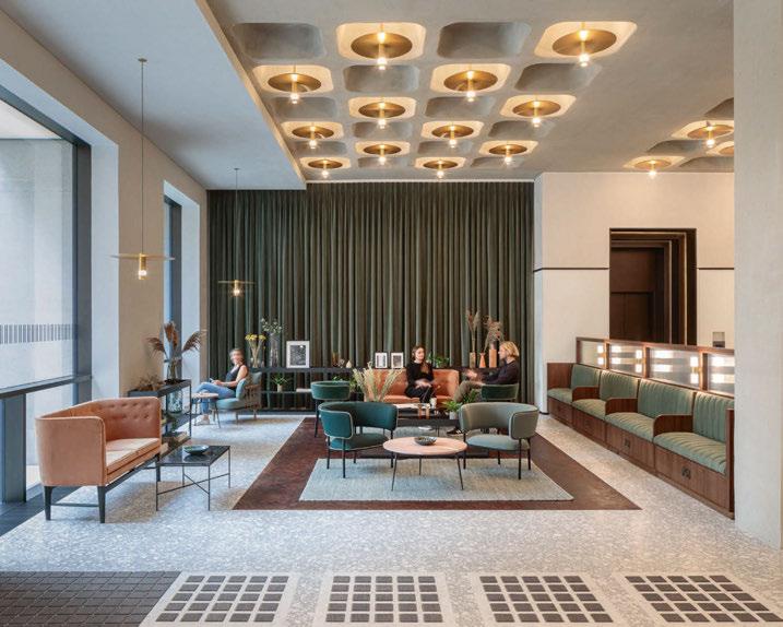
The bespoke products used here are derivatives of a standard product: Drop Pendant. Stoane Lighting first designed this for the Harrods Wine tasting room in 2010 for Lighting Design International. The pendants you can see nestled into the coffered concrete ceiling are height adjustable to allow for any variation on site. Some offered up and downlighting while others are downlighting only through the bespoke cowl. The intention was to produce a twinkle with low glare while maintaining a useful 360º downward light. The uplighting element is provided by a circular array of Billet, a flexible linear product that comes in the form of 52mm light capsules. A small proportion also had emergency gear incorporated. The gear above was remote mounted in a steel tray so as to avoid drilling through the decorative plate.
The same pendants using a high CRI LED hang in other areas from long braided cables. Bespoke up/down feature luminaires
were added to benches and tables to provide additional local atmospheric lighting. The brass anodised finish was selected to match the luxurious finishes throughout the huge reception area.
Following on from this project, Stoane Lighting is continuing its push for sustainable lighting used within projects by creating its own recycled collections. “By harnessing new and old technologies, we are creating a range of new products entirely based on recovered in-house waste materials,” says the brand.
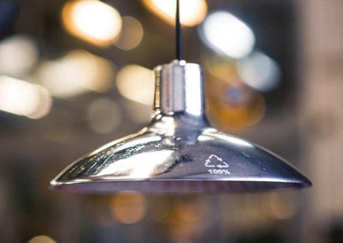
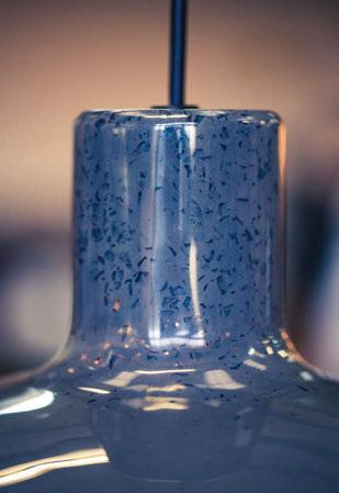
Stoane Lighting’s ZTA.50.PLP range is created using recovered mixed fine powder over spray from its finishing processes and recycled acrylic waste. And, its yet to be released sister product, the ZTA.50.CLP, is made from aluminium workshop off-cuts and hand-cast in a renewably powered electric forge.
To help specifiers, circularity and carbon data is available on nearly all of its products, as responsibly quantifying it progress on all sustainability aspects is something Stoane Lighting continues to take seriously. www.stoanelighting.com
Project images: Dirk Linder



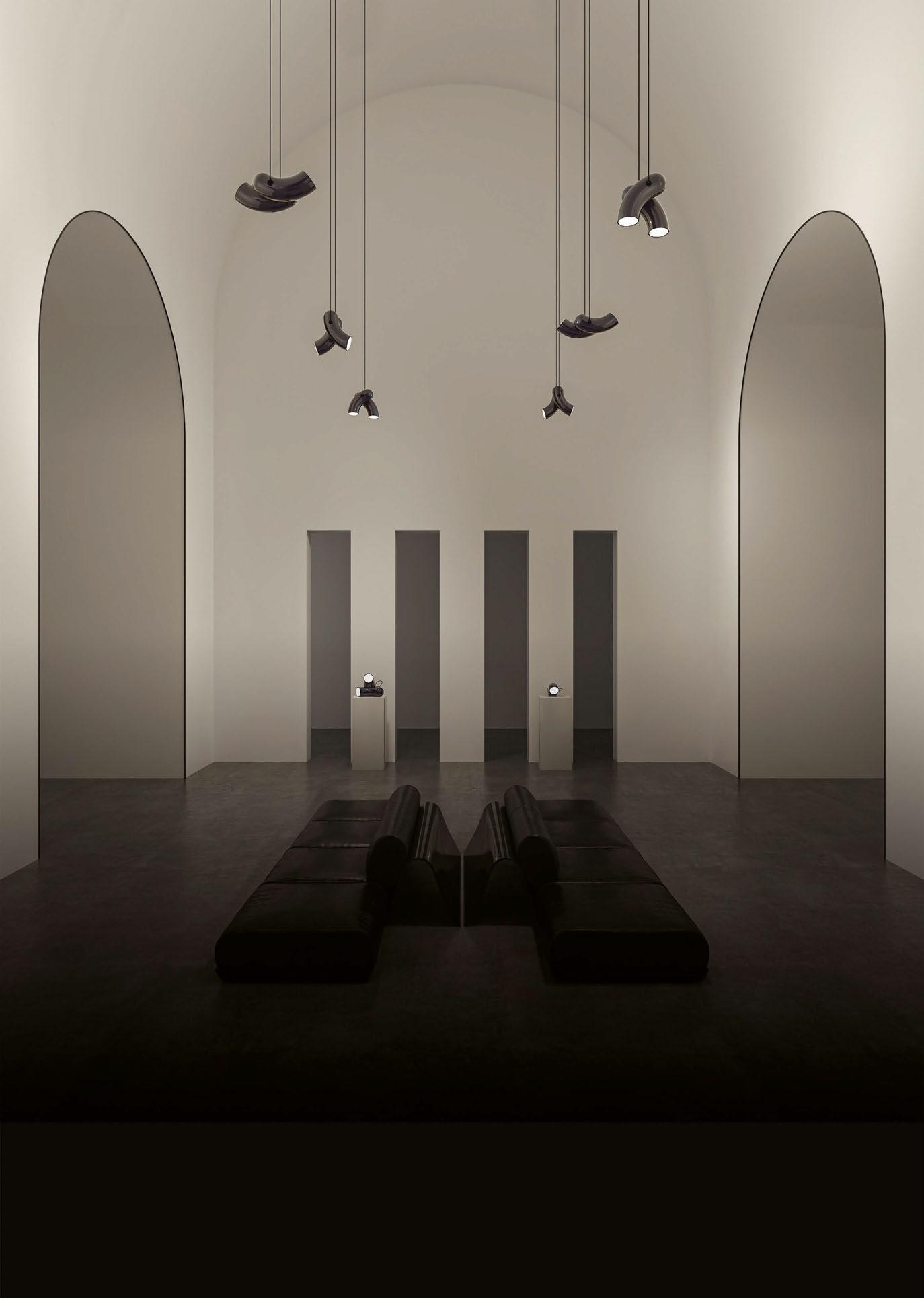
What is the design inspiration behind Hyphen?
Staying true to d’Armes’ aesthetic, Hyphen draws clean, minimal lines that are also fascinating. The details are kept to the essentials, creating a sophisticated design. Our team focused on creating volume that is evolving on a 360° scale; the lighting changes in its shape as we look at it from different points of view. Adding to the different light positions and orientations, the chromatic black finish, with its iridescence, accentuate this effect.
Hyphen designates the union of two opposites in one; the warm, soft, and sensitive porcelain and cold, strong, and brilliant steel. It is a reinterpretation of the simple pendant spotlight.
How long have you been working on Hypehn for?

Two years.
Can you describe the design and manufacturing process?
A local artist-ceramist casts and molds by hand the porcelain version. It requires several steps that extend to almost two weeks. Hyphen in porcelain is a work of mastery that demands finesse and achieves refinement.
The steel version is also the porcelain version's opposite by its production process, as it is fabricated in a factory. High heat is necessary for the deformation of the steel, and then follows the welding and polishing work.
The topcoat is the last step.
What was the most challenging aspect of producing this piece?
Working on the mould for the Hyphen in porcelain was the most challenging aspect. Because it was made by hand, the mould required us to go back and forth with adjustments to achieve this result. Afterwards, we had to fine-tune the steel version so it would tie in perfectly to the porcelain model.
What makes this product different to other lighting products available on the market?
Its shape and the different light positions and orientations make of Hyphen an object that catches the eye and leaves no one indifferent. Hyphen is both intriguing and attractive.
Our team decided on a PAR30 lightbulb instead of an integrated LED light engine so it can answer to the many specific needs of the industry. It is also more ecological to change a lightbulb than the whole fixture.
Can you describe the product in 3 words. Fascinating, attractive, soft.
