A MOTIVATE PUBLICATION DHS 25.00 OR 2.70 BD 2.60 SR 25.00 KD 2.10 ARCHITECTURE, DESIGN, INTERIORS + PROPERTY identity.ae ISSUE 232 / JUNE 2023
The Future Generations Issue featuring Samer Selbak
to the roots
Palestian


20 Features 14 10 contents 20 The rule breakers
Gallefoss and Nebil Zaman are exploring a collaborative practice 60 Abundant lifestyle
Brummell Majorelle is an architectural gem honouring local culture and creativity 30 Setting
scene
and context are at the core of Studio Baab’s interior design projects 54 Natural abundance
Plavu is an enchanting home and a stunning example of ‘reverse urbanisation’ 48 A peaceful refuge
Molodykh transformed the interior spaces of a Lake Lugano apartment for two friends 34 Fluid
minimalist showroom aims to educate on the importance of water security 24
Ali
Maison
the
Timelessness
Estate
Yana
thinking WAYOUT’s
Back
designer Samer Selbak reminds us that design is a powerful tool for change Regulars Design Focus Products #idmostwanted 40 72 74
Editor-in-Chief
Obaid Humaid Al Tayer
Managing Partner and Group Editor
Ian Fairservice
Editor
Aidan Imanova
Senior Art Director
Olga Petroff
Junior Designer
Charissa Canlas
Sub-editor
Max Tuttle
Chief Commercial Officer
Anthony Milne
Senior Sales Manager
Sharmine Khan
Sales Representative - Italy
Daniela Prestinoni
General Manager - Production
Sunil Kumar
Production Manager
Binu Purandaran
Production Supervisor
Venita Pinto
Contributors
Jennifer Copley
Karine Monié
Yotam Ben-David
Head Office: Media One Tower, PO Box 2331, Dubai, UAE; Tel: +971 4 427 3000, Fax: +971 4 428 2260; E-mail: motivate@ motivate.ae

Dubai Media City: SD 2-94, 2nd Floor, Building 2, Dubai, UAE
Tel: +971 4 390 3550 Fax: +971 4 390 4845
Abu Dhabi: PO Box 43072, UAE, Tel: +971 2 677 2005; Fax: +971 2 677 0124; E-mail: motivate-adh@motivate.ae
Riyadh: Office 452, Regus Offices, 4th
Floor, Al Hamad Tower, King Fahad Road, Al Olaya, PO.Box 12381, Riyadh 6764, Kingdom of Saudi Arabia; Tel:
+966 11 834 3595 / +966 11 834 3596; Fax: +966 11 8343501
London: Acre House, 11/15 William Road, London NW1 3ER, UK; E-mail: motivateuk@motivate.ae
contents 24
®
Photography by Yotam Ben-David
LUXURY
PERFORMANCE FABRICS AND RUGS | PERENNIALSFABRICS.COM
Mumbai Studio | Villar Ville PJ Ramchandani Marg. Mumbai, Maharashtra | info@perennialsindia.com
Dubai Studio | Perennials FZ LLC, A503 Building 1A, Dubai Design District (D3), Dubai | mena@thespstudio.com
Editor’s Note
A few themes have come to the fore while putting together this issue, which – as its name suggests – explores the many ways in which a new generation of designers is navigating the field. While for many years we have been taught the importance of specialisation, these lessons are becoming less of a blueprint. The current zeitgeist is about going against the grain, breaking the mould, blurring the lines – whatever you prefer to call it. The fact remains that the new generation is more inclined towards fluidity rather than rigidity, where rules are mere suggestions – which, to me, is very exciting.
Speaking to many of the young designers featured in the pages of this issue, the enthusiasm for exploration is undeniable: be it of new concepts, forms or materials. But besides aesthetic exploration, it is encouraging to observe how many designers today hold social and environmental issues to heart. While the design profession unfolds, it is up to the designers to shape what their future will look like – and this is more attainable today than ever before, as more designers and architects are being given a seat at the table to tackle complex social and environmental challenges.
Exhibitions like ‘Hot Cities: Lessons from Arab Architecture’ – which is currently on show at the Vitra Museum and curated by Ahmed and Rashid bin Shabib – is a great example of how architecture and environmental challenges intersect, and how one can inform the other.
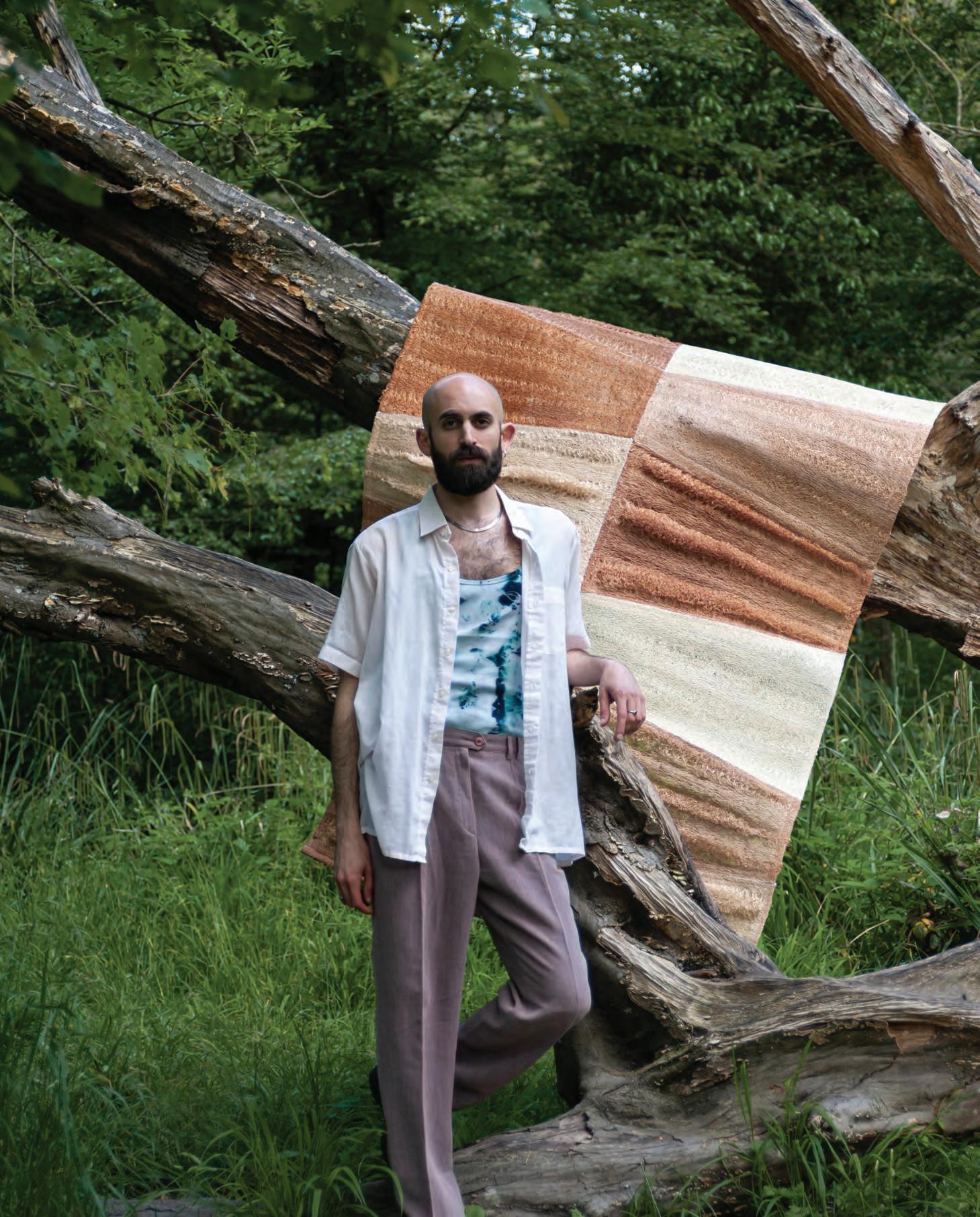
Our cover this month features Paris-based designer Samer Selbak, who grew up between Nazareth and Haifa in northern occupied Palestine where his surroundings cultivated a love and appreciation for nature – values that he still upholds in his design practice.
“I grew up being exposed to different cultures: On one hand [was] a traditional Palestinian lifestyle, preciously preserved by my grandparents and shared with us through storytelling, traditions and different activities around food and nature,” he told me. “On the other hand [was] a reality of living in an occupied place where you must always question conventions and fight for your place and for your own truth, and to find different types of compromises and inventions to react to those cultural clashes.”
His Luffa Project, for me, personifies the values that we see in many young designers today, where the revival of an indigenous plant is about reclaiming one’s identity while also being conscious of the importance of the natural world.
“I feel much more accomplished when I challenge myself to find creative ways not only to not harm the planet, but also to benefit it,” Selbak said during our interview, and I think these are definitely words to live by.
On the cover:
Aidan Imanova Editor
 Photo by Young Habibti
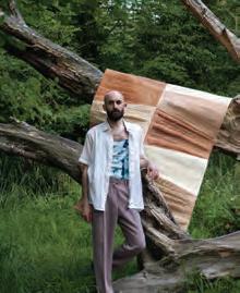
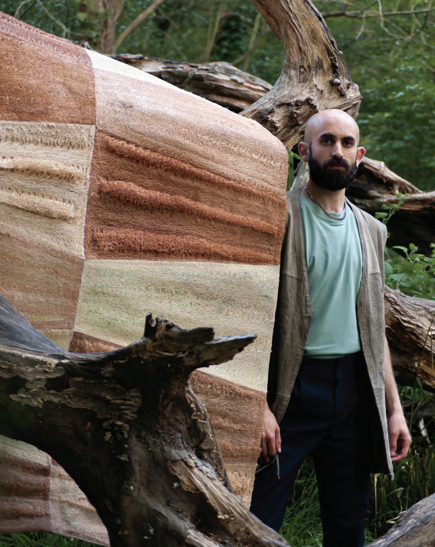
Palestinian designer Samer Selbak with his Reef divider, photographed in Paris
Photography by Yotam Ben-David


Hide and seek
At the helm of his eponymous studio, Lebanese architect Etienne Bastormagi works across different scales to create spaces and pieces that reflect his quest for minimalism
 WORDS BY KARINE MONIÉ
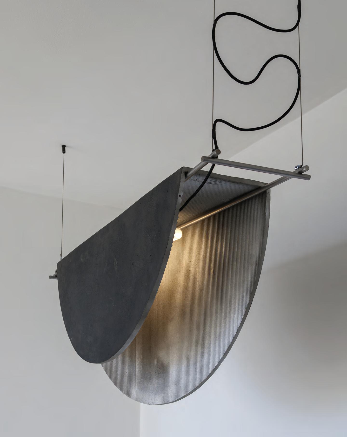
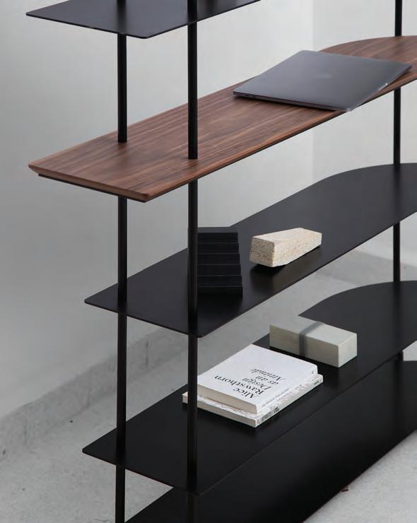
This page: 660.3° Cast Poems suspension light. Next page: Fillet shelving from the Shaping 90° collection
by Borgi Bastormagi
Photography by Wissam Chaaya
Some of our earliest childhood experiences strongly impact our adult life. Beirut-based Etienne Bastormagi has a deep understanding of how this has played out for him. “As a kid, I was always around machines making industrial pieces (such as ovens and fridges),” he reflects. “My grandparents worked in the industry and my mother had a gallery, so I combined both ends into what I thought an architect would be.”

Difficult moments have also nurtured his first design memories. “I remember running around stainless steel folding machines,” says Bastormagi. “They acted as protectors during the war, as we used to hide within them. Later, I was fascinated by their scale and the things that were made by them.”
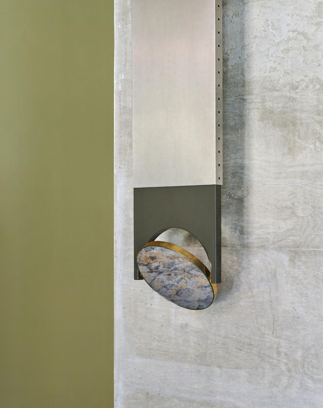
Today, exploring and researching are part of Bastormagi’s daily life. Whether imagining a masterplan, a building, a room or a product, the architect confesses to striving to create emotions, to give importance to the handmade, and to consider both the sustainability and the functionality of every project he tackles. Case in point: his first solo collection, presented during the 2023 edition of Milan Design Week, which includes several lamps and a mirror – all made entirely of metal.
“I have always been fascinated by the moon,” says Bastormagi. “This is what inspired [my project] ‘660.3 Degrees, Cast Poems’.
It is an exploration, a tactile journey between a material – aluminium – and all its potential. The work focuses on shadows and textures, revisiting a perpetual investigation of gravity and fragility, like a moon that sometimes hides, sometimes reveals
its secrets. “This approach interprets our relationship with the cosmos at a time when space travel is becoming accessible and humans seek to understand the universe around them,” he continues. “Each piece becomes a language and merges with the observer’s eye. The object on a wall, suspended or in a larger context, is in direct communication with architecture.”
In addition to aluminium, Bastormagi also uses a wide range of materials, from iron to stones. “I like the colours of raw material and combining them with vibrant contrasts,” he says. For example, concrete and white finishes are very present in his spaces, and black metal often adorns his pieces. Inspired by brutalist architecture, Bastormagi has a deep appreciation for geometry in general, as exemplified through the shapes and structured lines that characterise his projects. His creative process involves a lot of discussion –with colleagues, artisans and clients – and drawing, which he considers to be key. “I want to create contemporary places or pieces that respond to today’s needs [with] a minimalist approach and with an industrial feel,” he says. Whatever Bastormagi is currently working on – design pieces or residential and retail projects which are soon to be revealed – he remains strongly nurtured by his origins and past.
“I am from a place of chaos and a lot of natural light,” he says. “Both the urban environment and the shadows are influences for me. Fragility reflects the status of the people living here. Most of my work defies gravity and plays on that notion.” id
11 THE FUTURE GENERATIONS ISSUE design
Photography by Lyes Restom Photography by Lara Zankoul
A legacy story
Myles Igwebuike’s furniture designs are an homage to his Igbo heritage and represent the pursuit of showcasing the diversity of African design
 WORDS BY AIDAN IMANOVA
Nteje Studios – founded by designer and artist Myles Igwebuike – is based in Enugu, Nigeria, where he and his team create furniture that celebrates the rich design language of the African continent, with a particular focus on Igwebuike Igbo heritage. “As a contemporary designer with Igbo heritage, hailing from a royal bloodline, my creative work at Nteje Studios is deeply influenced by the rich traditions and values associated with my ancestral lineage,” he explains. “Being part of a royal bloodline instils in me a profound sense of responsibility, honour and reverence for the cultural heritage that has been
12
design
Photography by Keli Dzikunoo
passed down through generations. Moreover, it fosters a deep appreciation for the role of art and design in society,” Igwebuike continues. “It reinforces the belief that creativity and aesthetics hold immense power to inspire, uplift and unite people. It compels me to use my design skills to make a positive impact, contributing to the cultural discourse and shaping a more inclusive and culturally diverse creative landscape.”
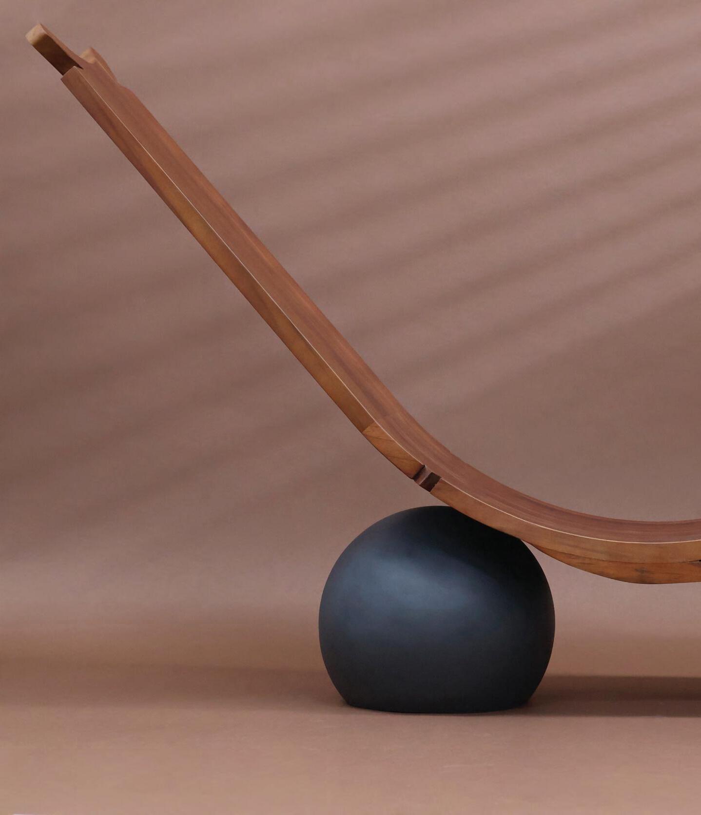
His Ozo chair – which was showcased at the International Contemporary Furniture Fair in New York City – is designed as an homage to the Igbo identity; its community and traditions. At the top of the chair is a crown-like arc which represents the ritual of receiving the chieftain title within the Igbo community: a fate that awaits Igwebuike himself, just like his father and grandfather before him. In fact, the word ‘ozo’ refers to this rank in the traditional hierarchical system of the Igbo people of Nigeria, who are then seen as custodians of traditions, and influential figures within the community.
“The Ozo chair is a love letter and an embrace of my own fragility, of what I am about to face,” the designer confesses. “It is a crafted interpretation and [demonstrates] how I can personally resonate with this moment.” The chair is made from premium African mahogany, its curved form complemented by a black, circular stainless steel base: a modern contrast to the wooden seat. Igwebuike describes its grandiose simplicity as “restrained opulence”. Much like all Igwebuike’s works, the Ozo chair utilises locally sourced materials and is crafted by local artisans with whom the designer often collaborates, from painters and metal workers to carpenters.
“In traditional Igbo design, the use of wood is significant due to the abundance of trees in the region,” Igwebuike says. “Wood is a readily available resource and was used extensively in the construction of buildings, furniture and other household items. It is also symbolic of the connection between the people and the natural world,” he continues, “and [of] the importance of sustainable practices in preserving the environment. The Igbo people have a long history of using natural resources in responsible and sustainable ways, and this is reflected in the use of wood in their
traditional designs.” The Ndali chair is another piece that is crafted using African wood, and can be easily assembled and taken apart, making it adaptable for any living space. The backrest showcases traditional motifs inspired by the designer’s ancestral home in Umeri, Nigeria.
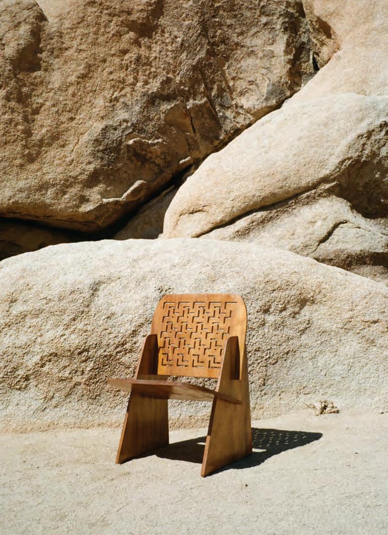
For Igwebuike, design is about more than just creating visually appealing designs. “I view design as a means to make a positive impact on the world, particularly within the African community. Through my work, I aspire to inspire and empower the next generation of African designers and creatives, while showcasing the incredible talent and potential that exists within
Africa,” he says. “I believe that by showcasing the beauty, depth and innovation inherent in our heritage, I can reshape perceptions, inspire unity, and foster a global appreciation for the artistic legacy of Africa.” id
13 THE FUTURE GENERATIONS ISSUE
This page: The Ndali chair. Opposite page: The Ozo chair
Photography by Philip Raheem
Fluid motion
Wafa Al Falahi’s diverse portfolio demonstrates the power of a multidisciplinary approach
 WORDS BY AIDAN IMANOVA
Ithink designers of my generation are multidisciplinary,” begins Emirati designer Wafa Al Falahi, whose own work spans interior design, spatial design and ceramics, as well as furniture design and research. “A ceramicist can suddenly become a painter, while a painter can become an architect – which I think is the beauty of having a multidisciplinary practice, because one can see the mark of a painter in an architect, or the mark of an architect in a ceramicist. “It is what makes everyone’s work so different: it’s these diverse approaches and backgrounds,” she continues. “And that’s how I like to think about my own practice: it is about how everything comes together in one place.”
Al Falahi graduated from the American University of Sharjah as an interior designer, having already begun her exploration of ceramics, working mostly on the wheel to create her pieces. It was during the COVID-19 pandemic – when ceramic studios shut down – that she decided to build her own ceramics studio, where she began experimenting with more hand-building techniques, which helped develop her artistic style.
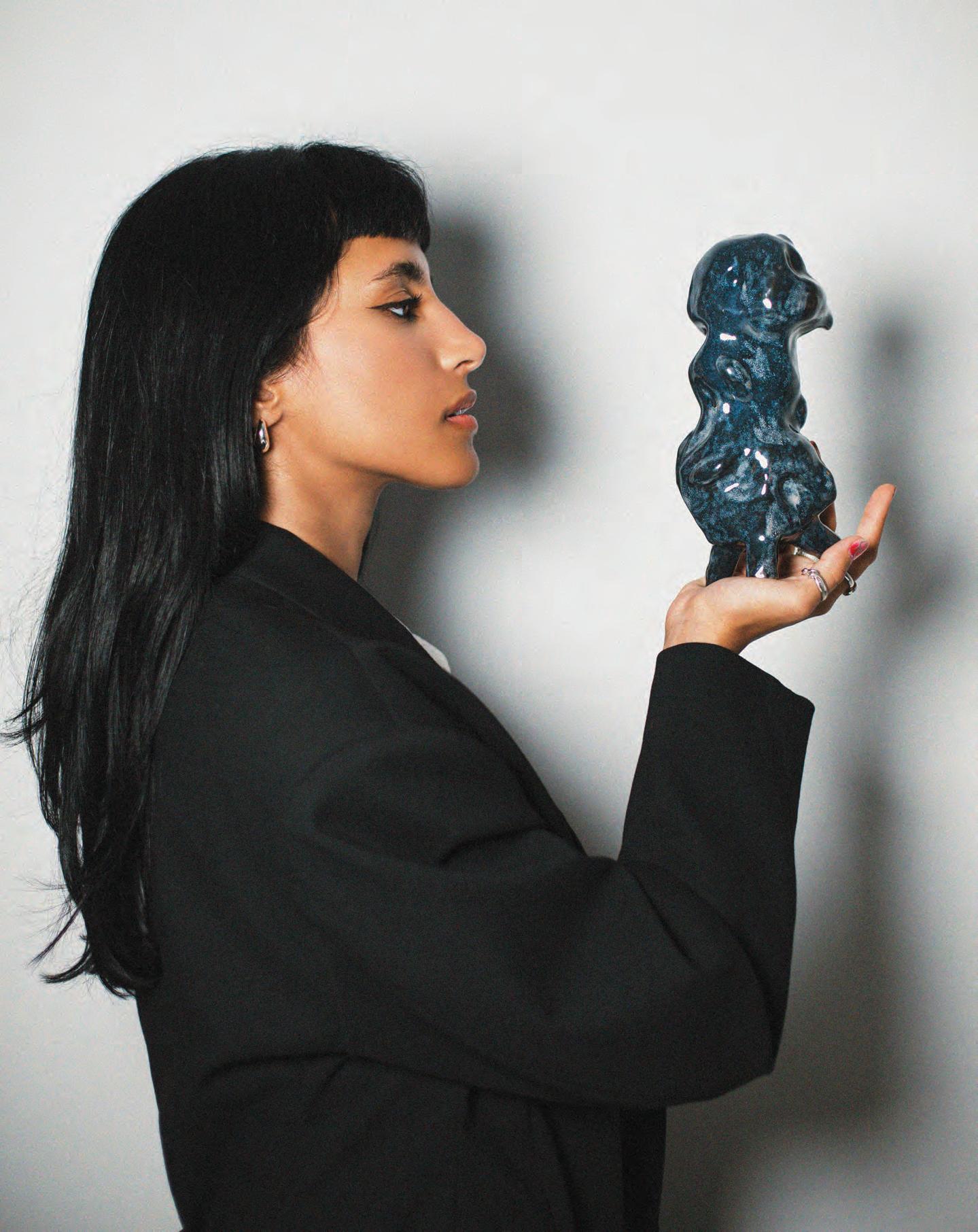
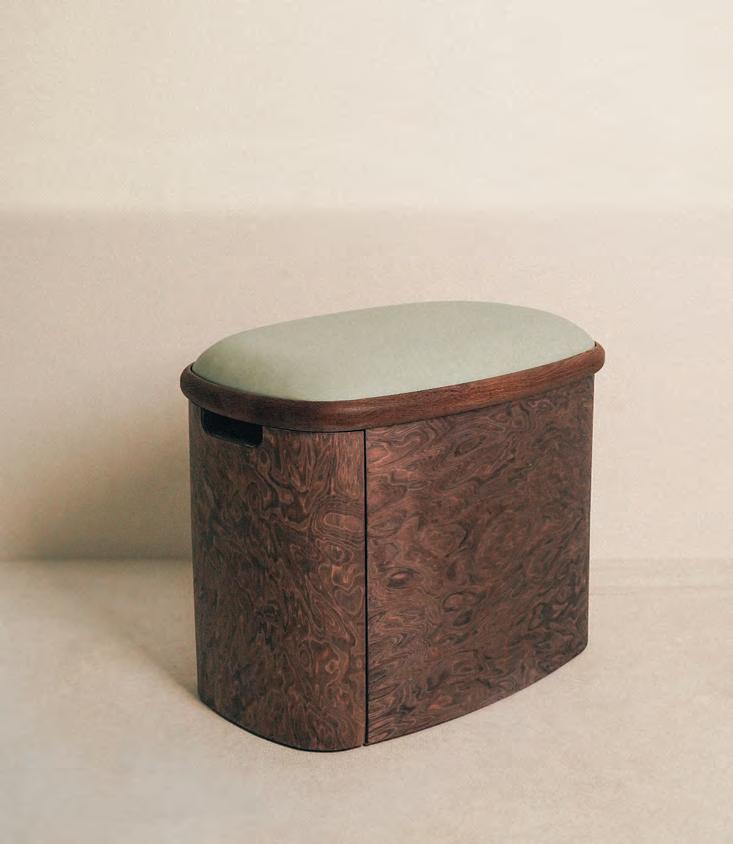
For her fluid ceramic pieces – embracing an abundance of feminine curves – Al Falahi uses organic clay and a variety of glazes. “The way I glaze is a little different and doesn’t follow traditional methods, which is reflected in the final result. For me, it’s about being a little more messy and less uniform; the glazing naturally follows the curves of the pieces,” she explains. Al Falahi was a member of the Athath Fellowship in 2022, where she was able to explore her tactile skills as a furniture-maker, creating a compact potter’s chair called Slip. The dynamic, liquid-like pattern on the wood was created using engineered plywood veneer, and later dyed, taking cues from the material quality of liquid clay. The piece also features a cushioned seat upholstered in synthetic leather.
Inspired by the potters working across small studios in Fujairah, Slip was designed to offer comfort and support for those working on the wheel. “I wanted to create something that would be an extension of a potter’s gestures and posture – and something that would help them have a better experience on the wheel,” Al Falahi explains. The chair also includes a storage space for potters to store their tools, and wheels that help the chair swivel around freely. Al Falahi is also currently a resident at the Cultural Foundation in Abu Dhabi, where she is experimenting with painting and conducting research in which she explores the dynamics of the female body within a space.
“I wanted to explore my artistic side instead of just focusing on design,” she shares. “I find that a lot of my paintings go back to my ceramics in the sense that they are organic, they flow, they are natural and fabric-like, and it’s interesting for me to see these intersections. Sometimes my background in interior design will also come into play. This is why it is interesting for me to explore a multi-disciplinary practice and I think that, by taking part in these different programmes, I am still trying to shape my narrative as a designer; but I find that a lot of my works go back to the subject of women and celebrating women,” Al Falahi says.
For her latest piece, developed as part of the Tanween 2023 programme, the designer is creating a lighting piece that explores the ritual of applying henna, which looks back at her own grandmother whom she cites as an inspiration. “I always wanted to find a way to pay tribute to the women in my family within my work,” she says.
Al Falahi states that her involvement in these various programmes has played a vital role in shaping her work thus far. “When I graduated, I was completely lost, like a lot of people are, but I think there are many institutions in the UAE that offer different programmes that really help in shaping your language as a designer or an artist,” she says. “When you are a part of them, you feel like you are part of a bigger picture.” id
15 THE FUTURE GENERATIONS ISSUE design
“
This page: Slip was conceived during Al Falahi’s Athath fellowship. Opposite page: Wafa Al Falahi holding one of her sculptural ceramic works
Photography by Menat El Abd
Light work
Tamara Barrage has designed monumental glass candelabras inspired by Chinese porcelain lights
 WORDS BY AIDAN IMANOVA
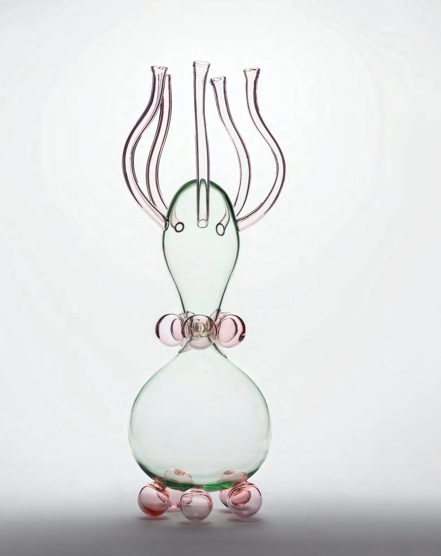
Lebanese designer Tamara Barrage’s collaboration with Studio Comploj (with whom she learnt to master the art of glass-blowing for the first time) has produced a pair of monumental zoomorphic candle holders. These were inspired by antique Chinese porcelain lights found at Schloss Hollenegg (Hollenegg Castle), which houses centuries of collected glass objects, including: Venetian glass imported in the early 1800s; tableware and chandeliers made for the Liechtenstein family by renowned manufacturer J&L Lobmeyr in the late 19th and early 20th centuries; as well as various commemorative gifts.
Barrage’s pieces are a product of her month-long residency at Schloss Hollenegg for Design in Austria last year – which was supported by Lebanese organisation House of Today. Much like design-led non-profit, Schloss Hollenegg’s mission is to also nurture young emerging designers by creating space for design research, thinking and critique. Barrage looked at the history of objects found across the castle, with one sparking her imagination: measuring over two metres in height and composed of blue and white Chinese porcelain bound together by bronze arms. Traces of Light is a result of this study, two large candelabras that play with the idea that things once used to provide light are now used only for special occasions. Barrage’s pieces are therefore more symbolic than functional. Featuring hand-blown glass produced in Vienna by Robert Comploj of Studio Comploj, Barrage has adapted the shapes typical of her work, which is often reminiscent of sea creatures, to the medium of glass. Here, the stacked shapes float weightlessly.
Traces of Light was exhibited last month at an exhibition titled ‘Ashes & Sand’, held in the castle’s historical rooms, which investigated glass while exploring its vast possibilities and potential uses, techniques, innovations and provenance. id
design
16
Run the world
The new Technogym Run prides itself on being the quietest treadmill on the market with the lowest power consumption
No other brand is better known for marrying technology and fitness than Technogym, and since home automation and wellness have become two of the most radical shifts we’ve seen within the home over the last couple of years, it only makes sense that its products – which are the dominant among many hotels and commercial buildings globally – are becoming equally (if not more popular) in private residences.
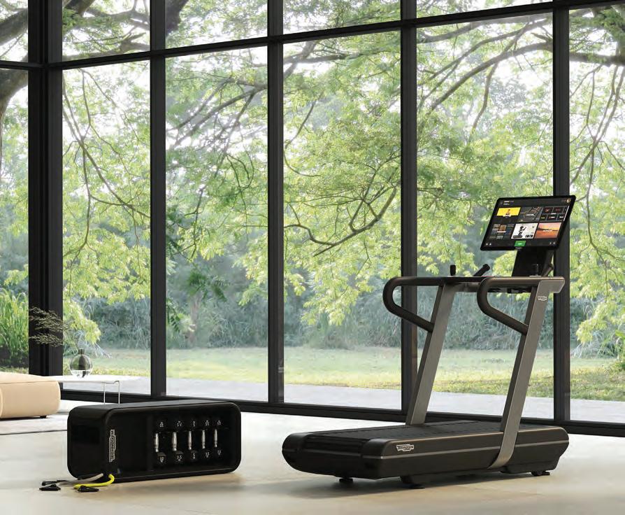
The new Technogym Run – described by the brand as the ‘quietest and lowest energy-consuming treadmill ever’ – offers a single solution for different types of training for the whole family, be it keeping fit, losing weight or improving sports performance, while maintaining the same level of quality and technology found in the best gyms. Here,
you can find an unprecedented variety of workouts, too: from running to power and bootcamp.
The 27” Technogym Live console allows users to choose their preferred training experience from a wide range of programmes and modes (including cardio, strength or high-intensity) or from a library of on-demand video workouts which include trainer-led sessions and routines, as well as virtual immersive outdoor workouts. Technogym Live also offers endless entertainment options (including Netflix, YouTube, TV channels, social media and more).
When it comes to bootcamp, the console also offers exercises and programmes to perform off-treadmill on the Technogym Bench. Designed following the brand’s vast experience as Official
Supplier of the last eight Olympic games, Technogym Run acts as more than just a regular treadmill. Its Slat Belt technology offers the same type of feeling that one would get on an athletic track, thanks to its reactivity and elastic response. The large running surface is suitable for longer strides, allowing for greater freedom of movement and better overall performance.
With Technogym Run you can also train all the parts of the body that are most important to running performance. Its bootcamp workouts enable high-intensity training without the need to leave the house, alternating between running, resistance and floor exercises. For any home gym out there, the new Technogym Run is definitely the one to add. technogym.com
17 THE FUTURE GENERATIONS ISSUE partner content
The hot topic
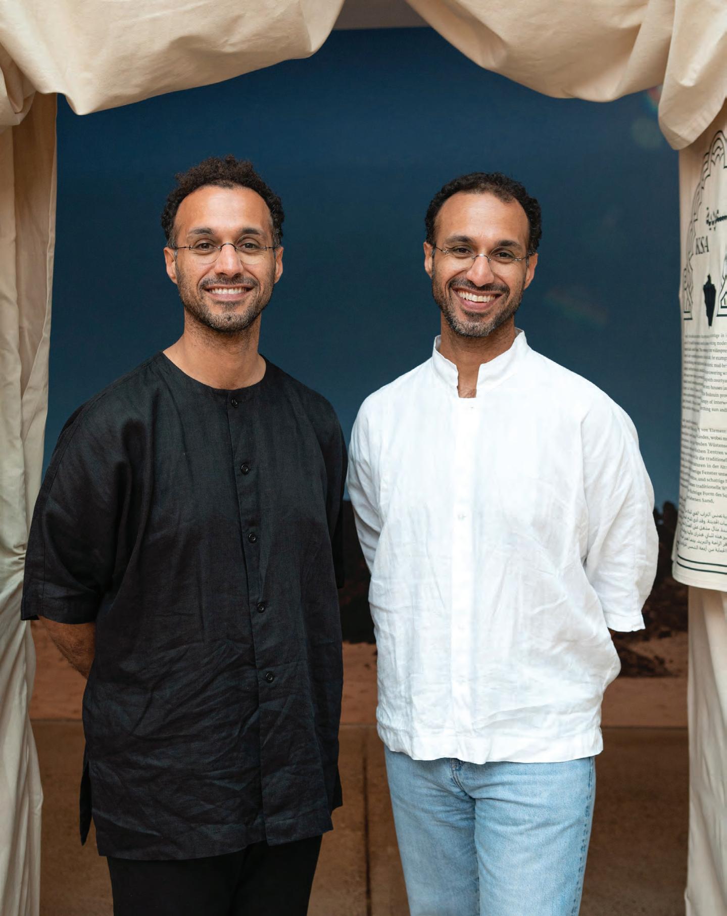
Curated by twin brothers Ahmed and Rashid bin Shabib, the ‘Hot Cities’ exhibition is offering new perspectives on a global concern
 WORDS BY KARINE MONIÉ
Photography by Bettina Matthiessen
After decades of being pushed aside while the gravity of the situation worsens, climate change has now become an ordinary topic with significant impacts that are already materialising, raising questions worldwide. Unfortunately, this is just the beginning.
The starting point of ‘Hot Cities: Lessons from Arab Architecture’ – an exhibition that is currently on view until 25 November at the Vitra Design Museum Gallery, in Weil am Rhein, Germany – was simple yet logical: What better place from which to learn to adapt than one with already very high temperatures?
The exhibition aims to address this serious and complex topic, and is curated by urbanists and publishers Ahmed and Rashid bin Shabib, who were born and raised in Dubai, where they are currently based. The twin brothers studied economics and property development in Boston before graduating from the University of Oxford in the field of geography. Throughout the years, they have gained recognition with their bi-monthly magazine Brownbook, which works as a kind of extension of their research exploring the Middle East’s culture, cities and identity.
Nominated for the Aga Khan Award for Architecture in 2010 and 2019, Ahmed and Rashid more recently won the Golden Lion at the 2021 Venice Biennale of Architecture for their contribution as authors of the book Anatomy of Sabkhas, in which they explored how the natural phenomenon of salt flats has the potential to contribute to the rehabilitation of the natural global order and to more sustainably built environments.
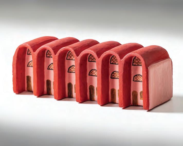
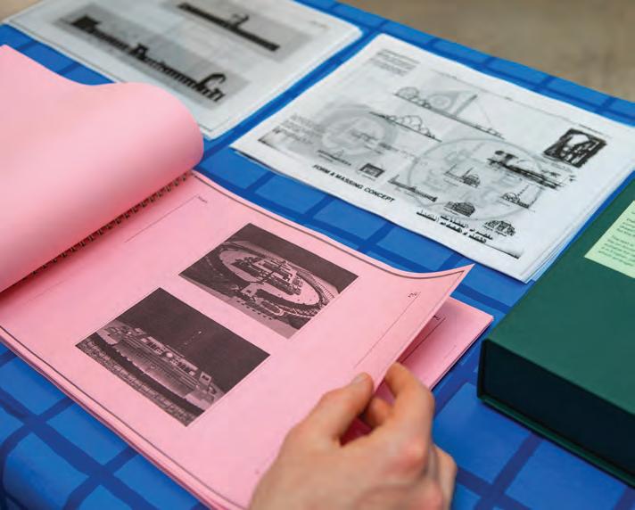
Raising the question of how to live in hot cities, the exhibition is a continuum of this ecological research that develops in three ways. Firstly, architectural models illustrate how aesthetics and climate adaptation are intricately linked. Secondly, the archive features a library of architectural vocabulary for each of the 20 metropoles of the Arabic-speaking world, including Agadir in Morocco, Baghdad in Iraq, Cairo in Egypt, Dubai in the United Arab Emirates and Riyadh in Saudi Arabia, to name only a few. Thirdly, a colloquium allows practitioners and scholars to gather and share their expertise on the topic.
Delving into the architectural and urban strategies used in the region to adapt to extreme heat, ‘Hot Cities: Lessons from Arab Architecture’
puts the spotlight on a variety of periods and styles while showing how architects combine the traditional and vernacular with modern technologies to find the best ways of tackling the challenges of the future. Water towers, lattice screen windows, fountains and courtyard houses, among other techniques, are examined as design solutions and ways for inhabitants to cope with harsh climate.
Instead of prescribing solutions, the curators aim to give the public the opportunity to experience these topics in different ways and learn from the exhibition, revisiting timeless learnings from our past and inspiring new ways of thinking. id
19 THE FUTURE GENERATIONS ISSUE architecture
Photography by Andreas Sütterlin
Photography by Bettina Matthiessen
Right from top: Hassan Fathy, New Baris, Egypt. Installation view Hot Cities: Lessons from Arab Architecture. Opposite page: Curators Ahmed and Rashid bin Shabib
The rule breakers
WORDS BY AIDAN IMANOVA
The expression ‘rules were made to be broken’ makes its case through Oslo-based designers Ali Gallefoss and Nebil Zaman, who – while each having their own individual practices – have recently come together to form a collaborative practice called NIFE, with the aim of exploring the potential that lies in collaboration. While the practice is still in its infancy, the designers are open to moving in any direction based on their common interests. “We’re both drawn to things we don’t know much about, and experiment through making. Perhaps this is [our] unifying factor,” the duo says. “From the beginning of this project, we been very careful not to define what NIFE is about, or [define a specific] vision [for it]. We want to let the project develop as we go along,” they explain. “We think in this way we can keep things fresh and open.”
Having both graduated from the Oslo National Academy of the Arts (although not at the same time), the duo came together after meeting at several group shows in Oslo. They now share a studio, where their shared interests in experimenting with materials and making are being explored. Hailing from diverse backgrounds, from fashion (Gallefoss) to woodworking (Zaman), the designers are interested in learning from each other and creating full experiences for clients and viewers.
Their first project together is the ‘Two Step, Tree Step’ chair made with prefabricated wood stair stringers, bought from a local hardware store, which are typically used to construct outdoor staircases for outdoor porches. As its name suggests, the chair is made with wooden two-step and three-step stair stringers that are joined together with screws and glue and later stained with textile colour and oil. Assembling the objects sparked excitement in both the designers, who are now setting out to put together an exhibition that will showcase a series of variations based on these materials.
Perhaps what also brings the two designers together is their knack for breaking the rules. Zaman came to Norway with his family as a refugee in 1992, fleeing the war in the Kurdish areas of northern Iraq, and has lived in Oslo ever since. “I’ve liked making things since I was a child,” he remembers. “While most of my friends were into sports, I used to draw and build small huts and other things in the forest.”
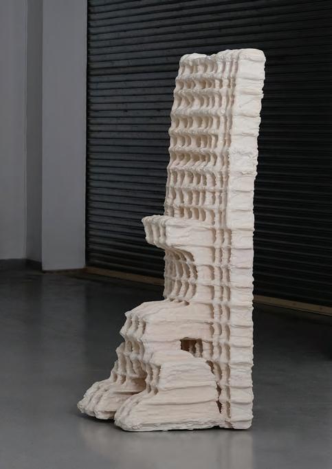
Having first started out working with wood, it was working with plaster that gave Zaman the sense of freedom that he’d been seeking. “I started working with plaster while studying at the academy. Back then, I used to be a wood guy. You know, with my background in woodworking, I only cared about wood and
20 design
From furniture, sculpture and fashion, the diverse backgrounds of designers Ali Gallefoss and Nebil Zaman serve as the canvas for their collaborative practice
 Two Step, Tree Step chair designed by NIFE
worked primarily with traditional techniques in a very strict and precise way. Eventually, I got bored and started experimenting with other materials. When I first worked with plaster, I got totally immersed. It was so weird and different from what I was used to. And very liberating,” he shares. Zaman’s interests vary between design, architecture and technology and the ways they relate to identity and visual culture. “We often think of furniture as only functional objects. But it’s also much more [than that]. Furniture relates to history, culture, taste and socio-economic status,” he reflects. Then there are the questions of materials and how different technological inventions make room for new ways of generating new aesthetics. “I think of technology as tools that can help us make things more efficient, economical or precise. I view a hammer,
digital drawing software or even AI in the same way,” Zaman continues. “They are just tools that can be used in certain ways. I have used digital drawing and fabrication tools in many of my works, but I don’t use them as they are supposed to [be used]. Some of these tools are made to make things very precise, but I’m not interested in that. I use them in a ‘dumb’ way – intentionally. I think this approach can create more unexpected and interesting results. In the end, it’s not what the machines can do that excites me, but how they can be used, as any other tool.”
Gallefoss, on the other hand, grew up between Bergen and Oslo, where his mother – who is a healer and painter – served as his inspiration to carve his own path. “My mother always told me that I could become anything I wanted, and [didn’t put any] limitations on myself or
22 design
Photography by David Gustav Eng
my siblings. I believe [that] her attitude towards life made a solid base for me to break out of traditional Norwegian life,” he remembers.
“Natural materials like stone, wood and clay fascinate me,” he continues. “I am [always] trying to add new materials or try new shapes and combinations to see if I can create something new. I am terrified of becoming a one-sided artist that only has one card to play; being
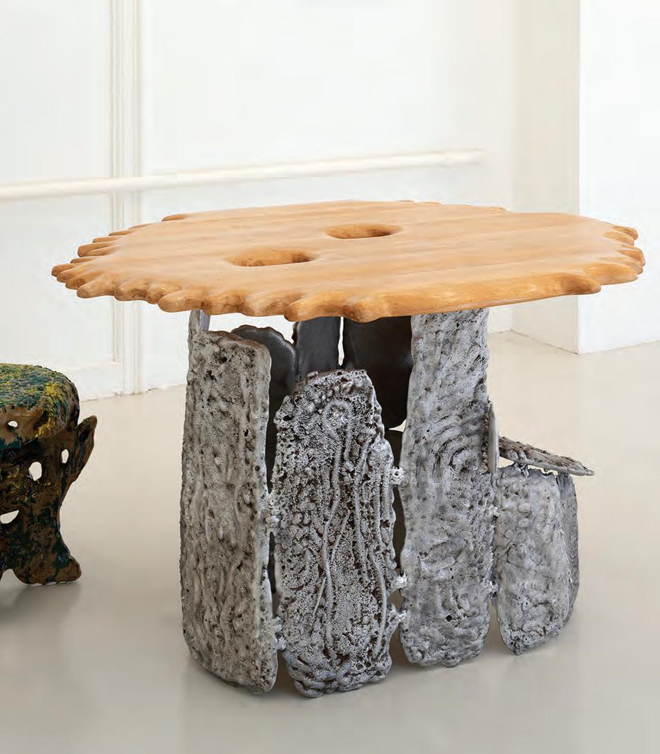
old and stuck in routine and comfort. I think the development and variety in my work reflects this feeling.” Gallefoss recently completed a residency at Numeroventi – a design residency in Florence – where he had a solo exhibition titled ‘Material Myths’, showcasing sand-casted aluminium furniture and sculptures, as well as extruded ceramic sculptures – all of which were made in Florence and nearby areas.
“I have put a lot of energy and time into creating my series of casted aluminium pieces, both before and after the Numeroventi residency. This is the first project where I have explored my experimentations further,” says Gallefoss. “The practical thing about always moving forward to new projects is that I am building a library of opportunity that I can always revisit and develop further.
“My passion is to break barriers for myself,” he continues. “Whether it is by designing furniture, working on spatial design, art or jewellery. I think it is important for the development of the different fields that one moves in-between them.” id
23 THE FUTURE GENERATIONS ISSUE design
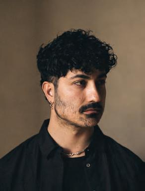
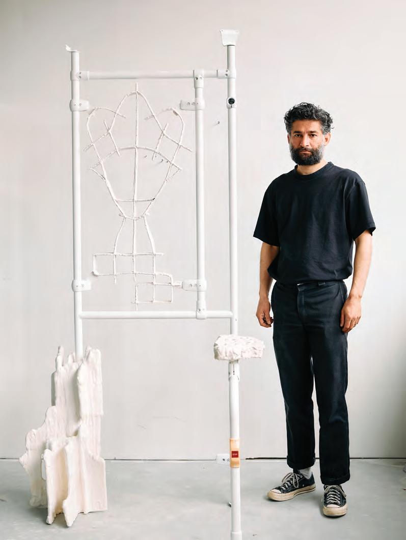
Clockwise from top: A portait of Ali Gallefoss. Nebil Zaman with his Collective Division piece, showcased during Milan Design Week 2022 at Galleria Milano. Standing sculpture by Nebil Zaman. Abstact Landscape, 2021-2023 (cast aliminium, beech) by Ali Gallefoss
Photography by Daniel Civetta
Photography by David B. Torch
Image courtesy of Pyton
Back to the roots
 INTERVIEW BY AIDAN IMANOVA
IMAGES ARE COURTESY OF SAMER SELBAK, © ADAGP
Photography by Yotam Ben-David
Can you tell me a little bit about your background: where you grew up and how/if your heritage plays a role in your work as a designer? I was born and grew up in Shefa-Amr, between Nazareth and Haifa in northern occupied Palestine. My family has always kept a very strong connection to nature, be it through our olive trees, our tradition of foraging, or simply our love for spending most of our time in our surrounding nature.
My first memories are [of being] in nature with my mother and grandmother, walking for hours in the nearby forest, looking for edible plants, wild fruits and vegetables. This has shaped my love for and connection to my environment; learning the names and the traditional uses of each and every kind of plant and tree, how to forage responsibly and how to prepare it for consumption or use, and what to cook with it. These occasions allowed me not only to learn more about the history of my culture, but also to share precious moments with the women of my family, hearing their stories and learning to develop a particular sensitivity to the details in my surroundings.
I grew up being exposed to different cultures: On one hand [was] a traditional Palestinian lifestyle, preciously preserved by my grandparents and shared with us through storytelling, traditions and different activities around food and nature. On the other hand [was] a reality of living in an occupied place where you must always question conventions and fight for your place and for your own truth, and to find different types of compromises and inventions to react to those cultural clashes.
Growing up, I was both fascinated and frightened by these two contradictions, thinking I could only exist in one of these extremities. Today I know that it is part of who I am, part of what enriches me culturally and personally, and what allows me to always see reality in a much more intricate manner. In my work as a designer, I would like to think that this rooted knowledge and sensitivity that I acquired, be it towards nature or towards my culture and traditions,
allows me to see things from a personal perspective. That’s why there is always a place for nature, animals, tradition and people in my work.
Do you have any anecdotes that you can share that perhaps show your early interest or curiosity for design?
My curiosity actually began with photography. My mother used to love taking pictures of us, her kids, and of the daily life around her. Soon enough, I managed to buy my first camera from my pocket money, and since then I’ve never left it. I think this was the preparation stage prior to becoming interested in design. I was observing life around me, as well as observing and questioning my own belonging to my surroundings. I think my mother brought to all of us a certain sensitivity and inclination towards beauty, and it too was present in anything she did with us – from how we dressed to the pastries we would make. I always helped at home with pastry-making and anything that had to do with creating perfect shapes that demanded a lot of attention to details, especially in my family where perfectionism is a shared curse. Both my mom and my dad were always good with their hands, and very much creative people. I guess this has left a mark on me as well.
You mention that your work connects aesthetics with politics. Can you expand a little more on that and give an example of where this intersection is present in your work? Being Palestinian has so many different ways of showing up in your life choices or your work. There will always be politics in anything I create, even though I prefer to think about my work [as being] beyond politics, and that it is somehow naturally woven into it.
I think that through aesthetics we can tell a story that can resonate with different people, and by doing so we can introduce or treat a political subject without it being the centre [of the work]. I do not find politics to be particularly beautiful, but I do think that design and art can be powerful tools to raise such questions. Sometimes showing certain types of beauty can be a political act.
25 THE FUTURE GENERATIONS ISSUE design
Palestinian designer Samer Selbak looks to his love for nature, his respect for tradition and his rich heritage to remind us that design is a powerful tool for change
In my work, there is always a story that connects the aesthetics with the political and cultural aspects, altogether. The Luffa project, for instance, was born from the idea of having an indigenous plant that used to be an everyday part of Palestinian culture, and that I stopped seeing around while growing up. It all began with a memory I had from my childhood, of seeing the huge Luffa fruits at my grandparents’ yard, which were bigger than me, and wondering why they disappeared. I wanted to remind my people of it, and to use it in a way that is different to its traditional use as a natural sponge.
It is always very emotional for me to see how the simple fact of working with this material reminds people of its existence, brings back old memories and resurfaces a forgotten interest and love for something we were in the process of being alienated from. I’ve had numerous encounters where people came up to me and told me how much it moved them to see these designs because it brought them back to their own childhood memories. When a woman from Morocco tells me it brought her back to her own family memories, it is definitely political;
it’s about bringing people together through our shared experience and about finding a way to keep this precious thing alive. Do you think design could be used as a tool to inform about bigger world issues and do you think it is being utilised enough within that sphere? I think the design world is changing right now, from a white-dominated field to a more inclusive and open environment. It’s quite a challenge finding your way into a well-established field when coming from a less privileged part of the world. You have to stand behind your ideas and beliefs even when you’re all alone. You have to fight harder to express and insist on your point of view, because sometimes you find yourself in front of someone who comes from a very different cultural background. Living in Paris for the last eight years has taught me many things, especially how to appreciate and value my own distinctiveness and how to turn it into my power. Not fitting in was always where I’ve fit in, and it becomes a blessing when you learn how to manage it. Design is an amazingly powerful tool that can have a concrete impact on people and on life in general. It can create real change, especially
within marginalised groups and in cultures that have been long left out of the conversation. The impact of the design world on the environment and on the planet is huge as well, so we need to assume responsibility as designers and do everything we can to work towards a change.

I think that people who are marginalised need to find endless ways to survive and adjust, to question the dominating cultures’ conventions and to work around them, instead of living by them. It is so important to listen and learn from people who do not fit into the main culture that controls the narrative. This is something that needs to be taught and encouraged – and we can already see its positive impact, changing our reality for the better in every field.
We should be working on creating a future that includes everyone, and that asks all the questions prior to making choices that could end up affecting humanity as a whole. We see it very clearly today: how the vanity of Western capitalistic logic leads to horrible consequences. We already understand what we get when we do not practice this kind of openness and consideration: a world full of injustices and inequality that profits only
26 design
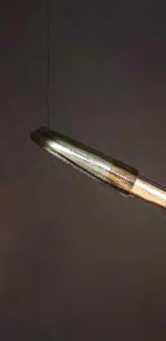
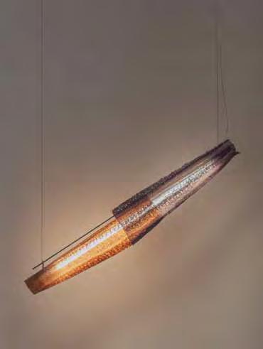
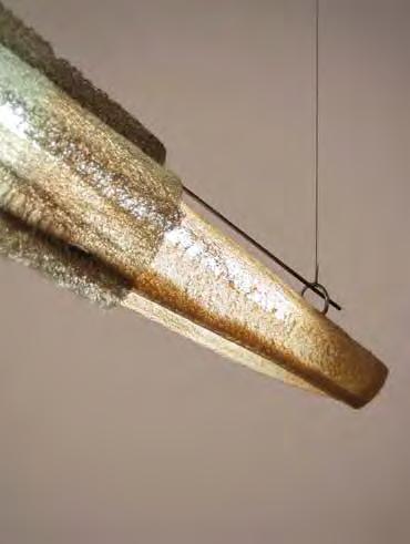
The Safeer pendant light – part of the Luffa Project
a fraction of humanity. But I think that there is much work ahead – the fight has only begun. Can you tell me more about your interest in tradition and what that means to you? I remember how I used to be afraid of tradition when I was younger. I always tried to run away from it and run towards the Western world’s ideas and values. With time I got to see and experience how our traditions were destined to be ridiculed and reduced into stigmas and racism. From this moment on, I started seeing and discovering the beauty in traditions, questioning myself about choices and ideas that I’ve adopted, and that were forced onto our cultures.
With design as a tool, I aim to shed a different light on the beautiful parts of our traditions, rather than continue living by what the West had imposed on us and what we might have internalised ourselves. I hope to empower my people and to show the world how these ideas and practices, that have been surviving for hundreds and thousands of years, should be appreciated and could help in building a better world. When you see the difference between the way in which tradition and indigenous knowledge af-
fect the way a group treats its environment, understands it and works with it instead of against it, you begin to understand the importance and the power of such things. I always joke with my family about how, with every year that goes by, I understand more deeply how my grandmother is always right. Our elders know best, and we should never forget or fight that. As newer generations, we should be critical of old ideas that may have expired, and re-examine and rethink some traditions, but all the while we must listen carefully and respectfully to our predecessors. Many of them hold so much intelligence and can help our generation create a better reality. What intrigues you about natural materials and how do you relate that to your interest in tradition? Working with natural materials means entering into a very intimate relationship with the material. Unlike industrial materials, where the whole production system is defined and the rules are clear, natural materials demand a deeper understanding. You have to discover everything on your own and instead of imposing your ideas on it, you must first let it teach you about itself. Thanks to this long jour-
ney of discovering, you have the chance to be critical of your choices, be it the production process, the material use, the waste you create, etc.
When you work with a natural material, it obliges you to be very creative during the different stages of the process: where to find the material, how to treat it, what to do with it, and how to appreciate its natural characteristics. You develop a different kind of respect for the material and hence for the work you do with it.

Working with Luffa, for instance, was very complex. Since I was so used to thinking about it as a bathing sponge, I needed to break free from my mind’s restrictions, to observe it and play with it and to challenge my imagination. Then [I moved to] researching the material, studying its behaviour, appreciating its strengths and accepting its weaknesses – it all demands a lot of patience and trial and error. But after all the difficult moments of failure, when you finally discover something about the material, when you succeed in valorising it, it is a different kind of payoff. It’s a strange feeling of excitement and accomplishment that I’ve never experienced before while working with industrial materials.
27 THE FUTURE GENERATIONS ISSUE design
This is the intimacy that I speak of; it’s between you and your discoveries and it feels like the synthesis between the human imagination and the great powers and restrictions of nature. It was imperative for me to respect the natural aspect of the material, and not to force anything on it. That’s how I started researching natural dye as a technique, in order to achieve the aesthetic that I had in mind, by extracting natural pigments from different plants and vegetables, which are traditionally used for the same purpose in Palestine. I think natural materials and tradition are deeply connected and they feed off each other. It is the special relationship between natural materials and tradition that interests me and enriches my work, and it is in the back and forth between the two that I find inspiration. Can you tell me more about your Luffa project? The Luffa project began with a feeling of longing for a receding memory of the Luffa plant. I wanted to find a way to bring it back to people’s thoughts, and today I see how it brought it back into their hearts more than anything else. Many of my friends, family and the people I’ve met while working on or showing my work have been suddenly planting and growing Luffas as a result of seeing this project. I find that amazing and it fills my heart in so many ways.
From this souvenir, it then quickly turned into a project that has nature at its centre. I am always in awe of nature, and this was an opportunity for me to pay homage and express this awe by way of design. I am often saddened by our detachment from it as human beings, and I wanted to bring natural and wild elements back into our lives and our homes. I would like for my pieces to be able to raise awareness about what we’re doing to the planet, to other animal species, and to ourselves.
The project began with two different sculptural pieces: Saffeer which is a pendant light, and Reef, a space divider. Since then, I’ve been working on developing new forms and new
material combinations, one of them being the Luffa ceramics that I am developing now.
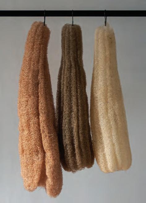
Aside from the process of understanding the material, I went through a long formal process of playing with texture, transparency and shapes, in order to come up with a new aesthetic. So, if the material and its treatment evoke tradition and nature, the shapes express innovation and experimentation. I think this synthesis is a very accurate self-portrait. With the Luffa ceramics, can you expand a bit more on your material exploration and what stage you’re at? The Luffa ceramics [project] is an ongoing material research revolving around Luffa fibres and ceramics, in which one suspends the other in time, creating a fossil-like material and shapes. I’m interested in creating objects that evoke the idea of living organisms frozen in time. The next stage for this project is to find funding, and partners to develop it with.
It is obvious that the natural world is of importance to your work and drives many of your projects. Can you tell me more about your intention of working with a ‘sustainable’ approach? I think that working with a sustainable approach should become one of the bases for designers today. I always come across these questions while working on anything, as it is my responsibility to create with awareness and to learn how to find new and alternative ways to solve problems and how to think deeply about consequences. Personally, I feel much more accomplished when I challenge myself to find creative ways not only to not harm the planet, but also to benefit it. I am always humbled by what I can learn from nature, animals and long-proven sustainable methods and practices.
For me, design becomes much more interesting when it serves those without a voice, or those facing difficulties. That’s why I would like to continue exploring ways in which I can take care of wildlife, for example, in my future work. How do you see the role of the designer today, and how do you see your own work reflecting this direction? The designer today is a person who thinks not only through values of aesthetics and profits, quantities and power. It is a person who has a great responsibility towards other people, from different parts of the world and societies, responsibility towards the environment, and respect for different approaches and beliefs. Someone who is capable of listening, questioning and learning while exploring their ideas and work. I aspire to continue my exploration of finding new ways to design, to always ask the difficult questions and to be critical of the choices that I intend to make. There is so much beauty in simplicity, and I feel like the world has always been generous with us human beings and has always provided us with more than we need. I hope we stop exploiting and exhausting the planet’s limited resources and accept that it is time for us to appreciate what there is, and make the best out of it. id
28 design
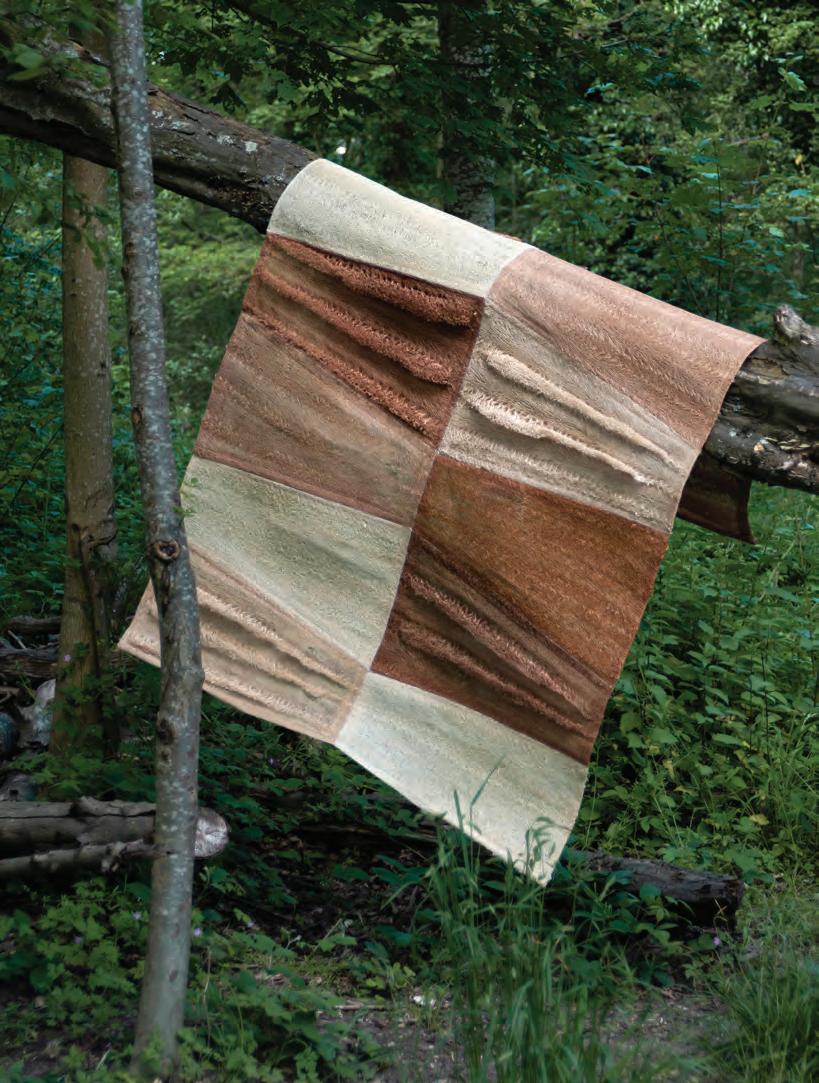
This page: The Luffa Project centres around the Luffa plant that has been widely used across Arab cultures for centuries. The objects in the collection are coloured using traditional natural dyes. Next page: The Reef space divider is made of dyed Luffa fibres and sewn in a trapezoid shape. The plant fibres are both durable and biodegradable

 Photography by Mohammad Taqi Ashkanani
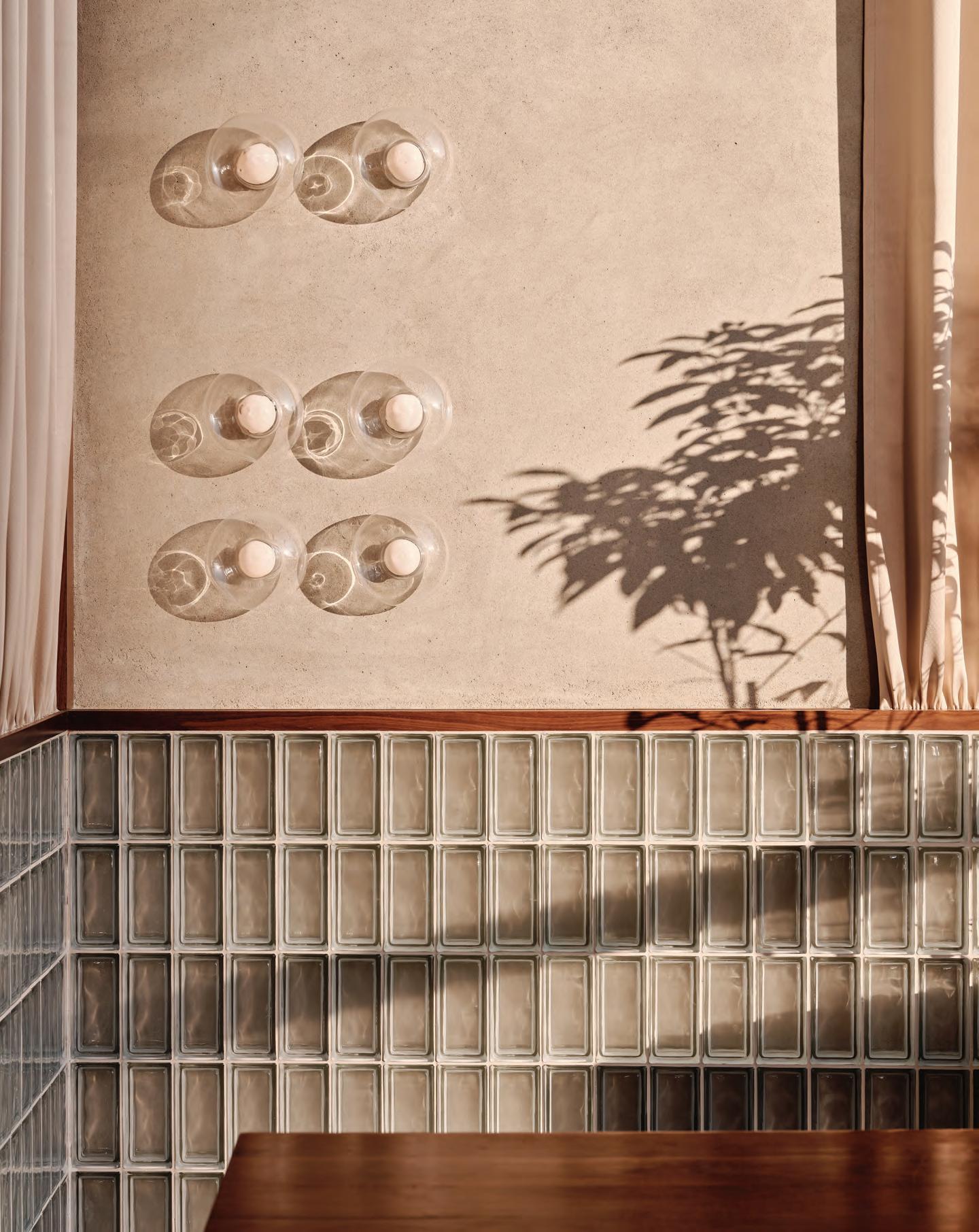
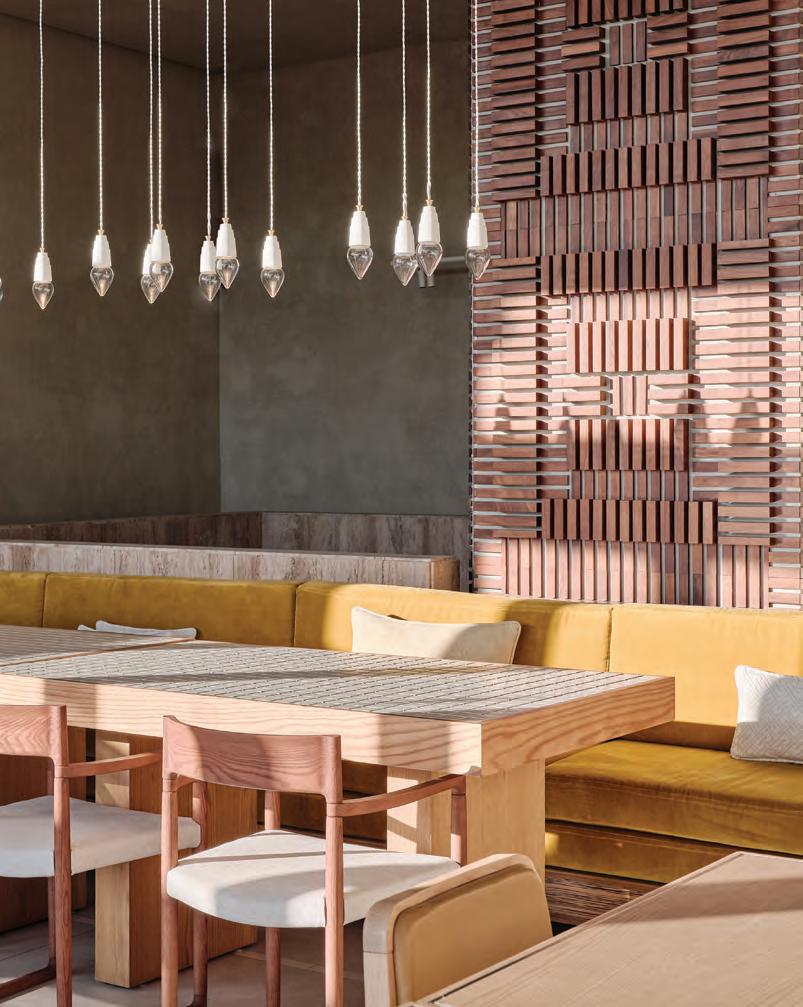
This page and opposite: Toplum restaurant in Riyadh, Saudi Arabia
Setting the scene
Timelessness and context form the core design ethos of Studio Baab, whose recent projects have solidified its place within the regional design scene
 WORDS BY AIDAN IMANOVA
31 THE FUTURE GENERATIONS ISSUE interiors
“Iwant to say that Studio Baab started long before it did,” begins Ghida Chehab, co-founder of the Dubai-based practice. “Moving to Dubai from Beirut, I struggled to find a home for the voice I wanted to express in design. Throughout my career I [was constantly] shuffling between architecture and interior design. I [finally] wanted to explore myself as a designer and craft my own path in the industry.” Chehab was born and raised in Beirut, Lebanon where she studied architecture at the American University in Beirut. The interior design studio was established at the beginning of 2022, a year after the young designer’s first independent project: designing the Aptitude Café at the Louvre Abu Dhabi. “Everything fell into place and grew naturally,” Chehab reflects. “We are still a boutique studio, growing with each passing day. This past year we focused mostly on defining our philosophy as a studio and concretising our identity and ethos.”
Its name draws inspiration from the word ‘baab’ (meaning ‘door’ in Arabic), which symbolises the opening of a new experience. This is the feeling Chehab wishes to express, where every project is a renewed exploration of space. The studio’s aim is to create timeless and contextual architecture, with a story at its core.
“Studio Baab focuses on the curation of spaces where form, rhythm and flow are considered,” Chehab describes. “We always like to begin by
highlighting and emphasising the existing features [and later] envisioning how we can define a balanced composition from it. I believe that, to set the right tone in any project, we always seek the use of natural materiality and lighting that sets the mood within the space.”
Toplum – a restaurant in Riyadh, Saudi Arabia – was the first project under the studio’s portfolio, and one that applied the most pressure. “I remember having a recurrent thought, which was ‘how [am I to] design this space considering [that it] is our first project and will have an impact on defining our character?’,” Chehab remembers.
“[But] I always tried keeping in mind the identity I wanted for Studio Baab and the impressions that I wanted to avoid. I made sure that the design focused on a neutral colour palette, using wood as a contrasting and eclectic feature within [the space]. Since then, we have instinctively used wood as a material in most projects and have realised its endless potential,” she says. Toplum’s architecture features clean lines, shapes and rhythmic patterns that reflect a geometric simplicity. Studio Baab combined architecture with craftsmanship, focusing on elements and materiality for refined detailing. Clayworks’ raw natural earthy clay was used throughout the surfaces, contrasted by the combination of clay and wooden blocks in different shapes and sizes. The overall calm atmosphere is contrasted by the mustard colour used for the fabrics and defined
by curating atmospheric lighting designed in collaboration with Beirut-based Fabraca Studios. Its most recently completed project is a chocolatier in Dubai’s Alserkal Avenue, called Ganache. “The thought behind the space was to create a captivating geometric flow that emulates the layering of the chocolate yet maintains a calm and warm experience for the user,” Chehab describes.
One can immediately sense the duality in its design: at once soft in its curvature yet grounded in the industrial features of its context, which have been intentionally maintained. The space becomes an unravelling experience of movement through an architecture of organic volumes, mimicking the organic process of chocolate-making, defined by a series of niches that target the different experiences within the space, from seating to retail and custom gifting. Delicate suspended lights featuring the 21 series by Bocci were used in the niches of the entrance, which later unwraps into a vast open ceiling of varying volumes, featuring a central Moby Dick lighting feature by Karman, which flows above the main retail space.
Following the success of Ganache Chocolatier, the studio is currently working on a range of projects in the region, which – in addition to interior works – is slowly encompassing architecture.
“Having personally pursued architecture as a career, the vision is to be a multidisciplinary design studio, focusing on both architecture and interior design,” Chehab concludes. id

32 interiors
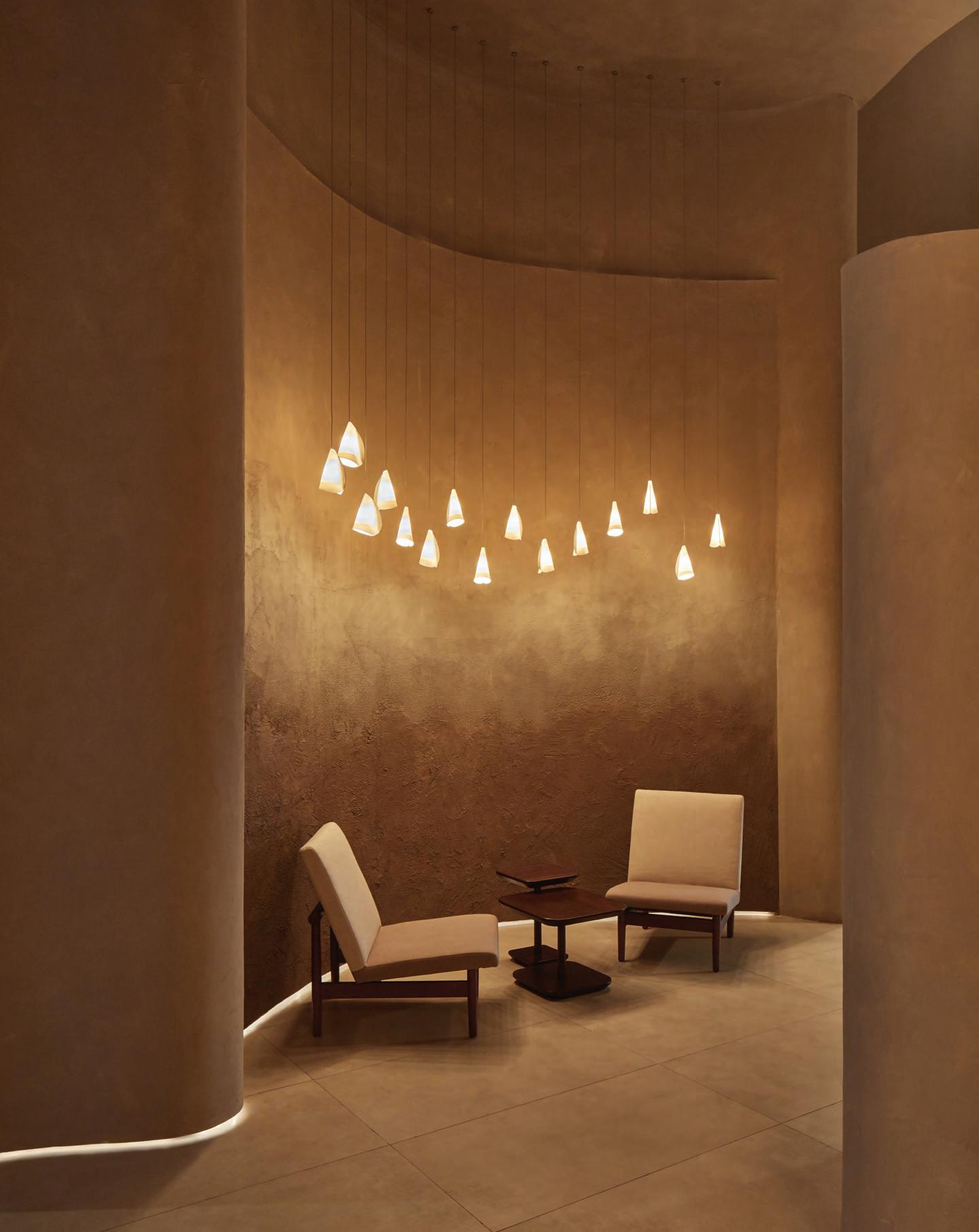 Ganache Chocolatier in Alserkal Avenue in Dubai
Photography by Oculis Project
Fluid thinking
WAYOUT’s minimally designed showroom aims to educate residents about the importance of water security
 WORDS BY AIDAN IMANOVA
PHOTOGRAPHY BY NATELEE COCKS
34
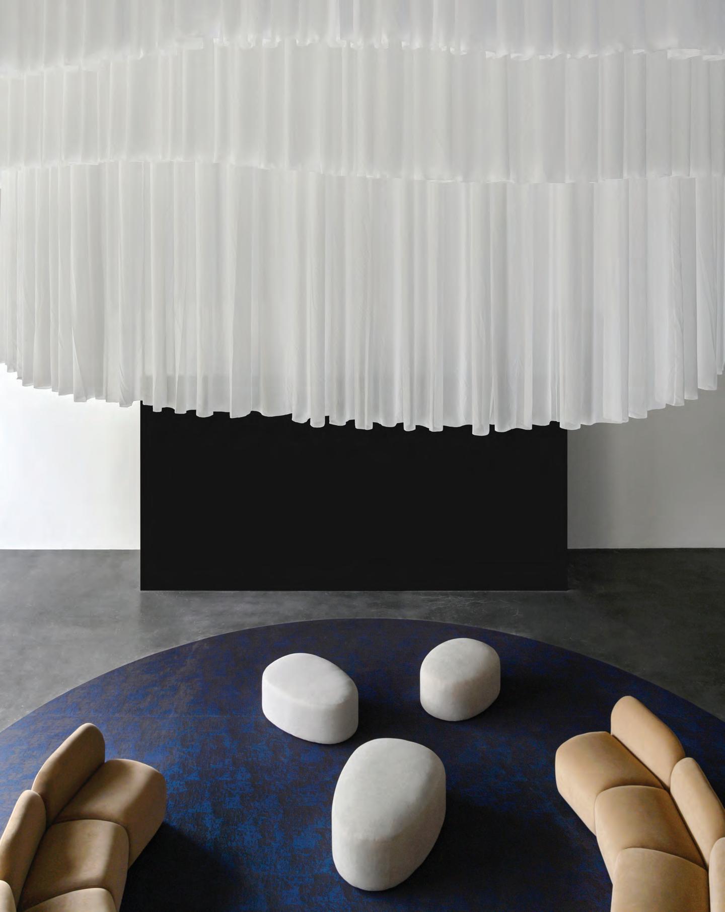
In recent years, the UAE has demonstrated substantial growth in its economy, population and development across a wide variety of sectors – from education to infrastructure and urban development – and yet it faces impending challenges when it comes to water resources and security, currently relying on desalination plants to supply 42% of its drinking water. Its ‘UAE Water Security Strategy 2036’ programme – launched in 2017 – aims to ensure safe drinking water by addressing not only long-term supply and accessibility issues, but also the water security challenges of the years ahead.
Enter WAYOUT, a Swedish water tech company that recently set up its first international outpost in Dubai’s Alserkal Avenue – with a site-specific global showroom designed by Dubaiand Stockholm-based sa|design studio, led by Shad Askari, and inspired by its sustainable technology and east-meets-west approach.
WAYOUT’s innovative water system converts any type of source water into drinking water, with a purification, distribution and dispensation system that has also been developed to reduce
the use of plastic bottles and the overall carbon footprint. According to the brand, a single WAYOUT system produces up to 20,000 litres of mineral water a day – enough to provide 10,000 people with their daily drinking water – while simultaneously preventing up to 13 million plastic bottles and 1,400 tonnes of CO₂ from entering the ecosystem yearly.
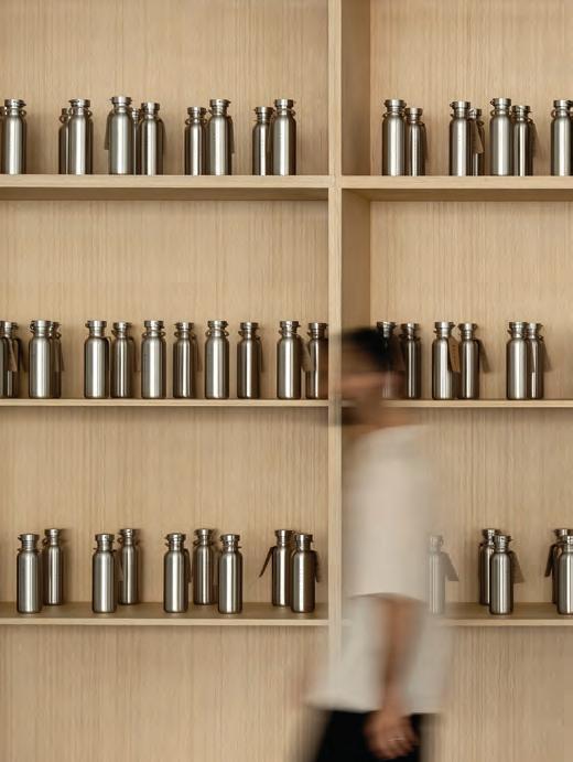
By installing digitised eco-friendly water systems in various neighbourhoods in the city (which are 100% locally sourced and include smart pods and kegs), the aim is to transform the area’s water supply by working with local water users, communities and experts to help accelerate the progress of water production in the region.
The showroom itself is set opposite the brand’s outdoor micro-factory where kegs are cleaned and refilled with drinking water, and which features a stainless steel façade that was the first point of inspiration for the interiors. The use of this material continues from the outdoors to the entrance tunnel that leads inside the showroom, creating a sense of continuity. A ripple-effect ceiling feature continues the metaphor of water

inside. “Water itself is very sexy so [we decided] to implement it in the design as a [defining] element,” says Askari, who also cites the Swedish mountains and deep forests as other points of inspiration, in addition to the brand’s sustainability values. Many of the items in the minimally designed and furnished space are custom-made, including a table on the mezzanine floor (which doubles as a work and meeting space) made from recycled wooden floor tiles from Kährs by Nordic Homeworx.
In the centre of the room is a 12-seater semi-circular sofa and pebble-like poufs set under a Bolon rug. Above, a series of lightweight fabrics hangs like an abstract curtain. Askari explains that it was designed to add to the water elements in the space, whether interpreted as a rain cloud or, more technically, a filtration system. In the centre of the room is a 3x6-metre screen that doubles as an education tool for visitors.
While design elements are kept to a minimum, the new space sets out to do what was intended, which is to educate more people about the importance of water. id
36 interiors
@identityae The latest architecture, design + interiors news, now online
Home in Ghazir, Lebanon designed by Karim Nader. Photography by Walid Rashid
The art of living
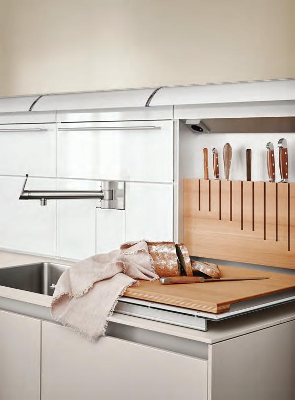
bulthaup’s kitchens are designed to put people first
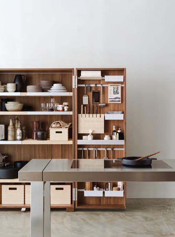
The kitchen comes alive thanks to the human energy around it,” says the CEO of butlhaup, Marc O. Eckert. He is the third-generation owner of the long-standing German kitchen manufacturer, whose ethos has remained consistent since its founding in
1949: putting design and craftmanship at the forefront of its products. Not long later, in the 1980s, the son of the founding CEO – Gerd Bulthaup – took over and pioneered the research and development collaboration between the company and designer Otl
38 partner content
“
Photography by Claus Brechenmacher & Reiner Baumann Photography
Aicher – a project that revolutionised the kitchen, creating the ergonomic, multi-functional spaces that are being enjoyed today.
This premise still stands now, with the brand’s signature collections transforming the kitchen into a space that isn’t tucked away from view, but instead set at the centre of the home as a place for socialising and human connection.
“A perfect kitchen is ultimately one that doesn’t draw attention to itself but puts itself at the service of its occupants,” Eckert continued. “It’s one that promotes interaction and intimacy between people and creates an environment for a special shared moment.” bulthaup believes that before style, a kitchen should be practical, well thoughtout and, above all, produced with quality materials. Aesthetically speaking, the brand’s designers believe that ‘less is more’ and tend to opt for
minimalism and timelessness in their designs. They work with a clear language of form: making things as simple and clear as possible. By doing so, the kitchen does not compete with its environment, and instead provides a stage for its users.
The brand has long stood for multifunctional kitchen spaces that are able to cope with people’s changing needs and habits. Each space must benefit from the best possible planning, with an attractive design that fulfils its new functions and makes its occupants feel comfortable.
Therefore, all bulthaup’s kitchens open onto living spaces to encourage the house’s inhabitants to circulate from one room to another without losing a sense of connection. The bulthaup b3 island, for example, is designed as a connecting element between the kitchen and living space. Because it features a diverse range of layout
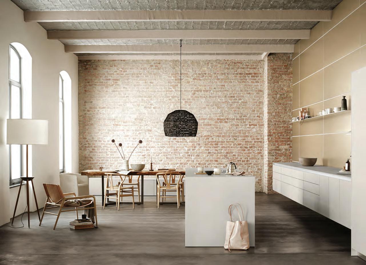
options – whether a purist kitchen island or a space-maximising functional wall – the customer is given the freedom of design.
A further system, the b2, is all about combinations: mixing and matching between the kitchen workbench as well as the tool and appliances cabinets. The designs are elemental and clear in form, while rational and practical in function. To fully enjoy one’s space, the bulthaup b2 transforms the kitchen into a workshop offering an abundance of freedom to move around and a unique organisational principle.
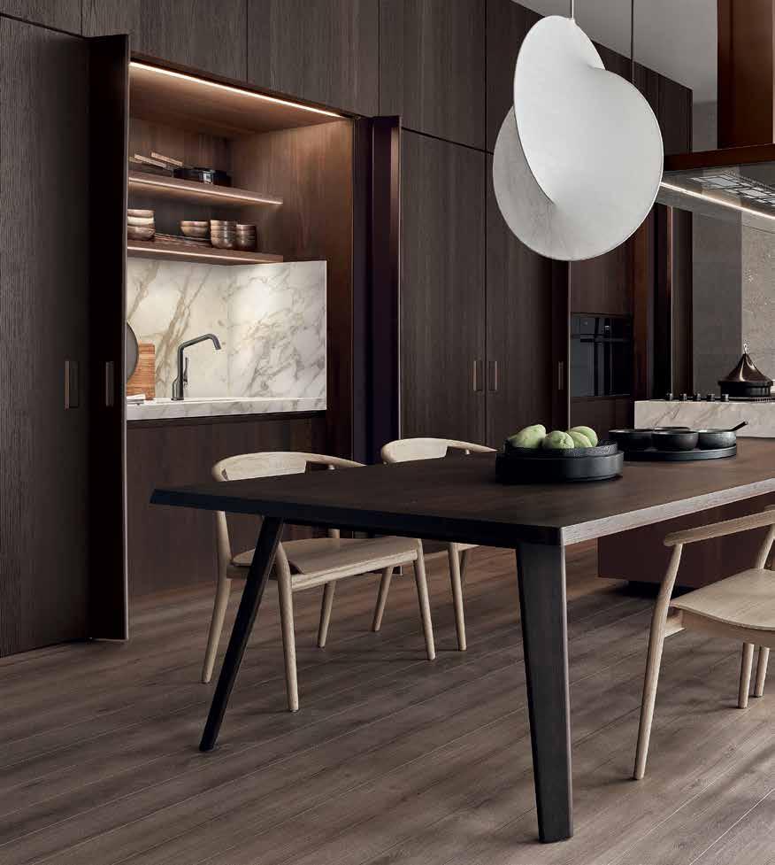
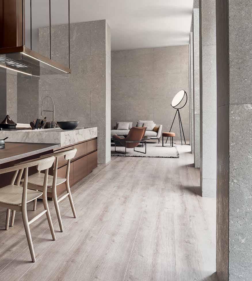
It is these elements of freedom, organisation, flexibility and minimalism – combined with top-tier craftsmanship and design – that make bulthaup’s kitchens ones to remember. bulhaup is available in the Middle East at Obegi Home. obegihome.com, bulthaup.com
39 THE FUTURE GENERATIONS ISSUE partner content
Photography by Ditte Isager
A feast for the eyes
Kitchens have become – in many homes – one of the main centres of attraction. Here, we explore some of the latest contemporary kitchens that are helping define the living space
 WORDS BY AIDAN IMANOVA
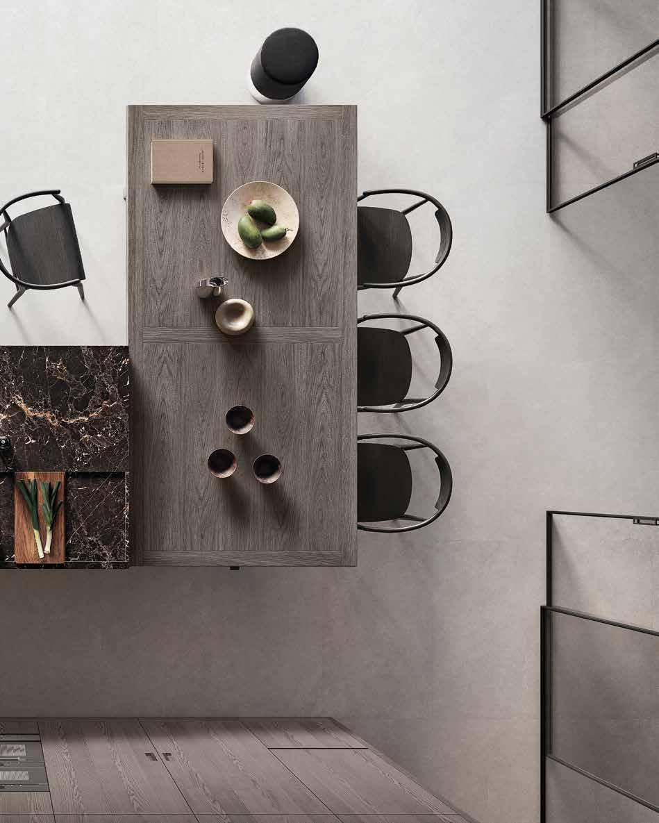
Shared moments
Designed as a symbol of conviviality and connection, the Convivium collection designed by Antonio Citterio for Arclinea acts as an open space: a kitchen that turns the acts of storing, prepping and cooking into shared rituals. While first conceived in 2022, the collection has evolved to consider all the latest needs for living spaces. Here, the kitchen flows into the living room, becoming the focal point of the home thanks to the work island with large built-in wooden table. A large, accessorised wall also teams with the work island and provides unobtrusive storage for food and tools, while in the middle stand two units, hidden by New Pocket System disappearing doors, that can open up to share various activities.
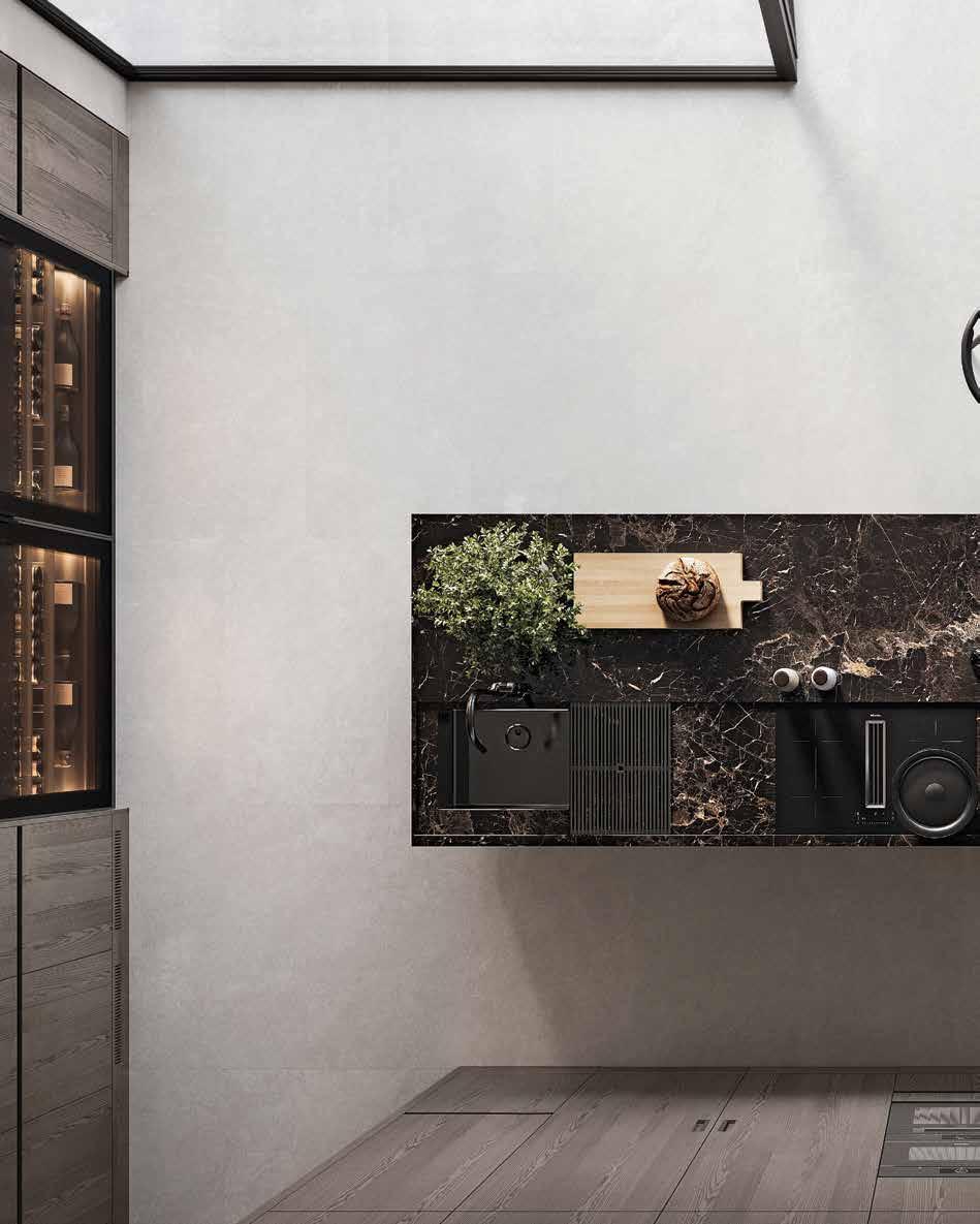
Monolithic forms
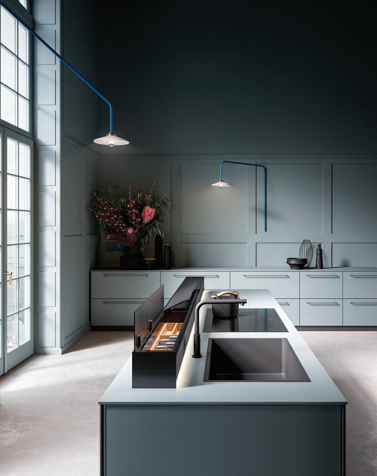
Part of Falmec’s exclusive new Elements collection, Monolith is all about solutions, where designs become increasingly flexible and functional. Comprising a packaged range of features, the 90-cm hood module in the new worktop can be complemented by various-sized storage modules offered in a range of layouts to suit individual styles and spatial requirements. In addition to housing everyday kitchen
utensils, the storage modules also contain plug and USB sockets to make life in the kitchen as practical as possible. Like the storage modules, the hood unit has an aluminium structure with a sophisticated matte black finish and polished glass panels at both the back and the front. In addition, the entire system is fitted with ambient lighting to produce an attractive suspended effect and mark the boundary between the other items on the worktop.
Modular mode
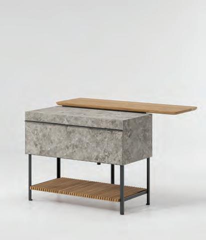
Kettal Studio’s Base kitchen is all about modularity and infinite solutions. For example, an aluminium supporting frame can be teamed with a number of stoneware modules in various combinations while still maintaining the kitchen’s authentic, linear design. Featuring clean, smooth surfaces with no corners, Base is designed for easy cleaning and maintenance – especially useful for the outdoors. It is available in two types of stoneware and two Iroko wood finishes for the doors. Along with basic kitchen functions, Base also has a gas barbecue and can include several burners as well as a bar.

43 THE FUTURE GENERATIONS ISSUE kitchens
Texture play
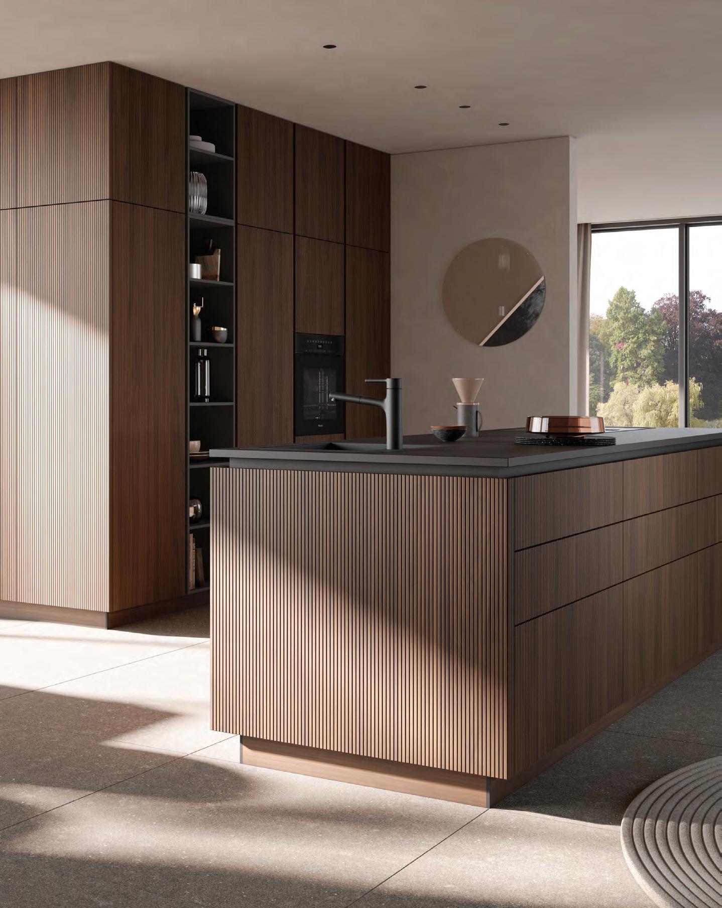
Texture plays an integral role in creating cohesive yet dynamic interiors, and kitchens are no exception. This new grooved cabinetry from Häcker Kitchens exemplifies the elegant use of texture. Released for the 2023 collection, the fluted real wood veneer is carefully crafted in Germany in three different shades of light oak, black oak and walnut. When used alongside glass cabinetry or bold, flat fronts, the combination is a striking one that leaves an instant impression.
Stone cold
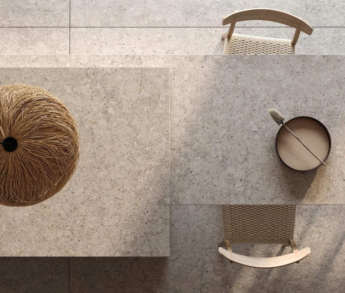
Surfaces brand Cosentino Group has recently added a new collection to its Dekton series of high-performance, ultra-compact stone. Designed by Argentinian designer and architect Daniel Germani, Pietra Kode is a reinterpretation of the timeless beauty of three classic Italian materials (Vicenza stone, Travertine marble and Ceppo di Gré) and pays homage to the beauty of Italian architecture. While it looks back to the past, Germani’s collection showcases a future-forward attitude, where the stones are decoded then recoded within three Dekton concrete series, enhancing their properties and possibilities for design and architecture. Featuring an array of rich shades and textures, the carbon-neutral Dekton surface offers the kitchen a rich traditional tactility that perfectly complements a contemporary interior.
45 THE FUTURE GENERATIONS ISSUE kitchens
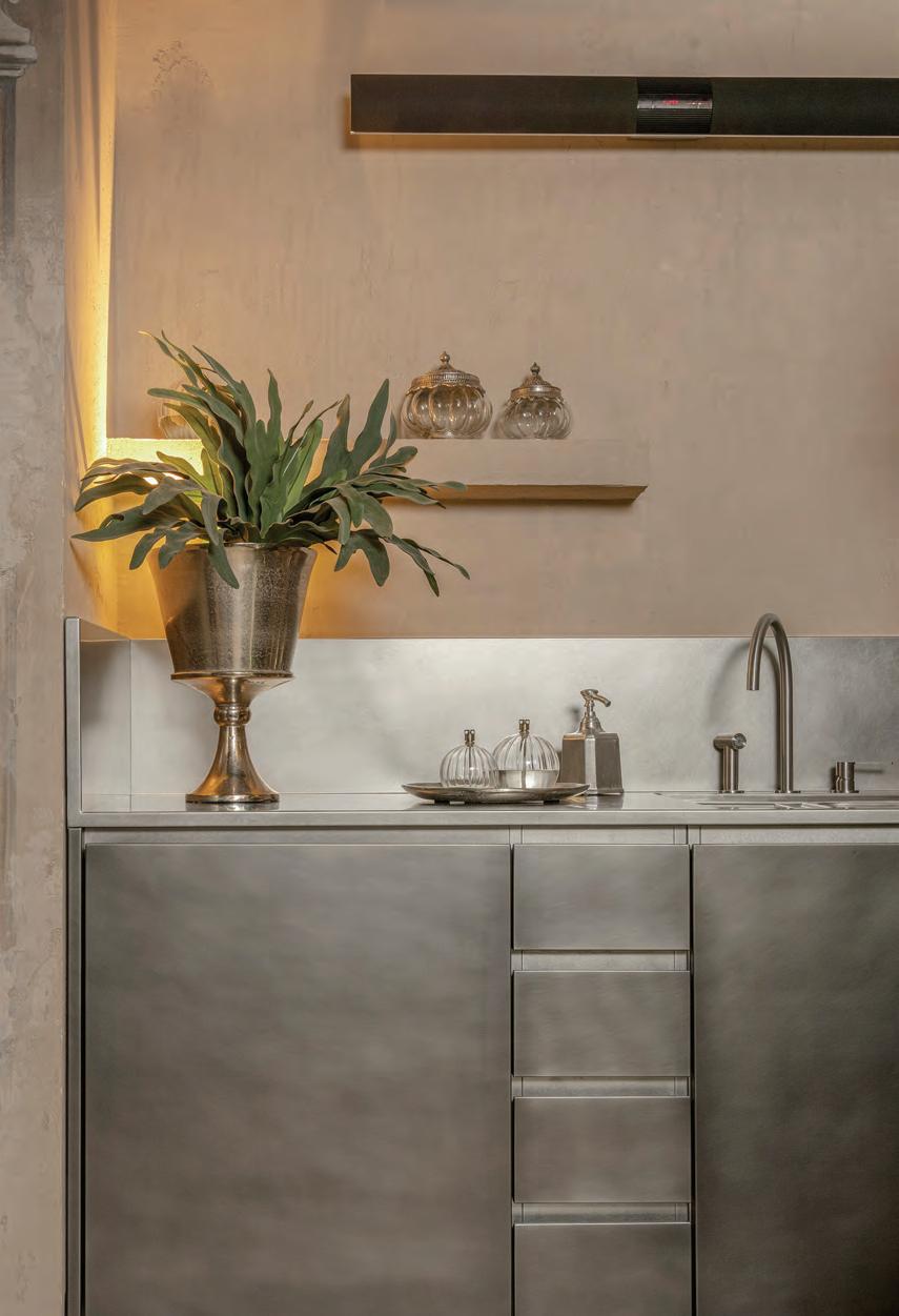
Custom-made Personalisation is at the heart of Abimis’ Atelier kitchen which, while highly customisable, remains true to the brand’s philosophy of creating functional luxury kitchens with stainless steel at their core. All possible materials can be used to contrast with the coolness of the stainless steel, from stone, marble and wood to synthetic materials such as Corian. In this residence set in Civita di Bagnoregio in central Italy, for example, the wall-mounted kitchen opens to the living and dining areas as a single spacious environment characterised by stone arches, plaster and floors in warm sand and ivory tones. The stainless steel features a sophisticated burnished finish to match the more traditional architecture, enhancing the style and contemporising the space. id
46 design focus
Choose from our extensive range of authentic Thesiger photographs.




PERFECT DECORATIONS FOR HOTELS, OFFICES AND HOMES.
Framed or unframed prints available exclusively from The Arabian Gallery
USE CODE FESTIVE10 AND GET GET 10% OFF

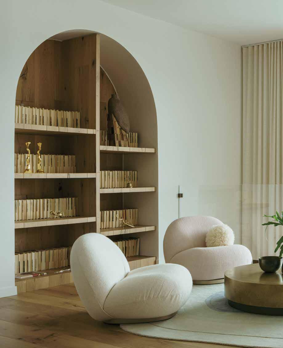 The space features the Edra Cipria sofa by Fernando and Humberto Campana, Gubi Pacha chairs, Baxter coffee table, CC-Tapis carpet and Ochre pendant
A peaceful refuge
Yana Molodykh transformed the interior spaces of this apartment, with breath-taking views of the mountains and Lake Lugano, for two of her long-time creative friends
 WORDS BY KARINE MONIÉ PHOTOGRAPHY BY VIGO JANSONS

For busy couple Sergey Sozanovsky and Irina Kostyuk, prioritising family and friends is essential to creating a balanced, healthy lifestyle. Sozanovsky, who is the owner of one of the biggest film studios in Ukraine, and Kostyuk, a TV and film producer, understand the importance of taking time to pause and recharge. This apartment is a clear response to that necessity.
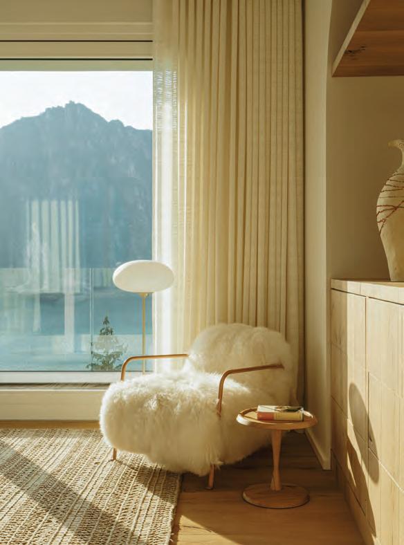
Located in the region of Lake Lugano, in the small town of Campione d’Italia, the apartment is ideal for two reasons: first, it provides exceptional views of the surrounding natural landscape; second, it is situated close to Sozanovsky and Kostyuk’s daughter’s boarding school (in Lugano).
The panorama was the starting point for the peaceful interior spaces that were created by interior designer Yana Molodykh, who is a friend of the homeowners. The three of them are originally from Ukraine and have known each other for a long time, so the project came about and developed very naturally.
As soon as the structural work and larger transformations were complete, Molodykh started on the interior decoration, with one objective in mind: make sure the final result would perfectly correspond to Sozanovsky and Kostyuk’s tastes. Spread over 138 square metres and organised across two floors connected by a staircase, the apartment comprises the living
room, main bedroom and terrace on the upper level, while the kitchen/dining area, daughter’s bedroom and guest room occupy the lower level.
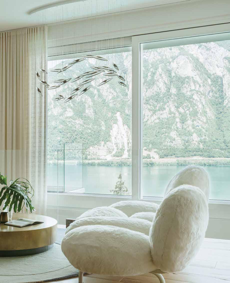
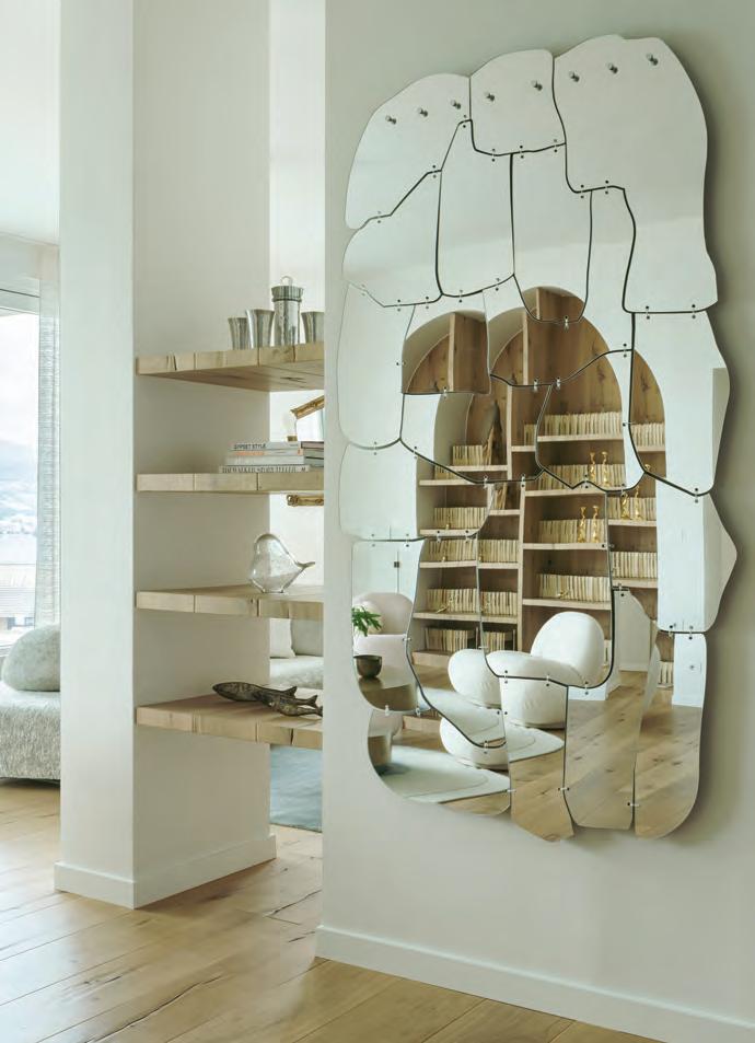
To soften the atmosphere and introduce a warm feeling within the different spaces, Molodykh opted for a selection of curvaceous furniture pieces and lighting fixtures, as well as textures such as cotton, silk and wool, complemented with accessories including rugs and cushions. For example, the On the Rocks sofa by Edra is an invitation to comfortably sit and watch a movie or admire the sunset, while the Miraggio mirror designed by Fernando and Humberto Campana, also for Edra, looks like a piece of artwork in the living space. In the same space, the Ochre chandelier is
51 THE FUTURE GENERATIONS ISSUE interiors
Above: The Era Miraggio mirror by Fernando and Humberto Campana makes a statement. Opposite page: The smaller lounging area features the Edra On the Rocks sofa by Francesco Binfaré, Bolia coffee table, Gan Rugs carpet, Gubi floor lamp and Rossana Orlandi mirror
reminiscent of a fish jumping out of the water. Two Pacha armchairs by Gubi are placed on a CC-Tapis rug that represents raindrops, while a Baxter coffee table in the lounge area is dressed with Chant D’ecume curtains by Misia in a champagne tone.
Molodykh also decided to paint the walls in a white tone, to create a sober ambience while trying to maximise the views of nature. In the kitchen/dining area, the oak table was made to measure by Vasko Sotirov and combines with ceramics by Ukrainian studio Gorn and an Atelier Areti lighting fixture for a contemporary touch.
Several very personal pieces adorn the apartment to give it even more character, including: a painting by the couple’s daughter in the powder room; a vintage rectangular mirror from the villa where the movie Call Me by Your Name was filmed, which is on
the terrace; an artwork from Ukrainian artist Maria Prymachenko; and a vase by Nadia Shapoval named ‘Leleka’, which is Ukrainian for ‘stork’, a symbol representing a new cycle of life.
In every nook, Molodykh, Kostyuk and Sozanovsky took pride in honouring the culture of their country by showcasing objects made by Ukrainian craftsmen and artists. In this cosy cocoon, a couple of birds are represented, including the wagtail – the family’s emblem – and the golden eagle on the Natura Ceramica vase on the shelf, which evokes those that can be seen flying around the region.
The colours of the surroundings, which change with the seasons, were the main source of inspiration for this inviting and elegant project that not only pays tribute to the homeowners’ origins but also highlights the beauty of the fascinating landscape. id
52 interiors
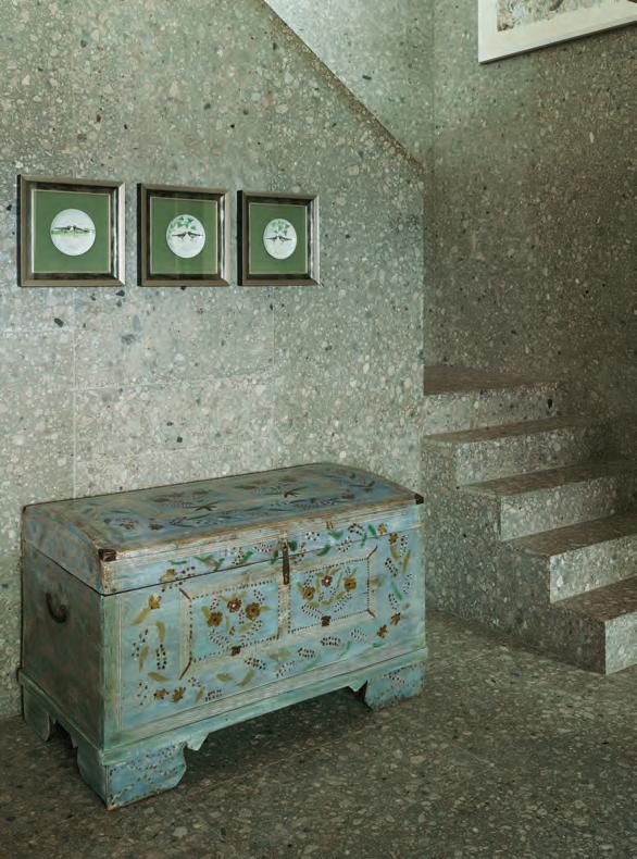
This page from left: The main bedroom features a carpet from The Gun Rugs, Baxter chair, Riva 1920 side table, Gubi floor lamp, and the Leleka vase by Nadia Shapoval. In the sober and functional entrance, a staircase connects the two levels of the apartment. Opposite page: Outdoors, the designers included a Gan Rugs carpet, Riva 1920 bar stools, a bar table made by Vasko Sotirov, and a rectangular vintage mirror from the villa where the movie Call Me by Your Name was filmed

Natural abundance
Estate Plavu is an enchanting home in the south of India and a stunning example of what architectural practice Earthitects refers to as ‘reverse urbanisation’
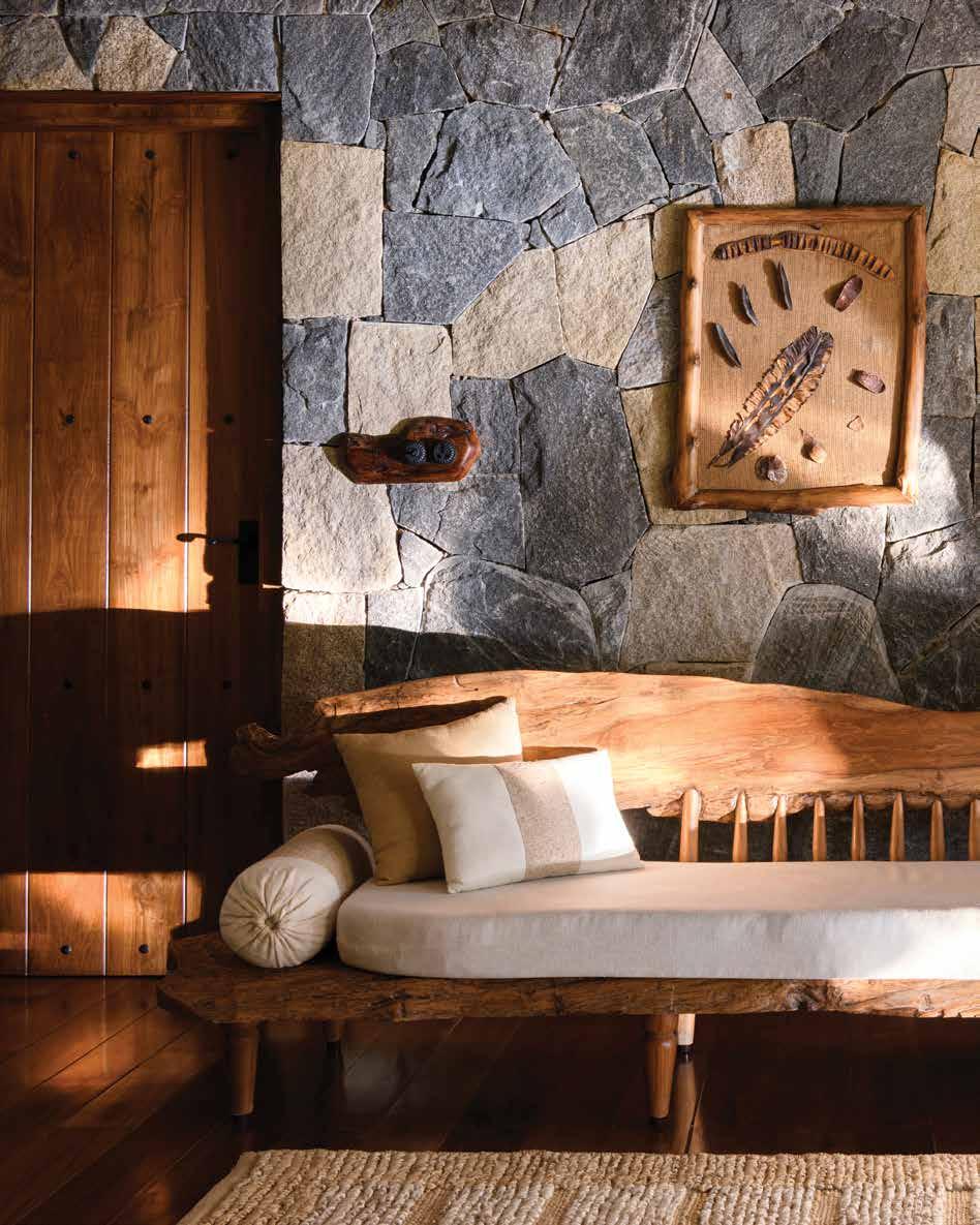 The Day lounger is designed by Earthitects for their Handcrafted Collectables collection and is crafted using single pieces of ecologically sourced teak wood and carved backrest spindles. The lower wooden form extends to become a side table
 WORDS BY JENNIFER COPLEY IMAGES ARE COURTESY OF EARTHITECTS

Instead of focusing on material attributes, what would happen if luxury was reimagined as time spent reconnecting with the rich abundance of nature? At Estate Plavu – a home designed by Earthitects in Wayanad, Kerala, in the southwest region of India – this is exactly the given definition of luxury. The villa epitomises biophilic design and what the architects dub ‘reverse urbanisation’.
“By designing and creating dwellings that are in harmony with oneself and the natural environment, we create spaces that facilitate natural life,” explains George E. Ramapuram, principal architect and managing director of Earthitects. “Reverse urbanisation is a means of bringing nature inside, and [of] being one with it.”
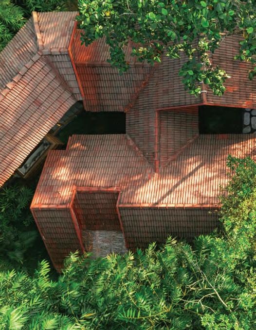
Estate Plavu is one of 13 villas situated within around five hectares of lush forest lining a steep hillside. This topography provided both a challenge and an opportunity, according to Ramapuram. “We turned the challenge on its head by designing
a luxury weekend home in a densely forested land full of rocks, trees and contours,” he explains.

Responding to this unique terrain required a creative approach. The architects created a design spread across three levels, incorporating two residential lodges, an infinity pool and a terrace. Each lodge sits six metres from the one above it to ensure that the estate follows the natural elevation of the hillside. The layout is configured around existing trees, and each lodge is connected by discreet bridges. The result is an estate embedded within the landscape.
Not only has the villa been constructed in harmony with the natural topography of the land, its design also pays close attention to the microclimate of the site as well as incorporating its biodiversity. Named after the large jackfruit tree that is endemic to the area, Estate Plavu attracts birds, bees and butterflies with carefully selected plants, bird baths, beehives and lily ponds.
57 THE FUTURE GENERATIONS ISSUE interiors
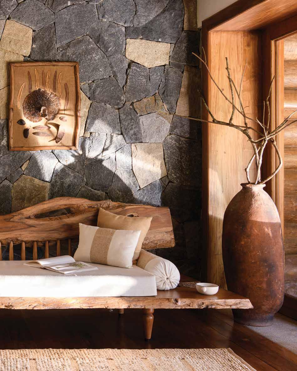
Below: The pool deck was created using Sadarahalli grey stone flooring, with a gazebo on one side and lush wilderness on the other. Opposite page: The bay window area is made from live-edge ecologically sourced teak wood and offers a peaceful window into the verdant landscape
With approximately 64 native bird species, the sound of birdsong is intrinsic to the experience of the property. “One can invite the sights and sounds of nature into the living space, celebrating the idea of ‘life in abundance’,” says Ramapuram.
Natural materials have been employed to respond to the distinct localised climate. For example, the thick stone walls absorb heat during the day and release it at night, while on the exterior deck, native stone finished with black oxide is enhanced by tropical rainfall. Estate Plavu also celebrates natural light. Courtyards bring daylight
into the interior spaces, while twilight becomes a feature in the outdoor dining area which provides unrestricted views of the valley below.
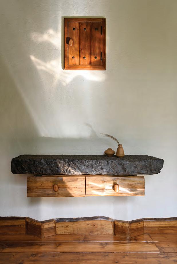
The design and construction process behind Estate Plavu sought to minimise environmental impact at every level. Raw materials were either sourced onsite or locally. Fallen trees provided timber, and any wooden poles used were compensated for with replantation. Surplus materials, such as leftover teakwood, were handcrafted to make fixtures and fittings, while unpolished boulders were cut to form the rubble walls. Here,
materials were minimally processed, to preserve their integrity and allow natural ageing over time.
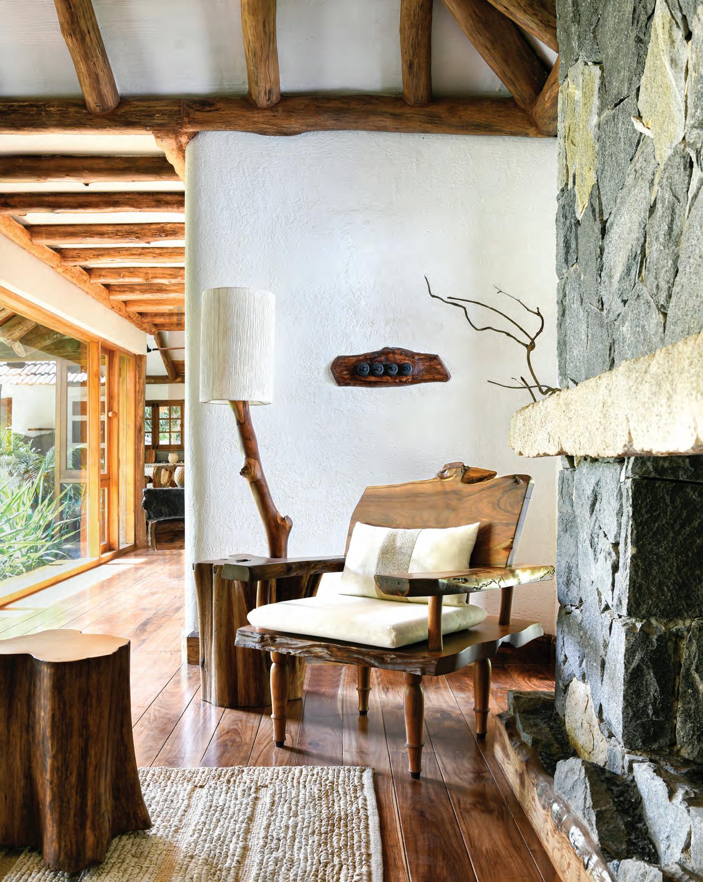
A core aspect of Earthitect’s approach to sustainability is its belief in preserving local craftsmanship, as Ramapuram enthuses: “We believe in going vocal for local.” In this spirit, Estate Plavu incorporates a bespoke furniture collection entitled ‘Handcrafted Collectables’, which celebrates indigenous workmanship. These furniture pieces draw inspiration from the natural world. For example, the ‘Snug Seater’ is crafted using eucalyptus spindles and a rotating base, recalling the cocoon of the Bagworm moth. On the other hand, the ‘Allure Armchair’ preserves the natural edges, grain and knots of handpicked wood and is both classic and organic in its design. The sculptural pieces have been designed in harmony with the interiors, creating a natural visual rhythm throughout.
All in all, Estate Plavu is a celebration of the natural world. It is a home built within nature, rather than imposed upon it. As Ramapuram explains: “We are passionate about preserving the purity and virtue of nature. This in turn facilitates life in abundance as we are able to enjoy God’s creations in their abounding fullness of joy and strength; for mind, body and soul.” id
58 interiors
This page from left: The Foyer table is designed by Earthitects and crafted using ecologically sourced teak wood and a discarded piece of natural stone, referred to as ‘the castaway stone’. The second lodge is built on the sloping side of a mountain. The residence follows the natural contours of the landscape and is inspired by local architecture. Opposite page: The Allure armchair is made from live-edge ecologically sourced teak wood and designed by Earthitects for their Handcrafted Collectables collection
Abundant lifestyle
In Marrakech, Maison Brummell Majorelle is an architectural gem three years in the making – and now a dream boutique hotel honouring local culture and creativity
WORDS BY KARINE MONIÉ
PHOTOGRAPHY BY LA DICHOSA
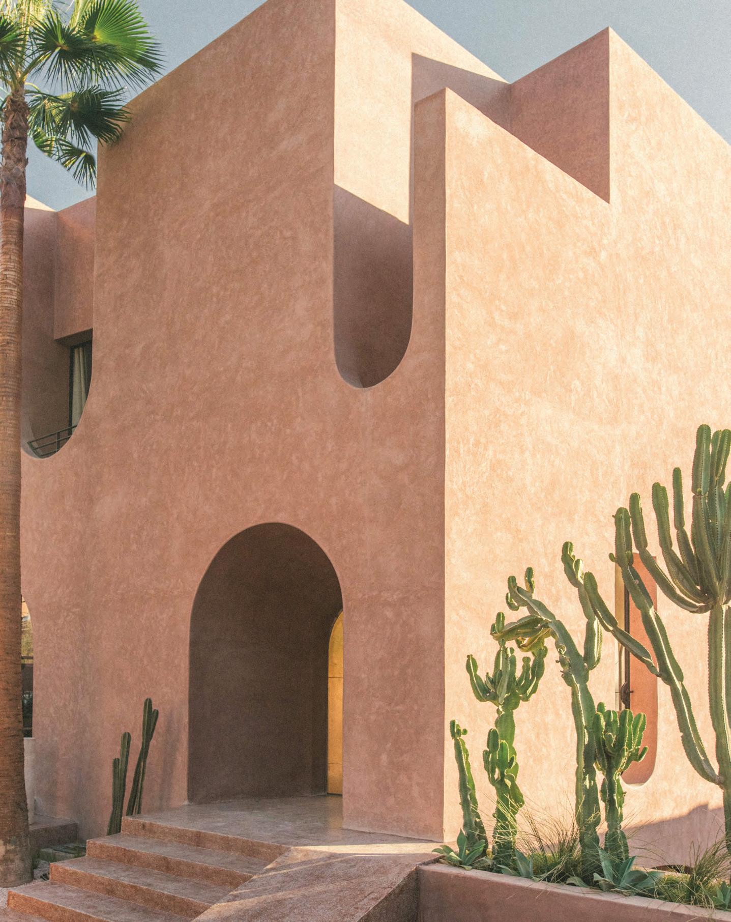 The main entrance to the hotel features a raw plaster façade, finished in Tadelakt plaster, and a curved brass door
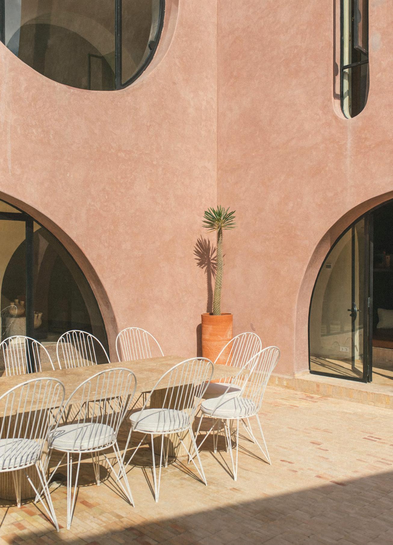 The courtyard features a travertine table with bespoke metal seats crafted by local metalworkers
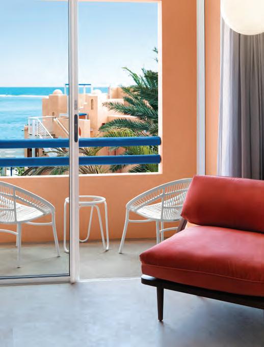
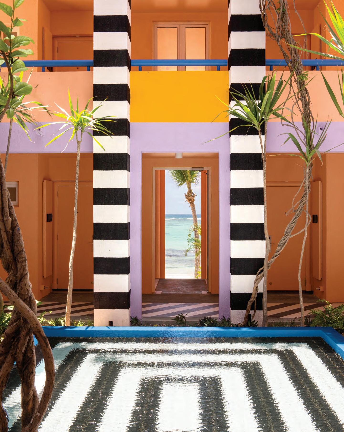
In a quiet neighbourhood far from the hustle and bustle of the medina, this house was built from the ground up in response to Austrian hotelier Christian Schallert’s desire to create a magical place where he could host his friends, family members and travellers from all over the world, and one ideally located a few steps from the famous Majorelle Garden and the Yves Saint Laurent museum.
Spread over a total of 805 square metres, Maison Brummell Majorelle comprises the garden floor (below street level, as local authorities imposed an 8-metre height restriction) with the common areas of the hotel, including the dining area, custom-built classic Moroccan kitchen, lounge, hammam with plunge pool and massage room as well as outdoor eating, living and swimming pool. The ground floor features the reception area, small shop and three rooms, while the first floor hosts five more bedrooms.
“Inspired by the local vernacular without replicating it, we have created a unique and playful contemporary language while maintaining a textural reference to the site’s rich history,” says Bergendy Cooke, founder of the eponymous Barcelona- and New Zealand-based practice, who designed the project with Marrakechbased architect Amine Abouraoui. “An abundance of lush vegetation and running water in various volumes conjures up the notion of [an] oasis.”
Local materials characterise the architecture, such as the pisé for the exterior, which consists of a mixture of earth and quicklime in a pink tone typical of Marrakech, and the hand-polished plaster finish called tadelakt, which originated in ancient Morocco.
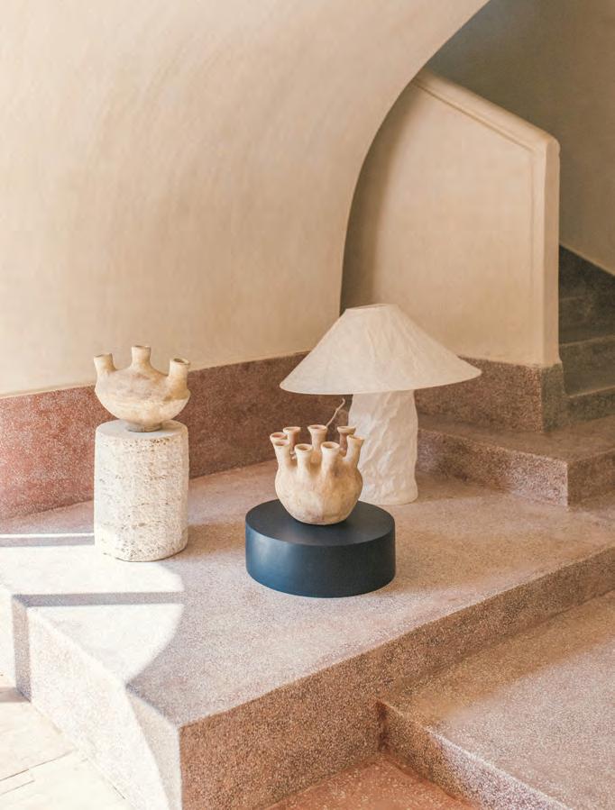
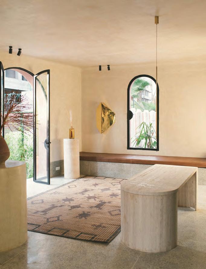
Terrazzo was preferred for the upper floors, and covers all bedroom walls, bathroom sinks, wet areas and the pool (which is complemented by local limestone), while handmade Bejmat tiles adorn the garden floor, extending to the terrace, and touches of brass add to the perfect mix. “The legacy of traditional building methods was essential to the project, [which] fully utilised exquisite artisanal craftsmanship to
63 THE FUTURE GENERATIONS ISSUE
From top: A sculptural travertine table sits at the centre of the reception area beside a vintage rug with Tuareg symbols, as well as a bespoke brass wall piece designed by Bergendy Cooke. The mini totems are from La Marrakechoise and the painted round wooden base is from Barcelona-based Another Again; they are set alongside locally sourced pottery and Ingo Maurer’s Lampampe paper lamp
create a contemporary typology,” says Cooke. “[The objective was to] pay homage to Morocco’s rich architectural history, including all the finishes throughout, but intentionally referencing them in a less traditional manner.” Playing with light and shadow, as well as with voids and solids, the architect strove to bring a variety of spatial experiences to life, always referencing the country’s culture. Several Arabic design elements are reinterpreted, such as the house’s sculptural form that pays tribute to the ancient rampart walls of the Marrakech medina, and the deep recesses that act as ancient ‘mashrabiya’ screens, providing privacy to the bedrooms. To develop her concept, Cooke imagined a story. “This was to be the imaginary house of a couple: Azzedine, a Moroccan, and Mio, his Japanese partner, who after years of living abroad have returned to live in Marrakech,” she describes. “The house is their shared vision, influenced by an international life, returning with fresh eyes.” Harmony and calm prevail in every corner, where the soft and restrained hues and
materials are an invitation for relaxation and contemplation. “[It] aligned to our story of the couple who wanted to desaturate the (typically colourful) local palette and create a timeless interior.”
Egon Eiermann chairs, an Ingo Maurer paper lamp, lighting fixtures by Vesoi and Gio Ponti Lama door handles, among other elements, combine with the many bespoke furniture pieces designed by Cooke and fabricated by local artisans — including the side tables in timber and brass, dining tables, the console in the entrance and sofa modules, to name only a few. Works by photographer Maite Caramés and artists Per Henrik Adolfsson and Soufiane Zarib, and textile pieces made in collaboration with LRNCE and Marrakshi Life, bring even more character to the different spaces.
“The [hotel] needed to conjure up curiosity,” says Cooke. “Our ethos tends toward a minimalist mentality, a more honed solution, stripping away the excess, to produce projects that are concise in their solutions.” id
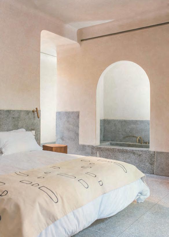
Below from left: The corner of the swimming pool is adjacent to the infamous Jardin Majorelle, with the pool floor made from hand-poured grey terrazzo. The Garden room –like others – features pieces exclusively designed for Maison Brummel Majorelle by Barcelonabased Santa Living, as well as bone-coloured Tadelakt walls and grey terrazzo floors. The rooms all have curved edges to give the space an extra-cocooning feeling
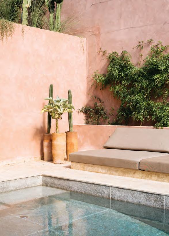
64 interiors
Photography by Anthony Perez
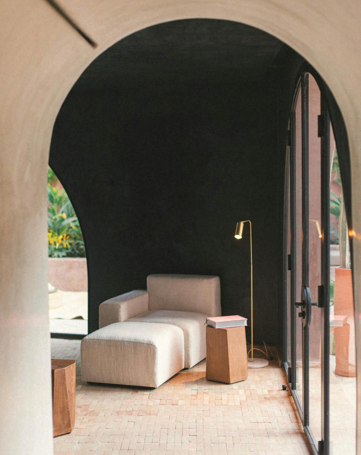 This lounge area features a bespoke lounge chair designed by Bergendy Cooke and locally made by Maison Nicole. The lamp is from Mallorca-based Contain design studio

Cultural revival
Dar Tantora is the newest hotel in Saudi Arabia’s historical town of AlUla, and has been inspired by its landmark sundial and traditional building methods
WORDS BY AIDAN IMANOVA
Tantora AlUla is a sundial that has been used by the locals of the historical Old Town of AlUla in Saudi Arabia for hundreds of years to announce the changing of the seasons. On the first day of winter, the sun’s rays fall directly on the stone sign, announcing the return of agricultural activities. It is on the site of this landmark sundial (Sahat Ad Darb) that the Dar Tantora guest house is set; the dial acts as inspiration for the design, which comprises several historical mud-brick buildings. The original architecture has been restored and repurposed, preserving it out of respect for the local community and customs while allowing visitors to immerse themselves in the heritage of the area.
Sahat Ad Darb, once known as Tantora, served as a vital link between the town and the oasis, facilitating the distribution of spring water to farmers and signalling the beginning of the seasons. Today, the Winter at Tantora festival celebrates the harvest season, honouring farmers and their contributions to the community.
Each hotel room is set inside a traditional mud house which is closely-knit with the others, forming a continuous defence wall that reflects the community’s close bonds and shared history. Narrow alleys wind through the maze-like plan, leading one to open marketplaces and corridors.
The restoration of the old town of AlUla is being led by the Royal Commission for AlUla (RCA),
working alongside a heritage team and various consultants. Using contemporary engineering methods and time-honoured techniques, local artisans were also engaged in the restoration, and received special training to complete the project. This included using the same techniques that were once employed to build the mud houses, which are great examples of traditional sustainable architecture. Much like with other projects by the RCA, a Sustainability Charter has been assigned to govern each project’s economic, social and environmental impacts – and Dar Tantora is no different.
The commitment to sustainability and to preserving the town’s architectural heritage is evident throughout the project. The intricate architectural design reflects the thoughtful planning that facilitated the town’s self-sufficiency for centuries. The
traditional mud-brick houses, with their effective use of natural ventilation and lantern fires, demonstrate a deep respect for the environment and a dedication to sustainable living.
Jeddah-based architecture and design studio WATAD – led by Dana AlAmri and Yahia Kandil – took charge of the concept and interior architecture for the first phase of the boutique hotel, which hosts 30 rooms. The architects told identity that they “designed the [hotel] to run like a traditional house,” as a way to showcase the vibrant traditions and culture of the town. With the aim of amplifying the landscape, the traditional building and the culture of the town, the architects focused on protecting the original visual and architectural elements of the buildings, allowing guests to journey back in time. Interacting with

the local community played a vital role in creating an experience that was true to the area and its heritage. This is also evident in the interiors, in which the architects insisted on promoting artisanal and locally made objects, materials, fabrics and patterns that are a showcase of the Northern Arab region. They also collected antique objects from the area to be displayed across the property.

The hotel rooms themselves are adorned with traditional décor, furniture and artistic accents, incorporating storytelling elements that capture the area̕s intangible heritage.
“We were guided here by the process, which is a true example of how we love to work as a team,” the designers said. “It allows us to learn something new every time – and that is where we find the pleasure in what we do.” id
68 travel

Colour therapy
WORDS BY AIDAN IMANOVA
Set in the village of Palmar on the east coast of Mauritius, the SALT of Palmar boutique hotel is the island’s first property to fall under Design Hotels’ diverse portfolio, having made waves in the local hospitality scene for its bold design, contemporary dining concept and commitment to giving back to its community. Located on a miniature peninsula between two bays with calm turquoise waters, the adults-only hotel sits close to the nearby Flacq market – the largest outdoor market in the area selling fabrics, food and handicrafts – as well as the fishing village of Trou d’Eau Douce, known for its corrugated iron huts, mazes of picturesque streets and friendly inhabitants.
The east side of the island showcases a lot of the natural abundance present on the island, from traditional villages to swathes of raw beachfront, sugarcane fields, mangroves and lagoons, in addition to reminding visitors of the island’s rich mix of African, Indian, Chinese and French cultures.
Taking all these attributes into consideration, Mauritius-born and -based architect Jean-François Adam renovated the hotel’s existing structure, which was originally built in the style of a traditional Moroccan riad – the elements of which still exist within the property today – but now takes better consideration of its surrounding natural landscape of tall palm trees and endless sea. “We had to bring these natural elements into
the interiors,” explains Adam. “We reorientated all the beds to face the sea and redesigned the pool for a better connection to the beach.”
French artist and designer Camille Walala –known for her vibrant and chromatic designs – was later brought into the project to inject her creativity into the overall interiors concept. “I was blown away by the vibrant colours around the island,” she says. “People paint their houses
in the most amazing tones that really stand out against the emerald green of the plants and the ever-changing colours of the sky. I wanted to marry these tones with my signature pop colours.” While the façade is painted peach with royal blue accents, the daybeds are a vibrant turquoise with orange piping, and even the beach towels are a canary yellow. Walala also worked with an extraordinary range of artisans on the island –referred to as the hotel’s ‘Salt Shakers’ – to develop the entire range of furnishings. Everything from the woven chairs by the pool and the rug in the library to the mosaic tables, cushions and sunbeds are bespoke. SALT of Palmar comprises 50 guest rooms, which also feature playful splashes of colour, such as the fiery orange-red chairs and similarly hued tiled showers, with plants set in painted ceramic pots, and black-and-white striped cushions. Every room is equipped with a custom mattress by Carpe Diem, a company founded by a Swedish chiropractor, a bespoke guidebook and small selection of books by local authors, a beach basket made from recycled plastics by local artisan Reotee Buleeram, and refillable, all-natural toiletries. Natural products are used in treatments at the hotel’s intimate spa, SALT Equilibrium, which also has a salt room for halotherapy.
It is no surprise that upon visiting the island in 1896, Mark Twain wrote: “You gather the idea that Mauritius was made first and then heaven; and that heaven was copied after Mauritius.” id

70 travel
Featuring in Design Hotels’ portfolio of the world’s most beautiful hotels, SALT of Palmar in Mauritius is inspired by the vibrant culture of the island

Shape shifter
This month’s moodboard moves away from traditional forms and embraces the unconventional, from irregular mirrors to amorphic stools

72 products
Marlene mirror
Dimorestudio for Artemest
Available at artemeste.com


73 THE FUTURE GENERATIONS ISSUE products
4 1 6 5 2 3
1. Bouquet vase by Mist-O for Ichendorf Milano. Available at mytheresa.com 2. Earth vase by Marie Michielssen for Serax . Available at mytheresacom 3. Bolle bottles by Venini. Available at artedona.com 4. Om chair by Johan Ansander for Blå Station. Available at blastation.com 5. Réaction Poétique centrepiece by Jaime Hayon for Cassina. Available at mytheresa.com 6. Mushroom stool from the Nubia collection by Shewekar. Available at shewekar.com
The old rocking chair is making a comeback as a cocooning rocking lounge chair, aptly called Coco and designed by Omar Al Gurg, founder of modular furniture brand MODU. Comprising an abundance of curves that allows one to “swaddle like a happy baby”, Coco is made of fibreglass and works for both indoor and outdoor spaces (be it the pool, garden or your favourite reading nook). It also comes in a range of fun pastel shades (like mint and coral) or bolder red and black tones.

74 id most wanted
Coco by MODU


Oikos Atelier Dubai The Opus, Tower A, office 1205 Al A’amal St, Business Bay - Dubai T +971 4 589 3332 | M + 971 52 556 7376 atelierdubai@oikos.it | oikos.it
in Italy Entrances
by You
Made
Designed


 Photo by Young Habibti
Palestinian designer Samer Selbak with his Reef divider, photographed in Paris
Photography by Yotam Ben-David

 WORDS BY KARINE MONIÉ


 WORDS BY AIDAN IMANOVA

 WORDS BY AIDAN IMANOVA

 WORDS BY AIDAN IMANOVA

 WORDS BY KARINE MONIÉ
Photography by Bettina Matthiessen


 Two Step, Tree Step chair designed by NIFE


 INTERVIEW BY AIDAN IMANOVA
IMAGES ARE COURTESY OF SAMER SELBAK, © ADAGP
Photography by Yotam Ben-David


 Photography by Mohammad Taqi Ashkanani
This page and opposite: Toplum restaurant in Riyadh, Saudi Arabia
 WORDS BY AIDAN IMANOVA

 Ganache Chocolatier in Alserkal Avenue in Dubai
Photography by Oculis Project
 WORDS BY AIDAN IMANOVA
PHOTOGRAPHY BY NATELEE COCKS


 WORDS BY AIDAN IMANOVA


 The space features the Edra Cipria sofa by Fernando and Humberto Campana, Gubi Pacha chairs, Baxter coffee table, CC-Tapis carpet and Ochre pendant
 WORDS BY KARINE MONIÉ PHOTOGRAPHY BY VIGO JANSONS


 The Day lounger is designed by Earthitects for their Handcrafted Collectables collection and is crafted using single pieces of ecologically sourced teak wood and carved backrest spindles. The lower wooden form extends to become a side table
 WORDS BY JENNIFER COPLEY IMAGES ARE COURTESY OF EARTHITECTS


 The main entrance to the hotel features a raw plaster façade, finished in Tadelakt plaster, and a curved brass door
 The courtyard features a travertine table with bespoke metal seats crafted by local metalworkers


 This lounge area features a bespoke lounge chair designed by Bergendy Cooke and locally made by Maison Nicole. The lamp is from Mallorca-based Contain design studio
