Elements of Web Design
Four principles that govern web page design


FOUR PRINCIPLES OF WEB PAGE
●
●
●
●
DESIGN
PROXIMITY
ALINGMENT
REPETITION
CONTRAST
PROXIMITY
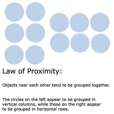
●When several items are close to each other they become one visual unit
●Be aware of what path the eye follows
●You should be able to create a logical progression from beginning to end
●The basic purpose of proximity is to organize.
●Organized information is more likely to be read and remembered
Example
How to create Proximity
●Squint ○Count the number of visual elements by the number of times your eye stops when reading.
●If you have more than 5 elements, see which ones can be grouped to make one unit.
Avoid
●Too many elements
●Sticking stuff in the corners and the middle
●Leaving equal amounts of white space between elements.
●Creating relationships with elements that don’t belong together
Examples
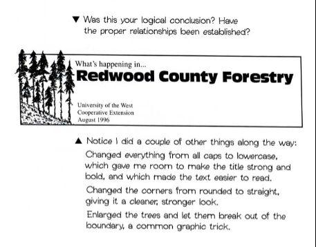
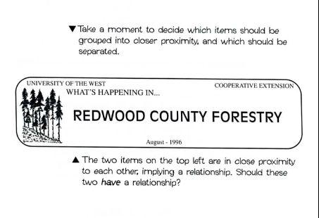
Example
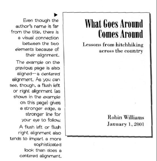
ALIGNMENT
●Every Element should have some visual connection with another element on the page
●The basic purpose is to unify and organize the page
●Even if the separate elements are not physically close on the page, they can appear connected.
How to Create Alignment
●Be conscious of where elements are placed.
●Always find something else on the page to align with, even if they are far away from each other on the page.
○Find a strong line and use it, such as a photo or graphic.
●Use one text alignment for the whole page, all left, center or right. Never mix.
Alignment problems to avoid
●Avoid using more than one text alignment on the page (don’t center some and right-align other texts)
●Try hard to break away from a centered alignment unless your are trying to create a more formal presentation
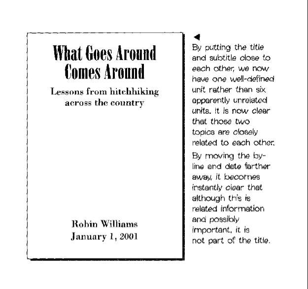
Alignment Example
REPETITION
●Repetition of visual elements throughout the design unifies a piece by tying together otherwise separate parts.
●The purpose of repetition is to unify and to add visual interest
Repetition doesn't mean you have to repeat exactly the same thing.
● The headlines are all the same typeface, but different colors (unity with variety).
● The illustrations are all different styles, but all rather funky and 'fifties.
● Make sure you have enough repetitive elements so the differences are clear, not a jumbled mess.
● The recipes all follow the same format.
● When there's an underlying sense of structure, you can be more flexible with the other elements.

How to create repetition
●Be consistent
●Find repeated elements such as lines or boxes and make them stronger & more dramatic
●Add repeating elements such as numbered lists.
●Use contrast to accent repetitions.
How to create repetition
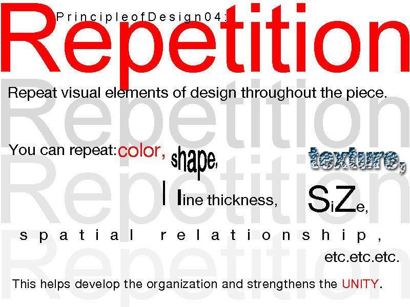
Avoid
●Repeating too much
○
Having every 3rd item in bold type will be distracting and boring.
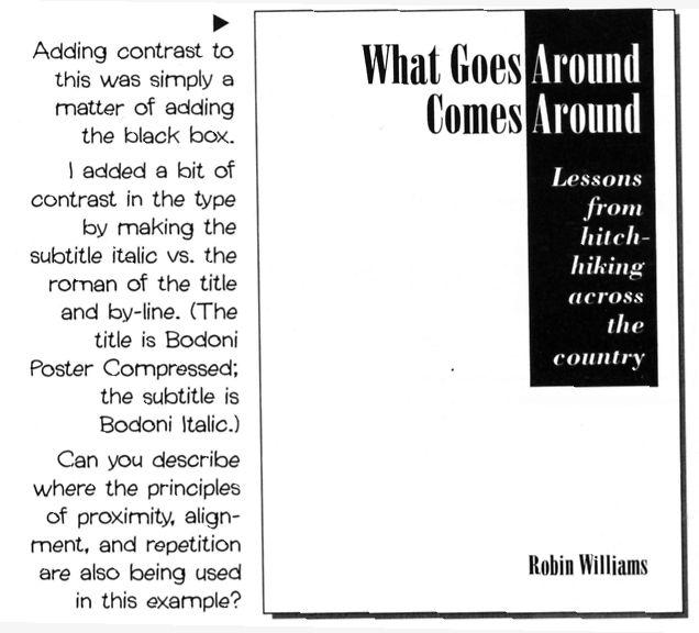
●In order for contrast to work it must be strong.
●Don’t Be A Wimp. If two items are not exactly the same, then make them different. REALLY DIFFERENT.
●Contrast adds interest to the page.
CONTRAST
CREATING CONTRAST
●Add contrast with typeface choices, line thicknesses, colors, shapes, sizes, and space.
●Make it strong, make it noticeable.
●Avoid using two or more typefaces that are similar.
●If items are not exactly the same, make them different.
CONTRAST EXAMPLE
Assignment: Graphic Design
○CreateaPostertoIllustrateeachof the4Principles:Contrast,Repetition, Alignment,andProximity
○SetYourimagesizeto8.25"x10.25" at300ppi.
○Youmayusetext,shapes,images& fontstoillustrateyourunderstanding ofeachprinciple.


