murthy. I am a conceptual interior designer

murthy. I am a conceptual interior designer
murthy. I am a conceptual interior designer
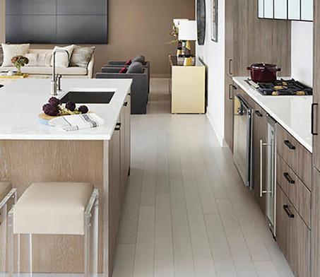
in Sanskrit means lotus flower - “neer” means “water” and “aja” means “born inside of”. My movements through the earth were written at my naming, as long as I can remember I’ve been able to locate stability amidst unruly, liquid landscapes and infinite possibilities. I’m honored to be called to the sacred ARIEL’S KITCHEN

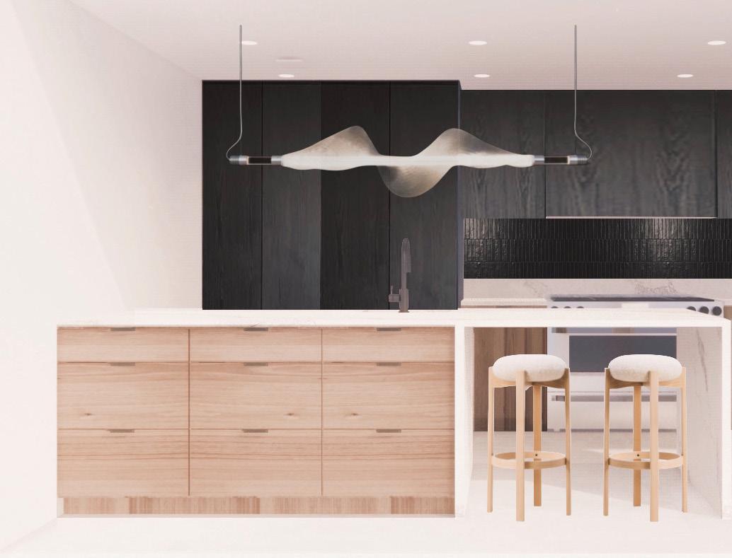
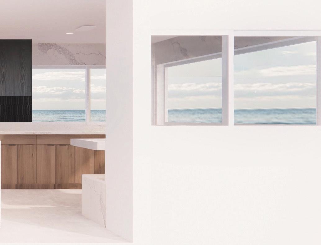
I used pale oak lowers jolted awake by black painted wood uppers, clean lines and invisible handles with wall and countertop marble look quartz to modernize my client’s sprawling space without the feeling of sterility. Glossy pencil tile separates the countertop backsplash and the cabinet creating seamlessness and infiniti to mirror this beachfront San Clemente location. I created an open space plan to honor the space’s natural light and abundance as well as allow Ariel to have her massive family over to entertain.
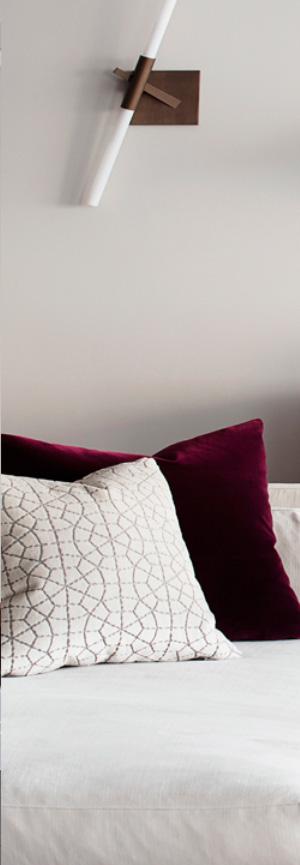
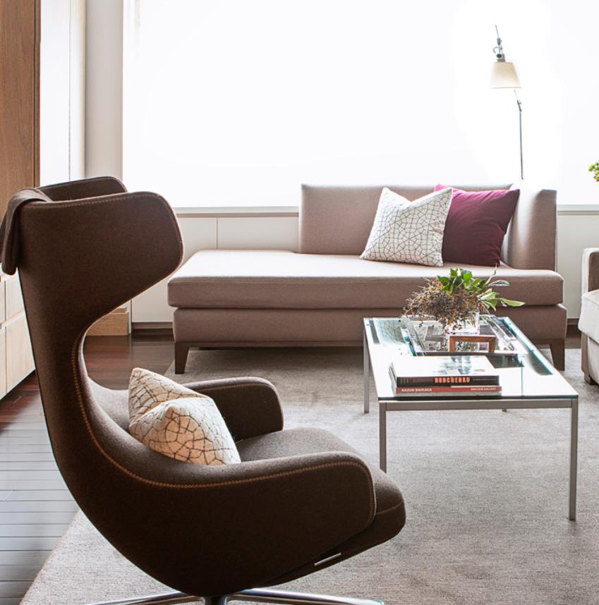
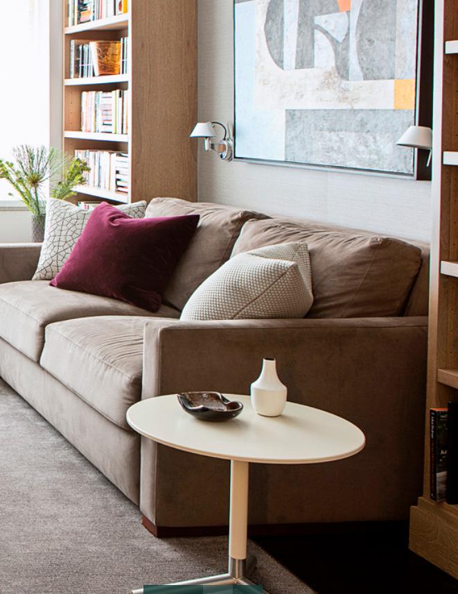
For one of my first projects out of design school I was tasked with sourcing FF&E for a second home for Maria’s bicoastal family. She wanted to still feel warmth despite her penchant towards an ultra modern aesthetic so I softened futuristic and midcentury furniture and lighting fixtures with cozy browns and deep, royal magenta.
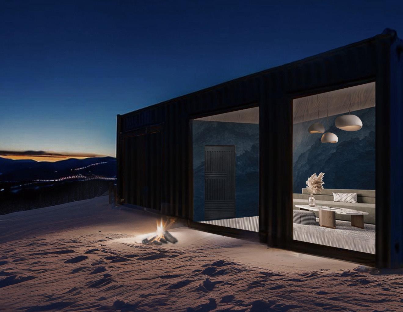
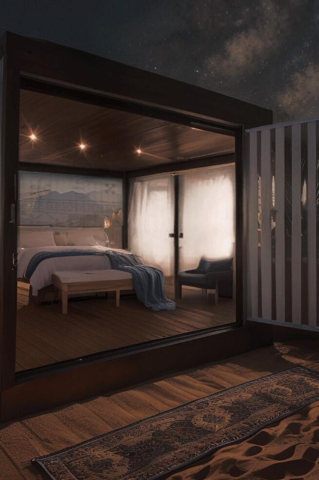

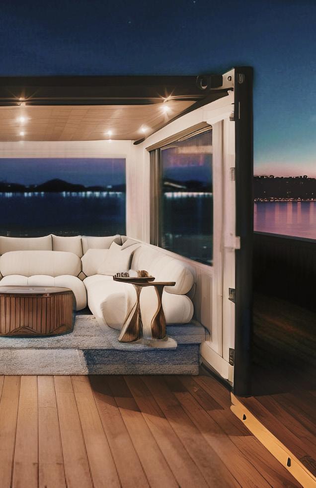
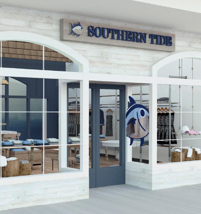
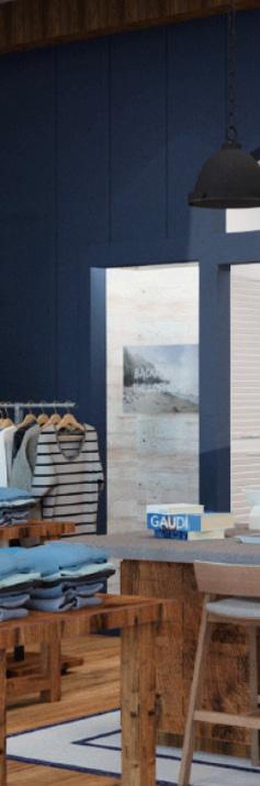
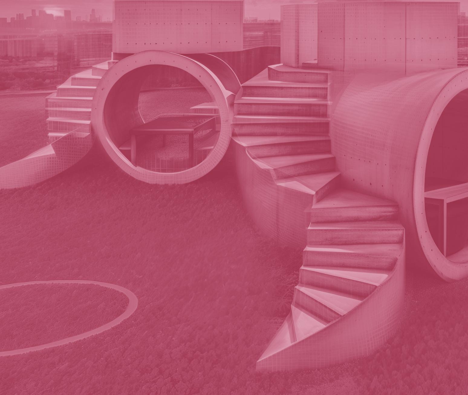
Approached by an investor to imagine a residential/short term rental repurposing of shipping containers, I created this concept of micro luxury units that had the ability to live in the actual heart of idyllic natural settings.
From left to right are my designs for short term rentals in Stowe, Montauk and Nantucket.
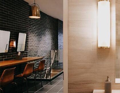
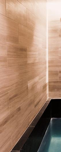
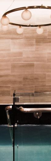
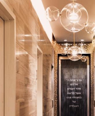
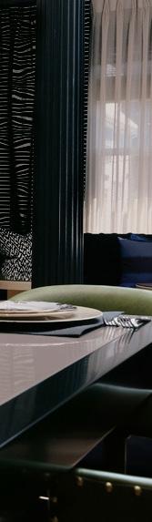
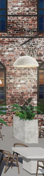
Both deeply intimate and communal, this space had to balance a sense of purity and opulence, The feeling of luxury and drama galvanizes the routine ritual for guests. I custom designed all chandeliers and lighting fixtures along with the walnut millwork, which were both fabricated locally.
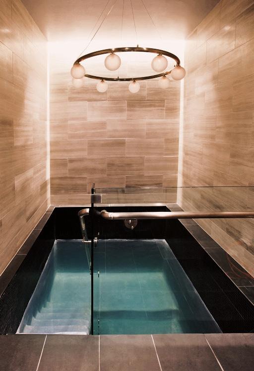
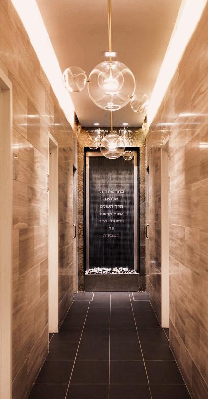
Combined with high contrast materials, the space achieved warmth and luxury to fully submerge and restore.
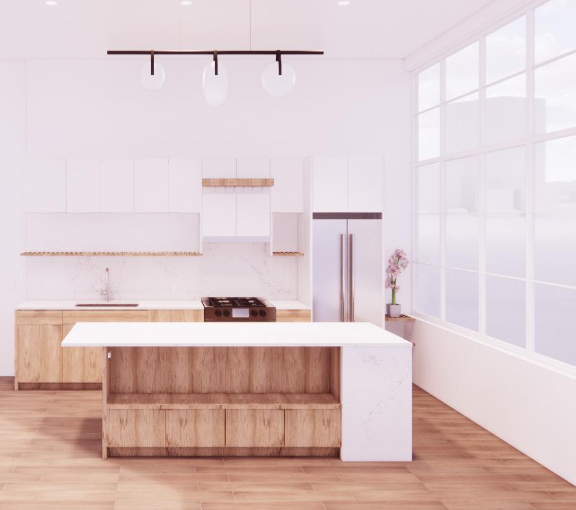

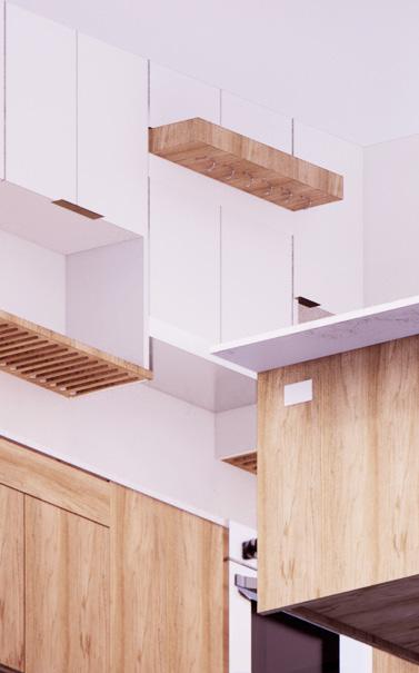
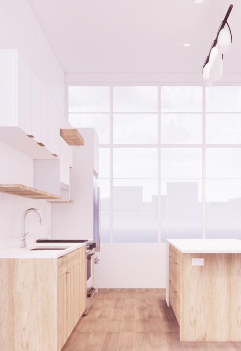
My scientist clients wanted a kitchen that would serve their weekly game nights and keep their open floor plan looking seamless and uncluttered. They used a lot of appliances, gadgets and accessories so I had to heavily customize every cabinet, shelf, and opening to let everything have it’s perfect place.
I invented an over- hanging, over-range pot holder and extended the dish rack shelf across the space for hyper-functionality so seamless in their inclusion that they’re best shown in an axonometric viewed from under the floor.
For this high rise residential building, I designed layouts of kitchen cabinets and bathrooms as well as designed FF&E and sourced and procured all materials for over 20 stories of units.

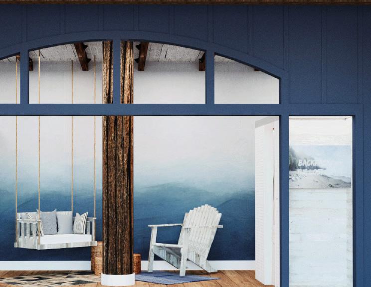

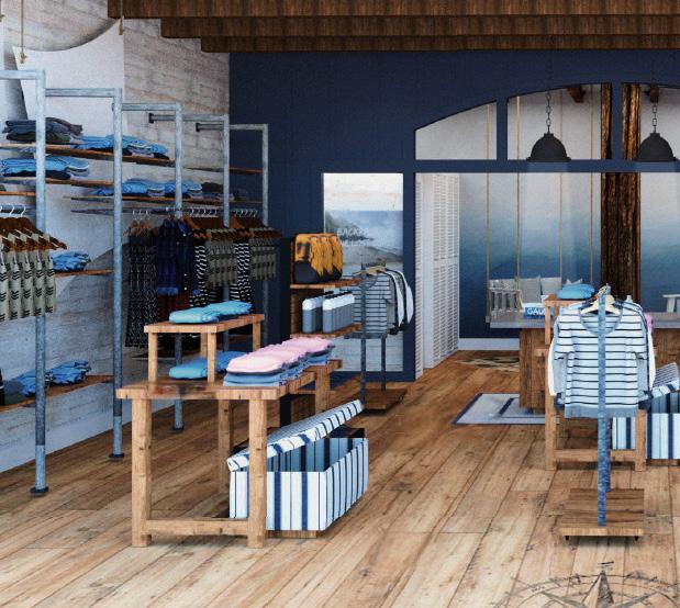
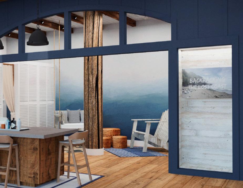
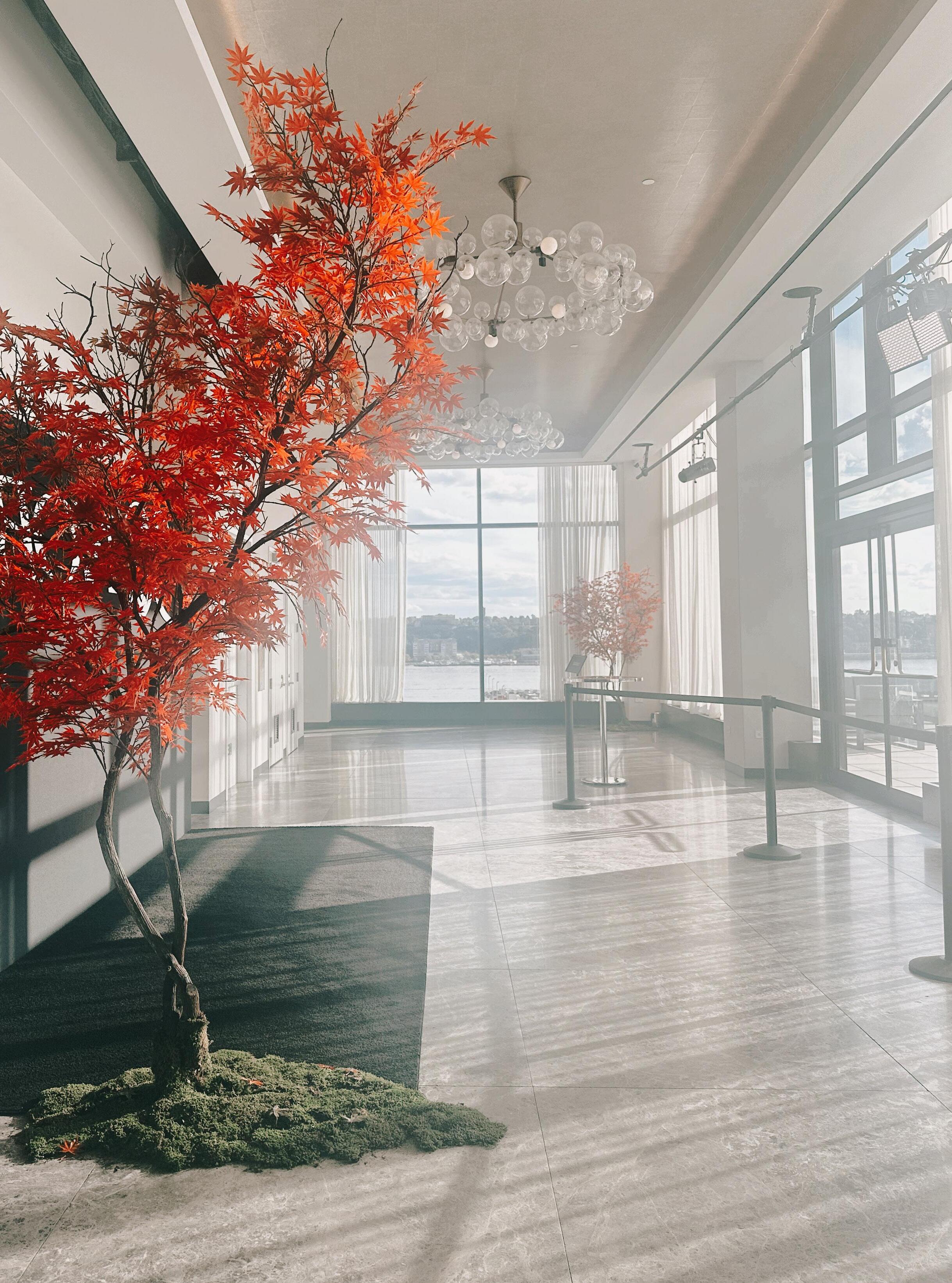
We summoned the feeling of ‘Blue Space’ using a series of unique design anchors but the crowning architectural centerpiece is the clerestory wall separating public and private spaces.
From this point inspired by coastal architecture spun off our other anchors for the prototype: a custom wall covering trompe l’oeil of the ocean from a distance, boardwalk planks and wood beams on the ceiling and walls, louvered doors and niches for marketing moments inside the unused ‘window’ panel.
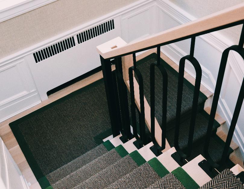
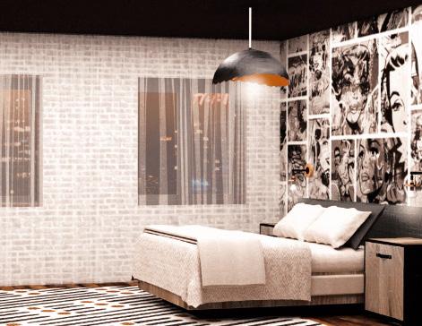
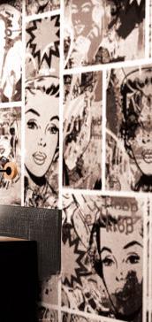
This Avenue S house draws out light hearted glamour from masculine forms.
From the blue and green color palette, to the hard geometric patterns, to tweed, and wood and bold strokes of darkness, it traverses the emotional spectrum with ease.
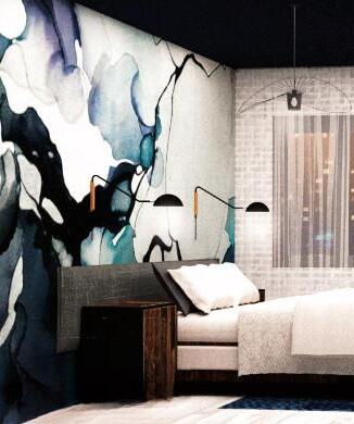
The softer material palette utilizes geometry and deep color to shape the space while harder design elements, such as this custom iron railing, continue those themes on a more graphic and magnified scale.

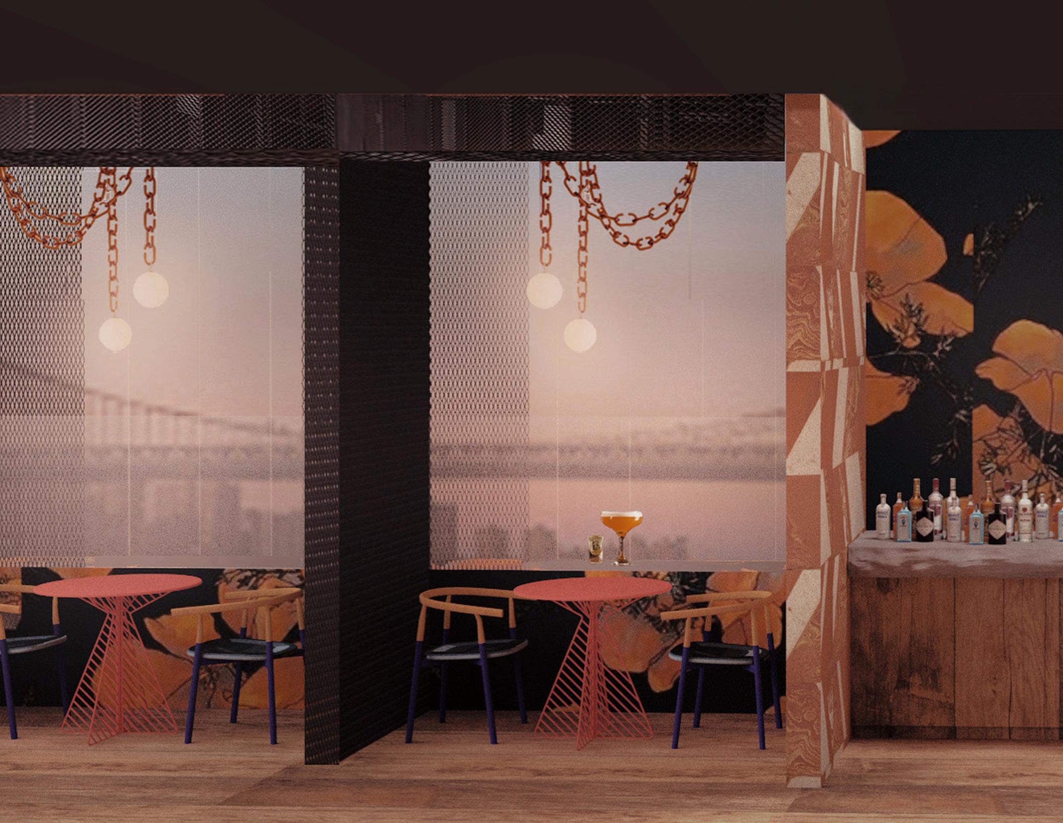
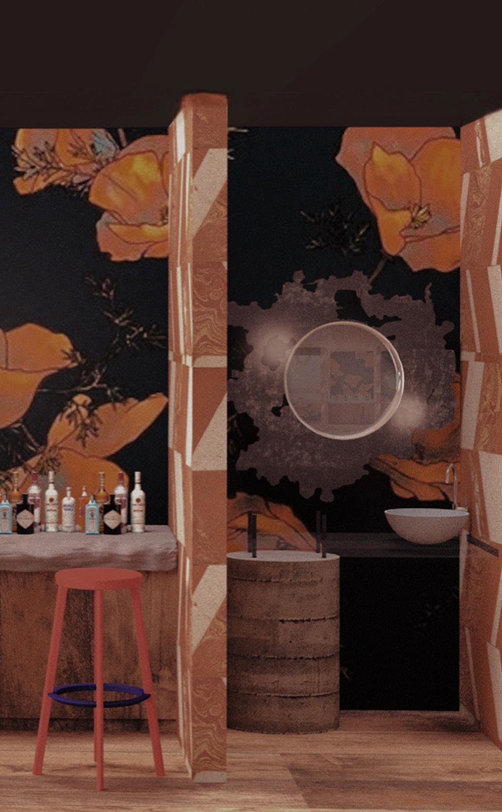
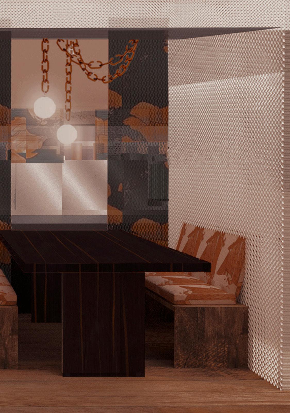
Tasked by leadership in June 2020 to create a restaurant concept for the future, I conjured this spaced to prioritize safety, clean air and the artistry of chefs/cooks.
The seating areas revolve around a kitchen core where chefs are semi-visible to guests behind windows with mesh shields. Food is delivered directly from the kitchen to the guest via conveyor belts.
The outer layer of the space is a re-imagined bar where drinks are delivered via outermost conveyor belt. Mesh walls separating tables allow air filtration to be hidden but ubiquitous.
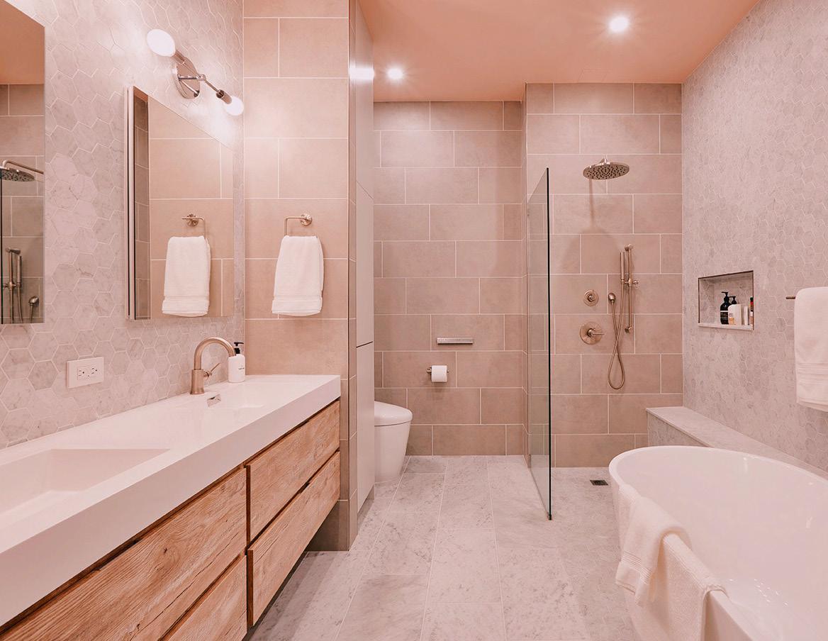
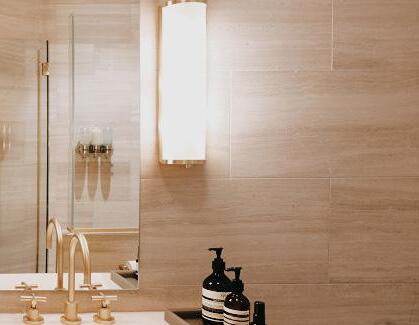
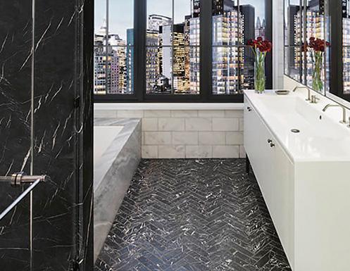
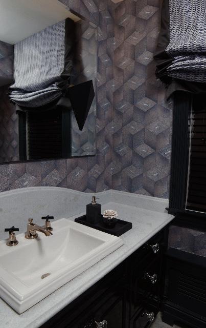
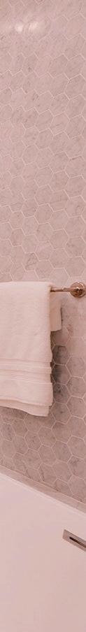
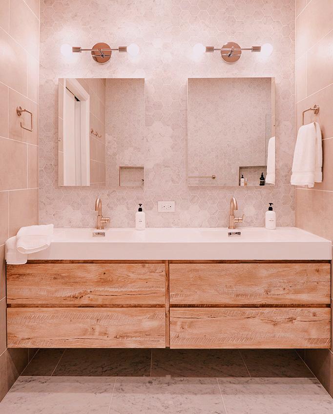
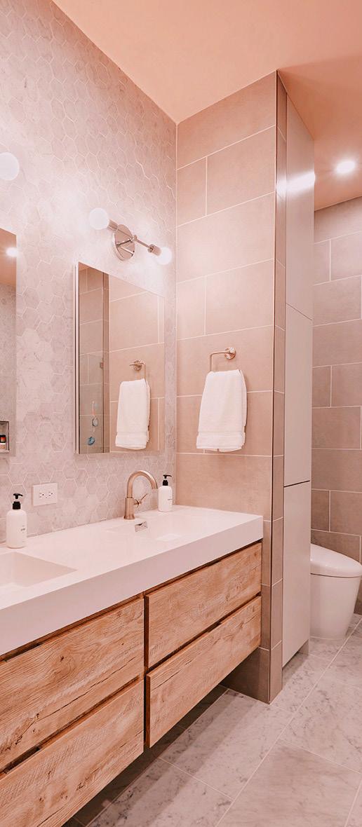
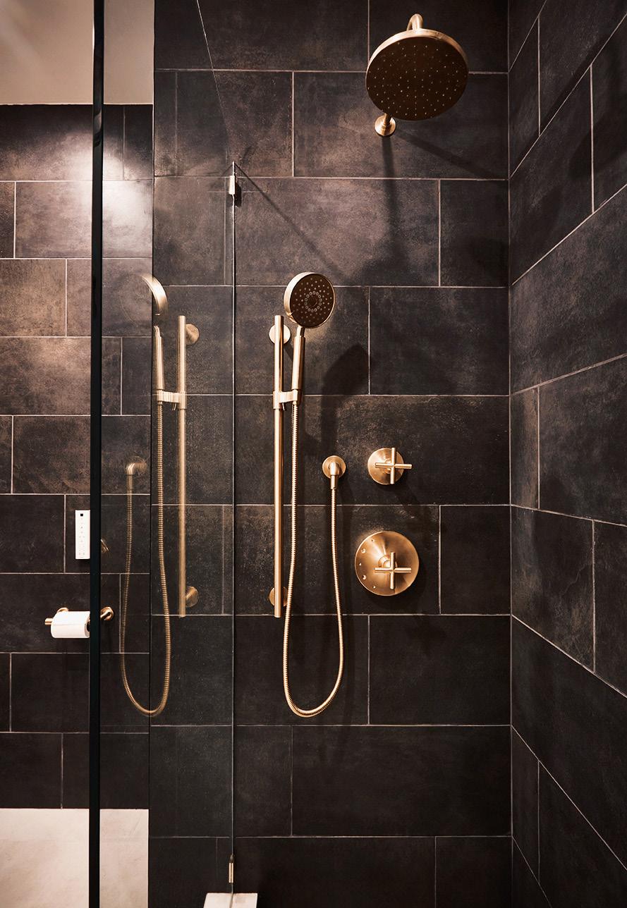
For this Rector St. couple’s two bathrooms, I transformed existing built in jetted tub and tiny box shower into an open wet room with freestanding tub, bench, niches, and open, curb-less shower. I also “hid” the toilet behind a built in cabinet and separating wall which enclosed the vanity.
The material palette used hexagonal carrara to invigorate the eye head-on and in reflection while an Odessa Pink ceiling cast a warm glow on concrete look tiles below.
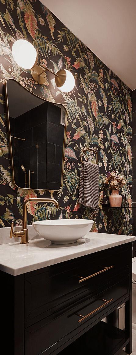
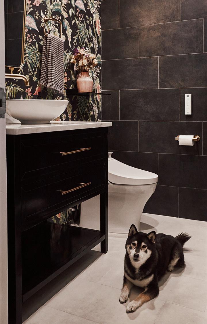
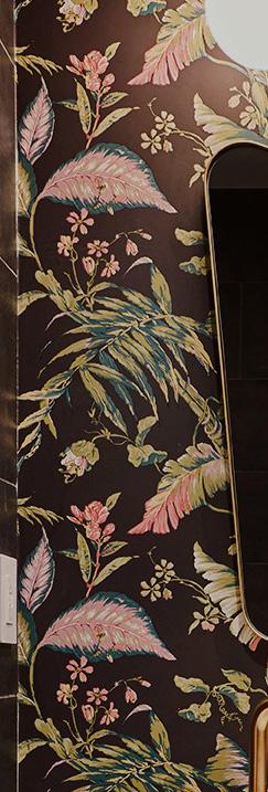
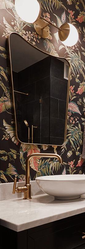
For the guest bath, I created a bolder, more outwardly luxurious space. Black concrete combined with tropical florals and shimmery brass allowed this space to be the fantasy compared to the hub of respite that became the master bath.
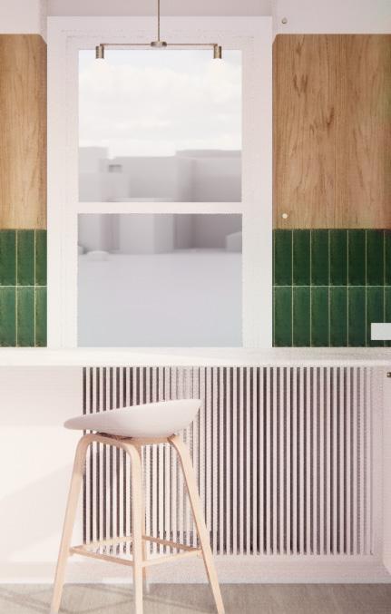
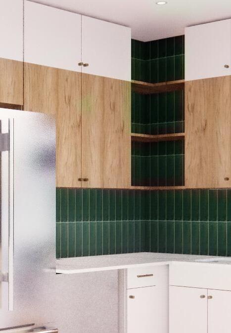
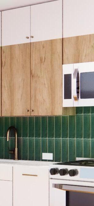
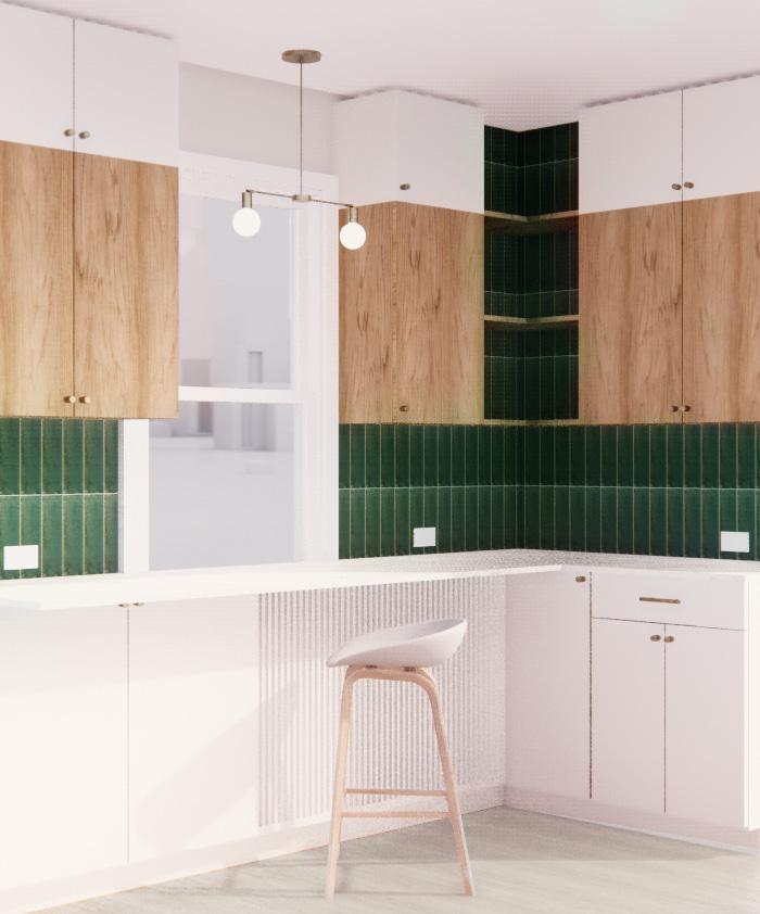
My graphic designer client and his wife loved the Scandinavian, clean aesthetic but did not want a white kitchen. To accommodate existing wood floor, small quarters, and avoiding the feeling of ‘white’, I punctuated white lowers and tiered uppers with oak that wouldn’t clash with the floor due to proximity and a deep green zellige in a linear pattern.
To support their intentions for the kitchen as both a work space and food prep zone, I created a desk area above a radiator and designed a custom radiator grille for seamless integration.
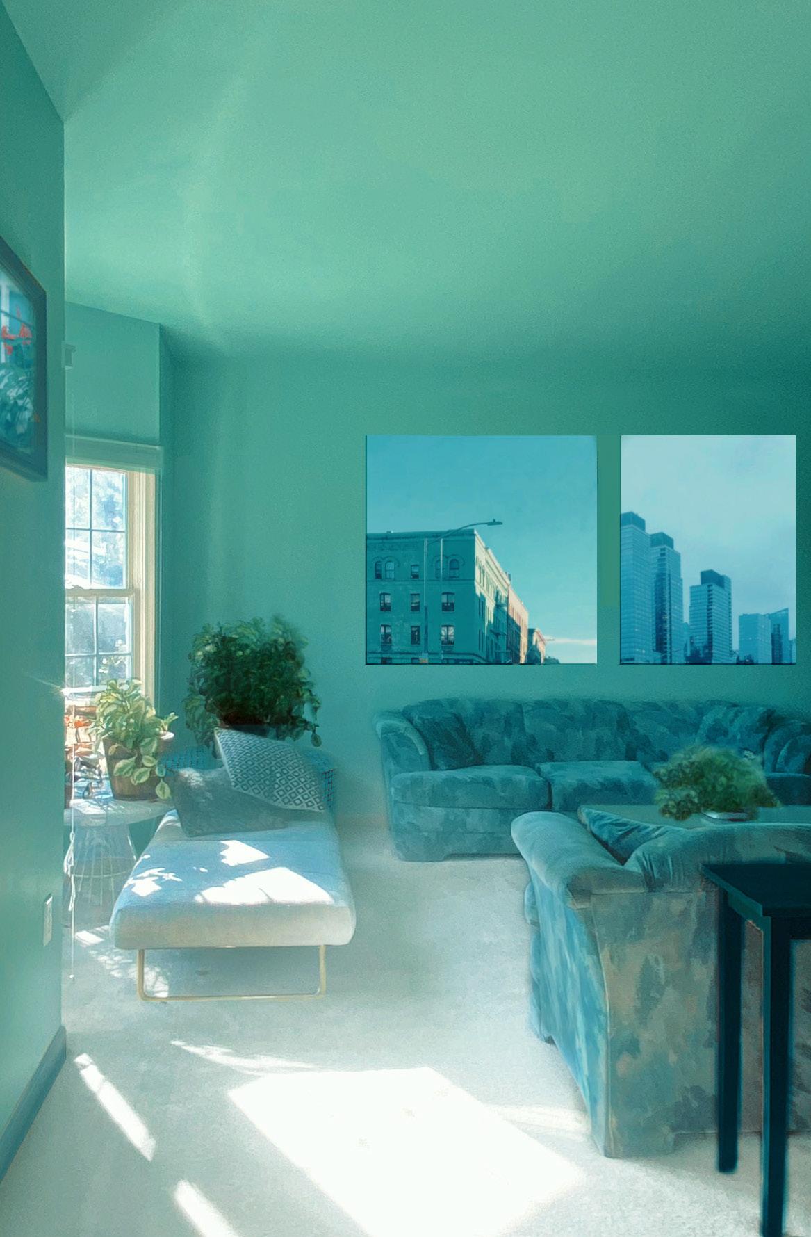
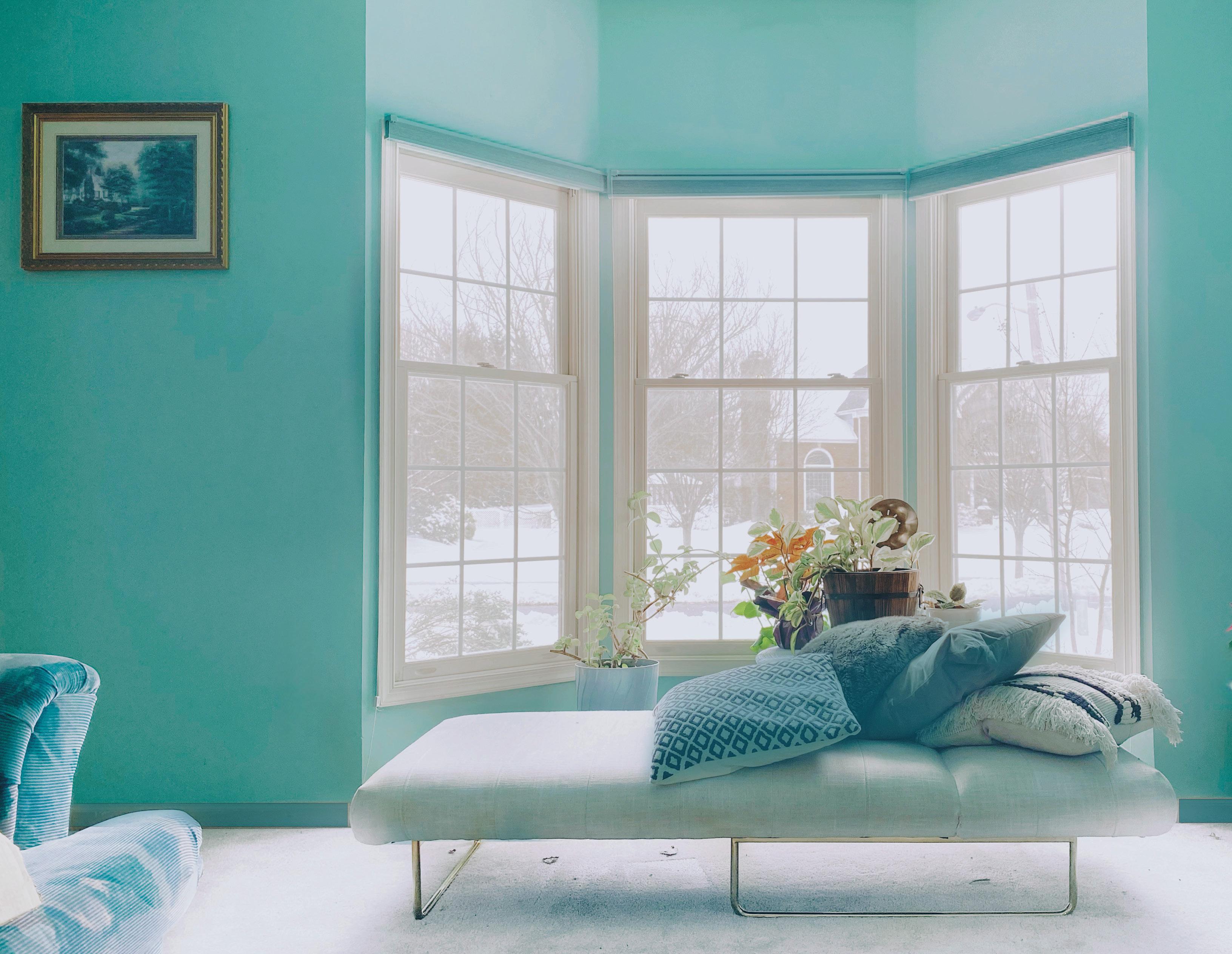
Wash yourself in what you love. This color is called Honolulu and it understood nothing of “accents” - it wants to be on every surface. The rest of the space concedes to is, and this sanctuary is born of that color’s kingdom .
For a forty story skyscraper in midtown to feel ‘ boutique’ one must value engineer the feeling of bespokeness to deliver it in mass. To conjure a high brow, custom vibe, I intersected two interior material finish
palettes with four Area Environments wallcoverings to create four individual guest experiences throughout hundreds of room. The lofty feel of each room is achieved by an original line of chic, earthy case goods.
I designed this furniture line to be available in two wood veneer options which both anchor the artistic feel of the space and contribute to the overall .
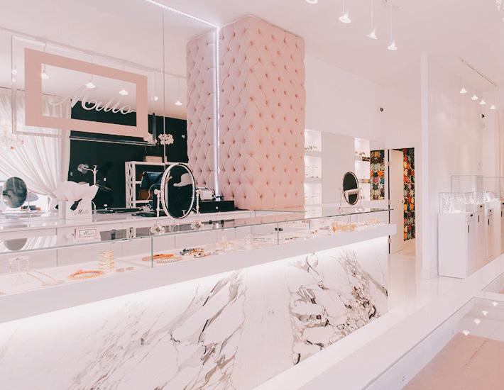
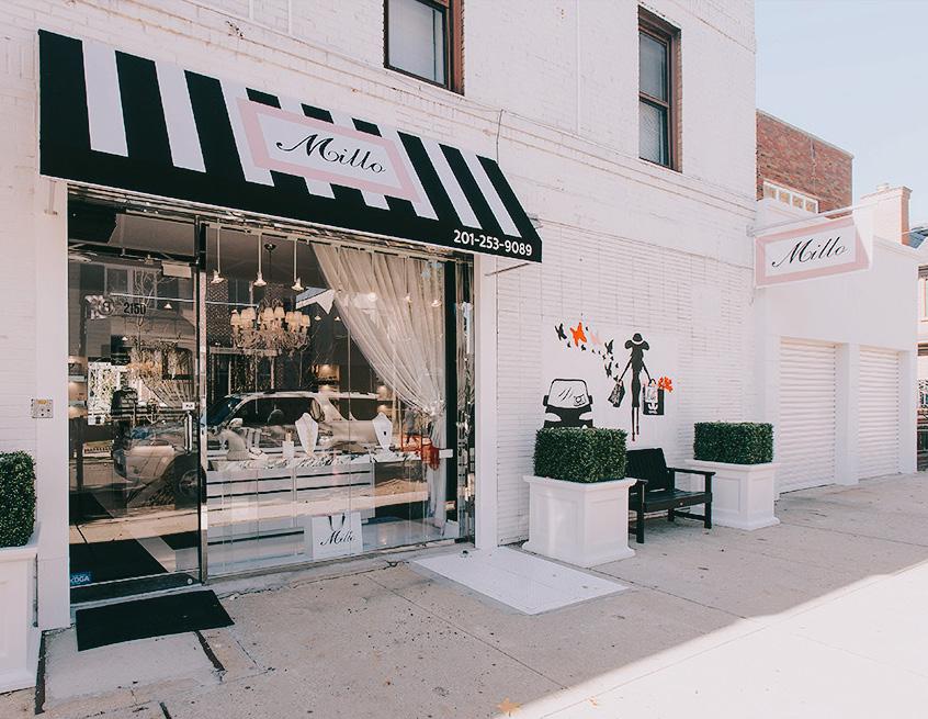
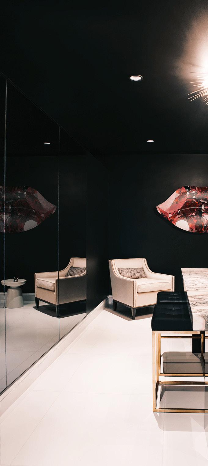
Millo’s two homes were entirely black white and red when I met her. She was ready to dive into this palette again for her jewelry store, but in zooming out to discuss larger and loftier goals for the space I was able to soften the original vision to replace red with millennial pink.
I worked directly with a graphic designer to create a logo and branding materials inspired by the design of the space. A darker private viewing room in the back creates sophisticated mystery while the public sales area is bright and inviting.
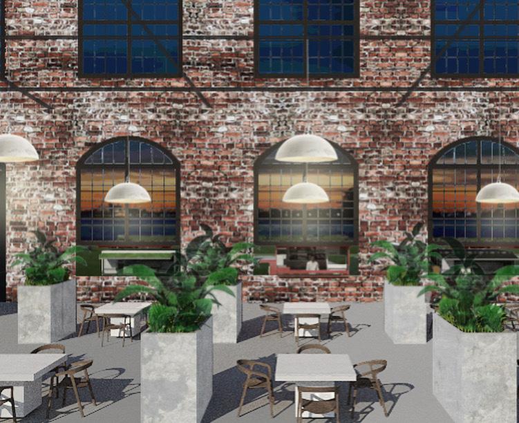

Tasked in June 2020 to create concepts to use in marketing materials that showed design possibilities following the world’s recent changes, I created this indoor/outdoor Food Truck Bazaar.
Utilizing an abandoned factory building, I imagined food trucks born of restaurants which had to shut down in quarantine driving up to the large windows and being able to serve both indoor and outdoor clients.
The outdoors provided fresh air while the spacious indoor is laid out to promote air flow and cleanliness.
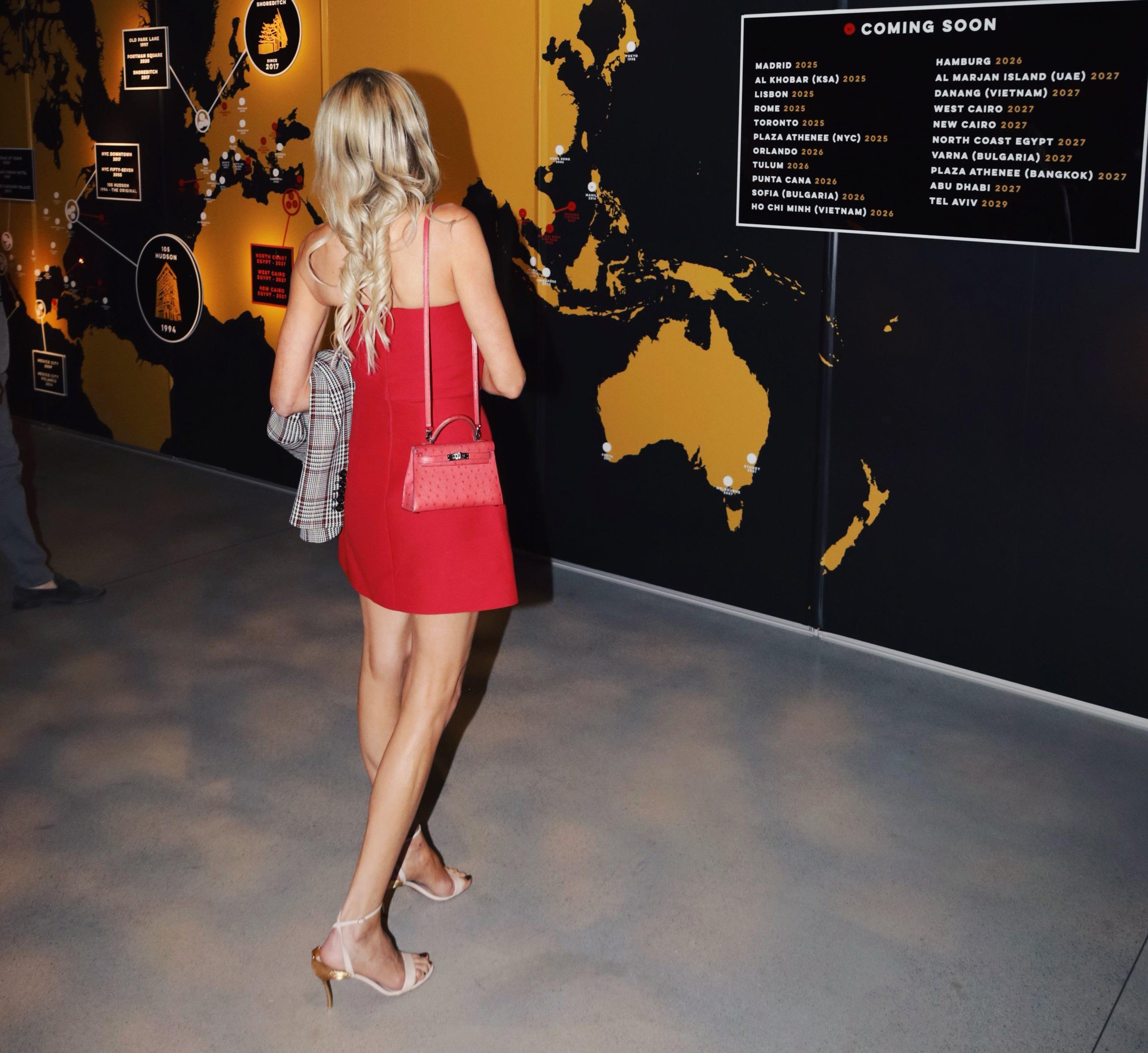
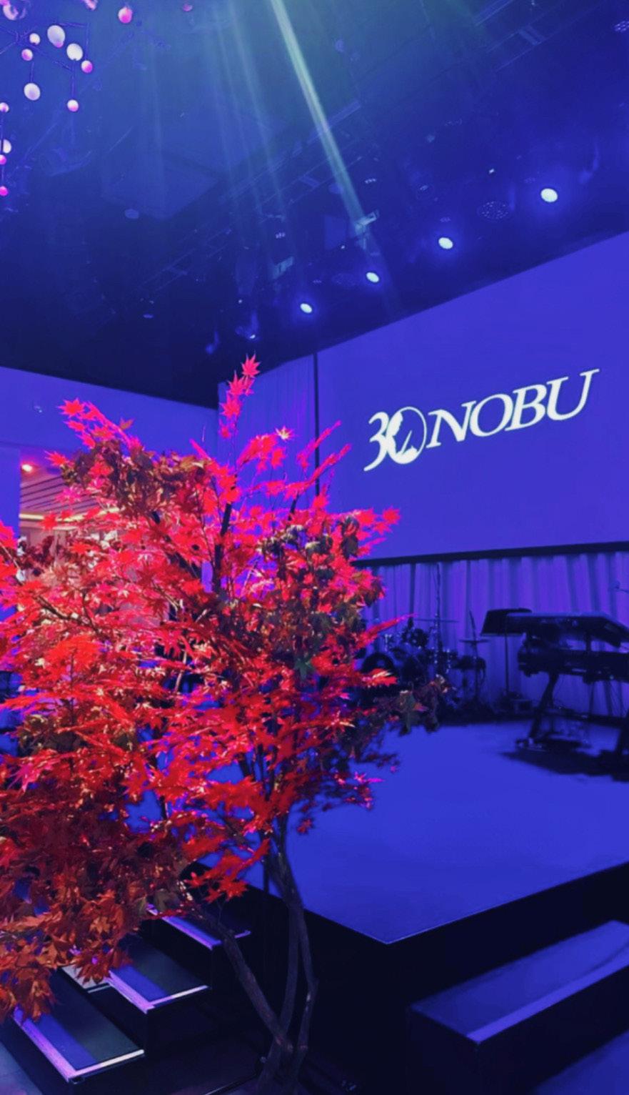
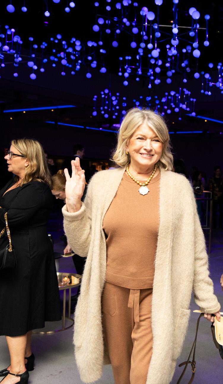
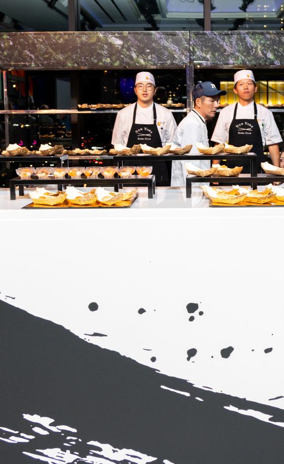
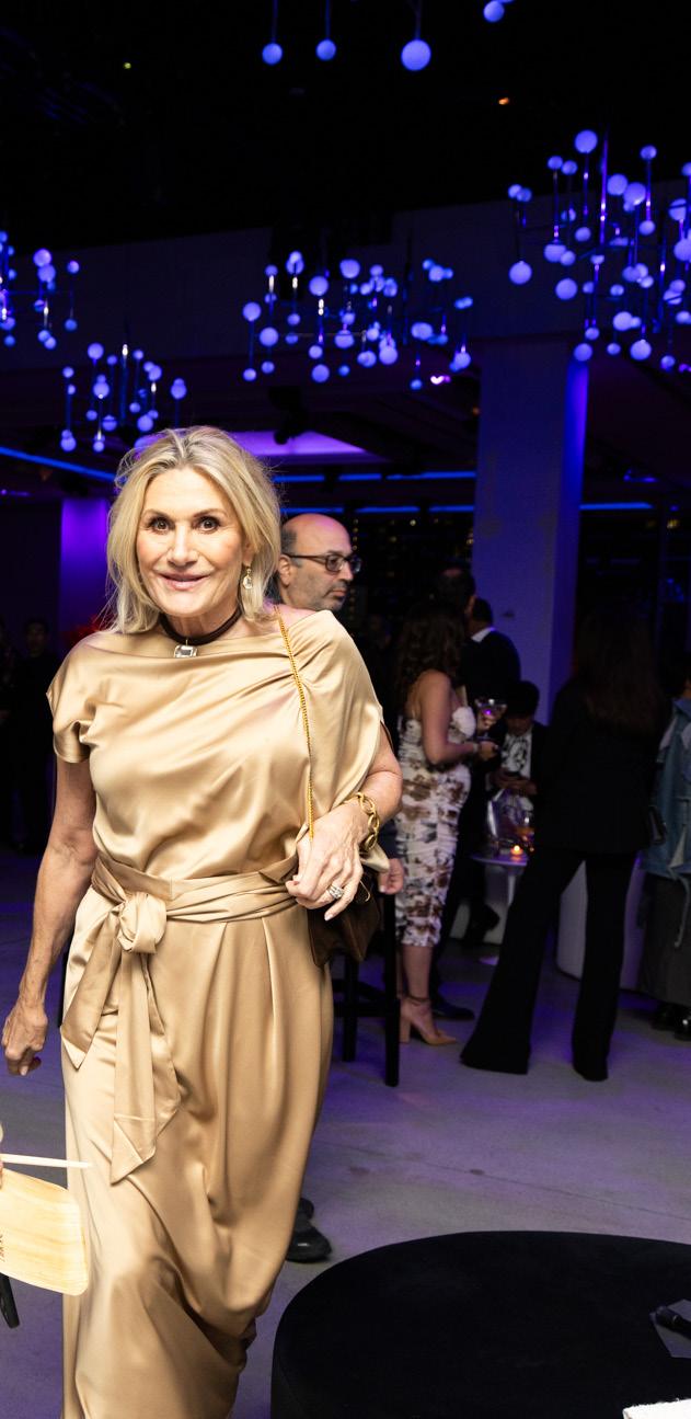
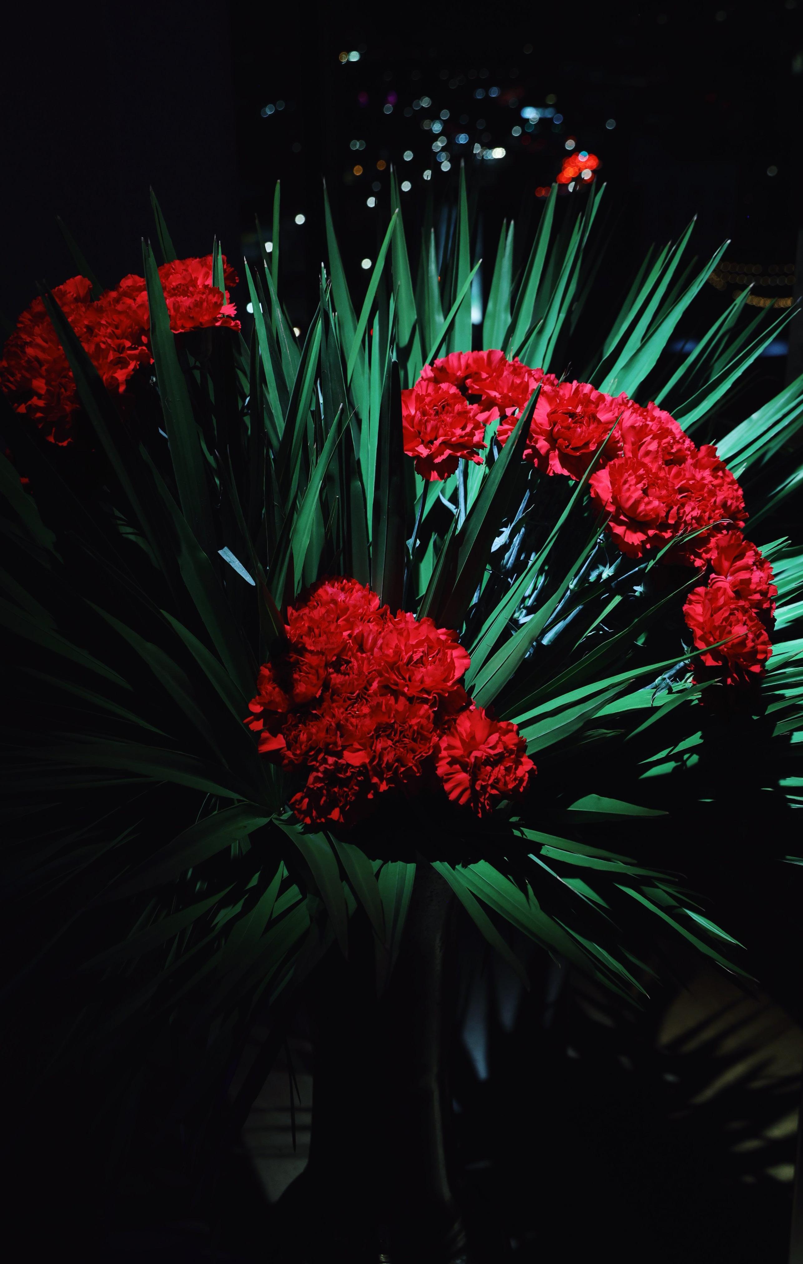
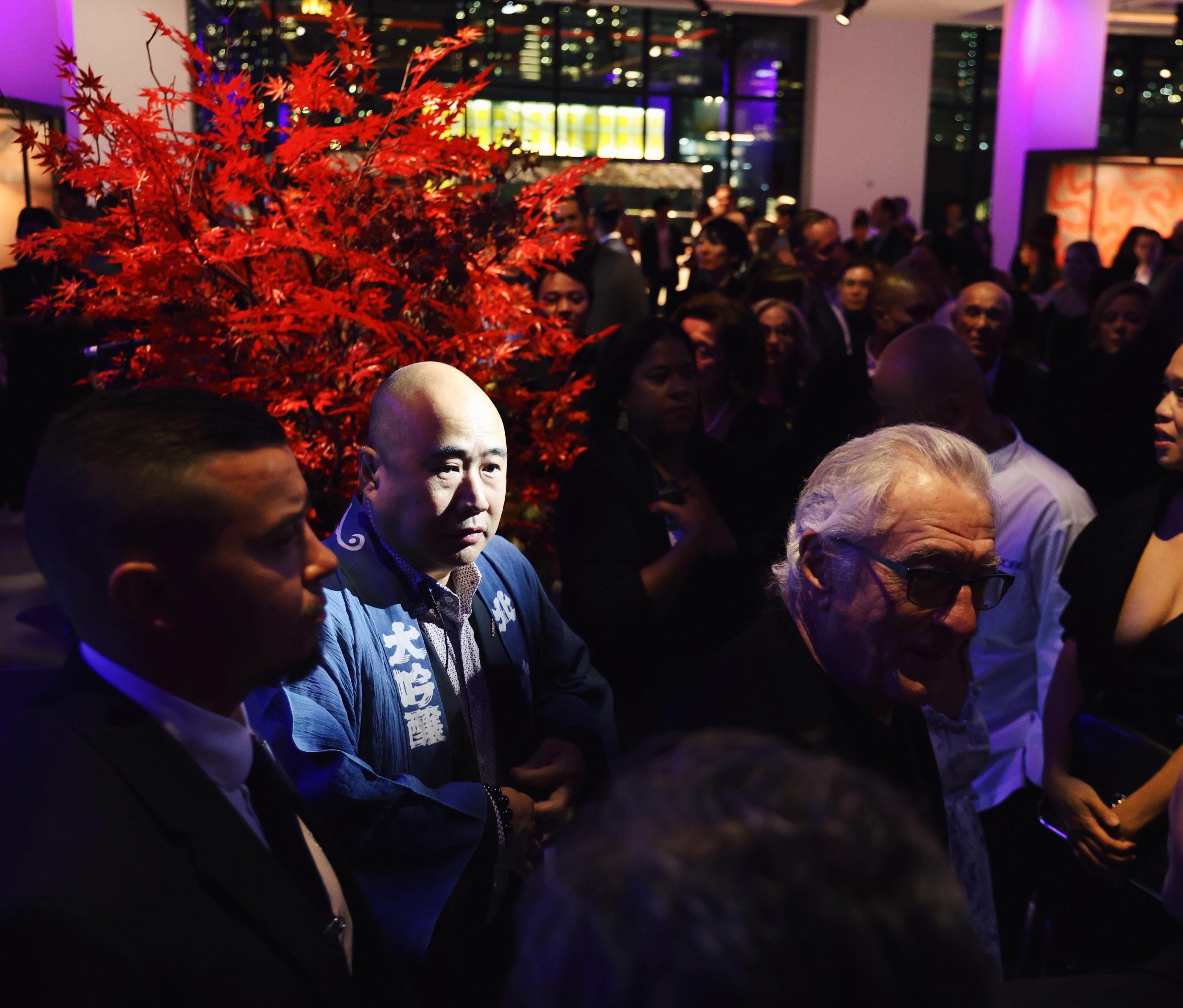
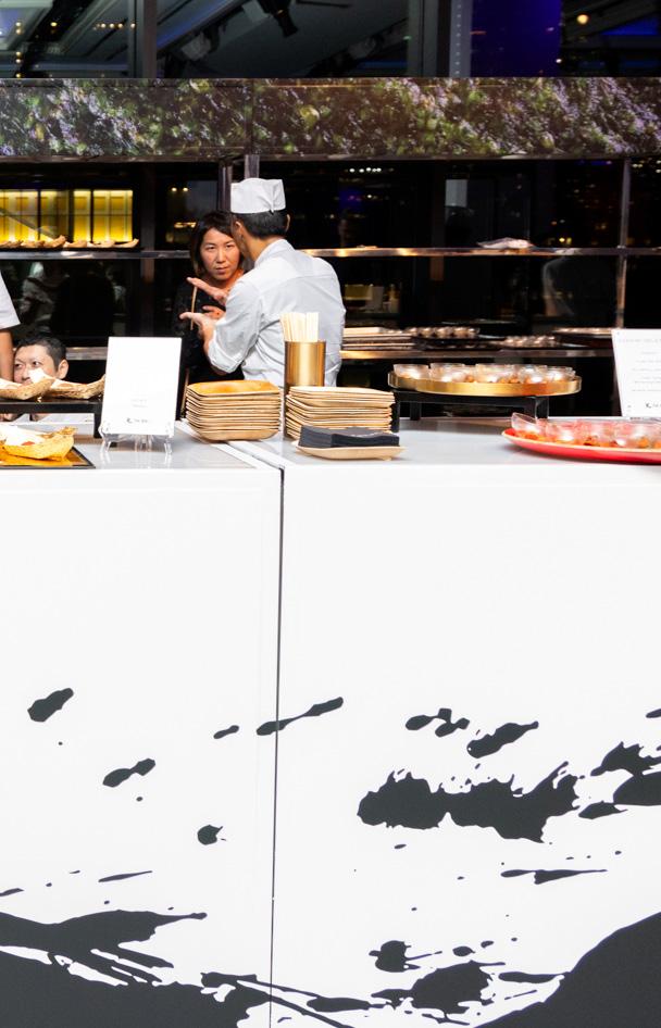
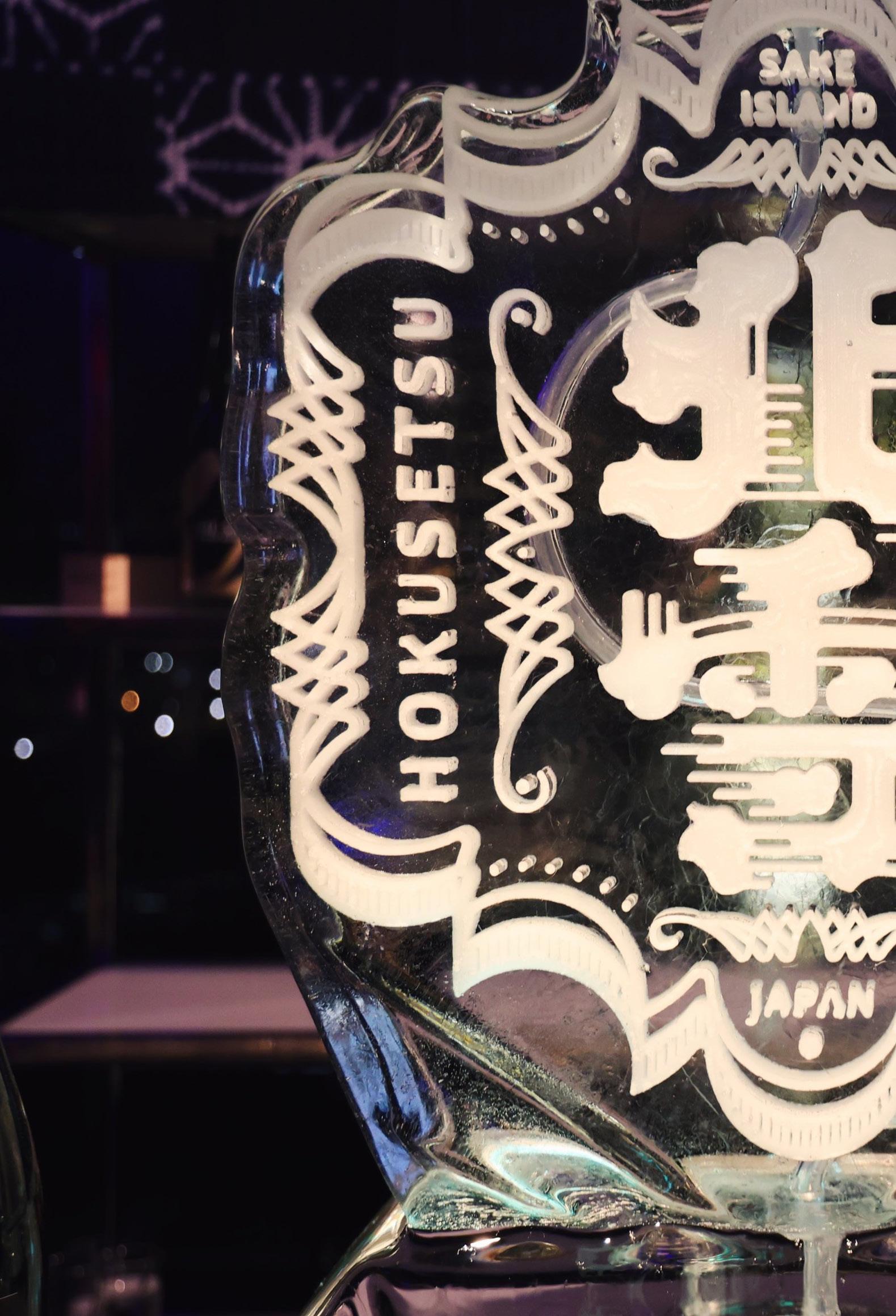
I was honored to be the spatial designer for the celebration of Nobu’s 30th birthday. I designed the space plan with care for egress paths and ADA necessities, specified furniture and decor and collaborated with the florist, and lighting team to bring this momentous occasion to life.