3 minute read
[New] Eclectic & Elegant
Te xt by FRED ALBERT Photography by MICHAEL J. LEE Styled by SEAN WILL IAM
Designer Honey Collins infuses a Beacon Hill home with soft colors and a dose of playfulness.
a ton of neutrals and no strong colors anywhere. My client wanted something that felt happy.”
Spanning 2,830 square feet on a single sunny level, the condominium had been extensively remodeled a decade earlier and blessed with elaborate millwork—all of which languished under a layer of benign taupe paint.
Architect Monika Zofia Pauli rejiggered a few spaces to accommodate the new owner, and cleaned up some of the interior detailing. “Too much of a good thing is not always a good thing,” she observes slyly.
RIGHT: A cart up to the dining table for easy access. FACING PAGE: Woven shades from Hartmann&Forbes temper formality in the living room. Collins reupholstered the owner’s wood chair in a Rubelli stripe. “It needed to be funked up,” she says.

But it’s a term that interior designer Honey Collins often uses when discussing a recent project there. Her client, a widow who was returning to the city after raising two daughters in suburban Boston, had traditional tastes that dovetailed beautifully with a 1911 condominium on one of the neighborhood’s most storied streets. But the place was in desperate need of updating—and a touch of levity.
“Everything was kind of dingy,” Collins says. “It was dark and heavy, with
The new kitchen sports custom cabinets painted Farrow & Ball Parma Gray and a La Cornue range that had to be hoisted through a window on a crane. The Urban Electric Co. lantern is surrounded by soffits concealing ductwork. FACING PAGE: The neighboring breakfast area showcases a Pierre Frey toile the owner treasured from a previous home.
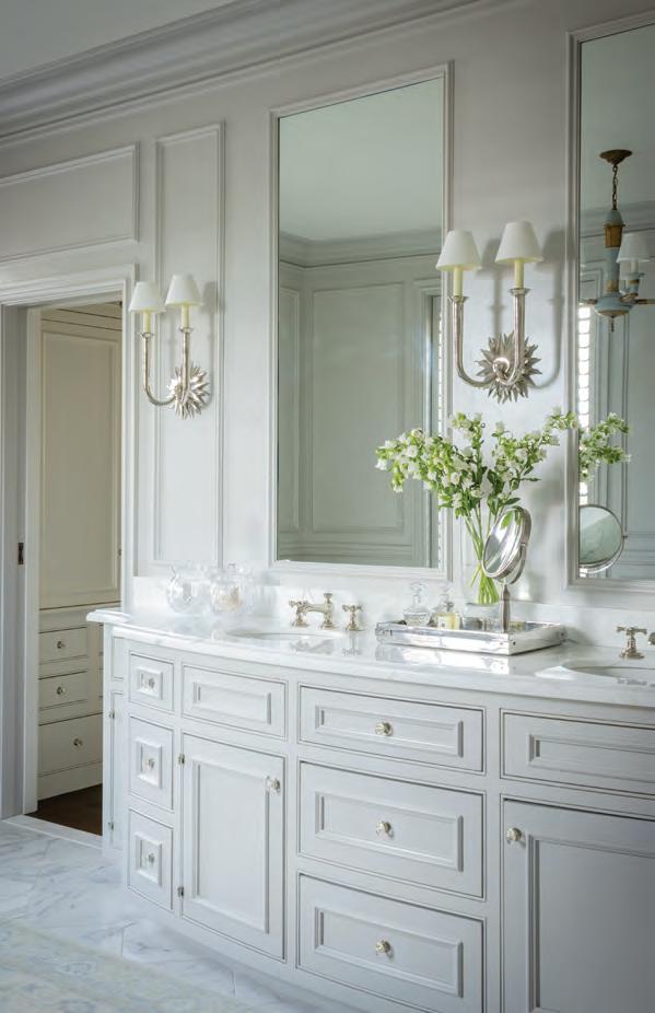
To inject some warmth and color into the home, Collins painted the public spaces a pale gray-blue. While a cool color might seem like a counterintuitive way of heating up a space, the paint’s muted hue (and subtle sheen) reflects the light while providing an understated backdrop for an eclectic mix of furniture styles and patterns.
In the living/dining area, Collins traded starchy curtains for woven-grass shades framed in silk panels, allowing soft filtered light to illuminate the dark walnut floors, which she topped with sisal. “I love the sisal because it gives a more casual vibe to a pretty formal space, and gives it texture, too,” says Collins. The designer combined custom furnishings with a few of the owner’s antiques, which she reupholstered in playful fabrics like leopard-print velvet to help wrest them from history’s grip. “You don’t want them to look like your mom’s old chairs,” she asserts.
Collins augmented the furniture with an array of quirky lighting fixtures, like the duck-footed lamp with feathered shade in the living room, and a chandelier that bathes the dining table in a cascade of glowing droplets.
“There are a few light fixtures I probably wouldn’t have dared to do on my own,” acknowledges the homeowner, “but I love them.”
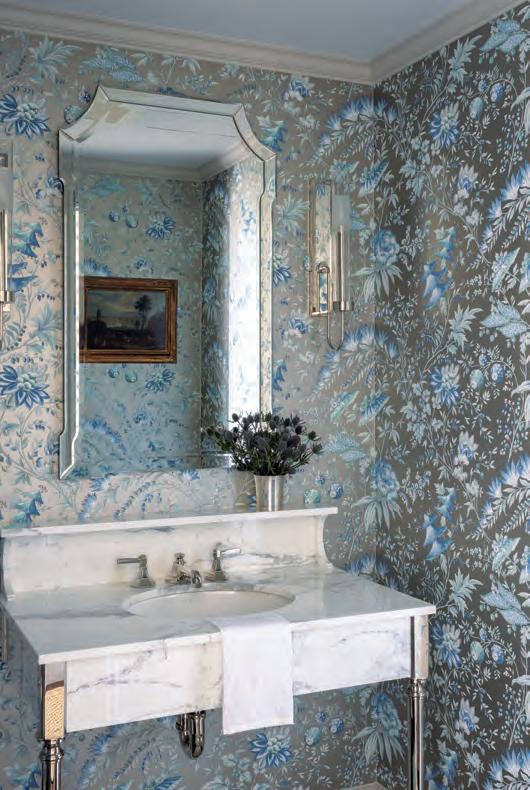
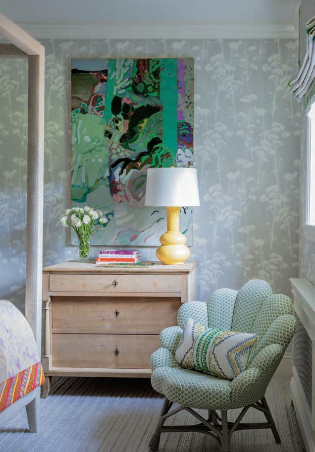
RIGHT: A Gabriel Godard painting hangs against a Galbraith & Paul wallpaper in a daughter’s bedroom; the chair is from Soane Britain. BELOW: Marble sourced from Cumar tops a Palmer Industries console vanity in a new powder room carved from a former bedroom and adorned with Pierre Frey wallpaper. FACING PAGE: Collins transformed the original dining room into a den for TV viewing. She chose the same color paint for the trim and walls, so the space feels more expansive.


Wallpaper reigns in the other rooms, livening the entry hall with chinoiserie and the breakfast room with toile, while bedrooms bask in demure florals. “My client told me she loved wallpaper and really wanted to incorporate that,” Collins says.


No cosmetic flourishes could redeem the kitchen, however—despite repeated attempts. “It got to a tipping point where the team decided, ‘Let’s go all in and put in a new kitchen,’ ” says Jim Foscaldo of F.H. Perry Builder. The homeowner had her heart set on a La Cornue range, so the kitchen was designed around it, with gray-blue Shaker-style cabinets and sleek Neolith counters and backsplashes contributing a timeless traditional touch.
“We did not want anything to look like it was redone today,” says Pauli. “We wanted to flow with the architecture so it feels like it was there from the start.” Funkiness and all.
EDITOR’S NOTE: For details, see Resources.

![[New] Timber!](https://assets.isu.pub/document-structure/230104074014-856a48689c98ca1d0f70047ba0f1bbfe/v1/d2afbd014d83cf651c4057907af5c06e.jpeg)


