3 minute read
Whimsy & Wit
Text by ALYSSA BIRD
Photography by JARED KUZIA
Produced by KARIN LIDBECK BRENT
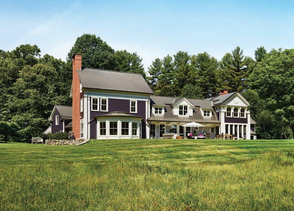
RIGHT: Tittmann tweaked the exterior—which originally merged both Greek Revival and New England farmhouse elements—to be more consistent with the Greek Revival style. BELOW: The den (or “the quiet room,” as the homeowners refer to it) is painted Benjamin Moore Approaching Storm; artwork by Peter Batchelder hangs above the fireplace. FACING PAGE: A mobile from Artefact Home|Garden and a custom rug from Merida welcome guests in the entry; the adjacent dining room features a vibrant Cole & Son wallpaper.
After two decades in the same home, there’s no harm in spicing things up. ¶ When Albert, Rig hter & Tittmann Architects designed this Concord, Massachusetts, residence nearly twenty years ago, the firm drew inspiration from the area’s history and surrounding architecture. “Concord has a strong Greek Revival tradition, so our goal was to connect with that while also exploring the idea of traditional New England farm complexes consisting of a main house, little house, back house, and barn,” says architect John Tittmann.
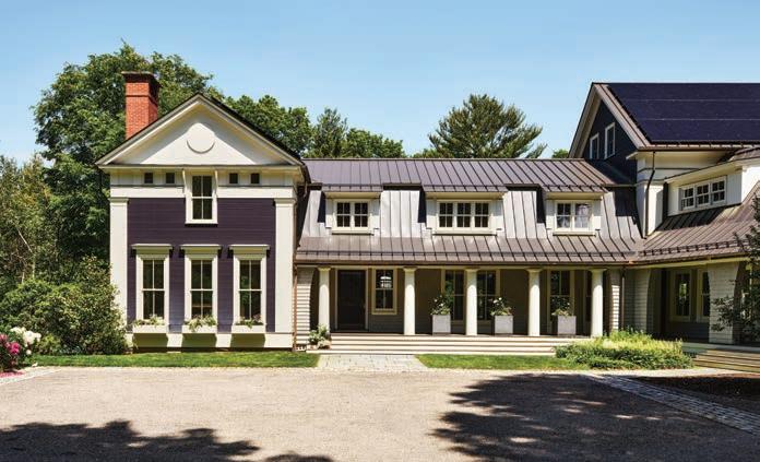
Times and tastes change, and the clients recently reached back out to Tittmann to refresh the property. “They wanted something that felt a little more grown up, so we unified the style of the components to look more Greek Revival,” Tittmann says. It was critical, however, that the homeowners’ affinity for fun continued to shine through in the house’s second iteration—hence its new exterior color scheme, which shifted from a primary palette of blue, red, and yellow to a dramatic deep aubergine.
Inside, Tittmann rebuilt the kitchen, breakfast area, and adjacent family room, and reworked the mudroom and butler’s pantry. “We stripped the family room and kitchen, clarified how the spaces work, and redid the molding, cabinetry, and millwork in a way that’s more delicate and finely rendered,” explains the architect. “We added some whimsical elements to the ornament of the space, including tulip-shape capitals on the colonettes in the family room.” The breakfast area’s ceiling detail resembling a tent with an oculus—inspired by an eighteenth-century ceiling pattern by British architect Robert Adam—remains intact from when the house was initially constructed.
A large component of the renovation was creating better flow between the kitchen, breakfast area, and family room.
FACING PAGE: An eighteenth-century pattern by British architect Robert Adam inspired the breakfast area’s tent-like ceiling. Designer Barbara Elza Hirsch replaced black-and-white marmoleum flooring with a marble checkerboard and chose Artistic Frame chairs to surround a table from Angela Adams.

Builder Mark Doughty, who had also worked on the original project, returned to help with the updates. “You wouldn’t necessarily know by looking at the house if it was built in the 1800s or now,” says Doughty. “It feels like an old home that has been really well taken care of.”
What started with a refresh of a few select areas eventually led to a full-fledged redecoration of the entire house with the help of interior designer Barbara Elza Hirsch, who advised on everything from bathroom and kitchen materials to lighting and furnishings. “The homeowners wanted something adventurous and a little quirky, which is just my style,” says Hirsch. “They were excited about saturated tones and texture. We modernized their sense of whimsy while implementing loads of color, making sure that when you look from one room to the next, the palettes speak to each other.”
Throughout, artwork from the
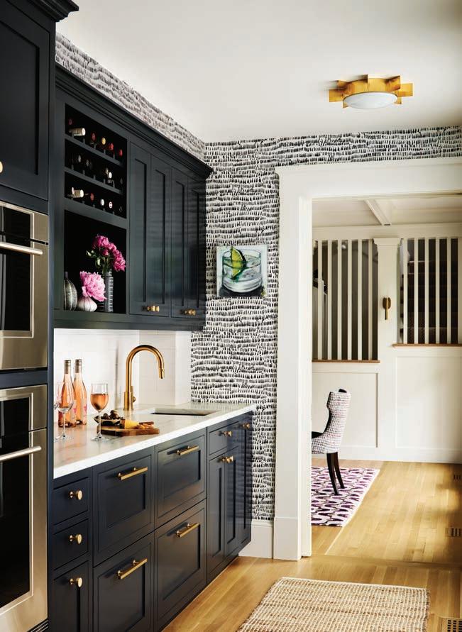
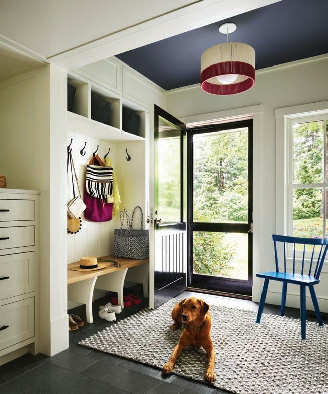
The screened porch off the den is furnished with pieces from Casa Design Group; the homeowners use this room for entertaining, dining, and games. FACING PAGE, TOP TO BOTTOM: The existing butler’s pantry was also given a refresh, thanks to wallpaper from Brewster, Danby marble countertops, new fixtures and appliances, and Farrow & Ball’s blueblack Railings on the cabinetry. In the mudroom, the designers reconfigured the layout and cabinetry, installed porcelain tile resembling slate on the floors, and painted the ceiling Benjamin Moore Wrought Iron.
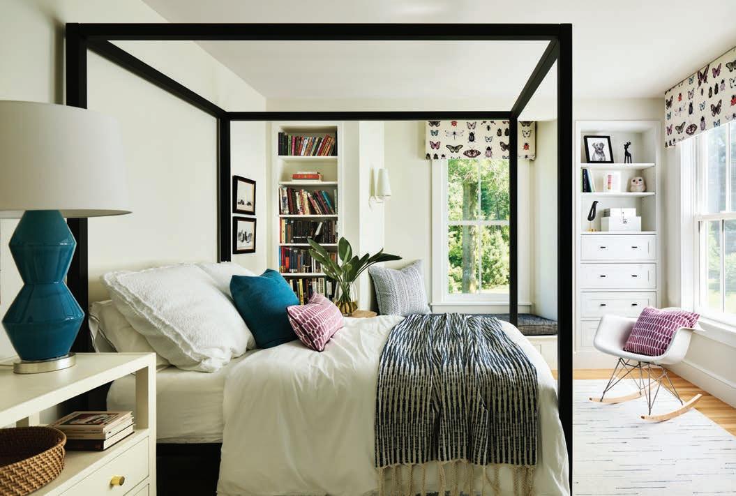
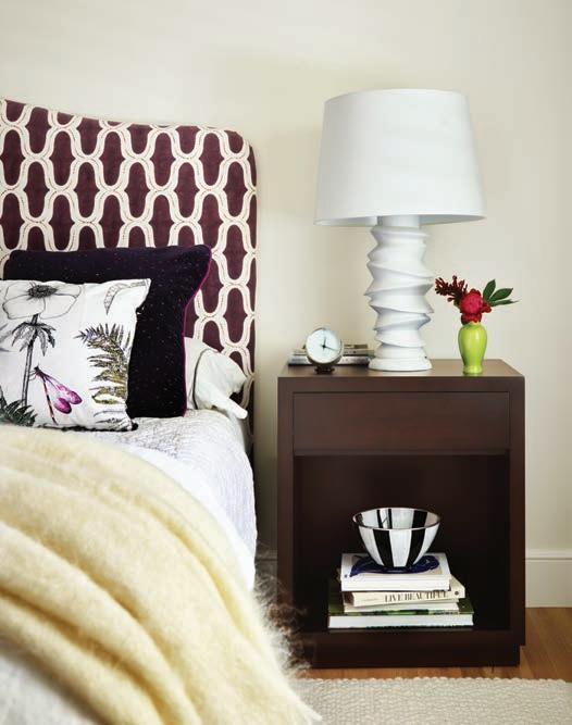
CLOCKWISE FROM ABOVE: In the primary bedroom, nightstands by Hirsch for Dowel flank a bed upholstered in fabric by Seema Krish from Studio 534. The primary bath was gutted to make way for custom walnut double vanities and marble mosaic flooring from New Ravenna. A four-poster makes a statement in a guest room, where a whimsical insect fabric from Kravet crowns the windows. FACING PAGE: A Schumacher-upholstered ottoman complements a cozy Kravet armchair in the primary bedroom.

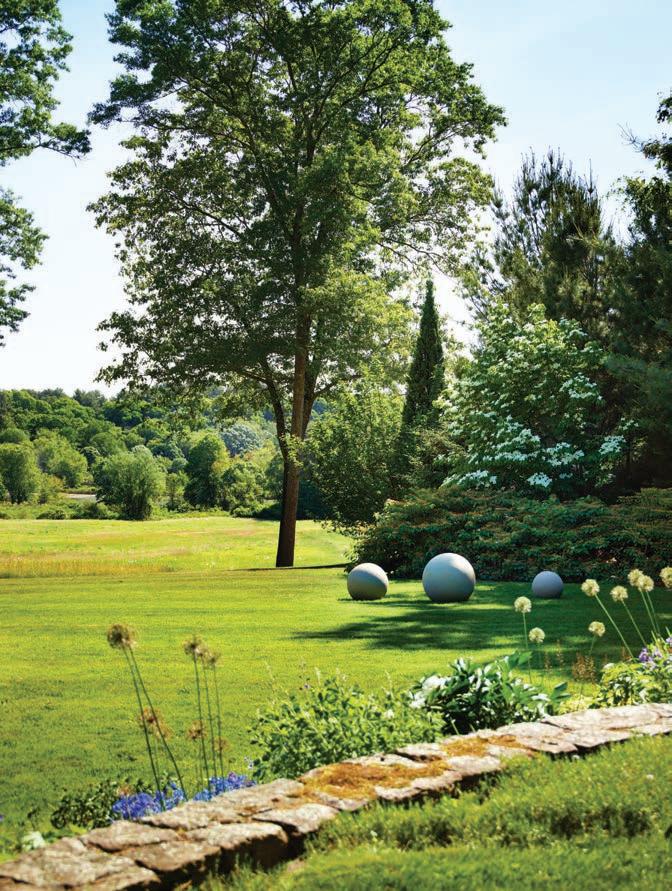
ABOVE: The homeowners chose a deep aubergine to complement the home’s new look. BELOW: The property extends down to a river and affords distant water views. FACING clients’ existing collection mingles with new pieces selected with Hirsch’s assistance. She started from scratch when it came to the furnishings, designing several pieces and customizing others, all while ensuring that everything was consciously produced with the environment in mind (no plastics per the homeowners’ request).
PAGE: The architect reshaped the three dormers on the shingled connector section of the house to look more Greek Revival than farmhouse; a metal roof was also installed to accommodate solar panels.
Materials and finishes also needed to be both kid- and dog-friendly, as the clients’ grown children often visit with grandkids and pets in tow. “They are a laid-back couple,” says Hirsch, “so it was important that the home feels comfortable and not overly designed. New England style is typically more traditional, but these clients challenged me to go off the beaten path to find the unusual.”
EDITOR’S NOTE: For details, see Resources.
ARCHITECTURE:
Albert, Righter & Tittmann Architects
INTERIOR DESIGN: Elza B. Design
BUILDER: Thoughtforms
LANDSCAPE DESIGN: Elizabeth Hanna
Morss and Alden Landscape Design
