3 minute read
COLORFUL CLASSIC


With its timeless elegance to keep it grounded, a historic Cambridge house is free to explore bold new directions.
Text by PAULA M. BODAH |
Photography
by JARED KUZIA
Like so many of the Boston area’s lovely late-nineteenth-century dwellings, this pretty shingled house in Cambridge had endured its share of changes since its 1899 construction. “Prior owners had done some unsympathetic alterations,” architect Christopher Dallmus of Design Associates says with a bit of understatement. “The interior had been fragmented.” A pity because, as he puts it, “the house is all about light. The whole south side is just bathed in light.”
Designer Kristin Paton was struck by the light, too, the first time she stepped inside the front door and saw the charming floor-to-ceiling window at the end of the broad entry hall. “It was such a focal point,” she says, “framing a tree in the backyard and flooding the space with sunshine.”
Architectural details, such as the dining room’s coffered ceiling and wainscoting, were either restored or recreated. William Morris wallpaper with bold cobalt and lime is paired with luxurious green wool drapes. Mitchell Gold + Bob Williams chairs in green leather join host chairs outfitted in Pierre Fray fabric.
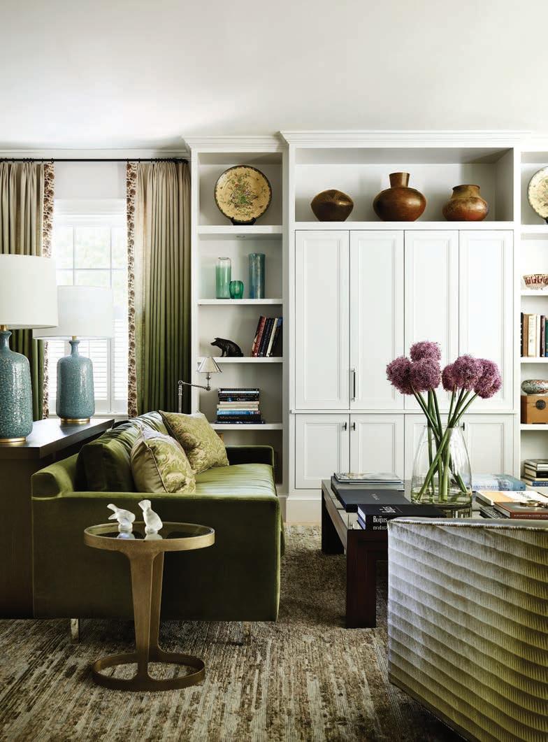
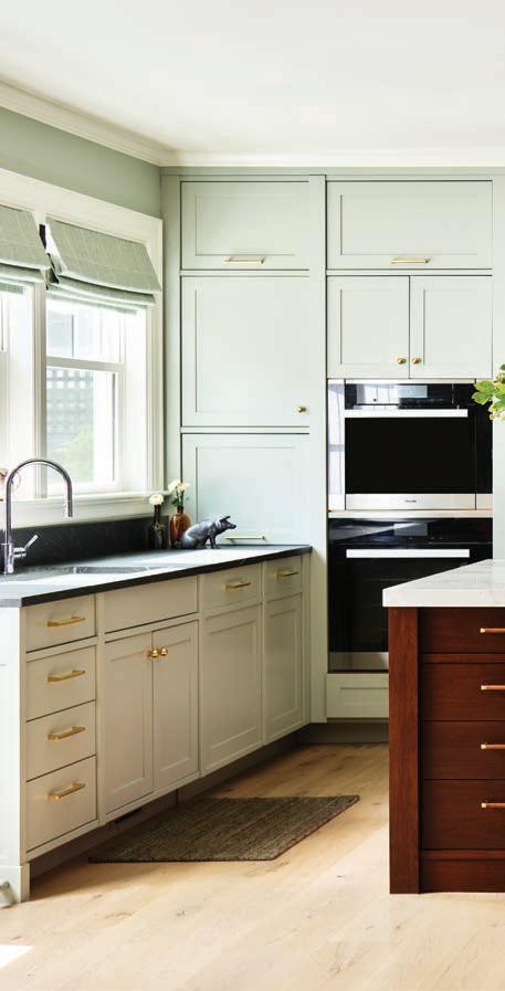
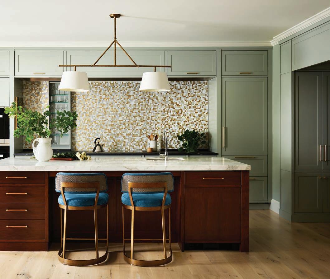
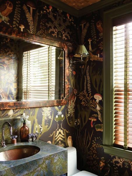
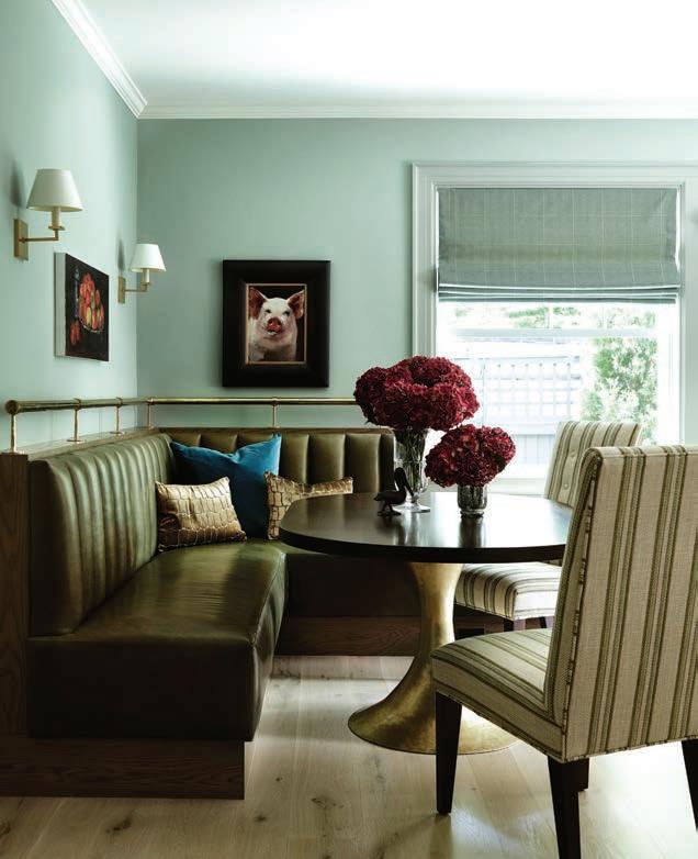
CLOCKWISE FROM ABOVE: The kitchen, designed and built by Kochman Reidt + Haigh Cabinetmakers, is decidedly contemporary with its Farrow & Ball Light Blue cabinetry, marbletopped island, and backsplash that designer Kristin Paton says resembles a Klimt painting. The casual dining area in the kitchen features a banquette covered in green leather. A new powder room provides a dose of drama. Builtins in the living room have a more contemporary look; barrel chairs with crushed-velvet backs make fine companions to the Steven King rug of steel gray, chocolate brown, and moss green.
The homeowners, a sophisticated, well-traveled pair of empty nesters, wanted their new place to reflect their flair for adventure and zest for life. For the architect and designer, success would begin with restoring the authenticity of the home’s interior architecture.
The design team, which included Marc Calheta of Kistler & Knapp Builders, maximized both light and flow on the first floor by taking down walls and relocating the stairs that lead to the basement so they could expand the kitchen. On the second level, they converted four bedrooms into one guest room and a spacious primary suite.
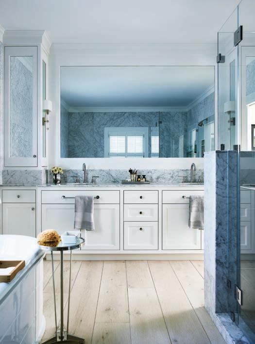
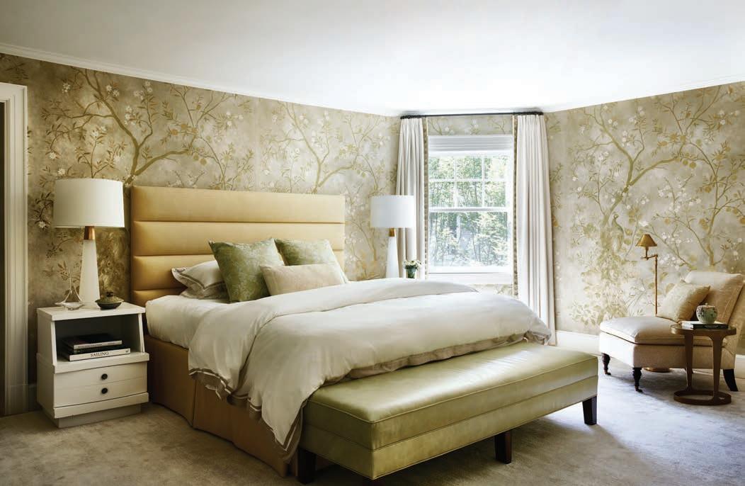
FROM TOP: Paton wrapped the primary bedroom in an elegant Zoffany wallpaper, then added a custom bed with an upholstered headboard. The tub in the primary bath is so heavy, a piano mover was brought in to put it in place. Herrick & White crafted the primary bath’s cabinetry. FACING PAGE: The fireplace in the primary bedroom suite was converted to gas and treated to a new mantel.

Bedrooms on the third level became his and her offices, one with a Murphy bed for guests.
Throughout the house, architectural details were restored or reconstructed. “The house had a lot of wonderful details,” Calheta says. “Chris and his team enhanced them. We added coffered ceilings, new fireplace mantels, and cabinetry. You’d be hard-pressed to tell what was there 100 years ago and what’s new.”
Paton enlivened that backdrop of quiet, classic architectural details with glorious shades of blues and greens. The entry hall sports turquoise grasscloth and a moss-green horsehair bench that came from the couple’s former home. A goatskin-covered console and mercury-glass lamps also came from the previous house, as did the round table that sits at the end of the hall.
“We added the stools, covered in a jazzy geometric, as a juxtaposition to the classic table,” Paton says.
Quiet classicism gets an exuberant boost in the dining room, too, with
William Morris’s Seaweed wallpaper in cobalt and lime.
The property’s revamping extended beyond the main house to the dilapidated little carriage house. Rather than rebuild it as a tiny replica of the main house, the design team opted for a more contemporary structure with guest quarters, a gym, and an airy, light-filled art studio.
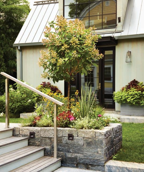
Tying the two structures together are the grounds, almost completely reimagined by landscape architect Gregory Lombardi, who bridged formal and casual in a series of walkways, terraces, lawn, and gardens.
“The homeowners spend time overseas in the summer, so we needed a garden that does well in the other seasons,” Lombardi explains. Late-season perennials, bushes and trees that hold winter interest, and annuals for color keep the landscape pretty year-round.
EDITOR’S NOTE: For details, see Resources.
ARCHITECTURE: Design Associates
INTERIOR DESIGN: Kristin Paton Interiors
BUILDER: Kistler & Knapp Builders
LANDSCAPE DESIGN: Gregory Lombardi Design
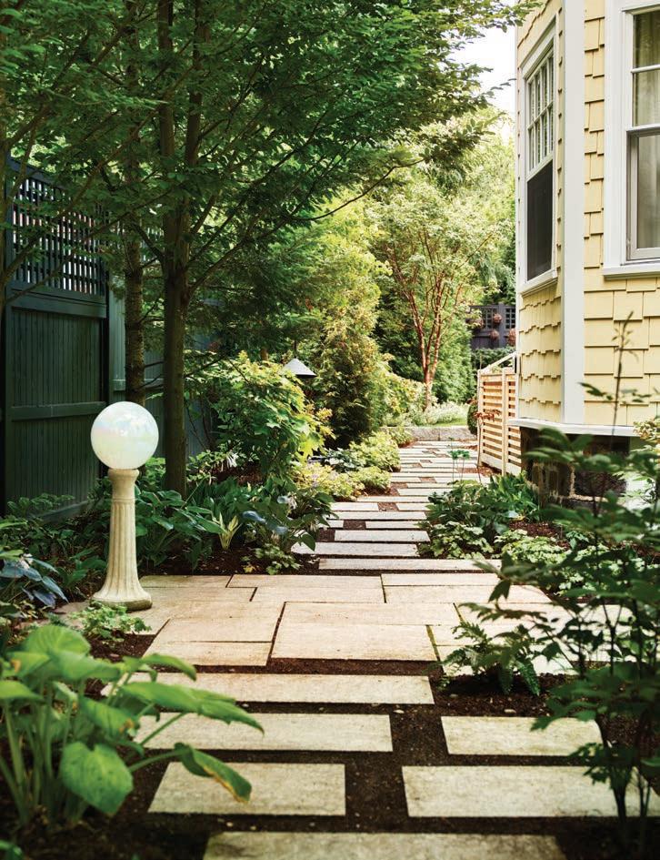
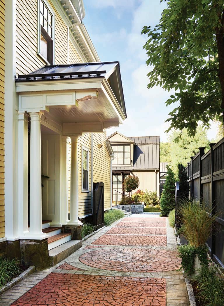
Rather than mimic the main building, the restored carriage house takes a more contemporary turn. FACING PAGE, TOP TO BOTTOM: “The stone box is one of a series that defines the parameter of the deck off the back of the house,” says landscape architect Gregory Lombardi. A walkway of pavers forms a kind of mosaic along one side of the home.


