2 minute read
Surprise of Element An
THERE’S MORE THAN MEETS THE EYE AT THIS WELLESLEY NEW BUILD.
Text by FRED ALBERT
Photography by LUKE WHITE
Stately houses crafted from stone, timber, and shingles line the rambling, tree-shrouded lanes that wind through Wellesley Farms, evoking the pastoral pleasures of rural New England life. Developed in the 1920s, the subdivision was designed to offer residents a bucolic alternative to conventional suburban life just twenty-five minutes by train from downtown Boston.
Little has changed in the intervening century, and one Wellesley Farms couple was determined to keep it that way. They purchased a 1923 house with the intention of preserving it, but found that its condition made the cost prohibitive. “At the end of the day, it made much more sense to do a new house in the spirit of the old house,” says architect Patrick Ahearn.
Ahearn crafted an imaginary biography for the new residence, then designed a house that reflected it, with “additions” that span the centuries, including one that absorbed an old stone smokehouse the architect concocted. “The house tells the story of how it could have evolved over time,” Ahearn says.
The team from Sweeney Custom Homes & Renovations applied wainscot-

—INTERIOR DESIGNER CHARLES SPADA
ing, paneling, and trim to nearly every inch of wall space and covered the ceilings with grids of cascading coffers. Despite the period touches, the rooms are large and high ceilinged, thanks to some spatial acrobatics Ahearn hid behind the staid exterior.
Interior designer Charles Spada proved to be a perfect match for both the setting and the client. “We were of the same mind with everything that was being done,” says Spada, whose blend of creamy custom furniture, European antiques, and billowing curtains swaddle the clients and their visiting grown children in a cocoon of elegant comfort.
While Spada’s style is lavish, his approach is restrained, eschewing strong colors and layered prints for a monochromatic curated mix. “Less is more,” the designer says. “My intention is not to load up a room just to load up a room.” Antiques are combined with new furniture, and seventeenth-century engravings share wall space with modern art, instilling a healthy tension between past and present.
In lieu of a formal living room, the house boasts a succession of interconnected gathering spaces, starting with the breakfast room across from the front door. Not the cozy nook the name might suggest, the high-ceilinged hall was designed for gatherings, with a rugged fieldstone wall (a relic of the fictitious smokehouse) spanning the rear.
“You think you’re going to walk into a ho-hum center-entrance colonial, then you see this,” Ahearn says slyly. “That’s the element of surprise.”
French doors lead to a conservatory, where a stone fireplace warms wicker seating illuminated by a skylight concealed in the coffers. The family room next door was designed around the owners’ existing furniture, which Spada augmented with a resplendently weathered Swedish secretary and a wall-size reproduction of a seventeenthcentury Italian fresco. The pocket doors between them lead to an intimate sitting room, where plump upholstered pieces beckon at the end of the day.
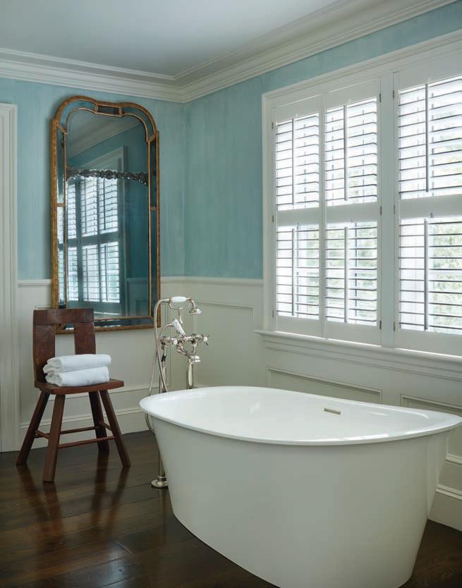
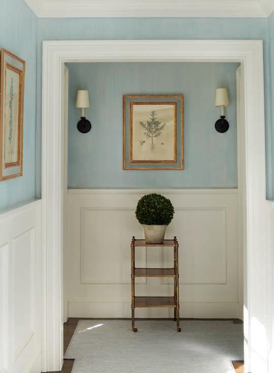
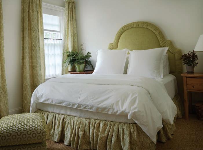
CLOCKWISE FROM ABOVE: An upstairs guest room invites cozy relaxation. Decorative painter James Herbst applied a strié finish to the hallway walls outside the primary bedroom. Herbst used the same technique in the primary bath, where a Kohler tub shares space with a chair that the owners’ daughter made in high school.


FACING PAGE: Spada covered the walls in the primary bedroom with a Sister Parish linen; an eighteenth-century ciel de lit shelters a headboard upholstered in a Raoul Textiles linen.

Although it measures less than an acre, the property feels larger, thanks to the adjoining woodlands and the canny ministrations of landscape architects Keith LeBlanc and John Haven, who tucked the pool alongside a rangy stone outcrop, leaving room for a broad back lawn and a couple of terraces. The pair preserved many of the mature trees to help blend the house with its
The pool sits perpendicular to the house, freeing vistas across the yard. Subtle terracing adds visual interest and creates a surface on grade with the first floor to accommodate a patio and a niche for grilling, which the landscape architects masked behind shrubs.


