Project #3 “Power of Patience” in IARD 1035 Fundamental Design Skills in Summer 2024
Students
Adkison, Anna Louise Bell, Ann
Brainard, Genevieve Marie Charlene Calaway, Kellah Chavez-Razo, Marilyn Cochran, Mason Dell Crain, Jocilyn Rose
Creed, Campbell Gayden Dickman, Jacob W
Dudley, Lily Dula, Landry E
Eargle, Haley Nicole
Endom, Mary Jane Elizabeth Grafe, Kaylynn E Gunn, Bentley Noel Hampton, Adian Hemker, Jack William
Instructors
Henry, Peyton E
Hudgins, Anna-Claire E
James, Addie S
Johnson, Maddie Ciara
Jordan, Ashley J
Kline, Alyssa Taylor
Lambeth, Jericha
Lammers, London Jade
Lopez, Young-Su Ying
McAfee, Fiona M
McCaig, Walker
Miller, Kinleigh Paige
Mutschler, Caroline Ruth
Newell, Jeremiah
Patterson, Ava Anezka
Perez, Jaylin Millie
Perez, Maribel
Peters, Zadie Brooks
Park, Jinoh (coordinator); Smith, Carl; Loftin, Lance; Park, Chung
Publisher
Park, Jinoh
Reichl, Summer Rivera Estay, Lydia Catalina
Satterwhite, Kaleigh L Schandua, Sydney Claire Schnelle, Jessica J
Short, Gabrielle Layne
Siebert, Forrest Slinkard, Kelsey Rebodos
Smith, Olivia Rose
Stinespring, Karena A
Swain, Audrey Elizabeth
Sylvester, Jordan A Tidwell, Nicholas I
Waites, Meagan Michelle
Wheeler, Lauren Grace
Wutzke, Hannah Elizabeth Young, Ava Camille
*. There is no restriction on academic use of the contents of this book.
*. The copyright of all design results contained in this book belongs to each (student) designer.
PUBLISHER’S NOTE
Since the beginning of my teaching career in Korea, I have always wished that I had a book such as this one. This wish may have originated from my 6th grade teacher, who made a graduation workbook containing students’ writings, drawings, and photographs. After my graduation and before my undergraduate years, I was able to see my growth in ways of thinking and understanding as a result of reading the book. With my colleagues, I made a school book including all the graduate projects completed at Hanyang University in 2006. By reading the book, I had been able to cheer up and reenergize myself whenever I was exhausted and burnt out in practice. With these memories, it has been four years since I made the course books for the subjects I taught.
During the process of creating this book, I learned something that I had never known before. I am gradually improving my skills as an instructor, learning what I have missed as an instructor, what I should remember when teaching next semester, which assignments to emphasize more, and what to emphasize less. Seeing the efforts and thoughts of the students that I had not yet discovered, I smiled at them and regretted that I had not been able to encourage them more.
After receiving this book, each recipient may have a different reaction to it. In the past four years, it has been observed that it serves as a tangible teaching portfolio for instructors, a data bank for students in the event of unexpected laptop failures, and an educational experience that motivates students to create their own portfolios. What will be your reaction when you receive this book? In the future, when you are about to graduate, what will you think after reading this book? In keeping with this thought, I completed the process of making the book.
In my opinion, the curriculum in the first two years is typically more focused on visualizing ideas by converting them into visualized outputs that can be shared with others. In the second half, the focus is more on materialization aligned with the realities, such as building codes, social issues, etc. It is my hope that you will be able to improve your ability to visualize and sense scale before the second half.
As a final note, I would like to thank you for all the time I spent with you. Despite the fact that this design studio with you has ended, please feel free to contact me at any time. I will be glad to respond to your contact. It has been a pleasure having you with me this semester.
I congratulate them on their successful completion.
-
Jinoh Park, Instructor and Publisher
Brainard, Genevieve
Cochran, Mason
Anna Adkison
Haley Eargle
Campbell Creed Portfolio
Mary Jane Endom
Kellah Calaway
Lily Dudley
Bentley Gunn
Mason Cochran
Landry Dula
Ava Patterson Portflio
Jaylin Perez
Maribel
Kinleigh Miller
Zadie Peters Portfolio
Addie James Portfolio
London Lammers Portfolio
Caroline Mutschler Portfolio
Summer Reichl
Lydia Rivera
Siebert
Kaleigh Satterwhite
Nicholas Tidwell
Sydney Schandua Olivia Smith
JESSICA SCHNELLE
Karena
Hannah Wutzke
If I could talk to me before these five weeks, what would I like to share with me?
Main Themes
1. Self-Discovery and Personal Growth
- Self-Confidence and Potential
- Students expressed surprise at their ability to push beyond their perceived limits and achieve more than expected.
- Realization of inner strength and capabilities.
- Resilience and Adaptability
- Overcoming challenges, managing stress, and coping with unexpected difficulties.
- Emphasis on the importance of perseverance and trust in the process.
2. Importance of Time Management
- Managing heavy workloads through effective time management.
- Balancing productivity with good craftsmanship and attention to detail.
- Recognizing the value of taking breaks to maintain mental health.
3. Significance of Relationships and Support
- Importance of building friendships and collaborating with peers.
- Relying on classmates for support and encouragement during challenging times.
- Instructors as valuable resources for guidance and learning.
4. Embracing Challenges and Learning Opportunities
- Understanding that difficult experiences are integral to growth and learning.
- Emphasis on the rewarding nature of overcoming obstacles.
- Appreciation for the lessons learned and the skills acquired during the course.
5. Reflection on Stress and Workload
- Acknowledgment of the initial overwhelming nature of the course.
- Learning to manage stress and not overthink or complain excessively.
- The importance of maintaining a positive mindset despite challenges.
6. Enjoyment and Fulfillment
- Despite the challenges, students found joy and fulfillment in their work.
- The sense of accomplishment and pride in completed projects.
- The positive impact of enjoying the process and the work itself.
Sentiments and
Emotions
1. Positive Emotions
- Pride and Satisfaction: Many students felt proud of their
accomplishments and the progress they made.
- Joy and Enjoyment: Despite the hard work, students found enjoyment in the creative process and the outcomes.
- Gratitude: Appreciation for the opportunity to learn and grow, as well as for the support received from peers and instructors.
2. Negative Emotions
- Stress and Overwhelm: Initial feelings of being overwhelmed by the workload and the intensity of the course.
- Doubt and Anxiety: Moments of doubt about their abilities and the feasibility of completing the tasks.
3. Mixed Emotions
- Relief and Accomplishment: Relief at having completed the course and a sense of accomplishment.
- Reflection and Insight: Mixed feelings about the difficulty of the course, balanced by the recognition of its value and impact.
Key Takeaways and Advice
1. Trust in the Process
- Emphasizing the importance of trusting the process and believing in one’s abilities.
- Encouragement to embrace challenges and learn from them.
2. Importance of Community
- Highlighting the value of building relationships and seeking support from peers.
- Advice to engage with classmates and instructors for a richer learning experience.
3. Balanced Approach
- Advocating for a balance between hard work and self-care.
- Importance of managing time effectively and taking breaks when needed.
4. Embrace Creativity and Risk
- Encouragement to think outside the box and take creative risks.
- Recognition that mistakes and messes are part of the learning process.
5. Positive Mindset
- Advice to maintain a positive mindset and avoid unnecessary stress.
- Encouragement to focus on the rewarding aspects of the work and the progress made.
Overall, the reflections indicate a transformative experience for the students, characterized by personal growth, the development of resilience, and the acquisition of valuable skills. The recurring themes of self-discovery, the importance of time management, and the value of relationships underscore the holistic nature of their learning journey.
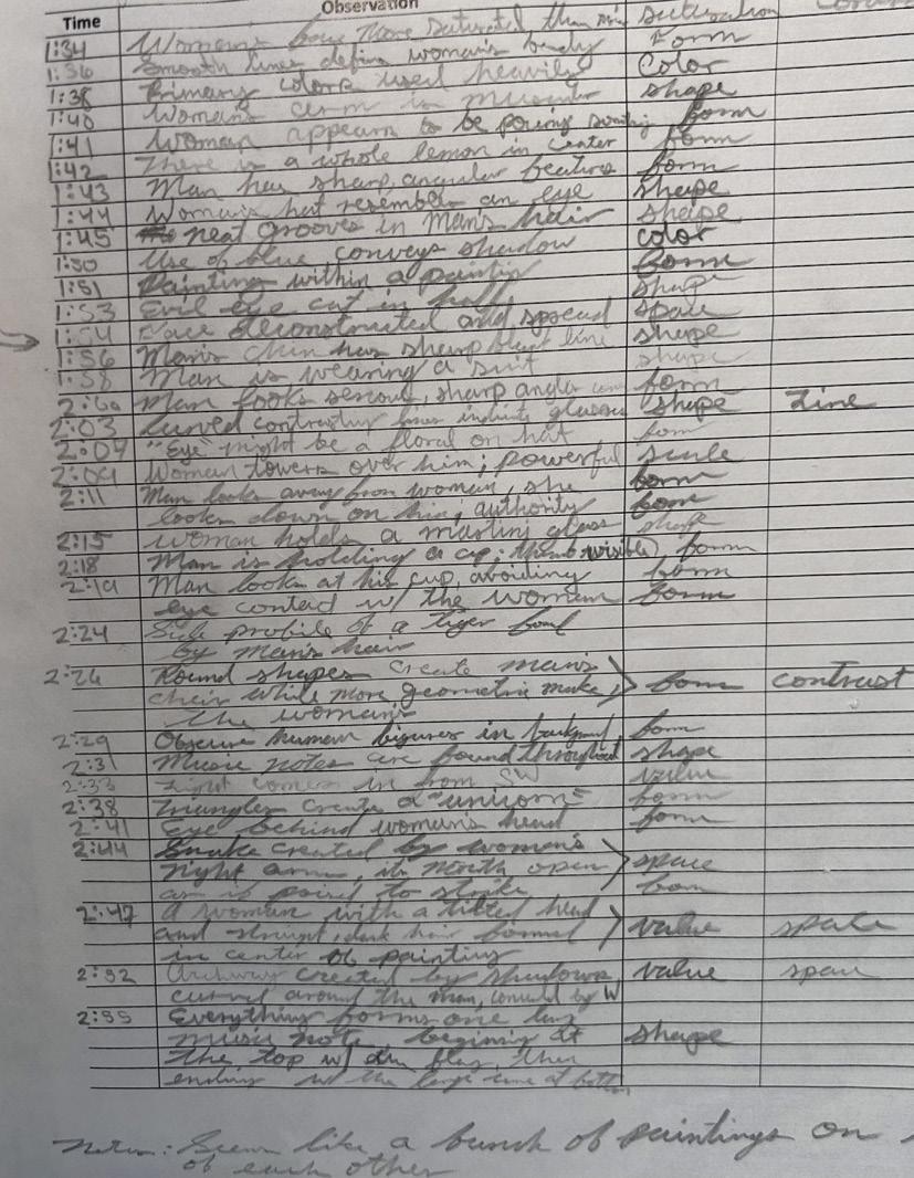
Power of Patience
Learning Objective
Students will have an opportunity to develop their ways of seeing, which are engaging and envisioning an object through deceleration and immersive attention. In addition, they will learn about the art elements and design principles.
Key Themes:
1. Patience and Observation:
- The importance of patience in thoroughly understanding and appreciating art.
- Discovering more details and deeper meanings in artwork through prolonged observation.
2. Art Interpretation:
- Interpreting the intentions behind artists’ choices and the stories within their works.
- Understanding the underlying meanings, emotions, and concepts conveyed by the artwork.
3. Design Principles and Elements:
- Learning to dissect and analyze the artistic and design elements used in paintings.
- Applying principles of design, such as shapes, colors, and tones, to interpret and appreciate art.
4. Deep Engagement with Art:
- The value of spending extended time with a single piece of art to uncover hidden details.
- Gaining a new perspective on art by slowing down and engaging deeply with the work.
5. Personal Growth and Reflection:
- Developing a greater appreciation for the nuances of art and design.
- Realizing the significance of patience in both art and everyday life.
Lessons Learned:
1. Enhanced Observation Skills:
- Noticing more details and understanding the complexity of art with prolonged observation.
- Developing the ability to see beyond initial impressions and uncover hidden aspects of artwork.
2. Importance of Patience:
- Learning that patience is a crucial skill in art appreciation and design.
- Recognizing the benefits of taking the time to thoroughly engage with and understand art.
3. Art Analysis Techniques:
- Gaining skills in interpreting shapes, colors, tones, and other design elements.
- Learning to apply design principles to analyze and appreciate artwork more deeply.
4. Art as a Storytelling Medium:
- Understanding that artists often embed stories and emotions within their works.
- Recognizing the importance of looking beyond the surface to grasp the full narrative of a painting.
5. Personal and Professional Growth:
- Realizing the importance of patience and attention to detail in both personal and professional contexts.
- Applying lessons from art observation to improve design skills and creative processes.
6. Appreciation for Art and Design:
- Developing a deeper appreciation for the thought and effort that goes into creating art.
- Learning to value the process of engaging with art and design on a deeper level.
Conclusion:
The “Power of Patience” project taught students the invaluable lesson of patience and its impact on art appreciation and design. By spending extended time observing a single piece of artwork, students developed enhanced observation skills, learned to interpret design principles, and gained a deeper understanding of the stories and emotions embedded in art. This project underscored the significance of patience in both personal growth and professional development, ultimately fostering a greater appreciation for the complexity and nuance of art and design.
Anna Adkison
Portfolio
What I learned...
Project #1 “Wall, Column, and Space”
- I learned how lighting effects walls and spaces. I also learned how wall, columns, and curved walls work together.
Project #2 “Hand Drawing”
- From this project I learned that drawing what you see can make you see more then what you thought you did. It also made me think about how we see the work in different perspectives.
Project #3 “Power of Patience”
- I learned that I really don’t have that much patience. After looking at a painting for 3 hours I did notice more things about the artwork then I did before.
Project #4 “Space Cube”
- Project four taught me a lot of different things. It taught me how to manage my time and do things right the first time.
Project #5 “First Portfolio”
- I learned that making a portfoili with all the projects that we did took a lot of work and made me happy to see them all together.
Overall
- These five weeks have been so stressful for me and has been nothing like anything I’ve done before. Although it was a stuggle with very long night it was very rewarding.
If you could talk to you before these five weeks, what would you like to share with you?
- One thing I would tell myself before the five weeks is that you can push yourself more then you think and you can do so much more then you think. You will lose a lot of sleep but this work is all your future and for you to do something you love.
Ann Bell
Project #1 “Wall, Column, and Space”
Project #2 “Hand Drawing”
Project #3 “Power of Patience”
Project #4 “Space Cube”
Project #5 “First Portfolio”
Overall
If you could talk to you before these five weeks, what would you like to share with you?
This course, while extremely important and useful, will seem convoluted at the beginning. The instructions and amount of time spent in the studio are daunting, but looking back, the completion of the tasks at hand was the most important aspect of the class. Completion, as Jinoh stated at the beginning of class, is ninety percent of the grade and something to be proud of. The times that I experienced doubt in this class, as to whether I should continue, were valid. But thanks to Mr. Carl, I now know that this class was much more geared towards interior design than anything else. Landscape, while not entirely different, asks for different aspects of architecture than what you are currently doing.
While the class was more aimed towards interior architecture, the lessons and projects are still important and useful for your degree. Building models, learning how to use software tools, and submitting assignments in a timely and orderly fashion are all skills you will need to have leading into the next five weeks, and in your life in general.
So, it’s important to remember that in the end, completing this course with your best foot forward is the goal of these five weeks. Be sure to look ahead at what is required of you and do your best to be punctual to class and pin-ups. There will be moments of angst and doubt, but the moments of joy and completion of things you enjoy far surpass those. Enjoy it.
For my initial power of patience summary, I reviewed an untitled work by Joan Mitchell. However, after being reassigned, I completed my three-hour assignment looking at a painting by Howard Finster. The good aspect of this change is that I have seen many of Mr. Finster’s works before in my former workplace. His work is incredible, to say the least, and while I have not always liked it, my exposure to his art throughout my years of working at a residential facility, which I believe he was involved in through some capacity, has taught me much about him and I have become accustomed to his work. My favorite aspects of his works are the angels, which, after three hours, I became enthralled with. The large George Washington face was impressive, but without the background containing people and angels, it would have had the same connotation as the less-than-inspiring portrait of George Washington to its left. With the added elements of the painting and the amount of time I spent in front of it, I ascribed depth to the work. While I stared at the painting and a scene of biblical imagery mirroring the beginnings of America came into view, those walking past it might just see it as an interesting portrait of George Washington and nothing more. That is what this painting has revealed to me: that the longer we stare at something, the more likely we are to assign meaning to it.
This painting, to me, after this amount of time, is a re-creation of the beginnings of America in comparison to the fall of Babel. With the sadness of those left on the ground, the joy of the angels above, and the colorful depictions of those who have fallen from the towers separating their oneness as a gray collective, the scene reminds me of the Bible story depicting the fall of Babel. Additionally, the only two structures inside the painting are a church and a depiction of the tower that looks incredibly similar to the one in my childhood Bible. This depiction, along with the separation of those below and inside the sky, and the colorful and color-drained depictions of those in the separate spaces, brings to mind longing and trials, only to end up on the ground no longer a collective but as individual parts which could never re-create what they had set out to do, leaving every figure on the ground to lift their hands to the heavens in anguish.
Comparing this view of the painting to the beginnings of America, we see that Washington is the focal point without question. However, the way he is depicted is especially interesting given that he morphs into a river almost towards the bottom of the painting. It looks as though he is melting, or at least dividing the space between the left and right of the bottom portion of the painting. I feel as though the painting is saying that much like Babel, the creation of America, as symbolized through Washington, was the result of something going wrong catastrophically. Whether that was the original Christian sin, the fall of Babel itself, or the dissolution of the colonies’ rights as the British became greedier, something happened. This could also be metaphorical. Though I do not believe that the world Washington would have wanted to view is what we are currently living in, as he was a slave owner, it could be a metaphorical sense of falling short of American values, and Washington, much like Jesus Christ, is the conduit to the most crucial American issues and beliefs. I am not sure of this last one, but I thought I should mention it as it was my initial thought. In the end, the symbolism and imagery could have been intended to speak on anything in the world, or nothing at all, and that would be fine. It is the time I took looking at the painting and the interesting imagery that put these ideas of working towards perfection, trying to become the perfect beings, and falling short back onto the earth. A mindset and experience many Americans feel daily. I believe that this painting is quite lovely and was happy to look at it for all that time.
Genevieve Portfolio
What I learned...
Project #1 “Wall, Column, and Space”
- I learned how walls, columns, and space can affect your emotions based on the type of walls, their sequence and their placement.
Project #2 “Hand Drawing”
- I learned that it is important to practice drawing what you see versus what you think you see, learned how to draw in 2-point perspective, and learned how color can affect emotions.
Project #3 “Power of Patience”
- I learned that there is more than what meets the eye about paintings, especially abstract ones.
Project #4 “Space Cube”
- I learned that iteration plays a critical role into a successful model, and failure can lead to accomplishment.
Project #5 “First Portfolio”
- I learned how to use AI in an acceptable manner so as to not diminish the human experience and creativity.
Overall
- I learned the basics of design school and how to think more about the placement and meanings behind everyday objects. If you could talk to you before these five weeks, what would you like to share with you?
- I would tell her that no matter what you think you are getting into, you have no idea what’s coming. Everyone is creative in their own way, and comparison is normal in the process, but don’t put yourself down just because someone has a different idea to yours because someone could be thinking the exact same thing.
The first thing I noticed about eter usa’s The Encounter was that the painting has a very small color scheme he employs. ost of the painting is made using dark browns, oranges, and yellows with a few complimentary colors being used like blue and purple. This allows for the painting to have a sense of unity because of how the colors all relate to each other through a monochromatic and complementary color scheme. The values of these colors additionally create some balance, as the darkest colors are used on the outer ends of the painting while the lighter ones are used closer to the center. ot only this, but the values of the colors create contrast which allows for some of the shapes to be emphasi ed. For instance, the backwards E shape in the center of the painting is made using a light orange and a beige color, but to emphasi e the shape usa used a dark brown underneath the shape.
Furthermore, usa repeatedly uses the same abstract shapes but gives them di erent proportions and orientations which I believe allows for some movement to be added to the shapes. The detailing of the shapes remains very plain with most only having one or two colors within them, but there are two areas on the painting that have very small and intricate details. The first is slightly below the center of the painting and the second in the bottom left corner. The patterns within these shapes in relation to the rest of the painting I believe are used to add some depth and texture to the painting.
Work #3. Second Report:
“Art Elements and Design principles in the Painting”
After staring at the painting for roughly 3 hours, the painting began to reveal itself. Being in person allowed our group to understand the painting by Peter Busa as there’s no other record of its existence on the internet. Reading the description on the wall, the first thing I noticed outside of what was apparent in my initial report was that the painting has a direct influence from Peruvian art. In the same room as The Encounter was an actual Peruvian textile piece from the Northwest Coast of Peru made in the 1800s. Comparing the two works, we began to understand that Busa’s abstract art style is directly inspired by the form, shape, and patterns of Peruvian textiles. The description provided by Crystal Bridges also provided us with the information that there are faces present in the painting that I don’t think I would have found otherwise. Busa additionally uses these abstract shapes to create scenes of Peru. Two of the faces mentioned earlier are some of the most detailed spots in the painting which I believe resemble scenes that you would find in a house. The face at the bottom left corner of the painting appears to be a living room, with an eye in the shape of the window and the nose as the door. In my initial report when I discussed the “detailed parts of the painting” – the faces – I said that they were added to create some movement in the painting. But after looking at the painting for 3 hours, I think Busa added these scenes for a more nostalgic sense. Not only does he include these scenes of a house, but the blue image above the face in the corner with a brown rectangle splitting the image in two resembles a lighthouse and the ocean. We began to think that Busa was trying to not only mimic Peruvian textile art but replicate scenes from Peru.
Additionally, the shapes to the right seemed random when I was writing the initial report, but after reviewing it, they all seem intentional and, in my opinion, look like a jigsaw puzzle waiting to be solved. Busa repeatedly uses the same shapes and patterns but places them in different orientations or in different colors throughout the painting. This adds rhythm to the painting and balances the artwork so as to make it more appealing to look at. Looking at the shapes more, our group theorized that the reason Peter Busa called it The Encounter is because some of these shapes resemble letters. At the very center of the painting is a backward “E” and right next to it a house shape that could be interpreted as an “n” and so on until you can spell out “encounter.” Using shapes in this painting I think is mainly to create patterns, rhythm, and unity within the painting. The patterns emerge with the repetition of certain shapes like the backwards “E” and the similarities between the two faces. Rhythm can be found in the fact that some of these shapes are not necessarily repeating but are recreated with new methods like different colors, proportions, and orientations. The use of patterns and rhythms balance the painting and create a sense of unity because they convey harmony and cohesion by connecting parts of the painting together through similar shapes and patterns.
Along with the shapes, the colors contribute to the painting in a significant way. When I first looked at the painting, the overwhelming amount of oranges and browns used reminds me of a dessert landscape, but after googling the landscapes of Peru, desserts aren’t the most prevalent biome. Even after three hours, I couldn’t figure out why Peter Busa used an overwhelming amount of oranges in his painting other than the fact that he was trying to emphasize the complimentary colors that he used in his painting. The blues used in the painting remind me of bodies of water, like the coastal landscape to the left of the painting and the pool-shaped blob underneath the center. I believe the colors used are mainly to create emphasis throughout the painting. With the lack of shading because of the very one-dimensional art style, Busa has to resort to deep contrasts within the colors which helps emphasize certain shapes and patterns. As mentioned in my first report, the lighter colors are used to create figures like the backwards “E” while the darker colors act like an outline. This painting is so complicated and with a lack of any description outside of the one provided by Crystal Bridges, I think I could stare at this painting for 30 hours and not fully understand what’s happening. Why he called the painting The Encounter could be for a number of reasons, from the fact that there are three people in the painting or the fact that certain shapes look like the letters in “encounter,” but I think I’d have to revisit for another day and do a year’s worth of research to find out the meaning behind this painting.
Kellah Calaway
What I learned...
Project #1 “Wall, Column, and Space”
- Throughout this project, I learned how to create purposeful compositions utilizing walls, columns, and space. This assignment gave me the opportunity to develop skills in creating intentional spaces with consideration of the environment and those utilizing the space.
Project #2 “Hand Drawing”
- Throughout this project, I learned a lot about different drawing perspectives and styles. This gave me the opportunity to further develop my drawing skills and to better understand my models and the spaces around me.
Project #3 “Power of Patience”
- This project allowed me to dive deep into interpreting art and understanding intentions of others’ work. The assignment gave me the opportunity to gain a new experience and discover the deeper meanings within my assigned painting.
Project #4 “Space Cube”
- This project taught me how to compose and continuously develop models of my own. It gave me the opportuniy to create my own intentions within a model and challeneged me to keep those intentions throughout a variety of assignments. Throughout this project I was able to further develop my critical thinking and problem solving skills.
Project #5 “First Portfolio”
- Throughout this project, I learned a lot about AI programs and gained experience in a new form of technology. I faced many challenges throughout these assignments but it allowed me to further my problem solving and computer skills.
Overall
- Throughout this course, I have gained a variety of experiences and skills by completing and analyzing design work. New concepts and ways of thinking were introduced throughout the course which greatly furthered my understanding of design as well as the depths of my work.
If you could talk to you before these five weeks, what would you like to share with you?
- I would share how important it is to understand the purposes and concepts of design while activley thinking outside the box. Along with that, I would tell myself to be confident in my ideas and work and to not stress because even during long, hard nights in the studio, life is always good when you get to do something you enjoy.
In Howard Daum’s untitled painting, it is apparent that various of the seven elements of art and principles of design are utilized in composing the sporadic and complex piece.
This artwork applies multiple visual components including line, shape, space, and color, all going hand in hand to make up this piece. At a first glance, the painting appears to be a significant amount of colorful lines and irregular shapes squished together, demonstrating the initial recognition of the elements of art that this work provides. Shapes play a big role in this work, providing a multitude of components, all unique and irregular, for the painting to build on. The shapes themselves contain other shapes within them, adding complexity and furthering the sporadic configuration of the piece. Lines, in this work, are utilized to contribute to other elements including shape and space. Not only do the lines add to the variety of shapes, but they are also used to tie and connect the others together. This minimizes negative space and contributes to a tangled-like aspect, which is consistent throughout the painting. Lines also provide a sense of repetition, as the piece is difficult to break up, they provide division of irregular shapes. Despite the sporadic composition of color, the combination of warm and cool toned colors, accompanied by black outlines, allows for a clearer view of the work.
There are various principles of design present in this work as well including contrast, balance, and rhythm. Contrast, present in shapes and colors, provide clarity amongst the chaos for the viewer and allow for the sense of complexity to stay consistent throughout the painting. Balance is an interesting concept in this work as the work is balanced towards the center considering the general cluster of shapes, however, within the cluster, despite the asymmetry and irregular shapes, the general composition of shapes and colors stays fairly consistent and balanced. Lastly, rhythm is present through the repetition of colors as well as similar shapes, giving a sense of cohesiveness to the composition without the outright use of replication.
Daum incorporated many components in this piece utilizing combinations of shape, space, and color, presented through contrast, balance, and rhythm to successfully, visually communicate his intentions for the work.
In Howard Daum’s untitled painting, it is apparent that various of the seven elements of art and principles of design are utilized in composing the sporadic and complex piece. The opportunity to view the painting in person presented a variety of new observations as well as a chance to dive further into the purpose and origins of the work.
Many of the seven elements of art are used to make up this work including line, shape, space, texture, and color. While observing this painting at Crystal Bridges, I was able to notice significantly more detail about these elements of art. Many of the lines present in the piece are used to break up the cluster of shapes, however, portions of them are not lines themselves, but rather striped shapes. These lines serve many purposes including tying the cluster together as well as leading the eye to different areas of the painting. Shapes are also a significant aspect to this piece. Though there is a wide variety of unique shapes, specific ones stood out to serve different purposes while others seemed to be more intentional. Many of the circles, specifically circles within other circles or shapes, are a representation of eyes while other configurations of shapes are interpreted to be skeletons. Certain compositions were interpreted as a ship, fish, mushroom, pathway, braid, and feathers, which may be consistent with the artist’s intention of representing indigenous styles of artwork. Space plays a significant role throughout the work as the arrangement lacks space within the cluster, creating a specific sensation to the viewer of a crammed and busy composition. Color contributes to this sensation as well while also playing a role in the flow of the painting, leading the eye to different areas with the accent color of yellow amongst the variety of cool tones. Observing the texture was very interesting in person as, up close, the work is a bit messy and undefined. There were visible brush strokes, visible layering, undefined lines, and many small sections on the canvas left blank. This allowed us to see the painting in a new way, specifically the way the artist saw it while in progress.
Contrast, balance, and rhythm were the specific principles of design I observed within this painting. Contrast of shape, direction, color, composition, etc, all contribute to the experience of this painting. The contrast between light and dark colors, which are mainly present in outlines, provide an aspect of depth amongst this mainly two-dimensional work. Balance is a key aspect of this painting as the shapes are distributed in a balanced manner within the cluster, allowing for consistency throughout the chaos. Rhythm is presented through repetition of certain shapes including a variety of lines and circles. This sense of rhythm also contributes to consistency, despite the lack of directional rhythm.
With ample time to observe this painting, many questions were brought to light. An intriguing question I thought of often throughout this experience was, was this painting composed upright how it is displayed, or could it have been originally painted in a different orientation? This led to efforts of learning more about the painting through changing our view of the painting. A variety of questions was introduced through reading the painting’s description and researching more through it. This artist created this painting as a part of a project based off of indigenous styles of artwork. The outdated wording described this work as “Indian Space”. The lack of information about the indigenous artists and specific tribes, which this style was copied from, led us to believe that this work may be considered cultural appropriation over anything else. The work going untitled, I believe, is a big missed opportunity to give credit to specific artists or tribes. I began to wonder if it was difficult to identify purpose in different aspects of the painting because it is more of a replication rather than a reflection of personal experiences and emotions. After recognizing that this artist copied a style from minorities and failed to give credit, I lost a bit of respect for this work, and began to be more interested in what the authentic work of this style looked like.
Marilyn Chavez
Portfolio
What I learned...
Project #1 “Wall, Column, and Space”
- Project one taught me how the mood of a room changes with the rearrangement of walls, columns, and space. This prokect helped me focus on envoking emotion through a space I made and to be more attentive on how a space feels. Especially when these elements are implemented in real life.
Project #2 “Hand Drawing”
- Hand drawing taught me patience and attention to detail due to the concentration needed when drawing or using my hands to put projects together.
Project #3 “Power of Patience”
- Observing a painting for a rigorous amount of time taught me how one’s perceptions can change over an extent of time. This excercise requires a strong time to be able to focus for a long extent of time but the result was the ability to truly understand the art piece to a deeper level.
Project #4 “Space Cube”
- A continuation of “Wall, Column, and Space”, this project continued to focus on envoking emotion in a space but aswell as proritizing teaching me to able to support my ideas throught models.
Project #5 “First Portfolio”
- I learned new software and digital techniques that will continue to help me in my career.
Overall
- Creating my portfolio allowed for reflection on the projects I made through out the semester and I am able to say I not only learned some fundemental design elements but I learned I am capable of more than I thought coming in 5 weeks ago.
If you could talk to you before these five weeks, what would you like to share with you?
- I would tell myself that this is not 5 weeks of perfectionalism and to embrace new ideas. Embrace messes and mistakes. I would add to ask for help and bounce ideas off others.
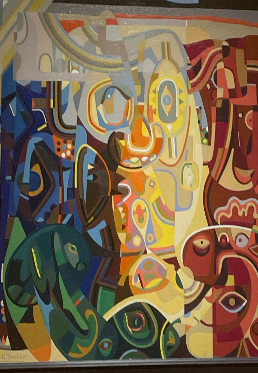
teve Wheeler’s Girl Whistling demonstrates design principles such as alance, contrast, and unity. e used alance along the di erent shapes while still showing contrast within the color and shading of the image. Together this creates unity in the painting.
At first glance, the art piece is not symmetrical and while that is true visually it is not through the first principle of design, balance. alance can be the symmetry between the di erent axes but also by the shapes and the weight they create on the opposite sides of the axis. y looking at the vertical axis the center large figure almost seems to be symmetrical due to the similar shape and width of the shapes merged to create larger one. y surrounding them with more shapes that fill the same space on both si es it creates this balance in the image in a di erent way than making both sides the same. e shows di erentiation this way.
Contrast makes the eye focus more on what the artist deems to be the most important part of their piece. y having a darker shading in the space, the lighter parts are more prominent. Even with this all the shapes and lines are lined up to surround the larger circular image in the center of what seems to be the girl’s face. The precise shading used brings out her side profile and whistle. e does this so particularly that one might not even notice it but still seems to notice the focus.
alance and contrast play a role in the last design element, unity. The choice of shape size and lines helps surround the face of the girl and her whistle by using shading, specifically darker shading in the negative space, the lighter and larger shapes are more prominent. With the help of the smaller detailed shapes, the image comes together blending all shades and shapes to help the viewer bring their attention to the muse of the image but still having to take a moment to think and look.
Work #3. Second Report:
“Art Elements and Design principles in the Painting”
Steve Wheeler’s “Girl Whistling” includes different elements of art and design principles. Whether knowingly or subconsciously Wheeler incorporates elements from these two categories in his painting. During the three hours of observation, the way I saw the painting changed a lot. The painting started with many colors and shapes to reveal people and faces as time passed. By the end of the three hours, I had almost a clear photo of what was in the painting.
At the start of the three-hour period, the painting did not have a clear photo. Throughout the first hour, I noticed the colors and shapes. For example, the different colors being separated on the canvas stood out to me immediately. Each area was differentiated by red, blue, green and yellow while the outer borders had more blacks and grays. After noticing the color placement, I noticed the many tear shapes throughout the painting, almost resembling an eye. During this first hour the noticeable parts of the piece were what I noticed first.
Towards the end of the first hour and the start of the second, I started looking for the girl whistling. The painting’s name led me to truly stare at this piece and look for the muse which it was named after. Looking for the girl I noticed on the bottom left within the green color an animal that resembled a crocodile or alligator and many eyes and what looked like faces. My eyes finally made their way to the center where I saw the eyes and head of what I assumed was the girl. She was placed in the center in yellow, her head disproportional to the rest of her body. After finding the girl I noticed the different colored rainbow swirls that branched out around her. I also noticed how bright the colors were in the center. The bright color surrounds the girl and is in the center while the darker colors like blue, red, and green circle it. More dull and darker colors surround the border such as black and grey.
During the last hour, I started to focus on the feeling these elements gave off. The girl in the bright yellow in the center gave a happy feeling. I think the artist did this to show the joy kids feel when playing or the joy music brings too. The other colors within show how the feeling can outshine negative feelings. I also realized the movement the shapes had. For example, the unusual color rainbow like swirls moved outwards in a fun and graceful way, I saw how the colors from the other areas are in corporate within each other through small lines and shapes to help create contrast. I noticed how the yellow color travels through the canvas and it further shows the happy feeling taking over.
Comparing my last analysis to this one I immediately noticed the vast amount of information I had to put into my final report. I was able to further analyze the painting and the real one to be more exact. The first time I was only able to find a black and white image therefore I feel like my last report was inaccurate. I also structured my report differently, I wrote a paragraph for every element I noticed and due to the image, I was referencing I only chose three while in this one I organized it by the hours spent looking at it. Although the elements are similar, I have more to say and more of an understanding of the painting. Overall, the three hours allowed me the opportunity to look at the painting more in-depth and get an accurate representation of the ideas the artist had.
What I learned...
Project #1 “Wall, Column, and Space”
- I learned how walls and columns relate to space and emotion. How they can impact people and thier thoughts on a space.
Project #2 “Hand Drawing”
- I learned how to ilistrate my ideas in both traditional and abstract ways, as well as how to draw diagrams of a 3d space. Ie elevations, sections, and 3d views.
Project #3 “Power of Patience”
- I learned how to view an image with a designers eye. Disecting the artistic and design elements used to create a painting.
Project #4 “Space Cube”
- I learned how to create a space in a limited area that can be used to express or envoke an emotion. I also learned how to simplifie elemnts in order to express the same emotion in a smaller space.
Project #5 “First Portfolio”
- I learned how to utilize Ai in order to render my images into an example of what they would look like in person.
Overall
- I learned how to express emotion and ideas through the manipulation of positive and negative elements, as well as how to understand what those elements are in understanding of artistic and design elements.
If you could talk to you before these five weeks, what would you like to share with you?
- You can make it. It wont be easy but it will be fun, and you will love everything that you will do.
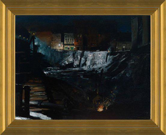
Excavation at ight by George Wesley ellows
In this art piece, depicting a city under construction at a late hour, George Wes ley ellows uses color to lead the eyes of the viewer. e does this by creating a significantly lighter area in the epicenter of the painting. From there the viewers eyes then follow the surrounding area leading them to view the buildings and, finally, the burning church. sing a cascade of the value in order to lead the eyes from top to bottom.
George also uses the lines of his brush strokes and within the paints to make the viewers eyes travel laterally across the painting when viewing it. This lateral way of viewing the painting assists the viewer when absorbing this painting. This is because is causes us to first note the buildings lined in the background, then we fully reali e the crumbling rock in the center of the painting, and lastly, we see the burning fire Infront of what appears to be a church. This way of viewing the painting also allows us as a viewer to better understand the se ng of the paint ing.
George also uses space to better tell the story of the painting. oing this by plac ing us as the viewer at a distance from the scene depicted in the painting. aking it as thought we are simply a spectator rather than an actual character that is part of the depicted scene.
Work #3. Second Report:
“Art Elements and Design principles in the Painting”
This art piece, created in 1908, depicts the mass excavation that took place in New York city for the famous Penn station. Showing how with the excavation for this mass transport in order to bring people together, it disrupted and negatively impacted many people in its creation.
In my initial observations of this painting, I noted how Bellows used both color and value to draw the eyes of the observer first to the more detailed buildings in the background of the painting. This added layer of detail given to these buildings gives a sense that they are lived in. With many of the windows have a warm light coming from within giving the idea that these buildings are well lived in.
This warm light from the buildings also creates an extreme contrast to the cool and dark tones that surround the excavation site. Moving further down the cool tones begin to fall into a blend of dark tones that become more difficult to decipher into individual shapes. This contrast also leads to the ideas that the buildings or the people within the buildings are not happy about the excavation.
Within the darker areas of the painting, it can be noted that there are many figures strewn about the site all having a sense of movement behind them but also a sense of separation with very few if any having any notable integration between them. Creating this overall sense of loneliness or separation.
Continuing with the artist’s use of color and value, it can be noted that the sky is without any characteristics. Rather it is starless and feels almost dead. This leads to one of the early ideas of father sky and mother earth. These ideas come from early art from native peoples. These ideas often carry over and are used to show peoples connection to the world around them. Subsequently it can be noted how there is an extreme disconnect between the people and the world surrounding them. With them not only destroying part of the earth but bathing it in an unnatural light that has no warmth or coolness. This disconnects leads to the idea that this action is an overall negative one in the eyes of the artist. That this action was having a negative impact on the people and their connecting to the world surrounding them.
Moving on from the color and tone of the painting, there are many details of the painting that are expressed through the texture and lines of the brushstrokes and paint. For example, the artist uses a majority of harsh and sharp lines in order to visually describe the excavation site giving it a sense of fresh destruction and violence.
There are also lines in the paint created by the strokes of the brush. These lines allow the viewer to inference the shapes that the artist was creating. For example, the building just Infront of the campfire, upon initial observation appears very small however when looking at the brush strokes and lines in the paint it can be seen that it is actually a much larger building resembling a cabin of some kind. It was also due to this surface texture that I was able to decipher the existence of a large pipe of some kind in the foreground toward the bottom of the painting with multiple people on it working. This pipe gives to the realism of the painting, in idea rather than look, as it shows that they are not only destroying the area but replacing the earth that they are removing with more unnatural items such as this pipe.
The surface texture also shows that many of the details of the buildings in the background are formed from very basic lines and brushstrokes. They become the details of the building when looking at the painting from the distance with the basic lines and patterns blending into walls, windows, and doors. It can also be noted that many of these details are formed from thick layers of paint creating small uplifts where they exist. This assists in creating these very detailed looking areas on the painting when viewing from a slight distance.
Overall, the artist uses multiple design and art elements in order to create a deep and complex painting with details created from both intent and inference based on who is viewing the art piece. Making this painting have a heavy and complex meaning with emotions of anger, sadness, and even a little hope. He has also created a painting that fills the viewer senses allowing them to see the darkness, feel the cold air, hear the echoed shouts and clangs of hammers on rock, and smell the burning smell of freshly broken rocks.
Comparison of first report and second report
My second report is worlds different form my first one. In my first report I felt little to no connecting to the painting. Feeling rather that it was a chore to look at rather than a gift. This is due to me not being able to make any real connection to it through the screen. Rather it felt in personable and distant filled with a false light due to the screen and lacking the texture of the real painting. But when looking at the painting in person I began to create connecting both in my mind and with the painting. Seeing areas that didn’t translate well through the screen and seeing how much more 3d the painting is in reality. I even felt as though I was becoming more connected with the artist that originally made the painting.
“Art Elements and
Design principles in the Painting”
When looking at the painting in person I felt a love for the painting seeing it as more than just an art piece, but a message written in a language that change and shift with whom looks at it. This led to my second report being far more detailed and cared for as I saw more details in the painting and felt far more care for the painting after getting the opportunity to view it in person.
Jocilyn Crain Portfolio
In the Wall Coulumn and Design I learned a lot about createing images that convey feelings and use angles and lighting to do it.
In the hand drawing excersise I learned to apply my five senses to drawing what I see and feel into a tangible image.
In the Power of Patience section I obvisly learned pateince but i also learned to dig deeper into art and understand the why behind designers choices.
The space cube taught me the imprtance of scale and being able to convey the same feeling through multiple different models
The process of making a portfolio is very rewarding and nice to see all of your work come together in one space. I also learned to get bettter at documenting my work in order to showcase the time i spent on it.
Art Elements and esign principles in the ainting
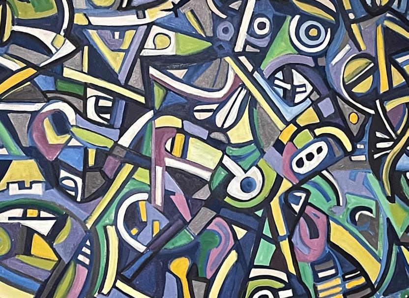
I was first introduced to the painting, ld irate ne, in class and took a moment to analy e and mediate on the painting. bserving the di erent elements of art color, shape, texture, line, value, space, and form. As well as the design principals rhythm, balance, contrast, movement, patterns, unity, and emphasis. pon my first look at the painting, I immediately was confused. The painting is filled with di erent geometric shapes, blended colors, and abstract designs. Arshile Gorky’s The irate is a masterpiece painted in . At first glance, The irate appears as a chaotic composition of abstract forms, swirling lines, and vibrant colors. Gorky’s brushstrokes are dynamic and energetic, conveying a sense of urgency and passion. The use of color in The irate is particularly striking. Gorky employs a rich palette of blues, greens, and earthy tones, creating a sense of depth and movement within the painting. plashes of red and yellow add bursts of intensity, and contrast in the painting.
Work #3. Second Report:
“Art Elements and Design principles in the Painting”
After our trip to Crystal Bridges to review our paintings again I found more purpose and depth in Arshile Gorky’s composition “The Old Pirate.” With art elements and the principals of design in mind I tried to dig deeper into the painting to understand the why behind Gorky’s painting.
The first hour I spent analyzing the painting I could only see the surface level shapes and designs of the painting. I quickly realized the painting was of a dog. Using abstract shapes and line work to create a visually engaging piece of artwork. Gorky’s painting is very fluid and he created a lot movement in his painting using different brush strokes, and art mediums. The painting was very easy to follow with your eyes and kept me entertained while analyzing the composition. The painting while being abstract had very distinct features that allowed me to create my own narrative of what I interpret the painting to be. An example of a scene I conjured up is a nature scene with a dog, butterflies, a sky, and green grass. There were a lot of literals, face value assumptions I made about the painting that did not quite give me the why of the painting. It was not until the two-hour mark that I started to consider why Gorky chose certain colors, lines, and shapes he did in the painting. He uses a lot of pastel green, and blues that create a fluid background that is very calming and entrancing when you look at them blended together. He also intentionally chose to use pops of orange, pink, and purples that jump off of the painting and draw your eye to the center of the image of the dog. Closer to the hour three mark I started to wonder what was going on during the time period that Gorky created the painting and applying what I knew to the why of the painting. In 1942 the United States was just nearing the end of the Great Depression and WW2 was starting. I envision that an artist in this time period was be using their creativity as an outlet to distract themselves from the current state of the world and to also bring joy and relaxation to others. The hues that he chose to illustrate his feelings are very calming and resemble naturistic colors that would most likely be able to take the viewer to a different state of mind. The simple features of the painting such as a dog adds a youthful affect to the painting that also does not take a lot of mental power to comprehend adding to the stress-free effect the painting has on its viewers. There is a lot of depth and interpretation to be discovered in this painting, “The Pirate 1” I would definitely take time to investigate more about this painting in the future as it was a great experience and allowed me to clear my head.
Campbell Creed
Portfolio
What I learned...
Project #1 “Wall, Column, and Space”
- Throughout the process of Project 1 I learned a lot about myself within the craftmanship area. When first beginning I was not sure of how to create specifc pieces while keeping them visually aesthetic. With practice of cutting and molding I was able to make clean work. I learnd that practice and itteration is key to creating precise art.
Project #2 “Hand Drawing”
- When entering Studio, I lacked confidence in the drawing/sketchign field. I can now confidently say that I feel much better about my skill set that I gradually created this 5 weeks. For some of us, it’s difficult to stear away from creating perfct work, and I mean slipping into a sort of abstract work. I heavily put my focus into whether or not my lines were straigt and so on and so forth. But what studio has taught me is that art is completely subjective, you have the creative freedom to illustrate your own thoughts and idea. So over the course of project 2, I began to loosen up slightly and let my mind get into a sort of flow.
Project #3 “Power of Patience”
- At first, I truly thought this project would lack in serving purpose toward my new skill set of interior deisgn knowledge, but sitting here today I know now that patience within art is one of the most key concepts towards understanding the meaning behind art. After visitng Crystak Bridges, I was astonished by the amount of details I had noticed after standing infront of a painting for 3 hours. With a group of people each giving individual feedback, it opens up so many new topics that reach greater than the eye can see. I have learned to enhance my time with work and delve deep into the significance of each stroke and decision made.
Project #4 “Space Cube”
- The space cube drawing was by far the most strenuious yet rewarding project I completed in these 5 weeks. When first gievn the task of creating a large sequence phase, I found it somehwat easy and entertaining to have free range over my model. But as we progressesed to building smaller space cube models, I learned that I am able to convey so many new emotions and messages through my work. As I recreated each scene, my narratives or stories for each phase would be become more and more detailed.
Project #5 “First Portfolio”
- AI is becoming a large part of the desgn work extremely fast. When asked to take our own work and create AI images, I was hesitant to follow through. I was scared of the fact that my work would be completely construed and alrtered based off a software. But after seeign the creations I was surpised to see that although my work had been completely changed it was not negative in any sort. It opened up my eyes to the hundreds of possibilites that are to come. AI is not a danger but more of a addition to creativity.
Overall
- Overall, I had an amazing experince over these past 5 weeks. I have never in my life learned so many new skills and yet so much about myself all at the same time. This program is mentally challenging but so rewarding which continues to push me to create bigger and better projects.
If you could talk to you before these five weeks, what would you like to share with you?
- If I could talk to myself before these 5 weeks, I would tell myself that It will all workout although you outcome may not be what you anticipated. Change is difficult for you in such a quick time frame but you will mold to the specificty of each task. I am extremely proud of how resilant you have become!
For this project, I was assigned the Stanton Macdonald Wright Au Cafe (synchrony) Painting. This piece of art, at first glance, is brightly colored with an assortment of shapes and shades, maybe even a few abstract faces. There are multiple lines, all moving in a mostly vertical downward direction as well as circles that are curved to the right. The middle of the painting is much busier with a more detailed amount of lines and shapes, also overlapping colors. This also goes along with the shape of the painting, it appears to sort of be leaping off the page in the middle due to the amount of color and dimension. Lastly, I believe the artist tried to stick to a general theme of colors, those being the 3 primary colors. This art piece makes me feels ambitious and eager, with pops of color and a positive connotation
Work #3. Second Report:
When first assigned the task of visiting Crystal Bridges, I was not amused with the fact that we had been asked to sit and analyze our assigned painting for 3 hours. Initially, this appeared excessive, yet now, having diligently finished the task, I’m pleased to declare that I’ve gained a comprehensive comprehension of how what initially felt like an endless stretch of time can greatly enhance one’s understanding of art. I had never been one to delve deep into paintings, but with the right atmosphere and patience, one may reach their full potential of dissecting another’s work.
When I had first researched my painting, Stanton Macdonald Wright Au Cafe (synchrony) painting, I really only thought it was a beautiful piece of art with a jumble of abstract shapes and an assortment of bright colors. I knew Macdonald had used mostly primary colors with the exception of a few blends, but past that nothing had really stuck out. Within minutes of my arrival to the painting my entire perception changed, I had finally realized that there were two figures made up of what I once thought were just abstract shapes. There is an ear located toward the bottom right of the painting which was the first giveaway, then the rest of the outline for the figure came along. The other figure in the painting, a woman, is located towards the upper left/middle of the painting. As time went on, I was able to notice that each of these figures had a drink in their hand, each with a garnish on the edge. I think that once one is able to take note of the two figures in the painting, the easy part is out of the way. After the first 30 minutes, my group and I continued to notice different shapes and meaningful lines, but really we curated an entire story with our imagination and interpretation. Macdonald uses softer, more curved lines for the woman’s figure compared to the man’s whereas he chooses sharp, vertical, and rigid lines to depict a masculine male. I believe this goes along with the fact that he was trying to make it very clear to his audience that the contrast between the two genders is extremely apparent. After about an hour, I decided to read the description placed next to the painting to search for any key details, and what I found changed the entire composition of the painting. The writing entailed that Macdonald based most of his work off of music, or musical notes. I assume the genre of music was jazz since he created this painting in France and the tone of the artwork is classical yet formal. With the background of musical notes as inspiration we began to depict that the entirety of the art was made up of notes ranging from large to small. These musical notes created the outlines of the figures and other objects in the painting. As we stared longer, we thought that maybe Macdonald had intended for the man to be playing music while he dreamt of or imagined the woman who stood before him. The man and woman seem to be in a bar/cafe, so it would make sense for him to be drinking something, possibly something of alcohol substance due to the martini shaped glasses. When I had a chance to comprehend this all, I was able to transform these new details into elements of art. The colors used throughout the painting, those being primary, were placed opposite of each other on the piece to make one another contrast. This not only made the figures stand out, but also allowed for dimension. Specific strokes used for the man contrasted the women, I identified this as texture. I also noticed that the distance or space between these two figures made it seem that the woman was a fantasy or dream that the man was having. She begins to fade or blur away on the right side of the painting, almost as if she isn’t real. The man is also looking down, avoiding eye contact, or maybe he is not able to fully grasp the idea of this woman he sees before him. I was not able to decipher if this was a woman he once loved or maybe even his mother who passed. This painting can be interpreted in so many different ways with a new story to each side. Looking back to when I first analyzed this painting, I feel ignorant to the fact that the story was right before my eyes. The once abstract colorful painting has now turned into one of the most beautiful and meaningful works of art I have yet to see
Jacob Dickman Portfolio
What I learned...
Project #1 “Wall, Column, and Space”
- This project taught me how to manage not only time and material, but also ideas and decision making. Throughout this project, I learned how to properly execute detailed and consistent model building with high craftsmenship. In addition to the craftsmanship and skills that this project taught me, I now have a much better understanding of lighting conditions and the way that they affect a space.
Project #2 “Hand Drawing”
- Hand Drawing was a seven series project including everything from blind drawing, to examining the sights outside of your window. These subsects of this project taught me all about my drawing style, and the way that I can shade, outline, and depict different real-world objects. Specifically, in the color section of this project, we were able to explore how color affects the world around us, and what we can do as designers to bend the boundaries.
Project #3 “Power of Patience”
- In this Project, I learned the valuable lesson of attention and patience. After watching and interacting with the same piece of artwork for three hours straight, there were many things that I learned. Generally, I learned that there are so many different reasons for an artist or designer to add something into their piece. Moving forward this observation will be helpful to be able to decifer design styles and see what they are trying to do to a space.
Project #4 “Space Cube”
- Within this Space Cube project, there were many different phases and models that were made to get the idea across to the viewers. This project specifically taught us how to iterate with the same idea. Moving from orginal photography, to sequence modeling, to prototyping modeling, and then finally finishing our final model allowed for us as designers to learn how to come againt adversity. All in all, this project allowed me to learn a higher level of crafstmenship and also taught me the skills I needed to be able to design a space based off of an emotion or idea.
Project #5 “First Portfolio”
- In this piece of the studio course allowed us to explore the ideas and images that can be created through artificial intelligence. Through this study, we were able to see what AI can do in the design world, as well as learning how as designers we can utilize this tool to create amazing designs.
Overall
- Overall, this course taught me some amazing lessons about design education and the true hands-on approach that is needed. From the first day of studio, this course requires you to dive into your work and immediately find your personal design style. Weaving through projects day in day out aided in taking in so much information about every facet of how to start a design journey. After moving through all of these projects and having to reflect on the course, this cours taught me how to manage time, generate ideas, and materialize those ideas into something tangible.
If you could talk to you before these five weeks, what would you like to share with you?
- If I could talk to me before embarking on this journey, I would tell myself that you need to trust the process. Most days will seem that the work is impossible, but truly at the end of the day when all of your work is layed out in front of you, there is not a better feeling.
Art Elements and Design Principles in Edward Hopper’s “Blackwell’s Island”
When taking a deep delve into Edward Hopper’s “Blackwell’s Island”, a viewer can pinpoint many different artistic elements and design principles. To begin, we will jump into the artistic elements from line and shape, to color and texture. Specifically, the lines and colors in this piece blend together to create values and shapes that aid in the depth of this work.
Details such as the foreground industrial styled buildings, and the rough, choppy water allow the viewer to float around and get lost in the linework of this piece. Elemental efforts such as the vibrant color selection by Hopper, as well as the textures that he hides within those vibrant colors allow for an extra layer of interpretation. The way that Hopper has created an entire scene just within the small layers of the water, adds an astounding amount of visual depth to the piece. Conversely, the way that Hopper utilizes the differentiation in values throughout the piece allows for the viewer to fall through the piece itself and has more of a peaceful and simple approach. All these pieces strung together create a piece that contains not only a busy and visually full foreground, but also a simple yet complex background. When it comes to design principles, Hopper created a harmonious balance between movement, unity, proportion and pattern. At first glance, this piece can seem boring and simplistic. However, while taking into account the brush strokes and the way that the piece moves together, the viewer can appreciate the balanced and unified structure of the piece itself. When taking a longer investigation of Hoppers work, the viewer can observe that in the water alone there is a myriad of patterns and movement contributing to the overall balance and unity of this piece. Speaking on balance and unity, this piece offers the viewers a different viewpoint when it comes to balance and unity. In most pieces, balance and unity are fixed, whereas in this piece there is balance between the ferocity of the water brush strokes, and the peace and solitude of the building skyline’s brush strokes. This also leads itself to the unity of the piece, with the balanced landscape and differing values, patterns, and lines all lending themselves to a unifying masterful composition.
Art Elements and Design Principles in Edward Hopper’s “Blackwell’s Island”
When taking a deep delve into Edward Hopper’s “Blackwell’s Island”, a viewer can pinpoint many different artistic elements and design principles. To begin, we will jump into the artistic elements from line and shape, to color and texture. Specifically, the lines and colors in this piece blend together to create values and shapes that aid in the depth of this work.
Details such as the foreground industrial styled buildings, and the rough, choppy water allow the viewer to float around and get lost in the linework of this piece. Elemental efforts such as the vibrant color selection by Hopper, as well as the textures that he hides within those vibrant colors allow for an extra layer of interpretation. The way that Hopper has created an entire scene just within the small layers of the water, adds an astounding amount of visual depth to the piece. Conversely, the way that Hopper utilizes the differentiation in values throughout the piece allows for the viewer to fall through the piece itself and has more of a peaceful and simple approach. All these pieces strung together create a piece that contains not only a busy and visually full foreground, but also a simple yet complex background.
When it comes to design principles, Hopper created a harmonious balance between movement, unity, proportion and pattern. At first glance, this piece can seem boring and simplistic. However, while taking into account the brush strokes and the way that the piece moves together, the viewer can appreciate the balanced and unified structure of the piece itself. When taking a longer investigation of Hoppers work, the viewer can observe that in the water alone there is a myriad of patterns and movement contributing to the overall balance and unity of this piece. Speaking on balance and unity, this piece offers the viewers a different viewpoint when it comes to balance and unity. In most pieces, balance and unity are fixed, whereas in this piece there is balance between the ferocity of the water brush strokes, and the peace and solitude of the building skyline’s brush strokes. This also leads itself to the unity of the piece, with the balanced landscape and differing values, patterns, and lines all lending themselves to a unifying masterful composition.
After observing this piece for three hours, there was not much that stood out to me. I believe that the goal of this exercise was to allow students to find anything within this painting that stood out to them in person rather than on a computer screen. In my personal experience, this piece by Edward Hopper did not have anything that popped off the page at me. From the elements of form, shape, line, and color used in this painting, to the principles such as unity, balance, contrast, emphasis, and movement; Hopper didn’t change anything about the composition of the piece that stood out to me. Hour after hour, I noticed artistic choices and elements that Hopper used to convey his ideas across to the viewer. However, rather than seeing the genius behind Hopper’s piece, I received nothing from the painting itself. In the art world today, there is an expectation that the “greats” are all amazing and they are not allowed to be criticized. But in reality, these amazing artists still have pieces that do not speak to everyone and that’s alright.
When it comes to the differences between this essay, and the first essay is the paragraph above. This paragraph allows the reader to dive into what the experience was like to stare at this painting for hours on end. This essay builds upon the first one by presenting the elements and principles that make up this artwork while also exploring the intention behind the artist’s focal points during the three-hour examination. All in all, the second report delves into the examination of this painting while highlighting the fact that not all of the amazing painters have amazing ideas and works to offer. Whether you think something is beautiful or dull, as designers it is crucial to take anything away from the work that they can use in their design ideas.
Lily Dudley Portfolio
What I learned...
Project #1 “Wall, Column, and Space”
- The most important thing I learned in this section was the use of clean and exact lines along with intentional lighting. The entirety of this section it became clear that for your pictures to come out the way you want them to it is crucial that you make clean-cut lines. Using the clean-cut foam board made it easier to make. pretty pictures. It was also important to learn the aspect of lighting. As time went on, I realized the importance of using different ways of lighting, which made my work have more contrast and appear better.
Project #2 “Hand Drawing”
- The most important tool this part of our semester has taught me is precision. In all of our drawings, it became important that with most of them, you needed to have precise measurements. Without the precise measurements, the drawings would not come out as intended, making your drawing look unrealistic. for most of the drawings implementing a ruler in your work was very important to make sure your drawings were exact.
Project #3 “Power of Patience”
- The most important learning device this section taught me is truly the art of patience. Patience is something that has been spoken about a lot and design school but is very hard to teach. The power of patience and something that is overlooked in most education. We were taught to be patient with our work, and we learned the positive outcomes of patience. This use of patience will be a long-term beneficial lesson that we will use.
Project #4 “Space Cube”
- The most important part of this particular section was the importance of well-crafted models. Throughout the entirety of the space cube, it becomes clear that my personal work became a lot better the further into the space cube section I got. In the beginning, it was hard to understand what a clean model versus a well crafted model looked like. After getting to see the difference between a well crafted model and a sloppy model. It was evident that a well-crafted model made a huge difference. The cleaning and cutting of foam board and other materials make a model look like a child arts and crafts experiment versus a professional model.
Project #5 “First Portfolio”
- The first portfolio has taught me to be careful about where I save my work and to be proud of myself. One of the struggles of the first portfolio was trying to find all work. File management is talked about a lot in design, thinking that is not necessarily taught. I wish we would have learned a little bit more about where to store our files for easy access to finish with that being said taught me intentional about where I’m saving my work. The first portfolio is also made me realize that I have lots of work to be proud of and look at.
Overall
- This course has taught me the importance of time management and the basic tools I need to succeed in the interior architecture program. As everyone knows, the summer program is extremely fast-paced. This fast-paced course has really implemented good habits of time management and my work. Because everything is due so quickly, it forced me to stay focused and get things done, which is something I will be grateful for in the long run. this course is also given us all the basics for what we will need in future architecture classes.
If you could talk to you before these five weeks, what would you like to share with you?
- If I could speak to myself before these five weeks, I would tell myself not to stress. Everyone makes it seem like the summer is borderline impossible to do but with good work ethic and time management, it is very possible. I believe that causing extra stress for myself was unnecessary to begin with. It helped me create good habits, but, most of the stress I had placed myself was unhealthy and unnecessary. Also, I would tell myself I’m about to have a lot of fun.
The principles and elements of design are the foundational properties that one must understand to be able to fully and deeply appreciate a piece of artwork. When thinking about design principles and elements it is good to note that design principles are the rules of creative work while the design elements are the components that help one achieve the design principles. Guernica (Resist #3) is a mixed-media collage-like piece of art created by Mickalene Thomas in 2021 representing the Black Lives Matter movement. The principles and elements in this particular piece of work are gorgeously executed by using acrylic and oil painting.
Design principles consist of 7 different rules'. One of the most prominent principles in the Guernica painting is the use of contrast. Contrast is achieved when an artist uses opposite elements in the work of art to create visual interest. Thomas illustrated contrast by using the design element of color. She almost exclusively used black and white acrylic and oil paint. When using these two completely opposite colors, Thomas achieved two main points. First, the use of black and white color is extremely eye-catching and instantly draws the eye to the overall intense feel and theme of the painting. Second, the use of these two opposite colors helps the viewer to understand the deeper meaning of the painting; that the Black Lives Matter movement is both literally and figuratively a “black and white” issue. The painting also seems to pay tribute to the African American community that historically and currently continues to strive for equal rights. The way Thomas used all black and white paint helps emphasize the message of the painting that both male and female African Americans have been fighting throughout history to achieve what they deserve; equal rights and that all black lives matter.
The second most important design principle used in the Garnica painting is the principle of emphasis. Emphasis is achieved when… When looking at this painting, the first thing one’s eye is drawn to is the predominant white square in the middle of the painting that has a black fist raised in the middle of it. Because Thomas used the element of color to achieve a point of emphasis it makes it clear to the viewer's eye what they are supposed to look at first. It is also important to note that it is possible to use the same elements to achieve different principles, for example using color to achieve both emphasis and contrast. When one looks at the fist first, the viewer immediately is hit with the painting's purpose and main message, effectively achieving symbolism because of the use of emphasis in the painting.
The third principle of design that is very clear in Garnica is unity. Unity is… When looking at this painting, everything works well together to produce one piece of art with one purpose. There are not multiple ideas being portrayed. There are no mixed messages. The painting has one main idea and one main meaning. Thomas used the element of shape to achieve the unity of her painting. When an artist uses shape in their painting, it means that they have chosen… By using different sections of the canvas for different parts of this painting, the viewer was able to admire different sections of the painting while maintaining the understanding of the underlying message of the Black Lives Matter movement.
While looking at and analyzing Garnica, it is clear that without understanding the elements and principles of design, it would be harder to deep dive into the true meaning of this painting. To the average viewer, the message is still conveyed, but a trained designer is able to look deeper into the ideas of the artist to help understand why they chose to make their art the way it was made. In Garnica, the three most outstanding principles used included contrast, emphasis and unity, making for a wonderfully crafted painting. By using the different elements of design Thomas was able to achieve the principles she wanted to include in this painting, making it a beautiful and interesting piece of work.
Work Cited:
Mikalene Thomas, Guernica (Resist #3), 2021, Crystal Bridges Museum of American Art, Bentonville, Arkansas, 2022.8
Lily Dudley
Power of Patience
The principles and elements of design are the foundational properties that one must understand to fully and deeply appreciate a piece of artwork. When thinking about design principles and elements one must be clear that design principles are the rules of creative work while the design elements are the components that help one achieve the design principles. Bronzeville at Night by Archibald John Motley Jr is a beautiful painting that is primarily made up of the colors blue, red and green. The element of color is the most utilized element that makes up Bronzeville at Night and color is what is used in all three principles being discussed in this art review.
The first principle seen in this painting is emphasis. Initially, when looking at this painting the very first thing that stands out is the lady in the red dress that is positioned front and center. Emphasis in a painting can be seen when an artist uses a particular element to create a focal point or main focus area in the painting. Because the lady in red is surrounded by other contrasting colors such as blue and green it makes her instantly noticeable; more than any other feature on the painting. The use of different colors is critical to create this emphasis because if everything was the same color or close to the same color, the lady in red would not stand out or be a focal point like she is meant to be. When I went to see this painting, I felt as though the art was not just about the city, but I believed that this piece of art had something to say about the lady in red.
The next design principle that was clearly displayed was the principle of balance. Balance can be seen whenever an artist uses different elements to create order or visual distribution. In Bronzeville at Night, color and space is used differently to divide the painting in many different sections. Many artists will use grid like structures to perform balance. In this particular painting, we can see that the people are primarily on the bottom half of the painting while the cityscape is sitting on the upper half of the painting. Additionally, Motley divided the painting vertically by the design, location and color of the buildings and street; the building on the left (people and building in shades of lighter blue), the street in the middle (people, street and cars mostly dark blue) and then the building on the right (introducing the color green). This use of color and space to create balance makes the art more peaceful to look at, even though the theme of the painting is very hectic.
The third design principle that is used and well demonstrated in Bronzeville at Night is the principle of unity. Unity, in a piece of art, is achieved when an artist uses different elements to make the different parts of the art work together. In Bronzeville at Night, it is clear that the main colors used in this painting are blue, red and green. The elements of color have been spread out somewhat evenly within the painting, making it easy for your eyes to bounce between the different sections of this painting. Because the background consists mainly of multiple blue tones, the items painted red and green pop the most. Your eyes are able to effortlessly drift across the painting, yet easily see the different focal points because of the use of contrasting colors.
One of the most important parts of this painting is how it evokes different emotions. My first impression of Bronzeville at Night, was that the artist intended to paint a colorful painting that displayed a fun, non-meaningful life at night. As I sat for three hours, I realized that this painting had a lot more to uncover than I had suspected and that my first thoughts were unintentionally an insult to the depth and complexity of this painting. At first glance, it was clear to me that the lady in red, in the front, had a definite significance, but overall the painting was just supposed to give off a fun evening vibe. My first notes, about 20 minutes into sitting with this painting, said “I feel excited to look at this”. As time continued and I began to look closer, I noticed the lady in red at the front was the only person that appeared to be looking at the viewer and she was the only person that was not moving. After about an hour, I made a note that said “the woman in red feels isolated”. Pushing the two hour mark, my notes were more focused on the buildings and I noted that some of the buildings in the back were out of scale. However, I kept coming back to noticing the people in the painting and there were couples in the distance that looked distressed. The humans did not have eyes and the shadows around only specific people were very eerie. The more I sat with this painting, I realized that there were things that were “off” that gave this painting an uneasy feel. Additionally, the woman in the front appeared like she needed to say something to the viewer; almost a call for help. The surreal way that Motley painted his humans made this painting feel dream-like and slightly off. The more I sat with this painting, it became clear that the original message of a fun night had turned into more of a dark questioning feeling of, what really happens at night?
I think it is fair to say that the art elements and principles that were used in Bronzeville at Night gave off a very intriguing and eerie aura that I only felt and understood after sitting with it for three hours. The power of patience assignment was a very interesting and impressionable lesson because it taught me that time with a piece of art is really the only way to truly appreciate the depth of the work. The realizations about Bronzeville at Night I had come to by the end of the three hours were drastically different from what I originally started with, making me wonder, how many pieces of art have I misinterpreted because of the speed in which I looked at it. Archibald John Motley Jr. did an amazing job of using the elements and principles discussed above to help make an especially sound piece of art. The way he made the people look and his painting technique overall made me feel slightly uneasy by the end of the three hours versus the happy and fun vibe I felt from my initial viewing. This proves again that it is critical to understand the elements and principles of design to completely understand how exceptional art is made, but it is the extended time with a piece of art that is truly how one can understand the deeper meaning and purpose of a piece.
Work Cited:
Archibald John Motley Jr, Bronzeville at Night, 2021, Crystal Bridges Museum of American Art, Bentonville, Arkansas, 2022.8
Landry Dula Portfolio
Project #1 “Wall, Column, and Space”
- The skillful art of scaling and proportions
Project #2 “Hand Drawing”
- How to draw perspectives properly so they appear correct
Project #3 “Power of Patience”
-Artists tend to tell stories within their art behind the big picture
Project #4 “Space Cube”
-Brainstorming and formulation of multiple drafts is key to success
Project #5 “First Portfolio”
-AI can generate just about any and everything you ask it to
Overall
-How to manage my time when given large amounts of work in a very short period of time
If you could talk to you before these five weeks, what would you like to share with you?
-It gets better, although you may have been thrown into the deep end you learned how to swim fast , and developed a lot of important skill
From what I’ve gathered at first glace, this work by Frank ig ear uses a wide variety of very bight colors to grab your attention. The piece is chaotic but creates an image in the chaos, a portrait of a man. The portrait is not only very bright but is made up of many smaller elements. For example, he has grass as hair with birds and flowers surrounding it creating an image within the image. As well as a butterfly on his forehead, hearts and water drops creating the shape of his neck lace and a beetle as his necktie. The artist created this portrait within the chaos of the bright colors and miny images.
Work #3. Second Report:
“Art Elements and Design principles in the Painting”
Throughout the timed three hours I spent in front of my painting, I gathered much more than I did at my initial glance at the piece. Not only does it use bright colors to grab the attention of the viewer, but complementary colors are often found paired with one another allowing the coloring to appear event more vibrant due to the contrast of the colors they are surrounded by. I found that within the painting as well, there were many images within the main image, which was a portrait of a man wearing a bear claw necklace. The elements that made up this portrait were a wide variety of shapes such as rectangles, circles, triangles, etc. As well as many many smaller images such as a list of insects: spider and spider web, a Beatle as a necktie, palm trees in the top left of the art hanging upside down, multiple ants, hearts, lightning bolts, etc. I also gathered that the hair on the mans head resembled hair that was attached to him, but at a closer look it resembled a field of grass surrounded by birds and a butterfly. To the left of the man was a tree with what looked like a wolf at the trunk looking up waiting to feast on the smaller prey inside of the tree. On the right side of the man was and another tree like totem, but with a more positive look in health and in action, which could possibly resemble an angel and a devil on each shoulder, the wolf attacking prey as the devil, and the tall and healthy totem representing the angel. I noticed as well that the mans clothes were made up solely of stripes. The artist demonstrated that he was clothed and is wearing something by illustrating it in a pattern to guarantee the shirt did not get lost in translation of all the other elements and colors within. The bear claw necklace, was on one side only warm tone colors, and the other only cool colors and also had a variety of fun shapes such as hearts, circles-shaded to appear as beads, clover like shapes, lightning bolts, cross like shapes, stars, etc. Last but not lease, something new I noticed after viewing the piece in person and for a longer period of time, was the use of black shades throughout, as bright as the artwork appears, there is many frequent uses of solid black or a very dark blue, but do not take away from the bright aspects within the piece.
Haley Eargle
What I learned...
Project #1 “Wall, Column, and Space”
- Throught the first project, I learned the basics. This included properly cutting foam board, arranging scenes, implementing lighting, photographing small scaled models, and creating unique scenes of my own. Learning the very basic skills meanwhile using my own creativity was a new and fun start to this program.
Project #2 “Hand Drawing”
- Hand drawing througout the semester improved my eye to pencil coordination. I was able to observe an object or space and grew my ability to recognize how the space can be portayed on a sheet of paper. Learning to draw more expressively and freely allowed my to expand my creativity within the drawing in the semester. Implementing not only observation but emotion and senses in to my drawings made me a more observant artist. Learning the way color, value and saturation affect spaces grew my awarness to the elements around me.
Project #3 “Power of Patience”
- Growing my ability to look at a painting and learn that within time there is always more you can learn the more you observe throught time. The more I looked at the painting over a large span of time, the more I began noticing details I woudnt have noticed prior to this project.
Project #4 “Space Cube”
- This project grew my creativity as well as learning how a space functions. Using an emotion to be the center of my work taught me how to be more in tune with my creativity within bounds. This project improved my craftmansip when creating models and floorplans. Creating cement and plaster models allowed me to learn a completely new skill of utilizing many different materials.
Project #5 “First Portfolio”
- Creating my first porfolio taught me how much I can do and learn in such a small period of time as well as learning how to compile all of my work. Learning to utilize AI within my creations opened my eyes to how much I can do with as simple as a hand drawing of a window.
Overall
- Overall, I learned so much within 5 weeks and what I beleive to be my biggest accomplishment within my learning journey is how much I am capable of doing and learning. I am beyond excited to continue learning.
If you could talk to you before these five weeks, what would you like to share with you?
- If I could talk to myself prior to these five weeks, I would like to share how fast time flies when I am enjoying the work I am doing. Despite the lack of sleep and high stress, the validation received from completing so much interesting work is worth it all.
In this analysis, I will be explaining my initial reaction to George Washington Looked into Another World by Howard Finster. I will be explaining the art principles and design elements that appear within this painting.
At my first look I immediately noticed the contrast between the large portrait of George Washington in comparison to the background. He is very large and simple whereas the surroundings are very dark and busy. His hair was filled with texture that was created of many lines. His face is very symmetrical and so is his portrait within the entire painting, which creates emphasis on him and draws the viewer to him first.
His portrait was my first analysis, and the surrounding unique images caught my eye quickly after. The figures that appeared to be clouds above him were very contrasted with the dark blue sky behind them. The clouds also had faces that matched the face of George, which created rhythm.
The next elements I analyzed were the rock like structures that were formed of value that created texture to appear like rocks. They create pattern rock after rock and are contrasted by the background of bolder colors than the dark grey used to paint the rocks. The usage of trees and people in the background on what appears to be grass creates rhythm with all of them scattered throughout.
Since the entire painting is very chaotic it creates unity because all the abstract elements flow together. The purpose of this painting and all its unique elements is unclear, and I can’t wait to learn more about it!
In this analysis, I will be explaining my second reaction to George Washington Looked into Another World by Howard Finster. I will be explaining the art principles and design elements that appear within this painting in comparison to my initial reaction to my reaction at Chrystal Bridges.
At my first look before going in person, I immediately noticed the contrast between the large portrait of George Washington in comparison to the background. He is very large and simple whereas the surroundings are very dark and busy. His hair was filled with texture that was created of many lines. His face is very symmetrical and so is his portrait within the entire painting, which creates emphasis on him and draws the viewer to him first. After seeing it in person, I began seeing more detail within the painting. The tie around George’s neck was textured like a river and his shirt was patterned with words. All the words are related to the war and impact George had on the United States at that time. His large size in contrast to the background signifies his importance in comparison to everything else during his time during the war and start of the country. His portrait was my first analysis before the in person viewing, and the surrounding unique images caught my eye quickly after. The figures that appeared to be clouds above him were very contrasted with the dark blue sky behind them. The clouds also had faces that matched the face of George, which created rhythm. After viewing it in person, I realized the clouds signified the heavens and the people in the sky are angels. This explains why they are heavily emphasized. The clouds also not only form faces, but some form lambs which brings biblical meaning to the painting.
The next elements I analyzed initially were the rock like structures that were formed of value that created texture to appear like rocks. They create pattern rock after rock and are contrasted by the background of bolder colors than the dark grey used to paint the rocks. The usage of trees and people in the background on what appears to be grass creates rhythm with all of them scattered throughout. After my in person viewing, I connected a deeper meaning. The rocks all had faces as well, like the clouds in the heavens, but the faces all appeared sad which brings me to believe they signify hell. Those in the grass are all raising their hands to the sky as if they are reaching to the heavens from earth.
Since the entire painting is very chaotic it creates unity because all the abstract elements flow together. The deeper meaning of the painting gives me a larger appreciation for the time and thought Howard Finster put into this work.
Mary Jane Endom Portfolio
What I learned...
Project #1 “Wall, Column, and Space”
- The “Wall, Column, and Space” project was the first project I have ever done in relation to architecture. This was, in my opinion, a very critical step to beginning the semester. By exploring how the smallest of changes can result in an entirely different feeling, I was more able to understand how important my design decisions are. By taking all of these photos and doing all 59 categories, I learned the importance of iteration. Since I was repeating these steps so many times, when it came time to develop my sequence model, I was more than ready to portray the emotion I needed to.
Project #2 “Hand Drawing”
- “Hand Drawing” is something that I would like to consider myself very familiar with. Through all stages of my life, I have always been an artist or creative. However, this class taught me a new type of hand drawing. To me, the most beneficial hand drawings we did were the blind contour drawings. ALthough they are not inherently “good,” the act of just drawing what is right in front of you acurately, without looking, is crucial to being able to draw floor plans, buildings, interiors, and landscapes. We also had a lot of practice with hand drawing floor plans. There was a slight learning curve for me, but in the end I think, so far, I have a good idea of how to make my floor plans and elevations in the future.
Project #3 “Power of Patience”
- The “Power of Patience” project was the project that tested my patience the most. We were tasked with sitting in front of an artwork for three hours. While my given artwork was interesting, it got increasingly harder to look at. I found myself making up new stories about the work that probably were not plausible. Although this task was grueling, I was able to be patient. I am glad I had the opportunity to do something like this. I feel like there are few times when a person is able to be still for this amount of time uninterupted. I can see myself repeating this activity again in the future if I start off with smaller time intervals and increase them as I get more comfortable.
Project #4 “Space Cube”
- The “Space Cube” project was another practice of iteration. Through this, I learned just how quickly my ideas can change. From my sequence model, to my first space cube, to my final. All of them are unique with their own qualities and special characteristics. I also think transforming my work into a cement and plaster model was a very cool experience. It is so rewarding to see my work come into fruition. I look forward to continuing to develop my space cube into something greater in the coming semester.
Project #5 “First Portfolio”
- Curating this portfolio was a very tedious process, however it was extremely satisfying. Being able to see where I started and where I ended and all of the progress I made made this all worthwhile. Creating this portfolio required a lot of reminiscing on these past five weeks. This portfolio is a gift to myself and my future self to remind myself where it all began.
Overall
- Overall, my first semester of design school would not have been possible without the friends I made along the way. Through my latest nights, they were always right there beside me. We shared in our struggles, successes, tears, and laughter. Without the support of my friends, family, and instructors, this would have not been as doable as it was. During these five weeks, I have made friends I could have never dreamt of making. They are the reason I am completing this portfolio right now.
If you could talk to you before these five weeks, what would you like to share with you?
- I would like to share that not only will this be extremely challenging, at the end of your first five weeks, you will be sad that it is over. There will never be a time like this again. Yes, you will continue pursuing architecture and having studio classes, but you will never (hopefully) be in summer studio again. I am proud of you and I always knew that you could do it.
Art Elements and esign principles in the ainting
pon first glance of eter usa’s The Encounter, the viewer might be extremely confused. There are a lot of di erent shapes and colors, making the piece appear complex. It is di cult to see the point of the painting, as it is so abstract. ow ever, I think the clues to unlocking the meaning of this painting lie in the title The Encounter.
efore understanding the concept of the painting, one must take into account all of the principles of art and design that the painting portrays. There are seven ele ments of art and The Encounter uses all but one form. The absence of form in this painting makes the viewer ask themselves what am I looking at It allows for the painting to be up for interpretation, which is one of the common themes in abstract art. We see many an array of di erent organic shapes, the use of space between every distinct shape, and many di erent values of similar colors. The texture lies in the medium itself, making it look like a sort of cave painting.
Although, it seems eter usa has thrown the design principles to the wind while creating this painting. While there is a lot of contrast and movement, there is a huge lack of balance, emphasis, pattern, rhythm, and unity. This is not un common for most of usa’s works, though. ften, in his art, there is expression through mostly shape and color instead of a distinct configuration.
In comparison to architecture and design, this painting seems to entirely contrast the things a person is used to when viewing design. In my opinion, design is the physical portrayal of interaction between man and man-made objects or struc tures. owever, a deeper look at The Encounter shows what could be akin to a street view of a city, showing more pattern than previously imagined.
Work #3. Second Report:
“Art Elements and Design principles in the Painting”
AFter spending three hours with Peter Busa’s “The Encounter,” I was more than happy to be done. I found that every time I shut my eyes, I could see the painting. Everything that I saw had a slight hint of orange. As previously stated, there a lot of different shapes and colors, which make the piece appear complex. After being with the piece for three hours, though, I realized it is a lot more complex than previously imagined.
Within the first few minutes of my exercise, I began to notice several different faces, which added more story to the painting. In my first report, I talked about the absence of form. After taking a deeper look into the painting, one can notice at least three different faces throughout the work. Yes, the painting will still be up for interpretation, but now there is more of a guide.Excluding the faces, there are still many arrays of different organic shapes. The texture and datedness of this painting are still akin to that of cave paintings.
As mentioned in my original essay, I stated that “it seems Peter Busa has thrown design principles to the wind” during his creation of ‘The Encounter.” I could not have been more wrong. There are so many different design principles included in this painting. Seeing form come into fruition was really interesting. I was extremely surprised every time I found something new.
In comparison to architecture and design, this painting does continue to contrast the things a person is used to seeing when viewing design, but that is because it is dated. In a different age, or closer to the time it was painted, this painting likely would have made a lot more sense. When asked, other viewers mentioned that they can see a villiage or even irrigation systems.
After spending three hours with the painting, I developed a strong distaste of the work. The longer you looked at it, the more confusing it became. It was extremely straining on the eyes because it was hard to find something to look at. Initially, the composition was interesting to me, because it seemed like there might be a bigger picture that I am not seeing, however, in the end, i discovered several different pictures inside of the one. This made it even more confusing because now I was unable to follow the story.
Portfolio
Kaylynn Grafe
Project #1 “Wall, Column, and Space”
Project #2 “Hand Drawing”
Project #3 “Power of Pa�ence”Project #4 “Space Cube”
Project #5 “First Por�olio”
OverallIf you could talk to you before these five weeks, what would you like to share with you? -
“Art Elements and Design principles in the Pain�ng”
Blackwells Island by Edward was created in 1928 and is of Blackwells Island in Manha�an New York and was a prison, an insane asylum, and a hospital. The first thing that I no�ced was the bright blue of the water compared to the dullness of the buildings on land using the art element color. The texture of the waves is also very detailed and shows movement of the waves. Movement is also shown with the boat riding past and with the clouds floa�ng by. The art element space is also used with the placement of the buildings being one behind the other and side by side. Value is used to show the dark shadows on the side of the buildings not receiving direct sunlight. The pain�ng uses emphasis with the contrast of the blue fire escape compared to the greyish-brown buildings. Shapes are used to create circle in the water and to make simple buildings I the background. Space is used again to show the far-off water tower on top of the buildings on the island. Lines are used to show the streaks of clouds in the sky and used for the chimneys and the ligh�ng rod on top of the tower. Emphasis is used again with the darkness of the building with the tower because it is very dark and no detail on the side of the building, we can see compared to the buildings surrounding it even though these buildings are further. Color is also used with the bright red of the building right next to the vibrant green of the grass as green and red are on opposite sides of the color wheel these could also be used for emphasis. Value is used again with the ombre of the sky fading from blue to white in certain spots. Color is also used on the yellowish green trees in the background. Space is used again with how �ny and put off to the side the bridge is on the right side of the pain�ng and the boat dock. It almost seems like they want you to see no way off the island. Emphasis is used again with how bright white the boat is it really stands out compared to the buildings. The pain�ng gives a sense of being desolate almost as there are no people shown on the island and the only living thing we actually see is the person on the boat. Thyre are not even animals shown to be roaming or flying around. The pain�ng gives me a sense of isola�on is the ways off the island are very out of the way and hidden and the pain�ng seems to focus more on the aspect of being surrounded by water than the actual island itself as the emphasis seems to be mostly on the water with the vibrant colors and the extreme detail of the movement of the water meanwhile the majority of the buildings are very muted colors like brown, grey and some greenish buildings the only part of the buildings being notable being the building with the red roof and the fire escape on the main building the buildings also barely have any detail compared to the water and the sky almost like the pain�ng is showing what people are missing out on while being stuck on the island.
Project #1 “Wall, Column, and Space”
Project #2 “Hand Drawing”
Project #3 “Power of Patience”
Project #4 “Space Cube”
Project #5 “First Portfolio”
Overall
If you could talk to you before these five weeks, what would you like to share with you?
-
“Art Elements and Design principles in the Painting”
First Report:
At first glance I thought this painting was very dark. I really couldn’t put any pieces together to makeup what this painting even was. I can tell there is some type of drop off and it kind of looks like a waterfall. I can tell there is such an intense story behind it because there is so much going on. I know once I get in person with this painting I will get so much more out of it. No painting is give justice through a computer screen and this really shows ou how difficult it is to interprut what story the painter is trying to tell.
Work #3. Second Report:
“Art Elements and Design principles in the Painting”
Second report:
I realized that when I wrote my first report, I was looking at the wrong painting. I wish I would have been looking at the right one because I think I could have gotten even more out of the painting when sitting at the museum. When arriving at the museum I was really excited to start the project. I was a little nervous as well because I wasn’t positive I could have sat in one position, staring at a painting for 3 hours. I quickly proved myself wrong! When I first found my painting and my classmates, I was still nervous how this was going to go. When I took a look at the painting I had no idea what I was looking at. For the first 10-15 minutes I was confused. After reading the description I was less confused, but still had no idea what I was really looking at. At the very beginning of my observation sheet, I was very positive with my observation. I could tell this scene was at night but I hadn’t picked up on the real truth of this painting.
About 45 minutes into observing, my group and I started to realize. This painting is dark. We started to see things that at first glance we didn’t see. We started to notice new people, new structures, and new brush strokes. All this adding up helped us put a story together. We all were pitching in new ideas and new discoveries which in the end really helped us. My group really helped me understand this painting as a whole. Hearing other people’s perspectives and thoughts is what helped me think of new ideas myself.
About half way through the 3 hours, we came to a realization. We realized that this painting is of the construction site of Penn Station and Madison Square garden. We also realized within the same 10 minutes we realized that at the top of the painting the painter put more detail and color into the structures. As time passed by the painting got messier and more dark towards the bottom of the painting. After finding multiple things, and stories within the painting we realized the whole story.
This painting is very dark. This painting shows the suffrage of people and their living situation so the world can benefit in entertainment and transportation. In the process of building, the citizens and workers were not through. This construction was in winter time which does not help any of the sad and depressing feelings.
My final thought was to look at others’ paintings and compare them to ours. We realized that our painting had the deepest and darkest meaning to it. Ours lacked bright colors, human faces and much more which helps others seem more uplifting. I do think we got so much out of this painting due to the fact it was dark and meaningful because I feel as though other groups did not get as much out of their paintings.
I overall really enjoyed this project because I got to do something I would have never done on my own. I loved my group’s input and teamwork to decode this painting and to understand the message as a team. I would honestly do another project like this on my own time because it was an escape from reality
Adian Hampton
Project #1 “Wall, Column, and Space”
Project #2 “Hand Drawing”
Project #3 “Power of Patience”
Project #4 “Space Cube”
Project #5 “First Portfolio”
OverallIf you could talk to you before these five weeks, what would you like to share with you? -
Project 3.01: Report #1 u afé ynchro y
Pr ect ep rt Au Café (Synchromy)
will notice a slight upturn in the woman’s brow, conveying a sense of endearment, rather than confidence. He seems to not even notice her, staring at his drink rather than looking up towards her, while she just sort of floats above him. I was reminded of the movie trope of people or objects appearing in thought bubbles above people’s heads. This implied that she was not actually there with him, but rather on his mind. Even more apparent is the transparent glass she was holding, which mirrors the one the man is staring into, which solidifies the idea that he is imagining her being there in that moment with him. Towards the end of the three hour observation period, a tour group came to view our painting as well, so we stepped aside and listened in to hear their thoughts of the work and see if anyone had any unique insights we had not thought of. While nothing revelational was said, the tour guide mentioned that Macdonald composed this painting while he was living abroad in France, hence the name Au Café. This was the last piece of the puzzle, as that statement told us he was away from his home and all the people that remained behind, and so he probably thought of his loved ones often since communication over long distance (much less internationally) was very difficult in the early 20th century, and this work in particular is conveying his longing for someone special that was no longer present. Was it an ex, a deceased lover, or simply a matter of inability to leave her home, that much is not clear, however I really enjoyed having the opportunity to speculate on the possibilities with my peers, as I feel like their insight and ideas were invaluable in discerning the story behind this work, as everyone had their own interpretations, but as more things were said, the more that a certain narrative began to form in a way that I probably would not have been able to do on my own, at least not in anyway that I would be able to speak confidently about.
Jack Hemker
Project #1 “Wall, Column, and Space”
Project #2 “Hand Drawing”
Project #3 “Power of Patience”
Project #4 “Space Cube”
Project #5 “First Portfolio”
OverallIf you could talk to you before these five weeks, what would you like to share with you? -
The Archile Gorky the Pirate 1 is a very abstract and unique painting that is located at Crystal Bridges Museum. It has a lot of vibrant colors and fluid lines. No matter where you look, there is something that will catch your eye. The brush strokes flow as their own part of the painting. The craziness of the painting allows for a complex visual of the artwork. The richness of the colors used, and the boldness of the lines make for a one-of-a-kind piece of art. The use of yellow and orange makes it stand out visually. The green and blue soften the visual, thus making the yellow and orange stand out even more. The use of black and dark grey makes one’s eyes attracted to the focal points of the painting. The use of white makes the crazy lines even more unique. But it still blends with some of the other colors, and makes the black stand out even more. There is a little bit of purple which separates the left and right side of the upper half of the painting. On the far-left side of the painting, there is a blueish green color which immediately stands out. The unique abstraction of the lines and soft colors surrounding many vibrant colors makes this a unique and a one-of-a-kind painting.
Arshile Gorky the Pirate 1 painting is a very colorful painting with abstract lines. The artwork is about Arshile Gorky’s neighbor’s dog name is the Old Pirate. In the middle of the painting is an outline of a white dog, the Old Pirate. Within the outline, there is a nose, mouth, tail, ear, and collar. The Old Pirates toy, a dog bone, is located just to the left of him. Across the entire painting, there are a lot of different design principles. For example, there are many varieties, contrast, and emphasis. The contrast in the color makes the painting look even more unique and vibrant. There are several outlines of a dog’s claw scattered across the middle area of the painting. There is a dog’s tongue up by the back of Old Pirates head. On the left side of the artwork, there are three pirates, one with a wooden leg. There are many other random things that I saw in the painting. The vibrant colors make the painting look very joyful. However, when you look further within the painting you start to see the darkness behind it. On the outline of the dog’s head, there is a butcher knife. This portrays a sense of the Old Pirate not being a joyful, playful dog, but a dangerous, deadly dog. The painting’s meaning has taken a turn, now you start to see the dark side of the story that it is portraying.
The difference between the first and second report is that I could not see the full story that the painting tells. In the first report, all I could see was lots of vibrant colors, and abstract lines. However now, I can see the outlines of different things, even the dog that it is about. I can see through the joyfulness and into the darkness of the story it tells.
Peyton Henry
Project #1 “Wall, Column, and Space”
- I learned basics in space, area, and lighting
Project #2 “Hand Drawing”
- I learned to trust my gut, hands artist’s intuition.
Project #3 “Power of Patience”
- I learned how to deeply analyze a piece of art by interpretting shapes, colors, and tone.
Project #4 “Space Cube”
- I expanded on my knowledge from Wall, Column, and Space. I experimented with many different modes of creativity like using and analyzing color, using correct scale, how to draw floor plans, etc.
Project #5 “First Portfolio”
- I learned how to use In Design, and learned about how professional portfolios are set up and labeled.
OverallIf you could talk to you before these five weeks, what would you like to share with you?
- Stay disciplined, don’t let up on your work. You will fall behind and you will stress yourself out so much more than needed.
Power of Patience 1st Report
Au Café (Synchromy) is an abstract oil on canvas painting created by Stanton Macdonald-Wright in 1918. e artwork consists of a generally simple color scheme of primary colors red, yellow, and blue along with pops of green throughout the piece. First glance looking at this painting you would assume it’s simply abstract, however, the closer you investigate the work you see more details of a severed face, limbs, and body parts. I noticed the ‘choppy’ nature of the painting was reminiscent of Pablo Picasso or Salvador Dali who were other artists known for their similar style of cubism during the same time-period in the early 20th century. e focus point of the painting is the center of the painting where a green circle is painted. Di erent levels of shading with mixing of the primary colors to be darker, harmonious hues underneath the original colors give the abstract shapes and lines a much deeper level of depth and perspective of the artwork. I felt the misshapen gure within the piece had an interesting layout that felt like it was done so purposefully. e placing of the body parts and lines or shapes combined with them was to help guide the viewer’s eye to the shape of the painting. e painting, Au Café (Synchromy) is a very diverse piece of art with many possible conclusions and various thought processes as to how the work should be seen. e closer you gaze into this artwork, the more you will realize what was in front of you the entire time, only if you take the time to really see the piece.
Power of Patience 2nd Report
After going to Crystal Bridges to look at our assigned paintings in person, I have a lot more thoughts on the work. Sitting in front of the painting for those three hours really allowed me to critically and creatively look at the painting and all the components within it.
Au Café (Synchromy) is a painting within the abstract and modern section of the museum. While taking the extra time to sit and evaluate all parts of the painting there were a few major things that I noticed. The first being the fact that these seemingly ‘floating’ limbs, create a whole scene. This painting consists of two figures at what appears to be a small, round table, and holding drinks while looking at each other. The man is sitting to the closer edge of the painting, his stature is rather small and confined compared to the woman sitting across the table. I noticed the woman being made up of shapes mainly in an abstract way where the man was instead very definitive in his shape and form.
Various sections of the painting are music notes embedded within the painting to create forms and shapes to dictate the scene. Very bright colors are added throughout the entire painting in a somewhat seamless but very separated way. Most colors in the painting are paired next to their exact complimentary color. This gives the painting a much more pronounced and emphasized way.
Portfolio
Anna-Claire E. Hudgins
What I learned...
Project #1 “Wall, Column, and Space”
- In this project in learned that different lighting is super helpful and can make a huge difference in the way the space looks and feels.
Project #2 “Hand Drawing”
- When drawing I always feel free and have fun doing it. I learned that there’s many different techniques and ways to draw.
Project #3 “Power of Patience”
- I learned that patience is very important. Whether that’s sitting at a certain painting and really digging deep into what it means or if it’s as simple as taking your time when designing.
Project #4 “Space Cube”
- Everything is connected! I learned that it’s smart to choose wisely when making decisions and to try your hardest on something because there is a chance it could be connected to something else. The space cube was a great example of that.
Project #5 “First Portfolio”
- I learned that taking good pictures of things the first time around is super helpful in the end, as well as naming files as I upload them.
Overall
- Throughout these 5 weeks I’ve learned so much. One thing that really stuck with me though when reviewing what I learned was the friendships and confidence I’ve made along the way. Those 2 things are super important to me and they make this process much easier!
If I could talk to myself before these past five weeks I would tell myself these things:
- It is going to feel like a lot at first but everything is so worth it.
- Continue to talk to people because you will meet lifelong friends who are there to help you and push you to be your best.
- There will be long nights in the studio, but you will be accompanied by your friends and get it done together.
- Let it be fun.
- Take breaks now and then to let your brain rest, then come back and give your best effort.
- Hangout with your studio friends! They are in the same boat and need someone just as much as you do.
Art Elements and esign principles in the ainting mastery of art elements and design principles. The painting depicts the waterfront of Blackwell's
The composition of "Blackwell's Island" is meticulously balanced and structured. Hopper
tension and interplay between these two worlds.
Hopper's use of light and shadow in "Blackwell's Island" further enhances the painting's
adds depth and dimension to the scene but also accentuates the sense of solitude and stillness.
application of art elements and design principles to convey a powerful and evocative image of urban isolation.
Edward Hopper’s "Blackwell’s Island," painted in 1928, remains a compelling example of his mastery of art elements and design principles. e painting features subtle hints of grays, browns, and blues, along with touches of red, green, and yellow. Spending three hours in front of this painting at the Crystal Bridges Museum allowed me to notice details I had previously overlooked.
e painting is dominated by horizontal lines, not only due to the buildings but also the lines in the water and the edge of the cli . ese elements stood out to me the most. e juxtaposition of the red roof and the green grass particularly caught my eye, revealing more vibrancy and contrast in person than I had noticed before.
During my three-hour observation and analysis, I discovered numerous small details that I had missed when viewing the painting on a computer screen. Hopper’s art is meticulously balanced, making it easy to appreciate at rst glance, but deeper inspection revealed a richer narrative. For instance, the le side of the painting evokes a homier atmosphere, while the right side, with its darker tones and a small glimpse of a bridge peeking out from behind a building, conveys a more somber mood.
Hopper’s use of light and shadow enhances the painting's emotional impact. e shadows over the buildings impart a gloomy, almost melancholic feeling, contrasting sharply with the vibrant blue tones of the owing water. e buildings' gray, boxy structures further emphasize this contrast. e thought and detail Hopper invested in these elements underscore his brilliance as a painter.
e main di erence between this analysis and my initial report is the depth of detail I was able to perceive and recall a er spending three hours with the painting. is extended observation forced me to look more closely and deeply into what the painting has to o er. Edward Hopper’s "Blackwell’s Island" employs numerous art elements and design principles, making it a thought-provoking and enduring work of art.
Addie James Portfolio
Project #1 “Wall, Column, and Space”
Project #2 “Hand Drawing”
Project #3 “Power of Patience”
Project #4 “Space Cube”
Project #5 “First Portfolio”
OverallIf you could talk to you before these five weeks, what would you like to share with you? -
The painting “Bronzeville at Night” by Archibald John Motley Jr uses lines to separate the life and lack of life of people and objects. Lines are primar-
the way the people and cars are painted, there are far less straight lines, creating a beautiful contrast. They have more unique shapes, providing them with more life than their surroundings. Shape is used in a similar way, with the lifeless objects being far more geometric and rectangular shapes, while the people and cars have a variety of unique shapes. Although the painting
colors of the building and people gives them shape, making the painting just a bit more realistic looking. This more realistic look is also attributed to the use of far more muted and dulled colors that highlight the fact that the painting is meant to be set at night, with the brighter colors being used in lights or to imply where the light is hitting objects or people. Balance is brought to the painting by having a bigger building on the left side of the and a smaller grouping of people, but a smaller building and bigger grouping of people on the right. Balance and color are also used to create the emphasis of the painting, or rather the lack of one because the painting doesn’t have an exact focus point because it wants you to look everywhere. The combination of balance, line, and shape all serve to create the space of this little nook of the town of Bronzeville. The bright pop of red in the lady in the center front of the painting and the bright red car not too far behind
leads your eyes all around it with other pops of red, orange, green, and other such subtle uses of colors that pop out from the far more dull shades of blue that fade into the background, creating yet another form of contrast in the painting and displaying the movement and rhythm aspects of the art piece.ff
all the more realistic looking. It almost feels as though the blurry or hazy ff a substance in the air, or it could even be meant to look as though it were a picture taken by an older camera.
The painting “Bronzeville at Night” by Archibald John Motley Jr is more than it meets the quick glancing eye. Upon further investigating the only -
nal observations was that the texture of the painting is globby in some areas and beginning to crack in others. Along with the discovery that there is a faint outline on some objects and people, appearing to be almost like a base coat/outline of where the artist wanted the people to be. Aside from these faint lines, there is no hardcore use outlinings. Instead, the artist chooses to shade in and out of colors to form any indication of where a person or
the painting as a whole. However, this is where the lines between real and
the painting, the original feeling of ease begins to fade and instead uneasiness takes its place. There are many elements of the painting that make it seem more like a dream than anything else. Upon further investigation one would come to realize certain oddities about the scene of the painting. One of the most alarming of these oddities is that not a single person has actual eyes. They merely have shaded pockets where the eyes should be. The artist never uses pure whites, grays, or blacks. All of them have a blue tint
softness that the lack of sunlight replaced by moonlight can be attributed to this, but I’d be willing to argue that that is not the case. It could be reasoned that this is done for the same reason that they have no eyes. Our eyes are naturally drawn to bright colors that pop out. The pure white of eyes would have certainly drawn out attention and stood out against the background, but for some reason the artist didn’t want that, they wanted our eyes to wander, never really focusing on just one spot–let alone a spot of importance. All of this along with the distinct lack of shadows and the fact that the only person not in movement is the center woman in red that is staring right at the viewer further pushes the eerie dreamlike atmosphere of this painting.
were more abstract were made and formulated for this report.
Madeline Johnson Portfolio
What I learned...
Project #1 “Wall, Column, and Space”
- I learned the effects of lights within spaces and the effects of scaled objects interacting within a space.
Project #2 “Hand Drawing”
- I learned how to draw abstractly and apply the creative way of drawing into sketches and work more efficiently in making plans.
Project #3 “Power of Patience”
- I learned how to study art principles and elements and how to apply them to color relationships and forms of objects within an interior space.
Project #4 “Space Cube”
- I learned how to interate in order to promote craftsmanship in my model making, and how the process of model making works.
Project #5 “First Portfolio”
- I learned how to turn physical model spaces into AI generated images and how my intentions for the models are dispalyed in the generations.
Overall
- My section instructor Jinoh Park gave me a unique perspective in design principles and practices. Through diffreent mediums of representation like model making, image capturing, AI generation, and drawing I was alble to articulate my design intentions well and clearly.
If you could talk to you before these five weeks, what would you like to share with you?
-
Report 1; Poetry of Joseph E. Big Bear
Art can be deciphered in many ways and through many perspectives for its purpose or original meaning, but a constant in almost all works are the foundational elements and principles that make the piece. The piece that will be dissected in its elements and composition is The Poetry of Joseph E. Big Bear by Frank Big Bear.
Beginning with the piece’s elements, Frank Big Bear hits all seven of them. Through color the piece is visibly vibrant and eye grabbing in the contrast of the specific colors that make up the work. There are multiple different shades of the same colors which helps balance the work, but also make it unique when viewing it. The next element that is noticed is the value and lines. There are distinct lines that make bold cuts through the work, while also including smaller lines highlighting details to make the piece decipherable. Along with value, texture is an important element presented by Big Bear. Looking closely there are small details that have detailed shading making the objects jump off the canvas while keeping its unique presentation with flat unshaded objects keeping the piece 2D. These contrasting objects in their dimensions also hits the element of form adding interest to the work. The next element shown would be space and this is shown through the placement of the subject. On a first glance it looks like a surreal depiction of someone with random shapes and colors in their background, but on close viewing there are natural scenes behind the subject that take up all of the background. This use of space allowed Big Bear to not only have his foreground as the subject, but also include small background details in their own adding to the different perspective one could take on this piece’s meaning.The last element that Big Bear has included would be shape. The organic lines that make this portrait surreal also include specific and rigid shapes. Doing this would allow Big Bear to still add incredible detail to the work, but also pay homage to its simplest form of the shapes included.
Going into more detail in the piece Big Bear included a lot of art’s main principles. The first one being balance. Though there is a lot going on in the piece's visual aspects, the subject
and it’s background are a constant with natural scenes on both the left and right side of the individual. Another principle included would be contrast. This was already highlighted in Big Bear’s use of lines and the value in different objects, but there is also contrast in even what the individual appears as. The background depicts surreal yet serene natural scenes which draws a lot of attention to the frozen look the subject appears to have on their face. This contrast could also play into the different perspectives one might take on this piece’s meaning. Along with this contrast, the subject’s facial expression adds to the principle of emphasis as the viewer is drawn to this expression and perplexed by why the subject has this look on their face. The last principle shown is patterns. This was shown in the use of the shapes depicting the subject and how they show up multiple times in the piece but rather in a different position or in a different set of colors. Tying into patterns this method that Big Bear used also goes with the principle of unity. Even if upon first glance this work looks very complex and jarring in its colors and shapes, noticing the patterns throughout the work helps unify all the elements so that one can have their own perspective of the piece.
What I learned...
Project #1 “Wall, Column, and Space”
- I learned how various types of walls, columns, and structures impact a space. I also learned how different strctures and lighting strategies can allow a space to display various emotions and styles.
Project #2 “Hand Drawing”
- Handdrawing has taught me to think creatively and develop ideas quickly without relying on digital tools. It has also improved my ability to visualize spatial relationships and communicate concepts clearly to others.
Project #3 “Power of Patience”
- In the Power of Patience project, I learned that taking the time to thoroughly engage with a design allows for a deeper understanding and appreciation of its components. This patience reveals details and insights that might otherwise be missed, leading to more thoughtful and well-crafted design solutions.
Project #4 “Space Cube”
- The Space Cube project taught me to design each space with a clear purpose, always considering the user and how the space will impact them emotionally and functionally. Additionally, I was able to hone my craft in model making through the process of iteration, refining my skills with each version.
Project #5 “First Portfolio”
- In my first portfolio project, I used AI to enhance my images and bring them to life, giving me a clear vision of how my project could be displayed. This allowed me to see adjustments I would make to the projects I submitted, and I can see AI becoming an essential tool in my career as it continues to grow and integrate into our daily lives.
Overall
- I developed numerous technical skills through programs like Adobe and Rhino, and I also learned valuable lessons in assessing how different structures, lighting strategies, materials, and colors impact a space.
If you could talk to you before these five weeks, what would you like to share with you?
- I would advise myself that even though your workload is heavy and your schedule is packed, it’s crucial to develop a thoughtful plan with clear objectives before diving into the final stages of any project
“Art
Elements and Design principles in the Painting”
Howard Finster, a self-taught visionary artist and Baptist preacher, created “George Washington Looked into Another World” to blend religious themes with his unique artistic style. This painting illustrates his distinctive approach by combining historical figures with spiritual experiences.
George Washington is depicted in Finster’s folk-art style, marked by simplicity and an expression of contemplation. Surrounding Washington are angelic figures, celestial symbols that hold the same resemblance of moons, and landscapes in vibrant colors and detailed patterns, indicating a divine vision. Handwritten text throughout the painting provides Finster’s thoughts and religious messages, adding context and narrative depth.
The painting shows Washington experiencing a divine revelation, linking American history with spiritual insight. The mystical background elements suggest a realm beyond ordinary experience, reinforcing the theme that even historical figures can access visionary insights. Finster’s work reflects his background as a self-taught artist and preacher, characterized by an expressive “naïve” art style. His creation of the Paradise Garden in Georgia showcases his blend of art and spirituality. The painting embodies the tradition of American folk religion, emphasizing personal visions and direct connections to the divine.
George Washington Looked into Another World” showcases Howard Finster’s unique vision by merging historical and spiritual themes in his vibrant folk-art style. The painting encourages viewers to explore the intersection of history and spirituality, suggesting that divine insight is intertwined with American history and accessible to all. Finster’s work prompts contemplation of the spiritual dimensions in everyday life.
“Art Elements and Design principles in the Painting”
The painting, “George Washington Looked into Another World”, created by Howard Finster explores George Washington’s role as a leader to the nation and the religious influences he helped represent. Finster used various art elements and design principles to illustrate the theme of historical figures with religious experiences.
Howard Finster uses a folk-art style to depict George Washington in the center of the painting surrounded by celestial symbols and suffering souls. Throughout the painting, Finster includes quotes from the bible and sayings from the figures talking about heaven and eternity in order to represent the religious narrative to indicate a divine vision.
The art elements included in the painting include shapes, colors, and lines throughout the painting. Triangles are used to represent the area of lost and suffering souls at the bottom of the page, and distorted circles are used at the top of the Image in the sky to represent celestial beings. The color blue illustrates the sky or heaven filled with celestial beings flying throughout, green displays the field with people spreading God’s word and talking about going to heaven, gray is used in the triangle shapes to represent darkness and the lost emotion the tortured souls are feeling, and various clusters of colors are shown throughout the image in the angel’s clothing and also in the bottom left corner of the painting to represent how those souls are hopeful even though they are stuck in a triangle of lost souls. Lines are also used withing George Washington’s hair to direct the viewer’s eyes up to the sky towards heaven or down to the lost souls.
Finster also implements many design principals are into the painting such as value, contrast, and movement. Value is illustrated in George’s neck-tie using the color gray going from dark to light, and also in the bottom left corner in the lost soul’s faces using various shades of blues, yellows, and reds to illustrate different values of shading. Contrast is also illustrated in Georges face making it the lightest area of the painting and drawing your attention to it. The contrast in the celestial moons and dark triangles help display the lightness vs darkness aspect of the painting and continue to represent the theme of spiritual experiences. Movement is also depicted on the lines on George’s hair to bring your attention upward to the representation of heaven or downward towards hell.
The difference between my final report and my first report is I focused more on the art elements and design principals rather than Howard Finster’s background in the final report. Although I believe Finster’s experience as a pastor helps the view understand the motive behind Finster’s painting, I think that focusing more on the elements in the painting it helps to understand the different themes and purpose behind each part. All in all, I found value in staring at the painting for 3 hours straight because I feel like it allowed me to develop a deeper understanding for the purpose behind each step Finster took in his painting.
Alyssa Kline
Portfolio
Project #1 “Wall, Column, and Space”
- The way you organize elements within a space can make a big difference in how the space makes you feel.
Project #2 “Hand Drawing”
- Hand Drawing is a good way to connect with the outside or inside environment and notice details you had previously overlooked.
Project #3 “Power of Patience”
- It takes a while to notice small things, but consistently observing and analyzing can help you think about things in a way you haven’t thought of before.
Project #4 “Space Cube”
- Iteration and patience is key. Creating multiple models of ideas can help to create the best final outcome.
Project #5 “First Portfolio”
- Though projects might seem hard while you’re working on them, the end result is usually worth it. Have patience and try your best.
Overall
- Going out of your comfort zone when it comes to ideation and designing can be scary, but very beneficial.
If you could talk to you before these five weeks, what would you like to share with you?
- Try to find a balance between being productive and getting things done, but also having good craftsmanship. Try to show who you are and what you feel through what you create.
“Art Elements and Design principles in the Painting”
Peter Busa’s “The Encounter” uses elements such as color, movement, and variety. This piece uses earth tones similar to Native American architecture, creating a warm and natural feel. He combines straight lines and rectangular shapes with organic forms, creating an interesting contrast that promotes visual interest. The different shapes allow for variety in the painting. Additionally, the art piece is asymmetric but still feels balanced overall.
Work #3. Second Report:
“Art Elements and Design principles in the Painting”
Peter Busa’s “The Encounter” uses elements such as color, movement, and variety. This piece uses earth tones similar to Native American architecture, creating a warm and natural feel. He combines straight lines and rectangular shapes with organic forms, creating an interesting contrast that promotes visual interest. The different shapes allow for variety in the painting. Additionally, the art piece is asymmetric but still feels balanced overall.
Viewing the painting in person for a longer time frame, several things began to pop out. Upon reading the description, my group discovered that the artist intended to create the shape of a human figure, which is not obvious at first, but begins to stand out the more you look at the painting. Additionally, I noticed that the artist uses various shapes and emphasis to spell out the word “Encounter”. Each letter is spaced out in different areas around the picture.
Upon viewing, the painting evokes feelings of calmness and resembles natural elements. The painting contains depictions of water, along with wood-toned colors and clay-like oranges. One square located on the bottom left of the painting looks like a building, river, and sunset.
The artist was inspired by Native American culture and was part of a group of Indian Space painters. The artist uses colors such as muted oranges and browns, along with light purple and blue shades. Indian space painters often created depictions of materials such as wood, stone, and copper, and I believe this could be the case with this specific painting also. Furthermore, Peter Busa used the elements of line and emphasis to create a picture within the painting itself, which looks like a woman standing looking out to the shoreline. The painting is mostly composed of rectangular shapes, but Peter Busa used organic shapes additionally to help create the shape of a human form or body parts, like a leg, which is located on the far right of the painting.
Portfolio
Jericha Lambeth
What I learned...
Project #1 “Wall, Column, and Space”
- I learned how to imagine myself in a room with walls and columns and how the position of those walls and columns would make me feel.
Project #2 “Hand Drawing”
- I learned how to draw by looking at what I’m drawing instead of looking at the paper I am drawing on.
Project #3 “Power of Patience”
- I learned how to dipect meanings out of paintings.
Project #4 “Space Cube”
- I learned how to make a complex enviornment functionable.
Project #5 “First Portfolio”
- I learned different software tools that will enhance my work.
Overall
- I learned the basic skills of interior architecture.
If you could talk to you before these five weeks, what would you like to share with you?
These five weeks have been the biggest challenge I’ve encountered but it is so rewarding knowing that I am studying my dream career at my number one university. I feel so honored to be in a professional program at the University of Arkansas.
Jeicha Lambeth
Summer24 IARD 1035
The Power of Patience
Howard Dunam, Untitled
The first thing I noticed was Howard Dunam’s Signature in the top right corner. I find this painting to be extremely busy. At first glance, I am feeling overwhelmed and unable to focus. This painting occupies nearly all of the space, a rather large painting. The painting takes a rectangular form along the outside of the painting forming a borderThere is not a large sense of space in the painting. The only use of space is outside the main focus of the painting. This makes the painting feel crowded and congested. A very tight mark-making piece of art. It has a sense of composition, design, and contrast conveying a remarkably powerful story by capturing observations of the real world. The size and business of this painting give off profound energy.
The form the painter made is boxy but as you look closer, one could notice that the painting spirals inward. Black lines are incorporated to outline the edges of the spiral, focusing your attention towards the middle. There are rectangular lines around the drawing, connecting to the black lines that curve and bend along the outer edge of the painting slowly following the pattern of a spiral. He uses geometric forms that rotate continuously throughout the painting. These forms are many different sizes and shapes. Most commonly used, are rectangles and squares. Shapes are incorporated to create direction within the painting. Many smaller curved shapes come together to create a circle when looking at the painting as a whole.
The painting is divided up into sections with different patterns in each section. Again, each section takes the form of a spiral, flowing inward and facing the direction the spiral is going at that point in the painting. Breaking down the painting further, each curve and rectangle within the section are shapes angled to flow in the direction of the spiral. This painting is going somewhere. It is constantly moving. No matter what direction you are looking at the painting from, there is an intent and purpose. The most calming part of this painting is the curves. The curves incorporate a calming sense and help the painting flow naturally. The curves are used as a guide to direct one’s eyes around the painting.
The artist uses contrasting colors consistently throughout the painting. These colors are primary and secondary. The consistent use of blue conveys a sense of sadness. This may be how the artist perceives the world. For example, some shapes used in the painting resemble tools and robots. In this day and age, robots are replacing human roles. Technology is everywhere. In the upper right-hand corner of the painting is a robot-looking figure painted in blue and next to that robot is an axe, painted in grey. The painter could be trying to relay a message about how hands-on jobs are less common, using the grey axe to symbolize this. The axe is grey because it is dying. While the robot is blue, the painter communicates his sadness about robots taking over our jobs.
Everyshapeinthiscompositionexemplifiestheuseofshadow,providingdepthandperspective. Theshadowtechniquedefinestheformandshapeofobjectsinapainting,addingrealismtoanobject. Thebluebackgroundgraduallygetsdarkerfromtoptobottom.Whenlookingatindividualshapes,you will seegreymixedinwithsomeoftheshapesoryouwillseethecoloroftheshapeheavilyusedonone
London Lammers
Project #1 “Wall, Column, and Space”
Project #2 “Hand Drawing”
Project #3 “Power of Patience”
Project #4 “Space Cube”
Project #5 “First Portfolio”
OverallIf you could talk to you before these five weeks, what would you like to share with you? -
Project #1 “Wall, Column, and Space”
Project #2 “Hand Drawing”
Project #3 “Power of Patience”
Project #4 “Space Cube”
Project #5 “First Portfolio”
OverallIf you could talk to you before these five weeks, what would you like to share with you? -
Two Women by George Wesley ellows
The painting Two Women by George Wesley ellows has Elements of Art and rinciples of esign that bring this masterpiece together. The first thing I noticed from the Element of the Arts is that the painting only uses straight lines for hard edges, like the window in the back center and the entrance towards the window in the background. The most common line type line used is the curve line. They have curved lines from the women’s body shape to the chair they sit in, including the dog in front. The art’s color and value elements help show where the light appears in the painting. The light source is mostly in front of the women on the left side of the painting. The values color shows it is not dark, but it has a light white creamy color. To how the shadow of the painting, the colors are dark, like the wall in the background, and the wood floor of the painting uses a dark purple color. The two women are large compared to the other things in paint to represent that they are closer in their way according to the space element, while things that are far apart are more minor. To create the texture of the dog’s fur, use repeated curve lines, especially in the dog’s ears, legs, and body. The chair has spots of purple with white outlines, representing that the chair has some complex and not soft material, like the dog’s texture. The shapes that I see most are squares, rectangles, circles, and triangles throughout the painting. The forms that are seen to bring out the depth of the place are spheres and cubes. In the concept of the principles of esign, the nity of the colors and value of the color that start in the middle as a bright and move outwards to the left side with a darker color creates that the light sources are placed not just in front of the left lady but placed in the angle of around -degree angle because, on the right side of painting where there another window, it has the value color at the middle. This represents the middle-value color that that area has some light being shown. The bright colors are placed from the left bottom corner to the right upper corner, and everything around that area becomes dark. The Contrast is very interesting. The two women have di erences in the elements of light vs. dark and smooth and rough. The woman si ng on the left has a rough ou it, purple and dark in color. This represents that the main object is not her but the other women. The color woman is the main focus because it has smooth lines and curvy that are in a bright color with a piece of cloth representing silk with its silky texture. The attern of this picture is that both women have furry objects. The left has the dog, and the right has a long coat with sleeves and neck pieces with fur texture.
Fiona McAfee
Project #1 “Wall, Column, and Space”
- What I learned after the wall column and space was that dependong on the palcement of the objects, it can affect the lighting. It also taght me scale and how to use an exacto knife, arch ruler, etc.
Project #2 “Hand Drawing”
-
Project #3 “Power of Patience”
- Power of patience taught me that the more you look at something the more you can understand it. Art has deeper meaning the more you try to observe and study it.
Project #4 “Space Cube”
- The space cube taught me how to build structures and make pathways. I learned how to put together scenes and take photos.
Project #5 “First Portfolio”
- During this section I learned how to use InDesign and learned how to put together my portfolio.
Overall
If you could talk to you before these five weeks, what would you like to share with you?
What I would tell myself 5 weeks ago was to be prepared and make sure you have all of your supplies. I would tell her it will be hard, tedious, time consuming, and that moments will feel overwhelming but nothing you cannot handle! The time passes very fast so it doesn’t feel like you are there 8 plus hours a day. There will be late nights but the present self made sure to not go to the school on the weekends. You will learn so many new things that you didn’t before and won’t even reealize how much time has passed!
Art Elements and esign principles in
e artwork “ e Pirate I” by Arshile Gorky in 1944, illustrates oil on canvas of abstract forms and shapes. Gorky showcases many di erent types of principles in design by making the art piece very uid and colorful. e piece is lled with many vibrant colors spreading across various areas of the canvas in warm and cool colors like green, blue, yellow, purple, black, pink, etc. e lines and shapes that were made look free-formed and have many di erent types of organic and geometric shapes. e lines make curves, straight lines, points, ridges, etc. Gorky was depicting an image of his old neighbor's dog named “Old Pirate”. e main focus of balance is on the center of the canvas, where the majority of the shapes and colors intercross. However, it does have asymmetrical use and o -balance to the le of the work. e background is various colors mixed and looks like watercolor and the lines and shapes make you follow the movement in a circle. ere is a sense of balance looking at the art piece, not because of the shapes used, but the colors and how he used them to bring a sense of balance. A er the three-hour observation, looking at all the lines you could tell there was a purpose in them to portray the art and story. You could decipher a claw shape in yellow near the bottom of the painting- making it look like the dog's foot. Other lines form a circle where the dog's eye would be or make shapes of a tail, butter y, grass sky, etc. However, the longer you stared at it the more those images became more.
Looking at how abstract the piece is you can make out many things. ere was a green and black butter y shape in the top le of the painting but at the same time, it also looked like Dutch clog shoes. ere was a shape on the dog's face that looked like a butcher knife, things that looked like security cameras, teeth, mountains, and shapes that made it look like there were birds, etc. Overall, there were many di erent types of lines and shapes bringing in a variety and so much form.
Gorky used proportion and scale by making di erent shapes and lines of varying sizes. Having done this it can contrast the size and proportions seen. An example of this is how he drew the dog. Some shapes were bigger, making it seem like it was in front of the dog. An observation was there was a dog bone, but it also could’ve been Old Pirate's front leg, showing him sitting down. Other objects and shapes are scaled down or made larger to give the painting some dimensions.
e emphasis principle is based on the center of the canvas where most darker colors are used. It draws your eyes there rst because all the colors are lighter except a few. Gorky also uses emphasis by making di erent shapes of di erent sizes and lling them with di erent amounts of void.
Gorly le out big chunks of shapes with no color which makes it seem that that was the main focus of the art. My perception of it was that the dog-lined body was in the white- lled spaces and the the observation was that it was sitting down. ere is dark purple surrounding both sides of the white space making it pop more into focus and forming a more distinct construct to the dog's body. Other forms backed up my observation because there seemed to be a blue heart shape at the back of the dog's neck that looked like it could be a collar or the oddly shaped tail at the bottom of the dog.
Another art element I found was color. e background was many di erent colors varying in blue, yellow, pink, purple, etc. It had the e ect of looking like watercolor because there are many di erent colors blended roughly. It also seemed the brush strokes were all going in di erent directions. I observed and realized that the majority of the top half of the painting was more blue and the bottom half was more green. I would guess that Old Pirate was sitting outside and perhaps staring at a butter y.
One of the rst observations I made was that it looked like a dinosaur or a stu ed animal because there were three triangle shapes, that alone looked like snowy mountains, on top of the dog's head. It made the dog look like it had a tough and rough personality because in general it just looked scary and not a dog!
e biggest di erence between the two reports was that the rst time I only saw an abstract piece of art. e second time, a er I stared at it for three hours I realized there was more to it than just free- owing lines and shapes. I did not know for a fact it was a dog until a er and realized there was more of a story to it. I found more shapes, lines, and details compared to the rst time that could make odd objects or help decipher the story of the work. I had more of an emotional pull towards the artwork the second time when I discovered it was a dog named Old Pirate!
Project #1 “Wall, Column, and Space”
Project #2 “Hand Drawing”
Project #3 “Power of Patience”
Project #4 “Space Cube”
Project #5 “First Portfolio”
OverallIf you could talk to you before these five weeks, what would you like to share with you? -
“Art Elements and Design principles in the Painting”
The first principle I see in this work is the color. The use of color in this work certainly portrays a mood that I can’t quite identify. The clashing of warm colors and cold colors leave me in a state of confusion. The explosion of color gives me a sense of creativity and imagination. With the color comes the shape. The shapes are in gradient form that gives the piece a three dimensional aspect to it. The different shades of the same colors have a great deal of importance in relation to the shape in forming the boundaries between shapes. After the shape comes the very noticeable yet ambiguous form of the work. I cannot quite tell what it is i am looking at in some areas i see facial features but never a clear cut shape. As well as facial features I see animals like a rabbit’s leg or a swan. After picking up on the general form I see a space where there is a clear background to the focus of the painting. Where I see the differentiating space from focus I see lines where lines are positioned to give the painting a concrete depth and idea. The texture of this painting seems to be a matte finish which makes it very easy to look at. The last thing I pick up on is the value where I see a sort of purpose behind it. I can imagine that the painter was trying to convey a sense of chaotic peace which is what can be experienced while creating a piece of art.
Work #3. Second Report:
“Art Elements and Design principles in the Painting”
Going to crystal bridges where I was to look at my painting originally seemed like a boring field trip where we were to put ourselves through three hours of suffering. I have now come to the conclusion that I was vastly incorrect. I was able to find many hidden shapes, form an interpretive thesis, and distinguish the elements used. When I first looked at the painting online I could only notice the colors and some vague shapes. I could tell these shapes were meaningful but could not extract any significance to them. When seeing it online I felt a sort of confused emotion with the contrast in colors. Even though I might have been confused, I still enjoyed the paint and I thought the colors were very appealing and chaotic but not overwhelming. This leads me to my reactions to seeing it in person where I gathered a great deal of insight on the painting. At first sight I was able to gather that there was way more to the painting then what I had first thought. Right away I was able to make out an ear shape on the right side of the painting. From there everything started to make sense. Next I saw the whole figure of the man and standing over the man was a woman. The hidden figures were only the tip of the iceberg. The use of lines as well as proximity of colors opposite each other, relative to the color wheel, brought the scene to life as I was able to identify the shapes Macdonald was trying to insinuate by using very different in value colors. The artist uses shapes to create lines and occasionally used lines to define a feature like hair or a chin. With the lines that were created by contrasting colors I was also able to pick up on the texture of the painting. The texture was very sleek and smooth with occasional protruding paint splotches on the canvas. The form of the painting was very interesting to me and I could make out different shapes that composed the two figures. The form of the man sitting down was very definite and less abstract compared to the woman’s figure which was more ominous and confusing at times. The form of the woman was almost solely composed of music notes from heer hair to her hands holding her drink and a martini shaker. After I identified the figures it led me to notice the space of the painting. I was able to identify a table and an arched opening in the background. Once I was able to understand the figures our group started speculating the meaning of the painting. This is when I came to the conclusion that the painting is portraying a distraught man who is drinking at a cafe where he is reminiscing. In his downtrodden state he hears music that soon turns into a comforting figure that hovers above him which represents his mother. The soothing music brings her to life in his imagination where she gazes upon him in pity as she seems to be trying to comfort her son. I was able to extract that she was in his imagination by identifying the shape of the woman being transparent in respect to the backdrop as well as the ambiguous shape of the female figure not having a distinguishable silhouette. You might say well that might have just been a lover of some sort but due to the size of the woman’s biceps and her appearance of shape we can use our association with mothers and strength as a clue to the identity of the woman. This makes sense as well because she is made up of music notes whereas the man is distinguished shapes. The artist’s goal of this painting was to portray visually what music does to a human. This painting is all about listening to music. After I had gathered all this I took one last inquisitive look at the painting. This is where I found the biggest hidden feature of the whole painting. Looking at the beige and orange shades of the painting starting at the man’s shoulder and all the way around from the arch way to the woman’s arm I saw an ear and it’s not just an abstract form, it’s a clear and defined ear that almost exactly resembles the shape of the man’s ear. This helped me conclude the painting is about the power of music that is only experienced through listening that can help us remember and create such powerful emotions.
Kinleigh Miller Portfolio
What I learned...
Project #1 “Wall, Column, and Space”
- What I learned while doing the Wall, Colomn, and Space project was how to manage my time and patience. This assignment was repetitive and it felt like I was taking picture after picture and cutting constantly. I learned how to manage my time to where I wasn't staying super late to finish but I was also getting it done correctly and on time.
Project #2 “Hand Drawing”
- What I learned from the hand drawing projects was how to draw in a one-point perspective and also a two-point perspective. I also learned what a blind contour is and that I need to practice drawing those more. What I learned the most about the project was during the outdoor sketches. These taught me to think further than drawing what I see and to try and capture what I hear and see while also the feeling of the landscape.
Project #3 “Power of Patience”
- The main thing that I took from this project was patience, even though the purpose of this assignment was to learn patience. I learned how to look more in-depth at a painting and to see further than just how aesthetically pleasing it is. I now know what the design elements and principles are and how to look for them in different paintings and artworks.
Project #4 “Space Cube”
- What I learned from the space cube projects was how important iteration is. While doing this many different times even though it felt repetitive, it helped me create the best and most efficient model. Doing things over and over again may not feel like you are getting very far but in reality, it really helped me see the best view of what I wanted my outcome to look like in the final model.
Project #5 “First Portfolio”
- What I learned during this project was how to use AI. I had never used AI prior to this assignment so it was a new experience for me and overall just cool to learn. Even though it wasn't always easy or wasn't working correctly, it still allowed me to get a feel of how it works and what it can do to create different things.
Overall
- Overall, I learned time management, patience, and many different skills. First coming into this course I was nervous about the workload or how I would be able to accomplish everything during such a small time frame. While being here I figured out that while it was time-consuming and took a lot of effort it is more than doable. Focusing on my time management is what really helped me set a pace and feel like I was able to stay on track.
If you could talk to you before these five weeks, what would you like to share with you?
- If I could talk to you before these five weeks I would tell myself not to stress so much about how you're going to get all my work done and that yes, it is time-consuming but it was honestly quite fun and you meet great people.
Art Elements and Design Principles in the Painting
In Edward Hopper's "Blackwell's Island" he uses some of the main central elements, like color, contrast, and texture to create an urban landscape. This painting gives the feelings of being isolated and lonely but also feeling calm and serene.
In this art Hopper uses calm and neutral colors such as blues and grays. He uses a mix of both cool and warm colors throughout this painting which adds a bit of contrast. The warmer tones from the grass and one of the buildings contribute to the contrast of cool colors. The warmth and brightness from the sunlight uplifts the painting from the darker colors of the buildings. Hopper also uses neutral colors of browns and grays specifically on the buildings which adds to the tone of this piece. He uses different shades to show shadows and how the light reflects off the buildings, which creates a sense of realism.
Contrast is one of the most important elements used in this painting. The biggest use of contrast in this painting is light and shadow. Hopper uses light and shadow to add to the effect of the buildings. He also uses contrast between the buildings and the natural scenery such as the water and sky. He uses the darker and neutral colors for the buildings while using brighter colors for the rest. Another contribution to the contrast is the warm and cool colors. The gray and brown buildings and blue sky and waters contrast with the bright and warm colors of the sunlight.
Texture also plays a vital role in “Blackwell’s Island”. The texture and brushstrokes that Hopper used on the water create a sense of continuous movement and flow, which makes it feel more realistic. Hopper also uses texture on the sky by using clean and smooth brushstrokes. He created a peaceful and serene sky atmosphere. The texture Hopper uses on the buildings are smooth brushstrokes. The smooth look of the buildings helps contrast between the natural elements like the sky and the water which are heavily textured.
Art Elements and Design Principles in the Painting Report 2
The painting “Blackwell’s Island” by Edward Hopper is a painting of an urban landscape that creates a feeling of isolation and a melancholy mood. This art depicts a psychological hospital off the coast of New York City on Rosevelt Island. This piece of art reflects many elements and principles such as contrast, color, texture, and emphasis.
One of the main principles of this work is contrast. The first use that I saw was the different shading on the buildings. Hopper shades the buildings to make it seem like there are shadows reflecting off the sun. He also displays this by creating a natural background with vibrant greens and blues and then painting the dark buildings in the center of a beautiful landscape. Another contribution to the contrast is the use of warm and cool colors. Hopper uses mainly cool colors to create this work but painted one building using a warm red which contrasts with the darker and cool feeling from the painting.
The next element that is used frequently in the painting is texture. The focus of the painting is the water because it is so lifelike. Hopper uses brushstrokes on the water that make it seem as if it is continuously moving and flowing. He also puts an emphasis on texture for the sky. The sky is painted smoothly to give serene feelings while the clouds have jagged edges which help contrast the sky and show where they meet.
One of the many things I noticed while looking at this painting was that the hopper puts emphasis on many things throughout the work. The first thing I noticed was that there are no people in the painting besides the one person inside the only boat on the water. He emphasizes this because the water is empty except for the only boat in the water. He also puts emphasis on
the only dome-like shape atop one of the buildings. This makes it seems as if that is the headquarters of the buildings or that only important people are allowed to go in there.
The last major element Hopper uses in this work is color. He uses mainly only cool colors to create this art which makes the painting feel calm and neutral. The small use of warm colors in the painting also adds a little contrast to the cool blues and grays of the work. Hopper also uses neutral colors of browns and grays specifically on the buildings which adds to the tone of this piece.
The differences I have noticed between the first and second report are that I found many more elements and principles after looking at it for three hours rather than for fifteen minutes before I wrote the first report. I also realized the tiny details of this painting and began to wonder about the meaning behind his work. After looking at this painting for quite some time I was able to describe the elements and principles a lot faster and easier.
Caroline Mutschler
Portfolio
What I learned...
Project #1 “Wall, Column, and Space”
From this project, I learned the importance of space that is created using different architectural elements. A single space can be turned into many when walls are added that create division. Specific direction can be applied with the use of columns and different heights and angles of walls. Overall, I learned that the position of objects is what makes a space unique and evokes certain feelings to a person.
Project #2 “Hand Drawing”
From this project, I learned the importance of perspective and how that perspective affects how a viewer perceives the information being communicated. I learned the significance of color and why it is important to know how colors react with each other. In design, specific colors are paired with each other to create a unique feeling. It is a form of communication between the designer and the viewer.
Project #3 “Power of Patience”
From this project, I learned patience is the most efficient way to grasp a full understanding of a piece of art. When viewing design at first glance, it is hard to truly understand the complexity within it. After applying yourself for sometimes hours at a time, it is then when you finally understand the artists intent behind the work or feel the emotions they felt while designing. After staring at my selected artwork for three hours, I had noticed and felt so much more towards the art than I had at first.
Project #4 “Space Cube”
From the project, I learned spatial awareness and how to incorporate many phases into a small space. Iteration was a common theme throughout this project since I had to repeat many process and create different versions of almost everything I made. I learned how to create a floor plan and why it is necessary to have different line weights to successfully communicate with other designers. I gained an understanding of craftsmanship and was able to visually see progression from the beginning to end.
Project #5 “First Portfolio”
From this project, I got to experience the complexities of AI. Taking my own creations and having the opportunity to generate a realistic image of them showed me how AI will benefit designers in the future. AI acts as a medium to help when you don’t have a complete vision for a space, but a general idea for how you want it to look. However, without aspects of human design and creativity, our buildings and spaces will lose their sense of intended emotion.
Overall
Throughout my five week journey, I have learned such a large amount of information when it comes to design. From color schemes to designing buildings with AI, design is everywhere. Not only have I learned beneficial design techniques, but I have also learned time management that allows me to develope my best quality of work within a small amount of time. I have developed a wide variety of skills that will stay with me for the rest of my career in design.
Artist’s design their artwork based upon many fundamental components that aid in creating meaning and evoking emotions in their viewers. In this report, I will analyze the specific elements of art and principles of design of Bronzeville at Night by Archibald John Motley Jr.
At first glance, the movement of people stands out. The street is filled with all kinds of people doing various activities like dancing, talking with friends, or rushing around. The contrast of blue and red put emphasis on the lady in the center of the artwork, implying she is a significant aspect in this piece. The red car also leads my eyesight down the back street, where the artwork is less chaotic and has more open space. The bottom of the photo is filled with people, whereas the top only contains a few objects and seems to lead into nothingness.
Though the art is filled with many blues, the value of them varies. The use of dark and light blues creates a sense of lightness where there are street lights and indoor lighting. Dark blues are used to create shadows and darkness on the street. The contrast between light and dark creates depth within the painting. Motley’s uses an array of deep blues, purples, and red to illustrate the atmosphere of night time in the city. The texture of the painting is very smooth throughout. The colors blend together very well to create unity that helps the painting tell a story of the people in the setting.
The repetition of people creates rhythm and draws attention to all the people in the painting. While looking at all the people, the different emotions expressed on each face is very unique. Some people seem to be concerned or angry, while some seem happy and excited. This evokes interest inside me and makes me wonder what all these people are doing.
Balance plays an important role in this art because of its uneven distribution of visual weight. The bottom half of the painting is much heavier than the top half. Almost all of the people are located in the bottom portion, whereas mostly buildings and cars make up the top half and are spaced out from one another. This creates a contrast of loud and quiet between the cluster of people and the emptiness of the street behind them.
Emphasis is put on the woman in the red dress in the center of the artwork to show her importance. Looking to the back left of her, there is only one other woman wearing the same dress and they seem to maybe be the same person, because of their like features.
Overall, Motley utilizes a specific color palette, composition, and a variety of art elements and principles of design to depict a night time setting in Bronzeville. All these aspects come together to create a piece of art that has unity and movement throughout to give the viewer an experience of how the nightlife would be in this location.
Work #3. Second Report:
At first glance, the first design element that stands out the most in the artwork, Bronzeville at Night, is the different values of blue. Light blues are used to represent highlighted areas from street or car lights and dark blues create shadows in certain areas. It almost seems as if there is no true white, just a very light shade of blue. The right side of the painting is much lighter than the left side which creates an uneven balance between the two sides.
Emphasis is put on the lady in the center of the painting because of her red dress. She seems to be staring directly at the viewer and she is the only one who isn’t moving. This creates an eerie feeling that maybe she sees something that no one else does. Her placement at the front and center of the crowd gives the feeling that she is important.
Though overall the painting is very cool toned, accents of warmer colors stand out. All the windows are highlighted with a warm reddish color. This creates contrast with the blue tones. Another thing that stood out is the fact that all the windows are lit up except for two on the top floor of the left building. This makes me question why the painter chose these windows to keep dark.
Looking around at all the red accents, I noticed there were additions of green near them. I learned that artists tend to pair red and green close to each other when creating art. Every single red object has a green object next to it.
When looking at everyone’s clothes, I noticed everyone seems to be wearing formal attire and all the dresses are the same style, just a different color. Each dress is either red, green, or blue and all the suits are blue. Everyone’s hair is also black. This creates a sense of unity in the painting. Another aspect that I noticed of unity is that there is a variety of race, size, and age of the people in the town. This brings a since of hope and togetherness that might be needed during 1949 in Chicago.
Everyone has different body language which adds to the storyline and atmosphere created in the painting. Some people seem to be dancing, while some are hunched over, or even fighting in the street. This leaves a lot of room for interpretation for the viewer to decide how each person is feeling while in this city. Another portion of the painting that stood out to me was the absence of a skyline/horizon. If you follow the movement of the street, the road just disappears into the sky. The bus looks like it is just going to disappear into the stars, which makes me wonder what type of bus this is and where it is going. The taillights on the bus are also an interesting color choice of green and red. This whole section of the art gives a feeling of dreaminess and surrealism.
Looking at the stoplights, they are all shining red on the side facing the viewer but seem to be shining green on the other side. This draws my attention to the black car because if the light is green on the other side, it would be running a red light. Also, the fact that it is black maybe signifies that it might be an important vehicle.
As time went by, I noticed that people don’t have eyes painted on their faces. Even without eyes, it still seems that each person is expressing a unique emotion. One of my thoughts for why they don’t have eyes is because they might take away from the whole painting. It might have been too chaotic, and I think the artist didn’t want the viewer to necessarily focus on the faces of each person. I think he wanted the main idea of the painting to be the nightlife and atmosphere of Bronzeville.
There seem to only be two couples in this painting, one as the focal point and the other walking away in the distance. Both couples are wearing the same outfit which makes me wonder if they are the same couple, just in different times. This adds to the surrealism/dreamy affect.
Because of their colored dresses, the women stand out much more than the men do. This creates contrast and emphasis on the difference in genders. I think the artist was trying to put meaning into the women depicted throughout the setting.
In conclusion, staring at this piece of artwork for three hours really gave me the opportunity to form deeper meanings with the specific design principles and elements of artwork that the artist chose. Though I did notice more physical aspects, I think overall I reflected on certain decisions that the artist made and why he might have made them. My first report was more surface level with the painting while my second report dove deeper into certain elements and their meanings.
Ava Patterson
Portflio
Project #1 “Wall, Column, and Space”
- Throughout the Wall, Column, Space section my understanding and knowledge of spatial awareness between different objects became much stronger. I was able to look at a human figure and notice different perceptions based on what was shown in the image.
Project #2 “Hand Drawing”
- The Hand Drawing Process is one that took more quallity time as well as learning more benefical ways to achieve the look you may want. Rather than just looking at an object and attempting to sketch it, this process has helped me take a deeper look into complex images and create a better understanding.
Project #3 “Power of Patience”
- The Power of Patience Project taught me it may be a longer process but in the end you see valuable stories, images, and charateristics you may have never uncovered.
Project #4 “Space Cube”
- The Space Cube project was by far the most intense project these past five weeks. Between every phase of the project we were able to explore the complexties gicing deeper into our creation.
Project #5 “First Portfolio”
- Through the Portfolio section we were able to explore AI options using our own projects we had created making a more realistic design.
Overall
- Over these past five weeks the experience has been tough with many challanges and learning curves. I have learned more than I thought I would be capable in such a short amount of time but could not be more thanful for the oppurtunity to becomes more successful in my design career.
If you could talk to you before these five weeks, what would you like to share with you?
- The process is as rewarding as you make it, time is everything, quality matters, and be creative.
The painting George Washinton ooked into Another World by oward Finister showcases an image of the late president George Washinton centered within the middle then surrounded by many other faces and words. This piece of artwork represents multi ple elements of art as well as many principles of design.
Throughout the artwork you can see many variations of colors. Finister keeping the same muted colors for larger portions of the piece while popping in brighter colors in the smaller spaces. There are also many textures throughout the painting including the hair of George Washington as well as grass and stones using more di erent textures within the background. As far as the space is concerned Finister clearly tried to fill up the artwork with many di erent pieces creating very little space and a lot to look at.
The rinciples of esign I noticed within oward Finister’s painting were lots of rhythm within di erent areas including what looked like rocks stacked together and many di erent faces and stars painted within the sky. I feel as if the emphasis is directed onto George Washingtons face due to the position of it being centered in the painting and the larger space within the face attracts your initial look. The contrast within the painting is also very interesting to look at between the large-scale face of George Wash ington while the smaller words and faces within his chest and background can be com pared.
verall George Washington ooked into Another World by oward Finister is a complex piece of art that can be looked at in many di erent ways and examined from the multiple principles of design and elements of art.
“Art Elements and Design principles in the Painting”
The painting “George Washinton Looked into Another World” by Howard Finister showcases an image of the late President George Washington centered within the middle then surrounded by many other faces, shapes, and words. Understanding what Howard Finister wanted to show case within this painting could have many interpretations. This piece of artwork represents multiple elements of art as well as many principles of design creating an even more sophisticated understanding.
Throughout the artwork you can see many variations of colors. Finister keeping the same muted colors for larger portions of the piece while popping in brighter colors in the smaller spaces. By placing a smaller pop of color within one of the corners the viewer’s attention can be grabbed looking into interesting faces stacked within each other representing more of a happier feel of faces. More color throughout the painting can be seen around George with words, phrases, and sentences which switch between black and colored. The meaning between words within the grayness and the outer green showcases a different feeling. The words within the grey give a darker feeling. For example, “What is life worth without eternity” and within the upper portions of the painting in the sky and greenery the words are viewed more happier such as “No wars here”, “Heaven is worth it all”, and “Life is too short to waste”. When looking deeper into Finister’s painting you can understand that he is giving a heavenly message throughout. There are also many textures throughout the painting including the hair of George Washington as well as grass and tall face stones. Using these different textures within the background makes it more interesting to examine and look at. As far as the space within the painting is concerned Finister clearly tried to fill up the artwork with many different pieces creating very little space and a lot to look at. Shapes giving meaning within the painting give a story as well such as a church and a tower that resembles The Leaning Tower of Pisa. The Art elements within this painting can lead to a lot of questions and interpretation.
The Principles of Design I noticed within Howard Finister’s painting were lots of rhythm within different areas including what looked like rocks stacked together and many different faces and stars painted within the sky. I feel as if the emphasis is directed onto George Washingtons face due to the position of it being centered in the painting and the larger space within the face attracts your initial look. Below his face representing what I believer to be his neck looks almost like a river flowing to the rocks. The contrast within the painting is also very interesting to look at between the large-scale face of George Washington while the smaller words and faces within his chest and background can be compared. The clouds within the sky show movement as well as the tiny people looking as if they are flying. In the sky the clouds can be compared to the smaller people, stars, and planets shown within the painting. The balance of words throughout the painting gives peace to the mind while examining the painting. Overall, the Design Principles are strong, giving the painting a lot of detail and thought. Between my Report one and Report two I would say that in the beginning I wasn’t quite sure how to look at the painting but after more careful examination at the Crystal Bridges Museum. I took into consideration the much more detailed piece of work and how the artists wanted to try and portray the work. I understood much more meaning behi8nd certain objects such as the tiny people and words and truly took away much more from the painting in the second report. The painting “George Washington Looked into Another World” by Howard Finister is a complex piece of art that can be looked at in many ways and examined from the multiple principles of design and elements of art.
Jaylin Perez Portfolio
What I learned...
Project #1 “Wall, Column, and Space”
- I learned the basics of walls, columns, and space. I realized that patience is key to achieving a good outcome. Understanding these elements takes time and effort, but the results are worth it. With patience, one can create more accurate and aesthetically pleasing designs. Walls define and enclose spaces, columns provide structural support, and space encompasses the layout and flow of areas within a structure.
Project #2 “Hand Drawing”
- I now understand the value of perspective in design, which gives designs more depth and real life. It is essential to understand spatial relationships and proportions. I’ve also studied color’s tone and value, which are described as intensity and lightness or darkness, respectively. These elements improve visual appeal and contrast, which makes designs appealing.
Project #3 “Power of Patience”
- In the arts, patience is a powerful tool. Artists can completely explore details and develop methods with its help. Understanding art requires time since it gives one the chance to observe, think about it, and learn. The creative process is richer and more fulfilling when one is patient and produces more deliberate, meaningful works.
Project #4 “Space Cube”
- I’ve learned a lot about scale and the value of sketching in order to communicate and represent design through hand drawing. I’ve gained the ability to precisely represent measurements and proportions via the process, which is essential for producing designs that are both accurate and useful. In the end, hand drawing has increased my admire for design as an art form and the accuracy needed to realize ideas.
Project #5 “First Portfolio”
- My approach to design has been expanded with the introduction of the Ai generation. This improved my ability to be able to see my photographs transformed into a realistic image and my drawings come to life. This not only helped me be able to personally visual my creations but to also communicate my work to peers and professors. Learning about ai technology was interesting and eye opening. It was an easy and entertaining experience. Because of ai, there will be much more opportunities to be able to transform and convert my design into real life.
Overall
- Overall, I learned more than I thought I was capable of coming into this course. Through these projects, I learned a great amount of design architecture. One of the best things I learned was how to get into a state of flow while working and creating my designs to provide my best work.
If you could talk to you before these five weeks, what would you like to share with you?
- I’d like to let you know that things will work out smoothly. Although it may seem like a lot, you are capable of much more than you may realize. Even though you might occasionally lose your patience and feel like you’re not performing well enough, everything will ultimately be incredibly rewarding. And you’ll think you’re crazy when you say that you would do it all over again.
The Encounter, y eter usa. In this piece of art, I notice a distribution of visual weight on either side of the paintings vertical line. While the art of not entirely symmetrical, there is a similar pattern of shapes on both sides causing a balance within the piece. n that not, there is some bold contrasting within the piece of art as well. I noticed how the primary color in the background is a rich, dark brown. While the shapes within the art are white, light brown, and shades of tan. This stood out to me because it is illustrating a light vs dark contrast. There is also great emphasis on the artwork due to the shapes being so bold because of the contrast of colors. As for the movement for The Encounter, I noticed that my eyes were immediately drawn by all the di erent shapes in the abstract. I followed each shape from top to bottom in a circular pattern. The pattern of the piece of art is followed by a repetition of the abstract shapes that are circular, rectangu lar, and bold. As for the rhythm, I would follow up on the pattern as I noticed there was a repetitive placement of the abstract shapes. astly, there is a visually pleasing agreement among the elements that are in the certain design. The color scheme flows together, and the shapes are similar in a way.
“Art Elements and Design principles in the Painting”
The Encounter, By Peter Busa. In this piece of art, I notice a distribution of visual shapes within the artwork. While the art of not entirely symmetrical, there is a similar pattern of shapes on both sides causing a balance within the piece. There are faces being made by shapes that are repetitive throughout the painting. On that note, there is some bold contrasting within the piece of art as well. There is also great emphasis on the artwork due to the shapes being so bold because of the contrast of colors. I noticed how the primary color in the background is a rich, dark brown. While the shapes within the art are white, light brown, and shades of tan. There are also pops of blue, light blue, and purple. This stood out to me because it is illustrating a light vs dark contrast. As for the movement for The Encounter, I noticed that my eyes were immediately drawn by all the different shapes in the abstract that made faces. I followed each shape from top to bottom in a circular pattern. The pattern of the piece of art is followed by a repetition of the abstract shapes that are circular, rectangular, and bold. As for the rhythm, I would follow up on the pattern as I noticed there was a repetitive placement of the abstract shapes. There is great emphasis within the painting through where the shapes create a piece of a face or body part. There is a specific form within the art of shapes throughout the painting spelling the words “The Encounter”. This creates a pattern and unity. On the other hand, there are shapes withing other shapes creating a coastline looking view. As well as a ship docking on an open body of water. I thought this brought unity to the painting due to where the work originated. Lastly, there is a visually pleasing agreement among the elements that are in the certain design. The color scheme flows together, and the shapes are similar in a way.
I would like to emphasize the difference between this report and my first report. After observing this meaningful piece of art for three hours, I believe that I could find a lot more details to than when I just viewed it over a picture online. The main difference is the minor details that would normally go unnoticed. For example, I found many shapes that formed objects and words as well as the background history of the painting
Maribel Portfolio
Project #1 “Wall, Column, and Space”
- Walls, column, and space combine in many different ways.
Project #2 “Hand Drawing”
- Learning different drawing types and techniques with tools.
Project #3 “Power of Patience”
- Learned the patience of knowing the meaning behind a painting.
Project #4 “Space Cube”
- Learned the concept of how each category combines in many ways.
Project #5 “First Portfolio”
- Learned how AI can take a while to get the perfect picture you want.
Overall
- I learned many new way design is worked in hands and skills of new tools.
If you could talk to you before these five weeks, what would you like to share with you?
- Design comes with so many skills you can learn and make come to life.
What I learned...
Art Elements and esign principles in the ainting
oward aum ntitled
oward aum, an artist who studied under Will arnet at the Art tudents eague, is known for coining the term Indian pace for a group of painters who exhibited together for the first time in . In describing this style, aum wrote that it is characteri ed by an allover basis dealing with negative and positive shapes as one. is abstract works feature masses that press to the edges of the canvas, incorporating curving segments, planes, and motifs that resemble skulls and eyes. This unique approach creates a dynamic and visually engaging quality in his art.
After conducting extensive research on this intriguing ntiled piece by aum, it became apparent that there is limited information available about the artwork. owever, I was able to ascertain that this creation can be admired at the esteemed Crystal ridges useum of American Art. In my analysis of this painting, I will carefully examine and interpret its diverse art elements. These encompass the fundamental components of visual art, including line, shape, form, space, texture, value, and color. It is important to note that this art piece falls within the category of abstract painting, a genre renowned for its emphasis on the interplay of line, texture, shape, form, and color to evoke emotions and stimulate the imagination. This ntitled piece by aum is a captivating example of abstract artistry, inviting viewers to contemplate the interplay of these artistic elements and the emotions they evoke.
As we delve into aum’s painting, a vibrant array of colors and shapes converge to convey profound meaning. aum himself remarked that the essence of this style lies in the harmonious interplay of negative and positive shapes. The composition features a variety of shapes, including ovals, circles, rectangles, and triangles, while the lines take on straight, diagonal, and curved forms. The color palette encompasses soothing pastel hues such as green, blue, purple, and white. The focal point of the piece consists of skulls and eyes, prominently featured within the white areas. The eyes, whether within the skulls or as separate circles, draw the viewer’s ga e. The texture of the painting is rendered through the use of oil paint on canvas.
In conclusion, oward aum’s ntitled piece showcases the intricate and captivating nature of abstract art. The interplay of negative and positive shapes, vibrant colors, and enigmatic motifs such as skulls and eyes creates a visually engaging experience for the viewer. Through careful analysis and interpretation of the diverse art elements present in this artwork, it becomes evident that aum’s unique approach to abstract painting invites contemplation and evokes a range of emotions. The piece stands as a testament to aum’s mastery of the Indian pace style and his ability to create dynamic and thought-provoking art.
“Art Elements and Design principles in the Painting”
Howard Daum Untitled
Howard Daum, a distinguished artist who was mentored by the renowned Will Barnet at the Art Students League, is credited with coining the term “Indian Space” to describe a group of painters who first exhibited together in 1946. In his exploration of this style, Daum described it as being characterized by an “allover basis,” which integrates negative and positive shapes as a unified entity. His abstract works are marked by masses that extend to the edges of the canvas, incorporating curved segments, planes, and motifs reminiscent of skulls and eyes. This distinctive approach yields a dynamic and visually compelling quality in his art.
In my extensive research on this intriguing Untitled piece by Daum, I discovered that there is limited information available about the artwork. However, I did confirm that this creation is on display at the esteemed Crystal Bridges Museum of American Art. In my analysis of this painting, I will meticulously examine and interpret its diverse art elements, including the fundamental components of visual art such as line, shape, form, space, texture, value, and color. It is important to note that this art piece falls within the category of abstract painting, a genre celebrated for its emphasis on the interplay of line, texture, shape, form, and color to evoke emotions and stimulate the imagination. This Untitled piece by Daum is a captivating example of abstract artistry, inviting viewers to contemplate the interplay of these artistic elements and the emotions they evoke.
As I undertook my initial observation, I immersed myself in Daum’s painting, which presented a vibrant array of colors and shapes converging to convey profound meaning. Daum himself remarked that the essence of this style lies in the harmonious interplay of negative and positive shapes. The composition features a rich variety of shapes, including ovals, circles, rectangles, and triangles, while the lines take on straight, diagonal, and curved forms. The color palette encompasses soothing pastel hues such as green, blue, purple, and white. The focal point of the piece consists of skulls and eyes, prominently featured within the white areas. The eyes, whether within the skulls or as separate circles, draw the viewer’s gaze. The texture of the painting is rendered through the use of oil paint on canvas.
During my visit to Crystal Bridges, I dedicated three hours to an in-depth examination of the painting in an effort to uncover its meaning. My initial observations were quite perplexing due to the limited information available. The painting featured a blue-shaded background, with “H DAUM” signed in the top right corner, presumably the artist’s signature. I noted several distinct shapes within the artwork, including an ax, a skull, a fish, a ship, a door pathway, a walkie-talkie, and a fishing hook. Initially, I found it challenging to understand the painting’s meaning and speculated that it might be related to aquatic themes. The predominant colors in the painting comprised cool tones such as blue, green, purple, and black, with minimal warm colors like yellow and pink. The overall impression was one of complexity, making it difficult to interpret, especially given the limited accompanying description.
“Art Elements and Design principles in the Painting”
Upon progressing into the second hour of observing the piece, I began to question why Daum considered this painting to be an “Indian Space” painting, as I did not readily identify elements that resembled other Indian paintings I had previously encountered. The colors seemed to deviate from what I associated with Indian tribes, lending to my confusion. A fellow visitor suggested that the painting might depict a futuristic Indian tribe, a notion that provided some sense in the interpretation. I was perplexed by the absence of a title for the painting and the lack of information available online. Nevertheless, as time went on, I gradually started to discern certain images in the painting that could symbolize aspects of Indian culture.
During my third hour of observation, I discerned various smaller elements within the painting that hinted at an Indian theme. In the bottom right corner, I noticed what appeared to be a feathered headdress, typically worn by individuals of Indian heritage. The accompanying description mentioned skulls and eyes, prompting me to contemplate if this could be interpreted as “Dead eyes,” though I hesitated about its significance in an Indian context. I delved into the meaning of the color blue in Indian culture and learned that it symbolizes water, sky, and the spirit world.
Upon closer scrutiny in the initial hour of observation, I had initially perceived a fish, a fishing hook, and a ship, leading me to speculate that the painting might depict an underwater scene. However, my perception evolved, leading me to recognize that the fish could represent braided hair, a customary style among individuals of Indian descent. Additionally, I discerned a small structure resembling a hut in the top right corner, as well as several mountains in the top middle, further supporting the notion of an Indian setting. These subtle details provided me with enhanced insight into the symbols present in the painting and their connection to Indian culture.
In conclusion, Howard Daum’s Untitled piece showcases the intricate and captivating nature of abstract art. The interplay of negative and positive shapes, vibrant colors, and enigmatic imagery invites viewers to embark on a contemplative journey, exploring the rich tapestry of artistic elements and the emotions they evoke.
In my initial report, I didn’t fully understand the painting because I had limited information and didn’t examine it closely. I only made small observations. However, after spending 3 hours viewing the painting in person, I now have a better understanding of it. I see the painting differently and comprehend the meaning of this assignment. “Power of Patience” refers to having patience in understanding a design or piece.
Zadie Peters Portfolio
Project #1 “Wall, Column, and Space”
- I learned that lighting and shadows can completely tranform a space. I also learned that surfaces are just a building block in a space.
Project #2 “Hand Drawing”
- I learned about my own capabilities as an artist. I found many ways to shade and create shadows. I also learned how different points of view can transform your view of a space.
Project #3 “Power of Patience”
- I learned that being patient will reveal rewards the longer you are patient. As we watched our assigned painting for hours, I began to see more than I could’ve even imagined. I saw technique, storytelling, ideation, and representation.
Project #4 “Space Cube”
- THe Space Cube project showed me that iteration and revisions will allow you to perform your best work. The craftsmanship and creativity will reveal itself along the way.
Project #5 “First Portfolio”
- I learned that my craftsmanship is extremely important in showing my work. ANother important aspect of showing off your work is the photography. You work must have proper lighting and documentation in order to best present your work.
Overall -
If you could talk to you before these five weeks, what would you like to share with you?
- If I could talk to myself before these five weeks, I would tell myself that it is going to be the most intense five weeks you’ve ever experienced. However, the pride that you will carry yourself with after all of your hard work is a feeling like no other. You will be able to look back at your work and feel so much gradification because of the time and effort you have put in.
Zadie Peters
The artwork, Excavation at Night by George Wesley Bellows uses many artistic elements to achieve a very oppositionist style. The contrast of the bright colors on the excavation site and the dark cityscape above creates a strong opposition. The artist also uses white and black on the lower half of the painting to create a dramatic shadow effect. George Wesley Bellows also uses more texture on the excavation scene as compared to the buildings. I find it interesting that he uses only black and white on the lower half of the painting, while he only uses colors on the top half. This creates a nice contrast to the artwork. Another type of opposition that the artist uses is shape. The shape of the extraction is more organic while the shape of the buildings at the top is more geometric and squared. Lastly, the use of light and darkness gives the painting dimension. The darkness of the night gives the painting negative space but the sources of light (streetlamps, etc.) fill the negative space while also creating a reflection on the buildings and windows.
Zadie Peters
When I was told that we would be observing a painting for 3 hours, I was nervous. However, this experience was very eye opening because I, as well as the others in my group, were still discovering new things within the painting in which we were assigned. This painting was George Wesley Bellows’ Excavation at Night. This painting highlights the construction process of Pennsylvania Station in New York City. It was quite interesting to learn that this painting was of that scene because I have visited there myself. The most interesting part of this experience, in my opinion, was being able to walk around the painting. From different angles, you can see so much detail, whether it be texture or paint strokes. The lighting changes as you move around the painting, allowing you to see it from many points of view. Seeing the painting in real life allows you to observe many things that fill up the seemingly negative space. For example, when I looked at the photo of the painting online, I thought that the black space in the bottom of the painting was just empty. However, seeing it in person, I found that there were darker details of shacks and people working. One thing that really stood out to me was the use of color. I noticed that the color of the buildings matched the color of the fire at the bottom of the painting. However, the only building that had light cast upon it was the color green, making it the only green element in the painting. I also noticed the pattern of the lights. Each lamp post or lantern in the painting was the same distance apart. I think Bellows does this to create some repetition and pattern within the space because the rest is so organic. I noticed that this painting suggested that the time of year was winter. Some factors that led me to this idea were that there was a fire, most likely keeping people warm; there was a source of steam on the street; there was a stark white color used, which could have been snow; and the scene took place on an extremely dark night.
There were many differences between this report and the first report. The first difference being that the details of the painting were not seen for the first report to be written. Another difference between the two were that I didn’t have the different points of view to look at like I did in person. Being able to walk around the painting and see it from different angles and in different light really made a difference and allowed me to see things that I wouldn’t have seen otherwise.
Project #1 “Wall, Column, and Space”
Project #2 “Hand Drawing” entertaining.
Project #4 “Space Cube” organize my materials was the hardest part.
Overallopportunity to learn about design and to be a part of a class such as this.
What I learned...
Summer Reichl
Power of Patience
6-1-24
Two Women by George Bellows
On first glance I see two women, one fully covered and one that is covered by only a small sca rf made of something very silky. I feel like there is a lot of contrast in the colors used for this painting, the undressed woman is very pale and somewhat glows in comparison to the rest of the room. The women to her right is in a very deep purple and magenta color that slightly matches the color of the very detailed and cushioned chairs they are sitting on. There are tons of details a round the entire room. There are two dogs that are either playing or fighting, and the women seem to be watch ing them. The women have their feet resting on a very small portion of carpet while the rest of the floor is a solid wood. The fully clothed women is only reveling a portion of her skin because one of her gloves has been removed and she is holding it. The unclothed women is ho lding a small bunch of beads, likely jade or emerald. In the background there is an arched doorway that looks like it leads to a dining room with a small circular t able with chairs surrounding it. It looks as if it is light outside because the blinds are closed other than a small portion that has blue and yellow peeking through it. The fully dressed women is either missing a button or her vest is slightly undone. She has a heart on her cap . There is another room past the green curtain that I had first mistaken for as a wall/ .
Work #3. Second Report:
Summer Reichl
06/10/24
IARD 1035
Chung
Report Two “Two Women”
Two women is a piece created by George Wesley Bellows. He was an artist who’s creativity began though the late 1800’s to early 1900’s. Known for depictions of the urbanization and lives in New York, he loved to paint blood and ghts. But the art that I had to opportunity to study seemed di erent. On rst look “Two Women” was an uncomfortable piece to study, the contrast of colors and women was interesting to study. Within the rst 30 minutes I was noticing the way the painting was in a sense opposite in all areas. e undressed women, and the fully clothed, thickly covered women. e absolute contrast to the light and dark of their auras, it felt at rst rather re ned and the stark contrast led to me believe that the women are direct opposite of one another. e naked woman being somewhat of a prostitute, and someone would keep hidden. e fully covered women felt interesting as well, when I took the time to genuinely study her, I realized one of her buttons was undone, and done in the incorrect order along her coat. Could that be a sense of urgency to leave, and a feeling of discomfort from the other women? In her hand she held a glove, which was the only area of skin that was revealed in the painting, and though discussion with my peers we come to realize that the language she was revealing was that she was heading out. When a glove is held in the right hand, it means someone is exiting a situation, meaning she was likely in a rush, also depicted by the poorly done button. She gave o an energy of reservation and darkness. But on the opposing side the unclothed women was totally bright and a light, she seemed relaxed and rather sweet, lightly draped by a ne sage silk. While I studied further I saw large similarities in the way their silk and coat draped along their legs, the way they fell were painted almost identically, the crossing of the silk over her legs, were similar to the way the clothed women’s legs were crossed, and the way the buttons on the clothed women was aligned, the painted women was painted with similar shadows on her thorax. is lead me to believe that they may not be opposite, but maybe the same person, with di ering perspectives of the world, or the world having di ering views of a women. When I looked into the meaning of the art it showed that there is a direct opposition between the women, on the right, is the materialistic and shallow women. She sees the world as some what of a show and she comes o as needy. e women on the le was depicted as pure love, she was depicted with a calm aura and a peace that she held. I felt as though it could have been how the world views women, in contrast to how women view themselves, or even something that women dearly strides to be like.
. en I began to concentrate on the background, and the di erence between the le and right was stark. On the side of the materialistic women, there is so much around her. Not a spot on the painting is blank. She has trinkets and fruit bowls and many things around her. is truly revealed that she was the material sided women. She has a desire for so much. And on the opposite side the room felt calm, painted with greens, whites and simple pure colors, the area was clean and orderly. She is only surrounded by her necessities and she has no desire or want for more. She is e ortlessly con dent and has an awe for the world around her. ere are dogs playing at her feet, that are mirroring the two women perfectly, but I feel like the dogs on her side are because it shows a sense of love and comfort for the person of love. at they are comfortable around her and have a desire to be nearer to her. She has a book which I feel is likely poetry, and a simple side table with a vase and owers, that when researched was symbolism of love and con dence. Digging deeper I noticed the chairs, are actually one couch. I think that is a symbol that the women are not two people, but only one. One who is viewed by the world, and one who is viewed through their own eyes.
e balance between this art piece was beautiful to study, the art is full of arches and curves and is almost never seen with straight lines. e piece ows so wonderfully to depict what it should. Also the balance of both hands being centered on the painting, where the two women are the same, they’re just women. Into the total opposite as you look le and right of the painting showed how mirrored but di erent the piece is meant to be. is art was a joy for me to study. I am so grateful for the opportunity to do this and I look forward to this practice on my own accord. e di erences I noticed from the rst and second report was incredibly stark. I felt that the naked women was somewhat of a worker and had no values where as the modest women was who I looked to be like, and how a women should be. at’s disappointing to me and I am so happy I had to opportunity to study this because the painting is a depiction of quite the opposite. Both women symbolize such di erent things.
In conclusion, this piece was painted with so much skill and thought, but you have to truly study it to truly understand what George Wessley Bellows is depicting.
Lydia Rivera
Project #1 “Wall, Column, and Space”
- I learned how to take one point perspective pictures, the importance of using the correct materials and how forms affect space. This project also taught me how to cut foam correctly.
Project #2 “Hand Drawing”
-This project taught me how to draw in different views, hand-eye coordination, and how to have intention behind color.
Project #3 “Power of Patience”
- This assignment opened my eyes to the beauty of art and art analysis. It taught me that everyone perceives things differently and we cannot always influence what others see. Overall, it taught me that patience is a powerful tool in starting the process to understand art and design.
Project #4 “Space Cube”
- From this project, I learned how to consider form and volume to maximize the space’s use. It also honed my cutting skills to the point where I can tell when to stop and what angle to position my knife to get the cleanest cut.
Project #5 “First Portfolio”
- This project taught me the importance of having well written and clear descriptions that accompany my work. I learned the importance of iteration and that it is okay to go back and fix previous designs to the point where I am proud of it.
Overall
- I learned many foundational concepts – such as how to draw in perspectives views, how to compose professional pin-ups, how to cut through foam cleanly and precisely, how color affects space, the importance of volume and form, and how powerful AI and other technological tools are, and will be, incorporated in design. I learned how to get in the zone and focus on the task at hand, how to manage my time, and how to ask for help when I do not fully understand a concept.
If you could talk to you before these five weeks, what would you like to share with you?
- It is ok to be creative and venture off into ideas and concepts that you have not done before. Do not play it safe. It might mean more work, but the end results will be worth it. You are going to go through some tough times mentaly and even physically; however, it looks like this is what you were supposed to do. You have made friendships, you pulled an all-nighter, and you have learned so many new things. You will get through this.
“The Pirate 1” by Arshile Gorky utilizes the elements of art and design principles to create a captivating painting. The use of light and dark colors creates a sense of depth within his composition. His use of lines and shapes create a sense of movement drawing the viewer into the scene. Teh juxtaposition of light and shadow adds dimension and drama to this work. Gorky utilizes rhythm to guide the viewer’s eye across the canvas. He also creates asymmetrical balance by having the figure placed on the right side and occupying the left side with something else. “The Pirate 1” by Arshile Gorky is a true testament to his abstract expressionism form of art.
Work #3. Second Report:
“Art Elements and Design principles in the Painting”
I surprisingly enjoyed our observation activity at Chrystal Bridges. “The Pirate 1” by Arshile Gorky is a painting about the memory of a neighborhood dog, named “old pirate” in Gorky’s hometown. As I sat there and analyzed the painting, I realized that it is abstract and that it utilized different design principles and art elements to portray a captivating painting.
The elements of art I noticed Gorky use in his painting were shape, texture, line, form, color, space, and value. Gorky uses many shapes and forms to create drawings of dogs, birds, bones, ships, and other figures around the whole painting. He uses lines to outline some of his drawings to have contrast and make them stand out. One can see the different textures throughout this work like brush stokes, droplets of paint, and places where he might have dapped off paint or smudged some paint around. He uses color and value by incorporating muted and vibrant colors together to create depth throughout the painting. Finally, he uses space intentionally by arranging all his shapes and forms in a way that makes the story of the painting flow naturally.
The principles of design I noticed Gorky use in his painting are unity, pattern, contrast, movement, emphasis, and balance. The overall theme of the painting I concluded was a memory of a pirate dog going on a journey to a greater place. All art elements created unity and had patterns throughout the painting. For example, a pattern I noticed was the number 3. There were three whiskers, three fingered paw, three fingered paw print, three “mountains” atop the dog’s head, etc. There is contrast between the hard black line and the muted colors of the background. Movement and rhythm work together in a sense that one’s eye can travel through the painting and see a scene play out. It is clear Gorky emphasizes the main dog in the middle of the painting, as well as all the other objects around the dog. Although the painting is asymmetrical, it is well balanced between the left and right side. The main dog is to the right with minor shapes and forms by it. The other objects, or treasures the dog collected, are positioned to the left with other bigger shapes and forms. This painting is asymmetrically balanced.
As can be seen, “The Pirate 1” by Arshile Gorky utilizes many art elements and principles of design to convey a story in an abstract form. As a group, we concluded that this painting is about a pirate around World War II. This pirate, represented by a dog, is going from turkey to the United States, specifically New York. I am not entirely sure if we went in the right track; however, this narrative does make sense.
The main difference between this report and the first report I made was that I am now more familiar with the painting. I go into more depth in this final report and I have a greater perspective on the painting. My first report also short and didn’t go into any details.
Project #1 “Wall, Column, and Space”
Project #2 “Hand Drawing”
Project #3 “Power of Patience”
Project #4 “Space Cube”
Project #5 “First Portfolio”
OverallIf you could talk to you before these five weeks, what would you like to share with you? -
This report delves into the intricate discussion of art elements and design principles in tanton acdonald Wright’s Au Cafe’ ynchromy , an artwork created in using oil paints on canvas. The piece of art immediately draws the viewer’s attention with its vibrant colors and bold use of lines and shapes. In this analysis, I will first identify the key elements present in the piece and then explore the design principles that underpin its composition. The three most prominent aspects that I initially observed were color, shape, and form.
The artists’ use of nearly only bright colors was most apparent to me as a viewer. Additionally, the creator incorporates almost all colors, including primary, secondary, and tertiary. In addition to incorporating numerous colors, the artwork demonstrates many geometric and curvy shapes. Although these shapes are two-dimensional in combination with the strange array of colors incorporated, the shapes at specific points almost appear three-dimensional. The presence of form within the piece allows for this manipulation of perspective and gives a sense of weight to the shapes involved. ecause this piece mainly includes straight lines, the angular shapes created from these lines crossing and or meeting generate a more masculine feeling.
A noticeable amount of contrast is involved when referring to the colors and shapes the artist uses. The contrast exists when comparing the shapes engaged to one another and the varying placement of colors within the piece. atterns also appear within the piece by repeating angular shapes their organi ation provides the viewer with multiple cases of potential interpretation. ecause the artist uses such a vast array of colors and shapes in the space, a feeling of unity becomes apparent. ue to the placement of various shapes and their corresponding colors, the elements within the piece feel connected.
Stanton Macdonald-Wright, a pioneering figure in non-objective painting during the early 20th century, co-founded the Synchromism movement with Morgan Russell (1918). Central to the Synchromism movement is the idea that colors can be orchestrated like musical notes to create a harmonious composition (1918). This report delves into the elements of art and design principles used in Syncromy, highlighting how Macdonald-Wright’s innovative approach contributes to the artwork’s significance and impact. Synchromy (1918), created by Macdonald-Wright, explores the interplay of color, form, and composition to create a vibrant, dynamic, lively visual experience.
Hues such as fiery reds, intense oranges, and golden yellows immediately capture the viewer’s attention, providing energy and vibrancy. Contrasting these are cooler colors, including serene blues and greens, which counterbalance the warm tones. In addition to the primary hues, Macdonald-Wright incorporates a range of secondary and tertiary colors, such as purples and muted browns. With strategic placement, these colors create depth and contrast, adding to the multi-dimensionality of the painting. The artist also utilizes analogous color schemes to establish a sense of harmony and unity within the composition. Analogous colors - those situated next to each other on the color wheel - such as the range of blues transitioning into greens or the gradation from yellow to orange, are employed to smooth transitions and create cohesive sections within the painting.
The composition has a complex interplay of abstract forms and shapes. The artist abandons representational imagery in favor of geometric and organic shapes that overlap and intersect throughout the piece. The curvilinear forms evoke a sense of fluidity within the piece with counterbalance by sharp, angular lines that introduce tension and structure. The nature of these shapes allows for many interpretations and perceptions in various ways. These aspects invite the viewers to explore the forms without the constraints of traditional subject matter. The artwork maintains great balance in its composition through the careful distribution of visual weight. The piece subtly incorporates symmetry elements, but the deliberate use of asymmetry truly animates the piece. Stability seems present within the artwork because the arrangement of elements allows no single area to dominate, achieving a cohesive and unified whole. The arrangement of shapes and colors guides the eye naturally from one area to another, creating a sense of continuous discovery.
Macdonald-Wright uses line and form to convey a pulsating, almost musical rhythm. Flow is created by the swirling shapes and vibrant colors, suggesting movement within the static paint medium. Enhancing this energy is the repetition of patterns and the curvilinear forms that lead the eye around the canvas. These patterns, often formed by repeating sequences of colors or shapes, establish order and continuity. The curvilinear forms help maintain this rhythm, and their contours contrast with angular shapes, propelling the viewer’s gaze from one composition area to another.
Though Synchromy is a flat, two-dimensional work, Macdonald-Wright skillfully creates the illusion of light and space. The layering of colors and the use of gradients give the impression of light filtering through the forms, adding depth and dimensionality to the composition. The layering and overlapping of shapes also contribute to the perception of depth, suggesting multiple planes within the flat surface. The overlapping shapes suggest a spatial relationship as some forms appear to recede while others advance. With color intensity and saturation, this manipulation of space further advances.
Viewing Synchromy in person allowed my perception of the colors to become more vivid, along with an expanded understanding of the interplay of light and shadow involved in the artwork. I would have needed to see the piece in person to convey the full depth of the artwork and the dimension created through the different layers incorporated. The colors in the piece and their part in creating contrast became more evident by seeing the artwork in person, and the relationship between all elements was more visible.
Through the lens of Sychromism, Macdonald-Wright transforms these elements into a visual symphony that captivates and moves the viewer. The color harmonies, dynamic interplay of shapes, and balanced composition contribute to the artwork’s significance. By abandoning symbolic imagery, the artist invites viewers to experience the painting as an exploration of form, color, and movement.
Sydney Schandua Portfolio
What I learned...
Project #1 “Wall, Column, and Space”
- During our first project, I learned a lot about how the environment we are in can affect your emotions. We were asked to create 59 categories of different environments and reflect on how that environment affects our emotion. I think the big take away I got from this project was to create a space that has some sort of emotion behind it because then you are creating a space with a purpose.
Project #2 “Hand Drawing”
- Our second project was hand drawing and I am not the best at drawing so I was a little nervous about how my final product would look. Over the last 5 weeks I think my craftsmanship grew a lot and I was slowly starting to learn the basics of how to draw. I still think there is a lot of room for improvement but I learned a lot and have confidence that my drawings will continue to get better with practice.
Project #3 “Power of Patience”
- Power of Patients was our third project and I think this project really opened my eyes. Instead of thinking you know everything about the painting just from a first glance, I learned that you must spend time to get a deep understanding of why the artist painted what he did. I think I can relate this project to everyday life. Instead of judging someone or something by the cover, you must take time to learn the facts and not assume.
Project #4 “Space Cube”
- During our fourth project, I felt that there were many aspects that I learned throughout the whole process. I learned more about how a space can affect your emotion, I learned that failure is okay and you can keep trying until you are satisfied with the final product, and I also learned a lot about making sure we use the correct scale throughout our work. I think I grew a lot during this project and understood what we need to do as designers to represent our work.
Project #5 “First Portfolio”
- Our fifth and final project was working with an AI image generator, during this process I learned many ways you can transform your image into a fantasy place. Through this process I learned new technology and what AI can do to my work with just a few clicks on my computer. I think the AI generator is another great way to represent your work.
Overall
- Overall, these past 5 weeks have had a lot of ups and downs. There was not a second of my day that I was thinking about the studio and what else I needed to complete. I figured out how to manage my time and learned how to work fast and efficiently. I made a lot of friends and felt that I became close with my instructors which helped me through the 5 weeks. I am extremely proud of myself that I completed everything to the best of my ability and can’t wait to look back on this portfolio in a couple of years and reminisce on where everything started.
If you could talk to you before these five weeks, what would you like to share with you?
- If I could talk to myself before the 5 weeks started, I would tell myself to try and stay calm and not overthink or stress. At times, there can be a lot of work but there is no reason to overthink and be negative. I also would want to tell myself not to complain as much as I did because that was not a good mindset, I need to keep a positive mindset and think about how cool my project will look at the end of the day. I would also want to say that you are a strong woman and you can do anything you put your mind to.
The painting “Blackwell’s Island” by Edward Hopper shows a clear landscape of many buildings on the shore with a body of water in front. He paints an ideal American landscape that you could regularly see if you live or travel by water. I think Hopper uses many techniques to get a unique blend of all the elements of art and the principles of design.
One element that I noticed immediately when I looked at the painting was the element of lines. Hopper uses horizontal lines to expand his painting and really show how much you can really fit into a simple canvas. The vertical lines give the painting more depth and give the viewer an idea of what this painting would look like in real life. The use of lines in “Blackwell’s Island” show that the painting is very clamming and puts you at ease because there are no lines too dramatic.
Another element that stuck out to me while looking at the painting was Hopper’s choice of color. This painting has more cool tone colors and keeps everything pretty muted. I think the use of cool tones says a lot about this painting and the fact that he wanted to keep it cohesive. The use of different shades of blue for the water really stood out to me and I think that’s where my eyes always end up looking.
The last element that I noticed just off first glance was the texture of the painting. In the picture online, the texture appears to be flat and smooth. I think this texture elevates the painting so much because Hopper keeps the same simple yet eye catching theme throughout all of the elements. Although the painting is flat, you can see the detail he put into the art to give it the lifted effect. I can see that effect on the water especially with the waves behind the boat.
In “Blackwell’s Island” there are many elements that also show some characteris of the principles of design. I think Hopper uses balance throughout his artwork. He has three layers to this piece, the water, the buildings, and then the sky. I think he balanced them out equally and each section is different in its own way. I like that he used balance for this piece because it sticks with the same uniform and symmetrical vibe.
The last thing I want to point out about Hopper’s painting is the unity within the artwork. He stays very consitis and keeps the painting as simple as he can but still lets some personality out. The consistency of color and lines keeps the artwork in a uniform and I think that says a lot about Hopper.
The painting “Blackwell’s Island” by Edward Hopper shows a clear landscape of many buildings on the shore with a body of water in front. He paints an ideal American landscape that you could regularly see if you live or travel by water. The buildings represent both physical and mental rehabilitation and he made the surrounding peaceful for those who are in rehab. I think Hopper uses many techniques to get a unique blend of all the elements of art and the principles of design.
One element that I noticed immediately when I looked at the painting was the element of lines. Hopper uses horizontal lines to expand his painting and really show how much you can really fit into a simple canvas. The vertical lines give the painting more depth and give the viewer an idea of what this painting would look like in real life. The use of lines in “Blackwell’s Island” show that the painting is very clamming and puts you at ease because there are no lines too dramatic.
Another element that stuck out to me while looking at the painting was Hopper’s choice of color. This painting has more cool tone colors and keeps everything pretty muted. I think the use of cool tones says a lot about this painting and the fact that he wanted to keep it cohesive. The use of different shades of blue for the water really stood out to me and I think that’s where my eyes always end up looking. There are also strokes of yellow in the water which make some parts of the water pop out because there aren’t many bright colors in this painting. Another bright color I noticed was one of the buildings on the far right had a red roof. This is the only building that isn’t neutral colors and I think Hopper wanted to do this because he wanted to get people’s attention. Another color choice that I noticed was the clouds. Hopper didn’t paint the clouds pure white, instead they are more of a creme which I think fits perfectly because all of the buildings are gray and brown.
The element that I noticed at first glance was the texture of the painting. I think this texture elevates the painting so much because Hopper keeps the same simple yet eye catching theme throughout all of the elements. Although the painting is flat, you can see the detail he put into the art to give it the lifted effect. I can see that effect on the water especially with the waves behind the boat.
The last element that stuck out to me was all of the different shapes Hopper uses in “Blackwell’s Island.” For example, at the top of Hopper’s painting there are clouds shaped in a “V” and I think this gives the painting some depth. Another shape that I found while looking at this painting was the figure “8” in the water. There were also many triangles on top of most of the buildings. I think Hopper added these shapes to give the painting a little more character.
and Hopper
In “Blackwell’s Island” there are many elements that also show some characteris of the principles of design. I think Hopper uses balance throughout his artwork. He has three layers to this piece, the water, the buildings, and then the sky. I think he balanced them out equally and each section is different in its own way. Another part of the painting that I think represents balance is how the clouds line up behind the building and give the buildings a little more color and pop out of the painting. I like that he used balance for this piece because it sticks with the same uniform and symmetrical vibe.
Another design principle that Hopper uses in his painting is unity. He stays very consitis and keeps the painting as simple as he can but still lets some personality out. I think his art looks very realistic and shows that it is a beautiful day outside even though the building seems to be muted. The consistency of color and lines keeps the artwork in a uniform and I think that says a lot about Hopper.
The last design principle I want to share is pattern. There are many patterns I found while looking at “Blackwell’s Island,” one of them being the windows on all of the buildings. The windows are basic rectangles and there is an even amount on all of the buildings, except for the one building with the bright red roof. Another pattern that stuck out to me was the swirls in the water and how the water is the most complex part of the whole painting in my opinion. Overall the painting is very simple but if you really dive into the painting you can discover more elements and figure out why the artist did what he did.
I added a lot more detail and observations in my second report compared to my first. For example, I added more details about the buildings and what I think Hopper meant to create around the rehab buildings. I also added more details about the colors he used and how the bright colors make those parts of the painting pop out. I also added more details about the clouds color and how they match the unity of neutrals that Hoppers uses throughout his whole painting. I added another element paragraph about the shapes in the painting and how those shapes stuck out to me. I talked about more design principles, including how Hopper used balance to elevate his art. I added more details about how I think Hopper usings unity in “Blackwell’s Island.” The last thing I added was another paragraph about the design principle pattern and how you can see Hopper’s personality come through those patterns.
JESSICA SCHNELLE
Portfolio
What I learned...
Project #1 “Wall, Column, and Space”
- With this being the introductory project of the semester - and also my first architectural project ever - it laid the foundation perfectly for what I would need to know moving forward. With limited supplies, I was able to create scenes in which you could visibly see and feel how elements impacted the overall mood of the scene/space. Stripping the elements to their barest state allowed me to fundamentally understand the characteristics and offerings of each of them.
Project #2 “Hand Drawing”
- Drawing in general has never come very intuitive to me, so I was unsure how I would perform in the more artistic aspects of this semester. However, the projects were structured in a way that allowed me to build off the basic skills I did know to create a dynamic and interesting outcome. Likewise, perfection was not the end goal - clarity and concept was - so the pressure of creating the best, most pristine piece of art faded away overtime. I really enjoyed this project because it took me out of my comfort zone and pushed me to continue striving to improve techniques, try new materials, and have fun with it.
Project #3 “Power of Patience”
- It was exactly what it sounds like, the power of patience. Looking back, this was one of my favorite days overall because I have never sat and admired a painting for such an extended amount of time before. After three hours, I had discovered two and half pages worth of new details within one 36” x 22” painting, which I had thought would be impossible beforehand. Since this project, I have found myself viewing every single piece of art or design I encounter with a new mindset of “why?“.
Project #4 “Space Cube”
- This project will forever have a special place in my heart - my first architectural models. Overall, it taught me the power of iteration. Every model I produced - from the original sequence model, to space cubes 1, 2, and 3 - I truly believed couldn’t get any better than the last one, but they did. Yes, in smaller and more subliminal ways each time, but in ways that impact the overall space much more than you even realize. In addition, drawing our first architectural plans of the space cube was so impactful in my process of bringing 3D to 2D because I had a physical object to model and look at from every angle to guide me along the way.
Project #5 “First Portfolio”
- For four weeks prior, everything I had created was done manually. So, switching to technology one, and then technology that essentially handles the design process for me, was quite a shift. I found it difficult to hand the reins over and let the machine do all the design decisions for me because I had been so particular up to this point. However, everything that I had been desiging for four weeks prior had the opportunity to come to life and become a real interior space. It was extremely eye opening in the fact that it created spaces that I would have never imagined and opened my mind to endless possibilities.
Overall
- Honestly, I doubted every single assignment that was given to us and the intention behind it, but they always proved important and critical to my design journey. Design school is unlike any other institution in the fact that they aren’t teaching you right versus wrong, they’re teaching you how to form your own mindset. To flip everything you know upside down and view it from a position of curiosity, not blind assumption. That’s what I gained overall this semester, literally a new view on life itself.
If you could talk to you before these five weeks, what would you like to share with you?
- You definitely didn’t know what you signed up for. This is going to be the most physically, mentally, emotionally, and spirtually draining five weeks of your life. You are going to question everything you know about both yourself and the world around you. You are going to question whether this is even right for you. BUT, you will walk away a completely different person. A more mature and intelligent adult, an intrigued student, and a respected designer. You will prove to yourself that you can do anything you set your mind to. You will be truly proud of what you accomplished and what is to come. And by the end, you’ll know it was all worth it.
Art Elements and esign principles in the ainting
y art piece to study this week is Archibald John otley Jr.’s ron eville at ight. The first thing I noticed in this painting is the balance of all subjects, background objects, and buildings. The weight is quite evenly distributed on either half of the vertical axis and there’s a certain symmetry to each half as well, it’s not exact but it really does feel like you are in the middle of a bustling four-way intersection.
The contrast is the next thing I noticed. otley emphasi es the area with a streetlight with lighter colors and values in the color palette and follows the same ideology for the subjects underneath it. e also disperses the light more and more as you move away from the light source. ikewise, subjects away from all light appear darker/in the shadows. Even the people underneath the tra c light are lit red.
The third thing I noticed was the movement and how each person is moving di erently. ome are clearly enjoying their night right where they are, others are just trying to get to their destination, and most are interacting with others. The only movement is not just at the forefront of the painting, however, but also within the buildings and between them as well. There’s a restaurant and a liquor store with many people si ng inside and a massage parlor upstairs with a woman awaiting her treatment.
The next element I noticed was the space between the buildings, towards the top of the painting. With the majority of the painting being so busy, the emptiness of the end of the street really stands out. There is no hori on visible to the viewer and the end of the street blends in with the sky and stars, making it seem as though the street is never-ending.
The last principle I noted was the unity of the painting. All the values, colors, textures, and shapes are uniform across the entire painting, making it feel like a complete and finished piece. In addition, they all work together to bring forth the bustling nature of the painting and the darkness of the night.
Work #3. Second Report:
“Art Elements and Design principles in the Painting”
My art piece to study this week was Archibald John Motley Jr.’s Bronzeville at Night. The first thing I noticed in this painting is the balance of all subjects, background objects, and buildings. The weight is quite evenly distributed on either half of the vertical axis and there’s a certain symmetry to each half as well, it’s not exact but it really does feel like you are in the middle of a bustling four-way intersection. Certain elements also aid in the balance effect after looking closer at the painting. This includes only two couples in the painting, both wearing the same outfits, one is the focal person of the painting and the other is walking away from the intersection, and streetlights on the left side illuminate white lights, and traffic lights on the right side illuminate red lights, creating a sort of devil vs. angel narrative.
The contrast is the next thing I noticed. Motley emphasizes the area with a streetlight with lighter colors and values in the color palette and follows the same ideology for the subjects underneath it. He also disperses the light more and more as you move away from the light source. Likewise, subjects away from all light appear darker/in the shadows. Even the people underneath the traffic light are lit red. In addition, small details such as lights being on inside every single room except the top row of the left building (which also makes the one window lit up in that row – a naked woman – stand out that much more) and a strip of green traveling down the left side of the right building work together to subconsciously create pockets of light vs dark and draw your eye all over the painting.
The third thing I noticed was the movement and how each person is moving differently. Some are clearly enjoying their night right where they are, others are just trying to get to their destination, and most are interacting with others. The only movement is not just at the forefront of the painting, however, but also within the buildings and between them as well. There’s a restaurant and a liquor store with many people sitting inside and a massage parlor upstairs with a woman awaiting her treatment.
The next element I noticed was the space between the buildings, towards the top of the painting. With the majority of the painting being so busy, the emptiness of the end of the street really stands out. There is no horizon visible to the viewer and the end of the street blends in with the sky and stars, making it seem as though the street is never-ending. Within this space are two questionable figures, one being a white ghostly figure and the other being a dark shadow waiting inside of a doorway. I’m not entirely sure what these mean, but it seems to be a symbol of being close to but still outside of the main attraction and people.
“Art
Elements and Design principles in the Painting”
The last principle I noted was the unity of the painting. All the values, colors, textures, and shapes are uniform across the entire painting, making it feel like a complete and finished piece. In addition, they all work together to bring forth the bustling nature of the painting and the darkness of the night.
After we viewed the painting for three hours, almost all of my preconceived notions were confirmed, but I also discovered some new elements and principles that were subconsciously working together to create the mood you feel when you first look at it. I didn’t read the excerpt on the artist and painting until about halfway through the three hours and it played into what I thought was happening: there are only 5-6 black people in the whole painting, and most of them are doing acts unlike that of the white people (one woman is seen putting her hand up to the window outside of the liquor store, as if she’s longing to be in there) which makes it seem as though they are suffering in silence whilst the rest of people are having a jolly time. Learning that the artist was one of the first black people to go to art school and the painting was set in the southside of Chicago, my suspicions were definitely confirmed with that discovery. Overall, I came to the conclusion that the main lore of the painting had to do with the intrigue of thinking about the stories behind every person present in the painting. The dynamic poses and movement create a story that begs you to want to know more. In addition, the overall mood of the painting is cold, made of blue and grey tones, but the pops of green and red (complementary colors) draw your eye around the painting to different people, vehicles, buildings, details, etc. The only other colors are those two colors, so they really pop off the painting and draw you in immediately. Lastly, the overall lighting is split into thirds from left to right which provides space/voids for your eye to be drawn to as well. The light vs. dark contrast is played with all over the painting but the large strips of dark between the light creates the feeling of nighttime and emphasizes the city narrative even more.
All in all, I really enjoyed this exercise and still want to know more about the story behind the painting and why it was done as it was. I suppose that is the point of art but I’ve never been this intrigued by one painting before. I appreciate the tools you’ve given me to view art in the future and continue to strive to understand it more.
Gabrielle Portfolio
Project #1 “Wall, Column, and Space”
Project #2 “Hand Drawing”
Project #3 “Power of Patience”
Project #4 “Space Cube”
Project #5 “First Portfolio”
OverallIf you could talk to you before these five weeks, what would you like to share with you? -
The painting “The Poetry of Joseph E Big Bear” by Frank Big Bear showcases a multitude of artistic elements and design principles, creating a vivid portrait of someone significant to the artist. This analysis shows the use of color and value, space, shapes, contrast, variety, and emphasis within the artwork.
Frank Big Bear uses vibrant colors throughout the painting, creating a dynamic and lively composition. The bold colors capture the viewer’s attention and evoke emotional responses, adding depth and meaning to the portrayal. The use of different values, or shades, makes the depicted person appear more lifelike. Additionally, the use of warm and cool colors creates a balance of the overall artwork.
In addition to color, the artist fills the canvas with a multitude of shapes, each contributing to the overall composition. Some of the shapes are designed to resemble body parts such as eyes, ears, nostrils, hair, and the torso. This intentional use of shapes ensures that the viewer can recognize the human form within the abstract patterns. Additionally, Bear uses symbols that likely hold personal significance. Patterns such as wavy lines and geometric shapes are very prominent in this work, and they add to the complexity of the piece. The patterns are placed intentionally to guide the viewer’s eyes across the canvas.
Design principles such as contrast, variety, and emphasis are used in the work to support the artistic elements. Contrast is used within the colors to sharpen the distinctions between shapes, and to help define the various forms within the artwork. This ensures that the viewer’s eye is drawn to specific areas. Variety can be seen in the use of both color and shapes. This helps keep the viewer engaged because there is always something new to discover within the painting. An assortment of patterns and textures can contribute to this multi-layered experience. Emphasis can be seen in the use of white to define the eyes of the figure, compared to the dark and bold colors used through the rest of the piece.
In conclusion, “The Poetry of Joseph E Big Bear” is a unique and intricate work of art that captivates viewers through its vibrant colors, diverse shapes, and intentional design principles. The use of contrast, variety, and emphasis not only supports the artistic elements but also brings the portrait to life, making it a fascinating piece to explore and learn more about.
Work #3. Second Report:
During our studio hours spent at the Crystal Bridges Museum of American Art, I had the privilege to view and study the artistic elements and design principles of “The Poetry of Joseph E. Big Bear,” painted by Frank Big Bear. This piece is very vibrant and abstract, and it gives viewers a lot to explore. In my time viewing this work, I acknowledged many unique shapes and colors, some abstract while others very detailed. This left me questioning the meaning behind the piece. The three prominent artistic elements in the painting are shape, color, and texture, and in this essay I will illustrate what I took away from this painting.
The use of shapes is the backbone of this painting, and the human figure represented is made of abstract shapes. In the description of the painting, it mentions that the human figure resembles the artist’s late brother, Joseph E. Big Bear. His brother was a poet, and the abstract shapes are included in order to depict the mind and energy of one. There are many shapes, and along with this comes great variety. The hair sprouting from Joseph’s head and nostrils is very pointy, and the area above his head appears to resemble lakes or a garden. The entire background appears to be split into scenes such as seasons, times of the day, or biomes. Many circles among the background are placed randomly around the piece, spaced evenly from one another. Two of these circles represent earrings, which reveals more information about Joseph. The animals and nature in the piece relate back to Joseph’s life and tell his story well. Many of them are detailed, while others are not. Joseph has a necklace, and in the center is a very detailed beetle. Around this are bear claws, red beads, colored circles resembling beads, and a line of symbols that must have had significance to Joseph. There are more animals that sit within and around the trees in the painting, such as snakes, rodents, spiders, ants, birds, and a lion. These animals have significance to Joseph or to the artist.
Color is the other half of what drives this piece to its success. The colors of the piece are intentionally vibrant to represent the life of Frank’s brother Joseph, who was a poet. White and black hues are limited, allowing them to stand out among the rest because there are few of them. This is seen clearly in the eyes of the human figure, which the artist chose to have one brown and one blue eye. This was most likely to resemble his brother’s features. The two most prominent colors in this piece are blue and orange, and these colors are across from one another on the color wheel making the contrast between them more dramatic. The use of color in this piece to represent a human figure reminded me of the book “A Bad Case of Stripes,” but in a more chaotic way. The great variety of color to view in this piece was enjoyable at first glance, but can be straining on the eyes after some time.
The third aspect that makes this piece unique is the texture. In this painting, the artist intentionally blended warm colors with other warm colors and cool colors with other cool colors. The color brown is limited, allowing the color to blend well with others. In order for the human figure to stand out, he is composed of slightly brighter colors than the background. Some shapes also have a lighter opacity in order to create a subtle blend, such as his eyebrows. Many colors also have a nice blend of two hues inside the shape. This adds a nice effect when viewing the painting from a distance.
Overall, “The Poetry of Joseph E. Big Bear” is a testament to Frank Big Bear’s ability to translate complex emotions into a work of art. The use of shapes, colors, and textures not only tells the story of Joseph E. Big Bear’s life and mind but also invites viewers to engage with the painting and learn more about the human depicted. The painting portrays the poet’s legacy, capturing his creative spirit. In conclusion, Frank Big Bear offers an exploration of memory, identity, and artistic expression, making “The Poetry of Joseph E. Big Bear” a fascinating work of art.
Forrest Siebert
Landscape Architecture
Portfolio
Project #1 “Wall, Column, and Space”
Project #2 “Hand Drawing”
Project #3 “Power of Patience”
Project #4 “Space Cube”
Project #5 “First Portfolio”
OverallIf you could talk to you before these five weeks, what would you like to share with you? -
is painting is a very unique work of art. e rst very noticeable thing is the elements that make up the background, which are mostly faces, whether it be the trees, ground or clouds within the sky. e painting is composed of realistic things, it is just portrayed in an unrealistic way, the face is very pale with a very simplistic style, not involving any wrinkles or shading causing it to look very one dimensional like the rest of the painting. e sky and grass have a realistic color, but once again no direct division dimensionally other than the fact that they are di erent colors, and the clouds and trees are very unrealistic as they are made up of faces. When it comes to unity, everything blends together other than the face in hair as they are all made up of little people and faces while also being very one dimensional. e proportion of the face to the rest of the painting is very drastic as it takes up most of the painting, making it the focal point. e main pattern noticed is de nitely the fact that everything in the background is made up of the same elements, just separable by color, which would have to be the contrast of the painting. In my opinion this painting does not apply much movement or rhythm, other than the fact that a person is riding one of the clouds. Aside from the face, most things are balanced in size and position compared to other aspects, but once the face is taken into consideration the whole painting is thrown o balance. Overall, the painting is very unique and has a broad perception of what exactly the message is. It lacks proportion, rhythm, balance, and movement, but relies heavily on having a main focus, an overlying pattern, some contrast, and most de nitely unity.
Art Elements and esign principles in the ainting
e signi cance of change in seeing this painting in person compared to online is honestly mind blowing. e meaning, attention to detail, and understanding of this piece was much more noticeable. e color was much more vibrant, di erence in sky, faces, and the ground were clearer, and the wording was distinguishable as each color text has di erent emotion behind it. If it was white, it was more positive and upli ing, red has animosity and anger behind it, and blue was sad. Ever except for George Washington himself was in scale, as he dominated the painting, almost as if he was the centerpiece and key piece in the function of everything else. Signifying his importance to the construction of the United States. e grey trees signi ed the losses and death from battle as trees are a symbol of foundation and life and black and grey typically correlate with death, and it is the only pieces with these aspects within the painting. e faces in the sky that make up what seem to be clouds seem to be overlooking the people on the ground as if they are angels, they also are smiling unlike the faces on the grey trees. e people on the ground all seem to be praying, the clouds have angels within, there are buildings that seem to be religiously related, and some of the messages are based upon heaven and god signifying this country is built o of faith and Christianity, which in this time was accurate, but not necessarily a universal agreement nowadays. Overall, the messages portrayed hold great meaning, persuading that each viewer spreads what is said and does their part in creating awareness for the greater good which is god in this case scenario, each detail from the lambs in the sky, to the church and people praying, as well as the angels and trees signify a di erent religious meaning correlating to Christianity which was a huge deal during this time as it was the label of freedom. e painting’s physical imperfection was a dislike of mine the rst time I looked at, but once I deeply observed this I began to appreciate it, as it helped me focus on the bigger picture portrayed from the work of art, the painting is one dimensional but the message received is three dimensional and basically says life is too short to waste, everything has meaning, and appreciate the greater good as it lies within all. We are very lucky to be born within a free country and need to appreciate it more o en.
Kelsey Slinkard
Portfolio
What I learned...
Project #1 “Wall, Column, and Space”
I learned how to recreate and assemble mulitple interior scenes that portrayed unique architectural elements. With the use of light depiction, curved angles, and structural height, these created movement through the use of images. This project created the basis for our future space cube.
Project #2 “Hand Drawing”
I learned the importance of line thickness, stroke and attention to line detail. With the illustration of drawing, I understood how important of an element line can portray in my pieces. Hand drawing is an expressive portrayel without the use of physical objects.
Project #3 “Power of Patience”
I learned through the power of patience that it takes time and dedication to understand a work of art. Art has underlying meaning and emotion through the artist’s impression. The long process of visualization connections underlying cues that are hidden at first glance surface.
Project #4 “Space Cube”
I learned how to estblish my ideas through the use of volume and space. By working with physical models, I had to overcome the struggles of construction assembly and explore the three-dimensional principles that illustrate the model. By working through a process of recreating models, I understood the precision it takes to develop a final outcome.
Project #5 “First Portfolio”
I learned that technological advancments and programs can bring my artwork to life and a new scenery. Working with AI allowed me to embellish a new emotion and story from the base creation I made. It opened my eyes to a new world and design presentation.
Overall
I truly have enjoyed my first Interior Architecture and Design semester. It came with lots of succesion and struggles. However, I learned throughout the way that desing works in flexible ways. My instructors helped guide my way and pushed my boundaries in a positive way. Learning through mulitple projects with hands on assignments or technology infused, overall I embraced many old and new talents.
If you could talk to you before these five weeks, what would you like to share with you?
I would tell myself that it’s not as stressful as it may seem. It may be overwhelming in the beginning few weeks, but friends are what made it better. I couldn’t have continued this process if it weren’t for the connections I made. The students around me are doing the same projects that I’m doing. Having that support and resource helped me in many ways. I could rely on them if I had questions, or they’d for my opinion for their work and so forth. I would also tell myself that the dedication is worth it. The amount of time spent on so many projects turned out well in the long run. I’m proud of the work I developed and rushing to get it done was not the path I took. I truly enjoyed this semester and I’m going to remember my first design semeseter to be a good one.
“Art Elements and Design principles in the Painting”
After taking time to observe and understand the painting The Encounter by Peter Busa, my first intake on the piece itself was the use of shape and line. Every shape consists of its own shape and size. They each are unique and unlike every other. It gives variety and diversity. The lines used to create these shapes were formed with curved or round edges. No shape is taken with sharpness or defined edges. There is a sense of fluidity with how the shapes fill the art piece. These shapes use an element of form to piece together like a puzzle piece, while also leaving open space for its background. These lines and shapes add movement to the overall piece. Additionally, I noticed the color scheme and use of shades that were used to create this piece. Without the use of a large color palette, it adds a sense of form and unity. Many shapes are paired with similar colors, this adds relation to the overall scheme and a defined form of color that’s not sporadic. These colors also add value to the piece itself. By using a darker burnt brown for its background, light colored shapes “pop out” and stand out to a keen eye. It allows the shapes to be easily identified and emphasized. Overall, I found this piece very unique and has a good overall composition. The details and overall shapes make it easy for the viewer to take in the piece. While keeping the color scheme to a warmer tone, it adds conformity and balance.
Work #3. Second Report:
“Art Elements and Design principles in the Painting”
Understanding a piece of art takes time and dedication. Art has underlying meaning and portrays emotion through visual cues and connections. Looking at a work of art is the best way to learn critical analysis within our own observation. Not only does art teach us about the artist themselves, but the historical, social, and political aspects that portrayed a role in the creation. The elements of art and principles of design act as the center foundation in every piece. With different principles to illustrate a creation, this embraces the true understanding of art.
After analyzing and observing the painting The Encounter by Peter Busa, I learned so much from the 3 hours I embraced it. As I stared at the piece for a long period of time, I understood the painting more as time went on. At first, I noticed the shapes and forms that stood out in positive space and contrasted with background color. This painting consisted of many shapes with a variety of sizes. They each were unique in their own way and were curved at the edges. The shapes added a sense of fluidity and formed together like a puzzle piece. These overall shapes that define a large majority of the painting embrace the art element form and the design principle rhythm. They form unique shapes that allow you to picture human-like figures with facial feature expressions. While also defining the principle of rhythm, the constant movement of multiple abstract shapes can be found anywhere you look. Additionally, at first glance, I noticed the pristine color scheme and use of shade value. The artist stuck to a similar color palette that portrayed a sense of form and unity. The colors aren’t sporadic and were chosen for a given underlying meaning. By using a darker burnt-brown to fill the negative space, it allowed the lighter-shaded shapes to project to a keen eye. The art element color and design principle contrast illustrate this color scheme used for this painting. The color gives balance within its color contrast.
“Art
Elements and Design principles in the Painting”
The visual aspect and time management to understand a painting takes great time to convey and understand. Even though these previous observations were emphasized to grab attention, I learned and understood more features through my 3 hours of analysis. For example, as I sat in front of the painting to capture the details myself, I noticed 3 human figures. They were formed by curved shapes and illustrated through multiple uses of color. It could be defined as an abstract use of form that was purposely placed by the artist himself. You wouldn’t notice them at first glance, but visually, the human figures blend into the piece. Another thing I noticed was how some of the shapes spelled out the title, “The Encounter.” Each individual letter was placed in a different spot and spaced apart from one another. It created symbolic meaning towards the title of the piece. However, I wouldn’t have noticed it if I wasn’t analyzing the painting for so long.
Looking at the same painting from my first to second time, I noticed so many different things. At first glance, I only paid attention to the objects that were emphasized by the artist. Basic aspects like the formal shapes that filled the space and color scheme used through the piece. In my first analysis, I only understood the basic use of lines and shapes that define the piece. I wasn’t drawn to the deep objects that were concealed. However, after my second time analyzing The Encounter, my observations were very detailed and the list continued longer than I imagined. Like form and emphasis, the painting illustrated an indigenous theme with the use of curved shapes and warmer tones palette. The indigenous theme was supported with other pieces of art that were a part of an indigenous time period. I wouldn’t have truly known that if I did visit the piece in person and compared it to the surroundings. Looking at this painting for so long made me realize how much art can truly teach you. People overlook artwork everyday, but you just need to take time to visualize it. Overall, I found this piece very unique with good overall composition. This was my first piece I’ve seen of Peter Busa, but I will remember this work of art very well.
Olivia Smith Portfolio
What I learned...
Project #1 “Wall, Column, and Space”
- I learned to do everything, even the small details, with intention. Taking over 300 pictures of foam board structures felt super repetitive at the time, but looking back, it set me up for success to create my space cube.
Project #2 “Hand Drawing”
- I learned how to draw different types of floor plans, draw from different perspectives, and how to use different mediums such as charcoal. I haven’t always been the best at drawing, but these small project taught me that not every drawing I make has to be perfect.
Project #3 “Power of Patience”
- This project taught me (ironically enough) patience. I never thought I would go to a museum and stare at one painting for three hours. However, I noticed so many things I never would’ve had I not done this exercise.
Project #4 “Space Cube”
- The space cube taught me how to perfect my craft, how to feel a specifc emotion by looking at a simple picture, and how to make a space flow. I learned the importance of iteration in the modeling process. Had we not been required to make three versions of our space cube I would not have gotten as good of a result as I did.
Project #5 “First Portfolio”
- Making this portfolio has been a full circle moment. Seeing everything I was able to accomplish in these short 5 weeks is amazing. I learned that hard work pays off and I’m so proud of myself!
Overall
- I’ve learned to more than I could have imagined in these short five weeks. I now know that sometime to you have to sacrafice perfection in order to acheive completion. With this, I have grown excellent time management skills. Most importantly I have learned more about myself and who I am as a person. I have learned how to deal with pressure, hard deadlines, and taking critiques and I tried my best to do it with grace.
If you could talk to you before these five weeks, what would you like to share with you?
- If I could talk to myself before these five week I would tell myself these things:
- Put yourself out there and make friends!
- Everything is cumulitive, so always give 100% effort
- It’s okay to take a break every once and a while.
- Don’t be afraid to get to know your instructors. They are there to help you succeed!
Art Elements and Design Principles in the Painting
The piece chosen for me to analyze is an untitled work by Howard Daum. Out of all the paintings in Crystal Bridges, I am truly happy to analyze this one. This painting is one of those pieces that you could look at for hours and continuously find new aspects you didn’t see before. Howard Daum was known for creating modern abstract paintings using shapes and configurations inspired by a kaleidoscope universe.
This painting is very complex and in turn uses a variety of art elements and design principles. The ones that stick out to me most are the shapes, color, and movement of the piece. Hundreds of freeform shapes are layered and intertwined in a complex puzzle that fits together perfectly. Bright shades of yellow and green are complemented by somber shades of blue, purple, and black. Daum also uses quite a bit of white that when paired with the thick black outline makes the colors pop even more. The main portion of this piece sits on a light blue background creating a perfect contrast for the darker colors. Movement design principle is strong here as the artist does a wonderful job of moving the viewer’s eye all around as the intertwined lines and shapes take your eyes on never ending journey through the entire painting.
This piece can be looked at in many subjective ways. For instance, it reminds me of an impossibly colorful boneyard. Personification is at play with the various eyeballs, knees, and elbows intertwined among the heap of shapes vying for attention. The layering of elements gives this painting depth, and my mind sees the shapes under the shapes that my eyes cannot see. All in all, I think this lovely piece of abstract art does precisely what abstract art is intended to do which is make the viewer think about all the possibilities.
The painting I was chosen to observe was a 1962 Untitled painting by the abstract artist Howard Daum. This artwork is untitled, however, if I were to give it a name it would be “Indigenous Outer Space”. I chose this name based not only on the appearance of the art, but also the history of it.
In Crystal Bridges Museum of American Art, you can find this work by Howard Daum located in a room full of other artwork either inspired by or produced by indigenous people. This specific painting stands out from all the other works. Most of the pieces were neutral in color whereas Untitled is painted with bold, bright colors. While other pieces of abstract art are present in the room, Daum’s painting is deeply abstract in comparison.
Howard Daum was part of a New York group called the Indian Space Painters. The group was comprised of other modern, mid-century artists who were influenced by the Native American art of the Pacific Northwest. However, the people in this group were not indigenous themselves. This makes me wonder if this art is influence or appropriation. Not giving this painting a title is a missed opportunity to give credit to indigenous works. Through a modern lens, it seems more like appropriation rather than influence. Due to this, I wanted to give this painting a name that reflects indigenous influence.
At first glance this painting looks like a mess of colors, lines, and shapes. The longer I observed, the more I could see a multitude of art and design elements used such as color, shape, texture, value, emphasis, movement, variety, and more. The colors in this painting are cool with varying shades of blues, purples, and yellows. Black and white are often used throughout to add contrast and accentuate certain elements. Behind the main portion of the painting the background is light blue. The top left starts darker, and value gradually gets lighter reaching toward the bottom right corner. In my opinion, the main focus of the painting is the shapes and how they move your eyes all around the piece. The closer you look the more you realize that every shape and line has a place and a purpose. The reason I say this is because as I stared at this painting for three hours, I continuously found what I called “hidden shapes”. The edges of the lines or colors divide the painting into larger shapes/sections. For example, in the bottom left corner you can see the outline of a larger circle and near the center there is a diagonal line going from the top right down to the bottom center. I really liked this aspect because it made me realize that each small element of this painting really adds to the bigger picture. These hidden shapes took me about an hour to find, but on the contrary, there were some shapes that grabbed my attention immediately. These were the “eyes” and “skulls” that Daum incorporated. There was an emphasis on the large colored dots and mushroom-like shapes that stuck out from all the chaos.
This painting feels futuristic for the era. It reminds me of a cartoon with aliens and spaceships because of the colors and shapes. I did not necessarily observe the indigenous influence, however, abstract art is open to many interpretations. This view is much different than what my view in my last report was. In my last essay I was strictly looking at the art and design elements. In this report I looked further past that into the history. I also started forming a narrative for this work in my head. I feel like after staring at this painting for three hours I understand what Howard Daum was trying to communicate to the viewers. In all the chaos, there is still meaning and everything is connected.
Karena
What I learned...
Project #1 “Wall, Column, and Space”
- The first project played with different objects and how they interact in a space. This project helped me understand how a space can evoke emotion and what elements of that space evoke it. “Wall, Column, and Space” was the first project of the semester which helped build the fundamental skills used for the rest of the semester.
Project #2 “Hand Drawing”
- I have never considered myself to be a good drawer, however this project challenged my abilities and I surprised myself. One of my favorite things from this entire semester is my 2-point perspective value drawing of my final space cube. I struggled to get started, but one I understood the project, I was able to use my talent and basic understanding of value to create a drawing I am extremely proud of.
Project #3 “Power of Patience”
- When we were assigned the task of sitting infront of a painting for three hours, I didn’t think it was possible. However, the task was achievable, but that doesn’t mean I loved it. I don’t feel that I noticed more details about the painting as time went on. Instead, I noticed many things, and then a new detail would present itself rarely after about two hours. I consider myself a patient person, but my patience was definately tested with this task. While I was observing, I was shockingly surprised by how quickly time was passing. And I am incredibly grateful for that.
Project #4 “Space Cube”
- My technique, quality, craftsmanship, and ideas developed greatly during the space cube project. Starting off, the building process was taking me a long time. But, by the end of it I could build a whole space cube with craftsmanship in a short amount of time. I was unsure if my models would change that much during the iteration process, however, in the moment I had no trouble finding errors to fix or new ideas.
Project #5 “First Portfolio”
- I greatly enjoyed experimenting with AI. I found it very interesting to play with different settings and writings to result in different renderings. For the most part, my images and sketches came through legibly in the AI generations. There was one image that blew me away. My window sketch was redered perfectly. AI didn’t miss a single detail. The windows of the house reflecting light, siding of the house, deck, hot tub, and the woods in the background were all crystal clear in the rendering. This shocked me because in previous images, some parts were messed up or forgotten in the renderings, but in the window generation, every detail was included. The AI added its own personality to the piece by adding small details around the window. This was interesting to me because many reviews about AI art say they lack the human feeling and this generation defiinately showed off its personality.
Overall
- Overall, I am proud of the challenges I have overcome, the projects I made, the time I put in, and the dedication I had in this course. The summer semester is brutal to say the least. There were numerous frustrations during this course, but there is no denying that I slayed every day this semester. I can’t express how proud I am of myself for getting through it. After completed these summer courses, no other college course will ever compare. I can’t wait the finish the next five weeks so I can say, “I made it!”
If you could talk to you before these five weeks, what would you like to share with you?
- Girl, you think you know what this is about to be like, but you have no idea. You will never be able to describe to others how this course is unless they were in the studio with you every day. You are so much stronger than you think. You will be faced with challenges you’ve never faced before. But keep on going. You are capable of so much. If you learn nothing from the next five weeks, just know that God created you in his image, and what a blessing that is. He will give your strength and determination. He guided me through the whole semester, so remain close to him. I love you. Now go get it girl!
Art Elements and esign principles in the ainting
teve Wheeler’s painting, Girl Whistling, uses color, shape, and line to create a unique and joyful piece. Joy or happiness is typically associated with yellow, or other bright colors. The painting uses bright colors and yellow to create a joyful piece. The use of di erent lines creates visual interest. The lines have di erent thicknesses, curves, colors, and shapes. The variation between the lines embrac es a fun and free-flowing painting. The addition of shape created by the lines begins to give the piece some form. ome shapes work with lines and colors to resemble abstract faces, including a figure in the center with a long face, whis tling. There doesn’t seem to be one specific image Wheeler wanted the viewer to see as there are many di erent interpretations of it. owever, whatever the im age looks like to you, you cannot deny the feeling of joy this painting embraces.
“Art Elements and Design principles in the Painting”
Karena Stinespring’s Report Over Steeve Wheeler’s painting, Girl Whistling
Steeve Wheeler’s painting Girl Whistling is an abstract piece that uses color, line, shape, movement, repetition, and contrast to lead the viewer around the painting. At first glance, the painting is very bright. It uses intense colors to pull the viewer in. The brightness gives the painting a fun, free-flowing look. The painting has some lower-intensity colors as well as lighter, pastel colors. There are very few pure white highlights, which brings the focus to those areas. The pastel colors cascade across the painting from the top left corner, down to the bottom right. This indicates some sort of light source. The spot where the painting is located has overhead spotlights reflecting off the texture of the painting. This creates organic highlights in the piece that create texture.
The inference of the light source contrasts with the other colors. Contrast is also seen in the black edges of the piece along with the dark, black frame. The contrast emphasizes the bright colors even more. The black used in the painting blends in with the black frame. This makes the shape of the painting more abstract, instead of a straight square.
This painting is abstract, so everyone can have their interpretations of the piece. To me, there were several faces, eyes, animals, and objects that came into view while observing the painting. In the center, a large figure takes over the piece. The painting shows a bust of a figure, who seems to be wearing armor of some sort with shoulder pads. The figure’s mouth is circular, in the position of whistling. Lines run across the painting, creating different shapes and forms, making these figures come to life.
There is a lot of movement and rhythm created by the lines throughout the painting. There are different shapes that are repeated such as the two clusters of dots around the figure. Some of the lines follow each other across the painting, giving the piece movement and rhythm.
Overall, Girl Whistling is an abstract painting created by Steeve Wheeler with a forum for different interpretations. Wheeler uses many design principles and elements of art to lead the viewer around the painting in wonder and awe.
This report differs from the one before because this one goes into detail about the piece, and uses many more design principles and elements of art. This report uses more examples to back up the claims about the piece.
What I learned...
Project #1 “Wall, Column, and Space”
- The “Wall, Column, and Space” project taught me numerous valuable lessons. One of the most significant takeaways was the importance in any kind of work. As I worked with walls and columns, I observed how they can influence a space. It was interesting to see how a simple shift of a wall or the addition of a column could transform the entire space. This experience showed me that space plays a crucial role in design and the functionality of a given area. I gained an appreciation for how space affects a design and usability.
Project #2 “Hand Drawing”
-The “Hand Drawing” projects revealed the essential role that drawing plays in the design field. Through these projects, I discovered that sketching and drawing serve a crucial role in helping visualize and communicate ideas. Each drawing allows you to translate your thoughts into a way that others can see and understand. I had a significant improvement in my sketching skills. From the first sketch we worked on, I learned how to effectively apply my ideas to paper. This progression deepended my understanding and appreciation for the art of sketching.
Project #3 “Power of Patience”
- The “Power of Patience” project illustrated the true significance of patience and time. Over the course of this project, we dedicated three hours to carefully evaluating a single painting, discovering new elements with each observation. This excercise taught me that initial impressions often miss hidden details. In the design field, this lesson is crucial. Thorough evaluation and patience are essential for appreciating and comprehending these details, leading to more effective designs. This project taught me the value of taking the time to engage and analyze a space.
Project #4 “Space Cube”
-The “Space Cube” project was important in teaching me how to scale down a large model into a more manageable size. Through this project, I gained experience in creating floor plans, sections, elevations, and axonometric drawings. These skills are important in the design field, and learning them has given me a deeper understanding of how to represent complex spaces in a clear way.
Project #5 “First Portfolio”
- The “First Portfolio” project taught me the crucial skill of displaying my work and assignments in a professional manner. This project provided valuable insights in how to present my accomplishments and highlight the importance of a well organzied portfolio in the professional field. The process of putting together this portfolio has given me an idea of what creating presentations of work will look like in the future.
Overall
-Overall, these first five weeks of design school have been amazing and have provided me with many valuable lessons. I have gained a deep understanding of the importance of space in design, recognizing how the arrangement of walls and columns can transform an environment. Through hands-on projects, I have improved my sketching skills, learning to convey ideas visually and appreciate drawing. I have learned the necessity of taking time to truly understand and evaluate designs, reavealing hidden details that are often overlooked. I also learned the significance of scale through the “Space Cube” project, mastering the creation of floor plans, section, elevations, and axonometric drawings. Creating a portfolio, taught me how to effectively organize and present my work.
If you could talk to you before these five weeks, what would you like to share with you?
- If I could speak to myself before starting these first five weeks, I would acknowledge the challenges ahead but emphasize their significance. I would explain that these initial weeks have been incredibly educational, teaching me crucial skills such as spatial awareness, sketching, patience, presentation, scaling, and visual communication. I would assume mysel that despite the hard work, the effort is very rewarding. The sense of accomplishment that comes from overcoming difficulties makes it all worth it.
“Art
Elements and Design principles in the Painting”
The principles of design and elements of art are essential, as they provide a framework for producing visually appealing and effective art pieces. These elements themselves help in organizing elements of an art piece that conveys its intended message clearly. Every artist considers the principles and elements when creating their own pieces. In my evaluation of” Excavation at Night” by George Wesley Bellows, I found that he utilized a variety of these elements in his work. For instance, he made use of contrasting colors, utilized lines, incorporated texture, and even a sense of movement. The use of these elements helps the piece truly speak for itself.
George Wesley Bellows utilized many different elements when creating his art, but four elements truly spoke out to me at first glance. I noticed that while most of the painting is in tones of gray, black, or white, Bellows chose to contrast the building by making them orange, yellow, and green tones. This choice makes the building stand out against the rest of the art. Bellow also utilized lines throughout his work, particularly in the windows of the building and within the rocks. These lines guide your eyes to various parts of the painting, ensuring that no detail is overlooked. These were also many great ways that Bellow used texture in this piece.
The roughness of the rocks, the smoothness of the buildings, and even the way he created a sense of fog all stood out to me. I believe that texture is important in understanding a piece and it can help create a variety of visuals for a viewer. Lastly, he even brought in the principle, movement where I spotted human figures in the painting running and moving at the bottom.
Lastly, Bellow incorporated the principle of movement, where I noticed human figures at the bottom of the painting, who seem to be running and in motion.
As you can see, the principle of design and the elements of art are crucial in the makeup of any artwork. Georgy Wesley Bellows beautifully utilized a various grouping of these principles and elements which brought his whole artwork together. The elements serve as building blocks that pull a piece together. Without these principles and elements, there would be no structure and there would be no art. They are what transform colors, shapes, and lines into a work of art.
“Art Elements and Design principles in the Painting”
George Wesley Bellows “Excavation at Night”
In the previous report, I stated that the principles of design and elements of art are essential, as they provide a framework for producing visually appealing and effective elements. This week, I was able to see this work and person and be able to see these elements and principles in person. The elements are organized in an art piece where it conveys its intended message clearly and I wasn’t able to see that until I saw it in person.
In my second evaluation of “Excavation at Night” by George Wesley Bellows, I found different ways of how he utilized a variety of the elements in his work. For example, in addition to the contrasting colors, lines, texture, and even a sense of movement, I found that he also used emphasis, variety, and balance as well. In this evaluation, I was able to form a story from what the painting was giving.
George Wesley Bellows used many elements when creating this art piece. When evaluating the art in person, they stood out much more than evaluating the art online. As I observed this painting, I immediately noticed the texture that is utilized within the rocks and buildings that emphasize their feeling of realness. You can even see the texture of each brush stroke which leads you through the painting so that you see everything. Next, I noticed the use of color in the artwork. The slight pops of color are distinct and the colors of the buildings, fire, railroad, etc. contrast against the dark sky, rocks, and more. The color of the brown structure and the rock in the middle of the artwork led me to believe this could be a construction site or railroad. We found out it was both because it was the construction site of Pennsylvania Station. At the top of the painting and around the edges, I could clearly visualize the buildings and structures but as we move closer toward the middle, I lose clarity of being able to make up the story. So, in a way, there is an emphasis on the clarity of the top buildings, and we must look harder to find the hidden layers of the middle section. There was also repetition that was used throughout the art, such as a repetition of buildings, and lines of the railroad. This created the city and led us through the art. Lastly, I evaluated the use of movement. I found that their movement as they moved through their space, as well as the smoke of the fire being pushed to the right indicating wind.
“Art
In the end, I was able to pull together an overall idea of what was occurring in the painting that I was looking at. I was able to find out that it was the setting of New York in winter, as we were able to see smoke and possibly snow, as they were constructing the Pennsylvania Station. I saw men working on pipes, sitting by fires, walking through the site, and dust falling from what I thought could be scaffolding. Overall, I was able to really make up a story by evaluating the artwork in person. Looking at it online, I couldn’t find all the hidden objects. I found that I could only find a few of the elements of art and the principles of design, but when I was looking in person, I was able to find so many more plus a story to go along with the painting. I think it was really interesting to look at the painting from another perspective and that I was able to find a story within the art. This was definitely a learning experience for me. The artwork was a dark and mysterious piece, but it was cool to pick it apart and make sense of the artist’s work. As you can see, the principle of design and the elements of art are crucial in the makeup of any artwork. Georgy Wesley Bellows beautifully utilized a various grouping of these principles and elements which brought his whole artwork together. The elements serve as building blocks that pull a piece together and without them, there would be no structure and there would be no art. It was a great experience to be able to look at this art and make a story for it.
Jordan Sylvester
What I learned...
Project #1 “Wall, Column, and Space”
- This project taught me how important it is to realize how spaces are affected by the walls and objects that are in it. Making the scenes, keeping in mind human scale, allowed me to truly visualize how a space can feel.
Project #2 “Hand Drawing”
- In this project, I learned how to let the scenes in front of me dictate how my pen would draw my image. Not being able to look at what I was drawing gave me a feeling of freedom to mess up.
Project #3 “Power of Patience”
- This project taught me to sit and truly visualize and absorb the scenes in front of me. While you may think a few minutes is enough time to grasp the view or object in front of you, there is always more things to take notice of. Taking my time viewing the painting in this project allowed me to see connection that I previously would have never found. It taught me to truly look at the world around me.
Project #4 “Space Cube”
- In this project, we focused on one emotion to set the tone for how we would craft our space cube. Finding my emotion in from the results of the “Wall, Column, and Space” project pushed me to see how spaces can influence emotion. It taught me how to craft an experience in my cube that made those who viewed it feel my emotion.
Project #5 “First Portfolio”
- The final project showed me how to craft a portfolio for my work and the importance of sharing my work with my peers and those interested in my work. Crafting my portfolio allowed me to be proud of my work and promote me to share with others my acomplishments.
Overall
- These projects taught me skills that I will use throughout my time in school and in my career. These building blocks that have begun to form will lay a stable foundation for me to grow and flurish.
If you could talk to you before these five weeks, what would you like to share with you?
- While the beginning is rough, everything has a purpose. The things you make now will allow you see things in a new light.
The line work in Two Women by George Wesley is focused on curved lines. Straight lines are rarely used to emphasis the natural figure of the naked woman. There is a stark contrast between the two women in both lighting and composition. One woman is portrayed naked with the light in the room focused on her at the forefront. Slightly set back in the painting is the second woman covered in rich dark purples and black. She is in the light but the lighting is fainter on her than the other woman. She is covered from head to toe in stark contrast to the other woman who is only covered by a sheet of fabric over her lap. The room the two women are in looks to be a cozy sitting room which has a dark wall and flooring with light colors used to highlight and contrast certain areas. Florals are used in a decorative manor in the rooms shown to emphasis the femininity shown in the painting.
Work #3. Second Report:
Two Women by George Wesley was quite an interesting piece to look at and learn about. The composition of the painting focused on two women and the duality between the two. Many details in the painting mirrored each other in a yin and yang fashion. The artist focused on each detail throughout the painting, making each piece intentional even if the viewer did not notice.
The colors in the painting are composed mainly in the shades of green, blue, purple and red with yellow used to highlight certain areas. While at first it may seem that the two women are sitting in two separate chairs, they are both sitting on a Victorian Settee. In the background, there is an arched doorway with a curved edge rectangular mirror. The windows in the reflect each other in a few ways. The window on the left is decorated with a ruffled floral curtain with the top part of the window blocked and the bottom allowing light to come through. The window reflected in the mirror on the right is decorated with a ruffled checkered curtain with the top open to let the light in and the bottom covered. Both mirrors in the painting are framed by a golden boarder which helps the viewer identify that both are the same type of item. While pattern is not used often in the composition of the painting, there is two patterns that are present. The floral and checkered pattern is placed in foreground, middle ground and background of the painting. In the background the patterns are shown in the curtains and the lamp shade, while in the middle ground pictures the pattern on the credenza cabinet and is symbolized in the vase of flowers. In the foreground, the circular rug marries the two patterns together in the tufted design.
The woman to the left is the first thing that you notice when you look at the painting. She grabs your attention by her lack of attire and her gaze seeming to look in your direction. Looking closer, she is holding a rosery in her right hand. She is sat slightly towards the viewer commanding your attention. The area around her is decorated simply with no patterns or frills. The room seems to be split in half between the women, with the window in the background showing half of the shades open on the side of the woman on the left, and the other half of the shade is closed.
The woman to the right airs a different atmosphere than the other. She is dressed from head to toe in heavy clothing, her left hand holding a glove while her right holds a small looking hand bag. She is sat lounged back with her feet crossed, looking ready to head out of the home. The room around her is decorated lavishly, with decorative fruits and golden trinkets.
In the forefront of the painting lies two small dogs mirroring the two women. The white dog reflects the woman on the left with her pale white and pink skin showing. The black and white dog mirrors the woman to the right with her white gloves and black trim on her coat and hat. The dogs also reflect the woman opposite to them. The white dog reflects the woman to the right through the relaxed pose the dog is illustrated in. The black dog in its raised position mirrors the woman to the left in her sat forward pose.
Looking back at my first report on this painting compared to this one, I have found much more symbolism in the painting than I saw at first glance. While I did notice the key compositional pieces in the painting, I did not see how they connected to each other as a whole.
Nicholas Tidwell
What I learned...
Project #1 “Wall, Column, and Space”
-The Wall, Column, and Space project taught about space and how to use space. The deeper I got in the categories, the more extreme they got and the more space had to be used.
Project #2 “Hand Drawing”
- The hand Drawing project tested my abilities a lot. Drawing is not my strong suit, but I loved the challenge. It shows me that I can do things that I thought I couldn’t do.
Project #3 “Power of Patience”
The Power of Patience project taught me how to be patient. Having to stare at a painting for 3 hours can be boring, but you notice a lot when you slow down, take your time and be patient.
Project #4 “Space Cube”
- The Space Cube project taught me a lot that I can use forever. I learned so much like making floor plans, elevations, and space. These things are very crucial for my career and will be used a lot and now I know how to do all of those things.
Project #5 “First Portfolio”
- The First Portfolio project was really fun. It was very chill and was setting me up for the future. Making portfolios in the future will set me up for life and getting a job and it all starts with this first portfolio.
Overall
- learned these first five weeks more than I learned a whole year in college lol. I learned a lot about myself that I didn’t know such as my work ethic and the depth of my creativity. I didn’t know my work ethic was this strong until now. I have learned so far that the studio is going to push you to do things you have never done before. You have to have discipline and take criticism well and accept feedback from others. I have completed projects that take you more than 5 hours to complete daily (not exaggerating) and even more just to turn in the next day. I have spent 16 hours in the architecture building multiple days a week and even though I was extremely tired, the outcome was worth it. The group of people I’m experiencing all of this with are amazing and talented people. I’m so lucky to have such a supportive team for the next 3 years. I am looking forward to the next 5 weeks of summer studio!
If you could talk to you before these 5 weeks, what whould you like to share with you?
If I was to talk to myself before these 5 weeks, I would tell myself to take a deep breath. Its going to be stressful, but at the end you will be very proud of yourself and all of your accomplishments. Manage your sleep and make sure you eat because that is very important. Once you get your balance, you will be great!
Archie Gorky The Pirate 1 is a very interesting painting. Gorky uses a lot of lines, colors, shading, and shapes to portray this painting. Gorky uses lines to show the figure he is trying to present. The lines make you see what is being shown in the painting. The lines in the painting are placed off centered to make the figure. There are multiple shapes that are in this painting. She uses a lot of shapes to make whatever she is making in the painting. The use of shapes in the painting are used very well. It looks like the shapes form a dog or something in that sense. The form in the painting is very noticeable. It includes the shadow of the figure and the other objects in the distance. The use of space is good in this painting. He uses all of the space he has on the paper. Some of the space is just color but, the use of the color is used verywell. The spaces that just have color are very bold and fit with the painting. There are a lot of textures in the painting. The painting looks like it was made with watercolor and crayon. Watercolor has a lot of texture as the watercolor goes through colors and blends together. I say crayon, or even pastels, because of the strokes in the painting. The definition of value in this piece is so good. The contrast in the color is very shape and clean. You can really see the difference and tone of the colors as it moves in the painting. The colors in the painting are not the brightest but they are. She gives a lot of dark tones around the edge of the painting and uses bright colors in certain areas. The use of color is very good considering what is going on in the painting. The colors give a sense of calmest in the painting and comfort. It’s not a busy painting and everything looks like there is a purpose for each element. I really like this painting and she uses all these elements of art to portray what she is trying to show in this painting.
Archie Gorky The Pirate 1 is a very interesting painting. Gorky uses a lot of lines, colors, shading, and shapes to portray this painting. Gorky uses lines to show the figure he is trying to present. The lines make you see what is being shown in the painting. The lines in the painting are placed off centered to make the figure. There are multiple shapes that are in this painting. She uses a lot of shapes to make whatever she is making in the painting. The use of shapes in the painting are used very well. It looks like the shapes form a dog or something in that sense. The form in the painting is very noticeable. It includes the shadow of the figure and the other objects in the distance. The use of space is good in this painting. He uses all of the space he has on the paper. Some of the space is just color but, the use of the color is used verywell. The spaces that just have color are very bold and fit with the painting. There are a lot of textures in the painting. The painting looks like it was made with watercolor and crayon. Watercolor has a lot of texture as the watercolor goes through colors and blends together. I say crayon, or even pastels, because of the strokes in the painting. The definition of value in this piece is so good. The contrast in the color is very shape and clean. You can really see the difference and tone of the colors as it moves in the painting. The colors in the painting are not the brightest but they are. She gives a lot of dark tones around the edge of the painting and uses bright colors in certain areas. The use of color is very good considering what is going on in the painting. The colors give a sense of calmest in the painting and comfort. It’s not a busy painting and everything looks like there is a purpose for each element. I really like this painting and she uses all these elements of art to portray what she is trying to show in this painting. After looking at the painting for three hours I noticed so much more about the painting. I experience painting in different lights. The painting was about the artist’s neighbor’s dog and we were trying to figure out why the dog. You can make a lot of interpretations about the painting. I think the painting was made for this because there are so many elements in the painting. Like I said before, objects such as shapes and color are used for a reason and have a purpose. This experience was very interesting and was very cool. I really enjoyed doing this exercise and it was fun experiencing painting and interpreting them with others.
Portfolio
Project #1 “Wall, Column, and Space”
Project #2 “Hand Drawing”
Project #3 “Power of Pa ence”
Project #4 “Space Cube”
Project #5 “First Por olio”
OverallIf you could talk to you before these ve weeks, what would you like to share with you?
-
“Art Elements and Design principles in the Pain ng” Au Café, by Staton Macdonald-Wright, sets a scene through the use of line, color, and shape.
At rst glance, the lines in this image give an overwhelming and almost abstract feeling to its viewers. But upon further inspection, gures begin to appear. The lines (although there are many) highlight a woman holding a drink, and a man sitting in front of her. The lines in this piece are sharp and abundant, yet effective in highlighting what is important (the man and woman), without too many distractions. In addition, due to the abundance of lines, many other gures can be picked out from this image.
It is apparent that this piece of art has several bright colors. These colors help viewers pick out different parts to this scene. For example, the dark colors around the lady are depicted as her hair. Although there are several colors used to depict one part, Staton’s color choice and shading guides viewers eyes to capture this piece.
Shape is used in order to create a scene in this piece. The immense number of shapes used makes the image busy and confusing at rst. However, as viewers stare, human gures begin to appear. The bigger shapes are used for forming human gures, yet the smaller shapes are the detail that reassures viewers. For example, the man’s ear can be seen, relatively detailed and tells viewers that we are viewing the man’s side prole. The woman’s hat can be seen, formed by circular shapes atop her head.
“Art
Elements and Design principles in the Pain ng”
At rst glance, Au Café, by Staton Macdonald-Wright, looks like a jumble of shapes and colors. However, taking the time to interpret this piece, viewers can observe much more. Staton’s use of color, shape, and proportion conveys to viewers that the feeling of music can be replicated by art.
The colors of Au Café help to replicate the emotions people receive from music. This piece has pastel primary colors around its boarder, and darker colors in the center. The colors of this piece are very muted like that of jazz. The colors used help to form the two gures in the painting. Light colors are used for highlights, as well as dark colors used to outline. In addition, dark colors are used to create shadowing and dimension to the gures. I noticed the majority of the darker colors are in the center to make up the woman and man.
Throughout my time at Crystal Bridges, I noticed several shapes throughout the painting. The main gures are formed through a series of different shapes. Soft rounded shapes make up the female in the painting, and sharp pointy shapes make up the male. Other smaller shapes make up minor objects like the woman’s hat or her martini glass. Besides the main gures, there are several music notes that are formed throughout the painting. These shapes allude to the musical meaning behind the painting.
The Proportions of the gures are important to the message behind Au Café. The woman in the painting is seemingly much bigger than the man. Though the man is closer to the viewers, the woman is not proportionally accurate. I believe this is due to the possibility that the female might be a gment of the man’s imagination. As the woman is formed by different musical forms, it can be inferred that the music reminds the man of this lady.
In the past I did not notice the meaning behind the essay or the different shapes that were formed. Now that I have had time to dig deep into this painting, I now truly understand why it was created and the different parts that contribute to that meaning.
Lauren Wheeler
What I learned...
Project #1 “Wall, Column, and Space”
- I learned about sequences and how they are an important part of design. Walls, colums, and space is what makes up the foundation of a room.
Project #2 “Hand Drawing”
- Blind countour and the outdoor scketches taught me that my drawings do not need to be perfect all of the time. The floorplans were difficult at first but I learned a lot about line weights and how to apply them to my drawings. The shaving cream project was fun and different from the other things that we had been working on. I learned how to draw a two-point perspective and got to draw my window view.
Project #3 “Power of Patience”
- Throught going to the Crystal Bridges art museam and looking at a painting for three hours taught me that the longer I look at a painting the more things I notice and understand about it. I learned how to point out lots of design principles and art elements.
Project #4 “Space Cube”
- The space cube taught me that it is better to repeat a process in order to make it better each time. The first one is not always going to turn out how you want and it takes time to improve it.
Project #5 “First Portfolio”
- Taking my portrait showed me all of my work in one place. It also made me realize how much I have improved. This is my first portfolio and it has helped me learn how to make more in the future.
Overall
- I definitely think I have improved from the beginning of this semester. I have become more confident with my work and have learned how to manage lots of assingments at once.
If you could talk to you before these five weeks, what would you like to share with you?
- I Would tell myself to slow down and not rush my work. Even though it seems like there is not enough time, rushing through causes you to make mistakes.
Archibald John Motley Jr. Bronzeville at Night
The painting Bronzeville at Night was created in 1949 by Archibald John Motley Jr. It is made with oil on canvas and is 30 x 40 in. This was a jazz inspired painting in a lively urban setting at night. The purpose of the painting was to display African American life in Bronzeville. The curved lines of the people create rhythm and the straight lines on the buildings add structure. The painter captures movement with the many directions people and cars are moving. The contrast between the light and shadow play a role in conveying the vibrant life during the nighttime. The painter used mostly darker colors like blues and purples with a contrast of brighter reds and greens. This draws the viewer’s eye to the most important parts of the painting. Texture is added in the smoothness of the clothing that the people are wearing. The spacing helps to increase the depth of the painting.There are many values created by the shadows and lights. There is asymmetrical balance with more weight on the bottom right. Emphasis is added by the use of brighter colors. All of these elements and principles help to show the viewer the deeper meaning of the painting.
Bronzeville at Night
The painting Bronzeville at Night by Archibald John Motley Jr. is made with oil on canvas and is 30 x 40 in. The painter displays the lively city of Chicago at night, using various shades of blue to evoke the nighttime atmosphere. The colors red and green were added to draw the viewer’s eye to the painting and create visual movement across different places of emphasis. The painting’s value creates a never ending look with the lack of a horizon. The texture of the painting is thick and rough, and the oil used causes a glare from the lighting of the display.
Motley employs a consistent rectangular shape for the windows and signs. This creates a pattern throughout the painting. There are exactly three people in red and three in green; the use of balanced color forms unity in the painting. Diverse lines are used throughout to give visual depth. An asymmetrical balance is used with straight corners on one building and curved corners on the other.
There is an emphasis on the woman standing still in the center of the painting. She is the only figure looking directly at the front toward the viewer. This draws immediate attention to the woman. The painter, considering the color and value, chose to put cool-toned lights on the streets and warm-toned lights inside the buildings. There is a naked woman through the window on the top left of the painting. This creates an emphasis on the woman because she is the only one not clothed.
The darker colors on the bottom left create shadows and a sense of heaviness. Contrast is seen in a man standing and looking out of the window. He is wearing dark colors, and behind him is a bright light. The women’s dresses share the same style, creating a pattern. These design elements enhance the viewer’s appreciation and understanding of the painting.
Hannah Wutzke Portfolio
What I learned...
Project #1 “Wall, Column, and Space”
This was a great introduction on how to use different elements inside a space, and really thinking about how they affect a subject’s emotions or reactions to the space. Something as simple as how a wall is placed or where the lighting comes from can make a massive difference and completely change the mood of a space.
Project #2 “Hand Drawing”
I loved this set of exercises; many of them got me away from my typical perfectionist approach to drawing, and it was a great challenge. Especially with the charcoal sketches at the Illinois River Watershed. I’ve never worked with charcoal before, as well as not really touching abstract drawing all the much in my own time.
Project #3 “Power of Patience”
Power of Patience forced me to really slow down my thinking process and be, well, patient. I’d never really looked at a singular painting as closely as I did The Poetry of Joseph E Big Bear, but it was really eye opening. I also got to go more in depth with the different principles of art and design than I had previously.
Project #4 “Space Cube”
Never before have I worked with foam board in this way, but I feel very accomplished now and I know a lot of extended foam board model techniques. I loved being able to work with my hands intensely during this project period, and it taught me a lot about the importance of iteration through the design process. I also got to see how the same basic idea I had morphed through the different phases of the project.
Project #5 “First Portfolio”
When it came time to start thinking about putting together this portfolio, I couldn’t believe it’d already been 5 weeks since I started my journey through design school. We finished up the class with a small AI workshop which I found very fun, and got to thinking about how I might use it in future projects to better envision a space I’m trying to create. Putting the last images and finishing touches into this portfolio was an amazing feeling, and I’m thrilled to be able to share my work here.
Overall
This first studio was a great one. I learned not just about design principles, the design process, how to interact with the environment around me, and how to express how spaces feel and what elements cause that feeling; I learned how to look within and draw inspiration, ideas, and thoughts from myself that greatly impact my work. When out in the world now, I already sense that I’m processing architecture I see differently and more deeply.
If you could talk to yourself before these five weeks, what would you like to share with past you?
Going into this studio, I wasn’t 100% sure exactly what to expect as far as exact workload or even course material, but I knew there would be a lot of dedication and grit involved. But, I would say that the workload was even a bit more than I originally anticipated. But I would say to myself “Trust the process!”
There were times when I felt like I would never be able to get everything done, but everything turned out just fine at the end.
The first thing I immediately noticed about this painting is the use of a vast array of colors. Many shapes are also present in the painting, but there’s clearly a method to the madness. Each small section within, whether a section of the shirt or the sky, each has a distinct pattern and color palette. Overall, I feel that this painting employs the use of variety through all the colors and patterns within the section. It is chaotic to initially look at, but you can still clearly see the shape of the subject and notice more details as you observe it more closely.
I had the painting The Poetry of Joseph E. Big Bear painted by Frank Big Bear. When first looking at the painting on the Crystal Bridges’ website, I only primarily noticed the major and shapes and colors used, as well as the fact that the painting was an abstract portrait of a man. It isn’t my favorite painting I’ve seen, and I feel overwhelmed looking at the picture. But after discussing some background information on different principles of art and design, as well as bringing awareness to what biases we may bring into our 3-hour observation, I felt that I was able to get a lot more out of the sit-in.
When first sitting down with the painting, I was looking at it as a collective piece. I still immediately noticed the use of bright, saturated colors and large, shaped sections in which different designs and patterns were used. Especially in contrast with the rest of the paintings on the wall in the portrait gallery, this piece really jumped out at you; it gives the impression of being filled with life and vibrancy, as opposed to the muted colors seen on the rest of the paintings. This piece had a much more child-like, imaginative, playful mood. This also made a lot of sense after reading the plaque next to the piece, which informed me that this painting is a portrait of Frank’s late brother, who was known for his imaginative mind and the poetry he wrote.
Considering that and looking closer at the painting, this canvas teemed with life. It almost seems like the imagination was exploding from Josehp’s head, and that the background of the portrait was being created from his head. There were also a lot of natural elements found in the background sections, such as mountains, the sun, trees, animals, and most notably, very detailed bugs including a beetle brooch, ants, and a spider. This made me wonder if Joseph often wrote about nature or was inspired by it and led me to think that insects were significant to Joseph and/or Frank.
Going back to the color and pattern used in this piece, the two most used colors were blue and orange, both violently saturated, making all other colors jump out of the canvas due to the contrast. We also discussed how complimentary colors can be used to tone down a color, a technique used in the painting to the right, but how it was used the opposite way in this painting. I also noticed that there were only a handful of greyscale sections within the painting, which I thought could possibly represent some moments where Joseph was possibly feeling less creative.
Even though I personally am not a huge fan of this painting, I’m immensely inspired by the attention to detail that Frank used, from the colors to the background elements, to the Anishinaabe floral print included on the bear claw necklace. You can tell a lot of love was put into this painting, and it was created with the memories of Joseph’s life to fuel the array of colors and shapes.
Overall, what I have learned...
Main Themes
1. Self-Discovery and Personal Growth
- Self-Confidence and Potential
- Students expressed surprise at their ability to push beyond their perceived limits and achieve more than expected.
- Realization of inner strength and capabilities.
- Resilience and Adaptability
- Overcoming challenges, managing stress, and coping with unexpected difficulties.
- Emphasis on the importance of perseverance and trust in the process.
2. Importance of Time Management
- Managing heavy workloads through effective time management.
- Balancing productivity with good craftsmanship and attention to detail.
- Recognizing the value of taking breaks to maintain mental health.
3. Significance of Relationships and Support
- Importance of building friendships and collaborating with peers.
- Relying on classmates for support and encouragement during challenging times.
- Instructors as valuable resources for guidance and learning.
4. Embracing Challenges and Learning Opportunities
- Understanding that difficult experiences are integral to growth and learning.
- Emphasis on the rewarding nature of overcoming obstacles.
- Appreciation for the lessons learned and the skills acquired during the course.
5. Reflection on Stress and Workload
- Acknowledgment of the initial overwhelming nature of the course.
- Learning to manage stress and not overthink or complain excessively.
- The importance of maintaining a positive mindset despite challenges.
6. Enjoyment and Fulfillment
- Despite the challenges, students found joy and fulfillment in their work.
- The sense of accomplishment and pride in completed projects.
- The positive impact of enjoying the process and the work itself.
Sentiments and Emotions
1. Positive Emotions
- Pride and Satisfaction: Many students felt proud of their accomplishments and the progress they made.
- Joy and Enjoyment: Despite the hard work, students found enjoyment in the creative process and the outcomes.
- Gratitude: Appreciation for the opportunity to learn and grow, as well as for the support received from peers and instructors.
2. Negative Emotions
- Stress and Overwhelm: Initial feelings of being overwhelmed by the workload and the intensity of the course.
- Doubt and Anxiety: Moments of doubt about their abilities and the feasibility of completing the tasks.
3. Mixed Emotions
- Relief and Accomplishment: Relief at having completed the course and a sense of accomplishment.
- Reflection and Insight: Mixed feelings about the difficulty of the course, balanced by the recognition of its value and impact.
Key Takeaways and Advice
1. Trust in the Process
- Emphasizing the importance of trusting the process and believing in one’s abilities.
- Encouragement to embrace challenges and learn from them.
2. Importance of Community
- Highlighting the value of building relationships and seeking support from peers.
- Advice to engage with classmates and instructors for a richer learning experience.
3. Balanced Approach
- Advocating for a balance between hard work and self-care.
- Importance of managing time effectively and taking breaks when needed.
4. Embrace Creativity and Risk
- Encouragement to think outside the box and take creative risks.
- Recognition that mistakes and messes are part of the learning process.
5. Positive Mindset
- Advice to maintain a positive mindset and avoid unnecessary stress.
- Encouragement to focus on the rewarding aspects of the work and the progress made.
Overall, the reflections indicate a transformative experience for the students, characterized by personal growth, the development of resilience, and the acquisition of valuable skills. The recurring themes of self-discovery, the importance of time management, and the value of relationships underscore the holistic nature of their learning journey.
Bachelor of Interior Architecture and Design | Fay Jones School of Architecture and Design, University of Arkansas
My students in IARD1035 Fundamental Design Skills developed visual and verbal communication skills including observation skills, design technologies, analysis and representation in both 2-dimensions and 3-dimensions through analog and digital tools; creative and critical thinking skills.