5 minute read
Aquas are splashing into interiors right now


AQUAS
are splashing into interiors right now
Advertisement
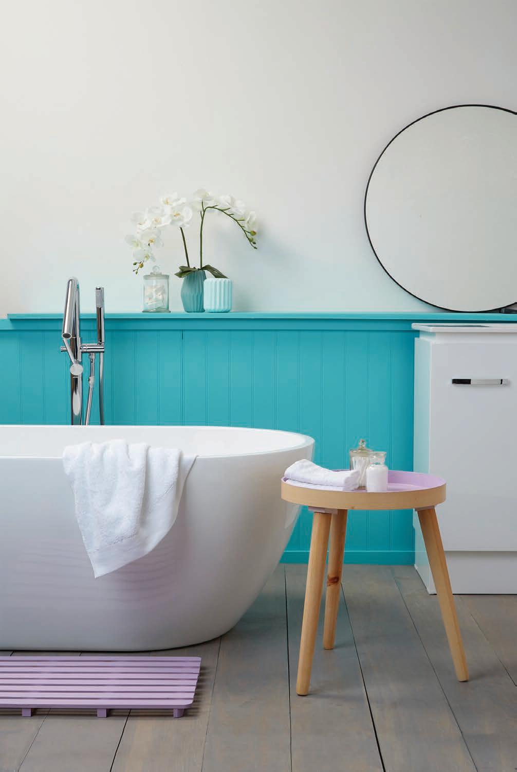
Aqua is at the front edge of trending interior colours at the moment for walls, painted furniture, accents and accessories.
From lighter versions like Resene Freelance to saturated shades like Resene Deep Teal, you can almost never go wrong when opting to decorate with beautiful blue-greens like these.
“Aqua is a universal colour that I find almost everyone likes,” says Vanessa Webb of
Dress My Nest. “Resene Raindance is a great example. It’s a stunning greyed off-aqua that works perfectly with whites and neutrals as well as timber – which is especially handy, as we are using a lot of timber in interiors right now.
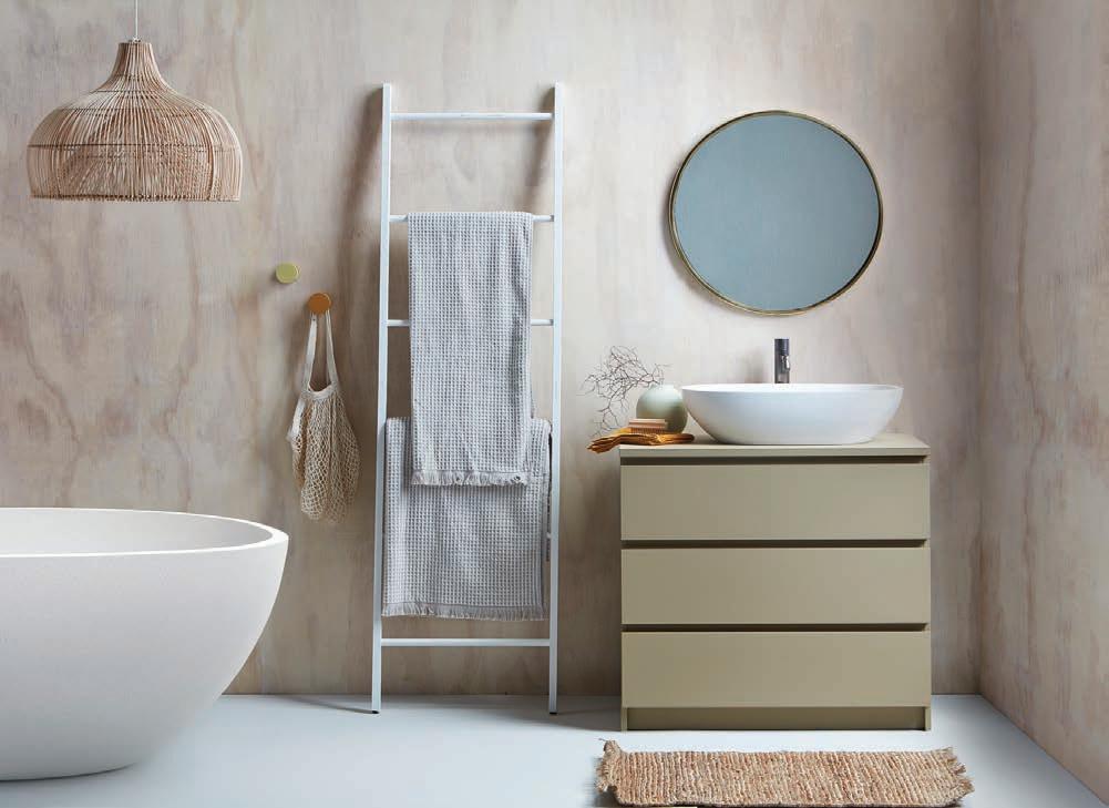
Think American oak floors, plywood ceilings, pale oak furniture and Resene Raindance is the perfect partner to create a calming environment at home. It’s a shade that can be used as a wall colour in almost any room, as it gives that soothing feeling that many people are searching for in their homes.”
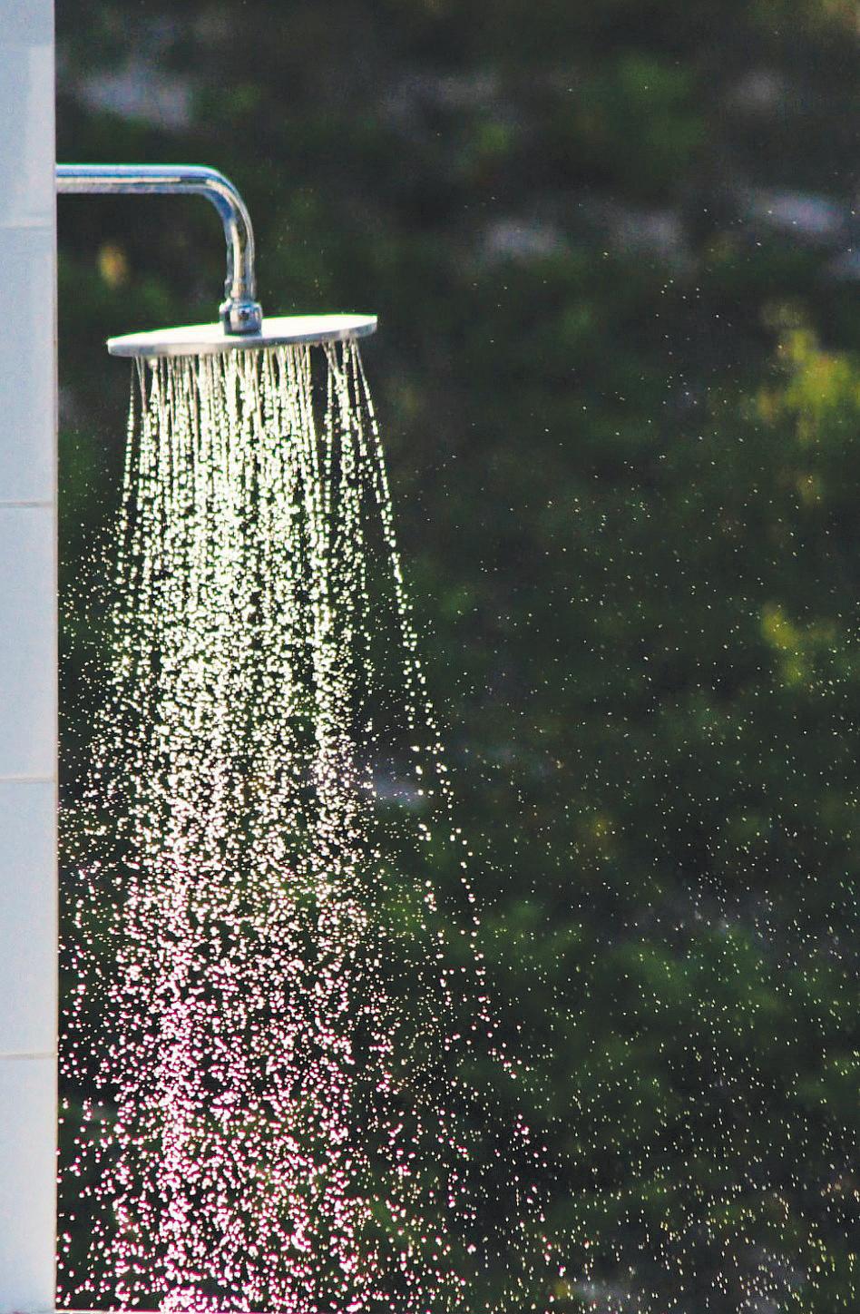
Since aquas are often associated with peaceful and calming things – the ocean, clear skies, and mother nature in general – it makes sense that people would want to surround themselves with the colour that makes them feel at peace and reduce the stress of the breakneck pace of our everyday lives.
“On the opposite end of the spectrum, figuratively speaking, Resene She’ll Be Right is a bright optimistic colour that can bring you that ‘wow’ factor and make a real statement. Jewel-toned colours are also featuring a lot in interiors at the moment, and Resene She’ll Be Right fits in perfectly with those rich hues – a mustard yellow like Resene Cleopatra, a rust like Resene Raging Bull, or a deep burgundy like Resene Salsa or Resene Courage, mixed with a lovely deep teal in a luxurious fabric such as velvet can create a stunning formal living room.
“Resene Yes Please, another bright and happy aqua, is absolutely perfect for a caravan renovation! I have used it on the exterior of a caravan and it always makes heads turn. Paired with a bright white such as Resene Alabaster, it’s such a fun and fresh combination.
“Resene Freelance is a similar shade and it looks fantastic in a kid’s room. I love pairing it with corals such as Resene Rapture and pale pinks like Resene Sakura to create a gorgeous and fun girl’s room.”
SPRING INTO ACTION @


Mobile planters, pots and more.. …an extensive range of fresh spring vegetable seedlings and potted colour..
Interior stylist Kate Alexander considers aqua to be among one of her favourite colours. “The last time turquoise and aqua were trending was when contrast was queen and we all had feature walls. Today we seek environments that provide interest but don’t overpower. Try for a tone-on-tone look instead.”
Resene has a whole range of awe-inspiring aquas and terrifi c teals that are perfect for building an on-trend tonal palette. Look to shades like Resene Yes Please, Resene Freelance, Resene Hullabaloo, Resene Deep Teal, Resene Yowza and Resene Maestro.
“Turquoise and aqua have an unfortunate reputation for being flippant colours, and too bold for those who don’t ‘love’ colour. However, if you combine them with muddier versions of their opposites it takes some of the punch away - for example, Resene She’ll Be Right with Resene Moccasin or Resene Sunbaked in a terracotta kitchen with glazed aqua tiles and stone floors or a burnt orange chair with a turquoise cushion,” recommends Kate.
Studies have shown that bringing an aqueous colour palette into your kitchen may actually curb your cravings. Some researchers say that the colour blue is unappetising, psychologically-speaking, because it rarely occurs naturally in food (save for mould) and thus doesn’t trigger an automatic appetite response – so a toned-down aqua can be a great fit.
The positive punch of turquoise can also be used to enliven coastal interiors. Use it to lead the eye around an otherwise crisp white backdrop, such as Resene Black White, in artwork, cushions and objects. Alternatively, you could opt for a grey-white like Resene Sea Fog or Resene Merino to soften the look
“Turquoise is a fun way to add punch to a black and white interior. For a real kick, try Resene Yowza with Resene Charcoal and Resene Alabaster and use the vibrant teal to draw attention to a feature, like the doorframe.”
One of Kate’s favourite aqua combinations she recently used in her own home: “I’ve created a ‘winter room’ by painting all four walls in Resene Green Meets Blue, and it’s made the space feel encompassing and sophisticated, but I’ve thrown a fun curveball at it by adding a table in Resene Endeavor and cushions to match. This combination is actually a grey-green base with cyan features, but you could take it deeper into the greens by painting the walls Resene Fast Forward and using Resene She’ll Be Right as a feature colour.”
Other amazing aqua and terrific teal colour combinations: • Aqua swims well with a whole range of pinks - go deep by pairing Resene
She’ll Be Right with Resene Pink
Ribbon or, for a softer take, combine
Resene Freelance with Resene
XOXO or Resene Shilo. • Try Resene Yowza with an inky navy, such as Resene Indian Ink or Resene
Twilight Zone. • Add just a few surprising pops of aqua into an otherwise neutral room. Keep walls light and calming in Resene
White Island or Resene Quarter Duck
Egg Blue and try painting a few small accessories in Resene Blue Lagoon or Resene Java and place them throughout your space.

Commercial Residential Industrial Maintenance Sheet Metal Fabrication Gas Water & Home Heating