4 minute read
AWARDING DESIGN EXCELLENCE
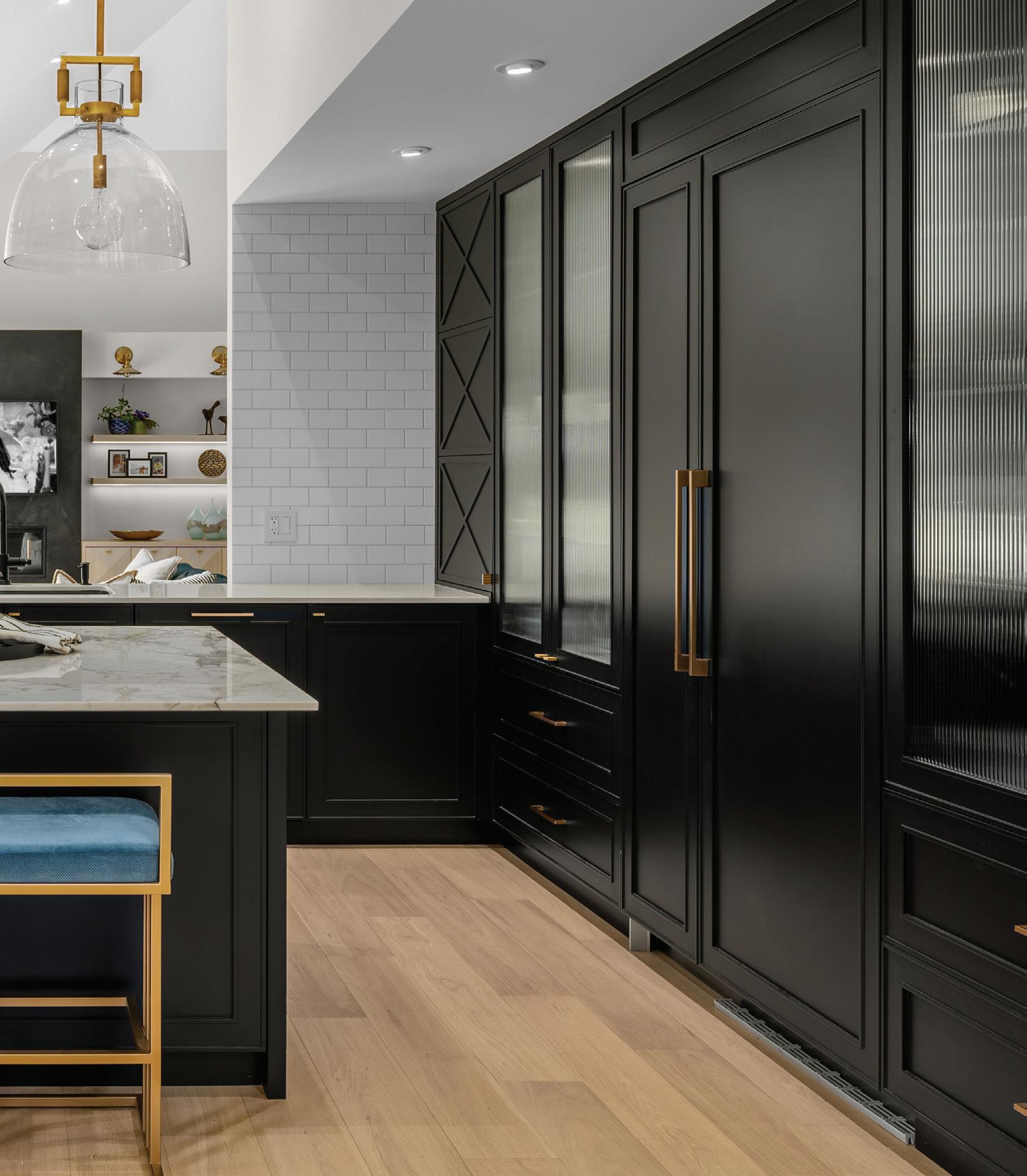
Ev e r y y e a r , t h e b e s t a n d b r i g h t e s t t a l e n t s i n i n t e r i o r design contend for the coveted NKBA design excellence awards. Here, we showcase our editor’s pick: A contemporary kitchen renovation by Space Harmony interiors, and a traditional bathroom by Beyond Beige. We love the colours and textures, lighting and layers of these rooms – designs that impact and improve the daily rituals of life. >
Advertisement
KITCHEN RENOVATION BY SPACE HARMONY.
SPRING 2020 LIVINGMAG.CA
THE GATHERING PLACE
WINNER: EDITOR’S PICK: NEGAR REIHANI, SPACE HARMONY British Columbia Chapter British Columbia Chapter
British Columbia Chapter DESIGNER NARRATIVE | NEGAR REIHANI PHOTOGRAPHY | COLIN PERRY
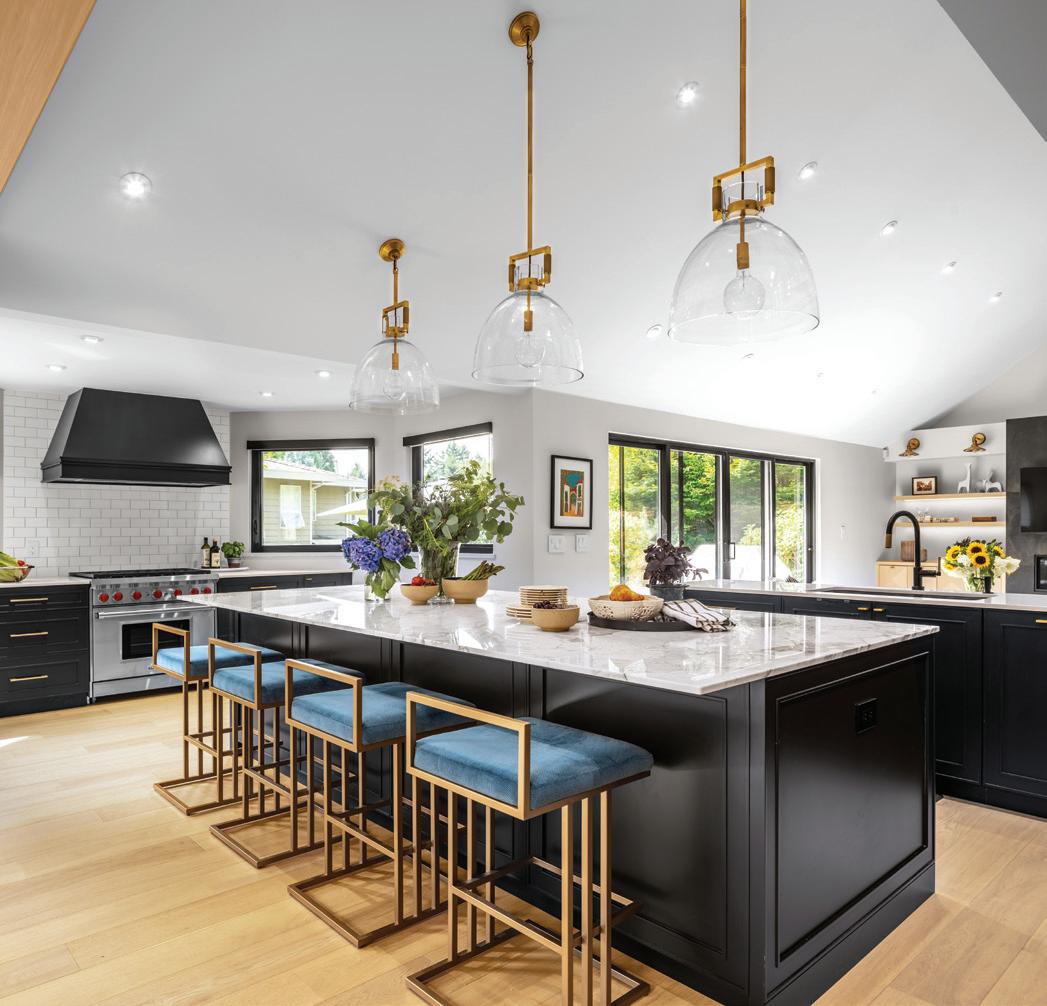
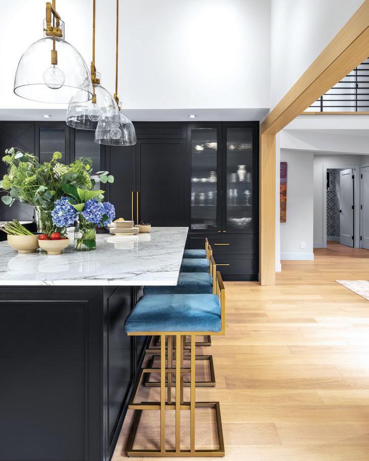
The challenge was to transform a small and dated kitchen into an elegant and functional one that meets the needs of a busy family with lots of cooking, baking and entertaining. The first order of work was to change the layout from what used to be a “typical” kitchen 40 years ago to what is needed for today’s lifestyle. The wall separating the kitchen from the rest of the house was partially opened and the dining area was moved from inside the kitchen to its new location.
With the dining room gone, the kitchen was extended to accommodate a generous-sized cooking station by the windows in a tucked-away corner, where the dining area used to be. This is great for everyday cooking as the mess is not visible from the rest of the house and the smell is perfectly exhausted through the double windows and the large hood. The extra-large island provides an ideal prep area, while there is still tonnes of space left for daily family use.
Different types of storage are provided throughout the kitchen to accommodate different needs and also to provide a visual balance. All small appliances are housed inside a cabinet with pull-out shelves so they can be used while being kept there. With the new open layout, double-high ceilings and an abundance of natural light, we had to do something unique when it came to selecting the color scheme and finishes, so we aimed for a caviar-black cabinet color. The black kitchen is bold and unexpected and it truly anchors the space. The brushed gold accents soften the space while connecting with light oak floors throughout. While a black and gold combination has a traditional / formal vibe, a touch of white subway tile and reeded-glass pantry doors injects some casual air to the space. The Volakas marble island and its soft cream, gray and gold veining adds an understated elegance to the space while pulling everything else together. The parameter countertops are kept in white quartz for practicality. The kitchen is a sophisticated mix of farmhouse meets modern glamour.
British Columbia Chapter
WINNER: DESIGNER OF THE YEAR: REISA POLLARD, BEYOND BEIGE
DESIGNER NARRATIVE | REISA POLLARD PHOTOGRAPHY | AMANDA OSTER, PROVOKE STUDIOS A RETURN TO TRADITION British Columbia Chapter
Th e client’s busy lives drew them t o the ide a of living on a farm. They wanted a sanctuary, their retreat from the hustle and bustle. The master bathroom was to be a key part of the experience, a place of serenity, a zen-like environment with a connection to the outdoors.
They wanted ample storage so that nothing normally left on a counter would be an issue; everything was to be put away so that time spent in the bathroom, whether an extended shower or a bubble bath, could be focused on the beauty around them.
The space was long and narrow with a soaring ceiling, making it challenging to design a space that felt warm and intimate. The original design had a wall between the water closet and the shower. This was convenient for the plumbing but took away the “lightness” and simplicity of only glass enclosures. We were able to move the plumbing to the outside wall by furring out the wall for proper insulation. We then had the challenge of finding British Columbia Chapter a stone mason that could clad the wall in an authentic old European style of installation and integrate the plumbing fixtures. We clad the opposite wall in reclaimed barn wood. The horizontal lines draw the eye down to the French doors that lead to a private patio. The long, floating vanity is a dramatic feature at over 18’ long and grounds the space while leaving the floor space open underneath. The mirror was custom made to match the length of the vanity with horizontal LED panels to properly light up the face.
Lots of ceiling lighting was required to light the space adequately. Then we added lighting under the vanity for mood or night lighting and a pretty chandelier dropped over the tub. The concrete is warm underfoot with radiant heat and provided for a curbless shower.
The wall textures provide warmth and interest without taking away from the view. All black fixtures stand out against the soft coloured backdrop and tie in the windows.

SPRING 2020 LIVINGMAG.CA


