
3 minute read
A Review of LuciferOmnibus:VolumeOne


by Christopher J. Garcia
Chuck Serface, the King of Men, got me a present, Lucifer Omnibus:VolumeOne . It’s a remarkable piece of work, and one that makes good use of the overall graphic novel format. Largely, it demonstrates how important design is in setting the content it presents in a proper light.
Advertisement
Or darkness, as the case may be.
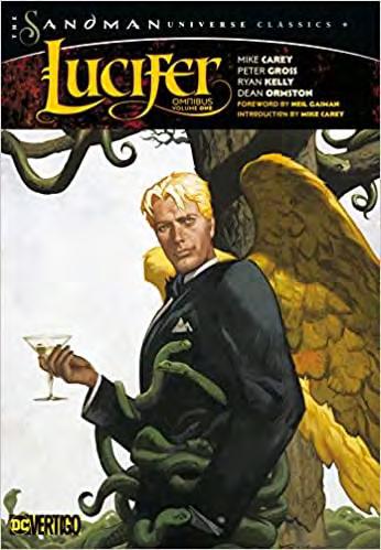
Let us start with the dustjacket.
Lucifer is front and center on the cover, looking suave (and a lot like David Bowie) with wings and snakes coming out of him. The top is the logo, and the mention of the talent. It’s a well-done piece without as much textual design as you see on a lot of omnibus covers. The spine is even sim- pler, with an image in blue-grey and white at the top in a square covering roughly 20% of the spine, and below simply the title. They have a lot of real estate to work with, it’s a massive bug-squisher of a title, so everything has a lot of room. The back is slightly more cluttered, there are reviews and blurbs, but there’s also an image of half of Lucifer’s torso (and if you open the inner-back flap, you see he’s flinging away a cigarette) and it’s a good piece that does the duty of the text while not being overly-concerned. The inner-front flap is great. Quote: "His omniscience only works because there are no alternatives. But I have conceived of a revolution that may surprise even Him."
It's not necessarily the quote so much as how it is presented. It’s done in a font that is all caps, save that each O is underlined and smaller. It’s incredibly stylish, especially with a sort of stain at the top of the flap. This is a theme that goes on all over the book, and that gives a general tone to the work. It does have the feel of those old lightshows where they’d put oil between two glass plates and shine a spotlight through it (pioneered by my friend and wildly. While most work in a more-or-less traditional comic book style, the best stuff is from Hampton and the legendary Jon Muth, whose watercolor technique is beyond reproach. The art changes completely from issue to issue, but the writing is stable, and as such, we are allowed to place a determination of the tone not as much through the art, as often happens in comics (and see the 1990s run of Starmanfor an incredible example of that) but through the design of the individual pages. The more grounded a page is in a realistic (at least realistic for comics) world we are in, the more tradition formatting we get for the individual pages but get slightly more beyond for those that deal with things like visits to hell or the like. The arcs “Children & Monsters” and “The House of Windowless Rooms” eliminate some guttering, going instead for simple lines at times. Still, a general lack of full-page spreads, there is a sense that this is going for something more modern, or at least less stiff. That does play with the storylines as well. “A Dalliance with the Damned” features Peter Gross’s finest work, and it also does some playing not only with guttering and panel floating, where one panel obscures a large portion of other though it continues around, and behind it, shows up, but in
Tony Martin in San Francisco).
They have thought through the fonts used so thoroughly. The introduction is done in a small font, which matches up with the lettering for the word bubbles. The fonts used for various characters (a much more stylish lettering for the mythological figures, traditional for more human-type characters) and that makes it targeted. These little things aren’t new, they’ve been done regularly throughout the history of comics, but they work so well here when the tone must go through so many different concepts to land properly. The mood of the piece swings back and forth, from nearly-Wodehousean to downright Alan Moore-like. You have to make the presentation fluctuate or things become too steeped in the general mode. This works there perfectly.
The way the comic panels themselves are set up also plays a major role. There’s almost always strong guttering, which has come in and out of fashion over the last thirty or so years after being the standard prior to that. This might not seem like a big deal, but I immediately noticed the orderly presentation of the work. For example, Scott Hampton’s art on the first issue, the beautiful watercolors (or perhaps gouache, a kind of watercolor) take on a sort of museum-like quality, and given the subject matter, it helps. There’s a constrained notion to each panel, save for a couple where the inky blackness more or less fills the page, and the panels edges are more defined by where the light ends.
The artists change frequently,


