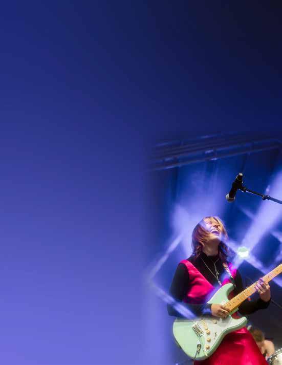
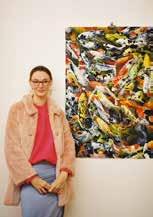
OLIVIA CHAMPAGNE
architecture

architecture
graphic design inquiry | prof. margarita barrios ponce | spring 2024
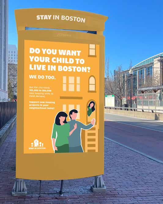
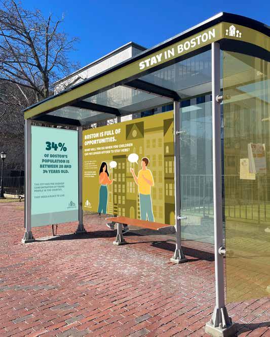
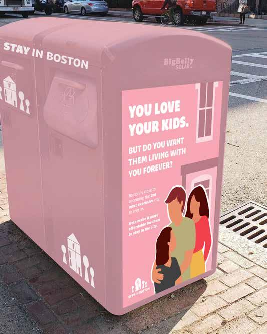
This semester-long project started by selecting a social cause I care about and considering factors such as the messaging, who the audience will be, and how the campaign will be rolled out across a location. While on co-op last fall I was introduced to multi-family housing and some of the challenges faced when proposing affordable housing projects in local communities, so I decided to focus on raising awareness of the lack of available and affordable housing in Greater Boston. After working with this broad topic for a few weeks, I decided to focus specifically on housing for young adults like myself who are drawn to the city for school and job opportunities, but struggle to afford to stay in Boston. This allowed me to narrow my audience to parents with children under 25, appealing to their relationship with their children and encouraging them to make a difference in their children’s future in the city. This campaign intends to encourage residents to be more aware of and supportive of new housing projects in their area while providing them with the resources to become more involved.
Displayed at bus stops, train stations, and on trash containers, the colorful signage transforms the displays to catch the attention of individuals on their way to and from work or their homes.
The style of the logo matches the rest of the campaign, a light and friendly feel that contrasts with more serious content. The home and figures are abstracted so they can apply to anyone, paired with the campaign name–inspired by the sentiment of young adults who want to stay in the city.
LOVE YOUR
BUT DO YOU WANT THEM LIVING WITH YOU FOREVER?

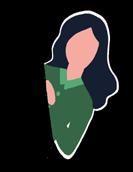
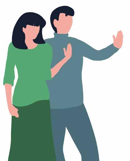
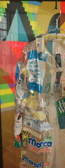
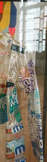
This series, “On the Go,” consists of a set of three colorful posters, with illustrations of parents and their young adult children outside of apartments or homes at different levels of closeness. The text is bold and yet limited to a few key points, for individuals are likely not stopping for long and need to quickly understand what the campaign is advocating for.
47%
OF RESIDENTS IN BACK BAY ARE BETWEEN 20 AND 34 YEARS OLD.
Of those young adults, many are forced to move to the suburbs or even out-of-state, unable to a ord to stay in Boston.
* Boston is close to becoming the 2ND MOST EXPENSIVE city for renters, with the median rent on a one-bedroom apartment being $2,720.
* One of the greatest obstacles to new, a ordable housing projects today is a lack of local support.
Do your part. Support new housing projects in your community.
What will you do when your children can no longer a ord to live here?
Learn more by visiting our website or checking out @stayinboston on Instagram!
57%
OF RESIDENTS IN MISSION HILL ARE BETWEEN 20 AND 34 YEARS OLD.
Of those young adults, many are forced to the suburbs or out-of-state, unable a ord to stay in
* More than 1 in 4 renters OVER HALF of their income toward housing Greater Boston.
* The median rent for bedroom apartment
* Gen Z can expect to $226,000 on rent in lifetimes.
Do your part. Support projects in your community.
What will you do your children can longer a ord to Learn our website out @stayinboston on Instagram!
adults, to move or even unable to Boston.
renters pay monthly housing in for a oneapartment is $2,720.
to pay close to in their new housing community.
do when can no live here?
more by visiting website or checking @stayinboston Instagram!
Of those young adults, many are forced to move to the suburbs or even out-of-state, unable to a ord to stay in Boston.
* To meet demand by 2030, Greater Boston will need 125,000 to 200,000 new units of housing.
* Even with a rising population, the region has permitted less homes recently than it did back in the mid-1980s.
Do your part. Support new housing projects in your community.
What will you do when your children can no longer a ord to live here?
Learn more by visiting our website or checking out @stayinboston on Instagram!
The “Closer to Home” series consists of door hangers that will be delivered to individual homes and apartments in Greater Boston, with statistics specific to the neighborhood. The type, colors, and illustrations have a similar feel to the poster series, but the door hangers contain more information, with an eye-catching statistic and visual on the front paired with more details on the back about the cause and next steps. Delivered right to their doorstep, the individual can review the details of the campaign when it is convenient for them.
One of the greatest obstacles to new and a ordable housing is a lack of local support.
Do your part. Support upcoming projects in your communty today.
Boston is close to becoming the 2nd most expensive city to rent in, making renting or buying a home increasingly out of reach for many. Stay in Boston is a campaign focused on raising awareness of the lack of available and a ordable housing for young adults in Greater Boston, especially for recent college graduates looking to continue living and working in the area.
When you can’t a ord to live in Boston, where do you go?
December 1, 2023
Business Insider
While young adults make up a significant portion of the city’s population, they also contribute to the economy, workforce and the livelihood of communities. Boston needs them to stay in the city. By sharing with residents the struggle faced by young adults, including their own children, this campaign hopes to call more attention to the issue, encouraging people to join the cause and advocate for more housing in their community.
Meet a Boston teacher who can't find an a ordable home in the city with the fastest-growing rent in the country:
February 6, 2o22
Globe
HOUSE, ONE FAMILY, AND THE FADING DREAM OF HOMEOWNERSHIP
October 25, 2023
your email address here
47% of residents in Back Bay are between 20 and 34 years old.
Of those young adults, many are forced to move to the suburbs or even out-of-state, unable to a ord to stay in Boston.
This website provides individuals with the resources necessary to accept the campaign’s call to action and advocate for more housing in their neighborhood. It is a larger resource with background on the campaign, articles that share the stories of young adults trying to live in Greater Boston, and a search bar that connects residents with proposed projects and upcoming meetings in their neighborhood.
The campaign book contains all of the information about Stay in Boston and each visual series. I follow the same color palette and illustrative style of my other design implementations, with the typeface Brevia used throughout. Each section of the book (strategy, brand elements, campaign) follows a dual color theme, first introduced with a color page that has an illustration paired with bold statistics related to the cause. I decided to add quotes from young adults on the pages without illustrations, and I went through many iterations of how the impactful messaging would be represented visually.
“This
she said.
Kate, 29
graphic design synthesis | prof. douglass scott | spring 2024
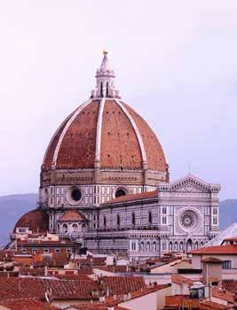
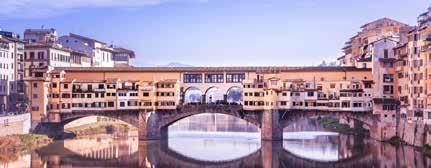
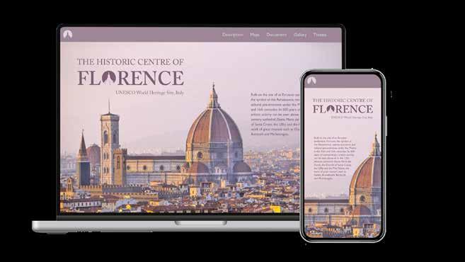
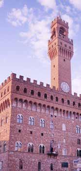
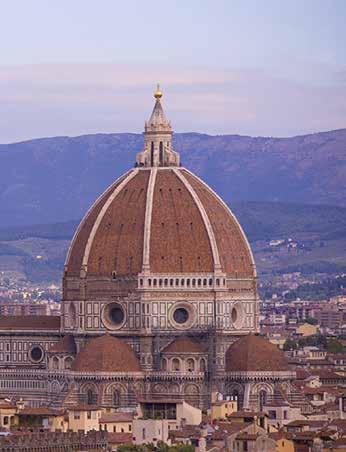
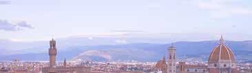
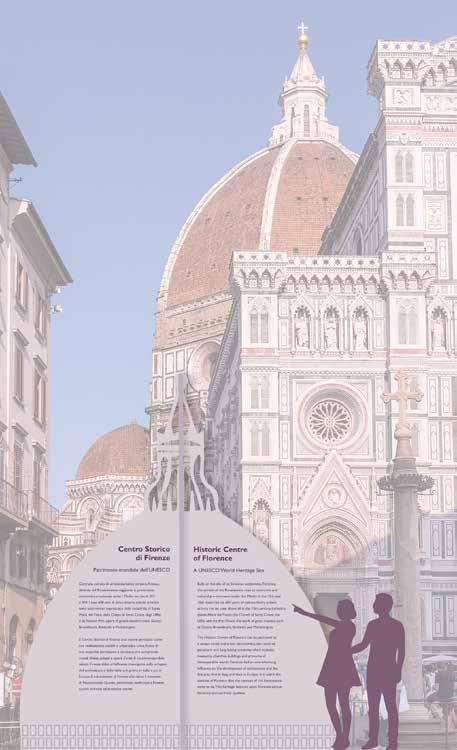
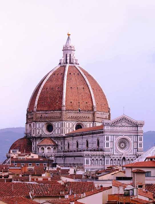
Another semester-long project I worked on involved developing an identity system for a UNESCO World Heritage Site. After studying abroad last summer in Italy, I was eager to work with the Historic Centre of Florence and try to represent the city through typography and visual elements. During the first few weeks of the semester, I worked to develop a mark and logotype, after compiling a wordlist including key features of the site. I decided to use an outline of the dome of the Florence Cathedral, one of the most well-known features of the city, also cut out from the letter “o” in Florence. Italy has a rich historical context, complemented by the use of Caslon for the typeface where a sans serif is not needed for improved readability. Producing so many deliverables allowed me to flesh out a well-developed visual system for the letterhead and envelope, business card, and website homepage that could also be applied to a series of advertisements in the New Yorker and a delivery van. Perhaps the most challenging tasks were bringing together two separate texts in a booklet about the site alongside photographs, and running through iterations for a three-dimensional site sign that would feature text in seven different languages for visitors. I found developing a pattern for my fifth element and a simple color palette essential for bringing each piece together in my visual summary.
Cathedral Dome Palace Baptistry
Bell Tower Galleries
Archways Columns Plazas
Arno River Sculpture
Fountain
Bridges Garden Marble Brick Cobblestone Pattern
Ornamentation
A visual summary that I printed at the end of the semester, which contains all of the deliverables developed for the identity of the Historic Centre of Florence.


1. The Historic Centre of Florence contains many historic cathedrals, museums, and plazas to visit, and a centralized information center in Piazza del Duomo will provide visitors with access to maps, ticket information, and guided tours for points of interest across the city. This will help streamline the visitor experience and allow people to learn about more than just the most popular tourist attractions.
2. Additional site signs will be established around Florence, as well as maps and directional signs to point visitors to points of interest near them, promoting exploration of the city and a greater understanding of its rich history. Signage outside specific buildings such as cathedrals will provide background before one enters the building.
3. Distribution of promotional materials will further establish the Historic Centre of Florence’s identity and role as a trusted source of information about the site, committed to protecting and sharing the city’s history with others. Frequently coming into contact with the mark and logotype across printed materials and merchandise will let people know who to contact to learn more about the site.
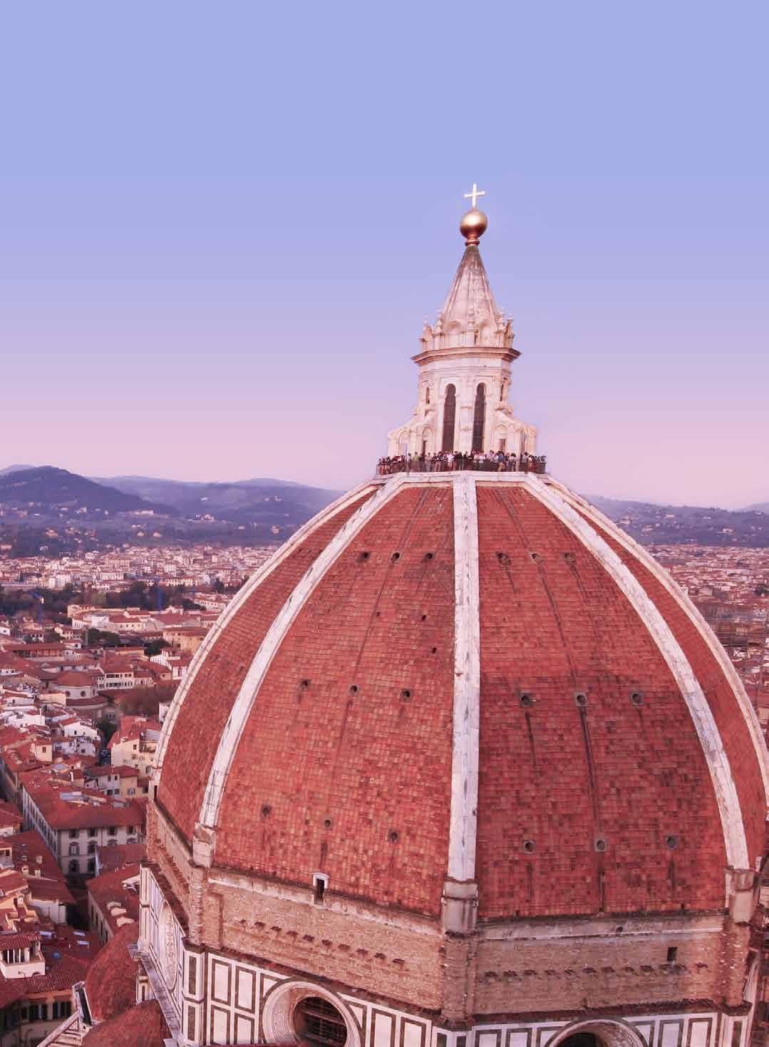
The outline of the cathedral dome serves as a mark of its own on the app icon and page watermarks, but it was also cut out of the “o” in Florence to create a trademarkable logotype.
I wanted the letterhead to have a formal and somewhat elegant feel. The design features a light outline of the dome that covers the lefthand side of the page, while the logotype and UNESCO site information are in color and aligned on the righthand side. This information is further distinguished from the body text of the letter with a change in typeface.
Olivia Champagne Graphic Designer
Northeastern University
360 Huntington Avenue Boston, MA 02215
Dear Ms. Champagne,
Thank you for reaching out to learn more about the Historic Centre of Florence. My name is Carlo Francini and I am the Head of the “Florence World Heritage and Relations with UNESCO” Office of the Municipality of Florence and the site mananger for this particular site. We appreciate your interest and would be happy to share a bit more information about Florence and our mission.
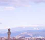
Florence served as a symbol of the Renaissance and was built on the site of an Etruscan settlement. The city rose to economic and cultural pre-eminence under the Medici in the 15th and 16th centuries, and its 600 years of extraordinary artistic activity can be seen above all in the 13th-century cathedral (Santa Maria del Fiore), the Church of Santa Croce, the Uffizi and the Pitti Palace, the work of great masters such as Giotto, Brunelleschi, Botticelli and Michelangelo. The city’s rich history and variety of museums, churches, and other famous sites has made it a major tourist attraction and a place to certainly visit within your lifetime.
The Historic Centre of Florence can be perceived as a unique social and urban achievement, the result of persistent and long-lasting creativity, which includes museums, churches, buildings, and artworks of immeasurable worth. Florence had an overwhelming influence on the development of architecture and the fine arts, first in Italy, and then in Europe. It is within the context of Florence that the concept of the Renaissance came to be. This heritage bestows upon Florence unique historical and aesthetic qualities.
We provide several online resources as well as on-site information centers and tours guides to assist you with experiencing everything Florence has to offer. Attached you will find a booklet that includes photographs of some of the main sites and background about UNESCO’s mission. We seek to continue to preserve this historic center of the city and encourage others to do the same.
Do not hesitate to reach out to us again if you or your university have any additional questions or require further information. We are always williing to help!
Sincerely,
Carlo Francini
Carlo Francini Site Manager
UNESCO World Heritage Site
Historic Centre of Florence
Via Giuseppe Garibaldi 7 Florence, Italy 50123
P: +39 055 2625441
E: firenzepatrimoniomondiale@comune.fi.it
W: http://www.firenzepatrimoniomondiale.it/
F lorence, Italy 50123
Olivia
360 Huntington Avenue Boston, MA 02215
My business card is in the shape of the dome, with die-cut details at the top. The front utilizes sans serif type for improved legibility, while the back includes both the logotype and the pattern I developed as a fifth element for the envelope.
The envelope carries on many of the elements from the letterhead, but I added a pattern that will be revealed when the envelope is opened. Inspired by the marble facade of the Florence Cathedral, this enhances the design of certain pieces with additional color and detail.
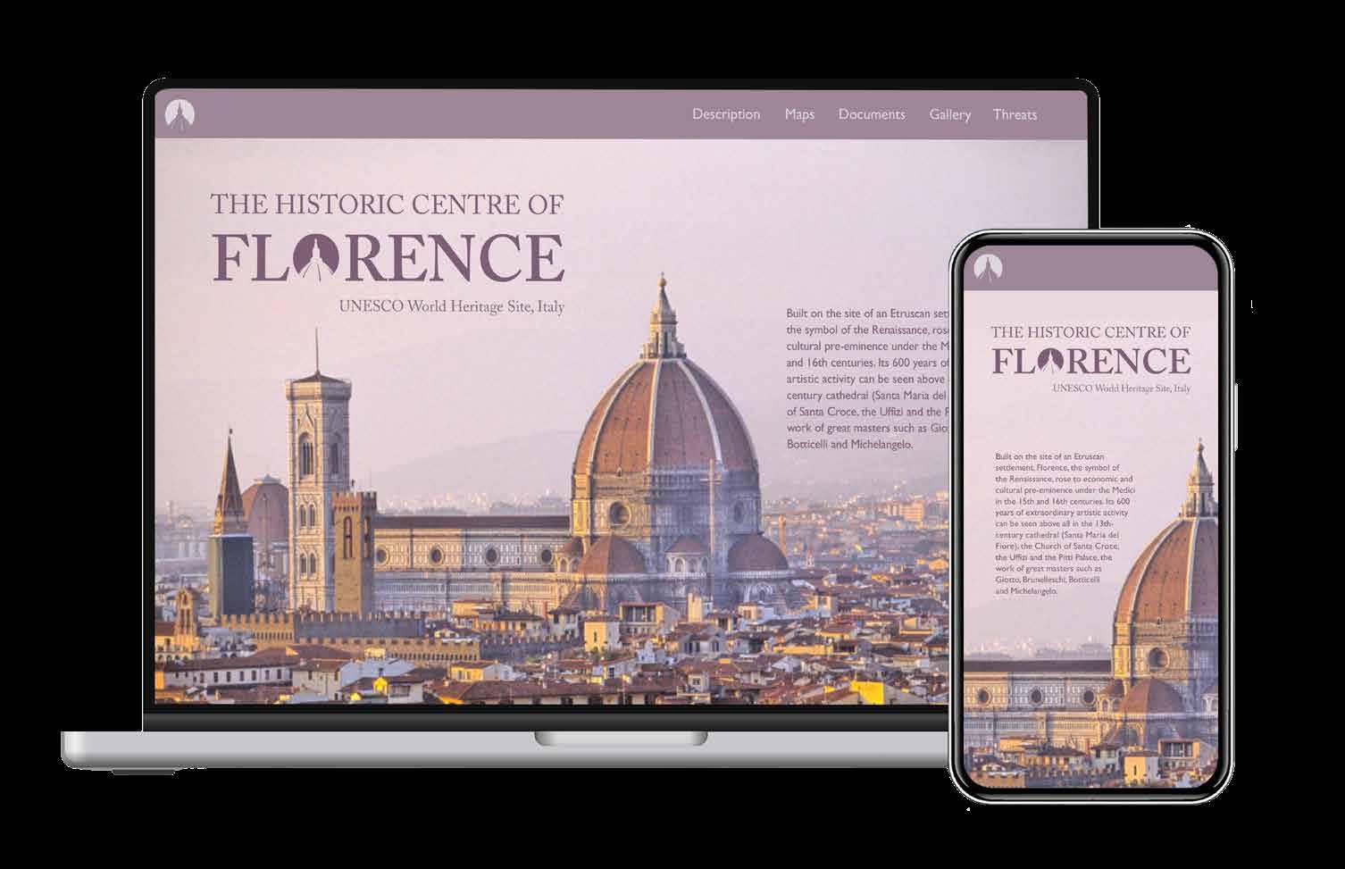
While my magazine advertisements each focus on an individual landmark in Florence, I wanted the website to convey the city as a whole, with its sprawling skyline. While the homepage needs to include links to pages with maps, photographs, and other information, I wanted the focus to be on a photograph and not an overwhelming amount of text on the page.
Each of my three advertisements features a different landmark in Florence, all photographs taken around sunset to appear more consistent. I continued to apply this color palette to the other deliverables going forward.
UNESCO World Heritage Site
Historic Centre of Florence
November 1, 2024 –January 31, 2025
Museum of Fine Arts, Boston
For more information, visit mfa.org
My first iteration of posters used Caslon for all of the text, but I found it blended too much with the background. I rotated the logotype and moved it to a vertical band at the edge of the page while using Gil Sans for the remaining text with a stronger sense of hierarchy. The placement of the main text changes across the posters in response to the photographs, always aligned with the top of the logotype.
UNESCO World Heritage Site
November 1, 2024 –January 31, 2025
Museum of Fine Arts, Boston
For more information, visit mfa.org

November 1, 2024 –January 31, 2025
Museum of Fine Arts, Boston
For more information, visit mfa.org
The two texts in the booklet are split between the top and bottom halves of the page, a different background color used for each. The typeface changes between serif and sans serif, with a dark purple tint for the top half and captions. Images of various scales and placement break up all the text.
Guide
P: +39 055 2625441
E: firenzepatrimoniomondiale@comune.fi.it
W: http://www.firenzepatrimoniomondiale.it/
This mockup presents the scale and location for my three-dimensional site sign, an eight-sided structure shaped like a dome in the plaza beside the cathedral.

With so many historical sites in the city, I focused on labeling those featured within the booklet in the Historic Center and the Arno River on the larger map in the left column. I highlighted Florence’s position in the Tuscan region and Italy on small maps on the right, aligned with the site contact information. Unlike the letterhead, I included a dark band at the bottom of the page inspired by my New Yorker advertisements.

typography 1 | prof. sofie hodara | fall 2022
typography 2 | prof. sarah friedman | spring 2023
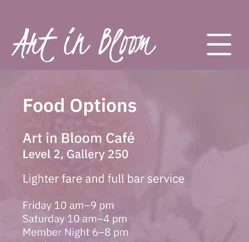
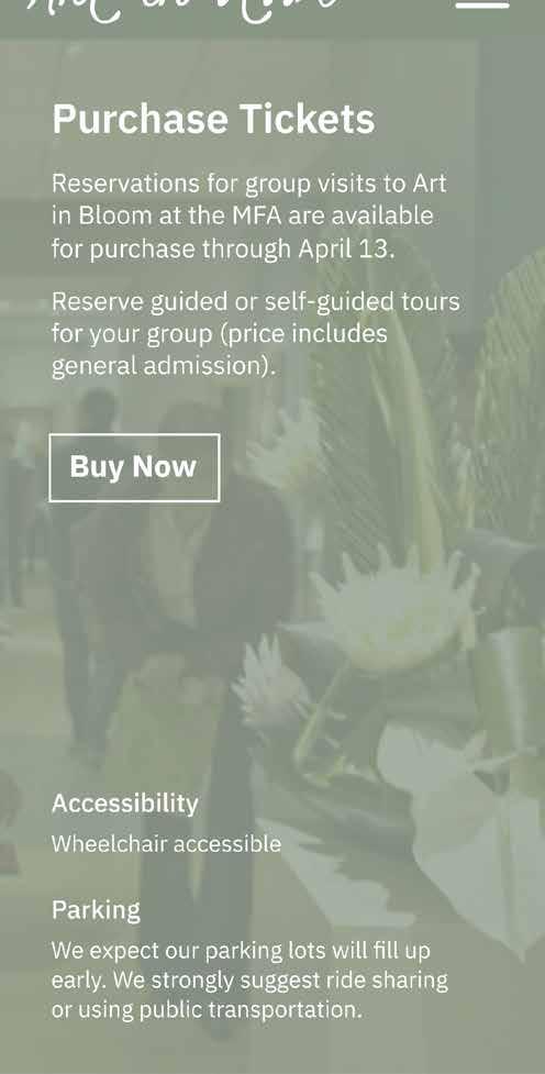
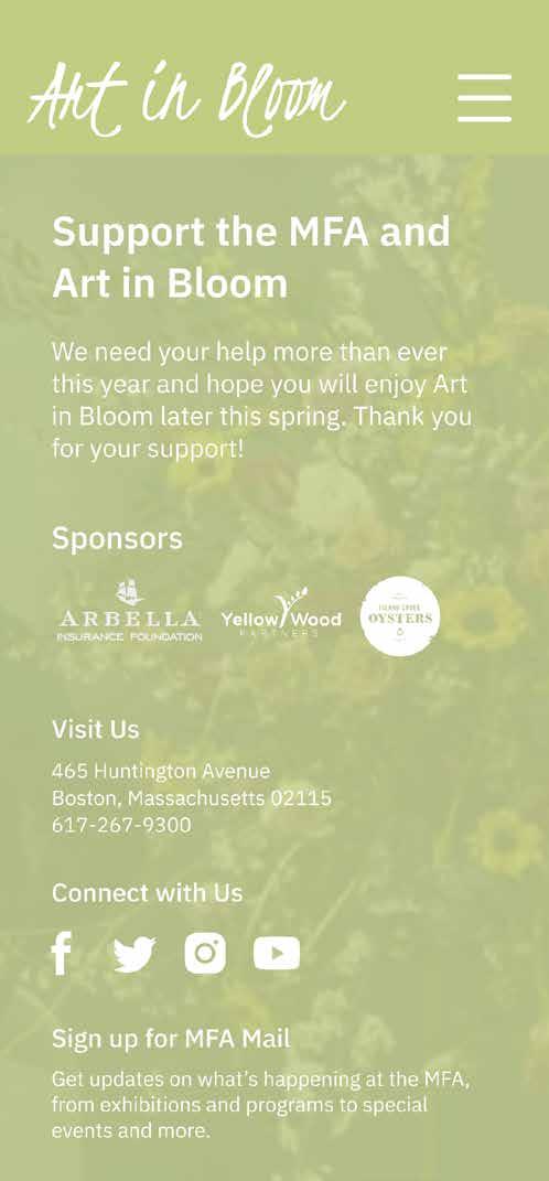
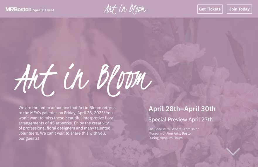
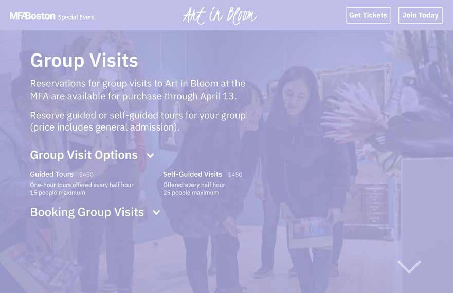
I never really thought in depth about the finer details of type before enrolling in typography courses at Northeastern. Through projects that resulted in visual compositions, cards, and publications alike, I explored different typefaces and how elements like type hierarchy and legibility can shape a design. Two of my classes last year introduced me to differences in choosing type for print and for digital media. I used Figma for the first time to develop prototypes for interactive mobile and desktop websites for an upcoming exhibition at the MFA titled Art in Bloom.
This project was a publication titled “Designing with Nature,” featuring articles about one of my architecture inspirations, Sou Fujimoto. The spreads I designed use both typograpic and visual systems to convey the nature of some of his notable designs, which were very organic and full of geometric forms.
Sou Fujimoto: Ideology and Philosophy
stay respectable and be satisfaction to your friends,” said Jo, shaking her head. “Can’t a fellow take a little innocent amusement now and then without losing his respectability?” asked Laurie, looking nettled. “That depends upon how and where he takes it. don’t like Ned and his set, and wish you’d keep out of it. Mother won’t let us have him at our house, though he wants to come. And if you grow like him she won’t be willing to have us frolic together as we do now.”
“Won’t she?” asked Laurie anxiously.
“No, she can’t bear fashionable young men, and she’d shut us all up in bandboxes rather than have us associate with them.”
“Well,
This best-selling transitional serif typeface inspired by Baskerville features petite caps and a lowered x-height.
Designed by Zuzana Licko
Emigre 1996
This booklet combines two texts, a passage from Little Women and select letters and accounts from the author, Louisa May Alcott, formatted side by side. I used color to distinguish between the two and Caslon to maintain the printed book feel, while exploring the light, handwritten quality of typefaces and symbols on the cover.
This typeface was named after Sarah Eaves, a live-in housekeeper for Baskerville whom he later married in 1764.
- Mrs Eaves OT Roman, 12pt
Licko focused on the printed, letterpress qualities of Baskerville, which had more character based on the paper and inkspread.
- Mrs Eaves OT Bold, 14pt
She tried to keep the lightness and openness of Baskerville, making the lowercase characters a wider proportion while reducing contrast.
- Mrs Eaves OT Italic, 15pt
In lowercase, Mrs Eaves appears as if it was set a point smaller than the average typeface.
- Mrs Eaves OT Bold Italic, 18pt
The typeface includes a wide range of 213 ligatures, some of
are made
and swash designs.
through
- Mrs Eaves Roman All Petite Caps, 12pt
Mrs Eaves is not fit for larger bodies of text due to the loose spacing, but is good for shorter lines of text and display contexts like headings. The typeface is commonly used for literary purposes, such as for book covers and short
of text on dust cover
and backs.
This specimen card is for the typeface Mrs. Eaves, exploring some of its unique features and characteristics. The typeface is feminine and used for many book covers, so I tried to keep that in mind while also highlighting the beautiful ligatures and flexibility offered by different fonts.
I wanted my website design for this floral exhibition to have the same colorful, eye-catching feel as the museum displays themselves. After establishing a display typeface for the name of the exhibit, I pulled colors out from the flowers and overlayed those over photographs taken of the exhibition in a way that scrolling between each page would also change the color and image. I explored the use of hover buttons and dropdown menus alongside a simple white serif type as to not draw too much attention away from the beautiful florals.
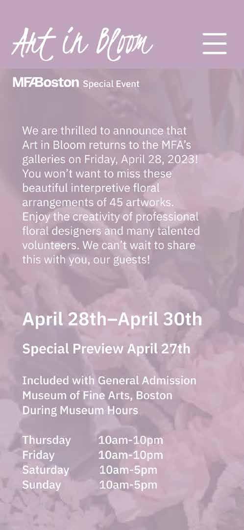
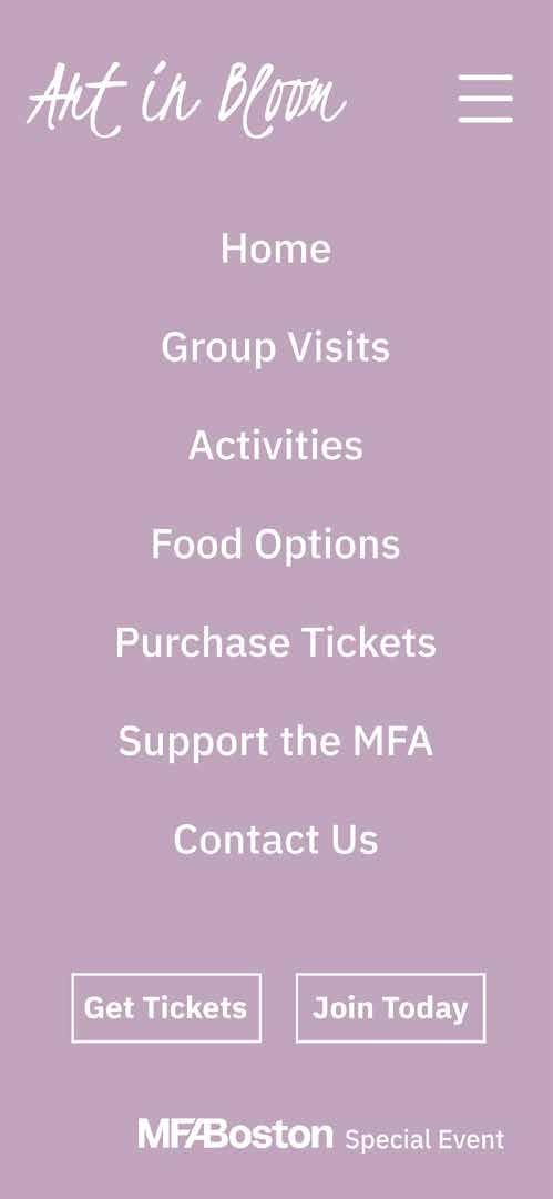
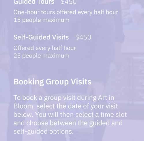
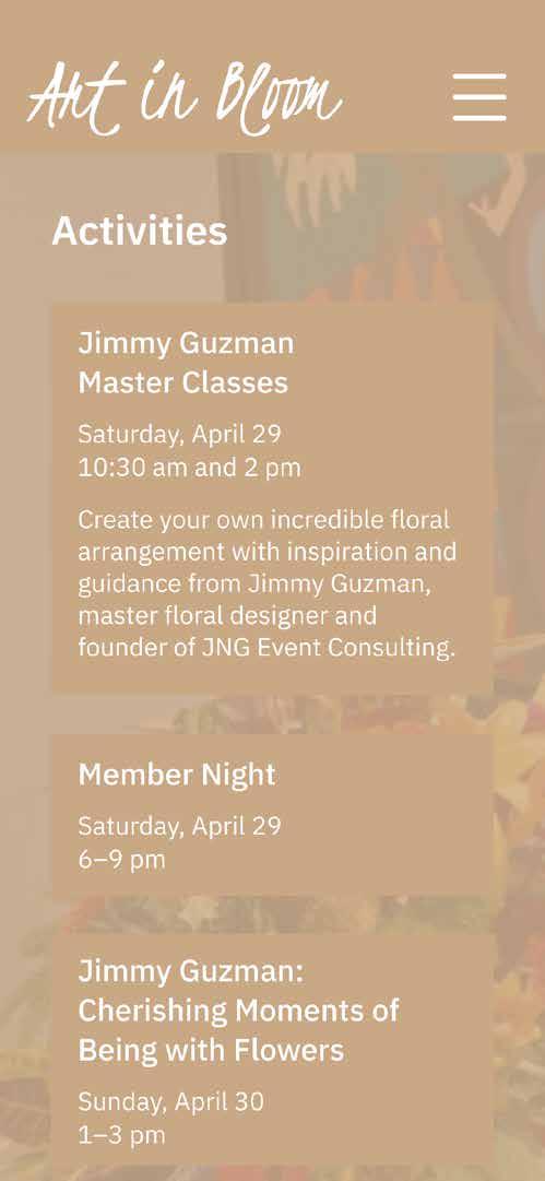
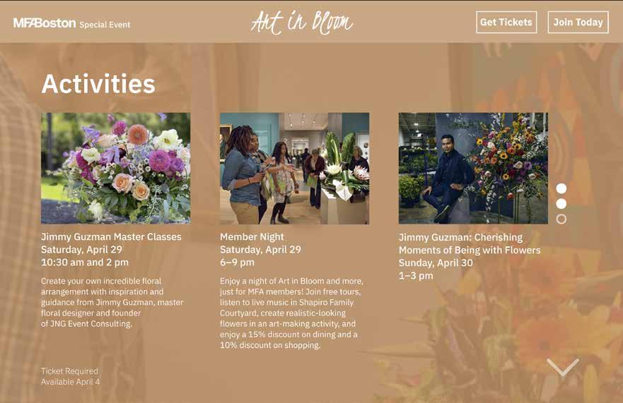
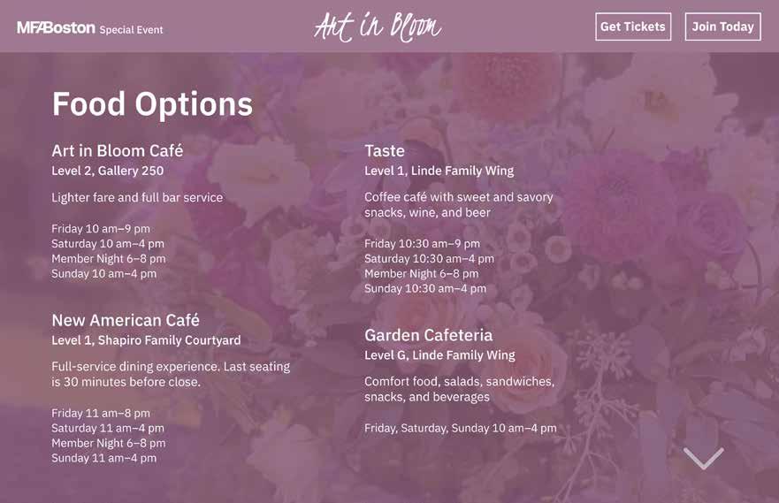
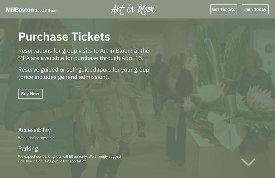
I maintained a similar system for both my mobile and desktop versions, mainly just choosing to included more icons on desktop that would allow one to click through the pages rather than scroll.
design principles | prof. doug scott | spring 2024
Centered around four major projects, this course explored how to convey meaning and messaging through a combination of icons, text, and data. With an emphasis on prototyping and time management, each week I was expected to have printed progress on multiple ongoing projects. Most importantly, I learned how to convey information with as few words as possible. Each project explored different types of information, from maps and signage to instructions and researched data, all requiring the development of a strong visual system.
This large print is a visual representation of 32 pieces types of data surrounding the country of Colombia, organized into different graphics. After some research on the country, I had the daunting task of finding a way to bring all of the data together in a way that would be legible and informative. There are many rounded forms, and the colors are inspired by the red, blue, and yellow of the Colombian flag.
Complied on a presentation summary to represent each sign in relation to the scale of the human body, this sign system for the art and design department included a map of sites used by students, a directory for Ryder Hall, a directional sign between Ryder and the Gardner Museum, and a room sign for our classroom. I wanted to use the university’s colors, and included a pairing of a serif and sans serif typeface to develop hierarchy. The color red highlights important information, and each sign has a light grey in the background and rounded corners for consistency.
This project serves as a map of three routes from my Boston living space to different locations: my hometown, class in Ryder Hall, and a hotel in Venice, Italy. Each trip is shown in a different color, and the line type determines whether I was walking (dotted), driving (solid), or flying (dashed). Along each line, icons represent a minimum of fifteen kinds of information about the journey, such as the weather, landmarks I passed, and things I ate.

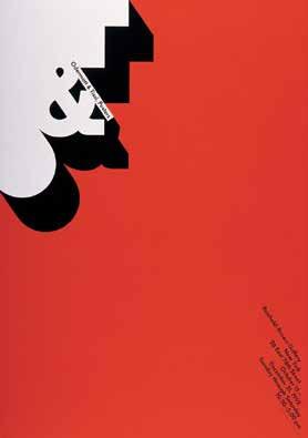


Rosmarie Tissi was granted the Swiss Grand Award for Design.
Siegfried Odermatt, whom Tissi was an apprentice for and later partners with at Odermatt & Tissi, passed away in 2017.
Stefanie Posavec completed a Practitioner in Residence at Royal Museums Greenwich. As part of their launch of a new wing of the National Maritime Museum, she gathered data from visitors to the museum and used it to create what was called “The visitor fleet,” a wall of pictures of visitor badges that have ship names and personalities listed.
This fold-out timeline brings together details from the lives and work of designers Rosmarie Tissi and Stefanie Posavec, alongside key historical dates and developments in the design world. Important dates are large and bold, while the symbol corresponds to the designer’s line, in a color commonly found in their work. Posavec’s work had a more organic feel, represented with circles and a curving line, while Tissi was more rigid and geometric, with squares and a bolded line.
graphic design 1 | prof. margarita barrios ponce | spring 2023
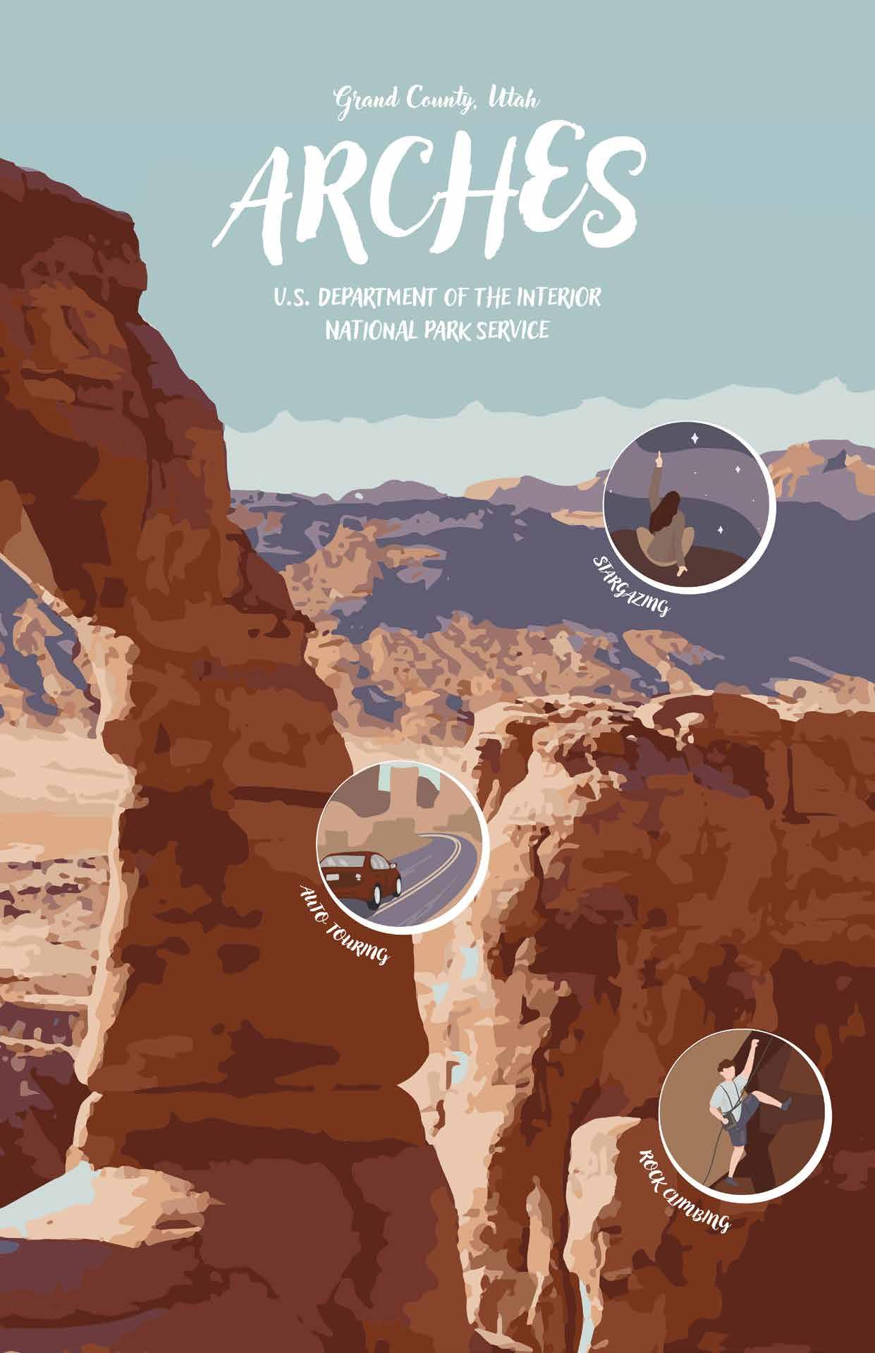
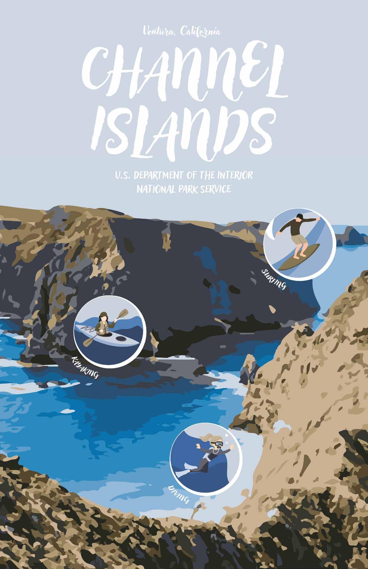
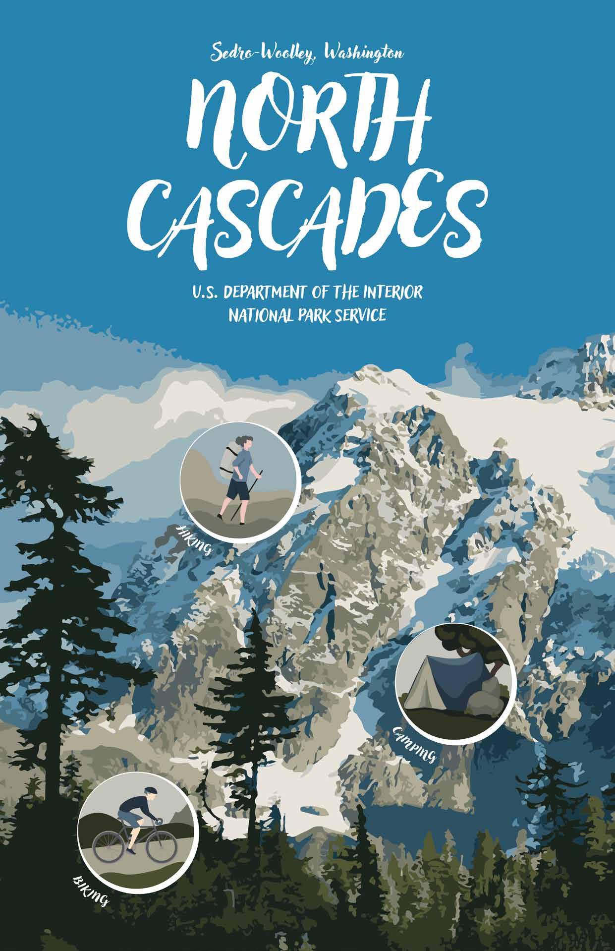
My graphic design course last year was centered around three major projects: a poster series for three U.S. National Parks, a book featuring forty word-a-day postcards, and a object translation that would be turned into an advertisement for that object. I consider iteration to have been the most important theme of the class as I worked through designs from early sketches to final design files across the entirety of the semester. I found it to be a bit of a challenge to start, adapting to using Adobe software in new ways, however I learned a lot about working in series and starting to develop my own style. I really enjoyed the variety of projects and found that they helped me train my eye to pick up on finer details that carried over into other courses.
These three posters make up my final poster series, all using an image-traced photo in the background, a consistent type hierarchy and muted color palette, and illustrated symbols that represent three of the activities featured within each park.
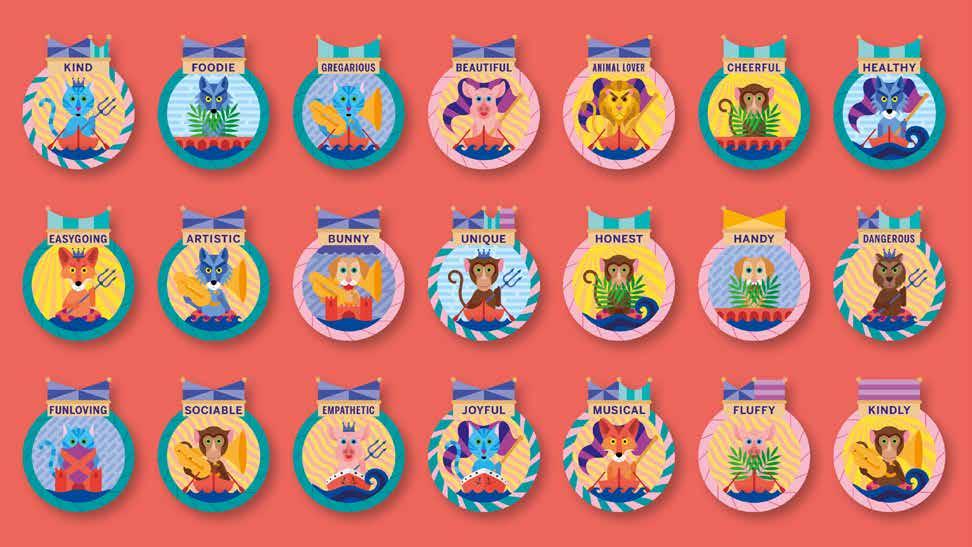
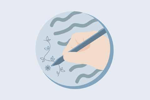
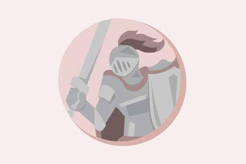
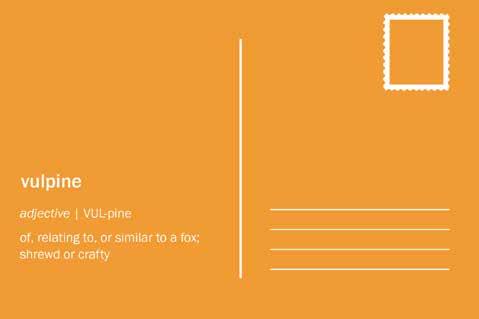
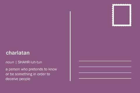
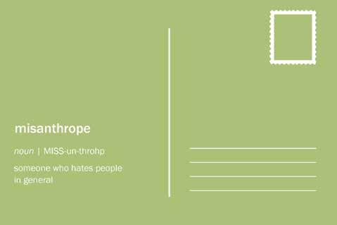
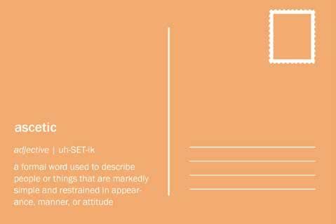
This semester long project followed Merriam Webster’s word-a-day definitions starting at the beginning of the year to develop a book of postcards that graphically represented the meanings of each word. For consistency, I developed a color palette and system for each of my postcards that involved a central circle on the front that would contain my simplified illustrations.


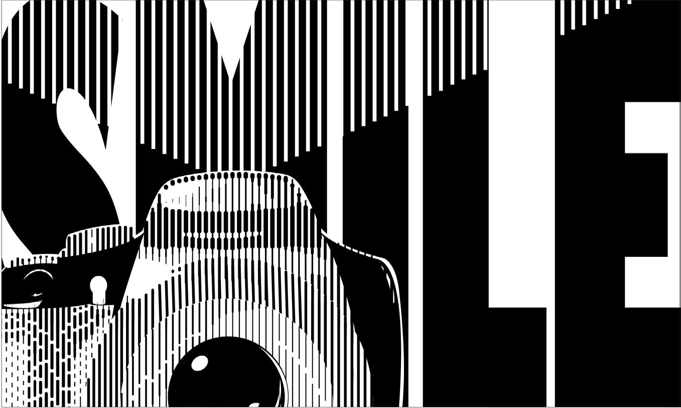
I digitally recreated my camera for this advertisement using lines of a variety of weights to convey light and shadows. I wanted the audience to view the camera as if they are having their picture taken, corresponding with the word “SMILE” in the background, a phrase I hear every time someone takes my picture. I played around a lot with where the camera would fall in the composition, but ultimately decided to place it in front of the letter “M” and have the camera’s flash stretch across the rest of the text using another line pattern.
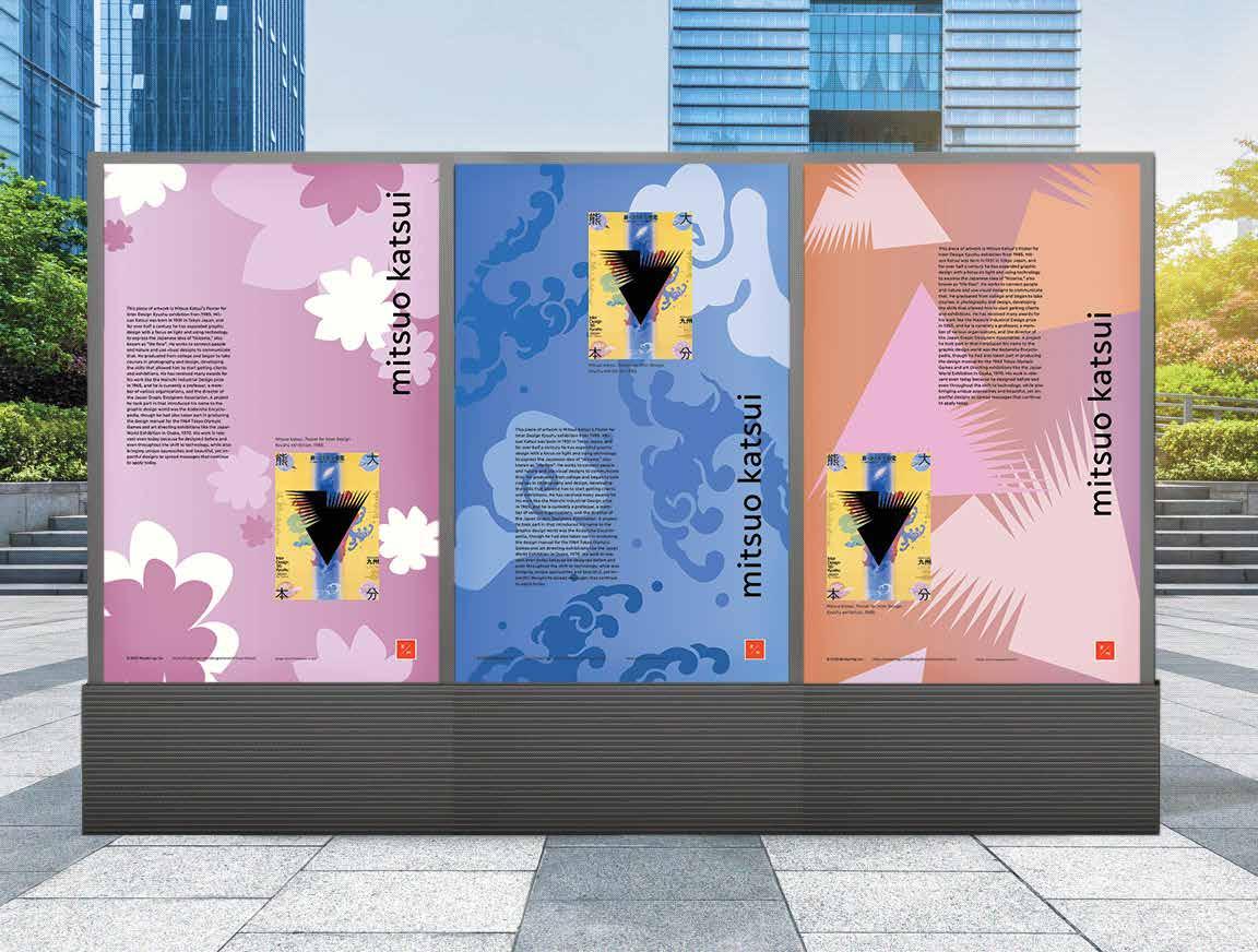
In this older project, I chose a poster by Mitsuo Katsui and developed a series of posters that draw inspiration from his design. I also visualized how the posters might be displayed on a digital screen, with movement across the three.
This past year, I joined the design team for Artistry Magazine, a student run arts & culture publication at Northeastern. After articles were submitted by students, I had the opportunity to take ownership of a few spreads for the semester publication to develop the layout and visual components of the spread. While the magazine does uphold certain typesetting requirements, I determined which photographs were used, the color palette, and the typeface(s) used for the title of each article. I also had the opportunity to design the cover of the magazine for the spring semester, as well as adapt it for use as a poster.
Why does society accept and proliferate ways of living that are toxic to our well-being? MassArt Art Museum explores this question in its current exhibition, “The Myth of Normal: A Celebration of Authentic Expression.” Running from October 5, 2023, to May 19, 2024, this exhibition focuses on work from MassArt’s alumni. It is divided into three sections: Body as Architecture, Untold or Unheard Stories, and Authentic Expression in Action. These interrelated groupings guide the visitor through a deep examination of the toxic norms held by modern society.
It leaves the viewer with a sense of liberation and inspiration, subverting expectations at every turn.
The exhibition draws inspiration from the book, “The Myth of Normal: Trauma, Illness, and Healing in a Toxic Culture” by Gabor and Daniel Maté. The Matés uncover the wrongdoings of Western medicine, exploring how chronic illness, general ill health, and mental illness are on the rise despite “advancements” in medicine. This book sheds light on how the stressors of today’s culture burden our immune systems. The Matés offer authentic expression as a step towards total health. “The Myth of Normal” exhibition is a space for such expression.
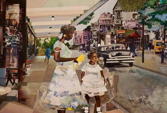
The first room in “The Myth of Normal,” Body as Architecture, accentuates feelings of oppression and constraint. The artwork houses imagery of physical architecture as an extension of the human body. It begins outside the museum with two portraits of MassArt freshmen painted high above the front entrance. Inside the Body as Architecture room, this motif continues. Chandra Mendez-Ortiz’s Parks Entrance collages personal pieces, as well as others she found, into a layered narrative of one African American family’s experience living in the South under Jim Crow.
The second space titled Untold or Unheard Stories, displays works that illuminate the histories covered up by an oppressive society. Jack Pierson’s Boston #1 documents the underground gay scene in a period of conservatism and homophobia. These black and white photographs convey deep emotion and eloquent sexuality, detailing the once-hidden spaces of selfexpression. In the middle of this room is a sculpture impossible to miss: Richard Streitmatter-Tran’s Gluskabe Comes Home a large woodchuck figure from indigenous cosmology. It symbolizes the artist’s ancestry and the stories passed down through generations.
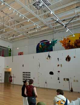
As you ascend the stairs into the Authentic Expression in Action section, a series of hanging wigs come into view. The delicately placed hairpieces were collected from drag performers as a part of Kathleen White’s Spirits of Manhattan This artwork addresses the AIDs epidemic and the many lives it took. This Authentic Expression in Action room fluently concludes the “Myth of Normal” series. The self-expression in this room, though at times tragic in nature, is a stepping stone towards liberation. It is a deep exhalation from the toxicity of societal standards and a pragmatic call to action.
Written & Photographed by Abigail Farmer
Designed by Olivia Champagne


I experimented a lot with with opacity, gradients, and blending to incorporate photos with the article text, while trying to capture the feel of the article visually.
The theme this semester was “saturate,” and I chose to work with a lot of color, texture, and repetition for the magazine cover. In my spread design for an exhibit, The Myth of Normal, I wanted to carry on the unique quality of the different pieces in the photos.
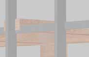
site, space, and program | prof. ang li | fall 2022
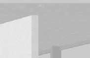
The objective of this project was to design a seasonal pavilion in the center of Boston’s Chinatown that would house a public restroom and an additional program providing public space fitting of the needs of the community. The restrooms had to be fully enclosed, but the rest of the space could be covered by some form of overhead shelter that was still left open to the elements.
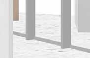
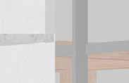
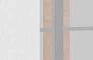
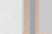
Inspired by a public installation next to the site that doubled as ordinary seating and a performance space, I decided that my additional program would be imbedded seating similar to an ampitheater that faces a space carved into the wall of the structure that can act as a backdrop or stage. I wanted the space to provide more seating for people passing by just as much as I also wanted it to function for gatherings. I made use of irregular pentagons for the seating, main structure, and the pergola-like structure made up of wood and a trellis that partially covers the two. A key element of my design was accessibility, with a variety of ways to approach and enter the restrooms and seating area, but also the angles of the different elements and how they created different spaces.
A plan diagram analyzing circulation and spatial relationships within the site.
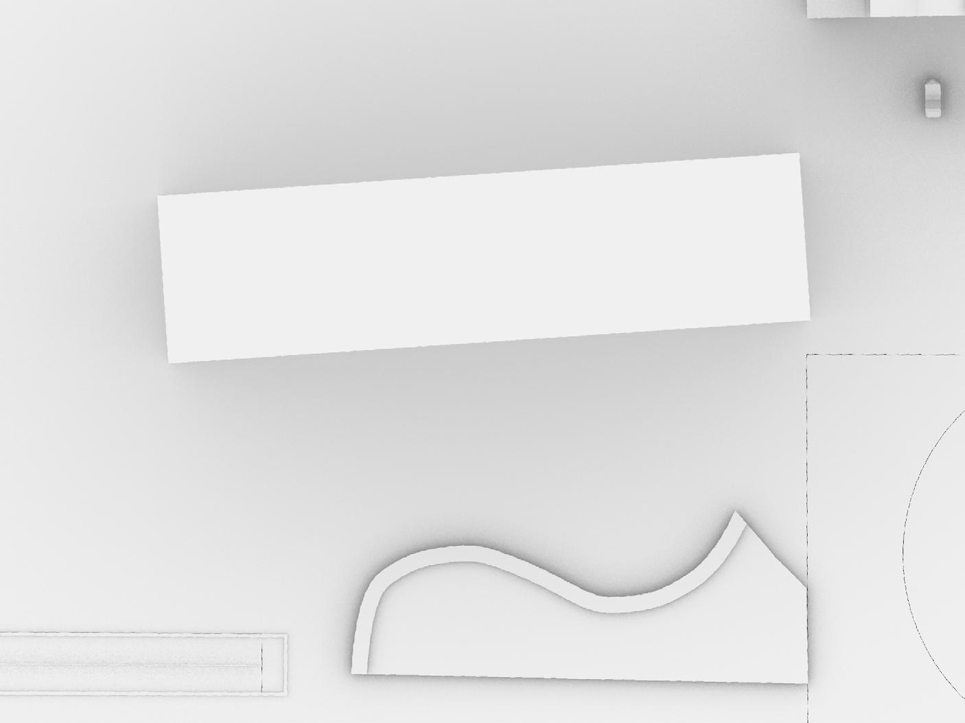


This plan drawing includes measurements and circulation paths around an existing public public pavillion.
A section drawing depicting that space in use for a public gathering, which highlights its variety of seating heights.
This exploded axonometric drawing highlighs the space contained within the frame, and the stage in use for a public event.

This section drawing highlights overhangs and seating that are carved out of the thickened exterior walls, along with the various level changes that are key to the public seating.
site, space, and program | prof. ang li | fall 2022
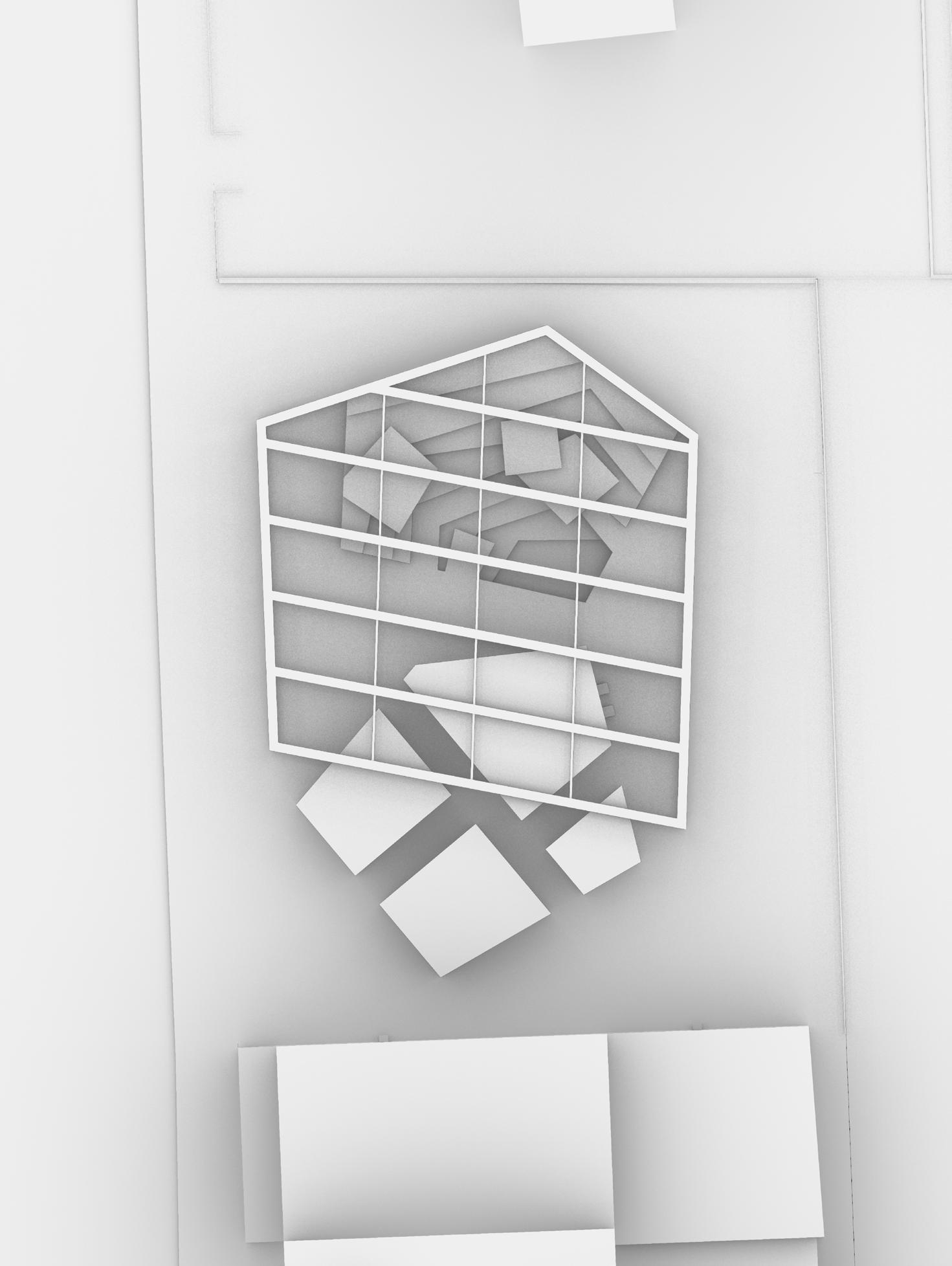
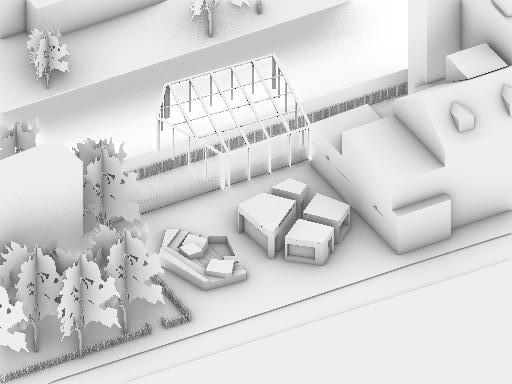
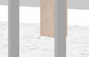
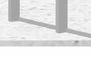
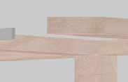
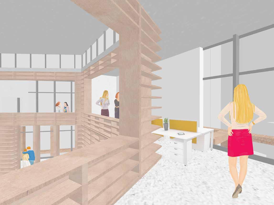
This was the largest project I have worked on to date, and the goal was to design a building for the Chinatown Branch of the Boston Public Library. My analysis of the chosen site, a parking lot surrounded by very different settings on each side, focused primarily on circulation, studying foot traffic and what people might observe as they pass by. I wanted the building to be accessible from all sides through the permeable outer frame, however I focused the outdoor living space on the southern end of the site which is quieter and close to a popular greenspace and apartment building.
Similar to my previous projects of the semester I used polygons with precise angles to provide functional in-between spaces. My design needed to house a number of library collections and reading spaces amongst other functions for employees and the community alike. I used a layering strategy, organizing my plan around an innermost core containing the auditorium and main reading space, with a different wall material and width to distinguish each one. The middle layer became a circulatory path from which any other room could be viewed or accessed with the use of aperatures, while still maintaining their own area.
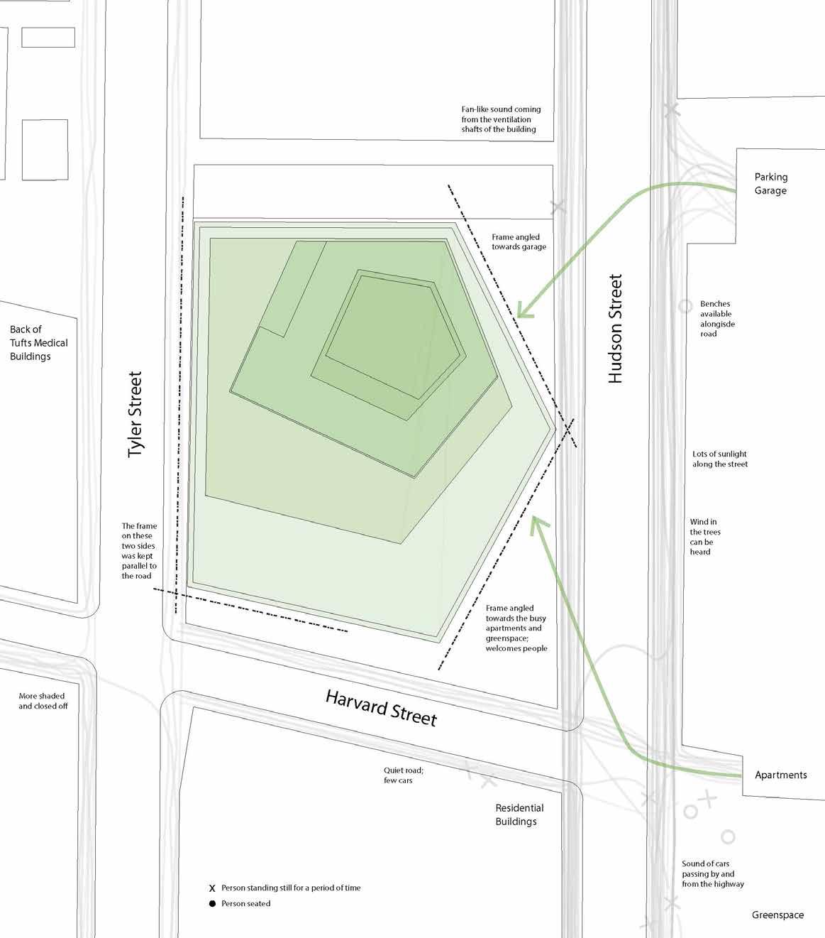
A circulation study looking at the movement of people on each side of the site and how the facade responds with the parti diagram.
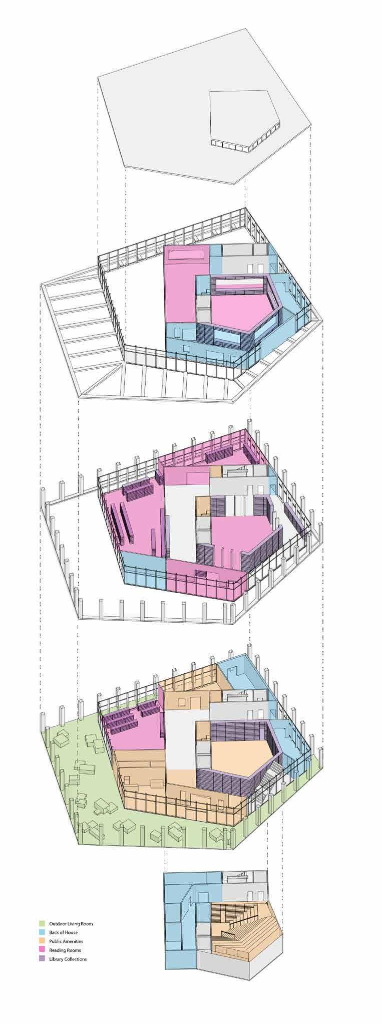
Exploded axonometric program diagram, designating the general areas meant for different library functions.
of a 1/8” = 1’ model of the library.
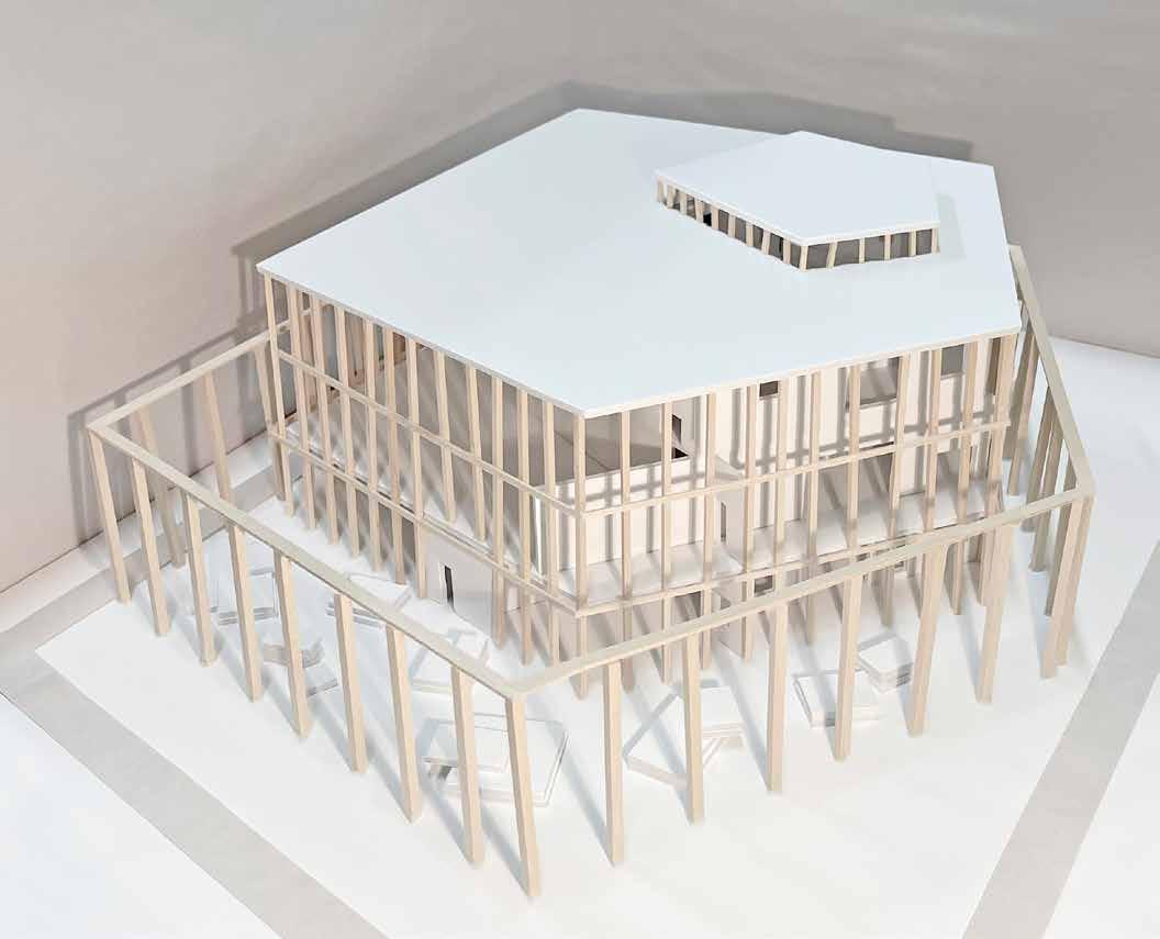
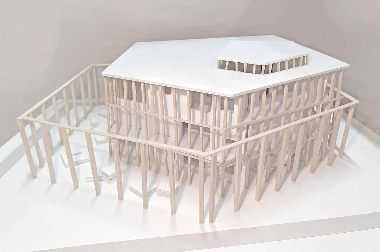


Section perspective of the library that cuts across all four layers, highlighting the wall material differences as well the implementation of double height spaces and aperatures throughout.


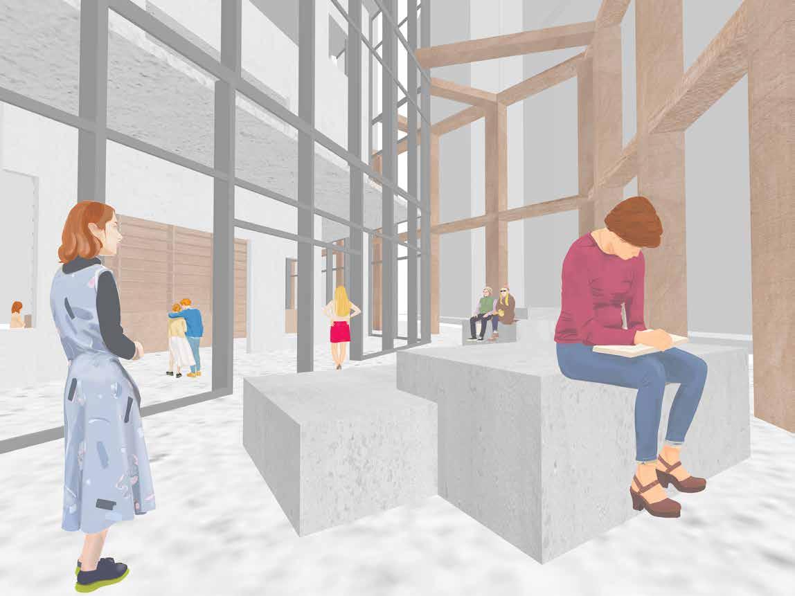
Perspective views from outside the library entrance and within the second floor staff offices, revealing the functionality of the layered indoor and outdoor spaces.
advanced architectural communication | prof. judith rodriguez | spring 2023
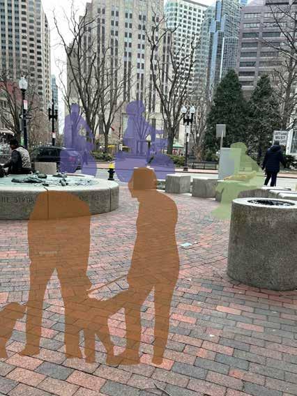
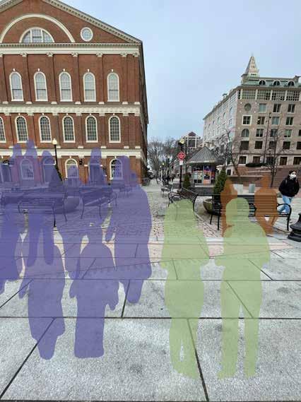
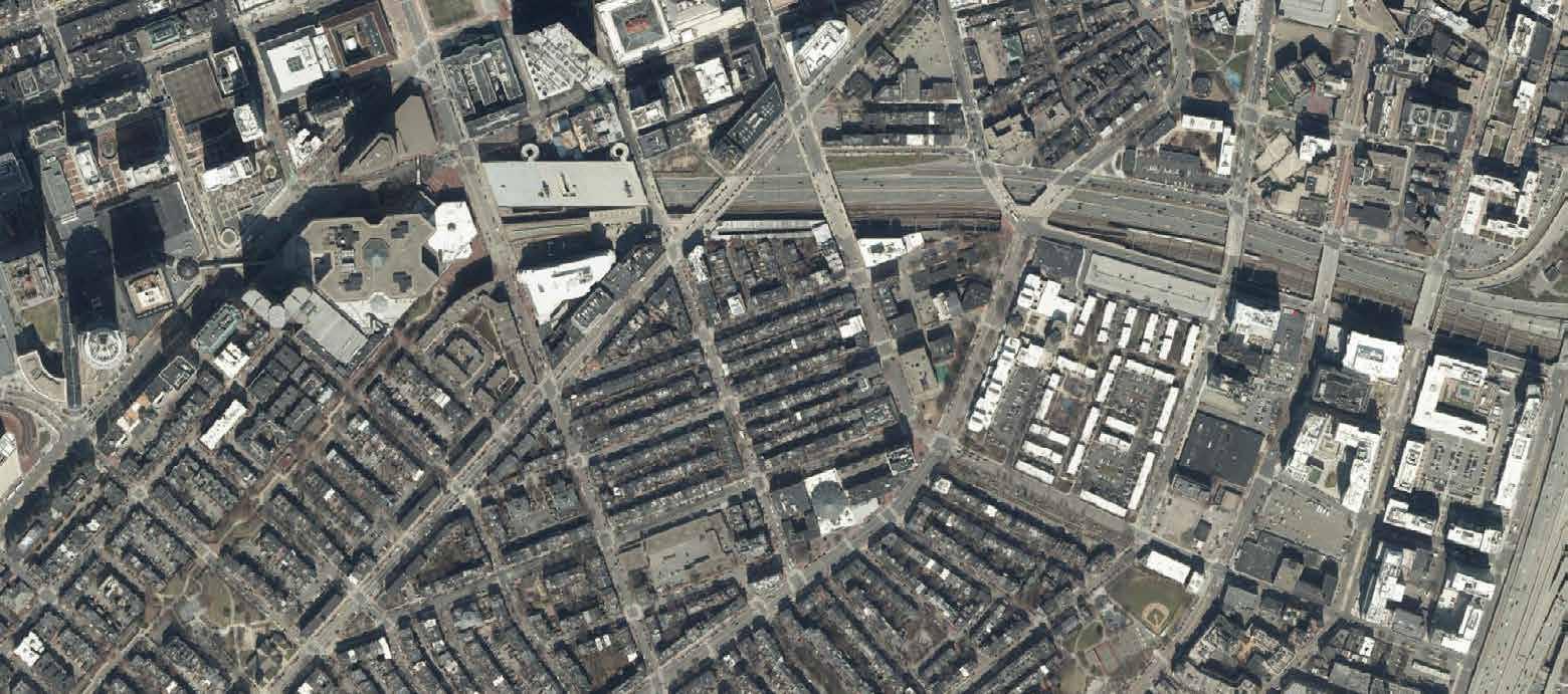
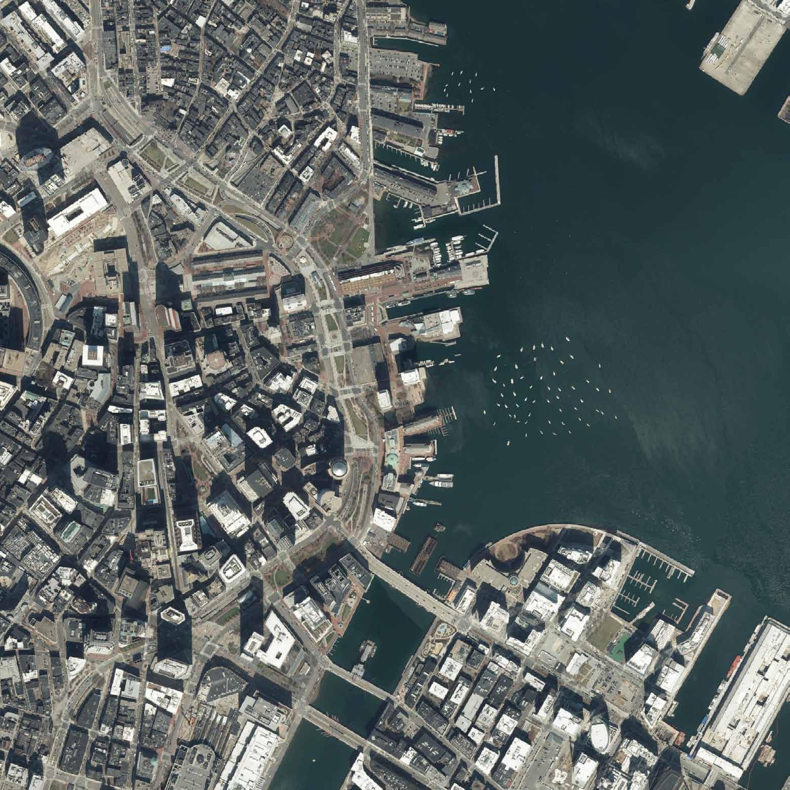
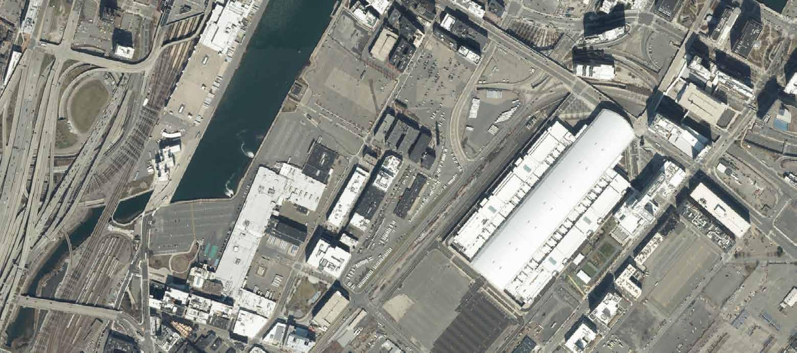
My section of this course, Playability in the City, involved the study of characteristics that impact or promote play in public places and how those spaces can be improved. I was assigned Downtown Boston and Bay Village to study for my first project, which involved visiting each of the parks in the neighborhood and documenting it through both photographs and lists of key features such as the number of trees, benches, and street lights. After being introduced to mapmaking using QGIS and layers made available by the city, I created a series of maps at the neighborhood and park levels. In particular, I chose to focus on transporation in one map since I consider park accessibility to be a determining factor in assessing playability. I also found that different types of ground covering and spaces to occupy have the ability to encourage more play, which I explored through diagrams.
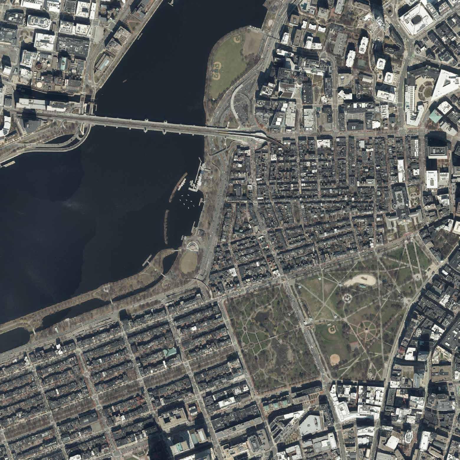
This map focuses on transportation routes through Downtown Boston and stops for blue bikes, buses, and trains, as well as all of the public spaces considered to be landmarks. Many parks in the neighborhood were also designated as Boston landmarks.
These are two sets of diagrams I created to highlight how softer ground coverings were better able to facilitate play, and the many ways public spaces could be utilized for play, intentional or not.
advanced
architectural communication | prof. judith rodriguez | spring 2023
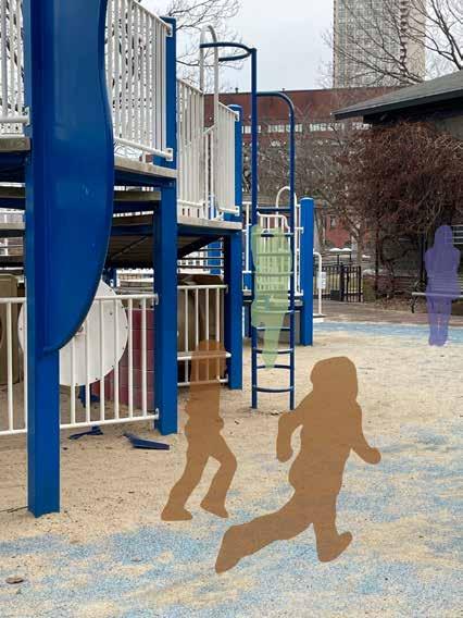
Continuing to work with my neighborhoods from the previous project, I was tasked with selecting one of the parks to focus on and suggesting interventions. Although I considered Christopher Columbus Park to be the most playable of those I studied, I found that there were still improvements to be made and its large scale allowed for the greatest flexibility in plan. After careful site analysis, I noted that there should be more of an interaction between the playground and the waterfront, and that the playground did not need to be confined to such a small portion of the site. I chose to add some soft rubber ground covering beneath all of the new playground equipment, as well as a sand play area and some paved space for basketball. Leaving open grass was still very important for my design to allow for running around, but I also wanted to facilitate more organized play and provide seating around the park.
The plan drawing features the alterations I made to the park, including the addition of new play equipment and varied ground surfaces, as well as more seating.
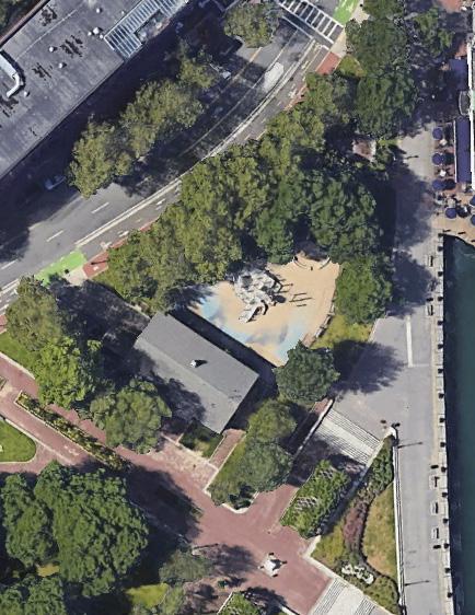
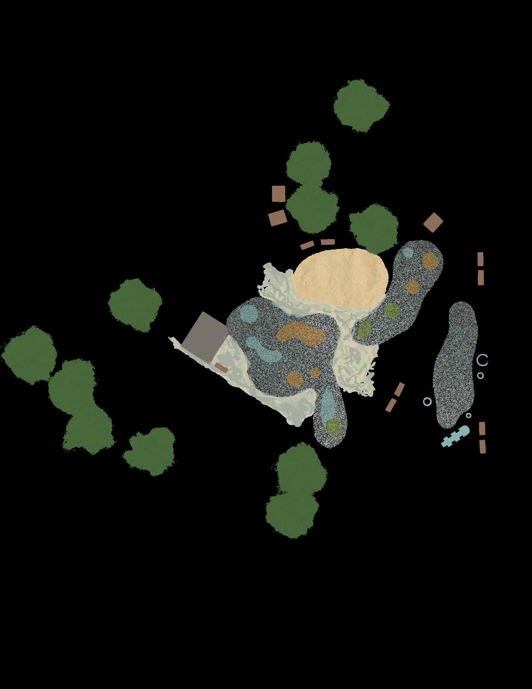
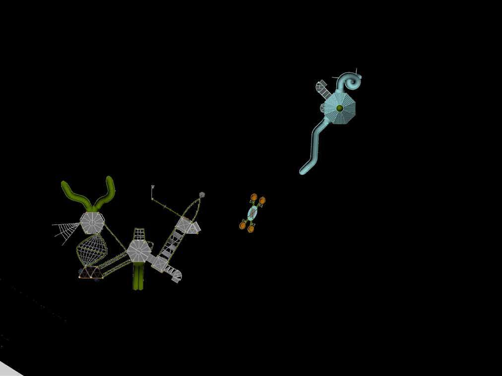
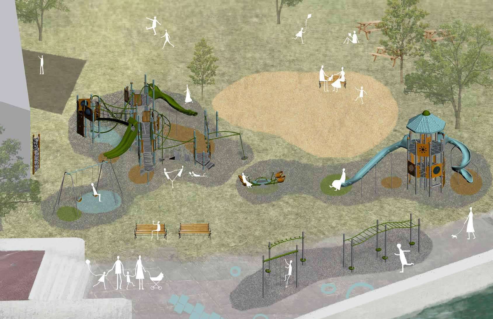
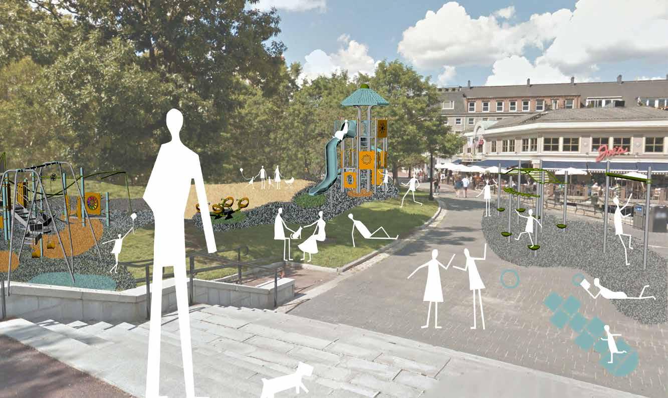
This axonometric depicts the layout of all the new equipment and ground coverings, while the rendering below is one of four built upon photographs of the original site to envision the increased playability of the site with the new changes.
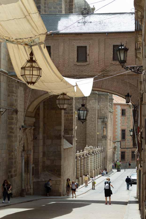
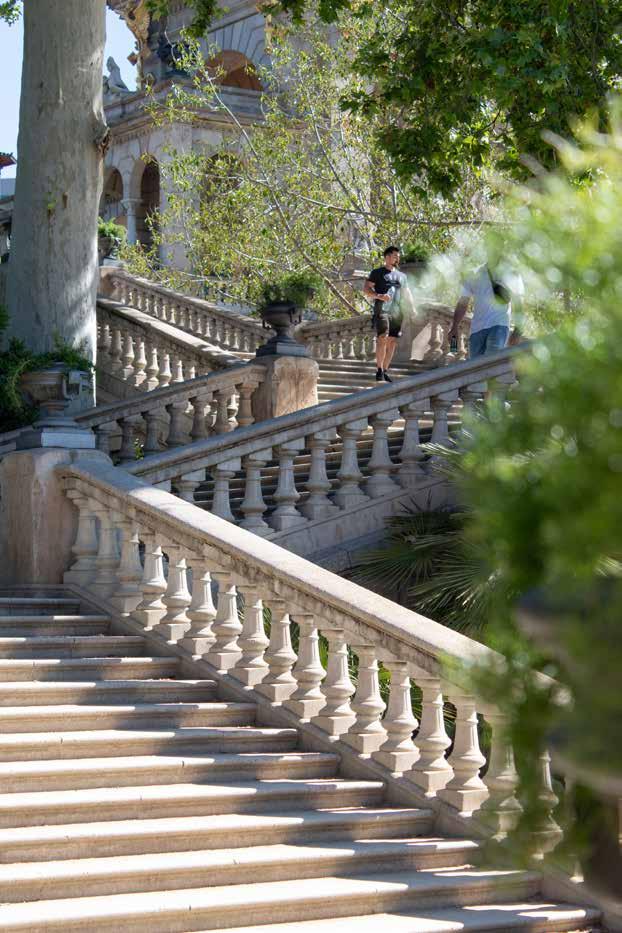
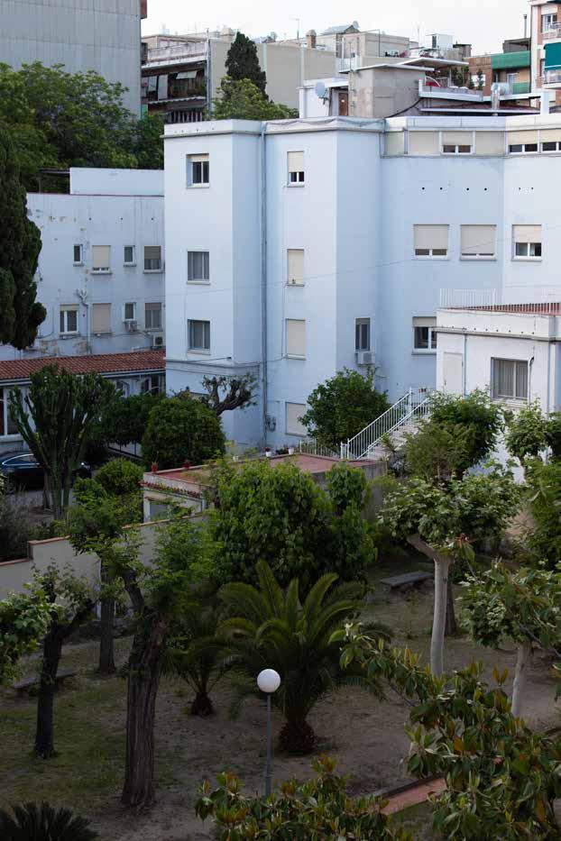
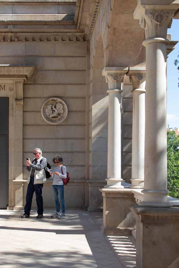
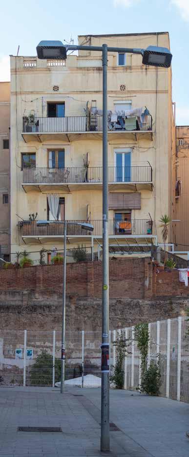
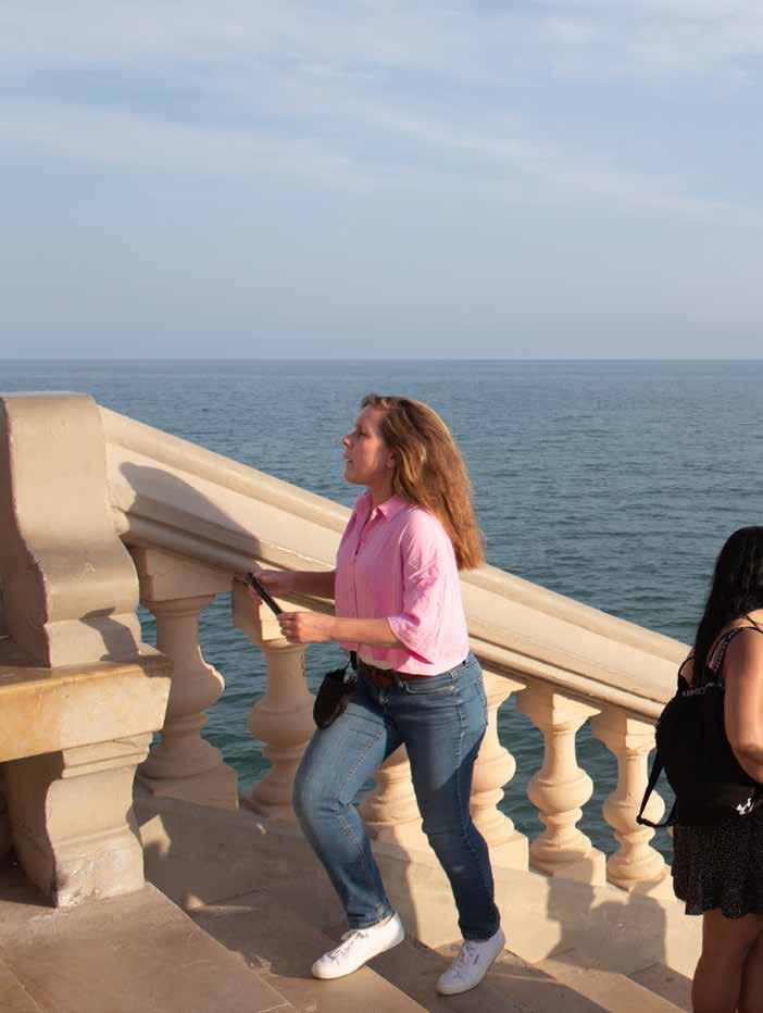
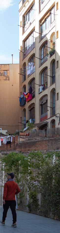
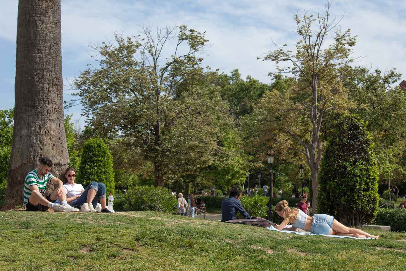
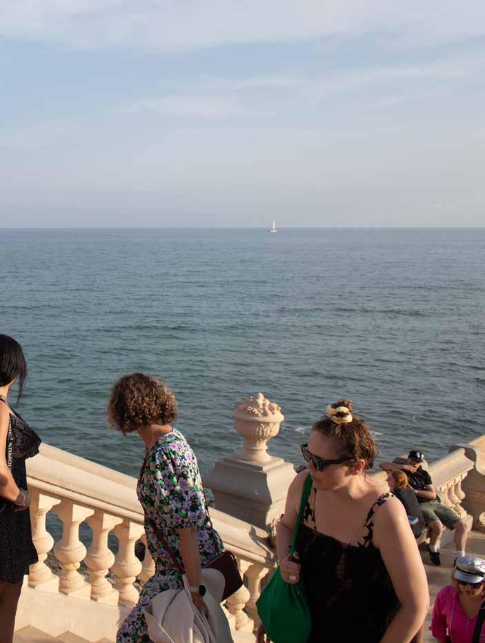
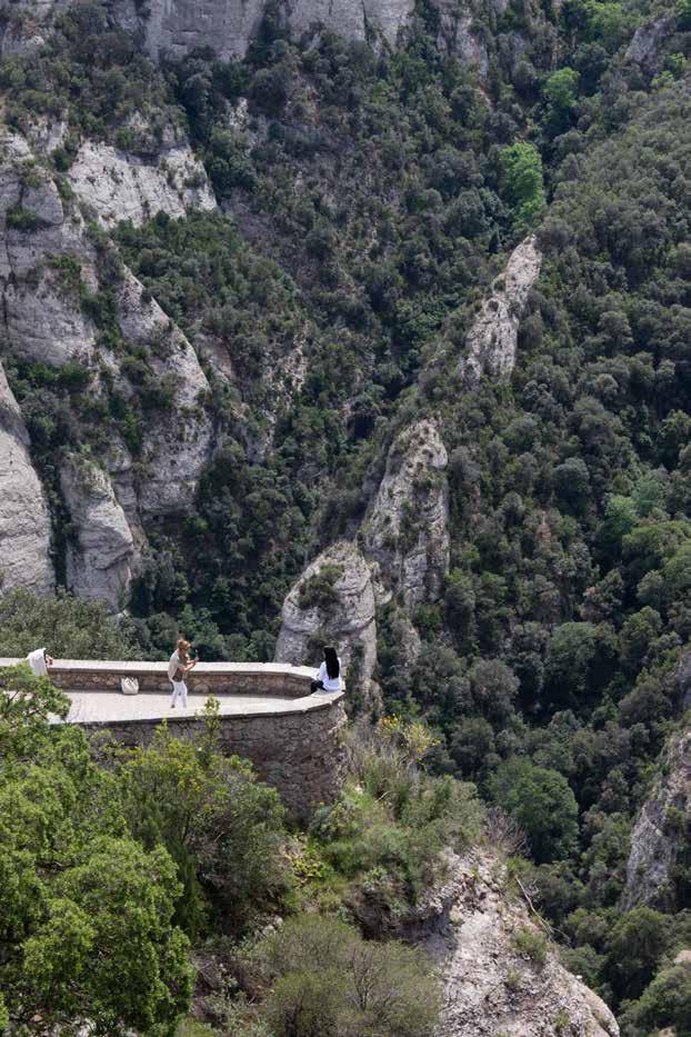
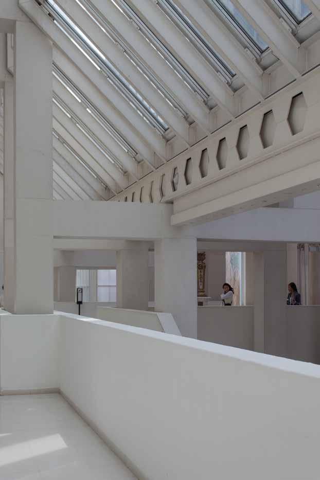
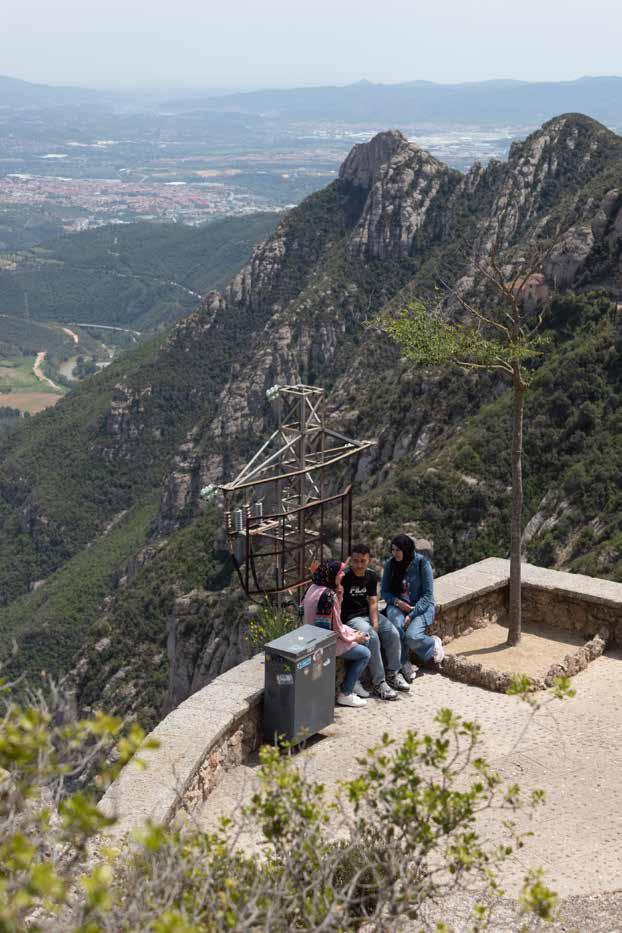
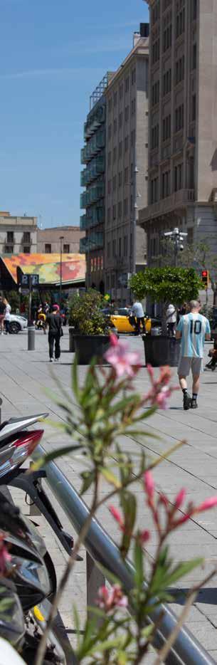
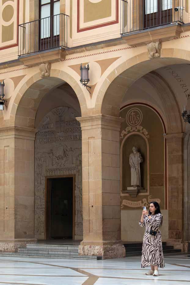
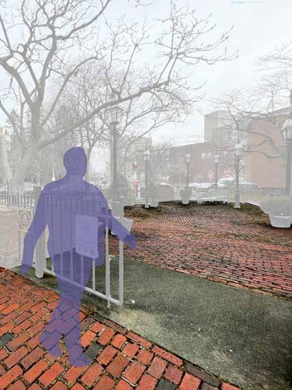
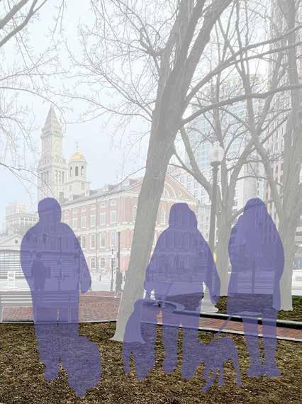
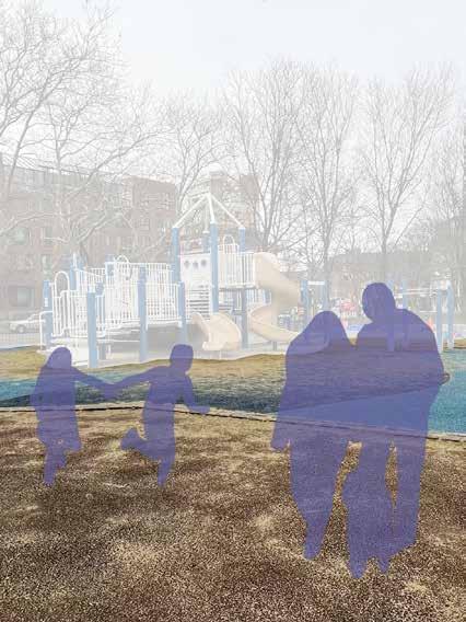
After taking an Introduction to Photography course in the spring, I had the opportunity to participate in a two-week photography workshop in Barcelona, Spain through a Northeastern University Dialogue of Civilizations. Here I was exposed to a variety of photographers, exhibitions, and techniques to apply while out in the city. These are an exerpt from my final portfolio which focused on the interaction of people with the landscape and architecture around them.